Embed Size (px)
Citation preview

Title stata.com
graph matrix — Matrix graphs
Description Quick start Menu SyntaxOptions Remarks and examples References Also see
Descriptiongraph matrix draws scatterplot matrices.
Quick startScatterplot matrix for variables v1, v2, v3, v4, and v5
graph matrix v1 v2 v3 v4 v5
As above, but draw only the lower trianglegraph matrix v1 v2 v3 v4 v5, half
Separate scatterplot matrices for each level of catvargraph matrix v1 v2 v3 v4 v5, by(catvar)
With hollow circles as markersgraph matrix v1 v2 v3 v4 v5, half msymbol(Oh)
As above, but with periods as markersgraph matrix v1 v2 v3 v4 v5, half msymbol(p)
Override the default text on the diagonal for v1 and v3
graph matrix v1 v2 v3 v4 v5, diagonal("Variable 1" . "Variable 3")
MenuGraphics > Scatterplot matrix
1

2 graph matrix — Matrix graphs
Syntaxgraph matrix varlist
[if] [
in] [
weight] [
, options]
options Description
half draw lower triangle only
marker options look of markersmarker label options include labels on markersjitter(#) perturb location of markersjitterseed(#) random-number seed for jitter()
diagonal(stringlist, . . . ) override text on diagonaldiagopts(textbox options) rendition of text on diagonal
scale(#) overall size of symbols, labels, etc.iscale(
[*]#) size of symbols, labels, within plots
maxes(axis scale optionsaxis label options) labels, ticks, grids, log scales, etc.
axis label options axis-by-axis control
by(varlist, . . . ) repeat for subgroups
std options title, aspect ratio, saving to disk
All options allowed by graph twoway scatter are also allowed, but they are ignored.half, diagonal(), scale(), and iscale() are unique; jitter() and jitterseed() are rightmost
and maxes() is merged-implicit; see [G-4] Concept: repeated options.stringlist, . . . , the argument allowed by diagonal(), is defined[ {
. | "string"} ] [ {
. | "string"}
. . .] [
, textbox options]
aweights, fweights, and pweights are allowed; see [U] 11.1.6 weight. Weights affect the size ofthe markers. See Weighted markers in [G-2] graph twoway scatter.
Optionshalf specifies that only the lower triangle of the scatterplot matrix be drawn.
marker options specify the look of the markers used to designate the location of the points. Theimportant marker options are msymbol(), mcolor(), and msize().
The default symbol used is msymbol(O)—solid circles. You specify msymbol(Oh) if you wanthollow circles (a recommended alternative). If you have many observations, we recommendspecifying msymbol(p); see Marker symbols and the number of observations under Remarks andexamples below. See [G-4] symbolstyle for a list of marker symbol choices.
The default mcolor() is dictated by the scheme; see [G-4] Schemes intro. See [G-4] colorstylefor a list of color choices.
Be careful specifying the msize() option. In graph matrix, the size of the markers varies withthe number of variables specified; see option iscale() below. If you specify msize(), that willoverride the automatic scaling.
See [G-3] marker options for more information on markers.

graph matrix — Matrix graphs 3
marker label options allow placing identifying labels on the points. To obtain this, you specify themarker label option mlabel(varname); see [G-3] marker label options. These options are oflittle use for scatterplot matrices because they make the graph seem too crowded.
jitter(#) adds spherical random noise to the data before plotting. # represents the size of the noiseas a percentage of the graphical area. This is useful when plotting data which otherwise wouldresult in points plotted on top of each other. See Jittered markers in [G-2] graph twoway scatterfor an explanation of jittering.
jitterseed(#) specifies the seed for the random noise added by the jitter() option. # shouldbe specified as a positive integer. Use this option to reproduce the same plotted points when thejitter() option is specified.
diagonal([
stringlist][, textbox options
]) specifies text and its style to be displayed along the
diagonal. This text serves to label the graphs (axes). By default, what appears along the diagonalsare the variable labels of the variables of varlist or, if a variable has no variable label, its name.Typing
. graph matrix mpg weight displ, diag(. "Weight of car")
would change the text appearing in the cell corresponding to variable weight. We specified period(.) to leave the text in the first cell unchanged, and we did not bother to type a third string or aperiod, so we left the third element unchanged, too.
You may specify textbox options following stringlist (which may itself be omitted) and a comma.These options will modify the style in which the text is presented but are of little use here.We recommend that you do not specify diagonal(,size()) to override the default sizing ofthe text. By default, the size of text varies with the number of variables specified; see optioniscale() below. Specifying diagonal(,size()) will override the automatic size scaling. See[G-3] textbox options for more information on textboxes.
diagopts(textbox options) specify the look of text on the diagonal. This option is a shortcut fordiagonal(, textbox options).
scale(#) specifies a multiplier that affects the size of all text and markers in a graph. scale(1) isthe default, and scale(1.2) would make all text and markers 20% larger.See [G-3] scale option.
iscale(#) and iscale(*#) specify an adjustment (multiplier) to be used to scale the markers, thetext appearing along the diagonals, and the labels and ticks appearing on the axes.
By default, iscale() gets smaller and smaller the larger n is, the number of variables specified invarlist. The default is parameterized as a multiplier f(n)—0 < f(n) < 1, f ′(n) < 0—that is used asa multiplier for msize(), diagonal(,size()), maxes(labsize()), and maxes(tlength()).
If you specify iscale(#), the number you specify is substituted for f(n). We recommend thatyou specify a number between 0 and 1, but you are free to specify numbers larger than 1.
If you specify iscale(*#), the number you specify is multiplied by f(n), and that product is usedto scale text. Here you should specify #>0; #>1 merely means you want the text to be biggerthan graph matrix would otherwise choose.
maxes(axis scale options axis label options) affect the scaling and look of the axes. This is a casewhere you specify options within options.
Consider the axis scale options{y | x
}scale(log), which produces logarithmic scales. Type
maxes(yscale(log) xscale(log)) to draw the scatterplot matrix by using log scales. Rememberto specify both xscale(log) and yscale(log), unless you really want just the y axis or justthe x axis logged.

4 graph matrix — Matrix graphs
Or consider the axis label options{y | x
}label(,grid), which adds grid lines. Specify
maxes(ylabel(,grid)) to add grid lines across, maxes(xlabel(,grid)) to add grid linesvertically, and both options to add grid lines in both directions. When using both, you can spec-ify the maxes() option twice—maxes(ylabel(,grid)) maxes(xlabel(,grid))—or oncecombined—maxes(ylabel(,grid) xlabel(,grid))—it makes no difference because maxes()is merged-implicit; see [G-4] Concept: repeated options.
See [G-3] axis scale options and [G-3] axis label options for the suboptions that may appearinside maxes(). In reading those entries, ignore the axis(#) suboption; graph matrix willignore it if you specify it.
axis label options allow you to assert axis-by-axis control over the labeling. Do not confuse this withmaxes(axis label options), which specifies options that affect all the axes. axis label optionsspecified outside the maxes() option specify options that affect just one of the axes.axis label options can be repeated for each axis.
When you specify axis label options outside maxes(), you must specify the axis-label suboptionaxis(#). For instance, you might type
. graph matrix mpg weight displ, ylabel(0(5)40, axis(1))
The effect of that would be to label the specified values on the first y axis (the one appearing onthe far right). The axes are numbered as follows:
x xaxis(2) axis(4)
v1/v2 v1/v3 v1/v4 v1/v5 y axis(1)
y axis(2) v2/v1 v2/v3 v2/v4 v2/v5
v3/v1 v3/v2 v3/v4 v3/v5 y axis(3)
y axis(4) v4/v1 v4/v2 v4/v3 v4/v5
v5/v1 v5/v2 v5/v3 v5/v4 y axis(5)
x x xaxis(1) axis(3) axis(5)
and if half is specified, the numbering scheme is
y axis(2) v2/v1
y axis(3) v3/v1 v3/v2
y axis(4) v4/v1 v4/v2 v4/v3
y axis(5) v5/v1 v5/v2 v5/v3 v5/v4
x x x x xaxis(1) axis(2) axis(3) axis(4) axis(5)
See [G-3] axis label options; remember to specify the axis(#) suboption, and do not specify thegraph matrix option maxes().
by(varlist, . . . ) allows drawing multiple graphs for each subgroup of the data. See Use with by( )under Remarks and examples below, and see [G-3] by option.

graph matrix — Matrix graphs 5
std options allow you to specify titles (see Adding titles under Remarks and examples below, and see[G-3] title options), control the aspect ratio and background shading (see [G-3] region options),control the overall look of the graph (see [G-3] scheme option), and save the graph to disk (see[G-3] saving option).
See [G-3] std options for an overview of the standard options.
Remarks and examples stata.com
Remarks are presented under the following headings:
Typical useMarker symbols and the number of observationsControlling the axes labelingAdding grid linesAdding titlesUse with by( )History
Typical use
graph matrix provides an excellent alternative to correlation matrices (see [R] correlate) as aquick way to examine the relationships among variables:
. use https://www.stata-press.com/data/r16/lifeexp(Life expectancy, 1998)
. graph matrix popgrowth-safewater
Avg.annual
%growth
Lifeexpectancy
at birth
GNPper
capita
safewater
0
2
4
0 2 4
50
60
70
80
50 60 70 80
0
20000
40000
0 20000 40000
0
50
100
0 50 100

6 graph matrix — Matrix graphs
Seeing the above graph, we are tempted to transform gnppc into log units:
. generate lgnppc = ln(gnppc)(5 missing values generated)
. graph matrix popgr lexp lgnp safe
Avg.annual
%growth
Lifeexpectancy
at birth
lgnppc
safewater
0
2
4
0 2 4
50
60
70
80
50 60 70 80
6
8
10
6 8 10
0
50
100
0 50 100
Some people prefer showing just half the matrix, moving the “dependent” variable to the end ofthe list:
. gr matrix popgr lgnp safe lexp, half
Avg.annual
%growth
lgnppc
safewater
Lifeexpectancy
at birth
0 2 4
6
8
10
6 8 10
0
50
100
0 50 100
50
60
70
80
graph matrix — Matrix graphs 7
Marker symbols and the number of observations
The msymbol() option—abbreviation ms()—allows us to control the marker symbol used; see[G-3] marker options. Hollow symbols sometimes work better as the number of observations increases:
. use https://www.stata-press.com/data/r16/auto, clear(1978 Automobile Data)
. gr mat mpg price weight length, ms(Oh)
Mileage(mpg)
Price
Weight(lbs.)
Length(in.)
10
20
30
40
10 20 30 40
5,000
10,000
15,000
5,000 10,000 15,000
2,000
3,000
4,000
5,000
2,000 3,000 4,000 5,000
150
200
250
150 200 250
Points work best when there are many data:
. use https://www.stata-press.com/data/r16/citytemp, clear(City Temperature Data)
. gr mat heatdd-tempjuly, ms(p)
Heatingdegreedays
Coolingdegreedays
AverageJanuary
temperature
AverageJuly
temperature
0
5000
10000
0 5000 10000
0
2000
4000
0 2000 4000
0
50
100
0 50 100
60
80
100
60 80 100

8 graph matrix — Matrix graphs
Controlling the axes labeling
By default, approximately three values are labeled and ticked on the y and x axes. When graphingonly a few variables, increasing this often works well:
. use https://www.stata-press.com/data/r16/citytemp, clear(City Temperature Data)
. gr mat heatdd-tempjuly, ms(p) maxes(ylab(#4) xlab(#4))
Heatingdegreedays
Coolingdegreedays
AverageJanuary
temperature
AverageJuly
temperature
0
5000
10000
0 5000 10000
0
1000
2000
3000
4000
0 1000200030004000
0
20
40
60
80
0 20 40 60 80
60
70
80
90
60 70 80 90
Specifying #4 does not guarantee four labels; it specifies that approximately four labels be used;see [G-3] axis label options. Also see axis label options under Options above for instructions oncontrolling the axes individually.
Adding grid lines
To add horizontal grid lines, specify maxes(ylab(,grid)), and to add vertical grid lines, specifymaxes(xlab(,grid)). Below we do both and specify that four values be labeled:
. use https://www.stata-press.com/data/r16/lifeexp, clear(Life expectancy, 1998)
. generate lgnppc = ln(gnppc)(5 missing values generated)
. graph matrix popgr lexp lgnp safe, maxes(ylab(#4, grid) xlab(#4, grid))
graph matrix — Matrix graphs 9
Avg.annual
%growth
lgnppc
safewater
Lifeexpectancy
at birth
−1
0
1
2
3
−1 0 1 2 3
6
8
10
12
6 8 10 12
20
40
60
80
100
20 40 60 80 100
50
60
70
80
50 60 70 80
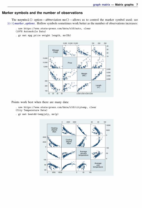
Adding titles
The standard title options may be used with graph matrix:
. use https://www.stata-press.com/data/r16/lifeexp, clear(Life expectancy, 1998)
. generate lgnppc = ln(gnppc)(5 missing values generated)
. label var lgnppc "ln GNP per capita"
. graph matrix popgr lexp lgnp safe, maxes(ylab(#4, grid) xlab(#4, grid))subtitle("Summary of 1998 life-expectancy data")note("Source: The World Bank Group")
Avg.annual
%growth
ln GNPper
capita
safewater
Lifeexpectancy
at birth
−1
0
1
2
3
−1 0 1 2 3
6
8
10
12
6 8 10 12
20
40
60
80
100
20 40 60 80 100
50
60
70
80
50 60 70 80
Source: The World Bank Group
Summary of 1998 life−expectancy data
10 graph matrix — Matrix graphs
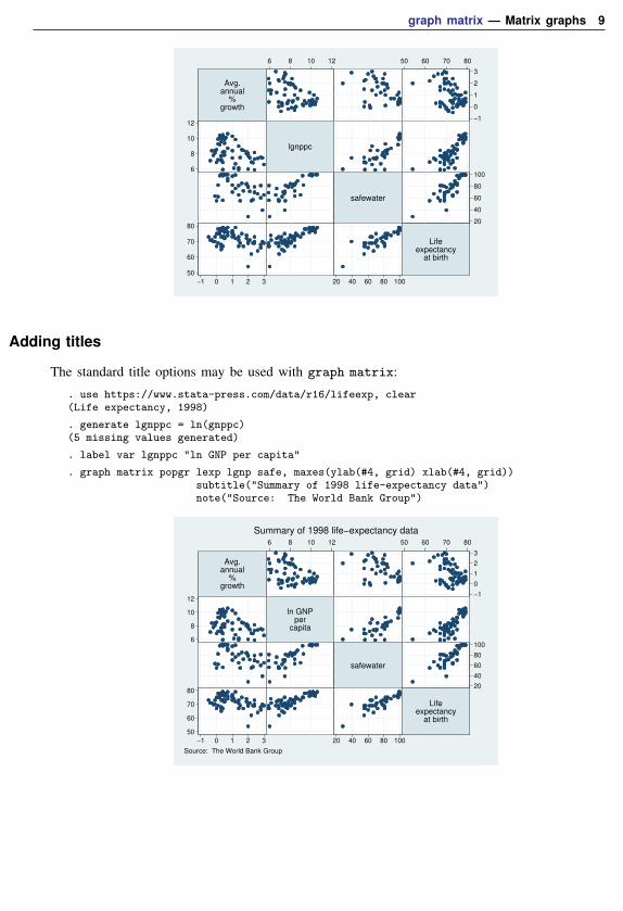
Use with by( )
graph matrix may be used with by():
. use https://www.stata-press.com/data/r16/auto, clear(1978 Automobile Data)
. gr matrix mpg weight displ, by(foreign) xsize(5)
Mileage(mpg)
Weight(lbs.)
Displacement(cu.in.)
10
20
30
10 20 30
2,000
3,000
4,000
5,000
2,000 3,000 4,000 5,000
100
200
300
400
100 200 300 400
Mileage(mpg)
Weight(lbs.)
Displacement(cu.in.)
10
20
30
40
10 20 30 40
2,000
3,000
4,000
2,000 3,000 4,000
50
100
150
50 100 150
Domestic Foreign
Graphs by Car type
See [G-3] by option.
History
The origin of the scatterplot matrix is unknown, although early written discussions may be foundin Hartigan (1975), Tukey and Tukey (1981), and Chambers et al. (1983). The scatterplot matrixhas also been called the draftman’s display and pairwise scatterplot . Regardless of the name used,we believe that the first “canned” implementation was by Becker and Chambers in a system calledS—see Becker and Chambers (1984)—although S predates 1984. We also believe that Stata providedthe second implementation, in 1985.
ReferencesBasford, K. E., and J. W. Tukey. 1998. Graphical Analysis of Multiresponse Data. Boca Raton, FL: Chapman &
Hall/CRC.
Becker, R. A., and J. M. Chambers. 1984. S: An Interactive Environment for Data Analysis and Graphics. Belmont,CA: Wadsworth.
Chambers, J. M., W. S. Cleveland, B. Kleiner, and P. A. Tukey. 1983. Graphical Methods for Data Analysis. Belmont,CA: Wadsworth.
Hartigan, J. A. 1975. Printer graphics for clustering. Journal of Statistical Computation and Simulation 4: 187–213.
Tukey, P. A., and J. W. Tukey. 1981. Preparation; prechosen sequences of views. In Interpreting Multivariate Data,ed. V. Barnett, 189–213. Chichester, UK: Wiley.

graph matrix — Matrix graphs 11
Also see[G-2] graph — The graph command
[G-2] graph twoway scatter — Twoway scatterplots


![[Neo]Chapter5 Path Problems in Graphs and Matrix Multiplication](https://img.pdfslide.net/doc/110x75/577d36bd1a28ab3a6b93e5a1/neochapter5-path-problems-in-graphs-and-matrix-multiplication.jpg)