Embed Size (px)
DESCRIPTION
Graduating Graphic Design portfolio
Citation preview


hi, my name is Krys ha.Graphic design has provided me with the opportunity to incorporate art into my
daily life. The fact that graphic design allows me to mix creativity with logic
was what truly pulled me into the industry. From a young age, I was more in
tune with my creative side, but as I grew, I was able to cultivate my critical
thinking skills, which allows me to collaborate with clients. Graphic design is
one of those fields that requires the person to be organized and disciplined
and yet still demanding imagination and uniqueness to truly thrive. It’s where I
believe I belong and where I can be passionate about the work that I produce.
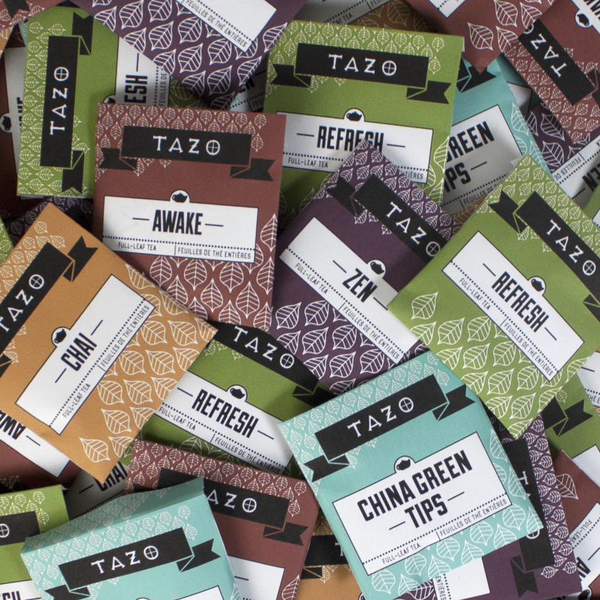
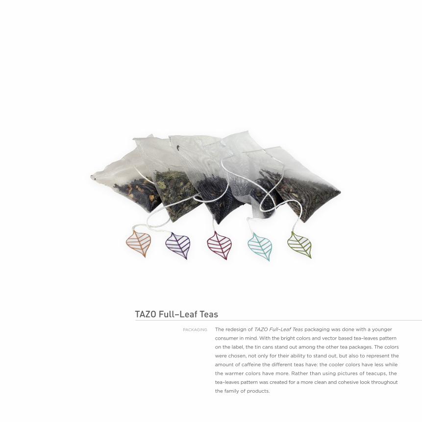
tazo Full–Leaf teasThe redesign of TAZO Full–Leaf Teas packaging was done with a younger
consumer in mind. With the bright colors and vector based tea–leaves pattern
on the label, the tin cans stand out among the other tea packages. The colors
were chosen, not only for their ability to stand out, but also to represent the
amount of caffeine the different teas have: the cooler colors have less while
the warmer colors have more. Rather than using pictures of teacups, the
tea–leaves pattern was created for a more clean and cohesive look throughout
the family of products.
packaGInG


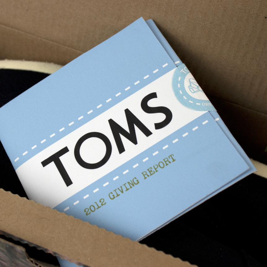

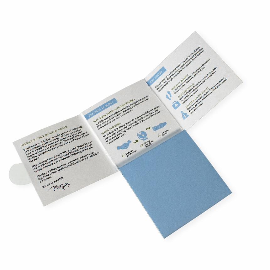
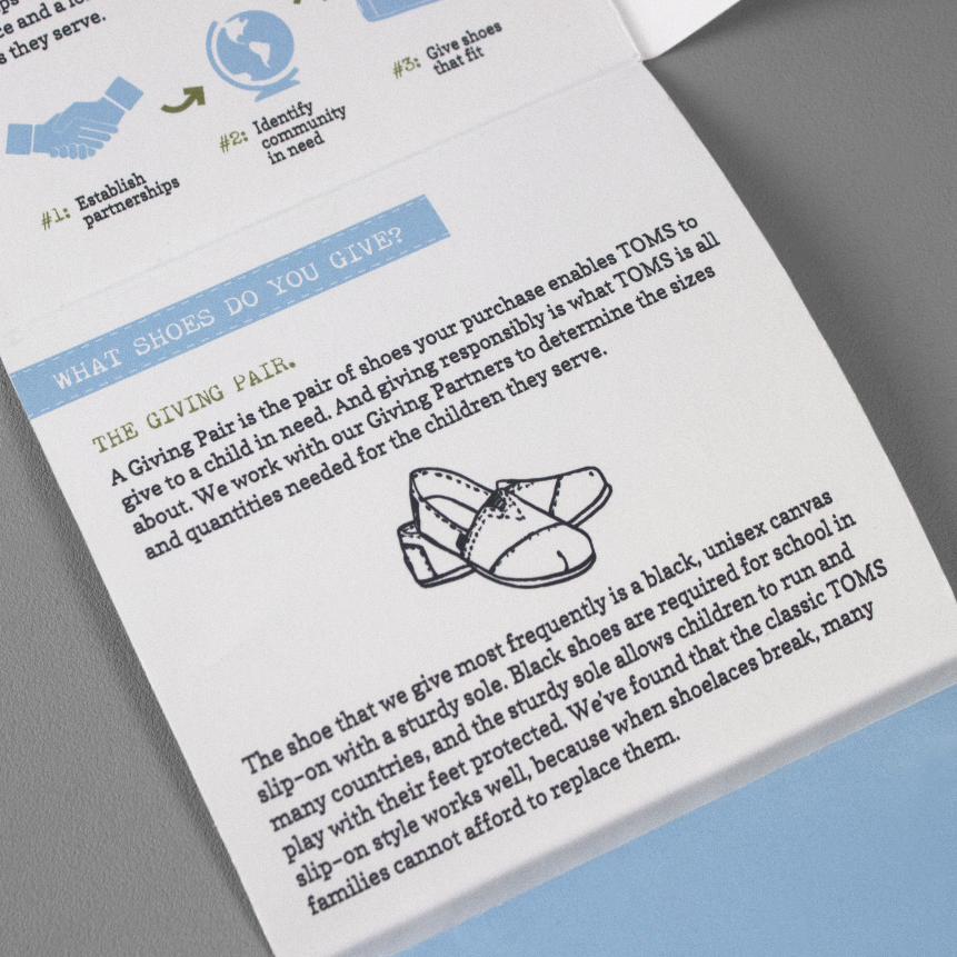
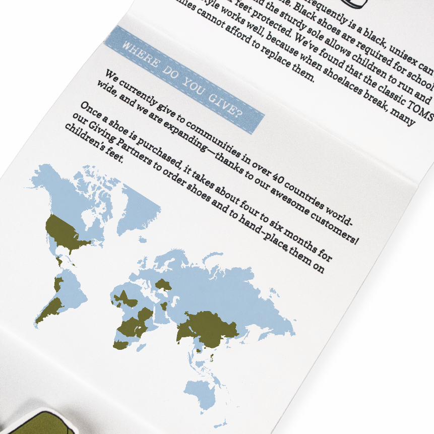
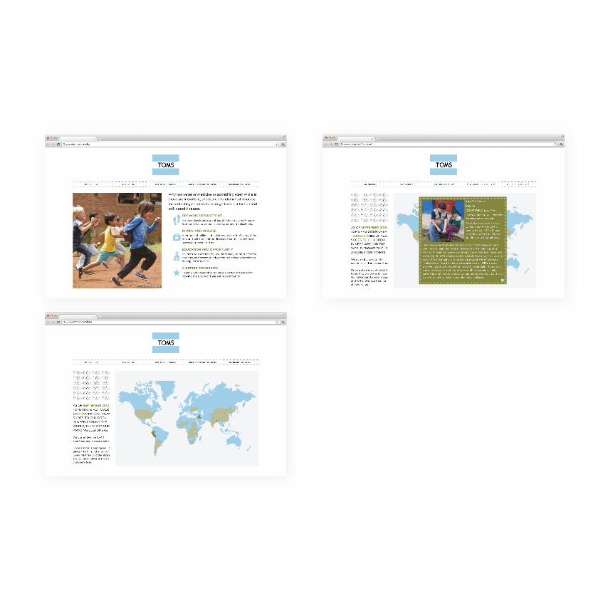
toms Giving ReportTOMS Giving Report was designed with the thought of easily displaying the
information for the consumers of TOMS through the use of infographics.
keeping with TOMS’ clean design style, the small pamphlet, which will be
found in the shoebox, opens up in the shape of a “T” and uses the TOMS blue
throughout. Stickers were also designed to allow the consumers to take part
in spreading TOMS’ influence. To better highlight TOMS’ One for One Move–
ment, a website focused on the mission was designed using the look and feel
of the TOMS Giving Report.
publIcaTIOn
InFOGRaphIcS
WebSITe


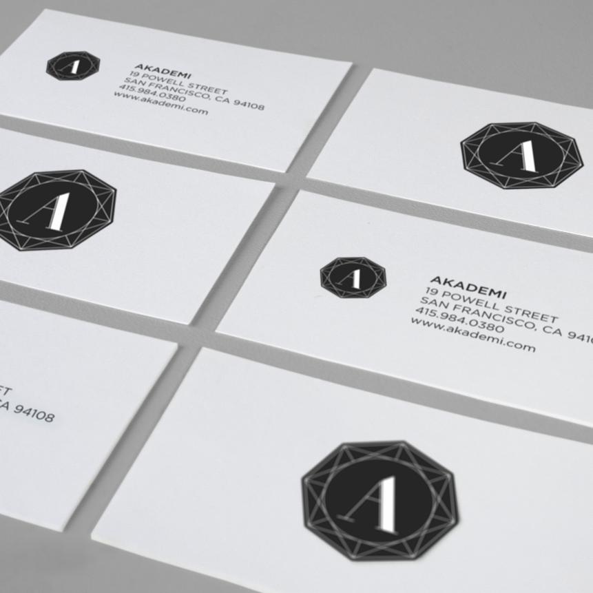
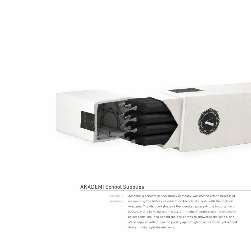
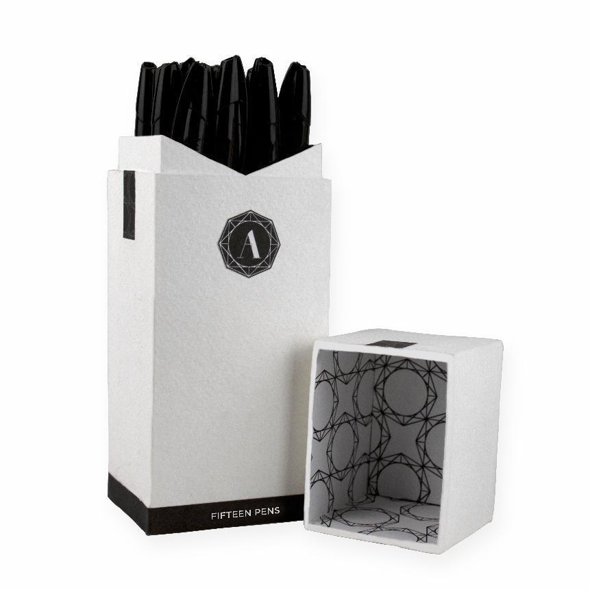
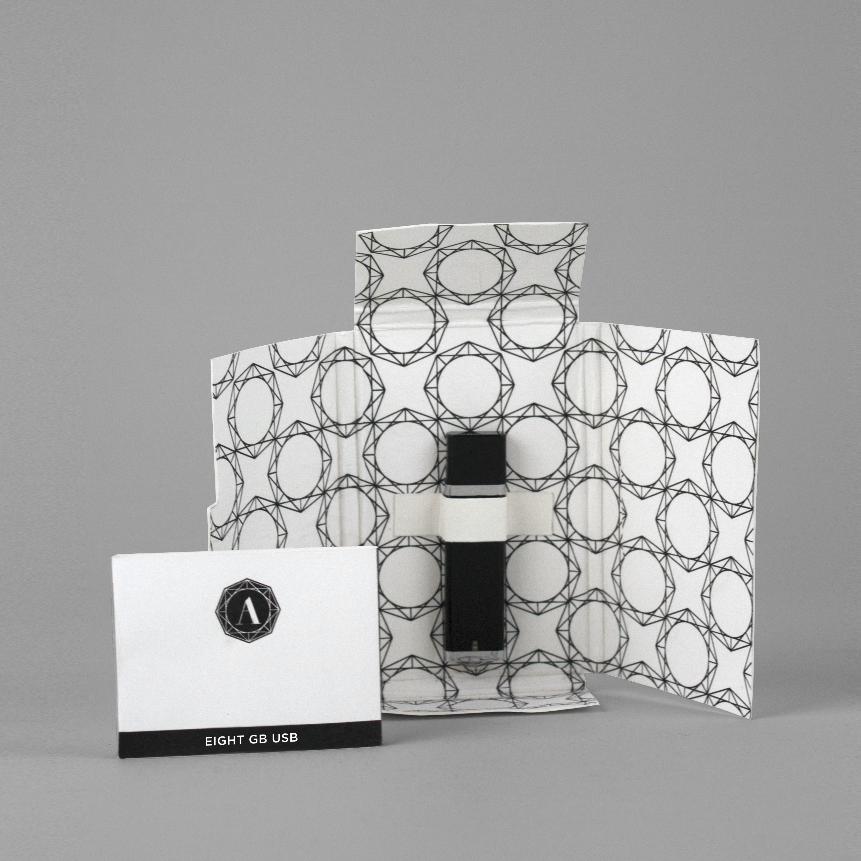
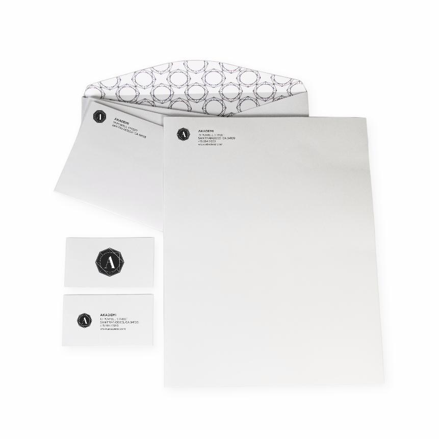
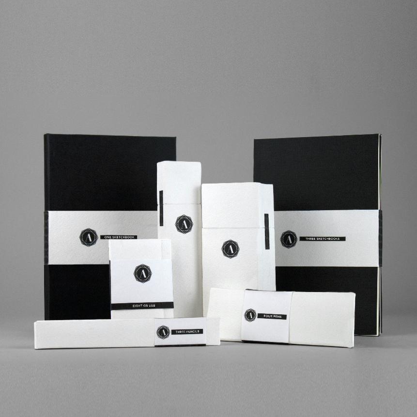
aKademi school suppliesAkademi, a concept school supply company, was named after a process of
researching the history of education back to its roots with the platonic
academy. The diamond shape of the identity represents the importance of
education and its value, and the custom–made ‘a’ emphasized the originality
of Akademi. The idea behind the design was to showcase the school and
office supplies rather than the packaging through an understated, yet refined
design to highlight the elegance.
packaGInG
bRandInG
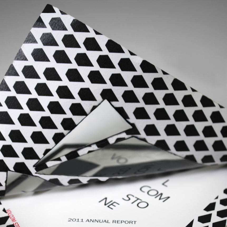
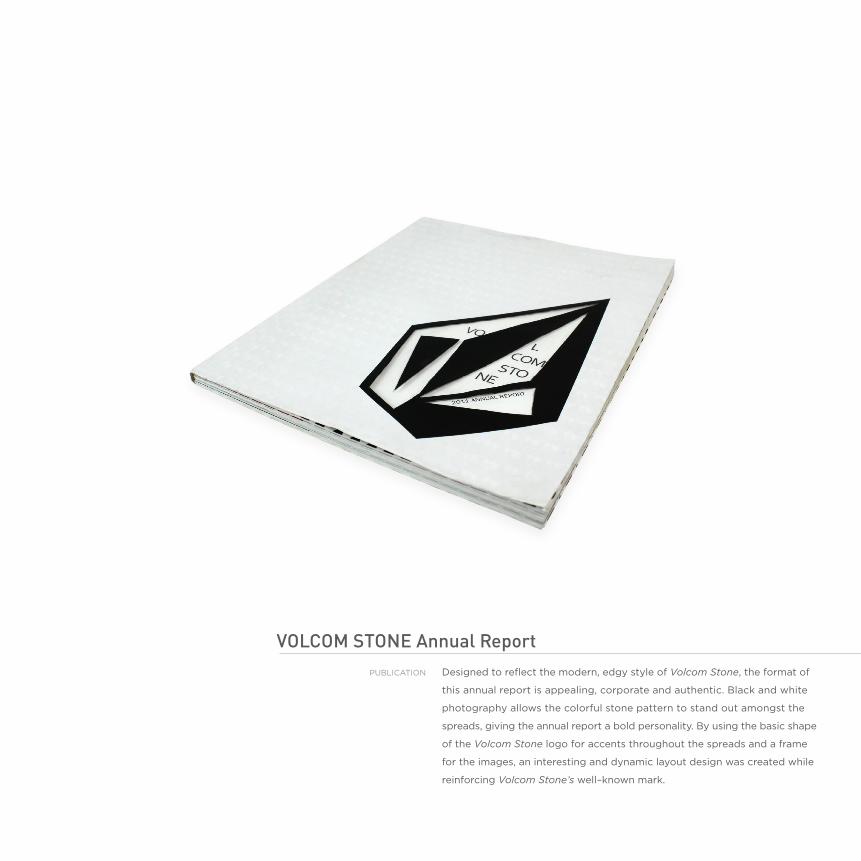
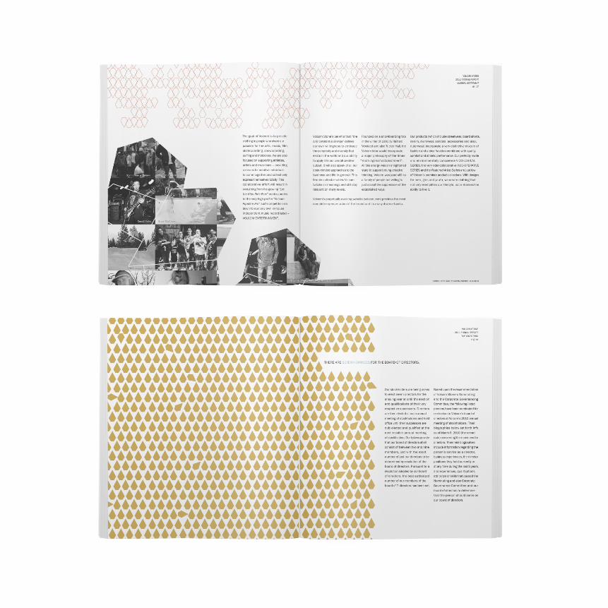
voLcom stone annual Reportdesigned to reflect the modern, edgy style of Volcom Stone, the format of
this annual report is appealing, corporate and authentic. black and white
photography allows the colorful stone pattern to stand out amongst the
spreads, giving the annual report a bold personality. by using the basic shape
of the Volcom Stone logo for accents throughout the spreads and a frame
for the images, an interesting and dynamic layout design was created while
reinforcing Volcom Stone’s well–known mark.
publIcaTIOn

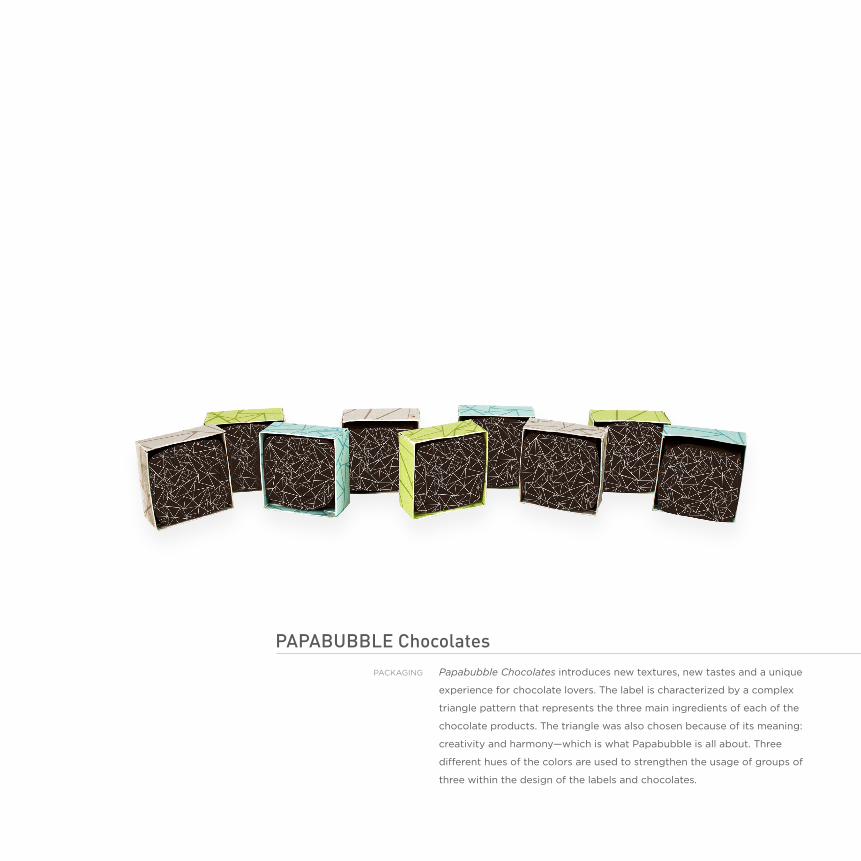
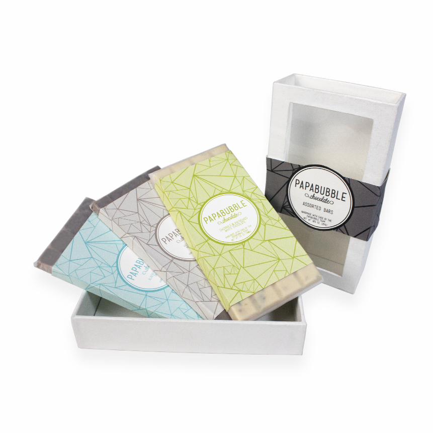
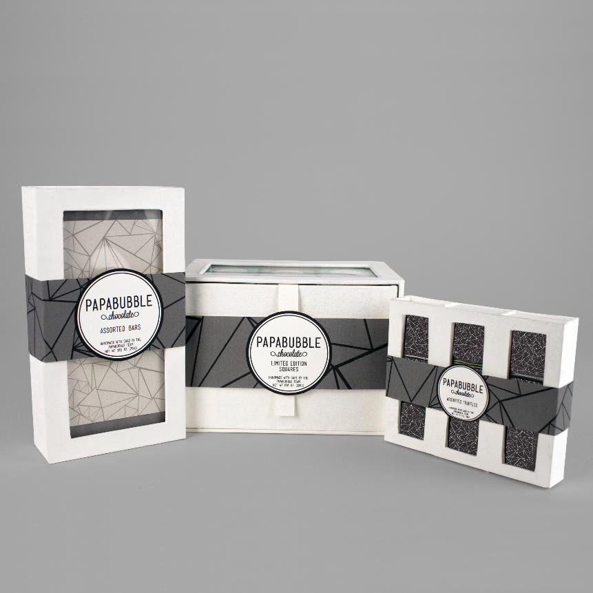
papabubbLe chocolatesPapabubble Chocolates introduces new textures, new tastes and a unique
experience for chocolate lovers. The label is characterized by a complex
triangle pattern that represents the three main ingredients of each of the
chocolate products. The triangle was also chosen because of its meaning:
creativity and harmony—which is what papabubble is all about. Three
different hues of the colors are used to strengthen the usage of groups of
three within the design of the labels and chocolates.
packaGInG
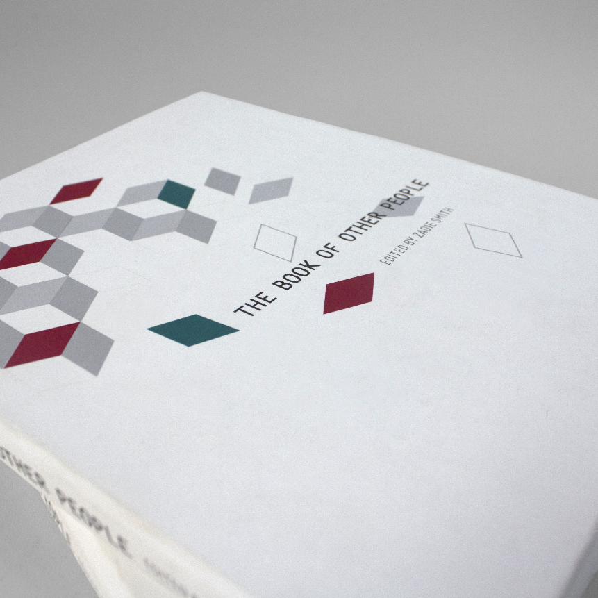
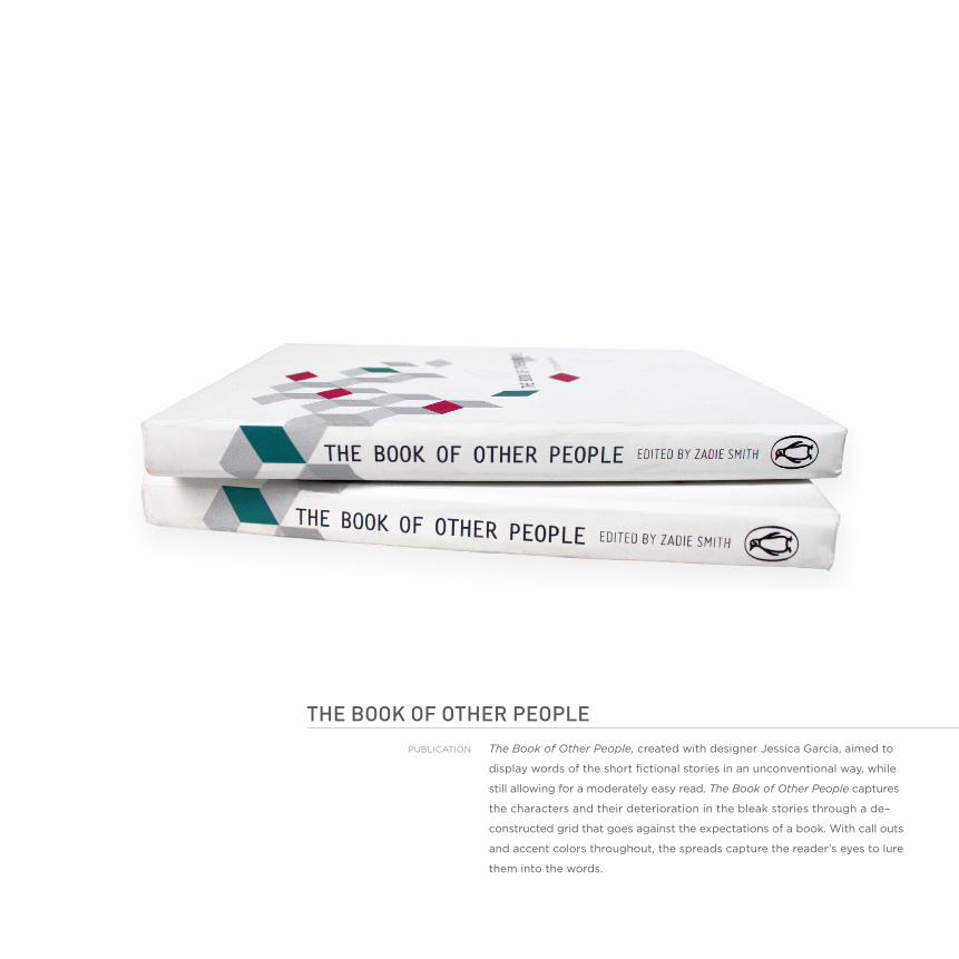
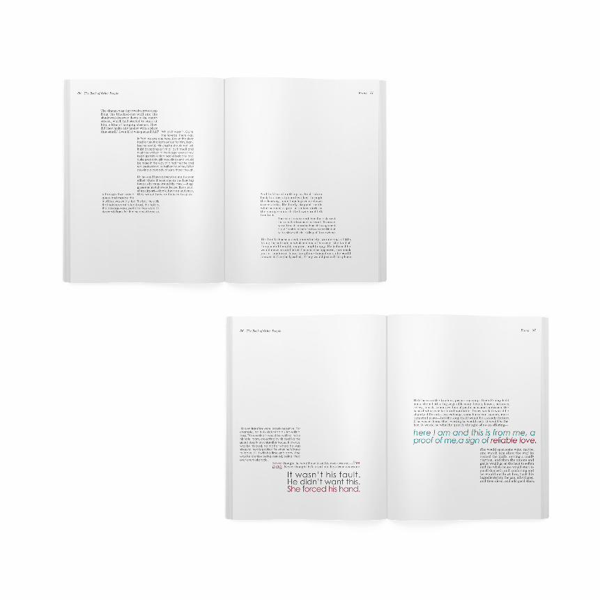
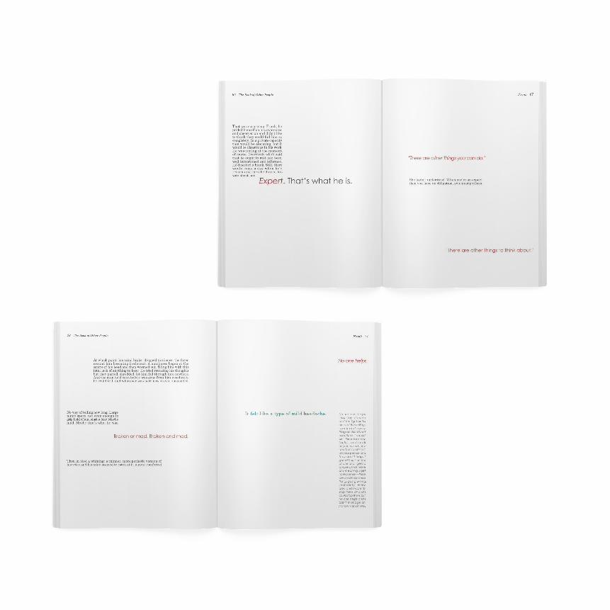
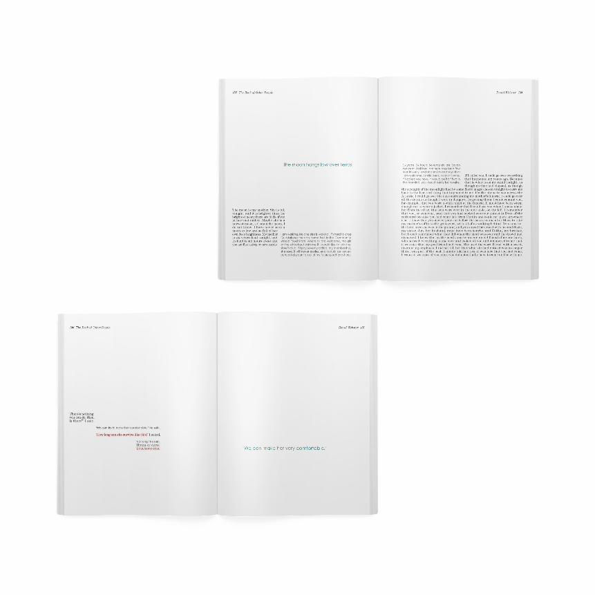
the booK oF otheR peopLeThe Book of Other People, created with designer Jessica Garcia, aimed to
display words of the short fictional stories in an unconventional way, while
still allowing for a moderately easy read. The Book of Other People captures
the characters and their deterioration in the bleak stories through a de–
constructed grid that goes against the expectations of a book. With call outs
and accent colors throughout, the spreads capture the reader’s eyes to lure
them into the words.
publIcaTIOn

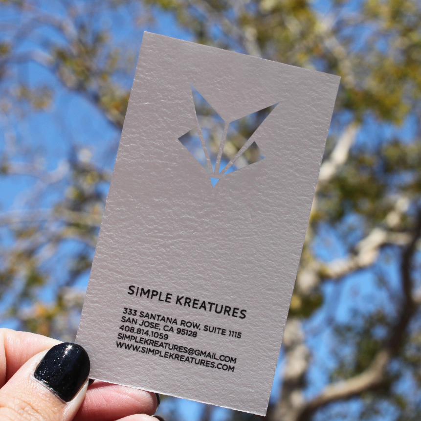
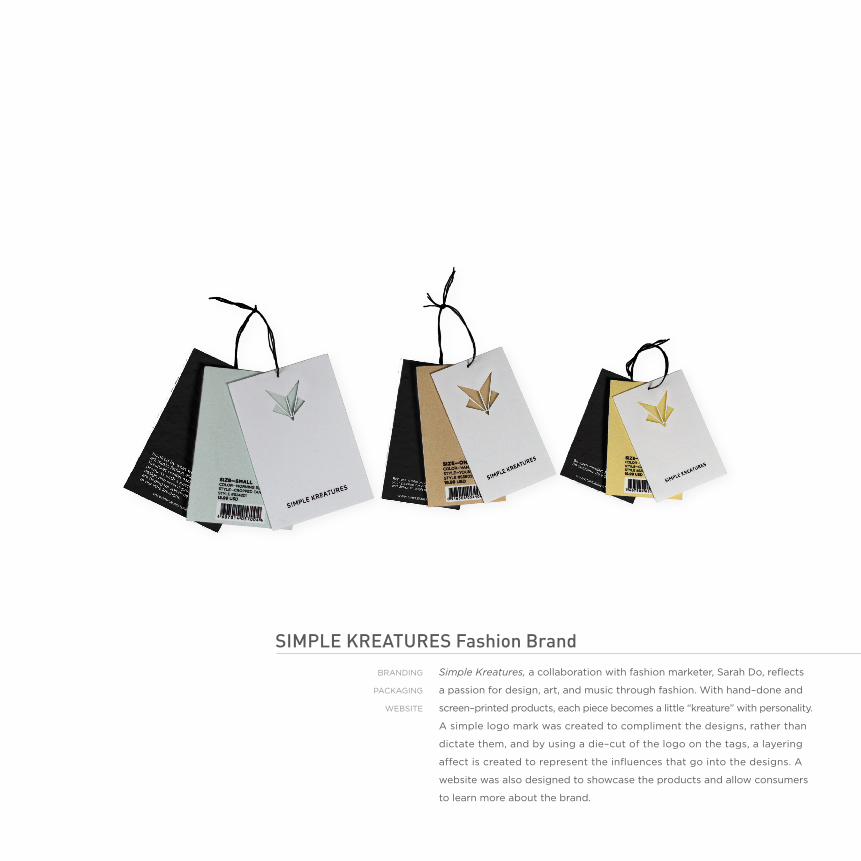
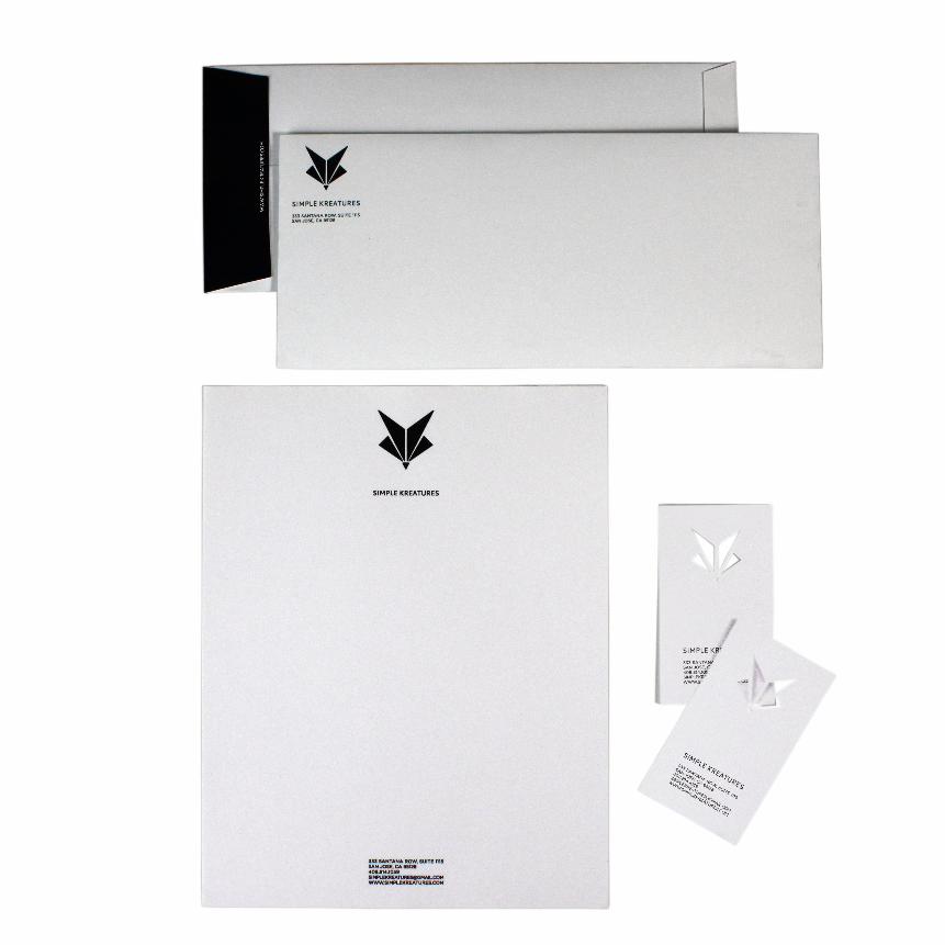
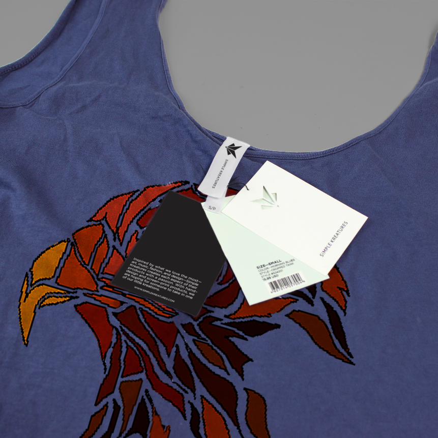
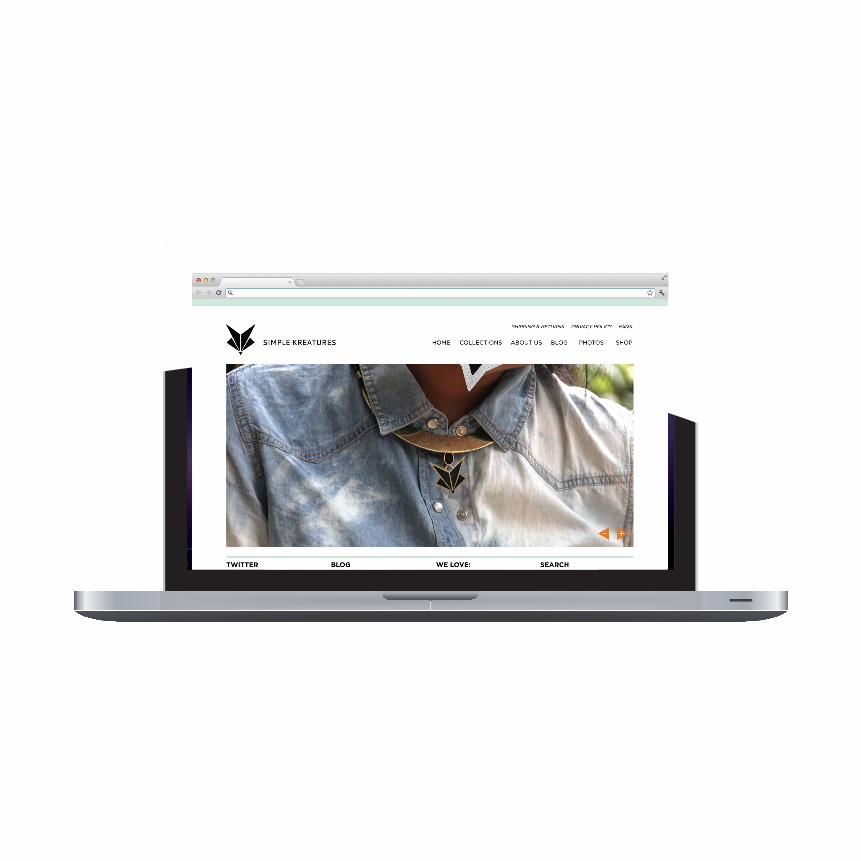
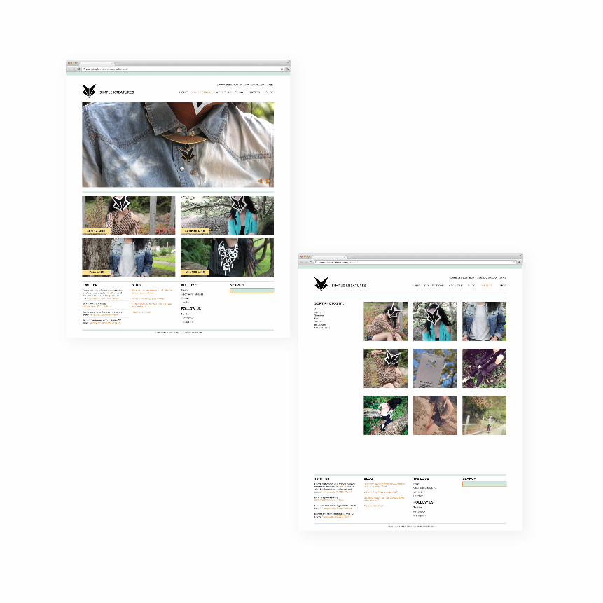
simpLe KReatuRes Fashion brandSimple Kreatures, a collaboration with fashion marketer, Sarah do, reflects
a passion for design, art, and music through fashion. With hand–done and
screen–printed products, each piece becomes a little “kreature” with personality.
a simple logo mark was created to compliment the designs, rather than
dictate them, and by using a die–cut of the logo on the tags, a layering
affect is created to represent the influences that go into the designs. a
website was also designed to showcase the products and allow consumers
to learn more about the brand.
bRandInG
packaGInG
WebSITe

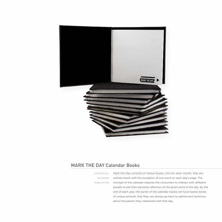
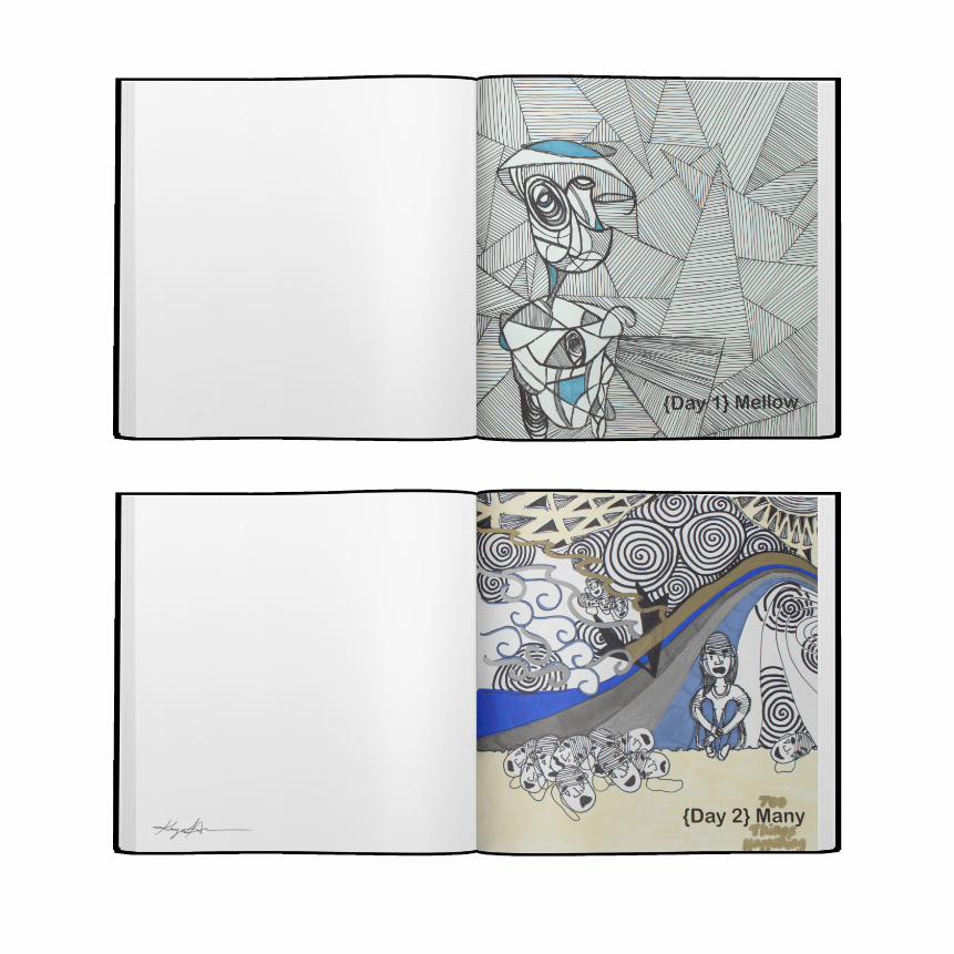
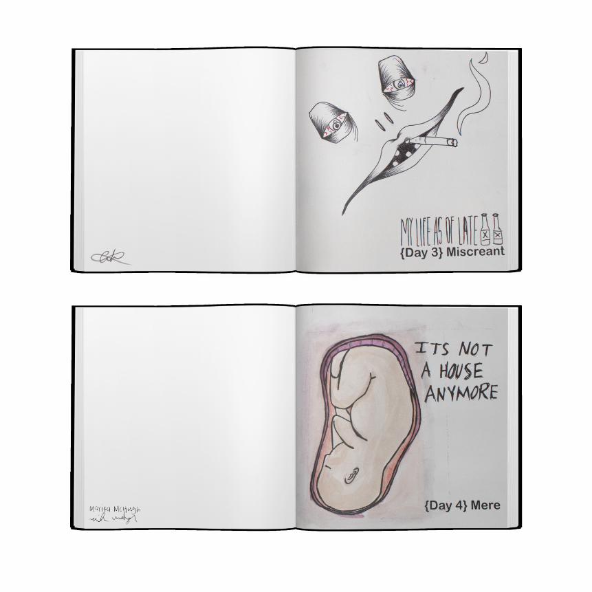
maRK the day calendar booksMark the Day consists of twelve books, one for each month, that are
entirely blank with the exception of one word on each day’s page. The
concept of the calendar requires the consumers to interact with different
people to ask their personal reflection of the given word of the day. by the
end of each year, the owner of the calendar books will have twelve books
of unique artwork, that they can always go back to admire and reminisce
about the person they interacted with that day.
cOncepTual
bRandInG
publIcaTIOn
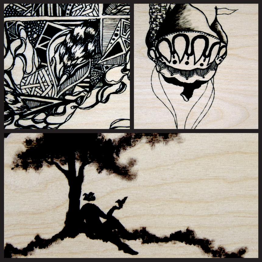
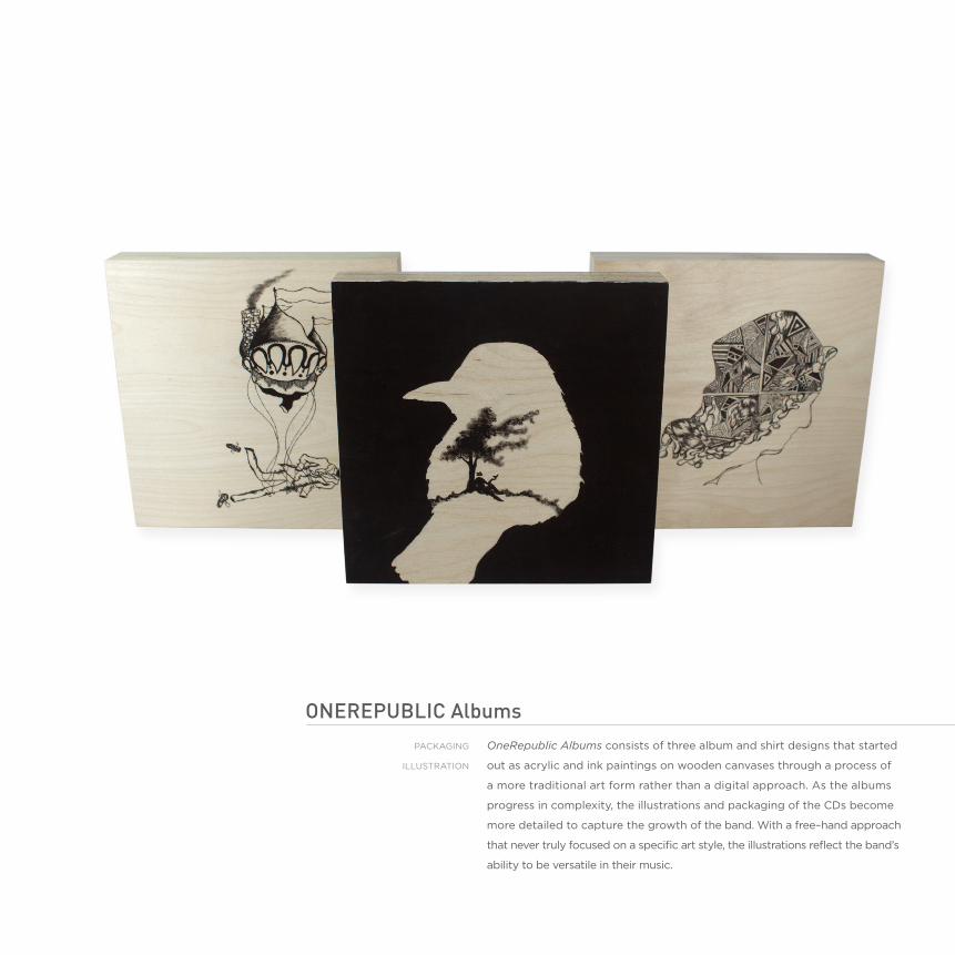
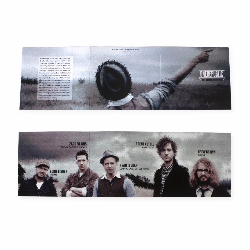
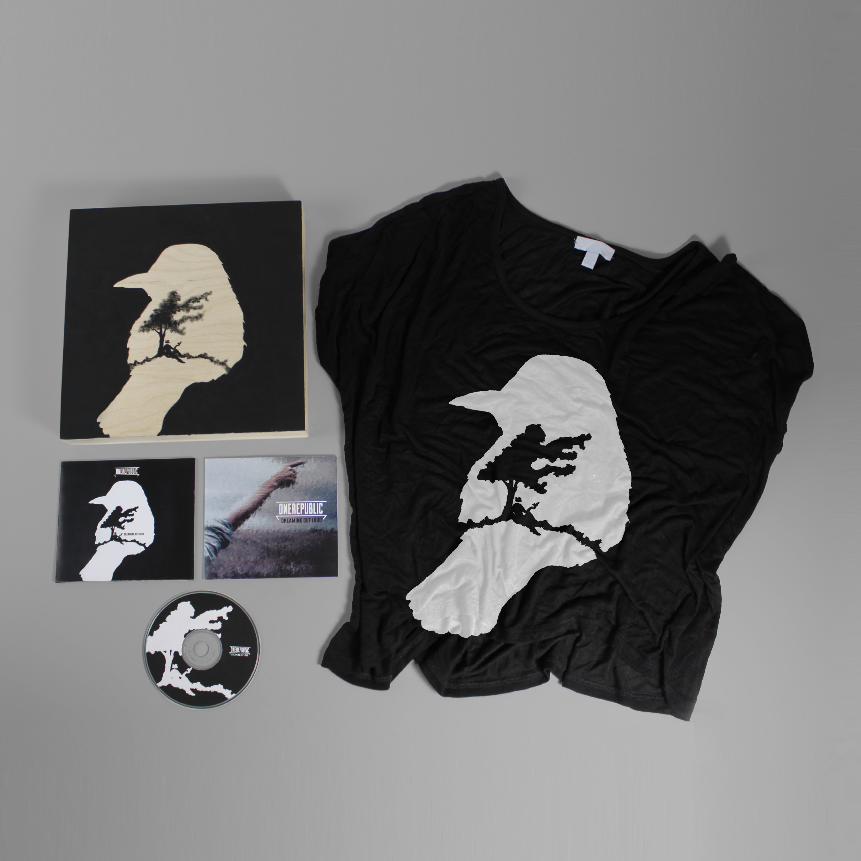
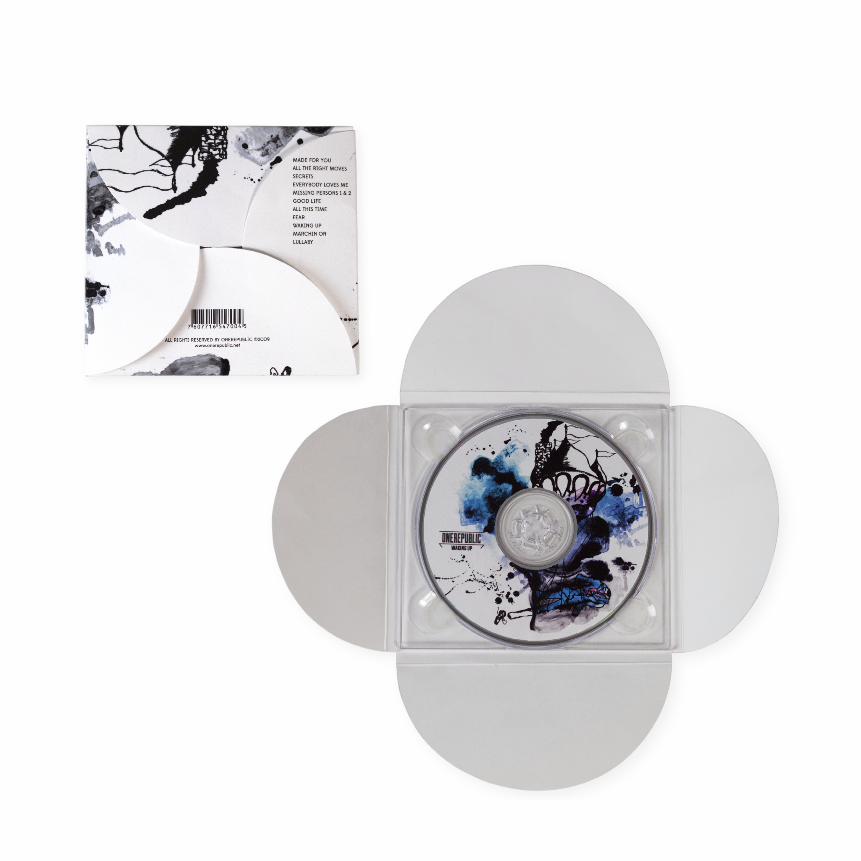
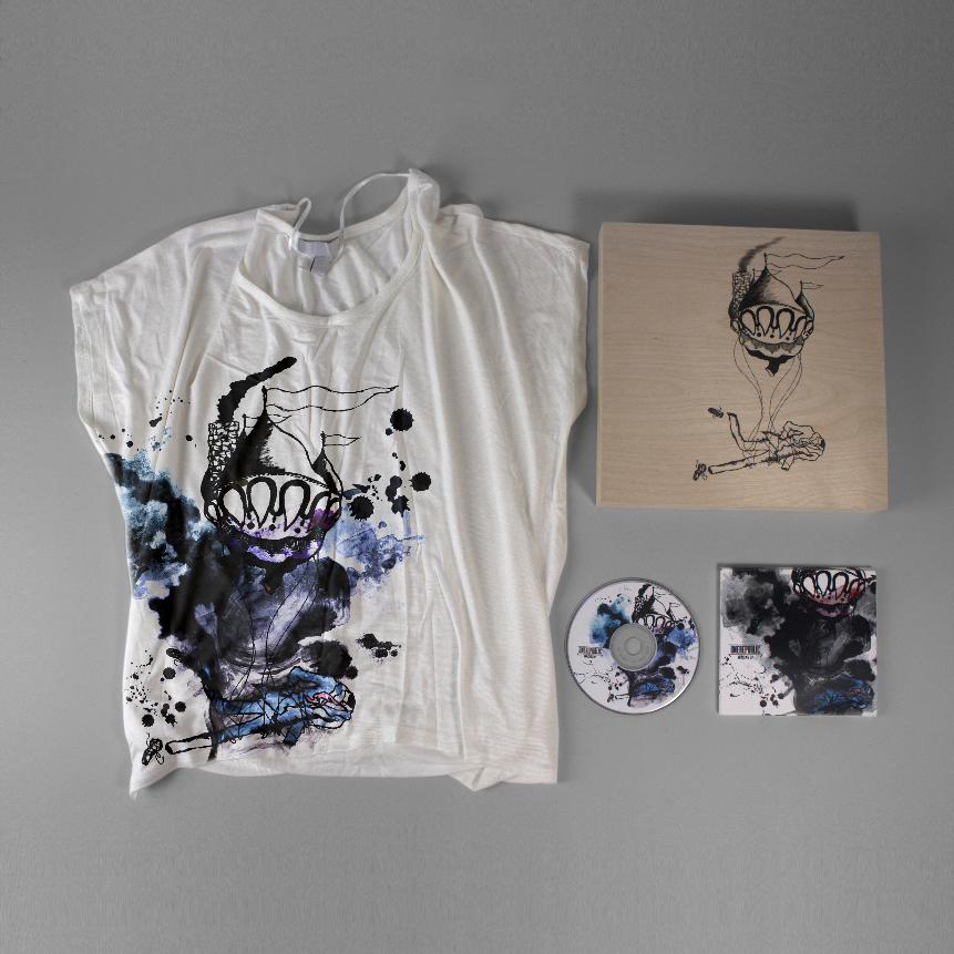
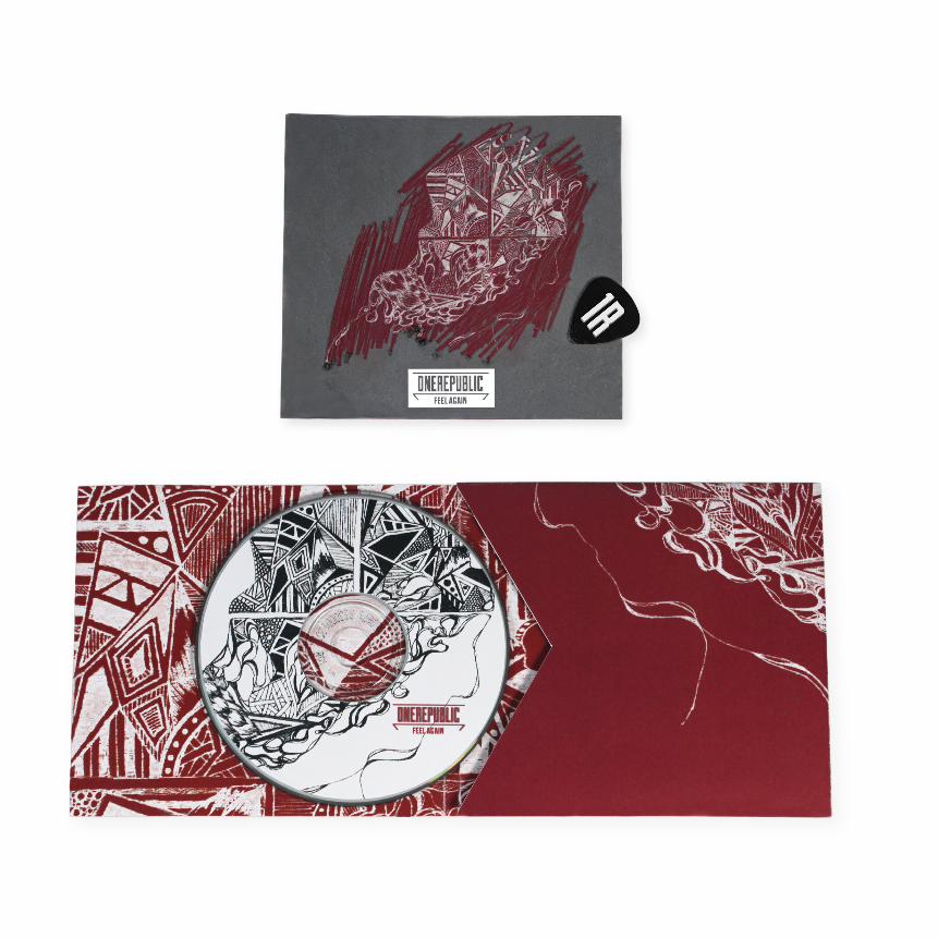
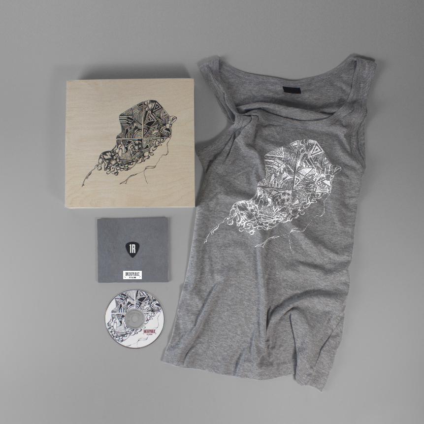
oneRepubLic albumsOneRepublic Albums consists of three album and shirt designs that started
out as acrylic and ink paintings on wooden canvases through a process of
a more traditional art form rather than a digital approach. as the albums
progress in complexity, the illustrations and packaging of the cds become
more detailed to capture the growth of the band. With a free–hand approach
that never truly focused on a specific art style, the illustrations reflect the band’s
ability to be versatile in their music.
packaGInG
IlluSTRaTIOn
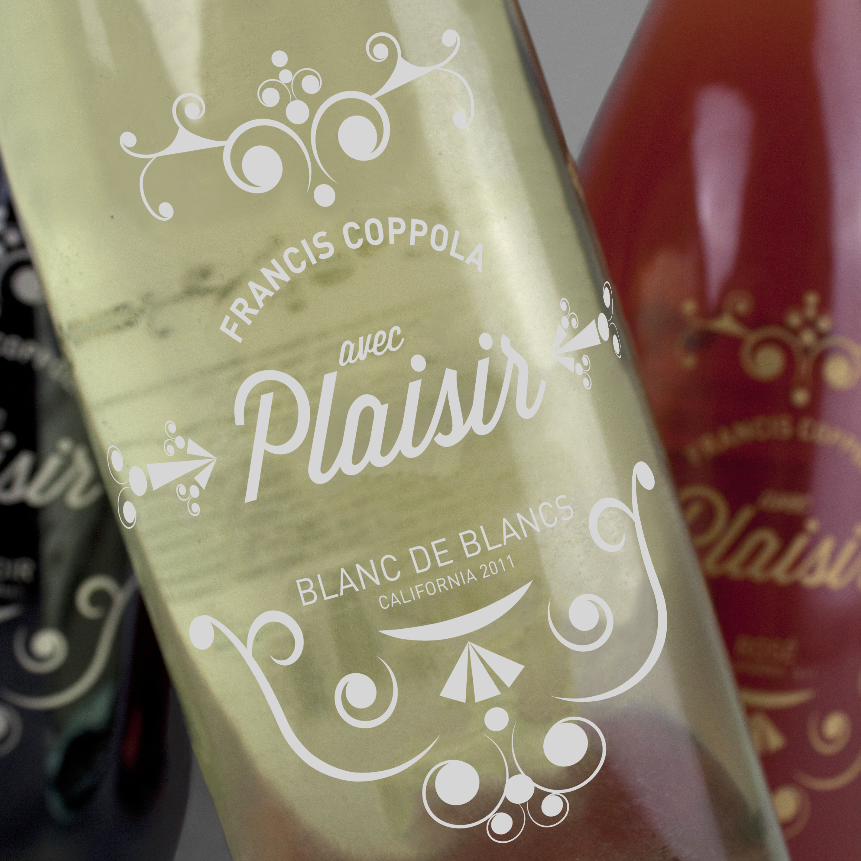
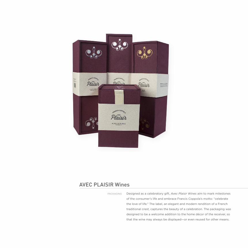
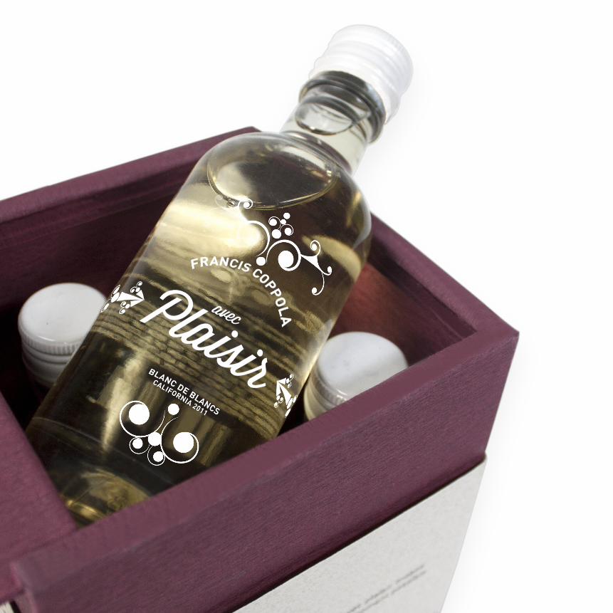
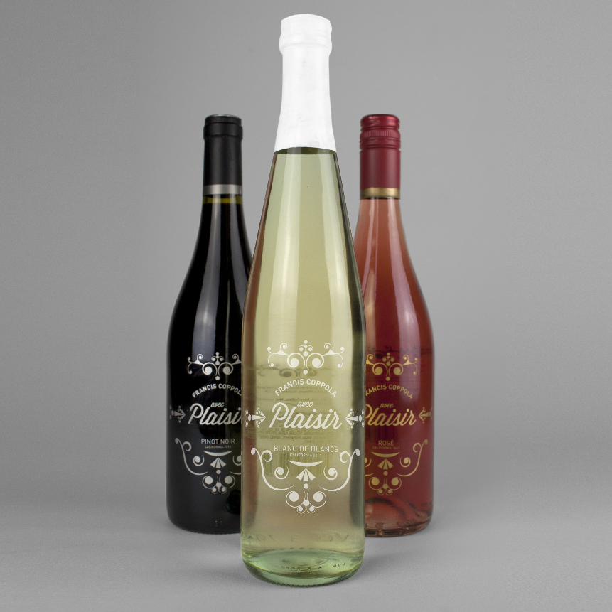
avec pLaisiR Winesdesigned as a celebratory gift, Avec Plaisir Wines aim to mark milestones
of the consumer’s life and embrace Francis coppola’s motto: “celebrate
the love of life.” The label, an elegant and modern rendition of a French
traditional crest, captures the beauty of a celebration. The packaging was
designed to be a welcome addition to the home décor of the receiver, so
that the wine may always be displayed—or even reused for other means.
packaGInG


![undergrad portfolio [rough]](https://img.pdfslide.net/doc/110x75/568c4ceb1a28ab4916a1fb93/undergrad-portfolio-rough.jpg)