Embed Size (px)
Citation preview
Graphical Display and Presentation of Quantitative
Information
13 February 2006
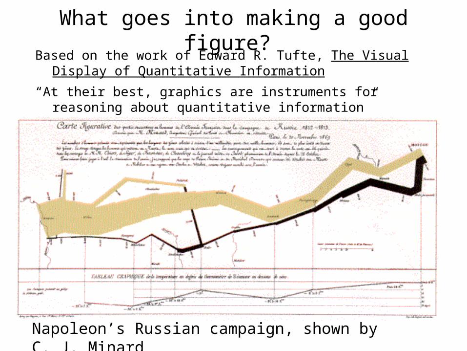
What goes into making a good figure? Based on the work of Edward R. Tufte, The Visual Display of
Quantitative Information
“At their best, graphics are instruments for reasoning about quantitative information”
Napoleon’s Russian campaign, shown by C. J. Minard
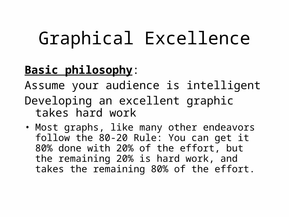
Graphical Excellence
Basic philosophy: Assume your audience is intelligentDeveloping an excellent graphic takes hard
work • Most graphs, like many other endeavors follow the
80-20 Rule: You can get it 80% done with 20% of the effort, but the remaining 20% is hard work, and takes the remaining 80% of the effort.
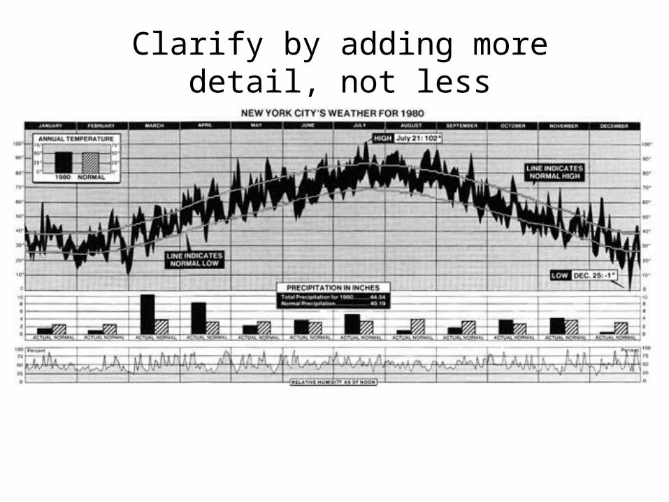
Clarify by adding more detail, not less
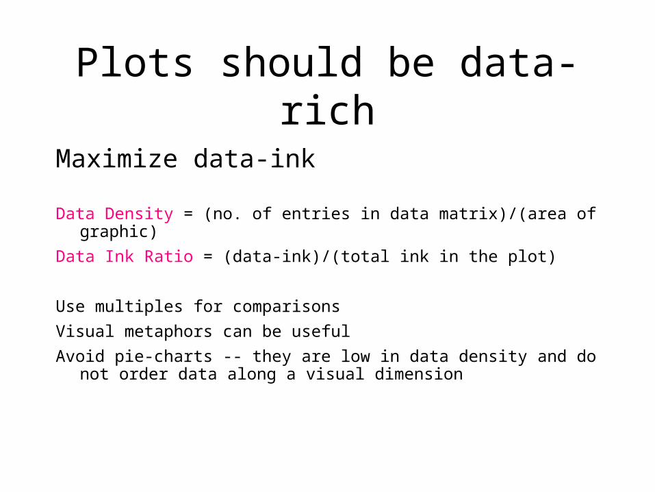
Plots should be data-rich
Maximize data-ink
Data Density = (no. of entries in data matrix)/(area of graphic)
Data Ink Ratio = (data-ink)/(total ink in the plot)
Use multiples for comparisons
Visual metaphors can be useful
Avoid pie-charts -- they are low in data density and do not order data along a visual dimension
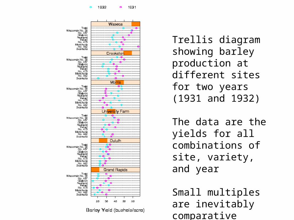
Trellis diagram showing barley production at different sites for two years (1931 and 1932)
The data are the yields for all combinations of site, variety, and year
Small multiples are inevitably comparative
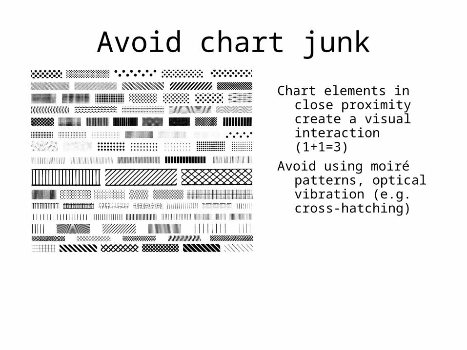
Avoid chart junk
Chart elements in close proximity create a visual interaction (1+1=3)
Avoid using moiré patterns, optical vibration (e.g. cross-hatching)
Where possible, use direct labelling instead of legends
Use horizontal text
Avoid abbreviations

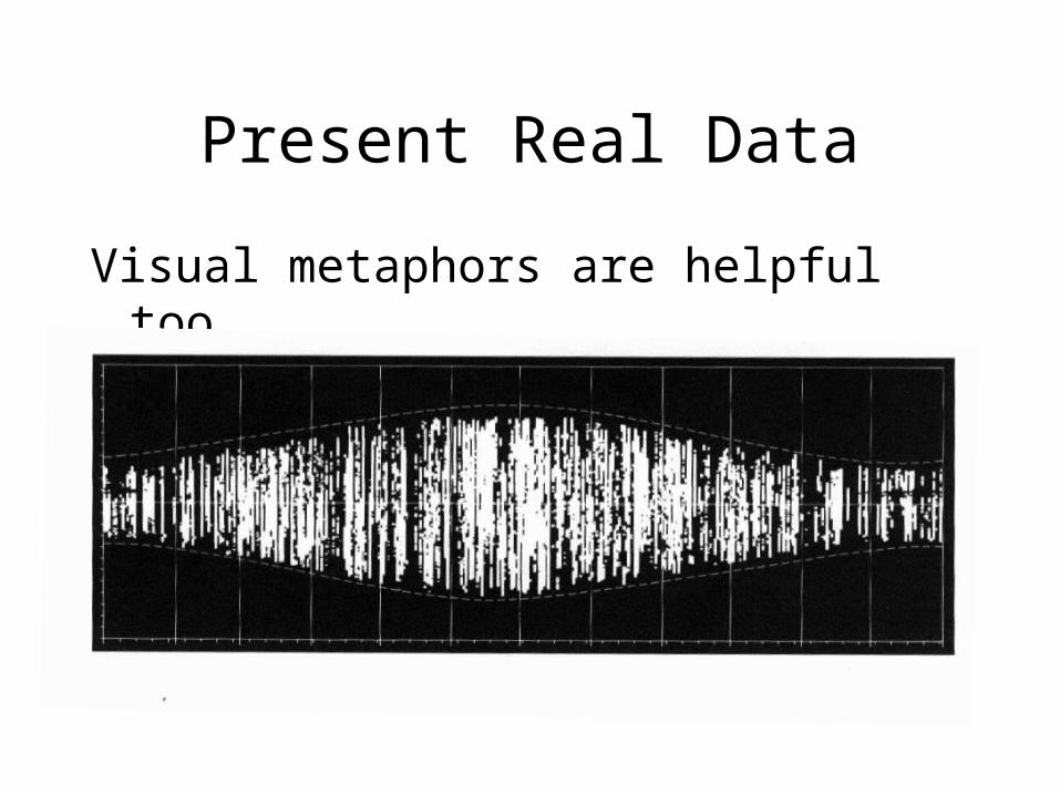
Present Real Data
Visual metaphors are helpful too

The Lie Factor"The representation of numbers, as physically measured on the surface of
the graphic itself, should be directly proportional to the quantities represented."
Plots should be:
• Comparative • Multivariate • High density • Able to reveal interactions, comparisons, etc • And where nearly all of the ink is actual data
ink
Small multiples can be visually effective

/Example of a good poster
http://cires.colorado.edu/~brodzik/2005agu/2005agu_pits.pdf

Ask the right questions
1. Does the display tell the truth? 2. Is the representation accurate? 3. Are the data documented?4. Do the display methods tell the truth?5. Are appropriate comparisons, contrasts, and
contexts shown?


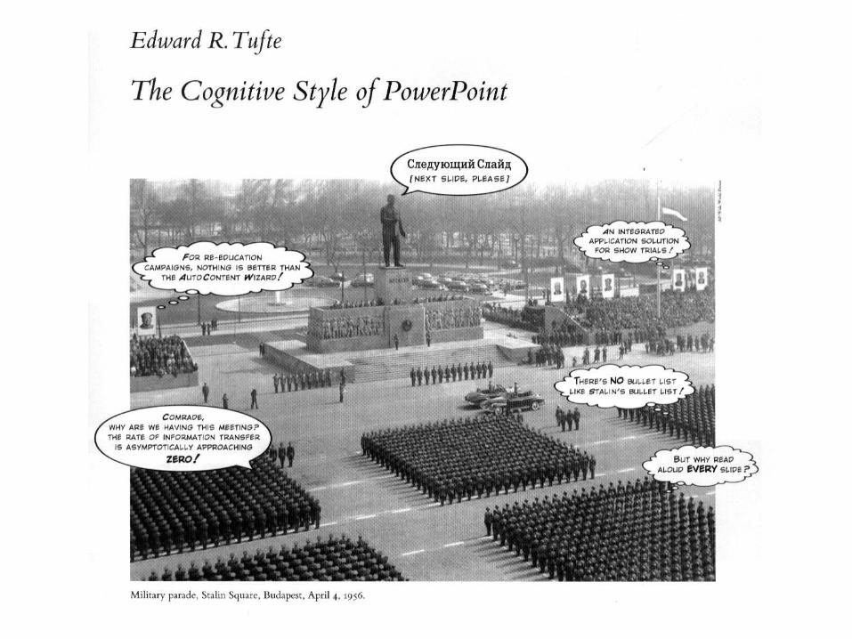
Slideware is Evil
“Power corrupts, PowerPoint corrupts absolutely” (Tufte, 2003)
• Presentations should serve the audience, not the speaker
• It should supplement the presentation, not be the presentation
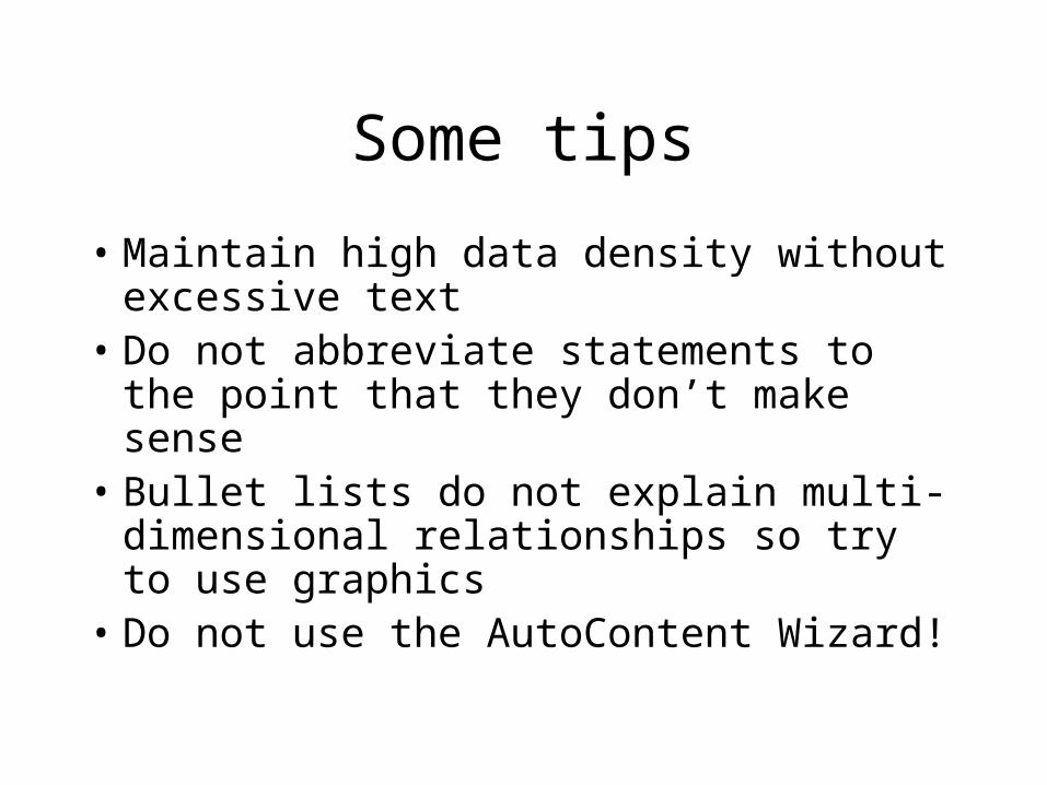
Some tips
• Maintain high data density without excessive text
• Do not abbreviate statements to the point that they don’t make sense
• Bullet lists do not explain multi-dimensional relationships so try to use graphics
• Do not use the AutoContent Wizard!

If Abe Lincoln had had Power Point:
http://www.norvig.com/Gettysburg/
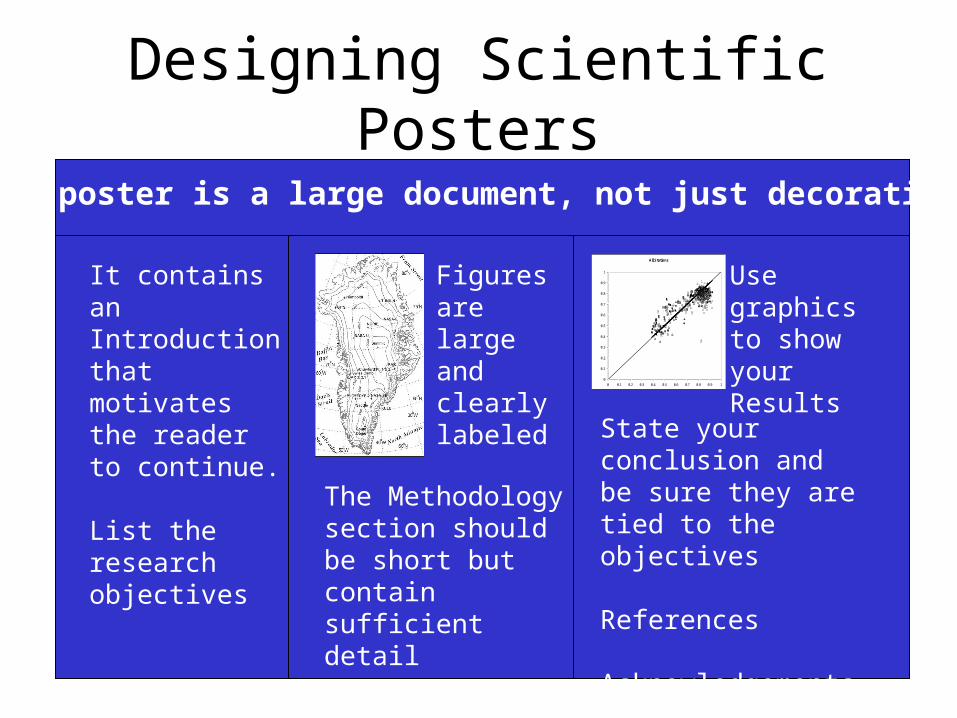
Designing Scientific Posters
The poster is a large document, not just decorative
It contains an Introduction that motivates the reader to continue.
List the research objectives
Figures are large and clearly labeled
State your conclusion and be sure they are tied to the objectives
References
Acknowledgements
All Stations
0
0.1
0.2
0.3
0.4
0.5
0.6
0.7
0.8
0.9
1
0 0.1 0.2 0.3 0.4 0.5 0.6 0.7 0.8 0.9 1
In Situ Albedo
MODIS Albedo
The Methodology section should be short but contain sufficient detail
Use graphics to show your Results

Making your poster presentation matter
• Make the title both informational and interesting
• Use color and symmetry to make your poster beautiful
• Someone should be able to read the entire poster in less than 10 minutes
• Develop your “elevator speech”• No text smaller than 24 point
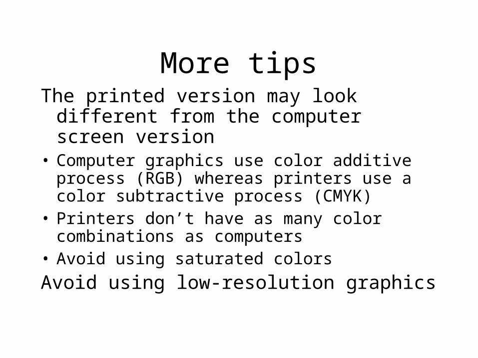
More tipsThe printed version may look different
from the computer screen version• Computer graphics use color additive process
(RGB) whereas printers use a color subtractive process (CMYK)
• Printers don’t have as many color combinations as computers
• Avoid using saturated colors
Avoid using low-resolution graphics
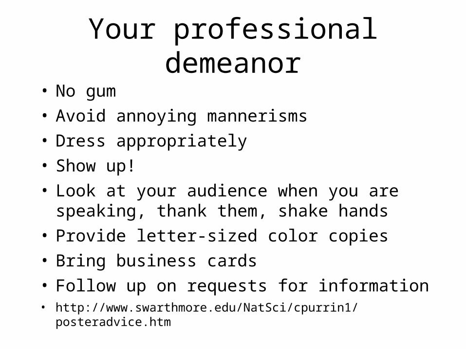
Your professional demeanor
• No gum
• Avoid annoying mannerisms
• Dress appropriately
• Show up!
• Look at your audience when you are speaking, thank them, shake hands
• Provide letter-sized color copies
• Bring business cards
• Follow up on requests for information• http://www.swarthmore.edu/NatSci/cpurrin1/posteradvice.htm


![The Visual Display of Quantitative Information...Visual Display of Quantitative Information" by Edward R. Tufte [1]. Chapter 1 Graphical Integrity When looking up graphical integrity](https://img.pdfslide.net/doc/110x75/5f02fef07e708231d407062b/the-visual-display-of-quantitative-information-visual-display-of-quantitative.jpg)