Embed Size (px)
Citation preview
GRAPHING
Mr. Platt
What do Graphs Tell You?
• A graph is a way of expressing a relationship between two different variables.
• There are several types of graphs– Line Graph– Bar Graph (Histogram)– Pie Chart– Pictograph
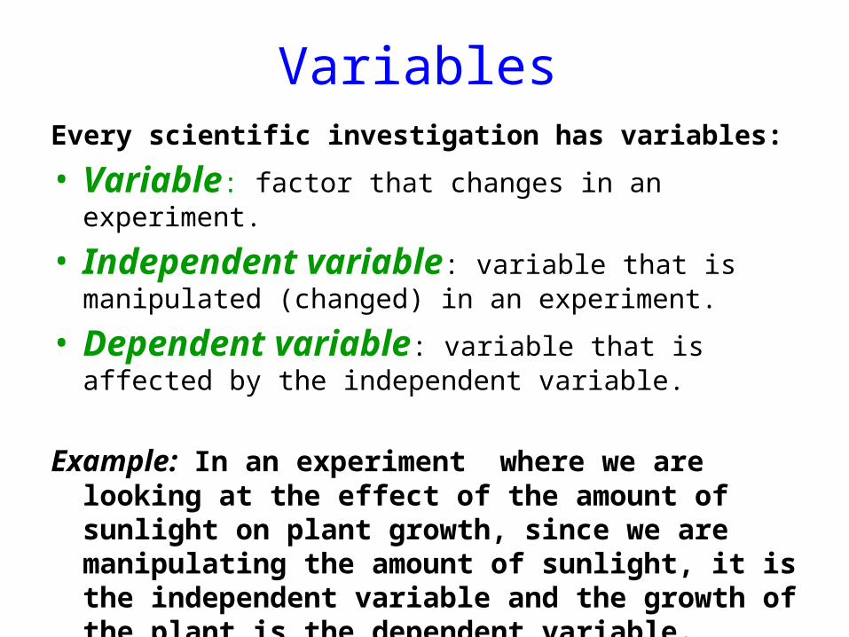
VariablesEvery scientific investigation has variables:
• Variable: factor that changes in an experiment.
• Independent variable: variable that is manipulated (changed) in an experiment.
• Dependent variable: variable that is affected by the independent variable.
Example: In an experiment where we are looking at the effect of the amount of sunlight on plant growth, since we are manipulating the amount of sunlight, it is the independent variable and the growth of the plant is the dependent variable.
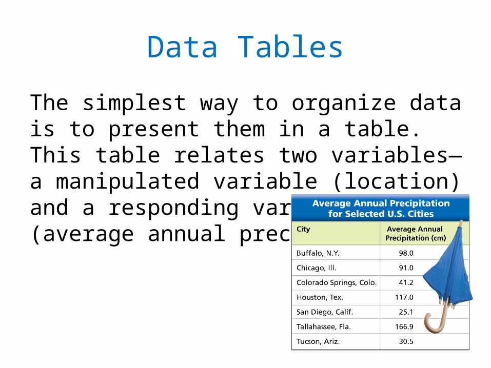
Data Tables
The simplest way to organize data is to present them in a table. This table relates two variables—a manipulated variable (location) and a responding variable (average annual precipitation).
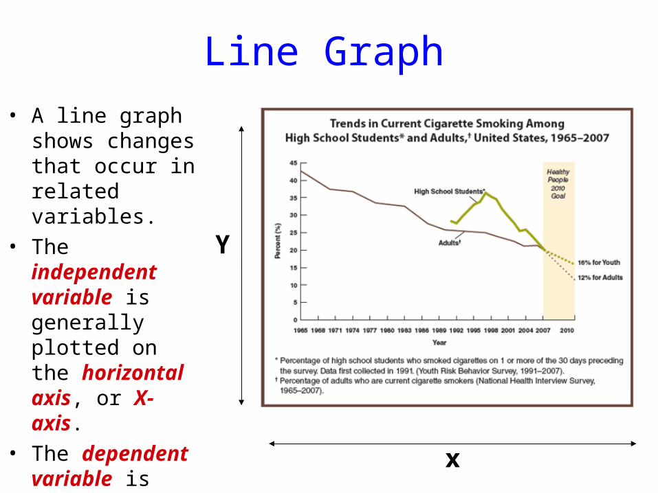
Line Graph• A line graph shows
changes that occur in related variables.
• The independent variable is generally plotted on the horizontal axis, or X-axis.
• The dependent variable is plotted on the vertical axis, or Y-axis, of the graph.
x
Y
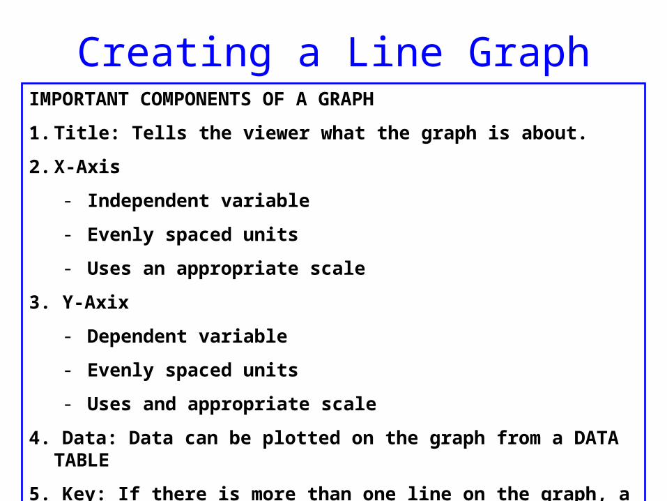
Creating a Line GraphIMPORTANT COMPONENTS OF A GRAPH
1. Title: Tells the viewer what the graph is about.
2. X-Axis
- Independent variable
- Evenly spaced units
- Uses an appropriate scale
3. Y-Axix
- Dependent variable
- Evenly spaced units
- Uses and appropriate scale
4. Data: Data can be plotted on the graph from a DATA TABLE
5. Key: If there is more than one line on the graph, a key is needed.
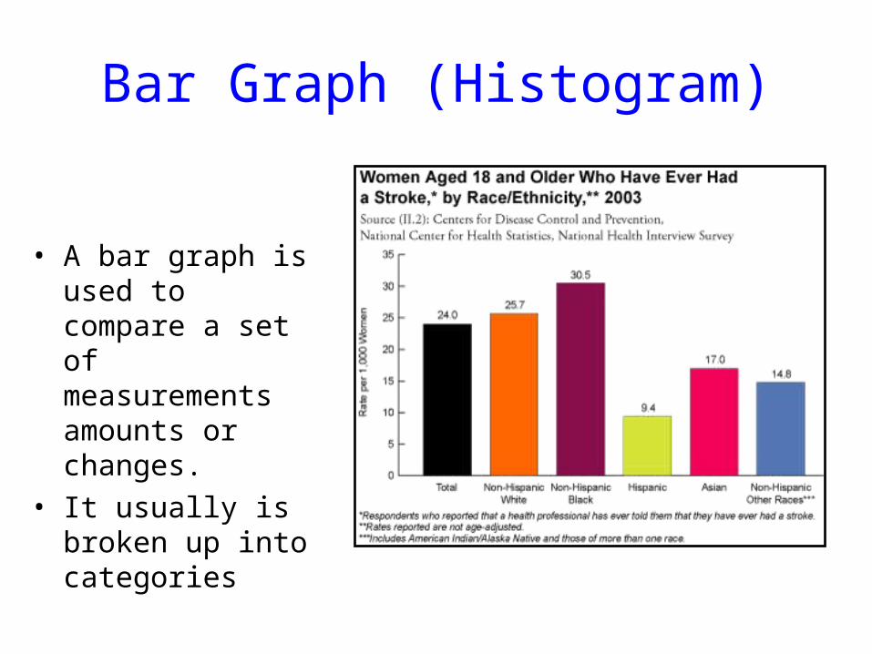
Bar Graph (Histogram)
• A bar graph is used to compare a set of measurements amounts or changes.
• It usually is broken up into categories
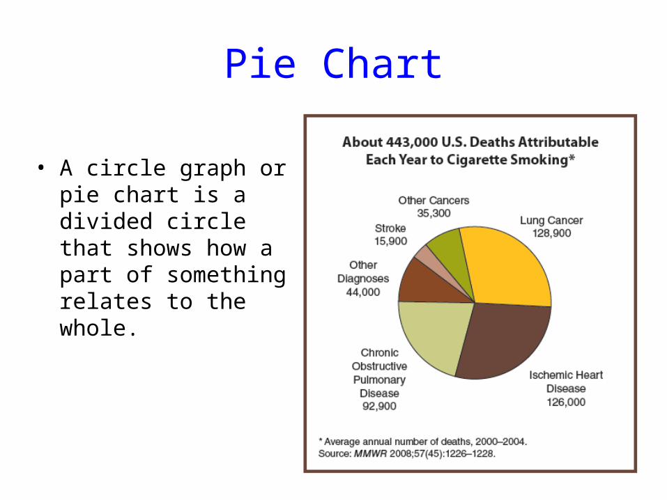
Pie Chart
• A circle graph or pie chart is a divided circle that shows how a part of something relates to the whole.
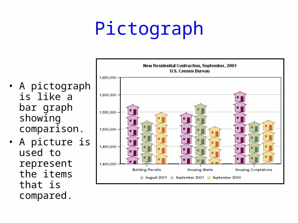
Pictograph
• A pictograph is like a bar graph showing comparison.
• A picture is used to represent the items that is compared.
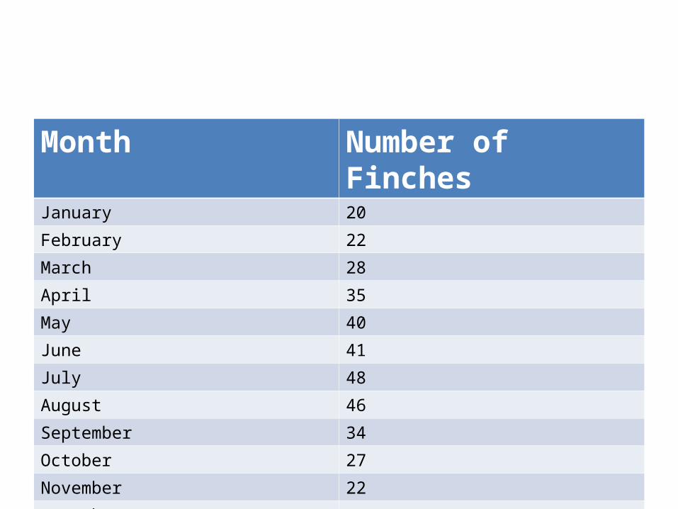
Month Number of FinchesJanuary 20
February 22
March 28
April 35
May 40
June 41
July 48
August 46
September 34
October 27
November 22
December 16
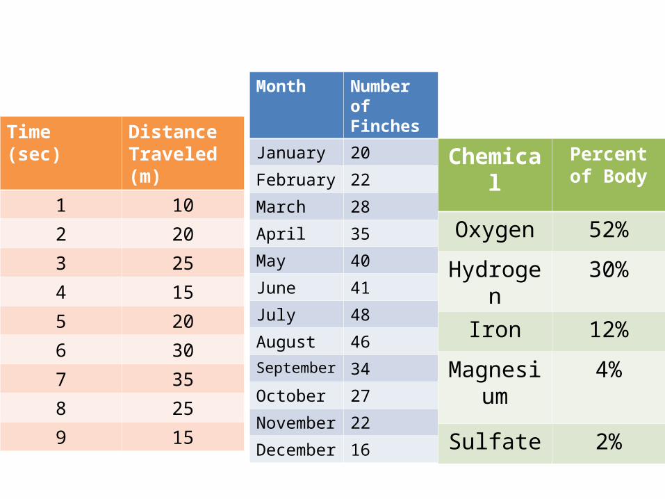
Time (sec) Distance Traveled (m)
1 10
2 20
3 25
4 15
5 20
6 30
7 35
8 25
9 15
Month Number of Finches
January 20
February 22
March 28
April 35
May 40
June 41
July 48
August 46September 34
October 27
November 22
December 16
Chemical Percent of Body
Oxygen 52%
Hydrogen 30%
Iron 12%
Magnesium
4%
Sulfate 2%
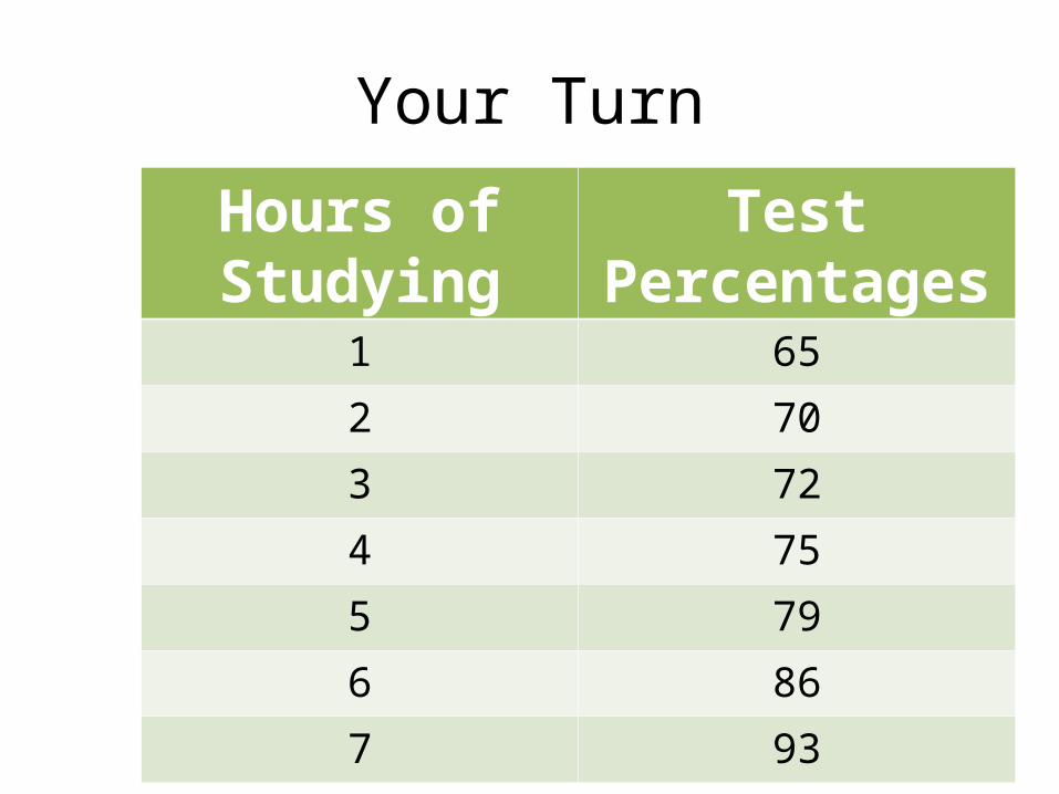
Your Turn
Hours of Studying
Test Percentages
1 65
2 70
3 72
4 75
5 79
6 86
7 93
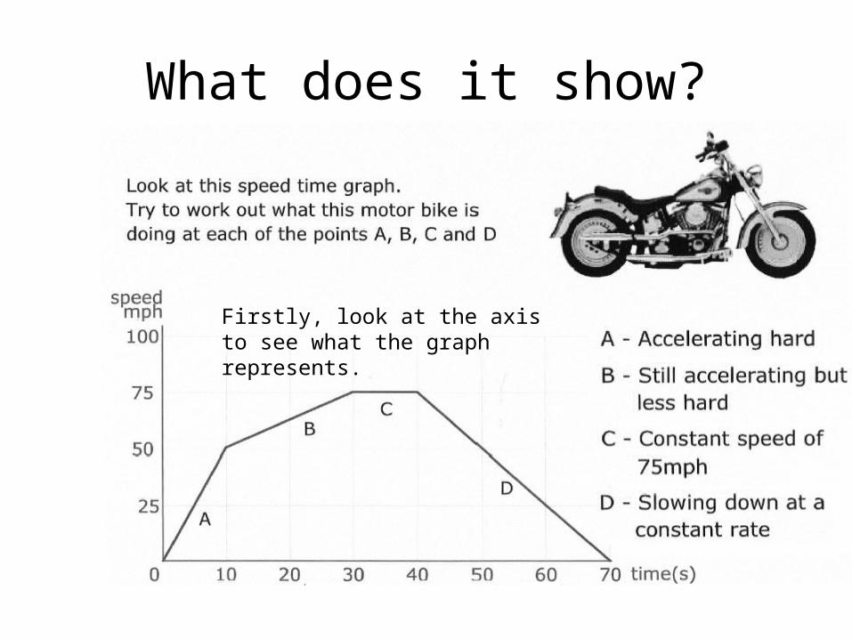
What does it show?
Firstly, look at the axis to see what the graph represents.
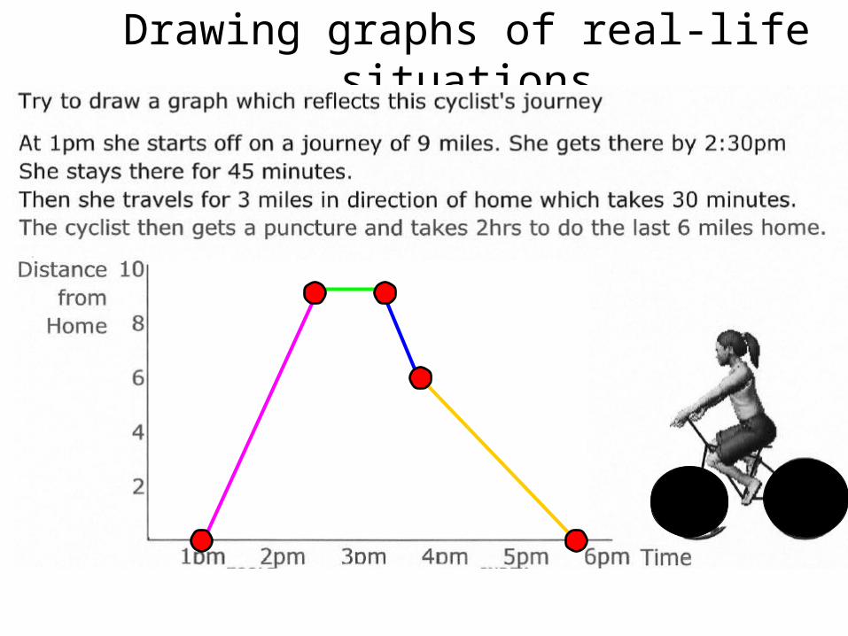
Drawing graphs of real-life situations
In your exams you may be asked to complete, or draw, graphs to represent given situations.
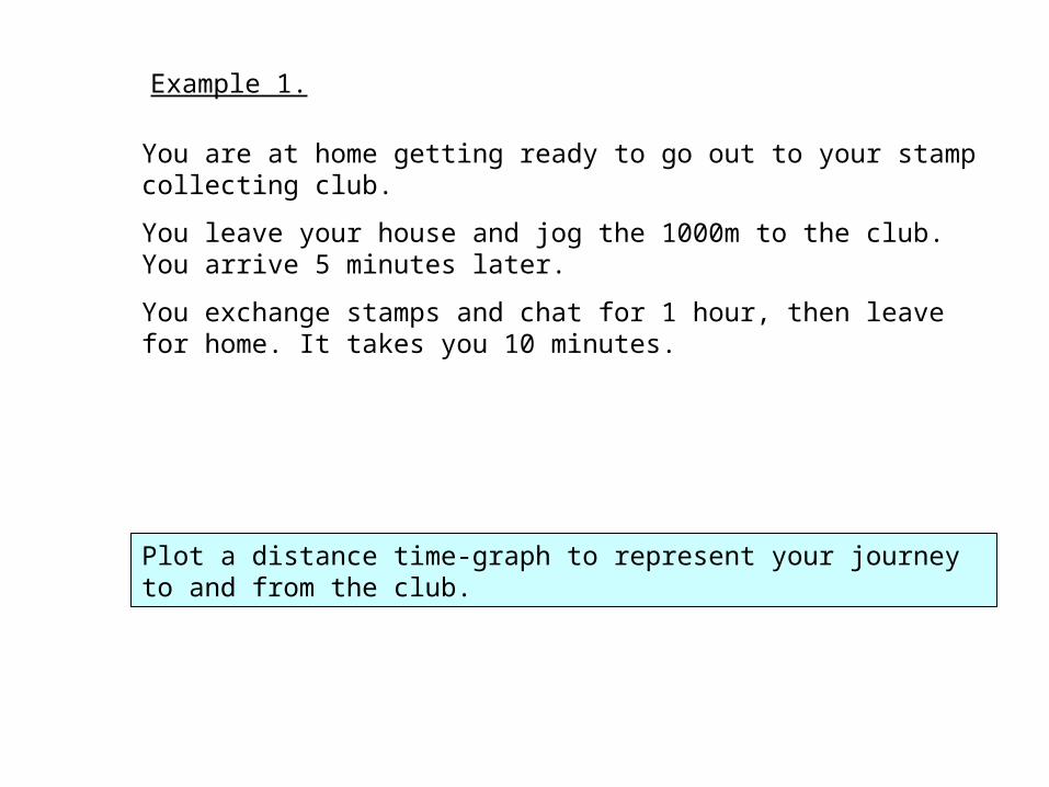
Plot a distance time-graph to represent your journey to and from the club.
You are at home getting ready to go out to your stamp collecting club.
You leave your house and jog the 1000m to the club. You arrive 5 minutes later.
You exchange stamps and chat for 1 hour, then leave for home. It takes you 10 minutes.
Example 1.