Embed Size (px)
Citation preview

MUSC University Press – Guide for Designing Posters (v03) Page 1 of 6
Guide for Designing Posters
Purpose of a PosterA good poster communicates your message in a visual, graphical manner, so the viewer can quickly discern your message. An effective scientific poster is a visual representation of data that has been organized and consolidated into an easily digestible format. It’s of the utmost importance to make sure your poster is logical, consistent, and designed well
Basic Poster Overview
Begin with a Template• The easiest way to get started is to use a template. Your MUSC college or department may already have templates with
up-to-date MUSC branding and predefined sections and elements. Consult with resources or colleagues in your college or department, especially others attending the same conference, to see if there are any applicable templates available for use.
• The MUSC Brand Center (musc.edu/brand) provides downloadable PowerPoint templates for MUSC University & Colleges, MUSC Health and MUSC Children’s Health. These templates include instructions at the bottom for images and formatting. They are pre-sized at 36” w x 18” h and are intended to be enlarged 200% to a final printed size of 72” w x 36” h.
• If you can’t find a poster template that matches your size or layout requirements, you can devise your own layout and incorporate the logo and various section elements included in the basic Brand Center templates. Simply start with the template available from the Brand Center and resize it to meet your poster size requirements.
Poster Templates
Basic Design GuidelinesWhen it comes to design, there are a few basic rules to follow:
❑ Simple is GoodYour background should be plain white or a very subtle gradient/pattern that is not distracting and your text should be clear and easy to read. Any charts or graphics should be able to be understood quickly and not include unnecessary elements.
❑ Make Important Information Stand OutSection headings should be obvious, and important research should draw attention.
❑ Line Things UpTry to fit everything to a basic grid and align each section with another. If you have a set of charts or photos, it looks best to have them equally-sized and distributed evenly.
❑ Don’t Make it CrowdedA viewer may only spend a minute or two looking at your poster so they should immediately be able to make sense of the organization and be able to identify the distinct sections.
Basic ChecklistBefore sending University Press your poster to print, it’s helpful to do one last check of everything to make sure your poster will look as good as possible. Here are 5 questions to answer:
❑ Do my poster sections flow logically? The sections of your poster should be organized and follow the general structure of Introduction Data Conclusion.
❑ Is all my text readable? All the text on your poster should use a legible font, stand out against its background, and be large enough to be read from a reasonable distance. Also, check for spelling mistakes!
❑ Are all my graphics good quality? Zoom in on your file to 100% and make sure all photos, charts, and illustrations look clear and crisp. (If you are going to be ordering a poster that is larger than your file, zoom in farther).
❑ Is my data understandable? All your tables, charts, and graphs should be able to be looked at and understood in a few seconds.
❑ Does the most important information stand out? When skimming over your poster, the most important parts should catch your eye and be very obvious. If someone reads your poster for a minute or so, they should be able to fully understand your presentation.

MUSC University Press – Guide for Designing Posters (v03) Page 2 of 6
• Use only official MUSC logos. Do not make up your own logo, modify or distort an existing logo – this is a violation of MUSC policy and these posters cannot be printed.
• When using official MUSC colors and logos, make sure the color values for CMYK color mode (4-color printing) conform to MUSC brand standards as specified on the Brand Center website at musc.edu/brand. If you use one of the Brand Center PowerPoint poster templates, these standards will be met.
MUSC BrandingMUSC Brand Center
Go to musc.edu/brand to download logos and templates
Insert Poster Title HereYour name here
Your institution’s name here
Insert your text here. Remember you can change your font size to fit the space.
Insert your text here. Remember you can change your font size to fit the space.
ABSTRACTInsert your text here. Remember you can change your font size to fit the space.
Insert your text here. Remember you can changeyour font size to fit the space.
Insert your text here. Remember you can change your font size to fit the space.
1. lsdkfdlkflkflsdfkjldfj;2. jdslkfjkdljf3. sdfjlsdakfjld;4. Djfldfadfalkdjf;a
Figure 1. Insert your charts or graphs here. Figure 3. Insert your charts or graphs here.
1st Qtr
2nd Qtr
3rd Qtr
4th Qtr
1st Qtr 2nd Qtr 3rd Qtr 4th Qtr
Figure 2. Insert your image or figure here.
Table. Insert your table or figure here.
0
10
20
30
40
50
60
70
1st Qtr 2nd Qtr 3rd Qtr 4th Qtr
Chart Title
METHOD
RESULTS CONCLUSIONS
SUMMARY
REFERENCES
PowerPoint poster templateSize (100%) = 36" x 18" | Print Size (200%) = 72" x 36"
Common Poster SectionsEvery section you include should have a purpose and be familiar to the viewer. The easiest way to decide which sections to include on your poster are to organize your information into 3 main categories - Introduction, Research, and Conclusion.
A typical poster will have 4-8 sections. The specifics of your research will dictate which sections are most important. If you’re having a hard time knowing what to include on your poster, here are some questions to make sure you can answer:
• What is my presentation about?• Why am I doing it and what do I hope to add to the conversation?• What were the methods I used?• What conclusions did I come to?• What are my recommendations based on this research?
Poster Setup – Sections
Introduction
The Introduction sections set the stage and outline why you did the research you did.
• Introduction• Condensed Abstract • Background• Hypothesis• Objectives/Purpose
Research
The Research shows all the data you collected and how you collected it.
• Materials• Methodology• Analysis• Models• Results
Conclusion
The Conclusion sections analyze and summarize your results.
• Conclusion• Recommendations• Implications• Discussion• Acknowledgements• Contact Information
How to Organize Poster• Most posters are divided into columns, with 1-3 sections per
column.
• Each column is read from top to bottom, and columns are read from left to right.
• Reading your poster in this order should give the viewer a clear picture of your research.
PowerPoint• PowerPoint is one of the programs of choice for creating posters because PowerPoint is a user-friendly program and is readily
compatible with other Microsoft programs such as Word and Excel. It is also readily available to the entire MUSC enterprise.
Adobe InDesign, Illustrator or Photoshop• These are feature-rich, integrated professional applications good for complex designs. However, special licensing is required.
Software Restrictions• University Press cannot accept files in Microsoft Word or Publisher format.
Software Applications

MUSC University Press – Guide for Designing Posters (v03) Page 3 of 6
Determining Poster Size• Find out the requirements! Conferences, seminars, courses and other events
often specify fixed sizes and other requirements.
• Typically, your poster will be attached to a presentation board, and those come in various sizes. Before choosing your size, make sure you know if it will fit. You may want to make the width of your poster slightly smaller than the total space so you can stand to the side of it and not block anything.
• If there are no requirements or restrictions, we recommend a 48” x 36” poster (Arch E). This is a standard size that fits most presentation spaces and is the most common size we see printed. Moreover, you can size the PowerPoint slide to these dimensions. No resizing will be needed.
Poster Sizing and Orientation ; It can be challenging to change the size
of your poster once it is designed, so starting out with the correct slide size in PowerPoint will save you a few head-aches
Once you add content to your slide (i.e., textboxes, images, graphs, etc.), if you change the slide size, you may lose, mis-align, or distort the objects.
Caution
• The maximum custom slide size that PowerPoint allows is 56 x 56 inches. However, the University Press large format printers are limited to 44 inches on the short side of posters, so either the width or height setting must accommodate those limitations.
• If you need a larger size (e.g., 36” x 60”), set up your poster for half the size, so it can be enlarged proportionately later. (Remember, some graphics will lose quality when enlarged.)
• If you need to resize your slide, be sure your content scales proportionally so that it doesn’t stretch or become distorted.
• After you resize your slide and kept all your content in proportion, you still need to rearrange your content to fit the new size
Resizing a PowerPoint Slide
Common Layouts• Use a layout that makes sense with the
research you’re including. To the right are some basid layouts we see.
• The general format of a scientific poster is to have a title section and 2-5 columns of information, divided into sections.
• Although our large format printers can print to the edges of the paper, it is better to leave a “safe margin” of at least 1/2 inch around the edges for visual appeal and to prevent content from being cut off.
Poster Layout and Design

MUSC University Press – Guide for Designing Posters (v03) Page 4 of 6
Colors• Using color is a very important aspect of poster design. Colors should capture attention and highlight important information
but should not be distracting to the viewer.
• If you are going to pick your own colors, try to keep them neutral, with perhaps one bolder color used sparingly.
Guidelines for Specific Aspects of Your Design
Background• Keep your background non-distracting.
• Keep the background white or some other light color, with a subtle gradient as an option.
• You should avoid photos, busy patterns, or distracting colors, as it will take away from your content.
• If you are going to use a darker color, make sure your text is white to keep it readable.
Title and Heading Styles• At a quick glance, a viewer should be able to easily identify each section
of your poster.
• A great way to accomplish this is by clearly defining each section with a heading that stands out.
• Using colors, boxes, bold text, and lots of whitespace are all good ways to make sure your section heading stands out.
• DO NOT USE ALL CAPS in any part of your poster.
Fonts• Make sure your fonts are easy to read. A good design principle to follow is to use one
font for titles and headings and another for the rest of your text.
• Try to use a cross-platform font to ensure your poster looks the same in every scenario. If you use an operating system-specific font (i.e., only on Mac or Windows), or an unusual font, you must embed that font in your PDF. You can embed the font within your file by doing File>Options>Save and checking the Embed fonts option.
Font Size• Font size is measured in points, a unit of measure where 72 points equals 1-inch
• The graphic to the right shows recommended font sizes for different components of your poster. This will allow your poster to be read from about a 4 foot distance, but you can increase the sizes if you anticipate the reader standing farther away.
• Set the line spacing of your text between 1.25 and 1.5
• Use sans serif fonts, since these are more legible from a distance.
Alignment and Whitespace• Keep things well-aligned. Imagine a grid on top of your
presentation and if two things are close to the same gridline, make sure they are exactly aligned.
• If you have a set of charts or images, try making them the same size and have them evenly distributed.
• Make sure there is enough space between each element in your design, and enough space around the border of your poster. If two sections of text are nearly touching, it will be hard for the viewer to see where one ends and the other begins. Although it may be counter-intuitive, more space around an element of your poster will draw attention to it and give it importance. If one piece of data is the highlight of your research, do not crowd it amongst other less-important data

MUSC University Press – Guide for Designing Posters (v03) Page 5 of 6
Resolution• Resolution is the measurement of how many pixels fit into one inch. The higher the
resolution, the sharper the image will be. Lower resolution images will print blurred, grainy, jagged or pixelated.
• Image resolution should be at least 150 ppi (pixels per inch) at the final print size in the layout, so start with a resolution of 300 ppi if the file will be enlarged.
• Resolution and image size are inversely proportional to each other. Enlarge an image, the resolution decreases; reduce an image, the resolution increases.
• The only way resolution can be improved is by decreasing the image size, or by recapturing the image at a higher quality setting.
• Technically, you only use “dots per inch” (dpi) when discussing printed output, while “pixels per inch” (ppi) is for displays and digital images.
Images and Graphics• Where possible, use vector graphics, which can scale to any size without losing
quality. Vector format types include EPS, WMF, or EMF files and are commonly used for logos and simple illustrations.
• If you have the option between a vector file and a rastor/bitmap image file, e.g., .tif, .jpg or .png, use the vector image. Otherwise, use a .tif file, or the largest size available of a .jpg file.
Raster Image Formats• TIFF files have larger file sizes and are meant to preserve quality. They are best for
editing because they offer options to use tags, layers, and transparency.
• JPEG images work O.K. at 100% quality, but every time the JPEG is edited and saved it is recompressed, so the quality can decrease quickly if it is saved often at less than maximum quality. JPEG images don’t support transparency, so don’t use JPEGs for line-based graphics, especially over another image or background color.
• PNG files support varying degrees of transparency, but they are designed for transferring images on the internet, not for professional-quality print graphics.
Working with Images and Graphics
; Images from web sites are typi-cally low resolution (72 dpi) GIF or JPEG files. When used on a poster, they will appear fuzzy. Do not save images or graphics from a website to use in your poster.
; Be aware that it is illegal to download images from Web sites without prior, written permission.
Caution
• All graphics should be pictures inserted directly into PowerPoint.
• Do not copy and paste images from web sites or link images from another program.
• Click on the Insert tab at the top and then click on the Pictures button. Use the Insert Picture dialogue box to navigate to where your picture files are stored. Click on the picture you want and then click on the Insert button.
• Do not enlarge pictures once they are inserted into PowerPoint or they may become fuzzy. Instead, obtain a higher resolution image with the desired dimensions.
• If you need to adjust the size of the picture, hold down the shift key on your keyboard, then click and drag with your mouse from one of the corners of the picture in order to scale it proportionally in height and width.
Inserting Pictures in PowerPoint
To see what an image will look like when printed full size on your poster, click on it and then zoom in to 100% to simulate how it will look at actual size.
Zoom in to 200% if creating your poster half size.
If it appears fuzzy on your monitor, it will be fuzzy on your poster.
Previewing Images
Since there will be a lot of information on your poster, keeping graphs, tables and charts simple and easy to understand is much better than an in-depth and complicated graphic.
Excel charts/graphs can be copied and pasted into PowerPoint, but you must be very careful that it looks OK on the screen. Sometimes it will work better to Paste Special as a Microsoft Office Excel Chart Object.
There are a few simple tricks to simplify charts and tables:
• Remove unnecessary borders, lines, and backgrounds• Remove unnecessary labels and markers• Use flat styles and solid colors• Highlight important values
Working with Graphs, Charts and Tables
Transparency refers to images or text that are transparent or “show through”.
These include drop shadows, glows, feathering, blending and fades.
To avoid transparency issues, do not use shadows, glows, or transparencies on top of a spot color.
Transparency
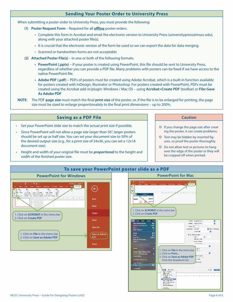
MUSC University Press – Guide for Designing Posters (v03) Page 6 of 6
PowerPoint for Mac
1. Click on ACROBAT in the menu bar2. Click on Create PDF
1. Click on File in the menu bar2. Click on Print...3. Click on Save as Adobe PDF from the dropdown list
PowerPoint for Windows
1. Click on ACROBAT in the menu bar2. Click on Create PDF
1. Click on File in the menu bar2. Click on Save as Adobe PDF
; If you change the page size after creat-ing the poster, it can create problems.
; Text may be hidden by inserted fig-ures, so proof the poster thoroughly.
; Do not allow text or pictures to hang over the edge of the poster or they will be cropped off when printed.
Caution
To save your PowerPoint poster slide as a PDF
• Set your PowerPoint slide size to match the actual print size if possible.
• Since PowerPoint will not allow a page size larger than 56”, larger posters should be set up as half size. You can set your document size to 50% of the desired output size (e.g., for a print size of 24x36, you can set a 12x18 document size).
• Height and width of your original file must be proportional to the height and width of the finished poster size.
Saving as a PDF File
When submitting a poster order to University Press, you must provide the following:
(1) Poster Request Form – Required for all offline poster orders.
• Complete this form in Acrobat and email the electronic version to University Press ([email protected]), along with your attached poster file(s).
• It is crucial that the electronic version of the form be used so we can export the data for data merging.
• Scanned or handwritten forms are not acceptable
(2) Attached Poster File(s) – in one or both of the following formats:
• PowerPoint (.pptx) – If your poster is created using PowerPoint, this file should be sent to University Press, regardless of whether you can provide a PDF file. Many problems with posters can be fixed if we have access to the native PowerPoint file.
• Adobe PDF (.pdf) – PDFs of posters must be created using Adobe Acrobat, which is a built-in function available for posters created with InDesign, Illustrator or Photoshop. For posters created with PowerPoint, PDFs must be created using the Acrobat add-in/plugin: Windows / Mac OS – using Acrobat>Create PDF (toolbar) or File>Save As Adobe PDF
NOTE: The PDF page size must match the final print size of the poster, or, if the file is to be enlarged for printing, the page size must be sized to enlarge proportionately to the final print dimensions – up to 200%.
Sending Your Poster Order to University Press