Embed Size (px)
Citation preview
Head-Up Display for Enhanced User Experience Infotainment designed around you Master of Science Thesis in Interaction Design and Technologies
ALEXANDER BOSTRÖM
FREDRIK RAMSTRÖM
Department of Applied Information Technology
CHALMERS UNIVERSITY OF TECHNOLOGY
Gothenburg, Sweden, 2014
Report No. 2014:015
ISSN: 1651-4769
Head-Up Display for Enhanced User Experience
ALEXANDER BOSTRÖM
FREDRIK RAMSTRÖM
© ALEXANDER BOSTRÖM, April 2014
© FREDRIK RAMSTRÖM, April 2014
Examiner: STAFFAN BJÖRK
Report No. 2014:015
ISSN: 1651-4769
Chalmers University of Technology
Department of Applied Information Technology
SE-412 96 Gothenburg
Sweden
Telephone +46 (0)31-772 1000
Abstract
With increased global information consumption, drivers are expecting better user
experience for information handling whilst driving and car manufacturers are
therefore offering more exciting technologies such as the head-up display (HUD).
The aim of the study is to find enhancements of the user experience for HUD in
vehicles. This has been done by building a working HUD graphical user interface
(GUI) prototype with the Qt framework from requirements gathered from interviews,
focus groups and competitor analysis. The prototype was field tested in a Volvo
XC90 which gave rise to a concept for how to increase the user experience for HUD.
The results from the evaluation of the prototype confirms that the user experience
can be enhanced with a more modern interaction, focus on usability and
functionality, and by keeping the information amount at a modest level while the
driver focuses on the road. The conclusion is that enhancing the HUD will enhance
the overall user experience allowing the driver to minimize the perceived inattention,
secondary tasks and gain better situational awareness. This is archived by moving
functionality to the HUD from the other information sources within the vehicle and
by displaying the information with design adapted to the HUD. The prototype has
received great feedback from key stakeholders both internally and externally. The
next step is to perform longer tests and in addition to develop functionality to find the
perfect balance between information visualization and safety.
KEYWORDS: head-up display, HUD, head-up display in vehicle, inattention,
secondary tasks, situational awareness, prototype, information visualization.
Abbreviations
CSD Center Stack Display
DIM Driver Information Module
HDD Head-Down Display
HMI Human-Machine Interaction
HUD Head-Up Display
GUI Graphical User Interface
QML Qt Meta Language
SA Situational Awareness
UX User Experience
Table of Contents
1. Introduction ............................................................................................................................... 1
1.1 Aim of the Study .................................................................................................................. 2
1.2 Limitations ........................................................................................................................... 2
2. Background ............................................................................................................................... 3
2.1 Head-Up Display ................................................................................................................. 3
2.2 Driver Information Module................................................................................................ 4
2.3 Center Stack Display ........................................................................................................... 5
2.4 User Experience ................................................................................................................... 6
2.5 Active Safety ........................................................................................................................ 7
2.6 Situational Awareness ......................................................................................................... 7
2.7 Driver Inattention & Driver Distraction ........................................................................... 8
2.8 Secondary Task ................................................................................................................... 8
3. Technical Description & Theory ........................................................................................... 10
3.1 Qt Framework ................................................................................................................... 10
3.1.1 Volvo HMI 2.0 ........................................................................................................................................... 11
3.2 Test Vehicle ........................................................................................................................ 12
3.2.1 The Head-Up Display ................................................................................................................................ 13 3.2.2 Input Device .............................................................................................................................................. 13
3.3 Driving Simulator .............................................................................................................. 14
4. Methodology ............................................................................................................................ 16
4.1 Literature Study ................................................................................................................ 16
4.2 Competitor Analysis .......................................................................................................... 16
4.3 User Interviews .................................................................................................................. 16
4.4 Focus Group....................................................................................................................... 17
4.5 Group Brainstorming ....................................................................................................... 17
4.6 Use Cases and User Stories ............................................................................................... 17
4.7 Prototypes .......................................................................................................................... 18
4.8 Wireframes ........................................................................................................................ 18
4.9 Mock-Ups ........................................................................................................................... 18
4.10 User Testing ..................................................................................................................... 19
4.10.1 Observation ............................................................................................................................................. 19
4.11 Scrum................................................................................................................................ 19
4.11.1 Scrum Team and Roles ........................................................................................................................... 19 4.11.2 Sprint ....................................................................................................................................................... 19 4.11.3 Daily Scrum ............................................................................................................................................. 20
4.11.4 Sprint Review........................................................................................................................................... 20 4.11.5 Product Backlog ...................................................................................................................................... 20 4.11.6 Sprint Backlog ......................................................................................................................................... 20 4.11.7 Increment ................................................................................................................................................ 20
5. Planning ................................................................................................................................... 21
6. Execution ................................................................................................................................. 22
6.1 Research ............................................................................................................................. 22
6.1.1 Literature Study......................................................................................................................................... 22 6.1.2 Competitor Analysis .................................................................................................................................. 22 6.1.3 Interview: Drivers Future Desires ............................................................................................................ 23 6.1.4 User Interview ........................................................................................................................................... 24
6.2 Ideation ............................................................................................................................... 25
6.2.1 Brainstorming ........................................................................................................................................... 25 6.2.2 User Stories ............................................................................................................................................... 26 6.2.3 Focus Groups ............................................................................................................................................ 27
6.3 Concept Generation & Design ......................................................................................... 28
6.3.1 Sketching ................................................................................................................................................... 28 6.3.2 Wireframes ................................................................................................................................................ 28 6.3.3 Graphical Mock-Ups ................................................................................................................................. 29
6.4 Prototyping ........................................................................................................................ 30
6.4.1 Graphical Mock-Ups ................................................................................................................................. 30 6.4.2 Qt Prototype ............................................................................................................................................... 31
6.5 Testing & Evaluation ........................................................................................................ 33
7. Result ........................................................................................................................................ 34
7.1 Evaluation of Qt HUD Prototype ..................................................................................... 34
7.2 Qt HUD Prototype ............................................................................................................. 38
7.2.1 Modes......................................................................................................................................................... 38 7.2.2 Interaction ................................................................................................................................................. 41 7.2.3 Side Bar ..................................................................................................................................................... 42 7.2.4 Applications & Features ........................................................................................................................... 43
7.2.4.1 Navigation ........................................................................................................................................................... 43 7.2.4.2 Music Player ....................................................................................................................................................... 44 7.2.4.3 Voice Communication ........................................................................................................................................ 46 7.2.4.4 Text Communication .......................................................................................................................................... 47 7.2.4.5 Weather and Road Information ........................................................................................................................ 48 7.2.4.6 Features ............................................................................................................................................................... 49
7.3 HUD Enhancement Concept ............................................................................................ 50
7.3.1 Recommendations for designing a HUD .................................................................................................. 51
8. Discussion................................................................................................................................. 52
8.1 Method Discussion ............................................................................................................ 52
8.2 Result Discussion ............................................................................................................... 55
8.3 Future Work ...................................................................................................................... 57
9. Conclusion ............................................................................................................................... 58
References .................................................................................................................................... 59
Appendix A. Competitive Analysis
Appendix B. User Interview: Enhancements for HUD
Appendix C. Brainstorming
Appendix D. Interview: Drivers Future Desires
Appendix E. Focus Group
Appendix F. Wireframes
Appendix G. Graphical Mock-ups
Appendix H. Use Cases & User Stories
Appendix I. User Testing
Appendix J. Qt Prototype

Acknowledgement
During the project many people helped in different ways. From Chalmers we had Morten Fjeld
as our tutor and mentor. From Volvo we would like to thank our supervisor Isabell Oskarsson for
her motivation and guidance, together with Claes Edgren and Patrik Palo for their support and
extensive knowledge within the subject of HMI, interaction design and automobiles. We would
like to thank Ingrid Pettersson, Ebba Lindblom, Jonathan Ström and Anders Larsson for their
assistance together with the ones participating in the focus groups and interviews. And finally a
big thanks to all our dedicated fearless test drivers, without you we could not had succeeded.
- Alexander Boström & Fredrik Ramström, Gothenburg, Mars 2014
1
1. Introduction
In year 2012, 1.2 million vehicles worldwide were equipped with head-up display (HUD) and the
world market will according to IHS Automotive forecast expand to 9.1 million vehicles in year
2020. With an expected growth of 758 percent in the next 8 years (IHS iSuppli, 2013) will put a
great demand on the car manufacturers to supply new technical solutions and functionality
together with new ways of user interaction and design of user interfaces to maintain
competitiveness and be at the forefront of technology development.
Although HUD was first introduced in cars in the 80s (Chris, 2010) has the functionality offered
to the customer not evolved much since then. The user experience is mainly based on moving
existing functionality from the DIM to the HUD without adding any extra features, content or
graphical solution to the head-up interface. E.g. the top seventeen car manufacturers with models
with HUD are displaying the vehicle speed in the HUD as a digit and the navigation is
exclusively visualized with a basic arrow, see appendix A.
There are several different HUDs on the market today with different technical solutions that
offers different user experiences to the end customer. From high-tech solutions with the HUD
projected 2 - 2.5 meters ahead of the driver (Scoltock, 2011), to low-tech solutions where the
HUD is projected on a glass/plastic screen inside the car or on the windshield. It is only in recent
years as manufacturers have realized that they could create a better user experience for HUD by
taking advantage of the recent technical evolution within electronics and offer better solutions to
their customers.
There is a great demand of a HUD that enhances the user experience with new ways of
displaying and visualizing information without causing inattention or lowering the driver
awareness, see appendix D. By accumulating the information stored in the CSD and the DIM, the
HUD could take advantage of the active safety systems and minimize the risks when performing
secondary tasks while driving (e.g. reading text communication).
The goal of the master thesis is to create a graphical user interface for a HUD that enhances the
user experience and can be implemented in a working HUD prototype that will be demonstrated
in a fully operational test vehicle. Together with the prototype will also concept guidelines be
presented, unfolding how to enhance the user experience for HUD. Furthermore, these ideas and
solutions should be aesthetically pleasing, have a functional benefit and help to strengthen the
Volvo brand "designed around you".
2
1.1 Aim of the Study
The aim of the study is to utilize existing technology in combination of introducing new ways of
interaction and interface visualization to increase the UX in the HUD. The research question this
master thesis aims to answer:
“How to increase user experience for HUDs in cars with existing technology?”
1.2 Limitations
The prototype should not depend on expensive hardware or major changes to the car’s
architecture, but instead utilize existing technology in a new and creative way, to secure
implementation of ideas and solutions in future vehicles. To further limit the scope of the project
the concept and prototype will involve the HUD and exclude the user interaction with the CSD
and DIM but the project will take advantage of existing functionality in both CSD and DIM.
Clinical testing of inattention, secondary task and situational awareness while using the HUD
prototype have not been taken into consideration due to both technical limitations, insufficient
resources within the project and explicit focus on infotainment aspect of user experience in HUD
and therefor will only the perceived experience of inattention, secondary task and situational
awareness be taken into consideration. The working prototype functionality will focus on
infotainment and information visualization, and will thereby not take active safety functionality
into bigger consideration.
3
2. Background
Head-up displays have been around since the middle of the 20th century and have primarily been
featured in airplanes (Popular Mechanics, 1955). A few attempts to put it in cars have been
made, but it is only recently that several major car brands have put it in production models.
Therefore it is important to explore how it collaborates with other displays in a car as well other
aspects such as active safety, situational awareness, inattention, secondary tasks and what this
thesis aims to explore, user experience.
2.1 Head-Up Display
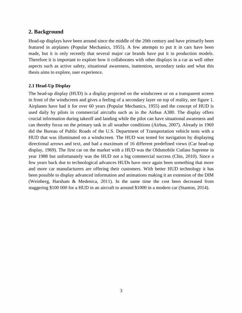
The head-up display (HUD) is a display projected on the windscreen or on a transparent screen
in front of the windscreen and gives a feeling of a secondary layer on top of reality, see figure 1.
Airplanes have had it for over 60 years (Popular Mechanics, 1955) and the concept of HUD is
used daily by pilots in commercial aircrafts such as in the Airbus A380. The display offers
crucial information during takeoff and landing while the pilot can have situational awareness and
can thereby focus on the primary task in all weather conditions (Airbus, 2007). Already in 1969
did the Bureau of Public Roads of the U.S. Department of Transportation vehicle tests with a
HUD that was illuminated on a windscreen. The HUD was tested for navigation by displaying
directional arrows and text, and had a maximum of 16 different predefined views (Car head-up
display, 1969). The first car on the market with a HUD was the Oldsmobile Cutlass Supreme in
year 1988 but unfortunately was the HUD not a big commercial success (Chis, 2010). Since a
few years back due to technological advances HUDs have once again been something that more
and more car manufacturers are offering their customers. With better HUD technology it has
been possible to display advanced information and animations making it an extension of the DIM
(Weinberg, Harsham & Medenica, 2011). In the same time the cost been decreased from
staggering $100 000 for a HUD in an aircraft to around $1000 in a modern car (Stanton, 2014).
4
Figure 1. Illustration of HUD in vehicle (grey area)
There are different types of projectors that generate the HUD picture on the windshield. The
most common ones are cathode-ray tubes (CRT), liquid-crystal displays (LCD), light-emitting
diode (LED) and plasma displays (PD). A computer is then supplying the projector with a signal
and an optical collimator that prevents parallax error from the emitted light from the projector.
Unfortunately the collimator does limit the view angle of the projected image preventing anyone
else except the driver and in some extent the passenger behind the driver to see the HUD. The
benefit of the collimator is that it allows the driver to see the HUD without refocusing on the
projected image while looking at the same direction as the HUD. Beyond using a projector to
generate an image are the technology of using optical waveguides and scanning laser beams that
are expected to be the future solutions for better HUD performance (Stanton, 2014).
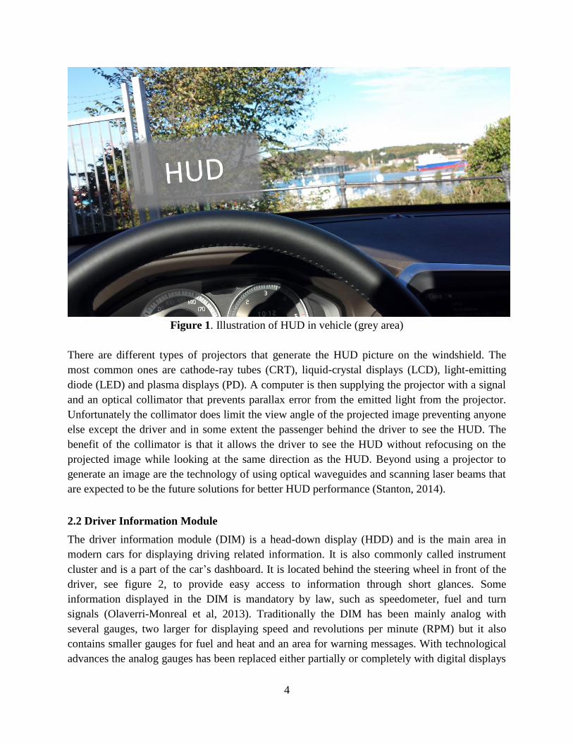
2.2 Driver Information Module
The driver information module (DIM) is a head-down display (HDD) and is the main area in
modern cars for displaying driving related information. It is also commonly called instrument
cluster and is a part of the car’s dashboard. It is located behind the steering wheel in front of the
driver, see figure 2, to provide easy access to information through short glances. Some
information displayed in the DIM is mandatory by law, such as speedometer, fuel and turn
signals (Olaverri-Monreal et al, 2013). Traditionally the DIM has been mainly analog with
several gauges, two larger for displaying speed and revolutions per minute (RPM) but it also
contains smaller gauges for fuel and heat and an area for warning messages. With technological
advances the analog gauges has been replaced either partially or completely with digital displays
5
(Howard, 2012). With digital displays replacing the physical gauges, different ways of
displaying information have been introduced, especially the possibility to have dynamic
information visualization depending on the importance in certain situations. Although gauges
have often been kept in digital form for information such as speed. It is usually controlled with
buttons on the steering wheel and/or levers around the steering wheel.
Figure 2. Illustration of DIM in vehicle (grey area)
2.3 Center Stack Display
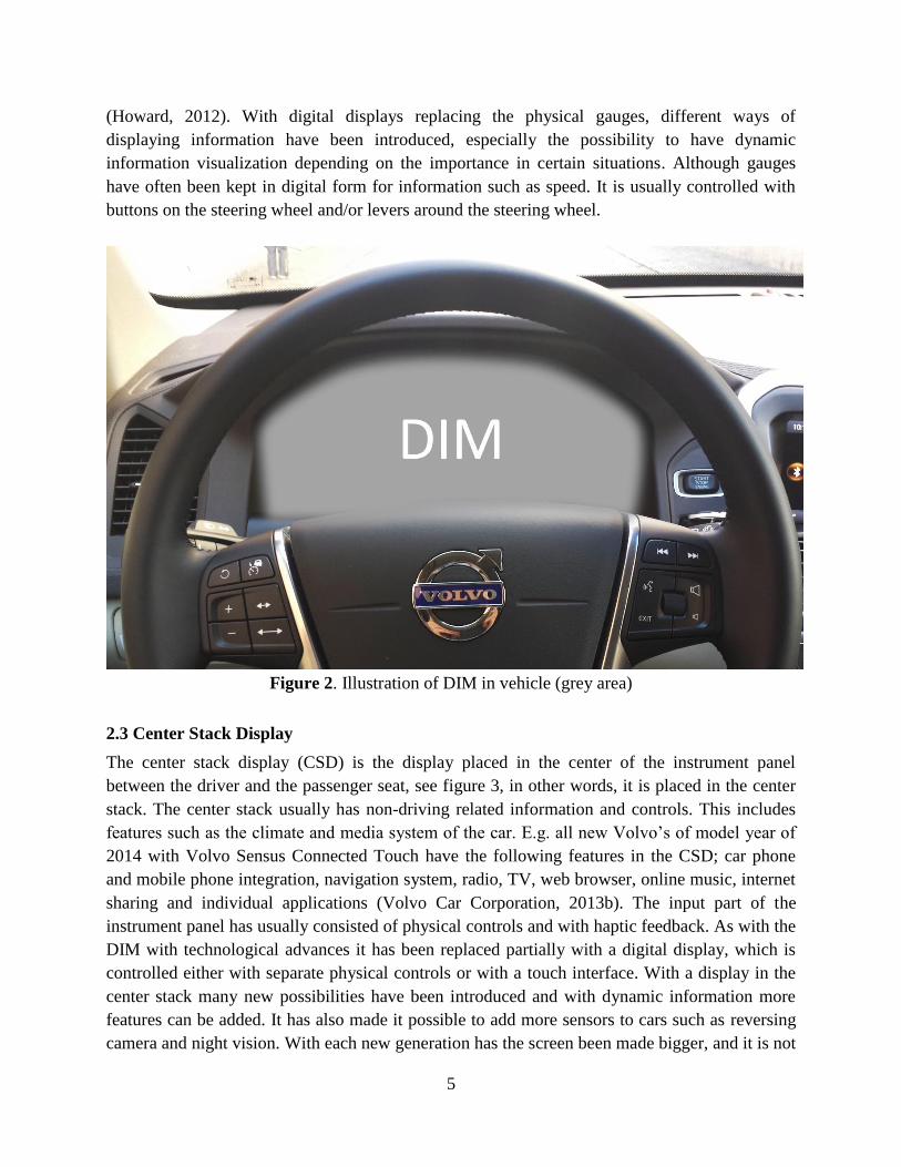
The center stack display (CSD) is the display placed in the center of the instrument panel
between the driver and the passenger seat, see figure 3, in other words, it is placed in the center
stack. The center stack usually has non-driving related information and controls. This includes
features such as the climate and media system of the car. E.g. all new Volvo’s of model year of
2014 with Volvo Sensus Connected Touch have the following features in the CSD; car phone
and mobile phone integration, navigation system, radio, TV, web browser, online music, internet
sharing and individual applications (Volvo Car Corporation, 2013b). The input part of the
instrument panel has usually consisted of physical controls and with haptic feedback. As with the
DIM with technological advances it has been replaced partially with a digital display, which is
controlled either with separate physical controls or with a touch interface. With a display in the
center stack many new possibilities have been introduced and with dynamic information more
features can be added. It has also made it possible to add more sensors to cars such as reversing
camera and night vision. With each new generation has the screen been made bigger, and it is not
6
unlikely that it will replace all the previous controls in the center stack as seen in many concept
cars (Private Fleet, 2013) and even some production cars. The CSD is also included in the HDD
family together with the DIM.
Figure 3. Illustration of CSD in vehicle (grey area)
2.4 User Experience
User Experience (UX) is about a user's behavior, emotions and attitudes towards a particular
product. This involves the entire experience of the interaction with the product (Nielsen &
Norman, 2013). Therefore it is also important to distinguish between the complete UX and UX
towards a particular area of a product. A user using the CSD of a car will not only experience the
interaction with the CSD but also the underlying information and their attitude towards the car
company will also affect the UX. Since UX is based on individuals’ perspective of a certain
product it can be seen as very subjective. UX should not be mixed up with usability. Usability is
the quality of the attributes of a product whereas UX covers a much larger area. It is also
constantly changing due to circumstances and changes to the product and its uses. User
experience (UX) as defined by the ISO 9241-210 standards:
“2.15. User experience: person's perceptions and responses resulting from the use and/or
anticipated use of a product, system or service”
(International Organization for Standardization, 2010)
Information architecture is a good way to explain UX since there is a interface, system or
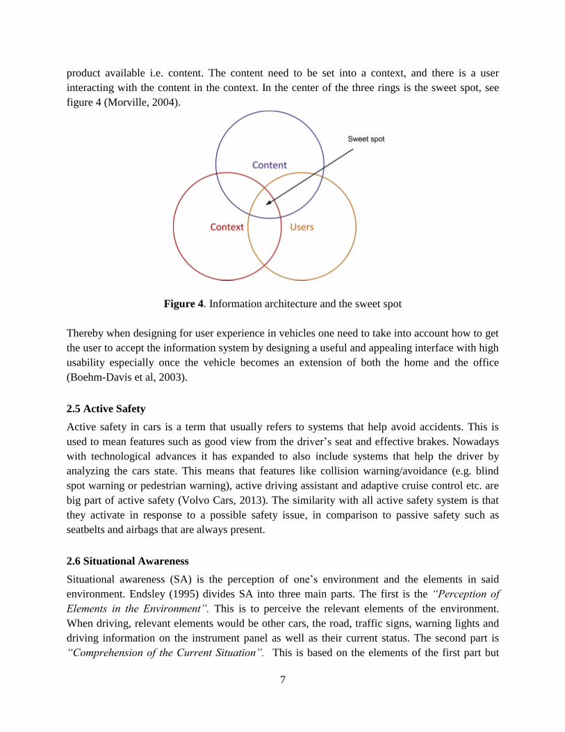
7
product available i.e. content. The content need to be set into a context, and there is a user
interacting with the content in the context. In the center of the three rings is the sweet spot, see
figure 4 (Morville, 2004).
Figure 4. Information architecture and the sweet spot
Thereby when designing for user experience in vehicles one need to take into account how to get
the user to accept the information system by designing a useful and appealing interface with high
usability especially once the vehicle becomes an extension of both the home and the office
(Boehm-Davis et al, 2003).
2.5 Active Safety
Active safety in cars is a term that usually refers to systems that help avoid accidents. This is
used to mean features such as good view from the driver’s seat and effective brakes. Nowadays
with technological advances it has expanded to also include systems that help the driver by
analyzing the cars state. This means that features like collision warning/avoidance (e.g. blind
spot warning or pedestrian warning), active driving assistant and adaptive cruise control etc. are
big part of active safety (Volvo Cars, 2013). The similarity with all active safety system is that
they activate in response to a possible safety issue, in comparison to passive safety such as
seatbelts and airbags that are always present.
2.6 Situational Awareness
Situational awareness (SA) is the perception of one’s environment and the elements in said
environment. Endsley (1995) divides SA into three main parts. The first is the “Perception of
Elements in the Environment”. This is to perceive the relevant elements of the environment.
When driving, relevant elements would be other cars, the road, traffic signs, warning lights and
driving information on the instrument panel as well as their current status. The second part is
“Comprehension of the Current Situation”. This is based on the elements of the first part but

8
goes beyond SA to understand their relevance to current situation in relation to the subject’s
goals. The driver of a car needs to understand the status of the car when certain warning lights
are lit or appropriate speed according the traffic situation. The third and final part of SA
according to Endsley (1995) is “Projection of Future Status”. This is the highest level of SA and
is the ability to predict future behavior, at least short term, of elements in one's surroundings.
This is done by combining the first two parts of SA. All these levels combined is SA and since it
is affected by elements and their complexity in the subjects surrounding it is critical when for
example driving a car to not have too many unnecessary elements in the that will impair the SA
of a driver.
2.7 Driver Inattention & Driver Distraction
Inattention and driver distraction is one of the main reasons for accidents. According to Regan,
Lee & Young (2008) estimations are that 23 % or more of all accidents are caused by inattention.
There are several definitions of driver inattention, but they all tend to tell the same story. Craft &
Preslopsky (2009) refers to driver inattention as “when the driver’s mind has wandered from the
driving task for some non-compelling reason. In this circumstance the driver is typically focusing
on internal thoughts (i.e. daydreaming, problem solving, worrying about family problems, etc.)
and not focusing attention on the driving task”. That implies that the driver is not focusing on the
primary task and thereby neglecting the task of focusing on driving. Treat (1980) on the other
hand is describing driver inattention as “whenever a driver is delayed in the recognition of
information needed to safely accomplish the driving task, because of having chosen to direct his
attention elsewhere for some non-compelling reason”. Inattention can thereby be seen as when
the driver is not focused on the driving and distracted by internal events, external events or
thoughts.
2.8 Secondary Task
Many drivers are performing secondary task while driving that affect the focus on the primary
task, see figure 5. Common secondary tasks that drivers are executing while driving are; eating
and drinking, smoking, adjusting clothing, adjusting integrated car related equipment (e.g. back
mirrors, heating or navigation), adjusting non-integrated devices (cell phone, mp3 player),
interaction with passengers, focusing on something outside of the vehicle, interacting with things
inside the car (e.g. reading, writing, cleaning and searching) and self-initiated tasks (monologues,
daydreaming and singing) (Huemer & Vollrath, 2011).
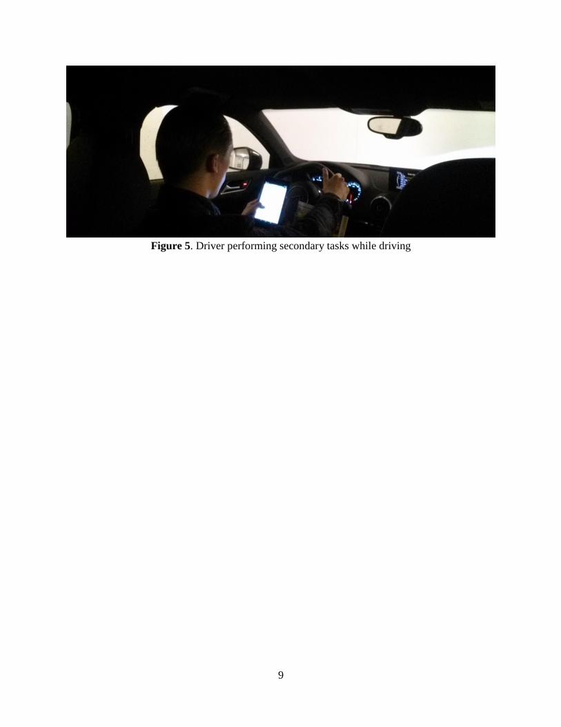
9
Figure 5. Driver performing secondary tasks while driving
10
3. Technical Description & Theory
Technical description explains the technical platform used for development of the working
prototype and is divided into three sections. In the first section, Qt Framework is explained, the
second section is the technical setup of the test vehicle described and in the last section explains
the setup of the driving simulator.
3.1 Qt Framework
Qt (pronounced “cute”) is a user interface framework for different platforms, created in C++ by
the telecommunications equipment company Nokia and was sold to the finish company Digia Plc
in year 2012. Qt facilitates the development of working prototypes and offers a toolkit to easy
create new applications to test the user experience in an early stage of a project. Qt project is
today developed by the engineers at Digia together with the open community (Qt Digia, 2013).
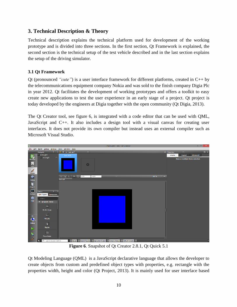
The Qt Creator tool, see figure 6, is integrated with a code editor that can be used with QML,
JavaScript and C++. It also includes a design tool with a visual canvas for creating user
interfaces. It does not provide its own compiler but instead uses an external compiler such as
Microsoft Visual Studio.
Figure 6. Snapshot of Qt Creator 2.8.1, Qt Quick 5.1
Qt Modeling Language (QML) is a JavaScript declarative language that allows the developer to
create objects from custom and predefined object types with properties, e.g. rectangle with the
properties width, height and color (Qt Project, 2013). It is mainly used for user interface based
11
applications and is a part of Qt Quick. QML itself does not provide any rendering engine but this
is provided by Qt Quick.
A simple declaration of blue rectangle in QML with 200x200 pixel dimensions:
Rectangle {
id: rectangle
width: 200
height: 200
color: "#0000ff"
}
An animation of the rectangle above that increases its scale by 50 % over 1000 ms:
PropertyAnimation {
target: rectangle
property: "scale"
from: 1
to: 1.5
duration: 1000
}
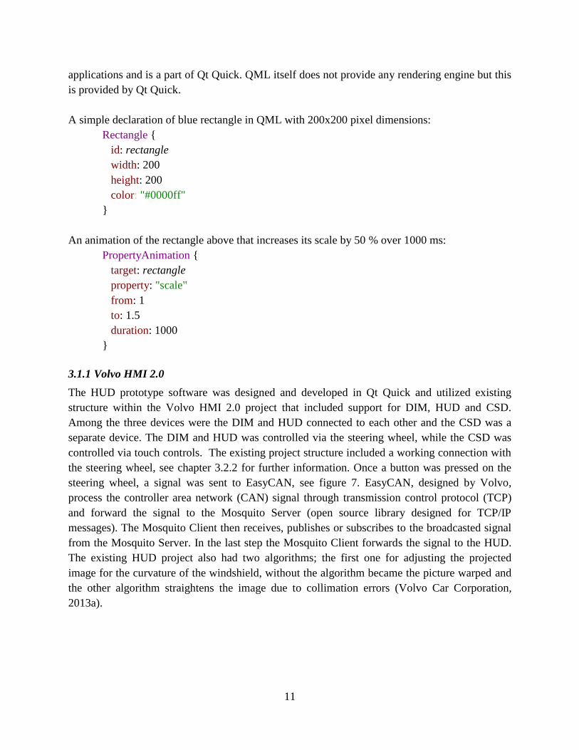
3.1.1 Volvo HMI 2.0
The HUD prototype software was designed and developed in Qt Quick and utilized existing
structure within the Volvo HMI 2.0 project that included support for DIM, HUD and CSD.
Among the three devices were the DIM and HUD connected to each other and the CSD was a
separate device. The DIM and HUD was controlled via the steering wheel, while the CSD was
controlled via touch controls. The existing project structure included a working connection with
the steering wheel, see chapter 3.2.2 for further information. Once a button was pressed on the
steering wheel, a signal was sent to EasyCAN, see figure 7. EasyCAN, designed by Volvo,
process the controller area network (CAN) signal through transmission control protocol (TCP)
and forward the signal to the Mosquito Server (open source library designed for TCP/IP
messages). The Mosquito Client then receives, publishes or subscribes to the broadcasted signal
from the Mosquito Server. In the last step the Mosquito Client forwards the signal to the HUD.
The existing HUD project also had two algorithms; the first one for adjusting the projected
image for the curvature of the windshield, without the algorithm became the picture warped and
the other algorithm straightens the image due to collimation errors (Volvo Car Corporation,
2013a).
12
Figure 7. Signal input process (from steering wheel to HUD)
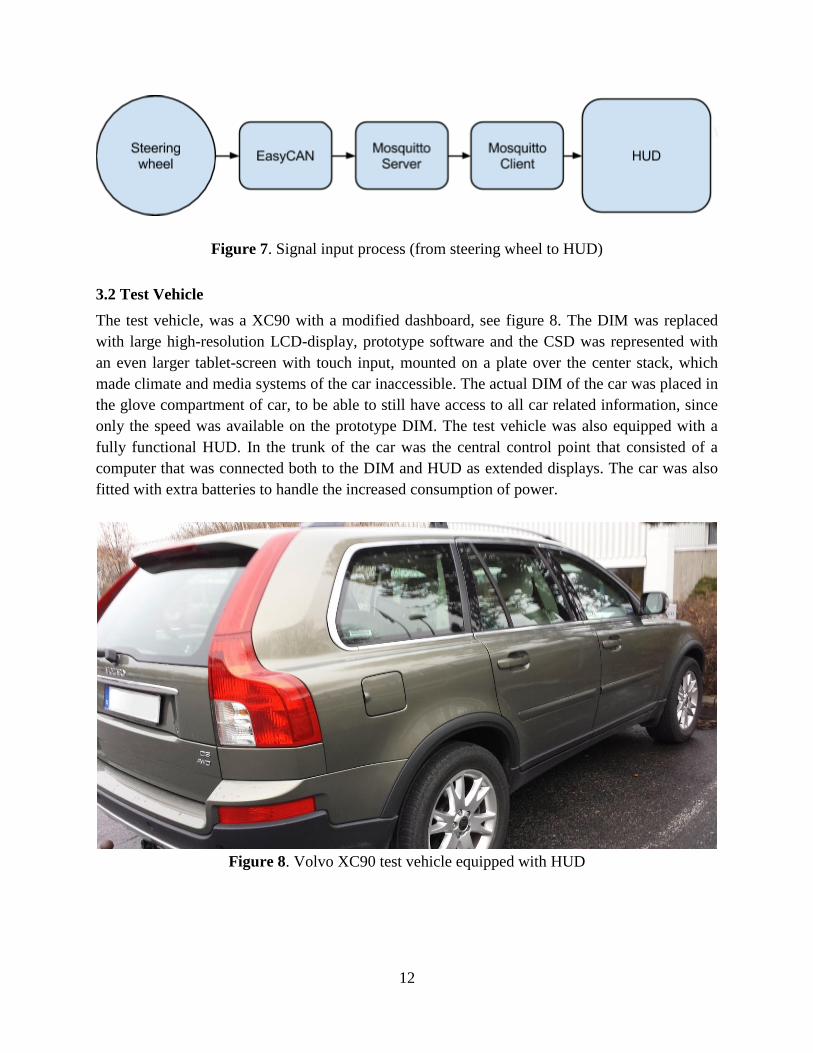
3.2 Test Vehicle
The test vehicle, was a XC90 with a modified dashboard, see figure 8. The DIM was replaced
with large high-resolution LCD-display, prototype software and the CSD was represented with
an even larger tablet-screen with touch input, mounted on a plate over the center stack, which
made climate and media systems of the car inaccessible. The actual DIM of the car was placed in
the glove compartment of car, to be able to still have access to all car related information, since
only the speed was available on the prototype DIM. The test vehicle was also equipped with a
fully functional HUD. In the trunk of the car was the central control point that consisted of a
computer that was connected both to the DIM and HUD as extended displays. The car was also
fitted with extra batteries to handle the increased consumption of power.
Figure 8. Volvo XC90 test vehicle equipped with HUD
13
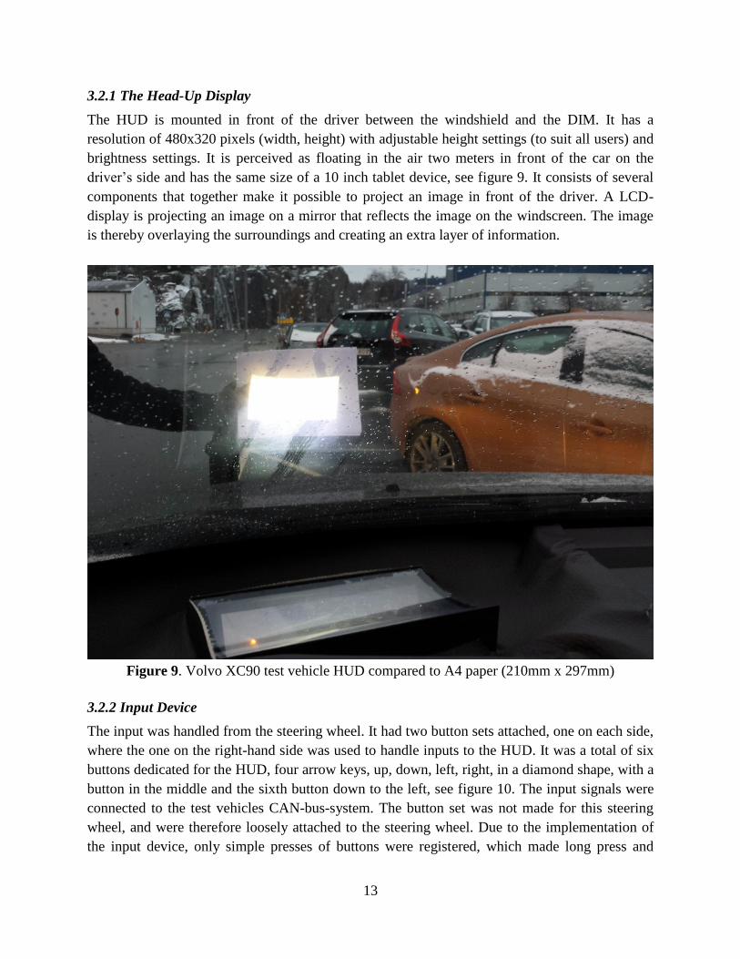
3.2.1 The Head-Up Display
The HUD is mounted in front of the driver between the windshield and the DIM. It has a
resolution of 480x320 pixels (width, height) with adjustable height settings (to suit all users) and
brightness settings. It is perceived as floating in the air two meters in front of the car on the
driver’s side and has the same size of a 10 inch tablet device, see figure 9. It consists of several
components that together make it possible to project an image in front of the driver. A LCD-
display is projecting an image on a mirror that reflects the image on the windscreen. The image
is thereby overlaying the surroundings and creating an extra layer of information.
Figure 9. Volvo XC90 test vehicle HUD compared to A4 paper (210mm x 297mm)
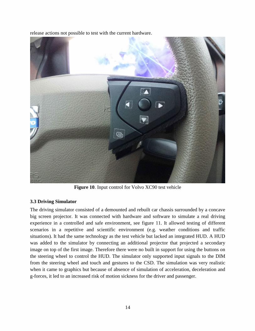
3.2.2 Input Device
The input was handled from the steering wheel. It had two button sets attached, one on each side,
where the one on the right-hand side was used to handle inputs to the HUD. It was a total of six
buttons dedicated for the HUD, four arrow keys, up, down, left, right, in a diamond shape, with a
button in the middle and the sixth button down to the left, see figure 10. The input signals were
connected to the test vehicles CAN-bus-system. The button set was not made for this steering
wheel, and were therefore loosely attached to the steering wheel. Due to the implementation of
the input device, only simple presses of buttons were registered, which made long press and
14
release actions not possible to test with the current hardware.
Figure 10. Input control for Volvo XC90 test vehicle
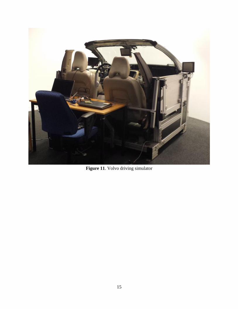
3.3 Driving Simulator
The driving simulator consisted of a demounted and rebuilt car chassis surrounded by a concave
big screen projector. It was connected with hardware and software to simulate a real driving
experience in a controlled and safe environment, see figure 11. It allowed testing of different
scenarios in a repetitive and scientific environment (e.g. weather conditions and traffic
situations). It had the same technology as the test vehicle but lacked an integrated HUD. A HUD
was added to the simulator by connecting an additional projector that projected a secondary
image on top of the first image. Therefore there were no built in support for using the buttons on
the steering wheel to control the HUD. The simulator only supported input signals to the DIM
from the steering wheel and touch and gestures to the CSD. The simulation was very realistic
when it came to graphics but because of absence of simulation of acceleration, deceleration and
g-forces, it led to an increased risk of motion sickness for the driver and passenger.
15
Figure 11. Volvo driving simulator
16
4. Methodology
Through the project, a number of methods have been used to standardize the execution, as well
as optimize and streamline the process. The methods were used continuously throughout the
project at various stages and served as the backbone of the process.
4.1 Literature Study
A literature study is a very important step of a research process. It is usually the first step in a
research process after identifying the topic of interest. It also serves to demonstrate one's
understanding of the topic as well as relevant works others have performed (Reed, 1998). Doing
a literature review can give an overview of the research area, reveal work that has already been
done, to not cause any unnecessary work along with several more benefits (Knopf, 2006). The
literature study will cover the current research in the field regarding previous research,
requirements, functions and needs and will give an understanding of the basic requirements such
as laws, technical limitations, physical limitations and relevant overall knowledge about what is
important when designing an interface for vehicles (Visocky O'Grady, 2006).
4.2 Competitor Analysis
A competitor analysis is important when developing a product and can be used for generating
ideas to add to your own. It is often used to determine who the competitors are, their products
and visions offered to the market, in the same time as finding the strengths and weaknesses of the
competitors. It can also be important to discover the key elements for success in the market of
interest. Competitor analysis also reveals the objectives and strategies of the competitors which
can help predict what the market will look like in the future (Knowles, 2002). There are many
methods that can be used and one of the most prominent is the SWOT Analysis (strengths,
weaknesses, opportunities and threats) that is well suited for non-recurring analysis (Coman &
Ronen, 2009).
4.3 User Interviews
User interviews are a way of asking potential users of what they want and what they think of a
certain product. There are usually considered four types of interview techniques. Unstructured,
were the interviewee is talking freely about the subject. Structured is when the interviewer leads
the interview with predefined questions. Semi-structured are a combination of the two before and
group interviews are done with a small group and an interview leader. Depending on the
situation and the goal of the interview, the best suited interview technique should be used
(Preece, Rogers & Sharp, 2002). User Interviews are between 30 to 60 minutes long. It will give
a great understanding of how the interviewee thinks and the results can been taken into
consideration in the concept and design-phase (U.S. Dept. of Health and Human Services, 2006).
17
4.4 Focus Group
The focus group is an established research method with focus on the research interest. Focus
groups are interviews with a larger group of people at the same time. They are controlled by a
moderator who guides the discussion with the participants. In focus groups, the data collected, is
everything the participants say during the interview. Before the focus group session can be hold,
one need to plan the session by e.g. writing down a script or discussion questions. One also needs
to recruit participants with enough knowledge in the field to participate in a discussion. The
group often consists of 6 - 8 participants, but there are examples of as few as 4 and as many as 12
participants. The moderator is often a trained professional but that is not a requirement. As a data
gathering method, focus groups are a qualitative research method. This means that the data
gathered will give a deep understanding of the participants’ experiences and viewpoints. Focus
groups can be useful in four different stages in a project that focus on academic research:
Assessment - mainly used to evaluate finished project to get a greater knowledge of
the results
Implementation - used to evaluate the implementation by collecting data
Planning - used to get input from participants regarding the research design
Problem Identification - used in the early stage of the project to generate the research
question
The results from the focus group are then compiled in a focus group report which then can be
used as a basis for the study (Morgan, 1997).
4.5 Group Brainstorming
Brainstorming is when an individual or a group tries to find ideas and solutions to problems.
There are many different brainstorming technique methods (e.g. Time Travel, Gap Filling, Brain
Writing and Group Ideation) which each has their different uses (Celestine, 2009). Chauncey
Wilson (2013) suggests that the brainstorming group should consist of three to ten participants.
Participants should ideally have different backgrounds to ensure a breadth of ideas and different
approaches to the topic. The group should also be well informed of the topic or problem that they
are expected to brainstorm around, to ensure that the generated ideas or solutions are in the right
direction. One must also remain neutral to the ideas the group comes forward to during the
session in order not to hamper the group's creative abilities. The session is ended with a
discussion around the ideas generated to get feedback and find the best ideas (Wilson, 2013).
4.6 Use Cases and User Stories
Use cases define different user goals in detail. This is performed by identifying every step the
user needs to perform to accomplish the initial goal. Each use case consists of a title that
summarizes what the use case is about, the actors involved, the complete scope, level of
importance/priority and a story of how to implement the use case (Cockburn, 2001). User stories
are included within use cases. The story is used to ensure that all involved stakeholders are
18
working towards the same goal, and then the story must be sufficiently detailed so that no
misunderstanding may arise. By having these stories, it simplifies the testing of the functionality
once it is developed (Cohn, 2004).
4.7 Prototypes
Low-fidelity prototyping is used to in a fast and quick way test a new design or concept without
investing too much time and resources in the development (Egger, 2000). Paper prototyping is a
low-fidelity prototyping method were mainly paper, post-its, glue and pens are used to create a
prototype. The great advantage with using paper prototypes is the shifts of focus from the details
to the user interaction between the prototype and the intended user (Klee, 2000).
High-fidelity prototyping is used to create a user interface with more details and functionality
(e.g. create the prototype with a tool like Adobe Photoshop together with HTML) to ensure that
it more resembles the intended finished product. A high-fidelity prototype requires time and
resources and is best used after the initial design or concept has been tested with a low-fidelity
prototype. The high-fidelity prototype can be fully working with an interactive user interface
(e.g. created with the Qt framework or Adobe Flash) to simulate the concept in a realistic way
(Egger, 2000).
4.8 Wireframes
Wireframes is an easy prototyping tool that can appear very different from different situations. It
can be anything from a simple sketch to detailed documentation. Wireframes are used when
designing and creating prototypes that will show functionality and layout without focusing on the
visual aspects of the product. These can be used as rapid low-fidelity prototypes since they
require no implementation and nor visually pleasing elements. Wireframes are well used in the
beginning of a prototyping phase but can also be used later in development when implementing
changes to the layout and functionality (Konigi, 2013). The short creation time of wireframe
makes it a low effort when creating them and allows for redesign and experimentation
(Arnowitz, Arent & Berger, 2007).
4.9 Mock-Ups
Mock-ups are used to visualize how the final product will look like. This is done without
implementing any of the underlying structure or code which means that it can be made much
earlier in the process (concept and design-phase). It is also possible to reuse graphical elements
created for mock-ups when implementing the working prototype. Mock-ups are more time
consuming than simple wireframes but also provides more feedback from testing (Interaction
Design Foundation, 2004). “Generally the last thing that you should do when beginning to design an
interactive system is write code” (Buxton, 2007). Mock-ups are therefore a very good solutions
next to implementing the real system.
19
4.10 User Testing
User testing is a central aspect when designing a product. It is done to measure performance of
when users are performing different tasks. To do this the user test needs to be defined together
with a clear goal. It can of course provide useful information outside the scope of the test as well.
This can be done in a controlled environment or in the field. User testing is used to see if the
product satisfies the needs of the end user and to solve usability problems. The tests need to be
with the right target group to yield any useful information (Visocky O'Grady, 2006).
4.10.1 Observation
Observation of a user interface involves watching what the user does and listen to what they say.
Observation can be done in laboratory or natural environment. There are a variety of different
approaches to how to observe a user. For example a user can be observed while performing a
predefined set of tasks or just using a product as they would on their own. Each has their
different strengths and weaknesses and which approach that should be used varies on the
situation and the goals of the test (Preece, Rogers & Sharp, 2002).
4.11 Scrum
Scrum is an overall framework methodology when designing and creating a new product. Scrum
enables stable increments in a controlled manner together with great project management. It has
been developed and refined by Ken Schwaber and Jeff Sutherland for over 20 years and is based
on empiricism, risk control and an iterative way of working (Schwaber & Sutherland, 2013).
Scrum consists of several important aspects that are presented in the following subchapters.
4.11.1 Scrum Team and Roles
There are three major roles with different responsibilities included in the Scrum Team:
A self-organizing Development Team with all the knowledge needed to create the
product
A Product Owner with the responsibility for the Product Backlog and its content
A Scrum Master that keeps the project up to date with how to use Scrum
(Schwaber & Sutherland, 2013).
4.11.2 Sprint
A Sprint is a time-boxed (up to one month) development period where an Increment is delivered.
Different subtasks need to be performed before a Sprint can begin. First one need to have a time-
boxed Sprint Planning meeting (maximum duration of 8 hours) where the Scrum Team decides
what to deliver in the Sprint and how it will be performed. The information gathered on the
Sprint Planning meeting is the baseline for the Sprint Goal, the strategic objective for the
upcoming Sprint (Schwaber & Sutherland, 2013).
20
4.11.3 Daily Scrum
The Development Team has a Daily Scrum session each day (time-boxed to 15 minutes) where
each member share what he/she will do today, what has been done yesterday and the current
obstacles within the scope of the Sprint Goal. The daily meeting replaces other meetings and
allows the team to be constantly updated with the latest on the project. It is recommended that
the meeting is held at the same location and at the same time every day (Schwaber & Sutherland,
2013).
4.11.4 Sprint Review
In the end of each Sprint, the Scrum Team and Stakeholders get together for a Sprint Review
meeting to review the Increment, update the Product Backlog and to discuss the next step in the
development regarding features and functionality. By highlighting what has happened in the past
Sprint, one can steer the future development in the right direction (Schwaber & Sutherland,
2013).
4.11.5 Product Backlog
The Product Backlog consist of all the suggested Increments for the entire project and is divided
into smaller tasks/features named PBIs (Product Backlog Items) with the following parameters:
unique ID number, summary, rank, estimated time to complete and status. The Product Backlog
is updated after each Sprint during the Sprint Review meeting or in Sprint Zero, the first Sprint
where the first version of the Product Backlog is created (Schwaber & Sutherland, 2013).
4.11.6 Sprint Backlog
For each Sprint a Sprint Backlog is created with all the PBIs that will be delivered and works like
a progress map for the Scrum Team to clarify what the team is working on, what each resource is
doing and to keep track of the remaining work. The Sprint Backlog is what the team find realistic
to achieve during a Sprint to reach the objective during the Sprint, e.g. deliver a type of
functionality (Schwaber & Sutherland, 2013).
4.11.7 Increment
The Increment consist of all the executed PBIs with the definition “Done” that has been
performed during a Sprint together with what has been delivered in previous Sprints. According
to Schwaber & Sutherland 2013, the most important part of the increment is “It must be in
useable condition regardless of whether the Product Owner decides to actually release it” which
indicates that the definition of done must be taken seriously (Schwaber & Sutherland, 2013).
21
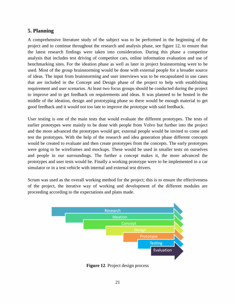
5. Planning
A comprehensive literature study of the subject was to be performed in the beginning of the
project and to continue throughout the research and analysis phase, see figure 12, to ensure that
the latest research findings were taken into consideration. During this phase a competitor
analysis that includes test driving of competitor cars, online information evaluation and use of
benchmarking sites. For the ideation phase as well as later in project brainstorming were to be
used. Most of the group brainstorming would be done with external people for a broader source
of ideas. The input from brainstorming and user interviews was to be encapsulated in use cases
that are included in the Concept and Design phase of the project to help with establishing
requirement and user scenarios. At least two focus groups should be conducted during the project
to improve and to get feedback on requirements and ideas. It was planned to be hosted in the
middle of the ideation, design and prototyping phase so there would be enough material to get
good feedback and it would not too late to improve the prototype with said feedback.
User testing is one of the main tests that would evaluate the different prototypes. The tests of
earlier prototypes were mainly to be done with people from Volvo but further into the project
and the more advanced the prototypes would get; external people would be invited to come and
test the prototypes. With the help of the research and idea generation phase different concepts
would be created to evaluate and then create prototypes from the concepts. The early prototypes
were going to be wireframes and mockups. These would be used in smaller tests on ourselves
and people in our surroundings. The further a concept makes it, the more advanced the
prototypes and user tests would be. Finally a working prototype were to be implemented in a car
simulator or in a test vehicle with internal and external test drivers.
Scrum was used as the overall working method for the project; this is to ensure the effectiveness
of the project, the iterative way of working and development of the different modules are
proceeding according to the expectations and plans made.
Figure 12. Project design process
22
6. Execution
The chapter explains the execution through the project and how the methods have been used,
from the research phase to the testing of the prototype together with the evolution of the project.
It also describes the requirements that formed the basis of the result presented in chapter 7.
6.1 Research
To understand car human-machine interaction (HMI) and how a HUD could be applied in this
area, thorough research has to be done within the field of subject. This have been done by
studying articles, comparing other car brands solutions and interviewing potential users to get an
understanding of what is expected from a HUD to understand how to increase the user
experience.
6.1.1 Literature Study
The literature study was performed by searching the databases of Chalmers University Library
and Google Scholar for articles and papers regarding head-up display, user experience in
vehicles, driver awareness, inattention, secondary task and active safety in vehicles. The
literature study revealed that the subject around enhancing the user experience for HUD was a
relatively unexplored area but there were some exciting articles about the subject HUD. Charissis
and Papanastasiou (2010) states in their article Human-machine collaboration through vehicle
head up display interface that HUD is better than HDD in critical situations and that their test
participants preferred the HUD over the DIM. The paper Designing a Direct Manipulation HUD
Interface for In-Vehicle Infotainment by Charissis Vasilis et al designed and tested a HUD
prototype for e-mail, SMS and phone calls in a driving simulator and found it to be both effective
and not distracting. The full results of the literature study of user experience in vehicles, driver
awareness, inattention, secondary task and active safety in vehicles can be found in Chapter 2.
6.1.2 Competitor Analysis
A competitor analysis was executed by a comprehensive investigation of HUDs that are
available on the market to end customers or has been officially displayed on motor shows and
events. Also working prototypes was taken into consideration. The analysis consisted of going
through all car brands on www.a2mac1.net (Automotive Benchmarking), to find models
equipped with HUD. Once a model was confirmed further investigations were performed on the
manufacturers’ official homepage together with a complementary search on the websites Google
and YouTube.
The analysis revealed that several car manufacturers already offer HUDs in their range of
vehicles with different technical solutions and at different price levels. All the following brands
got at least one model with HUD or got a working concept car with HUD; Audi, BMW, Buick,
Cadillac, Chevrolet, Citroen, GMC, Hyundai, KIA, Lexus, Mazda, Mercedes-Benz, Peugeot,
23
Rolls Royce, Toyota and Volkswagen. To find the strengths, weaknesses, opportunities and
threats, a SWOT analysis of the market was performed for cars with HUD including what is
offered today together with concepts of future models.
The different HUDs that are on the market today, provides a wide range of different features.
Most common and included in all HUDs today is the vehicle speed. Vehicle speed is always
visualized with a number together with unit (e.g. “10 km/h”) and comes in different scales,
placements and colors. Second most common feature is navigation assistance that can be found
in ⅔ of the HUDs. The common design feature of the navigation is turn by turn navigation with
an arrow pointing in the direction the driver should go but the level of details varies between the
HUDs. Some HUDs just got a plain arrow, other HUDs got a more detailed map displaying the
roads and conjunctions together with the arrow showing both the location of the car and the next
step in the navigation. The third most common feature is cruise control or active cruise control
indication that is included in ⅓ of the HUDs. Cruise control is most often displayed with the
classic cruise control icon (speedometer with an arrow pointing on the selected speed). The
active cruise control adds an additional icon displaying a vehicle and the distance is indicated by
zones. The fourth most common features are infotainment, warnings messages and collision
warning in the HUD. The infotainment is displaying what song is played or name of radio station
in plain text. The warning messages are displayed with icons similar to the ones that can be
found in the DIM and the collision warning is visualized with a red car approaching the driver's
vehicle or with a warning triangle. There are also a lot of features that is only offered in between
one to three models; speed limit, lane departure assistant, revolutions per minute, gear, compass
heading, temperature, incoming call, lights and blinkers and g-force. These features are mostly
visualized in the same way as in the traditional DIM. Some concepts offers more far-fetched and
futuristic visualization of all the features mentioned above, especially the navigation was
displayed in more advanced and details ways and gives an indication of what to be expected in
future HUDs on the market, see appendix A for the full analysis.
As a part of the competitive analysis a BMW 535i equipped with a HUD was driven. This was
the first firsthand experience with a car HUD in this project. BMW has what is considered one of
the best HUDs on the market and the feature list includes speed, speed limit, navigation, lane
keeping and warning messages. Driving with a HUD was distracting at first but quickly became
an advantage when driving. It relieved the driver from ever glancing down into the DIM and did
not cause any perceived distraction for the driver.
6.1.3 Interview: Drivers Future Desires
The interview was performed with Ingrid Pettersson, PhD student in User Experience at
Chalmers University of Technology and Volvo Car Corporation. Pettersson had just completed
an interview study to assess what drivers’ desire in their future cars. The interview was held at
Chalmers and was an open interview with no predefined questions. The results from the
24
interview was documented and analyzed and transformed into requirements, see appendix D.
From the interview requirements evolved, the most important factors were that drivers would
like to have fun in the car, have an interface that personify them in the car and have the
possibility for full integration with their cell phone with the car interface. The drivers also
wanted that technology should become a part of the user, get the feeling of being unique and
have the latest and simplest solutions. They also wanted to know everything about their car, even
information that did not assist them in their driving. Hands on functions requested by the users
were possibility to have Skype meetings in the vehicle, customizable interface and
personalization of driving modes together with innovative modes that correspond to the driving
conditions / situation. The full list can be seen in appendix D.
6.1.4 User Interview
User interview with a several participants were conducted. These interviews were done to gather
qualitative data about what type of content, features, information and how the HUD should look
like. The interviewee was introduced to the scope of the project and then shown graphical
mockups, see appendix G, of examples of how a HUD could be visualized. It was open
interviews with few predefined questions and the interviewee was freely to talk about the subject
and what interested them. A total of eight interviews were held, see appendix B. The tools used
for the interviews were graphical-mockups that showed how a HUD might look like. They were
two different groups of mockups shown. Group one was shown different types of content in the
HUD and the second group that handled the layout of different elements. For demonstration
purpose and to get the interviewee a feel for how a HUD looks like, it was demonstrated on a
tablet device held at two meters distance to give the user a proper feel of the size and look of the
elements in the HUD. They were also demonstrated both on a black background and a picture of
a road to test the visibility. In the first few interviews, some wireframes were used, but after bad
results of visualizing HUD examples they were replaced with graphical mockups. The graphical
mockups were used after the interviewee had time to talk freely about HUD so not to
superimpose the idea of what a HUD could be for the subject. The user interviews revealed that
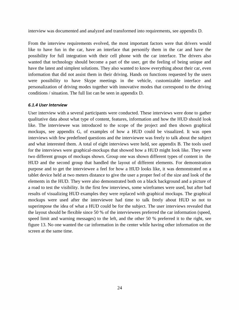
the layout should be flexible since 50 % of the interviewees preferred the car information (speed,
speed limit and warning messages) to the left, and the other 50 % preferred it to the right, see
figure 13. No one wanted the car information in the center while having other information on the
screen at the same time.
25
Figure 13. Left oriented HUD layout (L). Right oriented HUD layout (R).
Negative feedback was also received for mirroring smartphone to HUD, YouTube/video and
social media. The interviewees was concerned that displaying too much information in the same
time could cause information overflow and could be disturbing while driving but also that the
screen was not big enough to display the content. The interviewees gave positive feedback for
date and time, navigation help, notifications and text communication (SMS/chat). The most
important feature was SMS since many participants were texting while driving and felt that is
influenced their way of driving in a negative aspect but also here they were concerned about
information overload.
6.2 Ideation
During the ideation phase were the requirements defined for the project, where potential end
users had the opportunity to affect the project with their expectations and ideas. The
requirements became clearer and more specific as seen in the following chapters.
6.2.1 Brainstorming
Brainstorming has been used throughout the entire project to solve problems and to come up
with ideas, but there has also been three main brainstorming sessions used to generate basic
ideas, words and features of interest. The tools that were used during the sessions were pens and
post-it notes. The post-it notes were placed on a board and grouped together in related categories.
The first of these sessions was used to find as many words and features associated with HUD as
possible. Although all ideas weren’t feasible, there was no limitation to the ideas that was
supposed to come out of this. The second session was much the same but handled DIM instead.
The third session handled all of the screens; HUD, DIM and CSD.
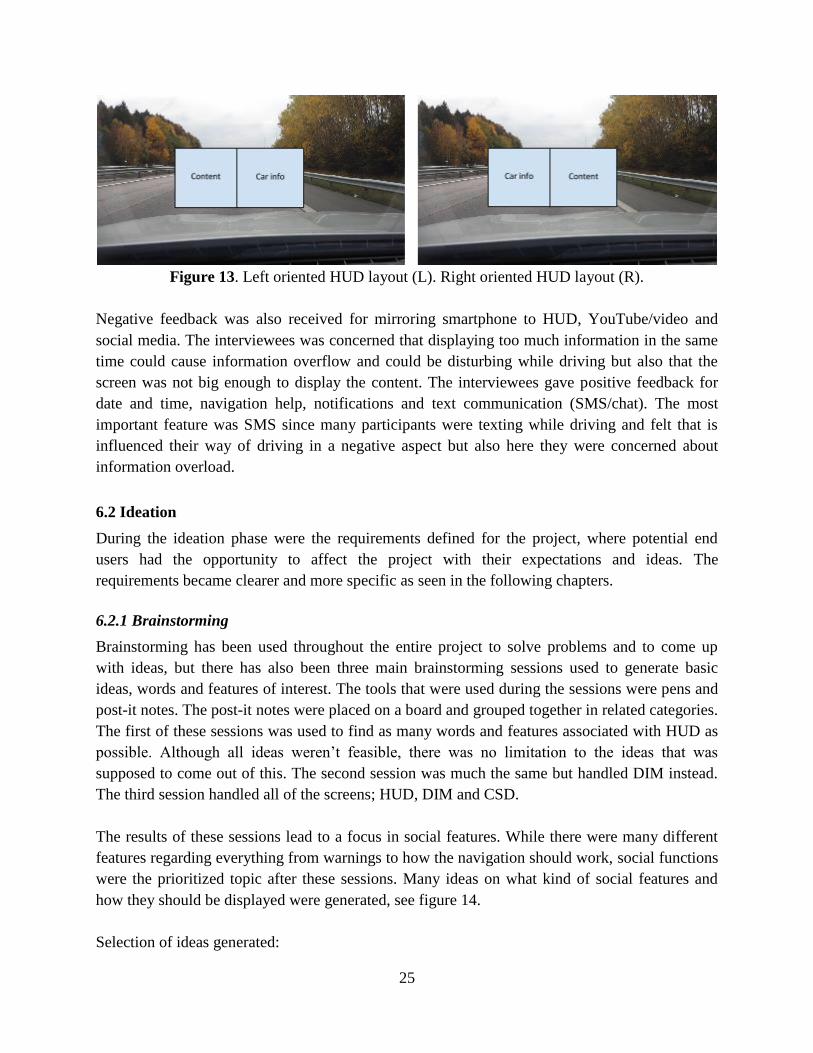
The results of these sessions lead to a focus in social features. While there were many different
features regarding everything from warnings to how the navigation should work, social functions
were the prioritized topic after these sessions. Many ideas on what kind of social features and
how they should be displayed were generated, see figure 14.
Selection of ideas generated:
26
● Full Twitter, Facebook and Instagram integration
● Able to see friends who are driving
● Mirror smartphone in HUD
● Mail, Chat and SMS etc
For full result of the brainstorming sessions, see appendix C.
Figure 14. Results from brainstorming sessions around HUD, CSD and DIM
6.2.2 User Stories
To create more refined ideas, relevant for different situation, user stories were created. Ideas
from the brainstorming session were used and combined to be of use in real driving scenarios.
These were used as reality checks so there were actual situation where an included features
might be used. This made them more realistic and also lead to new ideas. The user stories
handled different situation from a driver’s perspective. Although this was minor part of the
ideation phase, it was still very useful.
The user stories were stored in a matrix with the following columns; “As a/an”, “I want to…”
and “so that I...” thus became all stories easier to put into context. E.g. “As a driver, I want to be
more relaxed when driving for a longer period of time, so that I don't fall asleep and can focus
on more fun stuff”. Focus was unanimous on the driver because due to technical limitations that
only allows the driver to see the HUD. The situations that the driver could face was set into
context and made it possible to ensure what was important and relevant, and what could be
assigned a lower priority. A number of 36 user stories were created to be inspire the creation of
the prototype, for the full list of user stories, see appendix H.
27
6.2.3 Focus Groups
Focus group sessions were performed in groups of 7-8 users with mixed background to get input
on content, layout and design in the planning of the HUD. These sessions were held in meeting
rooms with whiteboard and the participants had access to paper, pens and post-its. The moderator
introduced the subject and the participants had the opportunity to introduce themselves around
the table. Initially the moderator started with questions regarding their prior knowledge to the
subject and then the focus group started to discuss the questions the moderator supplied to them.
The moderator then controlled the discussion subject by introducing new questions and by
asking follow up questions for the group to answer. Sketching was also took a big part of the
sessions were each participant created a few sketches of possible HUDs. The sessions with
participants that did not have much or any experience in the car industry was more prone to
discussing the different features and possibilities while those with more experience were more
focused on creating detailed sketches. Each session was also monitored by a note taker that wrote
a transcript of the discussion. The session was recorded with a tape recorder to assure that the
material could be further analyzed in a later stage. The material was later analyzed and structured
in a report, see appendix E.
The first session consisted of a mix of both young male and female participants with an academic
background with no prior experience from using HUD in vehicles. The participants revealed that
the automotive information (speed, speed limit and handbrake indication etc.) was more
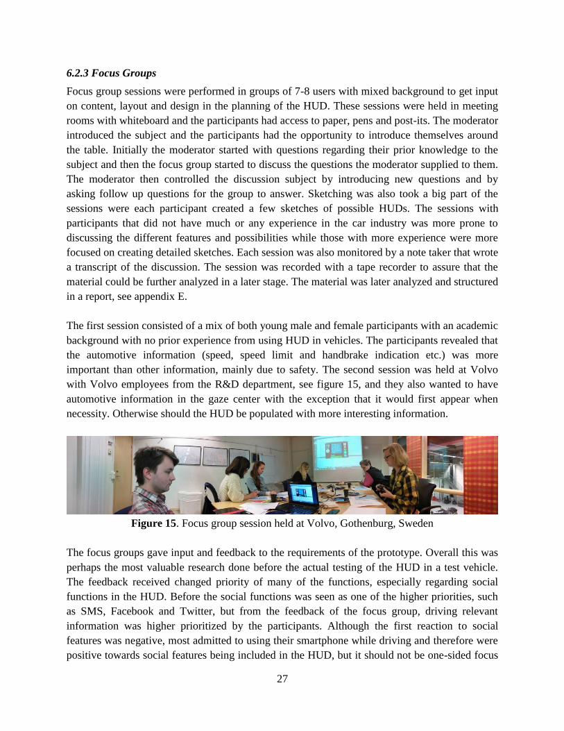
important than other information, mainly due to safety. The second session was held at Volvo
with Volvo employees from the R&D department, see figure 15, and they also wanted to have
automotive information in the gaze center with the exception that it would first appear when
necessity. Otherwise should the HUD be populated with more interesting information.
Figure 15. Focus group session held at Volvo, Gothenburg, Sweden
The focus groups gave input and feedback to the requirements of the prototype. Overall this was
perhaps the most valuable research done before the actual testing of the HUD in a test vehicle.
The feedback received changed priority of many of the functions, especially regarding social
functions in the HUD. Before the social functions was seen as one of the higher priorities, such
as SMS, Facebook and Twitter, but from the feedback of the focus group, driving relevant
information was higher prioritized by the participants. Although the first reaction to social
features was negative, most admitted to using their smartphone while driving and therefore were
positive towards social features being included in the HUD, but it should not be one-sided focus
28
on social features. Many of the suggestions that came up were futuristic and were in the forefront
of technology.
6.3 Concept Generation & Design
The concept generation and design is the phase where the first creative versions of the HUD take
its shape in the form of sketches, wireframes and graphical mock-ups.
6.3.1 Sketching
Sketching has been used as a design method throughout the entire project. It has been used as an
aid during brainstorming, concept generation and in focus groups. It has also been the main tool
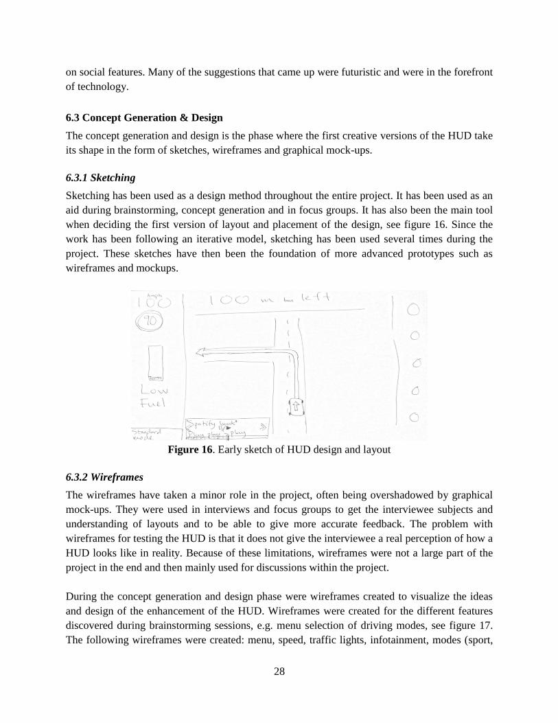
when deciding the first version of layout and placement of the design, see figure 16. Since the
work has been following an iterative model, sketching has been used several times during the
project. These sketches have then been the foundation of more advanced prototypes such as
wireframes and mockups.
Figure 16. Early sketch of HUD design and layout
6.3.2 Wireframes
The wireframes have taken a minor role in the project, often being overshadowed by graphical
mock-ups. They were used in interviews and focus groups to get the interviewee subjects and
understanding of layouts and to be able to give more accurate feedback. The problem with
wireframes for testing the HUD is that it does not give the interviewee a real perception of how a
HUD looks like in reality. Because of these limitations, wireframes were not a large part of the
project in the end and then mainly used for discussions within the project.
During the concept generation and design phase were wireframes created to visualize the ideas
and design of the enhancement of the HUD. Wireframes were created for the different features
discovered during brainstorming sessions, e.g. menu selection of driving modes, see figure 17.
The following wireframes were created: menu, speed, traffic lights, infotainment, modes (sport,
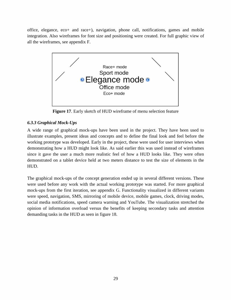
29
office, elegance, eco+ and race+), navigation, phone call, notifications, games and mobile
integration. Also wireframes for font size and positioning were created. For full graphic view of
all the wireframes, see appendix F.
Figure 17. Early sketch of HUD wireframe of menu selection feature
6.3.3 Graphical Mock-Ups
A wide range of graphical mock-ups have been used in the project. They have been used to
illustrate examples, present ideas and concepts and to define the final look and feel before the
working prototype was developed. Early in the project, these were used for user interviews when
demonstrating how a HUD might look like. As said earlier this was used instead of wireframes
since it gave the user a much more realistic feel of how a HUD looks like. They were often
demonstrated on a tablet device held at two meters distance to test the size of elements in the
HUD.
The graphical mock-ups of the concept generation ended up in several different versions. These
were used before any work with the actual working prototype was started. For more graphical
mock-ups from the first iteration, see appendix G. Functionality visualized in different variants
were speed, navigation, SMS, mirroring of mobile device, mobile games, clock, driving modes,
social media notifications, speed camera warning and YouTube. The visualization stretched the
opinion of information overload versus the benefits of keeping secondary tasks and attention
demanding tasks in the HUD as seen in figure 18.
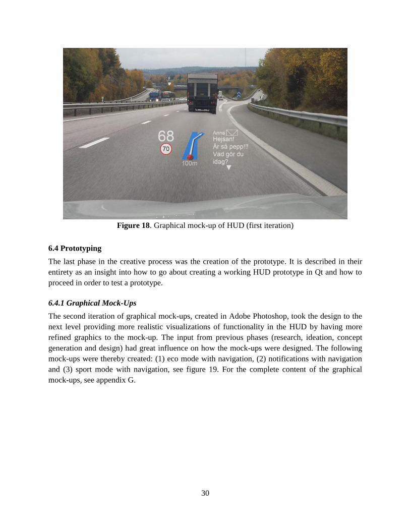
30
Figure 18. Graphical mock-up of HUD (first iteration)
6.4 Prototyping
The last phase in the creative process was the creation of the prototype. It is described in their
entirety as an insight into how to go about creating a working HUD prototype in Qt and how to
proceed in order to test a prototype.
6.4.1 Graphical Mock-Ups
The second iteration of graphical mock-ups, created in Adobe Photoshop, took the design to the
next level providing more realistic visualizations of functionality in the HUD by having more
refined graphics to the mock-up. The input from previous phases (research, ideation, concept
generation and design) had great influence on how the mock-ups were designed. The following
mock-ups were thereby created: (1) eco mode with navigation, (2) notifications with navigation
and (3) sport mode with navigation, see figure 19. For the complete content of the graphical
mock-ups, see appendix G.
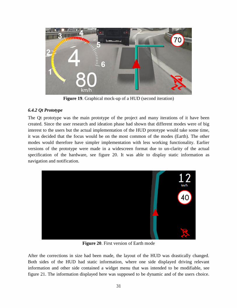
31
Figure 19. Graphical mock-up of a HUD (second iteration)
6.4.2 Qt Prototype
The Qt prototype was the main prototype of the project and many iterations of it have been
created. Since the user research and ideation phase had shown that different modes were of big
interest to the users but the actual implementation of the HUD prototype would take some time,
it was decided that the focus would be on the most common of the modes (Earth). The other
modes would therefore have simpler implementation with less working functionality. Earlier
versions of the prototype were made in a widescreen format due to un-clarity of the actual
specification of the hardware, see figure 20. It was able to display static information as
navigation and notification.
Figure 20. First version of Earth mode
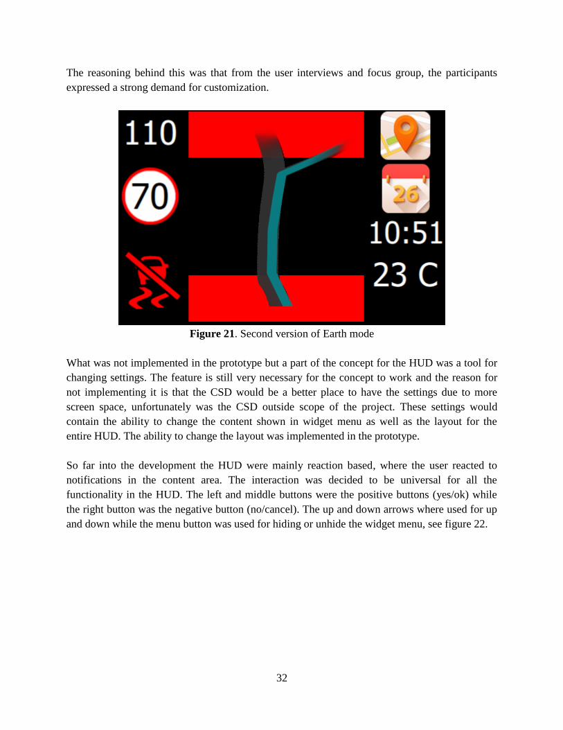
After the corrections in size had been made, the layout of the HUD was drastically changed.
Both sides of the HUD had static information, where one side displayed driving relevant
information and other side contained a widget menu that was intended to be modifiable, see
figure 21. The information displayed here was supposed to be dynamic and of the users choice.
32
The reasoning behind this was that from the user interviews and focus group, the participants
expressed a strong demand for customization.
Figure 21. Second version of Earth mode
What was not implemented in the prototype but a part of the concept for the HUD was a tool for
changing settings. The feature is still very necessary for the concept to work and the reason for
not implementing it is that the CSD would be a better place to have the settings due to more
screen space, unfortunately was the CSD outside scope of the project. These settings would
contain the ability to change the content shown in widget menu as well as the layout for the
entire HUD. The ability to change the layout was implemented in the prototype.
So far into the development the HUD were mainly reaction based, where the user reacted to
notifications in the content area. The interaction was decided to be universal for all the
functionality in the HUD. The left and middle buttons were the positive buttons (yes/ok) while
the right button was the negative button (no/cancel). The up and down arrows where used for up
and down while the menu button was used for hiding or unhide the widget menu, see figure 22.
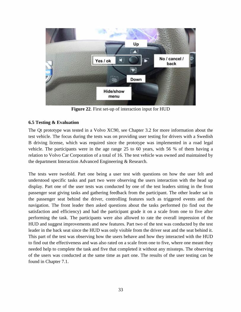
33
Figure 22. First set-up of interaction input for HUD
6.5 Testing & Evaluation
The Qt prototype was tested in a Volvo XC90, see Chapter 3.2 for more information about the
test vehicle. The focus during the tests was on providing user testing for drivers with a Swedish
B driving license, which was required since the prototype was implemented in a road legal
vehicle. The participants were in the age range 25 to 60 years, with 56 % of them having a
relation to Volvo Car Corporation of a total of 16. The test vehicle was owned and maintained by
the department Interaction Advanced Engineering & Research.
The tests were twofold. Part one being a user test with questions on how the user felt and
understood specific tasks and part two were observing the users interaction with the head up
display. Part one of the user tests was conducted by one of the test leaders sitting in the front
passenger seat giving tasks and gathering feedback from the participant. The other leader sat in
the passenger seat behind the driver, controlling features such as triggered events and the
navigation. The front leader then asked questions about the tasks performed (to find out the
satisfaction and efficiency) and had the participant grade it on a scale from one to five after
performing the task. The participants were also allowed to rate the overall impression of the
HUD and suggest improvements and new features. Part two of the test was conducted by the test
leader in the back seat since the HUD was only visible from the driver seat and the seat behind it.
This part of the test was observing how the users behave and how they interacted with the HUD
to find out the effectiveness and was also rated on a scale from one to five, where one meant they
needed help to complete the task and five that completed it without any missteps. The observing
of the users was conducted at the same time as part one. The results of the user testing can be
found in Chapter 7.1.
34
7. Result
The results are divided into two sections, the HUD prototype in Qt seen in section 7.1 and the
HUD Enhancement Concept in section 7.2.
7.1 Evaluation of Qt HUD Prototype
The results from the user testing are presented in Table 1, 2, and 3, and in Diagram 1, 2 and 3.
All the features have been graded on the scale of 1 (low, i.e. failure) to 5 (high, i.e. flawless) in
satisfaction, effectiveness and efficiency. Satisfaction and effectiveness was collected through
questions to the test participants and the efficiency was rated by the observer in the back seat of
the test vehicle. The categories warnings and notifications consist of several different
components with an aggregated result, and the components are not presented individually. The
column Overall is the final grade that the test driver stated after testing the HUD prototype.
The test participants were also engaged in a discussion while driving, which resulted in
comments around the functionality and design of the Qt HUD prototype. From the beginning
there was a pin function in the navigation application that allowed the user to pin or unpin the
navigation application as default application, the functionality received strong criticism and the
function was automated. Many drivers also pointed out that the navigation application was also
lacking distance which they felt should be added. The first versions of the music player had more
visual feedback, as progress bar and timestamps, but the number of object were scaled down
after feedback from the test participants. One driver also suggested that the controls for the music
player, such as mute, play/pause, next/previous track should be present for the driver all the time
without entering an application to control the music, even when one is engaged in another
application. The double functionality to have play and pause on the same button was
unfortunately not always clear for all drivers.
While testing the voice application and the text application, some of the test drivers suggested
that visual cues could be of assistance while the driver was faced with choices to ease the
process. The phone application was something that many thought was well built but there was a
mix of opinions if the number in a phone call should be displayed or not, where the older crowd
thought the number was important while the younger crowd was content with just the name.
Good feedback was that all drivers could read the text in the text communication application and
many thought it to be as good as reading it in their cell phone. Something that was not
appreciated was the weather application with its blue snowflakes as weather animation, which
had very poor visibility.
Notifications and alerts had generally too small font size and sound was something most drivers
suggested to be added. The incoming phone call notification had already a ringtone and no one
missed that notification. Also, most notifications should to have at least one moving object in
them to alert the driver of their presence, since some drivers did not notice incoming
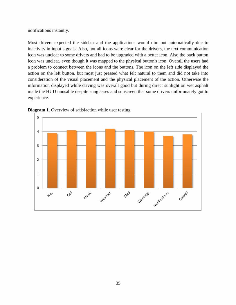
35
notifications instantly.
Most drivers expected the sidebar and the applications would dim out automatically due to
inactivity in input signals. Also, not all icons were clear for the drivers, the text communication
icon was unclear to some drivers and had to be upgraded with a better icon. Also the back button
icon was unclear, even though it was mapped to the physical button's icon. Overall the users had
a problem to connect between the icons and the buttons. The icon on the left side displayed the
action on the left button, but most just pressed what felt natural to them and did not take into
consideration of the visual placement and the physical placement of the action. Otherwise the
information displayed while driving was overall good but during direct sunlight on wet asphalt
made the HUD unusable despite sunglasses and sunscreen that some drivers unfortunately got to
experience.
Diagram 1. Overview of satisfaction while user testing
0
1
2
3
4
5
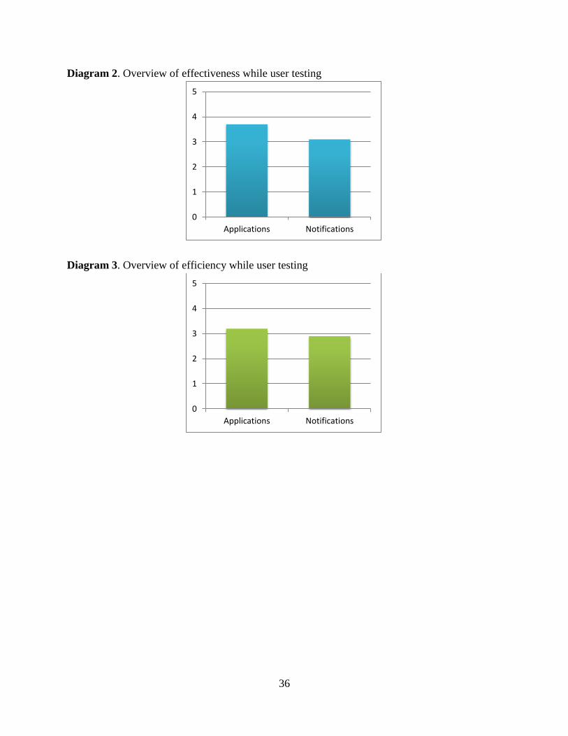
36
Diagram 2. Overview of effectiveness while user testing
Diagram 3. Overview of efficiency while user testing
0
1
2
3
4
5
Applications Notifications
0
1
2
3
4
5
Applications Notifications
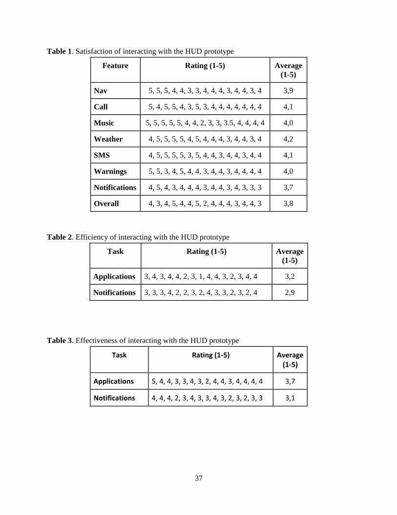
37
Table 1. Satisfaction of interacting with the HUD prototype
Feature Rating (1-5) Average
(1-5)
Nav 5, 5, 5, 4, 4, 3, 3, 4, 4, 4, 3, 4, 4, 3, 4 3,9
Call 5, 4, 5, 5, 4, 3, 5, 3, 4, 4, 4, 4, 4, 4, 4 4,1
Music 5, 5, 5, 5, 5, 4, 4, 2, 3, 3, 3.5, 4, 4, 4, 4 4,0
Weather 4, 5, 5, 5, 5, 4, 5, 4, 4, 4, 3, 4, 4, 3, 4 4,2
SMS 4, 5, 5, 5, 5, 3, 5, 4, 4, 3, 4, 4, 3, 4, 4 4,1
Warnings 5, 5, 3, 4, 5, 4, 4, 3, 4, 4, 3, 4, 4, 4, 4 4,0
Notifications 4, 5, 4, 3, 4, 4, 4, 3, 4, 4, 3, 4, 3, 3, 3 3,7
Overall 4, 3, 4, 5, 4, 4, 5, 2, 4, 4, 4, 3, 4, 4, 3 3,8
Table 2. Efficiency of interacting with the HUD prototype
Task Rating (1-5) Average
(1-5)
Applications 3, 4, 3, 4, 4, 2, 3, 1, 4, 4, 3, 2, 3, 4, 4 3,2
Notifications 3, 3, 3, 4, 2, 2, 3, 2, 4, 3, 3, 2, 3, 2, 4 2,9
Table 3. Effectiveness of interacting with the HUD prototype
Task Rating (1-5) Average (1-5)
Applications 5, 4, 4, 3, 3, 4, 3, 2, 4, 4, 3, 4, 4, 4, 4 3,7
Notifications 4, 4, 4, 2, 3, 4, 3, 3, 4, 3, 2, 3, 2, 3, 3 3,1
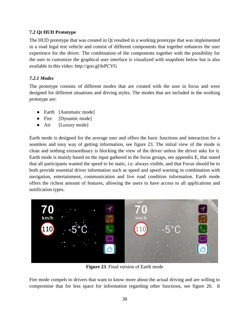
38
7.2 Qt HUD Prototype
The HUD prototype that was created in Qt resulted in a working prototype that was implemented
in a road legal test vehicle and consist of different components that together enhances the user
experience for the driver. The combination of the components together with the possibility for
the user to customize the graphical user interface is visualized with snapshots below but is also
available in this video: http://goo.gl/IePCVG
7.2.1 Modes
The prototype consists of different modes that are created with the user in focus and were
designed for different situations and driving styles. The modes that are included in the working
prototype are:
● Earth [Automatic mode]
● Fire [Dynamic mode]
● Air [Luxury mode]
Earth mode is designed for the average user and offers the basic functions and interaction for a
seamless and easy way of getting information, see figure 23. The initial view of the mode is
clean and nothing extraordinary is blocking the view of the driver unless the driver asks for it.
Earth mode is mainly based on the input gathered in the focus groups, see appendix E, that stated
that all participants wanted the speed to be static, i.e. always visible, and that Focus should be to
both provide essential driver information such as speed and speed warning in combination with
navigation, entertainment, communication and live road condition information. Earth mode
offers the richest amount of features, allowing the users to have access to all applications and
notification types.
Figure 23. Final version of Earth mode
Fire mode compels to drivers that want to know more about the actual driving and are willing to
compromise that for less space for information regarding other functions, see figure 26. It
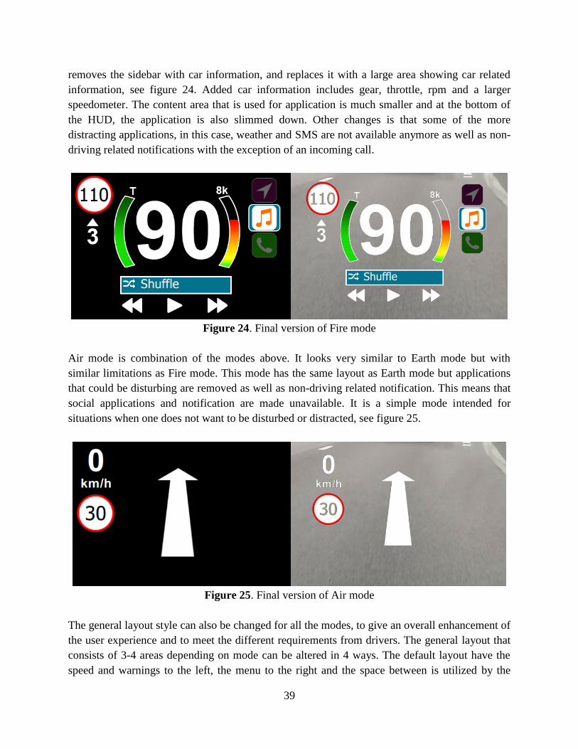
39
removes the sidebar with car information, and replaces it with a large area showing car related
information, see figure 24. Added car information includes gear, throttle, rpm and a larger
speedometer. The content area that is used for application is much smaller and at the bottom of
the HUD, the application is also slimmed down. Other changes is that some of the more
distracting applications, in this case, weather and SMS are not available anymore as well as non-
driving related notifications with the exception of an incoming call.
Figure 24. Final version of Fire mode
Air mode is combination of the modes above. It looks very similar to Earth mode but with
similar limitations as Fire mode. This mode has the same layout as Earth mode but applications
that could be disturbing are removed as well as non-driving related notification. This means that
social applications and notification are made unavailable. It is a simple mode intended for
situations when one does not want to be disturbed or distracted, see figure 25.
Figure 25. Final version of Air mode
The general layout style can also be changed for all the modes, to give an overall enhancement of
the user experience and to meet the different requirements from drivers. The general layout that
consists of 3-4 areas depending on mode can be altered in 4 ways. The default layout have the
speed and warnings to the left, the menu to the right and the space between is utilized by the
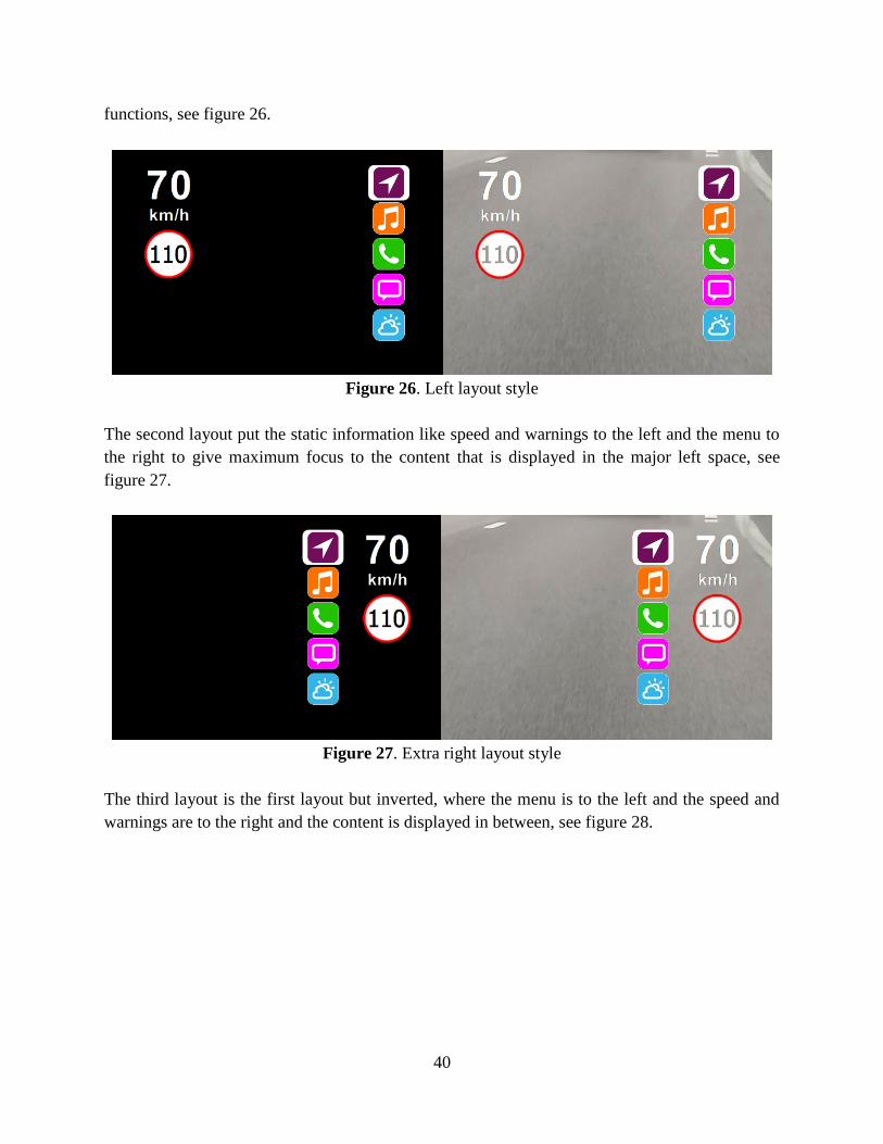
40
functions, see figure 26.
Figure 26. Left layout style
The second layout put the static information like speed and warnings to the left and the menu to
the right to give maximum focus to the content that is displayed in the major left space, see
figure 27.
Figure 27. Extra right layout style
The third layout is the first layout but inverted, where the menu is to the left and the speed and
warnings are to the right and the content is displayed in between, see figure 28.
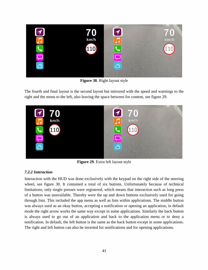
41
Figure 38. Right layout style
The fourth and final layout is the second layout but mirrored with the speed and warnings to the
right and the menu to the left, also leaving the space between for content, see figure 29.
Figure 29. Extra left layout style
7.2.2 Interaction
Interaction with the HUD was done exclusively with the keypad on the right side of the steering
wheel, see figure 30. It contained a total of six buttons. Unfortunately because of technical
limitations, only single presses were registered, which means that interaction such as long press
of a button was unavailable. Thereby were the up and down buttons exclusively used for going
through lists. This included the app menu as well as lists within applications. The middle button
was always used as an okay button, accepting a notification or opening an application, in default
mode the right arrow works the same way except in some applications. Similarly the back button
is always used to go out of an application and back to the application menu or to deny a
notification. In default, the left button is the same as the back button except in some applications.
The right and left button can also be inverted for notifications and for opening applications.
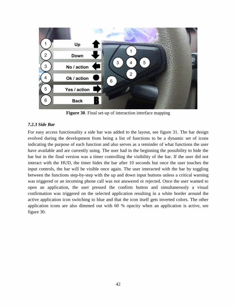
42
Figure 30. Final set-up of interaction interface mapping
7.2.3 Side Bar
For easy access functionality a side bar was added to the layout, see figure 31. The bar design
evolved during the development from being a list of functions to be a dynamic set of icons
indicating the purpose of each function and also serves as a reminder of what functions the user
have available and are currently using. The user had in the beginning the possibility to hide the
bar but in the final version was a timer controlling the visibility of the bar. If the user did not
interact with the HUD, the timer hides the bar after 10 seconds but once the user touches the
input controls, the bar will be visible once again. The user interacted with the bar by toggling
between the functions step-by-step with the up and down input buttons unless a critical warning
was triggered or an incoming phone call was not answered or rejected. Once the user wanted to
open an application, the user pressed the confirm button and simultaneously a visual
confirmation was triggered on the selected application resulting in a white border around the
active application icon switching to blue and that the icon itself gets inverted colors. The other
application icons are also dimmed out with 60 % opacity when an application is active, see
figure 30.
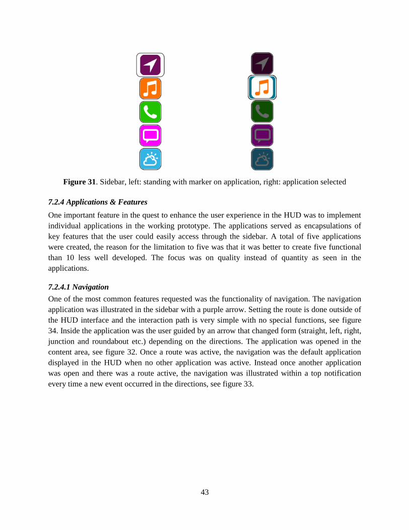
43
Figure 31. Sidebar, left: standing with marker on application, right: application selected
7.2.4 Applications & Features
One important feature in the quest to enhance the user experience in the HUD was to implement
individual applications in the working prototype. The applications served as encapsulations of
key features that the user could easily access through the sidebar. A total of five applications
were created, the reason for the limitation to five was that it was better to create five functional
than 10 less well developed. The focus was on quality instead of quantity as seen in the
applications.
7.2.4.1 Navigation
One of the most common features requested was the functionality of navigation. The navigation
application was illustrated in the sidebar with a purple arrow. Setting the route is done outside of
the HUD interface and the interaction path is very simple with no special functions, see figure
34. Inside the application was the user guided by an arrow that changed form (straight, left, right,
junction and roundabout etc.) depending on the directions. The application was opened in the
content area, see figure 32. Once a route was active, the navigation was the default application
displayed in the HUD when no other application was active. Instead once another application
was open and there was a route active, the navigation was illustrated within a top notification
every time a new event occurred in the directions, see figure 33.
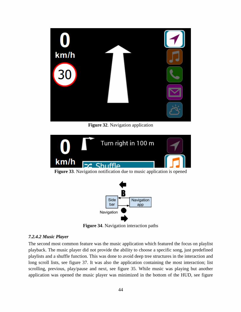
44
Figure 32. Navigation application
Figure 33. Navigation notification due to music application is opened
Figure 34. Navigation interaction paths
7.2.4.2 Music Player
The second most common feature was the music application which featured the focus on playlist
playback. The music player did not provide the ability to choose a specific song, just predefined
playlists and a shuffle function. This was done to avoid deep tree structures in the interaction and
long scroll lists, see figure 37. It was also the application containing the most interaction; list
scrolling, previous, play/pause and next, see figure 35. While music was playing but another
application was opened the music player was minimized in the bottom of the HUD, see figure
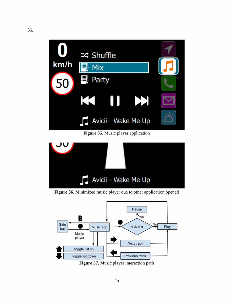
45
36.
Figure 35. Music player application
Figure 36. Minimized music player due to other application opened
Figure 37. Music player interaction path
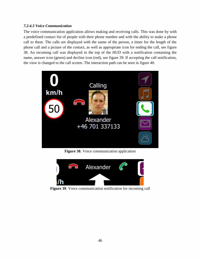
46
7.2.4.3 Voice Communication
The voice communication application allows making and receiving calls. This was done by with
a predefined contact list of people with their phone number and with the ability to make a phone
call to them. The calls are displayed with the name of the person, a timer for the length of the
phone call and a picture of the contact, as well as appropriate icon for ending the call, see figure
38. An incoming call was displayed in the top of the HUD with a notification containing the
name, answer icon (green) and decline icon (red), see figure 39. If accepting the call notification,
the view is changed to the call screen. The interaction path can be seen in figure 40.
Figure 38. Voice communication application
Figure 39. Voice communication notification for incoming call
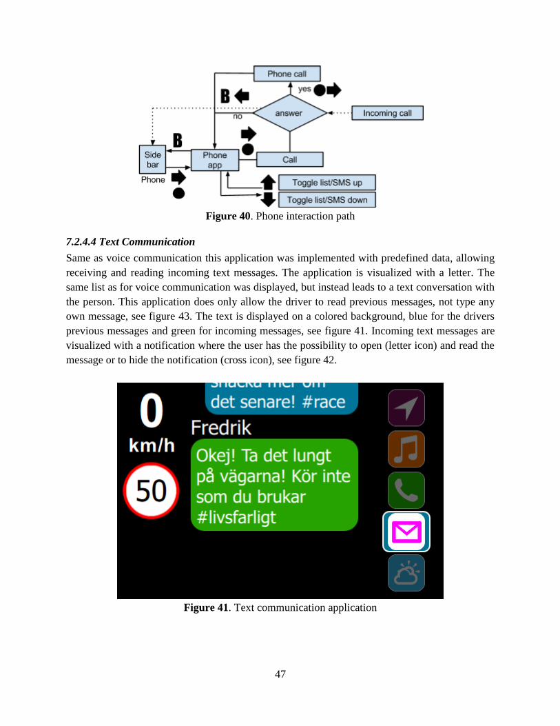
47
Figure 40. Phone interaction path
7.2.4.4 Text Communication
Same as voice communication this application was implemented with predefined data, allowing
receiving and reading incoming text messages. The application is visualized with a letter. The
same list as for voice communication was displayed, but instead leads to a text conversation with
the person. This application does only allow the driver to read previous messages, not type any
own message, see figure 43. The text is displayed on a colored background, blue for the drivers
previous messages and green for incoming messages, see figure 41. Incoming text messages are
visualized with a notification where the user has the possibility to open (letter icon) and read the
message or to hide the notification (cross icon), see figure 42.
Figure 41. Text communication application
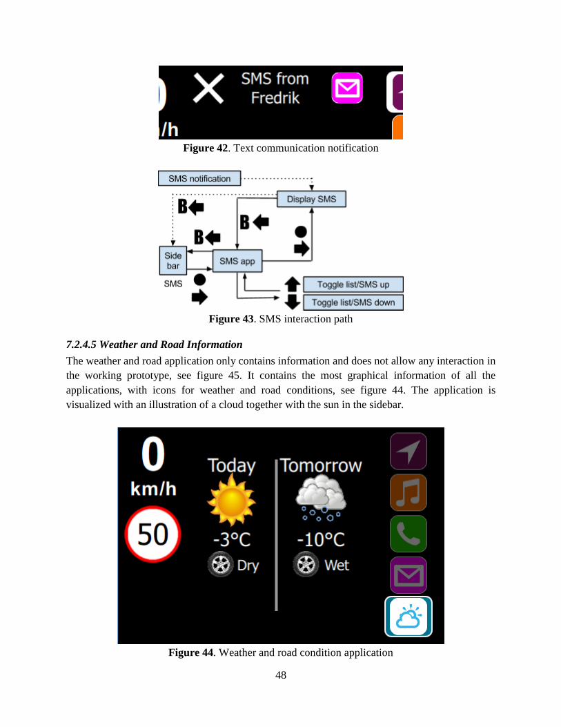
48
Figure 42. Text communication notification
Figure 43. SMS interaction path
7.2.4.5 Weather and Road Information
The weather and road application only contains information and does not allow any interaction in
the working prototype, see figure 45. It contains the most graphical information of all the
applications, with icons for weather and road conditions, see figure 44. The application is
visualized with an illustration of a cloud together with the sun in the sidebar.
Figure 44. Weather and road condition application

49
Figure 45. Weather interaction path
7.2.4.6 Features
Additional features, sub-applications, which could not be reached by the side bar, which the
system itself ruled over. The features are divided into notifications and warnings. Warnings
consist of vehicle malfunction alert, pedestrian alert, speed camera alert, traffic light alert,
speeding alert and low on fuel alert, see figure 46 and 47. The alerts are displayed in the top of
the HUD to best notify the driver and consist of an icon and a text description.
Figure 46. Fuel and traffic light alert
Figure 47. Speeding and traffic camera alert
Critical alerts are displayed in full screen, as the pedestrian alert that is displayed in the content
area, these alerts temporarily hides the current application in the content area and disables the
controls to take the full attention of the driver, see figure 48. The alert is visualized by a flashing
icon that switches color between orange and red in a pulsing repetitive manner.
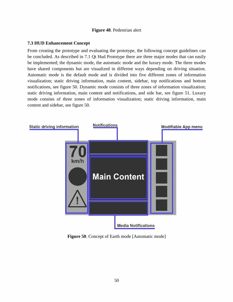
50
Figure 48. Pedestrian alert
7.3 HUD Enhancement Concept
From creating the prototype and evaluating the prototype, the following concept guidelines can
be concluded. As described in 7.1 Qt Hud Prototype there are three major modes that can easily
be implemented; the dynamic mode, the automatic mode and the luxury mode. The three modes
have shared components but are visualized in different ways depending on driving situation.
Automatic mode is the default mode and is divided into five different zones of information
visualization; static driving information, main content, sidebar, top notifications and bottom
notifications, see figure 50. Dynamic mode consists of three zones of information visualization;
static driving information, main content and notifications, and side bar, see figure 51. Luxury
mode consists of three zones of information visualization; static driving information, main
content and sidebar, see figure 50.
Figure 50. Concept of Earth mode [Automatic mode]
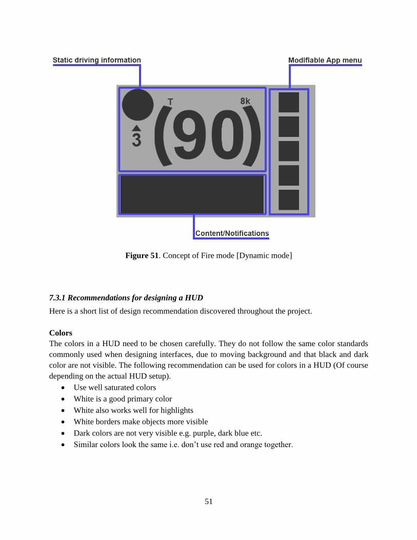
51
Figure 51. Concept of Fire mode [Dynamic mode]
7.3.1 Recommendations for designing a HUD
Here is a short list of design recommendation discovered throughout the project.
Colors
The colors in a HUD need to be chosen carefully. They do not follow the same color standards
commonly used when designing interfaces, due to moving background and that black and dark
color are not visible. The following recommendation can be used for colors in a HUD (Of course
depending on the actual HUD setup).
Use well saturated colors
White is a good primary color
White also works well for highlights
White borders make objects more visible
Dark colors are not very visible e.g. purple, dark blue etc.
Similar colors look the same i.e. don’t use red and orange together.
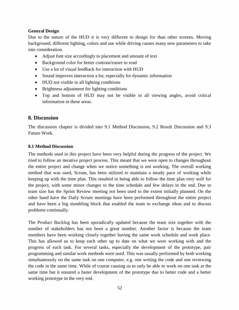
52
General Design
Due to the nature of the HUD it is very different to design for than other screens. Moving
background, different lighting, colors and use while driving causes many new parameters to take
into consideration.
Adjust font size accordingly to placement and amount of text
Background color for better contrast/easier to read
Use a lot of visual feedback for interaction with HUD
Sound improves interaction a lot, especially for dynamic information
HUD not visible in all lighting conditions
Brightness adjustment for lighting conditions
Top and bottom of HUD may not be visible in all viewing angles, avoid critical
information in these areas.
8. Discussion
The discussion chapter is divided into 9.1 Method Discussion, 9.2 Result Discussion and 9.3
Future Work.
8.1 Method Discussion
The methods used in this project have been very helpful during the progress of the project. We
tried to follow an iterative project process. This meant that we were open to changes throughout
the entire project and change when we notice something is not working. The overall working
method that was used, Scrum, has been utilized to maintain a steady pace of working while
keeping up with the time plan. This resulted in being able to follow the time plan very well for
the project, with some minor changes to the time schedule and few delays in the end. Due to
team size has the Sprint Review meeting not been used to the extent initially planned. On the
other hand have the Daily Scrum meetings have been performed throughout the entire project
and have been a big stumbling block that enabled the team to exchange ideas and to discuss
problems continually.
The Product Backlog has been sporadically updated because the team size together with the
number of stakeholders has not been a great number. Another factor is because the team
members have been working closely together having the same work schedule and work place.
This has allowed us to keep each other up to date on what we were working with and the
progress of each task. For several tasks, especially the development of the prototype, pair
programming and similar work methods were used. This was usually performed by both working
simultaneously on the same task on one computer, e.g. one writing the code and one reviewing
the code in the same time. While of course causing us to only be able to work on one task at the
same time but it ensured a faster development of the prototype due to better code and a better
working prototype in the very end.
53
The number of methods in relation to both team size and the timetable was ambitious. Great
focus had to be put on research and ideation phases relative to the concept, design, prototyping
and testing phases. This was an extra reminder in the final stages of the project, when the team's
ambitious requirements would be implemented; this resulted in the prioritization of scaling down
the number of features and functions. In hindsight it would probably been better with a more
focused approach, scaling down on the number of methods used as well as planning and
preparing it more.
The literature review resulted in a good starting point for developing car HMI and together with
the competitive analysis, we could get an comprehensive overview of how the market for HUD
stands today and what is expected to be launched in the future by competitors. The literature on
the subject of user experience in combination with HUD was not as explored as we had hoped.
We weren’t able to find many articles exploring similar projects. This made it time consuming to
find relevant articles on the topic since it was hard to find articles regarding UX in HUD. This is
not to say that the area was completely unexplored. For example the article “The Effects of a
Simulated Head-Up Display Speedometer on Perceptual Task Performance” suggests that a lot
of people would be interested in owning a car with a HUD. The competitive analysis on the other
hand was done very easily and greatly helped the effort to get an understanding of the area. It
provided several examples of other good as well as bad solutions regarding HUD, DIM and
CSD. This provided a very good foundation to start with and also made it easier finding relevant
articles. On closer reflection, it might have been better to perform the competitor analysis before
or at the same time as the literature review, where the analysis provided a good foundation in the
subject.
The requirements from the interview and the focus group proved to be the most useful in the
making of the prototype. According to David L. Morgan (1997), the preferred amount of focus
groups regarding the same subject should be three. Unfortunately though we were only able to
host two focus groups, it would have been ideal to have a third one but due to a lack of
participants who were able to participate simultaneously it was cancelled. In the two focus
groups we already had a good mixture of participants in relation to gender, age and experience of
HUD. The planned third group would have consisted of elderly participants with limited general
technical knowledge which would have complemented the existing selection.
Before any working prototype was developed, wireframes and mock-ups were used to visualize
the concept. The first generation of wireframes and mock-ups were used for both the interviews
and focus groups. The mock-ups were particularly useful but the wireframes were hard to apply
to the project, since many though they were hard to relate to and were difficult to put into
context. Most interview subjects and participants of the focus groups were not able to relate or
imagine how the concepts showed on the wireframe would actually work in a real environment.
54
While wireframes are usually good for deciding layouts and placement, when applying it on a
HUD for a car, it did not give any real useful feedback. The mock-ups on the other hand allowed
the users relate to how it could be used when driving and therefore was considered as better
feedback.
At first there were plans to host both workshops and focus groups. Although due to lack of time
and since the focus groups provided useful feedback and requirement for the project, it was
decided to cancel the workshops; the workshops became superfluous and redundant. However
since we also had performed interviews it was decided that we had enough user feedback at this
stage and started to put all the energy on creating a prototype that could be used for testing.
To create the working prototype we used the framework called Qt Quick. None of us had any
experience with it but once we had learnt the Qt Meta Language (QML) it was very easy to start
developing the Qt prototype by using the mock-ups as inspiration and guidance. Before Qt was
elected as the framework, several alternatives were considered, such as Adobe Flash and
Microsoft PowerPoint. We had worked with Adobe Flash before but since Volvo already worked
with Qt in similar projects and after a closer investigation it seemed more suitable to choose Qt
despite the team had no prior experience in the application framework. It was also tried and
discussed at first to build our own project from the ground to handle everything from button
presses to CAN signals but we quickly realized it would take more time than it was worth and
Volvo were able to lend a shell from one of their projects, HMI 2.0, that we could add our
project to. This made the integration with the test vehicle much easier and saved a lot of time.
However, there were some technical limitations because of this that made it so we could not
figure out how to stream video on the HUD and thus were unable to have it in our prototype.
While developing the prototype we also discovered a larger problem. The size ratio of the HUD
we worked against was not the same as the actual HUD in the test vehicle. This lead made it so
we had to redesign some features of the HUD. However we did discover this early in the
development phase and it did not however cause any big issues with the development. During the
development of the working prototype was also one of the most crucial times for evolving the
concept. A lot of different visibility and interaction problems were discovered. Especially since
we were finally able to interact with the prototype in the test vehicle and see how the graphics
were displayed in the HUD. This lead to several changes to the visual feedback and interaction.
Overall the progress with the prototype worked very well but we should probably have started
with the integration with the test vehicle earlier since that lead to a lot of changes and
improvements.
On the road user evaluation with external testers worked well to get feedback on the prototype,
deficiencies and errors were detected which pushed the development forward. The execution of
the testing could have been more structured, and it was not easy to ask questions to a
concentrated driver, who tried both to concentrate on the driving of a new car equipped with
55
HUD. When the driver was performing a task we focused more on observations of how efficient
the driver managed to solve the various tasks, and stopped asking questions. In the end we
managed to find a balance between asking questions and observing the driver. The test vehicle
that we had access to was an automatic XC90, a relative large vehicle. This lead to those drivers
often struggled with adapting to the vehicle as well as people used to manual gear changing had
problem in the beginning. This gave the drivers extra stress which of course had impact on the
result. Another problem that was realized is that most people have actually never driven a car
with a HUD or even seen one before. This meant that they had little to compare their experience
with and most thought it quite was different from anything they were used to which might have
impacted their feedback, making them more positive. To improve these user tests several
different approaches could have been used. Drivers who had previous experience with HUDs
could have been the participants. This would probably have made the initial adjustment easier as
well as giving the drivers something to compare their experience with. A wider selection of
vehicles could have allowed the drivers to experience the HUD in an environment they were
comfortable with. Perhaps though, the most effective approach would be to have test participants
use the test vehicle for a longer period of time and in private, to be able to evaluate how they
used the HUD and how well it worked when they had time to learn.
8.2 Result Discussion
The answer to the research question “How to increase user experience for HUDs in cars with
existing technology?” was tested with the working prototype that explored the possibilities to
increase the overall user experience in HUD. In our prototype we have done this by introducing
functionality traditionally found in different mediums in vehicles such as the DIM, CSD and
smartphone while also keeping features often found in competitors HUDs. As seen in the
competitor analysis, see appendix A, there are a few features that were almost always available
in HUDs regardless of brand. These features included speed and navigation. Feedback given
from the interviews and focus groups also promoted these features. The input given from our
user research was also the main reason for adding features from the other available screens in the
vehicle. To make this work we also figured that the driver had to be able to interact with the
HUD. This made also made it more unique compared to the other brands since they most often
displayed information or had very limited interaction. The main input though from focus groups
and interviews was modes and being able to choose what information to be displayed, although
under not completely. People wanted modes for about anything. We came up with the solution to
have applications in the HUD instead. Since a lot of the modes that were requested were very
similar, a different mode for each situation did not work well in practice. Instead the applications
could let the user access different features and it also made it more similar to how smartphones
work.
Before the testing phase was initialized, it was decided not to perform any tests with the
simulator, mainly because of the lack of HUD in the current simulator setup. The simulator could
56
had offered feedback regarding different levels of distraction within the HUD and given
feedback of the users’ eye movement with help of eye tracking technology. Although as
specified in the report, we limited ourselves from doing any clinical distraction tests.
The results from the user testing indicates good user satisfaction, but with more participants one
can verify that the results are correct and that all usability problems are found and thereby
enhanced the overall user experience. The limitations in the availability of the test vehicle were
one of the reasons for only testing the prototype with 15 drivers. Faulkner (2003) states that a
user test should at least be performed with 20 testers to be able to find a minimum of 95 % of all
usability problems and with 15 test participants, one will only find a minimum of 90 % of all
usability problems. Thereby was the result in the end not affected by the limited number of
participants. On the other hand should an international company with presence on the global
market perform the tests with different nationalities and with people from different segments and
experiences to truly find all problems.
The ratings from the user testing shows that the satisfaction level for all features in the Qt HUD
prototype, except the notifications, exceeds the overall rating of the HUD, see Diagram 1. The
reason for this could be argued but it is believed that the test drivers rate every individual feature
higher due to their novice experience of HUD in vehicles and that they in the end did not rate a
finished product but instead a working prototype. Although the feedback gathered from the user
testing had great impact on the end result, many features were removed such as the pin function
for navigation that was designed for engineers by engineers. This shows that one must be able to
design for all and not a specific group with specific experience and expertise. On the other hand
were the test participants more positive regarding how effective, see Diagram 2, they interacted
with the HUD in comparison with the effectiveness, see Diagram 3, that was observed by the test
leaders. Also this could be explained by the fact that the most test participants were not familiar
with a HUD and that they thereby overrated their performance. The test participants also
expressed an increased user experience due to the perceived increase in situational awareness as
well as less driver inattention and distraction by moving the functionality to the HUD where the
primary focus point is for the driver as the HUD reduces the driver distraction compared with
HDD, this is also seen in other studies comparing HUD and HDD (Nowakowski, Friedman &
Green, 2002). This is also supported by reducing the secondary tasks the driver need to do
outside the car interface and by introducing new ways of active safety to the focus point.
Then of course there is the discussion of what information is ethical to put in a HUD. With the
current HUD technology it offers the driver exclusiveness to the information ie. it is only the
driver and in some cases can the passenger behind the driver that can see the HUD but it is not in
a natural position for the passenger. This could cause mistrust for the vehicle occupants since all
except one, the driver, cannot get the potential crucial information that the HUD offers. The
passengers thereby do not know if the driver has received any important driving information

57
since information is exclusively displayed in the HUD. Another implication of this is that the
passenger could become unsure if the driver is actually focused on driving. Adding more features
could also mean more distraction and if this is displayed in the HUD, the driver could appear
focused on driving when actually performing other tasks. The ethics of where to display
information is something that probably has to be taken into consideration when developing a
HUD with enhanced user experience.
8.3 Future Work
There is a need of performing eye-tracking distraction test when only using the HUD prototype
on public roads, these tests should be performed on both experienced and inexperienced HUD
users for a longer period of time to find out the long term effects of placing more information in
the HUD. Further, future development of modes and applications generated from the ideation,
concept generation and design phase could explore the new ways of displaying information in
the HUD. Also development for embedding instant customization of the modes into the HUD
prototype could be interesting in order to offer a total experience within the car's interface. The
next step would be to move all the functionality in the DIM and CSD to the HUD and only
mirror the HUD content to the other displays. Further research can also be to find out how a
HUD for the future could look like, with no limitations on hardware (screen size and resolution)
to find the perfect user experience for HUD.
58
9. Conclusion
The thesis delivers a working HUD prototype in Qt that was installed in a Volvo XC90. The
prototype is fully connected to the steering wheel and allows the driver to interact with the HUD
and take advantage of functionality as phone, SMS, music, navigation, weather, notifications and
warnings. The project confirms the aim of the study, that one can increasing the user experience
for HUD by allowing the user to have his or her eyes on the road all the time by offering all the
essential functionality directly in the HUD so the driver can focus on the primary task of driving
the car. This is done by transferring information from the DIM, CSD and the driver’s mobile
phone to the HUD, and thereby allowing the HUD to be the only area for information. Allowing
the driver to personalize (applications) and customize (modes) the HUD allows one to increase
the user experience for different situations while taking into account the size, shape and color of
objects and the overall information load. Enhancing the user experience in HUD is a step in the
right direction in a global world where the lines between vehicle and technology is decreasing.
59
References
Airbus (2007) Airbus A318 approved for Head Up Display. Airbus.
http://www.airbus.com/presscentre/pressreleases/press-release-detail/detail/airbus-a318-
approved-for-head-up-display [2014-01-08].
Arnowitz, J., Arent M. & Berger N. (2007) Effective Prototyping for Software Makers.
Amsterdam: Elsevier Inc.
Boehm-Davis A D., Green, P A., Hideki, H., Marcus, A. & Wheatley, D. (2003) The Next
Revolution: Vehicle User-Interfaces and the Global Rider/Driver Experience. In CHI '03
Extended Abstracts on Human Factors in Computing Systems; April 05 - 10, 2003, Ft.
Lauderdale, FL, USA, p. 708– 709.
Buxton, B. (2007) Sketching User Experiences: getting the design right and the right design.
Burlington: Morgan Kaufmann Publishers
Car Head-Up Display (1969) Optics Technology, vol. 1, p. 109
Charissis, V. & Papanastasiou, S. (2010) Human-machine collaboration through vehicle head up
display interface. Cognition, Technology & Work, 12, p. 41-50.
Chis, A. (2010) GM’s Full Windshield HUD Technology Explained. autoevolution.
http://www.autoevolution.com/news/gms-full-windshield-hud-technology-explained-18454.html
[2013-09-25].
Celestine, C. (2009) 25 Useful Brainstorming Techniques. Personal Exellence.
http://personalexcellence.co/blog/25-brainstorming-techniques [2013-09-25].
Cockburn, A. (2001) Agile Software Development. Indianapolis: Addison-Wesley Professional
Cockburn, A. & Williams, L. (2000) The Costs and Benefits of Pair Programming. In eXtreme
Programming and Flexible Processes in Software Engineering XP2000; June 21-23, 2000,
Cagliari, Italy, p 223-247.
Cohn, M. (2004) User stories applied: for agile software development. Boston: Addison-Wesley
Coman, A. & Ronen, B. (2009) Focused SWOT: diagnosing critical strengths and weaknesses.
International Journal of Production Research, vol. 47: No. 20, p. 5677-5689.
60
Craft, R H. & Preslopsky, B. (2009) Driver Distraction and Inattention in the USA Large Truck
and National Motor Vehicle Crash Causation Studies. In First International Conference on
Driver Distraction and Inattention; Sept 28–29, 2009, Gothenburg, Sweden.
Egger, F N. (2000) Lo-Fi vs. Hi-Fi Prototyping: how real does the real thing have to be?
"Teaching HCI" workshop, OZCHI2000; December 14-19, 2000, Sydney, Australia.
Endsley, M R. (1995) Towards a theory of situation awareness in dynamic systems. Hum
Factors, 37, p. 32–64
Faulkner, L. (2003) Beyond the five-user assumption: Benefits of increased sample sizes in
usability testing. Behavior Research Methods, Instruments and Computers, vol 35, nr 3, p. 379-
383.
Howard, B. (2012) Digital dashboard: Why your car’s next instrument panel will be one big
LCD. ExtremeTech. http://www.extremetech.com/extreme/131485-digital-dashboard-why-your-
cars-next-instrument-panel-will-be-one-big-lcd [2013-09-25].
Huemer, A K. & Vollrath, M. (2011) Driver secondary tasks in Germany: Using interviews to
estimate prevalence. Accident Analysis and Prevention, vol 43, pp. 1703-1712 [2014-01-30].
IHS iSuppli (2013) Automotive Head-Up Display Market Goes into High Gear. iSuppli.
https://www.isuppli.com/Automotive-Infotainment-and-Telematics/News/Pages/Automotive-
Head-Up-Display-Market-Goes-into-High-Gear.aspx [2013-12-24].
Interaction Design Foundation (2004) Mock-ups. Interaction Design Foundation.
http://www.interaction-design.org/encyclopedia/mock-ups.html [2013-09-26].
International Organization for Standardization (ISO) (2010) ISO 9241-210 Ergonomics of human
system interaction: Human-centered design for interactive systems. Geneva: ISO
Klee, M. (2000) Five Paper Prototyping Tips. User Interface Engineering
http://www.uie.com/articles/prototyping_tips [2013-09-25].
Knopf, J W. (2006) Doing a Literature Review. Political Science and Politics. Vol. 39, No. 1, p.
127 - 132.
Knowles, M. (2002) How to Write a Competitive Analysis. Michael Knowles Consulting.
http://www.mwknowles.com/free_articles/companalysis/companalysis.html [2013-09-25].
61
Konigi (2013) Wireframes. Konigi. http://konigi.com/wiki/wireframes [2013-09-26].
Morgan, L D. (1997) Focus Group Guidebook. London: SAGE Publications.
Morville, P. (2004) User Experience Design. Semantic Studios.
http://semanticstudios.com/publications/semantics/000029.php [2014-01-31].
Nielsen, J. & Norman, D. (2013) The Definition of User Experience. Nielsen Norman Group.
http://www.nngroup.com/articles/definition-user-experience [2013-12-12].
Nowakowski, C., Friedman, D. & Green, P. (2002) An Experimental Evaluation of Using
Automotive HUDs to Reduce Driver Distraction While Answering Cell Phone. Proceedings of
the Human Factors and Ergonomics Society Annual Meeting. Vol. 46, No 22, p. 1819.
Olaverri-Monreal, C., Lehsing, C., Trübswetter, N., Schepp, C A. & Bengler, K. (2013) In-
Vehicle Displays: Driving Information Prioritization and Visualization. In 2013 IEEE Intelligent
Vehicles Symposium (IV); June 23-26, 2013, Gold Coast, Australia. p. 660-665.
Preece, J., Rogers, Y., & Sharp, H. (2002) Interaction design: beyond human-computer
interaction. New York: Wiley
Popular Mechanics (1955) Windshield TV Screen To Aid Blind Flying. Popular Mechanics.
March 1955, p. 101.
Private Fleet (2013) What is a Centre Console?. Private Fleet.
http://www.privatefleet.com.au/glossary/a-centre-console [2013-09-25].
Qt Digia (2013) About us. Qt Digia. http://qt.digia.com/About-us [2013-09-25].
Qt Project (2013) Getting Started Programming with Qt Quick. Qt Project. http://qt-
project.org/doc/qt-5.1/qtdoc/gettingstartedqml.html [2013-11-19].
Rabinowitz, P. (2013) Conducting a Workshop. Community Tool Box.
http://ctb.ku.edu/en/tablecontents/sub_section_main_1113.aspx [2013-09-25].
Reed, L E. (1998) Performing a Literature Review. In Frontiers in Education Conference; Nov
4-7, 1998, Tempe, AZ, USA, vol. 2, p. 380 - 383 vol. 1.
Regan, M A., Lee, J D. & Young K L. (2008) Driver Distraction: Theory, Effects, and
Mitigation. Boca Raton: CRC Press
62
Schwaber, K. & Sutherland, J. (2013) The Scrum Guide - The Definitive Guide to Scrum: The
Rules of the Game. http://scrum.org/Portals/0/Documents/Scrum%20Guides/2013/Scrum-
Guide.pdf [2013-09-25].
Scoltock, J. (2011) Automotive Engineer. Vol. 36 Issue 6, p. 38-38.
Sojourner, R.J. & Antin, J.F. (1990). The effects of a simulated head-up dis-
play speedometer on perceptual task performance. Human Factors, 32(3), 329-339
Stanton, A P. (2014) Heads-up displays. Access Science.
http://www.accessscience.com.proxy.lib.chalmers.se/content/heads-up-displays/YB140373
[2014-01-29]
Treat, J R. (1980) A study of precrash factors involved in traffic accidents. The HSRI Review, 10
May-Aug 1980.
Visocky O'Grady, V. & Visocky O'Grady K. (2006) A Designer's Research Manual: Succeed in
Design by Knowing Your Clients and What They Really Need (Design Field Guide).
Minneapolis: Rockport Publishers.
Volvo Cars (2013) The Safety Technology Within Our New Volvo Models. [YouTube].
http://www.youtube.com/watch?v=sy-sADBfb8E [2014-02-21].
Volvo Car Corporation (2013a) Technical Description of HMI 2.0 [unpublished internal
document].
Volvo Car Corporation (2013b) Volvo Sensus Connected Touch. Volvo Cars.
http://www.volvocars.com/se/sales-services/sales/sensus-connected-touch/pages/default.aspx
[2014-02-20].
Wilson, C. (2013) Brainstorming and beyond: a user-centered design method. Burlington:
Morgan Kaufmann Publishers.
Weinberg, G., Harsham, B. & Medenica, Z. (2011) Evaluating the usability of a head-up display
for selection from choice lists in cars. In AutomotiveUI '11 Proceedings of the 3rd International
Conference on Automotive User Interfaces and Interactive Vehicular Applications; 30 Nov - 2
Dec, 2011, Salzburg. pp. 39-46.

63
U.S. Dept. of Health and Human Services (2006) The Research-Based Web Design & Usability
Guidelines, Enlarged/Expanded edition. Washington: U.S. Government Printing Office.

Appendix A
Competitive Analysis of HUDs on market
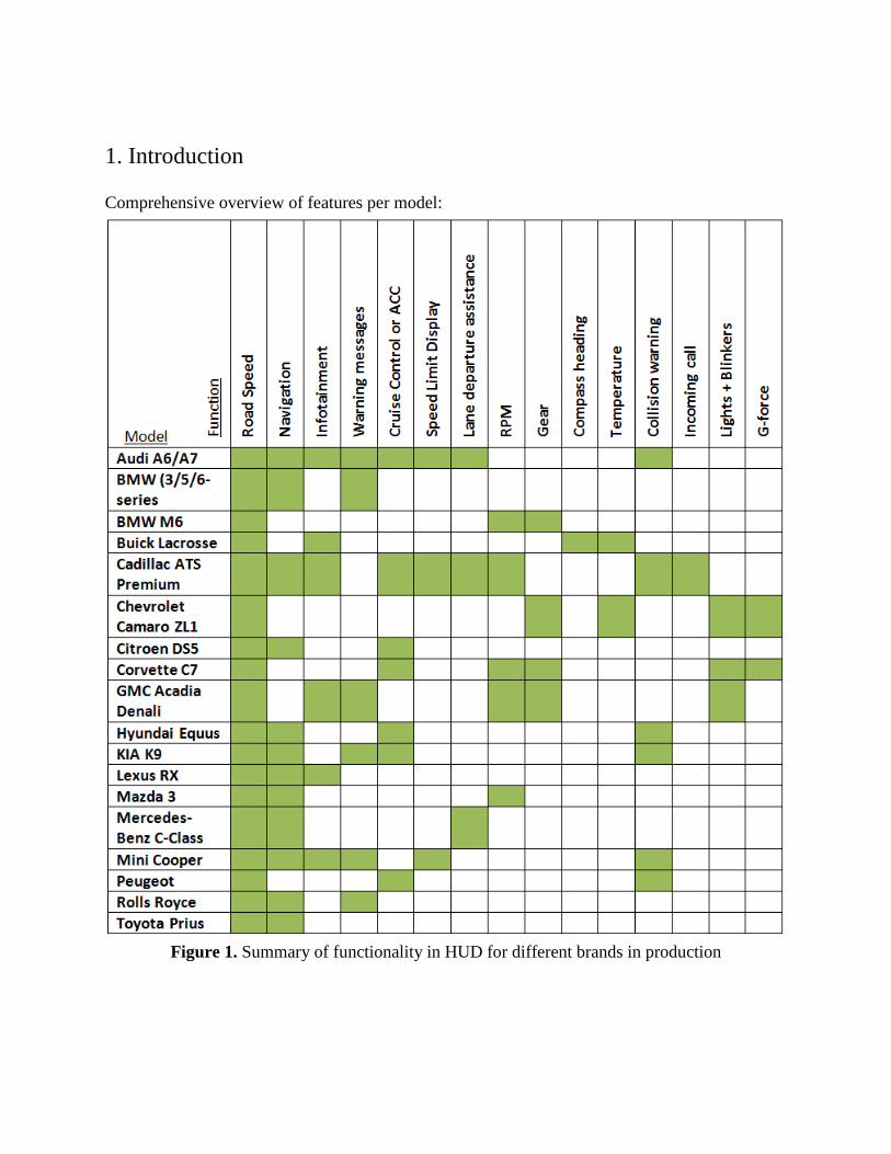
1. Introduction
Comprehensive overview of features per model:
Figure 1. Summary of functionality in HUD for different brands in production

1.1 Limitations Only published concepts and models and models with HUDs released on the market (until 2013-
11-15) from car manufacturers have been taken into consideration. Aftermarket solutions have
not been considered during the analysis.
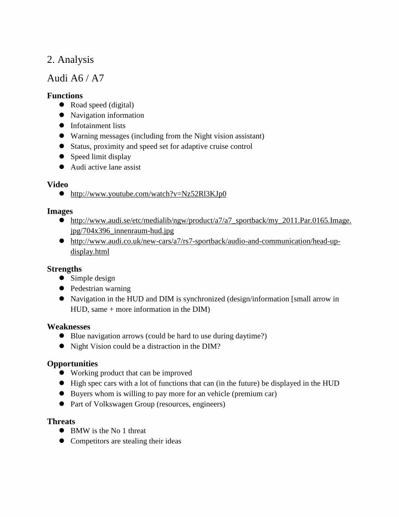
2. Analysis
Audi A6 / A7
Functions Road speed (digital)
Navigation information
Infotainment lists
Warning messages (including from the Night vision assistant)
Status, proximity and speed set for adaptive cruise control
Speed limit display
Audi active lane assist
Video http://www.youtube.com/watch?v=Nz52Rl3KJp0
Images http://www.audi.se/etc/medialib/ngw/product/a7/a7_sportback/my_2011.Par.0165.Image.
jpg/704x396_innenraum-hud.jpg
http://www.audi.co.uk/new-cars/a7/rs7-sportback/audio-and-communication/head-up-
display.html
Strengths Simple design
Pedestrian warning
Navigation in the HUD and DIM is synchronized (design/information [small arrow in
HUD, same + more information in the DIM)
Weaknesses Blue navigation arrows (could be hard to use during daytime?)
Night Vision could be a distraction in the DIM?
Opportunities Working product that can be improved
High spec cars with a lot of functions that can (in the future) be displayed in the HUD
Buyers whom is willing to pay more for an vehicle (premium car)
Part of Volkswagen Group (resources, engineers)
Threats BMW is the No 1 threat
Competitors are stealing their ideas
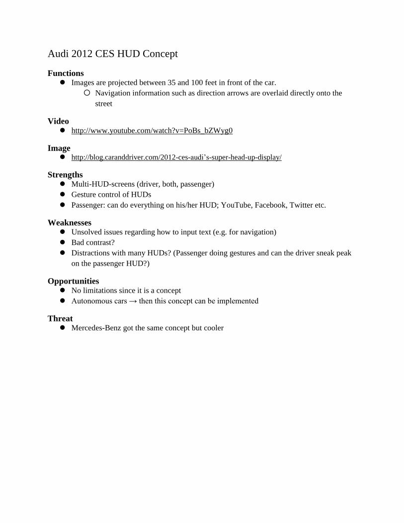
Audi 2012 CES HUD Concept
Functions Images are projected between 35 and 100 feet in front of the car.
Navigation information such as direction arrows are overlaid directly onto the
street
Video http://www.youtube.com/watch?v=PoBs_bZWyg0
Image http://blog.caranddriver.com/2012-ces-audi’s-super-head-up-display/
Strengths Multi-HUD-screens (driver, both, passenger)
Gesture control of HUDs
Passenger: can do everything on his/her HUD; YouTube, Facebook, Twitter etc.
Weaknesses Unsolved issues regarding how to input text (e.g. for navigation)
Bad contrast?
Distractions with many HUDs? (Passenger doing gestures and can the driver sneak peak
on the passenger HUD?)
Opportunities No limitations since it is a concept
Autonomous cars → then this concept can be implemented
Threat Mercedes-Benz got the same concept but cooler
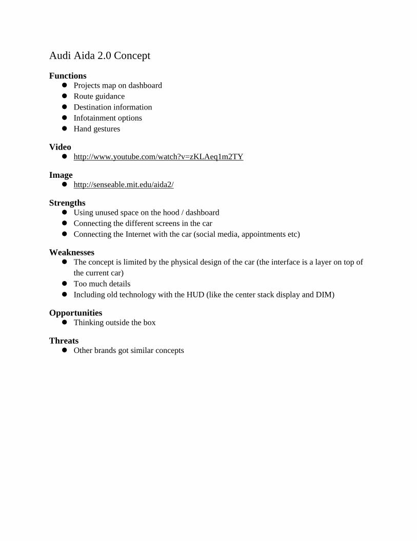
Audi Aida 2.0 Concept
Functions Projects map on dashboard
Route guidance
Destination information
Infotainment options
Hand gestures
Video http://www.youtube.com/watch?v=zKLAeq1m2TY
Image http://senseable.mit.edu/aida2/
Strengths Using unused space on the hood / dashboard
Connecting the different screens in the car
Connecting the Internet with the car (social media, appointments etc)
Weaknesses The concept is limited by the physical design of the car (the interface is a layer on top of
the current car)
Too much details
Including old technology with the HUD (like the center stack display and DIM)
Opportunities Thinking outside the box
Threats Other brands got similar concepts
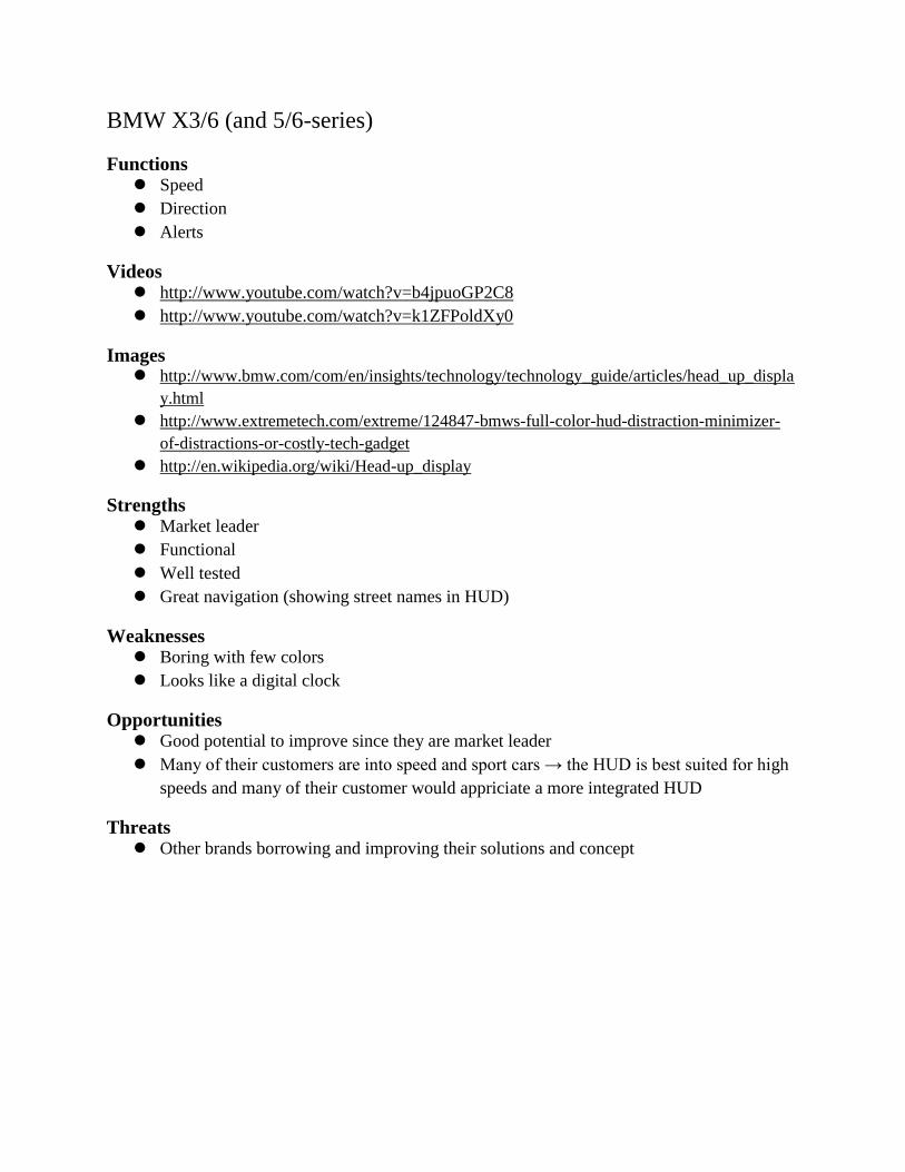
BMW X3/6 (and 5/6-series)
Functions Speed
Direction
Alerts
Videos http://www.youtube.com/watch?v=b4jpuoGP2C8
http://www.youtube.com/watch?v=k1ZFPoldXy0
Images http://www.bmw.com/com/en/insights/technology/technology_guide/articles/head_up_displa
y.html
http://www.extremetech.com/extreme/124847-bmws-full-color-hud-distraction-minimizer-
of-distractions-or-costly-tech-gadget
http://en.wikipedia.org/wiki/Head-up_display
Strengths Market leader
Functional
Well tested
Great navigation (showing street names in HUD)
Weaknesses Boring with few colors
Looks like a digital clock
Opportunities Good potential to improve since they are market leader
Many of their customers are into speed and sport cars → the HUD is best suited for high
speeds and many of their customer would appriciate a more integrated HUD
Threats Other brands borrowing and improving their solutions and concept
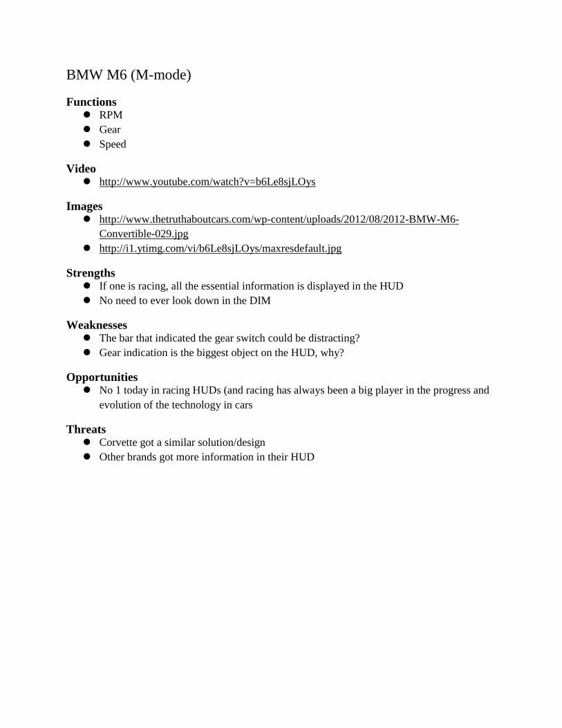
BMW M6 (M-mode)
Functions RPM
Gear
Speed
Video http://www.youtube.com/watch?v=b6Le8sjLOys
Images http://www.thetruthaboutcars.com/wp-content/uploads/2012/08/2012-BMW-M6-
Convertible-029.jpg
http://i1.ytimg.com/vi/b6Le8sjLOys/maxresdefault.jpg
Strengths If one is racing, all the essential information is displayed in the HUD
No need to ever look down in the DIM
Weaknesses The bar that indicated the gear switch could be distracting?
Gear indication is the biggest object on the HUD, why?
Opportunities No 1 today in racing HUDs (and racing has always been a big player in the progress and
evolution of the technology in cars
Threats Corvette got a similar solution/design
Other brands got more information in their HUD
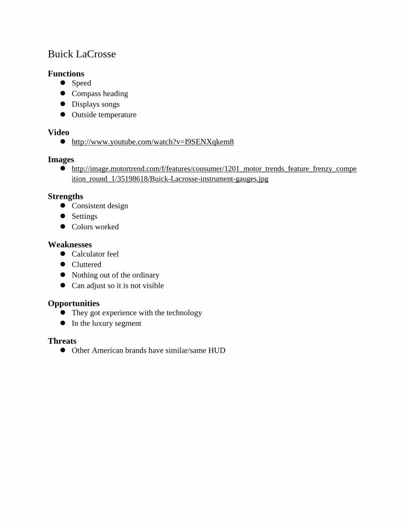
Buick LaCrosse
Functions Speed
Compass heading
Displays songs
Outside temperature
Video http://www.youtube.com/watch?v=I9SENXqkem8
Images http://image.motortrend.com/f/features/consumer/1201_motor_trends_feature_frenzy_compe
ition_round_1/35198618/Buick-Lacrosse-instrument-gauges.jpg
Strengths Consistent design
Settings
Colors worked
Weaknesses Calculator feel
Cluttered
Nothing out of the ordinary
Can adjust so it is not visible
Opportunities They got experience with the technology
In the luxury segment
Threats Other American brands have similar/same HUD
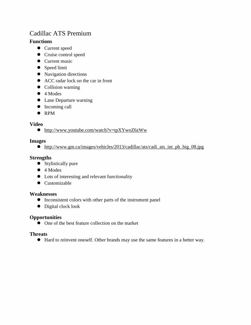
Cadillac ATS Premium
Functions
Current speed
Cruise control speed
Current music
Speed limit
Navigation directions
ACC radar lock on the car in front
Collision warning
4 Modes
Lane Departure warning
Incoming call
RPM
Video http://www.youtube.com/watch?v=tpXYwoZ6zWw
Images http://www.gm.ca/images/vehicles/2013/cadillac/ats/cadi_ats_int_ph_big_08.jpg
Strengths Stylistically pure
4 Modes
Lots of interesting and relevant functionality
Customizable
Weaknesses Inconsistent colors with other parts of the instrument panel
Digital clock look
Opportunities One of the best feature collection on the market
Threats Hard to reinvent oneself. Other brands may use the same features in a better way.
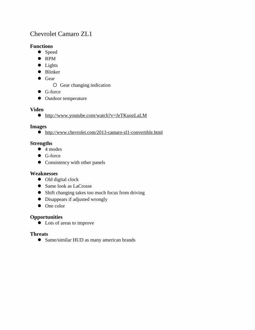
Chevrolet Camaro ZL1
Functions Speed
RPM
Lights
Blinker
Gear
Gear changing indication
G-force
Outdoor temperature
Video http://www.youtube.com/watch?v=JeTKuozLaLM
Images http://www.chevrolet.com/2013-camaro-zl1-convertible.html
Strengths 4 modes
G-force
Consistency with other panels
Weaknesses Old digital clock
Same look as LaCrosse
Shift changing takes too much focus from driving
Disappears if adjusted wrongly
One color
Opportunities Lots of areas to improve
Threats Same/similar HUD as many american brands
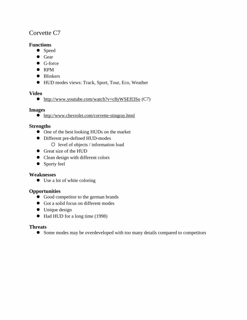
Corvette C7
Functions Speed
Gear
G-force
RPM
Blinkers
HUD modes views: Track, Sport, Tour, Eco, Weather
Video http://www.youtube.com/watch?v=c8yWSEfI3So (C7)
Images http://www.chevrolet.com/corvette-stingray.html
Strengths One of the best looking HUDs on the market
Different pre-defined HUD-modes
level of objects / information load
Great size of the HUD
Clean design with different colors
Sporty feel
Weaknesses Use a lot of white coloring
Opportunities Good competitor to the german brands
Got a solid focus on different modes
Unique design
Had HUD for a long time (1998)
Threats Some modes may be overdeveloped with too many details compared to competitors
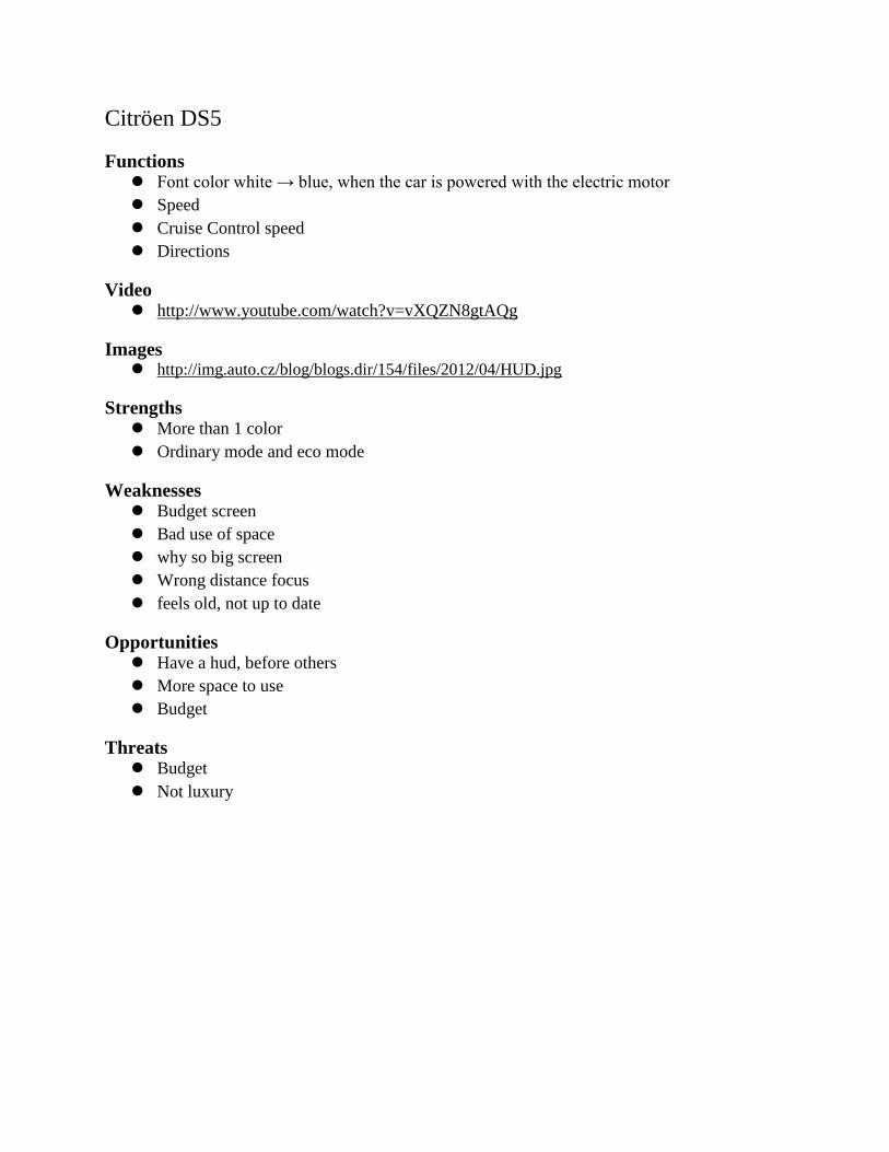
Citröen DS5
Functions Font color white → blue, when the car is powered with the electric motor
Speed
Cruise Control speed
Directions
Video http://www.youtube.com/watch?v=vXQZN8gtAQg
Images http://img.auto.cz/blog/blogs.dir/154/files/2012/04/HUD.jpg
Strengths More than 1 color
Ordinary mode and eco mode
Weaknesses Budget screen
Bad use of space
why so big screen
Wrong distance focus
feels old, not up to date
Opportunities Have a hud, before others
More space to use
Budget
Threats Budget
Not luxury
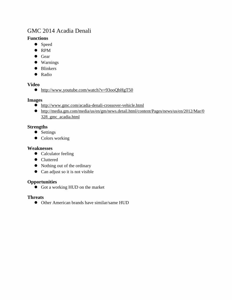
GMC 2014 Acadia Denali
Functions
Speed
RPM
Gear
Warnings
Blinkers
Radio
Video http://www.youtube.com/watch?v=93ooQbHgT50
Images http://www.gmc.com/acadia-denali-crossover-vehicle.html
http://media.gm.com/media/us/en/gm/news.detail.html/content/Pages/news/us/en/2012/Mar/0
328_gmc_acadia.html
Strengths Settings
Colors working
Weaknesses Calculator feeling
Cluttered
Nothing out of the ordinary
Can adjust so it is not visible
Opportunities Got a working HUD on the market
Threats Other American brands have similar/same HUD
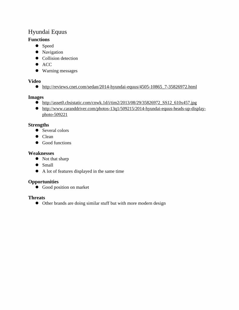
Hyundai Equus
Functions
Speed
Navigation
Collision detection
ACC
Warning messages
Video http://reviews.cnet.com/sedan/2014-hyundai-equus/4505-10865_7-35826972.html
Images http://asset0.cbsistatic.com/cnwk.1d/i/tim2/2013/08/29/35826972_SS12_610x457.jpg
http://www.caranddriver.com/photos-13q1/509215/2014-hyundai-equus-heads-up-display-
photo-509221
Strengths Several colors
Clean
Good functions
Weaknesses Not that sharp
Small
A lot of features displayed in the same time
Opportunities Good position on market
Threats Other brands are doing similar stuff but with more modern design
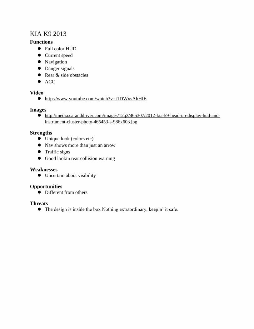
KIA K9 2013
Functions
Full color HUD
Current speed
Navigation
Danger signals
Rear & side obstacles
ACC
Video http://www.youtube.com/watch?v=t1DWxsAhHIE
Images http://media.caranddriver.com/images/12q3/465307/2012-kia-k9-head-up-display-hud-and-
instrument-cluster-photo-465453-s-986x603.jpg
Strengths Unique look (colors etc)
Nav shows more than just an arrow
Traffic signs
Good lookin rear collision warning
Weaknesses Uncertain about visibility
Opportunities Different from others
Threats The design is inside the box Nothing extraordinary, keepin’ it safe.
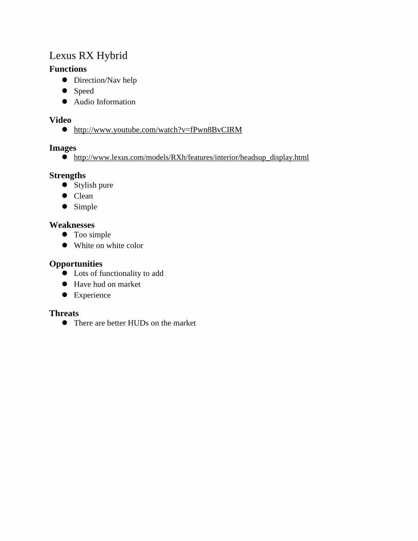
Lexus RX Hybrid
Functions
Direction/Nav help
Speed
Audio Information
Video http://www.youtube.com/watch?v=fPwn8BvCIRM
Images http://www.lexus.com/models/RXh/features/interior/headsup_display.html
Strengths Stylish pure
Clean
Simple
Weaknesses Too simple
White on white color
Opportunities Lots of functionality to add
Have hud on market
Experience
Threats There are better HUDs on the market

Mazda 3 2014
Functions Speed
RPM
Navigation help
Video http://www.youtube.com/watch?v=qR3b6ng94Ts
Images http://www.forbes.com/pictures/egdh45liil/a-new-take-on-the-head-up-display/
Strengths Distance focus
Cool feature to have a HUD scope on the dashboard
Weaknesses Budget/Plastic
Very small projection
Colors inconsistent
Too large screen compared to what is displayed in the HUD
Opportunities No one in budget HUD market
Threats Similar as Citroen/Peugeot
All other brands without plastic screen
Mercedes-Benz C-Class
Functions
Turn by turn nav
Road info
Speed
Lane keeping
Images http://www.carsguide.com.au/news-and-reviews/car-
news/mercedes_c_class_to_add_heads_up_display_option
http://mercedesbenzcolumbus.com/mercedes-benz-add-hud-system-new-models/
Strengths Two color navigation
Looks like a BMW (market leader)
Good functions
Elegant
Weaknesses Only a copy of other car brands
Boring colors
Opportunities Better looking than the competition
Threats Late on market
Mercedes-Benz Concept
Functions Speed
Video http://www.youtube.com/watch?v=-BfWS83vPks
Strengths Cool features & integration with the surroundings
Weaknesses Too far into the future/Unrealistic without autonomous
Opportunities Realise it!
If implemented will be coolest
Threats As a concept it is too far-fetched to be realized in the near future
Audi got a similar concept
Mini Cooper
Functions
Speed
Navigation
Optical signals
Traffic signs
Entertainment
Video http://www.youtube.com/watch?v=-BfWS83vPks
Images http://www.automotorsport.se/artiklar/nyheter/20130805/mini-cooper-narmar-sig-kommer-i-
host
Strengths Looks big (a lot of information displayed in the same time)
Weaknesses HUD on a plastic board could feels not in line with the sporty feeling of Mini
Not the most modern look of the HUD
Opportunities Could be one of the best in the budget HUD segment (the only one with 4-color)
Threats A lot of similar HUDs are already on the market
Peugeot
Functions Speed
Cruise control
Speed limiter
Distance alert information
Can be adjusted for driver height and light conditions
Video http://www.youtube.com/watch?v=NnwlJR-8QcU
Images http://cdn.caradvice.com.au/wp-content/uploads/2010/10/Peugeot-3008-16.jpg
Strengths Strong luminosity
Budget alternative
Weaknesses Budget screen
Bad use of space
Why so big screen
Wrong distance focus
Feels old, not up to date
Opportunities Have a hud, before others
More space to use
Budget
Threats Budget
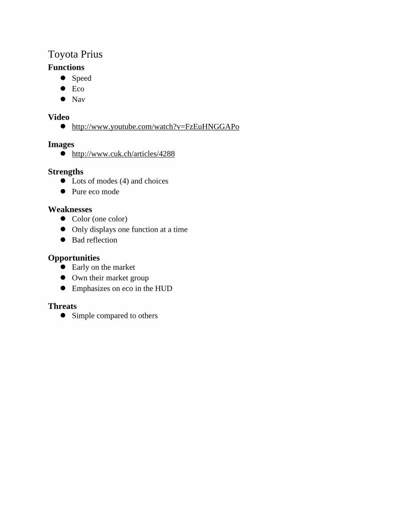
Toyota Prius
Functions
Speed
Eco
Nav
Video http://www.youtube.com/watch?v=FzEuHNGGAPo
Images http://www.cuk.ch/articles/4288
Strengths Lots of modes (4) and choices
Pure eco mode
Weaknesses Color (one color)
Only displays one function at a time
Bad reflection
Opportunities Early on the market
Own their market group
Emphasizes on eco in the HUD
Threats Simple compared to others

Appendix B
User Interview to find enhancements for HUD

Introduction A total of 8 interviews were performed during September 2013 to investigate what users thought
about the information displayed and placement/scale/design of information in HUD.
Method The interviewee was first introduced to the scope of the interview and was thereafter presented
with high-end mock-ups with different styles and features. The interviewer explained the
different features for each mock-up and asked what the interviewee thought about the mock-up.
It was performed as an open interview with no script nor predefined questions.
Results The result can be divided into 2 different standard answers regarding the layout of the
components in the HUD. The interviewees can be divided into 2 different groups, the ones that
want the content (e.g. SMS) to the left and the car information (e.g. speed) to the right (see Fig.
1), and the ones that want the opposite; content to the right and car information to the left (see
Fig. 2).
Fig 1. Content: SMS, fb, notifications etc.Car info: Speed, speed limit etc.
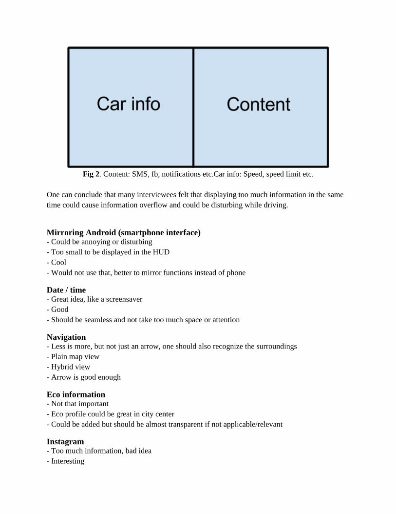
Fig 2. Content: SMS, fb, notifications etc.Car info: Speed, speed limit etc.
One can conclude that many interviewees felt that displaying too much information in the same
time could cause information overflow and could be disturbing while driving.
Mirroring Android (smartphone interface) - Could be annoying or disturbing
- Too small to be displayed in the HUD
- Cool
- Would not use that, better to mirror functions instead of phone
Date / time - Great idea, like a screensaver
- Good
- Should be seamless and not take too much space or attention
Navigation - Less is more, but not just an arrow, one should also recognize the surroundings
- Plain map view
- Hybrid view
- Arrow is good enough
Eco information - Not that important
- Eco profile could be great in city center
- Could be added but should be almost transparent if not applicable/relevant
Instagram - Too much information, bad idea
- Interesting
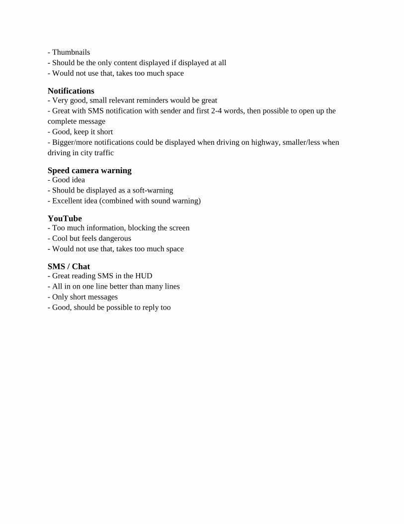
- Thumbnails
- Should be the only content displayed if displayed at all
- Would not use that, takes too much space
Notifications - Very good, small relevant reminders would be great
- Great with SMS notification with sender and first 2-4 words, then possible to open up the
complete message
- Good, keep it short
- Bigger/more notifications could be displayed when driving on highway, smaller/less when
driving in city traffic
Speed camera warning - Good idea
- Should be displayed as a soft-warning
- Excellent idea (combined with sound warning)
YouTube - Too much information, blocking the screen
- Cool but feels dangerous
- Would not use that, takes too much space
SMS / Chat - Great reading SMS in the HUD
- All in on one line better than many lines
- Only short messages
- Good, should be possible to reply too

Appendix C
Brainstorming sessions 1-3
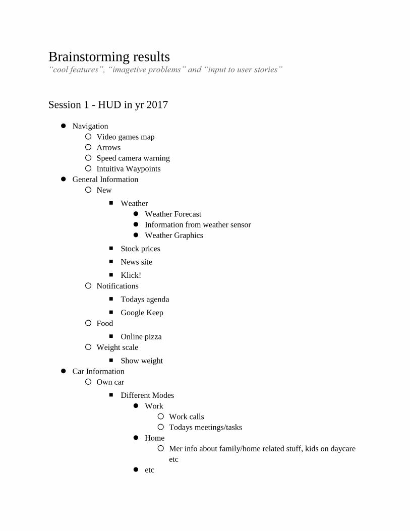
Brainstorming results “cool features”, “imagetive problems” and “input to user stories”
Session 1 - HUD in yr 2017
Navigation
Video games map
Arrows
Speed camera warning
Intuitiva Waypoints
General Information
New
■ Weather
Weather Forecast
Information from weather sensor
Weather Graphics
■ Stock prices
■ News site
■ Klick!
Notifications
■ Todays agenda
■ Google Keep
Food
■ Online pizza
Weight scale
■ Show weight
Car Information
Own car
■ Different Modes
Work
Work calls
Todays meetings/tasks
Home
Mer info about family/home related stuff, kids on daycare
etc
etc
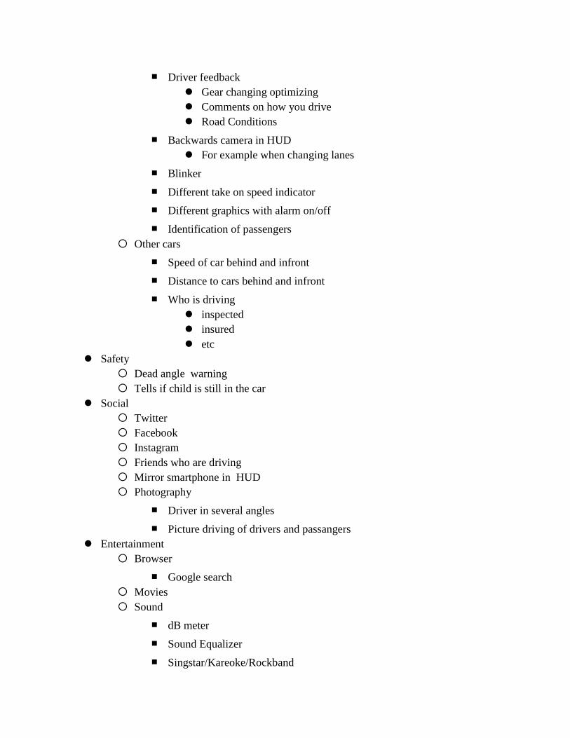
■ Driver feedback
Gear changing optimizing
Comments on how you drive
Road Conditions
■ Backwards camera in HUD
For example when changing lanes
■ Blinker
■ Different take on speed indicator
■ Different graphics with alarm on/off
■ Identification of passengers
Other cars
■ Speed of car behind and infront
■ Distance to cars behind and infront
■ Who is driving
inspected
insured
etc
Safety
Dead angle warning
Tells if child is still in the car
Social
Friends who are driving
Mirror smartphone in HUD
Photography
■ Driver in several angles
■ Picture driving of drivers and passangers
Entertainment
Browser
■ Google search
Movies
Sound
■ dB meter
■ Sound Equalizer
■ Singstar/Kareoke/Rockband
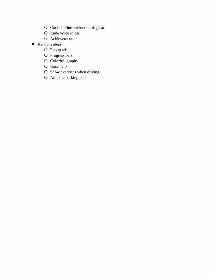
Cool clip/intro when starting car
Rude voice in car
Achievements
Random ideas
Popup ads
Progress bars
Colorfull graphs
Room 2.0
Show exercises when driving
Animate parkingticket
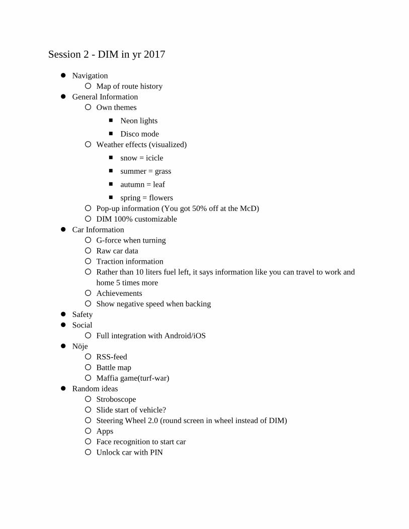
Session 2 - DIM in yr 2017
Navigation
Map of route history
General Information
Own themes
■ Neon lights
■ Disco mode
Weather effects (visualized)
■ snow = icicle
■ summer = grass
■ autumn = leaf
■ spring = flowers
Pop-up information (You got 50% off at the McD)
DIM 100% customizable
Car Information
G-force when turning
Raw car data
Traction information
Rather than 10 liters fuel left, it says information like you can travel to work and
home 5 times more
Achievements
Show negative speed when backing
Safety
Social
Full integration with Android/iOS
Nöje
RSS-feed
Battle map
Maffia game(turf-war)
Random ideas
Stroboscope
Slide start of vehicle?
Steering Wheel 2.0 (round screen in wheel instead of DIM)
Apps
Face recognition to start car
Unlock car with PIN
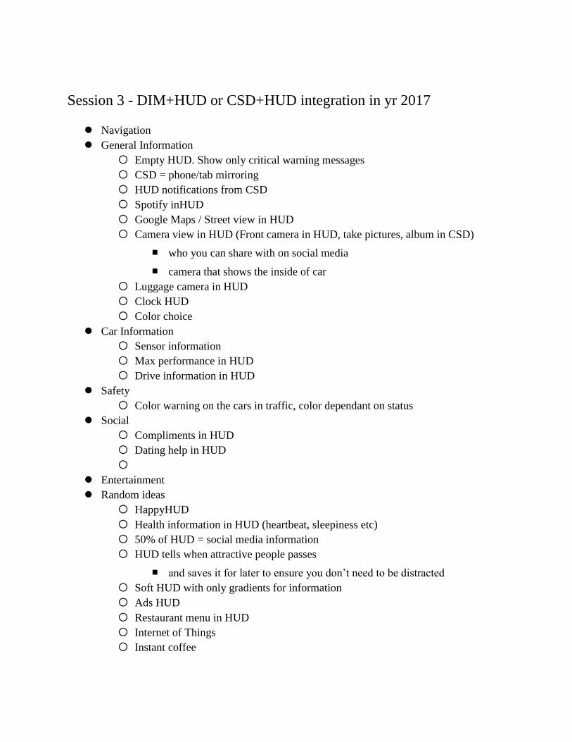
Session 3 - DIM+HUD or CSD+HUD integration in yr 2017
Navigation
General Information
Empty HUD. Show only critical warning messages
CSD = phone/tab mirroring
HUD notifications from CSD
Spotify inHUD
Google Maps / Street view in HUD
Camera view in HUD (Front camera in HUD, take pictures, album in CSD)
■ who you can share with on social media
■ camera that shows the inside of car
Luggage camera in HUD
Clock HUD
Color choice
Car Information
Sensor information
Max performance in HUD
Drive information in HUD
Safety
Color warning on the cars in traffic, color dependant on status
Social
Compliments in HUD
Dating help in HUD
Entertainment
Random ideas
HappyHUD
Health information in HUD (heartbeat, sleepiness etc)
50% of HUD = social media information
HUD tells when attractive people passes
■ and saves it for later to ensure you don’t need to be distracted
Soft HUD with only gradients for information
Ads HUD
Restaurant menu in HUD
Internet of Things
Instant coffee


Appendix D
Interview with PhD student Ingrid Persson
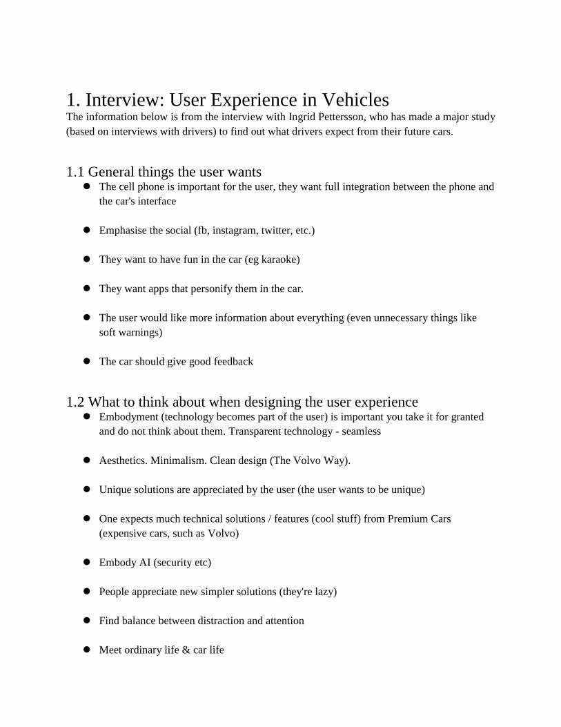
1. Interview: User Experience in Vehicles The information below is from the interview with Ingrid Pettersson, who has made a major study
(based on interviews with drivers) to find out what drivers expect from their future cars.
1.1 General things the user wants The cell phone is important for the user, they want full integration between the phone and
the car's interface
Emphasise the social (fb, instagram, twitter, etc.)
They want to have fun in the car (eg karaoke)
They want apps that personify them in the car.
The user would like more information about everything (even unnecessary things like
soft warnings)
The car should give good feedback
1.2 What to think about when designing the user experience Embodyment (technology becomes part of the user) is important you take it for granted
and do not think about them. Transparent technology - seamless
Aesthetics. Minimalism. Clean design (The Volvo Way).
Unique solutions are appreciated by the user (the user wants to be unique)
One expects much technical solutions / features (cool stuff) from Premium Cars
(expensive cars, such as Volvo)
Embody AI (security etc)
People appreciate new simpler solutions (they're lazy)
Find balance between distraction and attention
Meet ordinary life & car life
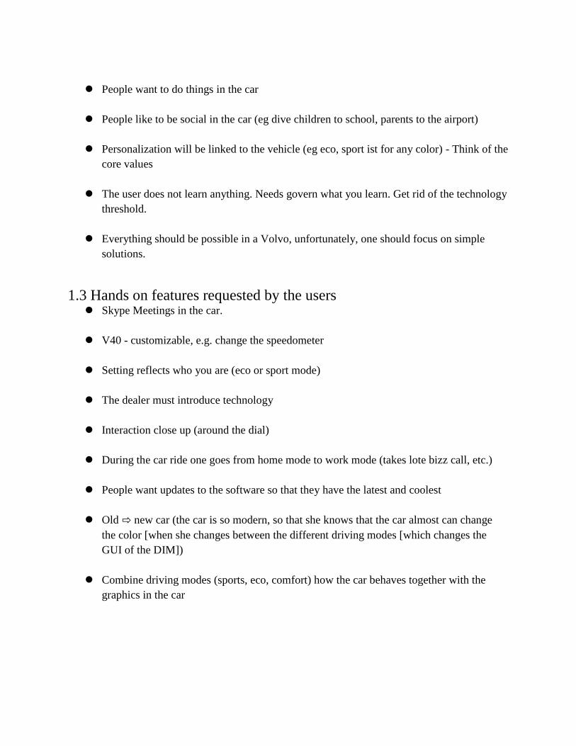
People want to do things in the car
People like to be social in the car (eg dive children to school, parents to the airport)
Personalization will be linked to the vehicle (eg eco, sport ist for any color) - Think of the
core values
The user does not learn anything. Needs govern what you learn. Get rid of the technology
threshold.
Everything should be possible in a Volvo, unfortunately, one should focus on simple
solutions.
1.3 Hands on features requested by the users Skype Meetings in the car.
V40 - customizable, e.g. change the speedometer
Setting reflects who you are (eco or sport mode)
The dealer must introduce technology
Interaction close up (around the dial)
During the car ride one goes from home mode to work mode (takes lote bizz call, etc.)
People want updates to the software so that they have the latest and coolest
Old ⇨ new car (the car is so modern, so that she knows that the car almost can change
the color [when she changes between the different driving modes [which changes the
GUI of the DIM])
Combine driving modes (sports, eco, comfort) how the car behaves together with the
graphics in the car

Appendix E
Focus Group: Next generation HUD

1. Focus Group Session #1 Participants: 7
Male/female: 5/2
Average age: 25
Date: 19/11/2013
Time: 01h:40m
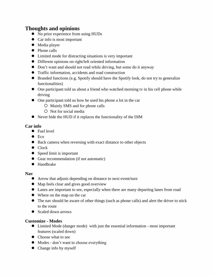
Thoughts and opinions No prior experience from using HUDs
Car info is most important
Media player
Phone calls
Limited mode for distracting situations is very important
Different opinions on right/left oriented information
Don’t want and should not read while driving, but some do it anyway
Traffic information, accidents and road construction
Branded functions (e.g. Spotify should have the Spotify look, do not try to generalize
functionalities)
One participant told us about a friend who watched morning tv in his cell phone while
driving
One participant told us how he used his phone a lot in the car
Mainly SMS and for phone calls
Not for social media
Never hide the HUD if it replaces the functionality of the DIM
Car info Fuel level
Eco
Back camera when reversing with exact distance to other objects
Clock
Speed limit is important
Gear recommendation (if not automatic)
Handbrake
Nav Arrow that adjusts depending on distance to next event/turn
Map feels clear and gives good overview
Lanes are important to see, especially when there are many departing lanes from road
Where on the map on the car
The nav should be aware of other things (such as phone calls) and alert the driver to stick
to the route
Scaled down arrows
Customize - Modes Limited Mode (danger mode) with just the essential information - most important
features (scaled down)
Choose what to see
Modes - don’t want to choose everything
Change info by myself
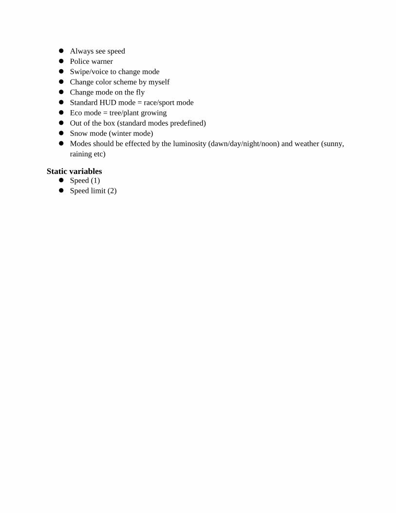
Always see speed
Police warner
Swipe/voice to change mode
Change color scheme by myself
Change mode on the fly
Standard HUD mode = race/sport mode
Eco mode = tree/plant growing
Out of the box (standard modes predefined)
Snow mode (winter mode)
Modes should be effected by the luminosity (dawn/day/night/noon) and weather (sunny,
raining etc)
Static variables Speed (1)
Speed limit (2)
Traffic info
Placement dependant on mode (dynamic?)
Familiarity is important
Driving help Parking help
Distance to other cars
Help with bad sight (fog/rain and so on)
Social Read sms or just hint about it
Notification → Preview version → Option to open it → Full screen display
Many people probably read and sms already when driving
Social media is an interesting feature, but could be unnecessary and overkill
Entertainment Video - big NONO
Should be at least 1080p in the HUD
Better than watching it on the phone
Music player - spotify and so on
Experience new music (personal radio)
Predefined playlists
Radio
Interaction Change modes with arrow keys
Left-right-up-down modes and so on
Not too many ways to interact
Natural interaction, don’t want to test their way to the right place
Selling point The participants would buy the Volvo
If the price was right (the HUD should be included free of charge)
If the HUD was more personalized towards the driver (the HUD should not be to
expensive)
■ The HUD alone does not motivate the grr gr CR gr gbuy
If one is deciding between 2 similar cars one would select the Volvo
■ If the Volvo had the personalized HUD
■ The other car had the standard HUD
Layout suggestions pics
2. Focus Group Session #2 Participants: 7
Male/female: 0/7
Average age: 30
Date: 19/11/2013
Time: 02h:00m
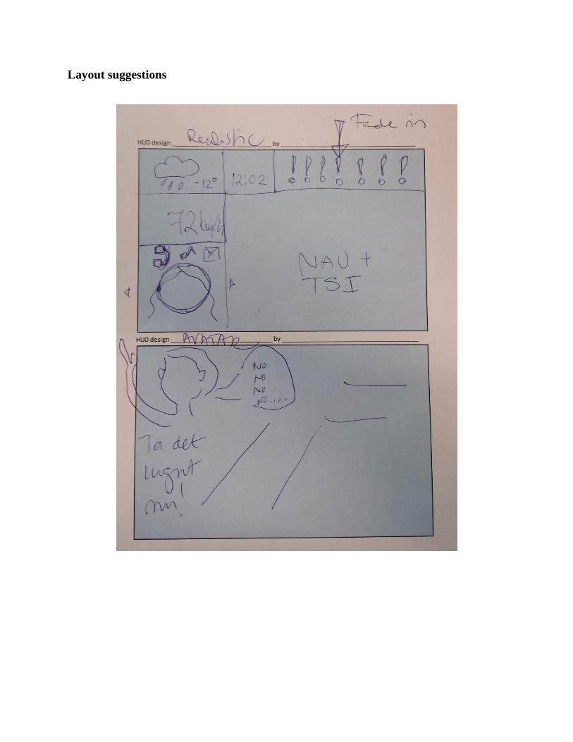
Layout suggestions
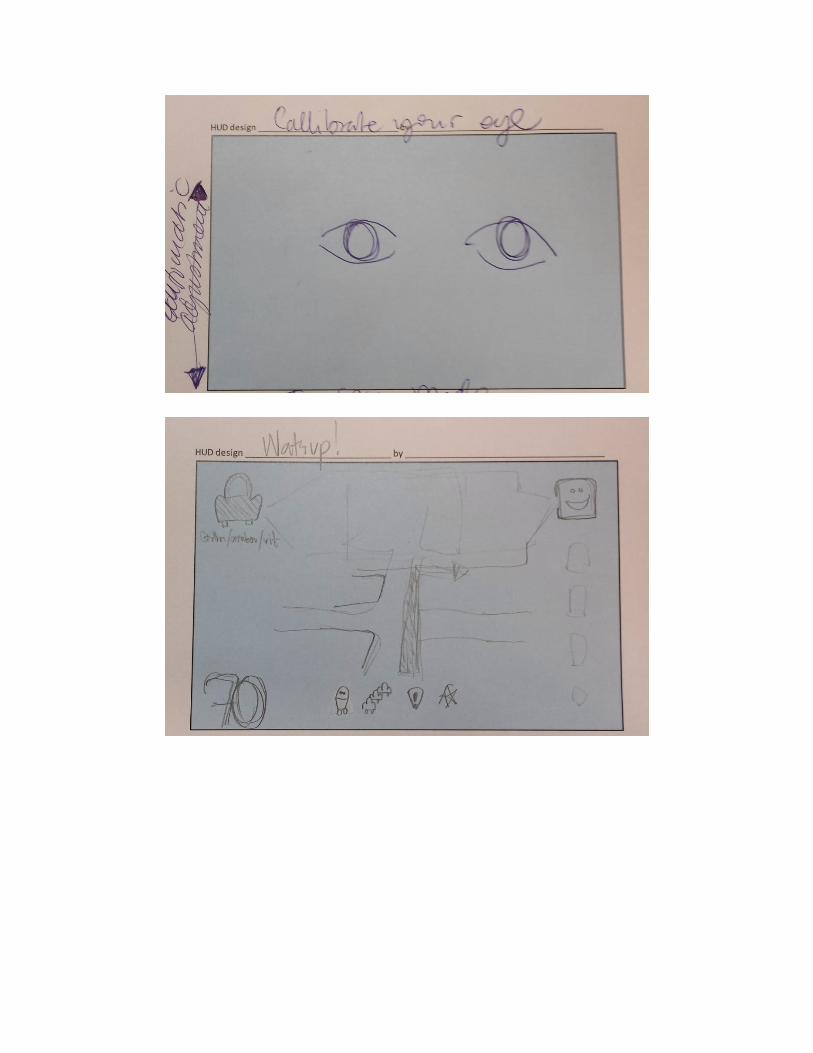
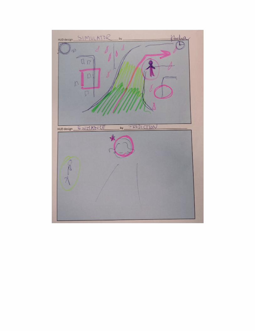
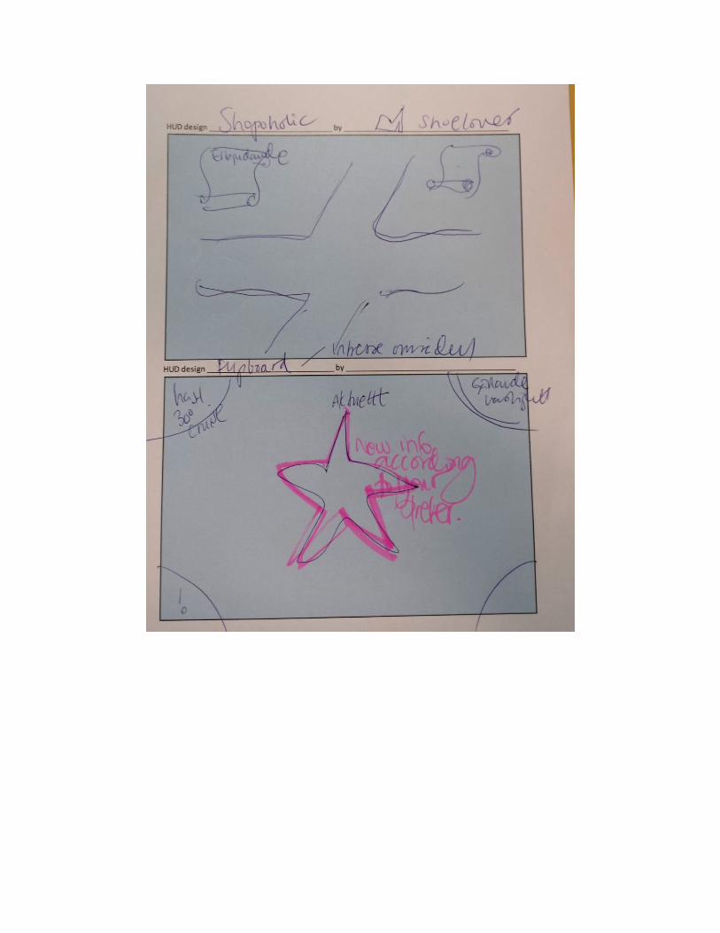
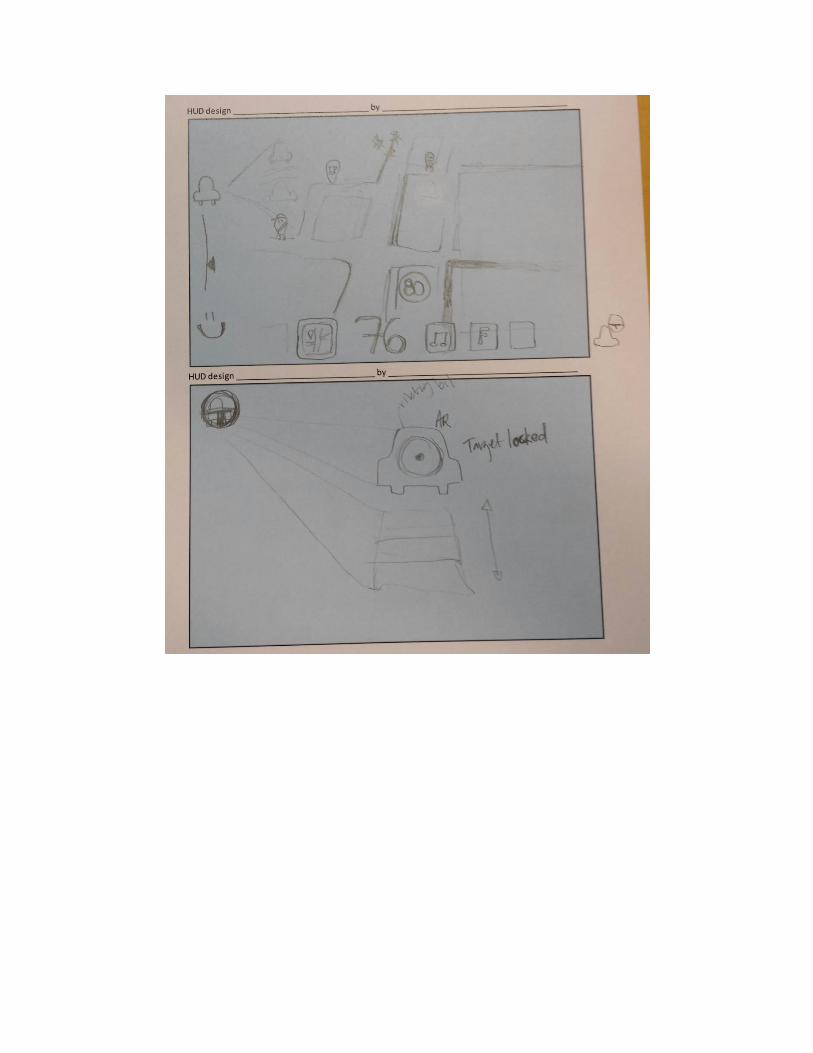
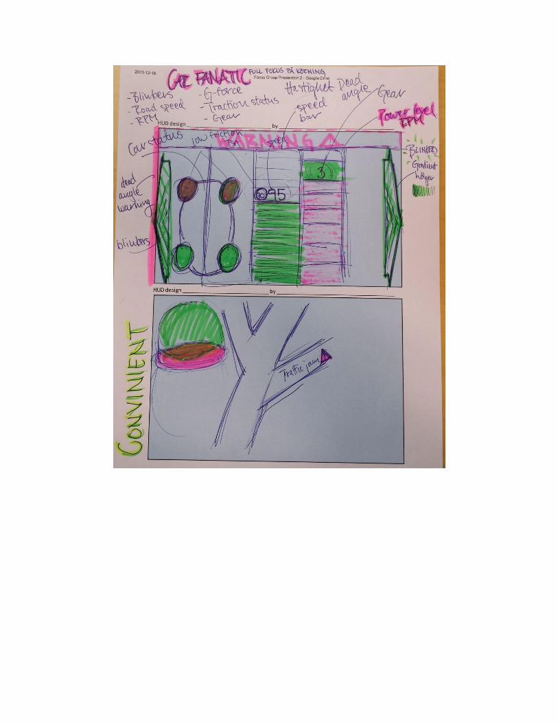
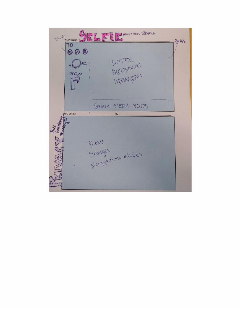
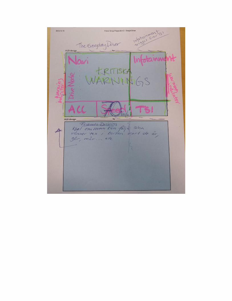
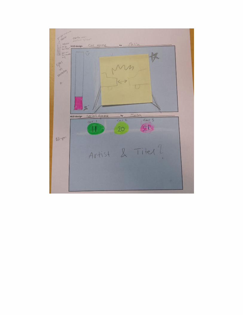
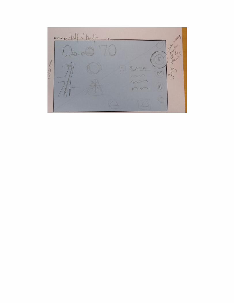

Appendix F
Wireframes
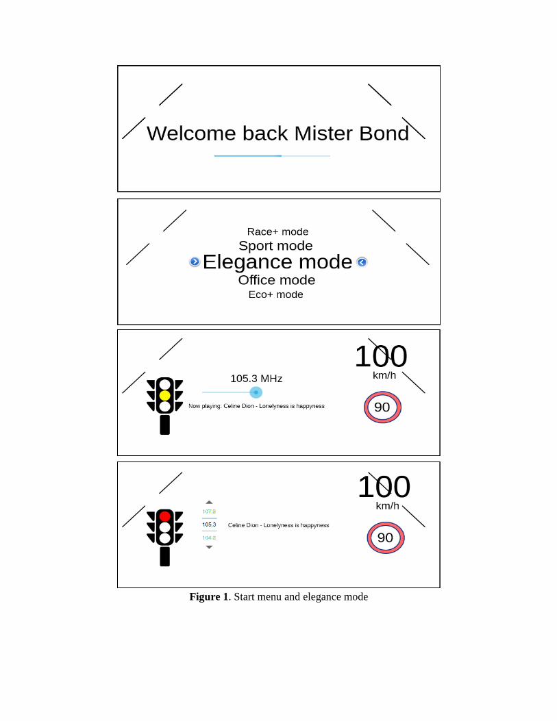
Figure 1. Start menu and elegance mode
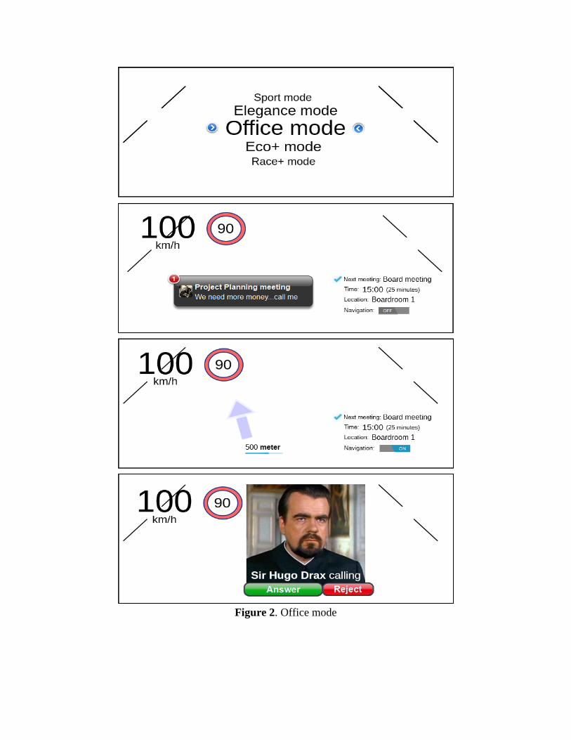
Figure 2. Office mode
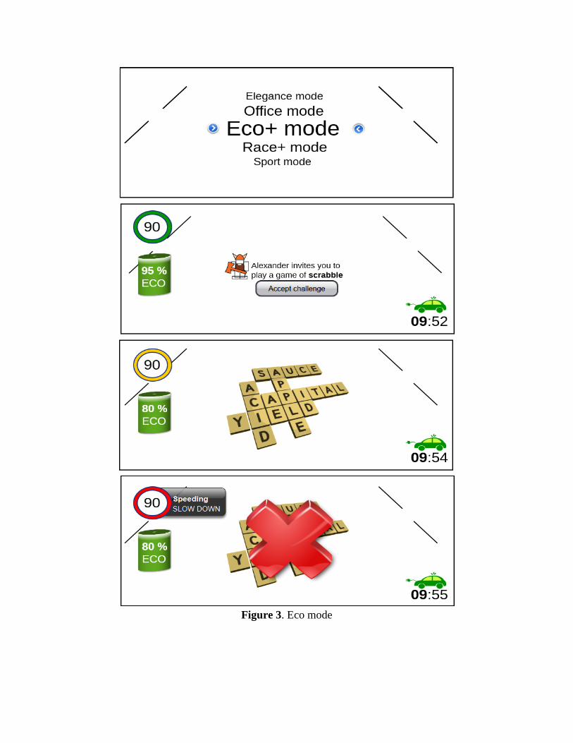
Figure 3. Eco mode
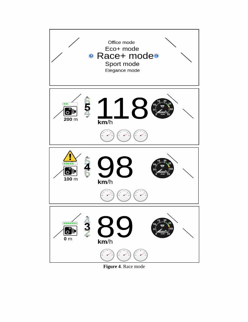
Figure 4. Race mode
Figure 5. Sport mode
Figure 6. Spotify mode
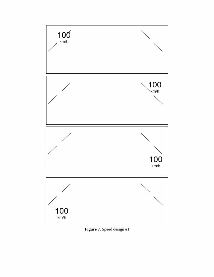
Figure 7. Speed design #1
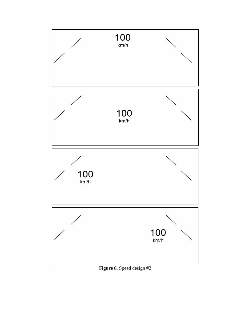
Figure 8. Speed design #2
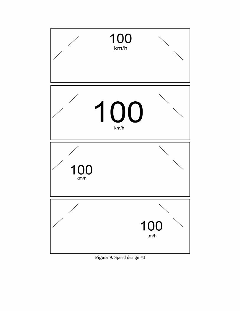
Figure 9. Speed design #3
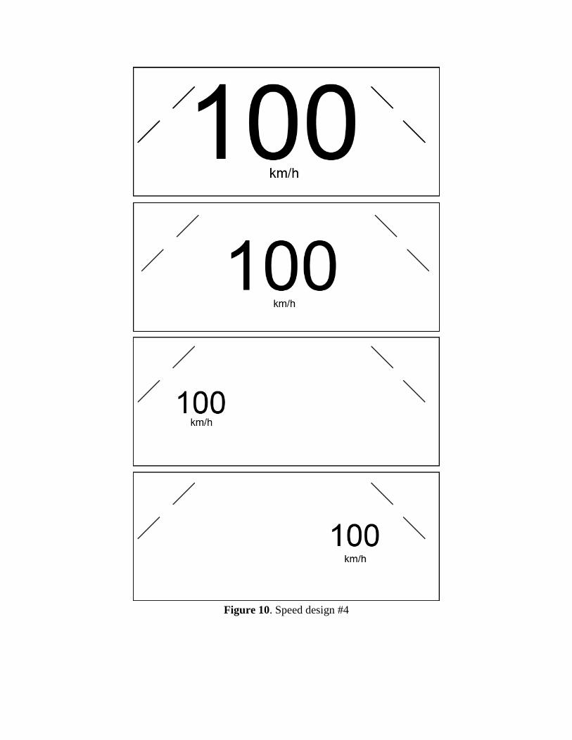
Figure 10. Speed design #4
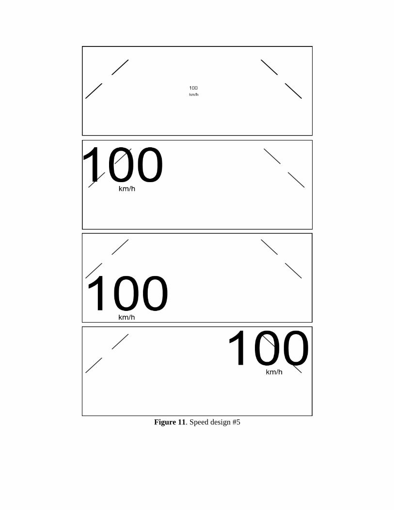
Figure 11. Speed design #5

Appendix G
Graphical Mock-ups
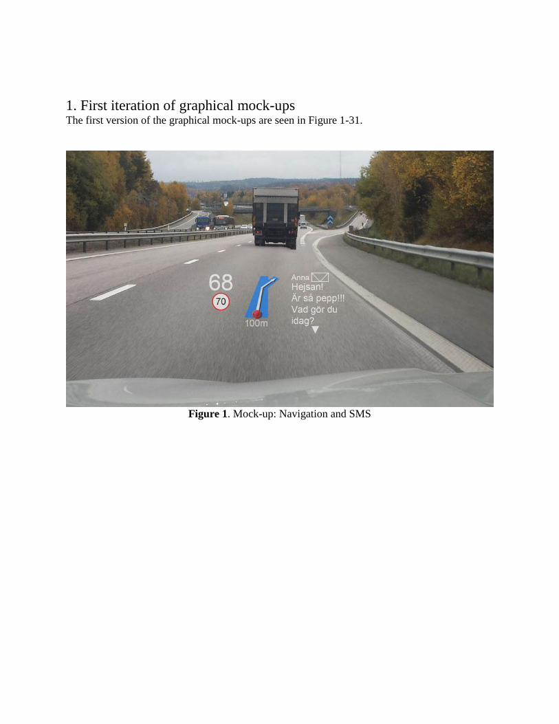
1. First iteration of graphical mock-ups The first version of the graphical mock-ups are seen in Figure 1-31.
Figure 1. Mock-up: Navigation and SMS
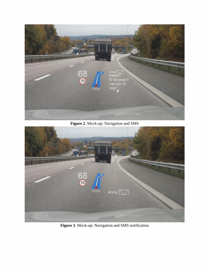
Figure 2. Mock-up: Navigation and SMS
Figure 3. Mock-up: Navigation and SMS notification
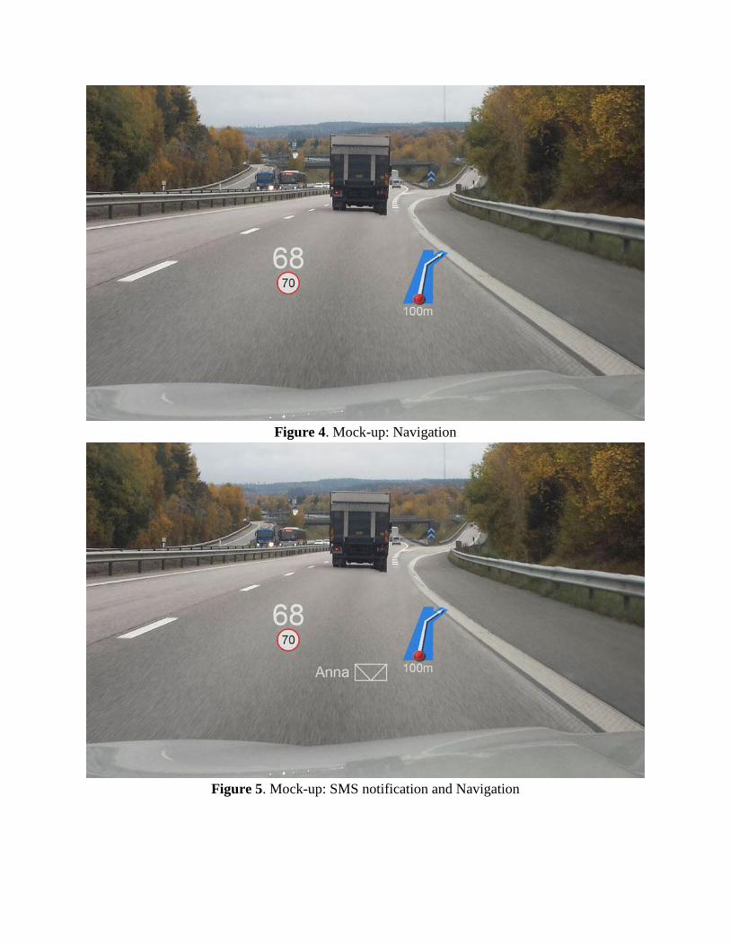
Figure 4. Mock-up: Navigation
Figure 5. Mock-up: SMS notification and Navigation
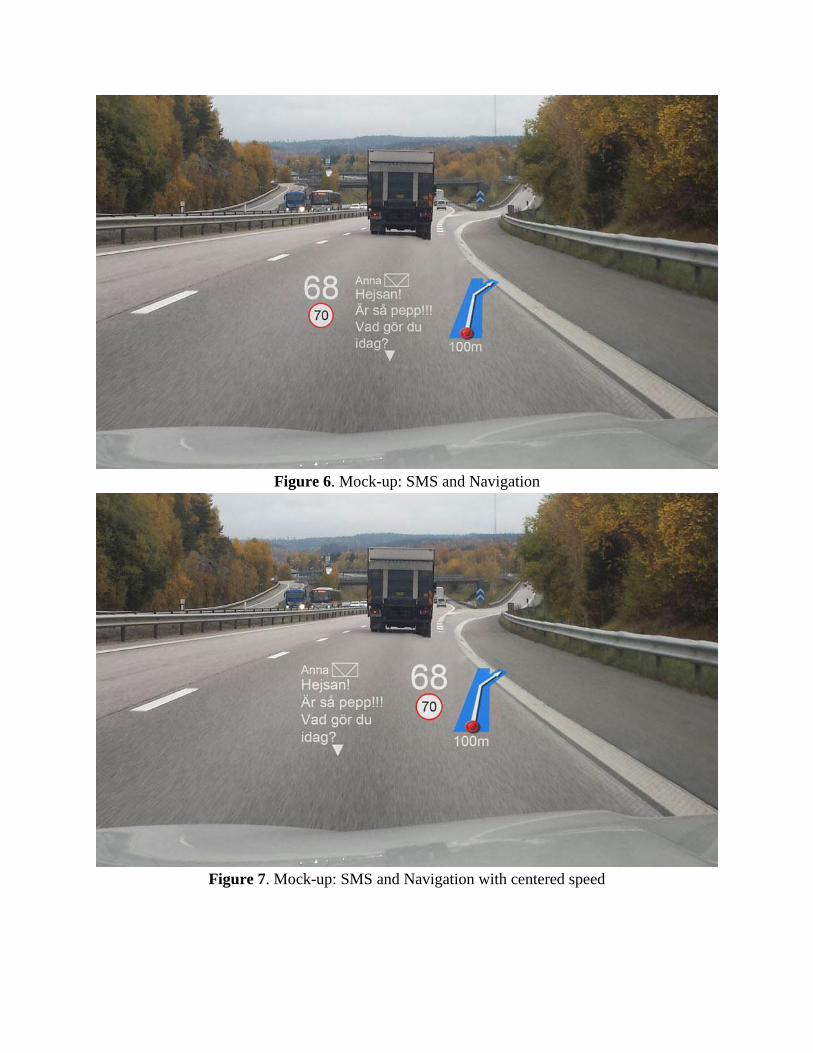
Figure 6. Mock-up: SMS and Navigation
Figure 7. Mock-up: SMS and Navigation with centered speed
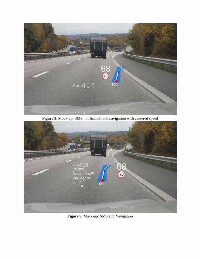
Figure 8. Mock-up: SMS notification and navigation with centered speed
Figure 9. Mock-up: SMS and Navigation
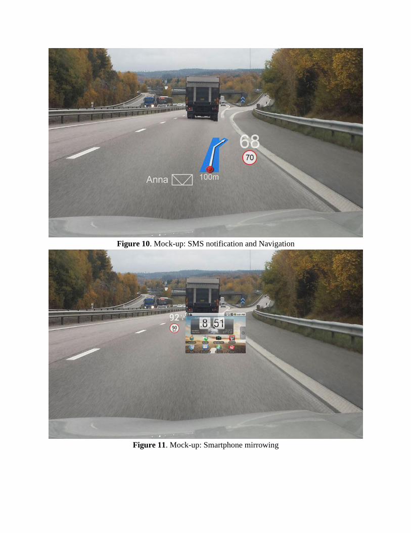
Figure 10. Mock-up: SMS notification and Navigation
Figure 11. Mock-up: Smartphone mirrowing

Figure 12. Mock-up: Candy Crush Saga (mobile game)
Figure 13. Mock-up: Navigation and clock/date

Figure 14. Mock-up: Navigation and clock/date with centered speed
Figure 15. Mock-up: Eco mode
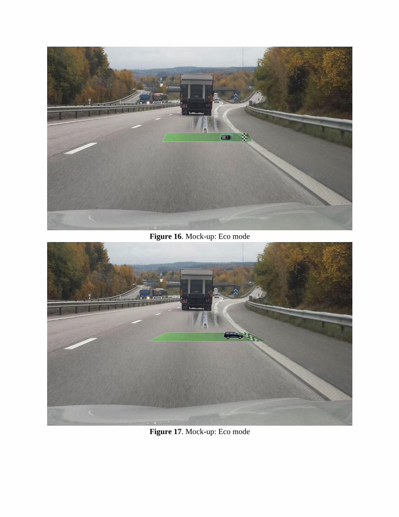
Figure 16. Mock-up: Eco mode
Figure 17. Mock-up: Eco mode
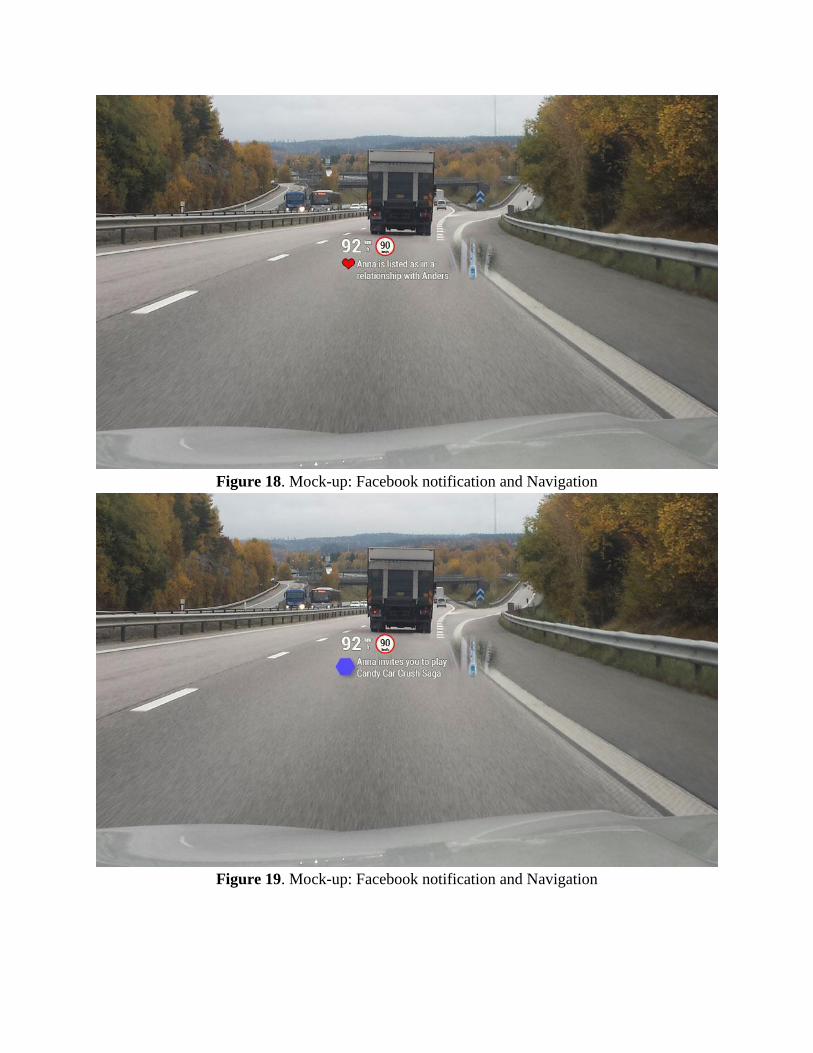
Figure 18. Mock-up: Facebook notification and Navigation
Figure 19. Mock-up: Facebook notification and Navigation
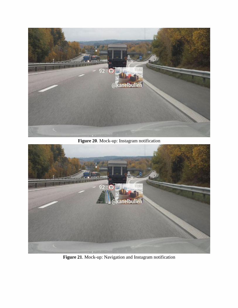
Figure 20. Mock-up: Instagram notification
Figure 21. Mock-up: Navigation and Instagram notification
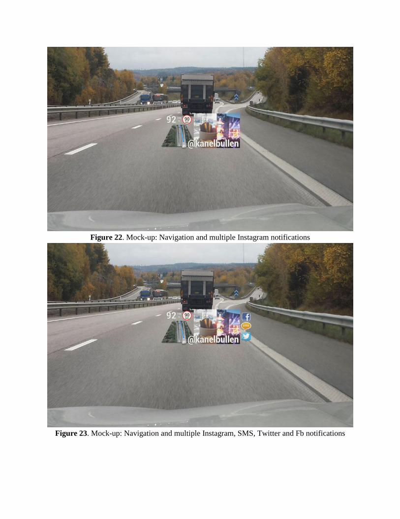
Figure 22. Mock-up: Navigation and multiple Instagram notifications
Figure 23. Mock-up: Navigation and multiple Instagram, SMS, Twitter and Fb notifications
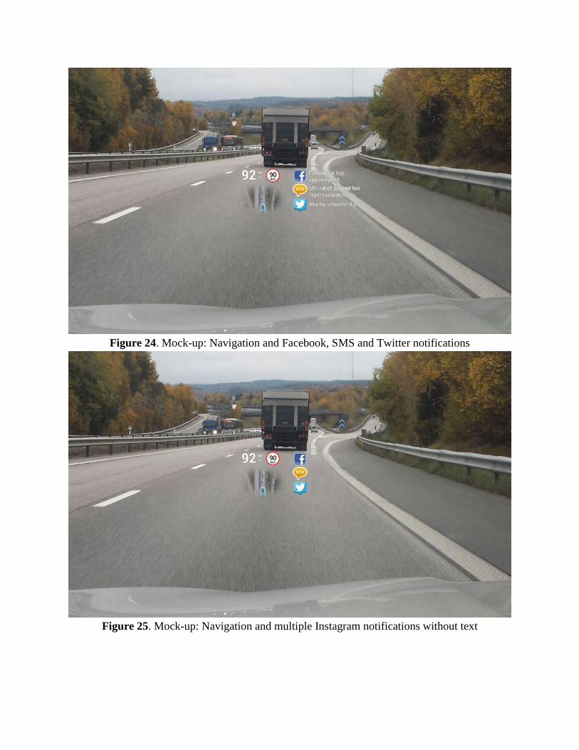
Figure 24. Mock-up: Navigation and Facebook, SMS and Twitter notifications
Figure 25. Mock-up: Navigation and multiple Instagram notifications without text
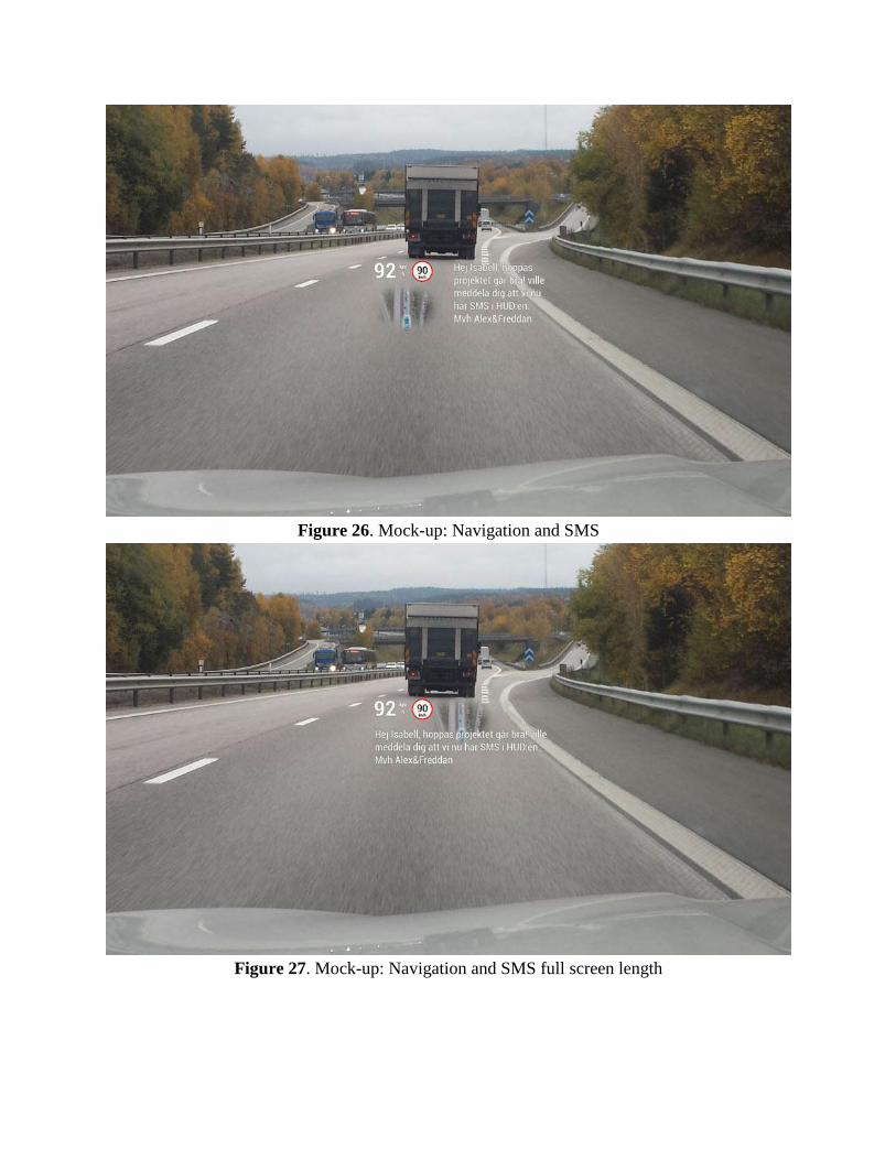
Figure 26. Mock-up: Navigation and SMS
Figure 27. Mock-up: Navigation and SMS full screen length
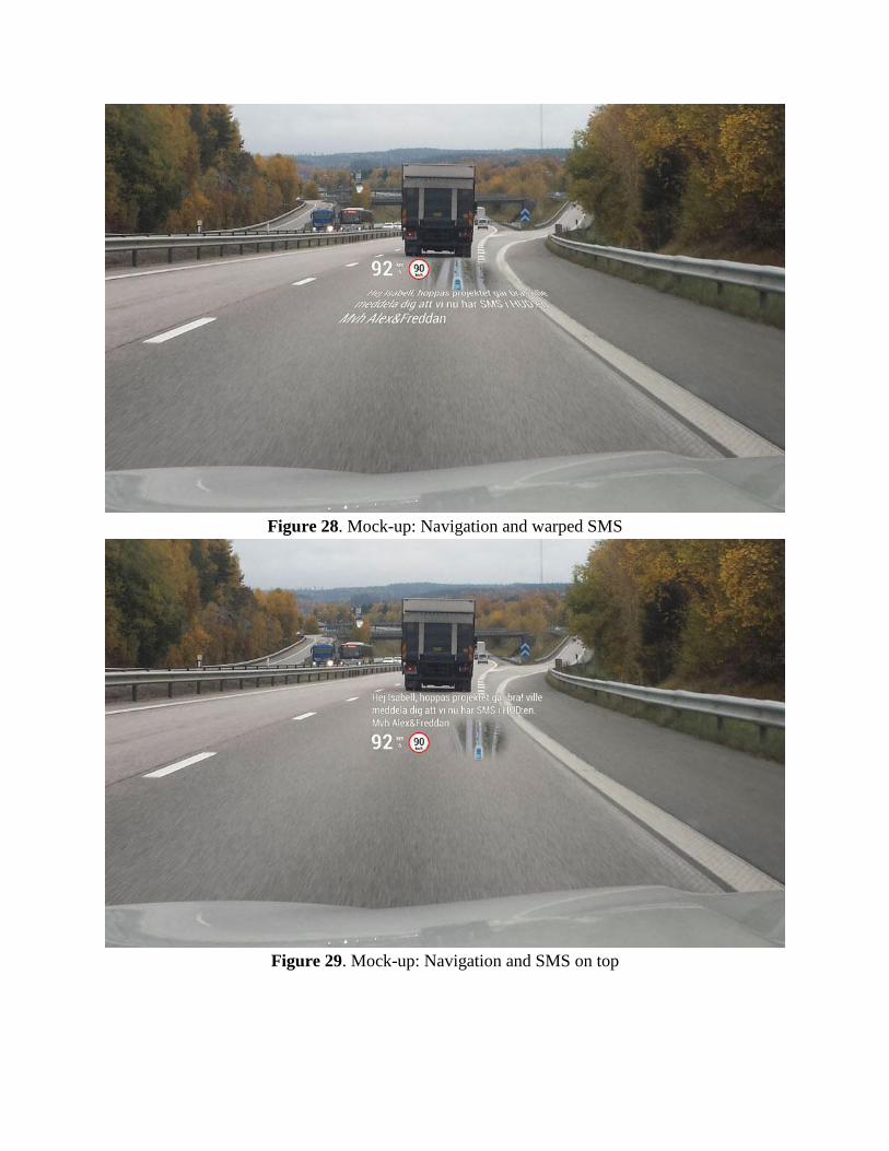
Figure 28. Mock-up: Navigation and warped SMS
Figure 29. Mock-up: Navigation and SMS on top
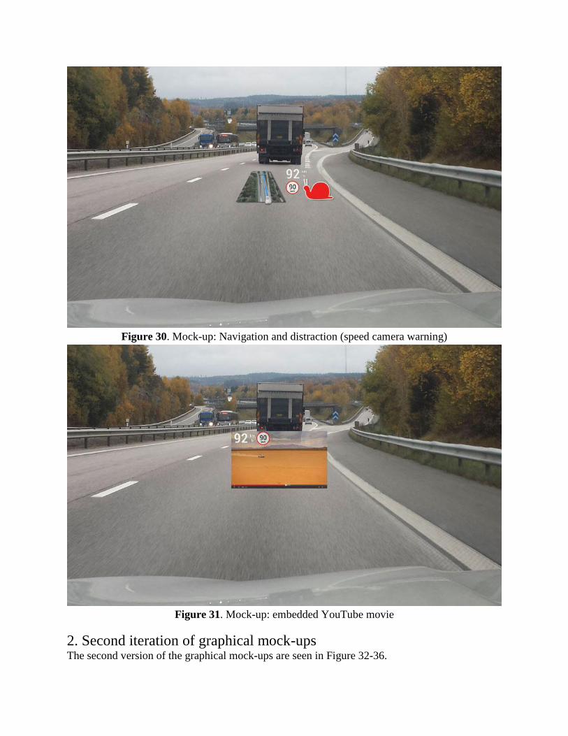
Figure 30. Mock-up: Navigation and distraction (speed camera warning)
Figure 31. Mock-up: embedded YouTube movie
2. Second iteration of graphical mock-ups The second version of the graphical mock-ups are seen in Figure 32-36.
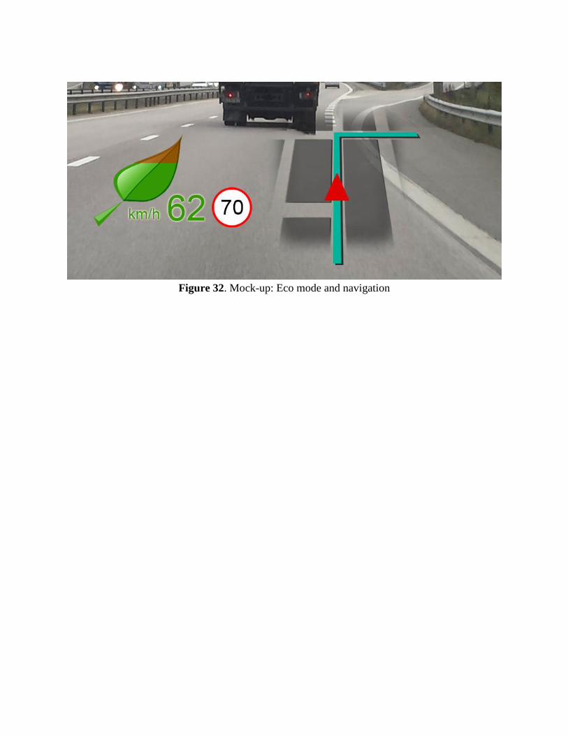
Figure 32. Mock-up: Eco mode and navigation
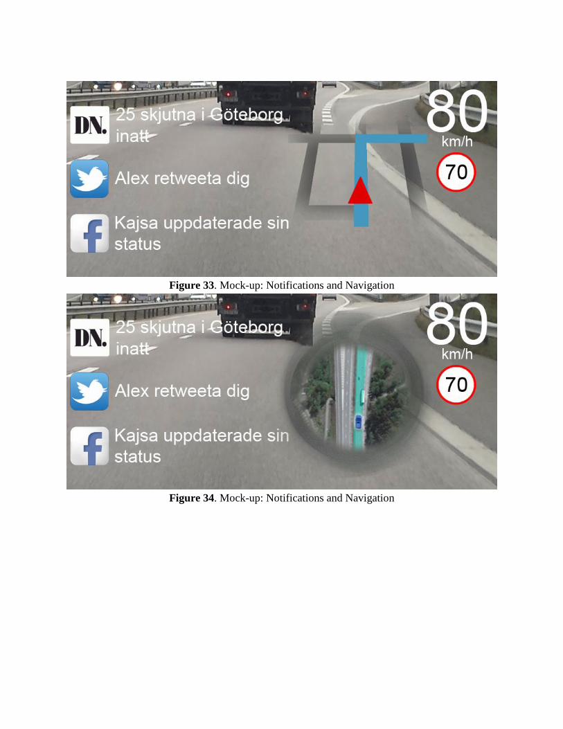
Figure 33. Mock-up: Notifications and Navigation
Figure 34. Mock-up: Notifications and Navigation
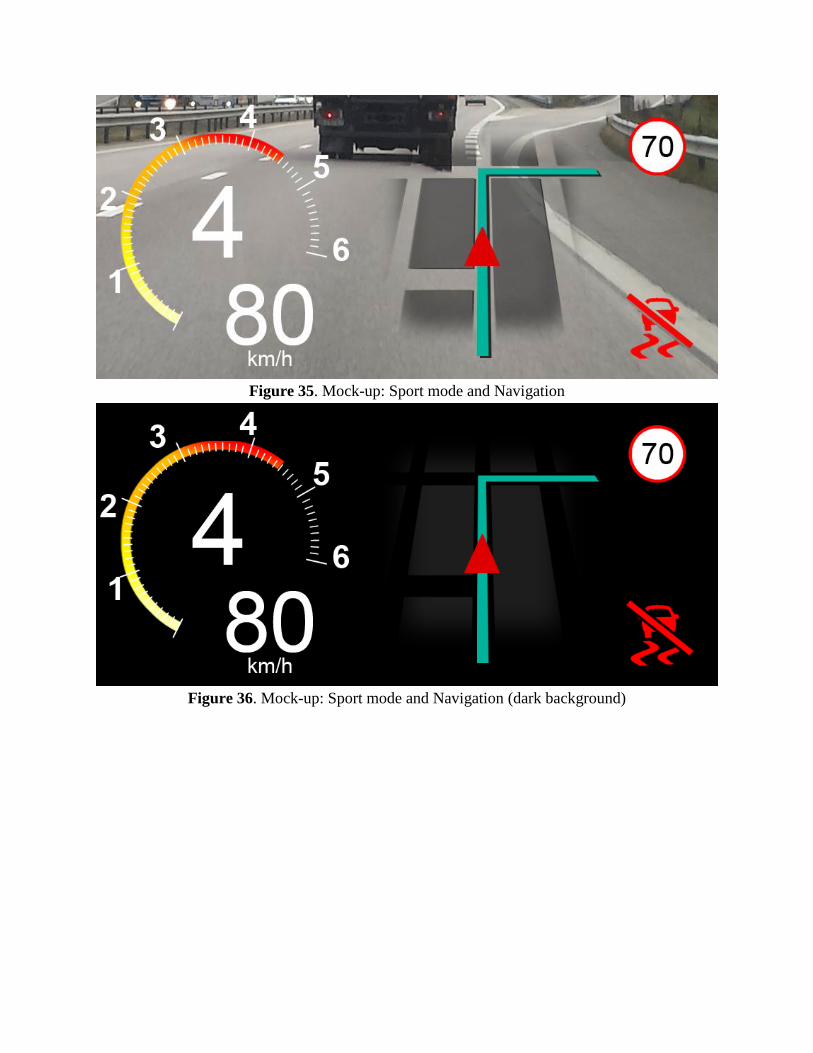
Figure 35. Mock-up: Sport mode and Navigation
Figure 36. Mock-up: Sport mode and Navigation (dark background)

Appendix H
Use Cases & User Stories
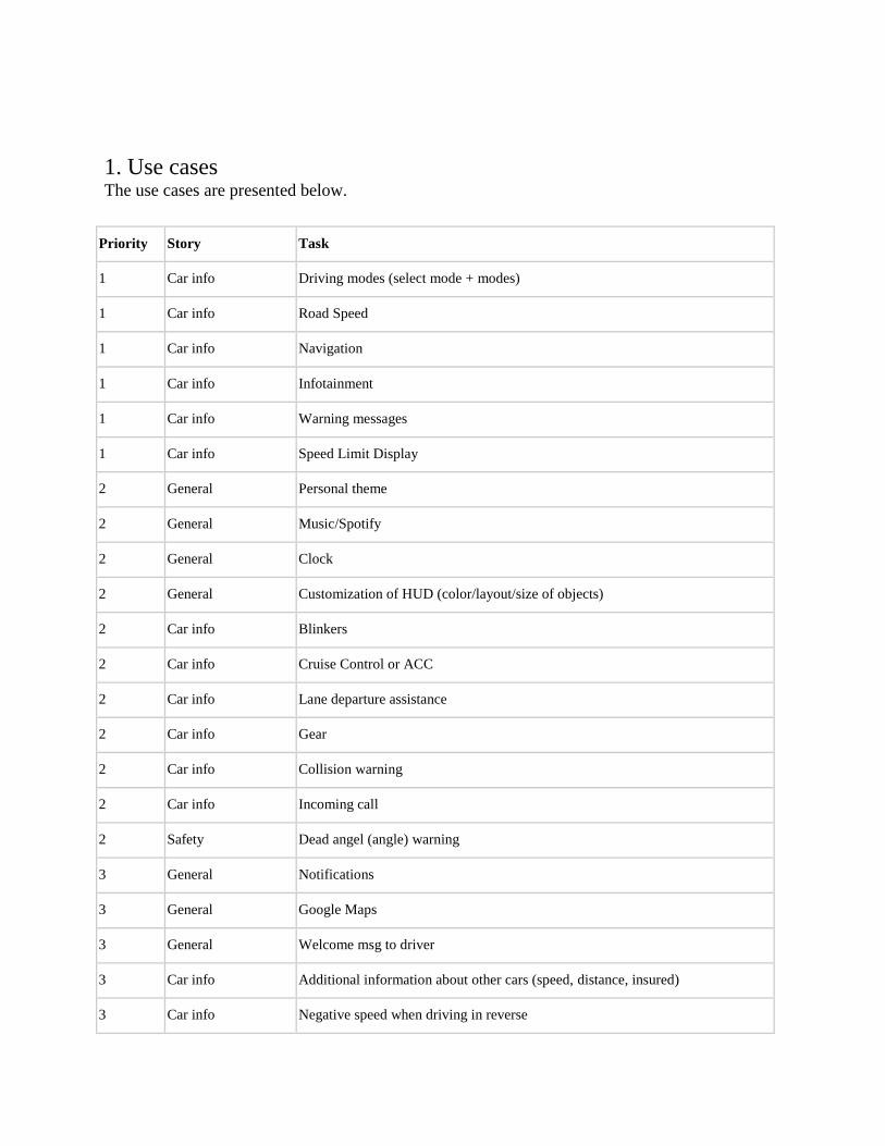
1. Use cases The use cases are presented below.
Priority Story Task
1 Car info Driving modes (select mode + modes)
1 Car info Road Speed
1 Car info Navigation
1 Car info Infotainment
1 Car info Warning messages
1 Car info Speed Limit Display
2 General Personal theme
2 General Music/Spotify
2 General Clock
2 General Customization of HUD (color/layout/size of objects)
2 Car info Blinkers
2 Car info Cruise Control or ACC
2 Car info Lane departure assistance
2 Car info Gear
2 Car info Collision warning
2 Car info Incoming call
2 Safety Dead angel (angle) warning
3 General Notifications
3 General Google Maps
3 General Welcome msg to driver
3 Car info Additional information about other cars (speed, distance, insured)
3 Car info Negative speed when driving in reverse
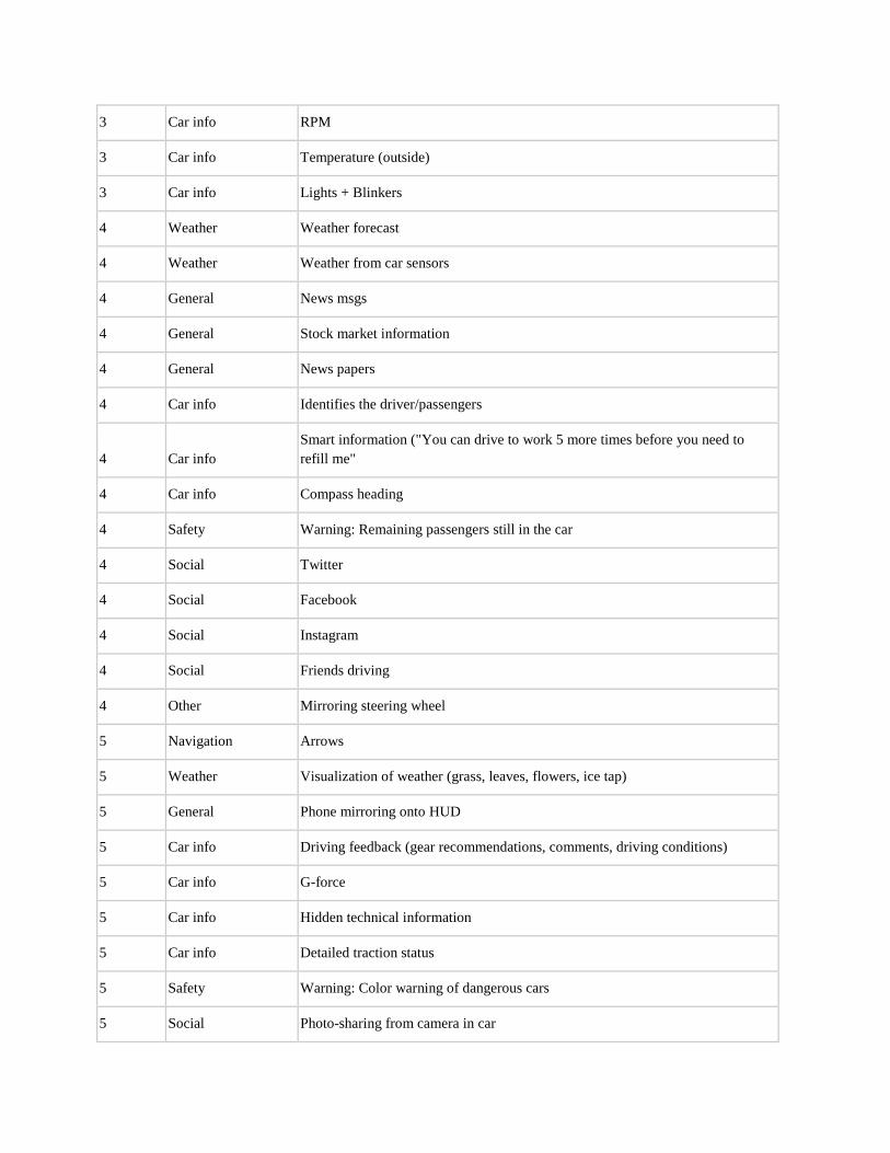
3 Car info RPM
3 Car info Temperature (outside)
3 Car info Lights + Blinkers
4 Weather Weather forecast
4 Weather Weather from car sensors
4 General News msgs
4 General Stock market information
4 General News papers
4 Car info Identifies the driver/passengers
4 Car info Smart information ("You can drive to work 5 more times before you need to
refill me"
4 Car info Compass heading
4 Safety Warning: Remaining passengers still in the car
4 Social Twitter
4 Social Facebook
4 Social Instagram
4 Social Friends driving
4 Other Mirroring steering wheel
5 Navigation Arrows
5 Weather Visualization of weather (grass, leaves, flowers, ice tap)
5 General Phone mirroring onto HUD
5 Car info Driving feedback (gear recommendations, comments, driving conditions)
5 Car info G-force
5 Car info Hidden technical information
5 Car info Detailed traction status
5 Safety Warning: Color warning of dangerous cars
5 Social Photo-sharing from camera in car
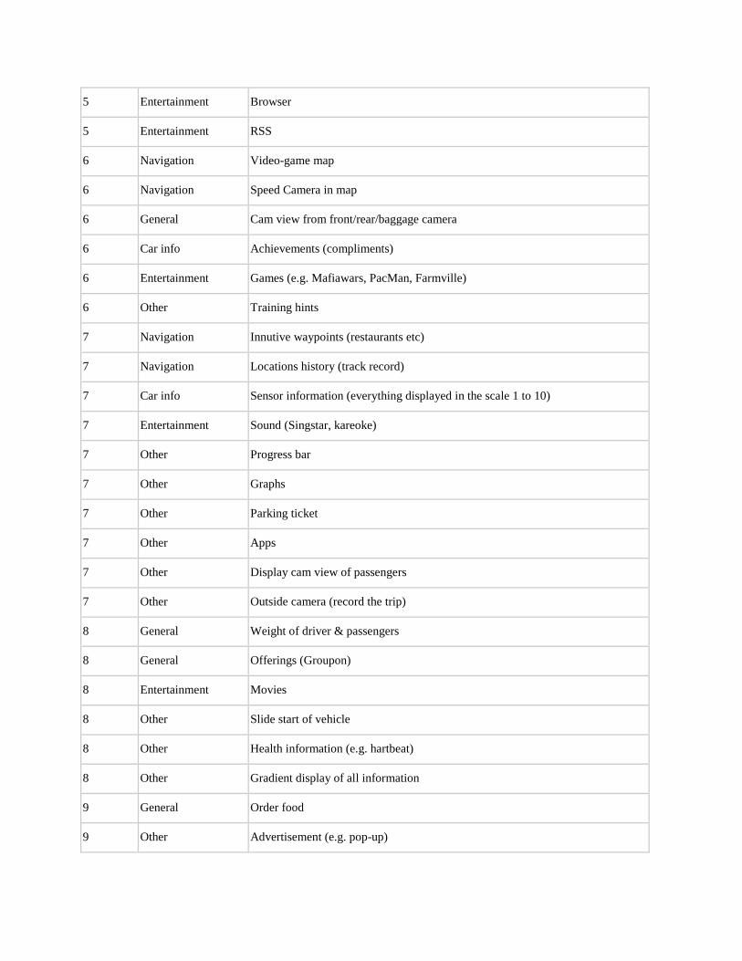
5 Entertainment Browser
5 Entertainment RSS
6 Navigation Video-game map
6 Navigation Speed Camera in map
6 General Cam view from front/rear/baggage camera
6 Car info Achievements (compliments)
6 Entertainment Games (e.g. Mafiawars, PacMan, Farmville)
6 Other Training hints
7 Navigation Innutive waypoints (restaurants etc)
7 Navigation Locations history (track record)
7 Car info Sensor information (everything displayed in the scale 1 to 10)
7 Entertainment Sound (Singstar, kareoke)
7 Other Progress bar
7 Other Graphs
7 Other Parking ticket
7 Other Apps
7 Other Display cam view of passengers
7 Other Outside camera (record the trip)
8 General Weight of driver & passengers
8 General Offerings (Groupon)
8 Entertainment Movies
8 Other Slide start of vehicle
8 Other Health information (e.g. hartbeat)
8 Other Gradient display of all information
9 General Order food
9 Other Advertisement (e.g. pop-up)
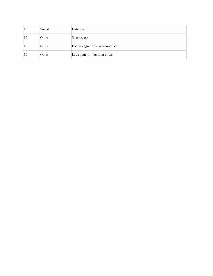
10 Social Dating app
10 Other Stroboscope
10 Other Face recognition = ignition of car
10 Other Lock pattern = ignition of car
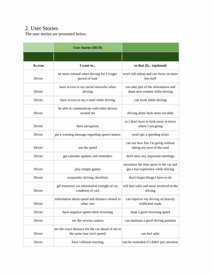
2. User Stories The user stories are presented below.
User Stories (HUD)
As a/an I want to... so that (I)... (optional)
Driver be more relaxed when driving for a longer
period of time won't fall asleep and can focus on more
fun stuff
Driver have access to my social networks when
driving can take part of the information and
share new content while driving
Driver have access to my e-mail while driving can work while driving
Driver be able to communicate with other drivers
around me driving alone feels more sociable
Driver have navigation so I don't have to look away to know
where I am going
Driver get a warning message regarding speed camera won't get a speeding ticket
Driver see the speed can see how fast I'm going without
taking my eyes of the road
Driver get calendar updates and reminders don't miss any important meetings
Driver play simple games maximize the time spent in the car and
get a fun experience while driving
Driver waypoints/ driving checklists don't forget things I have to do
Driver get extensive car information (weight of car,
condition of car) will feel safer and more involved in the
driving
Driver information about speed and distance related to
other cars can improve my driving on heavily
trafficked roads
Driver have negative speed when reversing keep a good reversing speed
Driver see the reverse camera can maintain a good driving position
Driver see the exact distance for the car ahead of me in
the same lane (incl speed) can feel safer
Driver have collision warning can be reminded if I didn't pay attention
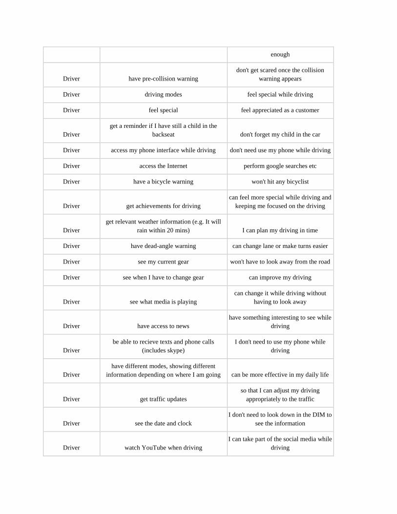
enough
Driver have pre-collision warning don't get scared once the collision
warning appears
Driver driving modes feel special while driving
Driver feel special feel appreciated as a customer
Driver get a reminder if I have still a child in the
backseat don't forget my child in the car
Driver access my phone interface while driving don't need use my phone while driving
Driver access the Internet perform google searches etc
Driver have a bicycle warning won't hit any bicyclist
Driver get achievements for driving can feel more special while driving and
keeping me focused on the driving
Driver get relevant weather information (e.g. It will
rain within 20 mins) I can plan my driving in time
Driver have dead-angle warning can change lane or make turns easier
Driver see my current gear won't have to look away from the road
Driver see when I have to change gear can improve my driving
Driver see what media is playing can change it while driving without
having to look away
Driver have access to news have something interesting to see while
driving
Driver be able to recieve texts and phone calls
(includes skype) I don't need to use my phone while
driving
Driver have different modes, showing different
information depending on where I am going can be more effective in my daily life
Driver get traffic updates so that I can adjust my driving
appropriately to the traffic
Driver see the date and clock I don't need to look down in the DIM to
see the information
Driver watch YouTube when driving I can take part of the social media while
driving

Driver have shazam(or similar services) know which song is playing on the
radio

Appendix I
User Testing
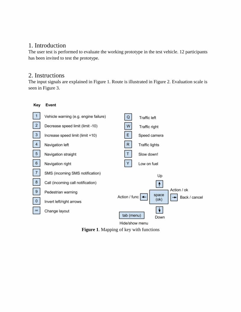
1. Introduction The user test is performed to evaluate the working prototype in the test vehicle. 12 participants
has been invited to test the prototype.
2. Instructions The input signals are explained in Figure 1. Route is illustrated in Figure 2. Evaluation scale is
seen in Figure 3.
Figure 1. Mapping of key with functions
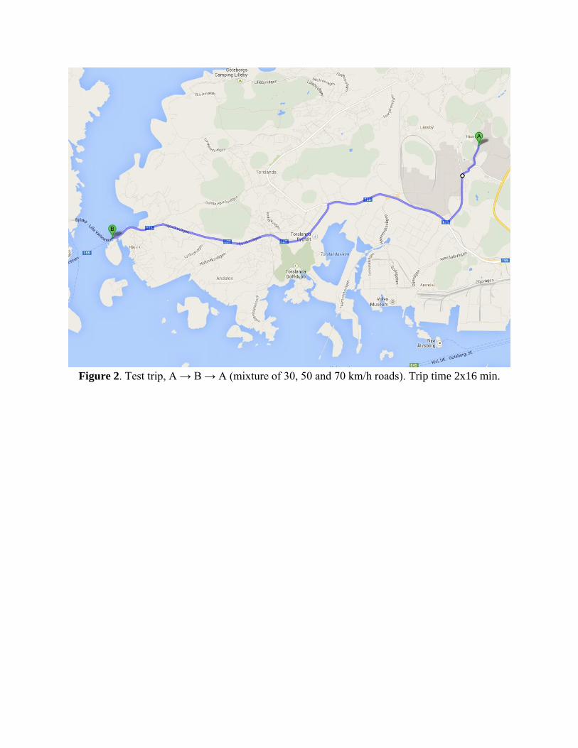
Figure 2. Test trip, A → B → A (mixture of 30, 50 and 70 km/h roads). Trip time 2x16 min.
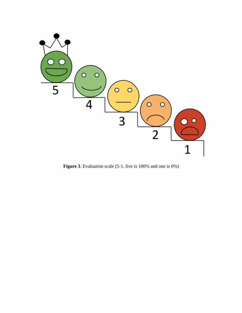
Figure 3. Evaluation scale (5-1, five is 100% and one is 0%)
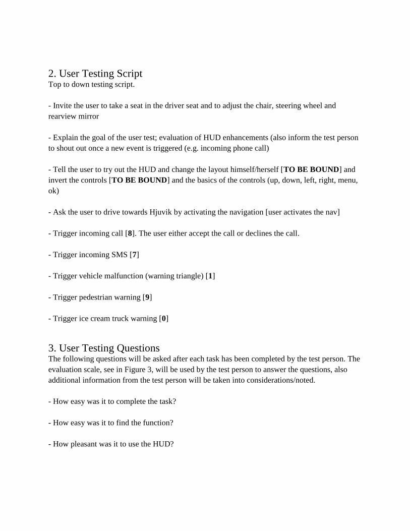
2. User Testing Script Top to down testing script.
- Invite the user to take a seat in the driver seat and to adjust the chair, steering wheel and
rearview mirror
- Explain the goal of the user test; evaluation of HUD enhancements (also inform the test person
to shout out once a new event is triggered (e.g. incoming phone call)
- Tell the user to try out the HUD and change the layout himself/herself [TO BE BOUND] and
invert the controls [TO BE BOUND] and the basics of the controls (up, down, left, right, menu,
ok)
- Ask the user to drive towards Hjuvik by activating the navigation [user activates the nav]
- Trigger incoming call [8]. The user either accept the call or declines the call.
- Trigger incoming SMS [7]
- Trigger vehicle malfunction (warning triangle) [1]
- Trigger pedestrian warning [9]
- Trigger ice cream truck warning [0]
3. User Testing Questions The following questions will be asked after each task has been completed by the test person. The
evaluation scale, see in Figure 3, will be used by the test person to answer the questions, also
additional information from the test person will be taken into considerations/noted.
- How easy was it to complete the task?
- How easy was it to find the function?
- How pleasant was it to use the HUD?
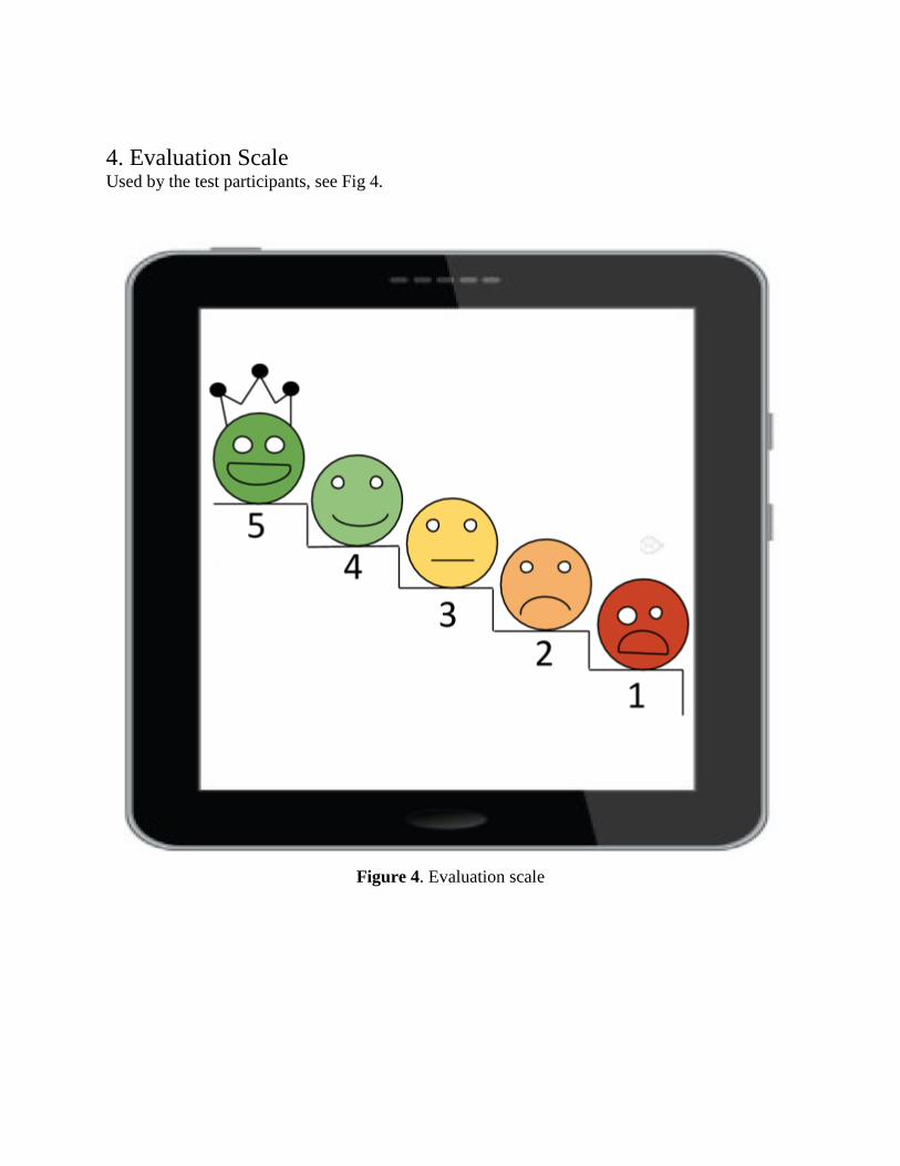
4. Evaluation Scale Used by the test participants, see Fig 4.
Figure 4. Evaluation scale

Appendix J
Prototype

The prototype code in Qt can be requested by Volvo Car Corporation or Chalmers University of
Technology.


![[XLS]Hospitals - NRIOL Resourceful Information and Services …nriol.com/indianinsurance/tata-aig/tata-aig-network... · Web viewAmbala Road 01746 223949 Haryana Kaithal Trinity Nursing](https://img.pdfslide.net/doc/110x75/5aa688487f8b9a1d728e9046/xlshospitals-nriol-resourceful-information-and-services-nriolcomindianinsurancetata-aigtata-aig-networkweb.jpg)