Embed Size (px)
Citation preview
• Planning• Organizing your talk• Slides
Elements of a Good Presentation Slide 1 of 16
Hints & Tips For Good Presentations
• Audience• Goal• Time Available• Site Constraints
Elements of a Good Presentation Slide 2 of 16
Planning Considerations
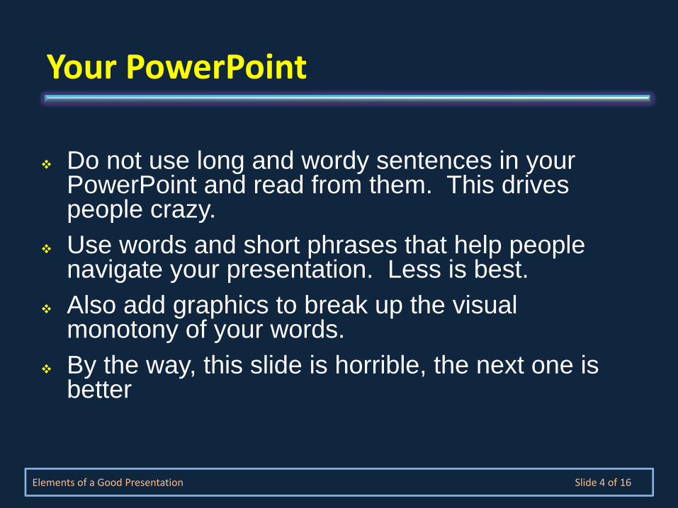
Do not use long and wordy sentences in your PowerPoint and read from them. This drives people crazy. Use words and short phrases that help people navigate your presentation. Less is best.Also add graphics to break up the visual monotony of your words.By the way, this slide is horrible, the next one is better
Elements of a Good Presentation Slide 4 of 16
Your PowerPoint
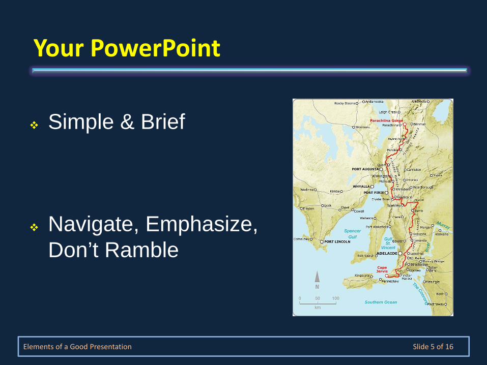
Simple & Brief
Navigate, Emphasize, Don’t Ramble
Elements of a Good Presentation Slide 5 of 16
Your PowerPoint

Goal – clarityUse sans serif fonts (Arial, Tahoma) Serif fonts (Times) can get too complexSimple background -- light and dark workOne set of colors and fontsUse simple templates
Elements of a Good Presentation Slide 6 of 16
Design ‐ 1
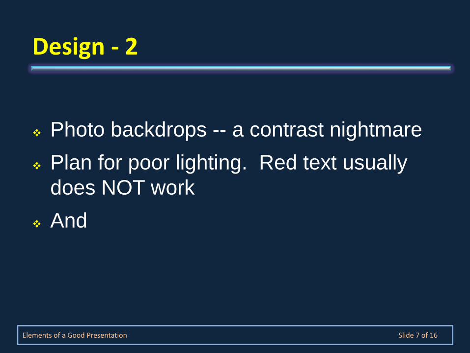
Photo backdrops -- a contrast nightmarePlan for poor lighting. Red text usually does NOT workAnd
Elements of a Good Presentation Slide 7 of 16
Design ‐ 2
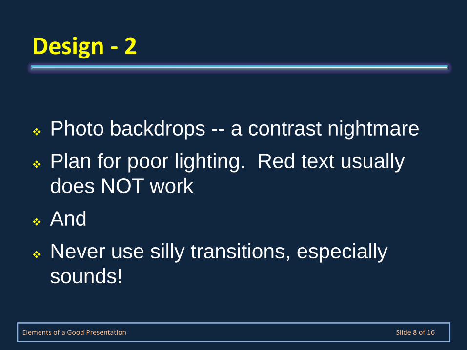
Photo backdrops -- a contrast nightmarePlan for poor lighting. Red text usually does NOT workAnd Never use silly transitions, especially sounds!
Elements of a Good Presentation Slide 8 of 16
Design ‐ 2
One goal – clarity
Use sans serif fonts (Arial, Tahoma)
Serif fonts (Times) can get too complex
Simple background. I use both light and dark
Stick to one set of colors and fonts
Use simple templates
Elements of a Good Presentation Slide 9 of 16
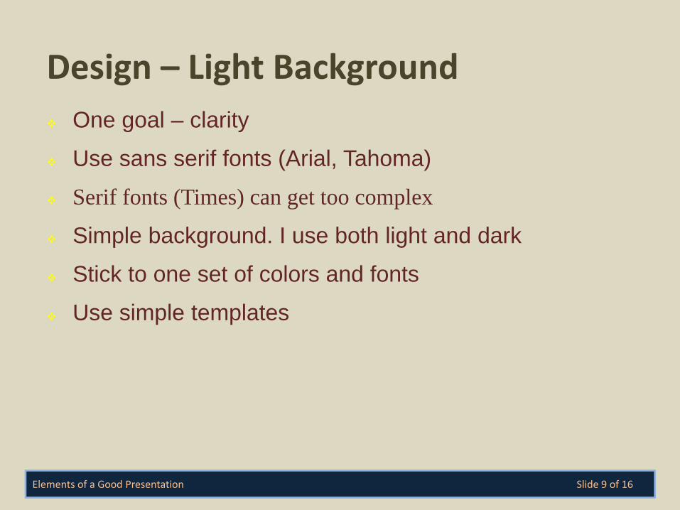
Design – Light Background
One goal – clarity
Use sans serif fonts (Arial, Tahoma)
Serif fonts (Times) can get too complex
Simple background. I use both light and dark
Stick to one set of colors and fonts
Use simple templates
Elements of a Good Presentation Slide 10 of 16
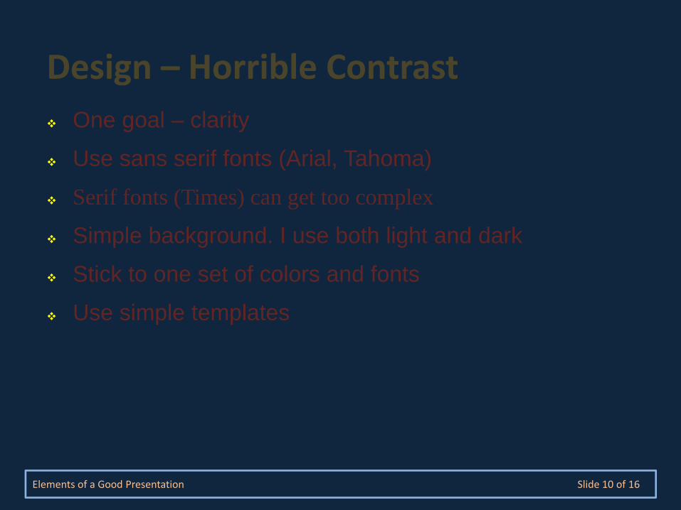
Design – Horrible Contrast
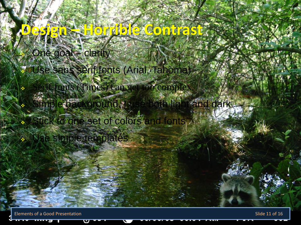
One goal – clarity
Use sans serif fonts (Arial, Tahoma)
Serif fonts (Times) can get too complex
Simple background. I use both light and dark
Stick to one set of colors and fonts
Use simple templates
Elements of a Good Presentation Slide 11 of 16
Design – Horrible Contrast
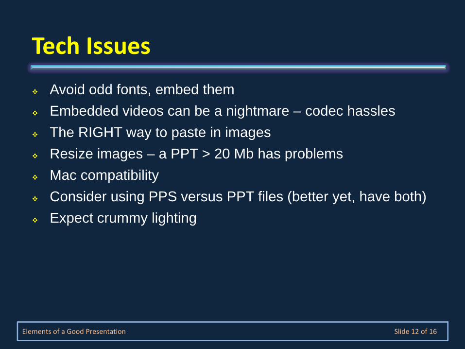
Avoid odd fonts, embed them Embedded videos can be a nightmare – codec hasslesThe RIGHT way to paste in imagesResize images – a PPT > 20 Mb has problemsMac compatibilityConsider using PPS versus PPT files (better yet, have both)Expect crummy lighting
Elements of a Good Presentation Slide 12 of 16
Tech Issues
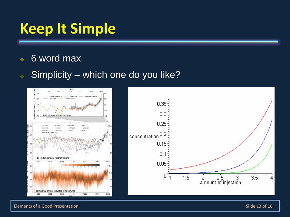
6 word max
Simplicity – which one do you like?
Elements of a Good Presentation Slide 13 of 16
Keep It Simple
3-6 main points per slideConsider dropping them in one my one
Elements of a Good Presentation Slide 14 of 16
Keep It Simple
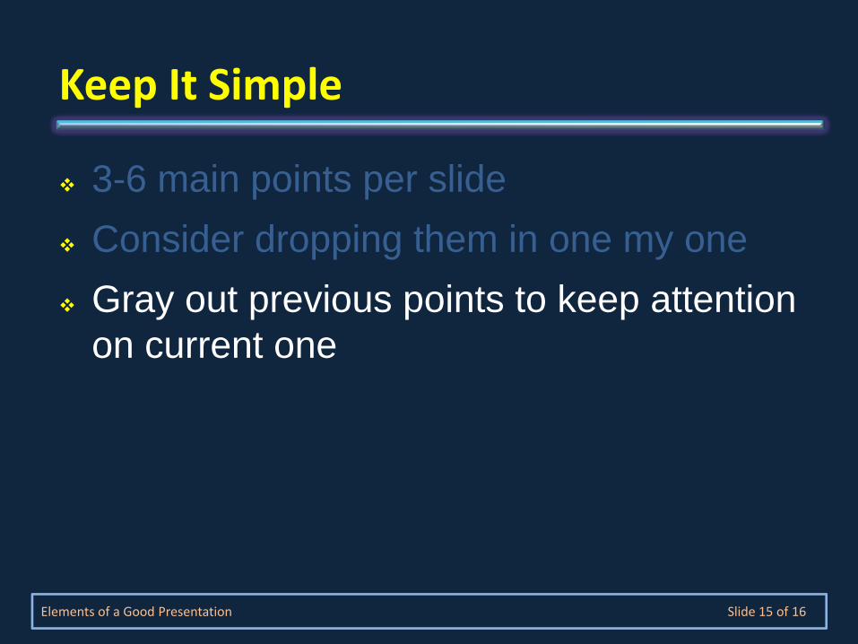
3-6 main points per slideConsider dropping them in one my oneGray out previous points to keep attention on current one
Elements of a Good Presentation Slide 15 of 16
Keep It Simple
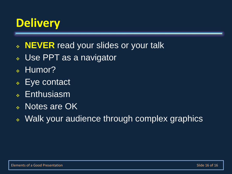
NEVER read your slides or your talkUse PPT as a navigatorHumor?Eye contactEnthusiasmNotes are OKWalk your audience through complex graphics
Elements of a Good Presentation Slide 16 of 16
Delivery
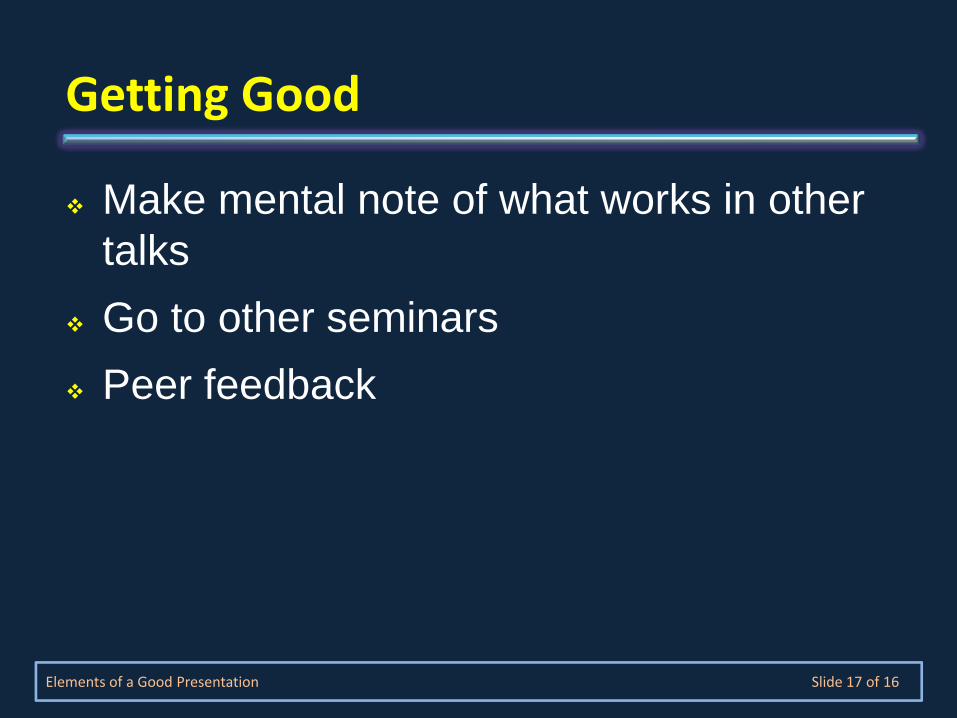
Make mental note of what works in other talksGo to other seminarsPeer feedback
Elements of a Good Presentation Slide 17 of 16
Getting Good