Embed Size (px)
Citation preview
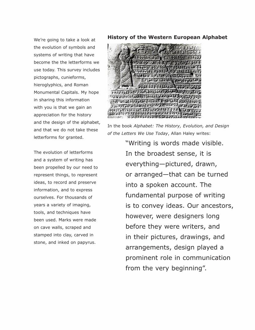
History of the Western European Alphabet
In the book Alphabet: The History, Evolution, and Design
of the Letters We Use Today, Allan Haley writes:
“Writing is words made visible.
In the broadest sense, it is
everything—pictured, drawn,
or arranged—that can be turned
into a spoken account. The
fundamental purpose of writing
is to convey ideas. Our ancestors,
however, were designers long
before they were writers, and
in their pictures, drawings, and
arrangements, design played a
prominent role in communication
from the very beginning”.
We’re going to take a look at
the evolution of symbols and
systems of writing that have
become the the letterforms we
use today. This survey includes
pictographs, cunieforms,
hieroglyphics, and Roman
Monumental Capitals. My hope
in sharing this information
with you is that we gain an
appreciation for the history
and the design of the alphabet,
and that we do not take these
letterforms for granted.
The evolution of letterforms
and a system of writing has
been propelled by our need to
represent things, to represent
ideas, to record and preserve
information, and to express
ourselves. For thousands of
years a variety of imaging,
tools, and techniques have
been used. Marks were made
on cave walls, scraped and
stamped into clay, carved in
stone, and inked on papyrus.
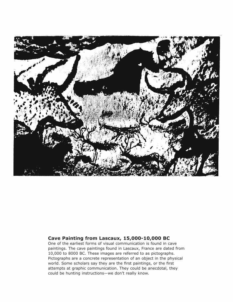
Cave Painting from Lascaux, 15,000-10,000 BCOne of the earliest forms of visual communication is found in cave paintings. The cave paintings found in Lascaux, France are dated from 10,000 to 8000 BC. These images are referred to as pictographs. Pictographs are a concrete representation of an object in the physical world. Some scholars say they are the first paintings, or the first attempts at graphic communication. They could be anecdotal, they could be hunting instructions—we don’t really know.
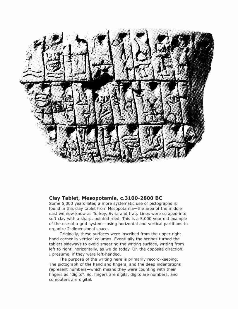
Clay Tablet, Mesopotamia, c.3100-2800 BCSome 5,000 years later, a more systematic use of pictographs is found in this clay tablet from Mesopotamia—the area of the middle east we now know as Turkey, Syria and Iraq. Lines were scraped into soft clay with a sharp, pointed reed. This is a 5,000 year old example of the use of a grid system—using horizontal and vertical partitions to organize 2-dimensional space. Originally, these surfaces were inscribed from the upper right hand corner in vertical columns. Eventually the scribes turned the tablets sideways to avoid smearing the writing surface, writing from left to right, horizontally, as we do today. Or, the opposite direction, I presume, if they were left-handed. The purpose of the writing here is primarily record-keeping. The pictograph of the hand and fingers, and the deep indentations represent numbers—which means they were counting with their fingers as “digits”. So, fingers are digits, digits are numbers, and computers are digital.
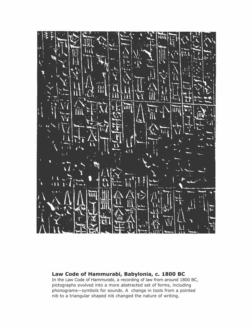
Law Code of Hammurabi, Babylonia, c. 1800 BCIn the Law Code of Hammurabi, a recording of law from around 1800 BC, pictographs evolved into a more abstracted set of forms, including phonograms—symbols for sounds. A change in tools from a pointed nib to a triangular shaped nib changed the nature of writing.
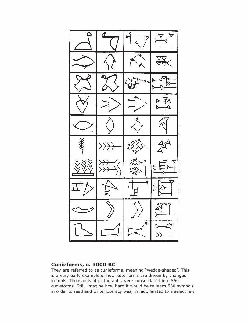
Cunieforms, c. 3000 BCThey are referred to as cunieforms, meaning “wedge-shaped”. This is a very early example of how letterforms are driven by changes in tools. Thousands of pictographs were consolidated into 560 cunieforms. Still, imagine how hard it would be to learn 560 symbols in order to read and write. Literacy was, in fact, limited to a select few.
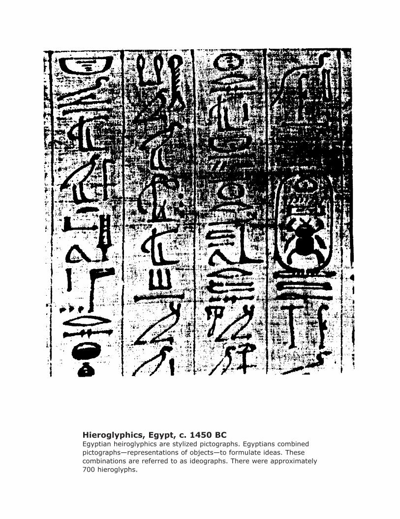
Hieroglyphics, Egypt, c. 1450 BCEgyptian heiroglyphics are stylized pictographs. Egyptians combined pictographs—representations of objects—to formulate ideas. These combinations are referred to as ideographs. There were approximately 700 hieroglyphs.
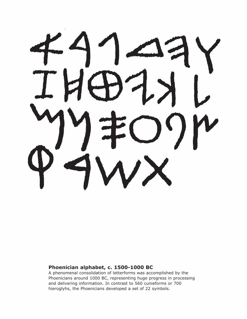
Phoenician alphabet, c. 1500-1000 BCA phenomenal consolidation of letterforms was accomplished by the Phoenicians around 1000 BC, representing huge progress in processing and delivering information. In contrast to 560 cunieforms or 700 hieroglyhs, the Phoenicians developed a set of 22 symbols.

Phaistos Disk, c. 2000 BCThis is the Phaistos Disk which was discovered on Crete in 1908. Because these symbols are so similar to the Phoenician alphabet, it is believed that the Phoenician alphabet is derivative of this writing system from Crete. The symbols represent individual sounds derived from the beginning of the words for pictographs. For example, the word for house is “beth”. The Phoenicians created the symbol we now call “b” for the sound of the beginning of the word “beth”. The development of this writing system was motivated by the desire to make money. As international merchants, Phoenicians were doing business with Mesopotamia in the west, using cunieforms—and Egypt in the south, using hieroglyphs. They needed a more efficient system for business transactions.
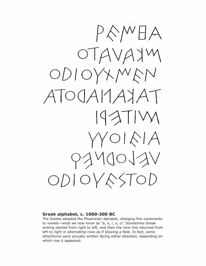
Greek alphabet, c. 1000-300 BCThe Greeks adopted the Phoenician alphabet, changing five consonants to vowels—what we now know as “a, e, i, o, u”. Sometimes Greek writing started from right to left, and then the next line returned from left to right in alternating rows as if plowing a field. In fact, some letterforms were actually written facing either direction, depending on which row it appeared.
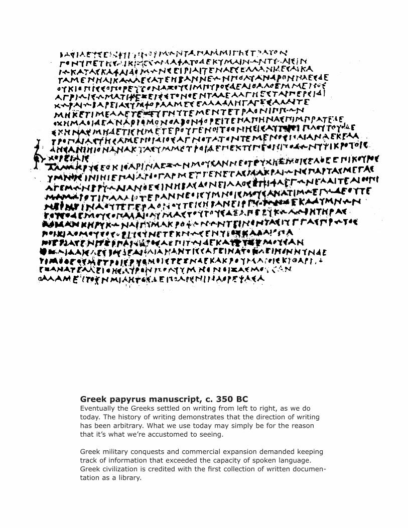
Greek papyrus manuscript, c. 350 BCEventually the Greeks settled on writing from left to right, as we do today. The history of writing demonstrates that the direction of writing has been arbitrary. What we use today may simply be for the reason that it’s what we’re accustomed to seeing.
Greek military conquests and commercial expansion demanded keeping track of information that exceeded the capacity of spoken language. Greek civilization is credited with the first collection of written documen-tation as a library.
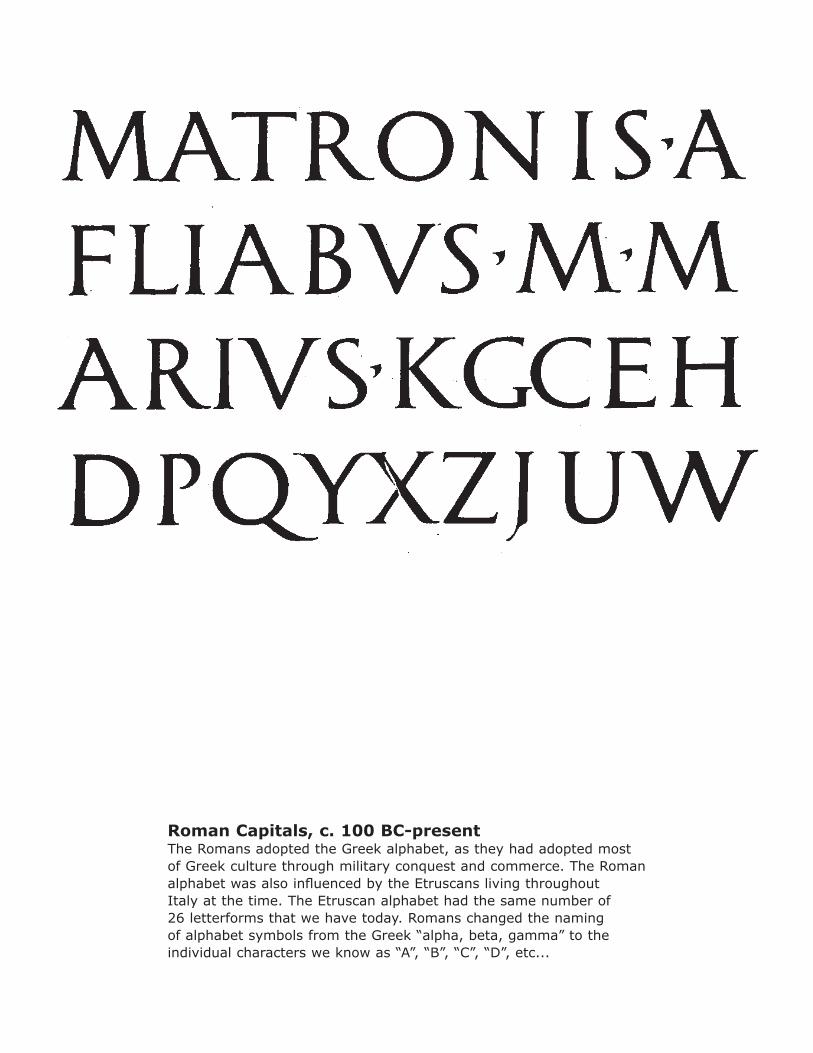
Roman Capitals, c. 100 BC-presentThe Romans adopted the Greek alphabet, as they had adopted most of Greek culture through military conquest and commerce. The Roman alphabet was also influenced by the Etruscans living throughout Italy at the time. The Etruscan alphabet had the same number of 26 letterforms that we have today. Romans changed the naming of alphabet symbols from the Greek “alpha, beta, gamma” to the individual characters we know as “A”, “B”, “C”, “D”, etc...
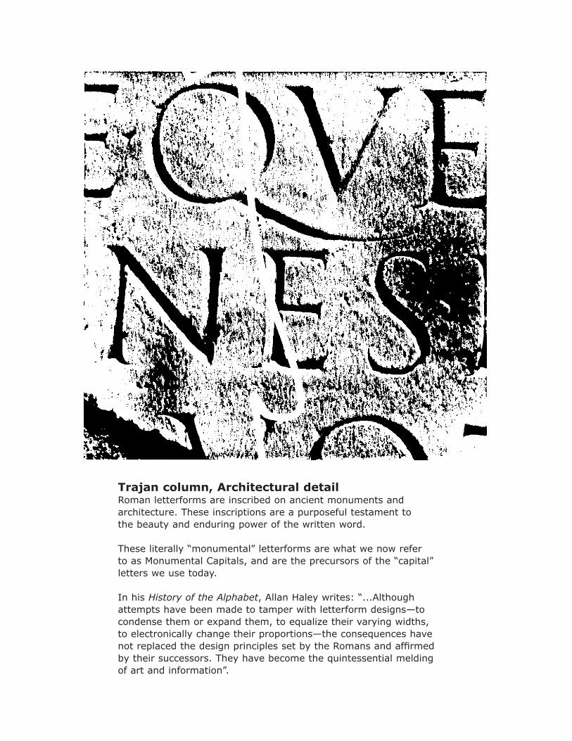
Trajan column, Architectural detailRoman letterforms are inscribed on ancient monuments and architecture. These inscriptions are a purposeful testament to the beauty and enduring power of the written word. These literally “monumental” letterforms are what we now refer to as Monumental Capitals, and are the precursors of the “capital” letters we use today.
In his History of the Alphabet, Allan Haley writes: “...Although attempts have been made to tamper with letterform designs—to condense them or expand them, to equalize their varying widths, to electronically change their proportions—the consequences have not replaced the design principles set by the Romans and affirmed by their successors. They have become the quintessential melding of art and information”.
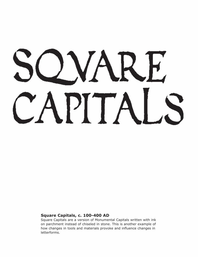
Square Capitals, c. 100-400 ADSquare Capitals are a version of Monumental Capitals written with ink on parchment instead of chiseled in stone. This is another example of how changes in tools and materials provoke and influence changes in letterforms.
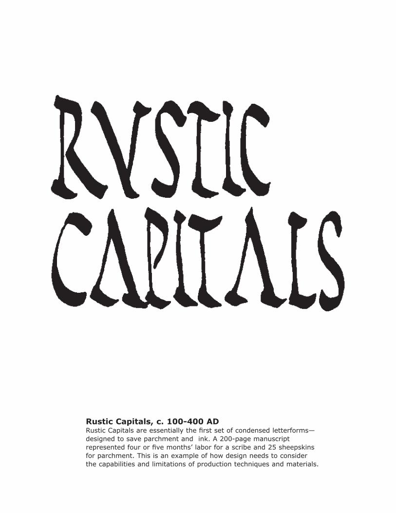
Rustic Capitals, c. 100-400 ADRustic Capitals are essentially the first set of condensed letterforms—designed to save parchment and ink. A 200-page manuscript represented four or five months’ labor for a scribe and 25 sheepskins for parchment. This is an example of how design needs to consider the capabilities and limitations of production techniques and materials.
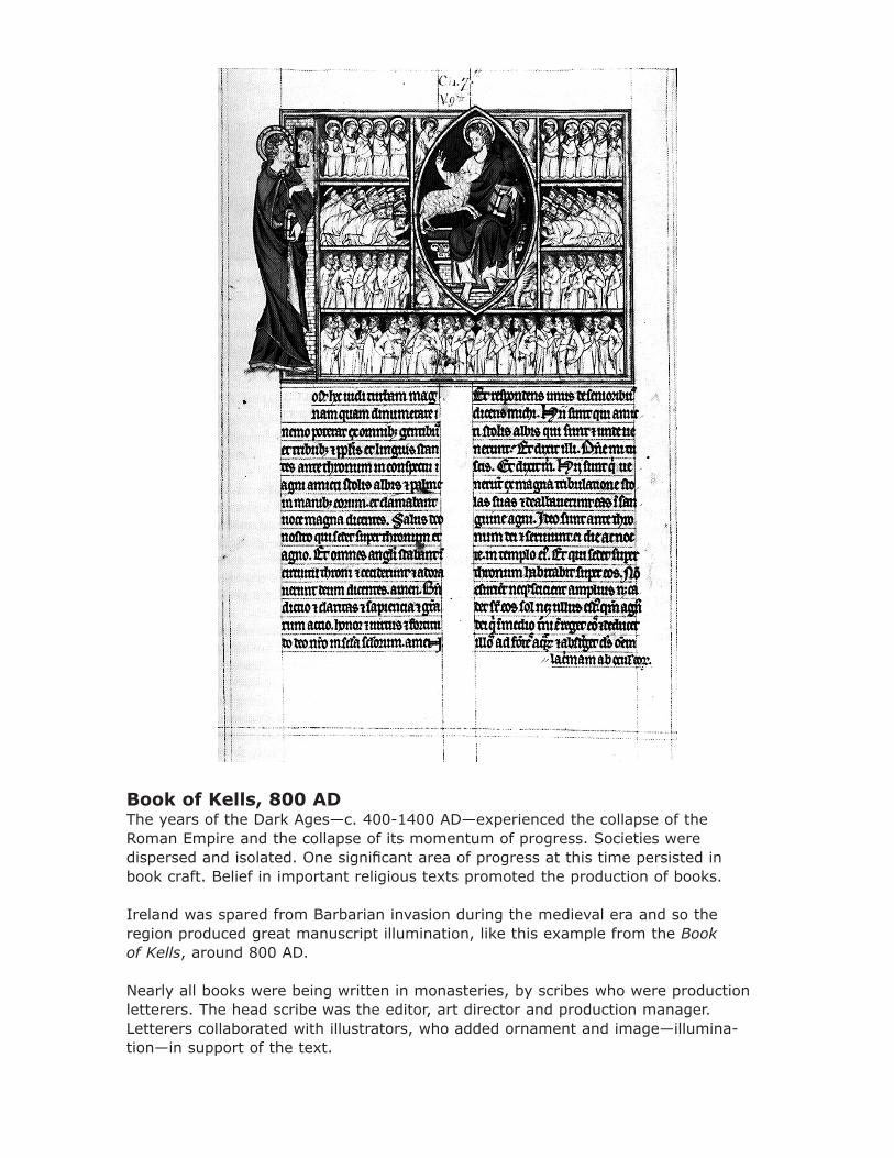
Book of Kells, 800 ADThe years of the Dark Ages—c. 400-1400 AD—experienced the collapse of the Roman Empire and the collapse of its momentum of progress. Societies were dispersed and isolated. One significant area of progress at this time persisted in book craft. Belief in important religious texts promoted the production of books.
Ireland was spared from Barbarian invasion during the medieval era and so the region produced great manuscript illumination, like this example from the Book of Kells, around 800 AD.
Nearly all books were being written in monasteries, by scribes who were production letterers. The head scribe was the editor, art director and production manager. Letterers collaborated with illustrators, who added ornament and image—illumina-tion—in support of the text.
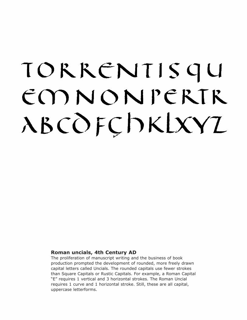
Roman uncials, 4th Century ADThe proliferation of manuscript writing and the business of book production prompted the development of rounded, more freely drawn capital letters called Uncials. The rounded capitals use fewer strokes than Square Capitals or Rustic Capitals. For example, a Roman Capital “E” requires 1 vertical and 3 horizontal strokes. The Roman Uncial requires 1 curve and 1 horizontal stroke. Still, these are all capital, uppercase letterforms.
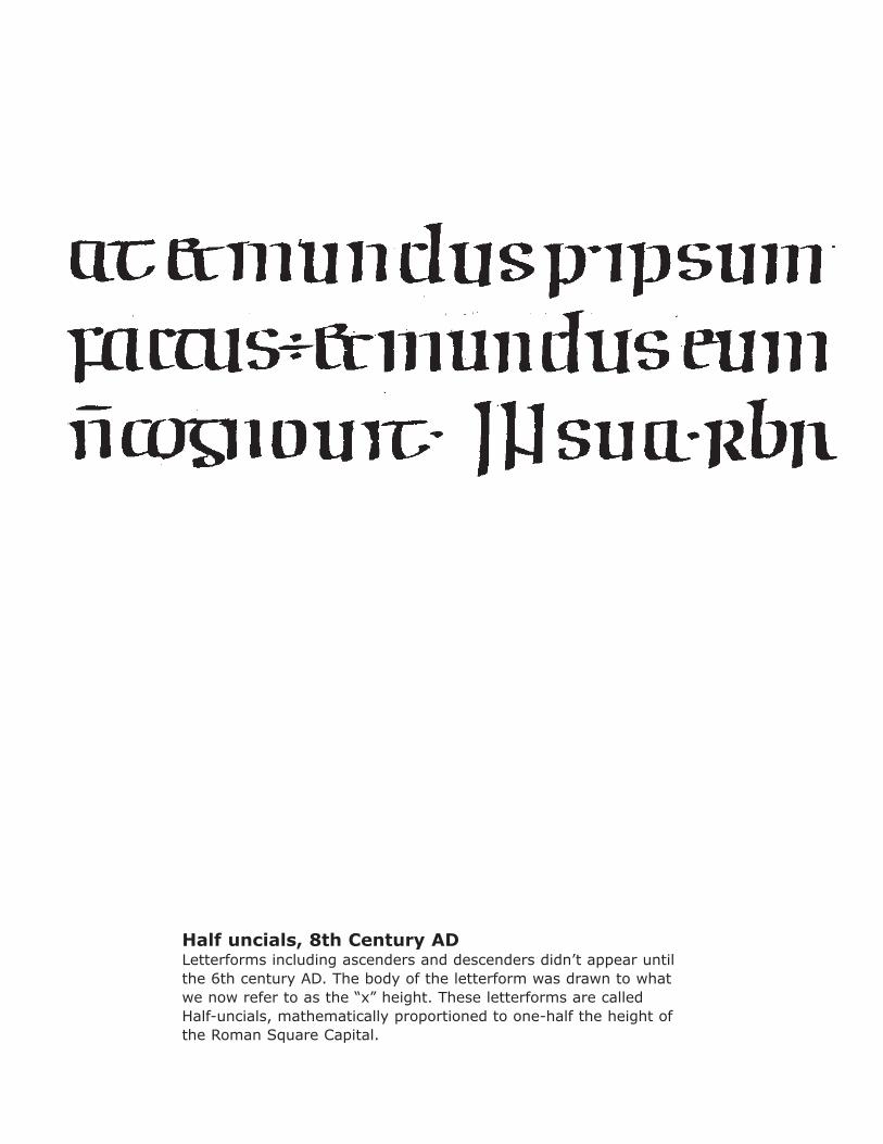
Half uncials, 8th Century ADLetterforms including ascenders and descenders didn’t appear until the 6th century AD. The body of the letterform was drawn to what we now refer to as the “x” height. These letterforms are called Half-uncials, mathematically proportioned to one-half the height of the Roman Square Capital.
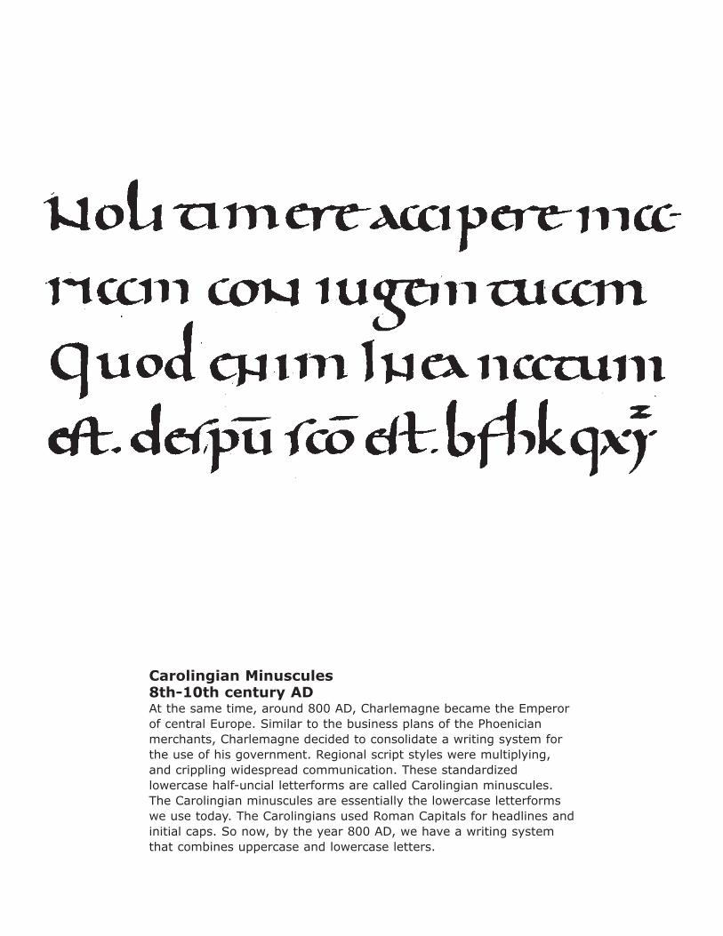
Carolingian Minuscules8th-10th century ADAt the same time, around 800 AD, Charlemagne became the Emperor of central Europe. Similar to the business plans of the Phoenician merchants, Charlemagne decided to consolidate a writing system for the use of his government. Regional script styles were multiplying, and crippling widespread communication. These standardized lowercase half-uncial letterforms are called Carolingian minuscules. The Carolingian minuscules are essentially the lowercase letterforms we use today. The Carolingians used Roman Capitals for headlines and initial caps. So now, by the year 800 AD, we have a writing system that combines uppercase and lowercase letters.
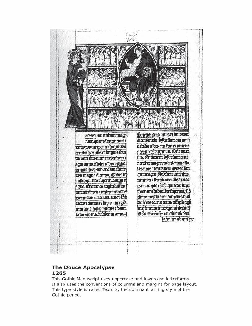
The Douce Apocalypse1265This Gothic Manuscript uses uppercase and lowercase letterforms. It also uses the conventions of columns and margins for page layout.This type style is called Textura, the dominant writing style of the Gothic period.
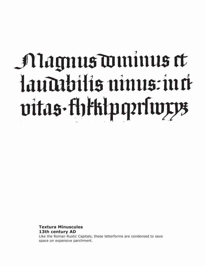
Textura Minuscules13th century ADLike the Roman Rustic Capitals, these letterforms are condensed to save space on expensive parchment.
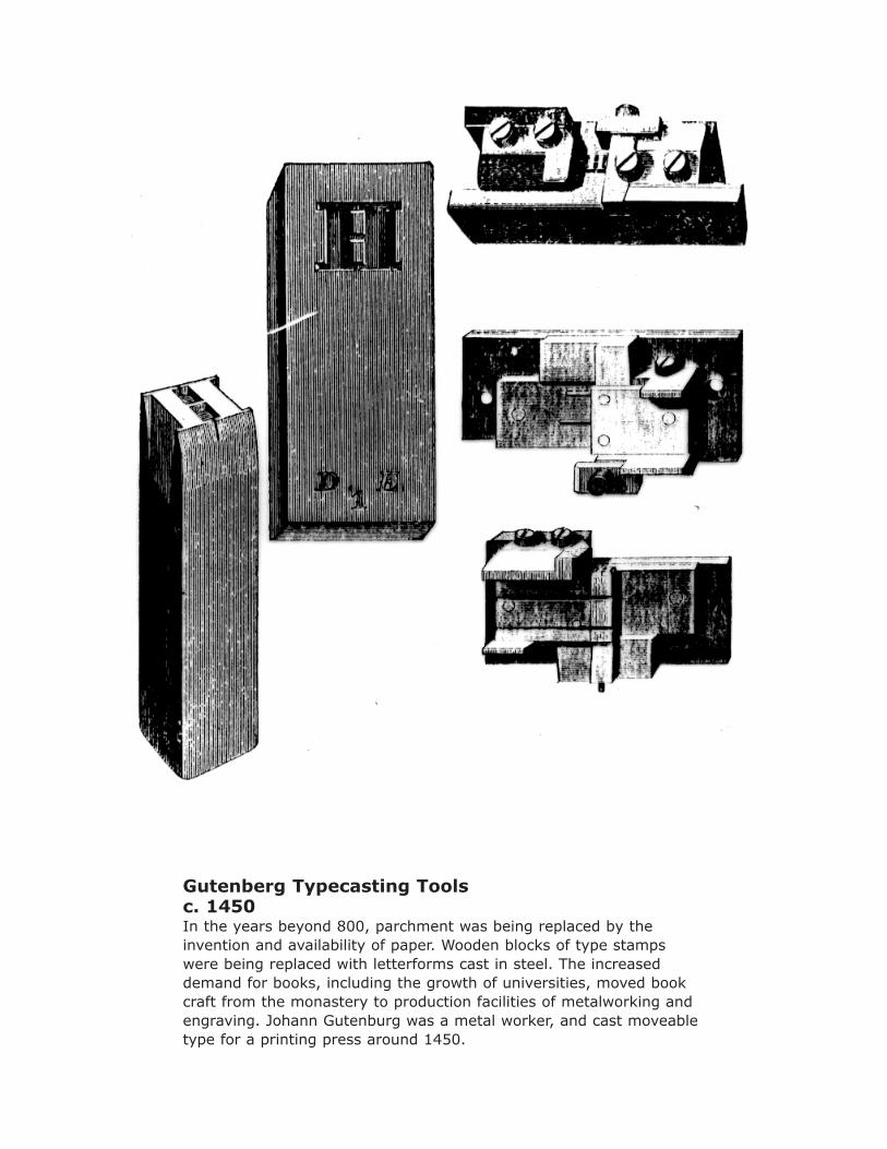
Gutenberg Typecasting Toolsc. 1450In the years beyond 800, parchment was being replaced by the invention and availability of paper. Wooden blocks of type stamps were being replaced with letterforms cast in steel. The increased demand for books, including the growth of universities, moved book craft from the monastery to production facilities of metalworking and engraving. Johann Gutenburg was a metal worker, and cast moveable type for a printing press around 1450.
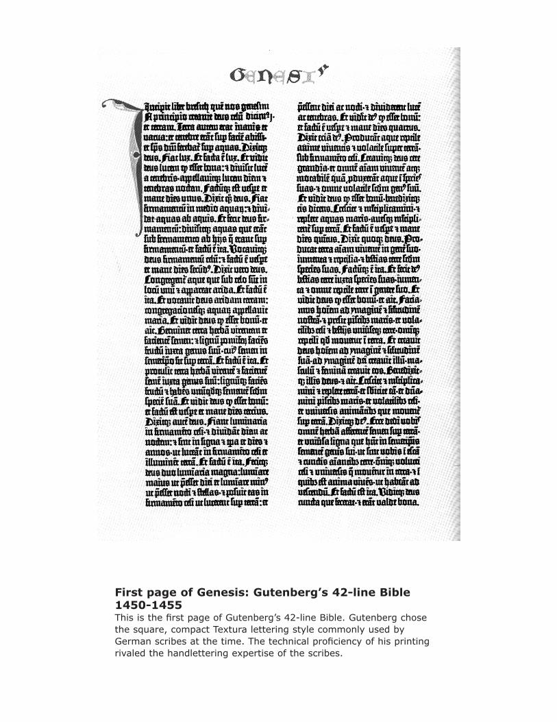
First page of Genesis: Gutenberg’s 42-line Bible1450-1455This is the first page of Gutenberg’s 42-line Bible. Gutenberg chose the square, compact Textura lettering style commonly used by German scribes at the time. The technical proficiency of his printing rivaled the handlettering expertise of the scribes.
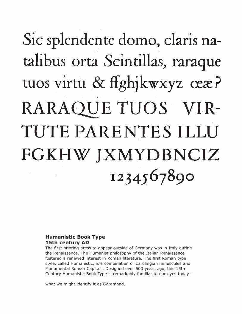
Humanistic Book Type15th century ADThe first printing press to appear outside of Germany was in Italy during the Renaissance. The Humanist philosophy of the Italian Renaissance fostered a renewed interest in Roman literature. The first Roman type style, called Humanistic, is a combination of Carolingian minuscules and Monumental Roman Capitals. Designed over 500 years ago, this 15th Century Humanistic Book Type is remarkably familiar to our eyes today—
what we might identify it as Garamond.
History of the Western European AlphabetAnnotated References James Craig, Designing with Type: A Basic Course in Typography Very practical information about the origins of the alphabet, and the use of type Rob Carter, Ben Day, and Philip Meggs, Typographic Design: Form and Function Includes a very comprehensive and well-illustrated chronological timeline of the evolution of typography Albertine Gaur, A History of Writing History and theory of writing from around the world Allan Haley, The History, Evolution, and Design of the Letters We Use Today Demonstrates the evolution of individual capital letters, lowercase letters, numerals, and punctuation Philip Meggs, A History of Graphic Design Comprehensive survey of graphic design, from prehistoric cave paintings, to computer graphics