Embed Size (px)
Citation preview

HOW TO MAKE YOUR WEBSITE WORK ACROSS MULTIPLE DEVICESACROSS MULTIPLE DEVICES
Your audienceisn’t on one screen anymore…
of people use their smartphones while
of people move between devices to
accomplish a goal, whether it’s on
smartphones, PCs, tablets or TV.1
90%
86%of people use their smartphones while
consuming other media. 2
Average number of devices per
person in UK increasing from 2.3
in 2012 to 3 in 2013. 3
1. The New Multi-screen World: Understanding Cross-Platform Consumer Behavior; Google and Ipsos MetdiaCT; U.S; August 2012
2. What Users Want Most From Mobile Sites Today; Google/Sterling Research/ SmithGeiger, US, July 2012
3. Google Connected Device Study, UK, March 2013
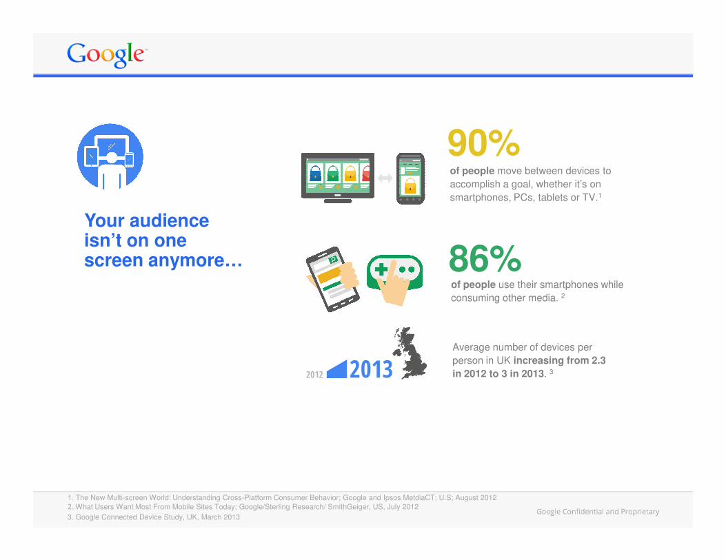
…and they love their smartphonesand tablets
Smartphone usage in the UK has
more than doubled in two years,
rising to 62%. 1
80% never leave home without
their smartphone. 4
and tablets
1. Our Mobile Planet, Google, Feb 2013 / 2. Our Mobile Planet, Google, Feb 2013 / 3. Our Mobile Planet, Google, Feb 2013/4. Our Mobile Planet, Google, Feb 2013 / 5. Our Mobile Planet, Google, Feb 2013 / 6. 2013 Mobile Path-to-Purchase –Understanding Mobile’s role in the consumer’s path to purchase for specific industries, xAd/Telmetrics/Nielsen, US, Aug 2012
Nearly three quarters of British
smartphone users go online with
their mobile every day. 3
People use their smartphone
everywhere: 85% use it on the go,
71% at work and 72% in stores. 5
Tablet usage in UK tripled in the
last year rising to 30% from
11% a year earlier. 2
46% of smartphone owners
only use their phone to
research. 6
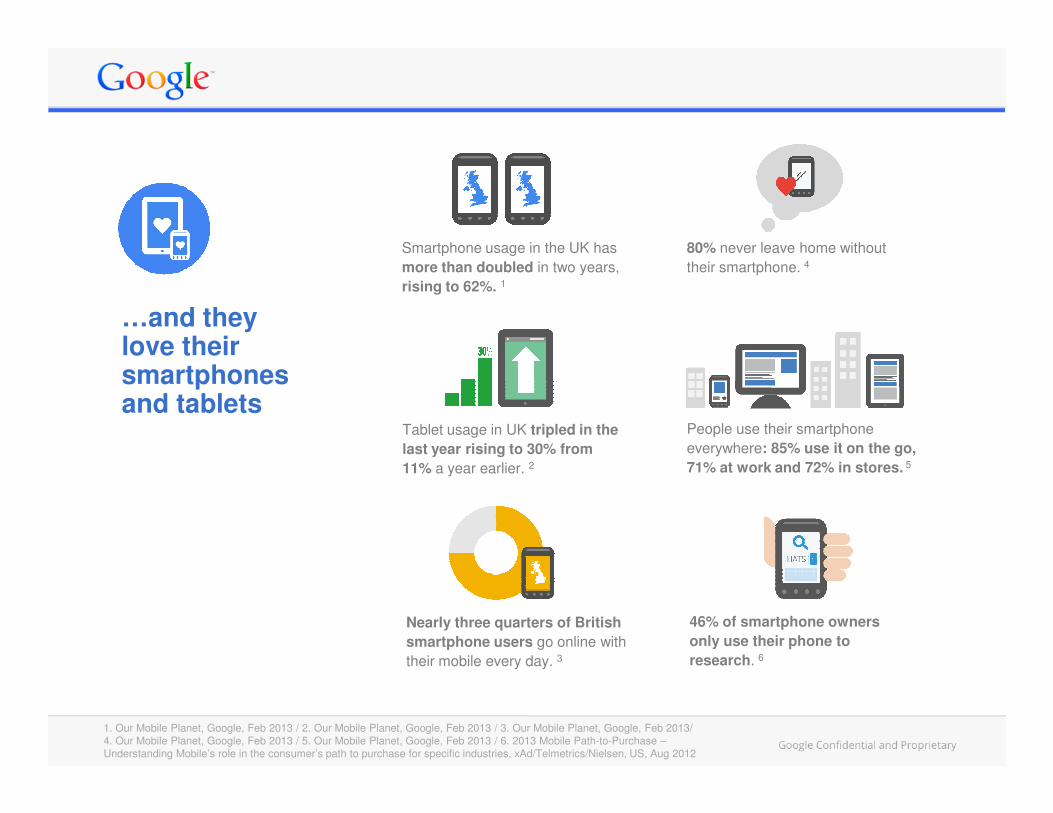
Sites that workacross deviceshave a big impact
of customers who visit a mobile
of customers prefer a mobile friendly site.1
75%
61%of customers who visit a mobile unfriendly site are likely to go to a competitor's site.2
1. What Users Want Most From Mobile Sites Today; Google/Sterling Research/SmithGeiger, US, July 2012 2. What Users Want Most From Mobile Sites Today; Google/Sterling Research/SmithGeiger, US, July 2012
Sites that work well across devices keep your customers happy, improve the performance of your online marketing and build brand value.
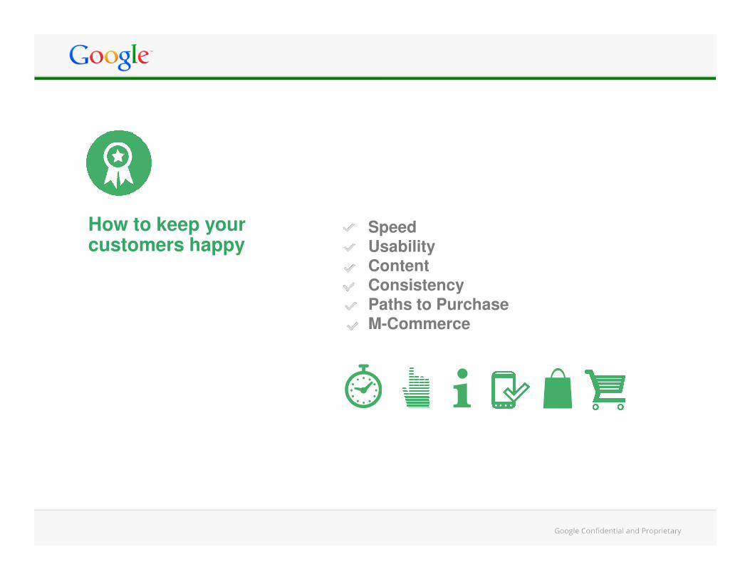
How to keep your customers happy
SpeedUsabilityContent ConsistencyConsistencyPaths to PurchaseM-Commerce
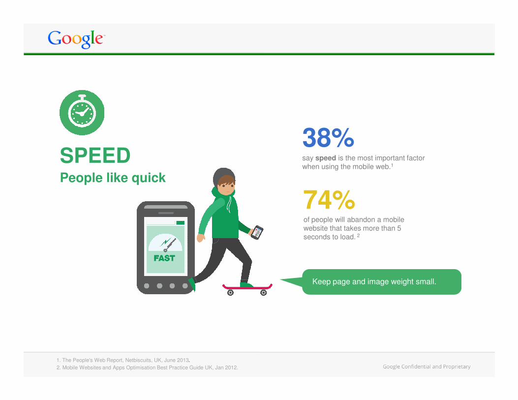
People like quick
say speed is the most important factor when using the mobile web.1
SPEED38%
74%of people will abandon a mobile website that takes more than 5 seconds to load. 2
74%
1. The People's Web Report, Netbiscuits, UK, June 2013.
2. Mobile Websites and Apps Optimisation Best Practice Guide UK, Jan 2012.
Keep page and image weight small.
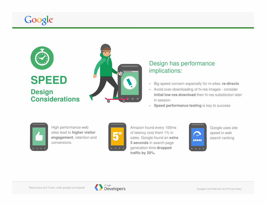
• Big speed concern especially for m-sites: re-directs
• Avoid over-downloading of hi-res images - consider
initial low-res download then hi-res substitution later
in session
DesignConsiderations
Design has performance
implications:
SPEED
Google uses site
speed in web
search ranking
• Speed performance testing is key to success
High performance web
sites lead to higher visitor
engagement, retention and
conversions.
Amazon found every 100ms
of latency cost them 1% in
sales. Google found an extra
5 seconds in search page
generation time dropped
traffic by 20%.
Resources and Tools: code.google.com/speed
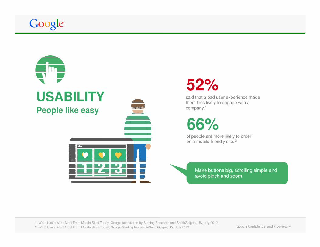
52%said that a bad user experience made them less likely to engage with a company.1People like easy
66%
USABILITY
1. What Users Want Most From Mobile Sites Today, Google (conducted by Sterling Research and SmithGeiger), US, July 2012.
of people are more likely to order on a mobile friendly site. 2
66%
2. What Users Want Most From Mobile Sites Today; Google/Sterling Research/SmithGeiger, US, July 2012
Make buttons big, scrolling simple and
avoid pinch and zoom.
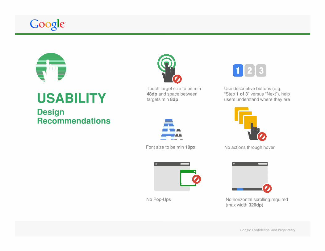
Design Recommendations
USABILITYTouch target size to be min 48dp and space between targets min 8dp
Use descriptive buttons (e.g. “Step 1 of 3” versus “Next”), help users understand where they are
Font size to be min 10px
No horizontal scrolling required (max width 320dp)
No actions through hover
No Pop-Ups
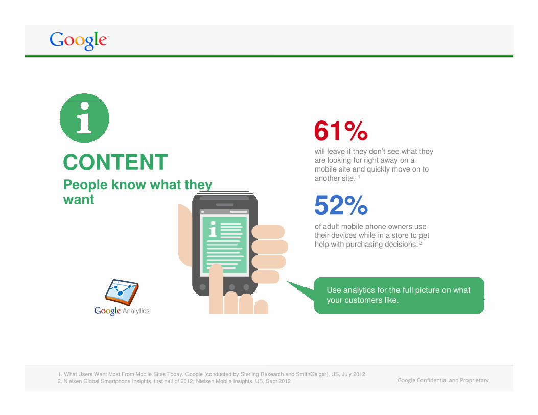
CONTENTPeople know what they want
will leave if they don’t see what they are looking for right away on a mobile site and quickly move on to another site. 1
61%
52%
1. What Users Want Most From Mobile Sites Today, Google (conducted by Sterling Research and SmithGeiger), US, July 2012
52%of adult mobile phone owners use their devices while in a store to get help with purchasing decisions. 2
2. Nielsen Global Smartphone Insights, first half of 2012; Nielsen Mobile Insights, US, Sept 2012
Use analytics for the full picture on what
your customers like.
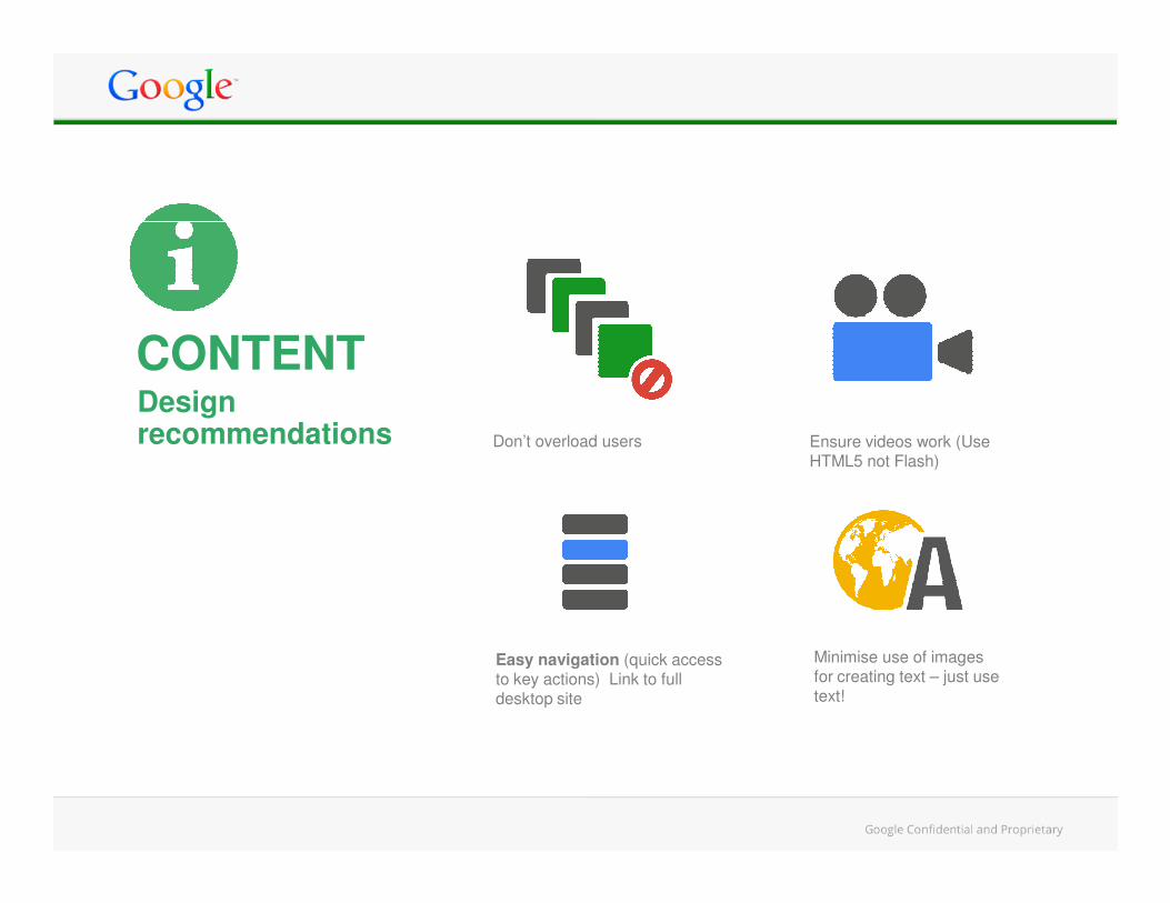
Don’t overload users Ensure videos work (Use HTML5 not Flash)
CONTENTDesign recommendations
Easy navigation (quick access to key actions) Link to full desktop site
HTML5 not Flash)
Minimise use of images for creating text – just use text!
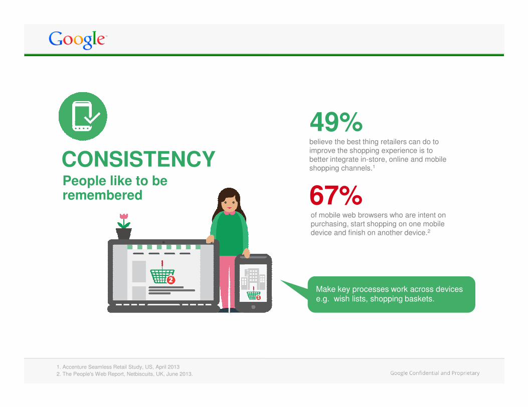
believe the best thing retailers can do to improve the shopping experience is to better integrate in-store, online and mobile shopping channels.1
People like to be remembered
49%
67%
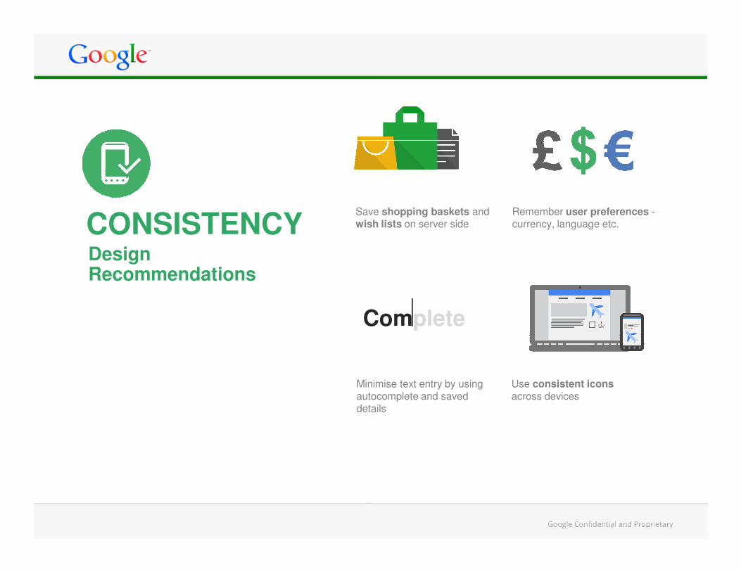
CONSISTENCY
1. Accenture Seamless Retail Study, US, April 2013
67%of mobile web browsers who are intent on purchasing, start shopping on one mobile device and finish on another device.2
2. The People's Web Report, Netbiscuits, UK, June 2013.
Make key processes work across devices
e.g. wish lists, shopping baskets.
Design Recommendations
Remember user preferences -currency, language etc.
Save shopping baskets and wish lists on server sideCONSISTENCY
Minimise text entry by using autocomplete and saved details
Use consistent icons across devices
Complete
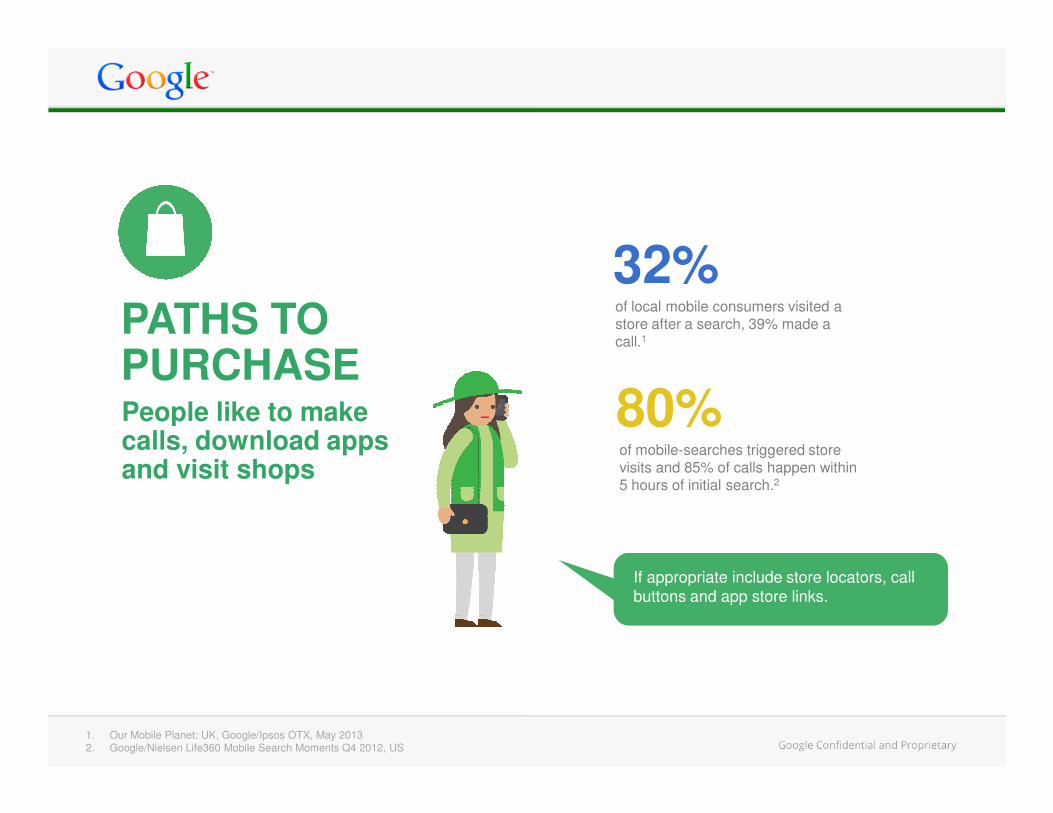
32%PATHS TO PURCHASEPeople like to make
of local mobile consumers visited a store after a search, 39% made a call.1
80%People like to make calls, download apps and visit shops
If appropriate include store locators, call
buttons and app store links.
of mobile-searches triggered store visits and 85% of calls happen within 5 hours of initial search.2
80%
1. Our Mobile Planet: UK, Google/Ipsos OTX, May 20132. Google/Nielsen Life360 Mobile Search Moments Q4 2012, US
Design
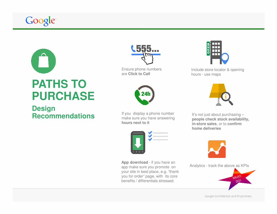
Ensure phone numbers are Click to Call
Include store locator & opening hours - use maps
PATHS TO PURCHASEDesignRecommendations
If you display a phone number make sure you have answering hours next to it
App download - if you have an app make sure you promote on your site in best place, e.g. “thank you for order” page, with its core benefits / differentials stressed.
It’s not just about purchasing –people check stock availability, in-store sales, or to confirm home deliveries
Analytics - track the above as KPIs
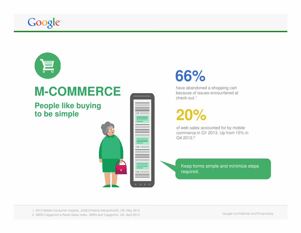
66%M-COMMERCEPeople like buying to be simple
have abandoned a shopping cart because of issues encountered at check-out.1
20%to be simple
1. 2013 Mobile Consumer Insights, JUMLO/Harris Interactive(R), US, May 2013
2. IMRG Capgemini e-Retail Sales Index, IMRG and Capgemini, UK, April 2013
Keep forms simple and minimize steps
required.
20%of web sales accounted for by mobile commerce in Q1 2013. Up from 15% in Q4 2012.2
Design Recommendations
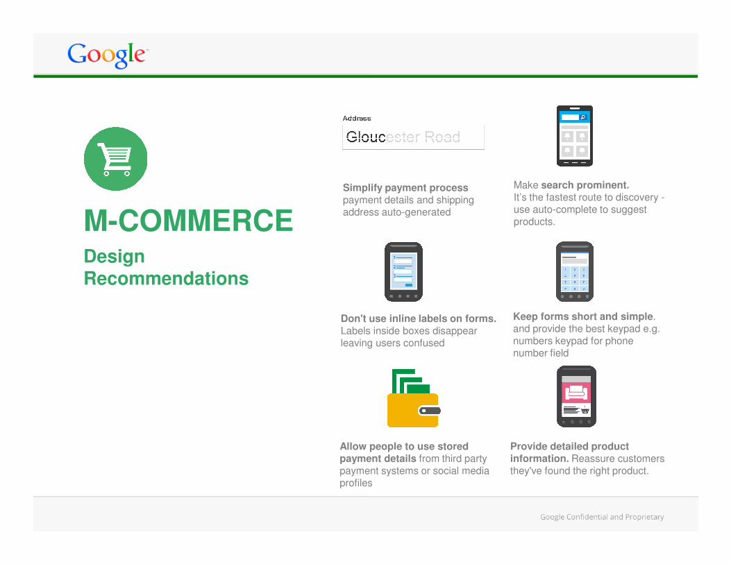
M-COMMERCE
Simplify payment process payment details and shipping address auto-generated
Make search prominent.It’s the fastest route to discovery -use auto-complete to suggest products.
Recommendations
Keep forms short and simple. and provide the best keypad e.g. numbers keypad for phone number field
Provide detailed product information. Reassure customers they've found the right product.
Don't use inline labels on forms. Labels inside boxes disappear leaving users confused
Allow people to use stored payment details from third party payment systems or social media profiles
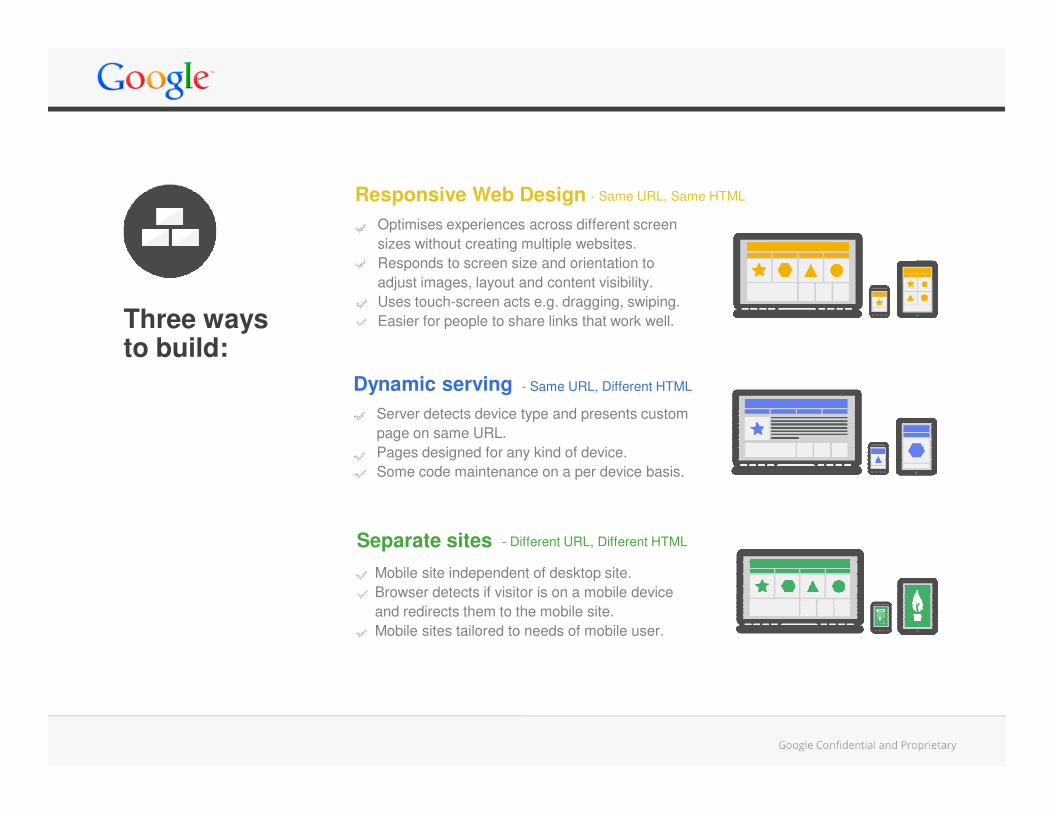
Three ways to build:
Responsive Web Design
Dynamic serving
Optimises experiences across different screen
sizes without creating multiple websites.
Responds to screen size and orientation to
adjust images, layout and content visibility.
Uses touch-screen acts e.g. dragging, swiping.
Easier for people to share links that work well.
Server detects device type and presents custom
- Same URL, Same HTML
- Same URL, Different HTML
Separate sites
Server detects device type and presents custom
page on same URL.
Pages designed for any kind of device.
Some code maintenance on a per device basis.
Mobile site independent of desktop site.
Browser detects if visitor is on a mobile device
and redirects them to the mobile site.
Mobile sites tailored to needs of mobile user.
- Different URL, Different HTML
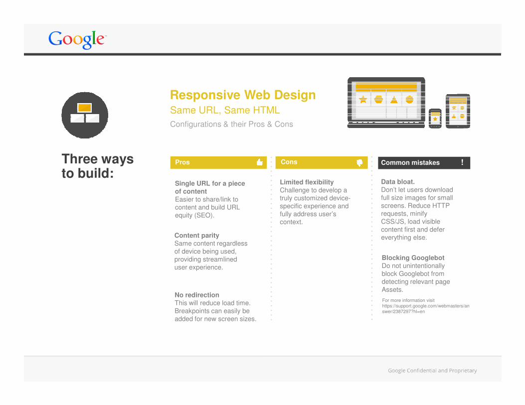
Data bloat.
Don’t let users download
full size images for small
screens. Reduce HTTP
Limited flexibility
Challenge to develop a
truly customized device-
specific experience and
Single URL for a piece
of content
Easier to share/link to
Same URL, Same HTML
Responsive Web Design
Configurations & their Pros & Cons
Pros Cons Common mistakes !Three ways to build:
screens. Reduce HTTP
requests, minify
CSS/JS, load visible
content first and defer
everything else.
Blocking Googlebot
Do not unintentionally
block Googlebot from
detecting relevant page
Assets.
specific experience and
fully address user’s
context.
Easier to share/link to
content and build URL
equity (SEO).
Content parity
Same content regardless
of device being used,
providing streamlined
user experience.
No redirection
This will reduce load time.
Breakpoints can easily be
added for new screen sizes.
For more information visit
https://support.google.com/webmasters/an
swer/2387297?hl=en
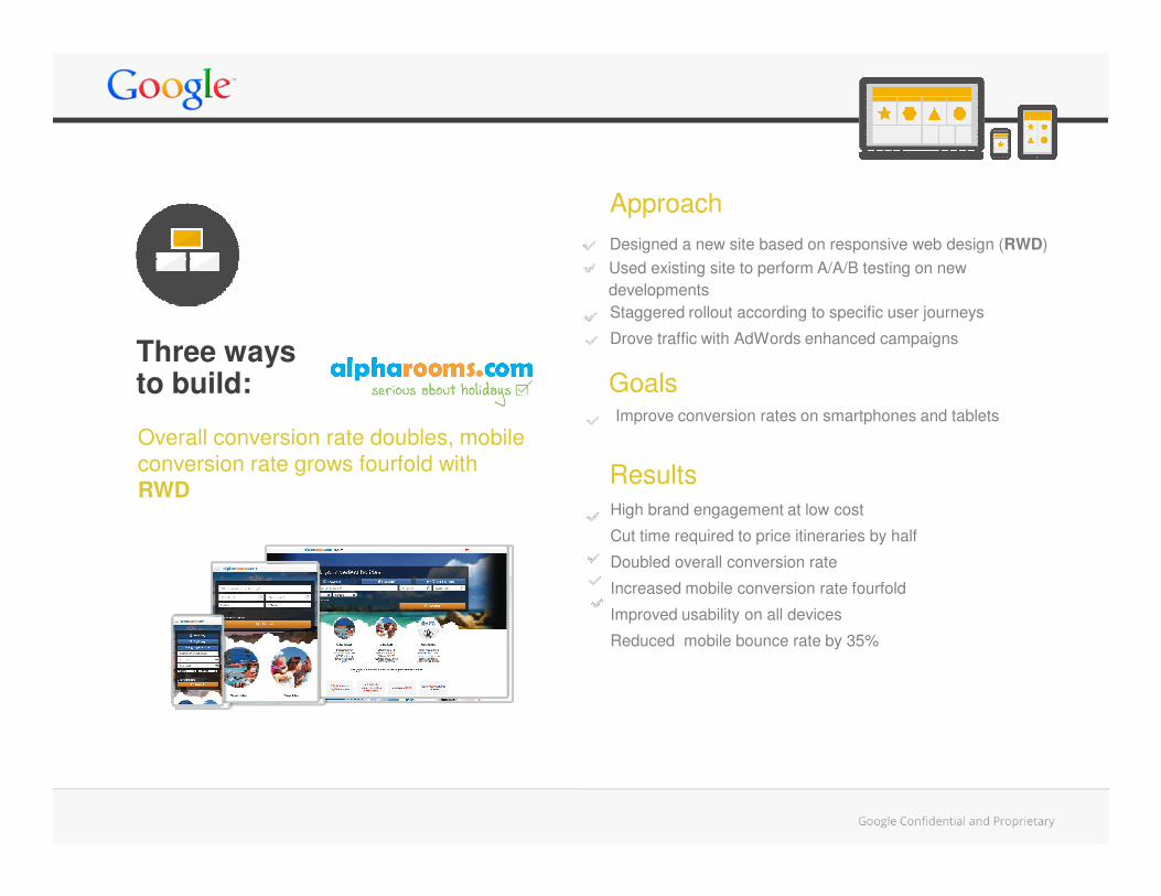
Designed a new site based on responsive web design (RWD)
Improve conversion rates on smartphones and tablets
Goals
Approach
Overall conversion rate doubles, mobile
Three ways to build:
Staggered rollout according to specific user journeys
Drove traffic with AdWords enhanced campaigns
Used existing site to perform A/A/B testing on new
developments
High brand engagement at low cost
Cut time required to price itineraries by half
Doubled overall conversion rate
Increased mobile conversion rate fourfold
Improved usability on all devices
Reduced mobile bounce rate by 35%
Results
Overall conversion rate doubles, mobile
conversion rate grows fourfold with
RWD
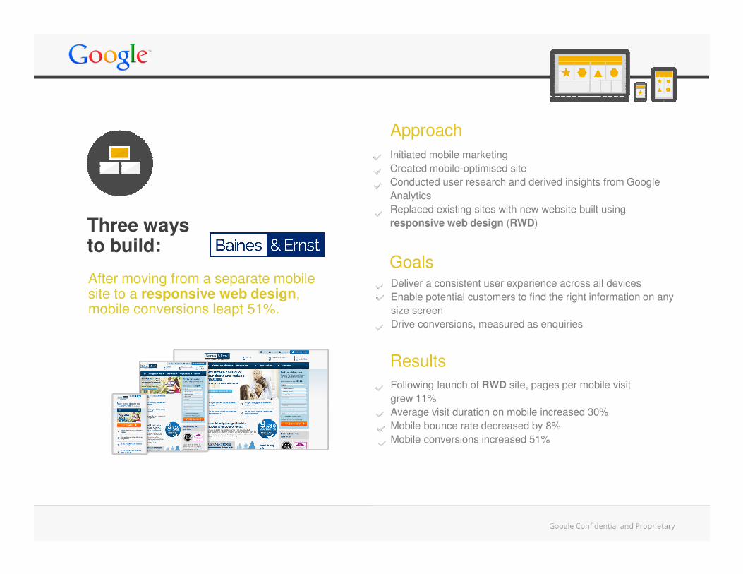
Initiated mobile marketing
Created mobile-optimised site
Conducted user research and derived insights from Google
Analytics
Replaced existing sites with new website built using
responsive web design (RWD)
Deliver a consistent user experience across all devices
Goals
Approach
After moving from a separate mobile site to a responsive web design,
Three ways to build:
Deliver a consistent user experience across all devices
Enable potential customers to find the right information on any
size screen
Drive conversions, measured as enquiries
Following launch of RWD site, pages per mobile visit
grew 11%
Average visit duration on mobile increased 30%
Mobile bounce rate decreased by 8%
Mobile conversions increased 51%
Results
site to a responsive web design, mobile conversions leapt 51%.
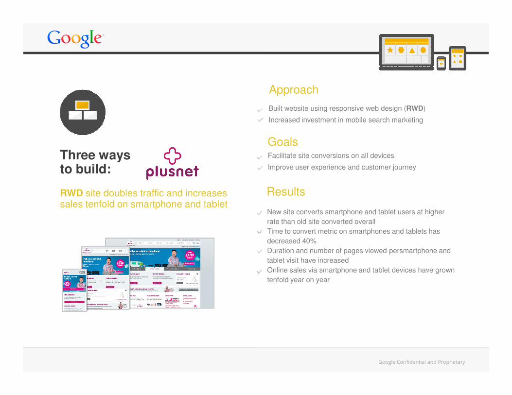
RWD site doubles traffic and increases
Built website using responsive web design (RWD)
Increased investment in mobile search marketing
Facilitate site conversions on all devices
Improve user experience and customer journey
Goals
Results
Approach
Three ways to build:
RWD site doubles traffic and increases sales tenfold on smartphone and tablet
New site converts smartphone and tablet users at higher
rate than old site converted overall
Time to convert metric on smartphones and tablets has
decreased 40%
Duration and number of pages viewed persmartphone and
tablet visit have increased
Online sales via smartphone and tablet devices have grown
tenfold year on year
Results
Goals
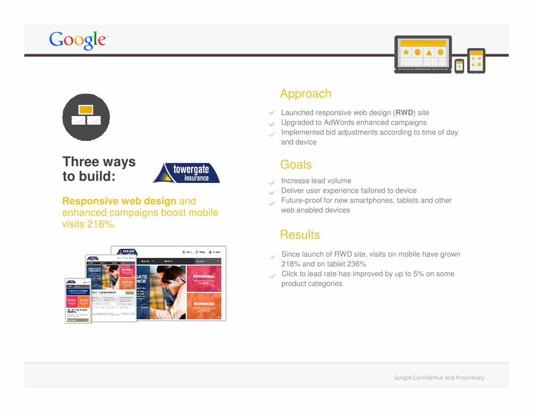
Increase lead volume
Deliver user experience tailored to device
Future-proof for new smartphones, tablets and other
web enabled devices
Launched responsive web design (RWD) site
Upgraded to AdWords enhanced campaigns
Implemented bid adjustments according to time of day
and device
Responsive web design and
Approach
Three ways to build:
web enabled devices
Since launch of RWD site, visits on mobile have grown
218% and on tablet 236%
Click to lead rate has improved by up to 5% on some
product categories
Results
Responsive web design and enhanced campaigns boost mobile visits 218%.
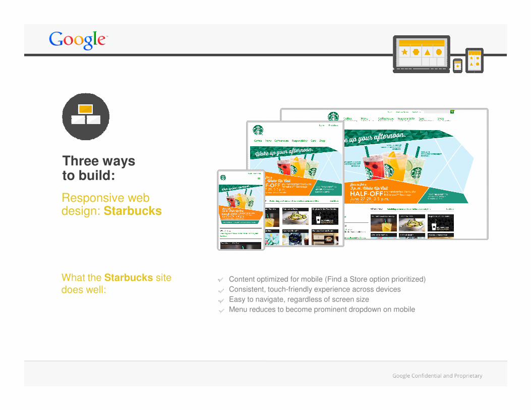
Responsive web design: Starbucks
Three ways to build:
What the Starbucks site
does well:
design: Starbucks
Content optimized for mobile (Find a Store option prioritized)
Consistent, touch-friendly experience across devices
Easy to navigate, regardless of screen size
Menu reduces to become prominent dropdown on mobile
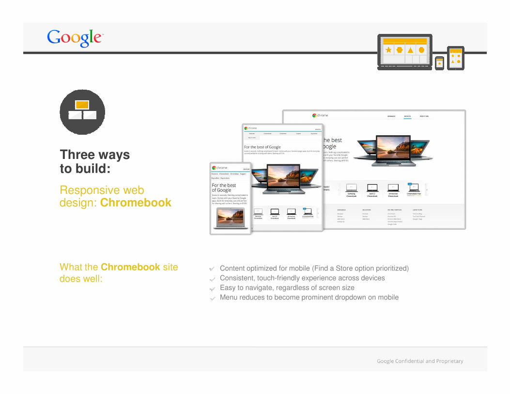
Responsive web design: Chromebook
Three ways to build:
design: Chromebook
Content optimized for mobile (Find a Store option prioritized)
Consistent, touch-friendly experience across devices
Easy to navigate, regardless of screen size
Menu reduces to become prominent dropdown on mobile
What the Chromebook site
does well:
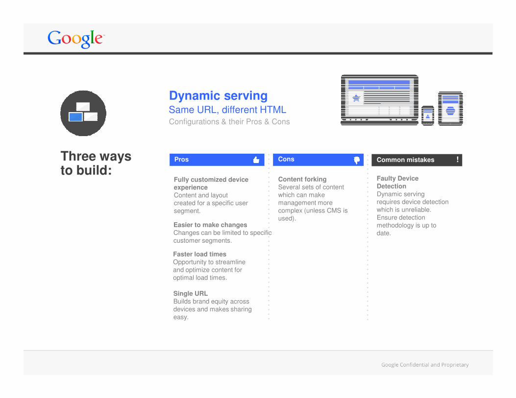
Same URL, different HTML
Faulty Device
Detection
Dynamic serving
requires device detection
Dynamic serving
Content forking
Several sets of content
which can make
management more
Fully customized device
experience
Content and layout
Configurations & their Pros & Cons
Pros Cons Common mistakes !Three ways to build:
requires device detection
which is unreliable.
Ensure detection
methodology is up to
date.
management more
complex (unless CMS is
used).
created for a specific user
segment.
Easier to make changes
Changes can be limited to specific
customer segments.
Faster load times
Opportunity to streamline
and optimize content for
optimal load times.
Single URL
Builds brand equity across
devices and makes sharing
easy.
Different URL, Different HTML
Separate mobile site
Multiple URLs
Sharing a web page
requires flawless
Fully customized to mobile
users
Content and overall experience
Faulty Redirects
Avoid redirects from deep
desktop pages to a generic
Pros Cons Common mistakes
Configurations & their Pros & Cons
!Three ways to build:
requires flawless
redirecting integration.Content and overall experience
created for a specific user
segment.
Easier to make changes
Changes can be limited to the
mobile version of a website,
other devices do not have to be
considered.
Faster load times
Opportunity to streamline and
optimize content for optimal load
times.
Content forking
Two different sets of content
which can make management
more complex.
desktop pages to a generic
mobile homepage. Also avoid
smartphone-only 404s.
Annotations for desktop
and mobile URLs
Use appropriate tags to
indicate device specific
content so your sites can be
indexed correctly.
Consistent user experience
Avoid unintentional differences in
user experience across devices.
It might lead to bad user
experience (especially missing
content).
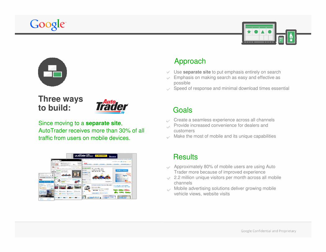
GoalsCreate a seamless experience across all channelsProvide increased convenience for dealers and
Use separate site to put emphasis entirely on search Emphasis on making search as easy and effective as possibleSpeed of response and minimal download times essential
Approach
Since moving to a separate site,
Three ways to build:
Provide increased convenience for dealers and customersMake the most of mobile and its unique capabilities
Approximately 80% of mobile users are using Auto Trader more because of improved experience2.2 million unique visitors per month across all mobile channelsMobile advertising solutions deliver growing mobile vehicle views, website visits
Results
Since moving to a separate site,
AutoTrader receives more than 30% of all
traffic from users on mobile devices.
Sites that work across multiple devices give your Key considerations are SPEED, USABILITY,
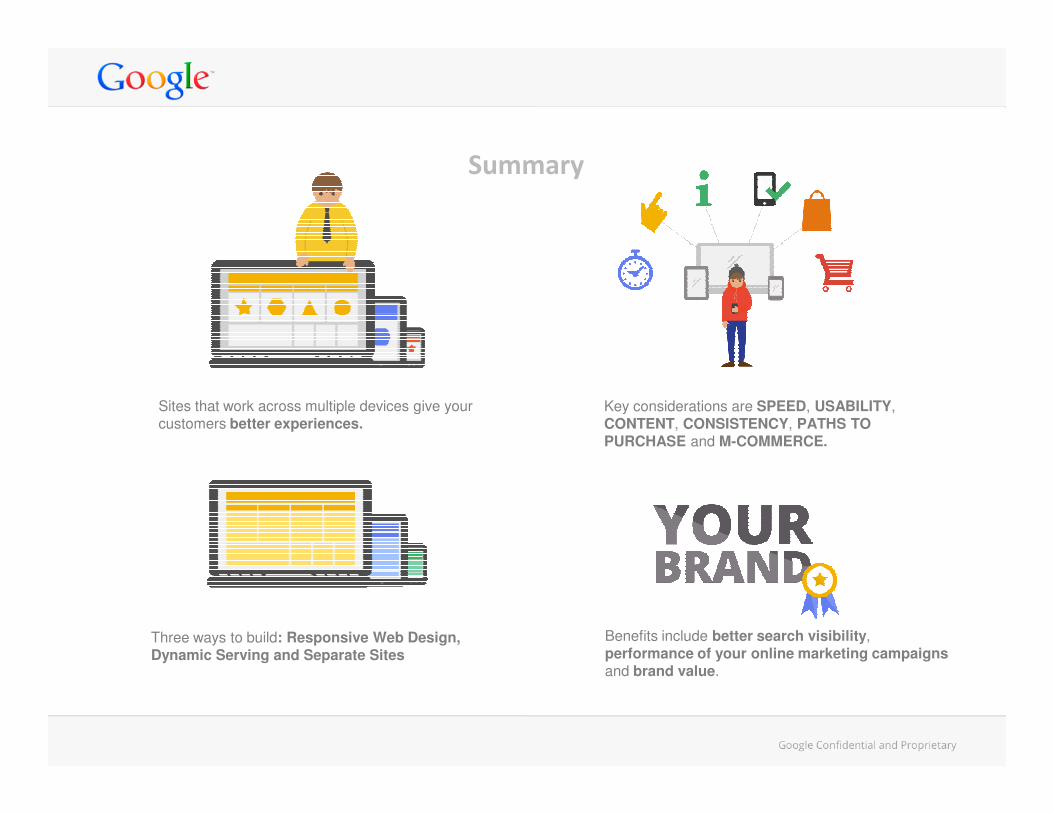
Summary
Sites that work across multiple devices give your customers better experiences.
Benefits include better search visibility, performance of your online marketing campaigns and brand value.
Three ways to build: Responsive Web Design, Dynamic Serving and Separate Sites
Key considerations are SPEED, USABILITY, CONTENT, CONSISTENCY, PATHS TO PURCHASE and M-COMMERCE.
For more information on how to make your
website work across multiple devices:
www.google.co.uk/think


