Embed Size (px)
Citation preview
BIET IT-IV Year 1 Sem (2011-2012) HCI NOTES
Prepared By- Nazia Banu and Ch.Ramu1
HUMAN COMPUTER INTERACTION
UNIT-I:-Introduction:- Importance of user Interface- definition, importance of good design. Benefits ofgood design. A briefly history off Screen design.
UNIT-IIThe graphical user interface- popularity of graphics, the concepts of direct manipulation,graphical system, Characteristics- Principles of user interface.
The User Interface-An Introduction And Overview
The user interface is the most important part of any computer system. It is the system to mostusers. It can be seen and it can be heard and it can be touched. The goals of interface designare simple, to make working with a computer easy, productive, arid enjoyable.
The Importance Of The User Interface:-
Defining the User Interface:-
User Interface design is a subset of a field of study called human-computer interaction(HCI). Human -Computer Interaction is the study, planning, and design of how people andcomputers work together so that a person's needs are satisfied in the most effective way.
The User interface is the part of a computer and its software that people can see, hear,touch, talk to, or otherwise understand or direct. The user interface has essentially twocomponents: input and output. Input is how a person communicates his or her need ordesires to the computer. Some common input components are the keyboard, mouse,trackball, one's finger(for touch-sensitive screens), and one's voice. Output is how thecomputer conveys the results of its computations and requirements to the user. Today, themost common computer output mechanism is the display screen.
The Importance of Good Design:- With today's technology and tools, and our motivation tocreate really effective and usable interfaces and screens, why do we continue to producesystems that are inefficient and confusing or, at worst, just plain unusable? Is it because:
1) We don't care?2) We don't posses common sense?3) We don't have the time?4) We still don't know what really makes good design?
We do care. But we never seem to have time to find out what makes good design, nor toproperly apply it. After all, many of us have other things to do in addition to designinginterfaces and screens. So we take our best shot given the workload and time constraintsimposed upon us. The result, too often, is woefully inadequate.
A well- designed interface and screen is terribly important to our users. It is their
BIET IT-IV Year 1 Sem (2011-2012) HCI NOTES
Prepared By- Nazia Banu and Ch.Ramu2
window to view the capabilities of the system.
A screen's layout and appearance affect a person in a variety of ways. It they areconfusing and inefficient, people will have greater difficulty in doing their jobs and willmake more mistakes.
The Benefits of Good Design:- Screen users were about 20 percent more productive with theless-crowded version. Screen users of the modified screens completed transactions in 25percent less time and with 25 percent fewer errors than those who used the original screens.
Cope and Uliano (1995) found that one graphical window redesigned to be moreeffective would save a company about $20,000 during its first year of use.
Other benefits also accrue from good design. Training costs are lowered becausetraining time is reduced, support line costs are lowered because fewer assist calls arenecessary, and employee satisfaction is increased because aggravation and frustration arereduced. Another benefit is, ultimately, than an organization's customer's benefit because ofthe improved service they receive.
A Brief History of the Human-Computer Interface:- Through its first few decades, acomputer's ability to deal with human communication was inversely related to what waseasy for people to do. The human-computer dialog reflected the computer's preferences,consisting of one style or a combination of styles using keyboards, commonly referred to asCommand Language, Question and Answer, Menu Selection, Function key Selection, andForm Fill-in.
Systems that recognize human speech and handwriting now exist, although they stilllack the universality and richness of typed input.
BIET IT-IV Year 1 Sem (2011-2012) HCI NOTES
Prepared By- Nazia Banu and Ch.Ramu3
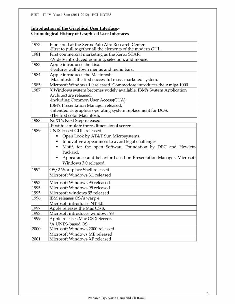
Introduction of the Graphical User Interface:-Chronological History of Graphical User Interfaces
1973 Pioneered at the Xerox Palo Alto Research Center.-First to pull together all the elements of the modern GUI.
1981 First commercial marketing as the Xerox STAR.-Widely introduced pointing, selection, and mouse.
1983 Apple introduces the Lisa.-Features pull-down menus and menu bars.
1984 Apple introduces the Macintosh.-Macintosh is the first successful mass-marketed system.
1985 Microsoft Windows 1.0 released. Commodore introduces the Amiga 1000.1987 X Windows system becomes widely available. IBM's System Application
Architecture released.-including Common User Access(CUA).IBM's Presentation Manager released.-Intended as graphics operating system replacement for DOS.-The first color Macintosh.
1988 NeXT's Next Step released.-First to simulate three-dimensional screen.
1989 UNIX-based GUIs released. Open Look by AT&T Sun Microsystems. Innovative appearances to avoid legal challenges. Motif, for the open Software Foundation by DEC and Hewlett-
Packard. Appearance and behavior based on Presentation Manager. Microsoft
Windows 3.0 released.1992 OS/2 Workplace Shell released.
Microsoft Windows 3.1 released
1993 Microsoft Windows 95 released1995 Microsoft Windows 95 released1995 Microsoft windows 95 released1996 IBM releases OS/s warp 4.
Microsoft introduces NT 4.01997 Apple releases the Mac OS 8.1998 Microsoft introduces windows 981999 Apple releases Mac OS X Server.
*A UNIX- based OS.2000 Microsoft Windows 2000 released.
Microsoft Windows ME released2001 Microsoft Windows XP released
BIET IT-IV Year 1 Sem (2011-2012) HCI NOTES
Prepared By- Nazia Banu and Ch.Ramu4
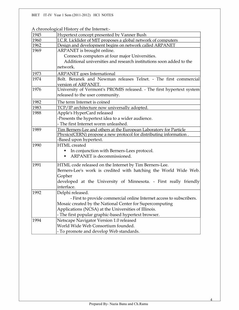
A chronological History of the Internet:-1945 Hypertext concept presented by Vanner Bush1960 J.C.R. Licklider of MIT proposes a global network of computers1962 Design and development begins on network called ARPANET1969 ARPANET is brought online.
Connects computers at four major Universities.Additional universities and research institutions soon added to the
network.1973 ARPANET goes International1974 Bolt. Beranek and Newman releases Telnet. - The first commercial
version of ARPANET.1976 University of Vermont's PROMIS released. - The first hypertext system
released to the user community.1982 The term Internet is coined1983 TCP/IP architecture now universally adopted.1988 Apple's HyperCard released
-Presents the hypertext idea to a wider audience.- The first Internet worm unleashed.
1989 Tim Berners-Lee and others at the European Laboratory for ParticlePhysics(CERN) propose a new protocol for distributing information .-Based upon hypertext.
1990 HTML created In conjunction with Berners-Lees protocol. ARPANET is decommissioned.
1991 HTML code released on the Internet by Tim Berners-Lee.Berners-Lee's work is credited with hatching the World Wide Web.Gopherdeveloped at the University of Minnesota. - First really friendlyinterface.
1992 Delphi released.- First to provide commercial online Internet access to subscribers.
Mosaic created by the National Center for SupercomputingApplications (NCSA) at the Universities of Illinois.- The first popular graphic-based hypertext browser.
1994 Netscape Navigator Version 1.0 releasedWorld Wide Web Consortium founded.- To promote and develop Web standards.
BIET IT-IV Year 1 Sem (2011-2012) HCI NOTES
Prepared By- Nazia Banu and Ch.Ramu5
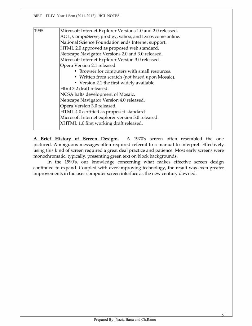
1995 Microsoft Internet Explorer Versions 1.0 and 2.0 released.AOL, CompuServe, prodigy, yahoo, and Lycos come online.National Science Foundation ends Internet support.HTML 2.0 approved as proposed web standard.Netscape Navigator Versions 2.0 and 3.0 released.Microsoft Internet Explorer Version 3.0 released.Opera Version 2.1 released.
• Browser for computers with small resources.• Written from scratch (not based upon Mosaic).• Version 2.1 the first widely available.
Html 3.2 draft released.NCSA halts development of Mosaic.Netscape Navigator Version 4.0 released.Opera Version 3.0 released.HTML 4.0 certified as proposed standard.Microsoft Internet explorer version 5.0 released.XHTML 1.0 first working draft released.
A Brief History of Screen Design:- A 1970's screen often resembled the onepictured. Ambiguous messages often required referral to a manual to interpret. Effectivelyusing this kind of screen required a great deal practice and patience. Most early screens weremonochromatic, typically, presenting green text on block backgrounds.
In the 1990's, our knowledge concerning what makes effective screen designcontinued to expand. Coupled with ever-improving technology, the result was even greaterimprovements in the user-computer screen interface as the new century dawned.
BIET IT-IV Year 1 Sem (2011-2012) HCI NOTES
Prepared By- Nazia Banu and Ch.Ramu6
UNIT-IICharacteristics of Graphical and Web user Interfaces
The Graphical User Interface:- In brief, a graphical user interface can be defined as follows. Auser interface, as recently described, is a collection of techniques and mechanisms to interactwith something. In a graphical interface, the primary interaction mechanism is a pointingdevice of some kind. This device is the electronic equivalent to the human hand. What the userinteracts with is a collection of elements referred to as objects. They can be seen, heard,touched, or otherwise perceived. People perform operations, called actions, on objects. Theoperations include accessing and modifying objects by pointing, selecting, and manipulating.All objects have standard resulting behaviors.
The popularity of Graphics:- Graphics revolutionized design and the user interface. Screennavigation and commands are executed through menu bars and pull-downs. Menu "pop up"on the screen. In the screen body, selection fields such as radio buttons, check boxes, list boxes,and palettes coexisted with the reliable old text entry field.
Increased computer power and the vast improvement in the display enable the user'sactions to be reacted to quickly, dynamically, and meaningfully. It permits faster informationtransfer between computers and people by permitting more visual comparisons of amounts,trends, or relationships; more compact representation of information; and simplification of theperception of structure.
The concept of Direct Manipulation:- The term used to describe this style ofinteraction for graphical systems was first used by Shneiderman (1982). He called them "directmanipulation" systems, suggesting that they possess the following characteristics.
The system is portrayed as an extension of the real world.Continuous visibility of objects and actions.Actions are rapid and incremental with visible display of results.Incremental actions are easily reversible.
Earlier Direct Manipulation Systems;- The earliest full-screen text editors possessed similarcharacteristics. Screens of text resembling a piece of paper on one's desk could becreated(extension of real world) and then reviewed in their entirety.
Indirect Manipulation:- In practice, direct manipulation of all screen objects and actions maynot be feasible. Indirect manipulation substitutes words and text, such as pull-down or pop-upmenus, for symbols, and substitutes typing for pointing. Most window systems are acombination of both direct and indirect manipulation. Direct manipulation, indirectmanipulation, or a combination of both - is best, under what conditions and for whom, remainsa question whose answer still eludes us.
Graphical Systems; Advantages and Disadvantages:-Advantages:-
Symbols recognized faster than text. Faster learning Faster use and problem solving
BIET IT-IV Year 1 Sem (2011-2012) HCI NOTES
Prepared By- Nazia Banu and Ch.Ramu7
Easier remembering More natural Exploits visual/spatial cues Foosters more concrete thinking Provides context Fewer errors Increased feeling of control Immediate feedback Predictable system responses Easily reversible actions Less anxiety concerning use More attractive May consume less space Replaces national languages Easily augmented with text displays Low typing requirements Smooth transition from command language system.
Disadvantages:-Greater design complexityLearning still necessaryLack of experimentally-derived design guidelinesInconsistencies in technique and terminologyWorking domain is the presentNot always familiarHuman comprehension limitationsWindow manipulation requirementsProduction limitationsFew tested icons existInefficient for touch typistsInefficient for expert usersNot always the preferred style of interactionNot always fastest style of interactionIncreased chances of clutter and confusionThe futz and fiddle factorMay consume more screen spaceHardware limitations
Some studies and a conclusion:- Over the past couple of decades a variety of studies havebeen performed comparing graphical systems with other interaction styles. In some usabilitystudies graphical systems were found superior, in other studies other interaction techniqueswere found superior, and in some cases no differences were found. How well the system wasdesigned was the best indicator of success, not the style of interaction. The design shouldreflect this.
The design of an interface, and not its interaction style, is the best determinants of ease ofuse.
User preferences must be considered in choosing an interaction style. In the overwhelming majority of cases, words are more meaningful to users than icons. The content of a graphic screen is critical to its usefulness. The wrong presentation or a

BIET IT-IV Year 1 Sem (2011-2012) HCI NOTES
Prepared By- Nazia Banu and Ch.Ramu8
cluttered presentation may actually lead to greater confusion, not less. The success of a graphical system depends on the skills of its designers in following
established principles of usability.
Characteristics if the Graphical User InterfaceSophisticated visual presentationPick- and- Click InteractionRestricted set of Interface optionsVisualizations
Object Orientation:-Container objects are objects to hold other objects. There are three kindsof container objects: The workplace is the desktop, the storage area for all objects. Folders aregeneral-purpose containers for long-term storage of objects. Work areas are temporary storagefolders used for storing multiple objects currently being worked on.
Device objects represent physical objects in the real world, such as printers or trashbaskets.
A collection is the simplest relationship-the objects sharing a common aspect.A Constraint is a stronger object relationshipA composite exists when the relationship between objects becomes so significant that the
aggregation itself can be identified as an object.A container is an object in which other objects exist.
Properties or Attributes of objects:- Objects also have properties or attributes. Properties arethe unique characteristics of an Object. Properties help to describe an object and can bechanged by users.
Actions:- In addition to objects are actions. People take actions on objects. They manipulateobjects in specific ways(commands) or modify the properties of objects(property or attributespecification).
BIET IT-IV Year 1 Sem (2011-2012) HCI NOTES
Prepared By- Nazia Banu and Ch.Ramu9
Commands are actions that manipulate objects.
Property/attribute specification actions establish or modify the attributes or properties ofobjects.The following is a typical property/attribute specification sequence.The user selects an object-for example, several words of textThe user then selects an action to apply to that object, such as the action BOLD.The selected words are made bold and will remain bold until selected and changed again.
Application versus Object or Data orientation;- When a text-based system was developed, itwas called an application. An application-oriented approach takes an action: object approach,like this:
Action> 1 .An application is opened(for example, word processing)Object> 2. A file or other object selected(for example, a memo).An object-oriented object: action approach does this:Object> 1. An object is chosen( a memo).Action> 2. An application is selected(word processing).
Views:- Views are ways of looking at an object's information. Composed views presentinformation and the objects contained within the object. Contents views list the components ofobjects. Settings views permit seeing and changing object properties. Help views provide allthe help functions.
Use of Recognition Memory:- Continuous visibility of objects and actions encourages use ofperson's more powerful recognition memory.
Concurrent Performance of Functions:- Graphic systems may do two or more things at onetime. Multiple programs may run simultaneously. Data may also be transferred betweenprograms. It may be temporarily stored on a "clipboard" for later transfer or be automaticallyswapped between programs.
The Web User Interface:- Looking forward, interface design tools will mature, research-baseddesign guidelines will become increasingly available(and will be applied), and knowledge ofusers and their needs, will expand. Then., the ultimate goal of a Web that feels natural, is wellstructured, and is easy to use will reach fruition.
The Popularity of the Web:- While the introduction of the graphical user interfacerevolutionized the user interface, the Web has revolutionized computing. Nowhere in thehistory of computing has the user been given so much control. Web usage has reflected thispopularity.
User controls has had some decided disadvantages for some Web site owners as well.Users have become much more discerning about good design. Slow download times,confusing navigation, confusing page organization, disturbing animation, or other undesirablesite features often results in user abandonment of the site for others with a more agreeableinterface. People are quick to vote with their mouse, and these warnings should not gounheeded.
BIET IT-IV Year 1 Sem (2011-2012) HCI NOTES
Prepared By- Nazia Banu and Ch.Ramu10
Characteristics of a Web Interface:- A web interface possess a number of characteristics, somesimilar to a GUI interface, and, as has already been shown, some different.
GUI versus Web page Design:- GUI and Web interface design do have similarities. Both aresoftware designs, they are used by people, they are interactive, they are heavily visualexperiences presented through screens, and they are composed of many similar components.The following paragraphs highlight the other most significant differences.
♦ Devices♦ User focus♦ Data/Information♦ User tasks♦ User's conceptual space♦ Presentation elements♦ Navigation♦ Context. GUI♦ Interaction. GUI♦ Response time♦ Visual style♦ System capability♦ Task efficiency. GUI's♦ Consistency♦ User assistance♦ Integration♦ Security♦ Reliability
Printed pages versus Web pages:- In the following paragraphs, the major differences betweenprint and web page design are briefly described. Implications for Web page design are alsosummarized.♦ Page size♦ Page rendering♦ Page layout♦ Page resolution♦ User focus♦ Page navigation♦ Sense of place♦ Interactivity♦ Page independence
The Merging of Graphical Business Systems and the Web:- Another strength of the Web liesin its ability to link databases and processing occurring on a variety of machines within acompany or organization. The graphical business system and the Web will merge into acommon entity. These web systems are called intranets.
Characteristics of an Intranet versus the Internet;- An intranet has many of the samecharacteristics as the Internet. They differ, however, in some important ways. The followingdiscussion is partly based upon Nielsen.
BIET IT-IV Year 1 Sem (2011-2012) HCI NOTES
Prepared By- Nazia Banu and Ch.Ramu11
Users Tasks Type of information Amount of information Hardware and Software Design philosophy
Extranets:- An extranet is a special set of intranet Web pages that can be accessed fromoutside an Organization or company.
Principles of User Interface Design:- An interface must really be just an extension of aperson. It must also be easy to learn, for people want to do, not learn to do. Finally, the systemmust be easy and fun to use, evoking a sense of pleasure and accomplishment not tedium andfrustration.
The interface itself should serve as both a connector and a separator: a connector in thatit ties the user to the power of the computer, and a separator in that it minimizes the possibilityof the participants damaging one another. These principles will continue to evolve, expand,and be refined as our experience with GUI and the Web increases.
Principles for the Xerox STAR:-
The illusion of manipulability objects Visual order and viewer focus Revealed structure Consistency Appropriate effect or emotional impact A match with the medium
General Principles:- Aesthetically pleasing Clarity Compatibility User Compatibility Task and job comparability Product compatibility Comprehensibility Configurability Consistency Control Directness Efficiency Familiarity Flexibility Forgiveness Predictability Recovery Responsiveness
Simplicity;- There are several ways to minimize this complexity
BIET IT-IV Year 1 Sem (2011-2012) HCI NOTES
Prepared By- Nazia Banu and Ch.Ramu12
Progressive disclosure Provide defaults Minimize screen alignment points Make common actions simple Provide uniformity and consistency
Transparency:- permit the user to focus on the task or job, without concern for the mechanicsof the interface.
Workings and reminds of workings inside the computer should be invisible to the user.
Trade-Offs;- Final design will be based on a series of trade-offs balancing often-conflicting design
principles. People's requirements always take precedence over technical requirements.
HUMAN COMPUTER INTER ACTIONUNIT -III
Design process- human interaction with computers, importance of human characteristicshuman consideration, human interaction speeds, understanding business junctions.
The user interface Design processIn total, 14 steps are presented, beginning with know your user or client and ending with adiscussion of testing.
Obstacles and pitfalls in the development path
Developing a computer system is never easy.Nobody ever gets it right the first timeDevelopment is chock -full of surprises.Good design requires living in a sea of changes.Making contracts to ignore change will never eliminate the need for change.Even if you have made the best system humanly possible will still make mistakes when usingit.You must have behavioral design goals like performance design goals.
Common pitfalls are
No early analysis and understanding of the user's needs and expectations.A focus on using design features or components that are neat or glitzy.Little or no creation of design element prototypes.No usability testingNo common design team vision of user interface design goal.Poor communication between members of the development team.
BIET IT-IV Year 1 Sem (2011-2012) HCI NOTES
Prepared By- Nazia Banu and Ch.Ramu13
Designing for people: the five commandments.
Gain a complete understanding of users and their tasks.Solicit early and ongoing user involvement.Perform rapid prototyping and testing.Modify and iterate the design as much as necessary.Integrate the design of all the system components.
USABILITY
Simply defined usability as the capability to be used by humans easily and effectively,where,
Easily = to a specified level of subjective assessmentEffectively = to a specified level of human performance.
Usability assessment in the design process
Common usability problems
Lists the 10 most common usability problems in graphical systems as reported by IBMusability specialists. They are.
Ambiguous menus and icons. Languages that permit only, single-direction movement through a system. Input and direct manipulation limits. Highlighting and selection limitations. Unclear step sequences. More steps to manage the interface than to perform tasks. Complex linkage between and within applications. Lack of system anticipation and intelligence. Inadequate error messages, help, tutorials, and documentation.
Characteristics particularly wasteful of peoples time, and often quite irritating, are.
Visual clutter. Impaired information readability. Incomprehensible components. Annoying distractions. Confusing navigation.
MYTH usability is nothing but common sense
Inefficient navigation Inefficient operations. Excessive or inefficient page scrolling. Information overload. Design inconsistency. Outdated information.
BIET IT-IV Year 1 Sem (2011-2012) HCI NOTES
Prepared By- Nazia Banu and Ch.Ramu14
Stale design caused by emulation of printed documents and past systems.
Some practical measures of usability.
Are people asking a lot of questions or often reaching for a manual? Are frequent exasperation responses heard? Are there many irrelevant action being performed? Are their many things to ignore? Do a number of people want to use the product?
Some objective measures of usability
How effective is the interface? Can the requited rang of tasks be accomplished:
At better than some required level of performance (for example, in terms of speed anderrors.
By some required percentage of the specified target range of users? Within some required proportion of the range of usage environments?
How learnable is the interface? Can the interface be learned? Allow some specified percentage variation in tasks and /or
environment s beyond those first specified?
What are the attitudes of the users? Are they:
Within acceptable levels of human cost in terms of tiredness, discomfort, frustration,and personal effort?
Such that satisfaction causes continued and enhanced usage of the system?
The level of established goals will depend on the capabilities of the user, The capabilities ofthe system, and the objectives of the system.
The design team
Provide a balance design team, including specialists in: Development Human factors Visual design Usability assessment Documentation Training.
Step 1: know your user or clients
To create a truly usable system, the designer must always do the following: Understand how people interact with computers. Understand the human characteristics important in design
BIET IT-IV Year 1 Sem (2011-2012) HCI NOTES
Prepared By- Nazia Banu and Ch.Ramu15
Identify the user's level of knowledge and experience Identify the characteristics of the user's need's tasks, and jobs. Identify the user's physical characteristics. Identify the user's psychological characteristics.
Understanding how people interact with computers
Why people have trouble with computers. User of jargon. Non -obvious design. Fine distinctions. Disparity in problem -solving strategies. Design inconsistency
Responses to poor design
Psychological
Typical psychological responses to poor design are:
Confusion Annoyance. Frustration Panic or stress Boredom
Physical Abandonment o the system. Partial use of the system. Indirect use of the system Modification of the task Compensatory activity Misuse of the system Direct programming.
People and their tasks.
Important human characteristics in design
Perception Proximity Similarity Matching patterns Succinctness Closure Unity Continuity

BIET IT-IV Year 1 Sem (2011-2012) HCI NOTES
Prepared By- Nazia Banu and Ch.Ramu16
Balance Expectancies Context Signals versus
MemoryMemory is not the most stable of human attributes, as anyone who has forgotten why they
walked into a room, or forgotten a very important birthday, can attest. Today, Memory is viewed asconsisting of two components, long-term and short -term (or working)
Short -term, or working, memory receives information from either the senses or long termmemory, but usually cannot receive both at once, the senses being processed separately.
Knowledge, experience, and familiarity govern the size and complexity of the information thatcan be remembered.
Long -term memory contains the knowledge we possess. Information received in short-termmemory is transferred to it and encoded with in it, a process we call learning .it is a complex processrequiring some effort on our part. The learning process is improved if the information beingtransferred from short term memory has structure and is meaningful and familiar. Learning is alsoimproved through repetition .unlike short term memory, with its distinct limitations, with significantimplications for interface design, is the difference in ability to recognize or recall words.
MAXIM minimizes the need for a mighty memory.
Thus enhancing system usability includes: Presenting information in an organized, structured, familiar and meaningful way. Placing all required information for task performance in close physical proximity. Giving the user control over the pace of informationpresentation. Sensory storage.
Repeated and excessive stimulation can fatigue the sensory storage mechanism,making it less attentive and unable to distinguish what important (called habituation) .avoidis unnecessarily stressing it. Design the interface so that all aspects and elements serve adefinite purpose. Eliminating interface noise will ensure that important things will be lesslikely to be missed.
Visual acuityThe eye's sensitivity increases for those characters closets to the fixation point(the
"0")and decreases for those characters at the extreme edges of the circle(50/50 chance exits forgetting these characters correctly identified.
Foveal and peripheral vision
Foveal vision is used to focus directly on something;peripheral vision senses anything in the area surroundingthe location we are looking at, but what is there cannot be clearly resolved because of the limitations in visualacuityjust described.
Information processing
BIET IT-IV Year 1 Sem (2011-2012) HCI NOTES
Prepared By- Nazia Banu and Ch.Ramu17
One level, the highest level, is identified with consciousness and working memory. Ti islimited, slow, and sequential, and is used for reading and understanding. You are utilizing this higherlevel now reading this book.In addition to this higher level, there exits a lower level of information processing, and the limit of itscapacity is unknown.
Visual distinctiveness of a screen is a strong contributor. If a screen is jammed withinformation and cluttered, it loses its uniqueness and can only be identified through the more time -consuming, and thought-interrupting, reading process.
Mental models
The key to forming a transferable mental model of a systemis design consistency and design standards.
Movement control
Particularly important in screen design is fits law91954. This law states that: The time to acquire a target is a function of the distance to and size of the target. This simply
means that6 the bigger the target is, or the closer the target is, the faster it will be reached. Theimplications in screen design are:
Provide large objects for important functions. Take advantage objects for important functions. Take advantage of the "pinning" actions of the sides, top, bottom, and corner of the screen, big
buttons are better than small buttons.
Learning
Learning, as has been said, is the process of encoding in long -term memory information thatis contained in short term memory. It is a complex process requiring some effort on our part.Our ability to learn is important -it clearly differentiates people from machines. Allows skill acquired in one situation to be used in another somewhat like it. Design
consistency accomplishes this. Provides complete and prompt feedback Is phased, that is it requires a person to know only the information needed at that stage of
the learning process.
SkillThe goal of human performance is to perform skillfully. Skills are hierarchical in nature. And
many basic skills may be intergraded to form increasingly complex ones. System and screen designmust permit development of increasingly skill full performance.
Individual differences.Technology now offers the possibility of tailoring jobs to the specific needs of people with
varying and changing learning or skill levels. Multiple versions of a system can easily be created,design must provide for the needs of all potential users.
Human considerations in design
Important user/ task considerations
BIET IT-IV Year 1 Sem (2011-2012) HCI NOTES
Prepared By- Nazia Banu and Ch.Ramu18
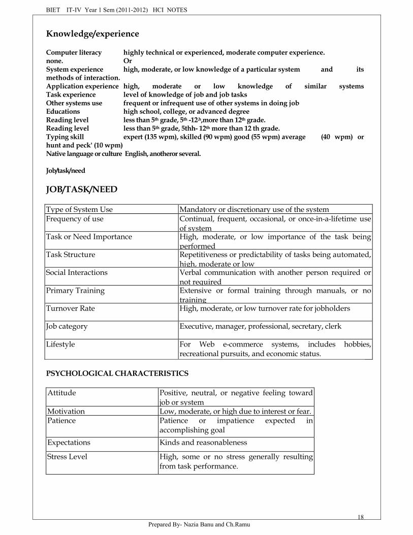
Knowledge/experience
Computer literacy highly technical or experienced, moderate computer experience.none. OrSystem experience high, moderate, or low knowledge of a particular system and itsmethods of interaction.Application experience high, moderate or low knowledge of similar systemsTask experience level of knowledge of job and job tasksOther systems use frequent or infrequent use of other systems in doing jobEducations high school, college, or advanced degreeReading level less than 5th grade, 5th -12,h,more than 12th grade.Reading level less than 5th grade, 5thh- 12th more than 12 th grade.Typing skill expert (135 wpm), skilled (90 wpm) good (55 wpm) average (40 wpm) orhunt and peck' (10 wpm)Native language or culture English, anotheror several.
Job/task/need
JOB/TASK/NEED
Type of System Use Mandatory or discretionary use of the systemFrequency of use Continual, frequent, occasional, or once-in-a-lifetime use
of systemTask or Need Importance High, moderate, or low importance of the task being
performedTask Structure Repetitiveness or predictability of tasks being automated,
high, moderate or lowSocial Interactions Verbal communication with another person required or
not requiredPrimary Training Extensive or formal training through manuals, or no
trainingTurnover Rate High, moderate, or low turnover rate for jobholders
Job category Executive, manager, professional, secretary, clerk
Lifestyle For Web e-commerce systems, includes hobbies,recreational pursuits, and economic status.
PSYCHOLOGICAL CHARACTERISTICS
Attitude Positive, neutral, or negative feeling towardjob or system
Motivation Low, moderate, or high due to interest or fear.Patience Patience or impatience expected in
accomplishing goalExpectations Kinds and reasonableness
Stress Level High, some or no stress generally resultingfrom task performance.

BIET IT-IV Year 1 Sem (2011-2012) HCI NOTES
Prepared By- Nazia Banu and Ch.Ramu19
Cognitive Style Verbal or spatial, analytic or intuitive,concrete or abstract.
PHYSICAL CHARACTERISTICS
Age Young, middle aged or elderlyGender Male or femaleHandedness Left, right, or ambidextrousDisabilities Blind, defective vision, deafness, motor
handicap
MYTH: Developers have been working with users for a long time. They always knoweverything users want and need.
MYTH: Ease of use promotes use.
Human Interaction Speeds
Reading Listening Speaking Keying
Performance versus Preference
Occasionally, when asked, people may prefer an interface design feature that actuallyyields poorer performance than another feature. Examples include pointing with a mouse orcursor, alternative menu interaction techniques, use of color, 2-dimensional versus 3-dimensional displays, and prototype fidelity.
Preferences arte influenced by a number of things, including familiarity, aesthetics,novelty, and perceived effort in feature use.
Where optimization is impossible, however, implement the feature that provides thebest performance and very importantly, explain to the user why this is being done.
Methods for Gaining an Understanding of Users
Visit user locations, particularly if they are unfamiliar to you, to gain an understandingof the user's work environment.
Talk with users about their problems, difficulties, wishes, and what works well now.Establish direct contact; avoid relying on intermediaries.
Observe users working or performing a task to see what they do, their difficulties andtheir problems.
Videotape users working or performing a task to illustrate and study problems anddifficulties.
Learn about the work organization where the system may be installed. Have users think aloud as they do something to uncover details that may not
BIET IT-IV Year 1 Sem (2011-2012) HCI NOTES
Prepared By- Nazia Banu and Ch.Ramu20
otherwise be solicited. Try the job yourself. It may expose difficulties that are not known, or expressed, by
users. Prepare surveys and questionnaires to obtain a larger sample of users opinions. Establish Testable behavioral target goals to give management a measure for what
progress has been made what is still required. In conclusion, this chapter has addressed the most important principle in interface and
screen design. Simply stated, it is this: Know your user, client, or customer.
Understand the Business Function
Requirements must be determined and user activities being performed must be describedthrough task analysis. From these, a conceptual model of the system will be formulated. Designstandards must also be created, usability goals established and training and documentationneeds determined.
The general steps to be performed are:
Perform a business definition and requirements analysis. Determine basic business functions. Describe current activities through task analysis. Develop a conceptual model of the system. Establish design standards or style guides. Establish system usability design goals. Define training and documentation needs.
Business Definition and Requirements Analysis
Before beginning the analysis, the developer should aware of the policies and workculture of the organization being studied.
Some techniques for Determining Requirements
DIRECT METHODSIndividual Face-to-Face Interview
A one-on-one visit with the user to obtain information. It may be structured orsomewhat open-ended.
Telephone Interview or survey A structured interview conducted via telephone
Traditional Focus Group A small group of users and a moderate brought together to verbally discuss the
requirements
Facilitated Team Workshop A facilitated, structured workshop held with users to obtain requirements
information. Similar to the Traditional Focus Group

BIET IT-IV Year 1 Sem (2011-2012) HCI NOTES
Prepared By- Nazia Banu and Ch.Ramu21
Observational Field Study Users are observed and monitored for an extended time to learn what they do.
Requirements Prototyping A demo, or very early prototype, is presented to users for comments concerning
functionality.User Interface Prototyping
A demo or early prototype, is presented to users to uncover user-interface issuesand problems.
Usability Laboratory Testing Users at work are observed, evaluated, and measured in a specially constructed
laboratory.Card Sorting for Web sites
A technique to establish groupings of information for Web sites.
INDIRECT METHODSMIS Intermediary
A company representative defines the users goals and needs to designers anddevelopers.
Paper Survey or Questionnaire A survey or questionnaire is administered to a sample of users using traditional
mail methods to obtain their needs.Electronic Survey or Questionnaire
A survey or questionnaire is administered to a sample of users using e-mail or theWeb methods to obtain their needs.
Electronic Focus Group A small group of users and a moderator discuss the requirements online using
workstations.Marketing and Sales
Company representatives who regularly meet customers obtain suggestions orneeds, current and potential.
Support Line Information collected by the unit that helps customers with day-to-day problems is
analyzed.E-mail or Bulletin Board
Problems, questions, and suggestions from users posted to a bulletin board or through e-mail are analyzed.
User Group Improvements are suggested by customer groups who convene periodically to
discuss software usage.Competitor Analyses
A review of competitors products or Web sites is used to gather ideas, uncoverdesign requirements and identify tasks.
BIET IT-IV Year 1 Sem (2011-2012) HCI NOTES
Prepared By- Nazia Banu and Ch.Ramu22
Trade Show Customers at a trade show are presented a mock-up or prototype and asked for
comments.Other media analysis
An analysis of how other media, print or broadcast, present the process,information, or subject matter of interest.
System Testing New requirements and feedback are obtained from ongoing product testing.
MAXIM Know thy users, for they are not you.
Determining Basic Business Function
The process the developer will use is summarized as follows:
o Gain a complete understanding of the user's mental model based upon:o The users needs and the users profile.o A user task analysis.
Develop a conceptual model of the system based upon the users mental model. This includes:o Defining objectso Developing metaphors.
Understanding the users Mental Model
Mental models enable a person to predict the actions necessary to do things if the actionshave been forgotten or have not yet been encountered,
Performing a Task AnalysisKnowing why establishes the major work goals; knowing how provides details of actions
performed to accomplish these goals. Task analysis also provides information concerningworkflows, the interrelationships between people, objects, and actions, and the usersconceptual frameworks. The output of a task analysis is a complete description of all usertasks and interactions.
Another result is a list of objects the users see as important to what they do. The objectscan be stored into the following categories:
Concrete objects-things that can be touched. People who are the object of sentences-normally organization employees, customers, for
example. Forms or journals-things that keep track of information. People who are the subject of sentences-normally the users of a system. Abstract objects-anything not include above.
BIET IT-IV Year 1 Sem (2011-2012) HCI NOTES
Prepared By- Nazia Banu and Ch.Ramu23
Developing conceptual models
The goal of the designer is to facilitate for the user the development of useful mental model ofthe system. This is accomplished by presenting to the user a meaningful conceptual model of thesystem. When the user then encounters the system, his or her existing mental model, will hopefully,mesh well with the system's conceptual model. As a person works with the system, he or she thendevelops a mental model of the system.
Guidelines for designing conceptual model Reflect the users mental model, not the designers. Draw the physical analogies or present metaphors. Comply with expectancies, habits, routines, and stereotypes. Provide action-response compatibility. Make invisible parts and process of a system visible. Provide proper and correct feedback. Avoid anything unnecessary and irrelevant. Provide design consistency Provide documentation and a help system that will reinforce the conceptual model. Promote the development of both novice and expert mental models.
Design Standards or Style Guides
A design standard or guide documents an agreed-upon way of doing something. In interfacedesign it describes the appearance and behavior of the interface and provides some guidance on the useof system components. It also defines the interface standards, rules, guidelines, and conventions thatmust be followed in detailed design.
Value of Standards and Guidelines
Developing and applying design standards or guidelines achieves design consistency.
This is valuable to users because the standards and guidelines: Allow faster performance Reduce errors. Reduce training time. Foster better system utilization. Improve satisfaction. Improve system acceptance.
They are valuable to system developers because they: Increase visibility of the human-computer interface. Simplify design. Provide more programming and design aids, reducing programming time. Reduce redundant effort. Reduce training time. Provide a benchmark for quality control testing.
BIET IT-IV Year 1 Sem (2011-2012) HCI NOTES
Prepared By- Nazia Banu and Ch.Ramu24
Business System Interface Standards and Guidelines
Rules were not adhered to, however, for the following reasons: An alternative design solution was better than that mandated by the standard. Available development tools did not allow compliance with the standard. Compliance with the standard was planned, but time was not yet available to implement
it. The rule that was broken was not known or was overlooked.
Web Guidelines and Style Guides
Today, many uniquely Web standards and guidelines are evolving by trial and error.Things are being tried to see what works best. De facto standards are being established when anoverwhelming majority of big sites focus on one way to do something.Worldwide standards are also being looked at by organizations such as the World Wide WebConsortium (2001).
Document Design
Include checklists to present principles and guidelines. Provide a rationale for why the particular guidelines should be used. Provide a rationale describing the conditions under which various design alternatives are
appropriate. Include concrete examples of correct design. Design the guidelines document following recognized principles for good document
design. Provide good access mechanisms such as thorough index, a table of contents, glossaries
and checklists.
Checklists and rationale. Concrete examples. Document design and access.
Design Support and Implementation
Use all available reference sources in creating the guidelines. Use development and implementation tools that support the guidelines. Begin applying the guidelines immediately.
System training and documentation needs
Training and documentation are also integral part of any development effort.
Training
System training will be based on user needs, system conceptual design, system learning goals, andsystem performance goals. Training may include such tools as formal or video training, manuals, online
BIET IT-IV Year 1 Sem (2011-2012) HCI NOTES
Prepared By- Nazia Banu and Ch.Ramu25
tutorials, reference manuals, quick reference guides, and online help. Training needs must beestablished and training components developed as the design process unfolds.
MYTH That problems can be handled with documentation and training.
Documentation:
System documentation is a reference point, a form of communication, and a more concrete design-words that can be seen and understood. It will also be based on user needs, system conceptual design,and system performance goals.
BIET IT-IV Year 1 Sem (2011-2012) HCI NOTES
Prepared By- Nazia Banu and Ch.Ramu26
HUMAN COMPUTER INTERACTIONS
UNIT-IV
Screen Designing;- Design goals-Screen planning and purpose, organizing screenelements, ordering of screen data and content-screen navigation and flow-Visually pleasingcomposition-amount of information-focus and emphasis-presentation information simplyand meaningfully-information retrieval on Web Statistical Graphics- Technologicalconsiderations in interface design.
SCREEN DESIGNING:-
Human Considerations in Screen Design:-A well-designed screen has the following properties
Reflects the capabilities, needs, and tasks of its users Is developed within the physical constraints Effectively utilizes the capabilities of its controlling software Achieves the business objectives of the system for which it is designed
It begins with a detailed series of guidelines dealing with user considerations, includingthe test for a good design, organizing the screen elements, screen navigation and flow, visuallypleasing composition, typography, and reading, browsing, and searching on the web. The stepconcludes with considerations imposed by a system's hardware and software. How muchinformation is presented on a screen, how a screen is organized, the language used on thescreen, the distinctiveness of the screen's components, its aesthetics, and a screen's consistencywith other screens.
How to distract the screen User
The following factors certainly apply to electronic forms and screens as well, Unclear captions and badly worded questions Improper type and graphic emphasis Misleading headings Information requests of irrelevant and unnecessary Cluttered, cramped layout, poor layout Poor quality of presentation, legibility and appearance Visual inconsistency in screen presentation Lack of restraint in the use of design Overuse of 3-D presentations Overuse of many bright colors Poorly designed icons Metaphors Extensive visual clutter Poor information readability Contusing and inefficient navigation Excessive and inefficient page scrolling Information overload Design inconsistency
BIET IT-IV Year 1 Sem (2011-2012) HCI NOTES
Prepared By- Nazia Banu and Ch.Ramu27
Outdated information
What screen user's want
An orderly clean and free appearance An obvious screen indication Expected information A clear indication of information Plain, simple English Simple presentation
What screen user's do
Identifies a task to be performed or need to be fulfilled. Decide how the task will be completed or the need fulfilled Manipulates the computers control Gathers the necessary data Forms judgments in in decisions relating to task or need
Interface design goals
The goals in design is Reduce visual work Reduce intellectual work Reduce memory work Reduce motor work Minimize or eliminate any burdens or instructions imposed by
technology
Screen meaning and Purpose
Each screen element must be
Every control, All text, emphasis, color, graphic, animation, message, feed back andperforming tasks, If an element does not have meaning, don't include it on the screen because itis noise. We know noise distracting the user's attention, and contributes to informationoverload.
Ordering of screen data and content
The following steps should be followed for ordering Divide information into units in a meaningful way Organize by the degree interrelationship According to user expectations Possible ordering schemes like conventional, sequence of use, frequency Of use and
function, importance, specific. Form groups that cover all possibilities Ensure information mat is comparable Ensure only the relative information.
BIET IT-IV Year 1 Sem (2011-2012) HCI NOTES
Prepared By- Nazia Banu and Ch.Ramu28
Screen navigation and flow
The navigation and the flow the screen is as follows Provide an ordering of screen that it is I. Rhythmic, ii. Ecourageble, iii. Minimized Locate the most important 7 frequently used elements at the top or left Maintain a top-bottom and left to right approach Assist in navigation of screen by i. Aligning elements, ii. Grouping elements, iii. use of line borders Trough focus and emphasis Tab through window Locate command buttons Related groups of information.
Visually Pleasing Composition
We provide visually pleasing composition with the following qualities a. Balance, b.Symmetry. C. Regularity, d. Predictability, e. sequentially, f. Economy, g. Unity, h. Proportion,I. simplicity, j. Groupings
Balance: Create screen balance by providing an equal weight of screen elements, left andright, top and bottom.
Symmetry: Crate symmetry by replicating elements left &right, of the screenRegularity: Create regularity by establishing standard and consistently spaced horizontal
and vertical alignment pointsPredictability: by being consistent and following conventional orders or arrangementsSequentially: by arranging elements to guide the eye through the screen in an obvious,
logical manner.Economy: by using as few styles, display techniques, and colors as possible.Unity: by using similar sizes, shapes, and colors for related information., also the spaces
between elements of screen.Proportion: By create windows and groupings of data or text with pleasing proportion.Simplicity: by optimize the no. of elements on a screen within limits of clarity.Groupings: by provide functional groupings of associated elements. And create spatial
groupings with evenly space controls, visually reinforce groupings, and provide meaningfultitles for each grouping.
Visual style in web page designFor a proper web page design maintain a consistent and unified visual style throughout
the pages of an entire web site. Base the visual style oni. The profile and goals of the website owner and the tastes, expectations of the website user.ii. Present the proper amount of information for the task,iii. Present all information necessary for performing an action or decision on the screeniv. Restrict the screen or window density levels to not more than 30%webpage size: w.r.to size minimize the page length (i.e.) restrict to 2 or 3 screens and placecritical or important information at the top of the page.Deciding on Long Vs Short pages: To find specific information Quickly, create links to shortpages. To understand an entire concept without Interruption, present an entire concept in onepage with internal links to subparts To print all or most of the content to read offline, use one
BIET IT-IV Year 1 Sem (2011-2012) HCI NOTES
Prepared By- Nazia Banu and Ch.Ramu29
long page or prepare a Version that uses one page. If a page will be loading over slow modemsand all Pages are not needed, and then create a comprehensive contents page with links to Manyshort pages.Scrolling and Paging: Avoid scrolling to determine a page's contents, Minimize vertical pagescrolling. Encourage viewing a page through paging.
Distinctiveness:Individual screen controls and groups of controls must be perceptually Distinct. Screen
controls should not touch a window border. Should not touch Each other .Fields & bordersshould not each other and should not widow borders. Button label should not touch the buttonborder. Adjacent screen element s must Be displayed in colors.
Focus and Emphasis:Visually emphasis the most prominent and most important element and Central idea or
focal point.To provide emphasis use techniques such as higher brightness, inverse Video, Larger
font, underlining, blinking, isolation, positioning, white space etc.. De-emphasize less importantelements, In web page design call attention to new or Changed content, ensure that page text isnot overwhelmed by page background.
Presenting Information Simply and meaningfullyTo present information meaningfully we should provide
i. Legibility- information is noticeable and distinguishable,ii. Provide readability- information is identifiable, interpretable, and attractiveiii. Present information in useful formiv. Utilize contrast display featuresv. Create visual lines and be consistent
Typography: In typography, a typeface is the name of a type, such as Times New Roman,Arial, Verdana. etc...Font type and families: Use simple, common, readable fonts and use no more than twofamilies, compatible interims of line thickness, capital letters, height etcFont styles and weight: Use no more than Two styles of same family i.e. Standard and Italicand two weights i.e. Regular & Bold. Also underline whenever necessary.Consistency: Establish a consistent hierarchy and convention for using typefaces, styles, andsizes. Decide on a font for each different level of importance in the hierarchy. Communicatehierarchy with changes in size, weight, color.
Paper Vs Screen reading: Provide a facility for printing a hard copy of documents
Caption/Labels: Identify controls with captions or labels, Fully spell them, display them, usemixed cast font, Capitalize the first letter, end each caption with a colon.
Data Fields: For entry or modifiable data fields, display data within a line box or a reversepolarity box. For inquiry or display screens, display data on the normal screen background.Visually emphasis the data fields.
Control captions/Data fields: Differentiate captions from data fields by using i. Contrastingfeatures i.e. separating columns, boxes, etc. For single data fields, place the caption to left of thedata field. Align the caption with the controls data. Alternatively place the caption above the
BIET IT-IV Year 1 Sem (2011-2012) HCI NOTES
Prepared By- Nazia Banu and Ch.Ramu30
data field. Align caption justified, upper left to the data field.. Maintain consistency positionalrelationships.
Control caption/Data field justification: Left justify both captions and data fields. Leave onespace between the longest caption and the data field column. Or otherwise Left-justify datafields and right justify captions to data fields. Leave one space between each.
Special symbols: Consider special symbols for emphasis Separate symbols from words by aspace.Headings: Control section headings: Provide a meaningful heading that clearlydescribes the relationship of the grouped controls. Locate section headings above their relatedscreen controls, separated by one space line. Indent the control captions to the right of the startof the heading. Full spell out in an upper case font. Display in normal intensity.
Control Subsection or Row Headings: Provide meaningful heading that clearly describes therelationships of the grouped controls. Locate to the left of the Row of associated fields. Topmostrow of a group of associate fields. Separate the symbol from the heading by one space andfrom the caption by a minimum of three spaces. Sub section or Row heading may be left or rightaligned. Fully sellout in an uppercase font. Display in normal intensity.
Web page headings: Control headings: For grouping of controls, follow the control headingguidelines. Page and Text headings: Provide a meaningful page heading that clearly describesthe content and nature of the page that follows. Establish a hierarchy of font styles, sizes, andweights depends upon the organization of created and the importance of the text content. Donot randomly mix heading levels or skip heading levels.
Instructions: Incorporate instructions as necessary on a screen in a position just preceding theparts of a screen to which they apply.
Completion Aids: Incorporate completion aids on a screen, as necessary: i. In a position to theright of the text entry control to which they apply. I) In a manner that visually distinguishesthem, including: a) displaying them within a parenthesis () .b) Possibly displaying them in aunique font style, iii) if the controls are arrayed on the screen in a columnar format, position thecompletion aids a) Far enough to the right so as to not detract from the readability of the entrycontrols within the column. B) But close enough to the related control so that they easilymaintain an association with the related control, iv) Left-alignment of completion aids in acolumn of controls is desirable but not absolutely necessary.
Key Procedures:-Keystrokes:-
Do not focus on minimizing keystrokes without considering other factors such as: The keying rhythm The goals of the system.
Tabbing:- Initially, position the cursor in the first field or control in which information can be
entered. Tab in the order in which the screen's information is organized.
BIET IT-IV Year 1 Sem (2011-2012) HCI NOTES
Prepared By- Nazia Banu and Ch.Ramu31
Manual Tab versus Auto skip:-Define fields to permit manual tabbing.
Keying Rules:- Do not require recording, changing, omitting, or including data based on
special rules or logical transformations.
Organization and Structure Guidelines
Information Entry and Modification (Conversational Screens) Organization: Logical and clear. Most frequently used information: On the earliest screens. At the top of screens. Required in formations: On the earliest screens. At the top of screens. Captions: Meaningful Consistently positioned in relation to data field controls. Left-or right-aligned. Mixed case using headline style. Text boxes/selection controls: Designate by boxes. Spacing and groupings. Create logical groupings. Make them medium in size, about 5 to 7 lines. Headings: Upper case or headline-style mixed case. Set off from related controls. Control arrangement: Align into columns. Organize for top-to-bottom completion. Required and optional input: Instructions and completion aids:
Grids:- Usage: To enter large amounts of related data or information. Design guidelines: Provide descriptive headings and, where appropriate, subheadings for columns and
rows. Do not include colons(:) after the headings. Justify column headings according to the data presented in the table cells. Left-justify heading for columns containing text. Right-justify headings for columns containing numbers. Left-justify row headings. Organize the data or information to be entered logically and clearly. Place similar information together.
BIET IT-IV Year 1 Sem (2011-2012) HCI NOTES
Prepared By- Nazia Banu and Ch.Ramu32
Place most important or frequently used information at the top. Arrange information chronologically or sequentially. Use light backgrounds. Provide consistent spacing between columns and rows. If more than seven rows are presented, insert white space after every fifth row.
Text Entry from a Source DocumentDedicated Source Document Screens:-
Organization:Image of associated source document.Captions: Abbreviations and contractions, consistently positioned in relation to data fields,Right-aligned.Text-Boxes: Designate by boxes.Spacing and grouping: Logical groups found on source document.Headings: Include if on source document, Upper case or headline-style mixed case,Set off from related controls.Control arrangement: As arranged on source document, Left-to-Right completion.Keying procedure: Use manual tabbing.Required and optional input: Not necessary to differentiate.Instructions and completion aids: None needed.
Display/Read-Only ScreensOrganization: Logical and clear, Limit to what is necessary.Most frequently used information: On earliest screens, At the top of screens.Captions: Meaningful, Consistently positioned in relation to data fields., Left-or- Right-aligned.Text Boxes: Do not include a surrounding border or box.Spacing and grouping: Create logical groupings, Make them medium-sized, about 5 to 7 lines.Headings: Upper case or headline-style mixed case, Set off from related controls.Data Presentation: Visually emphasize the data, Give the data a meaningful structure.Data arrangement: Align into columns, Organize for top-to-bottom scanning.Data justification: For text and alphanumeric data, left-justify, For numeric data, right-justify,Create a data "ladder".Data display: Consider not displaying no or null, data, Consider "data statements".Organization:-Only display information necessary to perform actions, make decisions, or answer questions,Group information in a logical or orderly manner, with the most frequently requestedinformation in the upper-left corner, For multiscreen functions, locate the most frequentlyrequested information on the earliest screens, Do not pack the screen. Use spaces and lines tobalance the screen perceptually.
Data Presentation:- Provide visual emphasis to the data, Give the data a meaningful structure,Spell out any codes in full, Include natural splits or predefined breaks in displaying data. Fordata strings of five or more numbers or a alphanumeric characters with no natural breaks,display in groups of three or four characters with a blank between each group.
Data Arrangement:-Align data into columns, Organize for top-to-bottom scanning.
Data Justification:-
BIET IT-IV Year 1 Sem (2011-2012) HCI NOTES
Prepared By- Nazia Banu and Ch.Ramu33
Left-justify text and alphanumeric formats, Right-justify lists of numeric data.
Data Display:- Consider not displaying data whose values are none, zero, or blank, Considercreating " data statements", in which the caption and data are combined.
Tables:- Usage-To present and/ or compare large amounts of data or information, Designguidelines: Provide descriptive headings and, where appropriate, subheadings for columns androws, Do not include colons(:) after the headings, Justify column headings according to the datapresented in the table cells, Left-justify row headings. Organize the presented data orinformation logically and clearly- Place similar information together, place most important orfrequently used at the top, Arrange chronologically or sequentially, Justify the data presented ina column according to its content- Left-justify textual data, Right-justify numeric data, Lengthshould not exceed the depth of a screen, Use light backgrounds-Highlight a particular cell,column, or row using a contrasting display technique, provide consistent spacing betweencolumns and rows, If more than seven rows are presented, insert white space after every fifthrow, Use caution in placing borders around cells.
Reading, Browsing, and Searching on the Web:- Web has an almost unlimited supply ofinformation-for those who can find it. and locate the elusive answer. The magnitude andstructure of the Web seems to be creating a user interaction pattern with these characteristics.The most sought-after web commodity is content, Behaviors is often goal-driven, Reading is nolonger a linear activity, Impatience, Frequent switching of purpose.
Web users access a site for different reasons: a focused search for a piece of information or ananswer, a less focused browsing, or simply to surf. But content is what most users comes to see.High-tech capabilities, fancy graphics, and rainbow of colors do not compensate for insufficientor poor content. All innovations are judged by how well they support the presented content.Users are also strongly goal-driven; often looking only for the thing they have in mind. Inforaging through the Web, reading is no longer a linear activity, instead information is acquiredin scattered bits and pieces. Easy content scanning is very important. The user is also impatient,with little time to waste.
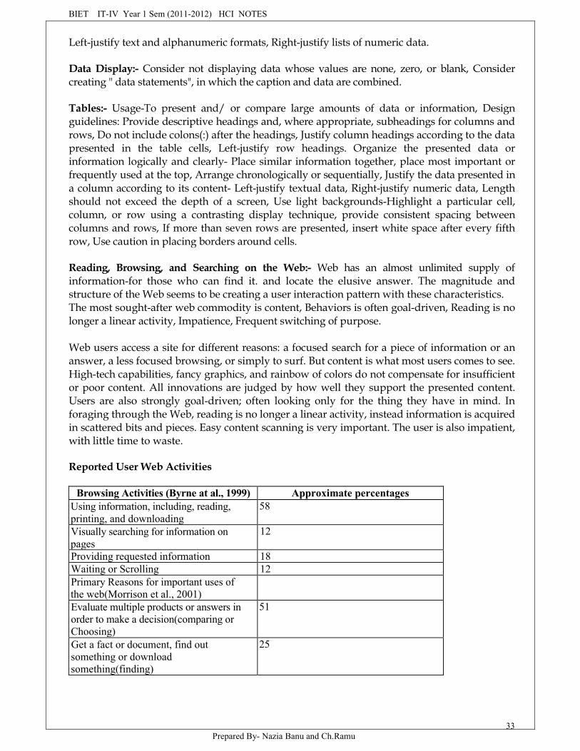
Reported User Web Activities
Browsing Activities (Byrne at al., 1999) Approximate percentagesUsing information, including, reading,printing, and downloading
58
Visually searching for information onpages
12
Providing requested information 18Waiting or Scrolling 12Primary Reasons for important uses ofthe web(Morrison et al., 2001)Evaluate multiple products or answers inorder to make a decision(comparing orChoosing)
51
Get a fact or document, find outsomething or downloadsomething(finding)
25
BIET IT-IV Year 1 Sem (2011-2012) HCI NOTES
Prepared By- Nazia Banu and Ch.Ramu34
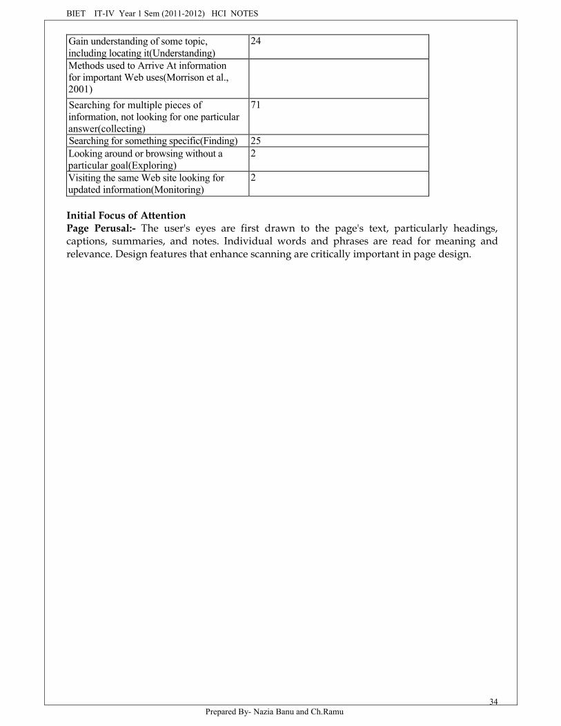
Gain understanding of some topic,including locating it(Understanding)
24
Methods used to Arrive At informationfor important Web uses(Morrison et al.,2001)Searching for multiple pieces ofinformation, not looking for one particularanswer(collecting)
71
Searching for something specific(Finding) 25Looking around or browsing without aparticular goal(Exploring)
2
Visiting the same Web site looking forupdated information(Monitoring)
2
Initial Focus of AttentionPage Perusal:- The user's eyes are first drawn to the page's text, particularly headings,captions, summaries, and notes. Individual words and phrases are read for meaning andrelevance. Design features that enhance scanning are critically important in page design.
BIET IT-IV Year 1 Sem (2011-2012) HCI NOTES
Prepared By- Nazia Banu and Ch.Ramu35
Scanning Guidelines:- Organization: Minimize eye movement, provide groupings ofinformation, Organize content in a logical and obvious way.Writing: Provide meaningful title, Provide meaningful heading s and subheadings.Concisely write the text, write short paragraphs containing only one ideas, use the invertedpyramid style of writing, Use bulleted and numbered lists, Array information in tables,Provide concise summaries.Presentation: Highlight: Key information-carrying words or phrases, important concepts.
MAXIM when the visual design clarifies the functional intent.... the interface becomesintuitive.Browsing: Web site browsing is analogous to shopping.
Browsing Guidelines:- Facilitate scanning, Provide multiple layers of structure, Makenavigation easy, Respect the user's desire to leave, Upon returning, help the users reorientthemselves.
The scanning provide multiple layers of structure with high-level summaries so userscan decide if they want to brose deeper or simply move on. Searching:- People search on theWeb when they have a specific goal or need for which they seek an answer, the design of aWeb site is the most effective searching tool, not a search facility itself.
Problems with Search Facilities:-Not understanding the user:- People do not remember things very well, 3 percent of allqueries in one study contained misspellings, most off by only one letter.Difficulties in formulating the search, Difficulties in presenting meaningful results, SearchFacility GuidelinesKnow your search user:- Identify the level of expertise of the user, Anticipate: The nature ofevery possible query, Plan for the user's switching purposes during the search process, Planfor flexibility in the search process.Express the Search:- What, Where, How, provide methods of specifying search parameters,including, provide a spell checker, Provide search controls, including, Structured controls, Acommand button, Location: to right of search text box, Provide separate interfaces for simpleand advanced search, Place "Advanced Search" link under text search box, Provide guidanceand assistance, Present clear instructions,Offer online help, Offer a search wizard.Launch the Search:- Permit search activation by clicking on the command button or pressingthe Return key,. In search refinement, permit changes to a parameter to automaticallyproduce a new set of results.Present Meaningful Results:- Goal: Provide exactly the information or answer the user islooking for,. Present it in a language and format that it easy to understand and use.Criteria Summary: Present a summary of the search criteria with the search results.Explanatory message: Provide, meaningful message to explain search outcomes.Indicate how many items compose the search results set.Results Presentation: Present a textual listing that is: Concise, Arrayed in order of relevance,Clear, Easily scan able.Permit the user to: Modify the result set sequencing. Cluster the result set by an attribute orvalue.For multipage listings, make obvious is the link to the next search result page. For results with
BIET IT-IV Year 1 Sem (2011-2012) HCI NOTES
Prepared By- Nazia Banu and Ch.Ramu36
only one item, immediately present the result page.
Destination Pages:- Describe how the page relates to the search query, provide pagesummary, highlight keywords.Locatability: - Provide text-based content, Repeat keywords frequently throughout the text,provide a page title: That possesses meaningful keywords, Whose first word is its mostimportant descriptor, That makes sense when viewed completely out of the context, ISdifferent from other page titles, Is written in mixed-case, headline style, with no highlighting.Titles: - Page titles must be carefully designed to provide useful information. The title's firstword should be its most important descriptor. A title must also make sense when viewedcompletely out of context, with no supporting content, or arrayed in a listing with other titles.Never use upper case for the first word in a title, its position is sufficient emphasis.Intranet Design Guidelines:- Provide a single home page containing at least: A directoryhierarchy, A search facility, Current news.Present a visual style that is: Different, Distinguishing, Unified, Orient the Intranet Web sitetoward tasks, Include many options and features, develop a strong navigational system.Extranet Design Guidelines:- To distinguish the extranet from the Internet, provide a subtledifference in: Visual style, Navigation, Provide links to the public Internet site.Statistical GraphicsUse of Statistical Graphics: Reserve for material that is rich, complex, or difficult.Components of a Statistical GraphicData presentation: Emphasize the data, Minimize the no data elements, Minimize redundantdata, Show data variation, not design variation, Provide the proper context for datainterpretation. Restrict the number of information-carrying dimensions depicted to thenumber of data dimensions depicted to the number of data dimensions being illustrated,Employ data in multiple ways, whenever possible, Maximize data density, Employ simpledata-Coding schemes, Avoid unnecessary embellishment of: Grids, Vibration,Ornamentation, Fill the graph's available area with data.Axes: Values on an axis should increase as they move away from the origin, Use thehorizontal axis(X) to shop time or cause of an event (the independent variable). Use thevertical axis(Y) to show a caused effect (the dependent variable).Scales and Scaling:- Place ticks to marks scales on the outside edge of each axis, Employ alinear scale, Mark scales at standard or customary intervals, Start a numeric scale at zero(O),Keep the number of digits in a scale to a minimum, Display only a single scale on each axis,For large data matrices, consider displaying duplicate axes, Provides aids for scaleinterpretation, provide scaling consistency across two or more related graphics, Clearly labeleach axis in a left-to-right reading orientation.Proportion:- Provide accurate proportion, of the displayed surfaces to the data they represent,Provide proper proportion by: Conforming to the shape of the data, Making the width greaterthan the height.Lines:- Data lines should be the heaviest, Axes lines should be of medium weight, . Extendthe lines entirely around the graphic, Grid lines should be very thin or absent.Labeling:- Employ clear, detailed and thorough labeling, Maintain a left-to-right readingorientation, Integrate the labeling with the drawing, Do not curve letters to match the shapeof curved lines, Use only one typeface, font and weight, For emphasis, use different typesizes, Do not separate labeling from the data through ruled lines, provide information aboutthe source of the data, Use a legend for complicated graphs.Title:- Create a short, simple, clear and distinctive title describing the purpose of the graphic,
BIET IT-IV Year 1 Sem (2011-2012) HCI NOTES
Prepared By- Nazia Banu and Ch.Ramu37
Position the title above, centered, or left-aligned to the rectangle formed by the extended axes,Spell it out fully, using a mixed-case or uppercase font.
Aiding Interpretation of Numbers:- Display a grid on request, Permit the viewer to click on adata point to display actual values, Show numeric values automatically for each point or bar,Permit the viewer to zoom in on an area of the graphic, Permit the user to change the scalevalues, Permit toggling between a graphic and a table.Types of Statistical Graphics:-Curve and line Graphs:- Display data curves or lines that must be compared in a singlegraph, Display no more than four or five curves in a single graph, Identify each curve or linewith an adjacent label whenever possible, If a legend must be included, order the legend tomatch the spatial ordering of the lines, For tightly packed curves or lines, provide datadifferentiation with a line-coding technique, such as different colors or different linecomposition types, Highlight curves or lines representing important or critical data, Whencomparing actual to projected data: Use solid curves or lines for actual data, Use brokencurves or lines for projected data, Display a reference index if the displayed data must becompared to a standard or critical value, Display differences between two data sets as a curveor line itself.Surface Charts:- Order the data categories so that: The least variable is at the bottom, and themost variable at the top, The largest is at the bottom and the smallest at the top, Use differenttexture or shading coding schemes to differentiate the areas below each curve or line,Incorporate labels within the bands of data.Scatter plots:- Limit use to two-dimensional displays of data, Maintain consistent scale sizeintervals, Provide distinguishable, equal-sized plot points, If there is more than one set of dataon the plot, use different symbols for each data set's points, Visually distinguish points ofparticular significance through a highlighting technique.Bar graphs:-
Orient bars consistently, either horizontally or vertically. Use vertical bars when the item being counted is of greatest interest,. Use horizontal bars: When the data labels are long. To highlight the information rather than the count. If none exists, arrange the bars so that the length of bars is in ascending descending
order. Make the spacing between bars equal to one-half the width of the bars or less. If groupings of bars are presented, leave space between the groupings only. If different kinds of bars must be easily distinguished, provide differentiation through
a coding technique. If possible, use a pattern or color that reinforces the data, Highlight bars : representing
important or critical data. Provide a consistent ordering for related groups of bars. Display a reference index if displayed data must be compared to a standard or critical
value. Identify each bar with an adjacent label. Place labels below, or to the left of, the baseline. When a great many pieces of data must be compared, consider using histograms or
step charts.Segmented or Stacked Bars:-
Order the data categories in the same sequence Order the data categories so that: The least variable is at the bottom, The most variable
BIET IT-IV Year 1 Sem (2011-2012) HCI NOTES
Prepared By- Nazia Banu and Ch.Ramu38
is at the top. Limit the number of segments to those that are large enough to be seen and labeled. Use different texture or coding schemes to differentiate the areas within each br. Clearly associate labels with bars of segments, Place segments labels to the right on a
vertical chart or above on a horizontal chart.
Pie charts:- Pie charts should be used with caution. IF pie charts are used: They must add upto 100 percent, Use five segments or fewer, Each segment should take up at least 5percent(18degrees) of the circle, Place the largest segment starting at 12:00, Directly label eachsegment in the normal reading orientation. If leaders for labels in small segments arenecessary, orient them in as few angles as possible, Include numbers with segments labels toindicate percentages of absolute values, Texture-or color-coding selected for segments shouldnot emphasize one segment over another(unless it is intended), Highlight segments requiringparticular emphasis through a contrasting display technique or by "exploding" it, Never tilt apie.
Choosing a Graph Type : - Determine what kind of information is most important for theviewer to extract, Choose the type of graph best suited for presenting that kind ofinformation.Flow charts:- Displayed steps should be designed to: Follow some logical order:Minimize path link, Orient the chart following common flowchart readingconventions to distinguish elements, Use arrows in conventions ways to indicate directionalrelationships, Highlight elements requiring particular attention through a contrasting displaytechnique, Require only one decision at each step, Be consistent in all option ordering andwording.Technological Considerations in Interface Design:-Graphical systems:- Screens design must be compatible with the capabilities of the system,including-System power, Screen size, Screen resolution, Display colors, Other displayfeatures.Screen design must be compatible with the capabilities of the: System platform being used,Development and implementation tools being used, Platform style guide being used.Development and implementation tool Compatibility:-Maxim Software should be seen and not heardStyle Guide CompatibilityWeb systems:- Understand the current level of Web technology, Design for systemconfiguration used by most users, Refrain from haphazard use of leading-edge technology.Browsers:- Compatibility: Make the Web site accessible to all users browsers, Use browserdefaults as much as possibleMonitor size and resolution: Design, 'within' the boundaries of an image-safe area for allbrowsers, Present images at a resolution appropriate for all users 'monitors'Fonts: Use fonts that can be displayed on a variety of browsers.Colors: Use colors that succeed on a variety of browsers and platforms, A palette of 216colors.Bandwidth: Design for the most commonly used band width; A 56-kbps modem is mostcommon for home users.Versions: Create multiple versions that support multiple browsers, Always provide a text-only version, Make use of browser sniffers.Other Web Considerations:- Downloading: Provide a fast page download times, no more than
BIET IT-IV Year 1 Sem (2011-2012) HCI NOTES
Prepared By- Nazia Banu and Ch.Ramu39
8 to 10 seconds per page.Minimize the use of design techniques that cause longer download time, Long pages,Large chunky headings, Numerous or large graphics and images, Animations,Excessive amount of color, Excess use of frames,.Provide enough information to the user so that whether or not to request a download can bedetermined, including: Program or document description, Type of download,Size of download, Download version, Estimated loading time, Special operatingrequirements.Currency: Keep Web site information current.Page printing: Provide a means to print: Groups of related pages, Individual pages, Sectionsof pages.Maintainability: Ensure easy Web site maintainability.THE USER TECHNOLOGY PROFILE CIRCA 2001:-Operating Systems:Windows 95 ,10%; Windows 98, 72%; Windows 2000, 6%; Windows NT ,5% =Totally 93%Browsers:-Internet Explored, 9%; Internet Explorer 5, 77%; Netscape 49%= Totally 95%SCREEN RESOLUTION IN PIXELS640*480=5%; 800*600=53%; 1024*768=31%; 1280* 1024=3%; Totally 98%.Color in Bits:-8=5%; 16=55%;24&32=3 8%; Totally 92%
BIET IT-IV Year 1 Sem (2011-2012) HCI NOTES
Prepared By- Nazia Banu and Ch.Ramu40
HUMAN COMPUTER INTERACTIONUNIT-V
Windows;- New and navigation schemes selection of windows selection of windowsselection of devices based and screen based controls.
Step-5
Selection the proper kinds of windows
A window is an area of the screen, usually rectangular in shape, defined by a border thatcontains a particular view of some area of the computer or some portion of a persons dialogwith the computer. A windows characteristic. A windows component. A windows presentation styles. the types of windows available Organizing window system functions. A windows operation. web system frames and pop -up windows
Windows characteristics:A window is seen to possess the following characteristics A name or title, following it to be identified. A size in height and width (which can vary) A state, accessible or active, or not accessible. (Only active windows can have their
contents altered.) Visibility -the portion that can be seen. (a window may be partially or fully hidden
behind another window ,or the information within a window may extend beyond thewindows display area)
a location ,relative to the display boundary Presentation that is, its arrangement in relation to other windows, it may be tiled,
overlapping ,or cascading. Management capabilities, methods for manipulation of the window on the screen. its highlight ,that is the part that is selected The function, task, or application to which it is dedicated.
The attraction of windows :
Context of a task or job. Manipulate data from a variety of sources, synthesizeInformation summarizes information and reorganizes information, task starts, stop and startagain.
Single screen technology supports this work structure very poorly, since only onescreen of information can be viewed at one time, comparing or integrating information fromdifferent sources and on different screens often requires extensive use of ones memory.
The appeal of windowing is that it allows the display workspace to mirror the deskworkspace to mirror the desk work space much more closely.overwriting, or placing more important information on top of that of less importance at that

BIET IT-IV Year 1 Sem (2011-2012) HCI NOTES
Prepared By- Nazia Banu and Ch.Ramu41
moment, does this.
Presentation of different levels of informationPresentation of multiple kinds of informationSequential presentation of levels or kinds of informationAccess to different sources of informationCombining multiple sources of informationPerforming more than one taskRemindingMonitoringMultiple representations of the same taskConstraints in window system designHistorical considerationsHardware limitationsHuman limitationsOther limitationsWhere to?Windows do have enormous benefits and are here to stay. We must copewith their constraints for now and, in the meantime, enjoy the benefitsthey possess.
COMPONENTS OF A WINDOWFrameTitle bar: caption, caption bar, or title areaTitle bar Icon• if the window contains a tool
Microsoft windows components• frame or border title bar text title bar icon title bar buttons minimize/maximize/restore menu bar status bar scroll bar size grip if the application even if the
WINDOWS SIZING BUTTONS
Sizing buttons are included on primary windows only, all buttons on a primary window'stitle bar must have equivalent commands on the popup or shortcut menu for the windows.When these buttons are displayed, use the following guidelines: when a window does not support a command, do not display its command button. the close always appears as
BIET IT-IV Year 1 Sem (2011-2012) HCI NOTES
Prepared By- Nazia Banu and Ch.Ramu42
the minimize button the restore
What's THIS? BUTTON• Menu barA menu bar is used to organize and provide access to actions. A menu bar contains a list oftopics or items that, when selected, are displayed on a pull-down menu beneath the choice.• status barMicrosoft recommends the bottom location and refers to this area as the status bar as amessage area or message bar.• scroll barA scroll bar is an elongated rectangular container consisting of a scroll area or shaft, a sliderbox or elevator, and arrows or anchors at each end.• split boxSpilt box located above a vertical scroll bar or to the left of a horizontalscroll bar. A split boxo Examine two parts of a document at the same timeo Display different, yet simultaneous, views of the sameinformation. Toolbar Command areaThe desired location of the command area is at the bottom of the window• Size gripWindow to permit it to be resized• work areaThe work area is the portion of the screen where the user performs tasks.WINDOWS PRESENTATION STYLESThe presentation style of the window refers to its spatial relationship toother windows. There are two basic styles, commonly called titled oroverlapping.
Tiled window the system open windows every window they are perceived they are easier they yield better only a limited as windows as the number of the changes in sizes the configuration they are perceived they permit less
OVERLAPPING WINDOWSMost systems today normally use this style of windows. They have the following
BIET IT-IV Year 1 Sem (2011-2012) HCI NOTES
Prepared By- Nazia Banu and Ch.Ramu43
advantages: Visually, their look is three-dimensional, resembling the desktop that is familiar to
the user. Greater control allows the user to organize the windows to meet his or her needs. windows can maintain larger sizes Windows can maintain consistent sizes. Windows can maintain consistent positions. Screen space conversation is not a problem, because windows can be placed on top of
one another. There is less pressure to close or delete windows no longer needed. The possibility exists for less visual crowding and complexity. Larger borders can be
maintained around window information, and the window is more clearly set offagainst its back ground. Windows can also be expanded to fill the entire display.
They yield better user performance for tasks where the data requires much windowmanipulation to complete the task.
Disadvantages include the following: They are operationally much more complex than tiled windows. More control
functions require greater user attention and manipulation. Information in windows can be obscured behind other windows. Windows themselves can be lost behind other windows and be presumed not to exit. That overlapping windows represent a three dimensional space is not always
realized by the user. Control freedom increases the possibility for greater visual complexity and crowding.
Cascading windows:
a special type of overlapping window has the windows automatically arranged in a regularprogression. Each window is slightly offset from others as illustrated in figure 5.6 no window is ever completely hidden bringing any window to the front is easier it provides simplicity in visual presentation and cleanness
Picking a presentation style:
1. Use tiled windows for :– single task activities– data that needs to be seen simultaneously– task requiring little window manipulation– novice or inexperienced users– unpredictable display contents
Types of windows
Primary window:1. Proper usage: should represent an independent function or application,use to present constantly used window components and controls
BIET IT-IV Year 1 Sem (2011-2012) HCI NOTES
Prepared By- Nazia Banu and Ch.Ramu44
2. Use for presenting information that is continually updated.3. Use for providing context for dependent windows to be created.4. Do not use.
The primary window is the first one that appears on screen when an activity or action isstarted. The primary window is the main focal point of the user's activities and shouldrepresent an independent function. Independent functions should begin in a primarywindow.
Secondary windows:Proper usage: for performing subordinate supplemental or ancillary actions that are:1. Extended or more complex in nature.2. Related to objects in the primary window. Important guidelines: shouldtypically not appear as an entry on the taskbar.a secondary window should not be larger than 263 dialog units *263dialog units.dialog boxes property sheets property inspectors message boxes palettewindows and pop up windows.guide lines:lone horizontal DLU2one vertical DLU
MODAL and MODELESS:
Modal: use when interaction with any other window must not be permitted
Presenting information: for example message (sometimes called a msg box).Receiving user input: for example data or information asking questions : for example, data,information ,or directionsUse carefully because it constrains what the user can do.Modeless: use when interaction with other windows must be permitted.Use when interaction with other windows must be permitted.Modal: most secondary window will be modalModeless: a modeless dialog box permits the user to engage in paralleldialogs.Cascading and unfolding:Cascading: to provide advanced options at a lower level in a complexdialog.Guidelines: to provide a command button leading to the next dialog boxwith a "to a window "indicator, an ellipsis (....)Present additional dialog box in cascaded formProvide no more than two cascades in given pathdo not cover previous critical informationTitle bar:Relevant display information, if independent close the secondary windowfrom which it was openedUnfolding: purpose: to provide advanced options at the same level in acomplex dialog
BIET IT-IV Year 1 Sem (2011-2012) HCI NOTES
Prepared By- Nazia Banu and Ch.Ramu45
Guide lime: provide a command button with an expanding dialog symbol.Expand to right or download.Dialog boxes: use for presenting brief messagesUse for requesting specific transient actionsUse for performing actions thatTake a short time to completeAre not frequently changedCommand buttons to include:Ok, cancel, others and necessary.
Property sheets and property inspector's secondary windows provide two other techniquesfor displaying properties, property sheets and property inspectors.
Property sheets: use for presenting the complete set of properties for an object, categorizesand group within property pages as necessary use tabbed property pages for groping peerrelated property sets.
Command buttons to include: ok, cancel, apply, and reset, other as necessary.For single property sheets place the commands on the sheets. For tabbedproperty pages place the commands outside the tabbed pages.property inspectors :use for displaying only the most common or frequently accessed objectproperties .make changes dynamically.massage boxes ruse for displaying a message about a particular situationor conditionCommand buttons to include ok, cancel, help, yes and no, stop. buttons to correct the actionthat displayed.Enable the title bar closed, designate the most frequent.
Palette windows: use to present a set of controls, design as resizable
pop-up windows: use pop-up windows to display.Additional information when an abbreviatedTextual labels for graphical controlsContext sensitive help information.Primary window:Purpose: to perform a major interactionComponents: frame or border
secondary window:purpose ,components ,kinds,
dialog box: purpose, descriptionProperty inspectors: purpose, description, usage,
Property sheets: purpose, description, usage.Message boxes: purpose, description,Palette windows: purpose, description,pop up windows: purpose, description.
BIET IT-IV Year 1 Sem (2011-2012) HCI NOTES
Prepared By- Nazia Banu and Ch.Ramu46
Window management: Microsoft endows also provides several window managementschemes, a single document inter face work bookstand projects
Single document inter face: description: a single primary window withasset of secondary windowsProper usage: where object and window have a simple one-to-one relationship.Where the objects primary presentation or use is as a single unit.to support alternate views by splitting the window panes
Advantages: most common usage, window manipulation is easier and less confusing. datacentered approach.
disadvantages: information is displayed or edited in separate windows.
multiple document interface: description: a technique for managing a set of windowswhere documents are opened into windows.
contains: a single primary window called the parent. a set of relateddocument or child windows each also essentially a primary. each child window is parentwindow proper usage: to present multiple, to compare data, to present multiple„best suited,to clearly segregate.
Proper Usage: To present multiple occurrences of an object, To compare data within two ormore windows, To present multiple parts of an application, Best suited for viewinghomogeneous object types, To clearly segregate the objects and theire windows used in atask.
Advantages: the child windows share the parent windows interface components making avery space efficient interface .useful for managing of objects, provides a groping and focusfor a set of activities within the larger environment of the desktop
BIET IT-IV Year 1 Sem (2011-2012) HCI NOTES
Prepared By- Nazia Banu and Ch.Ramu47
UNIT-VIWRITE CLEAR TEXT AND MESSAGES
The wording of the interface and its screens is the basic form of communication with theuser. Clear and meaningfully crafted words, messages, and text lead to greatly enhancedsystem usability and minimize user confusion that leads to errors and possibly even system,rejection.
Words. Sentences, Messages, and Text:-
Words:- Do not use:-Jargon, words, or terms:- Unique to the computer profession, with different meanings
outside of the computer profession, Made up to describe special functions or conditions.Abbreviations or acronyms, unless the abbreviation or acronym is as familiar as a full wordor phrase, word contractions, suffixes, and prefixes.Use:-
Short, familiar words, standard alphabetic characters, complete words, positiveterms. Simple actions words; avoid noun strings. The "more" dimension when comparing,consistent words.Do not:-
Stack words, hyphenate words, include punctuation for abbreviations, mnemonics,and acronyms.
Sentences and Messages:- Sentences and messages must be: Briefly and simple, directly andimmediately usable, and affirmative statement. In an active voice. In the temporalsequence of events. Structured so that the main topic is near the beginning, of parallelconstruction.
Sentences and messages must be of the proper tone:Non authoritarian, non threatening,, non anthropomorphic, no patronizing, no punishing.Cautious in the use of humor.
Messages:- Messages are communications provided on the screen to the screen viewer.System messages:- System messages are of several types, each reflecting a different purpose.
Common message types are:- Status messages Informational messages Warning messages Critical messages Question messages
Myth If the users need an explanation they'll always read the documentation
Writing Message Box Text::-Title bar-
Clearly identify the source of the message, the name off the object to which it refers,the name of the application to which it refers. Do not include an indication of message type,use mixed case in the headline style.
BIET IT-IV Year 1 Sem (2011-2012) HCI NOTES
Prepared By- Nazia Banu and Ch.Ramu48
Message box:- Provide a clear and concise description of the condition causing the messagebox to be displayed.Use complete sentences with ending punctuationState the problem, its probable cause(if known), and what the user can do about it., Avoidcontractions, Avoid technical jargon and system-oriented information, provide only asmuch background information as necessary for the message to be understood.Show only one message box about the cause of condition in a single message, make thesolution an option offered in the message, Avoid multistep solutions, use consistent wordsand phrasing for similar situations, use the word "please" conservatively.Do not exceed two or three lines, Include the relevant icon identifying the type of messageto the left of the text, Center the message text in window.
Message Box Controls:- Command buttons:If a message requires no choices to be made but only acknowledgement: Include an
OK button.If a message requires a choice be made, provide a command button for each option: IncludeOk and cancel buttons only when the user has the option of continuing or stopping theactionInclude Yes and No buttons only when the user must decide how to continue If thesechoices are too ambiguous, label the command buttons with the names of specific actions.If a message allows initiation of an action to correct the situation described: Include aproperly labeled button initiating the corrective action. If a message describes aninterrupted process whose state cannot be restored: Provide a Stop buttonIf message offers an opportunity to cancel a process as well as to perform or not perform anaction: Provides a Cancel buttonIf more details about a message topic must be presented: Provide a Help buttonDesignate the most frequent or least destructive option as the default. Display a messagebox only when the window of an application is active Display only one message box for aspecific condition. Close box: Enable the title bar Close box only if the message includes aCancel button.
Message Location:-
Use the message line for messages that must not interfere with screen information Pop-upwindows may be used for all kinds of messages, if available. Pop-up windows shouldalways be used for critical messages.
Other Message Considerations:- Abbreviated more concise versions of messages should beavailable. Something that must be remembered should be at the beginning of the text, Donot include code numbers with messages.
Instructional Messages:- Provide instructional information at the depth of detail needed bythe user. Locate it at strategic positions on the screen. Display in a manner that visuallydifferentiates it from other screen elements. In writing, follow all relevant writing guidelinesfor words, sentences, and messages.
Text:- Text by a very general definition, is any textual element that appears on a screen,
BIET IT-IV Year 1 Sem (2011-2012) HCI NOTES
Prepared By- Nazia Banu and Ch.Ramu49
including field captions, headings, words, sentences, messages, and instructions.
Presenting Text:-Fonts:Use plain and simple fonts, Choose a minimum point size of 12 to 14. Useproportional fonts.Width:-Include no more than 40 to 60 characters on each line..
A double column of 30 to 35 characters separated by five spaces is also acceptable.Do not right-justify, Do not hyphenate words.Content:- Use the headings to introduce a new topic, Separate paragraphs by at least oneblank line, Start a fresh topic on a new page, Use lists to present facts, Emphasize importantthings by:
Posotopmomg Boxes Bold typefaces Indented margins
Miscellaneous:- Use paging(not scrolling), provide a screen design philosophy consistentwith other parts of the system.
Maxim Clear communication is not shouting VERY, VERY LOUD.
Writing Text:- Sentences and paragraphs: Use short sentences composed of familiar, personal words Cut the excess words Try to keep the number of words in a sentence to 20 or less Cut the number of sentences Use separate sentences for separate ideas Keep the paragraphs short Restrict a paragraph to only one idea.
Style: Use the active writing style. Use the personal writing style, if appropriate. Write as you talk. Use subjective opinion. Use specific examples. Read it out loud.
Window Title:- All windows must have a title located in a centered position at the top. Exception:
Windows containing messages. Clearly and concisely describe the purpose of the window. Spell it out fully using an uppercase or mixed-case font. If title truncation is necessary, truncate it from right to left. If presented above a menu bar, display it with a background that contrasts with the
bar.
BIET IT-IV Year 1 Sem (2011-2012) HCI NOTES
Prepared By- Nazia Banu and Ch.Ramu50
Conventions:- Establish conventions for referring to: Individual keyboard keys. Keys to be pressed at the same time. Field captions. Names supplied by users or defined by the system. Commands and actions.
Sequence Control Guidance:- Consider providing a guidance message telling how to continue at points in the
dialog when: A decision must be made. A response needs to be made to continue. Consider indicating what control options exists at points in the dialog where several
alternatives may be available. Permit these prompts to be turned on or off by the user.
Text for Web Pages:-Words:- Minimize the use of words that call attention to the Web.
Error Messages:-Provide helpful error messages for:Incomplete or incorrectly keyed, entered, or selected data.Request for documents that do not exist or cannot be foundRedisplay a message on the page to which it relates.Present them in a visually distinctive and noticeable manner.Instructions:-Do not use phrasing that indicates a certain page under or flow.Explain where "Up" leads too.Phrase them in a browser-independent manner.Minimize "Click here" instructions.Say "Select this link".Text:- Web page text must be legible and properly written for the medium.Presentation:- Provide text that contrasts highly with the background.Writing:-Style:Use a style reflecting the needs of the site users.Write objectivelyUse the inverted pyramid organizationBy concise, using only about half the number of words of conventional text.Each paragraph should:Be shortContain only one main idea.Links:-Minimize within-text links, Place them at the beginning or end of paragraphs or sections oftext.Scanning:- Make text scannable by using:Bulleted Listings, Tables, Headings, Bold Type.
BIET IT-IV Year 1 Sem (2011-2012) HCI NOTES
Prepared By- Nazia Banu and Ch.Ramu51
Testing:- Test for legibility and readability.Links:-
Create wording that makes links:Descriptive, Differentiable, Predictive.
Create concisely worded links Integrated embedded links smoothly into the text Make only a few words the active
link.Do not spread links over two lines.
Standalone links should not exceed one sentence in length.Link titles:-
Provide link titles that describe The name of site the link will lead to (if different from current site). The name of subsection the link will lead to(if staying within the current site). The kind of information to be found at the destination. How the linked information relates to the anchor link and the current page content. How large the linked information is Warnings about possible problems to be encountered at the other end. Restrict them to no more than 60 characters.
Page Title:- Provide a page title:
■ That possesses meaningful keywords.■ Whose first word is its most important descriptor.■ That makes sense when viewed completely out of context.■ That is different from other page titles.■ Is written in mixed case using the headline style.
Do not highlight key words.
Headings and Headlines:-
Create meaningful headings and headlines that quickly communicate thecontent of what follows.
■ Make the first word an important information-carrying one.■ Skip leading articles( the and a).
Create meaningful subheadings to break up large blocks of text.
BIET IT-IV Year 1 Sem (2011-2012) HCI NOTES
Prepared By- Nazia Banu and Ch.Ramu52
Step 11Create Meaningful Graphics, Icons and Images
GUI systems rapidly began to supplement the earlier text-based systems that had been inexistence for three decades. When Microsoft finally entered the picture with their WindowSystem, GUI systems quickly became the dominant user interface. The significant graphicalfeature of a GUI system is the use of icons(the symbolic representation of objects, such asapplications, office tools, and storage locations) and the symbolic representation of actionsthat could be applied to objects.
The graphical evolution in interface design was further expanded in the 1990s withthe maturing of the World Wide Web. The Web permitted easy inclusion of other media ona screen, including images, photographs, video, diagrams, drawings, and spoken audio.Since these media, including icons, could be combined in various ways, the termmultimedia was coined to describe these combinations.
Screen graphics, if used properly, can be a powerful communication and attention-getting technique. They can hold the user's attention, add interest to a screen, and quicklyconvey information. Improperly used graphics, however, can confuse the user, lead tonavigation inefficiencies, and be distracting. Screen graphics must always serve a usefulpurpose.
It will then address how icons are chosen and the icon design process. Finally, designguidelines for the various other graphical media will be presented.
Icons:- Icons are most often used to represent objects and actions with whichusers can interact with or that they can manipulate.Kinds of Icons:-Icon. something that looks like what it means.Index. A sign that was caused by the thing to which it refers.Symbol. A sign that may be completely arbitrary in appearance.Definition of icon kinds.
Resemblances-An image that looks like what it means. Symbolic- An abstract image representing something. Exemplar- An image illustrating an example or characteristic of something. Arbitrary- An image completely arbitrary in appearance whose meaning must be
learned. Analogy- An image physically or semantically associated with something.
Characteristics of Icons:- An icon possesses the technical qualities of syntactics, semantics,and pragmatics(Marcus, 1984). Syntactics refers to an icon's physical structure. Is it square,round, red, green, big, small? Semantics is the icon's meaning. To what does it refer- a file, awastebasket, or some other object? Is this clear? Pragmatics is how the icons are physicallyproduced and depicted. Is the screen resolution sufficient to illustrate the icon clearly?Syntactic, semantics, and pragmatics determine an icon's effectiveness and usability.Influences on Icon Usability:- Simply providing an icon on a screen does the users noparticular favor, unless it is carefully designed to present a natural and meaningfulassociation between the icon itself and what it stands for.
The following factors influence an icon's usability. Provide icons that are:
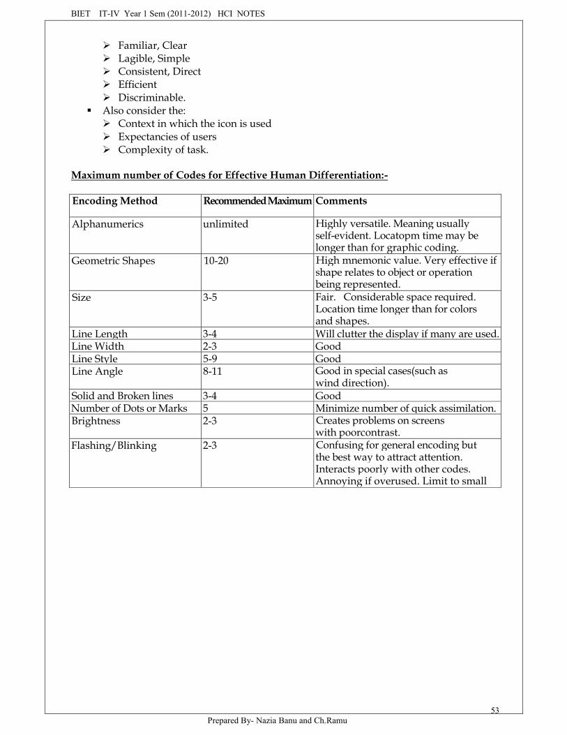
BIET IT-IV Year 1 Sem (2011-2012) HCI NOTES
Prepared By- Nazia Banu and Ch.Ramu53
Familiar, Clear Lagible, Simple Consistent, Direct Efficient Discriminable.
Also consider the: Context in which the icon is used Expectancies of users Complexity of task.
Maximum number of Codes for Effective Human Differentiation:-
Encoding Method Recommended Maximum Comments
Alphanumerics unlimited Highly versatile. Meaning usuallyself-evident. Locatopm time may belonger than for graphic coding.
Geometric Shapes 10-20 High mnemonic value. Very effective ifshape relates to object or operationbeing represented.
Size 3-5 Fair. Considerable space required.Location time longer than for colorsand shapes.
Line Length 3-4 Will clutter the display if many are used.Line Width 2-3 GoodLine Style 5-9 GoodLine Angle 8-11 Good in special cases(such as
wind direction).Solid and Broken lines 3-4 GoodNumber of Dots or Marks 5 Minimize number of quick assimilation.Brightness 2-3 Creates problems on screens
with poorcontrast.Flashing/Blinking 2-3 Confusing for general encoding but
the best way to attract attention.Interacts poorly with other codes.Annoying if overused. Limit to smallfields.
BIET IT-IV Year 1 Sem (2011-2012) HCI NOTES
Prepared By- Nazia Banu and Ch.Ramu54
Underlining No data Useful but can reduce text legibility.Reverse Video No data Effective for making data stand out.
Flicker easily perceived in largeareas, however.
Orientation(location ondisplay surface)
4-8 -
Color 6-8 Attractive and efficient. Short locationtime. Excessive use confusing. Poor forthe color blind.
Combinations of Codes Unlimited Can reinforce coding but complexcombinations can be confusing.
Choosing Icons:- Icon design is an important process.
A Successful Icon:- Looks different from all other icons. Is obvious what it does or represents. Is recognizable when no larger than 16 pixels square. Looks as good in black and white as in color.
Size:- Supply in all standard sizes. Use colors from the system palette. Use an odd number of pixels along each side. Provides center pixel around which to focus design. Minimum sizes for easy selection: Provide as large a hot zone as possible.
Choosing Images:- Use existing icons when available. Use images for nouns, not verbs. Use traditional images. Consider user cultural and social norms.
Creating Images:- Create familiar and concrete shapes Create visually and conceptually distinct shapes. Incorporate unique features of an object. Do not display within a border. Clearly reflect objects represented. Simply reflect objects represented, avoiding excessive detail. Create as a set, communicating relationships to one another through common shapes. Provide consistency in icon type. Create shapes of the proper emotional tone.
Drawing Images:- Provide consistency in shape over varying sizes, Do not use triangulararrows in design to avoid confusion with other system symbols, when icons are used toreflect varying attributes, express these attributes as meaningfully as possible, Provideproper scale and orientation, Use perspective and dimension whenever possible,Accompany icon with a label to assure intended meaning.
BIET IT-IV Year 1 Sem (2011-2012) HCI NOTES
Prepared By- Nazia Banu and Ch.Ramu55
MAXIM If people must remember hieroglyphics, they won't stick around long.
Icon Animation and Audition:-Animation:Use:
To provide feedback, For visual interest. Make it interruptible or independent of user's primary interaction. Do not use it for decoration. Permit it to be turned off by the user. For fluid animation, present images at 16 or more frames per second.Audition: Consider auditory icons.
The Design Process:- Define the icon's purpose and use. Collect, evaluate, and sketch ideas. Draw in black and white. Draw using an icon-editing utility or drawing package. Test for user: Expectations. Recognition Learning. Test for legibility. Register new icons in the system's registry.
Screen Presentation:- Follow all relevant general guidelines for screen design. Limit the number of symbols to 12, if possible, and at most 20. Arrange icons: In a meaningful way, reflecting the organization of the real world. To facilitate visual scanning. Consistently. Place object and action icons in different groups. Present an interactive icon as a raised screen element. Ensure that a selected icon is differentiable from unselected icons. Permit arrangement of icons by the user. Permit the user to choose between iconic and text display of objects and actions.
Multimedia:- The graphical flexibility of the Web permits inclusion of other media on ascreen, including images, photographs, video, diagrams, drawings, and spoken audio. Theavailability of these additional interface elements has, however, been a double-edgedsword. On the one hand, the various media can be powerful communication and attention-getting techniques. Multimedia can hold the user's attention, add interest to a screen,entertain, and quickly convey information that is more difficult to present textually. It canalso make the Web much more accessible to people with disabilities. On the other hand,effective use of multimedia in design has been hindered by a lack of knowledge concerninghow the various media may best be used, and a scarcity of applied design guidelines.Effective exhibited by many designers. The resulting usability problems, user confusion andfrustration, poor screen legibility, and slow downloads, and so on have created situations
BIET IT-IV Year 1 Sem (2011-2012) HCI NOTES
Prepared By- Nazia Banu and Ch.Ramu56
where the user was too often denied an efficient and meaningful Web experience.It is most difficult to use Web sites were those that were graphically intense, and the
top Web sites were characterized by little, if any, multimedia. Today, consequently, goodinterface design employs multimedia in a conservative and appropriate manner. Theobjective is good interaction design, not "sparkle". In the future, experts say, multimediaelements will be much better integrated with browsers, alleviating many of today's usabilityproblems.
Graphics:- Use graphics to: Supplement the textual content, not as a substitute for it. Convey information that can't be effectively accomplished using text. Enhance navigation through: Presenting a site overview Identifying site pages. Identifying content areas. Limit the use of graphics that take a long time to load. Coordinate the graphics with all other page elements.
Images:- General: Use standard images. Use images consistently. Produce legible images. Provide descriptive text or labels with all images. Distinguish navigational images from decorative images. Minimize: The number of presented images. The size of presented images. Restrict single images to 5k. Restrict page images to 20k. Provide thumbnail size images. Image animation. Avoid extraneous or gratuitous images. Color: Minimize the number of colors in an image. Format: Produce images in the most appropriate format. GIF(Graphics Interchange Format) JPEG(Joint Photographic Experts Group). Internationalization: Provide for image internationalization. Screen design: Reuse images on multiple pages.
Image Maps:- Use: To provide navigation links to other content.
BIET IT-IV Year 1 Sem (2011-2012) HCI NOTES
Prepared By- Nazia Banu and Ch.Ramu57
Advantages: Can be arrayed in a meaningful and obvious structure. Faster to load than separate images. Disadvantages: Consume a significant amount of screen space. "Hot Spots" not always obvious. One's location within image map is not always obvious. Guidelines: Use with caution. Provide effective visual cues and emphasis to make it easy to identify link
boundaries. Ensure image maps are accessible to the vision impaired.
MYTH Cool=Usable
Photographs/Pictures:- Use: When every aspect of the image is relevant. Guidelines: Use JPEG format. On the initial page: Display a small version. A thumbnail size image. Zoom-in-on most relevant detail. Link to larger photos showing as much detail as needed.
Video:- Uses: To show things that move or change over time. To show the proper way to perform a task. To provide a personal message. To grab attention. Disadvantages: Expensive to produce. Slow to download Small and difficult to discern detail Guidelines: Never automatically download a video into a page. Create short segments. Provide controls, including those for playing, pausing, and stopping. Consider using: Existing video Audio only. A slide show with audio.
Diagrams:- Uses: To show the structure of objects.
BIET IT-IV Year 1 Sem (2011-2012) HCI NOTES
Prepared By- Nazia Banu and Ch.Ramu58
To show the relationship of objects. To show the flow of a process or task. To reveal a temporal or spatial order. Guidelines: Provides simple diagrams Provides cutaway diagrams or exploded views to illustrate key points.
Drawings:- Use: When selective parts need to be emphasized or represented. Guidelines: Provide simple drawings showing minimal detail. Provide a link to a complete drawing.
Animation:- Uses: To explain ideas involving a change in: Time Position To illustrate the location or state of a process. To show continuity in transitions. To enrich graphical representations. To aid visualization of three-dimensional structures. To attract attention. Disadvantages: Very distracting. Slow loading. Guidelines: Use only when an integral part of the content Create short segments. Provides a freeze frame and stop mode. Avoid distracting animation.
MAXIM Content is always more important than graphics.
Audition:- Uses: As a supplement to text and graphics. To establish atmosphere. To create a sense of place. To teach To sample. Advantages: Does not obscure information on the screen Shorter downloading time than video. Disadvantages: Is annoying to many people, including users and nonusers in the vicinity. Can easily be overused, increasing the possibility that it will be ignored.
BIET IT-IV Year 1 Sem (2011-2012) HCI NOTES
Prepared By- Nazia Banu and Ch.Ramu59
Is not reliable because: Some people are hard of hearing. If it is not heard, it may leave no permanent record of having occurred. The user can turn it off. Audio capability may not exist for the user. Guidelines: When words are spoken: The content should be simple. The speed of narration should be about 160 words per minute. When used to introduce new ideas or concepts the narration should be slowed. Off-screen narration should be used rather than on-screen narration. Unless the narrator is a recognized authority on the topic. Create short segments. Provide segments of high quality. Provide audio controls. Play background audio softly.
Combining Mediums:- Combinations: Use sensory combinations that work best together: Auditory text with visual graphics. Screen text with visual graphics. Integration: Closely integrate screen text with graphics. Relevance: Both the visual and auditory information should be totally relevant to the task being
performed. Presentation: Visual and auditory textual narrative should be presented simultaneously, or the
visuals should precede the narrative by no more than 7 seconds. To control attention, reveal information systematically. Limit elements revealed to one item at a time and use sequential revelations for
related elements. Animations must show actions initiations as well as the action's result. Avoid animations that distracts from other more important information. Downloading times: Consider downloading times when choosing a media. Testing: Thoroughly test all graphics for: Legibility. Comprehensibility. Acceptance.
BIET IT-IV Year 1 Sem (2011-2012) HCI NOTES
Prepared By- Nazia Banu and Ch.Ramu60
Step-12Choose the proper Colors
Color adds dimension, or realism, to screen usability. Color draws attention because itattracts a person's eye. If used properly, it can emphasize the logical organizationinformation, facilitate the discrimination of screen components, accentuate differencesamong elements, and make displays more interesting. If used improperly, color can bedistracting and possibly visually fatiguing, impairing the system's usability. In this step wewill:
Come to understand color's characteristics. What color is The uses of color. Possible problems and cautions when working with color. The results of color research. Color and human vision. Come to understand how to use color. Choose the proper colors for textual graphic screens. Choose the proper colors for statistical graphics screens. Choose the proper color for Web screen text and images.
Color-What is it?To describe a color, it is useful to refer to the three properties it possesses: hue, chroma orsaturation, and value or intensity, as illustrated in figure-1. Hue is the spectral wave lengthcomposition of a color. It is to this we attach a meaning such as green, or red. Chroma orsaturation is the purity of a color in a scale from gray to the most vivid version of the color.The more saturated a hue is, the more visible it is at a distance. The less saturated, the lessvisible. Value or intensity is the relative lightness or darkness of a color in a range fromblack to white. Two-word descriptors, such as light red or dark blue, are usually used todescribe lightness differences. Some hues are inherently lighter or darker than others, forexample, yellow is very light and violet is very dark.
The primary colors of illuminated light are red, green, and blue, whose wavelengthsadditively combine in pairs to produce magenta, cyan, and yellow, and all the other visiblecolors in the spectrum. The three primary colors additively combine to produce white. Thelong-wavelengths colors(red) are commonly referred to as warm, and short-wavelengthscolors(blue) as cool.
Color, then, is a combination of hue, chroma, and value. In any one instance what wecall "blue" may actually be one of several hundred thousand "blues". This problem hasconfounded color research over the years. A "blue" may be unacceptable in one situationbecause it is highly saturated and dar, but perfectly acceptable in another, being lesssaturated and light. The exact measures of a color are rarely reported in the literature.The Visible SpectrumAPPROXIMATE COLOR WAVELENGTHS IN MILLIMICRONSRed 700Orange 600Yellow 570Yellow-green 535Green 500Blue-Green 493Blue 470Violet 400
BIET IT-IV Year 1 Sem (2011-2012) HCI NOTES
Prepared By- Nazia Banu and Ch.Ramu61
RGB:-Many color monitors use the three primary colors of light, in various combinations,
to create the many colors we see on screens. By adjusting the amounts of red, green, andblue light presented in a pixel, millions of colors can be generated.HSV:-
Some palette editors use a convention based on the Munsell method of color notationcalled HSV, for hue, saturation, and value(or HSL for hue, saturation, and lightness). Again,various combinations produce different colors.Dithering:-
The eye is never steady, instead trembling slightly as we see. If pixels of differentcolors are placed next to each other, this tremor combines the two colors into a third color.This is referred to as dithering, and sometimes texture mapping.Color Uses:
Use color to assist in formatting a screen: Relating or typing elements into groupings. Breaking apart separate groupings of information. Associating information that is widely separated on the screen. Highlighting or calling attention to important information by setting it off from the
other information. Use color as a visual code to identify: Screen components. The logical structure of ideas, processes, or sequences. Sources of information. Status of information. Use color to: Realistically portry natural objects. Increase screen appeal.
Color as a Formatting Aid: As a formatting aid, color can provide better structure andmeaning to a screen.
Color as a Visual Code:- A color code indicates what category the information beingdisplayed falls into.
Other Color Uses:- Color can also be used to more realistically portray objects in the Worldaround us that must be displayed on a screen. It is also thought that the addition of colorincreases a screen's appeal and makes working with a display more pleasant.
Possible Problems with Color: What may have been a poorly designed product will simplybecome colorful poorly designed product. When used improperly, color may even impairperformance by distracting the viewer and interfering with the handling of information.
High Attention-Getting Capacity:- This quality causes the screen viewer to associate, or tietogether, screen elements of the same color, whether or not such an association should bemade. The effect achieved is often described as the Christmas tree mentioned earlier.
Interference with Use of Other Screens:- The rationable for color will be difficult tounderstand and its attention-getting capacity severally restricted.
Varying Sensitivity of the Eye to Different colors
BIET IT-IV Year 1 Sem (2011-2012) HCI NOTES
Prepared By- Nazia Banu and Ch.Ramu62
Color-viewing Deficiencies
Cross-Disciplinary and Cross-Cultural Differences:- Colors can have different meanings indifferent situations to different people. A color used in an unexpected way can causeconfusion. An error signaled in green would contradict the expected associated of red withstop or danger. The color blue has the following quite different meanings:
For financial managers- Corporate qualities or reliability. For health care professionals-Death. For nuclear reactor monitors- Coolness or water. For American movie audiences- Tenderness or pornography.
Color and Human VisionThe Lens Muscles control the lens of the eye. These muscles focus received wavelengths oflight on the retina. The lens itself is not color corrected. The wavelength of light that createdifferent colors are focused at different distances behind the lens, the longerwavelengths(red) being focused farther back than the shorter wavelengths(blue). To create asharp image of the out-of-focus colors requires a refocusing of the eye. Excessiverefocusing(such as between red and blue) can lead to eye fatigue.
The lens also refocuses for light waves of different brightness. Sharp contrasts inbrightness in things being viewed can lead to visual fatigue as they eye continually makesmuscular adjustments. Driving an automobile through a forest of trees on a bright sunnyday illustrates this effect. The eye continually adjusts as the auto sequentially movesthrough areas of bright sunlight and patches of shadows.
The Retina:- The retina is the light-sensitive surface of the ye. It comprises two kinds ofreceptors, rod, and cones, which translate the incoming light into nervous impulses. Rodsare sensitive to lower light levels and function primarily at night. Cones are stimulated byhigher light levels and react to color. The sensitivity of cones to colors varies, different conespossessing maximum sensitivity to different wavelengths of light.MYTH If we can't do it right, do it big. If we can't do it big, do it in color.Choosing ColorsChoosing colors for categories of information:-
Choosing colors for categories of information requires a clear understanding of howthe information will be used.
Some examples: If different parts of the screen are attended to separately, color-code the different
parts to focus selective attention on each in turn. If decisions are made based on the status of certain types of information on the
screen, color-code the types of status that the information may possess. If screen searching is performed to locate information of a particular kind or quality,
color-code these kinds or qualities for contrast. If the sequence of information use is constrained or ordered, use color to identify the
sequence. If the information displayed on a screen is packed or crowded, use color to provide
visual groupings. Use color as a redundant screen code.
Color in Context:- Colors are subject to contextual effects. The size of a colored image, the
BIET IT-IV Year 1 Sem (2011-2012) HCI NOTES
Prepared By- Nazia Banu and Ch.Ramu63
color of images adjacent to it, and the ambient illumination all exert an influence on what isactually perceived.
Adjacent images can influence the perceived color. A color on a dark backgroundwill look lighter and brighter than the same color on a light background, for example. Acolor can be induced into a neutral foreground area(gray) by the presence of a coloredbackground. A red background can change a gray into a green.Usage :-
Design for monochrome first. Use colors conservatively. Do not use color where other identification techniques, such as location, are available.
Discrimination and Harmony:- For best absolute discrimination, select no more than four or five colors widely
spaced on his color spectrum. Good color: red, yellow, green, blue, and brown. For best comparative discrimination, select no more than six or seven colors Widely spaced on the color spectrum. Other acceptable colors: Orange, yellow-green, cyan, violet, and magenta. Choose harmonious colors. One color plus two colors on either side of its complement. Three colors at equidistance points around the color circle. For extended viewing or older viewers, use brighter colors.
Emphasis:- To draw attention or to emphasize elements, use bright or highlighted colors. The
deemphasize elements, use less bright colors. The perceived brightness of colors from most to least is white, yellow, green, blue,
red. To emphasize separation, use contrasting colors. Red and green, blue and yellow. To convey similarity, use similar colors. Orange and yellow, blue and violet.
Common Meanings:- To indicate that actions are necessary, use warm colors. Red, orange, yellow. To provide status or background information, use cool colors. Green, blue, violet, purple. Conform to human expectations In the job. In the world at large.
Red-Stop, fire, hot, danger. Yellow-Caution, slow, test. Green-Go, ok, clear, vegetation, safety. Blue-Cold, water, calm, sky, neutrality Gray-Neutrality. While-Neutrality. Warm colors-Action, response required spatial closeness. Cool colors- Status, background information, spatial remoteness.
BIET IT-IV Year 1 Sem (2011-2012) HCI NOTES
Prepared By- Nazia Banu and Ch.Ramu64
Some typical implications of color with dramatic portrayal are: High illumination- Hot, active, comic situation. Low illumination- Emotional, tense, tragic, melodramatic, romantic situations. High saturation- Emotional, tense, hot, melodramatic, comic situations. Warm colors-Active, leisure, recreation, comic situations. Cool colors- Efficiency, work, tragic and romantic situations. Proper use of color also requires consideration of the experiences and expectations of
the screen viewers.Location:-
In the center of the visual field, use red and green. For peripheral viewing, use blue, yellow, black and white. Use adjacent colors that differ by hue and value or lightness.
Ordering:- Order colors by their spectral position. Red, orange, yellow, green, blue, indigo, violet.
Foregrounds and Backgrounds:- Foregrounds: Use colors that highly contrast with the background color. For text or data, use: Black. De saturated or spectrum center colors such as white, yellow, or green. Warmer more active colors. Use colors that possess the same saturation and lightness. To emphasize an element, highlight it in a light value of foreground color, pure
white, or yellow. To deemphasize an element, lowlight it in a dark value of the foreground color. Backgrounds: Use a background color to organize a group of elements into a unified whole. Use colors that do not compete with the foreground. Use: Light-colored backgrounds of low intensity: Off-white or light gray. De saturated colors. Cool, dark colors such as blue or black. Colors on the spectral extremes.
Three-Dimensional Look:- Use at least five colors or color values to create a 3-D look on a screen. Background: The control itself and the window on which it appears. Fore ground: Captions and lines for buttons, icons, and other objects. Usually black or white. Selected mode: The color used when the item is selected. Top shadow: The bezel on the top and left of the control. Bottom shadow: The bezel on the bottom and right of the control.
Color palette, Defaults, and Customization :- Permit users to customize their colors. Provide a default set of colors for all screen components.
BIET IT-IV Year 1 Sem (2011-2012) HCI NOTES
Prepared By- Nazia Banu and Ch.Ramu65
Provide a palette of six or lightness shades for each foreground color. Provide a palette of six or seven background colors. Never refer to a screen element by its color.
Gray Scale:- For fine discriminations use a black-gray-white scale. Recommended values are white, light gray, medium gray, dark gray, black.
Text in color:- When switching text from black to color: Double the width of lines. Use bold or larger type: IF originally 8 to 12 points, increase by 1 to 2 points. If originally 14 to 24 points, increase by 2 to 4 points. Check legibility by squinting at text Too-light type will recede or even disappear.
Monochromatic Screens:-At the standard viewing distance, white, orange, or green are acceptable colors.At a far viewing distance, white is the best choice.Over all viewing distances, from near to far, white is the best choice.
Consistency:-Be consistent in color use.Cultural, Disciplinary, and Accessibility Considerations:-
Consider the impact of specific colors on: Users of various cultures. Users of various disciplines. Users with color-viewing deficiencies. Users relying on accessibility utilities.
Choosing colors for Textual Graphic Screens:- Use effective foreground / background combinations. Use effective foreground combinations. Choose the background color first. Display no more than four colors at one time. Use colors in toolbars sparingly. Test the chosen colors.
Choose the Background First:- When choosing, colors to display, it is best to select thebackground color first. Then, choose acceptable foreground colors. Maximum of Fourcolors
Use colors in Toolbars sparingly Test the colors Choosing colors for statistical Graphic Screens. Emphasis:- Emphasize the graphic's
data.Number of colors:-Use no more than six colors at one time.
BIET IT-IV Year 1 Sem (2011-2012) HCI NOTES
Prepared By- Nazia Banu and Ch.Ramu66
Use one color of five values or lightness.Backgrounds:-
Surround images: In a neutral color. In a color complementary to the main image.
Size:- Provide images of an adequate size for the task. If the image changes in size, use colors that exhibit a minimum shift in hue or
lightness. White, yellow, and red on dark backgrounds.
Status:- To indicate a status, use the following colors: Proper, normal, or OK: Green, white, or blue. Caution: Yellow or gold. Emergency or abnormal: Red.
Measurements and Area-Fill patterns:- Display measurements in the following codes: Grids: Gray Data points: Yellow Variance or error bars: Blue Out of specified range data: Red. Captions and labels: Lavender, lime green or cyan. Display area-fill patterns in the following colors: Widely spaced dots: Red Closely spaced dots: Green Wide dashed lines: Magenta Narrow dashed lines: Cyan Wide Crosshatch: Blue Narrow Crosshatch: Yellow.
Physical Impressions:- Size: To convey an impression of: Larger: Use bright or saturated colors. Smaller: Use dark or de saturated colors. Similar: Use colors of equal lightness. Weight: To convey an impression of: Heavy: Use dark, saturated colors. Light: Use light, de saturated colors. Distance: To convey an impression of: Close: Use saturated, bright, long-wavelength(red) colors. Far: Use saturated, dark, short-wavelength(blue) colors. Height: To convey an impression of height, use desaturated, light colors.

BIET IT-IV Year 1 Sem (2011-2012) HCI NOTES
Prepared By- Nazia Banu and Ch.Ramu67
Depth: To convey an impression of depth, use saturated, dark colors. Concentration level: To convey an impression of concentration level, use: High: Saturated colors. Low: De saturated colors. Magnitude of change: To convey an impression of magnitude of change, use: Lowest: Short-wavelength (blue) colors. Highest: Long-wavelength(red) colors. Actions: To convey an impression of action, use: Required: Long-wavelength(red) colors. Not required: Short-Wavelength (blue) colors. Order:- To convey an impression of order with color, use: Low end of a continuum: Short-wavelength(blue) colors. High end of a continuum: Long- wavelength(red) colors. When displaying an array of ordered colors, position: Short-wavelength colors at the left side or at the bottom. Long-wavelength colors at the right side or at the top. To convey an impression of order with value or lightness, use the lightness order of a
color( darkest to lightest or vice versa). Neutrality: To convey an impression of neutrality, use black, gray, and white.
Choosing colors for Web pages:- Purpose: Color must always have a meaningful purpose. Palette: Use the browser 216-color palette. Presentation: Minimize the number of presented colors. Always consider color in context. Use similar or the same color schemes throughout. For foregrounds: Use black or strong colors for text and headings. For backgrounds: Use weaker contrasting colors such as off-white or light gray. Use a uniform color in large areas. The smaller the element, the more contrast is required between it and its back
ground. Larger images should use: Flat, Web-safe colors. Fewer colors then small images. Select colors that can be easily reproduced in black and white. Links: Use default colors for links. Make unselected/unvisited links blue. Make selected/visited links purple.
BIET IT-IV Year 1 Sem (2011-2012) HCI NOTES
Prepared By- Nazia Banu and Ch.Ramu68
Do not display non-link text in link colors. Testing: Test all colors.
MAXIM Content is always more important than color.
Users of Colors to Avoid:- Relying exclusively on color. Too many colors at one time. Highly saturated, spectrally extreme colors together: Red and blue, yellow and purple. Low-brightness colors for extended viewing or older viewers. Colors of equal brightness. Colors lacking contrast: For example, yellow and white; black and brown; reds, blues, and browns against a
light a background. Fully saturated colors for text or other frequently read screen components. Pure blue for text, thin lines, and small shapes. Colors in small areas. Color for fine details. Non-opponent colors. Red and green in the periphery of large-scale displays. Adjacent colors that only differ in the amount of blue they possess. Single-color distinctions for color-deficient users. Using colors in unexpected ways. Using color to improve legibility of densely packed text.
BIET IT-IV Year 1 Sem (2011-2012) HCI NOTES
Prepared By- Nazia Banu and Ch.Ramu69
Software Tools(unit-VII)
There is great satisfaction in building good tools for other people to use
Introduction:
The emergence of user-interface architects, design and specification methods,standard components, and automated tools for construction are indicators of thematuration of our field.
Like building architects, successful user-interface architects know that it makesgood sense to complete the design before they start building, even though they knowthat, in the process of construction, some changes will have to be made.
Specification Methods
The default language for specifications in any field is the designer's naturallanguage, such as English, and a sketchpad or black board. But natural languagespecifications tend to be lengthy, vague and ambiguous, and therefore often are difficultto prove correct, consistent, or complete. Formal and semiformal languages have provedtheir value in many areas, including mathematics, physics, circuit design, music, andeven knitting. Grammars for command languages are effective, but for GUI's the amountof syntax is small.
Menu tree structures are popular, and therefore specifying menu trees by simplydrawing the tree and showing the menu layouts deserves attention. The more generalmethod of transition diagrams has wide applicability in user-interface design.Improvements such as state charts have features that are attuned to the needs ofinteractive systems and for wideget specification. New approaches such as the useraction notation (UAN) are helpful in characterizing user behavior and some aspects ofsystem responses.
Grammars:In computer programming, Backus-Naur form (BNF) is often used to describe
programming languages. Multiparty grammars are effective for text-oriented commandsequences that have repeated exchanges, such as a bank terminal. Menu selection can bedescribed by multiparty grammars, but the central aspect of tree structure and traversalis not shown conveniently in a Grammar-based approach.
Menu selection and dialogue-box trees:
For many applications a menu-selection tree is an excellent selection style becauseof the simple structure that guides designers and users alike. Menu trees are powerful as

BIET IT-IV Year 1 Sem (2011-2012) HCI NOTES
Prepared By- Nazia Banu and Ch.Ramu70
a specification tool since they show users, managers, implemented, and other interestedparties the complete and detailed coverage of the system.
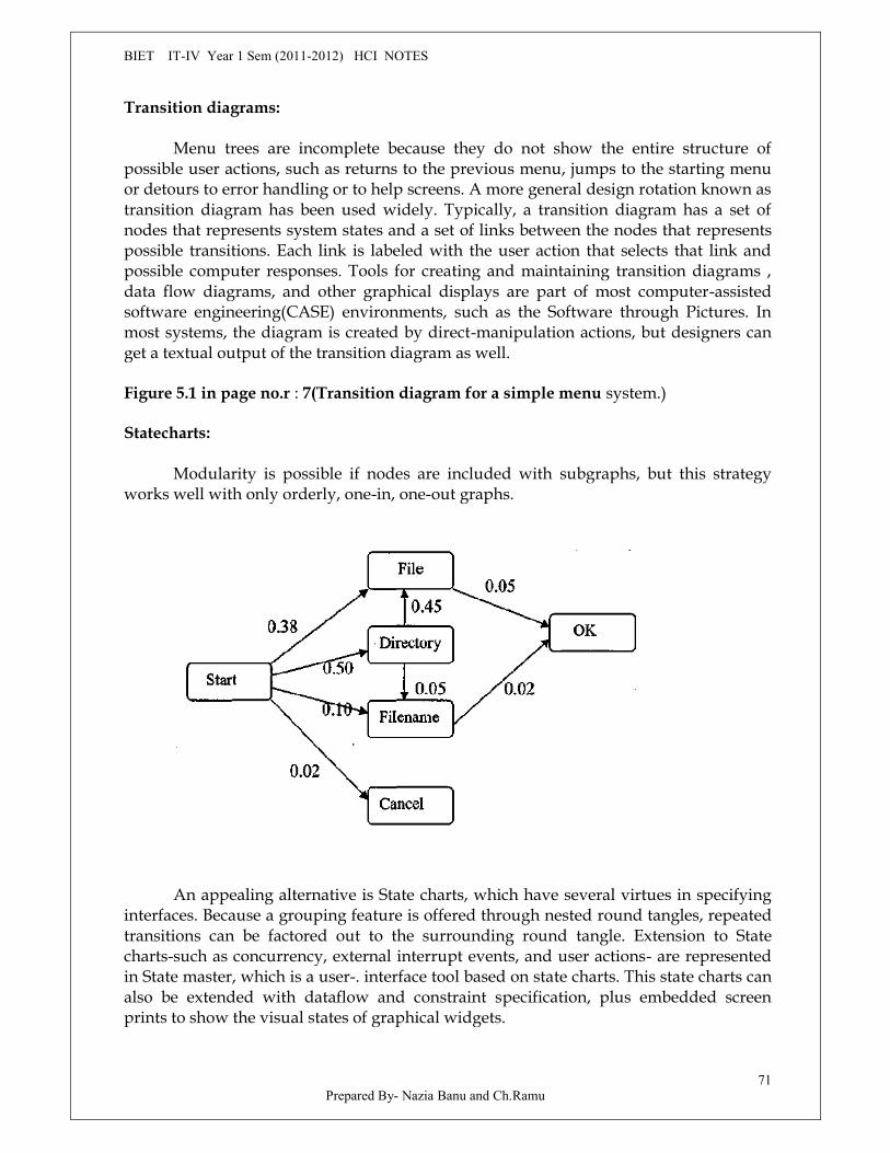
BIET IT-IV Year 1 Sem (2011-2012) HCI NOTES
Prepared By- Nazia Banu and Ch.Ramu71
Transition diagrams:
Menu trees are incomplete because they do not show the entire structure ofpossible user actions, such as returns to the previous menu, jumps to the starting menuor detours to error handling or to help screens. A more general design rotation known astransition diagram has been used widely. Typically, a transition diagram has a set ofnodes that represents system states and a set of links between the nodes that representspossible transitions. Each link is labeled with the user action that selects that link andpossible computer responses. Tools for creating and maintaining transition diagrams ,data flow diagrams, and other graphical displays are part of most computer-assistedsoftware engineering(CASE) environments, such as the Software through Pictures. Inmost systems, the diagram is created by direct-manipulation actions, but designers canget a textual output of the transition diagram as well.
Figure 5.1 in page no.r : 7(Transition diagram for a simple menu system.)
Statecharts:
Modularity is possible if nodes are included with subgraphs, but this strategyworks well with only orderly, one-in, one-out graphs.
An appealing alternative is State charts, which have several virtues in specifyinginterfaces. Because a grouping feature is offered through nested round tangles, repeatedtransitions can be factored out to the surrounding round tangle. Extension to Statecharts-such as concurrency, external interrupt events, and user actions- are representedin State master, which is a user-. interface tool based on state charts. This state charts canalso be extended with dataflow and constraint specification, plus embedded screenprints to show the visual states of graphical widgets.
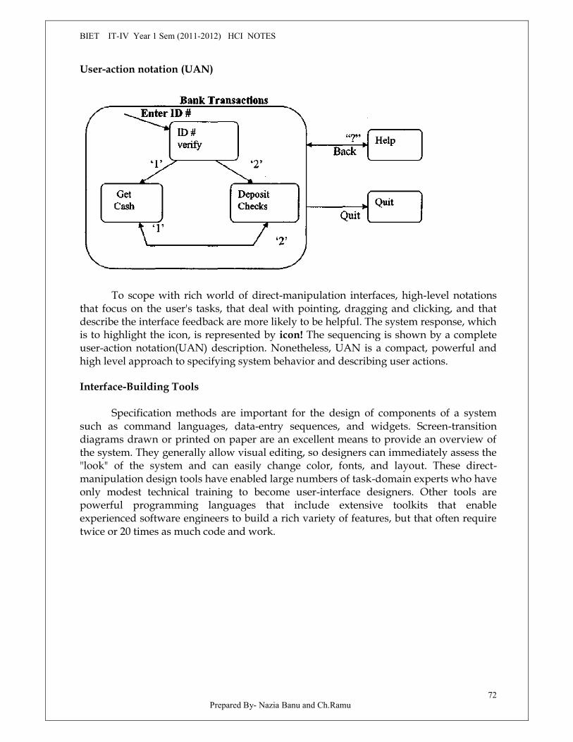
BIET IT-IV Year 1 Sem (2011-2012) HCI NOTES
Prepared By- Nazia Banu and Ch.Ramu72
User-action notation (UAN)
To scope with rich world of direct-manipulation interfaces, high-level notationsthat focus on the user's tasks, that deal with pointing, dragging and clicking, and thatdescribe the interface feedback are more likely to be helpful. The system response, whichis to highlight the icon, is represented by icon! The sequencing is shown by a completeuser-action notation(UAN) description. Nonetheless, UAN is a compact, powerful andhigh level approach to specifying system behavior and describing user actions.
Interface-Building Tools
Specification methods are important for the design of components of a systemsuch as command languages, data-entry sequences, and widgets. Screen-transitiondiagrams drawn or printed on paper are an excellent means to provide an overview ofthe system. They generally allow visual editing, so designers can immediately assess the"look" of the system and can easily change color, fonts, and layout. These direct-manipulation design tools have enabled large numbers of task-domain experts who haveonly modest technical training to become user-interface designers. Other tools arepowerful programming languages that include extensive toolkits that enableexperienced software engineers to build a rich variety of features, but that often requiretwice or 20 times as much code and work.
BIET IT-IV Year 1 Sem (2011-2012) HCI NOTES
Prepared By- Nazia Banu and Ch.Ramu73
User-interface independence Separate interface design from internals Enable multiple user-interface strategies Enable multiple-platform support Establish role of user-interface architect Enforce standards
Methodology and notation Develop design procedures Find ways to talk about design Create project management
Rapid prototyping Try out ideas very early Test, revise, test, revise,.... Engage end users, managers, and customers
Software support Increase productivity Offer constraint and consistency checks Facilitate team approaches Ease maintenance
Features of user-interface building blocks.
Design Tools
User-interface architects recognize that creating quick sketches is importantduring the early stages of design to explore multiple alternatives, to allowcommunication within the design team, and to convey to clients what the product willlook like.
In the simplest case, designers create a slide show of still images, which areswitched at a user-controlled pace. Most tools support more complete prototyping thatallows users to select from menus, click on buttons, use scrolling lists, and even dragicons. Visual editing tools usually permit designers to lay out displays with cursormovements or mouse clicks, and to mark regions for selection, highlighting, or dataentry.
Visual programming tools with direct manipulation, such as Paragraph (Pictoriussystems), are an intriguing alternative. Paragraph allows users to edit, execute, debug,and make changes during execution, with flowchart-like visual programming tools thayemphasize data flow and have a deeply nested modular structure. Visual programmingfor laboratory instruments was the motivating influence for Lab VIEW (NationalInstruments), which has a flat structure of function boxes (Arithmetic,Boolean,and more)linked with wires.
BIET IT-IV Year 1 Sem (2011-2012) HCI NOTES
Prepared By- Nazia Banu and Ch.Ramu74
Contemporary visual development tools such as Microsoft Visual basic(Fig 5.8),Borland Delphi(Fig. 5.9) and Symantec Cafe (Fig. 5.10) have easy to use design tools fordragging buttons, labels, data-entry fields, combo boxes, and more onto a work space toassemble the visual interface.
Software-engineering tools
Experienced programmers often build user interfaces with general purposeprogramming languages such as C or C++, but this approach is giving way to usingfacilities that are especially tuned to user-interface development and web access. Someproducts provide user-interface program libraries, often called toolkits, that offercommon widgets, such as windows, scroll bars, pulldown or pop-up menus, data-entryfields, buttons, and dialogue boxes.
Sun Microsystems has created the largest tremors on the web with its offerings ofJava and javascript. Java is a complete system-programming language that speciallydesigned for the WWW. It is compiled on the server and is sent to clients as byte codestat are interpreted by the browser on whatever platform the browser resides, there byobtaining cross platform capability. Java is object oriented but eliminates some of thecomplexity of C++, such as operator overloading, multiple inheritance, pointers, andextensive automatic coercions.
JavaScript is much simpler scripting language that is embedded in the Hyper TextMarkup Language (HTML) code that generates web pages.
The rapid pace of change on the Internet is stimulated by the easy sharing of codeand the capacity to build quickly on top of the work of other programmers. Theimportance of WWW has led developers of many tools-including Tcl/Tk, Galaxy,MacroMind Director, and visual basic-to enable their programs to run on the web.
Evaluation and Critiquing Tools:
Software tools are natural environments in which to add procedures to evaluateor critique user interfaces. Simple metrics that report numbers of displays, widgets, orlinks between displays captures the size of a user-interface project. Even straightforwardtools such as spell checkers or concordances of terms would be a benefit.
A second set of tool is run-time logging software, which captures user;s patternsof activity. Simple reports - such as on the frequency of each error message, menu-itemselection, dialogue-box appearance, help invocation, form field usage; or web pageaccess-are of great benefit to maintenance personnel and to revisers of the initial design.
Task dependent metrics are likely to be more accurate, but the effort anduncertainty in collecting sequences and frequencies of tasks may discourage potentialusers. An empirical study with 60 users demonstrated that increased variations in
BIET IT-IV Year 1 Sem (2011-2012) HCI NOTES
Prepared By- Nazia Banu and Ch.Ramu75
terminology - for example, switching from search to browse to query- slowedperformance times by 10 to 25 percent.
Web-page and we-site analyzers also offer designers some guidance. DoctorHTML (http://imaRiware.com/RxHTML/) provides link and spell checking; examinesforms, tables, and images; and gives code evaluation with comments.
Summary
There will always be a need to write some user interfaces with traditionalprogramming tools, but the advantages of specialized user interface software tools fordesigners and software engineers are large. They include an order- of- magnitudeincrease in productivity, shorter development schedules, support for expert reviews andusability testing, ease in making changes and ensuring consistency, better managementcontrol, and reduced training necessary for designers.
The profusion of current tools and the promises of improved tools requires thatmanagers, designers and programmers stay informed, and that they make fresh choicesfor each project. This educational process can be enlightening, since the benefits ofimproved and appropriate tools are enormous if the right tools are selected.
Widgets supported Widows and dialogue boxes Pull down or pop-up menus Buttons(rectangles, round tangles, etc) Radio buttons and switches Scroll bars (Horizontal & Vertical) Data entry fields Field labels Boxes and separator lines Sliders, gauges, meters
Interface features Color, graphics, images, animation, video Varying display size (low to high resolution) Sounds, music, voice input-output Mouse, arrow keys, touch screens, stylus
Software architecture Prototype only, prototype plus application programming support User-interface
development environment Interface style(Command language, menu, form fillin, or direct manipulation) Levels and strength of user-interface independence Programming language(C,Pascal,etc.) Evaluation and documentation tools Easy interface with database, graphics, networking, spread sheets, etc. Logging during testing and use
BIET IT-IV Year 1 Sem (2011-2012) HCI NOTES
Prepared By- Nazia Banu and Ch.Ramu76
Management issues Number of satisfied users of the tool Supplier reliability and stability Cost Documentation, Training, and technical support Project management support Integration with existing tools and processes
From the tools maker's viewpoint, there are still great opportunities to createeffective tools that handle more user-interface situations, that produce output formultiple software and hardware platforms that are easier to learn, that are morepowerful, and that provide more useful and accurate evaluation. Existing CASE toolscould be expanded to include user-interface features.
BIET IT-IV Year 1 Sem (2011-2012) HCI NOTES
Prepared By- Nazia Banu and Ch.Ramu77
UNIT-VIII
Interaction Devices
The wheel is extension of the foot,The book is an extension of the eye,Clothing, an extension of the skin,
Electric circuitry an extension of central nervous systemIntroduction
The remarkable progress since 1960 in computer-processor speeds and storagecapabilities is matched by improvements in many input and output devices. The futureof computing is likely to include gestural input, two-handed input, three-dimensionalpointing, more voice input-output, wearable devices, and whole body involvement forsome input and output tasks.
The increased concern for human factors has led to hundreds of new devices andvariants of the old devices. The still improving speech recognizers are joined by moremundane but widely used speech store-and-forward technologies with increasedemphasis on telephone-based applications. Proponents of eyetrackers, datagloves, andforce-feedback devices are trying to expand from their niches.
Color displays for desktops and most laptops are standard, but monochromedisplays continue to proliferate in small and large formats. Compact digital cameraswith instant viewing on small LCDs are creating a steadily growing success story. Lowcost printers, even with color , are widely available. Innovative input devices, sensors,and effectors, and integration of computers into the physical environment, open the doorto new applications.
Keyboards and Function Keys
The primary mode of textual data entry is still the keyboard. Hundreds ofmillions of people have managed to use keyboards with speeds of up to 15 keystrokesper second. Contemporary keyboards generally permit only one keypress at a time,although dual keypresses are used to produce capitals and special functions.
More rapid data entry can be accomplished by chord keyboards that allow severalkeys to be pressed simultaneously to represent several characters or a word. Courtroomrecorders regularly use chord keyboards serenely to enter the full text of spoken
BIET IT-IV Year 1 Sem (2011-2012) HCI NOTES
Prepared By- Nazia Banu and Ch.Ramu78
arguments, reaching rates of up to 300 words per minute. This feat requires months oftraining and frequent use to retain the complex pattern of chord presses.
Keyboard layouts
During the middle of the nineteenth century, hundreds of attempts are made tobuild typewriters, with a stunning variety of positions for the paper, mechanisms forproducing a character, and layouts for the keys. QWERTY layout put frequently usedletter pairs far apart, thereby increasing finger travel distances. The development ofelectronic keyboards eliminated the mechanical problems and led many twentieth-century inventors to propose alternative layouts to reduce finger travel distance.
Beyond the letters, many debetes rage about the placement of additional keys.The early IBM PC keyboards was widely criticized because of the placement of a fewkeys, such as backslash the where most typists expected to find the SHIF key, and theplacement of several special characters near the ENTER key.
Some researchers have recognized that the wrist and hand placement required forstandard keyboards is awkward.
Keys
Modern electronic keyboards use 1/2 -inch-square keys (12mm square) withabout a 1/4-inch space between keys. The keypresses require a 40-to 125-gram force anda displacement of 3 to 5 millimeters. The force and displacement have been show toproduce rapid typing with low error rates while providing suitable feedback to users.
An important element in key design is the profile of force displacement. Thetactile and audible feedback extremely important in touch typing. For those reasons,membrane keyboards that use a non-moving touch-sensitive surface are unacceptablefor touch typing. However, they are durable and therefore effective for publicinstallations at museums or amusement parks.
Function keys
Many keyboards contain a set of additional function keys for special functions orprogrammed functions. These keys are often labeled F1... F10 or PF1... .PF24. users mustremember the functions, learn about them from the screen, or consult an attachableplastic template, but some keys have meaning full labels, such as CUT, COPY, or PASTE.
The placement of function keys important if the task requires users to go fromtyping to using function keys. The greater the distance of the function keys from thehome position on the keyboard, the more severe the problem.
Function keys are sometimes build in to the display-screen bezel so that they areclose to display labels-a popular technique with bank machine.

BIET IT-IV Year 1 Sem (2011-2012) HCI NOTES
Prepared By- Nazia Banu and Ch.Ramu79
If all work can be done with labeled function keys, as on some CAD systems, thissolution is appealing. Word perfect became a worldwide success partly because all actions are initiated by function keys andrefined by onscreen menus The wheel is extension of the foot,
The book is an extension of the eye,Clothing, an extension of the skin,Electric circuitry an extension of central nervous system
The remarkable progress since 1960 in computer-processor speeds and storagecapabilities is matched by improvements in many input and output devices. The futureof computing is likely to include gestural input, two-handed input, three-dimensionalpointing, more voice input-output, wearable devices, and whole body involvement forsome input and output tasks.
The increased concern for human factors has led to hundreds of new devices andvariants of the old devices. The still improving speech recognizers are joined by moremundane but widely used speech store-and-forward technologies with increasedemphasis on telephone-based applications. Proponents of eyetrackers, datagloves, andforce-feedback devices are trying to expand from their niches.
Color displays for desktops and most laptops are standard, but monochromedisplays continue to proliferate in small and large formats. Compact digital cameraswith instant viewing on small LCDs are creating a steadily growing success story. Lowcost printers, even with color, are widely available. Innovative input devices, sensors,and effectors, and integration of computers into the physical environment, open the doorto new applications.
The primary mode of textual data entry is still the keyboard. Hundreds ofmillions of people have managed to use keyboards with speeds of up to 15 keystrokesper second. Contemporary keyboards generally permit only one keypress at a time,although dual keypresses are used to produce capitals and special functions.
More rapid data entry can be accomplished by chord keyboards that allow severalkeys to be pressed simultaneously to represent several characters or a word. Courtroomrecorders regularly use chord keyboards serenely to enter the full text of spokenarguments, reaching rates of up to 300 words per minute. This feat requires months oftraining and frequent use to retain the complex pattern of chordpresses.
During the middle of the nineteenth century, hundreds of attempts are made tobuild typewriters, with a stunning variety of positions for the paper, mechanisms forproducing a character, and layouts for the keys. QWERTY layout put frequently usedletter pairs far apart, thereby increasing finger travel distances.
The development of electronic keyboards eliminated the mechanical problemsand led many twentieth-century inventors to propose alternative layouts to reducefinger travel distance.
BIET IT-IV Year 1 Sem (2011-2012) HCI NOTES
Prepared By- Nazia Banu and Ch.Ramu80
Beyond the letters, many debetes rage about the placement of additional keys.The early IBM PC keyboards was widely criticized because of the placement of a fewkeys, such as backslash the where most typists expected to find the SHIF key, and theplacement of several special characters near the ENTER key.
Some researchers have recognized that the wrist and hand placement required forstandard keyboards is awkward
Modern electronic keyboards use 1/2 -inch-square keys (12mm square) withabout a 1/4-inch space between keys. The keypresses require a 40-to 125-gram force anda displacement of 3 to 5 millimeters. The force and displacement have been show toproduce rapid typing with low error rates while providing suitable feedback to users.
An important element in key design is the profile of force displacement. Thetactile and audible feedback extremely important in touch typing. For those reasons,membrane keyboards that use a non-moving touch-sensitive surface are unacceptablefor touch typing. However, they are durable and therefore effective for publicinstallations at museums or amusement parks.
Many keyboards contain a set of additional function keys for special functions orprogrammed functions. These keys are often labeled F1... F10 or PF1... .PF24. users mustremember the functions, learn about them from the screen, or consult an attachableplastic template, but some keys have meaning full labels, such as CUT, COPY, or PASTE.
The placement of function keys important if the task requires users to go fromtyping to using function keys. The greater the distance of the function keys from thehome position on the keyboard, the more severe the problem.
Function keys are sometimes build in to the display-screen bezel so that they areclose to display labels-a popular technique with bank machine.
If all work can be done with labeled function keys, as on some CAD systems, thissolution is appealing. Word perfect became a world wide success partly because allactions are initiated by function keys and refined by onscreen
Cursor movement keys
A special category of function keys is the cursor-movement keys. There areusually four keys-up, down, left, and right. Some keyboards are have eight keys tosimplify diagonal movements.
Pointing Devices
With complex information displays -such as those used in air-traffic control, wordprocessing, and CAD—it is often convenient to point at the select item.
Pointing tasks
Pointing devices are applicable in six types of interaction tasks
1. Select 2.Position 3.Orient 4.Path 5.Quantify 6.Text
BIET IT-IV Year 1 Sem (2011-2012) HCI NOTES
Prepared By- Nazia Banu and Ch.Ramu81
Direct-control pointing devices
The lightpen was an early device that enabled users to point to a spot on a screenand to perform a select, position, or other task.
Touch screens can produce varied displays to suit the task. Form fill in or menuselection works naturally by touch screens, as does typing on a touch screen keyboard.
Palmtop computers make it natural to have pointing on the LCD surface, which isheld in the hand, placed on a desk, or rested on the lap.
Indirect-control pointing devices
Indirect pointing devices eliminate the hand-fatigue and hand-obscuring -the -screen problems, but must overcome the problem of indirection. As they do with thelight pen, the off-keyboard hand position and pick-up problems remain.
The mouse is appealing because the hand rests in a comfortable position, buttonson the mouse are easily pressed, even long motions can be rapid, and positioning can beprecise.
The track ball has sometimes been described as an upside-down mouse. It isusually implemented as rotating ball 1 to 15 centimeters in diameter that moves a cursoron the screen as it is moved.
The joystick, whose long history began in aircraft-control devices, now has dozensof computer versions with varying stick lengths and thicknesses, display cement forcesand distances, buttons or triggers, anchoring strategies for bases, and placement relativeto the keyboard and screen.
The graphics tablet is a touch-sensitive surface separate from the screen, usuallylaid flat on the table or in the users lap.
A touchpad (5- by 8-centimiters touchable surface) built in near the keyboardoffers convenience and precision of a touch screen while keeping the user's hand off thedisplay surface.Comparisons of pointing devices
Each pointing concept has its enthusiasts and detractors, motivated bycommercial interests, by personal preference, and increasing by empirical evidence.
Indirect pointing devices have been the cause of much controversy. The graphicstablet is appealing when the can remain with the device for long periods withoutswitching to a keyboard, pens accompanying graphics tablets allow a high degree ofcontrol that is appreciated by artists using drawing programs.
BIET IT-IV Year 1 Sem (2011-2012) HCI NOTES
Prepared By- Nazia Banu and Ch.Ramu82
The usual belief is that pointing devices are faster than keyboard controls, such ascursor-movement keys, but this assertion depends on the task.
In summary, the touch screen and trackball are durable in public-access, shop-floor, and laboratory applications. The mouse, trackball, track point, graphics tablet, andtouch pad are effective for pixel-level pointing. Cursor jump keys attractive when thereis a small number of targets. Joysticks appealing to game or aircraft-cockpit designers,apparently because of firm grip and easy movement, but they are slow and inaccurate inguiding a cursor to a fixed destination in office automation and personal computing.Indirect-control pointing devices require more learning than do direct-control devices.
Fits' lawThe major pointing devices are depending on hand movement to control a cursor
on the display. An effective predictive model of time to move a given distance, D, to atarget of width, W, was developed by Paul Fitts (1954). He discovered that the pointingtime is a function of distance and the width; farther away and smaller targets take longerto pointer to. The index of difficulty is defined as
Index of difficulty = log2 (2D/W).
The index of difficulty is unit less number, but it is traditionally measured in bits.The time to perform the point action is
Time to point = Q + C2 (index of difficulty),
Where Q and C2 are constants that depend on the device. Once data have beencollected for a device, Q and C2 can be computed, and then predictions can be maderegarding the time for other tasks. For example, for a 1 cm-wide target at a distance of 8cm, the index of difficulty is log2(2*8/l) = log2 (16) = 4 bits. If tests show that, for a givendevice, Q = 0.2, C2 = 0.1, then the time to point = 0.2+0.1(4)=0.6 seconds.
MaKenzie (1992) lucidly describes what Fitts' law is, how it has been applied, andwhat the many refinements are for cases such as two-dimensional pointing. A threecomponent equation was thus more suited for the high-precision pointing task:
Time for precision pointing = Ci + C2 (index of difficulty) + C3 log2 (C4/W).
The third term, time for the tuning, increases as the target width, W, decreases.This extension to Fitts' law is quite understandable and simple; it suggests that the timefor precision pointing at an object consists of a time for initiation of action, Ch a time forgross movement, and time for fine adjustment.
Novel pointing devices
Since a user's hands might be busy on the keyboard, several designers haveexplored other methods for selection and pointing. Foot controls are popular with rock-
BIET IT-IV Year 1 Sem (2011-2012) HCI NOTES
Prepared By- Nazia Banu and Ch.Ramu83
music performers, organists, dentists, medical-equipment users, car drivers, and pilots,so maybe computer users could benefit from them as well. A foot mouse was tested andwas found to take about twice as much time to use as a hand-operated mouse, butbenefits in special applications may exist.
Eye-tracking, gaze-detecting controllers have been developed by severalresearchers and companies who make devices to assist the handicapped . non intrusiveand non contact equipment using video-camera image recognition of pupil position cangive 1- to 2-degree accuracy, and fixations of 200 to 600 milliseconds are used to makeselections. Unfortunately, the "Midas touch problem" intrudes, since every gaze has thepotential to activate an unintended command. For the moment, eye tracking remains aresearch tool and an aid for the handicapped.
An alternative to the goggles-and-gloves approach is the Fakespace BinocularOmni-Orientation Monitor (BOOM), which allows users to step up to a viewer withhandles and look in the binocular-like device while holding the handles to shift vantagepoints with in the range of the mechanical boom.
Pointing devices with haptic feedback are an intriguing research direction.Substitute for haptic feedback in many cases, and the special-purpose applications ofcurrent haptic devices limit widespread use.
Speech recognition, digitization, and generation
The dream of speaking to computers and having computers speak has luredmany researchers and visionaries. The reality is more complex and sometimes moresurprising than the dream. Hardware designers have made dramatic progress withspeech and voice manipulation devices, but current successes are sobering compared tothe science fiction fantasy.
The vision of a computer that has a leisurely chat with the user seems more offantasy than a desired believable realty. Instead, practical applications for specific taskswith specific devices are more effective in serving the users need to work rapidly withlow error rates.
A deeper understanding of neurological processing of sounds would be helpful.Why does listening to Mozart symphonies encourage creative work, whereas listening toradio news reports suspends it? Is the linguistic processing needed to absorb a radionews report disruptive, whereas background Mozart is some how invigorating?
Discrete-word recognition
Discrete-word-recognition devices recognize individual words spoken by aspecific person; they can work with 90 to 98 percent reliability for 20 to200wordvocabularies. Speaker dependent training, in which the user repeats the full vocabularyonce or twice, is a part of most systems. Speaker independent systems are beginning to
BIET IT-IV Year 1 Sem (2011-2012) HCI NOTES
Prepared By- Nazia Banu and Ch.Ramu84
reliable enough for certain commercial applications. Quiet environments, head-mountedmicrophones, and careful choice of vocabularies improve recognition rates.
Continuous-speech recognition
HAL's ability to understand the astronauts' spoken words and even to read therelips was an appealing fantasy, but the reality is more sobering. Although many researchprojects have pursued continuous speech recognition, commercially successful productsare still restricted to specialty niches such as radiologists. The difficulty lies inrecognizing the boundaries between spoken words. Normal speech patterns blur theboundaries.
Speech store and forward
Less exciting but more immediately useful are the systems that enable storing andforwarding of spoken messages. Stored messages are commonly used for weather,airline, and financial information, but personal messaging through the telephonenetwork is growing more popular.
Voice-mail technology works reliably, is fairly low cost, and generally liked byusers. Problems arise mainly because of the awkwardness of using the 12 key telephonepad for commands, the need to dial into check whether messages have been left, andpotential for too many "junk" telephone messages because of the ease of broadcasting amessage to many people.Speech generation
Speech generation is an example of successful technology that is used, but whoseapplicability was overestimated by some developers. Inexpensive, compact, reliablespeech-generation devices have been used in cameras, soft-drink vending machines,automobiles, children's games, and utility-control rooms.
The speech generation is frequently preferable in the following situations
Message is simple Message is short Message will not be referred to later Message deals with events in time Message requires an immediate response Visual channels of communication are overloaded Environment is too brightly lit, poorly lit, subject to severe vibration. User must be free to move around User is subject to high G force or anoxia.
Digitized speech segments can be concatenated to form more complex phrasesand sentences. In summary, speech generation is technologically feasible. Now clever
BIET IT-IV Year 1 Sem (2011-2012) HCI NOTES
Prepared By- Nazia Banu and Ch.Ramu85
designers must find the situations in which it is superior to competing technologies.Novel applications may be by way of the telephone as a supplement to the CRT or smallconsumer products.
Audio tones, audiolization, and music
In addition to speech, auditory machine outputs include individual audio tones;more complex information presentation by combinations of sound or audiolization andmusic. Auditory browsers for blind users or telephonic usage have been proposed.Each file might have a sound whose frequency is related to its size, and might beassigned an instrument .More ambitious audiolizations have been proposed in whichscientific data are presented as a series of stereophonic sounds rather than as images.Adding traditional music to user interfaces seems to be an appropriate idea to heightendrama, to relax users, to draw attention or to set a mood. The potential for novel musicalinstruments seems especially attractive.
Imager and video displays
The visual display unit (VDU) has become the primary sources of feedback to theuser from the computer. The VDU has many important features, including these:
o Rapid operationo Reasonable sizeo Reasonable resolutiono Quiet operationo No paper wasteo Relatively low costo Reliabilityo Highlightingo Graphics and animation
Health concerns-such such visual fatigue, stress, and radiation exposure-are beingaddressed by manufacturers and government agencies, but remain active.
Display technologies include:
Raster-scan cathode-ray tube(CRT): This popular device is similar to a televisionmonitor, with an electron beam sweeping outlines of dots to form letters andgraphics
Liquid Crystal displays (LCDs): LCDs are flicker free but the size of the capsuleslimits the resolution. Portable computers usually have LCD displays because ofthe latter's thin form and light weight. Resolutions have moved up from 640*480to 768*1024, with improved viewing from oblique angles, brighter images withbetter contrast, and more rapid adoption to movement. Watches and calculatorsoften use LCDs because of small size, light weight, and low power consumption.
BIET IT-IV Year 1 Sem (2011-2012) HCI NOTES
Prepared By- Nazia Banu and Ch.Ramu86
Plasma panel: Rows of horizontal wires are slightly separated from vertical wiresby small glass enclosed capsules of neon-based gases.
Light emitting diodes (LEDs): Certain diodes emit light when a voltage is applied.Arrays of these small diodes can be assembled to display characters. Here againthe resolution is limited by manufacturing techniques and cost.
Digital photography and scanners
Digital photography has become widespread in the news media andphotographic agencies, where rapid electronic editing and dissemination is paramount.Many suppliers offer specialized cameras or add-ons for existing cameras that can take100 images on a portable battery driven hard disk drive.
Digital video
The first generation of video applications was based on video disk sourcesprovided by procedures who have access to interesting visual resources. The 12 inchvideodisks can store up to 54,000 still images, or 30 minutes of motion video, per side.Access time has been reduced steadily. Video disks are still suited for full length motionpictures but cheap CD-ROMs can provide upto 600 MB of textual or numeric data. Orapproximately 6000 graphic images, 1 hour of music or 6 to 72 minutes of motion video.
Projectors, heads up displays, helmet-mounted displays