Embed Size (px)
Citation preview
University of South FloridaScholar Commons
Graduate Theses and Dissertations Graduate School
6-29-2016
Impact of Visualization on Engineers – A SurveyDhaval Kashyap ShahUniversity of South Florida, [email protected]
Follow this and additional works at: http://scholarcommons.usf.edu/etd
Part of the Computer Sciences Commons
This Thesis is brought to you for free and open access by the Graduate School at Scholar Commons. It has been accepted for inclusion in GraduateTheses and Dissertations by an authorized administrator of Scholar Commons. For more information, please contact [email protected].
Scholar Commons CitationShah, Dhaval Kashyap, "Impact of Visualization on Engineers – A Survey" (2016). Graduate Theses and Dissertations.http://scholarcommons.usf.edu/etd/6385
Impact of Visualization on Engineers – A Survey
by
Dhaval Kashyap Shah
A thesis submitted in partial fulfillment
of the requirements for the degree of
Master of Science in Computer Science
Department of Computer Science and Engineering
College of Engineering
University of South Florida
Major Professor: Paul Rosen, Ph.D.
Yao Liu, Ph.D.
Swaroop Ghosh, Ph.D.
Les Piegl, Ph.D.
Date of Approval:
April 27, 2016
Keywords: data analysis, education, human computer interaction, software
Copyright © 2016, Dhaval Kashyap Shah
DEDICATION
To my parents, thank you for always believing and supporting me. I love you.

ACKNOWLEDGMENTS
I would love to use this opportunity, which is not enough to thank my Professor, Dr. Paul
Rosen for giving me this opportunity and believing in me. I cannot express enough appreciation
to Dr. Rosen for encouraging, supporting and giving me this learning opportunity. I would not
have completed the project without Dr. Rosen
I would also like to thank all of my committee members, Dr. Yao Liu, Dr. Les Piegl, Dr.
Swaroop Ghosh, and CSE Graduate Director Dr. Srinivas Katkoori for the support and
encouragement. I would also thank to all my Professor from masters, bachelors, and diploma for
making me capable enough to achieve my goals. Finally, to my caring and lovely family for being
there always.
A special heartfelt thanks to Dr. Paul Rosen.
i
TABLE OF CONTENTS
LIST OF FIGURES ........................................................................................................................ ii
ABSTRACT .................................................................................................................................. iii
CHAPTER 1: INTRODUCTION ................................................................................................... 1
CHAPTER 2: PRIOR WORK ........................................................................................................ 3
CHAPTER 3: TECHNICAL APPROACH .................................................................................... 5 3.1 Online Survey ............................................................................................................... 5
3.1.1 Usage of Visualization ................................................................................... 5 3.1.2 Uncovering Thinking ..................................................................................... 7
3.1.3 Tools Used ..................................................................................................... 8 3.1.4 Perception of Visualization .......................................................................... 10 3.1.5 Demographic Information ............................................................................ 14
3.2 Interview Questions .................................................................................................... 14
CHAPTER 4: RESULTS .............................................................................................................. 15 4.1 Description of the Result ............................................................................................ 24
4.1.1 Usage and Frequency of Visualization ........................................................ 24 4.1.2 Data Type ..................................................................................................... 25
4.2 Source of Knowledge of Visualization ....................................................................... 25 4.3 Preferences .................................................................................................................. 26
4.3.1 Data Set Selection Method........................................................................... 26 4.3.2 Software ....................................................................................................... 27 4.3.3 Visualization Method ................................................................................... 27
4.4 Demographics ............................................................................................................. 28
CHAPTER 5: CONCLUSIONS ................................................................................................... 29
REFERENCES ............................................................................................................................. 30
ABOUT THE AUTHOR ............................................................................................... END PAGE
ii
LIST OF FIGURES
Figure 1 Visualization usage and frequency ................................................................................. 15
Figure 2 Types of data used by Engineers .................................................................................... 16
Figure 3 Source of Visualization knowledge ................................................................................ 16
Figure 4 Reason of selecting a Visualization tool ........................................................................ 17
Figure 5 Preferences for selecting Visualization tools ................................................................. 17
Figure 6 Data set selection methods ............................................................................................. 18
Figure 7 Visualization software tools ........................................................................................... 18
Figure 8 Visualization courses ...................................................................................................... 19
Figure 9 Preference in types of Visualization ............................................................................... 19
Figure 10 Engineering backgrounds ............................................................................................. 20
Figure 11 Tools vs Degree ............................................................................................................ 20
Figure 12 Is Visualization helpful? ............................................................................................... 21
Figure 13 Visualization fun .......................................................................................................... 21
Figure 14 Engineering Degree ...................................................................................................... 22
Figure 15 Engineers from different countries ............................................................................... 22
Figure 16 Age distribution of Engineers ....................................................................................... 23
Figure 17 Number of Engineer using Visualization sorted by age ............................................... 23
Figure 18 Source of Visualization knowledge among different Engineers .................................. 24
iii
ABSTRACT
In the recent years, there has been a tremendous growth in data. Numerous research and
technologies have been proposed and developed in the field of Visualization to cope with the
associated data analytics. Despite these new technologies, the pace of people’s capacity to perform
data analysis has not kept pace with the requirement. Past literature has hinted as to various reasons
behind this disparity. The purpose of this research is to demonstrate specifically the usage of
Visualization in the field of engineering. We conducted the research with the help of a survey
identifying the places where Visualization educational shortcomings may exist. We conclude by
asserting that there is a need for creating awareness and formal education about Visualization for
Engineers.
1
CHAPTER 1: INTRODUCTION
Visualization has been portrayed as form of art, design, or as a scientific discipline [1, 12].
Visualization is the helping factor in depicting abstract, meaningful informative data in analytical
way which helps in understanding the contents of the data through perception. Visualization aids
individuals at their work place, in school course-work, and in critical decision making [2, 5].
The volume data that society produces has increased exponentially with new advancements
in processing and storage, but the process of accessing and analyzing the data through
Visualization has not progressed as quickly [3, 7, 11, 14]. Visualization tools have been built with
more concentration on reducing the expense of analysis and increasing the efficiency of the output,
regardless of an individual having any prior user knowledge of Visualization [12, 23, 10].
For an Engineer, as well as people with less a technical background, reading graphs of
information may be overlooked for the level of importance it carries. For example, significant
research has determined that Engineers tend to practice Visualization while working with data
[12].
This research primarily focuses on “how and why Engineers use Visualization”. The
answer to this question will give an idea about how Engineers interact with data through
Visualization. The research has been done through a survey of Engineers to analyze the “Impact
2
of Visualization on Engineers”. The survey is conducted through two techniques, online survey
and interview questions. Visualization plays an essential role in data analysis, as it helps in
presenting precise amount of data for breaking down logical and relational patterns where raw data
would be incomprehensible[3,4,16]. Thus, there is a need to educate or create awareness of
Visualizations at early stages of education, which will result in more skilled users, better
Visualization techniques, and help make better decisions when using Visualization.
This research hypotheses that Engineers have been utilizing Visualization without being
properly educated in its usage. Additionally, the breadth of Visualization techniques they have
been exposed to is quite limited. The ability to visualize has been assumed to be learned easily.
Although this process of interpretation and projection appears intuitive, there is a vital need to
improve education for utilizing these techniques to their fullest. This could be implemented by
creating awareness of this important amongst the educational system and in daily work routine
simultaneously.
3
CHAPTER 2: PRIOR WORK
Numerous research have tried to explain Visualization and its importance in day-to-day
life. In previous research on impact of Visualization on computer science [35], it has shown that
Visualization is losing its importance in education. Similar research on Visualization techniques,
models, and challenges [1, 12, 5, 36] offers a descriptive amount of proof that Visualization, being
a very important aspect in day-to-day life, is losing ground [30, 31, 32]. This research has shown
the lack of acknowledgement of the value of Visualization in real life [10, 34].
The literature on Visualization challenges in human factors, human Visualization
frameworks, and models of Visualizations [35, 37, 10] focus on displaying Visualization that have
been matured enough to handle complex analysis, and its capabilities in accessing and analyzing
data are at a pace enough to provide handy solutions for decision making[5,33,37,38]. Different
models have been developed, keeping human analysis in mind, to help provide better
Visualizations results [36, 37, 17, 25]. Various tools have been developed providing different
analyzing and Visualizations capabilities, which can help in providing better and accurate graphs.
We see that research has made improvements to Visualization techniques, but the research
has only loosely connected these issues. Drawing on that, we argue that, despite advancement and
research, Visualization has not kept up to the pace of the requirements. Some researchers assert
that it’s because there are no tests to measure insight about Visualizations [27,28] while others
researchers defend it by asserting that Visualization instructors do not provide a high quality
Visualization education [29, 30, 18].

4
Numerous research have portrayed the adoption of Visualization in education [32]. Project
Chem Viz, which is used at the National Center of Supercomputing Activities, and a project
initiated for image processing titled, “Image Processing for Teaching,” are examples of adoption
of the Visualization in education [32, 13, 12]. In bridging the literature gaps, we have developed
research that gives a brief idea of how Visualization is impacting the education of Engineers. The
most important contribution of the research is that it provides a systematic investigation into how
Visualization could impact on Engineers, where education and awareness play an important role.
5
CHAPTER 3: TECHNICAL APPROACH
To pursue this research, we developed on online survey and interview questions that were
given to Engineering students at the University of South Florida. The concept behind this
methodology was to assess the importance of Visualization to Engineers and answer: “how is
Visualization making a difference in the life of an Engineer?” and “what improvements are
required to make them more proficient?”
Every Engineer who contributed in the interview and online survey depicted a different
perspective to Visualization. The fluctuations of opinions and perception of Engineers with regard
to Visualization resulted in a great amount of qualitative and quantitative data. The set of questions
were made up of general questions, which conveyed the abilities of Engineers in analyzing data
and Visualization.
3.1 Online Survey
The online survey is used to collect quantitative data. The survey contained polling
questions about the tools used for Visualization and preferences towards analyzing data, which
demonstrated the analysis skills of Engineers. The survey questions were formulated by making
groups of questions focused on extracting useful information about Visualization.
3.1.1 Usage of Visualization
This section consists of questions focusing on identifying a pattern about how often an
Engineer makes use of Visualization.
6
Question 1: How often do you analyze data?
A) Highly often (>80% of your work)
B) Very Often (50-79% of your work)
C) Less often (20-50% of your work)
D) Sometime (10-20 % of your work)
The above question is framed to get hold of an idea on how often Engineers need to analyze
data. This in turn assists to understand the need of Visualization in analyzing the data.
Question 2: When analyzing data, do you use:
A) Statistics (tables, numbers, raw data, etc.)
B) Visualization (Graphs, charts, etc.)
The main purpose of the above question is to demonstrate whether an Engineer utilizes
Visualization when analyzing data.
Question 3: What percentage of the time do you use Visualization?
A) Never
B) Rarely (0-25%
C) Sometime (25-50% of working with data)
D) Very often (50-75% of working with data)
E) Highly often (>75%of working with data)
The purpose of this question is to quantify the need of Visualization in an individual’s daily
life. The goal is to determine how they use the Visualization and how well it facilitates their work.
Question 4: Do you use Visualization in your work?
A) Personal life
B) School work
7
C) Job
D) Other
The motivation for this question is to see where Engineers utilize their knowledge of
Visualization, reflecting on how it contributes in their daily lives.
3.1.2 Uncovering Thinking
This section tries to uncover the mystery behind how Engineers think about Visualization
and uncover how Engineers select the Visualization approach for the data.
Question 5: While working on Visualization, what data types do you feel you are
comfortable with?
A) Numerical data (statistical data, raw data)
B) Geographical data (location, latitude, spatial)
C) Your Answer
The thought behind this question is to extract the purpose of Visualization, while working
on the data type that is best for an individual’s interest.
Question 6: How do you select your data?
A) Based on some past references
B) Based on Visualizations
C) Based on need
D) No particular preferences
The above question is intended to grasp how and why a certain data is selected by the
Engineers to facilitate Visualization.
Question 7: What do you select first while working on Visualization?
A) Dataset
8
B) Software
C) Visualization
D) Random
The above question tries to identify the significance behind the preference given by the
Engineers on whether they choose the data or software prior to visualizing the data itself. This
reveals the impact of Visualization in decision making and analysis in a sequence.
Question 8: Do you choose Visualizations prior analyzing your data?
A) Yes
B) No
This is one of the most important questions which helps to reveal if Engineers choose
Visualization tool prior to the need or after the need arises.
3.1.3 Tools Used
This set of questions had tried to understand the tools used by Engineers, and the source of
their knowledge about Visualization and its tools.
Question 9: Which of the tools have you used before?
A) Tableau
B) Excel
C) D3
D) Processing
E) Informatica
F) Chart sheet
G) Google Charts
H) Other
9
The above question attempts to identify to what extent Engineers been exposed to tools.
Question 10: How did you find out about these tools?
A) Self-explorer
B) Friends
C) Course work
D) Work
E) Other
The above question was posed to gain an understanding on where and how Engineers were
exposed to these tools, intending to examine that if Engineers are self-explorer or limit themselves
to tools introduced during their coursework or job.
Question 11: How did you learn to use these tools?
A) Self-explorer
B) Friends
C) Course work
D) Work
E) Other
This question was posed to comprehend how these Engineers acquired knowledge about
the tools they use. This information discloses the ambiguity between Engineers and Visualization,
and how they limit themselves on learning.
Question 12: Select which the following software you most prefer to use
A) Tableau
B) Excel
C) D3
10
D) Processing
E) Charts
F) Graphs (Google, Data etc.)
G) Informatica
This question enhances the purpose of the previous question by digging specifically into
the most preferable tool used by an Engineer. This question generates a hypothesis about how
Engineers tend to favor the tools that they are more familiar with, regardless of how well it aids in
their data analysis.
Question 13: Referring to the previous question, select all the other tools you use often for
Visualization?
A) Tableau
B) Excel
C) D3
D) Processing
E) Charts
F) Graphs (Google, Data etc.)
G) Informatica
These question further aids in clarifying how specific and exploratory are Engineers with
the mentioned tools.
3.1.4 Perception of Visualization
This set of questions tries to uncover the details about how the Engineer thinks about using
Visualization. We also try to extract if the process of Visualization is fun to Engineers, and they
find it useful in communicating their ideas to people with the help of Visualization.
11
Question 14: What helps guide your selection of Visualization software?
A) Familiarity with software
B) Available set of Visualizations
C) Ease of use
D) Ability to share Visualizations with others
E) Other
This question assists understanding what guides their path to select a particular tool and
work with it. It adds a general perception on how Engineers might have restricted themselves on a
particular feature that plays a role in selecting a tool of their interest that helps in Visualization.
Question 15: What kind of Visualizations are you familiar with?
A) Bar Graph
B) Line Graph
C) Histogram
D) Pie Charts
E) Your Answer
F) Bubble, Radar charts
This question identifies specific Visualization Engineers are familiar with.
Question 16: How did you know about these Visualizations?
A) Self explorer
B) Friends
C) School/College
D) Work
E) Other
12
The above research question has been asked to find the source of knowledge that exposes
Engineers to Visualization and discover if the learned about the tools by their own exploration or
an external guidance.
Question 17: How did you learn to use Visualizations?
A) Self explorer
B) Friends
C) School/College
D) Work
E) Other
This question aids in research by adding a component that explores the process of learning
that Engineers might have chosen used.
Question 18: Does Visualizations help in communicating your ideas to other people?
A) Yes
B) No
C) Sometimes
The above question extracts whether Engineers value the use of Visualization in
showcasing and transform their data to forms that enhance the communication of their ideas.
Question 19: Have you taken a course in…?
A) Graphics for Engineers
B) Visualization
C) Something similar to Visualization
13
The question intends to get information on how many Engineers have deliberately gained
knowledge on Visualization. Some Engineers may also not utilize Visualization claiming a lack of
clarity for their usage. Collecting information about how many Engineers have studied
Visualization showed it was helpful for the majority of them.
Question 20: Is the journey from data to graph fun?
A) Yes
B) No
C) Sometimes
This question assists in understanding the mindset of an Engineer on the path established
to convert the dataset into a Visualization. Enjoyment is often a critical part of continued usage of
a technique.
Question 21: Do you consider human perception when selecting Visualizations?
A) Yes
B) No
C) Sometime
Human perception plays an important role in creating and developing ones Visualization.
This question eases the process to confirm whether Visualization is based on perception or merely
past or habit.
Question 22: How long have you been working with Visualization?
A) 1-2 years
B) 3-4 years
C) 5-8 years
14
D) Greater than 8
This question intends to acquire information about how long the Engineers have been using
Visualization as part of their skillset in analyzing data and how it has impacted in their work
throughout.
3.1.5 Demographic Information
Question 23: What is your background?
Question 24: Where did you complete your primary and secondary education?
Question 25: What degree are you seeking currently?
Question 26: Your Gender
Question 27: Your Age
The demographic questions intended to get general information on the background of the
Engineers, their age, level of education and their field of interest in Engineering, which helps to
get a better idea on how Visualization impacts an Engineer of a particular group.
3.2 Interview Questions
The motivation of the interview questions is to support the online survey. The interview
questions were the same as those asked in the online survey. However, the interview question had
an in-depth component, which could help understand in detail about the answer provided by the
Engineers. The quantitative analysis is supported by qualitative data extracted from the interview
questions.
15
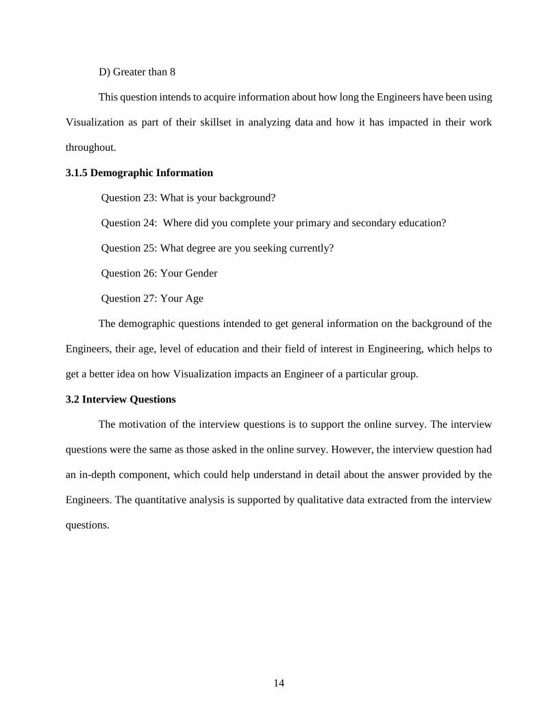
CHAPTER 4: RESULTS
These results have been generated after collecting the data from the online survey that had
been taken by Engineers from various fields and many of them were interviewed individually. The
online survey was published online, open from dates January 15, 2016 to March 30, 2016. 395
Engineers participated mostly from the University of South Florida. The interviews of Engineers
took place between the same dates, 46 Engineers participated in the interviews.
Figure 1 Visualization usage and frequency. The bar graph shows the number of users
analyzing data and those using Visualization to analyze data.
31
85
64
16
48
106
68
21
0
20
40
60
80
100
120
highly often very often sometimes rarely
Nu
mb
er o
f U
sers
How often do you analye data What percentage of time do you analyze data
16
Figure 2 Types of data used by Engineers. Bar graph plots of the number of users against
different types of data.
Figure 3 Source of Visualization knowledge. Bar graphs repressing number of respondents
against the source of their knowledge of Visualization.
161
82
10
0
20
40
60
80
100
120
140
160
180
Statistics (tables, numbers, rawdata )
Visualizations (Graphs, Charts ) Other
Nu
mb
er o
f U
sers
167
78
58
41
0
20
40
60
80
100
120
140
160
180
Course work Self Explorer Friends Work
Nu
mb
er o
f U
Sers
17
Figure 4 Reason of selecting a Visualization tool. Bar graph representing the number of users
against their logic for selecting a Visualization tool.
Figure 5 Preferences for selecting Visualization tools. Bar graph represents the number of
respondents against how they select their Visualization tool.
95
67 66
16
0
10
20
30
40
50
60
70
80
90
100
Available set ofVisualization
Familiarity withSoftware
Ease of use Ability to sharevisualization
Nu
mb
er o
f U
sers
146138
114
32
0
20
40
60
80
100
120
140
160
Software Visualization Dataset Random
Nu
mb
er o
f u
ser
18
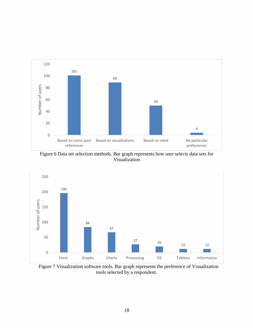
Figure 6 Data set selection methods. Bar graph represents how user selects data sets for
Visualization
Figure 7 Visualization software tools. Bar graph represents the preference of Visualization
tools selected by a respondent.
101
89
50
4
0
20
40
60
80
100
120
Based on some pastreferences
Based on visualizations Based on need No particularpreferences
Nu
mb
er o
f u
sers
196
84
67
2720
12 12
0
50
100
150
200
250
Excel Graphs Charts Processing D3 Tableau Informatica
Nu
mb
er o
f u
sers
19
Figure 8 Visualization courses. Bar graph represents the courses taken by respondent in
school/college relating to Visualization.
Figure 9 Preference in types of Visualization. Bar graph represents the most preference
Visualizations used by Engineers.
99
84
47
10
0
20
40
60
80
100
120
Graphics for engineers Visualization coursework
Something similar tovisualization
Other
nu
mb
er o
f p
eop
le
124
10295
73
25 25
0
20
40
60
80
100
120
140
Bar Graph Line Graph Histogram Pie Charts Bubble Chart Radar Chart
Nu
mb
ers
of
Use
r
20
Figure 10 Engineering backgrounds. Bar graph shows the number of Engineers from each field
who prefer Visualization.
Figure 11 Tools vs Degree. Bar graph represents the different tools used by Engineers from
different background.
189
102
3525 23 23
12 10
0
20
40
60
80
100
120
140
160
180
200
Maters inInformation
ComputerScience
Electrical Mechanical Industrial Engineeringmanagement
Civil otherengineers
Nu
mb
er o
f u
sers
80
40
2114 15 17
27
1215
0 0 0 0 0
45
12 125 3
07
0
23
15
48
5 63 3
20
0 0 0 0 0 0
12
0 0 0 0 0 0 0
12
0 0 0 0 0 0 00
10
20
30
40
50
60
70
80
90
Masters inInformation
ComputerScience
Electrical Mechanical Industrial Engineeringmanagement
Civil OtherEngineer
Nu
mb
er o
f U
use
rs
Degree Type
Excel Processing Graphs Charts D3 Tableau Informatica
21
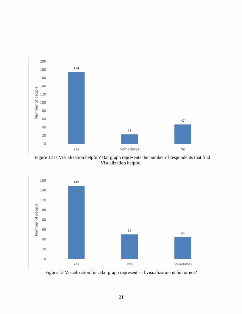
Figure 12 Is Visualization helpful? Bar graph represents the number of respondents that find
Visualization helpful.
Figure 13 Visualization fun. Bar graph represent – if visualization is fun or not?
174
23
47
0
20
40
60
80
100
120
140
160
180
200
Yes Sometimes No
Nu
mb
er o
f p
eop
le
149
5045
0
20
40
60
80
100
120
140
160
Yes No Sometimes
Nu
mb
er o
f p
eop
le
22
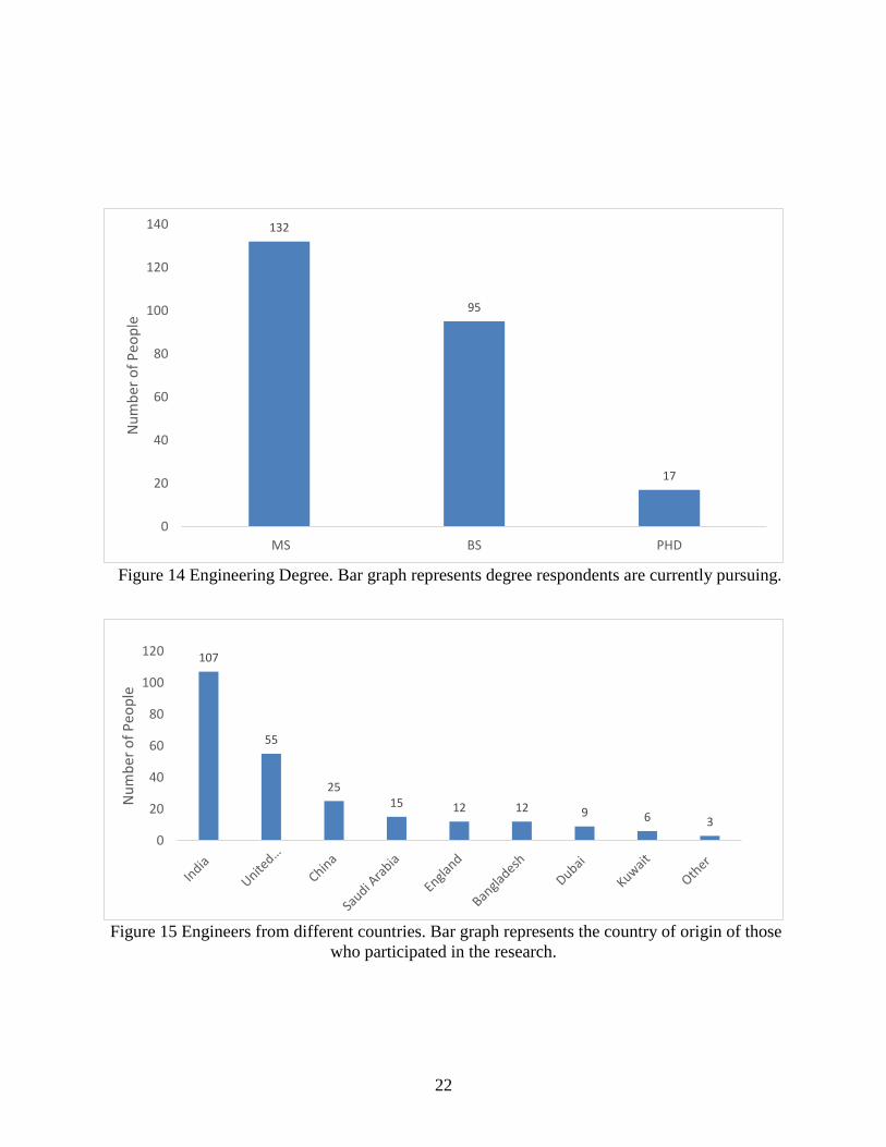
Figure 14 Engineering Degree. Bar graph represents degree respondents are currently pursuing.
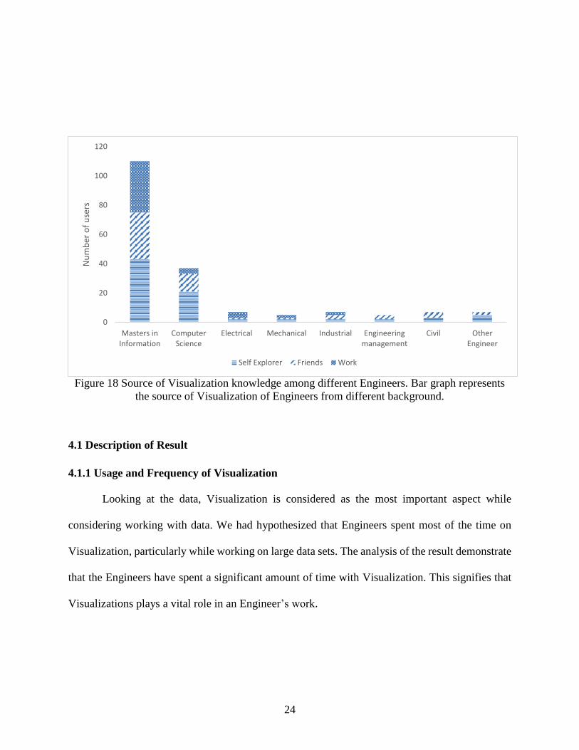
Figure 15 Engineers from different countries. Bar graph represents the country of origin of those
who participated in the research.
132
95
17
0
20
40
60
80
100
120
140
MS BS PHD
Nu
mb
er o
f P
eop
le
107
55
2515 12 12 9 6 3
0
20
40
60
80
100
120
Nu
mb
er o
f P
eop
le

23
Figure 16 Age distribution of Engineers. Line graph represents the age distribution of Engineers
participated in the research.
Figure 17 Number of Engineer using Visualization sorted by age. Bar graph represents age
distribution of Engineers with usage frequency of Visualization.
67%
55%60%
70%
50%44%
62%56% 55%
34%
23%
44%
34%
44%
32%
21%
0%
10%
20%
30%
40%
50%
60%
70%
80%
20 21 22 23 24 25 26 27 28 29 30 31 32 33 34 35
VIS
UA
LIZA
TIO
N U
SAG
E
AGE
0
10
20
30
40
50
60
20 21 22 23 24 25 26 27 28 29 30 31 32 33 34 35
Nu
mb
er o
f u
sers
Age distribution
Highly often Sometimes Not at all
24
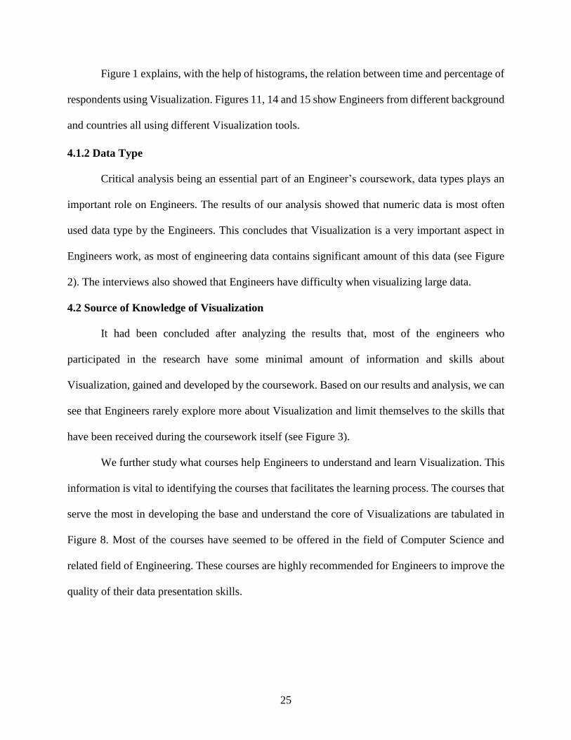
Figure 18 Source of Visualization knowledge among different Engineers. Bar graph represents
the source of Visualization of Engineers from different background.
4.1 Description of Result
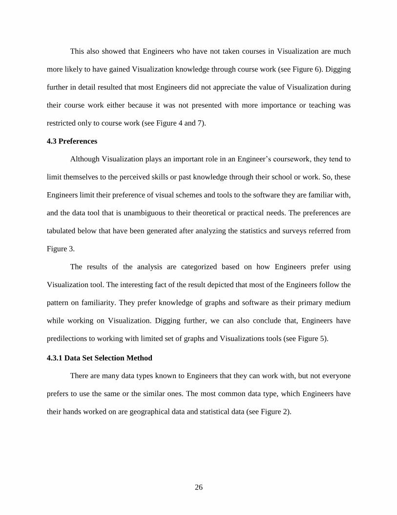
4.1.1 Usage and Frequency of Visualization
Looking at the data, Visualization is considered as the most important aspect while
considering working with data. We had hypothesized that Engineers spent most of the time on
Visualization, particularly while working on large data sets. The analysis of the result demonstrate
that the Engineers have spent a significant amount of time with Visualization. This signifies that
Visualizations plays a vital role in an Engineer’s work.
0
20
40
60
80
100
120
Masters inInformation
ComputerScience
Electrical Mechanical Industrial Engineeringmanagement
Civil OtherEngineer
Nu
mb
er o
f u
sers
Self Explorer Friends Work
25
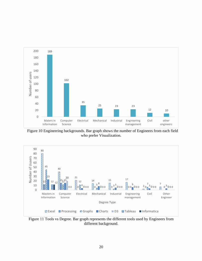
Figure 1 explains, with the help of histograms, the relation between time and percentage of
respondents using Visualization. Figures 11, 14 and 15 show Engineers from different background
and countries all using different Visualization tools.
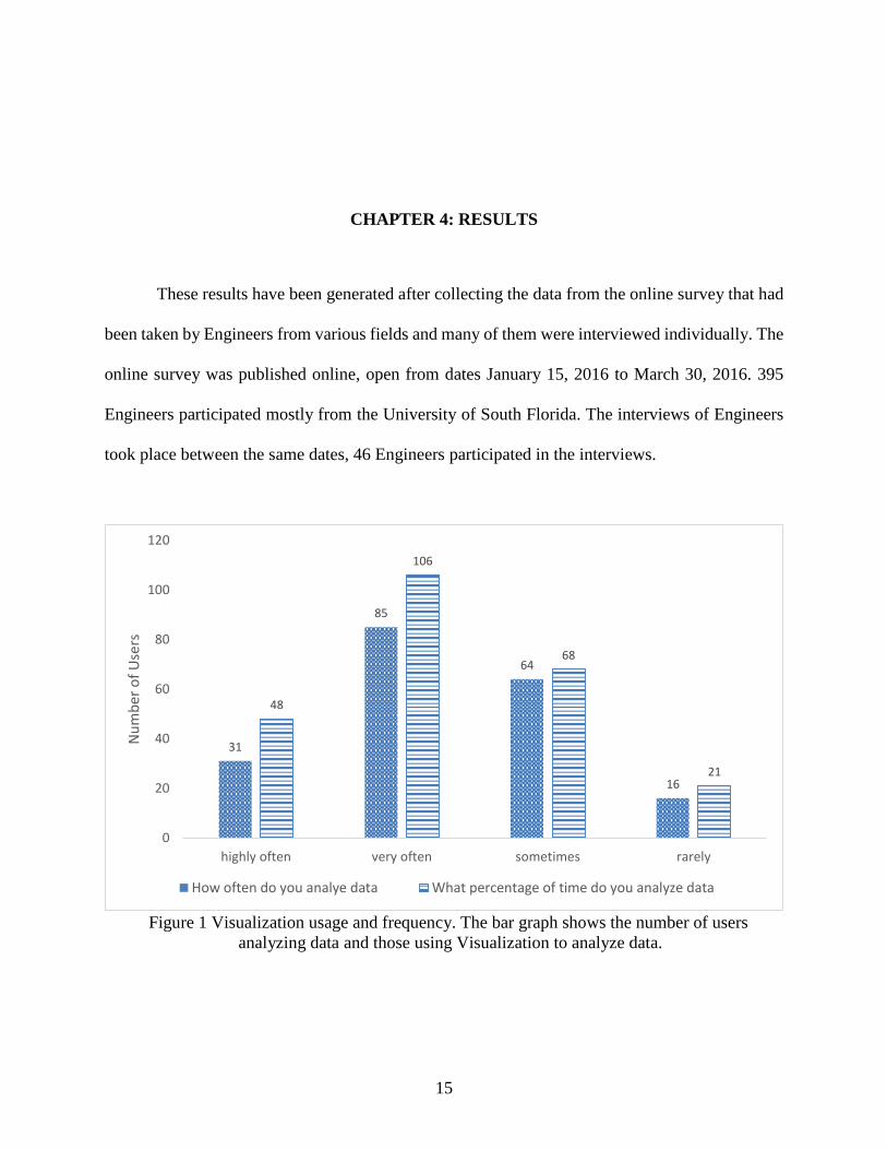
4.1.2 Data Type
Critical analysis being an essential part of an Engineer’s coursework, data types plays an
important role on Engineers. The results of our analysis showed that numeric data is most often
used data type by the Engineers. This concludes that Visualization is a very important aspect in
Engineers work, as most of engineering data contains significant amount of this data (see Figure
2). The interviews also showed that Engineers have difficulty when visualizing large data.
4.2 Source of Knowledge of Visualization
It had been concluded after analyzing the results that, most of the engineers who
participated in the research have some minimal amount of information and skills about
Visualization, gained and developed by the coursework. Based on our results and analysis, we can
see that Engineers rarely explore more about Visualization and limit themselves to the skills that
have been received during the coursework itself (see Figure 3).
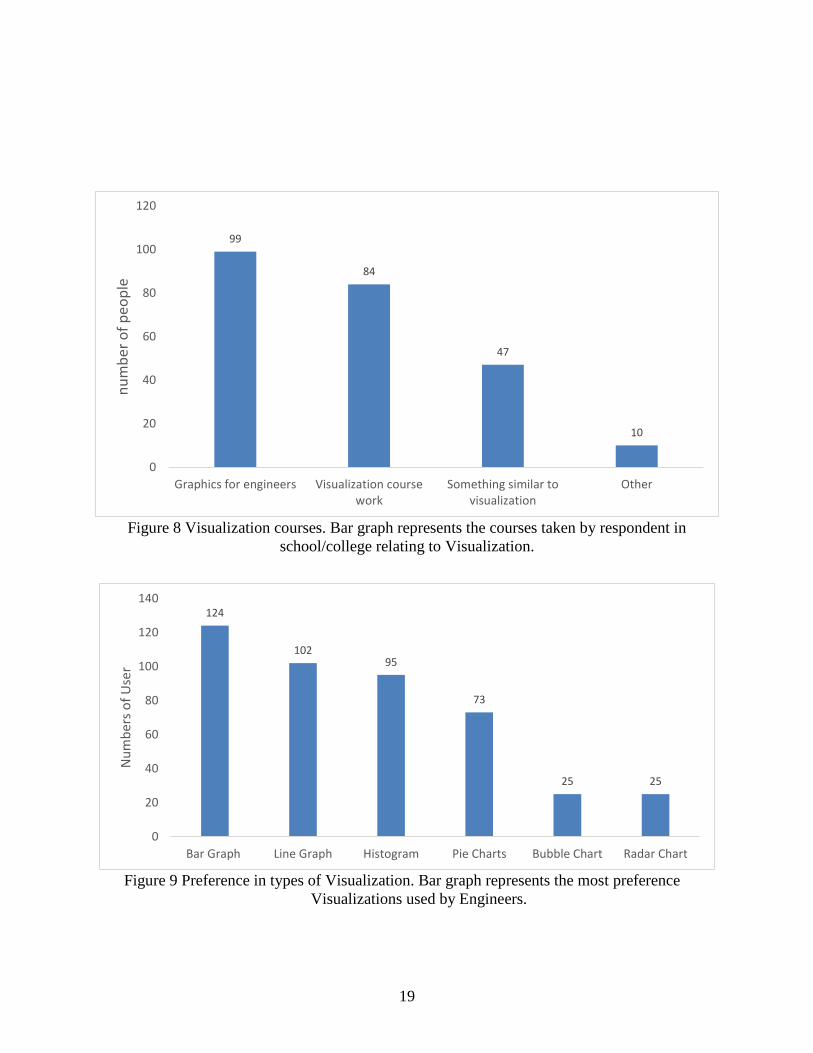
We further study what courses help Engineers to understand and learn Visualization. This
information is vital to identifying the courses that facilitates the learning process. The courses that
serve the most in developing the base and understand the core of Visualizations are tabulated in
Figure 8. Most of the courses have seemed to be offered in the field of Computer Science and
related field of Engineering. These courses are highly recommended for Engineers to improve the
quality of their data presentation skills.
26
This also showed that Engineers who have not taken courses in Visualization are much
more likely to have gained Visualization knowledge through course work (see Figure 6). Digging
further in detail resulted that most Engineers did not appreciate the value of Visualization during
their course work either because it was not presented with more importance or teaching was
restricted only to course work (see Figure 4 and 7).
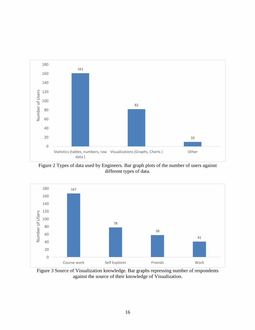
4.3 Preferences
Although Visualization plays an important role in an Engineer’s coursework, they tend to
limit themselves to the perceived skills or past knowledge through their school or work. So, these
Engineers limit their preference of visual schemes and tools to the software they are familiar with,
and the data tool that is unambiguous to their theoretical or practical needs. The preferences are
tabulated below that have been generated after analyzing the statistics and surveys referred from
Figure 3.
The results of the analysis are categorized based on how Engineers prefer using
Visualization tool. The interesting fact of the result depicted that most of the Engineers follow the
pattern on familiarity. They prefer knowledge of graphs and software as their primary medium
while working on Visualization. Digging further, we can also conclude that, Engineers have
predilections to working with limited set of graphs and Visualizations tools (see Figure 5).
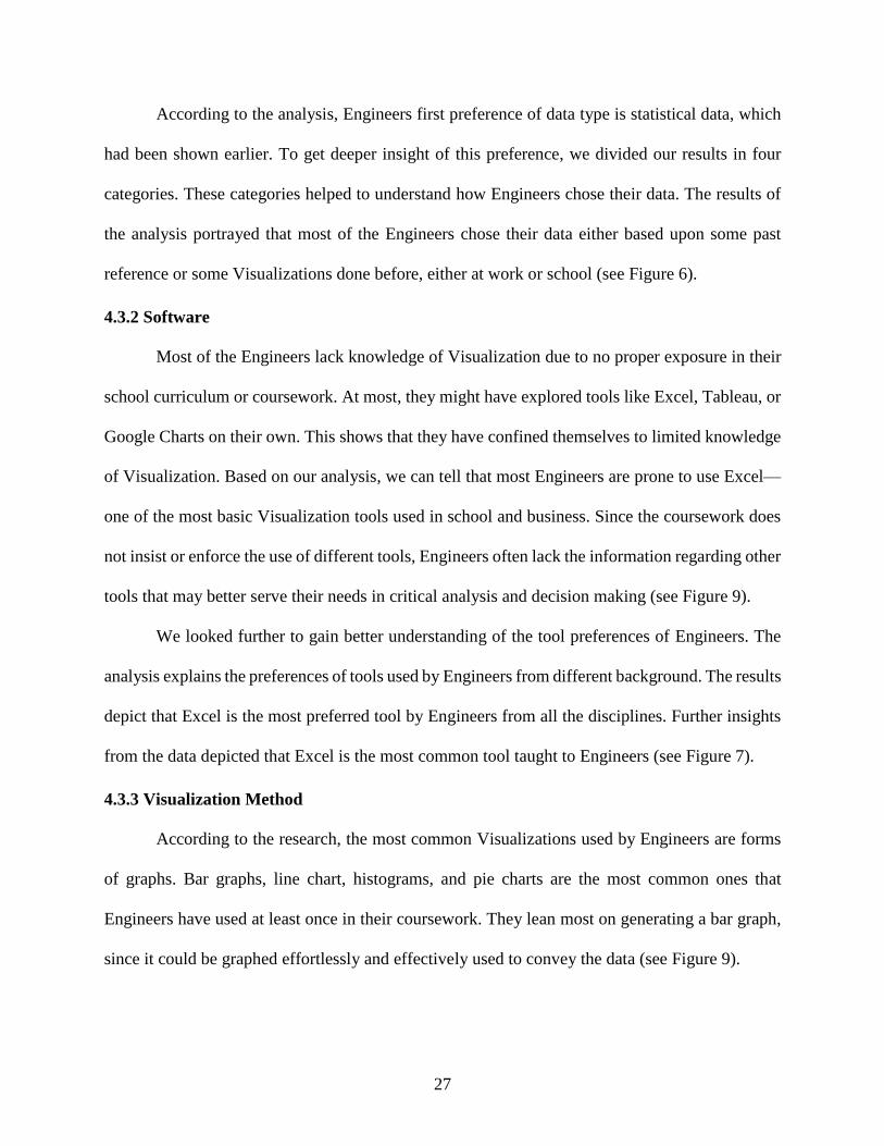
4.3.1 Data Set Selection Method
There are many data types known to Engineers that they can work with, but not everyone
prefers to use the same or the similar ones. The most common data type, which Engineers have
their hands worked on are geographical data and statistical data (see Figure 2).
27
According to the analysis, Engineers first preference of data type is statistical data, which
had been shown earlier. To get deeper insight of this preference, we divided our results in four
categories. These categories helped to understand how Engineers chose their data. The results of
the analysis portrayed that most of the Engineers chose their data either based upon some past
reference or some Visualizations done before, either at work or school (see Figure 6).
4.3.2 Software
Most of the Engineers lack knowledge of Visualization due to no proper exposure in their
school curriculum or coursework. At most, they might have explored tools like Excel, Tableau, or
Google Charts on their own. This shows that they have confined themselves to limited knowledge
of Visualization. Based on our analysis, we can tell that most Engineers are prone to use Excel—
one of the most basic Visualization tools used in school and business. Since the coursework does
not insist or enforce the use of different tools, Engineers often lack the information regarding other
tools that may better serve their needs in critical analysis and decision making (see Figure 9).
We looked further to gain better understanding of the tool preferences of Engineers. The
analysis explains the preferences of tools used by Engineers from different background. The results
depict that Excel is the most preferred tool by Engineers from all the disciplines. Further insights
from the data depicted that Excel is the most common tool taught to Engineers (see Figure 7).
4.3.3 Visualization Method
According to the research, the most common Visualizations used by Engineers are forms
of graphs. Bar graphs, line chart, histograms, and pie charts are the most common ones that
Engineers have used at least once in their coursework. They lean most on generating a bar graph,
since it could be graphed effortlessly and effectively used to convey the data (see Figure 9).
28
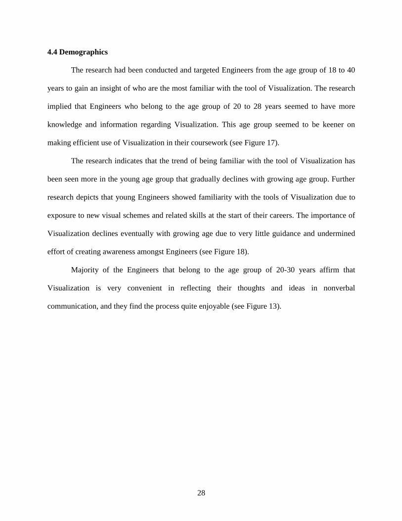
4.4 Demographics
The research had been conducted and targeted Engineers from the age group of 18 to 40
years to gain an insight of who are the most familiar with the tool of Visualization. The research
implied that Engineers who belong to the age group of 20 to 28 years seemed to have more
knowledge and information regarding Visualization. This age group seemed to be keener on
making efficient use of Visualization in their coursework (see Figure 17).
The research indicates that the trend of being familiar with the tool of Visualization has
been seen more in the young age group that gradually declines with growing age group. Further
research depicts that young Engineers showed familiarity with the tools of Visualization due to
exposure to new visual schemes and related skills at the start of their careers. The importance of
Visualization declines eventually with growing age due to very little guidance and undermined
effort of creating awareness amongst Engineers (see Figure 18).
Majority of the Engineers that belong to the age group of 20-30 years affirm that
Visualization is very convenient in reflecting their thoughts and ideas in nonverbal
communication, and they find the process quite enjoyable (see Figure 13).
29
CHAPTER 5: CONCLUSIONS
Engineers have considered Visualization as a form of art or a scientific discipline. Being a
discipline strongly grounded in data, they have been among the highest utilizers of Visualization
tools. The main problem of the paper have been bifurcated to two different categories: one that
shows Visualization playing a vital role in an Engineer’s daily coursework, and the other depicting
Engineers having limited knowledge about Visualization data types, tools, and techniques.
It can be seen from the results that Engineers belonging to the younger age group tend to
explore more themselves when it comes to Visualization. They find it fascinating and an
intellectual process to communicate their thoughts using visual schemes to reflect their ideas.
However, this excitement is not universal.
The only feasible solution to the address problem is to create awareness of the importance
of Visualization and its tools in the fields of Engineering and increase the availability of courses
available to all the Engineers. This would initiate, and eventually enhance the development of
Engineers. Engineers rely greatly on the wisdom of Visualization. So much so, they seem to take
it for granted.
30
REFERENCES
[1] Moorhead, Robert, et al. "Visualization Research Challenges." Computing in Science &
Engineering 8 (2006): 66.
[2] Naps, Thomas, et al. "Evaluating the educational impact of visualization." ACM SIGCSE
Bulletin. Vol. 35. No. 4. ACM, 2003.
[3] Johnson, Chris. "Top scientific visualization research problems." Computer graphics and
applications, IEEE 24.4 (2004): 13-17.
[4] Chen, Chaomei. "Top 10 unsolved information visualization problems." Computer Graphics
and Applications, IEEE 25.4 (2005): 12-16.
[5] Patterson, Robert E., et al. "A human cognition framework for information
visualization." Computers & Graphics 42 (2014): 42-58.
[6] DeFanti, Thomas A., Maxine D. Brown, and Bruce H. McCormick." Visualization:
expanding scientific and Engineering research opportunities." Computer 8 (1989): 12-25.
[7] Thomas, James J., et al. "Discovering knowledge through visual analysis." Journal of
Universal Computer Science 7.6 (2001): 517-529.
[8] Laakso, Teemu Rajala Mikko-Jussi, Erkki Kaila, and Tapio Salakoski. "Effectiveness of
program visualization: A case study with the ViLLE tool." Journal of Information Technology
Education 7 (2008): 15-32.
31
[9] Storey, Margaret-Anne D., Davor Čubranić, and Daniel M. German." On the use of
visualization to support awareness of human activities in software development: a survey and a
framework." Proceedings of the 2005 ACM symposium on Software visualization. ACM, 2005.
[10] Plaisant, Catherine. "The challenge of information visualization evaluation." Proceedings of
the working conference on Advanced visual interfaces. ACM, 2004.
[11] Zhang, Kang. "From abstract painting to information visualization." Computer Graphics and
Applications, IEEE 27.3 (2007): 12-16.
[12] Tory, Melanie, and Torsten Möller. "Human factors in visualization research." Visualization
and Computer Graphics, IEEE Transactions on 10.1 (2004): 72-84.
[13] Stanney, Kay M., Ronald R. Mourant, and Robert S. Kennedy. " Human factors issues in
virtual environments: A review of the literature." Presence7.4 (1998): 327-351.
[14] Plaisant, Catherine. "The challenge of information visualization evaluation." Proceedings of
the working conference on Advanced visual interfaces. ACM, 2004.
[15] Yi, Ji Soo, et al. "Toward a deeper understanding of the role of interaction in information
visualization." Visualization and Computer Graphics, IEEE Transactions on 13.6 (2007): 1224-
1231.
[16] Pike, William A., et al. "The science of interaction." Information Visualization 8.4 (2009):
263-274.
[17] Liu, Zhicheng, and John T. Stasko. "Mental models, visual reasoning and interaction in
information visualization: A top-down perspective." Visualization and Computer Graphics, IEEE
Transactions on 16.6 (2010): 999-1008.
32
[18] Fekete, Jean-Daniel, and Catherine Plaisant." Interactive information visualization of a
million items." Information Visualization, 2002. INFOVIS 2002. IEEE Symposium on. IEEE,
2002.
[19] Colet, Edward, and Doris Aaronson. "Visualization of multivariate data: Human-factors
considerations." Behavior Research Methods, Instruments, & Computers 27.2 (1995): 257-263.
[20] Chittaro, Luca. "Information visualization and its application to medicine." Artificial
intelligence in medicine 22.2 (2001): 81-88.
[21] Robertson, George, et al. "Selected human factors issues in information
visualization." Reviews of human factors and ergonomics 5.1 (2009): 41-81.
[22] Keim, Daniel A., et al. "Challenges in visual data analysis." Information Visualization, 2006.
IV 2006. Tenth International Conference on. IEEE, 2006.
[23] Keim, Daniel, et al. Visual analytics: Definition, process, and challenges. Springer Berlin
Heidelberg, 2008.
[24] Fekete, Jean-Daniel, et al. "The value of information visualization." Information
visualization. Springer Berlin Heidelberg, 2008. 1-18
[25] Shrinivasan, Yedendra Babu, and Jarke J. van Wijk. "Supporting the analytical reasoning
process in information visualization." Proceedings of the SIGCHI conference on human factors in
computing systems. ACM, 2008.
[26] Sedlmair, Michael, et al. "Information visualization evaluation in large companies:
Challenges, experiences and recommendations." Information Visualization (2011):
1473871611413099.
[27] Wiebel, Alexander, et al. "WYSIWYP: what you see is what you pick."Visualization and
Computer Graphics, IEEE Transactions on 18.12 (2012): 2236-2244.
33
[28] Tory, Melanie, and Torsten Möller. "Evaluating visualizations: do expert reviews
work?." Computer Graphics and Applications, IEEE 25.5 (2005): 8-11.
[29] Kosara, Robert, et al. "Visualization viewpoints." Computer Graphics and Applications,
IEEE 23.4 (2003): 20-25.
[30] Amar, Robert A., and John T. Stasko. "Knowledge precepts for design and evaluation of
information visualizations." Visualization and Computer Graphics, IEEE Transactions on 11.4
(2005): 432-442.
[31] Fouh, Eric, Monika Akbar, and Clifford A. Shaffer. "The role of visualization in computer
science education." Computers in the Schools 29.1-2 (2012): 95-117.
[32] Gordin, Douglas N., and Roy D. Pea. "Prospects for scientific visualization as an educational
technology." The Journal of the learning sciences 4.3 (1995): 249-279.
[33] Munzner, Tamara. "A nested model for visualization design and validation." Visualization
and Computer Graphics, IEEE Transactions on 15.6 (2009): 921-928.
[34] van Wijk, Jarke J. "Views on visualization." Visualization and Computer Graphics, IEEE
Transactions on 12.4 (2006): 421-432.
[35] Kehrer, Johannes, and Helwig Hauser. "Visualization and visual analysis of multifaceted
scientific data: A survey." Visualization and Computer Graphics, IEEE Transactions on 19.3
(2013): 495-513.
[36] North, Chris. "Toward measuring visualization insight." Computer Graphics and
Applications, IEEE 26.3 (2006): 6-9.
[37] Yi, Ji Soo, et al. "Understanding and characterizing insights: how do people gain insights
using information visualization?" Proceedings of the 2008 Workshop on Beyond time and errors:
novel evaluation methods for Information Visualization. ACM, 2008.

34
[38] Naps, Thomas L., et al. "Exploring the role of visualization and engagement in computer
science education." ACM SigCSE Bulletin. Vol. 35. No. 2. ACM, 2002.

ABOUT THE AUTHOR
Dhaval Kashyap Shah, a graduate student completing his masters in computer science from
University of South Florida. He is originally from India who came to United States to complete
his dreams. He has previously worked as a web developer, software engineer, teaching assistant in
different companies. He dreams to develop an application that can benefit the society.
In addition to his educational and professional skills, Dhaval loves to swim and do a lot of
social volunteer work. He plans to stay in United States till he achieves all his goals.