Embed Size (px)
Citation preview
4/17/2014
1
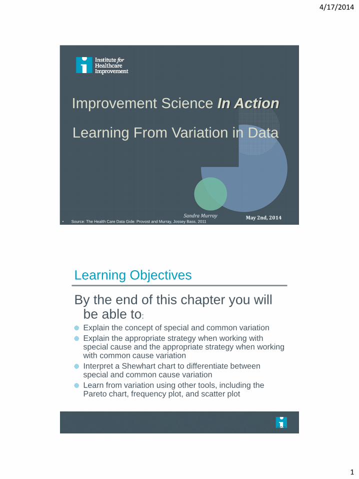
Improvement Science In Action
Learning From Variation in Data
Sandra Murray May 2nd, 2014
• Source: The Health Care Data Gide: Provost and Murray, Jossey Bass, 2011
Learning Objectives
By the end of this chapter you will be able to:
Explain the concept of special and common variation
Explain the appropriate strategy when working with special cause and the appropriate strategy when working with common cause variation
Interpret a Shewhart chart to differentiate between special and common cause variation
Learn from variation using other tools, including the Pareto chart, frequency plot, and scatter plot
Page 107
4/17/2014
2
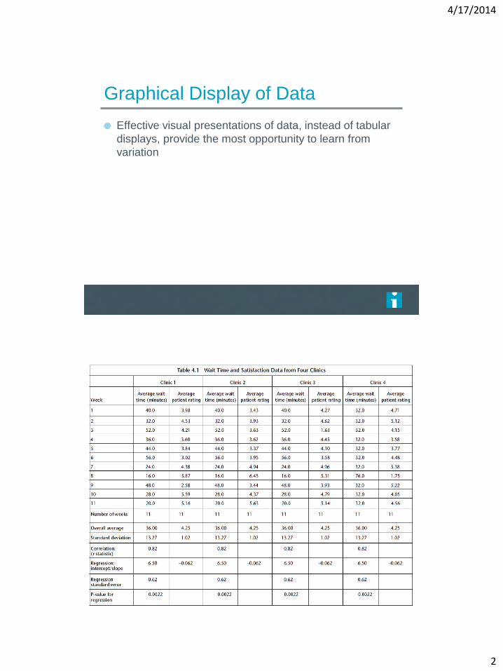
Graphical Display of Data
Effective visual presentations of data, instead of tabular
displays, provide the most opportunity to learn from
variation
4/17/2014
3
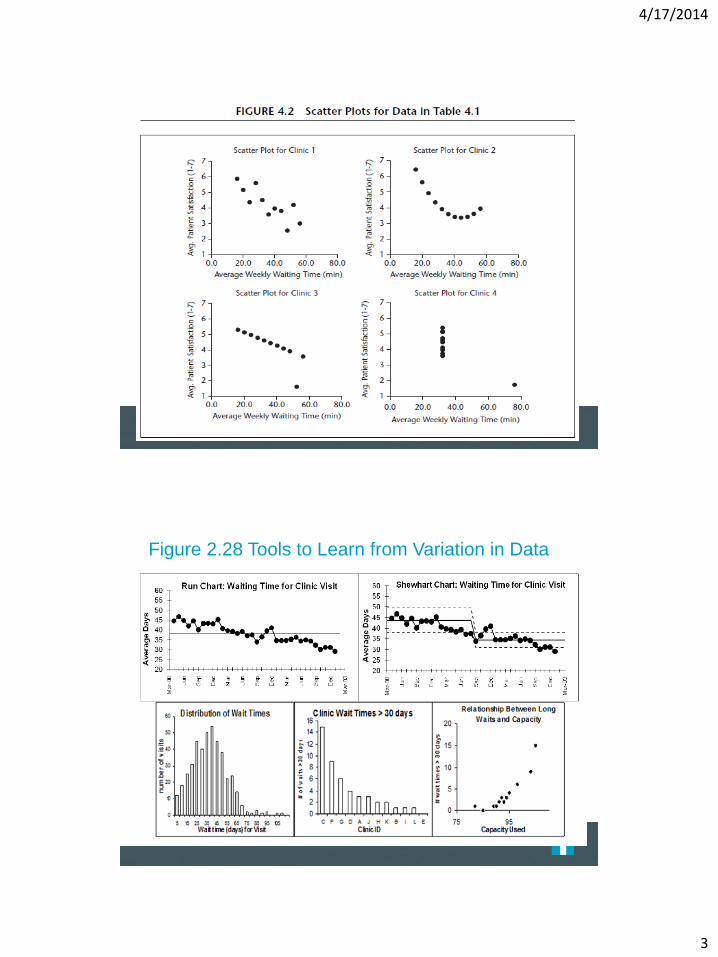
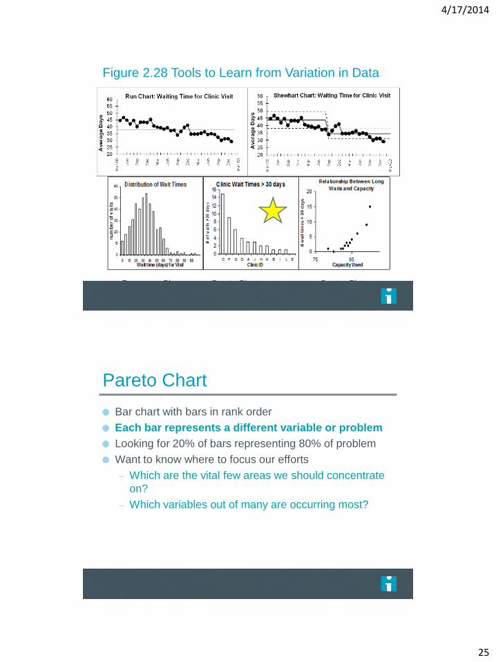
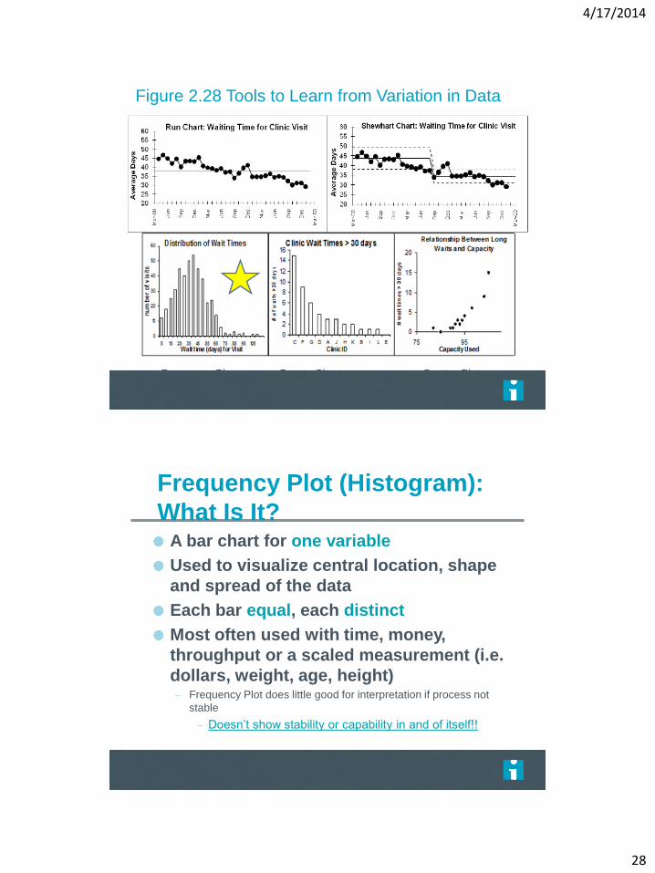
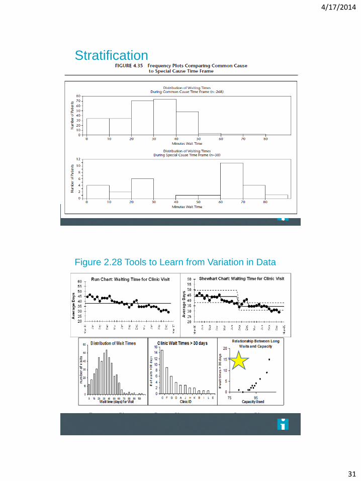
Figure 2.28 Tools to Learn from Variation in Data
Frequency Plot Pareto Chart Scatter Plot
4/17/2014
4
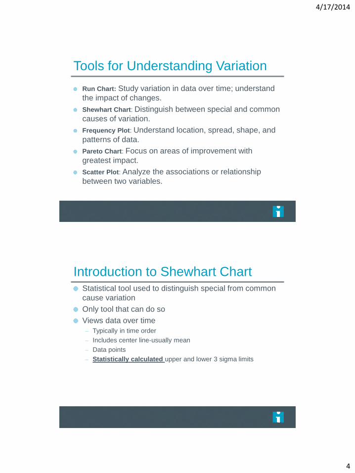
Tools for Understanding Variation
Run Chart: Study variation in data over time; understand
the impact of changes.
Shewhart Chart: Distinguish between special and common
causes of variation.
Frequency Plot: Understand location, spread, shape, and
patterns of data.
Pareto Chart: Focus on areas of improvement with
greatest impact.
Scatter Plot: Analyze the associations or relationship
between two variables.
Introduction to Shewhart Chart Statistical tool used to distinguish special from common
cause variation
Only tool that can do so
Views data over time
– Typically in time order
– Includes center line-usually mean
– Data points
– Statistically calculated upper and lower 3 sigma limits
Page 113
4/17/2014
5
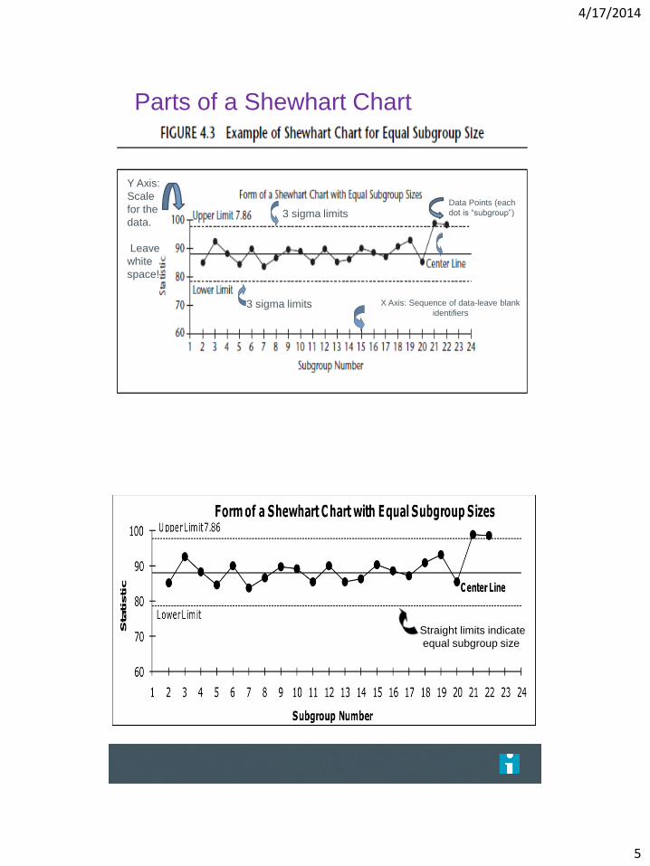
Parts of a Shewhart Chart
X Axis: Sequence of data-leave blank
identifiers
Y Axis:
Scale
for the
data.
Leave
white
space!
Data Points (each
dot is “subgroup”) 3 sigma limits
3 sigma limits
Straight limits indicate
equal subgroup size
The Health Care Data Guide. Sandra Murray and Lloyd Provost, Jossey-Bass, 2011.
4/17/2014
6
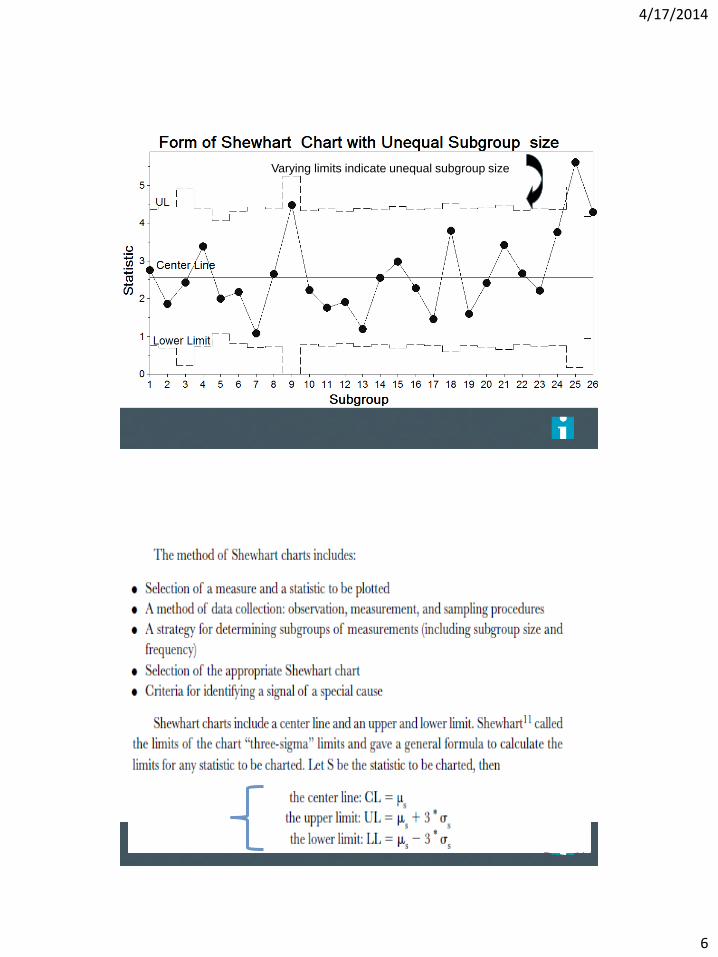
Varying limits indicate unequal subgroup size
The Health Care Data Guide. Sandra Murray and Lloyd Provost, Jossey-Bass, 2011.
Page 114
4/17/2014
7
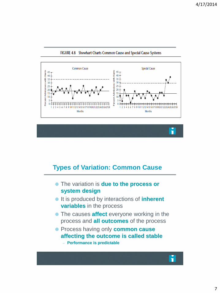
Page 119
Types of Variation: Common Cause
The variation is due to the process or
system design
It is produced by interactions of inherent
variables in the process
The causes affect everyone working in the
process and all outcomes of the process
Process having only common cause
affecting the outcome is called stable – Performance is predictable
4/17/2014
8
Management Strategy: Common Cause System
STRATEGY TO TAKE:
Process Study and Redesign!! – Understand that process performance will not change
unless process design is fundamentally altered
– Identify process variables contributing to common cause variation
– Determine which aspect of the process to change
– PDSA the process change ACTIONS TO AVOID:
Doing nothing at all!
Tampering
Trying to attach specific meaning to fluctuations in the data (i.e. explain the difference between points that are high vs... low)
Types of Variation: Special Cause
Variation in the process assignable
to a specific cause or causes - not
part of the usual process
This variation due to specific
circumstances
Process not stable
– Is not predictable
4/17/2014
9
Management Strategy: Special Cause System
IMPROVEMENT STRATEGY:
Investigate, learn and standardize the process!! – Immediately try to understand when Special Cause
occurred
– Study what was different when Special Cause occurred
– Identify ways to prevent or use it, if understandable, to standardize the process
– either standardize back to where the process was
– or standardize in a new better place
ACTIONS TO AVOID:
Doing nothing at all
Failing to involve the people who work in the process in identifying special causes
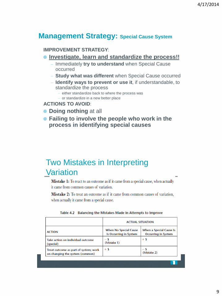
Two Mistakes in Interpreting
Variation
4/17/2014
10
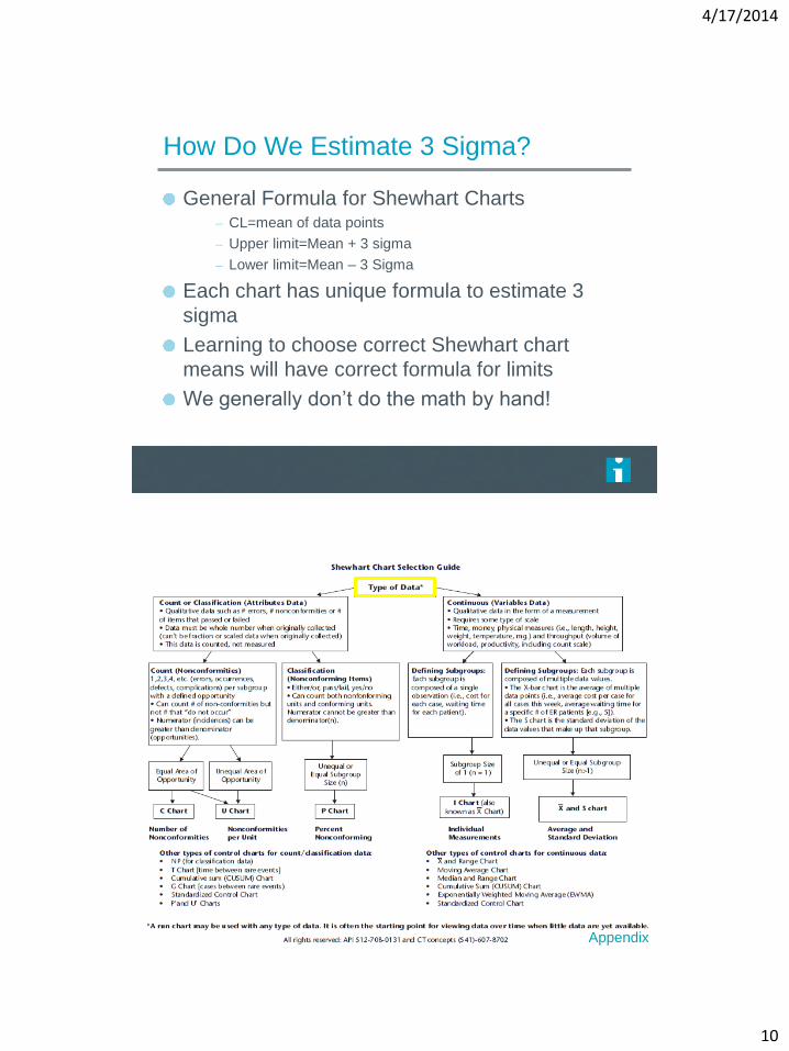
How Do We Estimate 3 Sigma?
General Formula for Shewhart Charts – CL=mean of data points
– Upper limit=Mean + 3 sigma
– Lower limit=Mean – 3 Sigma
Each chart has unique formula to estimate 3
sigma
Learning to choose correct Shewhart chart
means will have correct formula for limits
We generally don’t do the math by hand!
The Health Care Data Guide. Sandra Murray and Lloyd Provost, Jossey-Bass, 2011.
Appendix
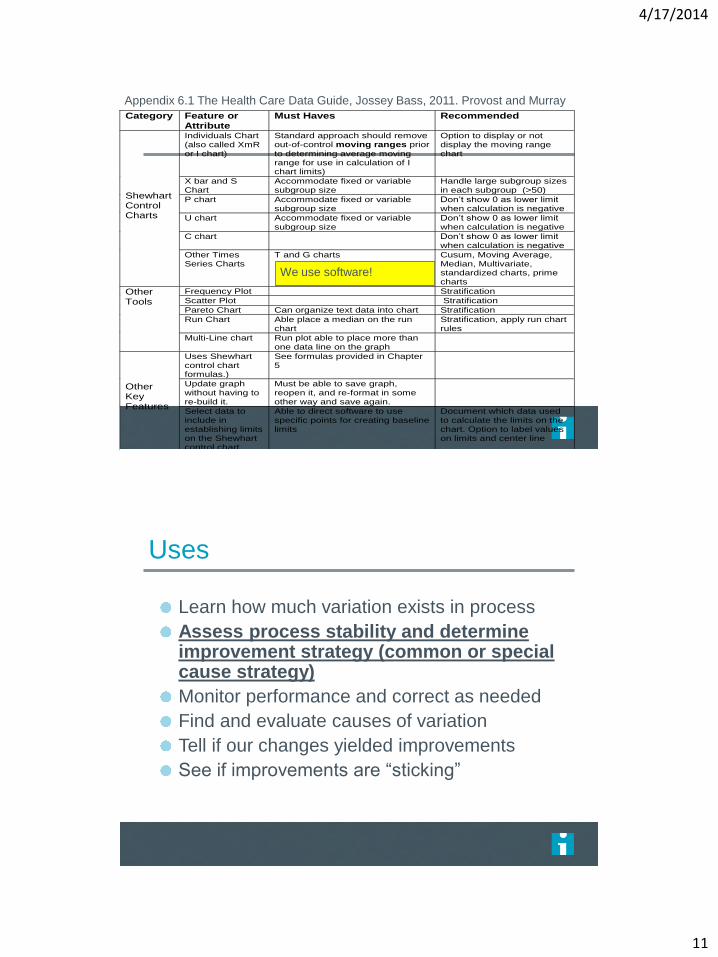
4/17/2014
11
Category Feature or Attribute
Must Haves Recommended
Shewhart Control Charts
Individuals Chart (also called XmR or I chart)
Standard approach should remove out-of-control moving ranges prior to determining average moving range for use in calculation of I chart limits)
Option to display or not display the moving range chart
X bar and S Chart
Accommodate fixed or variable subgroup size
Handle large subgroup sizes in each subgroup (>50)
P chart Accommodate fixed or variable subgroup size
Don’t show 0 as lower limit when calculation is negative
U chart Accommodate fixed or variable subgroup size
Don’t show 0 as lower limit when calculation is negative
C chart Don’t show 0 as lower limit when calculation is negative
Other Times Series Charts
T and G charts
Cusum, Moving Average, Median, Multivariate, standardized charts, prime charts
Other Tools
Frequency Plot Stratification
Scatter Plot Stratification
Pareto Chart Can organize text data into chart Stratification
Run Chart Able place a median on the run chart
Stratification, apply run chart rules
Multi-Line chart Run plot able to place more than one data line on the graph
Other Key Features
Uses Shewhart control chart formulas.)
See formulas provided in Chapter 5
Update graph without having to re-build it.
Must be able to save graph, reopen it, and re-format in some other way and save again.
Select data to include in establishing limits on the Shewhart control chart
Able to direct software to use specific points for creating baseline limits
Document which data used to calculate the limits on the chart. Option to label values on limits and center line
Display two or more sets of control limits on a Shewhart chart.
Ability to identify which subgroups As an example, must be able to arrange for the first set of limits to include subgroups 1-27, the second set subgroups 28-44
Remove data points from use in calculating the limits
Ability to designate specific data points not to be used in calculation of limits. Be able to “cause” or “ghost” a data point out (e.g. tell software to use points 1-15 and then 17-26 to create the set of limits).
Display multiple charts on the same page
Support multiple charts on the same page for display purposes (multi-charting, small multiples)
Annotate charts Make notes on the graph Notes stay with a particular subgroup when the chart is updated
Appendix 6.1 The Health Care Data Guide, Jossey Bass, 2011. Provost and Murray
We use software!
Uses
Learn how much variation exists in process
Assess process stability and determine improvement strategy (common or special cause strategy)
Monitor performance and correct as needed
Find and evaluate causes of variation
Tell if our changes yielded improvements
See if improvements are “sticking”
4/17/2014
12
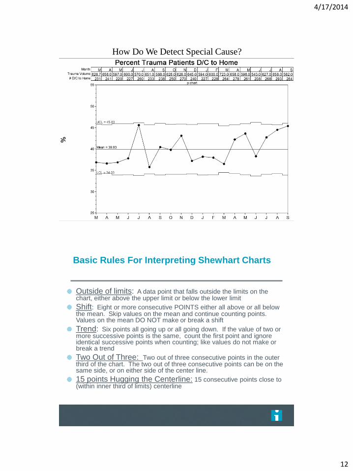
How Do We Detect Special Cause?
Basic Rules For Interpreting Shewhart Charts
Outside of limits: A data point that falls outside the limits on the chart, either above the upper limit or below the lower limit
Shift: Eight or more consecutive POINTS either all above or all below the mean. Skip values on the mean and continue counting points. Values on the mean DO NOT make or break a shift
Trend: Six points all going up or all going down. If the value of two or more successive points is the same, count the first point and ignore identical successive points when counting; like values do not make or break a trend
Two Out of Three: Two out of three consecutive points in the outer third of the chart. The two out of three consecutive points can be on the same side, or on either side of the center line.
15 points Hugging the Centerline: 15 consecutive points close to (within inner third of limits) centerline

4/17/2014
13
Rules for Determining A Special Cause A point outside limits Note: A point exactly on a limit is not considered outside the limit. If chart does not have limit on one side this rule cannot be applied to that side.
UCL
LCL
CL
Rules for Determining A Special Cause
UCL
CL
LCL
(A SHIFT): 8 points in row on same side of the center line
Note: A point exactly on the centerline does not cancel or count towards a shift
4/17/2014
14
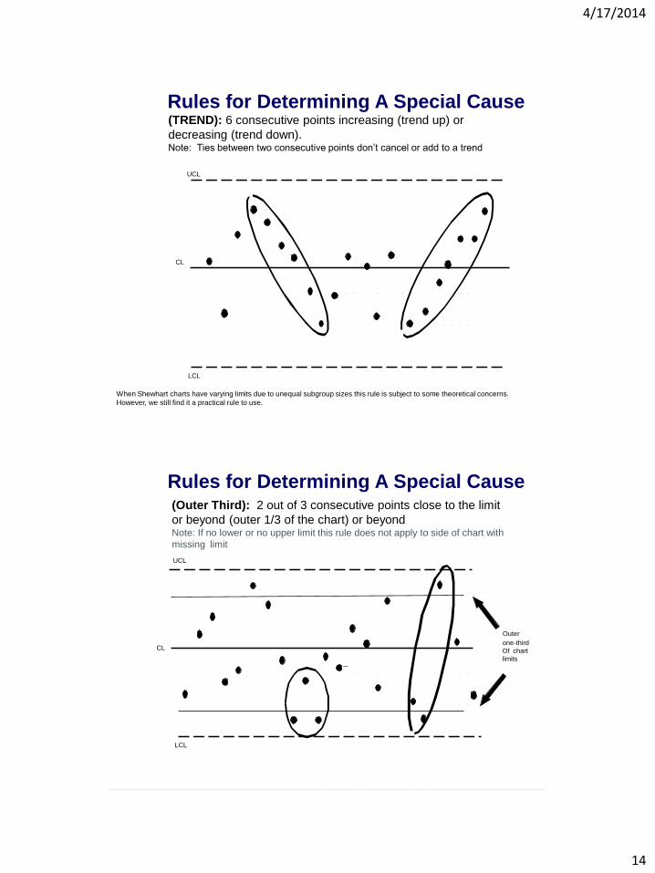
Rules for Determining A Special Cause (TREND): 6 consecutive points increasing (trend up) or
decreasing (trend down). Note: Ties between two consecutive points don’t cancel or add to a trend
When Shewhart charts have varying limits due to unequal subgroup sizes this rule is subject to some theoretical concerns.
However, we still find it a practical rule to use.
UCL
LCL
CL
Rules for Determining A Special Cause (Outer Third): 2 out of 3 consecutive points close to the limit
or beyond (outer 1/3 of the chart) or beyond Note: If no lower or no upper limit this rule does not apply to side of chart with
missing limit
UCL
CL
LCL
Outer
one-third
Of chart
limits
4/17/2014
15
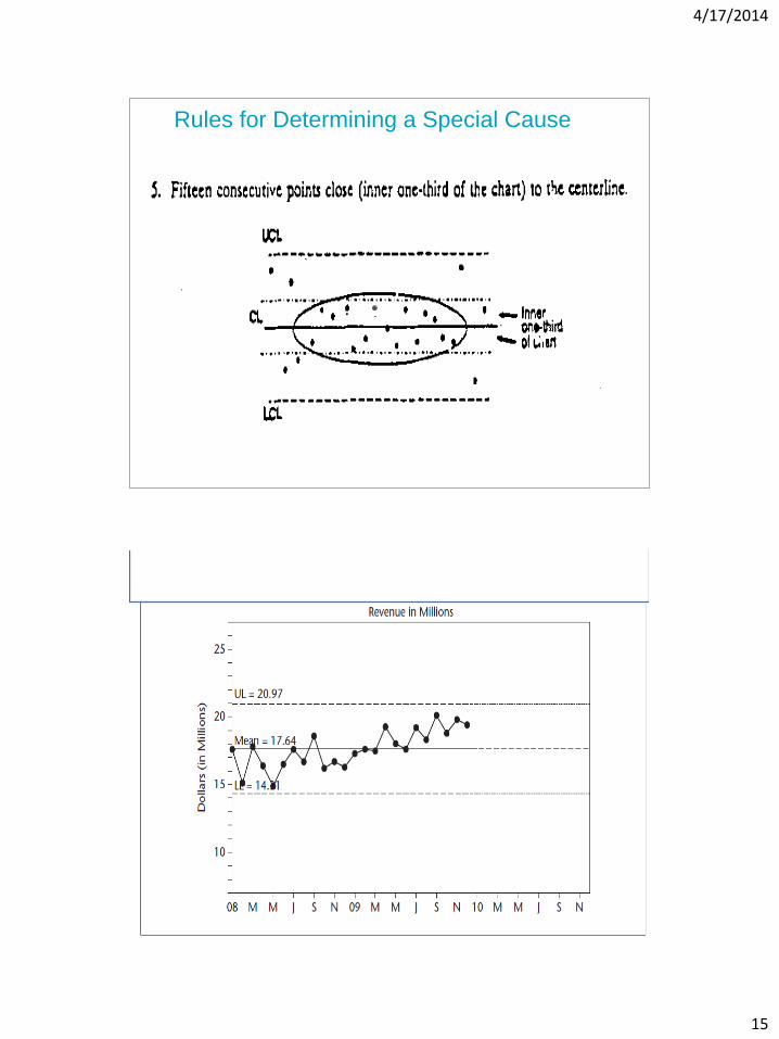
Rules for Determining a Special Cause
4/17/2014
16
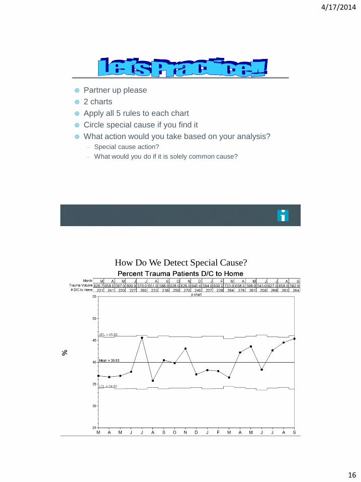
Partner up please
2 charts
Apply all 5 rules to each chart
Circle special cause if you find it
What action would you take based on your analysis?
– Special cause action?
– What would you do if it is solely common cause?
How Do We Detect Special Cause?

4/17/2014
17
Sic
k T
ime
Sick Time - Heartland
Individuals
UCL = 28.32
Mean = 21.59
LCL = 14.86
2006
-07 Q1
Q2
Q3
Q4
2007
-08 Q1
Q2
Q3
Q4
2008
-09 Q1
Q2
Q3
Q4
2009
-10 Q1
Q2
Q3
Q4
2010
-11 Q1
Q2
Q3
Q4
2011
-12 Q1
Q2
Q3
Q4
0
2
4
6
8
10
12
14
16
18
20
22
24
26
28
30
32
34
Avg. Hours Sick Time Used
Ho
urs
S
ick
Tim
e
Sick Time - Cypress
Individuals
UCL = 26.00
Mean = 18.82
LCL = 11.64
2006
-07 Q1
Q2
Q3
Q4
2007
-08 Q1
Q2
Q3
Q4
2008
-09 Q1
Q2
Q3
Q4
2009
-10 Q1
Q2
Q3
Q4
2010
-11 Q1
Q2
Q3
Q4
2011
-12 Q1
Q2
Q3
Q4
0
2
4
6
8
10
12
14
16
18
20
22
24
26
28
30
32
34
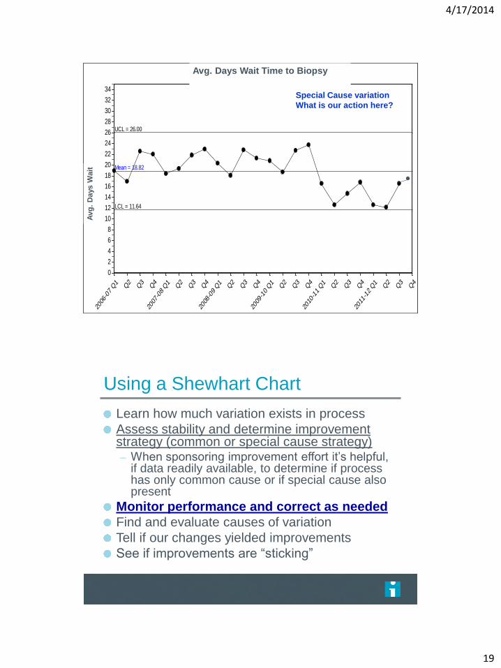
Avg. Days Wait Time to Biopsy
Avg
. D
ays W
ait
4/17/2014
18
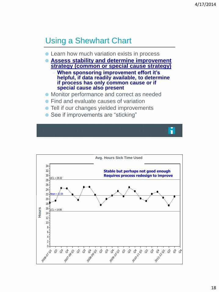
Using a Shewhart Chart
Learn how much variation exists in process
Assess stability and determine improvement strategy (common or special cause strategy) – When sponsoring improvement effort it’s
helpful, if data readily available, to determine if process has only common cause or if special cause also present
Monitor performance and correct as needed
Find and evaluate causes of variation
Tell if our changes yielded improvements
See if improvements are “sticking”
Sic
k T
ime
Sick Time - Heartland
Individuals
UCL = 28.32
Mean = 21.59
LCL = 14.86
2006
-07 Q1
Q2
Q3
Q4
2007
-08 Q1
Q2
Q3
Q4
2008
-09 Q1
Q2
Q3
Q4
2009
-10 Q1
Q2
Q3
Q4
2010
-11 Q1
Q2
Q3
Q4
2011
-12 Q1
Q2
Q3
Q4
0
2
4
6
8
10
12
14
16
18
20
22
24
26
28
30
32
34
Avg. Hours Sick Time Used
Ho
urs
Stable but perhaps not good enough Requires process redesign to improve
4/17/2014
19
Sic
k T
ime
Sick Time - Cypress
Individuals
UCL = 26.00
Mean = 18.82
LCL = 11.64
2006
-07 Q1
Q2
Q3
Q4
2007
-08 Q1
Q2
Q3
Q4
2008
-09 Q1
Q2
Q3
Q4
2009
-10 Q1
Q2
Q3
Q4
2010
-11 Q1
Q2
Q3
Q4
2011
-12 Q1
Q2
Q3
Q4
0
2
4
6
8
10
12
14
16
18
20
22
24
26
28
30
32
34
Avg. Days Wait Time to Biopsy
A
vg
. D
ays W
ait
Special Cause variation
What is our action here?
Using a Shewhart Chart
Learn how much variation exists in process
Assess stability and determine improvement strategy (common or special cause strategy) – When sponsoring improvement effort it’s helpful,
if data readily available, to determine if process has only common cause or if special cause also present
Monitor performance and correct as needed
Find and evaluate causes of variation
Tell if our changes yielded improvements
See if improvements are “sticking”
4/17/2014
20
Using a Shewhart Chart
Learn how much variation exists in process
Assess stability and determine improvement strategy (common or special cause strategy) – When sponsoring improvement effort it’s helpful,
if data readily available, to determine if process has only common cause or if special cause also present
Monitor performance and correct as needed
Find and evaluate causes of variation
Tell if our changes yielded improvements
See if improvements are “sticking”
4/17/2014
21
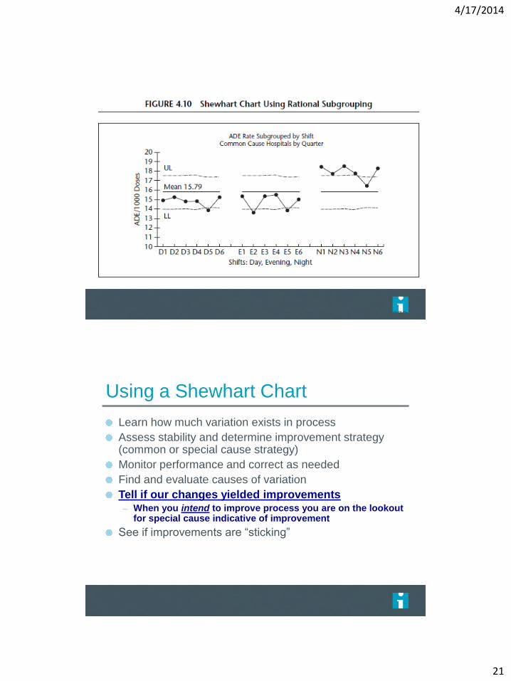
Page 120
Using a Shewhart Chart
Learn how much variation exists in process
Assess stability and determine improvement strategy (common or special cause strategy)
Monitor performance and correct as needed
Find and evaluate causes of variation
Tell if our changes yielded improvements – When you intend to improve process you are on the lookout
for special cause indicative of improvement
See if improvements are “sticking”
4/17/2014
22
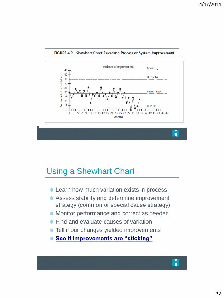
Page 119
Using a Shewhart Chart
Learn how much variation exists in process
Assess stability and determine improvement
strategy (common or special cause strategy)
Monitor performance and correct as needed
Find and evaluate causes of variation
Tell if our changes yielded improvements
See if improvements are “sticking”
4/17/2014
23
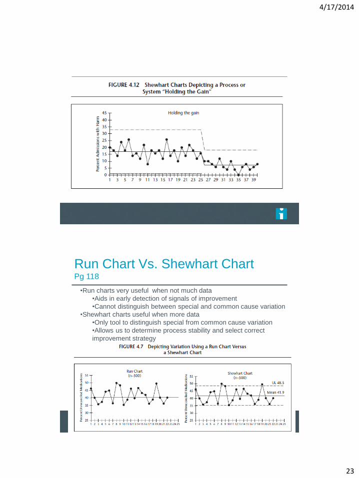
Page 121
Run Chart Vs. Shewhart Chart Pg 118
•Run charts very useful when not much data
•Aids in early detection of signals of improvement
•Cannot distinguish between special and common cause variation
•Shewhart charts useful when more data
•Only tool to distinguish special from common cause variation
•Allows us to determine process stability and select correct
improvement strategy
4/17/2014
24
47
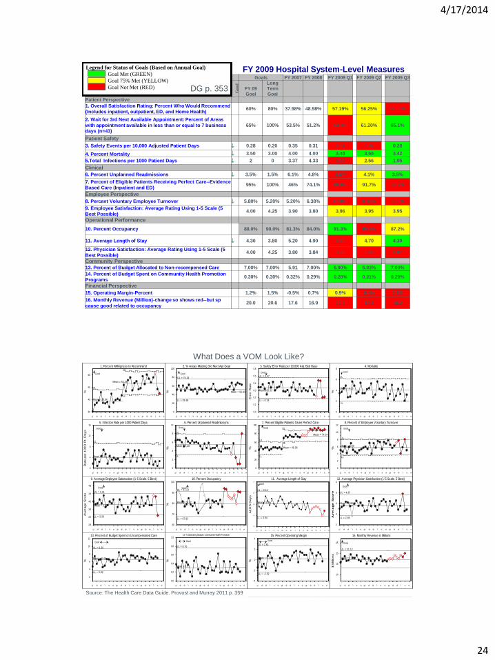
FY 2009 HOSPITAL SYSTEM LEVEL MEASURES
Goals FY 2007 FY 2008 FY 2009 Q1 FY 2009 Q2 FY 2009 Q3
Good
FY 09
Goal
Long
Term
Goal
Patient Perspective
1. Overall Satisfaction Rating: Percent Who Would Recommend
(Includes inpatient, outpatient, ED, and Home Health) 60% 80% 37.98% 48.98% 57.19% 56.25% 51.69%
2. Wait for 3rd Next Available Appointment: Percent of Areas
with appointment available in less than or equal to 7 business
days (n=43) 65% 100% 53.5% 51.2% 54.3% 61.20% 65.1%
Patient Safety
3. Safety Events per 10,000 Adjusted Patient Days 0.28 0.20 0.35 0.31 0.31 0.30 0.28
4. Percent Mortality 3.50 3.00 4.00 4.00 3.48 3.50 3.42
5.Total Infections per 1000 Patient Days 2 0 3.37 4.33 4.39 2.56 1.95
Clinical
6. Percent Unplanned Readmissions 3.5% 1.5% 6.1% 4.8% 4.6% 4.1% 3.5%
7. Percent of Eligible Patients Receiving Perfect Care--Evidence
Based Care (Inpatient and ED) 95% 100% 46% 74.1% 88.0% 91.7% 88.7%
Employee Perspective
8. Percent Voluntary Employee Turnover 5.80% 5.20% 5.20% 6.38% 6.10% 6.33% 6.30%
9. Employee Satisfaction: Average Rating Using 1-5 Scale (5
Best Possible) 4.00 4.25 3.90 3.80 3.96 3.95 3.95
Operational Performance
10. Percent Occupancy 88.0% 90.0% 81.3% 84.0% 91.3% 85.6% 87.2%
11. Average Length of Stay 4.30 3.80 5.20 4.90 4.60 4.70 4.30
12. Physician Satisfaction: Average Rating Using 1-5 Scale (5
Best Possible) 4.00 4.25 3.80 3.84 3.96 3.80 3.87
Community Perspective
13. Percent of Budget Allocated to Non-recompensed Care 7.00% 7.00% 5.91 7.00% 6.90% 6.93% 7.00%
14. Percent of Budget Spent on Community Health Promotion
Programs 0.30% 0.30% 0.32% 0.29% 0.28% 0.31% 0.29%
Financial Perspective
15. Operating Margin-Percent 1.2% 1.5% -0.5% 0.7% 0.9% 0.4% 0.7%
16. Monthly Revenue (Million)-change so shows red--but sp
cause good related to occupancy 20.0 20.6 17.6 16.9 17.5 18.3 19.2
Legend for Status of Goals (Based on Annual Goal)
Goal Met (GREEN)
Goal 75% Met (YELLOW)
Goal Not Met (RED)
FY 2009 Hospital System-Level Measures
DG p. 353
48
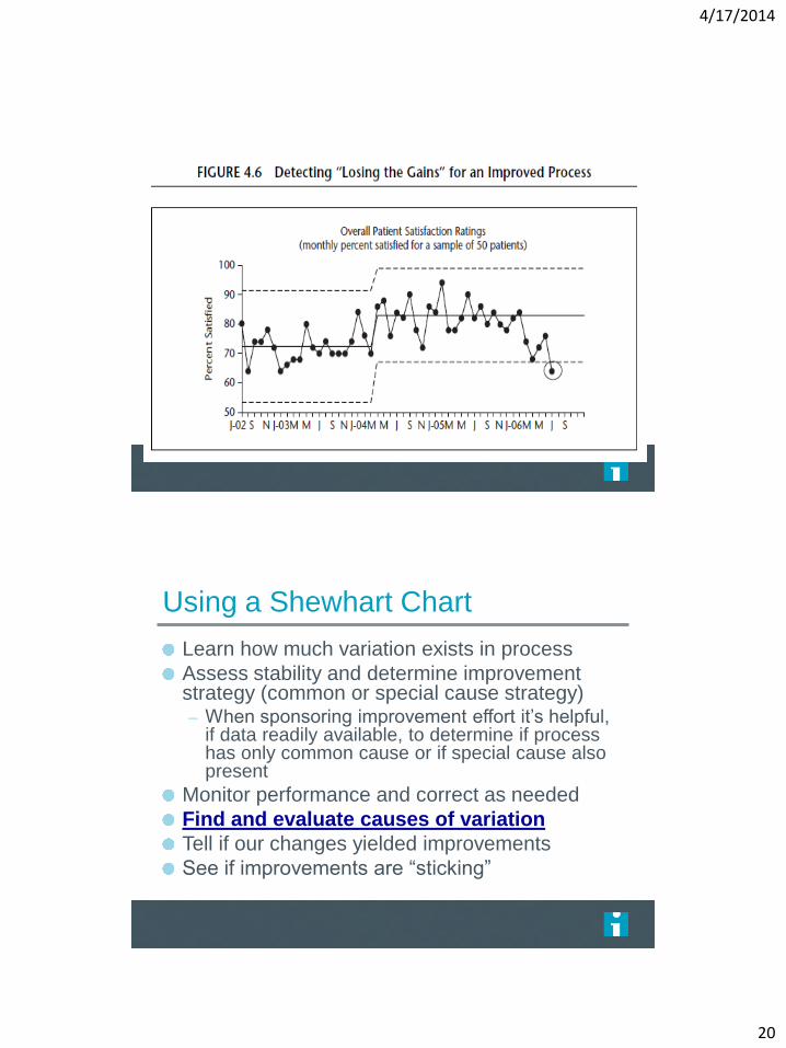
What Does a VOM Look Like?
Source: The Health Care Data Guide. Provost and Murray 2011 p. 359
%
1. Percent Willingness to Recommend
Good
UL
Mean = 38.64
UL
Mean = 53.28
LL
07 M M J S N 08 M M J S N 09 M M J S N
30
40
50
60
%
2. % Areas Meeting 3rd Next Apt Goal
Good
UL = 75.18
Mean = 52.93
LL = 29.48
07 M M J S N 08 M M J S N 09 M M J S N
0
20
40
60
80
100
Err
or
Rate
3. Safety Error Rate per 10,000 Adj. Bed Days
Good
UL = 0.47
Mean = 0.33
LL = 0.18
07 M M J S N 08 M M J S N 09 M M J S N
0.0
0.1
0.2
0.3
0.4
0.5
0.6
%
4. Mortality
Good
UL
Mean = 4.06
LL
07 M M J S N 08 M M J S N 09 M M J S N
0
2
4
6
8
Rate
per
100O
Pt. D
ays
5. Infection Rate per 1000 Patient Days
Good
UL
Mean = 3.91
07 M M J S N 08 M M J S N 09 M M J S N
0
4
8
12
16
%
6. Percent Unplanned Readmissions
Good
UL
Mean = 5.48
LL
07 M M J S N 08 M M J S N 09 M M J S N
0
2
4
6
8
10
%
7. Percent Eligible Patients Given Perfect Care
Good
UL
Mean = 46.06
LL
UL
LL
Mean = 74.24
07 M M J S N 08 M M J S N 09 M M J S N
0
20
40
60
80
100
%
8. Percent of Employee Voluntary Turnover
Good
UL
Mean = 5.79
LL
07 M M J S N 08 M M J S N 09 M M J S N
0
2
4
6
8
10
12
Avera
ge S
core
9. Average Employee Satistaction (1-5 Scale, 5 Best)
Good
UL = 4.41
LL = 3.30
Mean = 3.86
07 M M J S N 08 M M J S N 09 M M J S N
2.8
3.2
3.6
4.0
4.4
4.8
%
10. Percent Occupancy
Good UL = 91.23
Mean = 79.52
LL = 67.82
07 M M J S N 08 M M J S N 09 M M J S N
60
70
80
90
100
ALO
S D
ays
11. Average Length of Stay
Good
UL = 6.14
Mean = 5.04
LL = 3.94
07 M M J S N 08 M M J S N 09 M M J S N
3
4
5
6
7
Av
era
ge
Sc
ore
12. Average Physician Satisfaction (1-5 Scale, 5 Best)
Good
UL = 4.87
Mean = 3.86
LL = 2.85
07 M M J S N 08 M M J S N 09 M M J S N
2
3
4
5
6
%
13. Percent of Budget Spent on Uncompensated Care
Good
UL = 9.30
Mean = 6.46
LL = 3.62
07 M M J S N 08 M M J S N 09 M M J S N
2
4
6
8
10
12
%
14. % Operating Budget: Community Health Promotion
Good
UL = 0.76
Mean = 0.31
07 M M J S N 08 M M J S N 09 M M J S N
0.0
0.2
0.4
0.6
0.8
1.0
%
15. Percent Operating Margin
Good
UL = 2.61
Mean = 0.11
LL = -2.39
07 M M J S N 08 M M J S N 09 M M J S N
-4
-2
0
2
4
$ M
illio
ns
16. Monthly Revenue in Millions
Good
UL = 21.12
Mean = 17.
07 M M J S N 08 M M J S N 09 M M J S N
10
15
20
25
4/17/2014
25
Figure 2.28 Tools to Learn from Variation in Data
Frequency Plot Pareto Chart Scatter Plot
Pareto Chart
Bar chart with bars in rank order
Each bar represents a different variable or problem
Looking for 20% of bars representing 80% of problem
Want to know where to focus our efforts
– Which are the vital few areas we should concentrate
on?
– Which variables out of many are occurring most?
Page 140
4/17/2014
26
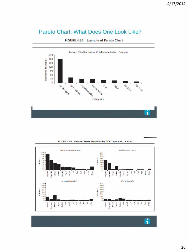
Pareto Chart: What Does One Look Like?
Page 141
Page 143
4/17/2014
27
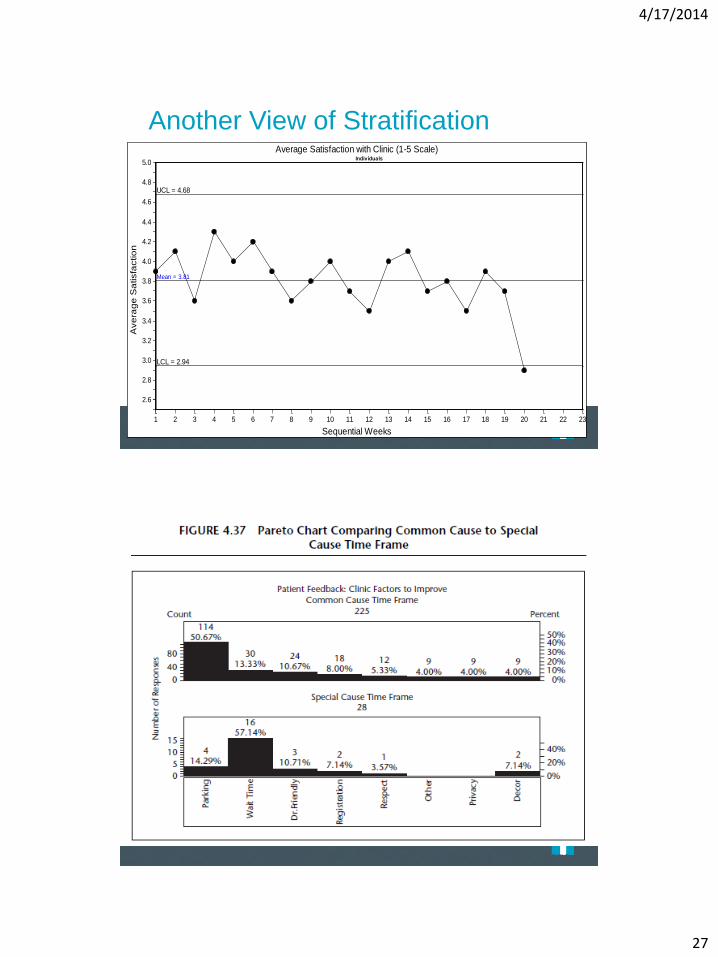
Another View of Stratification A
ve
rag
e S
atisfa
ctio
n
Average Satisfaction with Clinic (1-5 Scale)
Sequential Weeks
Individuals
UCL = 4.68
Mean = 3.81
LCL = 2.94
1 2 3 4 5 6 7 8 9 10 11 12 13 14 15 16 17 18 19 20 21 22 23
2.6
2.8
3.0
3.2
3.4
3.6
3.8
4.0
4.2
4.4
4.6
4.8
5.0
Page 139
Page 142
4/17/2014
28
Figure 2.28 Tools to Learn from Variation in Data
Frequency Plot Pareto Chart Scatter Plot
Frequency Plot (Histogram):
What Is It? A bar chart for one variable
Used to visualize central location, shape
and spread of the data
Each bar equal, each distinct
Most often used with time, money,
throughput or a scaled measurement (i.e.
dollars, weight, age, height) – Frequency Plot does little good for interpretation if process not
stable
– Doesn’t show stability or capability in and of itself!!
Page 136

4/17/2014
29
Various Formats
Page 137
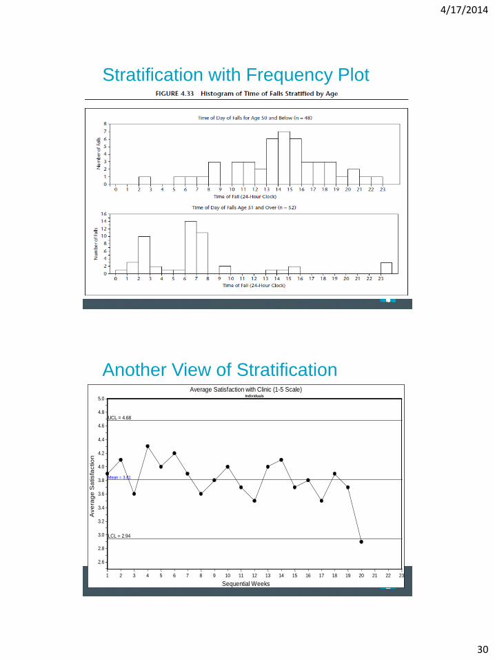
Stratification with Frequency Plot
Page 138
4/17/2014
30
Stratification with Frequency Plot
Page 139
Another View of Stratification
Ave
rag
e S
atisfa
ctio
n
Average Satisfaction with Clinic (1-5 Scale)
Sequential Weeks
Individuals
UCL = 4.68
Mean = 3.81
LCL = 2.94
1 2 3 4 5 6 7 8 9 10 11 12 13 14 15 16 17 18 19 20 21 22 23
2.6
2.8
3.0
3.2
3.4
3.6
3.8
4.0
4.2
4.4
4.6
4.8
5.0
Page 139
4/17/2014
31
Stratification
Page 140
Figure 2.28 Tools to Learn from Variation in Data
Frequency Plot Pareto Chart Scatter Plot
4/17/2014
32
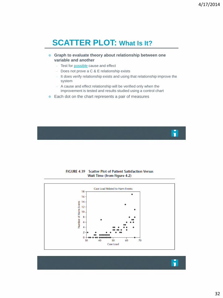
SCATTER PLOT: What Is It?
Graph to evaluate theory about relationship between one
variable and another
– Test for possible cause and effect
– Does not prove a C & E relationship exists
– It does verify relationship exists and using that relationship improve the
system
– A cause and effect relationship will be verified only when the
improvement is tested and results studied using a control chart
Each dot on the chart represents a pair of measures
Page 142
Page 143
4/17/2014
33
Page 143
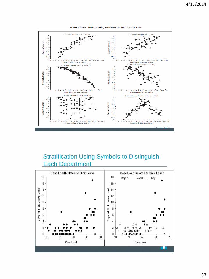
Stratification Using Symbols to Distinguish
Each Department
Page 143

4/17/2014
34
Summary