Embed Size (px)
Citation preview
Improving Students’ Cognitive Dimensionality through Education with Object-Level Interaction
Jessica Zeitz Self, Nathan Self, Leanna House, Scotland Leman, Chris North
Abstract—This paper addresses the use of visual analytics techniques in education to advance students' cognitive dimensionality. Students naturally tend to characterize data in simplistic one dimensional terms using metrics such as mean, median, mode. Real-world data, however, is more complex and students need to learn to recognize and create high-dimensional arguments. Data exploration methods can encourage thinking beyond traditional one dimensional insights. In particular, visual analytics tools that afford object-level interaction (OLI) allow for generation of more complex insights, despite inexperience with multivariate data. With these tools, students’ insights are of higher complexity in terms of dimensionality and cardinality and built on more diverse interactions. We present the concept of cognitive dimensionality to characterize students' capacity for dimensionally complex insights. Using this concept, we build a vocabulary and methodology to support a student’s progression in terms of growth from low to high cognitive dimensionality. We report findings from a series of classroom assignments with increasingly complex analysis tools. These assignments progressed from spreadsheet manipulations to statistical software such as R and finally to an OLI application, Andromeda. Our findings suggest that students' cognitive dimensionality can be improved and further research on the impact of visual analytics tools on education for cognitive dimensionality is warranted. Index Terms—Visual analytics, object level interaction, multivariate data analysis
1 INTRODUCTION
The phrase “Big Data" is practically redundant. Today's datasets are big; at low cost, advanced technology has enabled almost every industry, scientific field, branch of government, etc., to collect new and more data than ever. However, datasets are just tables of numbers without humans to discover, process, reflect, and communicate information in the data [1]. This means that, in the presence of large datasets, humans are called upon to assimilate what they know with tens, hundreds, even thousands of other variables at once. Is that possible? Data mining algorithms can scale to the size of today's data, but can humans? More specifically, can today's students? How can we train students to acquire these skills?
Education starts the process of teaching students how to analyze data. Simplistic techniques are taught early on and sometimes even applied to real world data, but not necessarily large or high-dimensional data. We live in a three-dimensional world, so humans naturally have the cognitive skills to think about at least three variables. Furthermore, based on visual analytic research and the everyday practice of professional data analysts, it is easy to accept that humans can think about more than three variables at once.
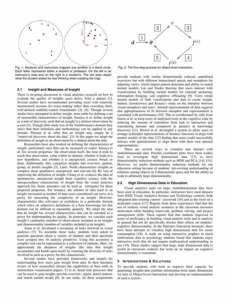
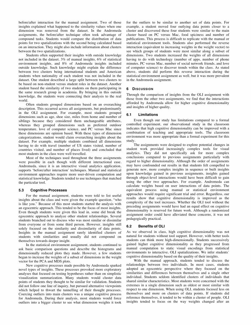
However, we have observed in the classroom while teaching Multidimensional Scaling (MDS) [2] that students tend to limit their cognitive processing of data to one or two variables. MDS is a method to visualize high dimensional data (e.g., more than 3 variables) in a two-dimensional scatter plot. Relative distances between observations in the scatterplot convey relative differences between them; e.g., observations in a MDS visualization that are close are more similar to one another than those that are far apart- across all variables in the considered in the measure of distance. To develop an intuition for the meaning of distance, we asked students to create their own maps of student data in a provided circle. That is,
the students took a survey which generated a dataset with 25 variables including age, average number of study hours per week, average number of texts sent per week, love of statistics (on a scale of 0 to 100), etc. The students were asked to create their own visual mappings of the class based on the data. Very few students used more than three variables. In fact, one pretended that there were two axes and plotted love of math versus love of statistics (Fig. ). To provide comparison, an instructor completed the same exercise and considered seven variables in his map: age, exercise, study habits, alcohol consumption, politics, hours sleep, and television watching (Fig. ).
In this paper, we show that thinking in one or two dimensions does not negate the opportunity to learn from data, but dramatically constrains what can be learned. Physical processes are complicated and often rely on multidimensional interactions of variables. Also, with the right exposure and tools, students can improve their cognitive dimensionality and, as a result, make complicated inferences from data. Namely, students naturally start with low cognitive dimensionality and make rudimentary inferences. Then, provided an interactive visualization tool that we developed called Andromeda, the students develop high cognitive dimensionality and make insightful inferences.
Given what we observed in the MDS classroom, we implemented a set of assignments to investigate the relationships between cognitive dimensionality and increasingly sophisticated tools. We sought to discover answers to the following research questions: • Do students initially gravitate by default towards low cognitive
dimensionality? • When provided better tools, can students learn to think with higher dimensionality?
• Can students find more complex and higher dimensional insights with these tools?
• Can tools that support object-level interaction (OLI) help students find novel types of high-dimensional insights?
2 LITERATURE REVIEW There has been previous work on using high dimensional data visualization in classrooms and on how to define and measure the complexity of insights gained from visualizations.
• Jessica Zeitz Self is with Virginia Tech. E-mail: [email protected]. • Nathan Self is with Virginia Tech. E-mail: [email protected]. • Leanna House is with Virginia Tech. E-mail: [email protected]. • Scotland Leman is with Virginia Tech. E-mail: [email protected]. • Chris North is with Virginia Tech. E-mail: [email protected].
2.1 Insight and Measures of Insight There is on-going discussion in visual analytics research on how to evaluate the quality of insights users derive from a dataset [1]. Several studies have recommended providing users with relatively unstructured sessions for sense-making rather than executing short, well-defined usability-centric benchmarks [3], [4]. Though several studies have attempted to define insight, most settle for defining a set of measurable characteristics of insight. Saraiya et al. define insight as a unit of discovery such that an insight is a distinct observation by a user [3]. Though their study was in the bioinformatics domain they stress that their definition and methodology can be applied in any domain. Plaisant et al. offer that an insight may simply be a “nontrivial discovery about the data” [5]. In this paper we adopt the definition of insight as an observation by a student about the data.
Researchers have also worked on defining the characteristics of insight, particularly ones that can be measured or coded. Saraiya et al. list several properties: the observation itself, the time it took to reach that observation, value within its domain, whether it leads to a new hypothesis, and whether it is unexpected, correct, broad, or deep. Additionally, they categorize insights into overview, pattern, group, or details insights [3]. Later, North characterizes insights as complex, deep, qualitative, unexpected, and relevant [4]. By way of improving the definition of insight, Chang et al. coalesce the idea of spontaneous, unexpected insight from cognitive science with the unexpectedness characteristic of insight from the visual analytics approach [6]. Some measures can be used as surrogates for these proposed properties. For instance, the amount of data used in an insight (measured as number of data cases considered) can serve as a proxy for measuring the complexity of an insight. However, characteristics like relevance or usefulness in a particular domain which relies on subjective definitions of a base knowledge for that domain can be difficult to repeatably quantify. We adopt the idea that an insight has several characteristics that can be encoded as a proxy for understanding its quality. In particular, we consider each insight’s cardinality (number of observations included in an insight) and dimensionality (number of variables included in an insight).
Amar et al. developed a taxonomy of tasks involved in visual analytics [7]. To assemble these tasks, students were asked to generate questions about a variety of datasets and their questions were grouped into 10 analytic primitives. Using this taxonomy a complex task can be represented as a collection of subtasks. Here, we approximate the deepness of insights (the idea that insight accumulates and builds upon itself) by counting the diversity of tasks involved in each as a proxy for this characteristic.
Several studies have provided frameworks and models for understanding how users gain insight from data. In their literature review of how researchers discuss the capabilities of their tools in information visualization papers, Yi et al. detail four processes that can be used to gain insight: provide overview, adjust, detect pattern, and match mental model [8]. In our study, all three assignments
provide students with similar dimensionally reduced, spatialized overviews but with different interactional speeds and metaphors for adjusting views, which impact pattern detection and ability to match mental models. Liu and Stasko theorize that users interact with visualizations by building mental models for external anchoring, information foraging, and cognitive offloading [9]. Users create mental models of both visualizations and data to create insight. Indeed, Ziemkiewicz and Kosara’s study on the interplay between visual metaphors and users’ internal representations of data suggests that appropriateness of fit between metaphor and representation is correlated with performance [10]. This is corroborated by calls from Green et al. to keep users of analytical tools in the cognitive zone by reducing the amount of translation from task to interaction and considering humans and computers as partners in knowledge discovery [11]. Brown et al. developed a system to allow users to arrange scatterplot representations of distance functions to align with mental models of the data [12] finding that users could successfully interact with spatializations to align them with their own internal representations.
There are several ways to visualize and interact with multidimensional data. Parallel coordinate plots have been widely used to investigate high dimensional data [13] as have dimensionality reduction methods such as MDS and PCA [14], [15]. However, we prefer dimensionality reduction methods for our education setting because of students’ pre-existing understanding of relations among objects in 2-dimensional space and for the ability to scale to arbitrarily large dimensionality.
2.2 High Dimensional Data in Education Visual analytics tasks on large, multidimensional data have
been used in education. In particular, instructors have used datasets from IEEE Visual Analytics Science and Technology contests, both integrated into existing courses’ classwork [16] and as the focus of a dedicated course [17]. Reports from these experiences find that the use of realistic visual analytic scenarios in the classroom increases motivation while building teamwork, problem solving, and project management skills. These reports find that students improved in terms of proficiency in building visual analytic tools and in analysis in general but not do specifically discuss their effects on students’ cognitive dimensionality. In the Statistics Education literature, there have been attempts to visualize high dimensional data for easier consumption [18]. A study on using interactive graphics to teach multivariate data to psychology students found that students enjoy interactive tools that do not require mathematical understanding to use [19]. These studies suggest that large, high dimensional data is useful in classroom contexts but work on its impact on cognitive dimensionality is warranted.
3 INTERVENTIONS & SOLUTIONS To provide students with tools to improve their capacity for generating insights that combine information from many dimensions we turn to Object-Level Interaction and develop an implementation of such a system.
Fig. 1. Students and instructors mapped one another in a blank circle. Each letter represents either a student or professor. On the left is an instructor’s map and on the right is a student’s. The red axes depict what the student stated he was thinking when creating the map.
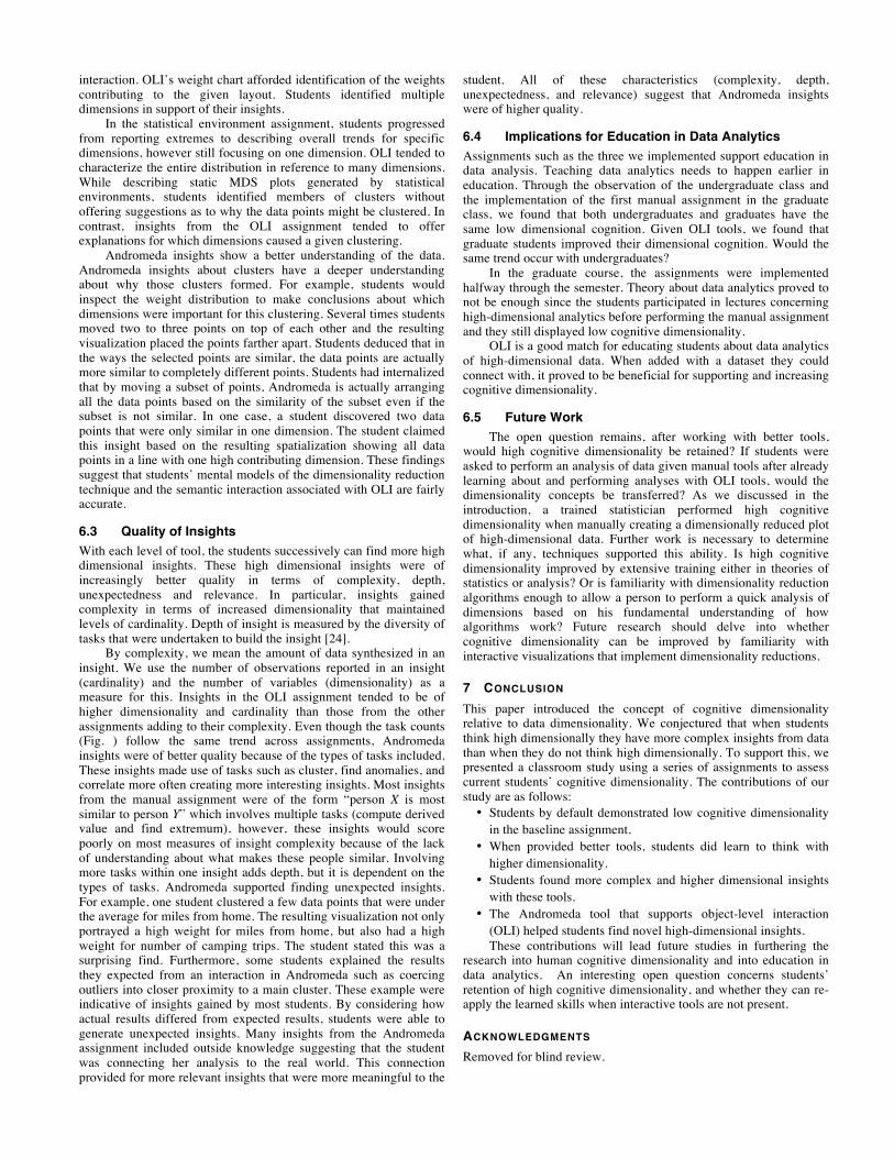
Fig. 2. The five-step process for object-level interaction.
3.1 Object-Level Interactions Reasoned decisions with data ultimately require a cognitive understanding of the questions at hand. While algorithmic techniques are capable of resolving structures in high dimensional data, such techniques can fail due to noisy and unanticipated structures. Analysts are not necessarily able to reason about such high-dimensional interactions; however, they are able to conjecture about which associations make sense and the subset of dimensions that drive their relationships. Hence, through iterations of a conversation between human and computer perspectives, a consensus can be had about meaningful relationships in data: those that are well supported by the data and simultaneously satisfy the user’s mental understanding [20]. Object-level interaction (OLI) enable high-dimensional cognition by allowing users to operate and process information at the spatial dimension. While, this spatial dimension is traditionally bounded by two or three dimensions, the number of structures and understanding of their interactions are effectively a much higher dimensional object. Connecting low-dimensional interactions with high-dimensional inferences is the basis behind OLI protocols.
OLI entails a 5-step process that facilitates a communication between the user’s understanding of visual associations and the backend parametric models responsible for the data layout. Fig. 2 describes this process.
Within this process, we denote data by 𝒅, the underlying backend parametric space by 𝜽, the visualization by 𝒗, and cognitive and parametric feedback by 𝒇(𝒄), and 𝒇(𝒑), respectively. In words, the process iterates by injecting data into the parametric model, fitting the tunable parameters through standard statistical methods, and ultimately displaying results via an interactive visualization. At this point, a user can decide that the visualization is sufficient for their knowledge discovery purposes or interact with the display to gather more insights. For example, given a spatialization of data objects, the user could decide to adjust the proximity of points to inject feedback. Moving objects closer would express desired similarities; whereas, moving objects apart would express differences between the objects. This feedback is re-encoded into the
parameter space in order to retune the fitting procedure, so that the user’s cognitive adjustments (if possible) are rendered through the updated visualization. This process continues until the user is satisfied with their exploration of the data [21], [22].
While this 5-step process creates a sequence of updated visualizations and the original low-dimensional visual space conveys information to the user, it is also necessary to update the user’s knowledge about the underlying high-dimensional space, as contained in the data. For instance, when converting from cognitive to parametric feedback (step 4), OLI models interact by finding a re-tuning of the underlying parametric model which coincides with the user’s cognitive inputs. These tunable parameters are a subset of the full model tunables (𝜽), and are responsible for re-weighting the underlying feature space (𝒅). Feature weights that substantially support the user’s mental-model are reported back to them.
One of the advantages of OLI interfaces, such as Andromeda, is that a user may acquire insights about a high-dimensional space by operating in a two-dimensional space. OLI effectively bridges the gap between the interpretation of a low-dimensional model and high-dimensional inferences, leading to higher cognitive dimensionality.
3.2 Andromeda Andromeda is our implementation of the OLI process. In order to support the translation of visual interactions into transformations of the underlying parametric space, Andromeda supports object-level interactions which allow users to interact directly with dimensionally reduced data plots. It hides the calculations of the dimensionality reduction algorithm so that the user can focus on the data using a familiar metaphor that encodes similarity with spatial proximity which does not require any knowledge of underlying statistical models.
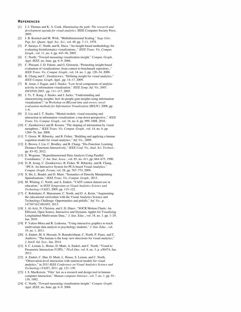
A typical usage scenario for Andromeda starts with loading the data. Andromeda simply reads in a CSV file containing high dimensional numerical data and then performs a dimensionality reduction algorithm, specifically Multidimensional Scaling (MDS). The new low-dimensional coordinate points are displayed within a visualization panel – current view (see Fig. 3a). Within this panel, a user can manipulate the data points and then rerun MDS. The
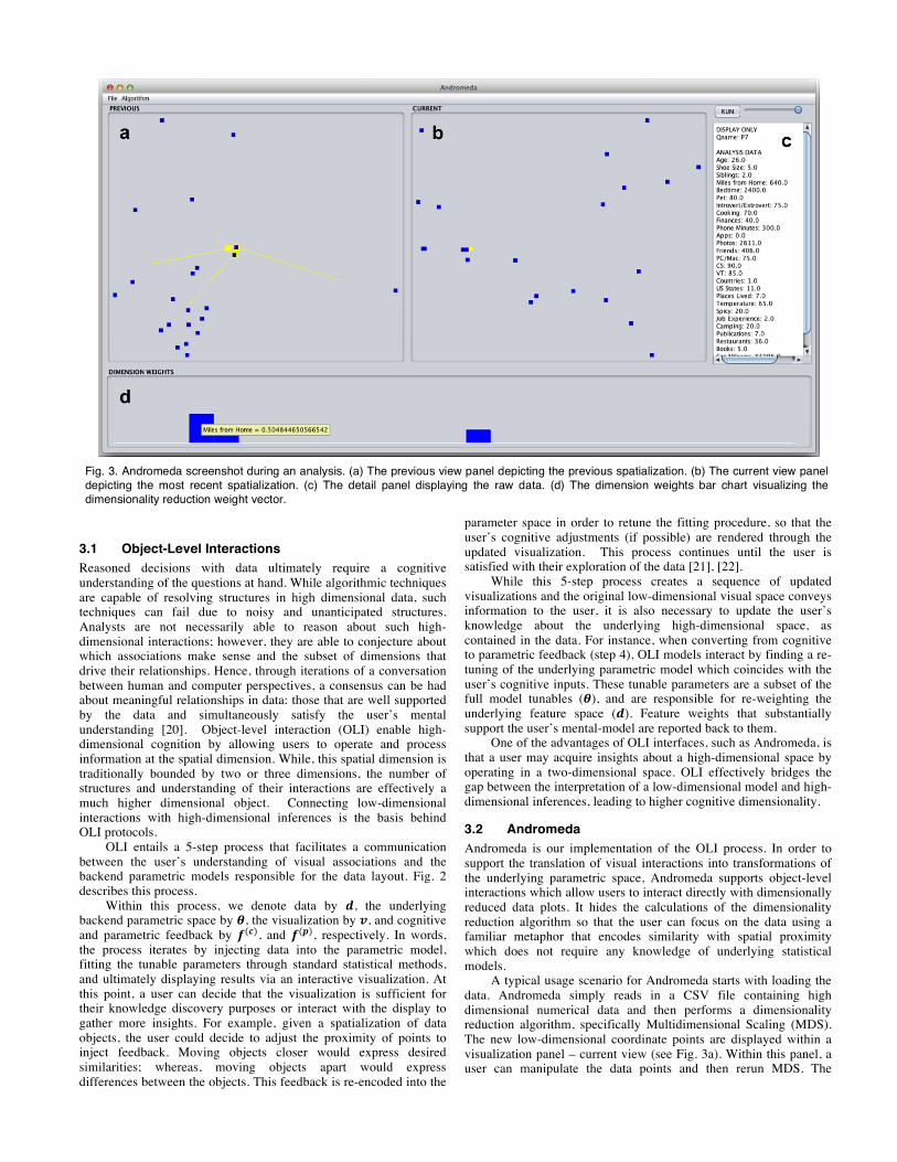
Fig. 3. Andromeda screenshot during an analysis. (a) The previous view panel depicting the previous spatialization. (b) The current view panel depicting the most recent spatialization. (c) The detail panel displaying the raw data. (d) The dimension weights bar chart visualizing the dimensionality reduction weight vector.
original visualization is now seen in a separate panel – previous view (see Fig. 3b) – and the current view is updated with the new low-dimensional points given the interactions.
These two visualizations are accompanied by two other elements: the detail panel and the weights bar chart. The detail panel displays the raw data (see Fig. 3c). A user can hover over any specific point in either the current view or the previous view to see all the dimensions with the associated data values. The weights bar chart visualizes the weight vector computed by the dimensionality reduction algorithm (see Fig. 3d). All weights are equal for the original visualization, but rerunning the algorithm after data point manipulations updates these weights to reflect the new visualization. The weight bars themselves can be manipulated providing direct parametric interaction.
3.2.1 Data Visualization Panels There are two data visualization panels: the current view and the previous view. The low-dimensional data points created through the dimensionality reduction algorithm are displayed in the current view. The most recent iteration of the algorithm is displayed in the previous view. The views are linked so that when a user hovers over a point in the current view it is highlighted in the previous view to provide ease in comparison.
OLI occurs within the current view. A user can manipulate the data points in order to perform analysis.
3.2.2 Weights Bar Chart The weights computed by MDS are displayed to the user through a bar chart. There is a bar for each dimension and the height of the bar depicts the degree to which that dimension contributes to the current spatial layout. For example, in Fig. 3d, the most prominent dimension is “distance in miles from home.” Only three dimensions contribute to this spatial layout meaning in order to explain the similarities among the three manipulated points, a user must consider the three dimensions. The weights bar chart provides parametric interaction to directly adjust the weight values. [23]
3.2.3 Detail Panel The detail panel displays the original raw data. It is linked with both the current view and the previous view. The data for an individual data point is visible in this panel when a user hovers over a point in either view. This panel supports simplistic tasks such as retrieving a value or finding an extremum, which we discuss later. Through an analysis, it may be important for a user to refer back to the raw data to further support an insight.
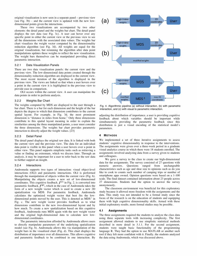
3.2.4 Interactions Andromeda supports two types of interaction: visual object-level interactions (OLI) and parametric interactions. OLI is performed through the manipulation of objects within the current view (Fig. b). Manipulating the objects creates a new set of low-dimensional coordinates. This cognitive feedback, 𝒇(𝒄) in Fig. 2, is converted into parametric feedback, 𝒇(𝒑), which in the case of Andromeda takes the form of a new weight vector which is used to create a new 2D spatialization via MDS. For parametric feedback, Andromeda calculates the optimized weight vector that best fits the low-dimensional points moved by the user. This is denoted as MDS-1 in Fig. c. The new weight vector provides feedback as to what dimensions contribute to the new two-dimensional layout and by how much. To create a new spatialization based on this cognitive feedback, Andromeda runs MDS again with the new weight vector and the original high-dimensional data to calculate new low-dimensional coordinates.
The parametric interaction afforded by Andromeda allows users to directly manipulate parameters of the underlying spatialization model (see Fig. b). Andromeda allows this via manipulation of the weight bars in the visualized chart (Fig. d). This chart displays the distribution of importance over all dimensions. This allows cognitive and parametric feedback to be combined in one interaction. By
adjusting the distribution of importance, a user is providing cognitive feedback about which variables should be important while simultaneously providing the parametric feedback since this distribution is just a visual encoding of the statistical model’s parameters.
4 METHODS We implemented a set of three iterative assignments to assess students’ cognitive dimensionality in response to the interventions. The assignments were given over a three-week period in a graduate visual analytics course in which there were 18 students enrolled. The assignments involved analyzing data from a survey given to students and colleagues.
We gave a survey to the class to create our high-dimensional data for the assignments. The survey consisted of 27 questions with numeric answers. Questions ranged from unchangeable characteristics such as age and shoe size to opinions such as do you like to cook to counts such number of camping trips or number of smartphone apps owned. Opinion questions were based on a 1-100 scale. The final dataset contained information about 23 people across 27 dimensions. Students had the option to answer the survey anonymously.
The classroom environment was beneficial for this exploratory study because it allowed more freedom with the assignments and the data. This study was not intended to be a formal study since the focus of the research is on the education of students and equipping them with high cognitive dimensionality skills. Armed with these initial exploratory results, more formal studies may be possible.
4.1 Assignments The three assignments required the students to analyze the class data using three separate tools with increasing complexity. The first assignment allowed students to use simplistic statistical methods described in more detail in 3.1.1. For the second assignment, students were taught basic functionality of the programming language R. They had the option to use MATLAB or another such tool if they felt more confident with it. Finally, the students analyzed the data using Andromeda, which was discussed above.
Fig. 4. Algorithmic pipeline (a) without interaction, (b) with parametric interaction, and (c) with visual to parametric interaction.
For each assignment, students were asked to analyze the survey data and develop insights about their classmates. Instructions were intentionally vague and asked students to find patterns of relationships among students using visualizations that use proximity to encode similarity. The data hoped to provide a more fun and interesting analysis since they were learning about each other. The students related to the data about their fellow classmates and could start with an egocentric analysis by asking “who is like me?”
4.1.1 Manual The first assignment was to establish a baseline for students’ current cognitive dimensionality with limited visual and interactive support. The first assignment was open-ended. It required students to calculate a similarity matrix using a metric such as the cosine similarity to compute the similarity value for pairs of students. No other more complex mathematical techniques or algorithms were allowed. Then students created a hand-drawn 2-dimensional representation depicting the similarity of the class members using the “spatial proximity equals data similarity” metaphor. No guidance was given on existing dimensionality reduction or visualization techniques. Using this representation, students listed insights they discovered about the data.
4.1.2 Statistical computing environments The second assignment built upon the first by adding computational and visual representations, with limited interaction. Students used a statistical analysis tool such as R or MATLAB. The assignment suggested that students create standard data plots such as histograms, scatterplots, scatterplot matrices, and parallel coordinate plots. To add more computational complexity, the students created unweighted and weighted multi-dimensional scaling (MDS) plots and performed a principal component analysis (PCA). Students could interact with the MDS by manually adjusting dimension weights. Students again listed their insights and compared these findings to the insights gained during the first assignment.
4.1.3 OLI The third and final assignment added OLI interaction. Students used the Andromeda tool to perform the same task from the previous two assignments: find insights about the relationships among data points. Students received a short tutorial on the basic functionality of Andromeda including manipulation of observations and weights. For the assignment, they were asked to provide screenshots to support their claims.
4.2 Data Collection For our analysis, we aggregated all insights provided by the 18 students across the three assignments. We define an insight as a piece of knowledge specified by the student. Most students denoted separate insights by a bulleted list within each assignment. Multiple sentences might comprise one single insight with a single
conclusion. Some students included a description of the techniques and processes they used to discover their insights.
Insights were coded for several characteristics that describe the complexity of each insight: • Dimensionality – Each dimension that was explicitly listed in
each insight is tallied. This way, dimensions that a student voluntarily decided to name are treated as dimensions that were important in the generation of that insight. Insights that mentioned no dimensions were given a zero for this measure.
• Cardinality – Each data point that is explicitly listed in an insight is counted. Insights that do not mention any particular data points count as a zero.
• Relationship cardinality – Most insights in our study involved comparisons of points. We categorize the nature of the relationship such as one-to-many, one-to-all, one-to-one, etc. To get a measure for diversity of tasks we used the analytic task
taxonomy of low-level components outlined in [7] to understand each insight. We broke down each insight into one or more of these analytic primitives. Based on the definition of each task, we developed a set of rules to classify which primitives occur in each insight and to count their occurrences. • Retrieve value – We consider each explicit listing of a
numerical value, either raw or derived, as a retrieve value task. In the manual task, several insights listed computed similarity scores or data values from raw data dimensions. Each unique value that appears in an insight is tallied as one retrieve value task.
• Filter – As described in [7], filter tasks involve finding all data that satisfy a given condition. In our case, insights that listed students that are older than x or have 0 siblings, for example, would have contained filter tasks, but no insights did such things.
• Compute derived value – Compute derived value tasks were tallied for any insights that involved a derived value whether derived by the student’s command as in the manual and statistical environment assignments or automatically as in the OLI assignment. For cases where there is more than one derived value such as comparisons between MDS plots, multiple compute derived value tasks were tallied. In our study, nearly every insight involved at least one compute derived value task since nearly all involved similarity scores or dimensionally reduced locations.
• Find extremum – Find extremum tasks were counted when an insight dealt with some number of the top or bottom values of any single dimension. In many cases, insights were of the form person P is most similar to person Q. In this case the extremum of person Q’s similarity score is reported. Cases such as persons P, Q, and S are most similar to person T are also of this task.
• Sort – No insights in our set included this as a standalone task. As per [7], some tasks such as find extremum may imply sorting but do not constitute full-fledged tasks.
• Determine range – Student conclusions that involved describing the range of values in a dimension are counted as determine range tasks. These only occurred in the manual assignment.
• Characterize distribution – Insights that describe the general pattern of all data points over a dimension are counted as characterize distribution tasks. These tended to occur across all homework assignments. Manual assignments often described skew in histogram plots. Statistical environment and OLI assignments tended to explain the layout of data points in dimensionally reduced space.
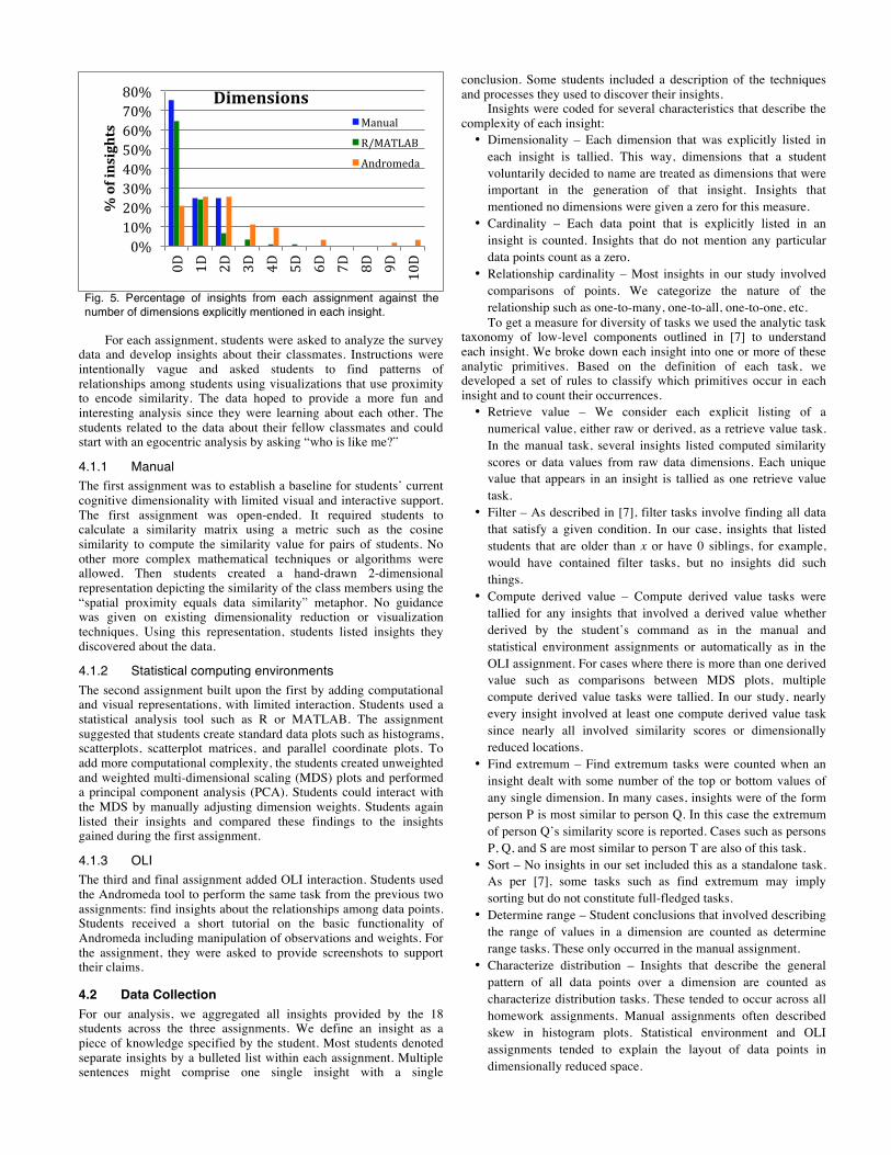
Fig. 5. Percentage of insights from each assignment against the number of dimensions explicitly mentioned in each insight.
0% 10% 20% 30% 40% 50% 60% 70% 80%
0D
1D
2D
3D
4D
5D
6D
7D
8D
9D
10D
% of insights
Dimensions Manual
R/MATLAB
Andromeda

• Find anomalies – These tasks were tallied for insights that describe unexpected values or distributions including statistical outliers. Across all assignments this tasks was used to identify outliers in derived value dimensions such as similarity scores and dimensionally reduced location.
• Cluster – Insights that identified members of clusters or relationships between clusters were counted as cluster tasks. Since dimensionally reduced layouts lend themselves easily to this type of interpretation, most of these tasks were found in the statistical environment and OLI assignments.
• Correlate – Correlate tasks were assigned to insights when a correlation between two dimensions was discovered. Dimensionality reduction techniques do not lend themselves well to this kind of interpretation and although some of the manual and statistical environment methods did explore correlations, few were reported. Based on this classification, each individual insight can be the
result of more than one analytical task. In practice, most insights were, especially because most insights made some conclusion based on derived data such as similarity scores. A typical manual assignment insight such as P1 is most similar to P2 is coded as a compute derived value task because it relies on a computed similarity measure and a find extremum task because it finds the person with the highest value in similarity score.
We performed an affinity diagramming technique on the insights of each assignment to classify the types of insights found by the students. By grouping reported insights by similarity we are able to discover and compare the characteristics of insights across the three assignments.
5 RESULTS To gauge the improvement in cognitive dimensionality gained over the course of the three assignments, we focused on three perspectives: insights, techniques, and cognitive processes.
5.1 Insights We classify an insight to be more complex based on dimensionality, cardinality, and diversity and type of tasks included. Across all 18 students, there were 73 insights for the manual assignment, 121 insights for the statistical computing environment assignment, and 63 insights for the OLI assignment. All manual insights tended to be simplistic comparisons between individuals or small groups.
5.1.1 Dimensionality As shown in Fig. 5, 75% of manual insights did not refer to any dimension. Most of these insights included finding extremums based on the computed similarity values, comparing two individuals, or characterizing the distribution of the data based on similarity or dissimilarity. All of these insights made no reference to any dimension. Insights comparing individuals would state the two were most similar based on similarity value, but would not offer dimension support. Furthermore, 25% of manual insights only considered one dimension. These insights focused on the anomalies and extremums of a single dimension. For example, an insight considering one dimension stated who in the dataset was the youngest (age dimension) or who wore the largest shoe (shoe size dimension).
Similar to manual insights, 64% of statistical environment insights did not reference any dimensions and focused on characterizing the distribution of derived values from MDS (see Fig. 5). However, statistical environment insights did start to include information regarding clusters and anomalies. We feel this occurred in part because of the nature of MDS. This algorithm displays a spatial layout that encourages finding clusters of data points and outlier data points. In this assignment, 24% of insights included one dimension. Most of these insights stemmed from characterizing the histogram of that particular dimension. For example, one such insight stated the students in the dataset have lived relatively few places (number of placed lived dimension). A small percentage of insights did refer to two to five dimensions, which is a step up from manual insights. When two dimensions were listed within the insight, it normally stated a correlation stemming from a scatterplot matrix of the two dimensions. Most insights referring to three to five dimensions were gleaned from a PCA plot which explained that certain dimensions contributed most to a particular component. In a few cases, we start to see dimensions being clusters based on a higher level category such as travel behavior consisting of number of countries visited, number of US states visited, and number of places lived.
The spread across the number of dimensions considered increases for OLI insights. A quarter of insights reference one and another quarter two dimensions. The remaining insights refer to either no dimensions or three to ten dimensions as depicted Fig. 5. Even though the percentages are small, we see a shift in the complexity of insights when using Andromeda. Neither tool supported many insights containing more than three dimensions. When using Andromeda, students produced insights consisting of up to ten dimensions and greatly increasing the number of insights using two, three or four dimensions.
5.1.2 Task Diversity We used the following list of tasks [7] to characterize each insight: retrieve value, compute derived value, find extremums, sort,
Fig. 6. Distribution of insights across tasks. Percentage of insights that contained at least one of the tasks.
Fig. 7. Percentage of insights against the number of tasks included in the insights.
0% 5% 10% 15% 20% 25% 30% 35% 40% 45% 50%
% of insights
Diversity of Tasks Manual
0% 10% 20% 30% 40% 50% 60% 70%
1 task 2 tasks 3 tasks 4 tasks
% of insights
Task Counts
Manual
R/MATLAB
Andromeda
determine range, characterize distribution, find anomalies, cluster, and correlate.
The 73 manual insights, 121 statistical environment insights, and 63 OLI insights contained 156, 216, and 141 individual tasks respectively. Fig. shows that a high percentage of these tasks were ‘compute derived value’ since all three assignments manipulated the raw data in some way. Most of the insights contained at least one compute derived data task. For the manual assignment the derived data included similarity values and matrices. Both the statistical environment and Andromeda assignments produced derived data from dimensionality reduction algorithms (MDS and PCA).
‘Find extremum’ was the most prevalent task within the manual insights (see Fig. ). 31% of the 73 insights contained this task. Most insights were of the form “Person X had the highest/lowest raw data value for this particular dimension.” These insights also included the highest or lowest top two or three persons based on a single dimension. We hypothesize this task is highly prevalent since it is a primitive task within analytic activity.
For the statistical environment assignment, the derived values are static histograms of each dimension and a static dimensionality reduction visualization. The most prevalent task within this context was ‘characterize distribution.’ 28% of the 121 insights contained a characterize distribution task, seen in Fig. . Students would describe unique histogram distributions of single dimensions. For the static MDS and PCA plots, students would describe the general location of the data points based on proximity and visible groups. For example, many students stated that the data points formed n number of groups.
They explained that the data points within each group are similar, however, they would not provide evidence as to how the data points are similar.
By adding the interaction to what would be a static
visualization, students perform a higher variety of tasks to produce insights. Because of the reduced cost of adjusting the visualization,
students performed more comparisons between spatializations. 44% of insights took advantage of the before/after interaction technique. The tasks included in these insights were fairly evenly distributed across ‘characterize distribution’ (13%), ‘find anomalies’ (16%), and ‘cluster’ (16%). Students would describe clusters that formed based on their interactions and would use the weight distribution to explain the relationship among the clustered data points. For example, one student dragged three data points from the main cluster far apart to see how this affected the similarity structure of the remaining main cluster. Her insight explained the shift in one dimension weight, but that the three must be very similar because the points remained close. The interaction supported a more complex insight that is based on the relationship between not only a subset of points, but also the relationship of the subset to the whole set.
5.1.3 Relationship Cardinality We categorized the insights based on cardinality and described relationships. An insight has cardinality if it specifically references one or more data points (people) in the dataset. Our categories consisted of no cardinality meaning no reference to any particular data point or group of points, one, one-to-one, one-to-many, one-to-all, many, many-to-many, many-to-all, and all.
Manual insights consisted of 27% 1-to-all, 26% one-to-one, and 16% all. Insights tended to focus on either one single person or the entire set of people. A great number of insights were egocentric meaning the student compared herself to another person either most similar or most dissimilar or compared herself to the entire dataset. For example, a student stated the he is fairly compatible with most of his classmates. This insight was based on the student having overall high similarity values with all pairs.
Insights for the statistical environment assignment consisted of 37% all, 17% many, and 16% 1-to-all. Given the highest percentage of insights for this assignment were categorized as characterizing the distribution, it fits that most insights referred to the entire dataset when describing people. The static MDS and PCA plots lend themselves to discussing the entire layout of the points. It also follows that insights would describe clusters of points – the many cardinality category.
Andromeda insights comprised of 29% many-to-many, 19% 1-to-all, and 17% all. This follows the same trend we saw with task diversity; OLI supported more comparisons among clusters as the students interacted with those clusters.
5.2 Techniques Students used a variety of techniques to generate insights. A technique is approach a student used to learn about the data set whether it was an interaction or not. The most basic technique that was used across the assignments was to simply describe the output of the specified tool for the assignment. This involved describing the similarity matrix in the manual assignment, the histograms and dimensionality reduction plots in the statistical environment assignment, and the MDS plot and weight distribution in the OLI assignment. In addition to this, each assignment provided for more interesting and specialized techniques. For example in Andromeda, this included manipulating the data points and weight bars.
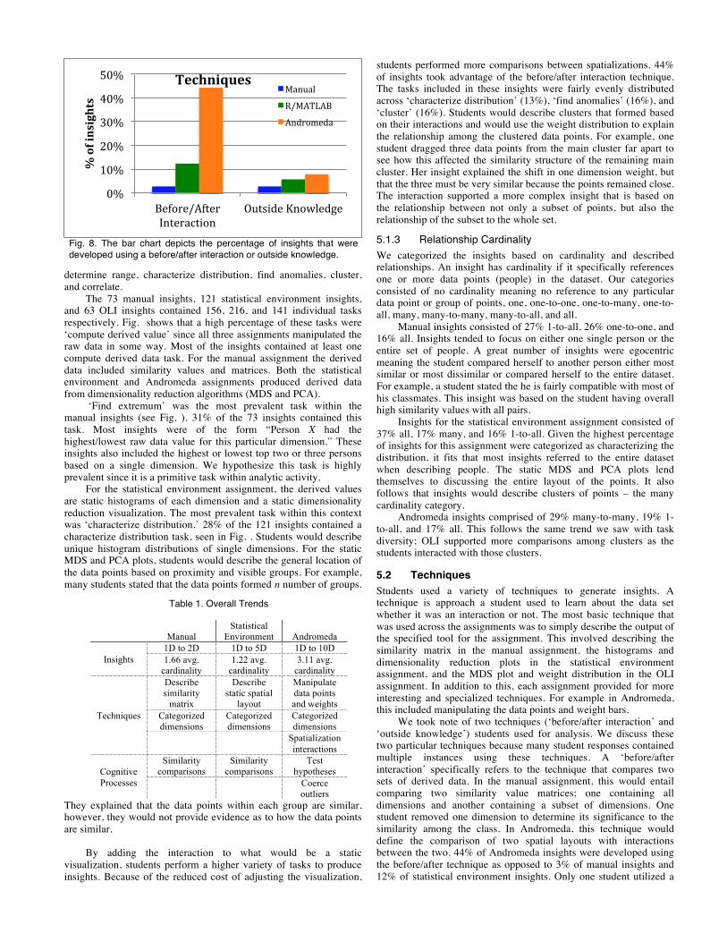
We took note of two techniques (‘before/after interaction’ and ‘outside knowledge’) students used for analysis. We discuss these two particular techniques because many student responses contained multiple instances using these techniques. A ‘before/after interaction’ specifically refers to the technique that compares two sets of derived data. In the manual assignment, this would entail comparing two similarity value matrices; one containing all dimensions and another containing a subset of dimensions. One student removed one dimension to determine its significance to the similarity among the class. In Andromeda, this technique would define the comparison of two spatial layouts with interactions between the two. 44% of Andromeda insights were developed using the before/after technique as opposed to 3% of manual insights and 12% of statistical environment insights. Only one student utilized a
Table 1. Overall Trends
Manual
Statistical Environment Andromeda
Insights 1D to 2D 1D to 5D 1D to 10D 1.66 avg.
cardinality 1.22 avg.
cardinality 3.11 avg.
cardinality
Techniques
Describe similarity
matrix
Describe static spatial
layout
Manipulate data points and weights
Categorized dimensions
Categorized dimensions
Categorized dimensions
Spatialization interactions
Cognitive Processes
Similarity comparisons
Similarity comparisons
Test hypotheses
Coerce outliers
Fig. 8. The bar chart depicts the percentage of insights that were developed using a before/after interaction or outside knowledge.
0%
10%
20%
30%
40%
50%
Before/After Interaction
Outside Knowledge
% of insights
Techniques Manual
R/MATLAB
Andromeda
before/after interaction for the manual assignment. Two of those insights explained what happened to the similarity values when one dimension was removed from the dataset. In the Andromeda assignments, the before/after technique often took advantage of compound tasks. Students would compare the distribution of data points for two spatializations with the second being calculated based on an interaction. They might also include information about clusters between the two spatializations.
Students often supported their insights with outside knowledge not included in the dataset. 3% of manual insights, 6% of statistical environment insights, and 8% of Andromeda insights included outside knowledge. Such knowledge might explain the difference between two clusters being international students and American students when nationality of each student was not included in the dataset. One student described a large split between two clusters to be based on non-student versus student roles in the dataset. Another student based the similarity of two students on them participating in the same research group in academia. By bringing in this outside knowledge, the students were connecting their analysis to the real world.
Often students grouped dimensions based on an overarching description. This occurred across all assignments, but predominantly in the OLI assignment. For example, most students grouped dimensions such as age, shoe size, miles from home and number of siblings because they considered them unchangeable attributes, whereas they grouped dimensions such as preferred outdoor temperature, love of computer science, and PC versus Mac since these dimensions are opinion based. With these types of dimension categorizations, student would claim overarching insights about the dataset. For example, multiple students combined all dimensions having to do with travel (number of US states visited, number of countries visited, and number of places lived) and concluded that most students in the class were well travelled.
Most of the techniques used throughout the three assignments were possible in each though with different interactional ease. Andromeda, since it is an interactive visual analytics application, supports ‘before/after interaction’ techniques. Manual and statistical environment approaches require more user-driven computation and statistical knowledge. Students tended to use techniques that matched the particular tool.
5.3 Cognitive Processes For the manual assignment, students were told to list useful
insights about the class and were given the example question, “who is like you.” Because of this most students started the analysis with an egocentric approach. This tended to be the focus of most insights. Even though students were given this lead in, some did break the egocentric approach to analyze other student relationships. Several students branched out to discuss who was most similar or dissimilar from everyone or from some third person. However, insights still solely focused on the similarity and dissimilarity of data points. Insights in the manual assignment rarely identified clusters of students with similarities and usually did not compound on themselves towards deeper insight.
In the statistical environment assignment, students continued to ask basic comparison questions and describe the histograms and dimensionally reduced plots they made. However, a few students began to increase the weights of a subset of dimensions in the weight vector for the PCA and MDS plots.
New cognitive processes made possible by Andromeda sparked novel types of insights. These processes provoked more exploratory analyses that focused on testing hypotheses rather than on simplistic visualization summarization. Many students would cluster data points of students they thought to be similar for validation. Students did not follow one line of inquiry, but pursued alternative viewpoints which helped to thwart the tunnelling of their thought processes. Coercing outliers into main clusters was a unique cognitive process for Andromeda. During their analysis, most students would force outliers into a bigger cluster to see what dimension weights it took
for the outliers to be similar to another set of data points. For example, a student moved four outlying data points closer to a cluster and discovered these four students were similar to the main cluster based on PC versus Mac, food spiciness and number of publications. This process is difficult to replicate with the manual or statistical environment tools. Students also performed the reverse interaction (equivalent to increasing weights in the weight vector) to see which groups of students were most similar along a subset of dimensions. Two students increased the weights of all dimensions having to do with technology (number of apps, number of phone minutes, PC versus Mac, number of social network friends, and love of computer science) to discover trends within the class. As stated above, students did perform this reverse interaction during the statistical environment assignment as well, but it was more prevalent in the Andromeda assignment.
6 DISCUSSION Through the comparison of insights from the OLI assignment with those from the other two assignments, we find that the interactions afforded by Andromeda allow for higher cognitive dimensionality and insights of higher quality.
6.1 Limitations Even though our study has limitations compared to a formal
controlled experiment, our observational study in the classroom indicates that high cognitive dimensionality can be improved with a combination of teaching and appropriate tools. The classroom environment was more appropriate than a formal experiment for this study.
The assignments were designed to explore potential changes in student work provided increasingly complex tools for visual analytics. They did not specifically ask for more complex conclusions compared to previous assignments particularly with regard to higher dimensionality. Although the order of assignments may have confounded out results in that students felt compelled to generate new, more complex insights in sequence or built insights upon knowledge gained in previous assignments, insights gained through object-level interactions would have been difficult to gain using the other two approaches. For example, Andromeda can calculate weights based on user interactions of data points. The equivalent process using manual or statistical environment approaches would require significant trial and error. Regardless, our results show that cognitive dimensionality is improved as the complexity of the tool increases. Whether the OLI tool without the preceding assignments would have had an equal effect on cognitive dimensionality is reserved for future work. Although a randomized assignment order could have alleviated these concerns, it was not pedagogically practical.
6.2 Benefits of OLI As we observed in class, high cognitive dimensionality was not natural for students without tool support. However, with better tools students can think more high-dimensionally. Students successively gained higher cognitive dimensionality as they progressed from manual computation to static visual encodings from statistical environments to interactive, OLI spatializations. We infer students’ cognitive dimensionality based on the quality of their insights.
With the manual approach, students tended to discuss the relationships between two individuals. In most cases, students adopted an egocentric perspective where they focused on the similarities and differences between themselves and a single other individual. Students seldom identified clusters of individuals that shared similar characteristics. Most students were concerned with the extremes in a single dimension such as oldest or most similar with respect to one dimension. When using OLI, students focused less on themselves and more on clusters of data points. If students did reference themselves, it tended to be within a cluster of people. OLI insights tended to focus on the way weights changed after an
interaction. OLI’s weight chart afforded identification of the weights contributing to the given layout. Students identified multiple dimensions in support of their insights.
In the statistical environment assignment, students progressed from reporting extremes to describing overall trends for specific dimensions, however still focusing on one dimension. OLI tended to characterize the entire distribution in reference to many dimensions. While describing static MDS plots generated by statistical environments, students identified members of clusters without offering suggestions as to why the data points might be clustered. In contrast, insights from the OLI assignment tended to offer explanations for which dimensions caused a given clustering.
Andromeda insights show a better understanding of the data. Andromeda insights about clusters have a deeper understanding about why those clusters formed. For example, students would inspect the weight distribution to make conclusions about which dimensions were important for this clustering. Several times students moved two to three points on top of each other and the resulting visualization placed the points farther apart. Students deduced that in the ways the selected points are similar, the data points are actually more similar to completely different points. Students had internalized that by moving a subset of points, Andromeda is actually arranging all the data points based on the similarity of the subset even if the subset is not similar. In one case, a student discovered two data points that were only similar in one dimension. The student claimed this insight based on the resulting spatialization showing all data points in a line with one high contributing dimension. These findings suggest that students’ mental models of the dimensionality reduction technique and the semantic interaction associated with OLI are fairly accurate.
6.3 Quality of Insights With each level of tool, the students successively can find more high dimensional insights. These high dimensional insights were of increasingly better quality in terms of complexity, depth, unexpectedness and relevance. In particular, insights gained complexity in terms of increased dimensionality that maintained levels of cardinality. Depth of insight is measured by the diversity of tasks that were undertaken to build the insight [24].
By complexity, we mean the amount of data synthesized in an insight. We use the number of observations reported in an insight (cardinality) and the number of variables (dimensionality) as a measure for this. Insights in the OLI assignment tended to be of higher dimensionality and cardinality than those from the other assignments adding to their complexity. Even though the task counts (Fig. ) follow the same trend across assignments, Andromeda insights were of better quality because of the types of tasks included. These insights made use of tasks such as cluster, find anomalies, and correlate more often creating more interesting insights. Most insights from the manual assignment were of the form “person X is most similar to person Y” which involves multiple tasks (compute derived value and find extremum), however, these insights would score poorly on most measures of insight complexity because of the lack of understanding about what makes these people similar. Involving more tasks within one insight adds depth, but it is dependent on the types of tasks. Andromeda supported finding unexpected insights. For example, one student clustered a few data points that were under the average for miles from home. The resulting visualization not only portrayed a high weight for miles from home, but also had a high weight for number of camping trips. The student stated this was a surprising find. Furthermore, some students explained the results they expected from an interaction in Andromeda such as coercing outliers into closer proximity to a main cluster. These example were indicative of insights gained by most students. By considering how actual results differed from expected results, students were able to generate unexpected insights. Many insights from the Andromeda assignment included outside knowledge suggesting that the student was connecting her analysis to the real world. This connection provided for more relevant insights that were more meaningful to the
student. All of these characteristics (complexity, depth, unexpectedness, and relevance) suggest that Andromeda insights were of higher quality.
6.4 Implications for Education in Data Analytics Assignments such as the three we implemented support education in data analysis. Teaching data analytics needs to happen earlier in education. Through the observation of the undergraduate class and the implementation of the first manual assignment in the graduate class, we found that both undergraduates and graduates have the same low dimensional cognition. Given OLI tools, we found that graduate students improved their dimensional cognition. Would the same trend occur with undergraduates?
In the graduate course, the assignments were implemented halfway through the semester. Theory about data analytics proved to not be enough since the students participated in lectures concerning high-dimensional analytics before performing the manual assignment and they still displayed low cognitive dimensionality.
OLI is a good match for educating students about data analytics of high-dimensional data. When added with a dataset they could connect with, it proved to be beneficial for supporting and increasing cognitive dimensionality.
6.5 Future Work The open question remains, after working with better tools,
would high cognitive dimensionality be retained? If students were asked to perform an analysis of data given manual tools after already learning about and performing analyses with OLI tools, would the dimensionality concepts be transferred? As we discussed in the introduction, a trained statistician performed high cognitive dimensionality when manually creating a dimensionally reduced plot of high-dimensional data. Further work is necessary to determine what, if any, techniques supported this ability. Is high cognitive dimensionality improved by extensive training either in theories of statistics or analysis? Or is familiarity with dimensionality reduction algorithms enough to allow a person to perform a quick analysis of dimensions based on his fundamental understanding of how algorithms work? Future research should delve into whether cognitive dimensionality can be improved by familiarity with interactive visualizations that implement dimensionality reductions.
7 CONCLUSION This paper introduced the concept of cognitive dimensionality relative to data dimensionality. We conjectured that when students think high dimensionally they have more complex insights from data than when they do not think high dimensionally. To support this, we presented a classroom study using a series of assignments to assess current students’ cognitive dimensionality. The contributions of our study are as follows: • Students by default demonstrated low cognitive dimensionality
in the baseline assignment. • When provided better tools, students did learn to think with higher dimensionality.
• Students found more complex and higher dimensional insights with these tools.
• The Andromeda tool that supports object-level interaction (OLI) helped students find novel high-dimensional insights. These contributions will lead future studies in furthering the
research into human cognitive dimensionality and into education in data analytics. An interesting open question concerns students’ retention of high cognitive dimensionality, and whether they can re-apply the learned skills when interactive tools are not present.
ACKNOWLEDGMENTS Removed for blind review.
REFERENCES [1] J. J. Thomas and K. A. Cook, Illuminating the path: The research and
development agenda for visual analytics. IEEE Computer Society Press, 2005.
[2] J. B. Kruskal and M. Wish, “Multidimensional Scaling,” Sage Univ. Pap. Ser. Quant. Appl. Soc. Sci., vol. 48, pp. 7–11, 1978.
[3] P. Saraiya, C. North, and K. Duca, “An insight-based methodology for evaluating bioinformatics visualizations.,” IEEE Trans. Vis. Comput. Graph., vol. 11, no. 4, pp. 443–56, 2005.
[4] C. North, “Toward measuring visualization insight,” Comput. Graph. Appl. IEEE, no. June, pp. 6–9, 2006.
[5] C. Plaisant, J.-D. Fekete, and G. Grinstein, “Promoting insight-based evaluation of visualizations: from contest to benchmark repository.,” IEEE Trans. Vis. Comput. Graph., vol. 14, no. 1, pp. 120–34, 2008.
[6] R. Chang and C. Ziemkiewicz, “Defining insight for visual analytics,” IEEE Comput. Graph. Appl., pp. 14–17, 2009.
[7] R. Amar, J. Eagan, and J. Stasko, “Low-level components of analytic activity in information visualization,” IEEE Symp. Inf. Vis. 2005. INFOVIS 2005., pp. 111–117, 2005.
[8] J. Yi, Y. Kang, J. Stasko, and J. Jacko, “Understanding and characterizing insights: how do people gain insights using information visualization?,” in Workshop on BEyond time and errors: novel evaLuation methods for Information Visualization (BELIV), 2008, pp. 1–6.
[9] Z. Liu and J. T. Stasko, “Mental models, visual reasoning and interaction in information visualization: a top-down perspective.,” IEEE Trans. Vis. Comput. Graph., vol. 16, no. 6, pp. 999–1008, 2010.
[10] C. Ziemkiewicz and R. Kosara, “The shaping of information by visual metaphors.,” IEEE Trans. Vis. Comput. Graph., vol. 14, no. 6, pp. 1269–76, Jan. 2008.
[11] T. Green, W. Ribarsky, and B. Fisher, “Building and applying a human cognition model for visual analytics,” Inf. Vis., 2009.
[12] E. Brown, J. Liu, C. Brodley, and R. Chang, “Dis-Function: Learning Distance Functions Interactively,” IEEE Conf. Vis. Anal. Sci. Technol., pp. 83–92, 2012.
[13] E. Wegman, “Hyperdimensional Data Analysis Using Parallel Coordinates,” J. Am. Stat. Assoc., vol. 85, no. 411, pp. 664–675, 1990.
[14] D. H. Jeong, C. Ziemkiewicz, B. Fisher, W. Ribarsky, and R. Chang, “iPCA: An Interactive System for PCA-based Visual Analytics,” Comput. Graph. Forum, vol. 28, pp. 767–774, 2009.
[15] X. Hu, L. Bradel, and D. Maiti, “Semantics of Directly Manipulating Spatializations,” IEEE Trans. Vis. Comput. Graph., 2013.
[16] M. Whiting, C. North, and A. Endert, “VAST contest dataset use in education,” in IEEE Symposium on Visual Analytics Science and Technology (VAST), 2009, pp. 115–122.
[17] C. Rohrdantz, F. Mansmann, C. North, and D. A. Keim, “Augmenting the educational curriculum with the Visual Analytics Science and Technology Challenge: Opportunities and pitfalls,” Inf. Vis., p. 1473871613481693, 2013.
[18] J. Al-Aziz, N. Christou, and I. D. Dinov, “SOCR Motion Charts: An Efficient, Open-Source, Interactive and Dynamic Applet for Visualizing Longitudinal Multivariate Data.,” J. Stat. Educ., vol. 18, no. 3, pp. 1–29, Jan. 2010.
[19] P. Valero-Mora and R. Ledesma, “Using interactive graphics to teach multivariate data analysis to psychology students,” J. Stat. Educ., vol. 19, no. 1, 2011.
[20] A. Endert, M. S. Hossain, N. Ramakrishnan, C. North, P. Fiaux, and C. Andrews, “The human is the loop: new directions for visual analytics,” J. Intell. Inf. Syst., Jan. 2014.
[21] S. C. Leman, L. House, D. Maiti, A. Endert, and C. North, “Visual to Parametric Interaction (V2PI).,” PLoS One, vol. 8, no. 3, p. e50474, Jan. 2013.
[22] A. Endert, C. Han, D. Maiti, L. House, S. Leman, and C. North, “Observation-level interaction with statistical models for visual analytics,” in 2011 IEEE Conference on Visual Analytics Science and Technology (VAST), 2011, pp. 121–130.
[23] I. S. MacKenzie, “Fitts’ law as a research and design tool in human-computer interaction,” Human-computer Interact., vol. 7, no. 1, pp. 91–139, 1992.
[24] C. North, “Toward measuring visualization insight,” Comput. Graph. Appl. IEEE, no. June, pp. 6–9, 2006.