Embed Size (px)
Citation preview


In A2 for our advanced portfolio we were asked to create three products; A trailer and two ancillary products which were a poster and magazine cover.
Our products we created were based around a psychological thriller named ‘Playhouse’ starring a girl named Cameron who is kidnapped. The identity of the kidnapper is yet
never revealed to the audiences.
Due to wanting to convey a professional image around our products we decided that the conventions of the products and conventions of the genre should be widely included not only to help the audience recognise the genre and reach our target audience
efficiently, however also to align our products and pursue the kind of professionalism which aligns with products from the likes of other independent film companies and
conglomerates in the film industry.
Inside of our research and planning we conducted a lot of research into real media products and the conventions not only to be able to incorporate these into our
products but to also gather some inspiration in order to make our own product unique whilst sticking to the genre we had chosen and following the layout and conventions of
the products themselves.
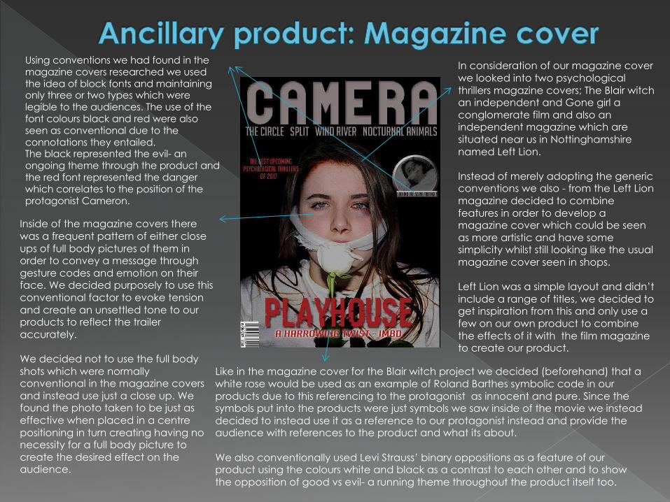
In consideration of our magazine cover we looked into two psychological thrillers magazine covers; The Blair witch an independent and Gone girl a conglomerate film and also an independent magazine which are situated near us in Nottinghamshire named Left Lion.
Instead of merely adopting the generic conventions we also - from the Left Lion magazine decided to combine features in order to develop a magazine cover which could be seen as more artistic and have some simplicity whilst still looking like the usual magazine cover seen in shops.
Left Lion was a simple layout and didn’t include a range of titles, we decided to get inspiration from this and only use a few on our own product to combine the effects of it with the film magazine to create our product.
Using conventions we had found in the magazine covers researched we used the idea of block fonts and maintaining only three or two types which were legible to the audiences. The use of the font colours black and red were also seen as conventional due to the connotations they entailed.The black represented the evil- an ongoing theme through the product and the red font represented the danger which correlates to the position of the protagonist Cameron.
Inside of the magazine covers there was a frequent pattern of either close ups of full body pictures of them in order to convey a message through gesture codes and emotion on their face. We decided purposely to use this conventional factor to evoke tension and create an unsettled tone to our products to reflect the trailer accurately.
We decided not to use the full body shots which were normally conventional in the magazine covers and instead use just a close up. We found the photo taken to be just as effective when placed in a centre positioning in turn creating having no necessity for a full body picture to create the desired effect on the audience.
Like in the magazine cover for the Blair witch project we decided (beforehand) that a white rose would be used as an example of Roland Barthes symbolic code in our products due to this referencing to the protagonist as innocent and pure. Since the symbols put into the products were just symbols we saw inside of the movie we instead decided to instead use it as a reference to our protagonist instead and provide the audience with references to the product and what its about.
We also conventionally used Levi Strauss’ binary oppositions as a feature of our product using the colours white and black as a contrast to each other and to show the opposition of good vs evil- a running theme throughout the product itself too.

When researching into our poster we looked into a range of example’s, this included films like; Shutter island, Secret window, the box, seven and more.
For our image we decided not to use the conventional close up of the protagonist or a shot of the protagonist herself but instead a close up of the rose on the floor in a low shot and with a glimpse of the kidnappers legs on the other side of the bed.
Similarly to the posters we looked into the close up on the protagonists face signified emotion and set the tone for the product with their gesture code. With using this angle instead and countering this convention the same effect has still been achieved. The reader is made feel tens due to the ambiguity of the shadow facing them but also it helps convey vulnerability and danger as if the audience is looking through the eyes of our protagonist Cameron.
For the fonts we used we used Noodle titling and a general font off Photoshop itself using the conventional 2 or three font styles in order to align our product with professional industries but also due to the fact that if we had more font types and more text it would withdraw the readers attention from the rose itself; a signifier of Cameron through its connotations of innocence and purity.
Conventionally, the names of the producers, cast and directors were usually placed on the product but were positioned in the centre on the bottom of the page not the left hand side.
However we decided it would be more suitable for our product to position the names of the directors/cast on the left side of the page purely because when placed underneath it created a distraction from the image itself, shifting the focus from the rose.
Conventionally a lot of the movie posters which we looked into had low key lighting or a shadowy image placed inside of the of the protagonist. We used low-key lighting when the camera focussed on different parts of the kidnapper.
We made sure the kidnapper stayed anonymous in order to evoke a mysterious sense to the poster. This also goes alongside Roland bathes Hermeneutic code ( creating mystery) as it entails that the audience should watch the movie to find out.
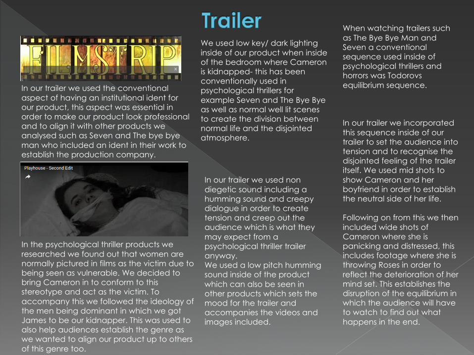
In our trailer we used the conventional aspect of having an institutional ident for our product, this aspect was essential in order to make our product look professional and to align it with other products we analysed such as Seven and The bye bye man who included an ident in their work to establish the production company.
In the psychological thriller products we researched we found out that women are normally pictured in films as the victim due to being seen as vulnerable. We decided to bring Cameron in to conform to this stereotype and act as the victim. To accompany this we followed the ideology of the men being dominant in which we got James to be our kidnapper. This was used to also help audiences establish the genre as we wanted to align our product up to others of this genre too.
We used low key/ dark lighting inside of our product when inside of the bedroom where Cameron is kidnapped- this has been conventionally used in psychological thrillers for example Seven and The Bye Byeas well as normal well lit scenes to create the division between normal life and the disjointed atmosphere.
In our trailer we used non diegetic sound including a humming sound and creepy dialogue in order to create tension and creep out the audience which is what they may expect from a psychological thriller trailer anyway.We used a low pitch humming sound inside of the product which can also be seen in other products which sets the mood for the trailer and accompanies the videos and images included.
When watching trailers such as The Bye Bye Man and Seven a conventional sequence used inside of psychological thrillers and horrors was Todorovsequilibrium sequence.
In our trailer we incorporated this sequence inside of our trailer to set the audience into tension and to recognise the disjointed feeling of the trailer itself. We used mid shots to show Cameron and her boyfriend in order to establish the neutral side of her life.
Following on from this we then included wide shots of Cameron where she is panicking and distressed, this includes footage where she is throwing Roses in order to reflect the deterioration of her mind set. This establishes the disruption of the equilibrium in which the audience will have to watch to find out what happens in the end.

in conclusion we used various conventions inside of both our ancillary products which aligned to real media products in order to make our work look professional and resemble the standard of actual film magazines and posters.We have converted the conventions for aspects like the magazine in order to make it look different and unique- give it our own style as an institution.Overall the conventions have helped us to make our product look professional good quality which was our aim for A2.