Embed Size (px)
Citation preview
Ana Andrade 1
Incorporating Usability Testing and Heuristic Evaluation to Improve Mobile User Experience
Ana I. Andrade Juarez
Arizona State University
GIT 480 Senior Project
Prototype: San Diego Bike Coalition
Ana Andrade 2
Abstract
This paper explores the efficacy of combining usability testing and heuristic evaluation to
determine issues affecting design, resulting in optimal mobile design and user experience. The
site to be re-designed is for San Diego Bike Coalition. Users were tested using the current site
design, being asked to perform several tasks and give any additional feedback to improve site
design. Along with user feedback, heuristic evaluation was created to rank issues by severity to
allow for efficient design corrections. A resulting prototype using Proto.io was created,
showcasing modern mobile design methods that address user issues during test sessions. Users
were asked to review prototype by completing usability testing scenarios once more and give
additional usability feedback - either negative or positive - of the new site design. The results
allowed for clear support of mobile design methods and the ability to make mobile site
experiences easier on the user. Success of new site design was determined by user feedback and
testing.
Keywords: mobile design, usability testing, wireframe, prototype, user experience, UX,
Proto.io, heuristic evaluation
Ana Andrade 3
Introduction
When most people think about browsing the internet or social media, the majority will
probably reach for their smartphone or tablet to do so. It is not surprising to be in a crowded
room and see most people around on their smartphones. Smartphone ownership has increased
rapidly in the last seven years, resulting in 77% of Americans owning a device that connects
them to the internet ("Demographics of Mobile Device Ownership and Adoption in the United
States", 2018). Since 2012 we have seen mobile digital media usage double, now averaging to
about 3.3 hours a day per person (Abramovich, 2018). With these ever-increasing statistics in
mobile internet use and smartphone ownership, it’s imperative that we focus on proper design
methods that accommodate mobile users and smaller screens.
When designing for a mobile device like a tablet or smartphone, the approach to design
will be different than a desktop device as the screen real estate is substantially smaller. The
challenge to include the most relevant and coherent pieces of information in a much smaller
screen is a frequent dilemma with site designers, as users can turn to another site for information
or services if the initial site does not stack up to their expectations. Easy access to information is
key for most users, with 91% reporting “that access to content is very important” and 57% of
users will not “recommend a business with a poorly designed mobile site” (Morales, 2017).
The success of a site should not be measured by the amount of traffic that lands on the
homepage, rather the experience that users have while using the site. By creating a site that
focuses on mobile ease-of-use, users will be able to come away with a pleasant experience that
results in more visits by more users. This project will focus on benefits of combining usability
testing and heuristic evaluation to create the best experience for users on a mobile device.
Ana Andrade 4
User Experience Background and History
User experience can be, and should be, applied to anything, from a product to a service to
a piece of technology. The ability to give users ease-of-use is what can determine success or
failure. One of the earliest examples of successful usability and user experience is the creation of
the Kodak camera in 1888. George Eastman, the creator of the Kodak camera, was aware of the
unwieldy and inaccessible camera equipment of his time and was on a mission to find a way to
make this experience available to the public in a much simpler format. Photography no longer
was left to the professionals and memories could now be captured by everyone and shared
around the world, without wet lenses and dark rooms. Eastman’s marketing line was, “You push
the button, we do the rest” (Rosenzwieg, 2015). His development and dedication to make a
product for everyone to use is a stellar example of user experience and usability, creating a
functional product that had the user’s best interest in mind. Although the term “user experience”
did not exist, Eastman was very much a designer following the practice.
Early versions of usability methods can be found through the practice of ergonomics in
industrial design. Ergonomics is “the scientific discipline concerned with the understanding of
interactions among humans and other elements of a system, and the profession that applies
theory, principles, data and methods to design in order to optimize human well-being and overall
system performance”, according to the International Ergonomics Association (“Definition and
Domains of Ergonomics”, 2018). The term was used in industrial design, a concept created by
the influential and notable design school, the Bauhaus, in the 1919. Elizabeth Rosenzwieg,
author of “Successful User Experience” credits the Bauhaus’ industrial design approach as being
“the first step in building the foundations that have evolved into UX” (2015).
Ana Andrade 5
Human interaction with machines and technology became a focus in design in the
decades to come, with Don Norman introducing the term “user experience” in 1995 to describe
“all aspects of the person’s experience with the system including industrial design, graphics, the
interface, the physical interaction and the manual”. Don Norman has been an integral part of the
design community that has paved the way for creating beautiful design with the user’s needs in
mind. He is currently Director of the Design Lab at the University of California, San Diego and
has authored many books, including the best-selling book, The Design of Everyday Things
(Lyonnais, 2017).
Creating A Successful User Experience
Usability Testing
Creating a design for a website will involve several designers and developers with
varying degrees of input and responsibility. To determine the success of a feature, usability
testing is conducted with potential or current users, so designers and developers can determine
what changes may need to be made to any part of a web page. Usability testing is conducted by
giving specially curated tasks to potential or current users and their interaction with the site is
observed. Any hesitations, comments, or frustrations are noted while easily achieved tasks will
be noted to confirm proper design of the feature or page. Steve Krug, author of “Don’t Make Me
Think” (2014), emphasizes the importance of simple design – a design that will make navigation
effortless to the user (pg.11). Usability testing is effective in achieving effortless usability by
considering the success or failure of a task given to the user. Results of a usability test can reveal
issues that design teams may not have thought of that could significantly impact user experience.
Ana Andrade 6
Heuristic Evaluation
Heuristic evaluation is a complementary step to achieving optimal user experience. The
difference between heuristic evaluation and usability test is an expert will typically evaluate the
product, either a member of the team or a hired professional. With heuristic evaluation, designers
can establish a list of necessary changes for the site design in order of severity. Heuristic
evaluation is useful when designers have time or financial constraints that affect the way they
approach usability. To keep the focus on user needs, heuristic evaluation can be combined with
usability testing to provide necessary identification of problems and prioritizing them to
implement proper fixes. The 10 usability heuristics for user interface, created by Jakob Nielsen,
are broad guidelines to conducting heuristic evaluation (Nielsen, 1995). By following the 10
heuristics listed, a design team can create a report that will evaluate different areas of a site, rate
their issues by severity, and provide suggestions to improve issues affecting user experience.
Importance of Mobile-First Design
As new smartphones are released to the marketplace every year, focus on mobile design
becomes crucial. Users are turning to their mobile devices to text, call, connect via social
network, and consume information. Google’s recent research confirms the need for mobile-
friendly design by stating that “ANY business…needs to have a mobile-friendly website if they
want to gain a competitive edge now and maintain it later” (McLeod, 2018). The focus of
mobile-friendly design is to make sure information is clear, concise and visually pleasing while
addressing any potential user issues that would otherwise not be relevant on a desktop monitor.
The average screen resolution on a mobile device worldwide is 750 x 1280, and although sizes
tend to creep up every year, effective mobile design should accommodate even the smallest
screens (Clancy, 2018).
Ana Andrade 7
The Research Process
San Diego Bike Coalition
Usability testing and heuristic evaluation can be applied to new sites or ones that have
been established for some time. San Diego Bike Coalition is an existing site for a cycling
advocacy group in San Diego, CA that benefits from usability testing and heuristic evaluation to
further improve their site. Usability testing was done on five individual users with an array of
scenarios and tasks, while heuristic evaluation was created to determine the urgency of each
usability issue.
The new site design considers usability issues that were a result of both the usability tests
and heuristic evaluation of the site. The resulting design should allow users to navigate the site
with ease while providing a pleasant visual experience.
Target Audience
Prior to conducting any usability testing and heuristic evaluation, research was needed to
discover the target audience so design considerations will be done with the data in mind. To
determine the regular user of San Diego Bike Coalition’s site, a pre-test questionnaire of six
questions was presented to ten users to get to know and understand the target audience.
Questions included the type of transportation that they used on a daily basis, the frequency of
bike use, the employment, hobbies, technology use, and bicycle lane safety. Of the ten users,
60% preferred cycling as a mode of transportation, 60% chose outdoor activities as their
preferred hobby, 90% used their smartphone as their main internet device, and 80% felt that San
Diego needs to allocate more funds to help resolve the lack of bike lane infrastructure throughout
the city.
Ana Andrade 8
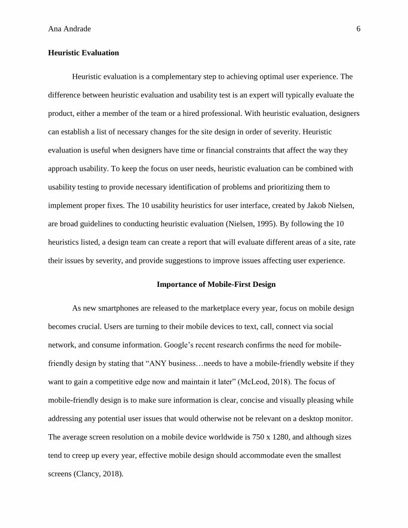
The resulting
persona was created after
data from all questionnaire
submissions were collected.
Steve is a working
professional in the
technology industry with a
higher education and has a
passion for cycling. He is
married, with children, and devotes a lot of his free time to his family. He is involved in the
cycling community in San Diego, joining local bike clubs and advocating for bike safety. Steve
can get frustrated when mobile sites have too much information that can hinder his experience
and will choose to leave the site if he does not find what he is looking for quickly. Steve’s
purpose for using San Diego Bike Coalition’s site will be to look up classes, community events,
and information on how to support bike safety and advocacy.
The creation of a persona will keep the site purpose on track and ascertain the site’s
primary goals. The persona will aid in gathering users for usability testing to address common
usability issues.
Usability Testing
The next step in the research process is to come up with a set of scenarios and tasks to
complete for the users during the usability testing portion. Five users participated in the usability
portion and each user conducted the usability test individually, with no one else in the room
except for the moderator/observer so that responses and feedback were not influenced. The users
Figure 1. Steve persona
Ana Andrade 9
were initially asked to look over the home page, without clicking on any links, and give feedback
on their first impressions of the site. Next, the users were given a set of scenarios and tasks to
complete.
The following scenarios and tasks were given the test subjects:
• Scenario One: You are a fan of San Diego Bike Coalition and wish to donate to their
cause.
o Task one: Locate page that will allow you to make a donation.
o Task: Find 501c non-profit statement to ensure your donation is tax-deductible.
• Scenario Two: You are interested in taking smart cycling classes in November.
o Task One: Locate smart cycling classes in November
• Scenario Three: While commuting home from work, you notice a pothole in the bike lane
and wish to report this road hazard using San Diego Bike Coalition’s resources.
o Task One: Locate the Road Hazard page
o Task Two: Locate the information for reporting a road hazard for the city of San
Diego
• Scenario Four: You’re curious about cycling events in San Diego, either classes or
community gatherings.
o Task One: Locate the most recent upcoming event
The user’s body language and comments were noted while conducting the usability test.
Each one was timed to gauge the average time it took to complete each task, aiding in evaluating
the success or failure of a task. Once all tasks were completed, each user was asked if they had
Ana Andrade 10
any further comments on the experience of the site. Feedback varied with each user, but some
took the opportunity to express frustrations with task completion.
User results were compiled and compared with each other to find any obvious pain points
within the site. Although results varied slightly between users, a list of usability issues was
created with the data. The most common usability issue that was expressed by the users was the
use of two mobile menu icons in the header. This led to confusion and delay when trying to
navigate to other pages. Other known issues that were identified during the testing process were
hidden text for 501c non-profit statement, where the text was the same color as the background,
the list of available safety classes was too crowded and made it hard to sort through, and
hyperlinks to road hazard reporting site were not clearly identified and were confused for section
headings.
Additional feedback once the task portion of the usability test was concluded was the
concern over the header space on the mobile site. The logo and top header seemed to take up
most of the top half of the phone screens which forced the user to automatically scroll down the
page to navigate with ease. Users also commented on the amount of information on the home
page. Feedback included feeling overwhelmed scrolling through the page and felt that having so
much information affected the speed at which they accomplished tasks. By allowing an excessive
amount of information released on the home page, it can leave users feeling put-off by the
experience. This design approach is contrary to the suggestion that user experience should be
simple and should not crowd the screen as it can lead to a negative user experience.
Ana Andrade 11
Heuristic Evaluation
Besides collecting data from current and potential users of the site to discover usability
issues, expert reviews can be conducted to create ratings and recommendations for known issues,
one example being heuristic evaluation (Rosenzweig, 2015, pg. 118).
This heuristic evaluation will be based on Jakob Nielson’s following 10 principles:
1. Visibility of system status (Feedback)
2. Match between system and the real world (Metaphor)
3. User control and freedom (Navigation)
4. Consistency and standards
5. Error prevention
6. Recognition rather than recall (Memory)
7. Flexibility and efficiency of use
8. Aesthetic and minimalist design
9. Help users recognize, diagnose, and recover from errors (Recovery)
10. Help and documentation
Each Principle will be used to evaluate parts of the site which will them be assigned a severity
rating based on the following scale:
0 = I don’t agree that this is a usability problem at all
1 = Cosmetic problem only: need not be fixed unless extra time is available on project
2 = Minor usability problem: fixing this should be given low priority
3 = Major usability problem: important to fix, so should be given high priority
4 = Usability catastrophe: imperative to fix this before product can be released
Ana Andrade 12
Following Jakob Nielsen’s 10 usability heuristics, here are the resulting ratings and
recommendations for San Diego Bike Coalition:
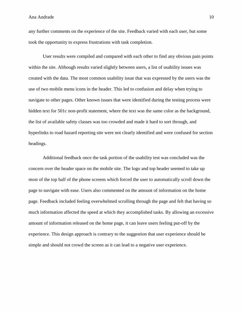
FEEDBACK
The system should always keep users informed about what is going on, through appropriate
feedback within reasonable time.
Rating: 0
The site does a good job in communicating with user when there is an issue, or when a form was
submitted.
Figure 2. Screenshot of error message
Suggestions:
No suggestions
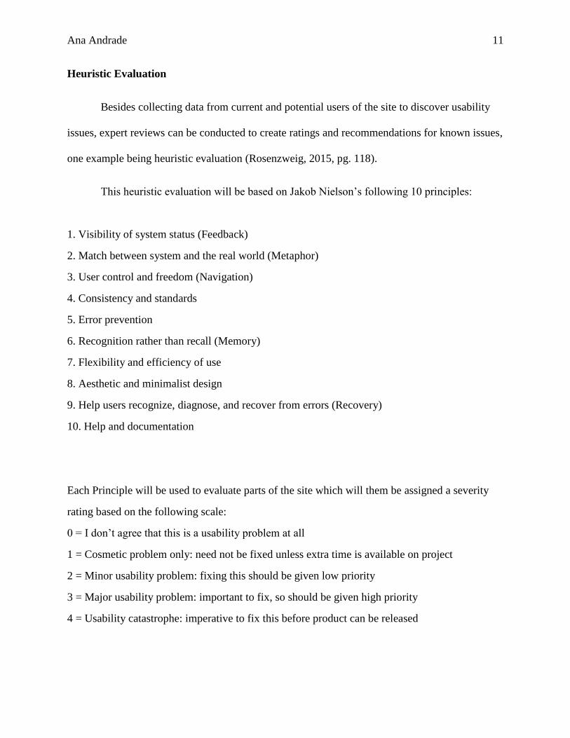
METAPHOR
The system should speak the user’s language, with words, phrases, and concepts familiar to the
user, rather than system-oriented terms. Follow real-world conventions, making information
appear in a natural and logical order.
Rating: 0
The site provides ways of sharing and connecting with the organization through social media and
electronic mail by using simple and common icons.
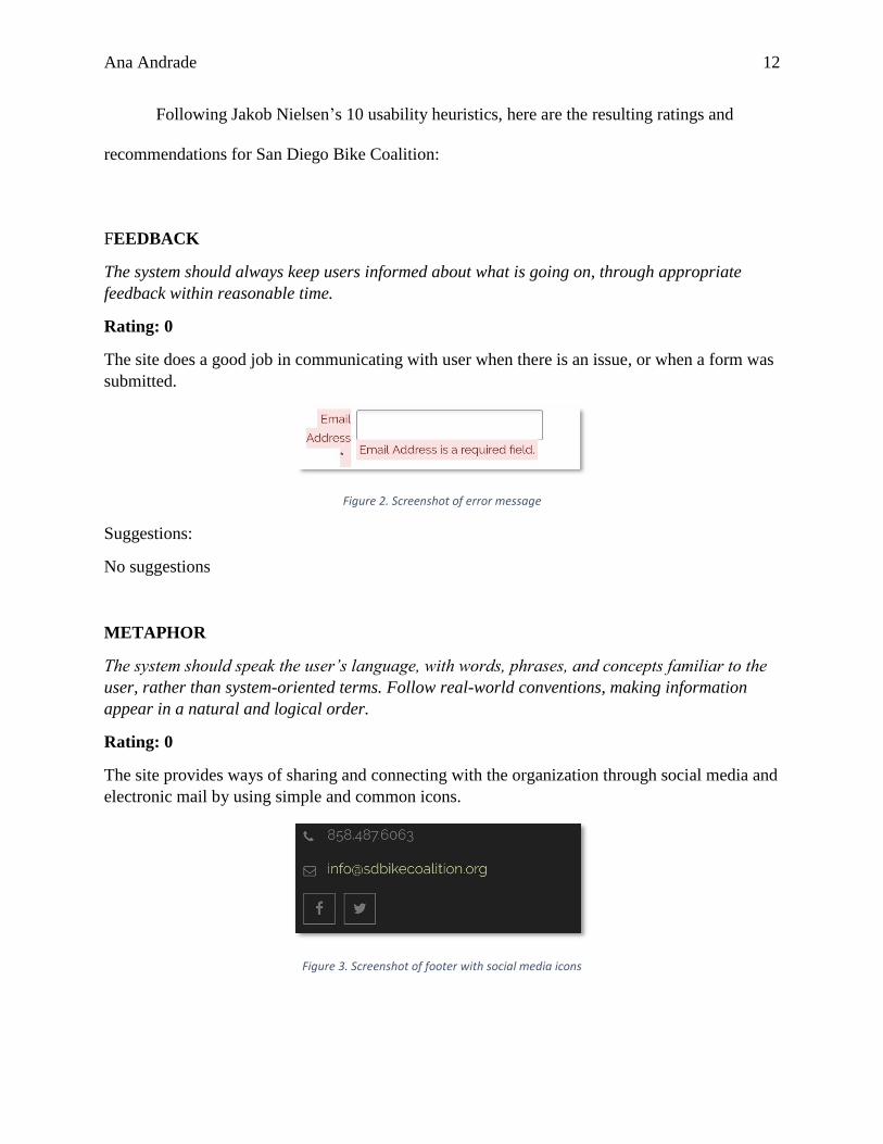
Figure 3. Screenshot of footer with social media icons
Ana Andrade 13
Figure 4. Screenshot of header social media icons
Suggestions:
No suggestions
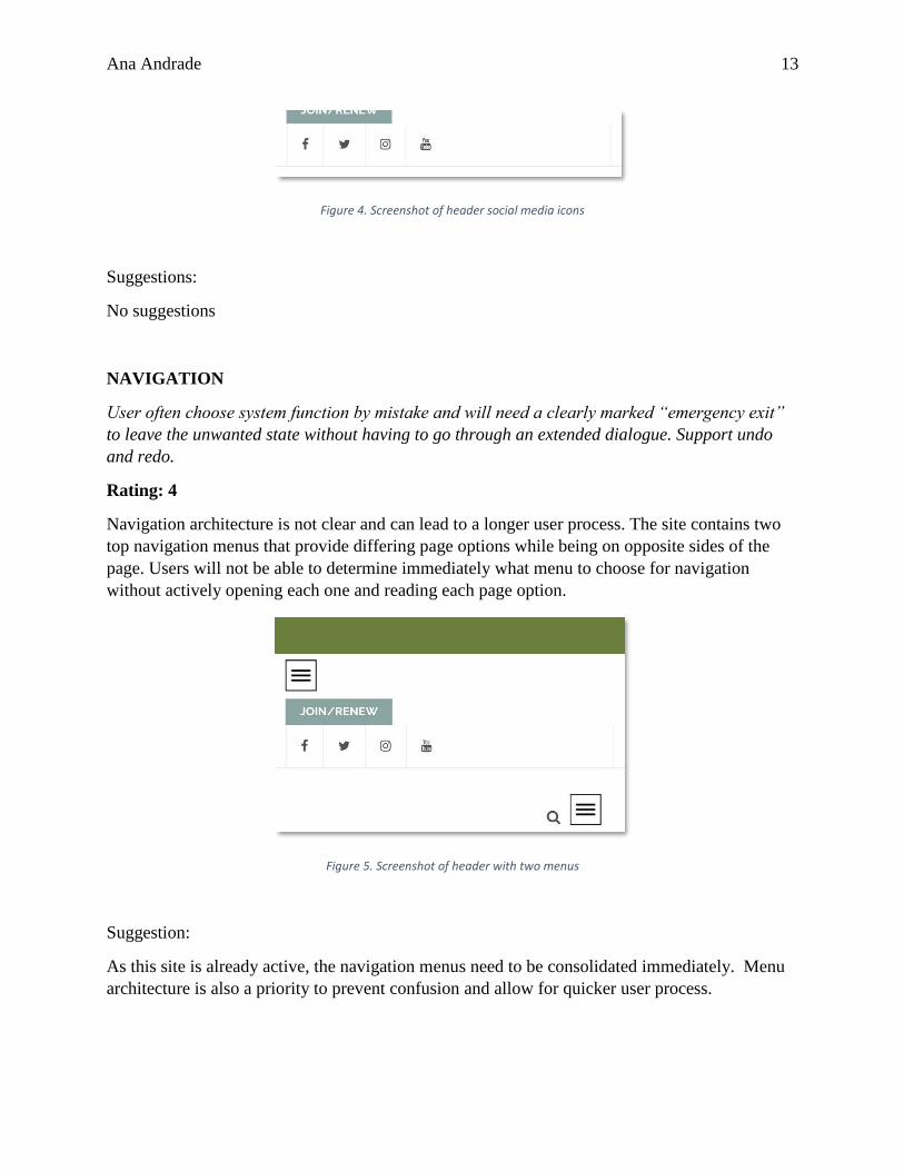
NAVIGATION
User often choose system function by mistake and will need a clearly marked “emergency exit”
to leave the unwanted state without having to go through an extended dialogue. Support undo
and redo.
Rating: 4
Navigation architecture is not clear and can lead to a longer user process. The site contains two
top navigation menus that provide differing page options while being on opposite sides of the
page. Users will not be able to determine immediately what menu to choose for navigation
without actively opening each one and reading each page option.
Figure 5. Screenshot of header with two menus
Suggestion:
As this site is already active, the navigation menus need to be consolidated immediately. Menu
architecture is also a priority to prevent confusion and allow for quicker user process.
Ana Andrade 14
CONSISTENCY AND STANDARDS
Users should not have to wonder whether different words, situations, or actions mean the same
thing. Follow platform conventions.
Rating: 0
The site provides proper wording of terms and descriptions that follow platform conventions.
Suggestions:
No suggestions
PREVENTION
Event better than good error messages is a careful design which prevents a problem from
occurring in the first place. Either eliminate error-prone conditions or check for them and
present users with a confirmation option before they commit to the action.
Rating: 0
The site provides sufficient feedback to users when a submission error has occurred. The user
will have the opportunity to fix any issues after they attempt an incorrect submission.
Suggestions:
No suggestions
MEMORY
Minimize the user’s memory load by making object, actions, and options visible. The user should
not have to remember information from one part of the dialogue to another. Instructions for use
of the system should but visible or easily retrievable whenever appropriate.
Rating: 0
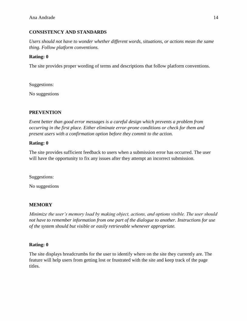
The site displays breadcrumbs for the user to identify where on the site they currently are. The
feature will help users from getting lost or frustrated with the site and keep track of the page
titles.
Ana Andrade 15
Figure 6. Screenshot of site breadcrumbs
Suggestions:
No suggestions
EFFICIENCY
Accelerators-unseen by the novice user- may often speed up the interaction for the expert user
such that the system can cater to both inexperienced and experienced user. Allow users to tailor
frequent actions.
Rating: N/A
Suggestions:
Not applicable
DESIGN
Dialogues should not contain information which is irrelevant or rarely needed. Every extra unit
of information in a dialogue competes with the relevant units of information and diminishes their
relative visibility.
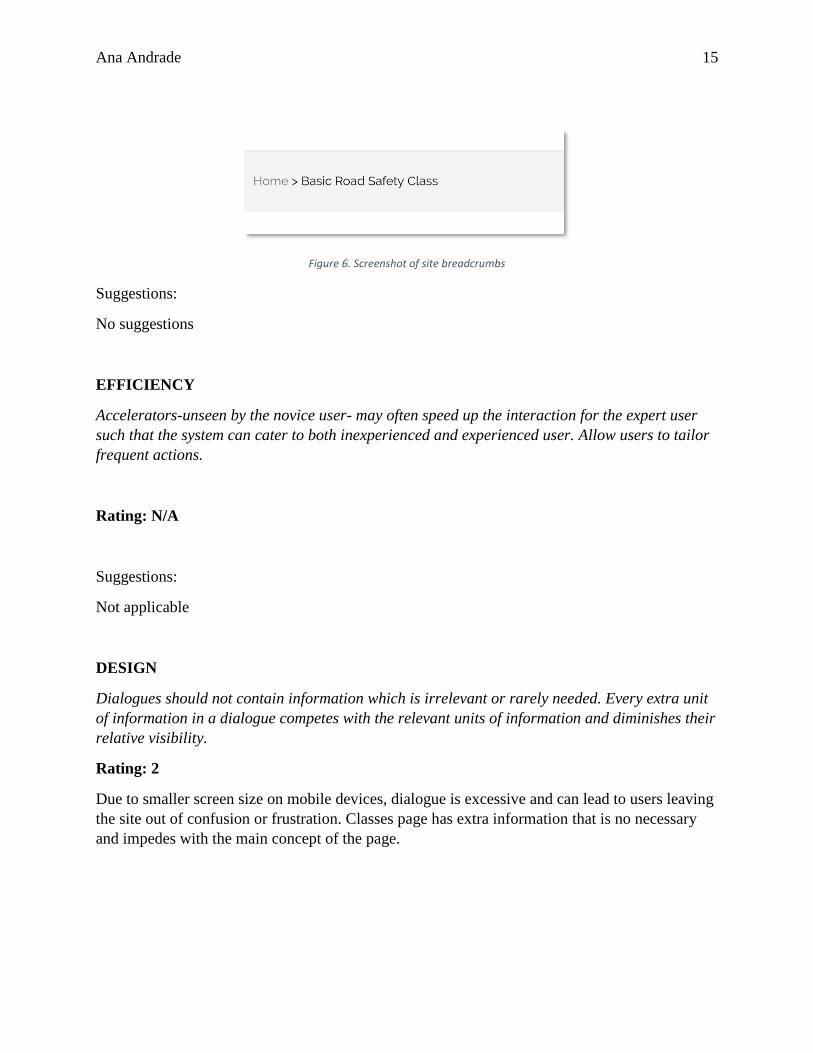
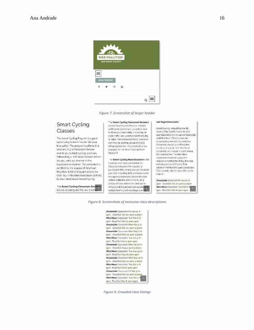
Rating: 2
Due to smaller screen size on mobile devices, dialogue is excessive and can lead to users leaving
the site out of confusion or frustration. Classes page has extra information that is no necessary
and impedes with the main concept of the page.
Ana Andrade 16
Figure 7. Screenshot of larger header
Figure 8. Screenshots of excessive class descriptions
Figure 9. Crowded class listings
Ana Andrade 17
Suggestions:
Limit the amount of information considering the smaller screen size for mobile devices. Reduce
the units of information on home page and class page to clearly display concept of pages to
users. Class page should have class listings clearly labeled and class descriptions minimized,
either by using an expandable paragraph or hyperlinks to other pages.
RECOVERY
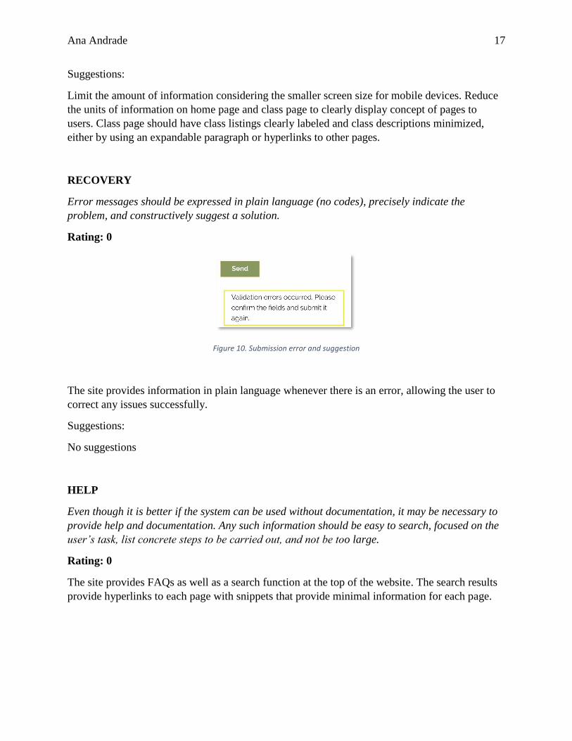
Error messages should be expressed in plain language (no codes), precisely indicate the
problem, and constructively suggest a solution.
Rating: 0
Figure 10. Submission error and suggestion
The site provides information in plain language whenever there is an error, allowing the user to
correct any issues successfully.
Suggestions:
No suggestions
HELP
Even though it is better if the system can be used without documentation, it may be necessary to
provide help and documentation. Any such information should be easy to search, focused on the
user’s task, list concrete steps to be carried out, and not be too large.
Rating: 0
The site provides FAQs as well as a search function at the top of the website. The search results
provide hyperlinks to each page with snippets that provide minimal information for each page.
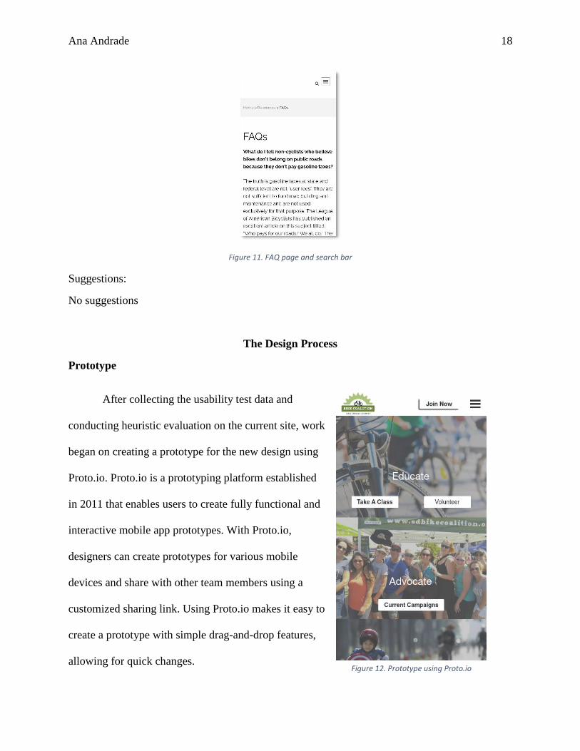
Ana Andrade 18
Figure 11. FAQ page and search bar
Suggestions:
No suggestions
The Design Process
Prototype
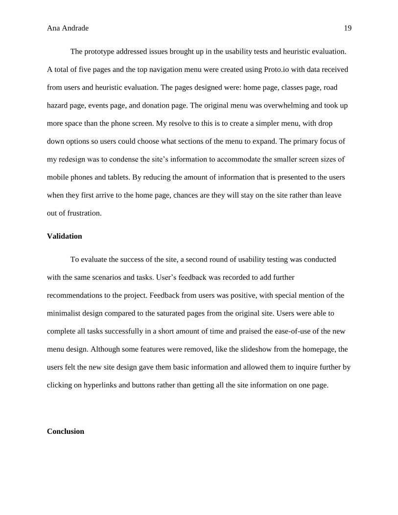
After collecting the usability test data and
conducting heuristic evaluation on the current site, work
began on creating a prototype for the new design using
Proto.io. Proto.io is a prototyping platform established
in 2011 that enables users to create fully functional and
interactive mobile app prototypes. With Proto.io,
designers can create prototypes for various mobile
devices and share with other team members using a
customized sharing link. Using Proto.io makes it easy to
create a prototype with simple drag-and-drop features,
allowing for quick changes. Figure 12. Prototype using Proto.io
Ana Andrade 19
The prototype addressed issues brought up in the usability tests and heuristic evaluation.
A total of five pages and the top navigation menu were created using Proto.io with data received
from users and heuristic evaluation. The pages designed were: home page, classes page, road
hazard page, events page, and donation page. The original menu was overwhelming and took up
more space than the phone screen. My resolve to this is to create a simpler menu, with drop
down options so users could choose what sections of the menu to expand. The primary focus of
my redesign was to condense the site’s information to accommodate the smaller screen sizes of
mobile phones and tablets. By reducing the amount of information that is presented to the users
when they first arrive to the home page, chances are they will stay on the site rather than leave
out of frustration.
Validation
To evaluate the success of the site, a second round of usability testing was conducted
with the same scenarios and tasks. User’s feedback was recorded to add further
recommendations to the project. Feedback from users was positive, with special mention of the
minimalist design compared to the saturated pages from the original site. Users were able to
complete all tasks successfully in a short amount of time and praised the ease-of-use of the new
menu design. Although some features were removed, like the slideshow from the homepage, the
users felt the new site design gave them basic information and allowed them to inquire further by
clicking on hyperlinks and buttons rather than getting all the site information on one page.
Conclusion
Ana Andrade 20
The need to provide transparency to users is an honest practice that can at times
negatively affect mobile design. Users want to use their mobile devices like they use their
desktop computers, yet the smaller screen sizes limit the amount of information they can process
at once. The goal of effective mobile design is to provide the same experience while keeping the
users from feeling overwhelmed. Usability testing provides a beneficial method of collecting
feedback from users that will be affected by design choices that were thought to be good
decisions. Heuristic evaluation provides expert feedback from an objective perspective and
provides a basic guide on correcting usability issues by severity. Combining these two methods
can aid in creating an optimized mobile site that will have the user’s experience in mind,
resulting in an overall pleasant and easy experience.
Ana Andrade 21
References
Definition and Domains of Ergonomics. (2018). Retrieved from
https://www.iea.cc/whats/index.html
Demographics of Mobile Device Ownership and Adoption in the United States. (2018, February
05). Retrieved from http://www.pewinternet.org/fact-sheet/mobile
Abramovich, G. (2018, May 30). The Top Takeaways From Mary Meeker's 2018 Internet Trends
Report. Retrieved from https://www.cmo.com/features/articles/2018/5/30/the-top-
takeaways-from-mary-meekers-2018-internet-trends-report.html
Clancy, M. (2018, January 11). Most popular smartphone screen sizes 2017. Retrieved from
https://deviceatlas.com/blog/most-popular-smartphone-screen-sizes-2017
Morales, F. (2017, May 01). 7 Essential Statistics to Guide Your Marketing Strategy for Mobile.
Retrieved from https://www.cardtapp.com/blog/7-essential-statistics-to-guide-your-
marketing-strategy-for-mobile/
Krug, S., Bayle, E., Straiger, A., & Matcho, M. (2014). Dont make me think, revisited: A
common sense approach to Web usability. San Francisco, CA: New Riders, Peachpit,
Pearson Education.
Lyonnais, S. (2017, August 28). Where Did the Term "User Experience" Come From? Retrieved
from https://theblog.adobe.com/where-did-the-term-user-experience-come-from/
McLeod, B. (2018, November 25). Mobile Friendly Website Design 101: What, Why, and How
to Get One. Retrieved from https://www.bluecorona.com/blog/more-reasons-to-have-a-
mobile-friendly-website

Ana Andrade 22
Nielsen, J. (1995, January 1). 10 Heuristics for User Interface Design: Article by Jakob Nielsen.
Retrieved from https://www.nngroup.com/articles/ten-usability-heuristics/
Rosenzweig, E. (2015). Successful user experience: Strategies and roadmaps. Waltham, MA:
Morgan Kaufmann Publisher/Elsevier.


![Panelists Marc Seißler,University of Kaiserslautern ... · USABILITY • Usability is studied since decades • Incorporating usability into requirements engineering tools [Goodwin,’87]](https://img.pdfslide.net/doc/110x75/5faaf52ce1744b610847e5da/panelists-marc-seileruniversity-of-kaiserslautern-usability-a-usability.jpg)