Embed Size (px)
Citation preview

IndustrialIT800xA - SystemSystem Version 4.1
Operator WorkplaceConfiguration


IndustrialIT800xA - SystemSystem Version 4.1
Operator Workplace Configuration

NOTICEThe information in this document is subject to change without notice and should not beconstrued as a commitment by ABB. ABB assumes no responsibility for any errors thatmay appear in this document.
In no event shall ABB be liable for direct, indirect, special, incidental or consequentialdamages of any nature or kind arising from the use of this document, nor shall ABB beliable for incidental or consequential damages arising from use of any software or hard-ware described in this document.
This document and parts thereof must not be reproduced or copied without written per-mission from ABB, and the contents thereof must not be imparted to a third party nor usedfor any unauthorized purpose.
The software or hardware described in this document is furnished under a license andmay be used, copied, or disclosed only in accordance with the terms of such license.
This product meets the requirements specified in EMC Directive 89/336/EEC and in LowVoltage Directive 72/23/EEC.
Copyright © 2003 - 2005 by ABB. All rights reserved.
Release: June 2005Document number: 3BSE030322R4101
TRADEMARKSAll rights to trademarks reside with their respective owners.

TABLE OF CONTENTS
About This BookGeneral ............................................................................................................................13
Intended User...................................................................................................................13
How to Read this Instruction................................................................................14
Document Conventions ...................................................................................................15
Use of Warning, Caution, Information, and Tip Icons ....................................................16
Terminology.....................................................................................................................17
Related Documentation ...................................................................................................23
Section 1 - IntroductionOverview .........................................................................................................................25
ABB Aspect Object Concept ...............................................................................26
What is an Aspect Object? ..................................................................26
Aspects .............................................................................................................27
Structures .............................................................................................................27
Control Structure .................................................................................28
Object Type Structure..........................................................................28
Library Structure .................................................................................28
Functional Structure ............................................................................28
Workplace Structure ............................................................................28
Object Types.........................................................................................................28
Trends and Historian ............................................................................................29
Alarm and Event ..................................................................................................29
Graphics .............................................................................................................30
User Roles/Security..............................................................................................30
3BSE030322R4101 5
Table of Contents
Additional Information ........................................................................................30
Audit Trail ...................................................................................... 30
Backup/Restore ...................................................................................30
Import/Export...................................................................................... 31
Operator Workplace Window.......................................................................................... 32
Section 2 - WorkflowBefore You Start ..............................................................................................................35
Create and Configure a Workplace .................................................................................36
Settings ............................................................................................................ 38
Set Default Start-up Workplace ........................................................................... 40
Autostart of Workplace ........................................................................................41
Configuring Workplace Mode .............................................................................41
Section 3 - Workplace ConfigurationWorkplace Layout ........................................................................................................... 43
Application Bar....................................................................................................45
Main Tab ...................................................................................... 45
Fixed Displays Tab .............................................................................46
Tool Collections Tab ........................................................................... 49
Configure the Workplace Clock Tool .................................................50
Shortcuts in the Application Bar......................................................... 51
Status Bar ............................................................................................................ 51
Panels ............................................................................................................ 52
Display Area ........................................................................................................53
Changing the Startup Display for a Workplace ................................................... 54
Set/Change the Default Startup Display .............................................................. 54
Configure a Startup Display for a User................................................................54
Configure Shortcuts to Displays .......................................................................... 55
Shortcuts in the Application Bar......................................................... 55
Shortcuts in the Display Bar ............................................................... 58
6 3BSE030322R4101

Table of Contents
Multiple Monitors............................................................................................................62
Configuration for 800xA System .........................................................................63
Configuration of the Workplace supporting Multiple Monitors ..........................64
Multi-screen Workplace .......................................................................................66
Large Workplace ..................................................................................................68
Screen, Panel and Overlap ..................................................................69
Window Handling............................................................................................................70
Aspect Views Introduction ...................................................................................70
Configuring Aspect Views ...................................................................................70
View Class Values ................................................................................................74
Configuring View Classes for Different Nodes ..................................77
Favorites ..........................................................................................................................78
Adding a Favorite.................................................................................................79
Hot Keys ..........................................................................................................................80
How to use the Hot Keys Aspect .........................................................................80
Configuration View - Global Operations ............................................84
Configuration View - Operations on Selected or Highlighted Object 85
Changing and Removing Hot Keys.....................................................85
Configuring Color Settings with Logical Colors.............................................................86
Overriding an Existing Logical Color Definition ...............................87
Creating a New Logical Colors Definition .........................................89
Configuring Context Menu..............................................................................................91
Default Aspects - Precedence List .......................................................................91
Default in the Library Structure ..........................................................92
Create additional Precedence List Aspects .........................................92
Configuring Aspect Filters ...................................................................................93
Context Menu Adaptations ..................................................................................95
Aspect Views in the Object Menu.......................................................96
Aspect Verbs in the Object Menu......................................................100
Aspect Category Adaptation .............................................................100
Object Verb Adaptation.....................................................................101
Adaptation Setup in the Workplace Settings Profile Values Aspect .102
3BSE030322R4101 73BSE030322R4101 7

Table of Contents
User Profile Configuration............................................................................................ 104
Settings in the Profile Values Dialog ................................................................. 105
Names List .................................................................................... 105
Rules List .................................................................................... 107
Data Source and Update Mode Area ................................................ 107
Clear/Change the User Startup Display ............................................ 107
Section 4 - Alarm and EventIntroduction ................................................................................................................... 109
Application Engineering ............................................................................................... 110
Alarm Philosophy .............................................................................................. 110
Default Alarm and Event List Configurations ................................................... 112
Create a Customized Alarm and Event List Configuration ............................... 115
Filtering .......................................................................................................... 115
How to set them are described in the following sections. ................ 116
Process Section ................................................................................. 117
Class .................................................................................... 117
Priority Level .................................................................................... 117
Filtering Process Alarm Messages.................................................... 117
Filtering Alarm Categories ............................................................... 118
Filtering Event Messages.................................................................. 119
Filtering Event Categories ................................................................ 120
Add an Alarm and Event List ............................................................................ 120
Hiding .......................................................................................................... 123
Hiding Mask .................................................................................... 123
Hiding Rules .................................................................................... 124
Hiding Masks Manager..................................................................... 124
Configuration Example with Hiding.................................................................. 131
Creating an Alarm Logger- Alarm and Event List for Printing......................... 140
Setting up an Alarm Printer with the Delivered Default Aspects..... 141
How to Create Parallel Redundancy for Alarm Printers................... 143
How to Create Alarm Lists with Different Layout ........................... 145
8 3BSE030322R4101

Table of Contents
Creating an Alarm Band.....................................................................................147
Creating a Sequence Bar Aspect .......................................................150
Alarm Expression...............................................................................................152
Expression Examples ........................................................................153
Valid Operators...................................................................................................155
Item Syntaxes .....................................................................................................157
Creation of a Separate Expression List ..............................................................159
External Alarm - Sounds, Lights........................................................................161
Configuring External Alarm .............................................................162
Working with External Alarm ...........................................................165
Configuration.................................................................................................................166
Changing the Presentation of an Alarm and Event List .....................................166
Setting Sort Order .............................................................................168
Setting Priorities, Colors and Sounds................................................169
Setting Colors....................................................................................170
Setting Sound ....................................................................................172
Setting Column Options ....................................................................172
Setting Date Format in Lists .............................................................174
Section 5 - History and TrendHistory Configuration....................................................................................................175
Log Template......................................................................................................177
Log Configuration ..............................................................................................185
Log Configuration Details..................................................................................191
Pop-up dialog New Log Template ...................................................191
Log Template Aspect View ...............................................................192
Pop-up dialog New Property Log ....................................................198
Log Configuration Aspect View .......................................................199
Log Summary.....................................................................................................207
Trend Configuration ......................................................................................................208
Trend Template...................................................................................................209
Default Trend Templates ...................................................................209
Create a New Trend Template...........................................................210
3BSE030322R4101 93BSE030322R4101 9

Table of Contents
Trend Display..................................................................................................... 216
Create a Trend Display ..................................................................... 216
XY-Plot .......................................................................................................... 223
End Marker .................................................................................... 223
Background Image ............................................................................ 224
Trend Configuration Details .............................................................................. 224
General Tab .................................................................................... 225
Colors Tab .................................................................................... 227
Columns Tab .................................................................................... 231
Trend Display Configuration Details................................................................. 238
Trend Template ................................................................................. 238
XY- Plot Picture Configuration......................................................... 239
Section 6 - Creating ReportsOverview ....................................................................................................................... 241
Report Building Applications ............................................................................ 241
Implementing Reports....................................................................... 242
Example Reports................................................................................................ 243
Example Information Management Reports..................................... 244
Basic Steps for Building and Executing a Report.............................................. 247
Section 7 - Process GraphicsCreating a Graphic Display for an Existing Application .............................................. 251
Adding Graphic Elements to the Graphic Display ............................................ 256
Saving .......................................................................................................... 258
Deploying .......................................................................................................... 258
Creating a Graphic Display without an Existing Application....................................... 258
Group Displays .................................................................................................. 261
Example: .................................................................................... 262
Faceplates ...................................................................................................................... 266
Push-Pin for Faceplates ..................................................................................... 266
Relevance of Structures for Graphic Aspects ............................................................... 268
10 3BSE030322R4101

Table of Contents
Setting the Background Color of Graphic Aspects .......................................................268
Background Color of Graphic Displays .............................................................269
Background Color of Graphic Element Instances..............................................270
Background Color of Primitive Elements ..........................................................270
Display Tool ..................................................................................................................271
Description of the Display Tools Interface ........................................................273
How to Deploy With the Help of the Display Tool............................................274
Section 8 - Plant ExplorerGeneral User Interface...................................................................................................277
The Plant Explorer Workplace Window.............................................................278
Change User .......................................................................................................279
Structures ...........................................................................................................280
Basic Navigation ................................................................................................280
Using the Context Menu ....................................................................................280
Using Drag-and Drop .........................................................................................281
Search Function..................................................................................................281
Working with Aspect Objects ............................................................................281
Object Context Menu ........................................................................281
Creating an Aspect Object ................................................................289
Inserting an Aspect Object ................................................................291
Cut/Copy/Paste an Aspect Object .....................................................292
Moving an Aspect Object..................................................................293
Rename an Aspect Object .................................................................293
Deleting Aspect Objects....................................................................294
Show Type Function..........................................................................295
Working with Aspects ........................................................................................295
Aspect Context Menu........................................................................296
Adding an Aspect ..............................................................................304
Copying an Aspect ............................................................................305
Configuring an Aspect ......................................................................305
Overriding an Aspect ........................................................................305
3BSE030322R4101 113BSE030322R4101 11

Table of Contents
Find Tool ....................................................................................................................... 305
User Interface..................................................................................................... 306
Find Query Definition Area ............................................................................... 306
Search for Objects............................................................................. 308
Search for Aspects ............................................................................ 308
Run Query Aspect Verb .................................................................... 308
Add Attribute .................................................................................... 309
Find Attribute Item ............................................................................................ 309
Search Tasks Area.............................................................................................. 310
Use Saved Find Query ...................................................................... 311
Save Query .................................................................................... 312
Print .................................................................................... 313
Configuration of Columns ................................................................ 314
Configuration of Operations ............................................................. 316
Result List .......................................................................................................... 318
Context Menu ................................................................................... 318
Drag and Drop .................................................................................. 319
Find Attributes .................................................................................. 320
QuickFind Tool .................................................................................................. 323
General .................................................................................... 323
User Interface and Functionality....................................................... 323
Appendix A - Property Translation AspectPurpose .......................................................................................................................... 325
Property Translations Aspect ........................................................................................ 326
Property Translation Extended Aspect.......................................................................... 328
INDEX ........................................................................................................................ 331
12 3BSE030322R4101

About This Book
GeneralThis instruction describes different configuration possibilities of an IndustrialIT 800xA Operator Workplace. It also describes the Plant Explorer tool.
For description of installation read IndustrialIT 800xA System, Installation and for description of operation read IndustrialIT 800xA System, Extended Operation.
Intended UserThe intended user of this instruction is an application engineer who configures a workplace and/or a plant model. The result of the configuration, will be a suitable workplace for an operator, including the most common and necessary settings.
The intended user should have experience with process control systems and Microsoft Windows operating systems. The 800xA System workplaces run in an environment using Microsoft's web browser technology. In general, Microsoft Windows functions are not described in this instruction.
In addition, the user must have Windows Administrator privileges to be able to perform the tasks described in this instruction.
It is recommended that people involved in system engineering attend the applicable system engineering courses offered by ABB.
If you are not familiar with the Plant Explorer Workplace tool. Start by reading Section 8, Plant Explorer.
3BSE030322R4101 13
How to Read this Instruction About This Book
How to Read this Instruction
This instruction contains recommendations for the most common configuration settings.
Section 1, Introduction gives an introduction to the 800xA System Operator Workplace. It describes the different ABB concepts like aspect objects, aspects, object types and structures. It also describes the basic workplace configuration possibilities in short.
Section 2, Workflow gives a recommended workflow to follow when configuring an Operator Workplace.
Section 3, Workplace Configuration describes how to create and customize a workplace. All steps in section Section 2, Workflow are described here in detail.
Section 4, Alarm and Event describes how to configure the presentation of alarm and event lists.
Section 5, History and Trend describes how to configure the presentation of trends and logs.
Section 7, Process Graphics describes how to create and configure graphic displays and faceplates.
Section 8, Plant Explorer describes the Plant Explorer tool.
14 3BSE030322R4101

About This Book Document Conventions
Document ConventionsThe following conventions are used for the presentation of material:
• The words in names of screen elements (for example, the title in the title bar of a window, the label for a field of a dialog box) are initially capitalized.
• Capital letters are used for the name of a keyboard key if it is labeled on the keyboard. For example, press the ENTER key.
• Lowercase letters are used for the name of a keyboard key that is not labeled on the keyboard. For example, the space bar, comma key, and so on.
• Press CTRL+C indicates that you must hold down the CTRL key while pressing the C key (to copy a selected object in this case).
• Press ESC E C indicates that you press and release each key in sequence (to copy a selected object in this case).
• The names of push and toggle buttons are boldfaced. For example, click OK.
• The names of menus and menu items are boldfaced. For example, the File menu.
– The following convention is used for menu operations: MenuName > MenuItem > CascadedMenuItem. For example: select File > New > Type.
– The Start menu name always refers to the Start menu on the Windows Task Bar.
• System prompts/messages are shown in the Courier font, and user responses/input are in the boldfaced Courier font. For example, if you enter a value out of range, the following message is displayed:
Entered value is not valid. The value must be 0 to 30.
You may be told to enter the string TIC132 in a field. The string is shown as follows in the procedure:
TIC132
3BSE030322R4101 15

Use of Warning, Caution, Information, and Tip Icons About This Book
Use of Warning, Caution, Information, and Tip IconsThis publication includes Warning, Caution, and Information where appropriate to point out safety related or other important information. It also includes Tip to point out useful hints to the reader. The corresponding symbols should be interpreted as follows:
Although Warning hazards are related to personal injury, and Caution hazards are associated with equipment or property damage, it should be understood that operation of damaged equipment could, under certain operational conditions, result in degraded process performance leading to personal injury or death. Therefore, comply fully with all Warning and Caution notices.
Electrical warning icon indicates the presence of a hazard which could result in electrical shock.
Warning icon indicates the presence of a hazard which could result in personal injury.
Caution icon indicates important information or warning related to the concept discussed in the text. It might indicate the presence of a hazard which could result in corruption of software or damage to equipment/property.
Information icon alerts the reader to pertinent facts and conditions.
Tip icon indicates advice on, for example, how to design your project or how to use a certain function
16 3BSE030322R4101

About This Book Terminology
TerminologyThe following is a list of terms, associated with the 800xA System, that you should be familiar with. The list contains terms and abbreviations that are unique to ABB or have a usage or definition that is different from standard industry usage.
Term/Acronym Description
Aspect An aspect is a description of some properties of a real world entity. The properties described could be mechanical layout, how the object is controlled, a live video image, name of the object etc.
Aspect Category A specialization of an aspect type. For example, the aspect type Graphic Display includes the categories Overview, Group and Object Display.
Aspect Object Type An Aspect Object type defines certain characteristics that are shared between several Aspect Object instances, such as a basic set of common aspects. This makes it possible to create and efficiently re-use standardized solutions to frequently recurring problems. For example, rather than building an Aspect Object from scratch for every valve in a plant, you can define a set of valve types, and then create all valve objects as instances of these types.
Aspect Objects A computer representation of a real world entity like a pump, a valve, an order or a virtual object like a service. This computer representation is implemented by the 800xA System. An Aspect Object works like an information container for it’s aspects.
Aspect Server A server that runs the central functions of the Aspect Object architecture, such as Aspect Directory, Structure and Name Server, Cross Referencing, File Set Distribution, etc.
Aspect System A software system, which implements one or several aspect types by providing one or several aspect system objects.
3BSE030322R4101 17

Terminology About This Book
Client Client is a part of a software that subscribes data from a server.
Composite Aspect Object Type
A composite Aspect Object type describes a set of Aspect Objects organized in a structure, with a parent object and one or several child objects. The children in a composite object type are called formal instances, because they inherit from object types defined elsewhere in the Object Type Structure, but they are not actual instances. When a composite object is instantiated actual instances are created for these child objects.
OCS Integration Package Product
OCS Integration components, up-loader, supporting aspect systems (e.g for the configuration), and graphical elements, faceplates, Aspect Object Types, etc., bundled together to provide the integration of a certain type of devices into the IndustrialIT 800xA System.
OCS Integration Package Server
A server that provides access to controllers and other sources for real-time data, historical data, and alarm and event data. A OCS Integration Server runs services related to OPC/DA, OPC/AE, OPC/HDA.
Faceplate A faceplate is an aspect that provides a graphical representation of a certain aspect object, with presentation of certain properties related to the object, and mechanism for operator interaction such as on/off, increase/decrease, etc. Aspect Object types often include several faceplate aspects, providing different presentation and interaction possibilities.
Graphic Display A graphic display is an aspect that provides a visual presentation. It consists of static graphics representing for example tanks, pipes etc., and graphic elements that present dynamic information. Graphic displays are often used to present the state of a process or a part of a process, but are useful in any context where dynamic graphical information is needed.
Term/Acronym Description
18 3BSE030322R4101

About This Book Terminology
Group Display A Group Display is a display that shows several faceplates for different process objects in the same window.
Hiding Alarm An alarm that is not included in the standard alarm list since it is irrelevant for the operator and therefore do not require any action from the operator.
IndustrialIT ABB’s vision for enterprise automation.
IndustrialIT 800xA System
A computer system that implements the IndustrialIT
vision.
Local A setting only valid for a specific alarm and event list aspect.
Node A computer communicating on a network e.g. the Internet, Plant, Control or IO network. Each node typically has a unique node address with a format depending on the network it is connected to.
OPC/DA An application programming interface defined by the standardization group OPC Foundation. The standard defines how to access large amounts of real-time data between applications. The OPC standard interface is used between automation/control applications, field systems/devices and business/office application.
Permission A permission groups a set of operations that require the same authority. For each operation defined for an aspect, the aspect category specifies the permission needed to use that interface.
Plant Explorer An application tool that is used to create, delete and organize Aspect Objects and Aspects within the 800xA System. The plant explorer organizes the Aspect Objects in structures according to functionality, location etc. You can also use it to browse and search the structures of the plant.
Process Alarm An alarm from a part of the process that normally requires an action from the operator.
Term/Acronym Description
3BSE030322R4101 19

Terminology About This Book
Process Event An event from a part of the process that normally requires an action from the operator.
Process Object A process concept/equipment e.g. valve, motor, conveyor or tank.
Product Family A range of products within a Product Suite, forming a scalable offering. Examples: a range of controllers, a family of I/O Products.
Product Suite Product with similar functionality are kept together in a suite. Suite names have a superscripted IT-suffix. Examples: OperateIT, ControlIT, IntegrateITetc.
Property A data field on an aspect of an Aspect Object that can be accessed through OPC using the standard Aspect Object reference syntax.
A data field on an ActiveX control accessible from the Visual Basic editor.
Security Security controls a user’s authority to perform different operations on Aspect Objects, depending on several parameters:
• The user’s credentials, as provided by Windows
• The node where the user is logged in. This makes it possible to give a user different authority depending on where he/she is located, e.g. close to the process equipment, in a control room, or at home accessing the system through Internet.
• The object the user wants to perform the operation on.
Server A node that runs one or several Afw Services.It is the part of the software that supply data to a subscriber.
Term/Acronym Description
20 3BSE030322R4101

About This Book Terminology
Service Provider A service provider is a Windows process that runs on a specified server node using the Industrial IT service account. A service provider implements a part of a service for the 800xA system. Service providers may be redundant and all service providers within the same service group implements the same function. A service provider is configured in the Service Structure.
Structure A structure is a hierarchical tree organization of Aspect Objects, comparable to Windows ExplorerTM.
A structure is used to store and define a certain context of Aspect Objects. For example the functional structure defines how a function can be divided into sub functions, the location structure defines how different objects are located relative to each other and the control structure defines how functions are executed in applications.
An Aspect Object can be located in several structures, for example both in a functional structure and in a location structure. Structures may be user defined.
System Alarm An alarm that is generated from the 800xA System, such as a network problem, a file system error or a server error.
System Application A software component, based on the Aspect Object architecture, which provides functionality. System applications cooperate according to rules defined be the Aspect Object architecture. They are normally bundled into the system products or system extensions. System applications are implemented as client applications or services. To participate in Aspect Object operations, an application must present itself as one (or several) aspect system.
When there is no risk for confusion with user application, the term application may be used instead of system application.
Term/Acronym Description
3BSE030322R4101 21

Terminology About This Book
System Event An event that is generated from the 800xA System, such as a network problem, a file system error or a server error.
System Extension A system extension consists of one or more applications that are bundled as an extension to one or several existing System Product(s). A System extension can only be installed if (one of) the corresponding System Product(s) has been installed previously.
System Product A system product consists of applications bundled together with relevant parts of the 800xA System. Several System Products can be installed on the same physical node.
Uploader An upload is used to import a configuration from devices, to load and build a set of Aspect Objects from information present in the devices.
User application A configuration of software and hardware components that applies to a specific problem, e.g. a specific process control problem. A user application consists of a set of simple and composite Aspect Object instances, with parameter values and other configuration data for the aspects, e.g control logic, graphics, alarm and event specifications, reports etc.
View An Aspect can have several ways to be presented depending on the task performed, like viewing or configuration. Each presentation form is called a view.
Workplace 1. User interactive functions that are combined for a particular use, e.g, Operator Workplace.
2. A node that runs one or several workplace applications.
XY-plot An XY-plot is a trend that use a trend variable instead of time on the X-axis. It draws one signal as a function of another signal (instead of plotting it as a function of the time).
Term/Acronym Description
22 3BSE030322R4101

About This Book Related Documentation
Related Documentation
Category Title Description
System Administration
IndustrialIT 800xA System, Installation Contains installation procedures for the Industrial IT 800xA System Version 4,0.
IndustrialIT 800xA System Administration and Security
Contains instructions about how to administrate and set security in your Industrial IT 800xA System.
Software IndustrialIT 800xA System Configuration
Contains an overview on engineering and configuration of the 800xA System in the context of an engineering project.
IndustrialIT 800xA SystemEngineering Graphics
This instruction describes how to use Industrial IT 800xA System Graphics.
IndustrialIT 800xA System
Extended Operation
Describes operation of the Operator Workplace.
IndustrialIT 800xA Information Management, Operation
Provides instructions for using Information Management Excel Data Access (Data Direct) and Desktop Trends for data access. Also provides instructions for setting up, scheduling and managing reports.
Options IndustrialIT 800xA System, 800xA for Advant Master Configuration.
Describes configuration of the 800xA for Advant Master.
3BSE030322R4101 23

Related Documentation About This Book
24 3BSE030322R4101

Section 1 Introduction
OverviewThe 800xA System is a Windows based Operator Interface for monitoring and control of process control systems. The 800xA System contains the functionality you need for efficient control and supervision of your process. Key functionality is presentation of process graphics, usages of faceplates, presentation of trends, and alarms. Operator Workplace user’s interface can be customized for different user categories, such as operators, engineers and maintenance personnel.
The 800xA can be connected to both ABB and third party controllers. Depending on controller type, 800xA System, with a OCS Integration Package product, offers different levels of controller integration support.
Figure 1. Example of a general 800xA System
3BSE030322R4101 25

ABB Aspect Object Concept Section 1 Introduction
This introduction section gives an overview of the 800xA System, the ABB concepts and the Operator Workplace window. It also gives a short introduction of the different configuration parts, which are further described later on.
ABB Aspect Object Concept
A plant of today is made up of many real entities, such as valves, motors, controllers, tanks etc. In the Aspect ObjectTM solution the real object, for example a valve, is modeled, and all the different pieces of information (aspects) are connected to the object.
What is an Aspect Object?
Aspect object is a key concept when working with the Plant Explorer tool. With the Plant Explorer you can create the most basic elements of your system, the simple aspect objects. Simple aspect objects can be placed directly into a structure, but they can also be parts of other aspect objects, so called composite objects. Simple aspect objects can be pipes or valves or other basic elements you use to build a more complex unit.
Another example of a simple aspect object can be a user, who is a part of a user group. The user group is then a composite aspect object.
Figure 2. Simple Aspect Objects Contained in Composite Aspect Objects
child object (simple)
parent object (composite)
26 3BSE030322R4101

Section 1 Introduction Aspects
Composite objects, which can contain several other simple objects, are called parent objects. They are composed of a number of sub-ordinate objects, called children. When you create a new aspect object, you can select a parent object, to which your new object will be a child.
Aspects
When you have created an aspect object, it gets a Name and a Structure aspect attached to it by default. Each object type has a structure aspect, and a primary name. You can change these characteristics by editing the aspects, i.e. the Name and Structure aspects. An object can also have one default aspect defined. This aspect will, if preview is activated, be automatically displayed when the object is selected. It is recommended to set your own default aspects, otherwise it will be automatically set by a precedence list. Read about Default Aspects - Precedence Liston page 91.
When you add aspects to an aspect object, there is a set of predefined aspect categories you can choose from. As is the case when you create aspect objects, aspects can be created in different ways, so that you can choose to work in a way that you feel comfortable with. The following section describes different ways to create aspects for aspect objects.
Structures
The Aspect ObjectTM concept allows organization of objects and aspects into different structures, depending on which context is to be viewed.
Structures are the graphical representations of the relations that exist between different aspect objects. Since there are usually a number of different types of relations between objects, an aspect object can be part of more than one structure.
The difference between the structures of Plant Explorer and Windows Explorer, is that in Plant Explorer there are a number of structures representing the same plant.
Structures can be built and improved at any time. Examples of the most common structures used when configuring a Workplace are mentioned below.
3BSE030322R4101 27

Object Types Section 1 Introduction
Control Structure
Shows the control network in terms of networks, nodes, field buses and stations. It contains all instanced of the aspect objects defined in the control system.
Object Type Structure
The Object Type Structure includes object types which acts like templates when creating new objects. Almost all objects are instances of an Object Type, see Object Types.
Library Structure
The Library Structure contains all libraries and its versions. It also holds the alarm and event list configurations, the view classes, the tools, the workplace frames and the workplace panels.
Functional Structure
Shows the plant from the process point of view. It is an overview of the functionality of the items in the plant. It is used for operation of the plant.
Read more about Structures in the IndustrialIT 800xA System, Configuration instruction.
Workplace Structure
This structure holds the Workplace objects and is used to modify your Workplace.
Object Types
An Aspect Object Type defines certain characteristics that are shared between several Aspect Object instances, such as a basic set of common aspects. This makes it possible to create and efficiently re-use standardized solutions to frequently recurring problems. For example, rather than building an Aspect Object from scratch for every valve in a plant, you can define a set of valve types, and then create all valve objects as instances of these types.
28 3BSE030322R4101
Section 1 Introduction Trends and Historian
The Object Type concept provides:
• A way of creating objects with a predefined set of aspects (inherited or copied from the object type).
• Single inheritance via Super Object Types.
• Object sharing features through the use of a common description, i.e. the object type.
• Control of how objects can be composed (in structures) and used.
• A way of specifying structures with embedded child objects, which makes it possible to build Composite Object Types (see Composite Object Types on page 109).
An Object Type is defined by an aspect object in the Object Type Structure. Read more about Object Types in the IndustrialIT 800xA System, Configuration instruction.
Trends and Historian
The Log Template defines how to log and the Log Configuration is used to produce a log for every object you would like to log.
The Trend Aspect System, which is used to display trends, interact with the Log Configuration to retrieve information about the logs that exists for an object.
The Trend System displays history data graphically. The history data and run-time data are seamlessly integrated. The Trend Aspect System defines two Aspect Types, the Trend Template and the Trend Display. Read about how to configure trends and logs in Section 5, History and Trend on page 175.
Alarm and Event
An Alarm system is an important element in almost all modern operator interfaces to industrial plants.
Alarms are signals announced to the operator by an audible sound, some form of visual indication, and/or with a message of some kind. Read about how to configure alarms and events in Section 4, Alarm and Event on page 109.
3BSE030322R4101 29
Graphics Section 1 Introduction
Graphics
Process Graphics in 800xA, including graphic displays, display elements and faceplates are used to view process information and interact with a process.
Read about graphic aspects and how to configure process graphics in Section 7, Process Graphics on page 249.
User Roles/Security
Your possibilities to configure the system are defined by your granted permission set by Security Definition aspects.
Your user role defines the look of the user interfaces.
For further information about roles, security and security settings, please read the IndustrialIT 800xA System, Administration and Security instruction.
Additional Information
Audit Trail
Audit trail gives the ability to log all operation and engineering changes made to the system.
The logged events can be shown on the screen or archived for later retrieval. The events contain information about when, by whom, what was changed/done, values etc. depending on the function set up.
Read more about Audit Trail in the IndustrialIT 800xA System, Administration and Security instruction.
Backup/Restore
It is recommended to take a backup of your system regularly. Make sure the system and the backup service provider is running while the backup is made.
Read more about Backup and Restore in the IndustrialIT 800xA System, Administration and Security instruction.
30 3BSE030322R4101

Section 1 Introduction Additional Information
Import/Export
The Import/Export tool allows you to import and export data to and from any IndustrialIT System. The data is saved as objects and aspects in archive files. The tool allows you to store and restore objects and aspects. They are stored in structured afw-files. It is also possible to view the contents of an archive file.
The Import/Export tool should be used to transport small applications in the form of object types and/or object instances between configurations.
Read more about Import and Export in the IndustrialIT 800xA System, Administration and Security instruction.
3BSE030322R4101 31

Operator Workplace Window Section 1 Introduction
Operator Workplace WindowThe Operator Workplace Window is divided into four main parts (see Figure 3); the Application Bar, the Display Bar, the Display Area and the Status Bar.
The Application Bar occupies the area at the top of the operator workplace window. It is used to show information that must be visible all time. The main use is to give you a fast and easy way to switch between information areas.
Figure 3. Operator Workplace in Operator Mode
Status Bar
Display area
Display Bar
Application Bar
32 3BSE030322R4101

Section 1 Introduction Operator Workplace Window
This is the main area for the displays. It is used to show a view of an aspect (a display), and can be used to present information like process displays, trend displays, alarm lists, etc. (You can also present displays as pop-up displays.) You can use the tools in the Workplace to control and identify the contents of the Display area.
The Status Bar, see Figure 3, occupies the lower part of the Workplace Window.
3BSE030322R4101 33

Operator Workplace Window Section 1 Introduction
34 3BSE030322R4101
Section 2 Workflow
Before You StartBefore you start configuring the workplace, consider what the main purpose with the workplace you are going to design is. The list below contains relevant questions that should be considered before you start to customize the workplace.
• How will you use the monitor(s)?
• What should the Application Bar, Status Bar and Panel to look like?
• Should the most important and/or frequently used displays be available through shortcuts?
• Which tools should be available in the toolbar?
• Do you want to use your own color settings?
• How many and how large graphic displays should be used?
• What should the alarm and event lists look like? Do you want to use the default lists or create your own ones?
• What signals do you want to log? Do you want to use default trend templates or create you own?
• Do you want to add Favorites and/or Hot Keys?
• Which Workplace should be the default Workplace in the default system?
• What should the startup display look like?
• In which mode shall the Workplace run, Operator or Windows mode?
• Will you receive information from other systems?
3BSE030322R4101 35

Create and Configure a Workplace Section 2 Workflow
Create and Configure a WorkplaceThe 800xA System is delivered with predefined workplaces. The Operator Workplace is intended for operators and the Plant Explorer Workplace is intended for application engineers. The default workplaces can be used as they are or be configured.
If you want to add for example a new application bar, new alarm list and faceplates to the default workplace, you need to save your new settings as a new workplace.
Figure 4. A default Workplace
36 3BSE030322R4101

Section 2 Workflow Create and Configure a Workplace
Otherwise your changes will disappear with the next system upgrade, when the new default Workplace settings will override the old default settings.
In addition to the default workplaces, you can, if you have the right user role, add as many workplaces as you wish to suit the need of different user categories.
Create a new Workplace Object in the Workplace Structure and make the changes you want. Follow the steps below:
1. Select the Workplace Structure in the Structure Selector drop-down menu.
2. Add a new aspect object under Web System Workplace. (Right-click on the Web System Workplace object and select New Object from the context menu).
3. In the dialog shown in Figure 5, enter a name and a description (optional) for the new aspect object of type Plant Workplace and click Create. The new Workplace aspect object will then be added under Web System Workplace.
Figure 5. New Object Dialog in Plant Workplace
3BSE030322R4101 37

Settings Section 2 Workflow
4. When you have created your own Workplace, different settings can be made. The section Settings describes what can be made.
Another way of saving your settings is to copy the default application and status bar from the default one to your new Workplace. To copy from the default Workplace do as follows:
1. Copy the Status bar aspect and the Application bar aspect, from the default workplace to your new Workplace object.
2. Go to the Workplace Layout aspect. Select the object with the new aspects and click Apply.
3. It is now possible to modify your new application -and status bars.
Follow the Settings on page 38, start from Step 2.
Settings
1. Add an Application Bar and a Status bar. Think about the height of the bars, so the graphic displays will fit in between.
For detailed description see Application Bar on page 45, Display Area on page 53 and Status Bar on page 51.
2. Add wanted tools and displays. The toolbar’s size is limited, so if you add too many tools, all of them might not be visible. Application shortcuts will also be located on the same row as the tools.
Figure 6. Application bar
Figure 7. Status Bar
38 3BSE030322R4101

Section 2 Workflow Settings
Favorites on the other hand, can be placed on a new row in the bar. An example of a toolbar in an Operator Workplace is displayed in Figure 8. See also the section Tool Collections Tab on page 49.
3. Select panel, see Panels on page 52.
4. Create a test process graphic. See Relevance of Structures for Graphic Aspects on page 268. Build all your graphics in the size you have decided. Place your graphic aspects on appropriate object in the Functional Structure.
5. If you want to use Aspect Links, make sure there are room for that.
6. Add your own alarm aspects if the default ones are not enough.
7. Configure logs and trends. See Log Configuration on page 185. There are default trends and logs available.
8. Add appropriate display shortcuts and application bar shortcuts. See Shortcuts in the Application Bar on page 51 and Shortcuts in the Display Bar on page 58.
9. Add favorites and hotkeys. See Favorites on page 78 and How to use the Hot Keys Aspect on page 80.
10. Configure the context menu by adding sub menus, default aspects and filters. See Configuring Context Menu on page 91.
Figure 8. Operator Workplace Toolbar
Find
All process
All ProcessEvents
Alarms
System
System
System
External Alarm Service
ReplacementStrategy Tool
Toggle Browser
Aspect MenuPrint Screen
Close all Overlaps
Show Help
About
Close
Alarms
Event List
Status
IndustrialIT
Workplace
3BSE030322R4101 39

Set Default Start-up Workplace Section 2 Workflow
11. Add your own color settings, for example change the background color. See Configuring Color Settings with Logical Colors on page 86.
12. Add users and configure the profiles according to User Profile Configuration on page 104.
13. When you are ready with your configuration, set up Default start-up Workplace, autostart of Workplace, Startup display and Workplace Mode.
Set Default Start-up Workplace
It is possible to decide which workplace that will be default in the default system. The default Workplace, e.g. Operator Workplace, will be opened when you double-click on the Workplace Startup icon (My ePlant).
1. Select the Workplace Profile Values aspect.
2. For the DefaultWorkplace mark the Local radio button and a default workplace setting in the ObjectName field, see Figure 9.
3. Click Apply.
Figure 9. Default Workplace Settings
40 3BSE030322R4101

Section 2 Workflow Autostart of Workplace
Autostart of Workplace
1. To configure the Workplace to start automatically when logging in, follow the steps below:
2. Add a shortcut to MyEplant in the Startup folder.
Configuring Workplace Mode
There are two modes available:
• Windows Workplace ModeThe Windows Workplace Mode means that the application runs as applications normally do in Windows. This mode is suitable for all users of the System.
• Operator Workplace ModeThe Operator Mode is a full screen mode and the title bar is not visible. Pop-up windows are always placed on top. The Application bar and the Status bar cannot be covered by a pop-up window.
Figure 10. Startup Folder
The User Profile values are set on the Workplace Profile Values aspect for each user in the User Structure.
It is highly recommended to set auto hide on the task bar in the Operator Mode.
3BSE030322R4101 41

Configuring Workplace Mode Section 2 Workflow
For the WorkplaceMode mark the Local radio button and select Operator Workplace Mode in the Workplace Mode field, see Figure 11. Click Apply.
Figure 11. Workplace Mode
42 3BSE030322R4101
Section 3 Workplace Configuration
This is a reference section where the configuration steps in Section 2, Workflow are described in detail.
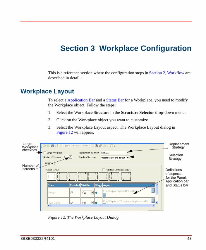
Workplace LayoutTo select a Application Bar and a Status Bar for a Workplace, you need to modify the Workplace object. Follow the steps:
1. Select the Workplace Structure in the Structure Selector drop-down menu.
2. Click on the Workplace object you want to customize.
3. Select the Workplace Layout aspect. The Workplace Layout dialog in Figure 12 will appear.
Figure 12. The Workplace Layout Dialog
screens Definitionsof aspectsfor the Panel, Application bar
checkbox
and Status bar
Number of
ReplacementStrategy
SelectionStrategy
Workplace Large
3BSE030322R4101 43

Workplace Layout Section 3 Workplace Configuration
4. Select the layout you want by checking the Enabled box to which Item you want. Select Yes in the Visible drop-down menu if you want the item to be visible.
5. Click the ... button in the Aspect field to bring up the Aspect Selection dialog box.
Check the Large Workplace check box if you only want one configuration, stretching over several screens. The Number of Screens options will then be disabled. One configuration is valid for each screen and up to four screens are supported. The Large Workplace check box will be disabled if the number of screens are more than one.
In the Replacement Strategy drop-down menu you can select Replace or Preserve to be the startup value for the workplace.
In the Selection Strategy drop-down menu (Figure 13) you select what action the workplace should perform when the selection is set on the workplace.
The alternatives in the drop-down menu are: Do nothing, Update target, Perform default action and Update target and default action.
If Perform default action or Update target and default action is selected, and the selection is an object, the default aspect will be shown. If the selection is an aspect, the default aspect view will be shown or the default verb will be executed.
How to create and configure the Application and Status Bar, is described in the following sections.
Figure 13. The Selection Strategy drop-down menu
44 3BSE030322R4101

Section 3 Workplace Configuration Application Bar
Application Bar
For example, to configure the Application Bar from the Workplace Layout aspect, see Figure 12:
• Check the Enabled box belonging to the Top Band item.
• Select Yes in the Visible drop-down menu to make the Application Bar visible.
• Click the ... button in the Aspect field and select the Application Bar aspect in the dialog.
• Click Apply.
An Application Bar aspect is placed on the workplace object. To modify the Application Bar layout, open the config view of the Application Bar aspect. (see Figure 14)
You have now opened the configuration dialog for the Application Bar (see Figure 14), and can design the look of it.
The dialog box has three tabs which are described below:
Main Tab
The Main tab, (Figure 14), has a number of settings:
– Show Fixed Displays
– Show Shortcuts
– Show Tool Collections
– Show Favorites
Check the On new row boxes if you want the selected setting to be displayed on a new row in the Application Bar.
It is important to note that if you modify an existing Application Bar, all workplaces that use this Application Bar will be affected by the changes.
The Workplace Window has to be restarted for any changes in the Application Bar to take place.
3BSE030322R4101 45

Application Bar Section 3 Workplace Configuration
If the check box is checked, the item will appear in the Application Bar. If not, it is hidden.
Fixed Displays Tab
On the top of the Fixed Displays tab is an input field named Height in pixels. In this field you enter the height that you want the fixed displays to have. ^The default value is 80 pixels.
There are no default fixed displays defined at start. Under this tab you can select which fixed displays you want to add to the Application Bar, see Figure 15.
Figure 14. Application Bar - Main Tab
46 3BSE030322R4101

Section 3 Workplace Configuration Application Bar
Each fixed display is identified by its Object Name, Aspect Name and Display Width, expressed in % of the total width of the Workplace window.
1. Click the Add button, see Figure 15. A second dialog box, according to Figure 16, opens.
2. Select the aspect you want to show as a Fixed Display.
Figure 15. The Application Bar - Fixed Displays Tab
Figure 16. Add/Edit Fixed Display Dialog Box
3BSE030322R4101 47
Application Bar Section 3 Workplace Configuration
3. Select the width of the fixed display you have selected to be viewed in percentage of the Workplace Window width, by typing the percent value in the Display width in percent field, in the upper right part of the dialog.
4. Click OK.
If you want to edit the fixed display, select a row (display), click on the Edit button and the dialog box shown in Figure 16 with the values of the selected object will open.
The sum of percentage of all fixed displays, Display width in percent, must not exceed 100%. The configuration tool will automatically calculate the highest value allowed if you try to exceed this.
48 3BSE030322R4101

Section 3 Workplace Configuration Application Bar
Tool Collections Tab
Under the Tool Collections tab, shown in Figure 17, you can choose which tool bars you want to appear in the Application Bar.
If the check box is marked, the collection (tool bar) will be displayed in the Application Bar. To change order, use the buttons to the right in the view.
Figure 17. The Tool Collections tab
3BSE030322R4101 49

Application Bar Section 3 Workplace Configuration
If the New collections default included check box is marked, new created Tool Collection’s will be checked by default in the Included list and shown in the Application Bar.
Configure the Workplace Clock Tool
In an Operator Workplace it is possible to add and configure a Clock Tool in the Application Bar. The clock shows the current date and time in a specific format. Default date and time format is default user locale.
To find the Workplace Clock Tool:
1. Go to the Library Structure.
2. Select Tools > ScreenBar Tools in the object list.
3. Select the Workplace Clock Tool aspect and the config view.
Go to the Properties dialog to configure the clock, see Figure 18.
Figure 18. Workplace Clock Tool
50 3BSE030322R4101
Section 3 Workplace Configuration Status Bar
You can select the format of the time and date presentation, from some predefined formats. Select desired values and click OK. Click Apply in the configuration view of the Workplace Clock to apply the changes.
Shortcuts in the Application Bar
A Shortcut in the Application Bar is created to get fast access to any viewable aspect associated with a particular object. You edit a Shortcut through the config view of the aspect representing the shortcut.
By deleting its aspect you delete all shortcuts. Open the Edit dialog to delete only one shortcut.
Status Bar
The Status Bar selected in Workplace Layout on page 43, will appear at the bottom of the workplace. The Status Bar aspect is placed on the Workplace object. It is possible to reconfigure the Status Bar in the same way as the Application Bar. To modify the layout of the existing Status Bar, select the Status Bar aspect and its config view.
It is important to note that if you modify an existing Status Bar, all workplaces that use this Status Bar will be affected by the changes.
The configured Workplace has to be restarted for any changes in the Status Bar to take place.
3BSE030322R4101 51

Panels Section 3 Workplace Configuration
Panels
You can select panel to your workplace in the Workplace Layout aspect, see Workplace Layout on page 43 and Figure 12. Existing panels are located in the Library Structure and are displayed in Figure 19:
To select Panel, do as follows:
1. Go to the Library Structure and select the Workplace Panels object. It has three Standard Workplace panel objects: Operator Workplace Panel, Plant Explorer Panel and Sample Advanced Operator Panel.
2. Select for example the Operator Workplace Panel. It has four different Layout aspects; AlarmPanelLayout, GraphicPanelLayout, StartupDisplayPanelLayout and TrendPanelLayout. See Figure 19.
3. The StartupDisplayPanelLayout aspect shows the StartupDisplay aspect situated on you Workplace Object. See also Set/Change the Default Startup Display on page 54.
Figure 19. Workplace Panels
Layout aspectsStandard Workplace Panel objects
52 3BSE030322R4101

Section 3 Workplace Configuration Display Area
The AlarmPanelLayout, GraphicPanelLayout and TrendPanelLayout aspects have predefined view classes, which means that they always will display an alarm aspect, a graphic aspect or a trend aspect.
As panel it is possible to use a Group Display aspect. See Group Displays on page 261. Additional information about panels can be found in Screen, Panel and Overlap on page 69.
Display Area
The Display Bar can be used to control and identify the contents of the Display Area.
A display area is showed below:
Figure 20. Display Bar
Figure 21. Display Area
3BSE030322R4101 53

Set/Change the Default Startup Display Section 3 Workplace Configuration
Changing the Startup Display for a Workplace
The Startup Display can be set for each operator workplace. It is possible to configure the Startup Display for a Workplace or a User. It can be made in three ways:
• Set the name Startup Display to the aspect of the Workplace object you want to use as Startup Display. The aspect can be of any view class.
• Configure the Startup Object in the User Profile. The first aspect with a matching view class will be displayed.
Set/Change the Default Startup Display
To set/change the Startup Display for a Workplace, do as follows:
1. Add the aspect you want to use as startup display to the Workplace object concerned (if you already have an aspect named Startup Display, you must delete or rename it).
2. Change the name of the aspect to Startup Display. (Make sure there is a space character between Startup and Display. Upper or lower case is of no importance.)
3. Start the Operator Workplace again to verify the changes.
Configure a Startup Display for a User
Follow the steps below to set a Startup Display for a user:
1. Open the User Structure in Plant Explorer.
2. Select the user you want to define a start object on.
3. Select the property WorkPlaceStartObject in the aspect Workplace Profile Values.
4. Set datasource equals to “Local” in Workplace Profile Values.
5. Click the Browse button and select an optional object. The name of the selected object is presented in the ObjectName field.
It is recommended to use a Graphic Display as Startup Display.
54 3BSE030322R4101

Section 3 Workplace Configuration Configure Shortcuts to Displays
6. Apply changes.
7. Start the Operator Workplace again to verify the changes.
Configure Shortcuts to Displays
Shortcuts can be configured in:
• Application bar (see Shortcuts in the Application Bar on page 55)
• Display bar (see Shortcuts in the Display Bar on page 58)
• Graphic Displays (see IndustrialIT 800xA Engineering, Graphics)
Shortcuts in the Application Bar
A Shortcut in the Application Bar is created to get fast access to any viewable aspect associated with a particular object. When you have added a Shortcut to a workplace, it will be displayed as a button with a drop-down menu. It will appear on the left-hand side in the Application Bar the next time you open the Workplace window.
To create a Shortcut, do as follows:
1. Add an Application Bar Shortcut aspect to the workplace object by doing like this:
a. Right click on the workplace object and select New Aspect.
b. In the dialog that comes up, select Application Bar Shortcuts and click Create.
Note that the WorkPlaceStartObject has the highest priority, which means that possible Start-up Display aspects will be ignored.
3BSE030322R4101 55

Configure Shortcuts to Displays Section 3 Workplace Configuration
2. Double-click on the aspect to open a dialog box. See Figure 22.
Figure 22. Dialog Box for Edit of Application Bar Shortcut
56 3BSE030322R4101

Section 3 Workplace Configuration Configure Shortcuts to Displays
3. Click on the Add button, and another dialog box pops up. See Figure 23.
4. In the dialog box, select structure, object, and aspect.
5. Click on the OK button.
6. The Shortcut is now added to the shortcut list.
7. Repeat steps 3 to 6 if you want to add more shortcuts.
8. Click on the Apply button, (see Figure 22), and the Shortcut is created the next time you start up the Workplace.
9. Restart the configured workplace to activate the configuration.
Figure 23. Application Bar Shortcuts Dialog Box
Figure 24. Workplace Window with Application Shortcuts
Application Bar Shortcuts
3BSE030322R4101 57

Configure Shortcuts to Displays Section 3 Workplace Configuration
The Shortcut buttons will look like the default icons of the referenced aspect objects.
To use the Shortcut, click on the Shortcut button in the Application Bar.
Shortcuts in the Display Bar
The Display Bar is connected to a specific Display. Figure 25 shows examples of a Display Bar.
You customize the Display Bar by configuring the shortcuts.
Creating Display Shortcuts in the Display Bar. A Shortcut in the Display Bar is a shortcut button you can create to get fast access to any viewable aspect associated with a particular object and its descendents. The difference between a shortcut in the Application Bar and a shortcut in a Display Bar, is that shortcuts in the Application Bar are associated with the Workplace and are available at all times (no matter which Display you have selected), while shortcuts in a Display Bar are visible only when you have selected the Display that has that Display Bar.
Figure 25. A Workplace Window with Display Shortcuts
Display Shortcuts in Display Bars
58 3BSE030322R4101

Section 3 Workplace Configuration Configure Shortcuts to Displays
By using shortcuts you can make displays related to, and of importance to, a certain display accessible by a simple click. This can be useful if you often look at a number of displays in sequence. Then you only have to click on the shortcut icon to go to the next display in the sequence.
To add a Shortcut to the Display Bar, do as follows:
1. Add a Shortcut aspect to the object from which the aspects should be linked.
2. Double click on the aspect. A dialog box opens.
3. Click on the Add button. A new dialog box pops up.
4. In the dialog box, select structure, object and aspect. See Figure 26.
5. Click OK, and the Shortcut will be added to the Shortcut list.
6. A Display Shortcut will be displayed in the Display Bar, to the right of the other tools.
The Shortcut buttons will look like the default icons of the referenced objects. To use the Shortcut, click on the Shortcut button in the Display Bar.
Figure 26. Add/Edit Display Shortcut Dialog Box
3BSE030322R4101 59

Configure Shortcuts to Displays Section 3 Workplace Configuration
Edit/Delete a Display Shortcut in the Display Bar. To edit or delete a Display Shortcut, do as follows:
1. Go to the Shortcut aspect you want to edit/delete, and double click on it.
2. The Display Bar Shortcuts dialog box opens.
3. Select the Display Shortcut you want to edit/delete.
4. To delete the Display Shortcut, click on the Delete button.
To open the Add/Edit Shortcut dialog, click on the Edit button. You can now edit your Display Shortcut, for example change the display to which the shortcut is connected.
Display Shortcut Inheritance. Display shortcuts can be inherited in the Functional Structure. If the Structure inheritance check box is marked (see Figure 27), the Display Shortcuts will be inherited. This means that an aspect object with the Structure Inheritance option set can “see” the defined Display Shortcuts of parent objects, up to the root or until finding a parent object for which the Structure Inheritance option is not set.
An aspect object with the Structure Inheritance check box unmarked cannot “see” and inherit display shortcuts defined in any parent object.
The following example explains the purpose of inheritance.
By default the Structure Inheritance option is selected.
Figure 27. The Structure Inheritance Check Box
60 3BSE030322R4101

Section 3 Workplace Configuration Configure Shortcuts to Displays
In Figure 28, all objects “down” to the “A2 area” have the Structure Inheritance option set. This means that they inherit the Shortcuts defined in objects above.
The A2 Area object has two inherited shortcuts from the objects above. The Inherited Shortcuts tab (see Figure 28) displays the inherited shortcuts.
In Table 1 you can see the result of a small configuration example, using a structure similar to the one in Figure 28.
Figure 28. Structure Inheritance Option Example
Table 1. Shortcut Inheritance Example
FunctionalStructure
StructureInheritance
Option
DefinedShortcuts
Result(Inherited)
Plant, Site Selected A1, Alarm List A1, Alarm List
A1, Area Selected MU1, Overview A1, Alarm ListMU1, Overview
Shortcutsinherited by theMU1 object from the objects “above”
The selected object
Aspects of theselected object
Plant in this case.
Site
3BSE030322R4101 61

Multiple Monitors Section 3 Workplace Configuration
Multiple Monitors
To be able to use multiple monitors in the 800xA System, a client has to be equipped with additional hardware. The multiple monitor support in the System uses the large desktop concept in Windows 2000. This usually means that one monitor is equivalent to one graphic card. Cards with multiple output must expose each output as one monitor.
Read about additional hardware and graphic cards in IndustrialIT 800xA System, Installation.
Using multiple monitors mean that applications can be moved from one monitor to another, or be displayed simultaneously on more than one monitor. In the operator’s environment of the 800xA System, the multiple monitor support uses large desktop and full screen mode.
MU1, Mixing Unit Selected M2, Motor A1, Alarm ListMU1, OverviewM2, Motor
M2, Motor Cleared AI137, Dialog AI137, Dialog
AI137, AI Selected Plant, Overview AI137, DialogPlant, Overview
Table 1. Shortcut Inheritance Example (Continued)
FunctionalStructure
StructureInheritance
Option
DefinedShortcuts
Result(Inherited)
62 3BSE030322R4101

Section 3 Workplace Configuration Configuration for 800xA System
Configuration for 800xA System
In 800xA System the monitors can be configured to stand side be side. If the system has an even number of monitors they can be configured on top of each other. Screen 1 has to be located to the left (or top-left). See Figure 29 and Figure 30. All monitors should have the same resolution.
Figure 29. Side by Side Configurations
Figure 30. On top Configurations
3BSE030322R4101 63

Configuration of the Workplace supporting Multiple Monitors Section 3 Workplace Configuration
Configuration of the Workplace supporting Multiple Monitors
There are two ways to configure a workplace to support multiple monitors.The workplace can be configured to behave as if all monitors were one single monitor, or it is possible to have a separate configuration for each monitor.
The first configuration is Multi-screen Workplace and the second Large Workplace. The Large Workplace fully supports the two screens side-by-side configuration.
The difference between the two configuration options, is set in the Workplace Layout aspect by marking the Large Workplace check box. If this box is unchecked, it is possible to specify the number of screens the workplace displays, and the Application Bar, Status Bar and Panel for each screen.
A multi-screen workplace configuration displays each screen on one monitor. This is the most common and the recommended configuration to use.
64 3BSE030322R4101

Section 3 Workplace Configuration Configuration of the Workplace supporting Multiple Monitors
The figure below (Figure 31), displays the configuration options in the Workplace Layout aspect.
Figure 31. Configuration of Workplace Layout
The number of screens does not have to correspond to the number of monitors. If you for example have two configured screens and three existing monitors, the third monitor will appear empty. If you on the other hand have configured more screens than the number of existing monitors, the configuration of the screen(s) that goes above the number of monitors will not be shown.
Number of screens
Definitionsof aspectsfor the Panel, Top Band (App bar)
Bottom Banditems
Large Workplacecheckbox
ReplacementStrategySelectionStrategy
(Status bar)and
3BSE030322R4101 65

Multi-screen Workplace Section 3 Workplace Configuration
Multi-screen Workplace
In a multi-screen workplace, each screen configuration is displayed on a single monitor.
The Application Bar and Status Bar is configured per screen and covers the top and bottom of the screen.
To create a Multi-screen Workplace configuration, the Large Workplace check box must be unchecked in the Workplace Layout aspect, see Figure 31. The aspect also specifies the number of screens, and the configuration for each screen.
Figure 32. Example of a Multi-Screen Workplace
Individual Status Bars
Individual Application Bars
66 3BSE030322R4101

Section 3 Workplace Configuration Multi-screen Workplace
A Workplace configuration with 3 screens could look like the figure below.
The screen configurations are used in the same order as they are listed, see Figure 29 and Figure 30. (Screen 1 = Monitor 1 (Primary), Screen 2 = Monitor 2 etc.)
Figure 33. An Example of a Three-Screen Configuration
3BSE030322R4101 67

Large Workplace Section 3 Workplace Configuration
Large Workplace
Configuration of a Large Workplace for multiple monitors is made in the same way as for a single monitor workplace, although the screen area covers two monitors in full screen mode, see Figure 34.
Example, for a system with two monitors (see the figure above), each monitor has 50% of the size of the desktop. The Application Bar is defined to cover the top of the maximized window.
For the Application Bar you define in percentage how much each display shall cover, e.g. if you want a fixed display bar to show on the second monitor, you need to set another fixed display to cover the first 50%. Positions on tools are dependent on the width of tools prior to the tool itself.
Figure 34. Large Workplace
Figure 35. Two Monitors in a Side By Side Configuration
68 3BSE030322R4101

Section 3 Workplace Configuration Large Workplace
Screen, Panel and Overlap
A Screen is the base window on one monitor. Each screen configuration in the Workplace Layout defines the Application Bar, Status Bar and the section of the panel to be presented on that monitor.
It is possible to configure the layout to be the same or different for all screens. For more information about how to configure the Application and Status Bar, see Application Bar on page 45 and Status Bar on page 51.
The Workplace Layout aspect contains one Panel Definition for each screen. The panel is configured for a single screen, which makes the panel reusable for different workplace configurations.
A pop-up is associated with one screen. Pop-ups can be moved from one monitor to another. When a pop-up is moved from one monitor to the another, it will also change which screen it is associated with.
If a pop-up is visible on two monitors, it belongs to the monitor which displays the major part of the pop-up.
When the workplace is displayed in Windows Mode, it is possible to move the base window of the screen.
If you move the base window away from its monitor, it is not possible to open an aspect from a popup placed on the now empty monitor.
The following view class values are involved in an pop-up position: X Position, Y Position, X Offset, Y Offset, Position at cursor and Screen. If the view class specifies that the pop-up should be positioned at the current cursor position, the other values are ignored.
See View Class Values on page 74 and Configuring View Classes for Different Nodes on page 77.
3BSE030322R4101 69
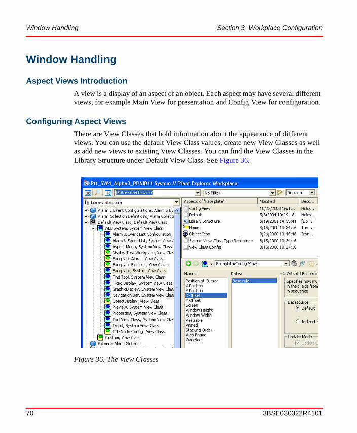
Window Handling Section 3 Workplace Configuration
Window Handling
Aspect Views Introduction
A view is a display of an aspect of an object. Each aspect may have several different views, for example Main View for presentation and Config View for configuration.
Configuring Aspect Views
There are View Classes that hold information about the appearance of different views. You can use the default View Class values, create new View Classes as well as add new views to existing View Classes. You can find the View Classes in the Library Structure under Default View Class. See Figure 36.
Figure 36. The View Classes
70 3BSE030322R4101
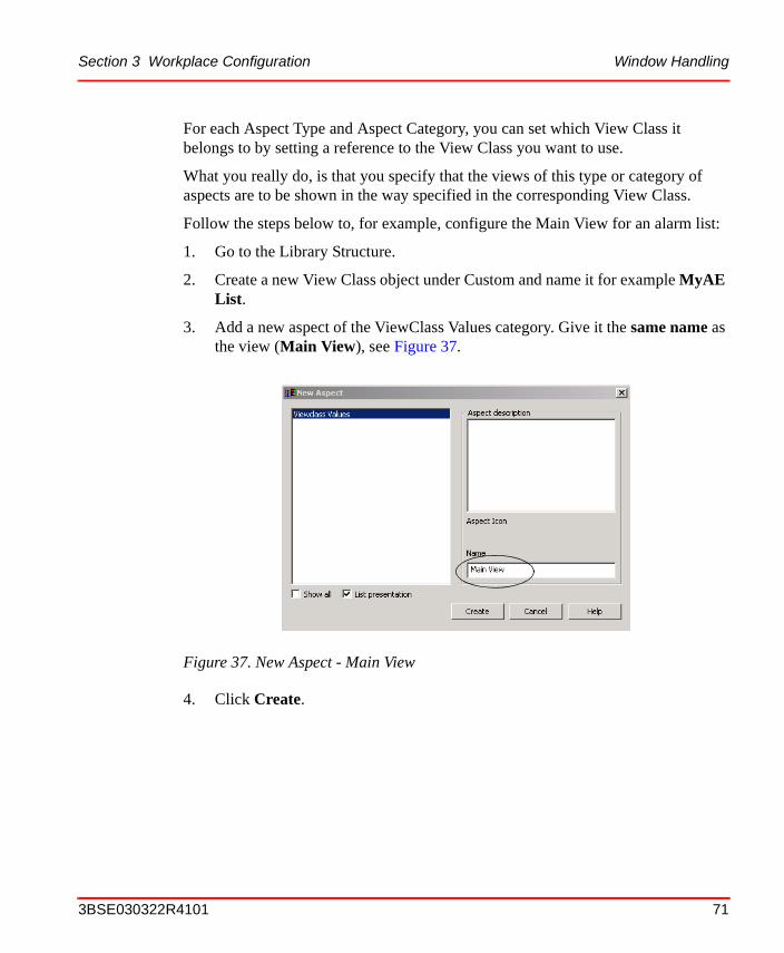
Section 3 Workplace Configuration Window Handling
For each Aspect Type and Aspect Category, you can set which View Class it belongs to by setting a reference to the View Class you want to use.
What you really do, is that you specify that the views of this type or category of aspects are to be shown in the way specified in the corresponding View Class.
Follow the steps below to, for example, configure the Main View for an alarm list:
1. Go to the Library Structure.
2. Create a new View Class object under Custom and name it for example MyAE List.
3. Add a new aspect of the ViewClass Values category. Give it the same name as the view (Main View), see Figure 37.
4. Click Create.
Figure 37. New Aspect - Main View
3BSE030322R4101 71

Window Handling Section 3 Workplace Configuration
5. Select the Main View aspect > Profile Definition Selection > View Classes/View Class Item Definition, see Figure 38 below:
6. Configure the Main View, for example X and Y position, window size and so on.
Figure 38. Profile Definition Selection
Figure 39. The Different View Class Values
72 3BSE030322R4101
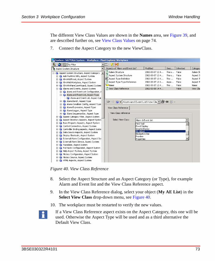
Section 3 Workplace Configuration Window Handling
The different View Class Values are shown in the Names area, see Figure 39, and are described further on, see View Class Values on page 74.
7. Connect the Aspect Category to the new ViewClass.
8. Select the Aspect Structure and an Aspect Category (or Type), for example Alarm and Event list and the View Class Reference aspect.
9. In the View Class Reference dialog, select your object (My AE List) in the Select View Class drop-down menu, see Figure 40.
10. The workplace must be restarted to verify the new values.
Figure 40. View Class Reference
If a View Class Reference aspect exists on the Aspect Category, this one will be used. Otherwise the Aspect Type will be used and as a third alternative the Default View Class.
3BSE030322R4101 73

View Class Values Section 3 Workplace Configuration
Another example will clarify this:
Assume that we want all Alarm Lists to always appear on top of all other windows because it is important that they are never hidden by mistake. Further on, we want the Alarm Lists to be placed at the lower right corner of the display. To achieve that, we create a new ViewClass in the Library Structure, with an aspect of category ViewClass values with the name Main View. We configure this Main View aspect to appear in the lower right corner and to lay on top of other windows. Then we link the Aspect Category, which alarm lists belong to, to the newly created View Class. When we access the Main View of an alarm list, it will be opened in the way that we have specified in the View Class that is pointed out. If there is no configuration for the Main View in the linked View Class, the settings in the Default View Class (see Figure 36) will be used. If we have no link at all from an aspect type or aspect category to a View Class, the settings of the Default View Class will be used for aspects of that type or category.
View Class Values
The different View Class Values in the Names area (Figure 39) are the following:
• Position at Cursor
If this value is set to Yes, the window will be positioned at the current cursor position. The X - and Y Position and the X - and Y Offset values will not be used. If this value is set to No, the window will be positioned as specified by the X - and Y Position and the X - and Y Offset values.
If there is no current cursor position, and the value is set to Yes, the window will be positioned as if the value was set to No.
• X / Y Position
Specifies the horizontal (x) and vertical (y) position of the upper left corner of the window.
• X / Y Offset
The X/Y offset values specifies the start position for an overlap of for example a view class. It means that several pop-up windows will be placed on top of each other but have different start positions.
74 3BSE030322R4101
Section 3 Workplace Configuration View Class Values
If no overlap window uses the same view class, the X and Y position values will be used to position the first window. New overlap windows will add X and Y offset values to the previously opened window. The latest window decides the next popup window position. If the overlap does not fit on the screen, the offset will move the window to the opposite side. The safe areas or the task bar will not be covered by popup windows.
An example:
The X and Y positions are 200. The X and Y offset values are 10. The first window will be placed at 200, 200, the second at 210, 210 and the third at 220, 220 etc.
If all windows are closed down and a new is opened it will be placed on a default position.
• Screen
Specifies on which screen to open the window. The Screen value can have the values "Current" (= 0), "Main" (= -1) or a specified screen such as 1 or 3. "Current" indicates the monitor where the pop-up was called up. "Main" indicates the monitor associated with the main screen (currently the primary monitor). The X Position and Y Position are always relative to the coordinate system of the indicated monitor.
If the Screen value specifies a monitor that does not exist, the fallback is the current monitor.
• Window Height / Window Width
Specifies the height and width (in pixels) of the window.
• Resizable
Specifies whether the window is resizable.
• Pinned
Pinned specifies whether the aspect displayed in the window can be replaced by another aspect.
• Stacking Order
This value can only be used in the Operator Mode and decides the priority of different windows. The window with the highest stacking order value can not be concealed by a pop-up window.
3BSE030322R4101 75

View Class Values Section 3 Workplace Configuration
For example; Set 5 as stacking order on a Properties window, 7 on an Alarm List and 20 on a Faceplate window and the result will look like Figure 41.
• Web Frame
You can decide which Frame to use for the aspect view. Today one Standard Frame and one Faceplate Frame are used. It is recommended not to change the values but to use the default ones.
Figure 41. Stacking Order Sample
76 3BSE030322R4101

Section 3 Workplace Configuration View Class Values
Max Number of Windows. In the config view of a view class, it is possible to decide the maximum number of windows displayed at the same time, using this view class.
If Max number of is set to 0 (zero) it means there is no limitation of windows displayed.
You should consider to change Max number of windows when:
• Preserve is selected in the Replacement Strategy tool.
• Pinned is not set to Yes in the View Class.
• Open window of the same ViewClass is Max Windows.
• At least one of the windows is not pinned.
Configuring View Classes for Different Nodes
For systems that have different monitor set-ups for different clients, it is possible to have different configurations for the view classes for each node in the system. For example it is possible to configure the behavior of the faceplate's position for the different nodes.
Figure 42. Max number of Dialog
3BSE030322R4101 77

Favorites Section 3 Workplace Configuration
This is enabled by the use of rules in the view class configuration. By adding local node rules, different set-ups can be achieved. See Figure 43 below.
FavoritesWith the Favorite aspect it is possible to group and organize the most visited aspects for fast access.
The Favorite aspect system is a function similar to the Favorites function in Internet Explorer. The main difference is that the Aspect Favorites deals with aspects of aspect objects instead of URLs.
Figure 43. Adding Node Rule for the Faceplate View Class
In the Add Rule dialog you can add a rule for one specific node, for example a node with multiple monitors, as in Figure 43.
78 3BSE030322R4101

Section 3 Workplace Configuration Adding a Favorite
In a Workplace, the Aspect Favorites can be accessed from the application bar, if the Workplace is configured to display favorites, or from the Aspect Menu tool. See Figure 44 and Figure 45.
The Aspect Menu displays the Favorite aspects of the current User and the User Groups the user belongs to.
In Plant Explorer you can add a favorite to a to a User Group as described in Adding a Favorite below.
Adding a Favorite
Create a Favorite aspect on a Favorites object in the User Structure in Plant Explorer. Open the configuration view and select the aspect the Favorite should link to. A Favorites object can be created as a child of a User or User Group object, or as a child of another Favorites object.
Adding a Favorite is possible for an operator as well. Read more about how to add, use and organize Favorites in IndustrialIT 800xA System, Extended Operation.The Aspect Favorites defined for user groups must be organized in the Plant Explorer.
Figure 44. Aspect Favorites Bar
Figure 45. Aspect Menu
3BSE030322R4101 79

Hot Keys Section 3 Workplace Configuration
The Aspect Menu tool can be accessed from the application bar, see Figure 45. The structure displayed in the Aspect Menu is the User Structure. It includes the Favorites objects placed under the user and the user groups. A Favorite aspect can only be added to a Favorites object.
Hot KeysThe Hot Keys Aspect System is used to configure Hot Keys. It enables configuration of key combinations that perform specific functions, such as opening an aspect view or activating a verb. The hot keys operations can be global, i.e. independent of selected or highlighted object or affect the selected or the highlighted object.
The hotkey configuration only allows binding hotkeys to existing object or aspect verbs.
How to use the Hot Keys Aspect
Each hotkey can be associated with two operations, one for key down and one for key up.
Figure 46. Favorites Aspect
There is a difference between a selected and a highlighted object. Current selection is displayed in the Object Shortcuts tool. Selection is set for example when clicking an Graphic Element in the object browser.
An object is highlighted when placing the mouse pointer over a graphic element.
80 3BSE030322R4101

Section 3 Workplace Configuration How to use the Hot Keys Aspect
Hotkeys enables fast access to:
• process object operations like start/stop, alarm acknowledge etc.
• information like displays, documents or other aspects
The following tables show available predefined Hot Keys in the Operator Workplace:
Table 2. Workplace Hot Keys
Hot Key Operation
ALT+HOME Show Cursor
CTRL+F Find tool
CTRL+SHIFT+3 All process alarms
CTRL+SHIFT+4 All process events
CTRL+SHIFT+5 System alarms
CTRL+SHIFT+6 System events
CTRL+SHIFT+7 System status
CTRL+SHIFT+S Direct external alarm silence
CTRL+ALT+F4 Close all overlaps
ALT+F4 Close Active Window
F1 Context Sensitive Help
CTRL+SHIFT+F1 Show hot key map
Table 3. Selected Object Hot Keys
Hot Key Operation
CTRL+G Show Object Type
3BSE030322R4101 81

How to use the Hot Keys Aspect Section 3 Workplace Configuration
Table 4. Highlighted Object Hot Keys
Hot Key Operation
CTRL+SHIFT+W Pop up alarm list
CTRL+SHIFT+E Activate the faceplate alarm button
CTRL+SHIFT+R Execute acknowledge verb
CTRL+SHIFT+Q Acknowledge all alarms
CTRL+SHIFT+T Order mode in which the output tracks an externally provided value
CTRL+SHIFT+Y Order manual mode, and also forced mode for input signals
CTRL+SHIFT+U Order automatic mode, and also dis-abling of forced mode for input signals
CTRL+SHIFT+I Order internal set point
CTRL+SHIFT+O Order external set point, or the 'first' if several exist
CTRL+SHIFT+P Order the 'second' external set point, if several exist
CTRL+SHIFT+0 Order stop, close, off, or set state to false
CTRL+SHIFT+1 Order start, open, on, or set state to true
CTRL+SHIFT+2 Order start of the higher speed
CTRL+SHIFT+B Order start in reverse/down/left direction
CTRL+SHIFT+K Order small increase of the analogue value in 'focus'
CTRL+SHIFT+L, CTRL+ALT+SHIFT+K
Order large increase of the analogue value in 'focus'
CTRL+SHIFT+H Order small decrease of the analogue value in 'focus'
82 3BSE030322R4101
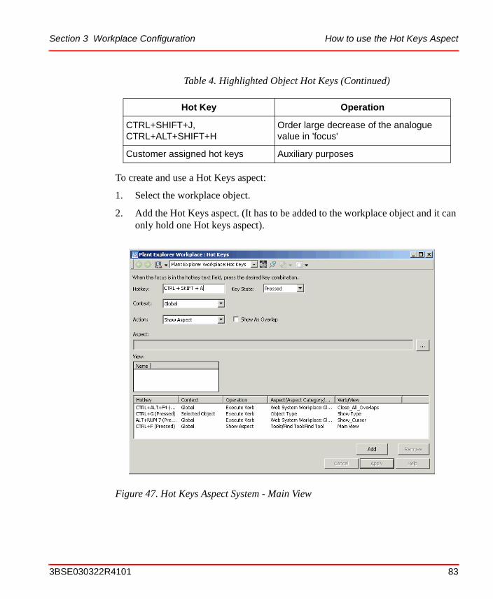
Section 3 Workplace Configuration How to use the Hot Keys Aspect
To create and use a Hot Keys aspect:
1. Select the workplace object.
2. Add the Hot Keys aspect. (It has to be added to the workplace object and it can only hold one Hot keys aspect).
CTRL+SHIFT+J, CTRL+ALT+SHIFT+H
Order large decrease of the analogue value in 'focus'
Customer assigned hot keys Auxiliary purposes
Figure 47. Hot Keys Aspect System - Main View
Table 4. Highlighted Object Hot Keys (Continued)
Hot Key Operation
3BSE030322R4101 83

How to use the Hot Keys Aspect Section 3 Workplace Configuration
The configuration contains a list of key combinations together with the operation to perform for each key combination.
It is possible to have two entries with the same hotkey if they have different key state.
Configuration View - Global Operations
Global hotkey operations are independent of highlight and selection. To configure a global Hotkey operation, follow the steps below:
1. Enter the key combination, for example ALT+A in the Hotkey area.
2. Select Global in the Context drop-down menu.
3. Select whether the hotkey should open an aspect or a verb in the Action drop-down menu. If the hotkey should open an aspect, select the aspect and the view. If no view is selected, the default view will be opened. If the hotkey should execute a verb, select the aspect that implements the verb and then the verb.
To define a hot key that uses the numeric key pad, the hot key must be defined with the Num Lock toggle off, and the Num Lock toggle must always be off when using the hot keys.
Figure 48. Global Operations
84 3BSE030322R4101

Section 3 Workplace Configuration How to use the Hot Keys Aspect
4. Click Add.
Configuration View - Operations on Selected or Highlighted Object
To configure an operation, do as follows (see Figure 49):
1. Enter the key combination, for example ALT+A in the Hotkey area.
2. Select Selected (or Highlighted) in the Context drop-down menu.
3. Select whether the hotkey should open an aspect or a verb in the Action drop-down menu. If the hotkey should open an aspect, you select the aspect category and possibly the view. If the hotkey should execute a verb, you will be limited to object verbs. In this case, you select the object type or object type instance and get a list of the object verbs implemented.
4. Click Add.
Changing and Removing Hot Keys
• Select details of a hotkey configuration in the list. The input fields will be then entered.
• To remove a hotkey configuration, select it in the list and click Remove.
Figure 49. Operation on Selected Object
3BSE030322R4101 85

Configuring Color Settings with Logical Colors Section 3 Workplace Configuration
• To modify a hotkey configuration, select it in the list and click Remove. The configuration will remain in the input fields. Change the input fields as desired and click Add.
When a selected (or highlighted) object with a Hot Key aspect is activated, and more than one aspect of the selected category is found, the default aspect of that category is used. If there is no default, the first aspect of the category is displayed.
If there is no aspect of selected category, an aspect of the same type will be attempted. If no object is selected (or highlighted) or if the operation cannot be performed, nothing will happen.
The operation will be performed on all objects that support the operation.
Configuring Color Settings with Logical ColorsSome colors have a special meaning for an operator, for example the color on an active alarm, or a warning message. Other colors need to be the same on all places to give the system a user-friendly look (for example background colors). You also want to be able to change these colors with one operation for all occurrences.
Logical color is the concept used to be able to fulfill these needs. A logical color is defined once, and the user of the color refers to it by its name.
The Operator Workplace contains a set of predefined logical colors divided into several groups for their different purposes.
After adding the first Hot Key aspect you must restart the Workplace. You do not have to restart the Workplace after additional hot key configuration.
If there are displays in the provider system using new Logical Color definition aspects, or if the default one is changed, must these be exported from the provider system and imported to the subscriber system using the Import/Export tool.
86 3BSE030322R4101

Section 3 Workplace Configuration Configuring Color Settings with Logical Colors
The table below shows the predefined logical colors groups:
A Logical Color Group is defined by a Logical Color Definition aspect always placed on the root object Web System Workplace in the Workplace Structure.
Overriding an Existing Logical Color Definition
The System is delivered with a standard set of Logical Colors. You can always override a logical color by changing the color definition in the Logical Color Values aspect, on the Workplace object. The Logical Color Values aspect is created together with a Logical Color Definition.
Table 5. Predefined Logical Color Tables
Color group Usage
Event Colors Used in graphic aspects for different events, like blocked, in alarm state, Alarm and Event lists etc.
Event Colors 3D Same as Event Colors, with support for 3D look. (The color set contains two variations of each color, one lighter and darker, which makes it possible to create 3D images)
General Colors A general set of colors for faceplates, graphics
Media Colors Used for graphic displays
Object Colors Colors for object properties, process graphics
Object Colors 3D Same as Object Colors, with support for 3D look. (The color set contains two variations of each color, one lighter and darker, which makes it possible to create 3D images).
Process Graphics Color Faceplates colors (general)
Trend Colors Colors for the different trend traces
Uncategorized Colors For special purposes
3BSE030322R4101 87

Configuring Color Settings with Logical Colors Section 3 Workplace Configuration
To change a logical color, do as follows:
1. Select the Logical Color Values aspect you want to change and open the Configuration dialog.
2. Select the logical color name you want to modify, then highlight the RGB value in the second section of the dialog. See Figure 50.
3. Click the Modify button and select the wanted color.
4. Click Apply to save the logical color value override.
Figure 50. Logical Color Override Dialog with Colors Added
88 3BSE030322R4101

Section 3 Workplace Configuration Configuring Color Settings with Logical Colors
Creating a New Logical Colors Definition
You can also add your own logical color groups for your own purposes. The added logical colors will work exactly as the system default logical colors. It is recommended to use the existing colors.
To create a logical color, do as follows:
1. Select the Web System Workplace object in the Workplace Structure. See Figure 51.
Figure 51. Workplace Structure
3BSE030322R4101 89
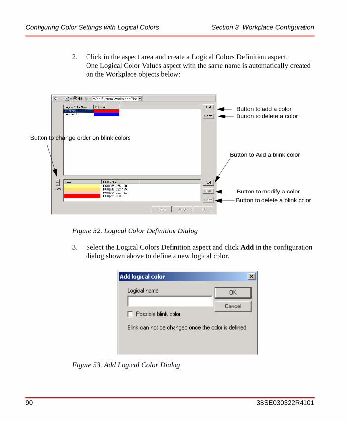
Configuring Color Settings with Logical Colors Section 3 Workplace Configuration
2. Click in the aspect area and create a Logical Colors Definition aspect.One Logical Color Values aspect with the same name is automatically created on the Workplace objects below:
3. Select the Logical Colors Definition aspect and click Add in the configuration dialog shown above to define a new logical color.
Figure 52. Logical Color Definition Dialog
Figure 53. Add Logical Color Dialog
Button to add a colorButton to delete a color
Button to change order on blink colors
Button to Add a blink color
Button to modify a color
Button to delete a blink color
90 3BSE030322R4101

Section 3 Workplace Configuration Configuring Context Menu
4. Mark the Possible blink color check box if you want to be able to define the color as a blink color. It is not possible to make a color blink after it has been created.
5. If the Possible blink color check box is marked, you can add up to 8 blink colors. The defined colors will be shown for 250 ms each.
Configuring Context MenuSome configurations affect the appearance of the context menu. For example configuration of default aspects, aspect filters and adaptations.
Default Aspects - Precedence List
The Aspect Precedence List aspect controls the objects default aspect. The default aspect is activated when an object is selected in the object browser. If a default aspect is selected for an object type (or instance) this default aspect will override the Aspect Precedence List aspect.
If no default aspect is selected the first aspect type/category found in the precedence list, that matches an existing aspect of this type/category, is selected as the default aspect of the object.
The logical color name must consist of the characters a-z, A-Z, 0-9. The name must start with an alphabetic character to be compatible with Visual Basic.
If you want to create a red-white blink that is red for 1 s and white for 1 s you define eight colors, four red identical color entries followed by four white identical color entries.
3BSE030322R4101 91

Default Aspects - Precedence List Section 3 Workplace Configuration
Default in the Library Structure
A default Precedence List aspect is located in the Library Structure. See Figure 54.
The Precedence List is valid for the whole system. If there is a faceplate aspect, that is the default aspect, see the list in Figure 54. If there is no faceplate, the second aspect in the list, the Graphic Display, will be default.
Create additional Precedence List Aspects
It is possible to create additional Precedence List aspects. The Object Handling Profile aspect located in the user object, controls which Precedence List to use. By default the Default Precedence List aspect is used for all users. To change to another Precedent List aspect, click the Local radio button, see Figure 55.
Figure 54. Default Precedence List
92 3BSE030322R4101

Section 3 Workplace Configuration Configuring Aspect Filters
Select wanted Precedence List aspect in the list.
Configuring Aspect Filters
An Aspect Filter is another aspect of an aspect object. When you configure an Aspect Filter, you can select which aspect categories to be included in the Aspect Filter. When the filter is applied, only the aspects that belong to these aspect categories will be shown in the aspect list in the context menu and in the aspect list area. The filters available can be selected from the Aspect Filter Selector drop-down menu. An Aspect Filter is valid for an Operator Workplace as well as for the Plant Explorer Workplace.
Figure 55. Object Handling Profile Values
3BSE030322R4101 93

Configuring Aspect Filters Section 3 Workplace Configuration
To configure an Aspect Filter, do as follows:
1. Click on the Aspect Filter Configuration button, to bring up the Configuration dialog.
2. In the Available filters list to the left, you can see all available filters. The other two lists displays available and hidden aspect categories in a new filter.
3. To configure an existing filter, select a filter in the Available filters list. When selected, the aspect categories included in that filter are displayed in the Available aspect categories or Aspect categories hidden by filter lists.
You can add and remove aspect categories by selecting them in the list and click the Add and Remove buttons to move them between the Available and Hidden lists.
4. To create a new aspect filter, click on the New button. This will display the New Filter dialog box.
Figure 56. Filter Configuration Dialog
94 3BSE030322R4101

Section 3 Workplace Configuration Context Menu Adaptations
5. In the dialog that pops up (Figure 57), enter a name for the new filter.
6. Click OK. The name of the new filter is displayed in the Available Filters list, and you can start configuring it by adding aspect categories to be included in the filter.
7. To add an Aspect Category to the filter, select it from the Aspect Categories hidden by filter list, and add it to the filter by clicking the Add button. It will then show up in the Available aspect categories list.
8. When you have finished adding aspect categories to your filter, click Apply.
9. When you have finished configuring the filters, click Apply to return to the Object Tree View window.
10. Activate the filter by selecting it in the Aspect Filter selector.
11. Verify the filter configuration by browsing in different structures and check that only the configured aspect categories are listed in the Aspect list area. Aspects included in the aspect filter are those that will be displayed in the aspect list.
Context Menu Adaptations
With adaptations it is possible to group information in the object context menu and/or expand information from the Aspect Context Menu to the Object Context Menu.
For example, if an aspect has got three views, you can select a specific view directly from the object menu. These types of adaptations made to the context menu can be enabled individually per user and/or workplace.
Figure 57. New Filter Dialog
Default aspect filters can be set for users and user groups.
3BSE030322R4101 95

Context Menu Adaptations Section 3 Workplace Configuration
The adaptations are specified via the Workplace Settings Profile Values aspect located on the workplace object and/or the user object.
Adaptations specified on a Workplace object override settings on a User object or the Definition. On the Definition it is possible to define settings for all users.
Aspect Views in the Object Menu
In the Object Context menu, all views of an aspect will be listed as a submenu to that aspect. This adaptation has four different modes:
• Normal (Default)In this mode, views are not expanded. The default action will be performed when this aspect is selected.
96 3BSE030322R4101

Section 3 Workplace Configuration Context Menu Adaptations
• ExplicitOnlyIn this mode, only those aspects that have the adaptation enabled are grouped. In the figure below you can see that the trend display aspect is the only aspect with a submenu.
Figure 58. Explicit Only View
3BSE030322R4101 97

Context Menu Adaptations Section 3 Workplace Configuration
• OnDemandIn this mode, the aspect must have more than one view that is accessible to the user and/or a default verb to be grouped. The views and default verbs (if any) will also be grouped if the aspect explicitly states this. See Figure 59 below. See also the example in Adaptation Setup in the Workplace Settings Profile Values Aspect on page 102.
Figure 59. On Demand View
98 3BSE030322R4101

Section 3 Workplace Configuration Context Menu Adaptations
• AlwaysIn this mode all aspects views are grouped, regardless of which aspect and/or the number of views. See the example in Figure 60 below.
The default verb/view is displayed in bold style.
Figure 60. Always View
3BSE030322R4101 99

Context Menu Adaptations Section 3 Workplace Configuration
Aspect Verbs in the Object Menu
In the Object Context menu, all the verbs of an aspect will be listed as a submenu to the selected aspect. This adaptation has four different modes:
• Normal (Default)In this mode, verbs are not expanded. The default action will be performed when this aspect is selected.
• ExplicitOnlyIn this mode, only those aspects that have the adaptation enabled, have the verbs expanded or grouped. If the aspect has a default view, it will be expanded/grouped together with the verbs.
• OnDemandIn this mode, the aspect must have more than one verb that is accessible to the user and/or a default view to be grouped. The verbs and the default view (if any) will also be grouped if the aspect explicitly states this.
• AlwaysGroups the verbs of all aspects, regardless of which aspect and/or how many verbs.
If the aspect has a default view, and the verbs should be expanded, the default view will be listed first and a separator will then check that the rest of the menu-items in the submenu are verbs (compare this to the Aspect Menu).
The default verb/view is displayed in bold style.
Aspect Category Adaptation
In the Object Context Menu, all aspects that belong to the same category will be grouped in a separate submenu. This adaptation has four different modes:
• Normal (Default)In this mode, aspects are not grouped according to category.
• ExplicitOnlyIn this mode, only those categories that have been enabled for this adaptation are grouped into a submenu.
(Adaptations specified by the aspect always override settings made on the aspect category.)
100 3BSE030322R4101

Section 3 Workplace Configuration Context Menu Adaptations
• OnDemandIn this mode, if more than one aspect belongs to the same aspect category, or explicitly states that it should be grouped, they will be grouped into a submenu. All other aspects will be listed as normal.
• AlwaysGroups all the aspects into submenus depending on the aspect category, regardless of how many aspects belong to each category.
Object Verb Adaptation
In the object context menu, all verbs that originate from the same aspect will be grouped in a separate submenu in the object verb section. This adaptation has four different modes:
• Normal (Default)In this mode, verbs are not grouped according to the originating aspect.
• ExplicitOnlyIn this mode, only those aspects that have been explicitly enabled for this adaptation will be grouped into a submenu.
• OnDemandIn this mode if an aspect supplies more then one verb that is accessible to the user, or explicitly states that verbs should be grouped, those verbs will be grouped into a submenu and the aspect name will be used in as menu item for that submenu.
• AlwaysIn this mode, all verbs will be grouped into submenus and for each aspect that supply verbs, regardless of how many verbs that aspect supplied.
3BSE030322R4101 101

Context Menu Adaptations Section 3 Workplace Configuration
Adaptation Setup in the Workplace Settings Profile Values Aspect
The steps below shows an example of an adaptation set up of the object context menu in the Workplace Profile Values aspect.
1. Select a workplace object or user object and add a Profile Values aspect and call it Workplace Settings Profile Values.
2. The Profile Definition Selection is displayed. See the figure below. Select Workplace Object/Workplace Settings Profile Definition.
3. Click OK.
Figure 61. Profile Definition Selection dialog
102 3BSE030322R4101

Section 3 Workplace Configuration Context Menu Adaptations
4. Select an option in the Names list, for example Expand Verbs in Context
Menu.
5. Select mode in the Mode drop-down menu, for example OnDemand, and click Apply.
6. Go to the Functional Structure and select an object, for example the Process Graphics object, to see the result. See Figure 63 below.
Figure 62. Profile Values Aspect dialog
3BSE030322R4101 103
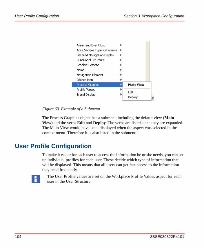
User Profile Configuration Section 3 Workplace Configuration
The Process Graphics object has a submenu including the default view (Main View) and the verbs Edit and Deploy. The verbs are listed since they are expanded. The Main View would have been displayed when the aspect was selected in the context menu. Therefore it is also listed in the submenu.
User Profile ConfigurationTo make it easier for each user to access the information he or she needs, you can set up individual profiles for each user. These decide which type of information that will be displayed. This means that all users can get fast access to the information they need frequently.
Figure 63. Example of a Submenu
The User Profile values are set on the Workplace Profile Values aspect for each user in the User Structure.
104 3BSE030322R4101

Section 3 Workplace Configuration Settings in the Profile Values Dialog
Settings in the Profile Values Dialog
Below you can read about the different settings in the Names list, the Rules list, the Datasource area and the Update Mode area.
Names List
In the Names list to the left, you can see which different settings that can be made for the user.
Figure 64. Workplace Profile Values Dialog
Names list Rules list Datasource area
Update Mode area
Object Name field Browse button
3BSE030322R4101 105

Settings in the Profile Values Dialog Section 3 Workplace Configuration
The available settings are:
Default Workplace. It is possible to decide which workplace will be default in the default system. See also Create and Configure a Workplace on page 36.
Plant Explorer Settings. With Plant Explorer settings you can configure how the Plant Explorer will behave and present data. You can set a default aspect filter, a default structure, make settings for the aspect list and the name composer.
The settings are made on the four tabs, in the dialog box.
• Default FilterIn the drop-down menu, you can select which aspect filter you want to be the default filter for the user.
• Default StructureUse the drop-down menu to set a default structure to be displayed in the Object tree view area at start-up. All browse dialogs will start in this structure (e.g. Add/Edit dialogs).
• Aspect ColumnsThe list on this tab shows all aspect columns that can be displayed in the aspect list. Use the lists to set the columns to be included in the user’s aspect list. (If the Auto select check box is checked in the dialog, the most recently selected aspect will automatically be selected when an aspect list is displayed.)
• Name ComposerUnder this tab, you can configure the way in which names of objects will be presented in the object browser of Plant Explorer. You can select which object attributes to be presented as well as determine the formatting. Free text strings can be included. The default setting is %Name%, %Type Name%, which displays the name of the object followed by the name of the object type.
Replacement Strategy. This setting decides the navigation strategy in the system. Enter Replace or Preserve in the text field.
Workplace Startup Display. It is possible to choose which aspect, added to the workplace object, will be the Startup Display. For more information, please read Set/Change the Default Startup Display on page 54.
106 3BSE030322R4101

Section 3 Workplace Configuration Settings in the Profile Values Dialog
Rules List
It is possible to add and delete nodes in the Rules list. For example; you want to use the default Workplace on every node except one special node. Add that node by clicking the Add button and use the browser to select desired Workplace. Click Apply.
Data Source and Update Mode Area
In the Datasource area, see Figure 64, you can select which settings you want for your profile. Select the Default radio button to use the default settings defined in the system’s Profile Definition. If you want to define and use your own settings, select the Local radio button. The Indirect from radio button gives you the possibility to choose definitions set by another user, for example the operator. Select the Indirect from button and use the browser to select desired user profile in the Object Name area.
In the Update Mode area two check boxes are available; Update Enable and Update local. If the Update Enabled button is checked, it is possible to make changes on the selected item. In the Object Name area the name of the default Workplace is shown. You can change it with the Browse button.
Clear/Change the User Startup Display
It is possible to change and remove the startup aspect object when it is configured per user.
Follow the steps below:
1. Open the User Structure in Plant Explorer.
2. Select the user you want to clear/change a start aspect object on.
3. Select the Workplace Profile Values aspect on the user object (Config View).
4. In the configuration sheet, select WorkplaceStartUpObject item in the list of value names on the left-hand side of the sheet.
5. Set datasource equals to Local.
6. Click the Clear button to clear Startup aspect object or click the Browse button to change the configured Startup aspect object.
3BSE030322R4101 107

Settings in the Profile Values Dialog Section 3 Workplace Configuration
108 3BSE030322R4101

Section 4 Alarm and Event
IntroductionAn Alarm system is an important element in almost all modern operator interfaces to industrial plants.
Alarms are signals announced to the operator by an audible sound, some form of visual indication, and/or with a message of some kind. The alarm indicates a problem and the purpose is to direct the operator’s attention towards plant conditions, so he/she can correct potentially dangerous situations in time.
There are two types of alarms and events.
• Process Alarms and Process Events are generated from your process, such as failure in a valve or pump or an overpressure in a tank.
• System Alarms and System Events are generated from the 800xA System, for example network problems, file system errors or server errors.
This chapter is divided in two different parts:
Application Engineering on page 110 includes information about the philosophy behind alarm configuration and about what to consider when deciding which alarms should be available at what workplace. For example, are there process conditions when hiding of sequential alarms would improve the operators possibilities to get a better understanding of the severity of the alarms.
Configuration on page 166 describes how to change the presentation of the list. You should decide what the lists should look like; how many columns should be included, which colors should be used, in what sort order should the alarms appear i.e.
3BSE030322R4101 109

Application Engineering Section 4 Alarm and Event
Application Engineering
Alarm Philosophy
An alarm is one of several sources that help the operator to diagnose a system. It helps the operator to:
• correct potentially dangerous situations in time
• recognize and act to avoid hazardous situations
• better understand complex conditions.
Another function the alarm system has, it to provide an alarm log, which can be viewed via an alarm list or alarm printout etc. The alarm log can be used for optimizing plant operation, for analyzing incidents, and for improving the performance of the system.
The alarm log can show:
• Alarms initiated during a specific time-span
• Alarms per unit or system with priority distribution
It is recommended to define an alarm philosophy before setting up an alarm environment. It typically describes alarm generation and structuring principles, the role of the operator, acceptable alarm rates, alarm priorities and definitions, etc.
A helpful guide to do this is Alarms Systems - A guide to design, management and procurement, publication no. 191, ISBN 085931 076 0, published by The Engineering Equipment and Materials Users Association in 1999 and available at www.eemua.co.uk.
This document has the objective "to help engineers to develop alarm systems which are more usable and which result in safer and more cost-effective operation of industrial systems".
A main topic in this guide is the need for addressing the usability of the alarm environment. A common problem is alarm rate overload. This makes an alarm system very hard to use and is a safety risk. A few rules of thumb are listed below. Remember that these are approximations and that specific systems may differ.
110 3BSE030322R4101

Section 4 Alarm and Event Application Engineering
Alarm systems should be designed to meet user needs and operate within the user's capabilities. This means that the information alarm systems present should:
• be relevant to the user's role at the time
• indicate clearly what response is required
• be presented at a rate that the user can deal with
• be easy to understand
The table below displays approximate figures for target maximum rates of occurrence of alarms of different priorities.
The Hiding functionality in 800xA (see Hiding on page 123) can be helpful in reducing the amount of irrelevant alarms even after the alarm system was designed.
Table 6. Presentation Rate per Priority
Priority Target maximum occurrence rate
safety related/critical very infrequently
high less than 5 per shift
medium less than 2 per hour
low less than 10 per hour
Table 7. Acceptable Long Term Alarm Rates
Long term average alarm rate in steady operation
Acceptability
more than 1 per minute Very likely to be unacceptable
one per 2 minutes Likely to be over-demanding
(industry average in HSE survey)
one per 5 minutes Manageable
less than one per 10 minutes Very likely to be acceptable
3BSE030322R4101 111

Default Alarm and Event List Configurations Section 4 Alarm and Event
It can easily be adjusted during system operation to accommodate new operational situations that generate unforeseen irrelevant alarms.
Default Alarm and Event List Configurations
There are default Alarm and Event Lists located in the Library Structure, see Figure 65. These default configurations are delivered with the system and are used if no other configuration is defined either in a new group in the Library structure or as a local configuration, see Create a Customized Alarm and Event List Configuration on page 115.
The configuration aspects are used as templates defining the look and behavior of instantiated Alarm, Event or Audit lists.
The configuration view of the Alarm and Event List Configuration aspects (Alarm and Event list templates) defines the layout and filter parameters of a list and may be associated with a number of Alarm and Event List aspects by name. A customized list can be saved with a descriptive name in the Library Structure with other default configurations or within another structure (usually where it is used).
Figure 65. Default Alarm and Event Configurations
112 3BSE030322R4101

Section 4 Alarm and Event Default Alarm and Event List Configurations
The figure below shows an example of the default Common Alarm List configuration view.
The configuration view has five tabs. The filter tab sets the type of alarms or events that should be visible in the list, see Filtering on page 115. The other tabs set the look and presentation of the list, see Changing the Presentation of an Alarm and Event List on page 166.
Figure 66. Filter tab in the Alarm and Event List Configuration
3BSE030322R4101 113

Default Alarm and Event List Configurations Section 4 Alarm and Event
The default lists delivered with the system are:
• Common Alarm Line (is used with the Alarm List aspect, and sets the filter for alarm type messages and the columns, that is appropriate, for three lines of alarms)
• Common Alarm List (is used with the Alarm List aspect, and sets the filter for alarm type messages and the columns, that is appropriate, for the 500 lines of alarms)
• Common Event List (is used with the Event List aspect, and sets the filter for event type messages and the columns, that is appropriate, for 500 lines of events)
• Common Logger Config (is used to configure the Logger function for printout of Alarm List)
• Common Operator Message Line (is used with the Event List aspect, and sets the filter for operator type messages and the columns, that is appropriate,for one line of events)
• Common Operator Message List (is used with the Event List aspect, and sets the filter for operator type messages and the columns, that is appropriate, for 500 lines of events)
• Common System Event Line (is used with the Event List aspect, and sets the filter for system type messages and the columns, that is appropriate, for one line of events)
• Common System Event List (is used with the Event List aspect, and sets the filter for system type messages and the columns, that is appropriate, for 500 lines of events)
Common Audit List (is used with the Event List aspect, and sets the filter and columns suitable for audit events generated from Security Definition aspects).
Read more about the default settings in IndustrialIT 800xA System Extended Operation.
If you want to have other filter or column settings than the ones in the default templates delivered with the system, you have to create your own as described in the next section.
114 3BSE030322R4101

Section 4 Alarm and Event Create a Customized Alarm and Event List Configuration
Create a Customized Alarm and Event List Configuration
This example shows how to create a customized Alarm and Event List Configuration for later use as template for alarm and event list:
You perform this task as described below:
1. Select the Library Structure.
2. Add a new Alarm & Event List Configuration object to the existing defaults by selecting Alarm and Event List Configurations (you may also start another object grouping for other customized configurations).
a. Select Alarm and Event List Configurations object.
b. Select New Object.
c. Select Alarm & Event List Configuration.
d. Name it Customized Alarm List.
3. Select the new object, Customized Alarm List.
4. Double click the Alarm and Event List Configuration aspect to open the Config View.
5. Configure the aspect to meet your needs.
Filtering
With the filtering function, in the configuration view of the Alarm and Event List Configuration object, you decide which type of alarms or events that will be shown in your alarm and event list using this specific customized configuration (template).
You can for example choose which type of messages and from which process area and what type of alarm state that you want to show in the alarm and event lists using your configuration.
When you create your own alarm and event list aspect for a process area, you refer to your customized alarm and event list configuration in the Library Structure.
3BSE030322R4101 115

Filtering Section 4 Alarm and Event
How to set them are described in the following sections.
Figure 67. Filter tab in the Alarm and Event Logger Configuration
116 3BSE030322R4101

Section 4 Alarm and Event Filtering
Process Section
At controller programming each ABB Controller may be given a Process Section number, so you can group controllers for example of the same part of the process, the same building, the same type of equipment, different logical structures etc. into a group, which is given a Process Section number. Then you may refer to this group of controller in for example the Alarm Filter. In this way you may have different alarms and/or external alarm for different Process Sections.
When you filter an alarm, you may choose which Process Section this alarm list will cover.
If you don’t use Process Sectioning or your controllers don’t support it the default All setting shall be used.
Class
In the Class section area you may select if you want:
• All - all classes will be selected
• Range - all classes in the chosen interval will be shown
• None - only alarms from OPC-servers, which do not support this function, will be shown
Priority Level
In the Priority Level area you select how many intervals regarding priority levels that shall be shown.
Filtering Process Alarm Messages
To filter Process Alarm Messages, see below:
1. Select Process Alarms in the Message Type area. This enables the list of process alarm message types.
2. Select the process alarm message states to be included in the list (Enabled, Disabled, Acknowledged, Unacknowledged, Auto Disabled).
Observe that the used controller(s) must support Process Sectioning. For more information, please see your controller documentation.
3BSE030322R4101 117

Filtering Section 4 Alarm and Event
– Active StateChoose to show Active/Inactive alarms or both.
– Enable StateChoose to show Enabled/Disabled alarms or both.
– Hiding StateChoose to show alarms that are in a hidden or in a not hidden state, or both.
– Acknowledge StateChoose to show alarms that are acknowledged or not, or both.
– Auto Disable StateChoose to see auto disabled alarms (alarms that are disabled in the controller), or Not Auto Disabled.
3. Select either Event Time or Acknowledge Time in the Time Stamp area and then set the view range. Newest Event and Oldest Event apply no time filter. To apply a time filter:
a. Select Time in either the View From or View To area.
b. Select the month, day, year, hour, minute or second segment of the Time area and use the up and down arrows to the right of the area to adjust the time. The actual format of the Time area depends upon how the Date tab was set.
4. Enter a number (1-1000) for the From and To in the Priority Level area. Only messages with priority levels that include this number range are displayed. Number 1 is the highest priority and 1000 the lowest.
Filtering Alarm Categories
Use the Categories area to select message category filters. The nature of these alarms are described in the table below.
118 3BSE030322R4101

Section 4 Alarm and Event Filtering
To filter Alarm Categories:
1. Select each category to be included in the Alarm List (shown with blue line). A selection can be deselected by another click.
2. Click Apply.
For categories of the different advant masters, see respectively manual.
Filtering Event Messages
To filter Event Messages, do as follows:
1. Select Events in the Message Type area.
2. Set the view range for Message Time. First Event and Last Event apply no time filter. To apply a time filter:
a. Select Time in either the View From or View To area.
b. Select the month, day, year, hour, minute or second segment of the Time area and use the up and down arrows to the right of the area to adjust the time. The actual format of the Time area depends upon how the Date tab was set.
3. Enter a number (1-1000) for the From and To in the Priority Level area. Only messages with priority levels that include this number range are displayed.
Categories Description
Alarm Expressions Used for alarms which are generated from the Alarm Expressions you have defined.
Soft Alarms Used by applications to create alarms. (For further information about soft alarms please see the IndustrialIT 800xA System Programmer’s Guide)
OPC_SERVER_ERROR Used for OPC Server error status
System Alarms Used for system alarms
Please note that if you change the Message Type from Process Alarms to Events, or vice versa, categories must be selected.
3BSE030322R4101 119
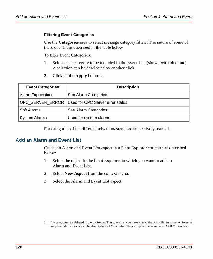
Add an Alarm and Event List Section 4 Alarm and Event
Filtering Event Categories
Use the Categories area to select message category filters. The nature of some of these events are described in the table below.
To filter Event Categories:
1. Select each category to be included in the Event List (shown with blue line). A selection can be deselected by another click.
2. Click on the Apply button1.
For categories of the different advant masters, see respectively manual.
Add an Alarm and Event List
Create an Alarm and Event List aspect in a Plant Explorer structure as described below:
1. Select the object in the Plant Explorer, to which you want to add an Alarm and Event List.
2. Select New Aspect from the context menu.
3. Select the Alarm and Event List aspect.
Event Categories Description
Alarm Expressions See Alarm Categories
OPC_SERVER_ERROR Used for OPC Server error status
Soft Alarms See Alarm Categories
System Alarms Used for system alarms
1. The categories are defined in the controller. This gives that you have to read the controller information to get a complete information about the descriptions of Categories. The examples above are from ABB Controllers.
120 3BSE030322R4101

Section 4 Alarm and Event Add an Alarm and Event List
4. Click on the Alarm and Event List aspect and select the config view.
5. Go to the Configuration Name drop-down menu and select the default list configuration you want to use. Here is where you can choose your own customized alarm and event list configuration. The configuration name drop-down menu shows all the available Alarm and Event List configurations, default or custom configurations. Selecting a configuration will associate with the filled-in tabs of the configuration (see Filtering on page 115 and Changing the Presentation of an Alarm and Event List on page 166) and with the Main View of the current list.
6. If you want the list to be local, select the Local radio button (default Shared).
7. Go to the Alarm Filter area and select the object filter function:
Figure 68. Template Alarm List Configuration
Local means that the settings (filtering, categories, alarm state etc.) only is valid for this specific alarm and event list aspect.
3BSE030322R4101 121

Add an Alarm and Event List Section 4 Alarm and Event
– Check the All alarms radio button to allow this aspect to display alarms and events for all objects.
– Check the Object Alarms radio button to show the alarms and events related to the object the Alarm List aspect belongs to.
– Check the Object and descendants radio button to show the alarms and events related to the object the Alarm List aspect belongs to and to all its descendents independent of structure.
– Check the Object and descendants in structure radio button to show the alarms and events related to the object the Alarm List aspect belongs to and to all its descendents in the selected structure. If the Object and descendants in structure radio button is checked as a filter, then select the structure from the drop-down menu.
8. Check the Show Tool Bar box, if you want the alarms tool bar to appear at the top of the Alarm List.
9. Check the Play Alarm Sounds box, if you want a sound when an alarm is generated. This should be configured under the Priorities tab (see Figure 106).
10. If you are adding an Alarm Line, uncheck the Show Tool Bar box, since it is too large to fit into the Alarm Line area.You have now added an Alarm and Event List aspect to your object.
Figure 69. Alarm List Tool Bar
Stop/start/restartAcknowledge
SilenceView configuration
Restore configurationDetails
Page upPage down
Connection Status
Print listPrint preview
User information
View Hiding Mask Manager
122 3BSE030322R4101

Section 4 Alarm and Event Hiding
Hiding
Hiding is a way of avoiding alarm situations where numerous squeal alarms make it hard to determine what is the problems root cause. By using the hiding function in 800xA, it is possible to hide non-relevant equal alarms. The hiding of alarms is initiated by hiding rules, which can be process conditions or logical expressions. All the hiding rules are kept in the Hiding Mask Manager.
Hiding affects the presentation of the alarm list. If an alarm is irrelevant it should not be shown in an alarm list. An alarm is irrelevant if it doesn't require an action from the operator. The Hiding alarm function will help the operator to get the alarm lists clearer from irrelevant alarms.
During a specific operational mode, for example a start-up or a shut-down, it is common that alarms, which are relevant during a normal operation, are totally irrelevant.
With Hiding Rules it is possible to define which alarms that will be hidden during a specific operation. Single alarms can be hidden as well as alarms from an object and its descendants.
A configurable indication in the Alarm Band shows that hidden alarms exist. See Hidden Alarms in the Alarm Band. The hidden status of alarms will also be indicated in Faceplates.
An hidden alarm also has a hiding indication in its context menu. Select hiding and the Hiding Rules dialog will be displayed. See Hiding Rules on page 124.
A hidden alarm is automatically acknowledged when the alarm is cleared, i.e. goes from active to inactive state.
Hiding Mask
A Hiding mask is a collection of Hiding Rules that will be evaluated at the same time. The rules are valid when the activating condition for a the mask is true.
A mask is invoked according to a Boolean condition or an OPC Property.
Applying a Hiding Mask will only affect new alarms that appear after the state change. The conditions are configured in the Hiding Mask Manager located in the Library Structure.
3BSE030322R4101 123

Hiding Section 4 Alarm and Event
Hiding Rules
Hiding rules define conditions under which alarms from a specific object will be hidden. The condition can be an expression containing any boolean OPC Property or alarm condition.
One hiding rule can only hold one condition. Logic expressions are possible to create directly in the rules.
If you want more complex conditions, these can be made by defining for example soft alarms using Alarm Expressions. See Alarm Expression on page 152. See the example with hiding rules Configuration Example with Hiding on page 131.
Hiding Masks Manager
The hiding masks are added and managed in the Hiding Mask Manager. The dialog, see Figure 70, displays Name, Condition and Description of the hiding masks.
Figure 70. Hiding Mask Manager dialog
124 3BSE030322R4101

Section 4 Alarm and Event Hiding
To add a new Hiding Mask, click the New mask button. Enter Mask Name, Activating Condition and Description for the mask.
Use the Export button to export the selected hiding mask to a Microsoft Excel spreadsheet for documentation. After clicking Export, Excel will open and show selected mask and its rules. The Export button is only enabled if Excel is installed on the machine.
Click Apply on the new created mask and then Edit Rules to add a Hiding Rule. Another dialog, the Hiding Mask Definition dialog, will be displayed. See Figure 71.
In this window Hiding rules are added and removed for a specific Hiding mask.
To add a rule:
1. Click New.
2. Enter the rule. Rules can be added/changed directly in this interface. You can use copy/paste to use the same expression and/or alarms in many rules.
3. Click OK. The Hiding Mask dialog will be closed and the mask is updated in the Manager.
Figure 71. Hiding Mask Definition
3BSE030322R4101 125

Hiding Section 4 Alarm and Event
4. To edit the rules of a mask, click the Edit rules... button.
The Hiding Mask Manager has the following options:
The A column shows whether an activating condition is true or not. The list also shows the Name, Activating Condition and Description of all hiding mask.
The buttons in the dialog are used as follows:
• New Mask - Select new to create a new Hiding mask. To edit a Hiding Mask, double-click on the Mask or select a Mask and click Edit Rules. This opens the Hiding Mask Definition dialog, see Figure 71 and Figure 72. Add the rules for the mask according the steps below Figure 71.
• Duplicate - Click here to create a new Hiding mask by copying the selected one.
• Delete - Click delete to remove selected mask from the list.
Figure 72. Options in the Mask Definition dialog
126 3BSE030322R4101

Section 4 Alarm and Event Hiding
• Find - Click here to open the Find/Replace dialog. Use the dialog to find hiding rules in selected mask (or all masks).
• Export - Click here to export the selected mask to an Excel sheet.
After you have added/edited the new mask and its rules, you should enter an activating condition. Select TRUE or FALSE from the drop down list, see figure below, or click Browse to open the Activating Condition dialog. See figure Figure 74.
Figure 73. Select condition
A Mask may have Activating condition “TRUE” if it should always be active.
3BSE030322R4101 127

Hiding Section 4 Alarm and Event
Figure 74. Activating Condition
128 3BSE030322R4101

Section 4 Alarm and Event Hiding
Click the Advanced button to write your own expressions, Figure 75. See also Alarm Expression on page 152 and Item Syntaxes on page 157.
Edit Condition. An Edit Condition dialog is launched from the Browse button to the right of Activity Condition for a mask, and Condition for a rule.
The expression for the row is automatically entered in the Expression field.
Expression Field . The conditions follow C++ syntax, which means that the following operators can be used: &&, AND, ||, OR, ! and NOT.
In special cases TRUE and FALSE can be used. TRUE makes the activating condition true at all times. FALSE makes the activating condition false at all times.
Figure 75. Advanced Activating Condition
3BSE030322R4101 129

Hiding Section 4 Alarm and Event
Add a description after you have built the condition in the browser.
Figure 76. Description area
130 3BSE030322R4101

Section 4 Alarm and Event Configuration Example with Hiding
Find. The Find dialog can be launched from the Hiding Mask Manager window and from the Hiding Mask window. The Find dialog has two radio buttons with which you can limit your search.
• In selected mask
The first radio button delimits the searching to selected mask(s). This is the default option. If the Find dialog was opened from the Mask Manager, one or more of the masks was probably selected. If the dialog was opened from a single hiding mask, that mask is selected.
• In all masks
The second radio button enables searching in all masks. This is the default option if no masks were selected when the find dialog was opened from the Mask manager.
Configuration Example with Hiding
This example describes step by step how to create a Hiding Mask and a Hiding Rule that defines a Hidden Alarm.
Figure 77. Find Mask dialogs
3BSE030322R4101 131

Configuration Example with Hiding Section 4 Alarm and Event
We will create a Hiding Mask that hides alarms for Tank 1 (Figure 78 below) during maintenance, e.g. when filling and draining it. The Hiding Mask will be set up so that it is activated when a certain condition is fulfilled - in this case a manual trigger is required to hide alarms during maintenance.
Figure 78. Tank 1
132 3BSE030322R4101
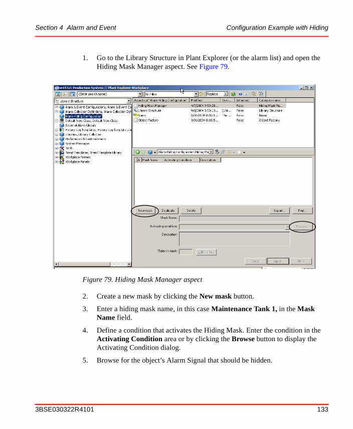
Section 4 Alarm and Event Configuration Example with Hiding
1. Go to the Library Structure in Plant Explorer (or the alarm list) and open the Hiding Mask Manager aspect. See Figure 79.
2. Create a new mask by clicking the New mask button.
3. Enter a hiding mask name, in this case Maintenance Tank 1, in the Mask Name field.
4. Define a condition that activates the Hiding Mask. Enter the condition in the Activating Condition area or by clicking the Browse button to display the Activating Condition dialog.
5. Browse for the object’s Alarm Signal that should be hidden.
Figure 79. Hiding Mask Manager aspect
3BSE030322R4101 133

Configuration Example with Hiding Section 4 Alarm and Event
6. Click OK to close window.
7. Enter a description in for the Hiding Mask in the Description field, see Figure 81 below.
Figure 80. Activating Condition dialog
134 3BSE030322R4101
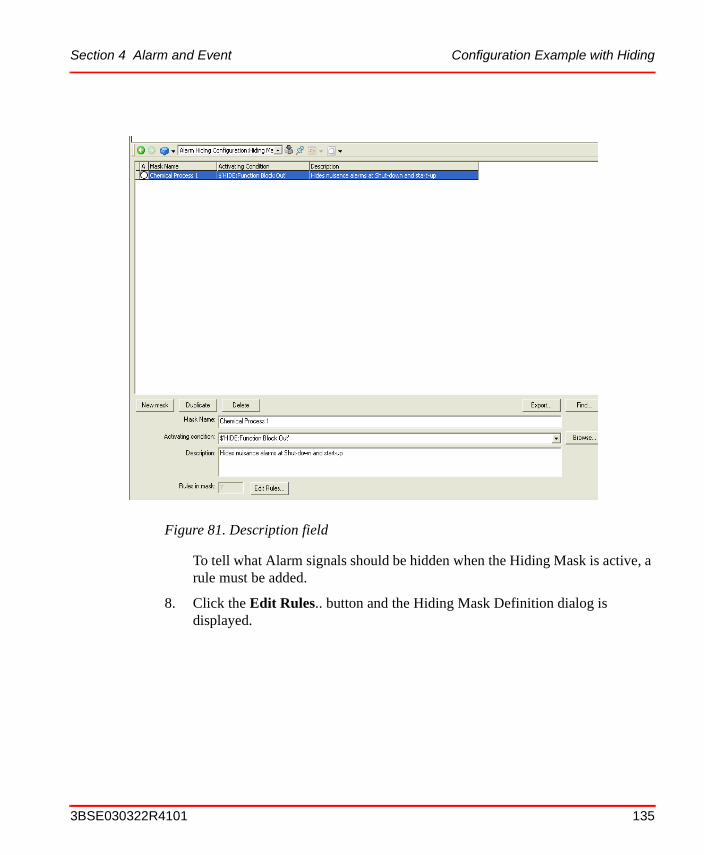
Section 4 Alarm and Event Configuration Example with Hiding
To tell what Alarm signals should be hidden when the Hiding Mask is active, a rule must be added.
8. Click the Edit Rules.. button and the Hiding Mask Definition dialog is displayed.
Figure 81. Description field
3BSE030322R4101 135

Configuration Example with Hiding Section 4 Alarm and Event
9. Click New Rule to add a rule. Leave the Condition to TRUE and select which object’s Alarm(s) shall be hidden, by clicking the Browse button next to the Hide Object field.
Figure 82. Hiding Mask Definition dialog
136 3BSE030322R4101

Section 4 Alarm and Event Configuration Example with Hiding
10. Select the object that should be hidden, in this case PI113 and click OK. See Figure 84. (The alarm triggers when the level in Tank 1 is either too high or too low.)
11. Select which alarm(s) that shall be hidden by clicking the Hide Alarms field.
Figure 83. Hide Object dialog
You have to download your application to the controller, to see which alarm conditions that are configured. Otherwise All is the only alternative.
3BSE030322R4101 137

Configuration Example with Hiding Section 4 Alarm and Event
12. Open the Faceplate for HIDE - (the Hiding Mask’s activating condition, see
Figure 80), and click the On button to activate the Hiding Mask.
Figure 84. Object that should be Hidden
138 3BSE030322R4101

Section 4 Alarm and Event Configuration Example with Hiding
The alarms hidden by Alarm hiding mask and rules, does not appear in the Alarm list, see figure above (Figure 85), but in the Hidden Alarm’s list.
The faceplate shows that the object has hidden alarms that are active, but the graphic element in the process display does not indicate the alarm condition.
The alarm band is configured to indicate the presence of hidden alarms by showing a white field at the lower part.
Figure 85. Alarm Lists, Faceplate and Alarm Band
Hidden alarm list
Normal alarm list
Faceplate
Alarm band
Graphic element
3BSE030322R4101 139

Creating an Alarm Logger- Alarm and Event List for Printing Section 4 Alarm and Event
Creating an Alarm Logger- Alarm and Event List for Printing
The easiest way to connect an alarm printer is to use the delivered default aspects created for this purpose. A logger list is defined in the Library structure (the Default Logger Config, Alarm & Event List Configuration).
Below we first describe how to use the default Alarm Logger Configuration aspect in the Library structure and the default Logger aspect in the Service Structure. See Setting up an Alarm Printer with the Delivered Default Aspects on page 141.
If you want to have alarm printers with parallel redundancy, see How to Create Parallel Redundancy for Alarm Printers on page 143.
You may create Alarm Lists with different layout. How to do this is described in subsection How to Create Alarm Lists with Different Layout on page 145.
The following rules are valid for Alarm and Event Logger printers:
The alarms are printing on a per line basis, so alarm printers should always be line printers.
The line printer used has to be added to a Windows node on which you run the System.
The printer has to be connected as a local printer to the node in Windows.
The configuration (layout) for Alarm list(s) is given by a configuration aspect in the Library structure.
You can have more than one configuration aspect for Alarm Lists in the Library structure for use then you configure Alarm Lists in the Service structure.
Please note that the following configurations are not available for the Alarm Logger: All settings under the Sort tab, settings for color and sound under the Priorities tab, and settings for showing row headers, showing column headers, viewable messages, blink behavior and font under the Column tab.
140 3BSE030322R4101

Section 4 Alarm and Event Creating an Alarm Logger- Alarm and Event List for Printing
Setting up an Alarm Printer with the Delivered Default Aspects
Here we will setup a printer to function as an alarm printer with help of the delivered default aspects. The alarms will be lost if the printer is not working.
Do as follows:
1. Install the line printer as a local printer in the Windows platform in your System node (if not already done).
2. Open Plant Explorer and go to the Basic, Service Group in the Alarm Logger, Service in the Service Structure.
Select the Config View and Special Configuration Tab to select Common Logger Configuration.
3. Go to the Default Alarm Logger object added to the Basic, Service Group and select the Config View.
Figure 86. Common Logger Configuration Aspect
3BSE030322R4101 141

Creating an Alarm Logger- Alarm and Event List for Printing Section 4 Alarm and Event
4. Three tabs are available:
– Configuration. See Figure 87.
– Special Configuration. Here you connect to the service provider(the Alarm printer) in the drop-down list. See Figure 88.
– Status. See Figure 89.
Figure 87. Configuration tab
Figure 88. Special Configuration tab
142 3BSE030322R4101

Section 4 Alarm and Event Creating an Alarm Logger- Alarm and Event List for Printing
5. Click Apply button and the configuration is done.
How to Create Parallel Redundancy for Alarm Printers
If you want to have more than one alarm printer in parallel redundancy to prevent missing printouts if the first selected printer needs maintenance. You do not need changes for the default printer.
If you do as described below (add more than one line printer to a service group for the Alarm Logger, Service in the Service Structure) the printers will work in parallel redundancy. If the running printer goes “out of order” the next printer starts printing.
Figure 89. Status tab
3BSE030322R4101 143

Creating an Alarm Logger- Alarm and Event List for Printing Section 4 Alarm and Event
Do as follows:
1. Go to the Basic, Service Group object in the Service Structure and select the configuration file you want to use. See Figure 90.
2. Add two or more Alarm Logger, Service Providers to a Service Group in the Service Structure. See Figure 90.
3. Each Alarm Logger object shall be connected to its own service provider (list printer). Configure them to different service provider (list printers). If you have two line printers as shown in Figure 91, you select Logger Printer #1 for one aspect (e.g. Alarm Logger #1 - see Figure 91) and Logger Printer #2 for the other (Alarm Logger #2).
Figure 90. Alarm Logger
In this aspect youselect the layoutof the Alarm listsby selecting aConfiguration aspectin the Library structure
144 3BSE030322R4101

Section 4 Alarm and Event Creating an Alarm Logger- Alarm and Event List for Printing
You now have configured the system, so that you have two alarm line printers that is in parallel redundancy. This means that if the current printer goes out of order, the other starts printing.
How to Create Alarm Lists with Different Layout
If you want to have several lists with different layout, you only have to add more configuration aspects in the Library Structure and then make two or more logger groups and aspects in the Service Structure.
Follow the steps below to create a new configuration aspect for your logger function layout:
1. Add a new group in the Library Structure (in this example - MyOwn Default Logger Config group), to which you can add your own configuration files. See Figure 92. A new group for plant specific configuration and a new plant specific aspect are created. Select the connection to the Alarm Server in the group object.
Figure 91. Drop-down menu in the Logger Aspect
3BSE030322R4101 145

Creating an Alarm Logger- Alarm and Event List for Printing Section 4 Alarm and Event
2. To this new group the new logger configuration objects are added, defining the
layout of the Alarm lists (see MyOwn Defaultobjects list in Figure 92). Add one for each layout. In this example one new “template” for the company/plant specific alarm list(s) is added.
3. Go to the Service Structure to add service providers for the logger function. You need to have:
– one Service Group for each used layout and
– one Alarm Logger Service Provider for each used line printer.
Figure 92. Creating a Plant
Default Logger Configuration
A new group created forplant or company specificlogger configuration files
A new plant specific LoggerConfiguration aspect
146 3BSE030322R4101

Section 4 Alarm and Event Creating an Alarm Band
4. In this example the default Logger Configuration aspect, delivered with the
system, can be used for one Alarm Logger printout layout, and an own for the other. See Figure 92 and Figure 93.
5. You may now connect the two Alarm Logger aspects to two different line printers (see Figure 93). Each printer will create a list according to the info given in the configuration files.
You may combine parallel redundancy with different layout.
Creating an Alarm Band
The Alarm Band provides an overview indication of the status of Alarm and Event Lists selected for display. The number of alarms or events are given in figures in the indicating squares and their highest priority are indicated with the defined color. The operator can use an alarm band button to call the list aspect.
Create the Alarm Band as described below:
1. Select the Functional Structure.
2. Select the test object.
3. Create a new aspect:
a. Right click on the test object and select New Aspect.
b. Check the Show all box and uncheck the List presentation box.
Figure 93. Logger Aspects in the Service Structure
3BSE030322R4101 147

Creating an Alarm Band Section 4 Alarm and Event
c. Expand the Aspect System Structure.
d. Browse to the Alarm Band aspect (Alarms and Events > Alarm Band).
e. Give the new aspect a proper name.
f. Click Create.
4. Right click on Alarm Band and select Config View to edit it, see Figure 94.
5. Select the Alarm and Event List aspects that are to be included in the Main View of the Alarm Band. This must be an aspect with process alarm configuration (not event configuration).
6. Check the Include Inherited box to show (and by default add) any object with an Alarm List that is a descendant of included objects. You may select to uncheck any of the inherited lists.
7. Check the New alarmlists default included box to automatically add a new Alarm List aspect to the Alarm Band. This is normally not recommended.
8. Check the Show Caption box if you want to have a caption above the alarm button in the Alarm Band. In the Caption Format text area you can enter your own caption. If you leave it empty the object name will appear by default.In the Alarm Text Format text area you can enter your own text, which will be displayed in the Alarm Band button. If you leave it empty the total number of unacknowledged alarms will be displayed by default.
9. Check the Use Active Alarms box to use the active alarms. If the box is checked, you have to type %3 in the Alarm Text Format text area.
10. In the Button width and height text areas you can define the size of the Alarm Band button in pixels.
If the Include Inherited check box is selected, this may cause high CPU-load for a few seconds in the Aspect Server
148 3BSE030322R4101

Section 4 Alarm and Event Creating an Alarm Band
11. Click Apply.
Figure 94. Alarm Band Aspect - Config View
3BSE030322R4101 149

Creating an Alarm Band Section 4 Alarm and Event
The result of the configuration according to Figure 94, is displayed in the figure below.
Hidden Alarms in the Alarm Band. The alarm band shows an indication of hidden alarms. It indicates the fact that alarms are hidden and it provides a link to open the list of Hidden alarms. In Figure 95 the alarm band to the left indicates that there are 2 unacknowledged, 4 active and 0 hidden alarms and the band to the right indicates 3 unacknowledged, 5 active and 1 hidden alarm. Read more about Hiding on page 123.
See IndustrialIT 800xA System, Extended Operation for description of operation of the Alarm Band.
Creating a Sequence Bar Aspect
The Sequence Bar provides an overview indication of the status of the Alarm List selected for display. The number of alarms is set at configuration, and may be between zero and ten.
The operator may select a band button to call the default aspect for the associated object. See Figure 96 on next page.
Create the Sequence Bar as described below:
1. Select the Functional Structure.
2. Select the test object.
3. Create a new aspect:
a. Right click on the test object and select New Aspect.
Figure 95. Hidden Alarms Indication
Hidden alarms indication
150 3BSE030322R4101

Section 4 Alarm and Event Creating an Alarm Band
b. Check the Show all box and uncheck the List presentation check box.
c. Expand the Aspect System Structure.
d. Browse to the Alarm Sequence Bar aspect (Alarms and Events > Alarm Sequence Bar).
e. Give the new aspect a proper name.
f. Click on the Create button.
4. Select the Sequence Bar aspect and open the Config View to edit it.
5. Select the Alarm List aspect that is to be displayed in the Sequence Bar.
6. Enter a number from zero to ten in the Alarms to display text area.
7. Click Apply.
See IndustrialIT 800xA System, Extended Operation for information about operation of the Sequence Bar.
Figure 96. Config View for the Sequence Bar Aspect
When configuring a Sequence Bar aspect or an Alarm band aspect, the changes will not be applied directly. The changes are applied after reloading the aspect or restarting the workplace.
3BSE030322R4101 151

Alarm Expression Section 4 Alarm and Event
Alarm Expression
Alarm Expression is used for states that are not reported via the process object alarms. It is a useful tool to get information in an Alarm and Event list based on property values. You can define an expression related to a property value, which gives you a predefined message line in the list.
The aspect is configured as shown below:
1. Add an Alarm Expression aspect to an object associated to the property.
2. Configure this aspect according to below:
a. Select Process Alarm or Event in the Message Type area.
b. Enter a name of the condition in the Condition area. This will be the first name of the expression.
c. Enter a sub condition in the Subcondition field.This will be the second name of the expression.
d. Give a severity value between 0 and 1000 in the Severity field.This value gives the presentation in the Alarm and Event list according to its settings.
e. Enter a message in the Message Text field.Here you type the message which will be display in the Alarm and Event list.
f. Enter a message in the Inactive Message Text field.This message is displayed when the alarm is inactive.
g. Enter an expression in the Expression field.This is the expression that gives if the message will be displayed.
The text areas Condition, Subcondition and Inactive Message Text are only valid for alarms.
152 3BSE030322R4101

Section 4 Alarm and Event Alarm Expression
Expression Examples
The expression can be more or less complicated, below are some examples:
Example 1 - Boiler Temperature. Say, for example, that you have a boiler and you want to have an indication when the temperature goes above 80 and one indication when above 90 degrees centigrade. You do this as follows:
1. Add an Alarm Expression aspect to a propriety Aspect Object.
2. In the Condition field, enter a name to identify the expression, in this case Boiler Temperature.
3. In the Subcondition field, enter a second description for identification, in this case (80 degrees centigrade), enter 80 degrees.
4. In the Message field, enter the message you want to have in the Alarm and Event list, in this case “The temperature is above 80 degrees centigrade”.
5. Set the severity. This value shall be between 0 and 1000. The value will give the color of the alarm list line according to the setting in the Alarm and Event list definition. For the temperature of 80 degrees we choose severity 400.
6. Give an expression in the Expression field, in this example TEMP > 80.
7. Click on the Apply button.
8. To create another limit for above 90 degrees, enter in the Condition field a name to identify the expression, in this case Boiler Temperature.
9. In the Subcondition field, enter a second description for identification, in this case (90 degrees centigrade), enter 90 degrees.
10. In the Message field, enter the message you want to have in the Alarm and Event list, in this case “Alert! The temperature is above 90 degrees centigrade”.
11. Set the severity. This value shall be between 0 and 1000. The value will give the color of the alarm list line according to the setting in the Alarm and Event list definition. For the temperature of 90 degrees we choose severity 800.
12. Give an expression in the Expression files, in this example TEMP > 90.
13. Click on the Apply button.
3BSE030322R4101 153

Alarm Expression Section 4 Alarm and Event
Example 2 - OPC Server with no event handling. Say for example that you have an OPC server without event handling. You want to have an alarm related to a special property value - say the value VALUE in this example. You can easily do this with help of the Alarm Expression aspect.
1. Add an Alarm Expression aspect to a relevant object in the Functional Structure.
2. In the Condition field, enter a name to identify the expression, in this case OPC property.
3. In the Subcondition field, enter a second description for identification, in this case Property #1.
4. In the Message field, enter the message you want to have in the Alarm and Event list, in this case “Alarm from the OPC server”.
Figure 97. Alarm Expression Aspect
154 3BSE030322R4101
Section 4 Alarm and Event Valid Operators
5. Set the severity. This value shall be between 0 and 1000. The value will give the color of the alarm list line according to the setting in the Alarm and Event list definition. In this case we choose severity 1000.
6. Give an expression in the Expression field, in this example OPC_Property_1==true.
7. Click on the Apply button.
8. You now have an alarm expression that will indicate when the OPC_Property_1 is true.
Valid Operators
Valid operators are specified in Table 8.
Table 8. Valid Operators for the Alarm Expression Aspect
Operator Description
+ Addition
- Subtraction
* Multiplication
/ Division
% Reminder
= Assignment
> Larger than
< Less than
>= Larger than or equal to
<= Lesser than or equal to
== Comparison
!= Not equal to
& Bitwise AND
3BSE030322R4101 155

Valid Operators Section 4 Alarm and Event
| Bitwise inclusive OR
^ Bitwise exclusive OR
>> Right shift
<< Left shift
&& Logical AND
|| Logical OR
?: Conditionex: expr1 ? expr2 : expr3
! Logical NOT
~ Bitwise complement
( ) Parenthesis, encapsulates expression
iif Conditionex: iif(expr1,expr2,expr3)
: Resolutionex: object:value
Field, BitField BitFieldex: BitField(field,shift,mask)
Bit Bitex: Bit(variable,bit)
$ Quoteex: $’Object1:VALUE’
[] Structure specificationex: $’[Control structure]/Object:VALUE’
Table 8. Valid Operators for the Alarm Expression Aspect (Continued)
Operator Description
156 3BSE030322R4101
Section 4 Alarm and Event Item Syntaxes
Item Syntaxes
The different syntaxes for ItemIDs are described in this section.
One or more OPC Items can be added to each of the OPC Groups. The AddItems standard OPC function is used. Each Item is identified by a vendor specific string. In that string the colon “:” is used as a separator between the property name and the aspect name.
The PPA OPC Data Access Server recognizes the following OPC Item syntaxes, the first three with the best performance:
1. {Object ID}{Aspect ID}:propertyName
Example:
{DA6BFD30-E1D3-11d2-B126-080009DCF329}{DA6BFD30-E1D3-11d2-B126-080009DCF329}:VALUE
This syntax is guaranteed to always uniquely identify an item.
2. {Object ID}:propertyName
Example:
{DA6BFD30-E1D3-11d2-B126-080009DCF329}:VALUE
3. {Object ID}:Aspect Name:propertyName
true Keyword that can be used as one of two possible boolean values
false Keyword that can be used as one of two possible boolean values
If numbers are used as names in the Expression field you must use “ “ around them. For example: “1“>3.
Note that regardless of which syntax you use, the ItemID must always be unique in the system.
Table 8. Valid Operators for the Alarm Expression Aspect (Continued)
Operator Description
3BSE030322R4101 157

Item Syntaxes Section 4 Alarm and Event
Example:
{DA6BFD30-E1D3-11d2-B126-080009DCF329}:Control Connection:VALUE
For the syntaxes listed below, the “Object Path” is translated to an Object ID with help of the name resolving mechanism in the system. The path can be anything that the name server can translate into an Object ID. These syntaxes should be used when a more user friendly syntax is required. Note that these syntaxes can reduce the performance, since it may take some time to resolve the object path.
4. {Object ID}Object Path:propertyName
Example:
{DA6BFD30-E1D3-11d2-B126-080009DCF329}Net1/BUS2/ST1/AC110_73_AIS3:VALUE
5. {Object ID}Object Path:AspectName:propertyName
6. Object Path:Aspect Name:propertyName
Object Path:propertyName
158 3BSE030322R4101
Section 4 Alarm and Event Creation of a Separate Expression List
Creation of a Separate Expression List
You may easily create a special Expression List for the presentation of the expressions created by the Alarm Expression aspect.
You do this as described below:
1. Add an Alarm and Event List aspect and an Alarm and Event List Configuration aspect to a proper aspect object. Give them the name Expression List and Expression List Configuration. See Figure 98.
2. Select the Config view of the Expression List Configuration aspect. Go to the Filter tab and select Alarm Expression from the Categories.
Figure 98. Expression List and Expression List Configuration Aspects added to an Object
Figure 99. Expression List Configuration Aspect - Filter tab
3BSE030322R4101 159

Creation of a Separate Expression List Section 4 Alarm and Event
Go to the Column tab and for example uncheck and check so only Event Time, Object Name and Message Description are set.
3. Click on the Apply button.
Figure 100. Expression List Configuration Aspect - Column tab
160 3BSE030322R4101

Section 4 Alarm and Event External Alarm - Sounds, Lights
4. Go to the Expression List and open the Config View. Open the Configuration Name drop-down menu and select your object.
5. Click Apply.
You have now configured a special Expression Line, to which you can refer to see all messages created by you Alarm Expressions.
External Alarm - Sounds, Lights
The External Alarm function provides aspect systems and components to make it possible to activate and deactivate an external alarm notification.
The user of the external alarm selects an alarm list and a destination output in the configuration view. The alarm list filter is used to subscribe for alarms and events from the alarm and event server. Set and silence are done via Data Subscription to the destination output.
Figure 101. Expression List - Config View
3BSE030322R4101 161

External Alarm - Sounds, Lights Section 4 Alarm and Event
When alarms fulfilling the filtering criteria are received by the external alarm function the destination output is set.
The operator can silence the external alarm through the silence view. Silence can be done for all configured alarms or for one explicit external alarm.
Configuring External Alarm
The External Alarm consists of two views, the External Alarm Configuration View and the External Alarm Silence View.
External Alarm Configuration View. In the External Alarm Configuration View (see Figure 102) you select the Alarm List and which filter criteria the external alarm uses to subscribe alarms from. You also configure the path to the destination output.
To create an External Alarm Configuration aspect follow the instructions below:
1. Select the object you want to add an External Alarm Configuration aspect to.
2. Click the right mouse button in an empty part of the aspect list and select New Aspect from the context menu.
3. In the New Aspect dialog, select the External Alarm Configuration.
4. Enter a name in the Name text field and an aspect description in the Aspect description field before you click Create.
5. In the External Alarm Configuration dialog box, select alarm list in the Alarm List drop-down menu.
6. Write the destination output to be used in the Destination text field.The destination can be an alterable OPC property. The syntax for the destination is: <Object:Aspect:Property>.
Before you add an External Alarm you have to connect to an Alarm and Event Server
162 3BSE030322R4101

Section 4 Alarm and Event External Alarm - Sounds, Lights
7. Click Apply.
The digital output signal of an AC 400 must be in ‘Man’ mode to work properly.
Table 9. Examples of Destination for AC 410/450
Digital Output (DO): DO4_1.10:Control Connection:VALUE
Boolean data (DAT): DAT10:Control Connection:B0_VAL
Table 10. Examples of Destination output for AC 800M/C
Application variable: Application_5:Application:ExternalAlarm2
Function Block variable: MyBlock_1:Function Block:InL
Control Module variable: Tank1:Control Module:ExtAlarm
3BSE030322R4101 163

External Alarm - Sounds, Lights Section 4 Alarm and Event
External Alarm Silence View. In the External Alarm Silence View (see Figure 102) a list with all the configured external alarms is shown. You have the possibility to silence all alarms that are active. Silence is possible for each individual external alarm or as a general silence for all displayed alarms.
To create an External Alarm Silence View aspect follow the instructions below:
1. Select the object you want to add an External Alarm Silence aspect to.
2. Click the right mouse button in an empty part of the aspect list and select New Aspect from the context menu.
3. In the New Aspect dialog, select the External Alarm Silence.
Enter a name in the Name text field and aspect description in the Aspect description field before you click Create.
Figure 102. External Alarm Silence - Config View
164 3BSE030322R4101

Section 4 Alarm and Event External Alarm - Sounds, Lights
Working with External Alarm
In the External Alarm Silence View all the external alarms are shown and here the operator has the possibility to silence the active external alarms. This can be performed for each individual external alarm or as a general silence for all displayed external alarms.
To silence an individual external alarm the operator can select the external alarm in the External Alarm Configurations area and then click the Silence Selected button, or just double click on the external alarm. To silence all the displayed active external alarms the operator just clicks the Silence All button.
Figure 103. External Alarm Silence - Main View
3BSE030322R4101 165

Configuration Section 4 Alarm and Event
ConfigurationWhen configuring an Alarm and Event List, you decide how the list should be presented for the operator. You decide how many columns it will include, which color will be used, in what sort order will the alarms be presented a.s.o.
This section describes how to use an Alarm and Event List Configuration aspect as provided in the Library Structure in the Plant Explorer, but it can also be your own customized Alarm and Event List Configuration. Configuration requires the Application Engineer role.
A configuration aspect defines the layout and filter parameters of a list and may be associated with a number of Alarm and Event List aspects by name. A customized list can be saved with a descriptive name in the Library Structure with other default configurations or within another structure (usually where it is used). Working with lists, the presentation of the view can be modified and the default configuration restored as required by the operator.
The following configuration possibilities of the Alarm and Event List aspect are described below:
• Setting Sort Order
• Setting Priorities, Colors and Sounds
• Setting Background Color
• Setting Sound
• Setting Column Options
• Setting Date Format in Lists
Changing the Presentation of an Alarm and Event List
1. Select the customized created alarm and event list configuration aspect in the library structure (or the copy).
A list presentation can also be changed locally by selecting the “View Configuration” button in the Tool Bar of the list, see Figure 104.
166 3BSE030322R4101

Section 4 Alarm and Event Changing the Presentation of an Alarm and Event List
2. Open the config view of the aspect. A dialog window with five tabs will be displayed:
– Sort
– Priorities
– Column
– Time/Date
Each of these tabs and the configuration possibilities are described in the following sections.
Figure 104. Alarm List Tool Bar - View Configuration Button
View configuration
3BSE030322R4101 167

Changing the Presentation of an Alarm and Event List Section 4 Alarm and Event
Setting Sort Order
• The Sort tab
Use the Sort tab (Figure 105) to set the alarm lists default sort order. It is possible to set three (3), which is max, sort orders for the alarms/events.
The list will be based on three different sorting criteria and the sort order you set. The sorting criteria depend on the attribute.
• For text fields such as Condition and Sub Condition, the sorting is Ascending or Descending alphabetic A, B, C and so forth.
• For numerical values such as Priority Level, the sorting is Hi > Lo orLo > Hi or for time values such as Event Time and Acknowledge Time itis Newest > Oldest or Oldest > Newest.
• For the remaining attributes the sorting is based on possible values for the column. For example, Acknowledge State can be Unacknowledged or Acknowledged.
Figure 105. Sort tab - config view
168 3BSE030322R4101

Section 4 Alarm and Event Changing the Presentation of an Alarm and Event List
You can change the sort order list by selecting an item and move it up or down in the list with the arrows on the right side.
Setting Priorities, Colors and Sounds
• Priorities tab
this tab is used to configure the number of priority levels and information about what colors and sounds are to be applied to each level. See Figure 106.
Setting Number of Priority Levels. To configure the number of priority levels, enter the number (1 to 1000) in the Number of Priority Levels text area. Use the Filter tab to set the actual levels that can be displayed.
Entering 5 for example, sets up 5 levels with 200 priorities in each level.
The Sort Order list will represent the order in which the column sorting is applied. To remove an item from the list, select the blank field in the Sort Criteria field.
Figure 106. Priorities tab
3BSE030322R4101 169

Changing the Presentation of an Alarm and Event List Section 4 Alarm and Event
Setting Colors
To select color for the Ack Text, Ack Back (Acknowledge Background), UnAck Text and UnAck Back columns click on the respective box, which you want to set a color for. A new window will appear, with predefined color groups, so-called Logical Colors, see Figure 107, or read about them below.
Setting Background Color. To change color, click in the field you want to change and choose color.
Logical Colors. Some colors have a special meaning for an operator, for example the color on an active alarm or a warning message. Other colors need to be the same in all places, to give the system a user friendly look (for example the background colors). You also want to be able to change these colors in one operation for all occurrences.
Logical colors is the concept used in IndustrialIT 800xA to be able to fulfill these needs. A logical color is defined once, and the user of the color refers to it by its name.
Figure 107. Logical Color dialog
170 3BSE030322R4101

Section 4 Alarm and Event Changing the Presentation of an Alarm and Event List
Logical Color Configuration. All IndustrialIT Systems contains a set of predefined logical colors divided into several groups for their different purposes. The table below shows the predefined set of logical colors.
A Logical Color Group is defined by a Logical Color Definition aspect, always placed on the root object Web System Workplace in the Workplace Structure. It may be overridden by changing the Logical Color Values aspect on the actual workplace object.
Table 11. Predefined Logical Color Tables
Color table Usage
Event Colors Used in faceplates, default Alarm and Event Lists for different events etc.
Event Colors 3D Same as Event Colors, with support for 3D look.(The color set contains two variations of each color, one lighter and one darker, which makes it possible to make 3D images.)
General Colors A general set of colors for faceplates.
Media Colors Used for multi-media presentations.
Object Colors Colors for object properties.
Object Colors 3D Same as Object Colors, with support for 3D look. (The color set contains two variations of each color, one lighter and one darker, which makes it possible to make 3D images.)
Process Graphic Colors Faceplates colors.
Trend Colors Colors for the different trend traces.
Uncategorized Colors For special purposes.
It is recommended to use logical colors in order to minimize your work and maintenance of the system. It makes it easier to change colors if needed.
3BSE030322R4101 171

Changing the Presentation of an Alarm and Event List Section 4 Alarm and Event
Setting Sound
Use the Sound column to preview or associate an individual.WAV file, with each priority and set the duration of the sound as off (no sound), momentary (one sound when a new alarm gets active) or continuous (a constant sound as long as the alarm is unacknowledged).
Setting Column Options
• Column tab
see Figure 108, is used to configure the header names as well as what column headers will be shown, and in what order. The check box at the bottom of the dialog window (see Figure 108) can be set as described below:
Use the check boxes at the bottom to show or not show Row or Column Headers.
Use the check boxes in the Blink Behavior area to set blinks on the alarms or not. Enter a number, 1 to 500, in the Viewable Message text area to set how many messages that shall appear in the list.
The path for the sound files differs between Windows 2000 and Windows XP.Therefore you have to do the sound setting in the right environment
Figure 108. Column Tab
172 3BSE030322R4101
Section 4 Alarm and Event Changing the Presentation of an Alarm and Event List
Selecting Message Fields for Display. Add or delete columns from the Message Layout area by checking or unchecking one of the Message Fields attributes. When an attribute is checked, it is added to the list. If it is unchecked (deselected), it is removed from the same list.
Setting Order of Columns. Move a column either by selecting the Message Field and using the positioning arrows to move the column up (left) or down (right) or drag and drop the column to the proper position within the Message Layout area. The arrow method is generally easier.
Changing Column Header Names. Select the row to be changed and then click on the column header name. An edit box will appear, where you can change the name. The customized name appears in the column heading. Another way to change the name is to select the row to be changed and then press F2.
Changing Column Size. Select the row to be changed and then click on the column width. An edit box will appear, in which you can change the size. It is also possible to change the width by dragging the columns to the right size in the Message Layout area.
Blink Behavior. In the Blink Behavior area you set the blink behavior. You have three choices:
• No BlinkNo blinking.
• Unacknowledged AlarmsUnacknowledged alarms are blinking.
• Active & Unacknowledged AlarmsActive and unacknowledged alarms are blinking.
Changing Font. Use the Change button at the right hand bottom to change the shape of the font.
3BSE030322R4101 173

Changing the Presentation of an Alarm and Event List Section 4 Alarm and Event
Setting Date Format in Lists
• Time/Date tab
see Figure 109, is used to configure the date Format area from the listed format options.
Figure 109. Time/Date tab
Use the same time separator as defined in Windows Regional Options, to be able to copy data to other applications such as Excel.
174 3BSE030322R4101
Section 5 History and Trend
History ConfigurationThe History Configuration Aspect System is integrated in the 800xA System. It consists of two Aspect Categories, the Log Template and the Log Configuration.The Log Template defines how to log and the Log Configuration is used to produce a log for every object you would like to log.
The Trend Aspect System, which is used to display trends, interact with the Log Configuration to retrieve information about the logs that exists for an object.
Historical data is stored in logs. Each data source requires its own log.See Figure 110.
The Data Source can be an OPC object or a Control Connection Specific Collector. The Data Collection contains common information for the log. The Log is normally stored on hard disk in one server connected to the Control Network.
The storage path can be changed by defining the History server path in the Service Definition aspect of the Basic History service object.
It is possible to use environment variables in the Storage field. The environment variable should be enclosed with dollar signs ($).
Figure 110. Historical Data
DataSource
DataCollection
Log Capacity
Data Entries
3BSE030322R4101 175

History Configuration Section 5 History and Trend
Example: $HTSTORAGE$/History. It is important that the environment variables are defined in all server machines, and that the location exists everywhere. When changing the storage path, the service must first be shut down and, the data must be moved manually before changing the path.
All logs are circular, which means that the oldest Data Entry is overwritten by the newest when the whole Log Capacity is used. Log data can not be archived.
You build hierarchical logs where it is possible to chose between a lot of log algorithms (Aggregates) for all logs with a log as source. There is no virtual limit on hierarchical levels. See example Figure 111.
The History service can be distributed among different service groups. The History Source aspect is used to specify which service group to use for a set of log configurations.
The History also supports the TTD-logs in AC 400 controller, and for performance reasons TTD-logs are preferred for objects located in AC 400 controllers. For more information see IndustrialIT 800xA System, 800xA for Advant Master Configuration.
Figure 111. Example of Log Hierarchy
To obtain the best possible logging performance you should follow the guidelines given in the respective Connect or 3:rd party OPC Server User’s Guide.
DataSource
Log
Log
Log
Aggregate
Aggregate
176 3BSE030322R4101

Section 5 History and Trend Log Template
Log Template
A Log Template is a re-usable template for building many similar logs. If you modify an existing Log Template, the changes will affect existing logs that has been created using that Log Template. For more details see Log Configuration Details on page 191.
You create a new Log Template aspect in this way:
1. Select the Library Structure from the Structure Selector.
Figure 112. Select Library Structure
3BSE030322R4101 177

Log Template Section 5 History and Trend
2. Go to the History Log Templates object and select New Object from its context menu.
Figure 113. Mark History Log Template
178 3BSE030322R4101

Section 5 History and Trend Log Template
3. In the pop-up dialog New Object, select the History Log Template Library. Fill in the desired name in the Name text field and an object description in the Object description area. Click Create.
Figure 114. Create a History Log Template Library
3BSE030322R4101 179
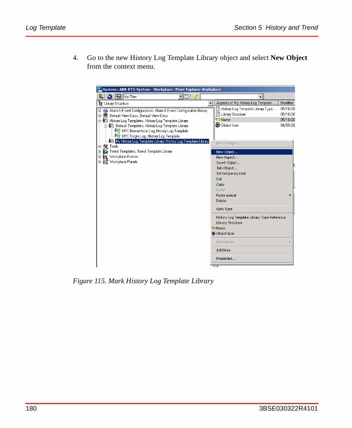
Log Template Section 5 History and Trend
4. Go to the new History Log Template Library object and select New Object from the context menu.
Figure 115. Mark History Log Template Library
180 3BSE030322R4101

Section 5 History and Trend Log Template
5. In the pop-up dialog New Object, select the History Log Template. Fill in the desired name in the Name text field and an object description in the Object description area. Click Create.
6. Select the created object in the object area.
Figure 116. Create a History Log Template
Figure 117. Select History Log Template Object
3BSE030322R4101 181

Log Template Section 5 History and Trend
7. Select the Log Template in the aspect list.
8. Select Property Log in the Property log Template area and click the Add button or open the context menu and select Add Log.
Figure 118. Select Log Template Aspect
Figure 119. Add Log
182 3BSE030322R4101

Section 5 History and Trend Log Template
9. In the pop-up dialog New Log Template, select a source from the Sourcedrop-down menu and click OK. In this example OPC is selected.
10. Write a log name in the Log Name text field under the Log Definition tab. Then you fill in the Storage Interval and Storage Size areas and the Exception Deviation text field under the Data Collection tab. Click Apply.
Figure 120. New Log Template Pop-Up Dialog
The sources available depend on the OCS Integration package installed.
The option to configure the Collector Link is only enabled if third party history servers are being used.
3BSE030322R4101 183

Log Template Section 5 History and Trend
11. Complete your log structure. To implement a new log, select the source which can be the Property Log or one of the other logs and click Add. Fill in the log name in the Log Name text field under the Log Definition tab.
Then you select aggregate from the Aggregate drop-down menu, and fill in the Storage Interval and Storage Size areas and the Exception Deviation and Bad Data Quality Limit in the text field under the Data Collection tab. Click Apply.
Figure 121. Log Template
The recommended way to write the log name is: Log_<Storage Interval>_<Storage Size>. If there are more logs with the same storage interval and storage size, add _<Aggregate> or _<Index number> at the end of the name.
This figure tells you how much aa new value must differ (in %)from the last accepted value beforeit is accepted as a new value
This figure tells how many (in %)bad values that will be acceptedfor an aggregate
184 3BSE030322R4101
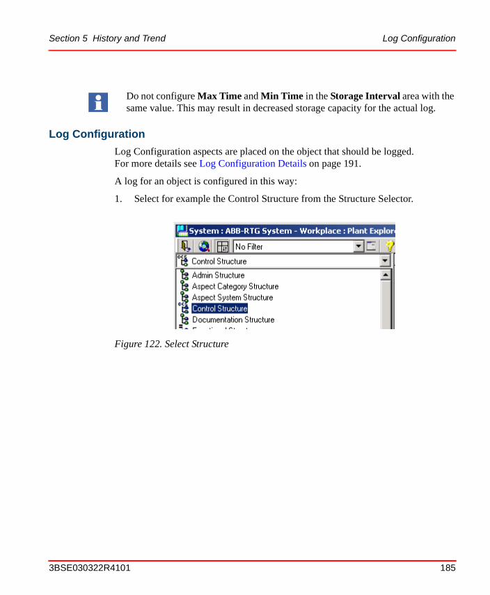
Section 5 History and Trend Log Configuration
Log Configuration
Log Configuration aspects are placed on the object that should be logged.For more details see Log Configuration Details on page 191.
A log for an object is configured in this way:
1. Select for example the Control Structure from the Structure Selector.
Do not configure Max Time and Min Time in the Storage Interval area with the same value. This may result in decreased storage capacity for the actual log.
Figure 122. Select Structure
3BSE030322R4101 185

Log Configuration Section 5 History and Trend
2. Go down in the structure in the Object Tree, to select the object that you want to log.
3. Click the right mouse button in an empty part of the aspect list and select New Aspect from the context menu.
Figure 123. Select Object
186 3BSE030322R4101

Section 5 History and Trend Log Configuration
4. In the pop-up dialog New Aspect, select the Aspect Category Log Configuration (Aspect System Structure > History Configuration > Log Configuration).
5. Enter the name in the Name text field and an aspect description in the Aspect description area before you click Create.
6. Select the created aspect in the aspect list.
Figure 124. Create Log Configuration
Figure 125. Select Log Configuration Aspect
3BSE030322R4101 187

Log Configuration Section 5 History and Trend
7. Make one of the following actions to create a Property Log:
– Select the object in the Logged Properties area and click the Add Property button.
– Select the object in the Logged Properties area and click the right mouse button. Select Add Log.
– Double click a property in the Property column.
Figure 126. Create a Property Log
188 3BSE030322R4101

Section 5 History and Trend Log Configuration
8. In the pop-up dialog New Property Log, select the property which will be logged. In this example VALUE is selected.
9. Select a new data type in the Data Type drop-down menu if needed and Log Template from the Template drop-down menu. Click OK. In this example the Log Template created in Log Configuration on page 185 is used.
Figure 127. New Property Log
Only suitable templates will appear.
3BSE030322R4101 189

Log Configuration Section 5 History and Trend
10. The Logged Properties area will look like Figure 129.
Figure 128. Select from Template List
Figure 129. Log Configuration
190 3BSE030322R4101

Section 5 History and Trend Log Configuration Details
11. Under the Presentation tab you can override Engineering Unit, Normal Maximum, Normal Minimum, No of Decimals or Display Mode from the object.
12. To implement the log click Apply. The log is created in the server and the sampling is started.
Log Configuration Details
In this section all selections for Log Configuration are handled more in detail.
Pop-up dialog New Log Template
If third party servers are being used it is possible to configure logs to run on these servers. This is what the Collector Link option is used for. If no Collector Links are registered on the system, this part will be disabled. If Collector Links do exist however, one can configure a Linked log by checking the Linked check box and select a server type from the Server Type drop-down menu.
Figure 130. New Log Template Dialog Box
3BSE030322R4101 191

Log Configuration Details Section 5 History and Trend
Table 12 and Table 13 explain the selection possibilities in the New Log Template dialog. The available sources depends on the system extensions installed.
Log Template Aspect View
Log Definition Tab. The Log Name can be any number of alpha numeric characters.
Table 12. Source Options
Source Description
OPC An OPC accessible property.
TTD A log in the Advant Controller 400 System. Only present if 800xA for Advant Master is installed.
Table 13. Log Type
Log Type Description
Direct The inputs are retrieved directly from the specified property.
Hierarchical The inputs are retrieved from another log in the server.
Figure 131. Log Definition Tab
192 3BSE030322R4101

Section 5 History and Trend Log Configuration Details
The value for Log Type, see Table 13, is only possible to select when creating the log template.
The Log Source is depending on log type, see Table 14. The source value is not possible to change.
The Service Group is only possible to change for linked logs, i.e. logs that are handled by a third party history server. For internal logs, the default Service Group is always used.
The recommended way to write the log name is: Log_<Storage Interval>_<Storage Size>. If there are more logs with the same storage interval and storage size, add _<Aggregate> or _<Index number> at the end of the name.
Table 14. Sources
Log Type Source
Direct OPC or TTD, depending on log source.
Hierarchical A log in the server.
3BSE030322R4101 193

Log Configuration Details Section 5 History and Trend
Data Collection Tab. The Data Collection Tab is displayed in the figure below:
Figure 132. Data Collection Tab
194 3BSE030322R4101

Section 5 History and Trend Log Configuration Details
Table 15. Aggregates
Aggregate Description
Interpolated The interpolated values.
Total The time integral of the data over the re-sample interval.
Average The average data over the re-sample interval.
Timeaverage The time weighted average data over the re-sample interval.
Count The number of raw values over the re-sample interval.
Standard Deviation
The standard deviation over the re-sample interval.
Minimum Actual Time
The minimum value in the re-sample interval and the time stamp of the minimum value (in seconds).
Minimum The minimum value in the re-sample interval.
Maximum Actual Time
The maximum value in the re-sample interval and the time stamp of the maximum value (in seconds).
Maximum The maximum value in the re-sample interval.
Start The value at the beginning of the re-sample interval. The time stamp is the time stamp of the beginning of the interval.
End The value at the end of the re-sample interval. The time stamp is the time stamp of the end of the interval.
Delta The difference between the first and last value in the re-sample interval.
Regression Slope
The slope (per cycle time) of the regression line over the re-sample interval.
Regression Const
The intercept of the regression line over the re-sample interval. This is the value of the regression line at the start of the interval.
Regression Deviation
The standard deviation of the regression line over the re-sample interval.
3BSE030322R4101 195

Log Configuration Details Section 5 History and Trend
All the timestamps returned are those of the beginning of the aggregate interval, except for those aggregates which explicitly state otherwise.
– AggregationThe Aggregate is only possible to change for logs with another log as source. Available aggregates are explained in Table 15.Exception Deviation is the maximum input deviation that is allowed without a new value is stored in the log. Notice that input will be stored to the log at least as often as the time in Max Time specifies. A large value at Exception Deviation will reduce the data size of the stored log.Bad Data Quality Limit specifies the maximum allowed percent of bad data in the resample interval for an aggregated point to be considered to be good. The Bad Data Quality Limit is applicable for all aggregates except those that calculate a value based on the quality of the aggregated points; they are OPCHDA_DURATIONGOOOD, OPCHDA_DURATIONBAD, OPCHDA_PERCENTGOOD, OPCHDA_PERCENTBAD and OPCHDA_WORSTQUALITY.
Variance The variance over the sample interval.
Range The difference between the minimum and maximum value over the sample interval.
Duration Good The duration (in seconds) of time in the interval during which the data is good.
Duration Bad The duration (in seconds) of time in the interval during which the data is bad.
Percentage Good
The percent of data (one (1) equals 100 percent) in the interval which has good quality.
Percentage Bad
The percent of data (where one (1) equals 100 percent) in the interval which has bad quality.
Worst Quality The worst quality of data in the interval.
Annotations The number of annotations in the interval. (Not implemented)
Table 15. Aggregates (Continued)
Aggregate Description
196 3BSE030322R4101

Section 5 History and Trend Log Configuration Details
– Storage Interval areaMin Time is the shortest time between two samples and Max Time is the maximum time between two samples. Max Time set to zero means that there is no sampling if the input changes are less than the Exception Deviation. In all other cases Max Time must be greater or equal to Min Time. The shortest time between two samples is one (1) sec. Data compaction is achieved by manipulating
– Exception Deviation and Max Time. Exception Deviation is the maximum input deviation that is allowed without a new value is stored in the log. Notice that input will be stored to the log at least as often as the time in Max Time specifies. A large value at Exception Deviation will reduce the data size of the stored log.
– Storage Size areaStorage size can either be specified as number of Points stored in the log or as the Time covered in the log. If the number of points is specified,the time covered in the log will be calculated and displayed in the time edit box. Max/Min Capacity. Max Capacity is an approximation of theMax Time multiplied with the number of Points. Min Capacity is an approximation of the Min Time multiplied with the number of Points.
3BSE030322R4101 197

Log Configuration Details Section 5 History and Trend
Pop-up dialog New Property Log
All logable properties are listed in the Property list in the New Property Log pop-up dialog.
When a property is selected, the default Data Type is automatically displayed. The available Data Types are Boolean, Byte, Char (8-bit integer), Double (64 bit), Float (32 bit), Integer, Long Integer (32 bit), Short Integer (16 bit), Unsigned Integer, Unsigned Long (32 bit), Unsigned Short (16 bit) and Very Long Integer(64 bit).
One reason to change the Data Type is when an aggregate sums up a large number of values. If you use a Data Type with too few bytes the sum will have a poor accuracy.
All available Log Templates can be selected in the drop-down menu, i.e. filtered on the templates which can be used to log the specified property. When a template is selected you can explore it by clicking the button View. With the New button it is possible to create a new Log Template, see Log Template on page 177. With the New button the Log Template will be created in the structure at the object. It is normally much better to create it in the Library Structure.
Figure 133. New Property Log Dialog
198 3BSE030322R4101
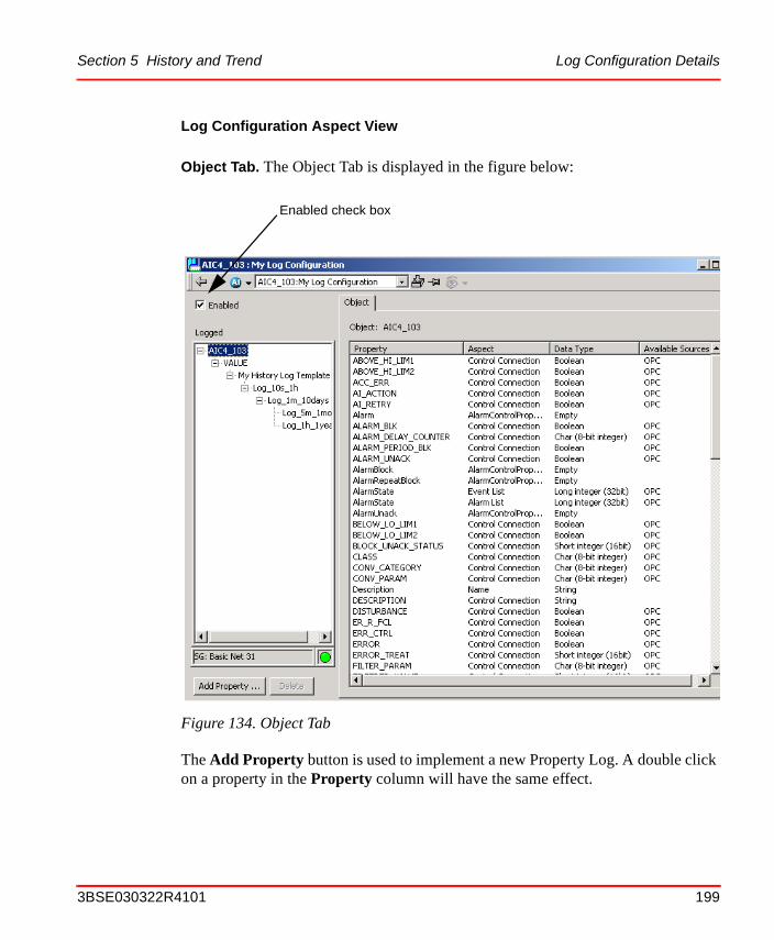
Section 5 History and Trend Log Configuration Details
Log Configuration Aspect View
Object Tab. The Object Tab is displayed in the figure below:
The Add Property button is used to implement a new Property Log. A double click on a property in the Property column will have the same effect.
Figure 134. Object Tab
Enabled check box
3BSE030322R4101 199

Log Configuration Details Section 5 History and Trend
The Delete button is used to delete a Property Log. To delete a Property Log, select the property log and click Delete.
The Service Status row shows status information for the configured Service Group. The name of the configured group is presented in the row. If no history source have been defined, the text ‘Not Specified’ is displayed.
Status for Configured Service Group:
All properties are listed for the selected object. Under the column Available Sources all possible sources for each property are indicated.
The Enabled box is checked by default. With the Enabled unchecked, the log will be inactive and there will be no sampling of the source.
Note that you can not delete a single log in the log structure, since the log is defined in the template. For example Log_5m_1month in Figure 134 is not possible to delete.
OK: All providers in the service group are up and running.
OK/ERROR: At least one service provider is up and running.
ERROR: All providers in the service group are down.
200 3BSE030322R4101

Section 5 History and Trend Log Configuration Details
Property Log Tab. The Property Log Tab is displayed in the figure below:
The Property Log tab displays log information. The Data Size is the size of the Property Log on disk. It is the sum of the size of all logs. The size of each log file is the sum of the file header and the data storage size.
Log Definition Tab. A read-only tab which hold the same information as Log Template, see Figure 131.
Data Collection Tab. A read-only tab which hold the same information as Log Template, see Figure 132.
Figure 135. Property Log Tab
3BSE030322R4101 201

Log Configuration Details Section 5 History and Trend
Presentation Tab. The Presentation Tab is displayed in the figure below:
All values are used to display the trace in a Trend Display in a proper way.These values can be set in either of:
• the Object Type (i.e. in the Property Aspect).
• the Object Instance (i.e in the Property Aspect).
• the Log (in the Log Configuration Aspect).
• the Trend Display.
The above listed are in override order.
For example you can override a value set in the Object Type by writing a value in the Object Instance. Another example is a value set in the Object Type, the Object Instance for presentation attribute or the Log can be overridden in the Trend Display.
To override a presentation attribute the box for the attribute must be checked. If the box is unchecked the default value is displayed. The default value can be a property name or a value, depending on what is specified in the Control Connection aspect.
Figure 136. Presentation Tab
202 3BSE030322R4101

Section 5 History and Trend Log Configuration Details
Engineering Units are inherited from the source. It is possible to override it.
Normal Maximum and Normal Minimum are scaling factors, used for the scaling of Y-axis in the Trend Display. The values are retrieved from the source but are possible to override.
The Number of Decimals are retrieved from the source but are possible to override.
The Display Mode can be either Interpolated or Stepped. Interpolated is appropriate for real values, Stepped for binary. See Figure 137.
With the button Apply the log is created in the server and the sampling is started. The button must be clicked to make a change take effect.
Figure 137. Difference between Interpolated and Stepped Display Mode
Interpolated
Stepped
3BSE030322R4101 203

Log Configuration Details Section 5 History and Trend
Status Tab. The Status Tab is displayed in the figure below:
By clicking the Read button the log values are displayed. By clicking the Settings button you can change the time frame and the number of data points to be retrieved.
Figure 138. Status Tab
204 3BSE030322R4101

Section 5 History and Trend Log Configuration Details
In the Page Size area you can set the number of points the page will display. Default is set to 1000 and max is 10 000.
In the Time Frame area you can set the time for the retrieval of data from the log.
If you check the Latest radio button the 1000 (if set) most recent data are displayed.
If you check the Oldest radio button the 1000 (if set) oldest data are displayed.
If you check the At time radio button you can decide from which time interval the data should be fetched. The data is fetched from the time before the specified date and time.
Figure 139. Data Retrieval Settings
If you click the arrow buttons you can see the next (or the previous)interval of data, i.e. the next (or the previous) thousand points, if the default setting is kept.
3BSE030322R4101 205

Log Configuration Details Section 5 History and Trend
By clicking the Display button you can change the appearance of the logged data.
If you uncheck the box in the Quality area, the value will be displayed as hexadecimals.
If you uncheck the first box in the Time & Date area, the value timestamps are displayed in UTC time.
If you select the second check box in the Time & Date area, the value timestamps will be displayed in milliseconds.
If you select the third check box in the Time & Date area, the value timestamps will be displayed using full resolution (100 ns).
Figure 140. Data Display Options
206 3BSE030322R4101

Section 5 History and Trend Log Summary
Log Summary
The Log Summary aspect gives an overview of all log configurations placed below the aspect in the tree.
In the overview you can see if the Log Configuration is enabled, the path to it and if it is passed the consistency check.
By right-clicking over the list of Log Configurations, a menu will be displayed where you can choose to enable/disable the Log Configurations. You can also choose to run auto-correct if they have not passed the consistency check. See the figure below.
Figure 141. Log Summary
3BSE030322R4101 207

Trend Configuration Section 5 History and Trend
Trend ConfigurationThe Trend System displays history data graphically. The history data and run-time data are seamlessly integrated.
A Trend Display example is shown in the figure below:
The Trend Aspect System defines two Aspect Types, the Trend Template and the Trend Display. Read about Trend Template on page 209 and Trend Display on page 216.
Figure 142. Trend Display Example
Trend Area
Tool Bar
Trend Table
208 3BSE030322R4101

Section 5 History and Trend Trend Template
Trend Template
A Trend Template is a re-usable template for building many similar trend displays. If you modify an existing Trend Template, the changes will not automatically affect existing Trend Displays that has been created using that Trend Template.Settings that are affected are those that you can not change in your existing trend display, such as number of areas and configurable rows, trace colors and Hide/Show Table. Still it is possible to fetch the Trend Template changes to the Trend Display. For more details see Trend Configuration Details on page 224.
Default Trend Templates
There are two default trend templates available; The Advanced Trend Template and the Standard Trend Template. See Figure 143 below.
Figure 143. Default Trend Templates
3BSE030322R4101 209

Trend Template Section 5 History and Trend
Create a New Trend Template
Follow the steps below to create a new Trend Template aspect:
1. Select the Library Structure from the Structure Selector.
2. Select the Trend Template in the Object Tree and New Object from the context menu.
Figure 144. Select Library Structure in the Structure Selector
Figure 145. Mark Trend Template
210 3BSE030322R4101

Section 5 History and Trend Trend Template
3. In the New Object dialog, select the Trend Template Library. Enter a name in the Name text field and an object description in the Object description area before you click the Create button.
4. Select the new Trend Template Library object and open the context menu.
Figure 146. Create a Trend Template Library
3BSE030322R4101 211

Trend Template Section 5 History and Trend
5. Select New Object.
Figure 147. Mark Trend Template Library
212 3BSE030322R4101

Section 5 History and Trend Trend Template
6. Select Trend Template in the New Object dialog. Enter a name in the Name text field and an object description in the Object description area before you click the Create button.
Figure 148. Create a Trend Template
3BSE030322R4101 213

Trend Template Section 5 History and Trend
7. Select the created object in the object area.
8. Select the Trend Template in the aspect list.
Figure 149. Select Trend Template Object
Figure 150. Select Trend Template Aspect
214 3BSE030322R4101

Section 5 History and Trend Trend Template
9. Customize the General, Colors and Columns tabs in the Trend Template Aspect. For more details see Trend Configuration Details on page 224.
10. Click Apply when all changes are done.
Figure 151. Default Trend Template Aspect
3BSE030322R4101 215

Trend Display Section 5 History and Trend
Trend Display
Create a Trend Display
Follow the steps below to create a Trend Display aspect:
1. A Trend Display can be created in any structure. One proper structure is the Functional Structure.
Figure 152. Select Structure
216 3BSE030322R4101

Section 5 History and Trend Trend Display
2. Select the place where you want to locate the Trend Display and select New Aspect in the context menu.
3. In the New Aspect dialog, select the Trend Display aspect.
Figure 153. Create New Aspect
Note that there exist three different aspect categories of Trend Displays, the Operator Trend, the Trend Display and the Object Trend. The differences between the three categories of Trend Displays are the user roles required to modify them.
3BSE030322R4101 217
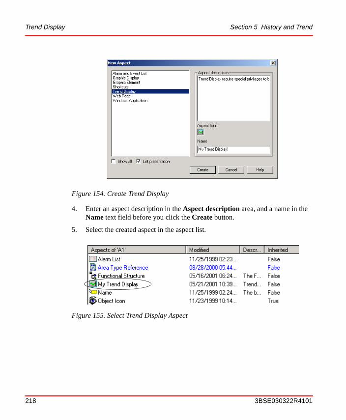
Trend Display Section 5 History and Trend
4. Enter an aspect description in the Aspect description area, and a name in the Name text field before you click the Create button.
5. Select the created aspect in the aspect list.
Figure 154. Create Trend Display
Figure 155. Select Trend Display Aspect
218 3BSE030322R4101

Section 5 History and Trend Trend Display
6. The created Trend Display aspect will look like the figure below:
Figure 156. Trend Display
3BSE030322R4101 219

Trend Display Section 5 History and Trend
7. The created Trend Display uses the default Trend Template. To use the Trend Template created in the section Trend Template on page 209, you must select it in the Config View.
8. In the Config View you select wanted Trend Template from the Trend Template drop-down list.
9. Return to the Trend Display Main View.
10. To insert an object, make one of the following actions:
– Click in the Object Name column and write the object name. (Or enter a dot)
– Select a signal from the Select Object pop-up dialog.
Figure 157. Config View
Figure 158. Select another Trend Template
220 3BSE030322R4101

Section 5 History and Trend Trend Display
– Drag the object and drop it in the Object Name column.
Figure 159. Select Object Pop-Up Dialog
3BSE030322R4101 221

Trend Display Section 5 History and Trend
11. Select Aspect, Property and Log Name from the drop-down menus.
12. If needed, change the other columns as well.
For more configuration information see Trend Configuration Details on page 224.
Figure 160. Select Trend Display Log
If you are not selecting an aspect in the Aspect Name column (see Figure 160), all properties for the selected object will be listed.
Press SHIFT while selecting property in the Property selection column (see Figure 160), then only logged properties will be displayed.
If you are not selecting a Log Name, SEAMLESS will be selected by default (see Figure 160).
Aspect Name Log Name listPropertyselectioncolumn
222 3BSE030322R4101

Section 5 History and Trend XY-Plot
XY-Plot
An XY-plot is a trend that use a trend variable instead of time on the X-axis. It draws one signal as a function of another signal (instead of plotting it as a function of the time).
End Marker
The size of the XY plot End Marker can be changed. Open the Trend Template aspect and enter wanted End Marker size in the End marker size area. See the figure below.
Figure 161. XY-Plot Area
3BSE030322R4101 223

Trend Configuration Details Section 5 History and Trend
Background Image
A background image can be shown on XY-plots. Two images can be configured in the template. See the section about Trend Display Configuration Details on page 238, for more information about how to configure the pictures.
Trend Configuration Details
In this section all selections for the Trend Configuration Details aspect are described in detail.
The Trend Template Configuration Details aspect has three tabs:
• General Tab
• Colors Tab
• Columns Tab
Figure 162. End Marker
224 3BSE030322R4101

Section 5 History and Trend Trend Configuration Details
General Tab
The General tab includes the following areas:
• Table area
• Trace areas
• XY-plot area
• Time Scopes area
Table area . The Size field indicates how many rows that will be displayed in the table part of the Trend Display. There is no virtual limit for the number of traces.
The Visible check box indicates if the table part of the Trend Display will be visible or not. The Update Rate text field specifies the update rate of trim traces in the Trend Display.
Trace areas. The number displayed in the Count field, is the number of trend areas displayed in the Trend Display. You must set the Sizes (height) of each trend area.
Figure 163. General Tab in the Trend Configuration Details aspect
3BSE030322R4101 225

Trend Configuration Details Section 5 History and Trend
XY-plot area . The End Marker Size field is used to configure the size of the XY-plot End Marker. The XY-plot background pictures are used to configure which pictures to use as background.
Time Scopes area. The Time Scopes area defines the time scopes that are selectable (by default) in the Trend Display. The marked time scope is used when your Trend Display opens. To make a new selectable range, mark an existing range, modify the numbers of Years, Months, Days, Hours or Minutes and click Add.
To Replace or Delete an existing range, do that in the same way as for Add, but click the dedicated button.
When changes are made, click Apply to make the changes take effect.Cancel resets all changes since the last Apply was given.
226 3BSE030322R4101

Section 5 History and Trend Trend Configuration Details
Colors Tab
The Colors tab includes the following areas:
• Grid Lines area
• Trend Display colors area
• Trace Properties area
Grid Lines area. The Grid Lines configuration allow you to enter the number of Major and Minor Ticks that will be displayed in the Trend Display. By checking the Show lines for minor ticks check box, you to decide weather or not to show minor tick lines.
Figure 164. Colors Tab
3BSE030322R4101 227

Trend Configuration Details Section 5 History and Trend
Trend Display colors area. You may change color on Background, Table, Trace area, Grid and Axis.
Click in the field for the part you want to change the set color. A new dialog window opens (see Figure 166). Here you can select the color you want to use.
Figure 165. Different Parts of the Trend Display for choosing color
Back-groundcolor
TraceAreacolor
Tablecolor
Gridcolor
Axiscolor
228 3BSE030322R4101

Section 5 History and Trend Trend Configuration Details
By default the Trend Colors set is selected.
If you want to use another color set, open the drop-down list (see Figure 167), and select the color set you want to use.
Figure 166. Color Select Dialog
Figure 167. Color Select Set Drop-Down Menu
3BSE030322R4101 229

Trend Configuration Details Section 5 History and Trend
Trace Properties area. The Number of traces in the Trend Display can be set. You are able to select the color to use for each trace. Click in the Color column to open the Color Select dialog (see Figure 166).
Cick in the Axis column to decide on which side the scaling will be shown, left or right. To specify in which Trend Area a trace will be displayed, click repeatedly in the Area column.
It is also possible to view trends using logarithmic scales. Click in the Axis Type column to change between linear and logarithmic scales.
Figure 168. Logarithmic scale
230 3BSE030322R4101

Section 5 History and Trend Trend Configuration Details
Columns Tab
The Columns Tab includes information about how to customize the Trend Display table columns.
A description of the Columns are found in Table 16. The Name and Width, refer to what and where columns will be displayed in the Table heading of the Trend Display.
To change them, double-click on a row and make the changes in the pop-up dialog.It is also possible to change the width by dragging the columns to the right size in the Column Layout area. After all changes are done you save the configuration by clicking the Apply button.
Figure 169. Columns Tab
3BSE030322R4101 231

Trend Configuration Details Section 5 History and Trend
Table 16. Trend Display Table Columns
Column Description
Visible A check box indicating whether the trace is visible or not. Clicking the check box toggles the visible state. This does not enable the Save and Cancel buttons.
Status The data collection status. Logical colors are used to display the data collection status. If something goes wrong with the data, the color of the cell is trendErrorStatus (by default red). If everything is OK, the color is trendNormalStatus (by default green). While a request for data is in progress the color is trendRequestStatus (by default flashing yellow). The logical colors used by trend are defined in the Trend Colors Aspect of the used workplace.
Trace Color The color of the respective trace.
Object Icon The object icon, which is the same icon that is displayed in the object browser. Clicking this cell displays a dialog that allows the user to select the object that is the source of the data.
Object Name The name of the selected object as specified in the name aspect. If the object has been configured to be relative to the object where the Trend Display aspect is placed, this cell shows the path of the object (usually beginning with ‘.’).
It is possible to type an object name or path into a cell in this column. The input will only be accepted if it refers to an existing Object.
When the cell is accepting input, the cell also contains a button with three dots. Clicking this button displays the same dialog as when clicking the object icon.
If the property column is not part of the configuration, the cells of this column also display the selected property using the syntax “<object>:<property>”.
Object Description
The description of the selected object.
232 3BSE030322R4101

Section 5 History and Trend Trend Configuration Details
Aspect The property aspect of the object that is selected. You can select from a drop-down menu the available property aspects on the object.
Property The property of the object which is displayed in the Trend display. In this column, you can select from a drop-down menu the available properties on the object, or type the desired property. If no property aspect is selected the drop-down menu includes all available properties on the object, otherwise only the properties from the selected aspect. It is not possible to select a non-existent property. Non-unique property names are prefixed with the aspect name.
If the property is not logged, the Trend Display will display a trim trace showing only data starting at the time the Trend Display was opened. This data is lost when the Trend Display is closed.
If the shift key is pressed only logged properties will appear in the property drop-down list.
Log Name The log which is displayed for the specified object and property. If no log is selected, data are fetched from different logs to match scope and treatment.
A drop-down menu shows logs defined by the Log Configuration Aspect. In addition to these, the TRIM log is always available, and if this is selected, a trim trace is displayed for the property. (See also Property column).
If there is no Log Configuration aspect on the selected object, the user can select TRIM and SEAMLESS.
Table 16. Trend Display Table Columns (Continued)
Column Description
3BSE030322R4101 233

Trend Configuration Details Section 5 History and Trend
Low Range The lowest Y-axis value of the trace. The user can change it by typing another value and press ENTER or use the arrows.
The Low Range can be set in either of:
• the Object Type.
• the Object Instance for presentation attribute.
• the Log.
• the Trend Display.
The above listed are in override order. The override order is explained for the Log Configuration Aspect View in Log Configuration Details on page 191.
The value zero means no override.
High Range The highest Y-axis value of the trace. High Range functions similar to Low Range.
The value zero means no override.
Time Offset The time offset used for the trace. The default is zero (0).If this offset is positive, the trace is shifted right. If the offset is negative, the trace is shifted left. The desired offset can be typed by the user. The format used by the cell is yy:mm:dd HH:MM:SS.
Table 16. Trend Display Table Columns (Continued)
Column Description
234 3BSE030322R4101

Section 5 History and Trend Trend Configuration Details
Filter The filter value to use. The default is zero (0), indicating no filter. The value must be between zero (0) and one (1), not including one. Only values above 0.5 have a noticeable effect.
The filter function is
where v is the original value at point n and f is the new value at point n.
The filter works as a low-pass filter, effecting noise reduction for the trace. The visible result is that the trace appears smoother. The closer this value is to one (1), the stronger this effect will be. With a value very close to one (1), the trace will appear almost flat. See example below.
Table 16. Trend Display Table Columns (Continued)
Column Description
fn 1 filter–( ) vn× filter v' n 1–( )×+=
filter = 0 filter = 0.8
3BSE030322R4101 235

Trend Configuration Details Section 5 History and Trend
Style The drawing style selected for this trace. It is possible to change the style by selecting from a drop-down menu of styles. The available styles are shown below.
In addition to these, there is Normal. If this style is selected, the actual style depends on what is specified for the display mode presentation attribute.
Ruler Time The time at the position of the ruler when the ruler is active. If the trace has a time offset, this time will differ from the axis time (and from the other traces).
Ruler Value The value at the position of the ruler for each trace when the ruler is active.
Treatment The treatment shows how the history server should treat the raw data before sending it to the Trend Display. A new value can be selected from the drop-down menu, see Table 15.
Mean Value The average value of the current scope.
Table 16. Trend Display Table Columns (Continued)
Column Description
Linear
Point
Stepped
Filled
236 3BSE030322R4101

Section 5 History and Trend Trend Configuration Details
Extrapolate The type of extrapolation which is selected. A new value can be selected from the drop-down menu. The meaning of the selections are:None, no extrapolation of the trace value is done. Value, the trace is continued from the last point until current time with the same value as the last point. Slope, the trace is continued from the last point until current time with the same slope as between the two last points.
Min Value The minimum value of the current scope.
Max Value The maximum value of the current scope.
Pair Property The index used for pairing XY plot.
Table 16. Trend Display Table Columns (Continued)
Column Description
3BSE030322R4101 237
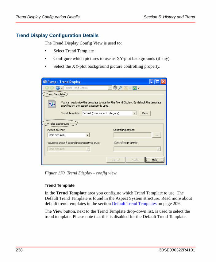
Trend Display Configuration Details Section 5 History and Trend
Trend Display Configuration Details
The Trend Display Config View is used to:
• Select Trend Template
• Configure which pictures to use as XY-plot backgrounds (if any).
• Select the XY-plot background picture controlling property.
Trend Template
In the Trend Template area you configure which Trend Template to use. The Default Trend Template is found in the Aspect System structure. Read more about default trend templates in the section Default Trend Templates on page 209.
The View button, next to the Trend Template drop-down list, is used to select the trend template. Please note that this is disabled for the Default Trend Template.
Figure 170. Trend Display - config view
238 3BSE030322R4101

Section 5 History and Trend Trend Display Configuration Details
XY- Plot Picture Configuration
If some pictures have been configured on the trend template, these are pre-selected in the picture boxes.
If some pictures are configured in both boxes, a controlling property is used to determine which one to use. First you have to select the object containing the property. This is done by using the "…" button next to the Controlling object text box. The Controlling property drop down list is then populated with all binary properties of the selected object.
3BSE030322R4101 239

Trend Display Configuration Details Section 5 History and Trend
240 3BSE030322R4101

Section 6 Creating Reports
OverviewYou can create reports either with Excel Data Access (Data Direct), or with various third party report building applications. These reports can then be scheduled and run using the Application Scheduler and Report action plug-in.
The Report action lets you direct the report to various output destinations including printers, e-mail, files such as PDF, html, Excel, and report logs configured with the Information Management History Server function. You may also attach completed report files to Completed Report objects in the 800xA system aspect directory. This lets you browse for completed report files via the Plant Explorer, and also lets you apply version control and electronic signatures to report files.
When you output a report to a Completed Report object or report log, the report can then be archived to a removable media for permanent storage.
You can also configure web access for reports so that you may open and view the reports using a web browser.
This section describes any set-up that may be required for reports to access data in the 800xA system, and provides instructions for scheduling, running, and managing reports. For further description refer to IndustrialIT 800xA Information Management, Operation and IndustrialIT 800xA System, Administration and Security.
Report Building Applications
Excel Data Access (Data Direct) is an add-in program for Microsoft Excel. It lets you integrate into a Microsoft Excel spreadsheet real-time and historical data from the 800xA system.
3BSE030322R4101 241

Report Building Applications Section 6 Creating Reports
Implementing Reports
The architecture for reporting in the 800xA system is illustrated in Figure 171.
Reports are created as templates which may be stored as Windows files (.xls for Excel) or as a file attached to a File Viewer aspect. Reports may be configured to access real-time data, trend data and alarm and events.
Reports are scheduled via the Application Scheduler. The scheduling instructions are specified in a Job Description object which is created in the Scheduling structure. This triggers a Report Action which specifies how the report will be executed. The Report Action identifies the report template, specifies one or more output destinations, and lets you pass in parameters to the report at execution time. The Report Action is added as an aspect to the Job Description object.
242 3BSE030322R4101

Section 6 Creating Reports Example Reports
Report building may be performed locally on the node where the scheduling server runs.
Most Excel Data Access add-in tools access data in the 800xA system without requiring any set-ups other than the standard post-installation set-up.
Example Reports
The Scheduler Installation includes example reports, which are intended as examples only. You can modify them or simply use them for reference. It is recommended that you copy and rename a report template before modifying them. The templates for Information Management reports are attached to file viewer aspects on objects located under the Reports branch in the Scheduling Structure. The other report files are stored as Windows files.
Figure 171. Report Services Architecture
ReportTemplate
Aspect System(File Viewer Aspect)
orWindows File System
Report Application
Schedule
Report Action
Triggers
Executes
CompletedReport
Completed Report ObjectReport LogPrinterE-mailWindows File
Data Sources:
Real-timeBatchHistoryHistory Events
Output Options:
Web Aspect
Excel Data Access(Data Direct)or
User DefinedExcel Spreadsheet
or
3BSE030322R4101 243

Example Reports Section 6 Creating Reports
Example Information Management Reports
The example Information Management Reports are described in Table 17.
Table 17. Information Management Reports
Name Description Parameters(1)
Hourly Log 1 hour log of 60 x 1 minute values
• Tag01 - Tag20 - List of tag names
• Tag01Algorithm - Tag20Algorithm - list of algorithms to be used for interpolation. Defaults to TimeAverage.
• Start - Time of first value to be displayed. Can be any valid Excel time format, for example: 8:30:00.
• DescriptionAtom - Tag atom of the description, for example: Description
• EUAtom - Tag atom of the engineering units, for example: Unit
Note: if Start = 23:30:15 and the report is run on 2003/10/22, the values will start at 2003/10/21 23:30:15 and extend to 2003/10/22 00:29:15. For times < 23:00:00 the report retrieves data for the current day.
Shift Log 8 hour log of 32 x 15 minute values
• Tag01 - Tag20 - List of tag names
• Tag01Algorithm - Tag20Algorithm - list of algorithms to be used for interpolation. Defaults to TimeAverage.
• Start - Time of first value to be displayed. Can be any valid Excel time format, for example: 8:30:00.
• DescriptionAtom - Tag atom of the description, for example: Description
• EUAtom - Tag atom of the engineering units, for example: Unit
Note: if Start = 23:30:15 and the report is run on 2003/10/22, the values will start at 2003/10/21 23:30:15 and extend to 2003/10/22 00:29:15. For times < 23:00:00 the report retrieves data for the current day.
244 3BSE030322R4101
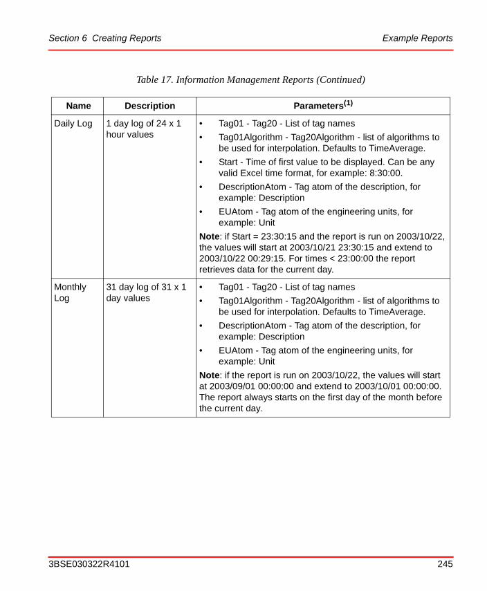
Section 6 Creating Reports Example Reports
Daily Log 1 day log of 24 x 1 hour values
• Tag01 - Tag20 - List of tag names
• Tag01Algorithm - Tag20Algorithm - list of algorithms to be used for interpolation. Defaults to TimeAverage.
• Start - Time of first value to be displayed. Can be any valid Excel time format, for example: 8:30:00.
• DescriptionAtom - Tag atom of the description, for example: Description
• EUAtom - Tag atom of the engineering units, for example: Unit
Note: if Start = 23:30:15 and the report is run on 2003/10/22, the values will start at 2003/10/21 23:30:15 and extend to 2003/10/22 00:29:15. For times < 23:00:00 the report retrieves data for the current day.
Monthly Log
31 day log of 31 x 1 day values
• Tag01 - Tag20 - List of tag names
• Tag01Algorithm - Tag20Algorithm - list of algorithms to be used for interpolation. Defaults to TimeAverage.
• DescriptionAtom - Tag atom of the description, for example: Description
• EUAtom - Tag atom of the engineering units, for example: Unit
Note: if the report is run on 2003/10/22, the values will start at 2003/09/01 00:00:00 and extend to 2003/10/01 00:00:00. The report always starts on the first day of the month before the current day.
Table 17. Information Management Reports (Continued)
Name Description Parameters(1)
3BSE030322R4101 245

Example Reports Section 6 Creating Reports
Trip Log 31 values, 20 before the trip time, 10 after the trip time and 1 at the trip time.
• Tag01 - Tag20 - List of tag names
• Tag01Algorithm - Tag20Algorithm - list of algorithms to be used for interpolation. Defaults to TimeAverage.
• TripTime - Trip time. Can be any valid Excel time format. eg. 8:30:00.
• DescriptionAtom - Tag atom of the description, for example: Description
• EUAtom - Tag atom of the engineering units, for example: Unit
Snapshot-Historical
Single values for 20 tags at the specified time
• Tag01 - Tag20 - List of tag names
• ReportTime - Date and time of values. Can be any valid Excel date/time format. eg. 10/28/2003 12:00:00 PM.
• DescriptionAtom - Tag atom of the description, for example: Description
• EUAtom - Tag atom of the engineering units, for example: Unit
Snapshot-Current
Current values for 20 tags
• Tag01 - Tag20 - List of tag names
• DescriptionAtom - Tag atom of the description, for example: Description
• EUAtom - Tag atom of the engineering units, for example: Unit
• ValueAtom - Tag atom of value
• AlarmAtom - Tag atom of alarm state
• QualityAtom - Tag atom of quality state
Alarm and Event
List of alarms and events between two times for a particular alarm and event object
• AreaObject – Alarm and/or Event object
• End Time - Report end date and time, defaults to current time.
• Start Time - Report start date and time, defaults to 1 day prior to the end time.
(1) All parameters are optional
Table 17. Information Management Reports (Continued)
Name Description Parameters(1)
246 3BSE030322R4101

Section 6 Creating Reports Basic Steps for Building and Executing a Report
Basic Steps for Building and Executing a Report
Follow these basic steps to build and run a report. Details are provided in the IndustrialIT 800xA Information Management, Operation instruction.
1. Create the report using Excel Data Access. All data access connections should already be established, and the report should access the requested data transparently. You may be required to make adjustments to the connected data providers. Detailed instructions for using Excel Data Access are provided in IndustrialIT 800xA Information Management, Operation.
To create a user defined report, use the Excel Add-ins for browsing to objects providing real-time data, trend data or alarm and event data.
2. Use the Application Scheduler to create the Job Description object. Then create an Action aspect on that object.
3. Configure the Action aspect to specify how the report will be executed. This includes:
a. Selecting the Report Action aspect.
b. Selecting the report template.
c. Specifying one or more output destinations for the report result.
d. Specifying parameters to pass into the report when it executes.
4. Configure the Job Description object to specify the scheduling instructions for the report.
5. Before you run a report, read the guidelines.
Login parameters must be specified like follows:
For Excel Data Access, you must define the DataServerLogin parameter in the Report action to connect the report to the applicable data server:
3BSE030322R4101 247

Basic Steps for Building and Executing a Report Section 6 Creating Reports
If you intend to schedule and execute reports using the Application Scheduler, the report file MUST be saved in Manual calculation mode; otherwise, they will run twice when run through the Scheduler.
The Excel calculation mode is set to the mode of the first file opened (or calculated, if no previously saved file has been opened). All workbooks that are opened in that Excel session will be set to that same calculation mode, despite any previous settings. The calculation mode is always Automatic when Excel is first opened. To check the mode and change it if necessary, see IndustrialIT 800xA Information Management, Operation.
248 3BSE030322R4101

Section 7 Process Graphics
Process Graphics in 800xA, including graphic displays, display elements and faceplates are used to view process information and interact with a process.
For more information about process graphics, refer to the IndustrialIT 800xA, Engineering Graphics instruction.
The graphic aspects are:
• Graphic DisplayShows a graphic representation of an area or process in the plant. Can consist of many process objects. Intended to be handled and invoked directly by the process operator, the person that uses graphics for monitoring and control in the run time situation.
• Graphic ElementGraphic elements are building blocks that are used when configuring graphic displays, or other graphic elements, but also faceplates. 800xA uses standard graphic elements (display elements) to represent for example a valve or a motor.
• FaceplateA process dialog for supervision and control. The faceplate include faceplate elements. 800xA has standard faceplates for the standard 800xA process objects.
• Faceplate elementsGraphic elements intended for faceplates.
3BSE030322R4101 249

Section 7 Process Graphics
The figure below shows some graphic aspects of the object MP301 and where they are used.
Graphic aspects created from each aspect type are in most respects the same. They are configured using the same tool, the Graphics Builder, and the same mechanisms can be used in each of them. Graphic Builder is described in detail in IndustrialIT 800xA, Engineering Graphics.
Figure 172. Relations graphic element, faceplates etc.
250 3BSE030322R4101

Section 7 Process Graphics Creating a Graphic Display for an Existing Application
Creating a Graphic Display for an Existing ApplicationThis example shows the major steps for creating the graphic display in Figure 173. The display includes static parts such as tanks, pipes, symbols and text. It also contains dynamic parts, a Display Element Reduced Icon for the process object MP301.
The Graphic Builder tool is used to create the display.
You create the graphic display as described below:
1. Go to the Functional Structure and select the object to which you want to add a graphic display. In this example T300, Supply.
Figure 173. Cooling Tank Display
Aspect Link
Static part - Tank
Text
Graphic Element for
Static part - Symbol
Process Object MP301
3BSE030322R4101 251

Creating a Graphic Display for an Existing Application Section 7 Process Graphics
2. Right-click the object and select New Aspect from context menu.
3. Select Graphic Display in the New Aspect list.
4. Name the Aspect Cooling Tank and click on the Create button.
5. Select the new aspect Cooling Tank and press the Edit button in the preview area or select Edit from the context menu.
6. Now Graphic Builder starts, and its dialog windows open. Open Tools menu, select Graphic Libraries and check Graphic primitives, Extended Primitives, Tank Elements and Symbol Factory Controls.
7. Create the static parts of the display.
a. Select Tank Elements tab and use the TankBody tool from the Tank Elements toolbox. Press the left mouse button and drag the mouse to the size of choice on the display area, then release the left mouse button.
b. To change the properties of the tank, Open View menu - Properties Window and change the properties in order to get the desired look.
c. Continue to build the rest of the tank and pipes using the Graphic Libraries and Properties Window in Graphic Builder.
Figure 174. Functional Structure in Plant Explorer
252 3BSE030322R4101

Section 7 Process Graphics Creating a Graphic Display for an Existing Application
8. Add symbols by selecting Symbol Factory Controls and SFStandard tool. Add it to the display.
a. Change symbol by right-click and choose Properties. Select, for example Valve and the right symbol.
b. Add the other Symbol Factory Control symbols using the same procedure.
Figure 175. Symbol Factory Controls
Figure 176. Symbol Factory Properties Window
SFStandard tool
3BSE030322R4101 253

Creating a Graphic Display for an Existing Application Section 7 Process Graphics
9. Add texts to the display by selecting Graphics Primitives tab and the text tool.
a. In Properties Window, change FillStyle to transparent.
b. Set LineWith and FrameWith to 0.
c. Set the Text to, for example, ST300
d. Change the font by clicking the button in the Font property, see below:
Figure 177. Graphic Primitives Tab
Figure 178. Text Property
Figure 179. Font Change
Text tool
Change font
254 3BSE030322R4101

Section 7 Process Graphics Creating a Graphic Display for an Existing Application
10. Add the link to the Water Tank Overview display by selecting Special tab and Aspect Link tool.
a. Change the text by changing the Caption property in Properties Window.
Figure 180. Graphic Library Special Tab
Figure 181. Caption Property
Aspect link
3BSE030322R4101 255

Adding Graphic Elements to the Graphic Display Section 7 Process Graphics
b. Define the target aspect for the link by choosing Aspect in Properties Window and browse to the Water Tank object and choose Water Tank Overview aspect. Click OK.
When you are finished with the static parts of the display its time to add the dynamic graphic elements.
Adding Graphic Elements to the Graphic Display
To add a Display Element Reduced icon for the object MP301. Follow the steps below:
1. Use the Element Browser in Graphic Builder. Select Tools> Element Browser.
Figure 182. Water Tank Object with Aspects
256 3BSE030322R4101

Section 7 Process Graphics Adding Graphic Elements to the Graphic Display
2. Click browse and select the MP301 object from Control Structure. Press OK.
3. The Element Browser now looks like in Figure 184. Select the graphic element Display Element Reduced Icon, and click Add Element. Drag the icon to the right position in the graphic display.
4. Repeat the steps, for all the object you want to add to the display.
Figure 183. MP301 Object in Control Structure
Figure 184. Element Browser - MP301 Aspects
3BSE030322R4101 257

Creating a Graphic Display without an Existing Application Section 7 Process Graphics
Saving
To save the graphic display, you either click the Save button in the tool bar, or choose Save from the File menu.
They display is saved and can be seen in Graphics builder. It is not launched for real operation.
Deploying
To deploy a graphic display, you either click the Deploy button in the tabular (see Figure 186), or choose Deploy from the File menu.
Deploy means the graphic aspects are saved, distributed and made viewable in the workplace. They are now launched for real operation. If a graphic aspect is not deployed, it is only visible in the Graphics Builder.
Creating a Graphic Display without an Existing Application
If there is no existing application with connected objects you can still add static graphics to you display as described in steps 1-10 in Creating a Graphic Display for an Existing Application on page 251.
Figure 185. Save Button
Figure 186. Deploy Button
To deploy graphics you must belong to the IndustrialIT group Application Engineer and the Windows group Power User, or higher.
258 3BSE030322R4101

Section 7 Process Graphics Creating a Graphic Display without an Existing Application
Without an existing application dynamic graphic elements must be added using the standard object types in the Object Type structure libraries. If you know the object type and the name of the object that is going to be referenced, you just need to deploy the graphic display when the application is created, to show dynamic data.
Follow the steps below to add the Display Element Reduced Icon for the object MB301 (see Figure 173) using an object type graphic element.
1. Use the Element Browser in Graphic Builder. Select Tools > Element Browser.
2. Click browse and browse the Object Type Structure to the right library and select the object type MotorBi. Press OK.
Figure 187. MP301 Object in Control Structure
3BSE030322R4101 259

Creating a Graphic Display without an Existing Application Section 7 Process Graphics
3. The Element Browser now looks like in Figure 188. Select the graphic element Display Element Reduced Icon, and click Add Element. Drag the icon to the right position in the graphic display.
4. Write the name MP301 in the Object Path property in Properties Window.
5. Save and Deploy as described in Saving on page 258 and Deploying on page 258.
6. You will get a message about unresolved references. Click Auto Resolve and in the next dialog click OK.
Figure 188. Element Browser - MotorBi Aspects
Figure 189. Object Path
260 3BSE030322R4101

Section 7 Process Graphics Group Displays
7. Now the Graphic Element looks like this:
8. Repeat the steps, for all the objects you want to add to the display.
Group Displays
With the Group Display aspect it is possible to display a collection of aspect views in a table format. For example you might want to combine several alarm lists or faceplates in one display.
A Group Display aspect can be added to any object. In the config view of the Group Display aspect you decide the group display layout. With different settings you decide which aspect views to show and in what order they will be displayed. You also decide how many rows and columns the display aspect should include when the main view is opened. The minimum number of rows and cells is 1. There is no maximum number of columns. The default numbers are 2 rows and 5 columns. See figure below.
Figure 190. Unresolved Motor MP301
After the application is created, all graphic elements and displays containing unresolved references must be deployed to obtain the connection with the object variables and dynamic data.
Displaying a large number of aspects in a group display might effect the call up time for the group display in a negative way.
3BSE030322R4101 261

Group Displays Section 7 Process Graphics
Example:
In this example four alarm lists will be displayed in the main view.
1. Select an object and add a Group Display Aspect.
2. Open the Group Display aspect config view and decide how many rows and columns your group display should include. In this example the number of columns and rows are 2, the width is 200 and the height is 250.
Figure 191. The Group Display Aspect - Config View
262 3BSE030322R4101

Section 7 Process Graphics Group Displays
3. Click Add button to add an aspect view. The Select View dialog will be displayed. See Figure 192.
4. Select wanted structure, object, aspect and aspect view (Main View is selected by default), see Figure 192.
5. Click OK.
6. Add as many aspects as you decided in the config view. The selected objects and views will be visible in the list, see Figure 193.
Figure 192. Select View to a Group Display Aspect
3BSE030322R4101 263

Group Displays Section 7 Process Graphics
When all table cells are filled, the Add button will be disabled. More rows or cells must then be added before you can add more aspect views.
To remove aspect views, click the Remove button. You can decide in which order the views should be displayed. Use the Move Up and Move Down buttons, see Figure 191. The first aspect view in the list will be placed at the top left position.
7. Click Apply.
Figure 193. Group Display - config view with added aspects
264 3BSE030322R4101

Section 7 Process Graphics Group Displays
Select the Group Display aspect’s Main View to see the result of your configuration. See Figure 194.
Each individual cell uses the Group Display View Class. See Configuring Aspect Views on page 70. The main view uses the Graphic Display View Class to display itself. The Group Display aspect can therefore be used in the Operator Workplace panel. See also Panels on page 52.
Figure 194. Group Display Aspect - Main View
3BSE030322R4101 265

Faceplates Section 7 Process Graphics
FaceplatesFaceplates are used to view, interact and change properties for process objects. The operator of the plant opens the faceplates by clicking on objects in graphic displays. For more information about the operator handling of faceplates, see IndustrialIT 800xA System, Extended Operation.
The process objects used in an application are normally created from standard object types which have standard faceplates. When you add an object type, to for example a graphic display, the standard faceplate for that object type will be used.
Push-Pin for Faceplates
By default the faceplates are unpinned. It means that if you have one faceplate on the screen and wants to open another one, the first one will be exchanged. To make the new faceplate appear in a new window, you can configure the faceplate to be pinned.
Follow the steps below to pin your faceplates:
1. Go to the Library Structure.
2. Select Default View Class, Faceplate System View Class.
3. Select the default aspect and open the config view.
4. A list appears where you select Pinned.
5. Change the value to Local and in the Boolean value area and enter Yes.
266 3BSE030322R4101

Section 7 Process Graphics Push-Pin for Faceplates
With this configuration the faceplates will always be pinned in your Workplace. It is also possible to set only one faceplate to be pinned. See figure below:
In this case the first faceplate on the screen is pinned. The next faceplate that is brought up is placed in a second window. If you want a third faceplate to appear on the screen, the second faceplate has to be pinned as well. Otherwise the second faceplate will be exchanged by the third.
Figure 195. A Faceplate with the Pinned Button Selected
Pinned button selected
3BSE030322R4101 267

Relevance of Structures for Graphic Aspects Section 7 Process Graphics
Relevance of Structures for Graphic AspectsGraphic aspects may be created on objects found in various structures. The structure used reflects the purpose of the graphic aspect. Structures used and the corresponding purpose of the aspect is described in Table 18.
Setting the Background Color of Graphic AspectsThe background color of graphic displays, graphic elements and primitive elements can be controlled.
Common for the graphic elements and primitive elements, that do not posses a transparent background, is that they may be made to appear transparent by setting the background to the same color as the surrounding surface, sometimes called pseudo transparency. There are different mechanisms for graphic elements and primitive elements to achieve pseudo transparency.
Table 18. Relevance of Structures for Graphic Aspects
Structure Purpose of aspect
Object Type Structure A graphic aspect placed on an object type object is inherited by all instances created from the object type.
Built in aspect categories suitable for object type objects are Graphic Element, Faceplate Element and Object Display.
Graphics Structure Aspects placed in the Graphics structure shall be generic.
The graphic structure is used to create toolboxes in the Graphics builder. An object placed in the Graphics structure corresponds to a toolbox tab.
Built in aspect categories suitable for the Graphics structure are Property Element, Subelement and Symbol Element.
Any other structure (typically the Functional Structure)
Graphic aspects placed in other structures are typically aspects of the Graphic Display aspect category. Graphic aspects placed for example in the functional structure are sometimes called “instance graphics”.
268 3BSE030322R4101
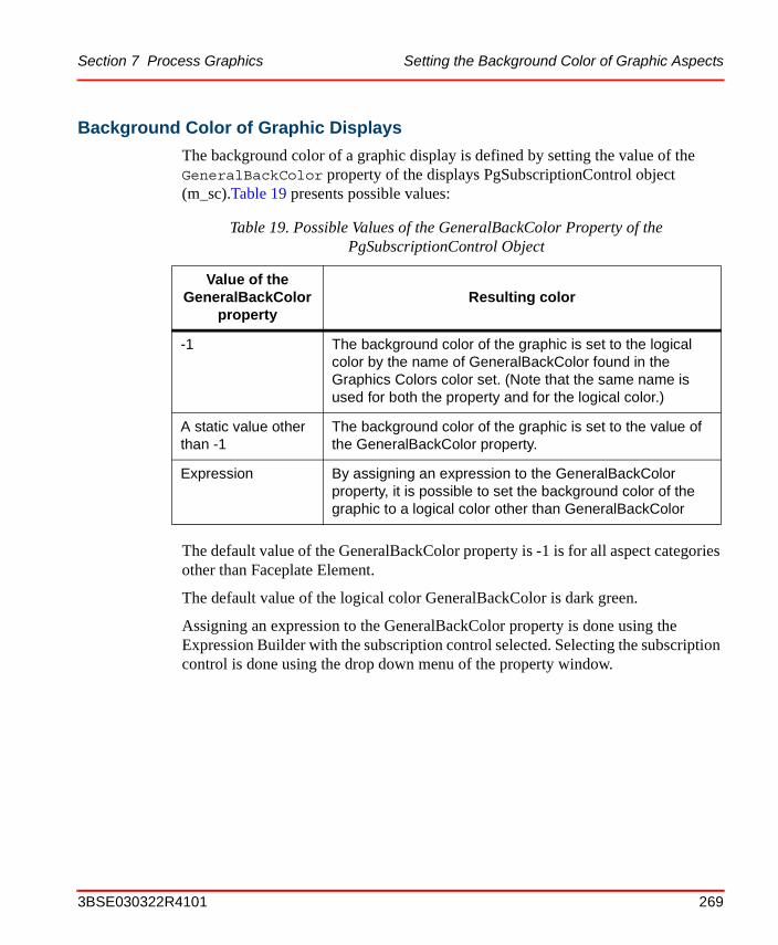
Section 7 Process Graphics Setting the Background Color of Graphic Aspects
Background Color of Graphic Displays
The background color of a graphic display is defined by setting the value of the GeneralBackColor property of the displays PgSubscriptionControl object (m_sc).Table 19 presents possible values:
The default value of the GeneralBackColor property is -1 is for all aspect categories other than Faceplate Element.
The default value of the logical color GeneralBackColor is dark green.
Assigning an expression to the GeneralBackColor property is done using the Expression Builder with the subscription control selected. Selecting the subscription control is done using the drop down menu of the property window.
Table 19. Possible Values of the GeneralBackColor Property of thePgSubscriptionControl Object
Value of the GeneralBackColor
propertyResulting color
-1 The background color of the graphic is set to the logical color by the name of GeneralBackColor found in the Graphics Colors color set. (Note that the same name is used for both the property and for the logical color.)
A static value other than -1
The background color of the graphic is set to the value of the GeneralBackColor property.
Expression By assigning an expression to the GeneralBackColor property, it is possible to set the background color of the graphic to a logical color other than GeneralBackColor
3BSE030322R4101 269

Setting the Background Color of Graphic Aspects Section 7 Process Graphics
Background Color of Graphic Element Instances
Graphic elements that have been created from any of the built-in aspect categories, has a property BackgroundColor that can be used to control the color of instances of these elements. Table 20 presents values that are relevant for the BackgroundColor property.
Background Color of Primitive Elements
It is often desirable to make the background of graphic primitives, or even entire primitives, to appear invisible. This can be achieved by setting the background color of the primitive to the logical color GeneralBackColor. This sets the color of the primitive to the background color of the graphic element it is part of, making it pseudo transparent.
The GeneralBackColor logical color always has the background color value of the graphic display/element, in which it is used rather than the color that is globally defined for it.
Table 20. Possible Values of the BackgroundColor Property of Graphic Element Instances
Value of the BackgroundColor property
Resulting color
-1 Pseudo transparent, i.e. the graphic element receives a background color that is the background color of the graphic that instantiates it.
This makes the graphic element appear transparent when placed on top of the solid background of the display.
Other static value than -1 The background color of the graphic element is set to the value of the BackgroundColor property
Expression By assigning an expression to the BackgroundColor property, it is possible to set the background color of the graphic element to a logical color
270 3BSE030322R4101

Section 7 Process Graphics Display Tool
Display ToolA graphic aspect may consist of information from several other graphic aspects (see Figure 196 below). In the figure you have a graphic display, which contains two graphic elements. These elements include two subelements each.
If a subelement is changed and deployed, the compiled information in the graphic display and the graphic elements is wrong, and these items have to be deployed as well.
Figure 196. A Typical Graphic Image Structure
SubelementsGraphicDisplay
GraphicElements
The graphic subelementsare included in a graphicelement. These arethen included in the graphicdisplay.
A Typical GraphicStructure are:
3BSE030322R4101 271

Display Tool Section 7 Process Graphics
To help you find graphic aspects that got their information (source code) changed but which have not been deployed, you can use the Display Tool. With the help of the Display Tool it is easy for you to see which graphic aspects that have to be deployed.
The following prerequisites exists for running the Display Tool.
• A running default system.
• A defined default Workplace for the actual user. The default workplace is defined in the Workplace Profile Values aspect for each user in the User Structure.
This means that, if you change the information in the Graphic aspect which is also a part of another Graphic aspect (see Figure 196), you have to deploy not only the changed subelement, but also all items containing info from it.
The Display Tool does not have full Unicode support and requires the correct language setting when using Far East languages.
272 3BSE030322R4101

Section 7 Process Graphics Description of the Display Tools Interface
You start the Display Tool from the Start menu, ABB Industrial IT 800xA > System > Display Tool. A window according to Figure 197 below opens. In a table all items with changed but not deployed source code are shown.
Description of the Display Tools Interface
In the Display Tool (see Figure 197) you find a display area with four columns:
• AspectNameIn this column you find the name of the graphic aspect
Figure 197. Display Tool
3BSE030322R4101 273

How to Deploy With the Help of the Display Tool Section 7 Process Graphics
• ObjectNameIn this column you find the path to the Aspect Object, which contain the graphic aspect
• Newer Source
– If YesThe deployed version is older than the source file. Deploy!
– If NoThe deployed version and the source file are the same.
• Newer Dependencies
– If YesThe graphic aspect contains an instance of another graphic aspect. For this instance there is a newer version. Deploy!
– If NoThe graphic aspect is from the same time or older than the graphic aspect you have accessed.
An area in the upper left corner contains info about the structure, that will be searched. With help of a drop down menu, which you access through the arrow head on the right side of the area, you can select the structure you want to search and view. Default is the Functional Structure presented.
If the Search in all structures is checked, all displays in all structures are presented.
In the middle of the upper part of the interface you find a pair of radio buttons. If you select Deploy Required only graphic aspects that have to be deployed are shown. If you select All, every graphic aspect are shown in the list.
How to Deploy With the Help of the Display Tool
When you have a list selected, you can easy deploy all or just a selection of the presented graphic aspects. If you want to deploy:
• All presented graphic aspectsJust click on the Deploy All in List button
274 3BSE030322R4101
Section 7 Process Graphics How to Deploy With the Help of the Display Tool
• Just a selection of the presented itemsSelect the items you want to deploy and click on the Deploy Selected button.
The deploy function takes some time per graphic aspect, so, if you are in a hurry, only deploy the items needed for the moment.
When you perform a deploy operation with the Display Tool the following message appears in Audit trail:
Display Tool session started
Graphic aspect deployed: <object name> : <aspect name>
Display Tool session terminated
For more information about Audit trail see the IndustrialIT 800xA System, Administration and Security instruction.
3BSE030322R4101 275

How to Deploy With the Help of the Display Tool Section 7 Process Graphics
276 3BSE030322R4101
Section 8 Plant Explorer
Plant Explorer is the 800xA System main tool for exploring and building hierarchically structured models of a plant or a system. It is also used to create and configure the objects and aspects of these structures. The information about the plant is stored in a single place, which means that you just have to enter information once.
Plant Explorer Workplace is suitable and recommended for application engineers who wants to configure an Operator Workplace.
In order to do the configuration, you need to know how to handle objects, aspects and structures. Read about the concepts in Section 1, Introduction.
This section includes configuration recommendations and examples.
To start the Plant Explorer Workplace, right click on the My ePlant icon and select Plant Explorer Workplace..
General User Interface800xA System workplaces use the window system provided by Microsoft windows. They are designed so as to retain a familiar environment. Plant Explorer works in a similar way as Windows Explorer regarding for example the following functions.
• cut, paste, copy
• shortcut tools
• drag-and-drop operations within and between the Workplace panes, see also Using Drag-and Drop.
The appearance of the user interface depends on the security settings and User Roles. See IndustrialIT 800xA System, Administration and Security.
3BSE030322R4101 277

The Plant Explorer Workplace Window Section 8 Plant Explorer
• context menu (reached by right-clicking), see Object Context Menu and Aspect Context Menu.
The Plant Explorer Workplace Window
The Plant Explorer Workplace window is the tool you use when you work with aspect objects, aspects and structures.
Figure 198 shows an example of the Plant Explorer window.
Figure 198. The Plant Explorer Workplace User Interface
Context Menu
Object Browser
Aspect List
Pop-up Display
Preview Area
Find Tool
Application Bar
278 3BSE030322R4101

Section 8 Plant Explorer Change User
In Plant Explorer you can use pop-up windows to get a better view of the various aspects of the objects. You can choose to view an aspect in a pop-up window, in the preview area, or to have it displayed in a full-screen window.
Change User
You can temporarily change user by right-clicking the user tool in the Status Bar.A context menu will be displayed with two options; Change User and Revert User. See the figure below:
1. Select Change User to open the Change User dialog.
2. Enter the new User ID and Password and click OK.
One user interface feature of Plant Explorer that is not consistent with the Windows Explorer interface is the presentation of child objects. In Windows Explorer, sub-folders in a folder structure are displayed in the right hand area of the window. In Plant Explorer, child objects are shown only in the object tree structure; the right hand area shows the aspect list.
Figure 199. Log Over Function
Figure 200. Change User dialog
3BSE030322R4101 279

Structures Section 8 Plant Explorer
To change user again, select Revert in the context menu and enter the previous User ID and password.
Read more about Change User in IndustrialIT 800xA System, Administration and Security.
Structures
The structures you normally use when working with Plant Explorer is the Control Structure, the Object Type Structure, Library Structure, the Functional Structure, the User Structure and the Workplace Structure.
Basic Navigation
Below the four most common ways to navigate are listed:
• Shortcuts make it easy to navigate to the most important and/or most frequently used aspects of different aspect objects. You can find different shortcuts in the Application Bar.
• You can move back to the previous display by clicking on the Back to Previous Display button. If the button is disabled, it is not possible to go backward.
• By clicking the Aspect Menu icon in the Tool Bar the Aspect Menu will be presented. From the Aspect Menu you can navigate to different displays by clicking on your Aspect Favorites.
• From the context menu you can e.g.select an aspect, action or a referenced display for the object or aspect. The contents of the context menu may differ depending on which object or aspect you have selected.
Using the Context Menu
By right-clicking an object or an aspect, the context menu is shown. The menu contains a number of actions which are related to the object or aspect. See Figure 198.
As the name Context Menu says, the content of the menu depends on in which context you are. Read about the Object Context Menu on page 281 and Aspect Context Menu on page 296.
280 3BSE030322R4101

Section 8 Plant Explorer Using Drag-and Drop
Using Drag-and Drop
You can carry out a number of tasks using drag-and-drop operations. They are used to cut, copy and move objects and aspects, according to the following:
Move is the default action carried out for a drag-and-drop operation. See Moving an Aspect Object.
If you press CTRL while performing drag-and-drop, a copy operation is performed. See also Cut/Copy/Paste an Aspect Object on page 292.
Pressing SHIFT+CTRL while performing drag-and-drop inserts an object. See also Inserting an Aspect Object on page 291.
Search Function
The structures you have built can be very complex, and might be difficult to find only by browsing the structures. In Plant Explorer you can access a search feature to take care of this, the Find tool, by clicking on the Find Tool button (see Figure 198).
Working with Aspect Objects
The aspect objects are the basic building blocks you use for composing your plant model. The following section describes how to work with aspect objects when configuring your Operator Workplace.
Object Context Menu
Right-click on an object to open the object context menu. The menu contains both items that are specific for the object context (but are the same for all different objects), called context specific items, and items that are specific for each object.
In Figure 201 the object context specific items and the object specific items are pointed out.
Please note that user roles affect the contents of the context menu.
3BSE030322R4101 281

Working with Aspect Objects Section 8 Plant Explorer
The menu items that are specific for the object context, but common for all the aspect objects are explained below:
New Object...
Select New Object... in the context menu to create a new aspect object in the New Object dialog. For further information please see Creating an Aspect Object on page 289.
Figure 201. Object Context Menu
Context specificitems
Objectspecificitems
282 3BSE030322R4101

Section 8 Plant Explorer Working with Aspect Objects
New Aspect...
Select New Aspect... in the context menu to create a new aspect in the New Aspect dialog. For further information please see Adding an Aspect on page 304.
Insert Object...
Select Insert Object... in the context menu to bring up the Insert Object dialog. The aspect object selected in the Insert Object dialog will become a child to the selected aspect object. For further information see Inserting an Aspect Object on page 291.
Set Temporary Root. This operation makes the selected aspect object the root object.
Cut. This operation removes the selected aspect object and all its children in the current structure, and places them on the clipboard. No structure aspects are copied in the Cut operation. Only the internal structures of the aspect objects are saved. If an aspect object, which is part of a Cut operation, is no longer part of any structure, the aspect object and all its aspects will be deleted.
Copy. Makes copies of the selected aspect object and all its children in the current structure to the clipboard. No structure aspects are copied in the Copy operation. Only the internal structures of the aspect objects are saved.
Paste. Pastes a tree structure from the clipboard to the selected aspect object. The pasted aspect object is linked into the current structure by adding a new structure aspect.
Paste Special:
Paste object - Pastes only the root aspect object in clipboard, not its children.
Paste aspect - Pastes the aspect(s) on the clipboard to the selected aspect object.
Note that the Paste operation of graphic aspects, only can be used if the Microsoft Visual Basic software is installed on the computer.
3BSE030322R4101 283
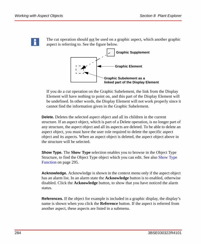
Working with Aspect Objects Section 8 Plant Explorer
Delete. Deletes the selected aspect object and all its children in the current structure. If an aspect object, which is part of a Delete operation, is no longer part of any structure, the aspect object and all its aspects are deleted. To be able to delete an aspect object, you must have the user role required to delete the specific aspect object and its aspects. When an aspect object is deleted, the aspect object above in the structure will be selected.
Show Type. The Show Type selection enables you to browse in the Object Type Structure, to find the Object Type object which you can edit. See also Show Type Function on page 295.
Acknowledge. Acknowledge is shown in the context menu only if the aspect object has an alarm list. In an alarm state the Acknowledge button is to enabled, otherwise disabled. Click the Acknowledge button, to show that you have noticed the alarm status.
References. If the object for example is included in a graphic display, the display’s name is shown when you click the Reference button. If the aspect is referred from another aspect, these aspects are listed in a submenu.
The cut operation should not be used on a graphic aspect, which another graphic aspect is referring to. See the figure below.
If you do a cut operation on the Graphic Subelement, the link from the Display Element will have nothing to point on, and this part of the Display Element will be undefined. In other words, the Display Element will not work properly since it cannot find the information given in the Graphic Subelement.
Graphic Supplement
Graphic Element
Graphic Subelement as alinked part of the Display Element
284 3BSE030322R4101

Section 8 Plant Explorer Working with Aspect Objects
Add Note. Adds an Operator Note aspect in the New Aspect List area. Read about the Operator Note in IndustrialIT 800xA System, Extended Operation.
Properties. Through the Properties dialog you can view and change data for the aspect object, for example change the object’s name, if it is not unique.
There are four tabs in the object Properties dialog, which are described below:
• Identification Tab
The Identification tab displays information about when the object was created and last modified. If an object description exists, it will be displayed in the Description text box.
• Name Tool Tab
The System supports objects with equal names. Under the Name Tool tab, you can check whether the object name is unique or not.
Figure 202. Identification Tab
3BSE030322R4101 285

Working with Aspect Objects Section 8 Plant Explorer
All collisions are displayed in the Collisions text box. To check for collisions, select an object in the Name drop-down menu.
If there is a collision, the name of the object will be displayed in the text field next to the drop-down menu. Enter a new name and click the Change button.
Figure 203. Name Tool Tab
286 3BSE030322R4101

Section 8 Plant Explorer Working with Aspect Objects
• Names & Paths Tab
The Names & Paths tab displays all the currently existing names of the chosen object. It also displays the path to the object (see Figure 204).
Figure 204. Names & Paths Tab
3BSE030322R4101 287

Working with Aspect Objects Section 8 Plant Explorer
• Permissions Tab
This tab shows your permissions for an object, what is allowed and denied. If you have permission, you can see the security settings for this object for other persons, by using the Change User button.
Figure 205. Permissions Tab
288 3BSE030322R4101
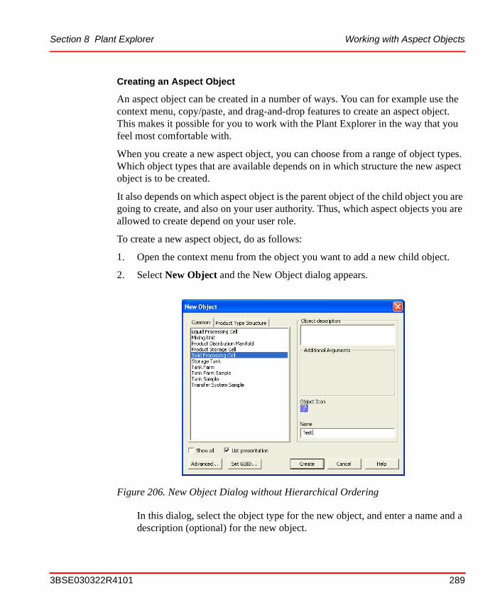
Section 8 Plant Explorer Working with Aspect Objects
Creating an Aspect Object
An aspect object can be created in a number of ways. You can for example use the context menu, copy/paste, and drag-and-drop features to create an aspect object. This makes it possible for you to work with the Plant Explorer in the way that you feel most comfortable with.
When you create a new aspect object, you can choose from a range of object types. Which object types that are available depends on in which structure the new aspect object is to be created.
It also depends on which aspect object is the parent object of the child object you are going to create, and also on your user authority. Thus, which aspect objects you are allowed to create depend on your user role.
To create a new aspect object, do as follows:
1. Open the context menu from the object you want to add a new child object.
2. Select New Object and the New Object dialog appears.
In this dialog, select the object type for the new object, and enter a name and a description (optional) for the new object.
Figure 206. New Object Dialog without Hierarchical Ordering
3BSE030322R4101 289
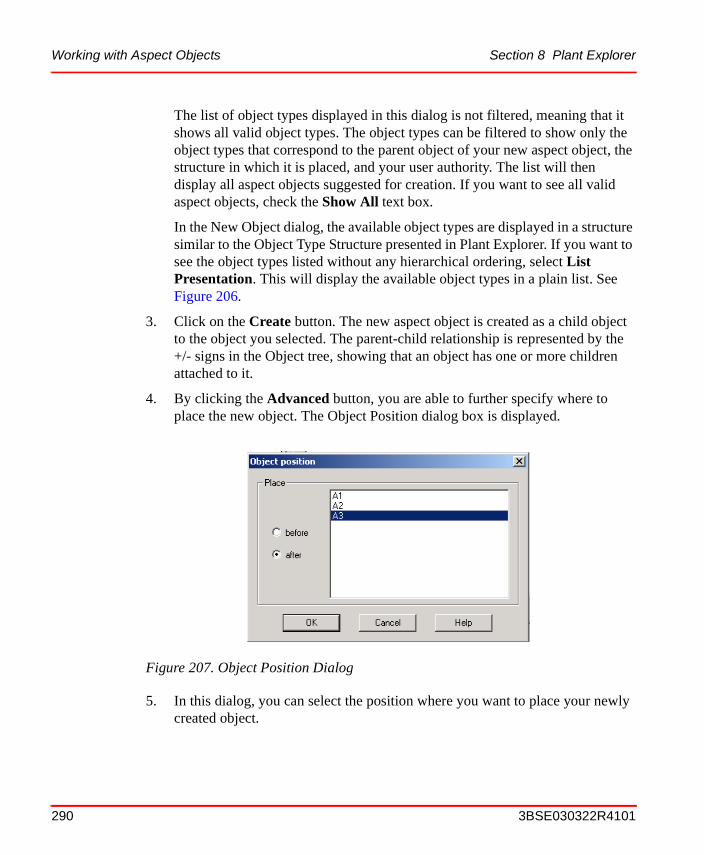
Working with Aspect Objects Section 8 Plant Explorer
The list of object types displayed in this dialog is not filtered, meaning that it shows all valid object types. The object types can be filtered to show only the object types that correspond to the parent object of your new aspect object, the structure in which it is placed, and your user authority. The list will then display all aspect objects suggested for creation. If you want to see all valid aspect objects, check the Show All text box.
In the New Object dialog, the available object types are displayed in a structure similar to the Object Type Structure presented in Plant Explorer. If you want to see the object types listed without any hierarchical ordering, select List Presentation. This will display the available object types in a plain list. See Figure 206.
3. Click on the Create button. The new aspect object is created as a child object to the object you selected. The parent-child relationship is represented by the +/- signs in the Object tree, showing that an object has one or more children attached to it.
4. By clicking the Advanced button, you are able to further specify where to place the new object. The Object Position dialog box is displayed.
5. In this dialog, you can select the position where you want to place your newly created object.
Figure 207. Object Position Dialog
290 3BSE030322R4101

Section 8 Plant Explorer Working with Aspect Objects
If you select before, your object will be placed before the object you are pointing at, on the same hierarchical level. If you select after, the object will be placed after the object you are pointing at, on the same level.
When the aspect object has been created, the right-hand panel will show the default aspects set to the object. You can add more aspects in order to further specify your new object. This is described in Working with Aspects on page 295.
Inserting an Aspect Object
You can place the same aspect object in different structures, in order to make it easier to navigate in the System. Inserting an aspect object, means that a new structure aspect is added to it.
The Insert Object operation is similar to the Create Shortcut operation in Windows. The Insert Object operation can be performed by using the context menu for the Object tree, or by using drag and drop.
To perform an Insert Object operation on an aspect object, follow these steps:
1. Select the aspect object to which you want to insert an aspect object.
2. Select Insert Object from the context menu.
3. In the Insert Object dialog that pops up, browse to the aspect object you want to insert and select it. See Figure 208.
This is relevant only when you do not have selected alphabetical order (through User Profiles) between the objects. See configuring User Profiles.
3BSE030322R4101 291

Working with Aspect Objects Section 8 Plant Explorer
4. Click on the Insert button.
To Insert an aspect object, you can also do as follows:
1. Click on the aspect object you want to insert.
2. Drag it to its new position, while pressing <SHIFT-CTRL>, and drop it.
Cut/Copy/Paste an Aspect Object
A Copy operation will copy the aspect object and all its children and their aspects to the clipboard. In the same way, a Cut operation cuts both the aspect object and its children and all their aspects and places them on the clipboard.
Figure 208. Select Object to Insert
The inserted aspect object must be valid for the structure in which it is to be inserted for the Insert Object operation to be performed.
O
Only the object selected in the Insert dialog will be inserted. Its children will not be included, they must be inserted separately.
292 3BSE030322R4101

Section 8 Plant Explorer Working with Aspect Objects
If any of the cut aspect objects are no longer part of any structure, these aspect objects and all their aspects are deleted. They are, however, still available on the clipboard.
To perform a Copy operation, do as follows:
1. Click on the aspect object you want to copy.
2. Select Copy in the Object context menu.
3. Click on the aspect object to which you want to copy your aspect object.
4. Select Paste in the context menu.
All Cut/Copy/Paste operations can also be carried out using the standard Windows features: CTRL+X to perform a Cut operation, CTRL+C to Copy and CTRL+V to paste the contents on the clipboard.
Structure operations such as Cut/Copy/Paste of aspect objects do not include structure aspects. Only the internal structure of the Cut/Copied sub-tree is saved. This structure is reproduced when pasting the sub-tree. If the Paste operation is made in another structure, the sub-tree is adapted to the new structure.
A Copy operation can also be carried out by a drag-and-drop operation while holding CTRL and pressing the left mouse button.
Moving an Aspect Object
You can move an aspect object by using the drag-and-drop method:
1. Select the aspect object by clicking on it.
2. Move the aspect object by dragging it to another place in the structure.
3. Drop the aspect object on another aspect object in a structure. The moved aspect object will become a child to that aspect object.
Rename an Aspect Object
It is easy to rename an aspect object. The name is stored in the Name aspect of the object. There are two ways to change the name. The first one is like this:
1. Go to the aspect object in Plant Explorer and select its Name aspect.
2. In the preview area or pop-up window, change the name in the Name area.
3BSE030322R4101 293

Working with Aspect Objects Section 8 Plant Explorer
3. Click on the Apply button.
The other way is as described below:
1. Right-click on the aspect object.
2. Select Name in the context menu.
3. Change the name in the Name area of the pop-up window that opens.
4. Click on the Apply button.
Deleting Aspect Objects
Delete removes the aspect object from the current structure. It also removes all the children of the deleted aspect object. If any of the deleted aspect objects is no longer part of any structure, the aspect object and all its aspects will be deleted. To be able to delete an aspect object, you must have the user role specified for the current aspect object. To remove an aspect object and all its children, do as follows:
1. Right click on the aspect object to open the context menu.
2. Select Delete in the context menu. If the aspect object and its children has more than one structure aspect, that is, if it occurs in more than one structure, then the aspect object will be removed from the structure in which you are working. If the aspect object has only one structure aspect (occurs in only one structure), the aspect object and all its aspects are deleted entirely.
or
1. Select the aspect object to be deleted.
2. Press the Delete keyboard button.
3. On the confirmation dialog that is displayed, click on OK to delete the aspect object.
294 3BSE030322R4101

Section 8 Plant Explorer Working with Aspects
Show Type Function
You have to search for the Object Type object to edit an instance of an object. To see the Object Type of an object, you select Show Type in the object’s context menu. Another window with object type information will be displayed.
The object type and its aspects can be edited in the same way as objects in Plant Explorer Workplace, but changes to the object type will affect all objects of this object type.
Working with Aspects
Each aspect object is specified by a number of aspects. The aspects contain information on all characteristics of the aspect object, such as the name of the aspect object, its geographical location, its place in the Functional Structure, user’s rights, and so on. Aspects are used to inform the System how the aspect objects shall be treated by the different parts of the system.
Figure 209. Display for Object Types
3BSE030322R4101 295

Working with Aspects Section 8 Plant Explorer
Aspect Context Menu
The aspect context menu is opened when you right click on an aspect (for example in the aspect list). The context menu contains items that are specific for the aspect context (but are the same for all different aspects) called aspect specific items, together with items that are specific for each aspect.
The menu items specific for the aspect context, and common for all the aspects are explained below and seen in Figure 210.
New Aspect... Brings up the New Aspect dialog. See Figure 218 and the section about Adding an Aspect on page 304.
Cut. Cuts the selected aspect and places it on the clipboard.
Copy. Copies the selected aspect to the clipboard. See also the section about Copying an Aspect on page 305.
Paste. Pastes the cut/copied aspect to the aspect list. This operation can only be carried out when the clipboard contents has a valid format. See also the section about Copying an Aspect on page 305.
Figure 210. Aspect Context Menu
296 3BSE030322R4101

Section 8 Plant Explorer Working with Aspects
Delete. Deletes the selected aspect.
Rename. Select Rename to put the aspect in an edit mode and rename it.
Override. If the aspect is inherited, this operation makes a local copy of the aspect. See also Overriding an Aspect on page 305.
Add to Aspect Menu. This function is included in the Favorites Aspect System. Select Add to Aspect Menu to open the Aspect Favorites dialog. In this dialog you can add the selected aspect to the Favorites list.
Read more about the Favorites Aspect System in Favorites on page 78.
Properties.... Through the Properties dialog, you can change data for the aspect, for example set the aspect to be the default aspect, change its name and enter in a description of the aspect.
The four tabs in the Aspect Properties dialog are described below:
• Identification Tab
3BSE030322R4101 297

Working with Aspects Section 8 Plant Explorer
Under the Identification tab you can change the name of the aspect and you can add a description of the aspect. Enter a new Name and a Description. Click Apply to activate the changes.
Figure 211. Identification Tab
298 3BSE030322R4101

Section 8 Plant Explorer Working with Aspects
• Aspect Details Tab
Under the Aspect Details tab you can find information about when the aspect was last modified and created. You can also make the current aspect to default aspect for the aspect object, by checking the Default aspect box.
The Priority drop-down menu contains information about whether the aspect shall be preloaded on the client by the File Set Distribution function. Priority is especially useful for Graphics.
There are four predefined priorities in the drop down menu, see Figure 213.
Figure 212. Aspect Details Tab
Figure 213. Priority drop-down Menu
3BSE030322R4101 299

Working with Aspects Section 8 Plant Explorer
Select a priority or create a new by clicking on the New button. For more information about Graphics, File Set Distribution and Priorities read the IndustrialIT 800xA, Engineering Graphics.
Enter a name and a description for the Priority. Check the Set to current aspect check box if you want to set the Priority to the current aspect. Click OK.
You can customize the aspect by adding Keys to the aspect. Keys attached to the aspect are displayed in the Keys text box, see Figure 212. Add new Keys by clicking the Add button. This will open the Add Keys dialog. Select suitable Keys in the list displayed.
Figure 214. Add Priority Dialog
300 3BSE030322R4101

Section 8 Plant Explorer Working with Aspects
The Default Aspect Key makes the aspect “default” for the object. When you have selected the Keys, click OK.
If you select a key in the list under the Aspect Details tab and then press the Remove button, the selected Key will be removed from the aspect.
By clicking the New button, you can add new Keys in the same way as you added new Priorities, see Figure 215.
Figure 215. Add Keys Dialog
3BSE030322R4101 301

Working with Aspects Section 8 Plant Explorer
• User Role Mapping Tab
The User Role Mapping tab displays the required roles to view, modify, create and look at the configuration view of the aspect. Default user roles are displayed in this dialog. The User Roles can be changed and added on the Aspect Category.
Figure 216. User Role Mapping tab
User roles affect the contents of the context menu. The roles help to customize the environment to suit the needs of each user. This means that the operations which the user needs to act on are visible for him/her.
302 3BSE030322R4101
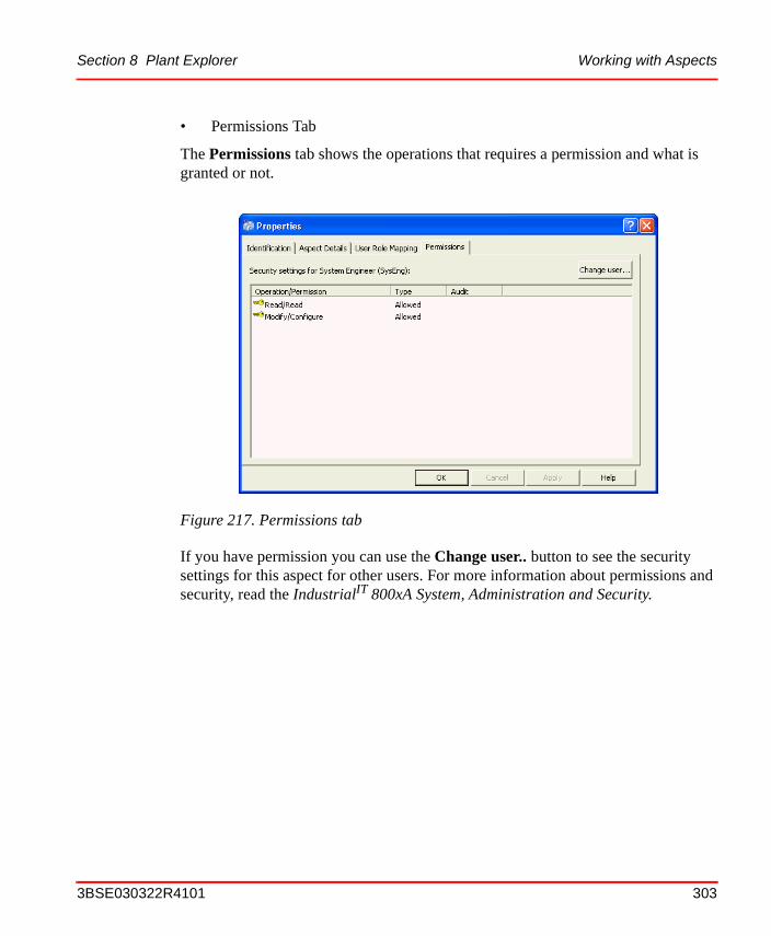
Section 8 Plant Explorer Working with Aspects
• Permissions Tab
The Permissions tab shows the operations that requires a permission and what is granted or not.
If you have permission you can use the Change user.. button to see the security settings for this aspect for other users. For more information about permissions and security, read the IndustrialIT 800xA System, Administration and Security.
Figure 217. Permissions tab
3BSE030322R4101 303

Working with Aspects Section 8 Plant Explorer
Adding an Aspect
To add an aspect to an aspect object, do as follows:
1. Right click on the aspect object for which you want to add a new aspect.
2. Select New Aspect from the context menu that appears. A list of available aspect categories is displayed.
The aspect list is filtered according to the aspect object you have selected and the structure you are working in. The aspects are listed according to the existing aspect categories.
3. Select an aspect category. The aspects listed are those suggested for the object type you are creating it for, but you can view all valid aspects for the object type by checking the Show all box. Uncheck the List Presentation box to show the Aspect System Structure instead of a plain list of the aspects.
4. You can also add a description of the aspect and a name for it. If you do not set a name, the aspect category name will be used and displayed in the aspect list.
5. Click on the Create button. The aspect you have just created will then be presented as the topmost aspect in the list.
Figure 218. New Aspect Dialog
304 3BSE030322R4101

Section 8 Plant Explorer Find Tool
Copying an Aspect
To copy an aspect, do as follows:
1. Right-click on the aspect you want to copy to open the context menu.
2. Select Copy (CTRL+C) in the context menu.
3. Right-click on the aspect object to which you want to copy the aspect.
4. Select Paste (CTRL+V) in the context menu.
Configuring an Aspect
Most aspects can be edited when you open the Config View of the aspect. Right-click on the aspect and select Config View in the context menu. The aspect may also have a verb defined in the context menu to open the aspect for configuration. See as an example Edit for graphic aspects.
Overriding an Aspect
The override function is very useful when an object has an inherited aspect and you want to modify that aspect only for a specific object instance.
Right-click on the inherited aspect and select Override in the context menu to create a local copy of the aspect.
Find ToolThe Find Tool provides functionality to search for objects and aspects.
At start up a default Find Tool configuration is displayed. It is possible to extend the tool and search features with attributes, columns and additional operations.
In the Find tool, enter the name of an object or the path to an object as a search criteria and then search for the object that you are looking for. It is also possible to search for aspects.
The override function breaks the inheritance for the selected aspect. To remove override, delete the overridden aspect.
3BSE030322R4101 305

User Interface Section 8 Plant Explorer
You can run the search globally or in a specific structure. In the Find tool you can also use wild card searches, if you are uncertain of the exact name of the object you are searching for. Use the “*” character as a substitution for zero, or one or more characters, and the “?” sign to substitute exactly one character.
User Interface
The Find Tool dialog provides the main user interface for the Find Tool. It contains two areas; the Find Query Definition area, where the search request is defined, and the Result List area, where the search result is presented. See the figure below.
Find Query Definition Area
Find queries are defined in the Find Query Definition area in the Find Tool. This is the main input and user interface area of the Find dialog. In the Name area the search expression is entered. Use the Find Attributes to define the query.
Tasks related to a Find query, e.g. printing, saving or loading Find queries, can also be accessed from here. The Search Tasks item is collapsed in Figure 219, but is described later on.
Figure 219. Main View of the Find Tool Dialog
Find Query Definition area Result List
Find Attributes
Example of asearchexpression
306 3BSE030322R4101

Section 8 Plant Explorer Find Query Definition Area
Enter a Search Expression. Enter a search expression and press Enter or click the Search button to start the search. Clicking the Stop button will interrupt the search request. It is possible to use search wild cards in the search expression, for example A1* or A?. See Figure 220 above.
Search Expression History. All entered search expressions are added to the Expression History list. The expression is added to the list in order to be easily reused.
Figure 220. Find Query Definition Area
Search expressioneditable drop-down menuradio buttons
Object- and Aspect search
Add attributes
Search button
Collapsed Search Tasks item
Find Attributes
Searchexpression
3BSE030322R4101 307

Find Query Definition Area Section 8 Plant Explorer
Search for Objects
When the Objects radio button is checked, the object search will be activated. The name of the object to search for can either be an object id {objectId}, or a search expression. The result will be filtered according to included Find attributes.
Search for Aspects
Aspects can be searched by name, e.g. Process Graphic, or by entering the object id and aspect id on format {objectId}:{aspectId}. When the Aspects radio button is checked the aspect search is activated.
Run Query Aspect Verb
The Find dialog can be opened from the context menu of a Find Query aspect. Select the aspect and the Run Query verb from the context menu, see Figure 221 below. This will open the Find tool dialog which will be initialized from the Find Query aspect
Figure 221. Context Menu of a Find Query Aspect
308 3BSE030322R4101

Section 8 Plant Explorer Find Attribute Item
Add Attribute
This operation adds an attribute to the Attribute drop-down menu, see (Figure 219). The attribute item is expanded and included (the attribute box is checked) by default, in order to simplify a selection in the Find Attribute editor.
Find Attribute Item
The Find Attribute item is a container control for Find attribute editors. When a Find attribute is added, it is displayed as the figure below shows.
The following Attribute options are available in the Attribute item.
• The Include Attribute check box indicates if the Find attribute is included in the Search Request.
• The Attribute name shows the name of the attribute.
• Click the Expand/Collapse arrow to toggle the expand and collapse state of the Attribute item.
• An Attribute selection shows the current selection in the Find editor. This label is enabled when the Attribute selection box is checked.
Figure 222. Find Attribute Item
Include attributecheck box Expand / CollapseAttribute name Selection
3BSE030322R4101 309

Search Tasks Area Section 8 Plant Explorer
• Click the Remove attribute link to remove the attribute from the Find query definition.
Search Tasks Area
Search Tasks are related to a search request or a result from a search
Each function in the Search Tasks area is described below.
Figure 223. Remove Attribute
Figure 224. Search Task Area expanded
Expand/Collapsearrow
Saved queries
Search task options
list
310 3BSE030322R4101

Section 8 Plant Explorer Search Tasks Area
Use Saved Find Query
Saved queries can be opened from the Use a saved search query drop-down menu. There are two sections in the list; My personal queries and Shared search queries. The personal queries are saved on the current user object, see also Save Query. Personal queries are available only for the current user of the Find tool.
Shared queries are located on the Everyone object in the User Structure and are available for all users.
Figure 225. Use a Saved Search Query drop-down Menu
3BSE030322R4101 311

Search Tasks Area Section 8 Plant Explorer
Save Query
The Save option opens the Save or Save as dialog. The name and description for a query can be entered in the Find Query Name area.
The query is saved in a Find Query aspect which automatically gets the same name as the query. The aspect is created and added to the current user object in the User Structure. To place query aspects in other locations, they have to be copied or moved manually. Such queries can be opened in Plant Explorer via for example the context menu.
Figure 226. Save Search Query dialog
312 3BSE030322R4101

Section 8 Plant Explorer Search Tasks Area
With the Printer label, Search requests and Results can be printed. Click the Print option to open a new window and then the Print button to proceed the job. See Figure 227 below.
Figure 227. Print Preview Dialog
3BSE030322R4101 313

Search Tasks Area Section 8 Plant Explorer
Configuration of Columns
Columns in the Result List can be configured either in the Choose columns dialog, see the figure below, or from the context menu (see Figure 229 and Context Menu on page 318) in the Result List header. Open the Choose columns dialog by clicking the Choose column configuration in the Search Tasks area (Figure 224), or by selecting More in the Header context menu in the Result List (Figure 229).
Figure 228. Choose Columns dialog
314 3BSE030322R4101

Section 8 Plant Explorer Search Tasks Area
The figure below displays a list of standard column suppliers provided by the 800xA System Find Tool.
Figure 229. Context Menu in the Result List Header
3BSE030322R4101 315
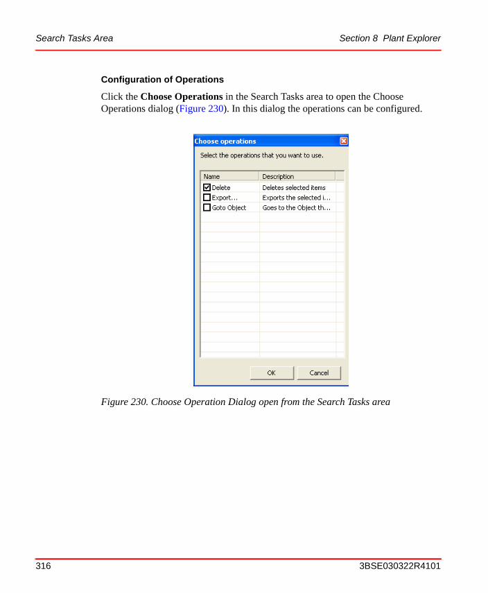
Search Tasks Area Section 8 Plant Explorer
Configuration of Operations
Click the Choose Operations in the Search Tasks area to open the Choose Operations dialog (Figure 230). In this dialog the operations can be configured.
Figure 230. Choose Operation Dialog open from the Search Tasks area
316 3BSE030322R4101

Section 8 Plant Explorer Search Tasks Area
The selected operations will then appear in the Result List context menu (Figure 231).
Export Result . Objects and aspects found in a search request can be exported by using the Export function in the Search Tasks area. When the Export option is clicked the Import/Export application is started and all items in the result list are exported to the new Import/Export document. Read about the Import/Export Tool in IndustrialIT 800xA System, Administration and Security.
Online Help. The online help for the Find Tool dialog is opened by clicking the Help label in the Search Tasks area. A related help topic will be opened in a significant help file.
Figure 231. Context Menu in the Result List with the Delete Operation enabled
Configured operations
3BSE030322R4101 317

Result List Section 8 Plant Explorer
Result List
The Result List displays items found in the last performed search request. The list displays objects or aspects depending on the type of search. It is configured with a set of columns and operations, which preferable is relevant to the type of displayed items.
Context Menu
The Result List provides a context menu for the currently selected item, see the figure below (Figure 233). Depending on whether the item is an object or an aspect, the object- or aspect context menu is displayed. There is a section in the menu which is dedicated to configured operations in the Find Tool. All included operations appears as items in the menu.
Figure 232. Result List
318 3BSE030322R4101

Section 8 Plant Explorer Result List
The figure below shows the Delete operation.
Drag and Drop
The Result List supports the drag and drop operation, i.e. items in the result list can be selected and dragged to an area in a Workplace. Aspects might be dragged from the result list to a drop target tool and objects might be dragged to the Plant Explorer object browser.
Figure 233. Object Context Menu in the Result List
3BSE030322R4101 319
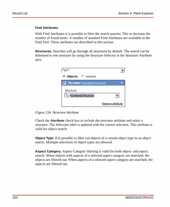
Result List Section 8 Plant Explorer
Find Attributes
With Find Attributes it is possible to filter the search queries. This to decrease the number of found items. A number of standard Find Attributes are available in the Find Tool. These attributes are described in this section.
Structures. Searches will go through all structures by default. The search can be delimited to one structure by using the Structure Selector in the Structure Attribute area.
Check the Attribute check box to include the structure attribute and select a structure. The Selection label is updated with the current selection. This attribute is valid for object search.
Object Type. It is possible to filter out objects of a certain object type in an object search. Multiple selections of object types are allowed.
Aspect Category. Aspect Category filtering is valid for both object- and aspect search. When objects with aspects of a selected aspect category are searched, the objects are filtered out. When aspects of a selected aspect category are searched, the aspects are filtered out.
Figure 234. Structure Attribute
320 3BSE030322R4101
Section 8 Plant Explorer Result List
Modification Date. The Modification Date attribute filters objects or aspects according to a specified modification date interval.
Creation Date. The Creation Date attribute filters objects or aspects according to specified creation date interval. It is valid for both object - and aspect searches.
Modified By. Filters out items modified by the selected user. This attribute is valid for searching for both objects and aspects.
Created By. This Find attribute is similar to the Modified by attribute, although the filtering regards which user created the item.
3BSE030322R4101 321

Result List Section 8 Plant Explorer
OPC Property. The OPC Property attribute is targeting object search requests.
The user interface of OPC Find attribute, is displayed in the figure above. It is composed by an object type- and an OPC Property list for selecting the property and an editable drop-down menu for defining the conditional value of the property.
The OPC Properties list is depending on the selection made in the Object type list. For example, if the selection in the Object Type list = AI, then the list will contain all available OPC Properties for the AI objects.
For all selected OPC Properties a condition, e.g. IS; IS NOT, LESS THAN, and a value can be specified.
Figure 235. OPC Properties Attribute
322 3BSE030322R4101

Section 8 Plant Explorer QuickFind Tool
For example: an OPC property named IS_BLOCKED may have a typical condition of IS NOT and a value BLOCKED. The search result will be filtered according to the conditions specified in the OPC Properties item.
Name Category. The Name Category attribute is valid when searching for objects. The attribute is filtering out objects with aspects of the selected Name Category.
QuickFind Tool
General
Navigating to items in Plant Explorer is performed by browsing the structures and trees. Another way is to use the Quick Find tool to get quick access to an object. Quick Find searches for objects with the name that has been entered or selected in the list. If an object is found it will be selected in the list and in the Object Browser.
User Interface and Functionality
The Quick Find tool is a drop-down list. The list contains the history of entered object names for the current user. The name of the object to search for can either be entered or selected.
Figure 236. Quick Find Tool
3BSE030322R4101 323

QuickFind Tool Section 8 Plant Explorer
Quick Find History. Object names that have been entered in the text field are added to list. The Quick Find History should not be confused with the Auto fill functionality.
Auto Fill. There is an Auto fill (an auto completion) functionality provided by the QuickFind tool. Each time characters are typed a search request is invoked to lookup objects matching the string entered so far. The search expression sent to the Find logic component is the string with a '*' wildcard appended, i.e. find all objects with names starting with the string entered.
An example; the user enters A1 and the search expression is A1*. Hence all objects starting with A1 will be displayed in the drop-down menu. When the search is done all objects found are added to the list. If no items are found nothing happens. As soon as a new character is entered a new search request is started and any pending search tasks are terminated.
Workplace Selection. When a quick find search request is completed, the Workplace selection is updated depending on the result from the search.
324 3BSE030322R4101

Appendix A Property Translation Aspect
PurposeYou can use the Property Translation aspect to create properties presenting the result of an evaluation or calculation of one or several object properties. The result is available as an OPC Property on the Property Translation aspect itself. The result can also be translated to a text string describing the result. Displays and reports can access this information as an ordinary OPC item.
The data collection can be done from any public aspect object property (including the aspect properties from aspects such as the General Properties aspect). This means that object properties in controllers, are accessible as data sources.
There are two Property Translation aspects with different functionality regarding translation to strings:
• Property TranslationIn this aspect you use a literal translation for the string translation expression. It is useful to describe states in for example sequence objects, multiple values etc.
• Property Translation ExtendedIn the extended aspect you can also use expressions when translating to strings. You can set strings both for the result True and False (of the expression). Property Translation Extended can evaluate expressions, and as an example evaluate and describe intervals as text strings.
Properties which depend on each other, e.g. property a = b, b = c and c = a etc. may cause the Property Translation to loop recursively.
3BSE030322R4101 325

Property Translations Aspect Appendix A Property Translation Aspect
Property Translations AspectThe Property Translations aspect is placed on the object, for which you want to provide translated properties.
Right click on the aspect in Plant Explorer and select the config view. See the figure below:
• In the Name area, enter the name you selected for the translated value.
• In the Description area, write a description of the purpose with the translation.
Figure 237. Property Translations Aspect
326 3BSE030322R4101

Appendix A Property Translation Aspect Property Translations Aspect
• In the Expression field, enter the formula for the translation. See Valid Operators on page 155.
• In the Data Type list, select the data type for the expression result. The data type is only applicable when the string translation table is not used.
• In the String Translation Table enter the mapping between expression result and strings. The value in the Value area must be integer, * or Bad. The value (integer) should be equal to the output value from the Expression area. The wildcard (*) will be used when the expression result is not equal to any of the specified values and Bad will be used when the expression result is of bad quality.
In the Expression text field you can use the Property name, as a short reference, if the property is defined on the same aspect object as the property translation aspect. In other cases you have to enter a syntax according to Item Syntaxes on page 157.
3BSE030322R4101 327

Property Translation Extended Aspect Appendix A Property Translation Aspect
Property Translation Extended AspectThe Property Translation Extended aspect works in the same way as the Property Translation aspect, but gives you the opportunity to use expressions when translating to strings.
Right click on the aspect in Plant Explorer and select the config view. See the interface in the figure below:
• In the Name area, enter the name you selected for the translated value.
• In the Description area, write a description of the purpose with the translation.
Figure 238. Property Translation Extended Aspect
328 3BSE030322R4101

Appendix A Property Translation Aspect Property Translation Extended Aspect
• In the Expression field, enter the formula for the translation. See Valid Operators on page 155.
• In the Expression area of the String Translation Table, give each expression an output string when true and/or when false. These output strings are concatenated to a result string. Use the variable “result” as a reference to the translation expression result, the third field from the top.
• In the Separator field, you set the delimiter for the concatenated strings.
In the Expression text field you can use the Property name, as a short reference, if the property is defined on the same aspect object as the property translation aspect.
3BSE030322R4101 329

Property Translation Extended Aspect Appendix A Property Translation Aspect
330 3BSE030322R4101

INDEX
AAdaptations 95Aggregate 196
Annotations 196Average 195Bad Data Quality Limit 196Count 195Delta 195Duration Bad 196Duration Good 196End 195Exception Deviation 196Interpolated 195Max Actual Time 195Maximum 195Min Actual Time 195Minimum 195Percentage Bad 196Percentage Good 196Range 196Regression Const 195Regression Deviation 195Regression Slope 195Standard Deviation 195Start 195Timeaverage 195Total 195Variance 196Worst Quality 196
AlarmExternal 161
Alarm and EventBasic Configuration 166
Alarm and Event List 120, 166Alarm Band 147
Application BarConfigure 45Create 45Shortcuts 55
Aspect 296Alarm Band 148Configure 305Context Menu 296New 304Override 305Properties 297
Aspect Filter 93Aspect Object
see Object 26Aspect View 70
Configure 70
CColor
Trace 230Colors tab 227Column
Aspect 233Extrapolate 237Filter 235Header Names 173High Range 234Log Name 233Low Range 234Max Value 237Mean Value 236Min Value 237Object Description 232Object Icon 232Object Name 232
3BSE030322R4101 331

IndexIndex
Order 173Pair Property 237Property 233Ruler Time 236Ruler Value 236Size 173Status 232Style 236Time Offset 234Trace Color 232Treatment 236Visible 232
Column tab 172Columns tab 231
Name 231Configuration
Application Bar 45Workplace Mode 41
Context MenuAspect 296Object 281Use 280
Creating Reports 241
DData Collection tab 201DataDirect 241Date Format 174Default Alarm and Event Lists 112Deploying
graphic displays 258Display
Fixed 46Display Bar
Display ShortcutsCreate 58Edit/Delete 60
Display ModeInterpolated 203Stepped 203
Display Shortcuts in the Display BarCreate 58Edit/Delete 60
Duration of sound 172
EEngineering Unit 203Events
Filter 119Example Reports 243Excel Data Access 241Exception Deviation 197External Alarm 165
External Alarm Silence View 164
FFavorite Aspect 78Filter 93
Acknowledge Time 118Events 119Process Alarms 117
Filter states 117Find Tool 305Fixed Display 46
GGraphic displays
deploying 258Grid Lines
Major Ticks 227Minor Ticks 227
Group Displays 261
HHiding Masks 123
Hiding Masks Manager 124Hiding Rules 124History Log Template 178
332 3BSE030322R4101 332 3BSE030322R4101

Index
Hot Keys AspectChanging and Removing 85Global Operations 84Operations on Selected or Highlighted
Object 85
IImplementing Reports 242
LLarge Workplace 68Layout 172Line Printer 140Log Configuration 191, 199Log Configuration Aspect 187Log Definition tab 201Log Information 201Log Source 193
OPC 192TTD 192
Log Template 177, 189, 198Log Type
Direct 192 to 193Hierarchical 192 to 193
MMessage Fields 173Mode of Operation
Operator 41Windows 41
Multiple Monitors 62Configure View Classes 77
Multi-screen Workplace 66
NNew Aspect pop-up dialog 187, 217New Log Template pop-up dialog 183, 192New Object pop-up dialog 179, 181, 211New Property Log 189, 198No of Decimals 203
Normal Maximum 203Normal Minimum 203Number of Priority Levels 169Number of Traces 230
OObject 281
Aspect Object 26Child 26Composite 26Copy 292Create 289Cut 292Delete 294Insert 291Move 293New 289Parent 26Paste 292Simple 26
Operator Mode 41Order of Columns 173
PPanels 52Plant Explorer Workplace 277Printer
Line 140Priorities 169Process Alarms
Filter 117Property
Available Sources 200Data Type 198
Property Log 182Property Translation 325
aspect 326Property Translation Extended 328
3BSE030322R4101 333
Index
QQuickFind Tool 323
RReport Building Applications 241
SShortcuts in the Application Bar
Create 55Sort 168Sort Order 168Startup Display 51Status Bar
Configure 51Storage Interval
Max Time 197Min Time 197
Storage SizeMax Capacity 197Min Capacity 197
TTime Scope 226Time/Date tab 174Trace
Area 230Axis 230
Trace AreasCount 225Sizes 225
Trace Properties 230Translation 249Trend Display 208, 216, 238Trend Display Aspect 217Trend Template 209Tutorial
add graphic elements 256
UUser Interface
Context Menu 280User Interface 306
User Profiles 35
VValid Operators 155View Class 70
Link to Aspect Type or Category 73View Class Values 74
WWAV file sound 172Windows Mode 41
XXY-Plot 223
Background Image 224End Marker 223
3BSE030322R4101 334

3BSE030322R4101. Printed in Sweden June 2005Copyright © 2003-2005 by ABB. All Rights Reserved® Registered Trademark of ABB.™ Trademark of ABB.
Automation Technology ProductsMannheim, Germanywww.abb.de/controlsystems
Automation Technology Products Wickliffe, Ohio, USAwww.abb.com/controlsystems
Automation Technology ProductsVästerås, Swedenwww.abb.com/controlsystems
http://www.abb.com