Embed Size (px)
Citation preview

Inflation in the
Great Recession and Gradual Recovery:
Surprises and Puzzles
Robert G. King
October 11, 2016
Abstract
Inflation in the Great Recession of 2007-9 and the subsequent Gradual Re-
covery has been surprising and puzzling to many economists. Using accounting
methods —models and empirical designs developed by other economists —this
paper isolates three elements that were a surprise relative to information in
June 2009 and that are, to differing extents for various models, puzzling in
2016.
1

1 Introduction
The behavior of inflation during the Great Recession of 2007-2009 and the subsequent
Gradual Recovery has been surprising and puzzling to many economists. In my review
of the experience, a “surprise”will be an aspect of inflation that was not forecasted
to occur, but seems understandable in retrospect, while a “puzzle”will be an element
that is currently not well understood.
This paper uses accounting techniques to consider the inflation experience of 2008
through 2016. That is, it will draw on underlying models and empirical designs
developed and estimated by other economists to review the behavior of inflation.
There are, of course, many different measures of inflation. Since this is a conference
at a Federal Reserve Bank, the main focus is on the behavior of the “core”Personal
Consumption Expenditure price index which is a central focus of U.S. monetary
policy.
1.1 The three accounting techniques and their applications
The accounting techniques are applied to three aspects of inflation experience and
inflation models as these have developed over 2008-2016.
1.1.1 Inflation, unemployment, trends and expectations
The first accounting is for core PCE inflation and uses a framework that has grown
increasingly popular over the period, namely the “long-term trend”framework that
Watson (2014) and Yellen (2015) have employed to study inflation during the reces-
sion and recovery.1 These studies differ in a number of details, with Watson using
an estimated univariate trend and Yellen using long-term expected inflation from
surveys. But they have a common empirical implication, which can be summarized
using a simple approximate linkage between inflation and unemployment.
In terms of the evolution of inflation, there are three puzzling features that are
identified vis-à-vis this type of model: the sharp drop in late 2008, the recent rates
of inflation below the Fed’s 2% target, and an intervening interval in which inflation
exceeds the model-based accounting.
1Yellen’s lecture is principally about the dynamics of headline inflation, with the core inflationmodel mainly an input.
2

The “trend inflation”framework’s popularity has grown along with skepticism to-
ward earlier “New Keynesian”models that featured powerful inflation consequences
of shorter-term measures of inflation expectations interacting with an inflation per-
sistence mechanism.
While it has not been my practice to work with survey expectations in prior
empirical research, it is a desirable choice for studying inflation dynamics in an interval
is widely regarded as suffi ciently unusual so that conventional rational expectations
methods may founder. In using survey expectations, the paper follows the early work
of Roberts (1995) on New Keynesian pricing and the recent interpretations of the
Great Recession and its aftermath by Fuhrer (2011, 2012) and Fuhrer, Olivei, and
Tootell (2012).
A simple forward-looking model with short-term survey inflation expectations
measures makes two of these three elements look less puzzling. However, the behavior
of inflation during late 2008 remains quite puzzling.
1.1.2 Micro price adjustments: frequency and size
Since the work of Bils and Klenow (2004), there has been an active research program
measuring aspects of micro price dynamics that accelerated with empirical work by
Klenow and Kryvstov (2008) and Nakamura and Steinsson (2008) along with quanti-
tative theory Golosov and Lucas (2007) and by these authors. This literature is well
known for the finding that price adjustments are frequent, but it has also documented
that the frequency has changed over time in the U.S. For one example, Nakamura,
Steinsson, Sun and Villar [2016] find that monthly frequency averaged about 11%
over the 1978-2014 period, but was as high as 17% near the start of that interval. For
another example, Vavra (2015) and Berger and Vavra (2015) have highlighted the
fact that the frequency of price adjustment changes substantially during recessions.
For example, for a particular universe of prices drawn from BLS’s research database
of survey data that underlies the Consumer Price Index, Berger and Vavra (2015)
find that the frequency of adjustment —averaged across individual prices —rose from
about 11% per month to about 12.5% per month in the last half of 2008. Then, over
the balance of the recession, the frequency of adjustment declined to about 9%.
The second accounting approach uses summary data kindly provided by David
Berger and Joseph Vavra (hence, BV) to document elements of the dynamics of fre-
quency and size of price adjustment during the 2008-2012 interval. The micro pricing
3
literature has been marked by widely differing views concerning the importance of
these two factors for inflation. One can read the work of Nakamura and Steinsson
(2008) as suggesting that the dynamics of inflation are to be understood principally
in terms of changing fractions of positive price adjustments, with relatively constant
size of positive and negative adjustments and a stable frequency of price declines.
One can read the work of Klenow and Krytsov (2008) as suggesting that inflation —
particularly at higher frequencies —is mainly driven by changes in the size of price
adjustments, with a negligible role for changing frequencies.
The BV data concerns price changes that the literature terms “regular price ad-
justments”with sales and product substitutions excluded. Ideally, given the focus on
core PCE inflation, one would look at a particular part of the BLS research database
(BLS-RDB) and link it to a particular part of the PCE index.2 In constructing the
CPI, the BLS relies on the survey information in the BLS-RDB only for part of its
index: it uses other methods to construct prices of shelter and used vehicles. For
comparability to the PCE, ideally, one would explore the micro data excluding food
and energy and extract shelter as well as food and energy from the PCE.
However, the BV data corresponds to a wider universe with food and energy com-
ponents, so that my accounting can only be suggestive. For this universe, the BV
micro-based CPI construct (comparable to a CPI less shelter and used vehicles) is
dominated by the size of price adjustments throughout the 2008-11 interval, in line
with the findings of Klenow and Kryvstov (2008). To aid in future interpretations
of this and other periods, some recommendations are made about public access sum-
maries that could be constructed by the BLS as part of its “research series”program.
1.1.3 Labor costs and inflation
The third accounting approach involves exploring the behavior of inflation and labor
costs, as in Gali and Gertler (1999) and King and Watson (2012). Results for this
section are not yet available. .
2That this is feasible is illustrated by Vavra (2015), who studies the cyclical variation frequencyand size for such a core CPI. Unfortunately, BLS restrictions meant that he has retained only band-pass filtered data which is (a) hard to use in an accounting approach and (b) stops in 2009 due toleads spent in constructing the filter.
4

1.2 A historical context
To evaluate the extent to which the behavior of inflation has been surprising, it is
useful to think back to mid-2009. When the FOMC met in June, there was evidence
that the US economy had stopped contracting, with particular evidence of a leveling
off in consumer spending. (In fact, the NBER would later the end of the recession to
that month.) However, during the first half of the year, the unemployment rate had
continued to rise and staffprojections were that it would shortly increase to 10%. The
core rate of inflation been 2% in the first half of the year, but the staff attributed a
portion of that to a one-time effect of large increases in tobacco excise taxes. Headline
inflation had been higher, due to increases in energy and other commodities.
How rapidly would the economy recover? What would be the effect of persistent
slack —as reflected in the unemployment rate and other measures of real activity —
on the path of inflation? The Board staff offered three perspectives using various
types of models. The first was a simple accelerationist model, estimated using a
rolling regressions approach. The second was the a forecast using the large-scale
FRB-US model under the assumption of a binding zero lower bound through 2012.
The third was a small DSGE model which featured separate behavior of goods and
service sectors together with standard wage and price frictions. I will discuss the
first two of these models in the current section and the next, while returning to the
topic of the third model in section 4 below.
1.2.1 A simple accelerationist structure
The Fed staffestimated a simple Phillips curve with an accelerationist structure using
annual data, specifically a regression of the change in the annual inflation rate on a
measure of the unemployment gap. To allow for changing structure, it was estimated
with rolling 20 year windows. The resulting slope coeffi cient is plotted in the top panel
of Figure 1.1. During the estimation period, the slope coeffi cient declined in absolute
value from about -.4 to about -.2.3 This empirical accelerationist specification has a
long tradition in economics dating to work in the early 1970s and remains a staple of
macroeconomics textbooks. For example, Charles Jones (2011, chapter 14) begins
with an expectations augmented Phillips curve specification, πt = et + c(ut − u),
3I am indebted to Michael Kiley for explaining the calculations to me. Published research byRoberts (2006) reports similar calculations and coeffi cient estimates.
5

then makes the assumption that expectations are formed according to et = πt−1 and
employs the framework to discuss the risks of deflation in the Great Recession.4
To illustrate the predictions of this approach, the bottom panel of Figure 1.1
computes a simulated inflation path using a slope of c = .2 together with annual
average actual unemployment starting after June 2009, so that the first year makes
use of unemployment during July 2009 through June 2010 and so on. The initial
condition is an inflation rate of 2%: given the sustained decline in unemployment,
there is deflation after 2 years and the resulting long-run level is -1.5%.
1.2.2 The FRB-US forecast
The Board staffalso calculated the behavior of inflation and unemployment within the
FRB-US model under the assumption that the funds rate would be at the zero lower
bound through late 2012. In making their projection, they assumed that inflation
expectations would remain anchored, appealing to observed stability in two long-
term inflation expectations measures, the Reuters/Michigan survey and the Survey
of Professional Forecasters.5 However, in the FRB-US model of the time, inflation
dynamics were influenced by expectations of nearby future inflation formulated in a
model consistent manner.
The top panel of Figure 1.2 provides information on these "extended forecasts" and
the actual experience, for unemployment as measured by the civilian unemployment
rate and year-over-year inflation measured by the "core" PCE inflation rate.6 The
staff forecast for unemployment was quite accurate through early 2011. However,
the staff —like many members of the FOMC and outside economists including me —
underestimated the duration of the interval of high unemployment.
The bottom panel of Figure 1.2 shows that the inflation forecast was for a sub-
stantial interval of low inflation, but no deflation. Relative to the sharply declining
path of unemployment, the inflation path is delayed, as a consequence of inertial
mechanisms built into the wage-price block of the FRB-US model. Further, even
after forecasted unemployment returns toward a normal level of about 5%, forecasted
inflation remains low, at about 1.5% at the end of 2013 although it presumably as-
4I have not made any systematic review of current textbooks, but stumbled across this exampleas part of a visit to a lecture by one of my junior colleagues.
5Upper right corner of Exhibit 5.6Personal Consumption Expenditure excluding Food and Energy (chained index). Series JCXFE
6

ymptotes to the 2% level under the anchored expectations assumption. In any event,
the forecast for 2013 is sharply different from the accelerationist model.
During June 2009 through the end of 2013, the deviations of forecasted unem-
ployment from 5% sum to about 53.5% and the deviations of forecasted inflation
from 2% sum to about 17.5% so that there is a ratio of about .33 for these persistent
variations.
One curious element of Figure 1.2 is that core inflation in early 2009 is well below
the staff "forecast" in June 2009. This reflects major revisions in the core PCE
inflation rate that occurred at some point after the meeting: the Q4 2008 year-over-
year inflation rate was revised downward by about .3% and the Q1 2009 year-over-year
inflation rate was revised downward by about .6%.7
These various elements will figure in our discussion throughout the paper: the
surprisingly rapid decline in inflation in late 2008 and early 2009; the surprisingly
high rate of inflation during the middle of the period; and the surprisingly low rate of
inflation at the end of the period. These are surprises vis-a-vis the Fed staff’s June
2009 information and forecasts. We will be learning about whether these are also to
be regarded as puzzles.
2 Visions of inflation dynamics, 2007 and 2015
The class of inflation models studied here can usefully be summarized by the following
linear specification. The inflation rate πt is related to (i) a measure of expected near-
term future inflation, et which would be Etπt+1 under rational expectations, with the
coeffi cient f governing the strength of this forward-looking effect; (ii) past inflation
with the coeffi cient l governing the strength of this backward-looking effect; (iii) a
measure of a long-term expected inflation τ t with the coeffi cient m governing the
strength of this trend effect; (iv) a measure of real activity st, with the coeffi cient c
governing the strength of this cyclical effect; and (v) one or more additional factors
xt that will be treated as real determinants (including changes in relative prices) with
the coeffi cient g controlling the strength of their effect.
7From ALFRED, the 2008 Q4 percentage change from a year ago was 1.9% using theJCXFE_20090529 series and was 1.6% using the most recent data. The comparable numbersfor 2009 Q1 were 1.8% and 1.2%
7

πt = fet + lπt−1 +mτ t + cst + gxt (1)
Frequently, analysts impose the "neutrality" restrictions on the coeffi cients,
1 = f + l +m
which is most easily understood if x is real and has zero mean.8
In this discussion, several particular parameter cases are referred to by labels that
are now defined.
The accelerationist model seen in section 1.2 above corresponds to changes ininflation being linked to a real activity measure, so that l = 1 and f = m = 0.
A standard New Keynesian model was the consensus framework circa 2007:it has both forward and backward components with f + l close to 1, but no long-term
expectations component (m = 0). The standard specification put forward as a link
between inflation and real marginal cost by Gali and Gertler (1999) and Sbordonne
(2002), then widely incorporated into small-scale DSGE models such as Smets and
Wouters (2007) with an additional specification governing wage dynamics. However,
even the price equation of the early FRB-US model had similar elements and the
current FRB-US inflation specification has an extremely small trend influence (i.e.,
a small value of m).9 Alternative versions such as those of Fuhrer and Moore (1995)
looked through the marginal cost nexus, linking directly to output or unemployment
gap measures.
A long-term expectations model is emerging as a consensus framework: itplaces substantial emphasis on τ t and downplays the influence of et by setting f = 0
We turn next to exploring it.
8Under the neutrality assumption, this expression can be converted to one for "detrended" infla-tion, under the assumption that Etτ t+1 = τ t, as follows
πt − τ t = fEt(πt − τ t+1) + l(πt−1 − τ t−1) + l(τ t − τ t−1) + cst + gxt
with l(τ t − τ t−1) perhaps being small.9Early FRBUS is described at https://www.federalreserve.gov/pubs/feds/1996/199642/199642pap.pdf.
Current FRBUS has small a very small long-term expectations effecthttps://www.federalreserve.gov/econresdata/notes/feds-notes/2014/november-2014-update-of-the-frbus-model-20141121.html
8

2.1 The long-term expectations model
In a range of studies, economists have employed a "trend inflation" model for explor-
ing U.S. history and, most specifically, for interpreting the behavior of inflation since
2008. One example is Watson’s (2014) comparison of the behavior of unemployment
and inflation during the 1979-1985 and 2007-2013 intervals. A second is Yellen’s
(2015) lecture on inflation dynamics that covers the broad sweep of inflation over
1960-2015, but focuses on explaining why headline PCE inflation has fallen below the
Fed’s 2 percent target since 2008.10
At the heart of each analysis is trend inflation τ t, although this is implemented
in different ways: for Watson, it is an estimated univariate stochastic trend of the
Stock and Watson (2007) form, while for Yellen it is based on the Survey of Profes-
sional Forecaster’s 10 year ahead estimate. Notably, each study employs a variant
of the general model with f = 0, so that near-term inflation expectations are not
a determinant of actual inflation. Yellen’s framework for core inflation is a two-lag
version,
πt = l1πt−1 + l2πt−2 +mτ t + cst + gxt (2)
= .31πt−1 + .23πt−2 + .41τ t + .08st + .57xt
with st being the gap between the standard total civilan unemployment rate and the
CBO’s historical estimate of the long-run natural rate and xt being a measure of
the change in real imports prices (discussed further below). The coeffi cients on the
inflation series are restricted so that they sum to one. Watson’s empirical framework
is
πt = τ t + β(L)st + ... (3)
where β(L) is a polynomial in the lag operator and there are additional terms in-
cluding distributed lags of import and other prices as well as variables developed by
Gordon that capture Nixon-era price controls.11
While superficially different, these two frameworks have remarkably similar impli-
cations for the behavior of inflation since 2008. For sustained change in unemploy-
10Blanchard (2016) summarizes his own use of this type of model, individually and with variouscollaborators.11 Watson begins with lags of inflation, but then inverts a polynomial in the lag operator to arrive
at (3).
9

ment or trend inflation, each implies
πt ' τ t − .20st + ...
That is, for Yellen, the distributed lag coeffi cients lead to
m
1− l1 − l2= 1 and
c
1− l1 − l2=.08
.41= .195
and Watson (2014, page x) reports estimates a sum of coeffi cients estimate over
1959:Q2-2013:Q4 of β(1) = −.20 with a standard error of .04 and split sample esti-mates of β(1) = −.21 prior to 1984 and β(1) = −.19 afterward.12
If the trend is constant at τ t = 2 and st = ut − 5, then the approximate inflationmodel takes the form that I will use as a reference point throughout the discussion,
πt = 2− .20(ut − 5)
which is convenient for two reasons. First, it provides perspective on the consequences
of various model assumptions on lag structure, expectation formation, and shocks.
Second, since it is simply a scaled version of an unemployment gap, it reminds us
about this measure of the evolution of the real economy during the 2008-2016 period.
2.2 The PCE indices and inflation rates
For the reader’s convenience, Figure 2.1 displays the levels of the PCE and the core
PCE over 2007-2011, along with quarter-to-quarter and year-over-year inflation rates.
The discussion below will focus mainly on the quarter-to-quarter changes, while the
inflation measures discussed in section 1 are year-over-year.
2.3 Survey expectations
Given my interest in exploring the interaction of survey expectations with inflation
and unemployment during 2008-2016, I use the general specification (1) and explore
12 The use of sums of coeffi cients to capture the effects of persistent movements in inflation orunemployment dates back to early work on the Phillips curve by Solow and Gordon, which attractedinfluential criticisms from Lucas and Sargent. . It is not being used for testing long-run neutrality inthe current setting, though, but rather simply as a means of approximating the influence of sustainedchanges in variables. It was previously found to be a very convenient and useful approximation ofthe link between inflation and unit labor cost (King and Watson (2012)).
10
the consequence of various expectations assumptions in the Yellen model and related
setup. Figure 2.2 shows the four SPF measures of expected inflation used. The
first three are forecasts of core PCE inflation: the SPF 1 quarter forecast (SPF 1Q),
the two quarter ahead forecast (SPF 2Q), and the four quarter year ahead forecast
(SPF 1YR). The fourth is the forecast of headline PCE for ten years in the future.
However, given the behavior in Figure 2.1, one might be comfortable with equating
core and headline forecasts at long horizons.
There are several notable features of these series. First, the decline in inflation in
the latter part of 2008 appears largely unanticipated. Second, after it was underway,
the 10 year forecast barely budged — the anchored expectations behavior used by
the staff in 2009, depicted in Yellen (2015) and widely discussed —while all of the
shorter term measures dropped substantially. Third, the shorter the term, the more
the survey expectations series displays the same "yammering" as in the quarterly
inflation rates in Figure 2.1, suggesting that the SPF participants are actively seeking
to forecast these transitory swings. Fourth, the expectations series increase in 2011
and 2012, but remain lower than 2 percent at the end of the period.
2.4 Constructing inflation dynamics
With a measure of inflation expectations and historical unemployment in hand, one
can simulate the path of inflation which would take place in the absence of shocks x.
All simulations use the same slack measure, the unemployment rate less a constant 5%
natural rate, chosen for simplicity and transparency. All simulations start in 2008Q3
with both lags of inflation at the quarterly rates in most recent data revisions (but
the results are not visually different if 2% is used as the starting point).
The results for the trend inflation model are the dark solid line in Panel A of Figure
2.3: it is the model’s prediction for the core PCE quarterly inflation rate, which can
be contrasted to the dashed line which repeats the actual core PCE inflation rate from
the center panel of Figures 2.1 above. Two reference lines are included: the blue line
is the model with expected long-term inflation rate is held constant at 2% through the
period, while the red line corresponds to the simple reference model πt = 2−.2(ut−5).In the Yellen long-term expectations model, inflation declines to about 1.25% in late
2010, which is similar to the path when the long-term inflation expectation are fixed
at 2% (blue line). Both of these models incorporate the influence of lags on the
11

behavior of inflation so that there is a slower response than in the simple model (red
line).
But all three models miss on features of the quarter-to-quarter inflation dynamics:
(1) The dramatic decline in inflation in late 2008 and early 2009;
(2) The return to inflation averaging about 2% centered on 2011;
(3) The low rates of inflation beginning in 2014 and ownwards;
Interestingly, because the simple model has an immediate effect of unemployment
on inflation, it comes closest to capturing the behavior of inflation during the earliest
part of the Great Recession.
Time averaging: The bottom panel of Figure 2.3 shows the model’s implicationfor year-over-year inflation (moving averages of the simulated series in the top panel).
The simulation begins in 2008Q3, so that series match up to that point and diverge
as the effects of initial observations wear off. (This corresponds to the treatment of
inflation in the June 2009 forecasts discussed in Section 1). The resulting data and
model series are now smoother, but the puzzles about the three time intervals remain
intact.
Import price shocks: Yellen’s (2015) model incorporates the effect of changingimport prices, based on some detailed calculations by Fed staff using unpublished in-
formation from the BEA. From the description, the import price shock is constructed
by first creating the annualized change in an import price index less the lagged year-
over year rate of change of the core PCE index, then multiplying by a measure of
the share of imported goods. To proxy for this measure, I took a annualized one
quarter percentage change in the series that Watson (2014) uses for non-petroleum
imports13, subtracted the lagged year-over-year core inflation rate, and then multi-
plied by the 2011 share of imported goods in personal consumption less food and
energy (.12, as reported by Hale and Hobijn in an August 2011 FRB-SF Economic
Letter).14 The import shock defined in this manner is displayed in the top panel of
Figure 2.4, along with the effect that it has on the simulation as it moves through
the lag structure. The consequences of the import shock for the predicted path core
inflation are shown in the bottom panel, which repeats the simulation result from
Figure 2.3 as a reference measure. According to this calculation, import shocks do
13The series used by Watson is identified as PIMP_NP and matches B187RG3Q086SBEA fromFRED.14http://www.frbsf.org/economic-research/publications/economic-letter/2011/august/us-made-
in-china/
12

not contribute much to core inflation dynamics since 2008, which is in accords with
findings using Watson’s (2014) approach that employs a related measure of import
shocks.15
2.5 Short-term expectations effects
The standard New Keynesian model places significant weight on short-term expecta-
tions of inflation. How would the nature of inflation dynamics change if expectations
about nearer-term inflation replaced the trend? Rational expectations theory indi-
cates that the effects on a "slope" can be substantial when unemployment variations
are persistent. For example, if we consider a purely forward-looking model of the
New Keynesian form, with β close to one,
πt = βEtπt+1 + γst
and we assume that st = ρst−1 + zt with zt being unpredictable, then the reduced
form relationship is
πt =γ
1− βρst = cst
For a value of ρ of .95 and β close to 1, then there is a c which is 20 bigger than
γ (in absolute value). A researcher using data on short-term survey expectations
would want to use γ but the methods of Watson (2014) and Yellen (2015) would
estimate something close to c. If the researcher instead used c, then a simulated path
of inflation would be twenty times more responsive in the model than in reality.
When one puts a short-term expectations measure directly into (1), dropping mτ tbut using the coeffi cient on m as the coeffi cient on a short-term expectations variable
(et) then this sort of effect take place. If we look back at Figure 2.2, the SPF 1YR
series is the least volatile of the series and this is the horizon that has been previously
used by Fuhrer and research collaborators.
Partly Forward-Looking: The inflation dynamics with the one year aheadmeasure are shown as the blue line in Panel A of Figure 2.5, which (a) uses the Yellen
lag parameters; and (b) drops the slope from -.08 to -.03. This slope coeffi cient
15The results are small using Watson’s method in two senses. First, his estimated sum ofcoeffi cients on import inflation is statistically insignificant. Second, using the replication materialsavailable on his website, one can compute a measure of fitted core inflation with and without hisimport price series. The results are not very different, in line with the findings in Figure 2.4.
13

means that the model shares many features with the long-term expectations model
of Yellen (2015), which is the solid black line in the Figure as previously. The simple
model πt = 2 − .2(ut − 5) is the solid red line in the Figure as previously. As we
explore the implications of alternative specifications in the rest of this section, these
two models will always serve as reference points.
The behavior of inflation in 2008 remains a puzzle, as does the inflation of 2011.
However, the fact that the SPF 1Y series remains below 2% toward the end of the
period, when the unemployment gap has returned to close to zero, means that the
choice of the expectations variable matters for Puzzle #3.
Fully Forward-Looking: Fuhrer (2011) has experimented with a fully forward-looking specification using one year ahead expectations, which is shown in Panel B
of Figure 2.5, again using a slope of -.03. Inflation drops more rapidly in this model
in the last quarter of 2008 and the first quarter of 2009. But the expectations shift
cannot capture the full decline in inflation.
The fully forward-looking model (f = 1, l = m = 0) also yields higher inflation
than the long-term expectations model during the middle of the Gradual Recovery,
although not as much as observed, and preserves the earlier implication that inflation
is below the 2 percent level in the latter part of the period.
2.6 Results for Shorter-Term Expectations
Figure 2.6 shows results for the purely forward-looking model with f = 1, using one
the SPF2Q and SPF1Q measures displayed in Figure 2.2. (The slope is maintained
at -.03). In the top panel, the simulated inflation with SPFQ2 drops dramatically in
late 2008 via a forward-looking variation on the accelerationist result. The bottom
panel shows that use of very near-term inflation measures leads to great volatility in
inflation, which is likely one of the consideration which has prompted some to move
away from the benchmark NK model.
2.7 Summing up
This section has described the "long-term expected inflation model" which is increas-
ingly in use and identified three aspects of inflation during 2008-2016 that are puzzling
relative to it. In fact, these are three features of inflation which are surprising relative
to the forecasts made at the June 2009 FOMC meeting, but these remain when the
14

more slowly declining path of actual unemployment is incorporated into a dynamic
simulation of the 2008-2016 interval. This section also display some simple inflation
specifications that depend on measures of expected inflation which are shorter term
in nature. To my eye, these are promising in terms of capturing aspects of puzzles
#2 and #3, but they are less so with respect to puzzle #1. The promise makes it
desirable to extend the econometric work of Fuhrer (2011, 2012) to examination of
2008-2016 interval.
2.8 References for Section 2
Blanchard, Olivier, (2016), "The U.S. Phillips Curve: Back to the 60’s?", Peterson In-
stitute for International Economics, Policy Brief 2016-1, https://piie.com/publications/pb/pb16-
1.pdf
Fuhrer, J.C., Moore, G.R., 1995. "Inflation persistence" Quarterly Journal of
Economics 440 (February), 127-159.
Fuhrer, Jeffrey (2011), "Inflation and the Evolution of U.S.Inflation," Federal Re-
serve Bank of Boston, Policy Brief 11-4 (November), https://www.bostonfed.org/economic/ppb/2011/ppb114.pdf.
Fuhrer, Jeffrey, (2012), "The Role of Expectations in Inflation Dynamics," Inter-
national Journal of Central Banking, Vol. 8 No. S1, 131-165.
Fuhrer, Jeffrey C., Giovanni P. Olivei, and Geoffrey M.B. Tootell. (2012), “Infla-
tion Dynamics When Inflation Is Near Zero.”Journal of Money, Credit, and Banking
44, no. 1 (February): 703-8.
Gali, Jordi, and Mark Gertler. 1999. “Inflation Dynamics: A Structural Econo-
metric Analysis,”Journal of Monetary Economics, 44(2): 195-222.
Roberts, John, 1995, “New Keynesian Economics and the Phillips Curve,”Journal
of Money, Credit, and Banking 27, 975-84.
Roberts, John, 2006, "Monetary Policy and Inflation Dynamics," International
Journal of Central Banking, vol. 2 (3), 193-230.
Sbordone, Argia. 2002. “Prices and Unit Labor Costs: A New Test of Price
Stickiness,”Journal of Monetary Economics 49 (2): 265-291.
Smets, F. and R. Wouters. 2007. .Shocks and Frictions in US Business Cycles: A
Bayesian DSGE Approach,.American Economic Review 97(3), 586-607.
Watson, Mark, (2014), "Inflation Persistence, the NAIRU, and the Great Reces-
sion, American Economic Review, Vol. 104(3), xxx-xxx.
15

Yellen, Janet, 2015, "Inflation Dynamics and Monetary Policy," Phillip Gamble
Memorial Lecture, University of Massachusetts at Amherst, September 24 2015 (ver-
sion from http://www.federalreserve.gov/newsevents/speech/yellen20150924a.htm)
3 Micro Price Dynamics
The assumed degree of price stickiness is a key parameter in time dependent models of
inflation dynamics. The influential work by Bils and Klenow (2004) explored the 1995-
1997 survey data underlying the U.S. consumer price index for 350 categories of goods
and services covering about 70 percent of consumer spending. They documented
three main facts: (i) that the frequency of price changes differed dramatically across
goods; (ii) that price changes were much more frequent than suggested by prior
studies, with half of price spells lasting less than 4.3 months; and (iii) that even if
temporary price cuts (sales) were excluded, it was still the case that half of prices
lasted 5.5 months or less. This initial work rapidly was augmented by additional CPI
research by Klenow and Kryvtsov (2008) and Nakamura and Steinsson (2008), which
documented dramatically large changes in individual prices on a month-to-month
basis. Quantitative theoretical work by Golosov and Lucas (2007), as well as these
authors, soon contrasted the implications of state dependent and time dependent
pricing when matched to various micro pricing facts. Thus, by the onset of the Great
Recession, the Bils and Klenow (2004) study had initiated a major research program
that continues to be high energy area. The objective of my review of this literature
is to ask "how does the work on micro pricing inform our understanding of inflation
during the Great Recession and the Gradual Recovery."
3.1 A long term perspective
Before turning to this recent period, it is useful to begin with a longer-term perspec-
tive. Until recently, studies of micro price dynamics were limited to data beginning in
1988. However, recent work by Nakamura, Steinsson, Sun and Villar (2016) has con-
structed measures of adjustment frequency and the average size of price changes back
through 1978 in a remarkable project that digitizes and interprets old BLS records
in a careful manner.
Panel A of Figure 3.1 displays annual average data from the NSSV project kindly
16

provided by the authors, which highlights two aspects of micro price dynamics which
have been much stressed in the literature. First, price adjustments are frequent :
according to the NS definition of a price adjustment (discussed further below), a
measure of the median frequency of adjustment has a mean value of 10.7% over 1978-
2014. Second, price changes are large: a measure of the absolute change has a mean
value of 7.5% over 1978-2014. Further, Panel A of Figure 3.1 shows that there are two
interesting linkages to inflation and real activity. First, the high inflation period of the
late 1970s and early 1980s was marked by high frequency of price adjustment, reaching
a maximum value of about 17% per month. Second, during several recessions, there
are declines in the frequency of adjustment.
Panel B of Figure 3.1 (extracted from the NSSV paper) shows another break-
down of adjustment frequency stressed in the earlier work of Nakamura and Steinsson
(2008): their measure of price adjustment frequency is quite volatile for positive price
adjustments, but relatively stable for negative price adjustments. Coupled with the
relatively stable measures of the average size of price increases and decreases reported
in Nakamura and Steinsson (2008), one might conclude that a simple model of in-
flation dynamics should focus entirely on explaining the frequency of price increases
(as suggested in King (2009)) rather than explaining the average size of adjustments
with fixed frequency (as in the Calvo (1983) model and other time dependent setups).
Note that panel B of Figure 3.1 also displays the annual inflation rate for the CPI
less shelter, highlighting the comovement of inflation with the measure of adjustment
frequency. Note also that the recent decline in inflation is associated with a sharp
downward movement in the measure of the adjustment frequency.
3.2 Switching to the CPI
The BLS uses a different methodology for the CPI components for (1) shelter and (2)
used vehicles. Thus, that these items do not figure in the survey data employed in
the micro studies and that panel A of Figure 3.2 displays two series that are stripped
of these components.16 Both remove shelter, but one also removes food and energy
along with used vehicles to get closer to a core measure of the CPI that could be
constructed from BLS micro data.
Panel B of Figure 3.2 shows inflation measures for these two series over 2008
16http://www.bls.gov/cpi/cpifacuv.htm
17

through 2012, with these rates measured in terms of percent per month. Looking
ahead to discussion of micro pricing research, a monthly inflation rate with a .5
corresponds to a 6=12*.5 percent annual inflation rate. To produce the series,
monthly observations within a quarter are averaged because we will be restricted
looking at quarterly averages of monthly frequency of adjustment and other aspects
of the micro data.
One aspect of the panels of Figure 3.2 is stunning in retrospect: in the last
quarter of 2008, the CPI less shelter index fell about fell about 5 1/2 percent17. (This
corresponds to multiplying the monthly percentage change observations in panel B
by 3). By contrast, the level of the CPI less food, energy, shelter and used vehicles
was essentially unchanged during the last quarter of 2008, with a monthly inflation
rate of -.07 and an overall decline of -.21%.
Just as in our discussion of PCE inflation, we see that there was a major decline in
inflation during the second half of 2008. Earlier, we found that this was resistant to
two forces which made inflation respond more quickly to the path of unemployment
than in the Yellen model: (1) the elimination of lags; and (2) the use of survey
inflation expectations for a year or less. At an annual rate, Figure 2.1 showed core
PCE inflation fell about from about 2% at the start of the year to .5% in the fourth
quarter.
3.3 What’s a price change? Does it matter for inflation?
In micro price data, there are many situations where a nominal price changes for a
time, perhaps due to a sale, and then returns to its prior value. Empirical research
in this area has therefore distinguished between changes in prices and changes in
"regular prices." The BLS survey records sales as these are identified by its workers,
but micro price researchers also sometimes use algorithms to identify the level of
the regular price at a point in time, enabling the analysis of changes in such regular
prices.
In its constructing its price indices, the BLS includes changes in prices due to sales
and does not employ the regular price construct, so that an inflation rate constructed
along the lines of (4) may differ from its BLS counterpart. There are other sources
17Its decline in November 2008 alone was about 2 3/4 percent as may be checked usinghttps://fred.stlouisfed.org/series/CUUR0000SA0L2#0
18

of discrepancy as well, depending on how an individual researcher handles product
substitutions, stock-outs and other situations.
The existence of such temporary changes, product substitutions and so on into
question the strict "menu cost" interpretation of price rigidity and economists disagree
about how to treat these. For some researchers, such as Klenow and Kryvstov (2008),
product substitutions are are price changes "pure and simple.". For others, such as
Kehoe and Midrigan (2015), sales-related changes are to be governed by a different
form of menu cost and the appropriate approximation for considering non-neutrality
is to focus just on changes in "regular prices."
The analysis below makes use of summary statistics on monthly changes in regular
prices assembled by David Berger and Joseph Vavra, who have begun the important
work of exploring the cyclical behavior of the frequency of adjustment and the dis-
tribution of price changes in Vavra (2015) and Berger and Vavra (2015): they both
provided extracts from their work and tutored me on aspects of it. Figure 3.3 shows
the month-to-month changes in two inflation measures for "CPI excluding shelter".
The first is the same as in Figure 3.2: it is the offi cial BLS index. Recall that the
data are quarterly averages of monthly percentage changes, so that an annual change
of 3% corresponds to a value of 0.25%. The second is the monthly inflation rate
obtained by aggregating regular changes in prices. Panel A of Figure 3.3 shows the
two series over the full sample of 1988 through the end of 2011 (BV’s sample based
on trips to the BLS) and Panel B focuses in on the series 2008. The micro-based con-
struction is smoother, reflecting that the authors have eliminated temporary price
movements arising from sales and do not undertake the many complicated adjust-
ments that the BLS uses to construct the published series. (The standard deviation
of the BLS measure is 0.32 and that of the micro-based measure is 0.24) But the two
series move together: there is a correlation of .75. Comparison of the two series gives
some information about how inflation depends on how price changes are measured.
3.4 An accounting framework
To understand the construction of this series and others discussed below, it is useful
to employ an accounting framework put forward by Klenow and Kryvtsov (2008) and
elaborated by Nakamura and Steinsson (2008). To begin, consider a set of survey
observations on individual prices Pjt as in the BLS survey. Define the log price
19
relative for the good j as log(Pjt)− log(Pj,t−1). Then, a measure of inflation can beconstructed.
πt =∑J
j=0ηjt[log(Pjt)− log(Pj,t−1) (4)
with weights ηjt capturing expenditure shares, sampling and so on18
This specification may be viewed as an approximation to a change in a price index
or a literal recipe for creating the measure of inflation. For many of the prices, the
changes will be zero.
Klenow and Kryvstov (2008) propose a decomposition of inflation into the weighted
fraction of prices changed in the period, which will be called ft in this discussion, the
average size of price changes, which will be called mt. More specifically, defining ajtas a selection (dummy) variable for non-zero price changes, the decomposition is
πt = ftmt (5)
with
ft =∑J
j=0vjtajt
and
mt =
∑J
j=0vjt[log(Pjt)− log(Pj,t−1)∑J
j=0vjtajt
This framework can be elaborated in various ways. First, Nakamura and Steinsson
(2008) utilize a breakdown into positive and negative price changes. Within the
accounting framework, this would be
πt = f−t m−t + f+t m
+t
with ft =∑J
j=0vjta
−jt and m−
t = [∑J
j=0vjta
−jt[log(Pjt) − log(Pj,t−1)]/
∑J
j=0vjta
−jt
as well as similar constructions for f+t and m+t . Second, Berger and Vavra study the
distribution of non-zero price changes in detail: at each date, they compute statistics
describing the shape of the distribution including moments and percentiles. For the
18In broad form, the discussion accords with material in BLS 2015 Handbook of Methods, Chapter17, page 18).
Evidence prior to 2008
So, is it m or f during 2008-2016?Bils and Klenow: widely differing adjustment rates across types of goods.
20

latter task, my understanding is that they proceed as follows each month: (i) they
select only nonzero price relatives; (ii) they rescale the weights on these relatives so
that they sum to one; (iii) they then order the relatives from low to high; and (iv)
sum the weights appropriately to form percentiles. For example, starting from the
smallest price change, they sum the weights until the result is .10 and that price
relative is the 10th percentile.
3.5 The evolution of adjustment frequency
The literature has explored two different measures of adjustment frequency. Klenow
and Kryvstov (2008) consider the behavior of the fraction of prices changed, which
is ft in (4). Nakamura and Steinsson (2008) take median frequency across sectors.
For the monthly data 1998-2011, Berger and Vavra calculated both of these measures
and these are displayed in the two panels of Figure 3.4. The full sample is shown in
Panel A: there is substantial time series variation in each of these measures. Further,
with the exception of the 2000-2006 interval, these measures display broadly similar
patterns. In particular, the two series move in a parallel fashion during 2008-11 as
shown in Panel B.
The relatively close correspondence over 2008-2011 is important to us, because
may indicate that the patterns are not driven by large changes in a small number of
types of goods, which is somewhat comforting because, as explained above, we would
ideally like to look at a series closer to a "core" construction such as the narrower
inflation measure in Figure 3.2.
3.6 The evolution of price adjustments
The percentiles of the distribution of price adjustments produced by Berger and
Vavra is shown in Figure 3.5, which is a complicated but informative figure about
determinants of the micro-based inflation rate which we saw in Figure 3.3 and which
is best interpreted as an inflation rate for "CPI less shelter and used vehicles, purged
of sales." The median regular price change is the solid red line at the center of the
graph, which fluctuates above and below zero. The mean value of the median price
change over the 1988-2011 sample is .5%, which corresponds to a 3% annual inflation
rate. In the BV data set, therefore, the fraction of positive adjustments is typically
higher than the fraction of negative price adjustments (about 80% of the months).
21

The range of price changes is large, in line with the general findings of the litera-
ture. During recessions, the distribution shifts downward with all of the percentiles
falling except for the 90th percentile. Further, as stressed by Vavra (2015), there is
an increase in the spread of the distribution during the last two recession periods.
3.7 Price increases and decreases
The shifting distribution of non-zero price changes shown in Figure 3.5 has implica-
tions for the fraction of price changes and decreases in a given month. Given the
Nakamura and Steinsson evidence on the frequency of price increases and decreases
shown in panel B of Figure 3.1, I calculated an estimate of these fractions as follows.
First, in each month, I fit a beta distribution (with a rescaled base) to the percentiles
of the price relatives shown in Figure 3.6. Second, I calculated the probability of a
negative price change given that distribution. Third, I multiplied the resulting prob-
ability by the average frequency of adjustment displayed in Figure 4. The result is
shown for the full sample period in the top panel of Figure 3.6. There is substantial
volatility in the calculated frequency of increases and decreases. Notably, during the
latter two recession intervals, the frequency of decreases rises sharply and exceeds the
frequency of increases.
The procedure of estimating the beta distribution is more complicated than nec-
essary for the task of producing results reported in Figure 3.6. From Figure 3.5, we
know that the median price change at the 50th percentile is negative during the last
two recessions, so that the frequency of decreases must exceed that of increases during
the period. A similar result is obtained just by taking a straight line interpolation
between the median and its nearest neighbor to estimate the probability of a nega-
tive price change. The procedure should also provide information on other statistics
of interest, such as the average size of price decreases and increases. However, at
present, the method does not produce results for these other tasks which are robust
to small changes in implementation.
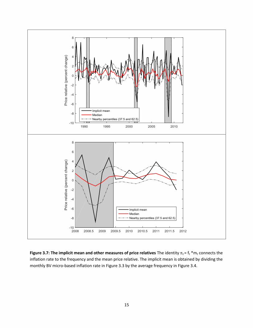
3.8 The implicit mean of micro price adjustments
Using (4), the BV micro-based inflation rate from Figure 3.3 and the average fre-
quency from Figure 3.4, we can calculate a value of the mean change as mt = πt/ft.
Figure 3.6 shows this series along with the median and two near-by percentiles. This
22

implicit mean is highly volatile, much more than I expected even given the work of
Klenow and Krytsov (2008).19
With a measure of the mean, one can ask the Klenow-Kryvtsov question "during
a specific time interval, how much of inflation was accounted for by changes in ft,
and how much by mt?" The two panels of Figure 3.8 show that fluctuations in the
average size of price changes account for essentially all of the changes in the micro-
based CPI series created by Berger and Vavra (2015): these figures are related to
a main result of their paper, which is that the intensive margin dominates inflation
when they implement a particular approach to breaking inflation into intensive and
extensive components due to Cabellero and Engel (2007). The simpler procedure
employed in Figure 3.8 is to take fix the mean adjustment frequency at its value
over the full sample (1988-2011) and to then create an inflation measure as f ∗mt.
The result using the implicit mean inflation rate is shown in the top panel: the
fixed frequency version matches the BV micro inflation series (with both the micro
inflation series and the implicit mean series deseasonalized using quarterly dummies
with coeffi cients estimated through 2007). A second perspective is provided by the
lower panel of Figure 3.8, where two different simulated inflation series are calculated
from the median price relative. (I construct these series because they do not rely
on implicitly creating the mean, which could overstate its effect if the frequency is
mismeasured). The solid line is ft ∗ φ50t and the dots are fφ50t . Even when using thesmoother median series, the variations in frequency are dominated by variations in
the size of price changes.
To put matters in perspective, suppose that inflation is 1.8% per year, which is
close to the sample mean for the micro-based CPI constructed by BV over 1998-2011.
Then, monthly inflation is .15%. Suppose further that frequency is .11, the mean
value over 1998-2011. Then, the average price relative must be 1.36%. If frequency
were to fall to .9 (which would be the range of decline from 2008 through 2011) in
Figure 3.4, holding fixed the price change, then monthly inflation would fall from
.15% to .12% (and annual inflation to 1.4%). But the changes shown for the median
in Figure 3.7 are much larger than this variation.
Thus, for 2008-2001 and earlier, the BV data set supports the conclusion that
inflation is mainly accounted for by changes in the size rather than the frequency of
19Even though the the micro-based series has some seasonality, removal of it does not affect thegeneral shape of the implicit mean picture over 2008-2011.
23

adjustment.
At the same time, macroeconomists have a sense that changing adjustment fre-
quency can be important for the linkage between inflation and real activity. Dis-
cussing his own estimates that the slope of the Phillips curve has declined since
the 1980s but not much since 1994 or during the recent recession, Blanchard (2016)
writes: " Given expected inflation, a (1%) decrease in the unemployment rate led to
an increase in inflation of 0.7 percent in the mid-1970s. The effect is now closer to 0.2
percent. Various explanations have been offered for this evolution. The most convinc-
ing is that, as the level of inflation has decreased, wages and prices are changed less
often, leading to a smaller response of inflation to labor market conditions." Vavra
(2015) sees a connection between changing microeconomic volatility, the frequency
of adjustment, and the size of adjustment which leads the Phillips curve slope to be
lower in recessions (and other times of high volatility).
In addition to microeconomic evidence on price-setting using offi cial survey data,
economists have explored the nature of price adjustments for individual firms and
groups of firms. One recent study by Eichenbaum, Jaimovitch and Rebelo (2011)
focuses on the interplay between a variant of regular prices —which they call reference
prices —demand and cost. It is to that interaction at the macro level to which I
now turn. But before we do, it is useful to indicate a useful and reasonable set of
calculations that micro price researchers and the BLS could produce.
3.9 New public research indices
BLS regularly produces some public access output of a “research series” form. For
example, in working with labor data and having concerns about the jumpiness of
standard BLS population series, it is useful to employ the research series “Labor
force and employment smoothed for population control adjustments.”
It would be useful for academics working on micro pricing to help BLS create
new pricing research series, both in terms of the design and potentially in terms of
development of algorithms that the BLS could simply make use of each month.
In this research, I’d like to have started with micro-based components of a core-
like CPI series —excluding food and energy as well as shelter —with estimates of πt,
ft and mt. for regular and total price changes. In terms of understanding inflation
during 2008-9 and more broadly, it would be desirable to have breakdowns of this
24

core micro-based CPI into durables, nondurables, and services.
3.10 References for Section 3
Berger, David and Joseph Vavra, (2015), "Dynamics of the U.S. Price Distribution,"
NBER working paper 21732 (November)
Bils, Mark, and Peter J. Klenow, 2004. "Some Evidence on the Importance of
Sticky Prices," Journal of Political Economy, University of Chicago Press, vol. 112(5),
pages 947-985, October.
Caballero, Ricardo J. and Eduardo M.R. Engel (2007), "Price stickiness in Ss
models: New interpretations of old results", Journal of Monetary Economics, 54
(SUPPL.), 100 121.
Calvo, Guillermo A. (1983). "Staggered Prices in a Utility-Maximizing Frame-
work". Journal of Monetary Economics 12 (3): 383—398
Eichenbaum, Martin S., Nir Jaimovich, and Sergio Rebelo. 2011. "Reference
prices, costs, and nominal rigidities," American Economic Review 101: 234-62.
Gertler, Mark, and John Leahy. 2008, "A Phillips curve with an Ss foundation,"
Journal of Political Economy 116: 533-72.
Golosov, Mikhail, and Robert E. Lucas, Jr. 2007. "Menu costs and Phillips
curves," Journal of Political Economy 115: 171-99.
King, Robert G., 2009, Comments on "Implications of Microeconomic Price Data
for Macroeconomic Models" by Bartosz Mackowiak and Frank Smets, FRB Boston
conference in "Understanding Inflation and the Implications for Monetary Policy: A
Phillips Curve Retrospective" June 2008.
Klenow, Peter J., and Oleksiy Kryvtsov. 2008. "State-dependent or time-dependent
pricing: Does it matter for recent U.S. infllation?," Quarterly Journal of Economics,
vol 123(3): 863-904.
Klenow, Peter J., and Benjamin A. Malin. 2010. "Microeconomic evidence on
price-setting,". In Handbook of Monetary Economics, vol. 3A, ed. Benjamin M.
Friedman and Michael Woodford. 231-84. Amsterdam: North-Holland.
Midrigan, Virgiliu. 2011. Menu costs, multiproduct firms, and aggregate fluctua-
tions,"Econometrica 79: 1139-80.
Nakamura, Emi, and Jon Steinsson. 2008. Five facts about prices: A reevaluation
of menu cost models. Quarterly Journal of Economics 123: 1415-64.
25

Nakamura, Emi, and Jon Steinsson. 2010. More facts about prices. Supplement to
Five facts about prices: A reevaluation of menu cost models." Manuscript. Columbia
University.
26

1
Figure 1.1: The Accelerationist perspective.
Top panel: Estimate of a simple Phillips Curve using rolling 20 year windows on annual data, taken
from presentation materials for the June 23 2009 FOMC meeting, Exhibit 5.
Bottom panel: Counterfactual inflation calculated using t = t-1 - .2 (Ut -5), where U is annual average
unemployment for each year starting July 2009 and the initial conditions in 2008 are =2 and U=5.

2
Figure 1.2: Inflation and Unemployment Forecasts in June 2009
Solid line: Fed Board Staff Extended Forecasts prepared for June 2009 FOMC meeting, as reported in
Chart 8 of the BlueBook. Dashed Line: Actual unemployment and inflation experience.
Unemployment: Civilian Unemployment Rate (Percent) Monthly, seasonally adjusted. Inflation:
Personal Consumption Expenditure Excluding Food and Energy, Chain Type Price Index Monthly
(Percent change from a year previous), seasonally adjusted.

3
Figure 2.1 The Personal Consumption Expenditure price indices and measures of inflation

4
Figure 2.2: Forecasts from the Survey of Professional Forecasters assembled by the Federal Reserve
Bank of Philadelphia. SPF 1Q, SPF 2Q and SPF 1YR are one quarter ahead, two quarter ahead and four
quarter ahead forecasts of the Core PCE, while SPF 10YR is a forecast of the long-term Headline PCE
inflation rate.

5
Figure 2.3: Simulated inflation series. The solid black line in both panels is a simulation of the long-
term expectations model described in FRS Chairman Janet Yellen’s lecture on Inflation Dynamics at
the University of Massachusetts at Amherst in Fall 2015. The solid blue line is a variant with inflation
expectations constant at 2%, while the solid red line is a simple reference specification described in
the text. The dashed line in both panels is the actual Core PCE inflation rate. The top panel is a
quarterly inflation rate (annualized) while the bottom panel is a year-over-year inflation rate.

6
Figure 2.4: The top panel is a relative price of imports shock which is a simple version of a shock used
in the Yellen (2015) study and is similar to one used by Watson (2014). The top panel includes the
shock itself and its contribution to the model when fed through the distributed lag structure. The
bottom panel is the model with and without the import shock and the actual quarterly Core PCE
inflation rate.

7
Figure 2.5: Two inflation specification with SPF 1YR inflation expectations (solid blue lines). Both
specifications involve a smaller slope coefficient than the Yellen model. Top panel: distributed lag and
expectation coefficients as in Yellen (2015). Bottom panel: Purely forward-looking model with a
coefficient of one on expected inflation. Reference information common to both panels: the Yellen
model and simple inflation model repeated from Figure 2.5

8
Figure 2.6: Inflation simulations with shorter-term inflation expectations in the purely forward-looking
model. Top panel: SPF2Q. Bottom panel: SPF1Q

9
Figure 3.1: Measures of the frequency of price change and the average size of price adjustments based
on the methodology of Nakamura and Steinsson (2008). Source: Nakamura, Steinsson, Sun and Villar
(2016)

10
Figure 3.2: BLS CPI aggregates useful for thinking about results of micro studies. The micro price
survey information is not used to produce CPI components for shelter or for used vehicles. However, it
does contain information on food and energy components which are not included in core PCE or CPI.
Notice the units in the lower panel. A monthly inflation rate of 0.5% is an annual inflation rate of 6%.
These units are the natural ones for relating changes in micro prices to aggregate inflation. The series
are quarterly averages of monthly data.

11
Figure 3.3 Each panel displays two series, measured as a monthly inflation rate. The CPI less housing
is the same BLS aggregate shown in Figure 3.2 The other inflation rate is that calculated by Berger
and Vavra (2015) from BLS micro data, as an average of the changes in individual prices.

12
Figure 3.4: Estimates of the frequency of price adjustment produced by Berger and Vavra (2016).
Quarterly averages of underlying monthly frequencies of adjustment (seasonal means removed). The
median frequency of adjustment is taken across 1 digit industries, as in the work of Nakamura and
Steinsson (2008). The average frequency of adjustment uses only BLS weights and is closer in design
to Klenow and Kryvtsov (2008).

13
Figure 3.5: The evolving distribution of adjustments of “regular prices” captured with selected
percentiles. Calculated by Berger and Vavra (2015) from BLS micro data. Quarterly averages of
monthly figures.

14
Figure 3.6: An estimate of the frequency of price increases and price decreases calculated from the
data in Figure 3.5. Method illustrated with November 2008, a month in which the average frequency
of adjustment in Figure 3.4 was just under .12. Using a beta distribution fit to the price relative
percentiles (top left), the fraction of negative changes – conditional on adjustment – is .59. Hence, the
frequency of negative adjustment overall is .068.
15
Figure 3.7: The implicit mean and other measures of price relatives The identity t = ft *mt connects the
inflation rate to the frequency and the mean price relative. The implicit mean is obtained by dividing the
monthly BV micro-based inflation rate in Figure 3.3 by the average frequency in Figure 3.4.

16
Figure 3.8: Inflation constructed using fixed frequency assumption (full sample mean). Top panel:
mean frequency multiplied by implicit mean. Bottom panel: mean frequency multiplied by median.
Implicit mean and median of the price relatives shown in Figure 3.6

17
Appendix Figure A-1