Embed Size (px)
Citation preview
Interaction DesignForm Fill-In
Prof. Dr. Matthias RauterbergFaculty Industrial DesignTechnical University Eindhoven
04-DEC-2002
(c) M. Rauterberg, TU/e 2
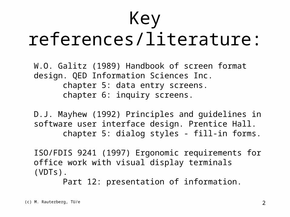
Key references/literature:
W.O. Galitz (1989) Handbook of screen format design. QED Information Sciences Inc.
chapter 5: data entry screens.chapter 6: inquiry screens.
D.J. Mayhew (1992) Principles and guidelines in software user interface design. Prentice Hall.
chapter 5: dialog styles - fill-in forms.
ISO/FDIS 9241 (1997) Ergonomic requirements for office work with visual display terminals (VDTs).
Part 12: presentation of information.
(c) M. Rauterberg, TU/e 3
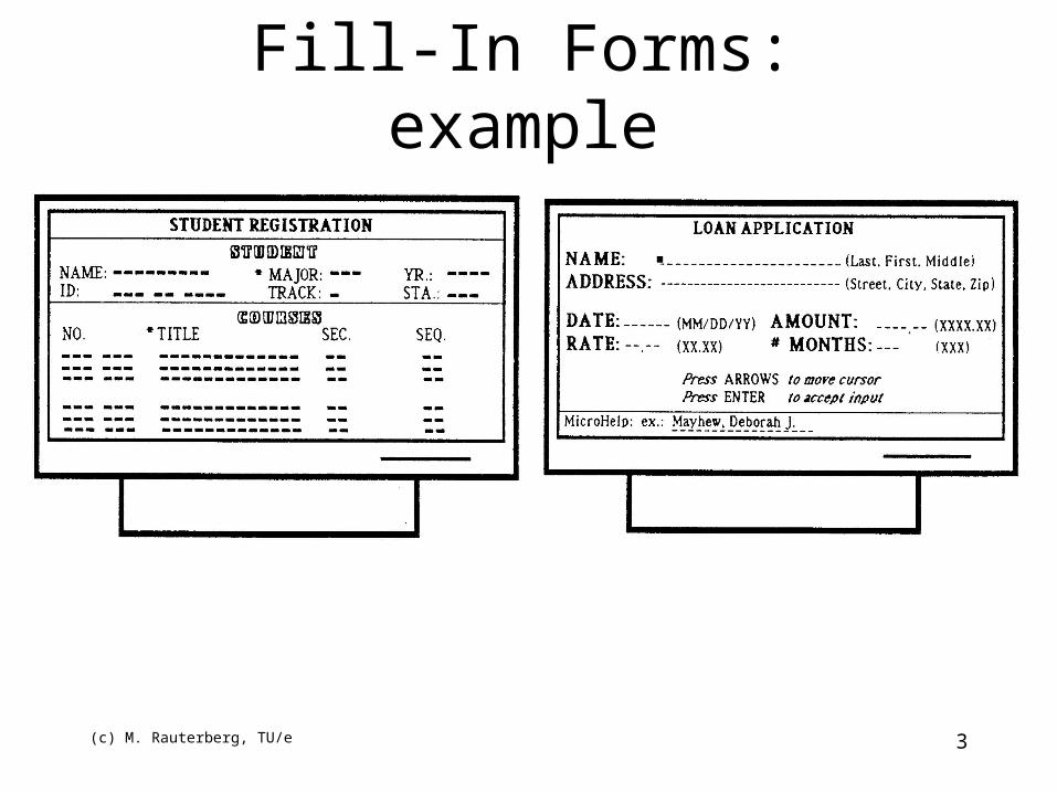
Fill-In Forms: example
(c) M. Rauterberg, TU/e 4
Fill-In Forms: when to use (1)• User is presented with a display resembling
a paper form and enters data into fields
Advantages:– Simplifies data entry, reduces need for manuals– Requires modest training– makes both semantics and syntax explicit
Issues:– movement around the form– input validation and correction
(c) M. Rauterberg, TU/e 5
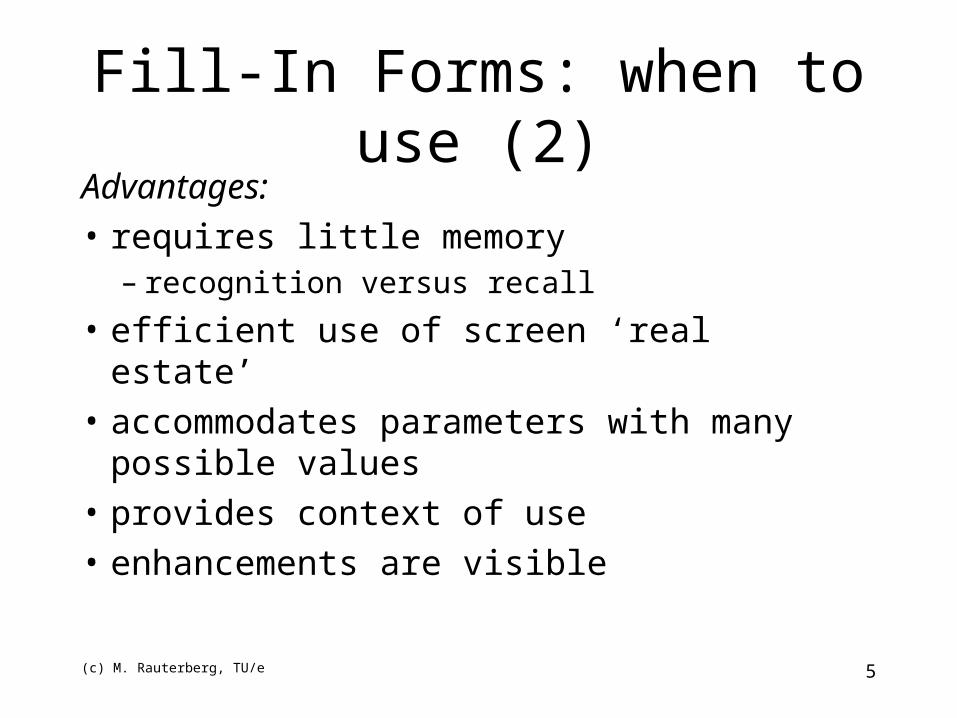
Advantages:• requires little memory
– recognition versus recall
• efficient use of screen ‘real estate’• accommodates parameters with many possible
values• provides context of use• enhancements are visible
Fill-In Forms: when to use (2)
(c) M. Rauterberg, TU/e 6
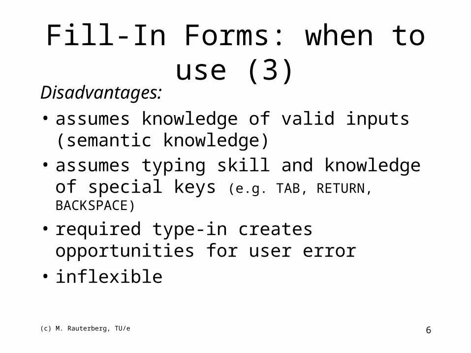
Disadvantages:• assumes knowledge of valid inputs
(semantic knowledge)• assumes typing skill and knowledge of
special keys (e.g. TAB, RETURN, BACKSPACE)
• required type-in creates opportunities for user error
• inflexible
Fill-In Forms: when to use (3)
(c) M. Rauterberg, TU/e 7
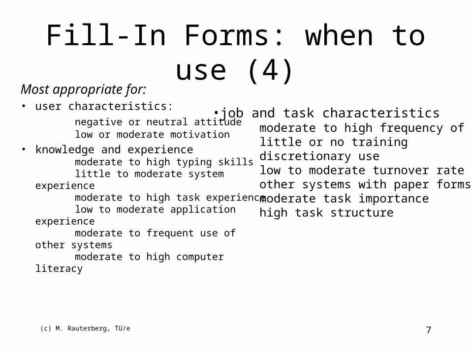
Most appropriate for:• user characteristics:
negative or neutral attitudelow or moderate motivation
• knowledge and experiencemoderate to high typing skillslittle to moderate system experiencemoderate to high task experiencelow to moderate application
experiencemoderate to frequent use of other
systemsmoderate to high computer literacy
Fill-In Forms: when to use (4)
•job and task characteristicsmoderate to high frequency of uselittle or no trainingdiscretionary uselow to moderate turnover rateother systems with paper formsmoderate task importancehigh task structure
(c) M. Rauterberg, TU/e 8
Fill-In Forms: navigation (1)
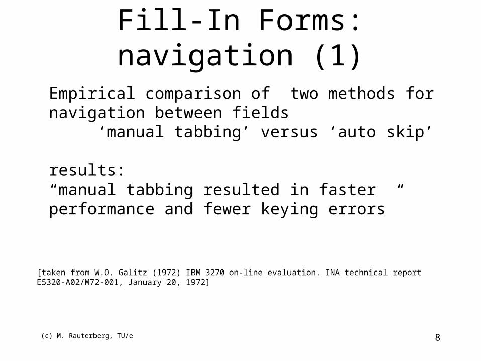
[taken from W.O. Galitz (1972) IBM 3270 on-line evaluation. INA technical report E5320-A02/M72-001, January 20, 1972]
Empirical comparison of two methods for navigation between fields
‘manual tabbing’ versus ‘auto skip’
results: “manual tabbing resulted in faster performance and fewer keying errors”
(c) M. Rauterberg, TU/e 9
Fill-In Forms: layout (1)
• Design and organise the form to support the task (e.g. data entry from paper form versus customer support or phone order);
• organise groups of items related semantically, by order of use, by frequency of use, and/or importance;
• keep related and interdependent items on the same screen;
• minimise number of screens for high frequency users/slow system response time; maximise screen clarity for infrequent users/fast system response time;
• use white space to create balance and symmetry, and lead the eye in the appropriate direction;
• separate logical groups by spaces, lines, colour or other visual cues.
(c) M. Rauterberg, TU/e 10
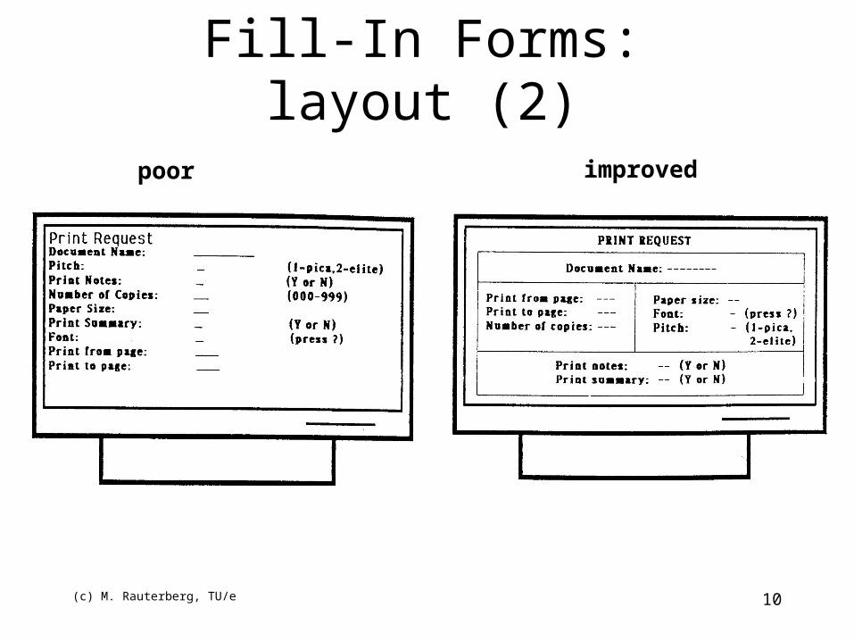
Fill-In Forms: layout (2)
poor improved
(c) M. Rauterberg, TU/e 11
• Left justify alpha fields; left justify numeric input fields, but right justify or decimal-align numeric fields upon display; right justify captions when data entry is from a source document; otherwise left justify captions, unless captions vary considerably in length.
• Separate the (longest) caption (in a right justified column) from its field by one space (following the delimiter).
• Separate one caption-field group from another by three spaces horizontally, one line vertically.
• Break up long columnar fields or long columns of single-field items into groups of five separated by a blank line.
• Provide distinctive field group and section headings in complex forms.
• For single fields, place the caption to the left; for list fields, place caption above, left justified.
Fill-In Forms: captions & fields (1)
(c) M. Rauterberg, TU/e 12
• Distinguish captions and fields with a visual cue (bold versus plain, upper versus lower case) and a delimiter (e.g. colon); highlight fields when a data entry is from a source document; otherwise highlight captions (but be consistent if a system contains both kinds of forms).
• Captions should be brief, familiar and descriptive; use abbreviations and contractions when data entry is from a source document; otherwise spell out captions in full; avoid computer jargon, but exploit user jargon; use consistent terminology.
• Indicate the number of character spaces in a field with underscores (versus column separators, brackets or reverse video) which are overstruck when data is entered.
• Indicate when fields are optional.
Fill-In Forms: captions & fields (2)
(c) M. Rauterberg, TU/e 13
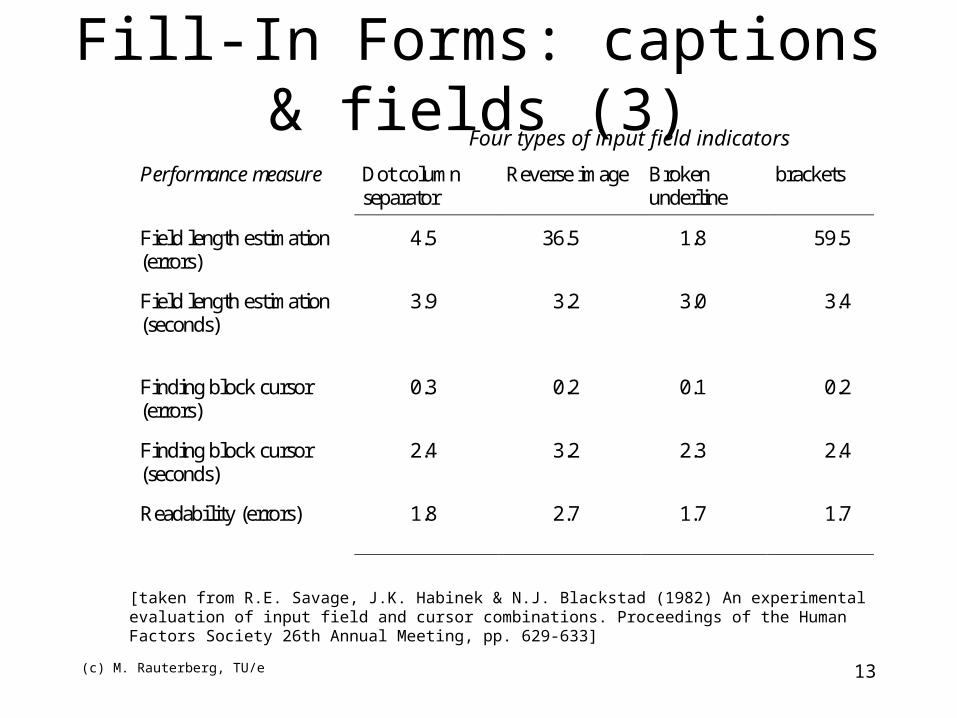
Fill-In Forms: captions & fields (3)
Performance measure Dot columnseparator
Reverse image Brokenunderline
brackets
Field length estimation(errors)
4.5 36.5 1.8 59.5
Field length estimation(seconds)
3.9 3.2 3.0 3.4
Finding block cursor(errors)
0.3 0.2 0.1 0.2
Finding block cursor(seconds)
2.4 3.2 2.3 2.4
Readability (errors) 1.8 2.7 1.7 1.7
Four types of input field indicators
[taken from R.E. Savage, J.K. Habinek & N.J. Blackstad (1982) An experimental evaluation of input field and cursor combinations. Proceedings of the Human Factors Society 26th Annual Meeting, pp. 629-633]
(c) M. Rauterberg, TU/e 14
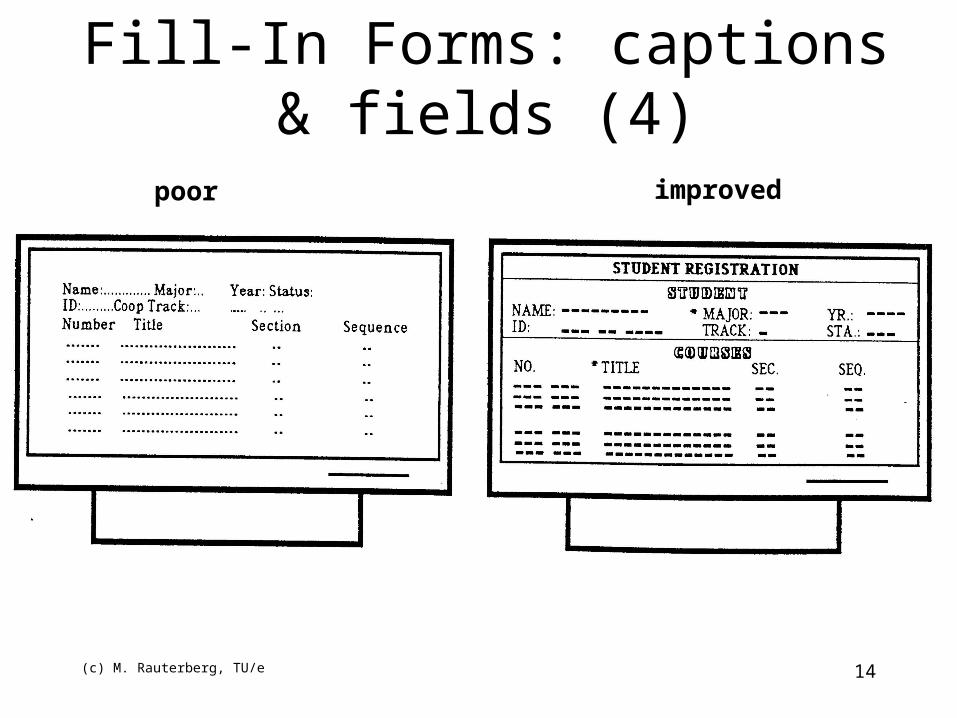
Fill-In Forms: captions & fields (4)
poor improved
(c) M. Rauterberg, TU/e 15
• Make high frequency inputs easy to express (.e.g Y/N, OO, defaults).
• Let the user specify the unit of measurement; don’t require transformations or calculations!
• Provide meaningful groupings to break up long input formats.
• Allow abbreviated input when it can be unambiguously interpreted (Yes or Ye or Y).
• System should be ‘case blind’ when it really doesn’t matter (YES or Yes or yes).
• Provide defaults whenever possible; allow simple (single key) acceptance of defaults; decide whether system, session or file defaults are appropriate; make it clear which is which, if systems provides both kinds of different contexts.
Fill-In Forms: input formats (1)
(c) M. Rauterberg, TU/e 16
• Keep input fields short if possible.
• Do not combine letters and numbers in a single field.
• Avoid frequent shifts between upper and lower case characters.
• Avoid uncommon letter sequences ([‘an’ or ‘th’] versus [‘gp’ or ‘xz’]).
• Do not require leading zeroes.
Fill-In Forms: input formats (2)
(c) M. Rauterberg, TU/e 17
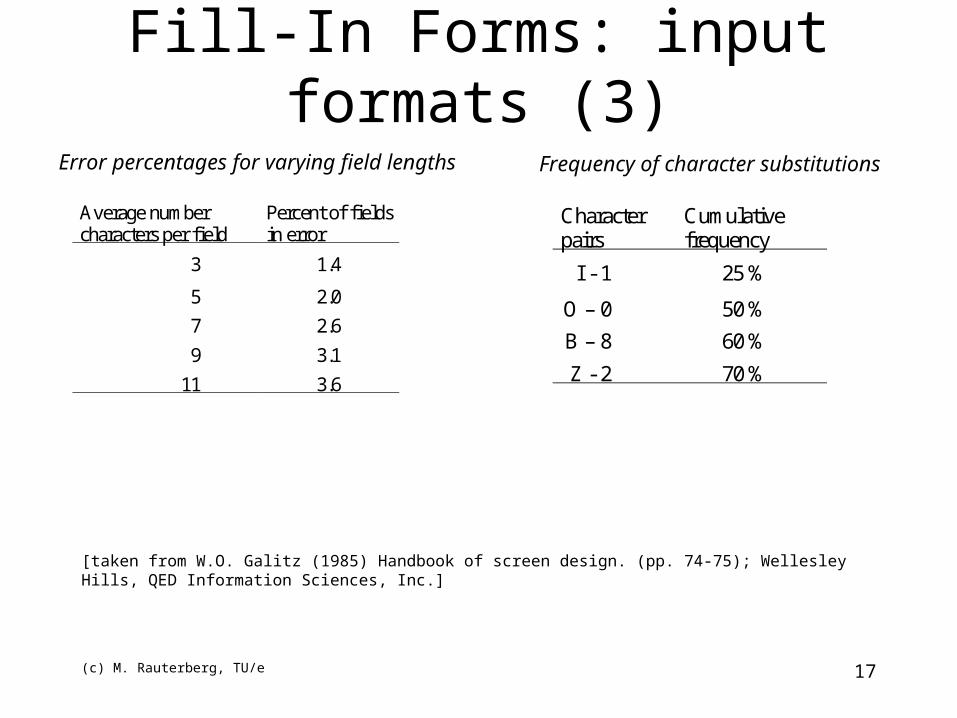
Average numbercharacters per field
Percent of fieldsin error
3 1.4
5 2.0
7 2.6
9 3.1
11 3.6
Fill-In Forms: input formats (3)
Error percentages for varying field lengths
Characterpairs
Cumulativefrequency
I - 1 25 %
O – 0 50 %
B – 8 60 %
Z - 2 70 %
Frequency of character substitutions
[taken from W.O. Galitz (1985) Handbook of screen design. (pp. 74-75); Wellesley Hills, QED Information Sciences, Inc.]
(c) M. Rauterberg, TU/e 18
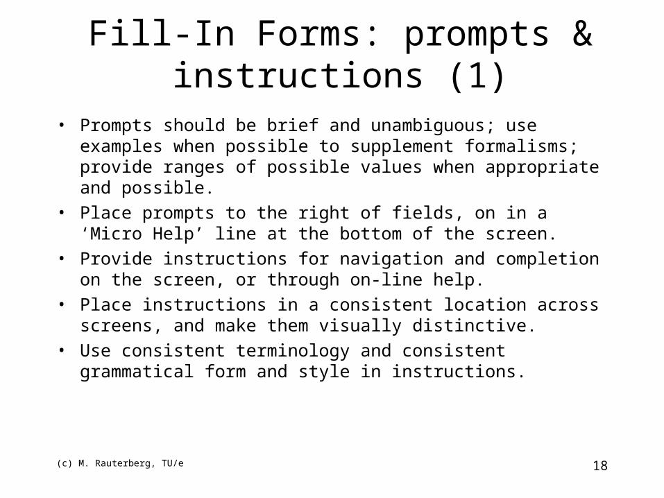
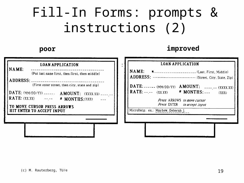
Fill-In Forms: prompts & instructions (1)
• Prompts should be brief and unambiguous; use examples when possible to supplement formalisms; provide ranges of possible values when appropriate and possible.
• Place prompts to the right of fields, on in a ‘Micro Help’ line at the bottom of the screen.
• Provide instructions for navigation and completion on the screen, or through on-line help.
• Place instructions in a consistent location across screens, and make them visually distinctive.
• Use consistent terminology and consistent grammatical form and style in instructions.
(c) M. Rauterberg, TU/e 19
Fill-In Forms: prompts & instructions (2)
poor improved
(c) M. Rauterberg, TU/e 20
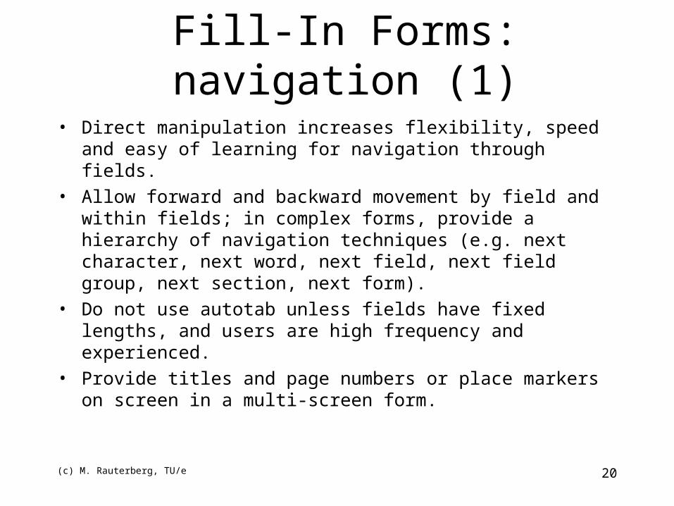
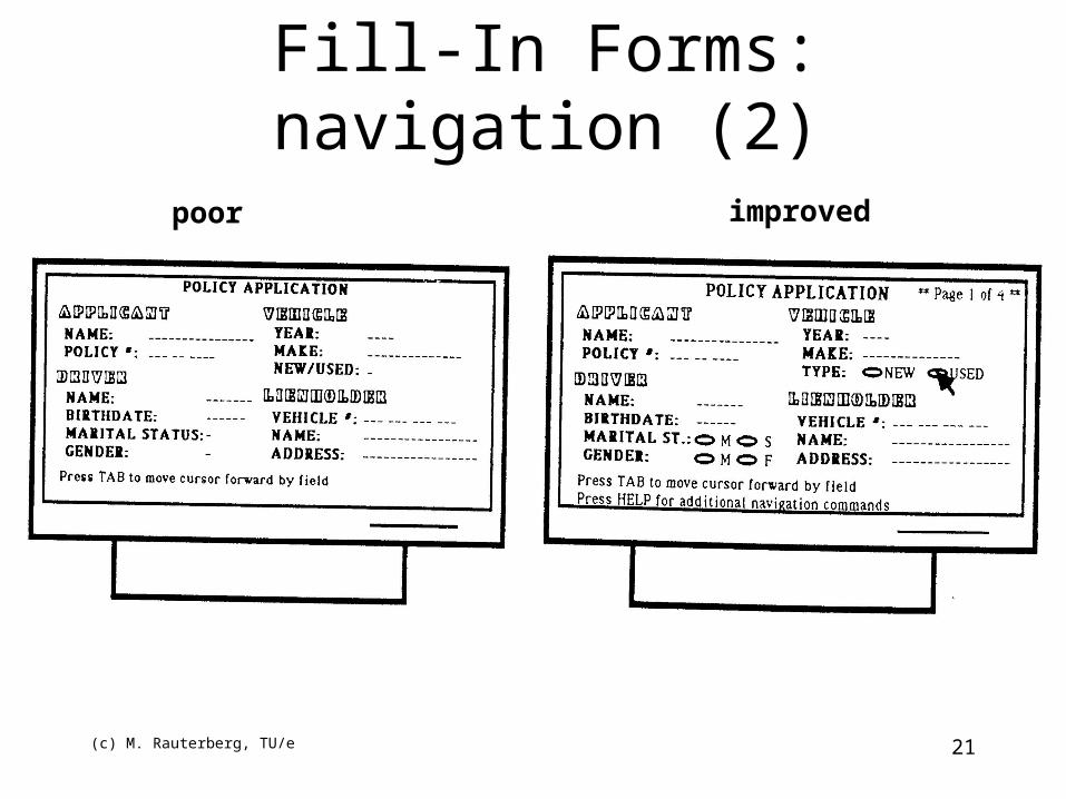
• Direct manipulation increases flexibility, speed and easy of learning for navigation through fields.
• Allow forward and backward movement by field and within fields; in complex forms, provide a hierarchy of navigation techniques (e.g. next character, next word, next field, next field group, next section, next form).
• Do not use autotab unless fields have fixed lengths, and users are high frequency and experienced.
• Provide titles and page numbers or place markers on screen in a multi-screen form.
Fill-In Forms: navigation (1)
(c) M. Rauterberg, TU/e 21
Fill-In Forms: navigation (2)
poor improved
(c) M. Rauterberg, TU/e 22
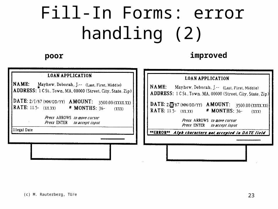
• Allow character edits in fields (versus re-type whole field).
• Place cursor in error field after error detection; highlight error field if possible.
• For independent fields, withhold error reporting until user request.
• Provide semantic and syntactic information in error messages depending on user knowledge.
Fill-In Forms: error handling (1)
(c) M. Rauterberg, TU/e 23
Fill-In Forms: error handling (2)
poor improved
(c) M. Rauterberg, TU/e 24
Layout of the Form (1)
• Not too much on a Form– Split, logically, over several Forms– hide/reveal controls
• Information in centre of visual field is most likely to be seen.– Put important info in obvious positions
(c) M. Rauterberg, TU/e 25
Layout of the Form (2)• Arrange controls in a logical sequence
– especially for data entry
– work from left - right, top-bottom
– consistency of layout over Forms
• e.g. “exit” button in same position on all Forms
• Arrange order using “Tab-key”
• Set Focus after major operation
– e.g. after pressing a Command button
when loading/returning to a Form
– clear text boxes on data entry forms?
(c) M. Rauterberg, TU/e 26
Form fill-in (1)
• good in appropriate applications
• easy, little training required
• can be used to interface with query languages– QBE [query by example]
(c) M. Rauterberg, TU/e 27
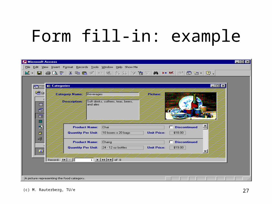
Form fill-in: example
(c) M. Rauterberg, TU/e 28
Form fill-in (2)• Principle: user’s main task is to provide data in labeled
fields clustered in one or more screens
• Data
– Binary choice (Yes/No, Female/Male)
– Selection from brief list (days of week, set of colours)
– Large domain (personal names, chemical formulae)
– Essential unbounded (exploratory paragraphs, meteorological data)
• Can replace form fill-in with a series of menu choices ->
however may become extremely tedious
(c) M. Rauterberg, TU/e 29
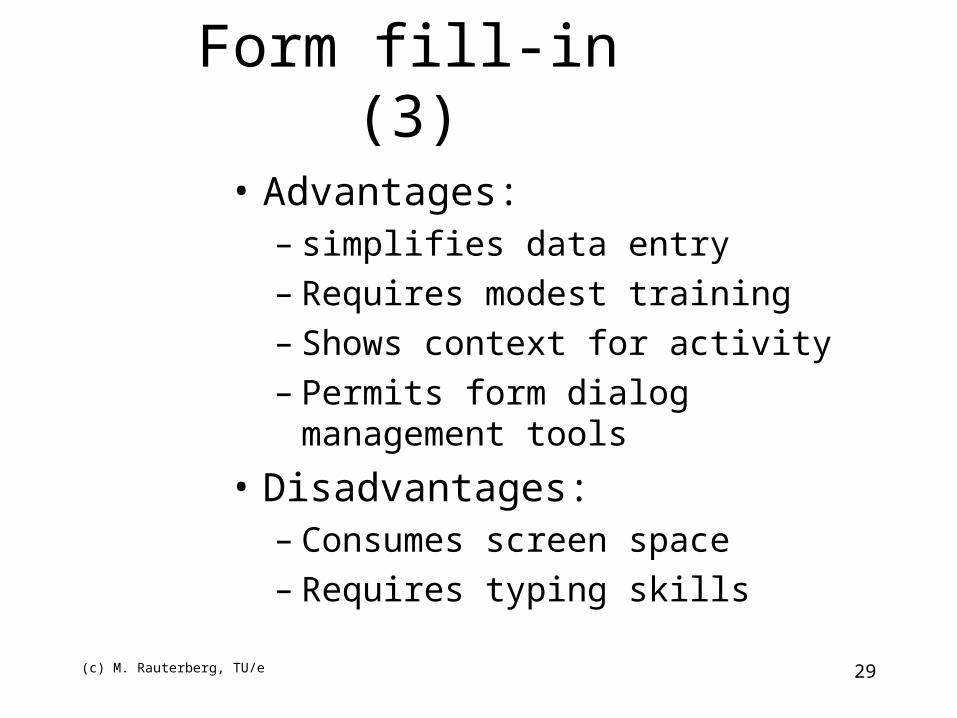
Form fill-in (3)
• Advantages:– simplifies data entry– Requires modest training– Shows context for activity– Permits form dialog management tools
• Disadvantages:– Consumes screen space– Requires typing skills
(c) M. Rauterberg, TU/e 30
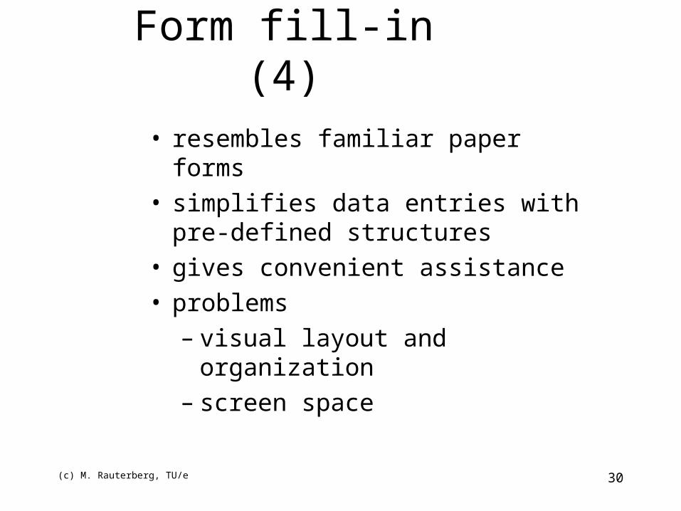
Form fill-in (4)• resembles familiar paper forms• simplifies data entries with pre-defined
structures• gives convenient assistance• problems
– visual layout and organization– screen space
(c) M. Rauterberg, TU/e 31
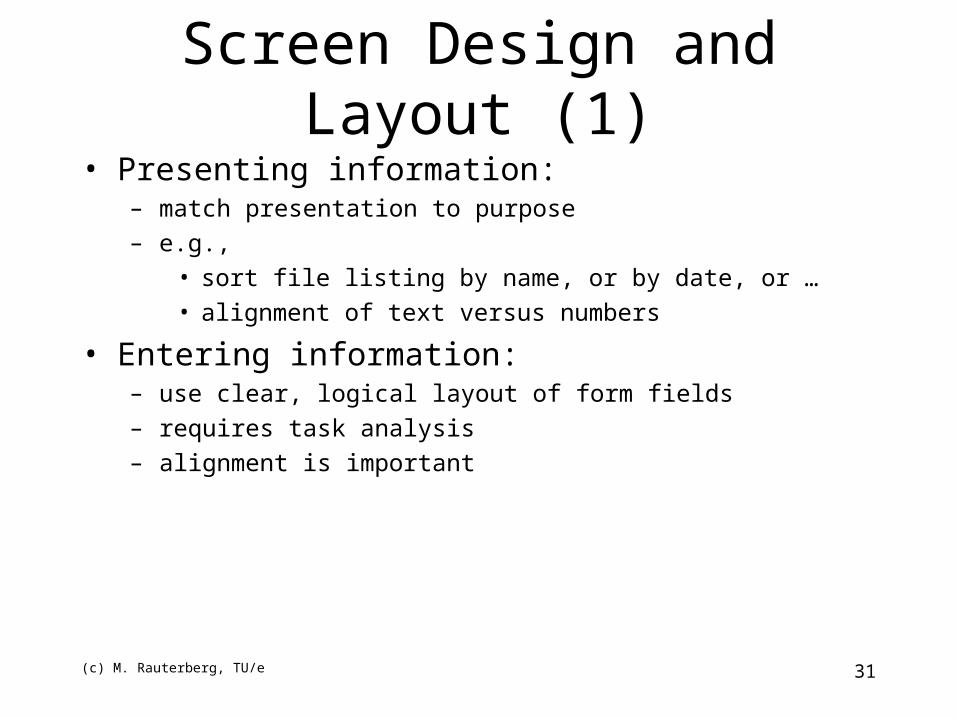
Screen Design and Layout (1)• Presenting information:
– match presentation to purpose
– e.g.,
• sort file listing by name, or by date, or …
• alignment of text versus numbers
• Entering information:– use clear, logical layout of form fields
– requires task analysis
– alignment is important
(c) M. Rauterberg, TU/e 32
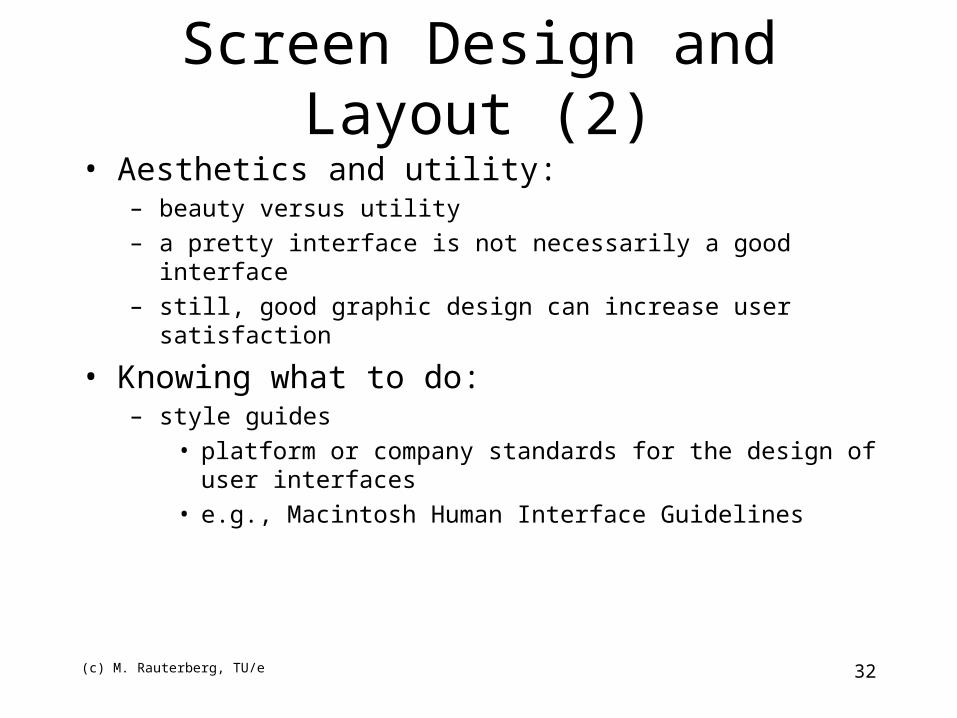
Screen Design and Layout (2)• Aesthetics and utility:
– beauty versus utility
– a pretty interface is not necessarily a good interface
– still, good graphic design can increase user satisfaction
• Knowing what to do:– style guides
• platform or company standards for the design of user interfaces
• e.g., Macintosh Human Interface Guidelines
(c) M. Rauterberg, TU/e 33
Screen Design and Layout (3)• Knowing what to do:
– affordances• “where do I click?”
• elements should suggest, by their shape and other attributes, what you can do with them
• e.g., a button affords pushing
• Localization/internationalization:– change of language for text
– alignment and layout
– date formats
– time formats
– number formats
(c) M. Rauterberg, TU/e 34
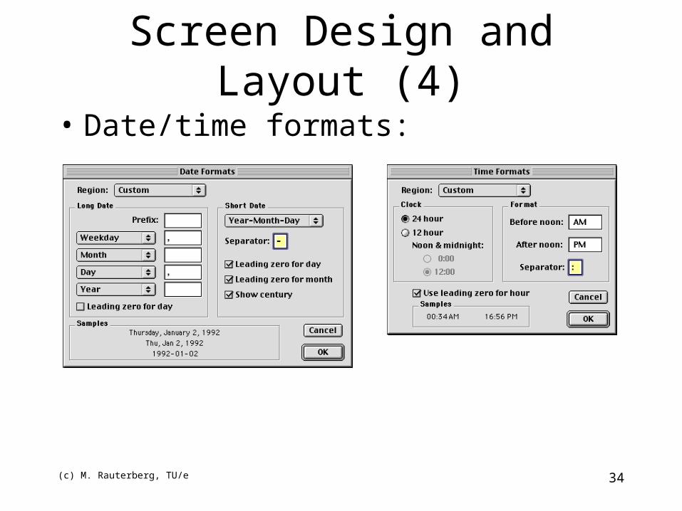
Screen Design and Layout (4)
• Date/time formats:
(c) M. Rauterberg, TU/e 35
Visual Display Elementsto Consider
• Color – Can have unwanted emotional meaning– Incorrectly connect parts of the interface
• Typography– Affects legibility, understanding
(c) M. Rauterberg, TU/e 36
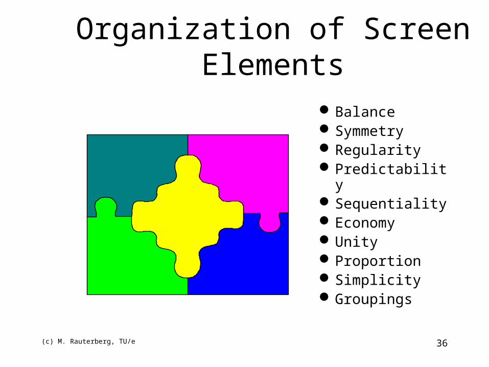
Organization of Screen ElementsBalanceSymmetryRegularityPredictabilitySequentialityEconomyUnityProportionSimplicityGroupings

(c) M. Rauterberg, TU/e 37
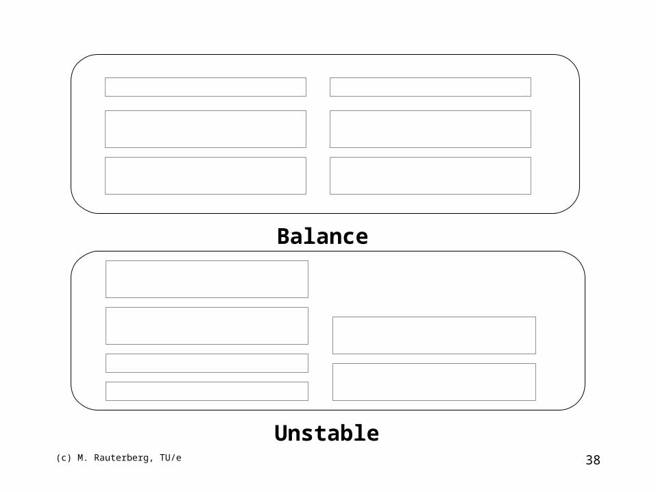
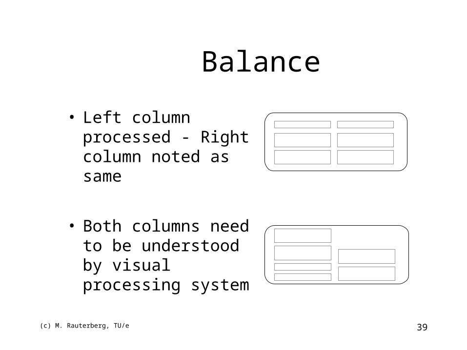
Balance
• Equal weight of screen elements• Left to right, top to bottom
(c) M. Rauterberg, TU/e 38
Balance
Unstable
(c) M. Rauterberg, TU/e 39
Balance
• Left column processed - Right column noted as same
• Both columns need to be understood by visual processing system
(c) M. Rauterberg, TU/e 40
Symmetry
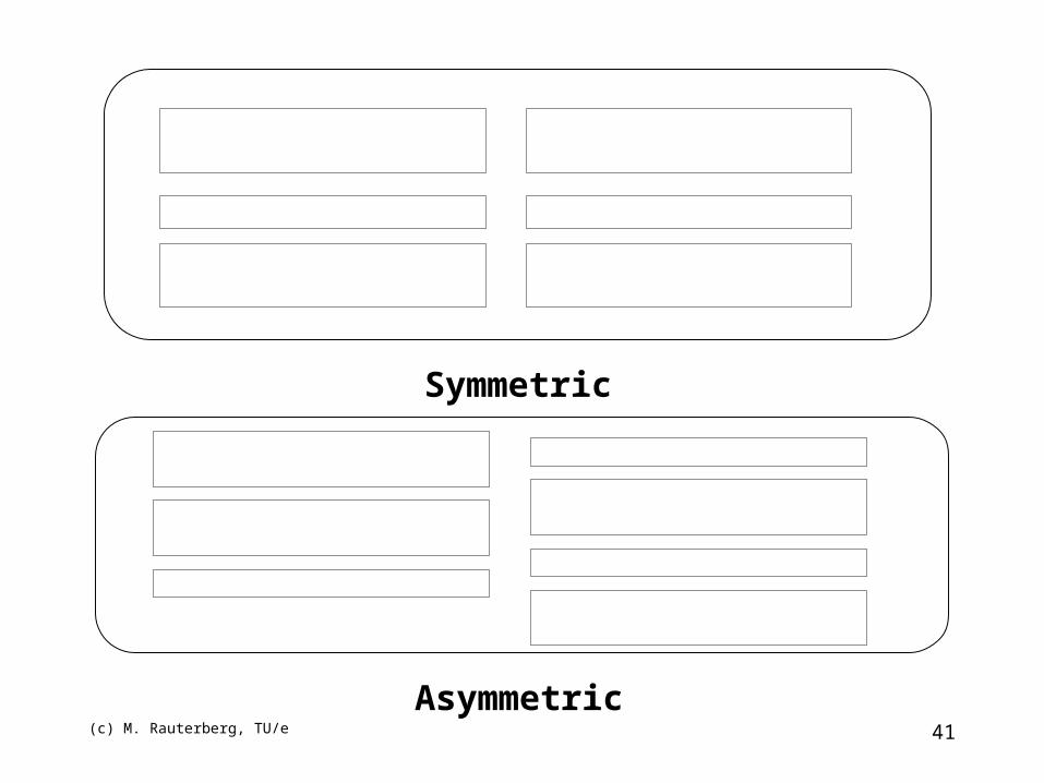
• Replicate elements left and right of the center line
(c) M. Rauterberg, TU/e 41
Symmetric
Asymmetric
(c) M. Rauterberg, TU/e 42
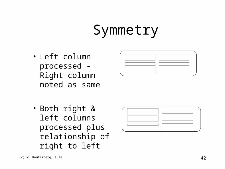
Symmetry
• Left column processed - Right column noted as same
• Both right & left columns processed plus relationship of right to left
(c) M. Rauterberg, TU/e 43
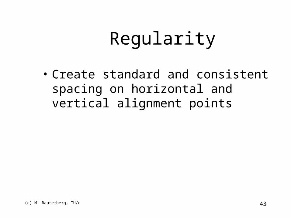
Regularity
• Create standard and consistent spacing on horizontal and vertical alignment points
(c) M. Rauterberg, TU/e 44
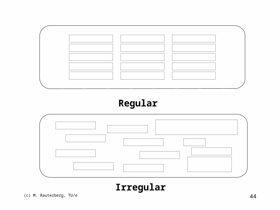
Regular
Irregular
(c) M. Rauterberg, TU/e 45
Regularity
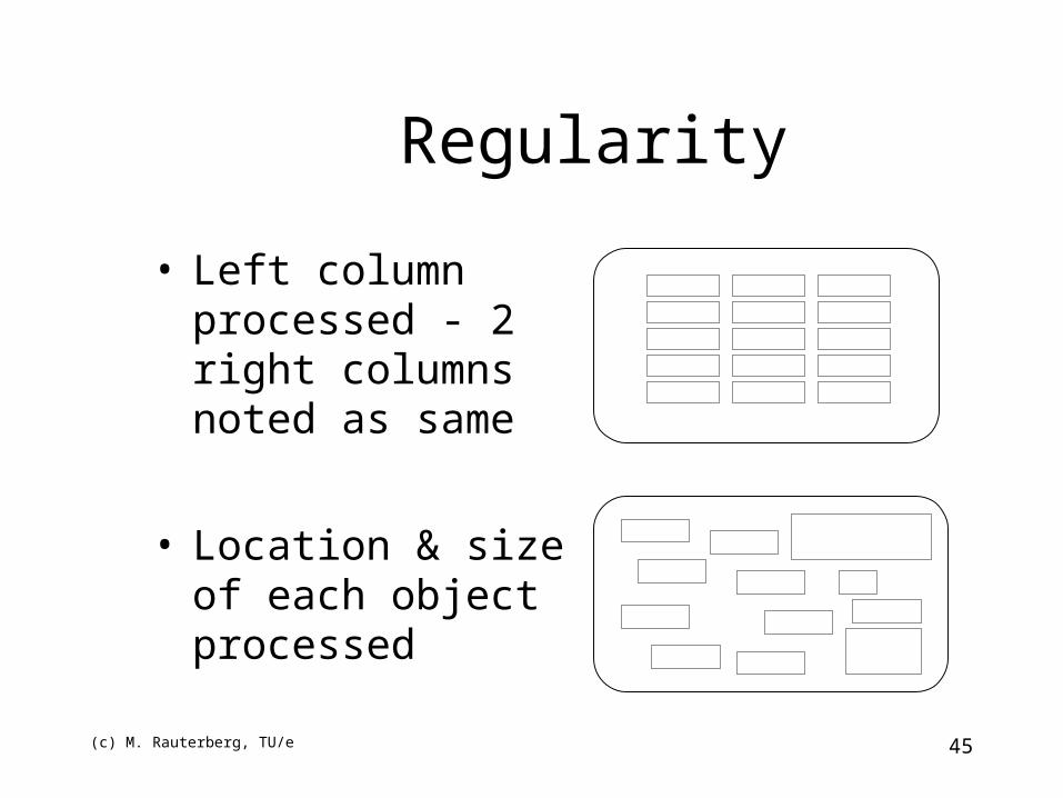
• Left column processed - 2 right columns noted as same
• Location & size of each object processed
(c) M. Rauterberg, TU/e 46
Predictability
• Put things in predictable locations on the screen
(c) M. Rauterberg, TU/e 47
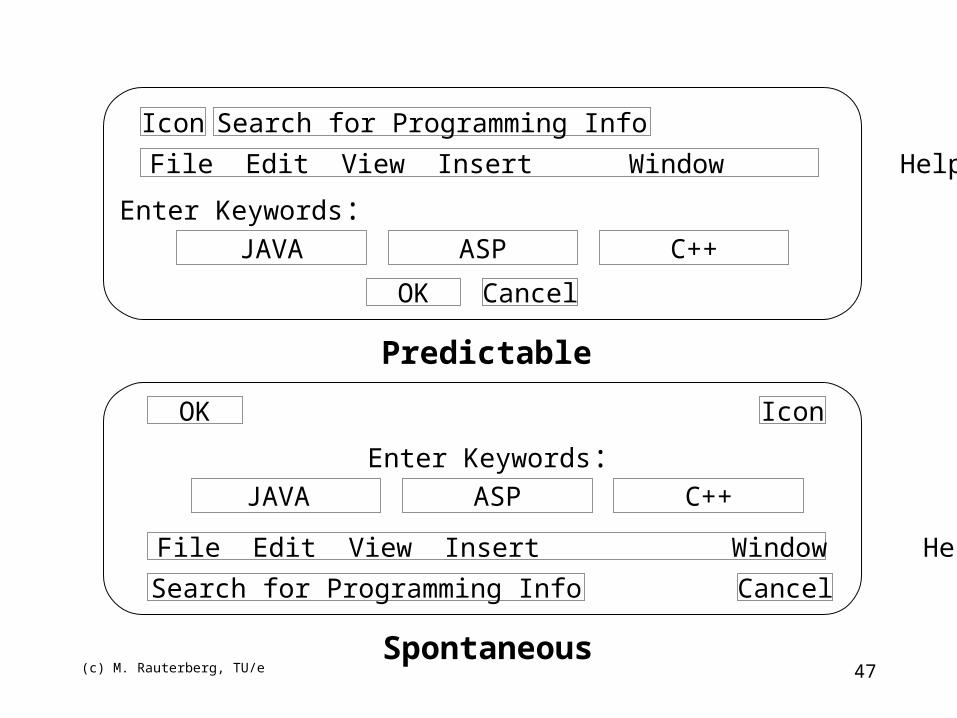
Predictable
Spontaneous
Icon
File Edit View Insert Window Help
JAVA
Search for Programming Info
CancelOK
Enter Keywords:ASP C++
Icon
File Edit View Insert Window Help
JAVA
Search for Programming Info Cancel
OK
Enter Keywords:ASP C++
(c) M. Rauterberg, TU/e 48
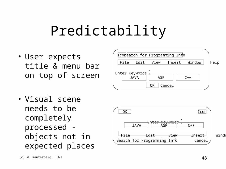
Predictability
• User expects title & menu bar on top of screen
• Visual scene needs to be completely processed - objects not in expected places
Icon
File Edit View Insert Window Help
JAVA
Search for Programming Info
CancelOK
Enter Keywords:ASP C++
Icon
File Edit View Insert Window Help
JAVA
Search for Programming Info Cancel
OK
Enter Keywords:ASP C++
(c) M. Rauterberg, TU/e 49
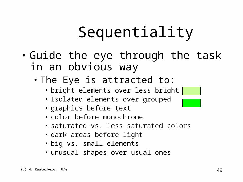
Sequentiality
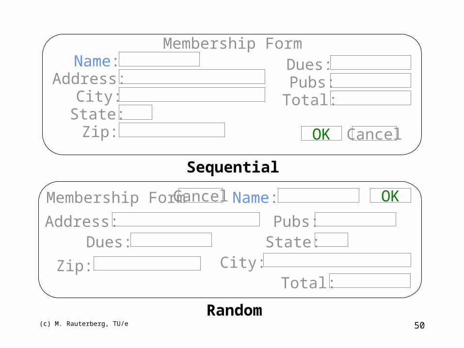
• Guide the eye through the task in an obvious way• The Eye is attracted to:
• bright elements over less bright• Isolated elements over grouped• graphics before text• color before monochrome• saturated vs. less saturated colors• dark areas before light• big vs. small elements• unusual shapes over usual ones
(c) M. Rauterberg, TU/e 50
Sequential
Random
Membership FormName:
Address:City:State:Zip:
Dues:Pubs:Total:
OK Cancel
Membership Form Name:
Address:
City:State:
Zip:
Dues:Pubs:
Total:
OKCancel
(c) M. Rauterberg, TU/e 51
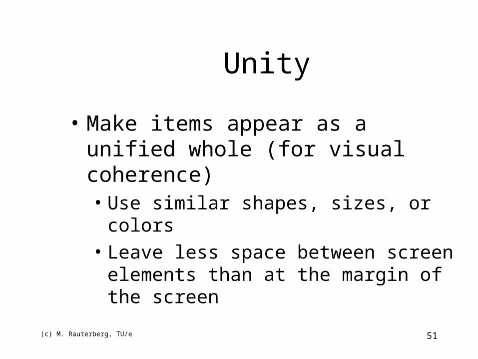
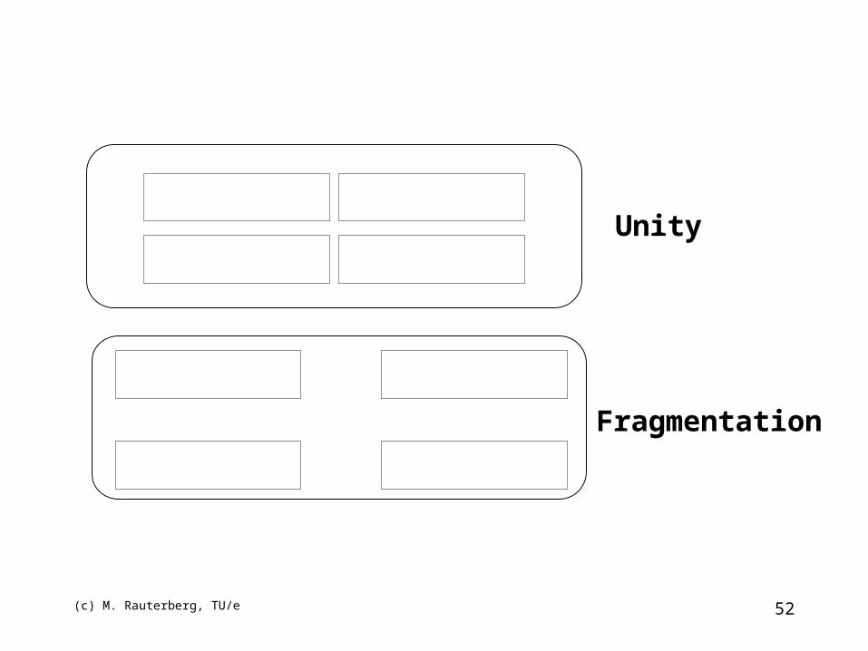
Unity
• Make items appear as a unified whole (for visual coherence)• Use similar shapes, sizes, or colors• Leave less space between screen elements than
at the margin of the screen
(c) M. Rauterberg, TU/e 52
Unity
Fragmentation
(c) M. Rauterberg, TU/e 53
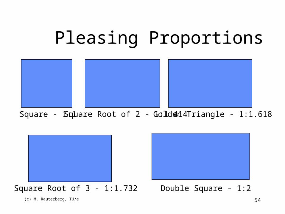
Proportion
Create groupings of data or text by using aesthetically pleasing proportions
(c) M. Rauterberg, TU/e 54
Square - 1:1 Square Root of 2 - 1:1.414 Golden Triangle - 1:1.618
Square Root of 3 - 1:1.732 Double Square - 1:2
Pleasing Proportions
(c) M. Rauterberg, TU/e 55
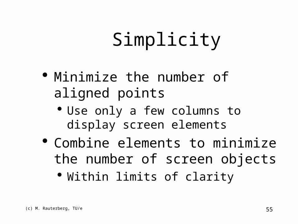
Simplicity
Minimize the number of aligned points Use only a few columns to display screen
elements
Combine elements to minimize the number of screen objects Within limits of clarity
(c) M. Rauterberg, TU/e 56
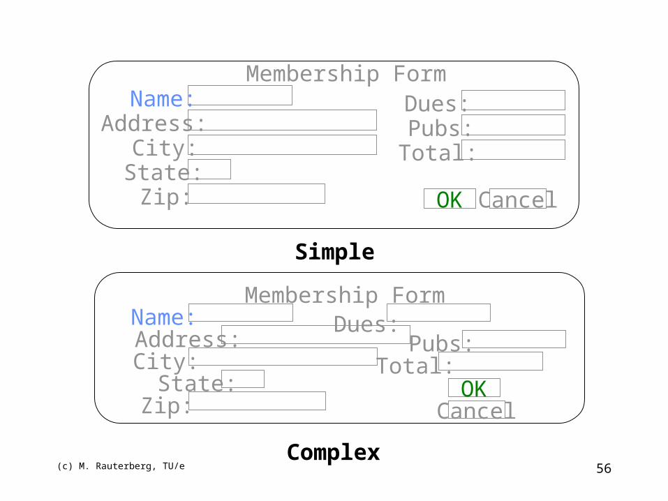
Simple
Complex
Name:Address:
City:State:Zip:
Dues:Pubs:Total:
OK Cancel
Membership Form
Dues:Membership Form
Name:Address:City:
State:Zip:
Pubs:Total:
OKCancel
(c) M. Rauterberg, TU/e 57
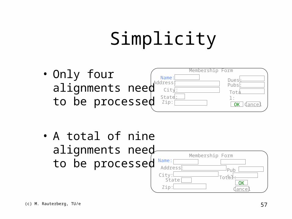
Simplicity
• Only four alignments need to be processed
• A total of nine alignments need to be processed
Name:Address:
City:
State:Zip:
Dues:Pubs:
Total:
OK Cancel
Membership Form
Membership FormName:
Address:
City:State:
Zip:
Pubs:
Total:OK
Cancel
(c) M. Rauterberg, TU/e 58
Simple
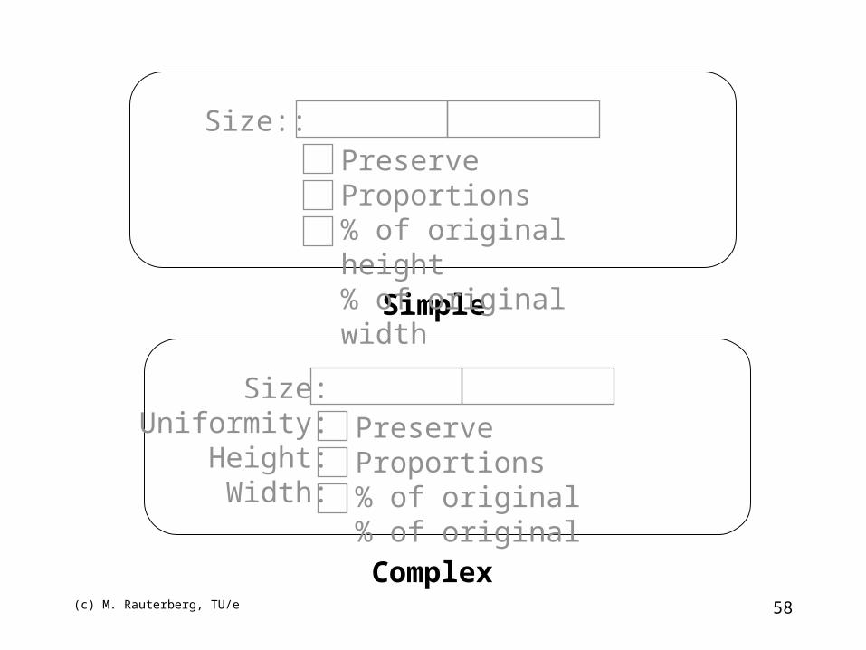
Complex
Size:Uniformity:
Height:Width:
Preserve Proportions% of original% of original
Size::Preserve Proportions% of original height% of original width
(c) M. Rauterberg, TU/e 59
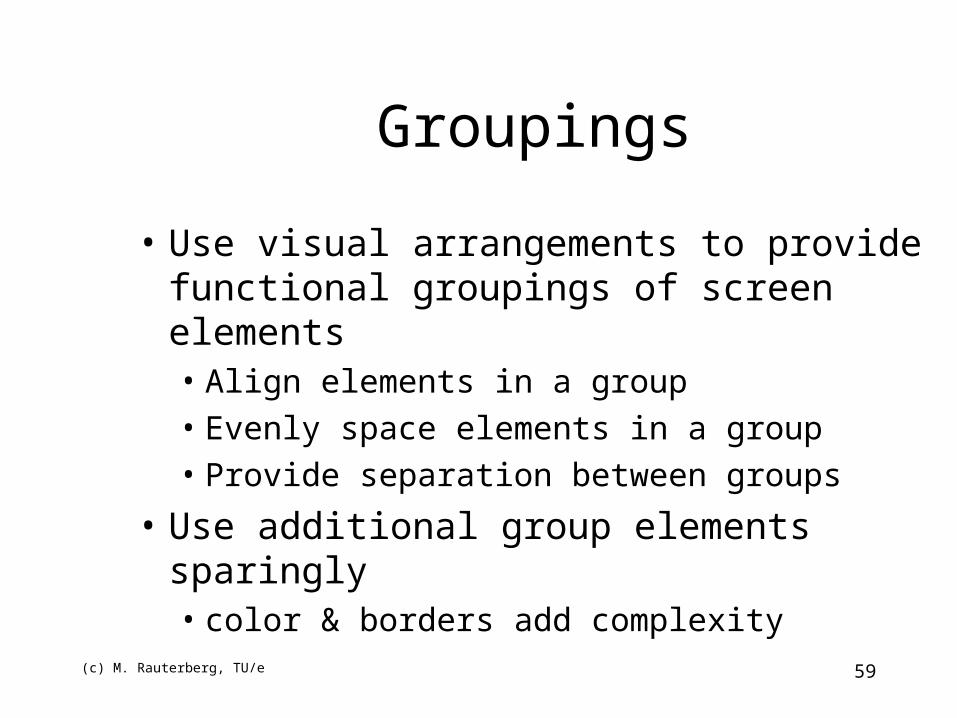
Groupings
• Use visual arrangements to provide functional groupings of screen elements• Align elements in a group• Evenly space elements in a group• Provide separation between groups
• Use additional group elements sparingly• color & borders add complexity
(c) M. Rauterberg, TU/e 60
Membership FormName:
Address:City:State:Zip:
Dues:Pubs:Total:
OK Cancel
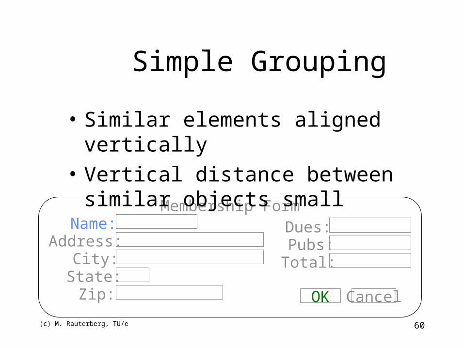
Simple Grouping
• Similar elements aligned vertically
• Vertical distance between similar objects small
(c) M. Rauterberg, TU/e 61
Membership FormName:
Address:City:State:Zip:
Dues:Pubs:Total:
OK Cancel
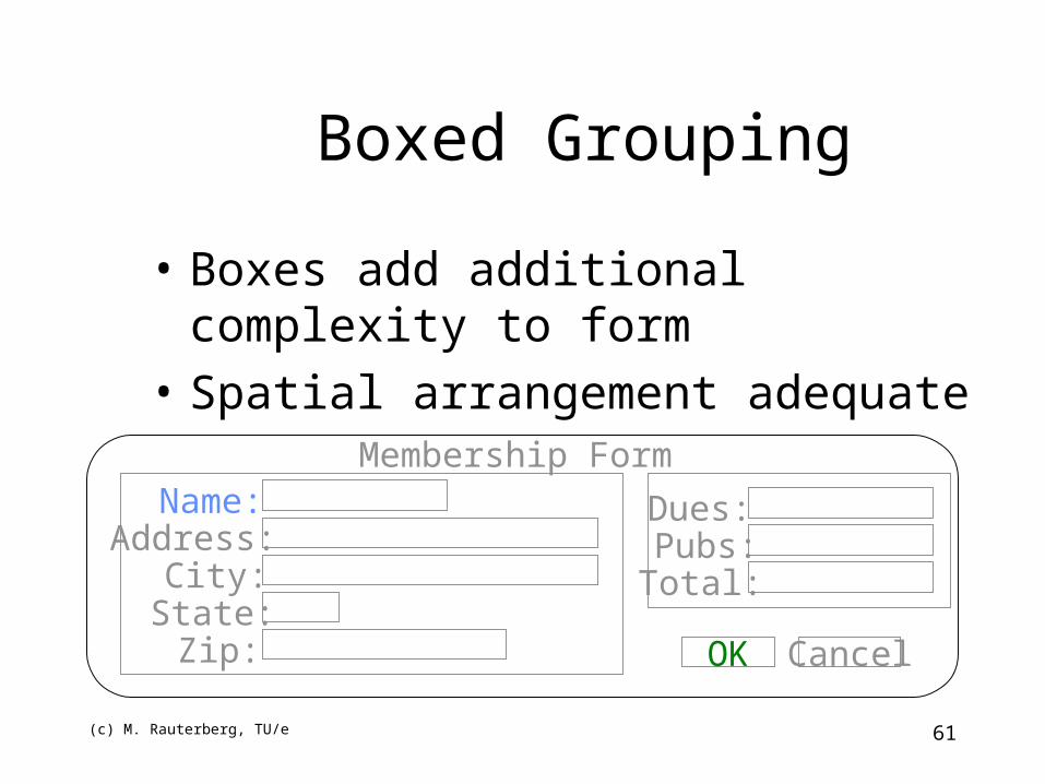
Boxed Grouping
• Boxes add additional complexity to form
• Spatial arrangement adequate
(c) M. Rauterberg, TU/e 62
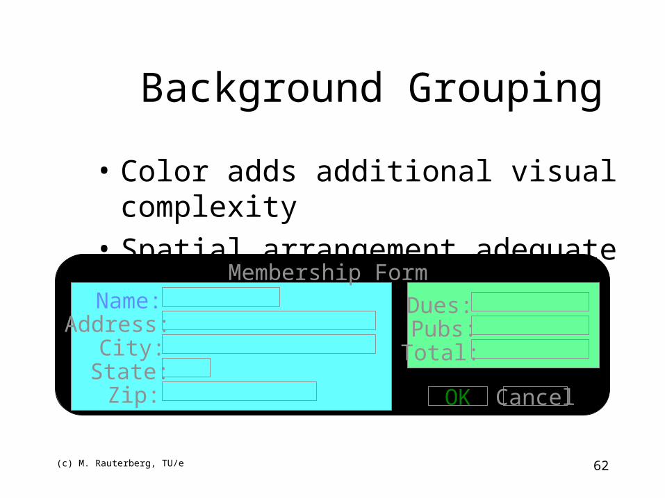
Background Grouping
Membership FormName:
Address:City:State:Zip:
Dues:Pubs:Total:
OK Cancel
• Color adds additional visual complexity
• Spatial arrangement adequate
(c) M. Rauterberg, TU/e 63
Form fill-in: guidelines• Meaningful title
• Comprehensible instructions
• Logical grouping and sequencing of fields
• Visually appealing layout of the form
• Familiar field labels
• Consistent terminology and abbreviations
• Visible space and boundaries for data entry fields
• Error correction for individual character
• Error messages for unacceptable values
• Optional fields should be marked
• Explanatory messages for fields
(c) M. Rauterberg, TU/e 64
Design Guidelines
• Be consistent
• Allow shortcuts
• Offer feedback
• Organize in logical groups (screens)
• Provide simple error handling
• Provide reversible actions