Embed Size (px)
DESCRIPTION
An Introduction to Graphic Composition for artists
Citation preview

INTOCOMPOSITION
JOHN KAY
The Millrind Press
A Painter’s Guide


JOHN KAY
The Millrind Press
Boat at Wivenhoe
INTOCOMPOSITION
A Painter’s Guide

4
First I am indebted, as always, to the patience and kindness of mywife Jennifer who has helped to edit and refine my prose.
I must gratefully thank Frank Webb who gave his kind permissionto reproduce his work. I owe a long lasting debt to all the artists ofthe past and present whose work has inspired me. Lastly and notleast to the many skilful artists whose wisdom I have quoted andwhose example I have tried to follow.
Ars longa, vita breva.
John Kay
ACKNOWLEDGEMENTS
INTO COMPOSITION
A Painter’s Guide
John Kay
Copyright © John Rowland Kay 2004
All rights reserved
No part of this book may be reproduced or utilised in any formor by means, electrical or mechanical, without express permis-sion from the publisher.
A Selection of John Kay’s Paintings may be seen at his website:
http://www.millrind.co.uk
email: [email protected]
Limited edition. Typeset in 11pt. Minion Pro. Designed,printed and published by The Millrind Press
22 Hall Road. Fordham, Colchester Essex CO6 3NQ
ISBN 1 902194 07 1

5
1. Introduction ...............................................................7What is a painting?...................................................8What is composition?...............................................9
2. Aspects of Composition............................................11Golden Section ......................................................11Lines joining significant points .............................12Centre of interest and sweet points .......................12Rabatment ..............................................................14Eye Line .................................................................14Emphasis and contrast...........................................15Dominance .............................................................15Repetition & variation............................................17Tonal balance..........................................................17Linking the mid-tones............................................18Strong verticals and horizontals.............................18Rhythm of forms.....................................................19Diagonal lines give action & dynamism ................20Pointers to the centre of interest............................21Compositional faults..............................................23
3. Working Methods ....................................................26Planning .................................................................26Using a viewfinder..................................................26Sketching................................................................28
Tonal values - natural and stage set................29Quick tonal sketches........................................29
Simplification.........................................................30Photography ..........................................................33From the sketch to the painting.............................35
Some practical advice:......................................365. The Process...............................................................39Bibliography..................................................................42
Contents

6
Canal lock near Birmingham
Tollesbury, Essex

7
1. IntroductionThis book is mainly about composition, how to recognise it and how best to useit. It doesn’t matter which medium you use, composition is always a considera-tion. I seek to explain the more practical and therefore the more obvious factorsof this fascinating subject but I will leave a fuller discussion to others.
There is a set of standards for composition shared by many great artists of the pastand a large number of practising artists today. These represent a consensus whichlinks good sense, good practice and sound judgement. They are a well-establishedset of values, handed-down, preserved and developed which give direction,
coherence and mean-ing to all art.
An awareness of the ba-sics of compositionhelps you to appreciatethis quality in otherpeople’s work and alsohelps you to structureyou own work no mat-ter how skilful yourdrawing or your paint-ing technique. I hopethis will lead you to agreater satisfaction in
what you do.
Good composition is very important to painting. I work on location and in thestudio using sketches and photographs. I paint landscapes, townscapes and stilllife mainly in watercolour with some mixed media but composition appliesequally to every medium and subject.
I do want to stress the importance of planning before a main painting is em-barked upon. I find that a methodical approach does much to help me to makesense of a situation where all the decisions seem to arise at the same time.
Aldeburgh House, Suffolk

8
What is a painting?Any study of painting should include an appreciation of the traditional emphasiswhich, before the use of photography had two genuine rôles: to record theappearance of people and objects andto represent history and mythology.Commissions by the rich and famousenabled artists to earn a hard-wonliving, something very difficult to donowadays.
In my view there are two aspects tothe definition of a painting, the philo-sophical and the practical. Philosophi-cally, it may be helpful to regard apainting as an offering or submissionby the artist. The artist’s motivationto paint could be equated with the need to share the delight of something whichhas been found or discovered. Only in this case the discovery is through theexplorations and particular vision of the artist. Herbert Read commenting on thedistinction between art and nature wrote:
Most simply we might say that the artist in painting a landscape (and it is true ofwhatever the artist does) is not seeking just to depict the visible appearance of thelandscape, but to tell us something about it. That something may be an observation oremotion which we share with the artist but more often it is an original discovery of theartist’s which he wishes to communicate to us. (READ, 1931)
This raises the question of how much attention the artist gives to detail. Theaspirations of many beginners are often based on their experience of looking atphotographs. This often results in paintings that are highly detailed all over.
If art were merely a record of the appearances of nature the closest imitation would bethe most satisfactory work of art and the time would be fast approaching when photog-raphy should replace painting. (READ, 1931)
Photography has still not replaced painting nor ever will. An attempt to representobjects and scenes exactly as the camera would record them, with every detailclearly defined, evenly lit and focused is a lost opportunity for the painter to sharea personal vision and create something unique.
Street scene, Cambridge

9
We are entitled to know where an artistic endeavour begins and ends, thereshould be agreed borders, which define the area of professional responsibility. Ibelieve therefore it is essential that the edges of the painting are clearly indicatedand that is the purpose of a frame, it clearly defines that which is presented andseparates it from the wall and the surroundings in which it hangs. Within thatframe lies the work, so that there is no doubt in our minds as to the extent of whatis presented.
Some artists have challenged the concept of clearly defining the picture bycontinuing the painting onto the actual surface of the frame and in some rarecases onto the wall surrounding it. This is technically described as “breaking thepicture plane”.
What is composition?Composition means, literally and simply, putting several things together, so as to makeone thing out of them; the nature and goodness of which they all have a share inproducing. (RUSKIN, 1857)
and Frank Webb:
Many painters use composition intuitively, without conscious awareness that they are doingit. However many painters ignore composition.First of all many who are painting do not realise they are composing,… Since the Frenchimpressionists, there has been a feeling that a painting must be an improvisation, and thatcomposing thwarts improvisation. Others stray because they are so focused on technique,materials and media. Thenthere are those impatientwho are also anxious to slapon paint. Then, too, lazinesstakes its toll, for composing ishard work and we wish toavoid not only work but pain.And last, but not least, compo-sition is ignored by painterswho cater to a public condi-tioned by photography, be-lieving a picture must haveelaborate detail. Thus the
Farmhouse, Little Cornard

10
world is overloaded with non-composed pictures insinuating themselves into everycorner of our lives. (WEBB, 1988)
I see composition as the basic skeleton of a painting, all the flesh of colour, texture,detail and technique need strong bones to carry the weight. I believe that compo-sition is the secret key to success in painting.
To give some meaning to the term composition two aspects need to be considered.First, in a good composition the parts of the painting should link to or have aspecial relationship to the frame.
Second the various parts of the painting should have an internal coherence, theforms, the shapes and the interrelationship of tones should form a cohesive whole, i.e. every part of it should have a reason for being there. Leaving just one part outwould detract from the whole. If you have ever, on entering an exhibition hall,had your attention forcibly drawn to one picture in particular, taking yourimmediate attention as no others do, it is highly likely that that particular paint-ing had a very skilful composition .
Snow, East Fordham

11
2. Aspects of CompositionIn order to describe the separate compositional features of a painting they haveto be dealt with in isolation but in practice they are used in association with eachother. A picture is com-posed and seen as a wholeand in one picture an art-ist may use many of theseelements to achieve a com-posite which makes astatement.
Some features of composi-tion use lines which referparts of the picture topoints on the edge of theframe others are aboutachieving balance, defin-ing the centre of interest and leading the eye into the painting.
Golden SectionThroughout history the proportion we know asThe Golden Mean has always had a great signifi-cance in structured composition. The Golden Sec-tion is the division of a line or the construction ofa rectangle of approximately these proportions.– 1: 1.67
This proportion coincides with the Fibonacci series. This is formed by startingwith one and adding the last two digits to form the next one. Like this - 1, 1, 2, 3,5, 8, 13, 21, 34 , 55 etc., any two adjacent figures indicate the proportion. Thefurther along the series goes, the nearer it gets to the true ratio. Like pi(Π)however, we never get to an end of this progression.
The most fascinating quality of this proportion is that it derives directly from anatural origin and has a close affinity with the growth patterns in nature. Some
Moat, Moat Hall, Fordham
This is a GoldenRectangle
Ratio 1 to 1.67

12
Lines joining significant pointsSignificant points are the corners, the halfway points and the eight golden sectionpoints (ie. Where the Golden Section lines touch the frame. These are lengthilydescribed by some writers on composition and there are complicated drawingsshowing these lines superimposed onto many famous paintings. In particularRichmond, 1933 and Gordon, 1934 are worthy of mention. It isn’t said that artistsactually construct their paintings with these lines in mind but it may be hintedthat they may have been aware of them, if only subconsciously.
Using just these points it is possible to construct a net of ideal lines for composi-tional purposes, this however would probably result in far too mechanical aprocess for most artists. even though many treatises of old went into great detailover these measurements.
I am more inclined to the view expressed by Frank Webb that these relationshipsare more felt by artists than measured or plotted.
There are also particular lines to be wary of when placing shapes in your picture,particularly diagonals and lines of bisection. The Union Jack demonstrates all ofthese and sums up the type of composition that designers and graphic artistsstudiously avoid.
Centre of interest and sweet pointsArtists don’t usually use the centre of the composi-tion to place the most interesting parts of their paint-ings but place them slightly to one side or other ofthe middle point, these places are often referred to asthe ‘sweet points’ of a painting. These are often de-
book sizes, old and new, adhere fairly closely to theseproportions, namely Demy, Royal Folio, Royal Octavo,Foolscap Folio and Foolscap Octavo.
This is a Nautilus shell. Tangents at right angles to thewalls of the shell, (shown in red) will be in the proportionof the Golden Mean. Ferns, pine cones and other naturalforms also seem to demonstrate this proportion in theirstructure.
The four possible sweetpoints

13
Dabchicks YC, West Mersea
The sky and the clouds here areentirely a figment of my imagi-nation but have been placed inthat particular way to drawyour attention to the main sub-ject which is on a sweet point(the white building), and directattention away from the corners.The lines of the road also help inthis.
E.Bergholt Church,South Side
The centre of interesthere is the extremecontrast of the lighthitting the bushy treeon the sweet point ofthe painting, the light-er area in the fore-ground also points tothis.
scribed as the four places where the lines which divide the painting into thirds,cross. This is accurate enough for most purposes but to be slightly more correct Ithink that these should be described as the places where the Golden Sectiondividing lines cross. There is no definite requirement to use these places however.The centre of interest may well be a long way from any of these but you can besure that a well planned painting will have striking ways of drawing thespectator’s attention to it. I always try to ensure that there is only one centre ofinterest more than one dilutes the interest of a painting but there should never betwo of equal importance.

14
RabatmentNot all paintings are made in theproportion of the Golden Sec-tion however.
If a square is drawn to overlap apicture with its side being thelength of the shorter side of therectangle, the resulting verticalline is called a rabatment. Thisline can be measured from eitherside of the rectangle. Many artistsdeliberately use this division asthe place to put the centre of in-terest of their composition. Obvi-ously it is not possible to use thisvertical in either a square paint-ing or in a painting with the sidesin the ratio of 2:1 (when a rabat-ment would coincide with thevertical centre line of the picture).
Eye LineThis is a line parallel to the basewhich represents the horizon(sometimes called a Horizon Line) and it is related to the actualheight of the eye of the observerabove the scene depicted. A higheye line results in a view whichapproaches a plan view, the indi-vidual objects show very smalldifferences in height due to dis-tance. Low eye lines however ex-
Trinity Street, Colchester
Vineyard Street, Colchester
Fordham Schoolhouse
The low eye line gives drama, many triangular ele-ments and diagonals give tension.

15
Emphasis and contrastYou can increase the importance of the subject by making sure that dark and lightcontrast most strongly around it. Toning down the contrast in the rest of thepainting helps to strengthen what is left.
Dominance Dominance is probably the most often used way of drawing attention to the mainsubject of a picture. If there is one main subject in a picture and it is larger thanany other part of the painting it automatically becomes the centre of interest. Theeffect can be extended if there is also a smaller shape included, sometimesechoing the shape of the dominant one as a way of emphasizing the size differ-ence between the two.
Parkeston Quay,Harwich
There is no doubt that thecar ferry is the largest ob-ject in this painting andtherefore the most domi-nant part in it. The tonalgradation of the sky directsinterest, the smoke and thequayside features alsopoint to the main subject.
aggerate differences in size due to distance from the observer and hence tend todramatise the view. The norm is an eye line which approximates the height of astanding observer. A common compositional fault is to place the horizon at themid-point of the painting and this should be avoided.

16
Willie Lott’s Cottage, Flatford MillThe cottage is the central and dominantsubject, the surrounding forms pointing to-wards it.
Red Still Life
I have tried here to give a certain tension to thegroup by placing most of the mass above thecentre line. The shadows help to link the objectsto the frame.
Still Life with Stoneware Jar
In this group the lines of the wall, the tablecloth and the floor lead the eye in to the maingroup.
Dominance is most evident in stilllife groups. I find that still life paint-ing is probably the most satisfyingway of spending a dull winter day. Itis the one occasion where an artisthas full control over his subject, eve-ry object and its placement is completely under the control of the artist which canbe placed in the most attractive way, everything about it can be changed, even theway the light falls upon it— total control.
I find it easier to tackle a still life painting if I use a close-up view. This has twomain advantages, the objects are larger and therefore easier to draw and paint andthe background is reduced in size and thus does not distract attention from thegroup itself.
17
Logan Square,Philadelphia
I was extremely pleasedthat I was able to bal-ance all the separateshapes in this asymmet-ric way even though themain emphasis of the pic-ture is horizontal. Also Iwas able to echo thetheme of the three chil-dren in three fountains.
Repetition & variationIt needs three objects to form a series, two objects are not enough to establish asequence and the use of four is overstating it. Thus when repetition is used thereare usually three of the same kind of shape. Most artists avoid a mechanical,monotonous interpretation by changing one or more aspects of the shapes.Variation may be in the tone, colour, angle or size. Sometimes the repetition iseven more subtle where two or more factors are varied.
Tonal balanceThe apparent weight of shapes depends upon ontheir size and tone. Darker shapes appear tohave more weight than lighter ones. In a compo-sition the aggregate, or the joint result of thebalance of all shapes should present a form ofequilibrium and the best solutions tend tohave a asymmetrical form. These are usuallyillustrated with the analogy of a seesaw, oreven better, the sort of balance attained by asteelyard.
symmetrical
asymmetrical

18
Linking the mid-tonesMid-tones are the glue which holds a picture together, if they stretch across fromone side of the frame to the other they help to unify the composition.
Strong verticals and horizontalsIf these are very striking elements, there should be emphasis on either horizontalor vertical, not both. They can provide a good support for the whole composition.
R.Colne in Snow
Here I tried to maintain a balanceacross the picture of light shapes anddark shapes so that they representedan asymmetric tonal equilibrium.
East BergholtChurch
This view of EastBergholt Church isan example of wherethe mid-tones are ex-tended across theframe to unify thewhole picture.

19
Rhythm of formsWhere there are several verticals, such as the trunks of trees, vertical supports toa fence or any other vertical shapes most artists will take steps to avoid a repeti-tion of equal spaces between them. They will use this opportunity to vary theintervals in a certain rhythm which will promote visual interest. In addition they
Pink Rudder,Burnham on Crouch
I chose this view becauseit offered an exercise inshapes. Both horizontalsand verticals play theirpart, verticals predomi-nate and the telephonepole is on a rabatment.The street furniture helpsto link the whole picturetogether. The curvedshadow on the boat, thecurve of the wall on theseaward side, the trian-gle of the boathouse roof and the shaft of light from the break in the wall help to pull the wholeinterest into the centre where the pink rudder is.
Hotel Svon, MarienskyLazny, Czech Republic
A good example of thegrandeur of Austro-Hun-garian achitectecture.The diagonal lines help tobreak up the horizontaland vertical emphasis ofthis interior view. The ex-treme darks and lights ofthe reception hall con-trast with the sunny dayoutside.

20
Diagonal lines give action & dynamismStrong lines or pointed shapes give dynamism to a painting and indicate adefinite compositional movement or thrust.
Jumbo, (the watertower), Colchester
I have varied the posi-tions of the pillars whichhold up the water towerand as a result the skyshows through as a rhyth-mic progression ofshapes across the picturewhich is further dividedby the verticals of trees.
Burnham on Crouch,new quay
The perspective lines ofthe buildings, the pathand also the horizon allpoint to the main subjectbut in addition the darklines of the boom and thejetty frame it as well andintroduce an interestingtension into the composi-tion.
will also vary the height of each vertical, also to add variety. This applies equallyto horizontals or in fact all shapes. As a general rule all artists try to introducesome variety in tone, shape and colour whenever possible in order to avoidmonotony.

21
Pointers to the centre of interestSome features act as pointers within the composition, I sometimes have to reducethe importance of very strong lines which don’t help and sometimes emphasisethose that do.
Perspective lines pointing to the main subject are very obvious in many of mypaintings, it is after all probably the easiest device to arrange in a townscapewhere perspective shows up most markedly.
The Dalles - Frank Webb
Two major thrusts of the pic-ture are represented by thewhite shapes surging acrossfrom left to right. The top oneoriginates and stays close tothe line joining two goldenmean points on the frame.The bottom one follows a linefrom a corner to anotherGolden Mean point. These di-agonals together with the di-agonal of the roof shadowmake a determined move-ment towards the right butthis is successfully countered
by the struts of the structure which strain backwards to produce a tense equilibrium.
Deckchairs, Clacton Pier
A typical example of objectswhich have an animationwithin themselves, I caughtthis on camera and wasvery pleased with the waythat the wind had animat-ed the cloth of the deckchairs. I also loved the op-portunity to make the shad-ows lead into the picture.

22
The presence of people immediate-ly commands attention in a compo-sition. The eye is drawn to themand they add scale to a painting atthe same time. If they are pointingto something, the viewer looksthere. The figures don’t even haveto do this, they only have to beturned towards a subject as if look-ing at it to provide a strong compo-sitional pointer towards it. Roads,pathways and streams perform a
Trinity Street, Colchester
Burnt Sienna, prussian blue and theirmixtures go to make up this very min-imal yet telling flower arrangement.Particularly note the direct, clean andwell-considered brushstrokes. Thehorizontal strokes in pale grey effec-tively link the group to the frame.
A good example of the consummate skill of a matureartist. Simple brushwork delineates the subtleshapes which make up the modelling of the face.Heavy shadows of the robe point effectively to theface as well. The left side of the robe is blended intothe background linking the figure to it. Note the useof violet and green and their mixtures to contrastwith the warm tones of the skin.
Still life in two colours, FrankWebb Detail from a nude - Frank Webb

23
Compositional faultsThese further paintings of mine have more than a few compositional faults. Ialways think that if I am to underline shortcomings they might as well be minerather than embarrass somebody else. I would urge you to keep your failures,think how encouraged you will be when you later can say that you are so muchbetter now. I plan, when death seems immanent to destroy them completely, Ihave seen more than enough examples of poor quality work rescued from deadartists’ studios that would have shamed them had they lived to see them exposedto the public gaze.
These are all my early efforts in watercolour, mostly painted on the spot, onholiday. A lot of this work represents the learning process. All the way throughcollege I painted in oils and didn't touch watercolour, at the time watercolourswere regarded as impermanent and only suitable for children. Although manypigments were fugitive in this medium they did not deserve this condemnation.In any case, at this time, many galleries and exhibitions were reluctant to acceptwatercolours as finished pieces of work. I used acrylics for my work as well. Ididn't start to use watercolour until I felt as if I had enough time to master it fully.
Honfleur Port
These perspective lines direct attentioninto the painting and point to the cen-tre of interest which in this case hap-pens to be the red spot, whatever that is.Note the balance formed by all thewhite shapes and all the dark shapes.
similar function and can prove to be very convincing pointers, so strong thatoccasionally the artist has to blur the lines a little to reduce this effect and makeit less obvious. You may think that the treatment of a painting is beginning tosound as if it is most contrived, well that's exactly what art is or what art shouldbe. An artist should be making something, imposing his rationalisation uponwhat he creates, he doesn't take his subject the way it comes, he makes it into whathe wants it to be. This is the difference between matching and making.

24
Barton Broad, Norfolk
The Waterfront, Porec
I painted this many years agoon the waterfront at Porec, Yu-goslavia. The sheer complexityof the subject drew me to it. Themain fault is that I chose a flat-on view. There is no Centre ofInterest, the whole painting isjust a collection of details. Thepositioning of the people heredoes not help to guide the eye,They don't know whether theyare coming or going and I obvi-ously didn’t know either.
Crail Harbour, Fife
This painting of Crail harbour,is rather heavy in tone and verydark on the right hand side,. It'snot well balanced as a composi-tion.
Barton Broad, Norfolk
The most significant thingabout this particular paintingof Barton Broad is the broad,and the broad is all you can see,much too central in emphasisand very little tonal contrast. Atypically tentative piece of workwhich identified me as a realbeginner in watercolour. One ofmy early attempts.

25
Satuna, Costa Brava
I was intrigued by the dominanceof the buildings on this promonto-ry. This painting turned out to berather bland and I must havethought at one time that it was fin-ished but I don’t now. I could havedeveloped the tones and mademore of the contrast of the shadowsagainst the buildings. The sea isnot convincing and the sky is toopale.
Workshop, Charney Manor
This painting has become a historical docu-ment as the workshop depicted no longerexists. As to the composition, the whole pic-ture is flat on, not a very original viewpoint
. The overworked wall dissipates the atten-tion and there is no distinct centre of inter-est.
Anstruther, Fife
Once in a while things turn out well without agreat deal of fuss and labour I was particularlypleased with how this painting turned out. Thetwo great curves of the cirrus cloud and theshoreline point satisfactorily towards the maincentre of interest. The dark shapes balance eachother very well too.

26
3. Working MethodsI like to draw a parallel here with a television programme where a full orchestralrehearsal is shown, the conductor taking the players through the piece slowly,describing exactly how he wants the work to be performed and why. We watchthe mood and spirit of the piece being gradually worked out. To finish, the pieceis played in its entirety. This both illuminates and increases our understandingand adds immensely to our appreciation of the final work.
PlanningI always plan the composition before I make a mark on the support (watercolourpaper, board or canvas). I select the view and fix the frame, checking for the mostfavourable arrangement.
There is a distinct difference between active looking where the looking is part ofanother action (finding, avoiding, comparing, reading) and seeing, meaning beingreceptive to the scene before you “for its own sake.”
Learning to "see" the large simple masses of shape, value and colour becomes intuitiveafter some trial and error. It can be learned and like anything else requires some patienceand discipline.Looking is very different from seeing, the act of looking presupposes a mental image ofwhat is sought. Seeing is a much more passive action, which allows the scene viewed toimpact upon the viewer. (STABIN, 1999)
I use subsequent sketches to explore different possibilities in interpretation, selectingand refining at each stage. This avoids the trial and error approach which rapidlyleads to overworking and losing freshness.
If the bigger areas of the painting are not well-designed there is littleuse in going on. No qualities of colour or texture can save apainting that has undistinguished shapes and unreadable val-ues. (WEBB, 1990)
Using a viewfinderAlways use a viewfinder, providing it doesn’t make youfeel too self-conscious. It ensures that you draw a picturethat is level, i.e. at 90 degrees to the angle of vision. A

27
small piece of card about 2½ x 4 in. With a central hole of 1½ x 1 in. Will servevery well. Use the viewfinder to frame the subject and relate the lines and shapesto the frame. This is particularly relevant if you are painting out of doors.
Ruskin advocates the use of a viewfinder:
It is good, in early practice, to accustom yourself to enclose the subject, before sketchingit, with a light frame of wood held upright before you. It will show you what you maylegitimately take into your picture, and what choice there is between the narrow fore-ground near you, and a wide one further off; also what height of tree or building you canproperly take in, etc. (RUSKIN, 1857)
Don’t accept the first view that seems suitable. Look at it through the viewfinderfrom as many angles and distances as you can before you decide upon one. If youintend to paint sitting down, don’t make your judgements while standing up.Think ahead and you will avoid predicaments later. Always be prepared for thesituation to worsen. Someone may well park a car or a van in front of you, boatswhich may loom large part in your painting may suddenly sail away. Many artistscannily take a photograph before they start, this not only insures against futuredisaster but also records and fixes the fleeting shadows which can change drasti-cally as the painting progresses.
When you look at a magnificent panoramic view you have an awe-inspiring senseof place. This is difficult to convey within the bounds of a picture frame. I wouldadvise against attempting to capture the magnificent. It is hard to establish acentre of interest and difficult to establish a foreground and middle-ground.
A viewfinder is particularly useful for transferring a line to your sketch that you may finddifficult to see accurately, particularly when drawing buildings in perspective. You can getthis angle just right by looking at the scene you have chosen and using a pencil across theopening of the viewfinder to lining it up with the line in question. Then without movingthe pencil, place both pencil and viewfinder down uponyour drawing and you can readily see the angle you needto draw.
You can also use the outside of the viewfinder as a tem-plate to draw a pencil frame in your sketch book to useas an aid to composition.
28
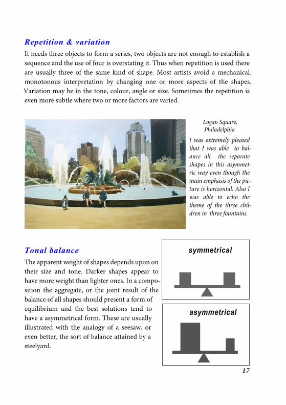
SketchingYou may be satisfied with the subject but don’t rush straight into paint,several compositional sketches will enable you to make critical decisionsabout tonal balance and relationships early in the process. Don’t confusefinished drawings with preliminary sketches, these can be very rough indeed,just enough lines to plan out the areas. Once you have started the paintingitself, it is too late to make major changes in form. If the painting fails you stillhave the sketches to work from if you want to start again. I believe that apreliminary sketch, preferably a tonal one is best for planning out a composi-tion.
I also think that it is important to enclose preparatory sketches within adrawn border on the sketchbook page. Leaving a white space between thesketch and the edge of the paper offers many advantages.
It gives the border a proper importance in the composition and makes youfully conscious of its importance while you are designing; if you have mis-judged the extent of the area you wish to include it makes it possible to extendthe frame somewhat in any direction without redrawing and it gives space forcolour notes or any other information.
Frank Webb calls this a Graphic Border:
Many artists draw in a sketchbook, letting the edges of the paper be the edge of the design.It is far better to draw a borderline an inch or so inside the edge, taking care that the
proportions match your intended painting.By doing so you will be more conscious ofthe composition. It is also easier to scribbletones up to this border without the pencilgetting caught at the edge of the paper orpad. The chief advantage of working up to agraphic border is that at the conceptualstage it effectively separates the picture fromordinary reality. (WEBB, 1988)
It is at this stage it is important to ensure that there is a way for the eye toenter into the picture which is not diverted or blocked off.

29
Tonal values - natural and stage set
The first diagram, based on a sketch by Frank Webb, illustrates the natural tonaldifferences that can be found in most landscapes. Tonal values here are dictated
by the general way that light behaves overlarge areas.
The second diagram draws a parallel betweena view and a stage set which sometimes provesuseful as a concept. This uses the faded tones
of aerial perspective to simulate distance.
Both of these schemes are employed as a ruleof thumb in many paintings to give depth. Idon’t feel however that either of these places
any obligation upon me as to how I allocate tones in my own work. I vary theseaccording to the tonal pattern I wish to use.
Quick tonal sketches
Many people take careful note on their sketchesof the actual colours in a view. Once you havedecided on a view, you can use whatever coloursand emphasis you like, these are not as fixed aspeople may think. How you apply them is up to
you and the colours you useare a matter of choice as well.
Most people like to seeartist’s sketches especiallythose which lead to finishedwork because they give amore detailed insight intothe way the artist’s mind isworking as he goes through
S K Y
G R O U N D
M O U N T A IN S
T R E E S & H O U SE S
lightest of al l
s l ight ly darker
darker s t i l l
darkest of al lN ATU RAL TON AL V ALU ES
F O R E G R O U N D
M I D D L E G R O U N D
B A C K G R O U N D
V I E W F I N D E RWA Y IN Here are a few tonal sketches (or value sketches) where
alternate tonal schemes are tried out. This is the opti-mal way of working out where best to place and balancethe tones within the picture frame.

30
the preparation and process of making a painting.
SimplificationSimplification is an integral part of the sketching for composition process. Ab-straction is a result of this simplification.
Remember, also, that painting is a process of subtraction, not addition. Resist the urge toinclude everything you see in your painting. Include only those elements that are expres-sive of your subject, and ruthlessly eliminate those that are not. (STABIN, 1999)
It is helpful to think of every shape we create as a position on a continuousspectrum of degrees of abstraction. This spectrum ranges from photographicrealism at one end and an arrangement of shapes and colours at the other. The
Addington Common
I simplified the domi-nant tree by lookingcarefully at the branch-es and the way that theyformed abstract shapesand these I simplified.Being able to identifytrees can actually get inthe way of depictingthem simply, all youneed to do is to use youreyes and discern theway the tree grows in or-
der to draw it. I emphasised the lines that lead in to the main subject and reduced the back-ground to a mere silhouette. To establish dominance I made sure that the main subjectcontains the greatest contrast between dark and light.
latter extreme seems at first sight to have no meaning at all, apparently a pleasant-ly arranged design and nothing else. Piet Mondrian painted a series of paintingswhich showed the stages in a process of abstraction from a conventional depic-tion of a tree to a fully abstracted composition. Every time I paint I use a certainamount of abstraction. Every time I paint I use a certain amount of abstraction.The human eye, being what it is, cannot rest without imposing some meaning

31
upon everything it sees and will pick out something for itself whatever happens.This very fluidity of meaning is very attractive to some people as it appears to offerthe chance to interpret the picture in a very subjective way.
Any drawing and any painting requires a certain suspension of disbelief on thepart of the viewer the more skilful the artist the more complete the co-operationbetween the artist and his audience. A good abstraction is a joy to behold. Largelyspeaking, abstractions make sense because of where the abstracted objects areplaced. These still need to be proportionate to everything else.
When you are looking at a scene or even a photograph you immediately becomeaware of the seductiveness of detail. Every luscious object in all its detail singssweetly to you just as the sirens did to Ulysses, “am I not wonderful?, paint me,paint me.”
Frank Webb – Flat Musicians at Market Square
This is a good example of how a skilful artist directs attention to the main subject. The attitudesof the audience point to and make it perfectly plain where the centre of interest lies. This isfurther strengthened by the lightest part also centring on the musicians. Although predomi-nantly cool in colour scheme the picture is relieved by the occasional warm shape. This is anobject lesson in how to abstract the forms without compromising the statement of the whole.

32
Don’t be conditioned by the manydetailed photographs you have seenand imagine that a painting consistsmerely of a collection of accumulateddetail.
Frank Webb says:
Any painting is a bad painting when apart becomes more interesting than thewhole. Over attention to detail spawnsconfusion and chaos – the opposition ofdesign. (WEBB, 1990)It is my particular duty as an artist toallocate priorities to the forms infront of me. I am the one in charge, Iam entrusted with the privilege toextract, to establish order, to playdown some things and to emphasizeothers and to change according to myown vision.
There are always those who are con-tent to paint subjects ‘the way it was’.I believe that an artist must takecharge, where there is full controlthere is also full responsibility, each ofus must bear this for our work.Artists are not cameras. We must beobliged at some stage or other to ab-stract what we see and convert it intoshapes and forms that are paintable.
Tony Couch calls these shapes, sym-bols:
To symbolise means we don’t report each object in all its detail, as would a camera;rather we invent symbols for them. The painting has a language different from the reallandscape or seascape, so a translation job must be done. (COUCH, 1987)
West Mersea
Boatyard at Pin Mill
Beer, Devon

33
Abstraction and simplification is a personal and subjective response to the subject.This is one of the ways in which an artists develops a distinct style.
PhotographyMany artists have very guilty feelings about using a camera to help them. Theyshouldn’t. Many do not realise the enthusiasm with which artists, since the timeof the renaissance have embraced and used every technical aid as soon as theybecame aware of it: the camera oscura, the convex lens and finally the camera.Canaletto, Guardi, Caravaggio, Watteau, Vermeer, Pissarro all used technicalassistance at some time or other in their work.
A good photograph is in focus over its whole surface, when we use our eyeshowever, only the centre of our vision is in sharp focus, the rest fades as it getstowards the edge of our vision. A photo therefore represents a summary ofeverything we see once we have let our eyes wander all around what we arelooking at.
“A camera does so much for you but it doesn’t take a point of interest. Instead itfocuses on the whole thing, it takes a picture of the entire subject.” (Tom Coates -as quoted by Oliver Lange, The Artist, May 2001)
In general use a camera gives you a reduced angle of vision putting you furtheraway from the scene,affecting scale. Grandi-ose scenery is reducedin impact and this canmake the view unrecog-nisable when the film isdeveloped.
In spite of these limita-tions the camera is aninvaluable aid, its built-in viewfinder helps usto find promising po-tential compositions
Seafront at Aldeburgh

34
and is a quick and ready source ofreference. It captures otherwise fleet-ing shadows, it makes the life of asitter far less arduous and it enablesdetail to be recorded in its entirety forlater use in the studio.
On the question of copying directlyfrom a photograph. Many paintersdo this, some actually project an im-
age from a photograph us-ing some kind ofepidiascope and drawround the image. Detailedwork of this kind, althoughpopular, conveys very littleof the artist’s vision to theviewer.
It is always best if the pho-tograph you work from isyour own, you are thenable to bring the experi-
ence of taking the photograph and the ‘feeling of place’ to your work and addition-ally there is no difficulty with copyright issues.
Working directly from a photograph without making a preliminary sketch isprobably the worst thing you can do, there is so much detail you are tempted togo into detail right away whereas the first thing you should do is to simplify whatyou see. One of the greatest values an artist can offer is the interpretation fromwhat he sees. There needs to be a buffer between the photograph and the paintingand that is best realised by interposing a sketch, preferably a tonal one. This waythe tonal balance can be worked out at an early stage and that is itself an abstract-ing process. Your painting becomes a much less hit and miss affair when you havealready made important decisions about the structure and the composition youwill use.
Willie Lott’s Cottage, Flatford Mill

35
Artists have to arriveat their own practi-cal ways of simplifi-cation which are stillacceptable to the on-looker, any objectmust of necessity besubjected to a degreeof abstraction at thehand of the artist.
From the sketch to the paintingWhen painting directly from the subject the compositional sketch is often over-looked but I have found from experience that even the briefest and scrappiestsketch is useful for sorting out priorities and deciding upon the best plan of action.
It is not necessary to redraw a complete version of the sketch on the support. Thesketches and photographs are to refer to asthe work progresses.
The ability to draw well does not automati-cally ensure good painting. Many gooddraughtsmen will spend no time on prepara-tory sketches preferring to spend a great dealof time drawing, in great detail, every con-tour of every object. Some even take thisfurther by shading to show shape. It is onlywhen they start painting that they mightrealise that it was badly planned or that thecolours were rendered dark and messy bymixing with the graphite. Many become dis-couraged by this that they steer clear of col-our altogether for a while.
Connere, France
Panther Hollow Stairs, - Frank Webb

36
Some practical advice:
Use good quality watercolour paper but you don’t need to buy hand-made. Buythe best brushes and paint you can afford.
Use the biggest brush you can for the job, you wouldn’t paint a wall of a roomwith a one inch brush. As to paint, always mix at least three times the amount thatyou think you will need and at least twice as dark as you think it should be whileit is wet. Nothing is more disappointing than to realise that the perfect wash youhave manfully desisted from messing about with and is really fresh and good isnonetheless far too light in tone.
Whether completing work on location or from source material in the studio it isbest to paint in your initial areas according to the main divisions of your compo-sitional plan even to the extent of ignoring what is directly in front of you. Thepainting should progress from the largest shapes to the smaller ones. Do not workin just one area at a time but bring all of the painting forward together.
Normally in watercolour practice the lightest shapes are dealt with first, a mid-tone wash covers the paper and leaves the lightest shapes as negatives, being the
French town with canal and flowers

37
white of the paper. The darker mid-tones are dealt with next, finishing off withthe darkest shapes. Check at this stage that you have achieved an acceptablebalance with the tones.
I find it is best to refer to the compositional sketch for as long as possible, onlyusing the photograph, providing you have taken one, for fine detail. If you do thisit may surprise you how far you have come in interpreting the original stimulus.This is when you must be selective and sparing, choosing only the most tellingdetail to draw attention only to the centre of interest.
You do not need to dot every ‘i’ and cross every ‘t’. A subtle hint can suffice, theviewer will supply the rest, and gain a greater amount of enjoyment from doingso.
I have heard many artists say that you have to stop just when you feel that justanother small detail could be added but it is far more complex than that. There isa particular awkward trait in us all which believes that all we have to do to achieveperfection in the painting we are working on is to keep at it for long enough andwe will get get there eventually, perhaps to perfection itself? In watercolour where
Bowness Boatyard

38
things can rapidly go wrong, the more one works on it, the worse it gets. This isnot confined to watercolour I have seen very many acrylics and oil paintings thathave been worked to death resulting in passages of purple/brown sludge.
Tollesbury quayside
For myself I find that giving a demonstration is a particularly good occasion forplacing just the right amount of pressure to the progress of the painting . Underthis constraint there is no time for dwelling on any stage too long and everyreason to finish when a statement has been achieved. Not going on too long isbuilt into and part of the whole process.

39
5. The Process
Be adventurous, risk failure, spend as much time painting as you can. Openyourself to other people's work, see as much as you can, read as much as you can,experiment as much as you can and don’t look ahead all the time to a precon-ceived end point, instead regard your artistic work as a process.
It is far better to create many paintings– being focused and working quickly and simply– thanto try to paint a masterpiece. Production is important. Some of your paintings will fail. Some willsucceed. We learn from our failures. Look forward to them. They are part of the process, if mywatercolour is a more successful than yours. It is because I have failed more often than you have.Remember, it is “the process” that is important. A painting is a by-product of “the process.” Thejoy and excitement is in the act of painting itself. (STABIN, 1999)
Feel confident that you will gain from the process. The ability to use compositiontranscends technical facility in painting and drawing although gaining compe-tence in these is very important.
Maldon Yacht Club

40
As Mel Stabin also points out:
Technique will emerge as a result of production, but does not make a painting. ... when you become proficient in the application of technique, don’t feel that you have
“arrived.” Unfortunately, many artists do. (STABIN, 1999)Don’t judge yourself harshly, painting, like learning to play a musical instrument,can be learned and you can only learn if you can truly suspend self-criticism or atleast temper it so it is commensurate with the standard you have reached.
Enjoy yourself, I will finish with a very apt quote from William Hogarth:
The active mind is ever bent to be employed. Pursuing is the business of our lives; andeven abstracted from every other view, gives pleasure. Every arising difficulty, that for awhile attends and interrupts the pursuit, gives a sort of spring to the mind, enhances thepleasure and makes what else be toil and labour, become sport and recreation.(HOGARTH, 1753)
Fordham Place Cottage
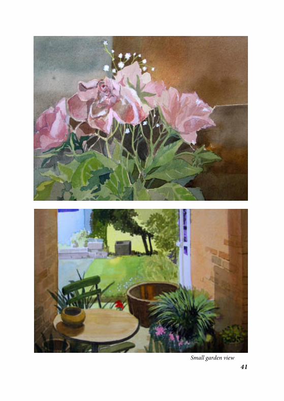
41Small garden view

42
BibliographyCOUCH, Tony - Watercolor, You Can Do It - 1987 - North Light Books
ISBN 0 89134 188 9 – pp. 34
GORDON, Jan - A Stepladder to Painting - 1934 - Faber & Faber Ltd. Londonpp. 56-57, 146-169
HOGARTH, William - The Analysis of Beauty - 1753 - §V, 24
READ, Herbert - The Meaning of Art - 1931, (Pelican Books) Penguin Booksin association with Faber and Faber – p. 130
RICHMOND, Leonard - Essentials of Pictorial Design - 1933 - Sir IsaacPitman & Sons, Ltd. London pp. 86-111
RUSKIN, John - The Elements of Drawing - 1857 - Dover Publications Inc.New York 180 Varick Street, New York NY 10014 -ISBN 0 486 22730 8 –pp. 18, 188
STABIN, Mel - Watercolor, Simple, Fast and Focused - 1999 - Watson-Gup-till Publications ISBN 0 82230 5706 0 – pp. 9, 12, 14, 44
WEBB, Frank - Watercolor Energies - 1983 - North Light Books ISBN 0 8914751 422
WEBB, Frank - The Artists Guide to Composition, 1988 - Published asStrengthen Your Paintings with Dynamic Composition, North LightBooks, - 1994 David & Charles, Brunel House, Newton Abbot Devon -ISBN 0 7153 0337 – 6 pp. 1, 8
WEBB, Frank - Webb on Watercolor - 1990 - North Light Books F & WPublications, Inc., 1507 Dana Avenue, Cincinnati, Ohio 45207, ISBN0 89134 346 6 – pp. 93, 139


The Millrind PressISBN 1 902194 07 1