Embed Size (px)
Citation preview
James Ofria MATH505
Introduction Since the first corporations were created people have pursued a repeatable method for
determining when a stock will appreciate in value. This pursuit has been alchemy of the
investment world. Theoretically this using any mathematical method to analyze historical data or
time domain graphs to predict the future performance of stock is impossible because the future
performance (output) is based on future values of each metric (input). In today’s stock market the
approach of mathematically analyzing metrics is called technical trading and in today’s market
more trades are executed by computers than by humans. According to a chart published by CNN
Money in 2012 more than 60% of all trades were executed automatically by computers.
Moving average convergence/divergence (MACD) is a technical indicator derived from
the share price belonging to a certain stock. Developed in the 1970s by Gerald Appel and
pronounced “Mack’Dee”, it is used to find opportunistic changes in the strength and momentum
of a company’s shares.
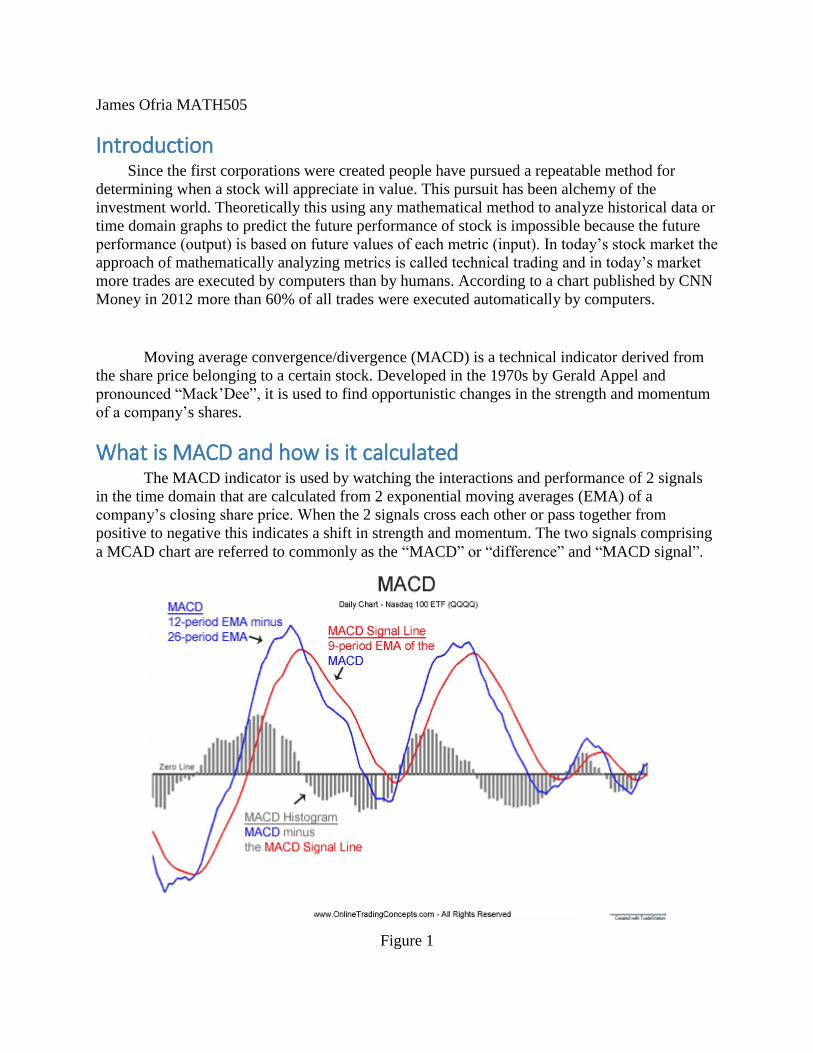
What is MACD and how is it calculated The MACD indicator is used by watching the interactions and performance of 2 signals
in the time domain that are calculated from 2 exponential moving averages (EMA) of a
company’s closing share price. When the 2 signals cross each other or pass together from
positive to negative this indicates a shift in strength and momentum. The two signals comprising
a MCAD chart are referred to commonly as the “MACD” or “difference” and “MACD signal”.
Figure 1
Exponential Moving Average
An exponential moving average, abbreviated in the document as EMA, is a way of
averaging a set of data in a particular domain. In our case we are concerned with the time
domain. EMA is a type of infinite impulse response filter that can be applied to an input signal to
reveal the direction of momentum change as well as other trends. EMA works by applying
different coefficients to each term begin averaged. This is done in a way that applies less weight
to older data (time domain) in the dataset by applying ever smaller coefficients. See Equations
below. The weights applied to each data point follow an exponential curve, which is where
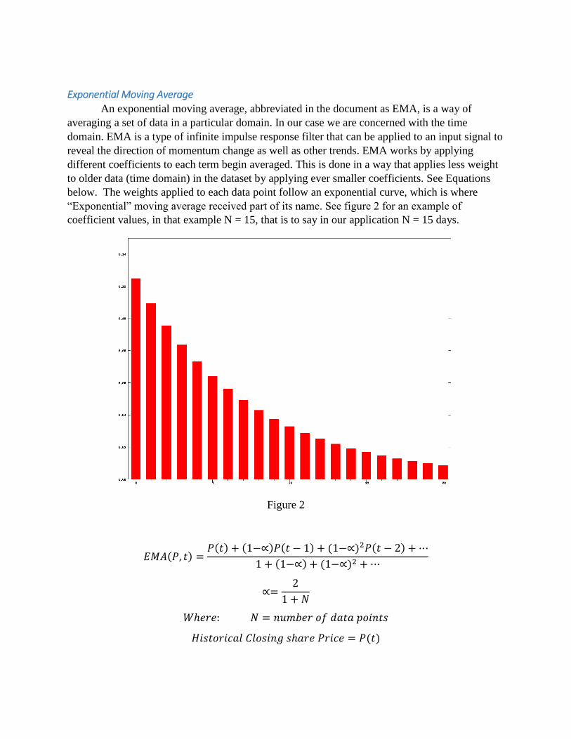
“Exponential” moving average received part of its name. See figure 2 for an example of
coefficient values, in that example N = 15, that is to say in our application N = 15 days.
Figure 2
𝐸𝑀𝐴(𝑃, 𝑡) =𝑃(𝑡) + (1−∝)𝑃(𝑡 − 1) + (1−∝)2𝑃(𝑡 − 2) + ⋯
1 + (1−∝) + (1−∝)2 + ⋯
∝=2
1 + 𝑁
𝑊ℎ𝑒𝑟𝑒: 𝑁 = 𝑛𝑢𝑚𝑏𝑒𝑟 𝑜𝑓 𝑑𝑎𝑡𝑎 𝑝𝑜𝑖𝑛𝑡𝑠
𝐻𝑖𝑠𝑡𝑜𝑟𝑖𝑐𝑎𝑙 𝐶𝑙𝑜𝑠𝑖𝑛𝑔 𝑠ℎ𝑎𝑟𝑒 𝑃𝑟𝑖𝑐𝑒 = 𝑃(𝑡)
“MACD” or “difference”
The “MACD” or “difference” line is calculated by taking the difference of two separately
calculated EMAs of a company’ closing share price. Closing share price is the price of one
company share at the end of the regular trading day. The first EMA is calculated with a relatively
short period and is often referred to as the “Fast EMA”, as a standard 12 days is used. The
second EMA, called the “Slow EMA”, is calculated with a much longer period typically 26 days.
𝐻𝑖𝑠𝑡𝑜𝑟𝑖𝑐𝑎𝑙 𝐶𝑙𝑜𝑠𝑖𝑛𝑔 𝑠ℎ𝑎𝑟𝑒 𝑃𝑟𝑖𝑐𝑒 = 𝑃(𝑡)
𝑀𝐴𝐶𝐷(𝑡) = 𝐸𝑀𝐴12[𝑃(𝑡)] − 𝐸𝑀𝐴26[𝑃(𝑡)]
“MACD signal”
The “MACD signal” is generated by taking the EMA of the “MACD” or “difference”
curve over an even shorter period than the “Fast EMA” we took earlier of the closing market
share price.
𝑀𝐴𝐶𝐷_𝑆𝑖𝑔𝑛𝑎𝑙(𝑡) = 𝐸𝑀𝐴12(𝑀𝐴𝐶𝐷)

How MACD is applied to trading As mentioned earlier the MACD is used as a tool to show investors when there is an
opportunistic shift the momentum of a stocks share price. The MACD indicator is typically
represented as a chart with two curves or a histogram. MACD histograms usually show data
points only where the events where action should be taken, and always convey less information.
For this reason we will be focusing our analysis on the chart representation of the MACD
indicator.
If presented as a chart with two curves important and opportunistic events are identified
when, “MACD difference” and “MACD signal” cross each other or when the “MACD
difference” curve crosses from positive to negative values or vice versa. When this happens the
MACD is said to have “crossed zero”. Additionally, if the two curves start to diverge from each
other significantly this is an indicator that action should be taken.
Figure 3
Excerpt from MACD analysis using CISCO share prices from 1/1/2003 to 6/3/2003
MACD difference crosses MACD signal
As seen in figure 3 event one circled in red shows an example of the “MACD” or
“difference” curve crossing the “MACD signal” curve. This type of cross event where the
“difference” crosses below the “MACD signal”, indicates that the stock is “bearish” meaning
that it might be a good time to sell.
The next event where the “difference” curve crosses the “MACD signal” is event 3 seen
on figure 3. This cross happens the opposite as the previous and indicates that the stock is at a
good time to buy because it may be experiencing upward momentum.
MACD crossed zero or diverges
In the second event shown in figure 3 of my analysis the difference curve crosses from
positive to negative. This indicate that the momentum of the share price is changing from
positive to negative. Conversely, as seen in the very beginning of event 4 the total momentum of
the change in share price is shifting from negative to positive.
Further, from both events 2 and 4 it can be seen that the “difference” and “MACD signal”
curves are diverging from one another. This indicates that the shares are volatile and a change in
momentum may be imminent.
RESULTS: Does MACD really work? To find out how well this trading method actually works I simulated trading the shares
using a MACD indicator using 10 years of daily historical data for large well-known tech
companies. To help govern my automated MACD trader I set a series for rules for how it should
handle things like bad trades that continue to cause a loss and what percentage of the total capital
should be allocated to each trade as the total capital it has access to changes. See in table 1
below.
Maximum capital to allocate per trade 25%
Target profit per trade (when to liquidate shares) 25%
Max loss to take per trade 5%
Total starting Balance $1000.00
Table 1
Below in charts 1 through 6 you can see the performance of the MACD indicator can be
seen as compared to the overall performance of the company’s share price. The orange line
indicates the account balance of MACD trader, which starts at $1,000.00 USD using the axis on
the right. The blue line shows the price of a single share of the company’s stock (use axis on left
of chart). If the orange line finishes higher than the blue line then the MACD trader
outperformed the company’s growth.
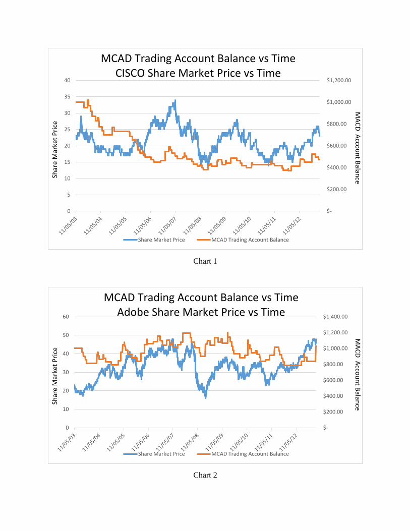
Chart 1
Chart 2
$-
$200.00
$400.00
$600.00
$800.00
$1,000.00
$1,200.00
0
5
10
15
20
25
30
35
40
Share Market Price MCAD Trading Account Balance
MCAD Trading Account Balance vs TimeCISCO Share Market Price vs Time
Shar
eM
arke
t P
rice
MA
CD
Acco
un
t Balan
ce
$-
$200.00
$400.00
$600.00
$800.00
$1,000.00
$1,200.00
$1,400.00
0
10
20
30
40
50
60
Share Market Price MCAD Trading Account Balance
MCAD Trading Account Balance vs TimeAdobe Share Market Price vs Time
Shar
eM
arke
t P
rice
MA
CD
Acco
un
t Balan
ce
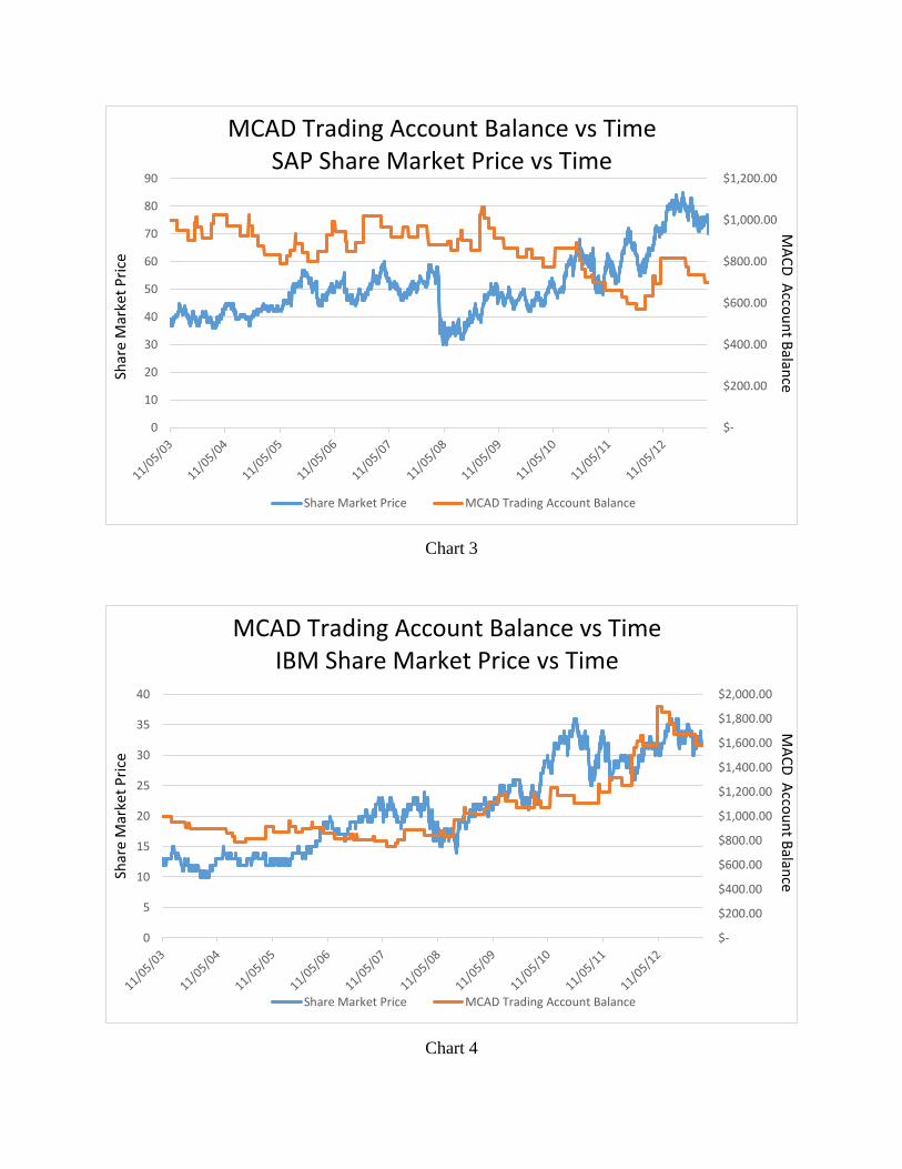
Chart 3
Chart 4
$-
$200.00
$400.00
$600.00
$800.00
$1,000.00
$1,200.00
0
10
20
30
40
50
60
70
80
90
Share Market Price MCAD Trading Account Balance
MCAD Trading Account Balance vs TimeSAP Share Market Price vs Time
Shar
eM
arke
t P
rice
MA
CD
Acco
un
t Balan
ce
$-
$200.00
$400.00
$600.00
$800.00
$1,000.00
$1,200.00
$1,400.00
$1,600.00
$1,800.00
$2,000.00
0
5
10
15
20
25
30
35
40
Share Market Price MCAD Trading Account Balance
MCAD Trading Account Balance vs TimeIBM Share Market Price vs Time
Shar
eM
arke
t P
rice
MA
CD
Acco
un
t Balan
ce
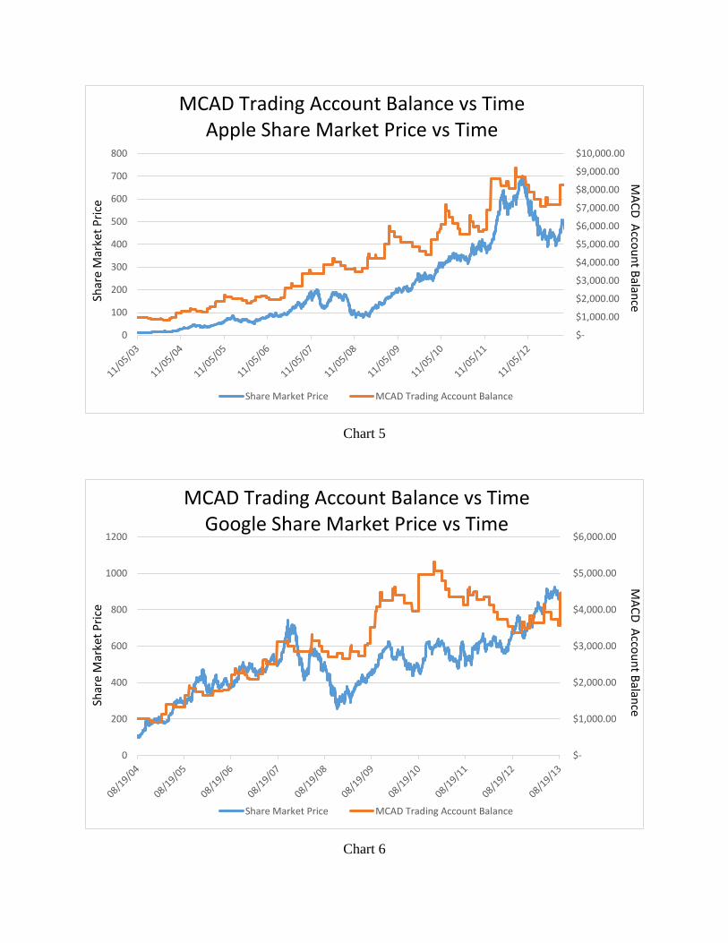
Chart 5
Chart 6
$-
$1,000.00
$2,000.00
$3,000.00
$4,000.00
$5,000.00
$6,000.00
$7,000.00
$8,000.00
$9,000.00
$10,000.00
0
100
200
300
400
500
600
700
800
Share Market Price MCAD Trading Account Balance
MCAD Trading Account Balance vs TimeApple Share Market Price vs Time
Shar
eM
arke
t P
rice
MA
CD
Acco
un
t Balan
ce
$-
$1,000.00
$2,000.00
$3,000.00
$4,000.00
$5,000.00
$6,000.00
0
200
400
600
800
1000
1200
Share Market Price MCAD Trading Account Balance
MCAD Trading Account Balance vs TimeGoogle Share Market Price vs Time
Shar
eM
arke
t P
rice
MA
CD
Acco
un
t Balan
ce
Conclusion/Analysis of results From analyzing the above graphs it can be said that the MACD indicator does not
necessarily make a for a good investment tool. The performance on trading stocks belonging to
Cisco, SAP, and Google was over all very poor, because if instead of running the MACD trader
an initial investment was made in each of those companies the final profit would have been
greater. Further on stocks IBM and adobe the performance of the MCAD trader was
approximately the same as performance of the stock. The MACD trader some made money but is
was very close to the performance of investor who made a single investment and did nothing.
Finally, apple shares were out performed by the MACD trader, but that shows that only one out
of six times MACD works to produce significant profit. Three out of six time the MACD trader
will be out performed by value investors who keep shares for many years. Finally, my results
show that two out of six times the performance of the MACD trader will very nearly match that
of the companies own organic growth.
The results of my experimentation is very limited I only tested one sector (large tech
companies), and I was also not able to account for events like splits, where the number of shares
are doubled and share price halved. However, my results do show that the MACD indicator at
face value is not landslide holy grail to tell the future of the market. With more complexity put
into the simulation and addition algorithms to uncover corner cases where MACD might not be
relevant could yield a more accurate analysis of the MACD indicator and will be have to be
deferred to later works on this project.