Embed Size (px)
Citation preview
Discovering Algebra Investigation Worksheets LESSON 1.1 1
©2009 Key Curriculum Press
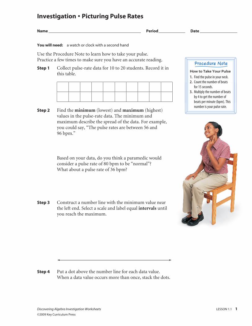
You will need: a watch or clock with a second hand
Use the Procedure Note to learn how to take your pulse. Practice a few times to make sure you have an accurate reading.
Step 1 Collect pulse-rate data for 10 to 20 students. Record it in this table.
Step 2 Find the minimum (lowest) and maximum (highest) values in the pulse-rate data. The minimum and maximum describe the spread of the data. For example, you could say, “The pulse rates are between 56 and 96 bpm.”
Based on your data, do you think a paramedic would consider a pulse rate of 80 bpm to be “normal”? What about a pulse rate of 36 bpm?
Step 3 Construct a number line with the minimum value near the left end. Select a scale and label equal intervals until you reach the maximum.
Step 4 Put a dot above the number line for each data value. When a data value occurs more than once, stack the dots.
Investigation • Picturing Pulse Rates
Name Period Date
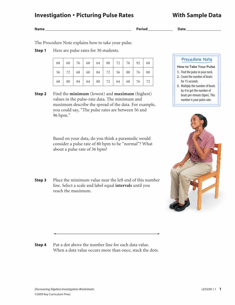
How to Take Your Pulse
1. Find the pulse in your neck. 2. Count the number of beats
for 15 seconds. 3. Multiply the number of beats
by 4 to get the number of beats per minute (bpm). This number is your pulse rate.
2 LESSON 1.1 Discovering Algebra Investigation Worksheets ©2009 Key Curriculum Press
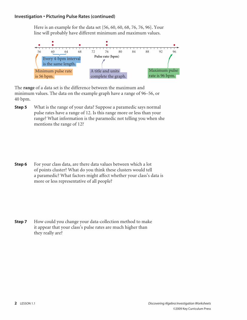
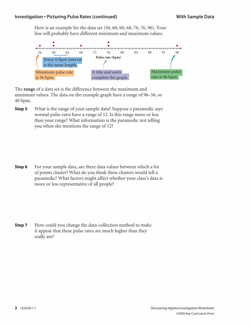
Here is an example for the data set {56, 60, 60, 68, 76, 76, 96}. Your line will probably have different minimum and maximum values.
The range of a data set is the difference between the maximum and minimum values. The data on the example graph have a range of 96–56, or 40 bpm.
Step 5 What is the range of your data? Suppose a paramedic says normal pulse rates have a range of 12. Is this range more or less than your range? What information is the paramedic not telling you when she mentions the range of 12?
Step 6 For your class data, are there data values between which a lot of points cluster? What do you think these clusters would tell a paramedic? What factors might affect whether your class’s data is more or less representative of all people?
Step 7 How could you change your data-collection method to make it appear that your class’s pulse rates are much higher than they really are?
76 80 84
Minimum pulse rateis 56 bpm.
A title and unitscomplete the graph.
Maximum pulserate is 96 bpm.
Every 4-bpm intervalis the same length.
88 92 967268646056
Pulse rate (bpm)
Investigation • Picturing Pulse Rates (continued)
The Procedure Note explains how to take your pulse.
Step 1 Here are pulse rates for 30 students.
68 60 76 68 64 80 72 76 92 68
56 72 68 60 84 72 56 88 76 80
68 80 84 64 80 72 64 68 76 72
Step 2 Find the minimum (lowest) and maximum (highest) values in the pulse-rate data. The minimum and maximum describe the spread of the data. For example, you could say, “The pulse rates are between 56 and 96 bpm.”
Based on your data, do you think a paramedic would consider a pulse rate of 80 bpm to be “normal”? What about a pulse rate of 36 bpm?
Step 3 Place the minimum value near the left end of this number line. Select a scale and label equal intervals until you reach the maximum.
Step 4 Put a dot above the number line for each data value. When a data value occurs more than once, stack the dots.
Investigation • Picturing Pulse Rates With Sample Data
Name Period Date
Discovering Algebra Investigation Worksheets LESSON 1.1 1
©2009 Key Curriculum Press
How to Take Your Pulse
1. Find the pulse in your neck. 2. Count the number of beats
for 15 seconds. 3. Multiply the number of beats
by 4 to get the number of beats per minute (bpm). This number is your pulse rate.
2 LESSON 1.1 Discovering Algebra Investigation Worksheets ©2009 Key Curriculum Press
Here is an example for the data set {56, 60, 60, 68, 76, 76, 96}. Your line will probably have different minimum and maximum values.
The range of a data set is the difference between the maximum and minimum values. The data on the example graph have a range of 96–56, or 40 bpm.
Step 5 What is the range of your sample data? Suppose a paramedic says normal pulse rates have a range of 12. Is this range more or less than your range? What information is the paramedic not telling you when she mentions the range of 12?
Step 6 For your sample data, are there data values between which a lot of points cluster? What do you think these clusters would tell a paramedic? What factors might affect whether your class’s data is more or less representative of all people?
Step 7 How could you change the data-collection method to make it appear that these pulse rates are much higher than they really are?
76 80 84
Minimum pulse rateis 56 bpm.
A title and unitscomplete the graph.
Maximum pulserate is 96 bpm.
Every 4-bpm intervalis the same length.
88 92 967268646056
Pulse rate (bpm)
Investigation • Picturing Pulse Rates (continued) With Sample Data
Discovering Algebra Investigation Worksheets LESSON 1.2 1
©2009 Key Curriculum Press
You will need: 20 to 30 pennies
In this investigation you learn to find the mean, median, and mode of a data set.
Step 1 Sort your pennies by mint year. Make a dot plot of the years.
Step 2 Put your pennies in a single line from oldest to newest. Find the median, or middle value. Does the median have to be a whole-number year? Why or why not? Would you get the same median if you arranged the pennies from newest to oldest?
Step 3 On your dot plot, circle the dot or dots that represent the median. Write the value you got in Step 2 beside the circled dot(s), and label the value “median.”
Step 4 Now stack pennies with the same mint year. The year of the tallest stack is called the mode. If there are two tall stacks, your data set is bimodal. If every stack had two pennies in it, you might say there is “no mode” because no year occurs most often. How many modes does your data set have? What are they? Does your mode have to be a whole number?
Investigation • Making “Cents” of the Center
Name Period Date
Finding the Median
If you have an odd number of pennies, the median is the year on the middle penny. If you have an even number of pennies, add the dates on the two pennies closest to the middle and divide by two.
Step 5 Draw a square around the year corresponding to the mode(s) on the number line of your dot plot. Label each value “mode.”
Step 6 Find the sum of the mint years of all your pennies and divide by the number of pennies. The result is called the mean. What is the mean of your data set?
Step 7 Show where the mean falls on your dot plot’s number line. Draw an arrowhead under it and write the number you got in Step 6. Label it “mean.”
Step 8 Now enter your data into a calculator list, and use your calculator to find the mean and the median. Are they the same as what you found using pencil and paper? [ Refer to Calculator Note 1A: Setting the Mode to check the settings on your calculator. See Calculator Notes 1B: Entering Lists and 1C: Median and Mean to enter data into lists and find the mean and median. ]
Investigation • Making “Cents” of the Center (continued)
2 LESSON 1.2 Discovering Algebra Investigation Worksheets
©2009 Key Curriculum Press
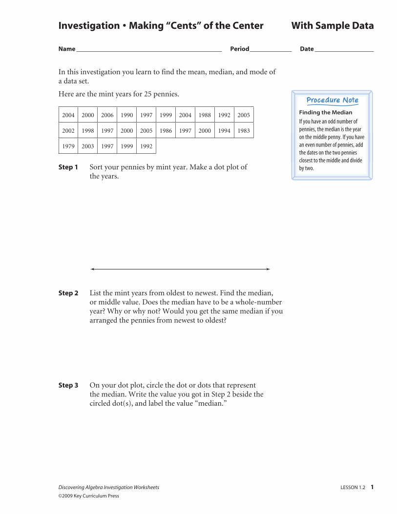
In this investigation you learn to find the mean, median, and mode of a data set.
Here are the mint years for 25 pennies.
2004 2000 2006 1990 1997 1999 2004 1988 1992 2005
2002 1998 1997 2000 2005 1986 1997 2000 1994 1983
1979 2003 1997 1999 1992
Step 1 Sort your pennies by mint year. Make a dot plot of the years.
Step 2 List the mint years from oldest to newest. Find the median, or middle value. Does the median have to be a whole-number year? Why or why not? Would you get the same median if you arranged the pennies from newest to oldest?
Step 3 On your dot plot, circle the dot or dots that represent the median. Write the value you got in Step 2 beside the circled dot(s), and label the value “median.”
Investigation • Making “Cents” of the Center With Sample Data
Name Period Date
Discovering Algebra Investigation Worksheets LESSON 1.2 1
©2009 Key Curriculum Press
Finding the Median
If you have an odd number of pennies, the median is the year on the middle penny. If you have an even number of pennies, add the dates on the two pennies closest to the middle and divide by two.
2 LESSON 1.2 Discovering Algebra Investigation Worksheets ©2009 Key Curriculum Press
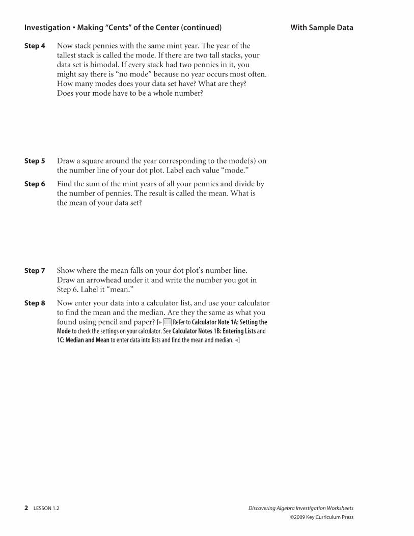
Step 4 Now stack pennies with the same mint year. The year of the tallest stack is called the mode. If there are two tall stacks, your data set is bimodal. If every stack had two pennies in it, you might say there is “no mode” because no year occurs most often. How many modes does your data set have? What are they? Does your mode have to be a whole number?
Step 5 Draw a square around the year corresponding to the mode(s) on the number line of your dot plot. Label each value “mode.”
Step 6 Find the sum of the mint years of all your pennies and divide by the number of pennies. The result is called the mean. What is the mean of your data set?
Step 7 Show where the mean falls on your dot plot’s number line. Draw an arrowhead under it and write the number you got in Step 6. Label it “mean.”
Step 8 Now enter your data into a calculator list, and use your calculator to find the mean and the median. Are they the same as what you found using pencil and paper? [ Refer to Calculator Note 1A: Setting the Mode to check the settings on your calculator. See Calculator Notes 1B: Entering Lists and 1C: Median and Mean to enter data into lists and find the mean and median. ]
Investigation • Making “Cents” of the Center (continued) With Sample Data
Discovering Algebra Investigation Worksheets LESSON 1.3 1
©2009 Key Curriculum Press
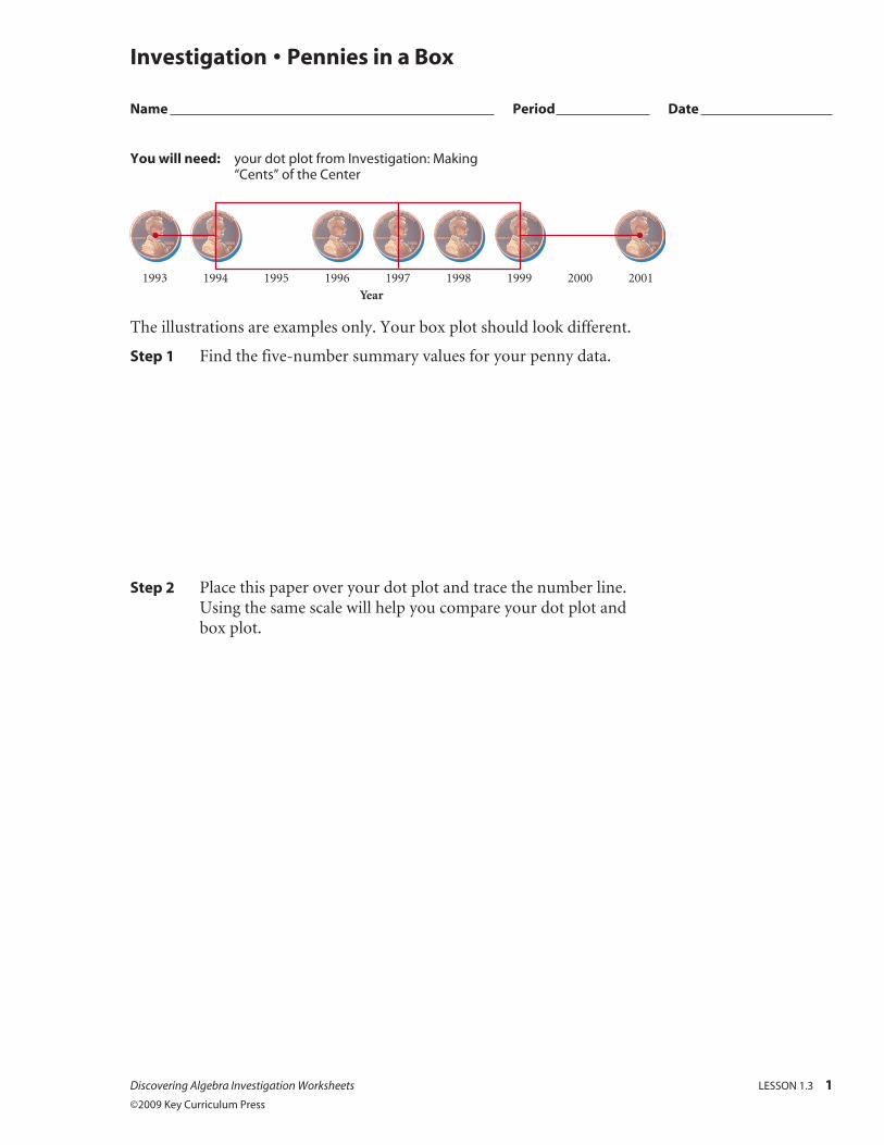
You will need: your dot plot from Investigation: Making “Cents” of the Center
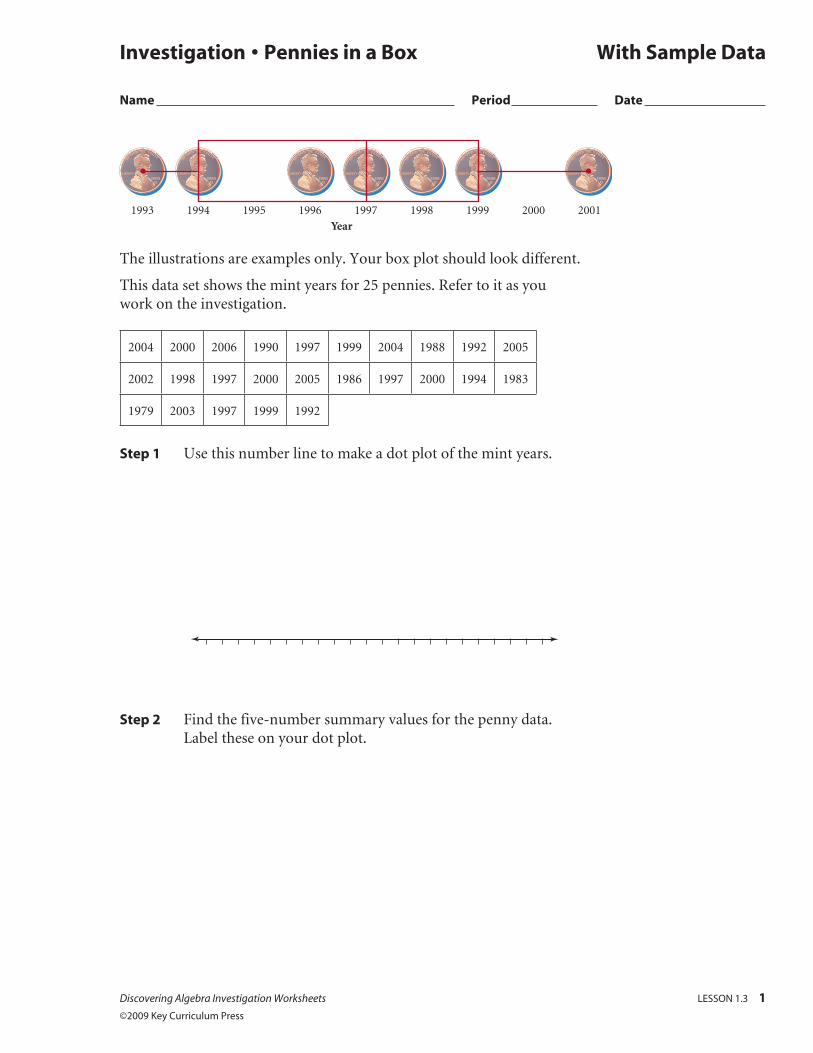
The illustrations are examples only. Your box plot should look different.
Step 1 Find the five-number summary values for your penny data.
Step 2 Place this paper over your dot plot and trace the number line. Using the same scale will help you compare your dot plot and box plot.
Investigation • Pennies in a Box
Name Period Date
1993 1994 1995 1996
Year1997 1998 1999 2000 2001
2 LESSON 1.3 Discovering Algebra Investigation Worksheets ©2009 Key Curriculum Press
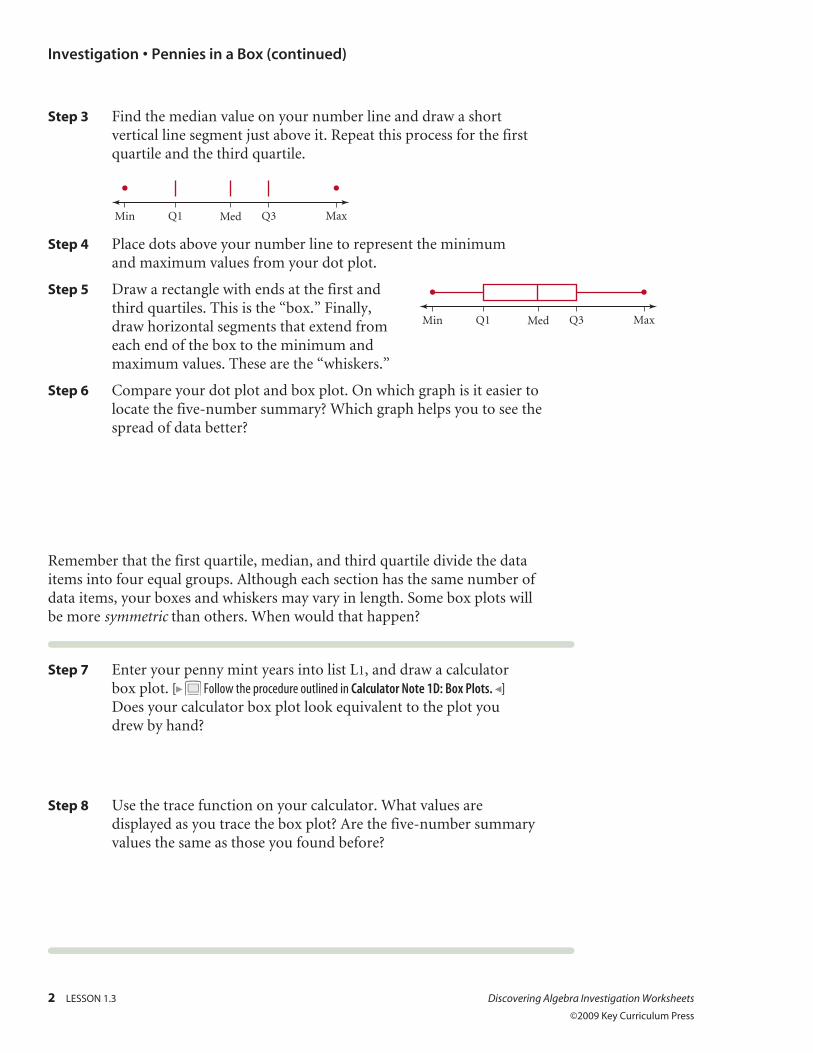
Step 3 Find the median value on your number line and draw a short vertical line segment just above it. Repeat this process for the first quartile and the third quartile.
Q1Min Med MaxQ3
Step 4 Place dots above your number line to represent the minimum and maximum values from your dot plot.
Step 5 Draw a rectangle with ends at the first and third quartiles. This is the “box.” Finally, draw horizontal segments that extend from each end of the box to the minimum and maximum values. These are the “whiskers.”
Step 6 Compare your dot plot and box plot. On which graph is it easier to locate the five-number summary? Which graph helps you to see the spread of data better?
Remember that the first quartile, median, and third quartile divide the data items into four equal groups. Although each section has the same number of data items, your boxes and whiskers may vary in length. Some box plots will be more symmetric than others. When would that happen?
Step 7 Enter your penny mint years into list L1, and draw a calculator box plot. [ Follow the procedure outlined in Calculator Note 1D: Box Plots. ] Does your calculator box plot look equivalent to the plot you drew by hand?
Step 8 Use the trace function on your calculator. What values are displayed as you trace the box plot? Are the five-number summary values the same as those you found before?
Investigation • Pennies in a Box (continued)
Q1Min Med MaxQ3
Discovering Algebra Investigation Worksheets LESSON 1.3 3
©2009 Key Curriculum Press
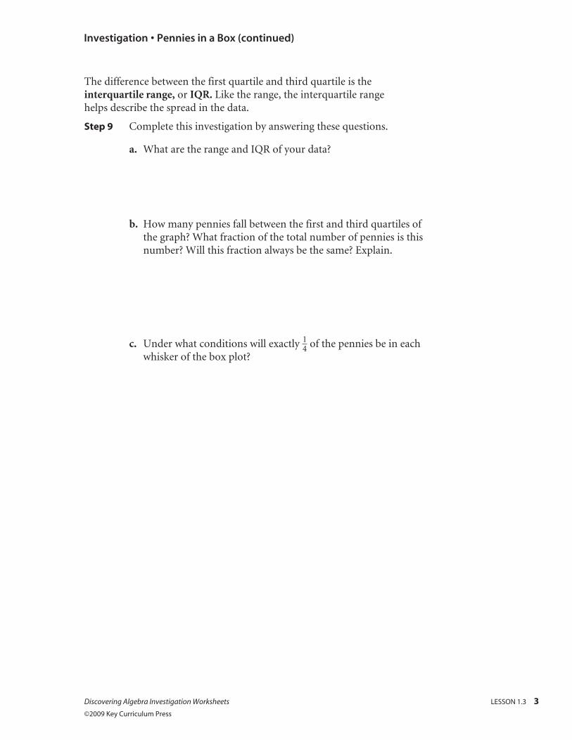
The difference between the first quartile and third quartile is the interquartile range, or IQR. Like the range, the interquartile range helps describe the spread in the data.
Step 9 Complete this investigation by answering these questions.
a. What are the range and IQR of your data?
b. How many pennies fall between the first and third quartiles of the graph? What fraction of the total number of pennies is this number? Will this fraction always be the same? Explain.
c. Under what conditions will exactly 1 _ 4 of the pennies be in each whisker of the box plot?
Investigation • Pennies in a Box (continued)
Discovering Algebra Investigation Worksheets LESSON 1.3 1
©2009 Key Curriculum Press
1993 1994 1995 1996
Year1997 1998 1999 2000 2001
The illustrations are examples only. Your box plot should look different.
This data set shows the mint years for 25 pennies. Refer to it as you work on the investigation.
2004 2000 2006 1990 1997 1999 2004 1988 1992 2005
2002 1998 1997 2000 2005 1986 1997 2000 1994 1983
1979 2003 1997 1999 1992
Step 1 Use this number line to make a dot plot of the mint years.
Step 2 Find the five-number summary values for the penny data. Label these on your dot plot.
Investigation • Pennies in a Box With Sample Data
Name Period Date
2 LESSON 1.3 Discovering Algebra Investigation Worksheets ©2009 Key Curriculum Press
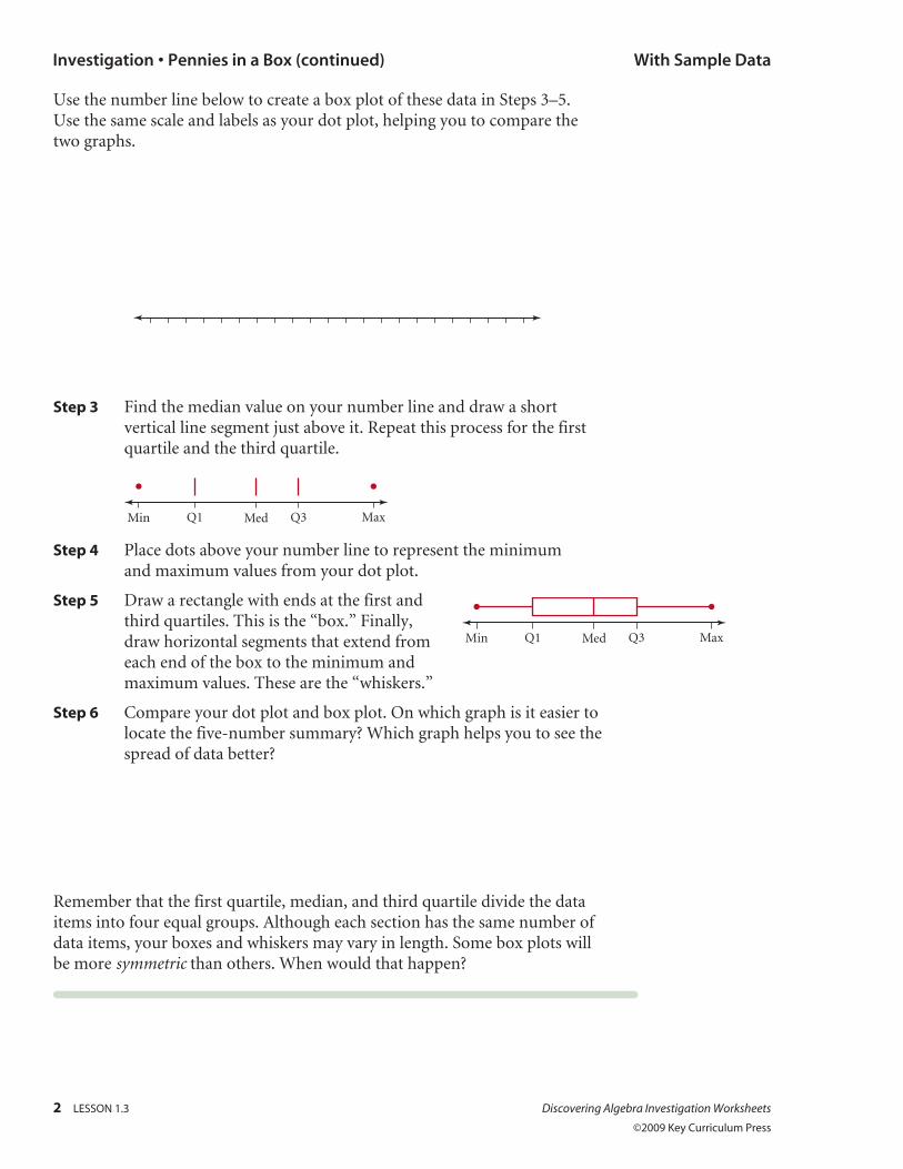
Use the number line below to create a box plot of these data in Steps 3–5. Use the same scale and labels as your dot plot, helping you to compare the two graphs.
Step 3 Find the median value on your number line and draw a short vertical line segment just above it. Repeat this process for the first quartile and the third quartile.
Q1Min Med MaxQ3
Step 4 Place dots above your number line to represent the minimum and maximum values from your dot plot.
Step 5 Draw a rectangle with ends at the first and third quartiles. This is the “box.” Finally, draw horizontal segments that extend from each end of the box to the minimum and maximum values. These are the “whiskers.”
Step 6 Compare your dot plot and box plot. On which graph is it easier to locate the five-number summary? Which graph helps you to see the spread of data better?
Remember that the first quartile, median, and third quartile divide the data items into four equal groups. Although each section has the same number of data items, your boxes and whiskers may vary in length. Some box plots will be more symmetric than others. When would that happen?
Investigation • Pennies in a Box (continued) With Sample Data
Q1Min Med MaxQ3
Discovering Algebra Investigation Worksheets LESSON 1.3 3
©2009 Key Curriculum Press
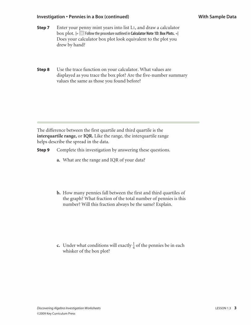
Step 7 Enter your penny mint years into list L1, and draw a calculator box plot. [ Follow the procedure outlined in Calculator Note 1D: Box Plots. ] Does your calculator box plot look equivalent to the plot you drew by hand?
Step 8 Use the trace function on your calculator. What values are displayed as you trace the box plot? Are the five-number summary values the same as those you found before?
The difference between the first quartile and third quartile is the interquartile range, or IQR. Like the range, the interquartile range helps describe the spread in the data.
Step 9 Complete this investigation by answering these questions.
a. What are the range and IQR of your data?
b. How many pennies fall between the first and third quartiles of the graph? What fraction of the total number of pennies is this number? Will this fraction always be the same? Explain.
c. Under what conditions will exactly 1 _ 4 of the pennies be in each whisker of the box plot?
Investigation • Pennies in a Box (continued) With Sample Data
Discovering Algebra Investigation Worksheets LESSON 1.4 1
©2009 Key Curriculum Press
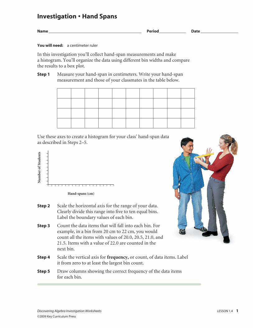
Investigation • Hand Spans
Name Period Date
You will need: a centimeter ruler
In this investigation you’ll collect hand-span measurements and make a histogram. You’ll organize the data using different bin widths and compare the results to a box plot.
Step 1 Measure your hand-span in centimeters. Write your hand-span measurement and those of your classmates in the table below.
Use these axes to create a histogram for your class’ hand-span data as described in Steps 2–5.
Hand-spans (cm)
Nu
mbe
r of
Stu
den
ts
Step 2 Scale the horizontal axis for the range of your data. Clearly divide this range into five to ten equal bins. Label the boundary values of each bin.
Step 3 Count the data items that will fall into each bin. For example, in a bin from 20 cm to 22 cm, you would count all the items with values of 20.0, 20.5, 21.0, and 21.5. Items with a value of 22.0 are counted in the next bin.
Step 4 Scale the vertical axis for frequency, or count, of data items. Label it from zero to at least the largest bin count.
Step 5 Draw columns showing the correct frequency of the data items for each bin.
Step 6 Enter your hand-span measurements into list L1 of your calculator. Create several versions of the histogram using different bin widths. [ See Calculator Note 1E: Histograms for instructions on creating a histogram.]
Step 7 How did you select a bin width for your paper histogram? Now that you have experimented with calculator bin widths, would you change the bin width of your paper graph? Write a paragraph explaining how to pick the “best” bin width.
Step 8 Use the number line below to make a box plot of your hand-span data, and add a box plot to the histogram on your calculator. What information does the histogram provide that the box plot does not? Consider gaps in the data and the shape of the histogram.
Investigation • Hand Spans (continued)
2 LESSON 1.4 Discovering Algebra Investigation Worksheets ©2009 Key Curriculum Press
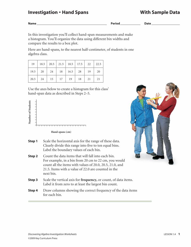
In this investigation you’ll collect hand-span measurements and make a histogram. You’ll organize the data using different bin widths and compare the results to a box plot.
Here are hand-spans, to the nearest half-centimeter, of students in one algebra class.
19 18.5 20.5 21.5 18.5 17.5 22 22.5
19.5 20 24 18 16.5 28 19 20
20.5 24 15 17 19 18 21 21
Use the axes below to create a histogram for this class’ hand-span data as described in Steps 2–5.
Hand-spans (cm)
Nu
mbe
r of
Stu
den
ts
Step 1 Scale the horizontal axis for the range of these data. Clearly divide this range into five to ten equal bins. Label the boundary values of each bin.
Step 2 Count the data items that will fall into each bin. For example, in a bin from 20 cm to 22 cm, you would count all the items with values of 20.0, 20.5, 21.0, and 21.5. Items with a value of 22.0 are counted in the next bin.
Step 3 Scale the vertical axis for frequency, or count, of data items. Label it from zero to at least the largest bin count.
Step 4 Draw columns showing the correct frequency of the data items for each bin.
Investigation • Hand Spans With Sample Data
Name Period Date
Discovering Algebra Investigation Worksheets LESSON 1.4 1
©2009 Key Curriculum Press
2 LESSON 1.4 Discovering Algebra Investigation Worksheets ©2009 Key Curriculum Press
Step 5 Enter these hand-span measurements into list L1 of your calculator. Create several versions of the histogram using different bin widths. [ See Calculator Note 1E: Histograms for instructions on creating a histogram.]
Step 6 How did you select a bin width for your paper histogram? Now that you have experimented with calculator bin widths, would you change the bin width of your paper graph? Write a paragraph explaining how to pick the “best” bin width.
Step 7 Use the number line below to make a box plot of these hand-span data, and add a box plot to the histogram on your calculator. What information does the histogram provide that the box plot does not? Consider gaps in the data and the shape of the histogram.
Investigation • Hand Spans (continued) With Sample Data
Discovering Algebra Investigation Worksheets LESSON 1.6 1
©2009 Key Curriculum Press
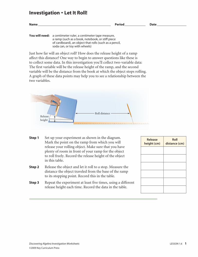
You will need: a centimeter ruler, a centimeter tape measure, a ramp (such as a book, notebook, or stiff piece of cardboard), an object that rolls (such as a pencil, soda can, or toy with wheels)
Just how far will an object roll? How does the release height of a ramp affect this distance? One way to begin to answer questions like these is to collect some data. In this investigation you’ll collect two-variable data: The first variable will be the release height of the ramp, and the second variable will be the distance from the book at which the object stops rolling. A graph of these data points may help you to see a relationship between the two variables.
Roll distanceReleaseheight
Step 1 Set up your experiment as shown in the diagram. Mark the point on the ramp from which you will release your rolling object. Make sure that you have plenty of room in front of your ramp for the object to roll freely. Record the release height of the object in this table.
Step 2 Release the object and let it roll to a stop. Measure the distance the object traveled from the base of the ramp to its stopping point. Record this in the table.
Step 3 Repeat the experiment at least five times, using a different release height each time. Record the data in the table.
Investigation • Let It Roll!
Name Period Date
Release height (cm)
Roll distance (cm)
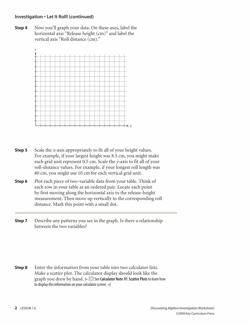
Step 4 Now you’ll graph your data. On these axes, label the horizontal axis “Release height (cm)” and label the vertical axis “Roll distance (cm).”
x
y
Step 5 Scale the x-axis appropriately to fit all of your height values. For example, if your largest height was 8.5 cm, you might make each grid unit represent 0.5 cm. Scale the y-axis to fit all of your roll-distance values. For example, if your longest roll length was 80 cm, you might use 10 cm for each vertical grid unit.
Step 6 Plot each piece of two-variable data from your table. Think of each row in your table as an ordered pair. Locate each point by first moving along the horizontal axis to the release-height measurement. Then move up vertically to the corresponding roll distance. Mark this point with a small dot.
Step 7 Describe any patterns you see in the graph. Is there a relationship between the two variables?
Step 8 Enter the information from your table into two calculator lists. Make a scatter plot. The calculator display should look like the graph you drew by hand. [ See Calculator Note 1F: Scatter Plots to learn how to display this information on your calculator screen. ]
Investigation • Let It Roll! (continued)
2 LESSON 1.6 Discovering Algebra Investigation Worksheets
©2009 Key Curriculum Press
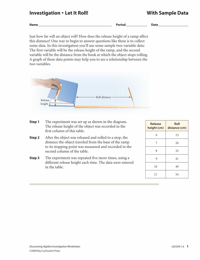
Just how far will an object roll? How does the release height of a ramp affect this distance? One way to begin to answer questions like these is to collect some data. In this investigation you’ll use some sample two-variable data: The first variable will be the release height of the ramp, and the second variable will be the distance from the book at which the object stops rolling. A graph of these data points may help you to see a relationship between the two variables.
Roll distanceReleaseheight
Step 1 The experiment was set up as shown in the diagram. The release height of the object was recorded in the first column of this table.
Step 2 After the object was released and rolled to a stop, the distance the object traveled from the base of the ramp to its stopping point was measured and recorded in the second column of the table.
Step 3 The experiment was repeated five more times, using a different release height each time. The data were entered in the table.
Investigation • Let It Roll! With Sample Data
Name Period Date
Discovering Algebra Investigation Worksheets LESSON 1.6 1
©2009 Key Curriculum Press
Release height (cm)
Roll distance (cm)
6 15
7 26
8 32
9 41
10 49
11 54
2 LESSON 1.6 Discovering Algebra Investigation Worksheets
©2009 Key Curriculum Press
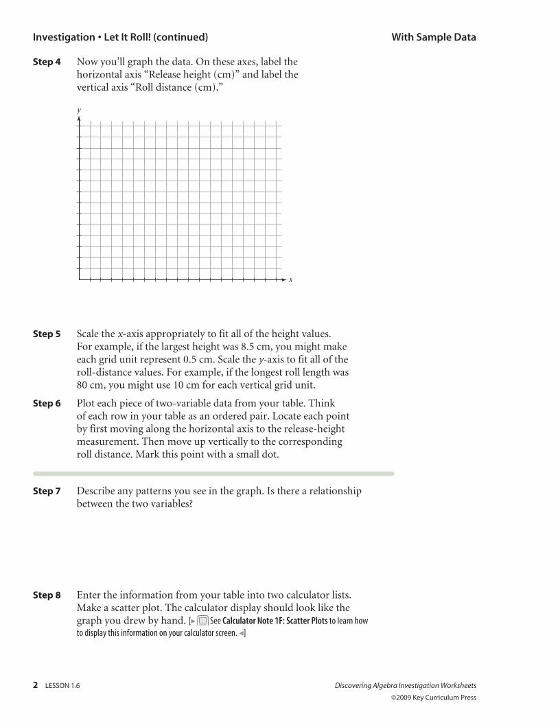
Step 4 Now you’ll graph the data. On these axes, label the horizontal axis “Release height (cm)” and label the vertical axis “Roll distance (cm).”
x
y
Step 5 Scale the x-axis appropriately to fit all of the height values. For example, if the largest height was 8.5 cm, you might make each grid unit represent 0.5 cm. Scale the y-axis to fit all of the roll-distance values. For example, if the longest roll length was 80 cm, you might use 10 cm for each vertical grid unit.
Step 6 Plot each piece of two-variable data from your table. Think of each row in your table as an ordered pair. Locate each point by first moving along the horizontal axis to the release-height measurement. Then move up vertically to the corresponding roll distance. Mark this point with a small dot.
Step 7 Describe any patterns you see in the graph. Is there a relationship between the two variables?
Step 8 Enter the information from your table into two calculator lists. Make a scatter plot. The calculator display should look like the graph you drew by hand. [ See Calculator Note 1F: Scatter Plots to learn how to display this information on your calculator screen. ]
Investigation • Let It Roll! (continued) With Sample Data
Discovering Algebra Investigation Worksheets LESSON 1.7 1
©2009 Key Curriculum Press
You will need: a meterstick, tape measure, or motion sensor
In this investigation you will estimate and measure distances around your room. As a group, select a starting point for your measurements. Choose nine objects in the room that appear to be less than 5 m away.
Step 1 List the objects in the description column of this table.
DescriptionActual
distance (m), x
Estimated distance (m),
y
Step 2 Estimate the distances in meters or parts of a meter from your starting point to each object. If group members disagree, find the mean of your estimates. Record the estimates in your table.
Step 3 Measure the actual distances to each object and record them in the table.
Investigation • Guesstimating
Name Period Date
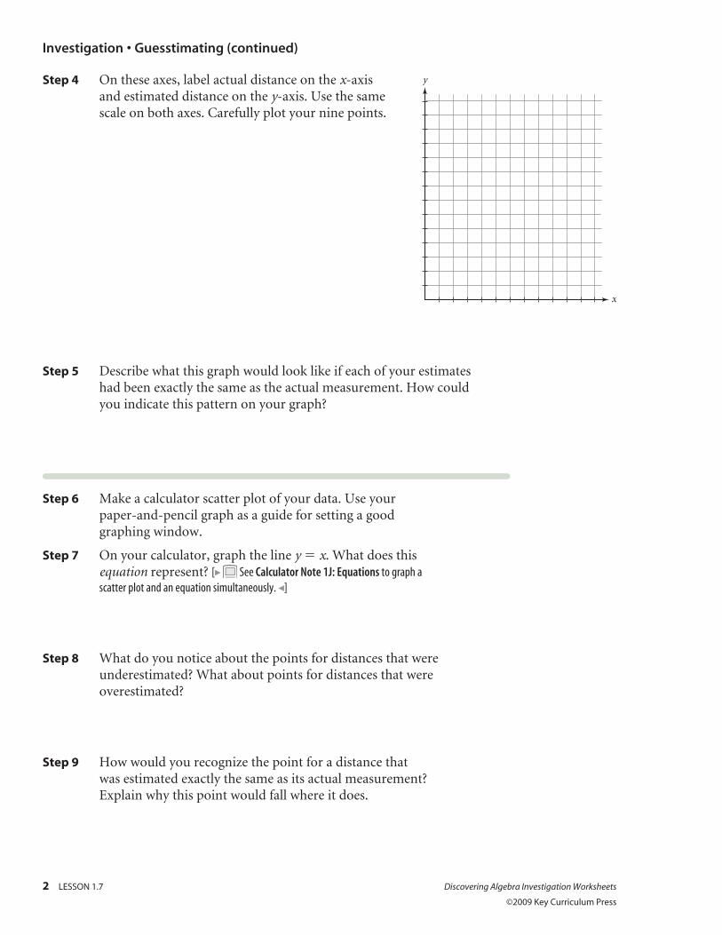
Step 4 On these axes, label actual distance on the x-axis and estimated distance on the y-axis. Use the same scale on both axes. Carefully plot your nine points.
Step 5 Describe what this graph would look like if each of your estimates had been exactly the same as the actual measurement. How could you indicate this pattern on your graph?
Step 6 Make a calculator scatter plot of your data. Use your paper-and-pencil graph as a guide for setting a good graphing window.
Step 7 On your calculator, graph the line y 5 x. What does this equation represent? [ See Calculator Note 1J: Equations to graph a scatter plot and an equation simultaneously. ]
Step 8 What do you notice about the points for distances that were underestimated? What about points for distances that were overestimated?
Step 9 How would you recognize the point for a distance that was estimated exactly the same as its actual measurement? Explain why this point would fall where it does.
Investigation • Guesstimating (continued)
2 LESSON 1.7 Discovering Algebra Investigation Worksheets
©2009 Key Curriculum Press
x
y
Discovering Algebra Investigation Worksheets LESSON 1.8 1
©2009 Key Curriculum Press
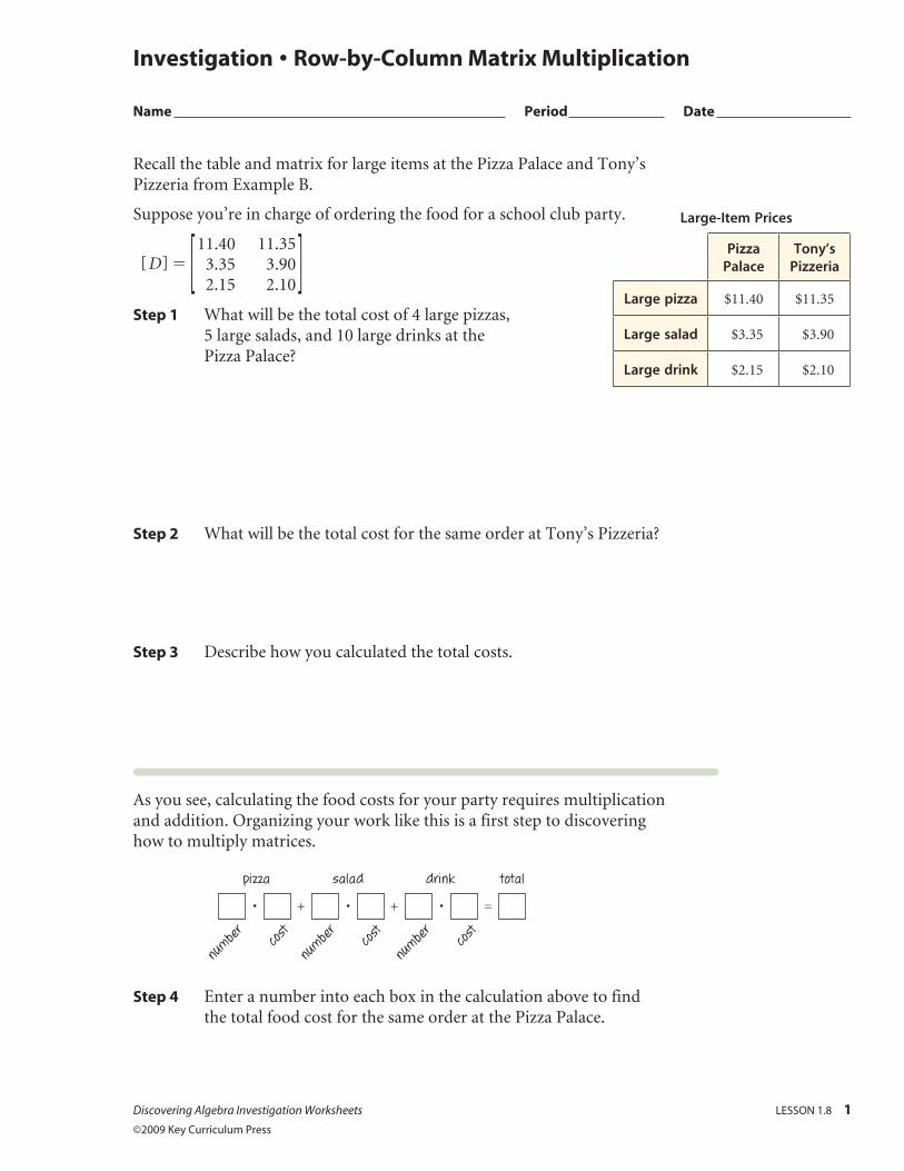
Recall the table and matrix for large items at the Pizza Palace and Tony’s Pizzeria from Example B.
Suppose you’re in charge of ordering the food for a school club party.
[ D ] 5 [ 11.40
3.35
2.15
11.35
3.90
2.10 ]
Step 1 What will be the total cost of 4 large pizzas, 5 large salads, and 10 large drinks at the Pizza Palace?
Step 2 What will be the total cost for the same order at Tony’s Pizzeria?
Step 3 Describe how you calculated the total costs.
As you see, calculating the food costs for your party requires multiplication and addition. Organizing your work like this is a first step to discovering how to multiply matrices.
pizza
number cos
t
number cos
t
number cos
t
salad drink total
+ +• • • =
Step 4 Enter a number into each box in the calculation above to find the total food cost for the same order at the Pizza Palace.
Investigation • Row-by-Column Matrix Multiplication
Name Period Date
Large-Item Prices
Pizza Palace
Tony’s Pizzeria
Large pizza $11.40 $11.35
Large salad $3.35 $3.90
Large drink $2.15 $2.10
2 LESSON 1.8 Discovering Algebra Investigation Worksheets ©2009 Key Curriculum Press
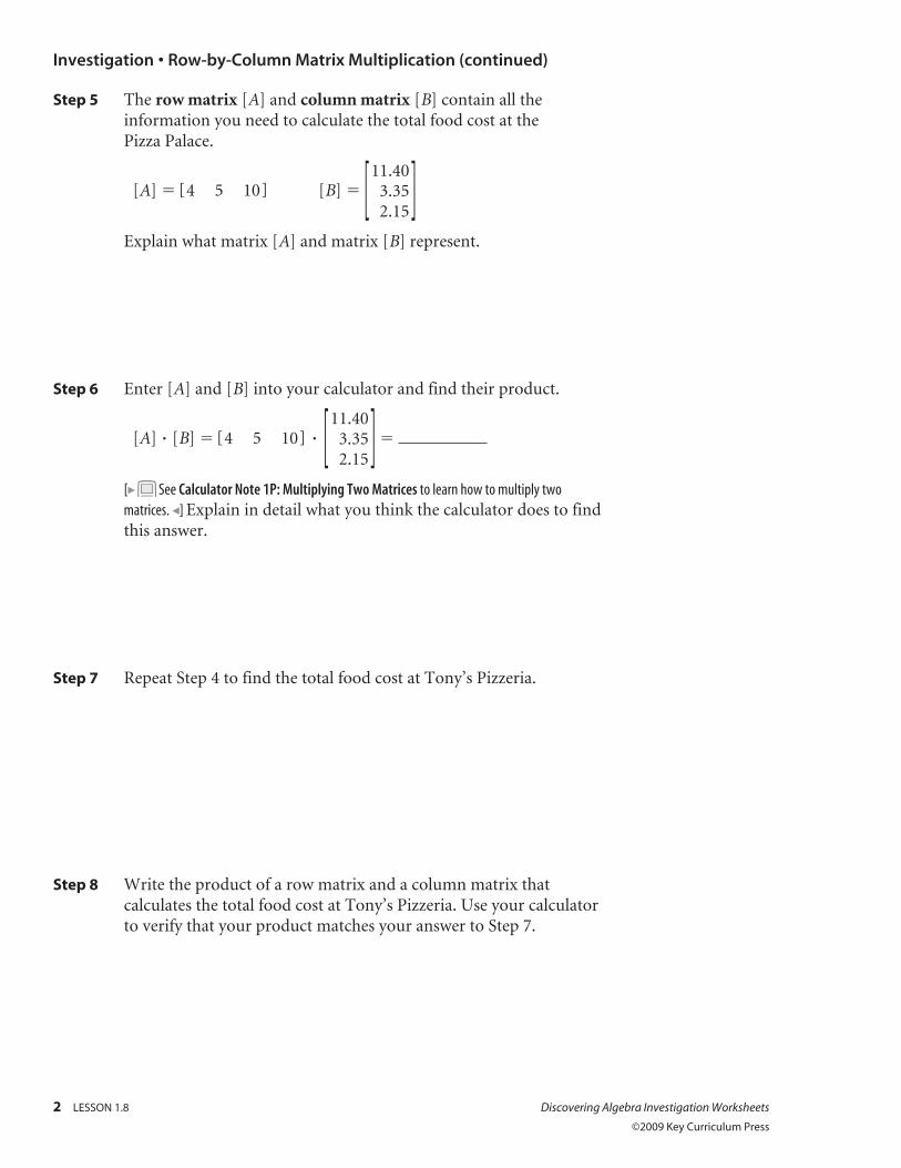
Step 5 The row matrix [A] and column matrix [B] contain all the information you need to calculate the total food cost at the Pizza Palace.
[A] 5 [ 4 5 10 ] [B] 5 [ 11.40
3.35
2.15 ]
Explain what matrix [A] and matrix [B] represent.
Step 6 Enter [A] and [B] into your calculator and find their product.
[A] [B] 5 [ 4 5 10 ] [ 11.40
3.35
2.15 ] 5
[ See Calculator Note 1P: Multiplying Two Matrices to learn how to multiply two matrices. ] Explain in detail what you think the calculator does to find this answer.
Step 7 Repeat Step 4 to find the total food cost at Tony’s Pizzeria.
Step 8 Write the product of a row matrix and a column matrix that calculates the total food cost at Tony’s Pizzeria. Use your calculator to verify that your product matches your answer to Step 7.
Investigation • Row-by-Column Matrix Multiplication (continued)
Discovering Algebra Investigation Worksheets LESSON 1.8 3
©2009 Key Curriculum Press
Investigation • Row-by-Column Matrix Multiplication (continued)
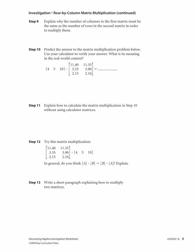
Step 9 Explain why the number of columns in the first matrix must be the same as the number of rows in the second matrix in order to multiply them.
Step 10 Predict the answer to the matrix multiplication problem below. Use your calculator to verify your answer. What is its meaning in the real-world context?
[ 4 5 10 ] [ 11.40
3.35
2.15 11.35
3.90 2.10
] 5
Step 11 Explain how to calculate the matrix multiplication in Step 10 without using calculator matrices.
Step 12 Try this matrix multiplication:
[ 11.40
3.35
2.15
11.35
3.90
2.10 ] [ 4 5 10 ]
In general, do you think [A] [B] 5 [B] [A]? Explain.
Step 13 Write a short paragraph explaining how to multiply two matrices.