Embed Size (px)
Citation preview

1
IT MIGHT LOOK LIKE A REGRESSION EQUATION … BUT IT’S NOT!
AN INTUITIVE APPROACH
TO THE PRESENTATION OF QCA AND FS/QCA RESULTS
Carsten Q. Schneider*
Assistant Professor
Department of Political Science
Central European University, Budapest
and
Bernard Grofman
Professor of Political Science and Adjunct Professor of Economics
School of Social Sciences
University of California, Irvine
Draft Version – March 20, 2006 Comments are welcome
- Do not quote without the authors’ permission -
* Paper to be presented at the Conference on “Comparative Politics: Empirical
Applications of Methodological Innovations”, Sophia University, Tokyo (Japan), 15 - 17.
July 2006.Email address for Correspondence: [email protected]

2
Abstract
Scholars who have presented their QCA and fs/QCA results in conference papers
or journal articles will most likely have encountered the problem that an audience not
trained in these approaches tends to read the notations and graphs displaying the results as
if they stemmed from standard statistical techniques such as linear regression or factor
analysis. This leads to gross misunderstandings, since the underlying mathematical models
and the epistemology are different, and because the notations and graphs used in QCA und
fs/QCA carry a different meaning than similar looking ones in standard statistical
approaches. Thus readers may think they know what’s going in QCA analyses when they
really don’t.
The main aim of this paper is to offer seven ways, some new to this paper, of
presenting results in QCA and fs/QCA that are designed to make the interpretability of
results from these methods clearer and more intuitive: (1) truth tables; (2) solution
formulas; (3) parameters of fit; (4) Venn diagrams; (5) dendograms; (6) x-y plots; and (7)
membership scores for solution terms – the latter two only appropriate for fuzzy set QCA.
We show that each form tends to be confused with one or more presentational forms
commonly used in standard statistical techniques, its “false friend(s),” and thus
misinterpreted; and so we try to clarify the implications of each of these presentational
tools by pointing out what they do not mean
Generally speaking, the presentation of results generated with any kind of method
applied in comparative social research has multiple purposes, not all of which can always
be achieved simultaneously in one presentational form. In grosso modo, the presentation of
results aims at: (a) displaying relations between variables; (b) highlighting descriptive or
causal accounts for specific (groups of) cases; (c) expressing the fit of the result obtained
with the data at hand. Trying to accomplish all three of these purposes is particularly
important for QCA and fs/QCA because they have been explicitly introduced as methods
for bridging the gap between qualitative (case-oriented) and quantitative (variable-
oriented) approaches of social scientific research. While the individual presentational
forms serve one or more (but never all) of the three above-mentioned purposes, using a
combination of them in a fashion that covers all three bases allows us to display the full
potential and logic of QCA and fs/QCA methods.

3
Table of Content
1 INTRODUCTION....................................................................................................................................4
2 AIMS OF PRESENTATIONAL FORMS .............................................................................................8
3 PRESENTATIONAL FORMS IN QCA AND FS/QCA.....................................................................10
3.1 BASIC CONCEPTS IN QCA AND FS/QCA............................................................................................10 3.2 THE EMPIRICAL DATA .......................................................................................................................12 3.3 FIVE PRESENTATIONAL FORMS IN QCA AND FS/QCA......................................................................12 3.3.1 Truth Tables .............................................................................................................................13 3.3.2 Solution Formulas....................................................................................................................15 3.3.3 Consistency and Coverage (Raw Coverage, Solution Coverage and Unique Coverage) as
Measures of Fit ........................................................................................................................................23 3.3.4 Venn Diagrams ........................................................................................................................25 3.3.5 Dendogram (Tree Representation)...........................................................................................29
3.4 TWO ADDITIONAL PRESENTATIONAL FORMS FOR FS/QCA...............................................................33 3.4.1 x-y plots....................................................................................................................................36 3.4.2 Tables.......................................................................................................................................40
4 CONCLUSION ......................................................................................................................................44
List of Tables and Figures
TABLE 1: DATA MATRIX FOR 18 CASES ON WELFARE STATE AND ITS CONDITION - DICHOTOMIZED ...............48 TABLE 2: TRUTH TABLE GENEROUS WELFARE STATE AND FOUR CONDITIONS ...............................................49 TABLE 3: FUZZY DATA ON WELFARE STATE ....................................................................................................50 TABLE 4: CONSISTENCY AND COVERAGE SOLUTION FOR W – NO SIMPLIFYING ASSUMPTIONS.........................51 TABLE 5: FUZZY SET MEMBERSHIP SCORES IN CAUSAL CONJUNCTIONS AND THE OUTCOME..........................52 TABLE 6: SEVEN TYPES OF PRESENTATIONAL FORMS – STRENGTHS, WEAKNESSES, AND FALSE FRIENDS..........53
FIGURE 1: VENN DIAGRAM – 3 CONDITIONS ....................................................................................................54 FIGURE 2: VENN DIAGRAM (BERG-SCHLOSSER/ DE MEUR) .............................................................................55 FIGURE 3: PSEUDO VENN DIAGRAM .................................................................................................................56 FIGURE 4: CONDITIONS FOR GENEROUS WELFARE STATE IN DENDOGRAM FORM ...........................................57 FIGURE 5: X-Y PLOT..........................................................................................................................................58 FIGURE 6: X-Y PLOT PUC .................................................................................................................................59 FIGURE 7: X-Y PLOT UCS ..............................................................................................................................60 FIGURE 8: X-Y PLOT PUC+UCS ....................................................................................................................61

4
1 Introduction
This paper aims to contribute to a better understanding of what QCA and fs/QCA is
and is not. We focus on one of the, so far, most underdeveloped aspects of QCA and
fs/QCA: the different possibilities of displaying analytic results in the form of graphs,
charts, figures, and formulas. The authors’ own experience indicates that the presentation
of empirical results generated with QCA and fs/QCA often causes problems and
misunderstandings especially (but not exclusively) among those scholars who are not
trained in this approach. We argue that this problem is caused by two, not mutually
exclusive, reasons: (a) scholars familiar with QCA do not exploit the full range of
possibilities to present their results, and thus prevent themselves from fully communicating
the information they have generated with their analyses, and (b) among the tools used
more quantitative research, almost all QCA presentational forms have false friends, i.e.,
forms of presentation that are seemingly similar yet actually quite different in meaning.
Such “false friends” can deceive those scholars who are trained in standard quantitative
approaches, and even similarly mislead more qualitatively trained scholars who are not
familiar with QCA.
On the one hand, this paper targets the active users of QCA and fs/QCA. Many of
them might have encountered situations in which they faced an audience that did not seem
to get the point of what the QCA results should tell them, or faced situations in which they
unintentionally drew the audience’s attention to one aspect of their results rather than what
they had intended readers to focus on. This problem is particularly pressing for QCA and
fs/QCA because it is located at the intersection between variable-oriented and case-
oriented research. 1 In regression, it is common if cases disappear behind variables and
1 The claim that QCA and fs/QCA has its closest roots and affinities with qualitative comparative approaches
rests on several arguments. First, its analytic procedures require nnput based on extensive case knowledge.
Second, the QCA-based research process forces us to pay attention to the observed conjunctions of case
characteristics (as shown in a truth table). Third, the data are membership values of cases in sets (crisp or
fuzzy), and thus either nominal or ordinal variables. And fourth, tribute is paid to complex causal patterns in
terms of necessary and sufficient conditions, and thus equifinal conjunctural patterns, whereby equifinal
refers to a situation in which different causes lead to the same outcome. Multifinality, in turn, is present if
one and the same condition leads to different outcomes.
5
their coefficients. In contrast, for QCA and fs/QCA presentations, it is absolutely necessary
to take account both of variables (Which variables are connected to the outcome to be
explained?) and of cases (Which cases are explained with which causal conjunction?).2
Such a combined approach, and the interpretation of the analytic results it gives rise to,
requires, we believe, some special presentational skills for QCA and fs/QCA users. We
hope that, after having read this paper, QCA and fs/QCA users should have a number of
new ideas about how to present their analytical results in a more reader-friendly and
encompassing way.
On the other hand, we also wish to address those social scientists who already have
heard about QCA and fs/QCA and who do not discard from the outset the possibility for
generating meaningful insights with these methods. For such scholars, we hope to improve
their basic understanding of what these methods are about by providing some comparison
and contrasts with other more well known methods, and by introducing them to some
graphical and other tools that will help then in reading and understanding the meaning of
QCA and fs/QCA-based studies.
By and large, one can distinguish two groups among those scholars who try to get
at least a passive knowledge of the logic and research practice of QCA and fs/QCA: some
The co-authors of this paper are not in full agreement about how logically distinctive QCA is from more
standard quantitative methods. One of us is close to the views of Ragin 2005a), who summarizes key
differences and argues that QCA and regression are very different and pursue different analytic goals. The
other takes the view that, were we make more use of multiplicative relationship among variables and the
specification of compound variables using the maximum and minimum functions, standard regression could
largely mimic the results from the truth-functional form of simple QCA; and that QCA equivalences could be
developed for standard statistical concepts such as confidence limits. We also differ on the extent to which
the supposed differences between ‘conditions’ in QCA and ‘independent variables’ in regressions , or
between ‘outcomes’ and ‘dependent variables,’ distinctions whose importance is insisted on by QCA users,
are actually meaningful. We share, however, the view that, over the longer run, it is possible that the QCA
camp will split into those who use this approach more for large N analyses and others who use it for small N
designs. For high N analyses with limits to case knowledge, and the application of statistical tests within
QCA, QCA will more resemble regression analysis -- with all its strengths, weaknesses, and limitations.
Thus, our advice to high N QCA users is to make use of the relevant statistical literature on modelling
complexity already out there (e.g. Braumoeller 2003, Eliason & Stryker 2005, Seawright 2005). Our advice
to those who stick to the original spirit of QCA as a case-based method is to integrate more case-oriented
ideas, concepts, and strategies -- such as paying tribute to complexity through time, timing, and sequences
(for first attempts see Caren & Panofsky 2005) -- into QCA. 2 Of course, even for regression-based analyses, it is certainly far better for authors to provide enough
detailed information about regression results so as to make it clear which, if any, cases are particular outliers
and in which direction, since that may well lead to ideas for better model specification; but failure to do so is
rarely regarded as a bar to publication in standard large-n comparative case analyses.

6
scholars approach these methods from the perspective of a qualitative research paradigm,
another group from a more quantitative, statistical angle. These different perspectives tend
to determine what kinds of criticisms are made about QCA and fs/QCA analyses.
Quantitatively-oriented scholars tend to raise issues for QCA about robustness, functional
form, probabilistic vs. deterministic assertions, confidence limits, etc. Qualitatively
oriented scholars are more apt to complain that QCA and fs/QCA is really just another
form of quantitative analysis: turning concepts into numbers, reducing cases to
combinations of conditions, and dismissing the temporal dimension of social phenomena.
The qualitative-quantitative divide in approaching QCA and fs/QCA also seems to
lead to different types of misinterpretations of the various charts, graphs, and formulas by
which its analytic results can be represented. In this paper, we focus on the potential
misreading of QCA and fs/QCA as they most typically occur to those readers who are
trained in the basics of the standard statistical approaches to analyzing social data.
Especially for this group of reader, many of the presentational forms of QC and fs/QCA
results represent ‘false friends’ in that they appear to be equivalents to standard forms of
analyses from which, in fact, they are quite different.
Some of these misunderstandings are due to a lack of proper knowledge of the
basic logic of QCA and fs/QCA – but not all. All too often, members of the QCA
community and those who apply these methods regularly do not put much effort in
explaining the logic of the presentational forms they use. Also, most of them do not make
enough use of multiple ways to present QCA results. And some are too sloppy in the way
they label (or even interpret) their own presentational forms.
In order to clarify the meaning of different presentational forms, we will first
concentrate on QCA only. Didactically, it is more appropriate to start with the crisp set
QCA, whose logic is easier to understand. Furthermore, since crisp sets can be seen as a
special case of fuzzy sets, most of what we develop for QCA can be applied directly to
fuzzy set QCA.
In this paper, we proceed in the following way: In a first step, we will very briefly
lay out the basic concepts necessary for understanding the logic of QCA: set memberships,
necessary and sufficient conditions, equifinality and conjunctural causation, truth tables,
7
the logical minimization process, and the measures of consistency and coverage of QCA
solution terms. After that, we spell out the different and sometimes conflicting general
aims that one pursues when presenting analytic results -- regardless of whether they are
generated by QCA or some standard statistical technique. Next we identify five different
presentational forms that are at the disposal of scholars performing QCA analyses. Later,
when we turn to fuzzy sets, two more presentational forms are added to our list. For each
presentational form we will discuss (a) its logic, (b) which of three basic aims are best
achieved, and (c) which are its ‘false friends.’
To illustrate our points, we will make use of Ragin’s data on welfare states (see
Ragin 2000, Table 10.6). This is a data set that contains fuzzy values. For the crisp set
QCA part of this paper, we will use a crisp set representation of this data. Intuitively, a
crisp set representation of the data is one in which all conditions are treated as having
values of either zero or one, while the outcome is also treated as a dichotomized (yes or no)
variable (see Ragin 2005b for the representation of fuzzy data in a crisp truth table).
8
2 Aims of presentational forms
Looking at matters at a high level of abstraction, the presentation of analytic results
in comparative political research can have three different aims: (a) displaying relations
between variables in a readily comprehensible fashion; (b) highlighting descriptive or
causal accounts for specific (groups of) cases; (c) expressing the fit of the result obtained
to the data at hand. Any given author tends to give priority to some of these goals over
others.
By and large, scholars engaging in a classical case-based qualitative comparison
tend to focus more on the second of these, understanding/explaining (how/why) what is
going on in specific cases. In contrast, for quantitatively oriented scholars, the focus is on
variables and on how much of the variation they are able to explain, the third of our two
goals.3 Both types of scholar place some attention on our first goal, the display of results,
but in our view, this goal tends to be unduly neglected by scholars of all persuasions. For
QCA and fs/QCA, however, it is particularly important to try and accomplish all three of
these purposes. This is so because these methods been explicitly introduced to bridge the
gap between qualitative (case-oriented) and quantitative (variable-oriented) approaches of
social scientific research and because they purport to offer the potential for a richer and
more nuanced understanding then either polar approach alone. On the one hand, QCA and
fs/QCA users cannot afford to simply look at how, in the aggregate, the conditions link to
the outcome (variable perspective). They need to take stock of where individual (groups
of) cases fall within their equifinal4 and conjunctural accounts (case perspective) if they
want to stay true to the qualitative, case oriented aspect of QCA and fs/QCA. On the other
hand, they need to be attentive to how well the solutions fit the data (mainly in terms of
consistency and coverage).5
3 As noted earlier, the application of standard statistical techniques such as regression, definitely is improved
if, during the analysis, the location of specific cases within the analytic results is looked at. However, the
ultimate aim of such an exercise is not so much to put cases into the center of attention but to further specify
the model. 4 See Fn 1. 5 Increasing attention is paid to the question within the fs/QCA (but not so much the QCA) community.

9
In the next section, we discuss five different forms of presenting results generated
with QCA. For each type, we present (a) its basic logic, (b) which of the three general aims
it serves best, and (c) differences between it and its ‘false friend(s)’ from mainstream
mathematics and statistics.6
6 In a later part of the paper we consider two additional presentation forms for fuzzy QCA.
10
3 Presentational forms in QCA and fs/QCA
3.1 Basic concepts in QCA and fs/QCA
Exhaustive introductions into the logic and reasoning underlying QCA and fs/QCA
can be found in Ragin (Ragin 1987, 2000). For the purpose of the present paper, it suffices
merely to highlight some of the core features of these methodological approaches that set
them apart from those commonly applied in qualitative or quantitative studies. Whenever
necessary, we will explain some of these core concepts in further detail when discussing
the different presentational forms.
The primary aim of QCA and fs/QCA consists in modeling the outcome to be
explained as the result of different combinations of causal conditions. QCA and fs/QCA,
thus, represent a potentially appropriate methodological choice in research situations in
which: (a) hypotheses, or at least justified hunches, on the existence of necessary and/or
sufficient conditions exist, i.e. when the underlying causal structure is believed to be
equifinal and conjunctural; (b) the number of cases and the quality of data are too low to
apply common (let alone advanced) statistical techniques to unravel complex causal
structures; and (c) the researcher holds good case knowledge and wants to make use of it in
the entire research process, and (d) careful thought has been given to the definition and
specification/measurement of key concepts.7
Let us begin by highlighting some of the potential differences between QCA and
fs/QCA, on the one hand, and its perceived “natural competitor” in analyzing data in
comparative social sciences, multiple regression, on the other.
First of all, QCA and fs/QCA are research strategies focusing on complex
causality, and those who use them customarily want to go beyond mere curve fitting. Of
course, this alone need not distinguish them from theoretically oriented researchers in other
traditions, including users of regression techniques.
7 While we recognize, of course, that definition and measurement of concepts is a critical aspect of the
research process, so that we may focus on the presentation of results, we will proceed as if this phase has
been completed so that we have available to us appropriately measured observations.

11
Second, one of the core features of QCA is equifinality. Different conditions can
lead to the same outcome.
Third, the data used in QCA and fs/QCA are of a qualitative nature. They express
the membership of cases in (crisp or fuzzy) sets. In particular, for simple QCA, the data are
in the form of dichotomized concepts. This may be the single most salient distinction
between the domain of this approach and that of regression.8
Fourth, as previously mentioned, QCA and fs/QCA results are interpreted in terms
of necessary and sufficient conditions. In regression based analyses this is not the case.
Even the much to be welcomed trend of a more frequent use of interaction terms in
regression models is not relevant to interpreting these models in terms of necessary and
sufficient conditions. At the heart of the analysis of data with QCA and fs/QCA is the
restatement of information that is contained in a truth table in terms of a parsimonious and
encompassing truth-functional proposition or set of propositions.9
Fifth, because the (causal) relation between “conditions” (NB not “independent
variables”) and the “outcome” (NB not “dependent variable”) are conceptualized in terms
of set relations and not covariations, what in the eyes of a QCA researcher may be seen as
a perfect subset relationship between condition and outcome, may seem to a quantitatively
minded researcher as insignificant, because she sees a low correlation between the
dependent and independent variables.
Sixth, those who use QCA and fs/QCA methods tend to see them as involving a
constant dialogue between ideas and evidence that re-shapes the data by dropping and
adding both cases and variables throughout the research process. While those using
regression approaches may also consider many different combinations of variables, they
are unlikely to redefine the universe of relevant cases by adding or dropping cases. Indeed,
doing so is often regarded as “cheating”.10
8 However, we would note that, while OLS regression is not appropriate for nominal or ordinal variables,
there are other statistical techniques designed explicitly for such variables, including variations of regression
such as multinomial logit or probit. 9 Of course, arguably, both regression and other approaches need to be sensitive to issues of bidirectional
casuality, and longitudinal effects that may not be captured with cross-sectional data. 10 Partly as a consequence of this, there is a striking silence in many statistical applications on the scope conditions (Walker & Cohen 1985) of associations found between variables.

12
3.2 The empirical data
Ragin (2000: 286-300) present the analysis of the conditions for the existence of a
generous welfare state (W) in advanced-industrial, democratic countries. The conditions
the literature claims to be linked to welfare states are strong left party (P), strong unions
(U), corporatist industrial system (C), and socio-cultural homogeneity (S). Ragin (2000)
provides a data set for 18 countries with their respective fuzzy membership scores in the
four conditions and the outcome, and in is book he describes the analysis of this data with
the so-called “inclusion algorithm.”
We will deviate from the data analysis procedure presented in Ragin’s 2000 book
in two respects. First, at least for the time being, we will use a crisp representation of this
fuzzy data (see Ragin 2005b for the procedure), and analyze it with the standard Quine-
McClusky algorithm for crisp sets (as described in Ragin 1987). Both the initial fuzzy data
in Ragin (2000) and our crisp version of it are there for purely presentational purposes and
it is not claimed that concepts and cases are appropriately measured.11 Moreover, we make
no claims in this paper to contribute to the literature on welfare states. Our use of the data
is purely illustrative. Second, in the later fuzzy set part of this paper, we will use the fuzzy
data of Ragin but we will apply the “fuzzy truth table algorithm” (not, as in Ragin 2000,
the “inclusion algorithm”) in analyzing the data.
3.3 Five Presentational Forms in QCA and fs/QCA
For each of the five presentational methods described below we first elucidate how
to interpret it; then we discuss how to evaluate its uses in terms of our threefold typology
(ease of intuitive understanding, ease of distinguishing applicability to the different cases,
and ease of ascertaining overall goodness of fit); and then we consider how to distinguish
this method from its nearest “false friend” among quantitative methods.
11 The data used by Ragin reports fuzzy values with two-digit accuracy, and thus claims to be able to
distinguish between cases with at least 0.01 fuzzy set membership score difference, such as e.g., Germany
W=0.68 vs. Ireland W=0.67. In most fuzzy set QCA analyses such fine-grained distinctions would hardly
ever be made, because it is unlikely that they rests on any theoretical justification or appropriate empirical

13
3.3.1 Truth Tables
3.3.1.1 (1) Meaning
Each row of a truth table represents one of the 2k logically possible combinations of
the k conditions, one column for each of the conditions. The (k+1)th column (final
column) indicates the value of the outcome that those cases display that are characterized
by the combination of conditions indicated in the respective row. Any empirical case can
be allocated to one (and only one) row of the truth table.
3.3.1.2 (2) Which aim is best achieved?
Truth tables are at the heart of any QCA and fs/QCA analysis. They help to sort the
information obtained on the cases in a logically structured way. Truth tables thus help to
bring to the fore (a) analytic similarities and differences between cases; (b) reveal
contradictory rows, i.e. cases with identical combinations of conditions that show,
nonetheless, differences in the outcome; and (c) the degree of diversity in the data, i.e.,
which logically possible combinations of conditions are and are not empirically observed.
All these pieces of information, when examined appropriately, can help the researcher to
respecify the universe of cases, the set of conditions, and the conceptualization of linkages
between conditions and the outcome. For purposes of theory building, tables like Table 2
can play an important heuristic role.
3.3.1.3 (3) False friends
Whenever truth tables are reported in a QCA analysis – and they should always be
reported – they are likely to deceive the untrained reader as to how to interpret the
information that is contained in them. The “false friend” of truth tables is the standard data
matrix. In a normal data matrix each row presents the information on one case whereas, as
mentioned, in truth tables each row presents information about one of the logically
possible combinations between the conditions.
evidence. For the purely presentational purpose of the present paper the data measurement choices made

14
We can show the difference between a data matrix and a truth table using Ragin’s
data on welfare states. Table 1 displays for the 18 countries the information contained in
the original fuzzy data set after the fuzzy truth table algorithm has been applied to it.12
ABOUT HERE Table 1
Table 1 is not a truth table but a standard data matrix. Rows represent cases and
not, as in a truth table, all logically possible combinations between the conditions.
However we would also note that even Table 1 is not your “ordinary” data array. We have
deliberately sorted the data to make it easier see that some of the cases display the same
configuration of conditions. Take, for instance, the first five cases - Austria, Denmark,
Finland, Norway, Sweden. They are all best described as cases with a strong left party (P),
strong unions (U), an industrial corporatist system (C), and a socio-economically
homogeneous society (S). In other words, they are closest to the ideal type of a society
described as PUCS . They are, thus, analytically similar, and can be subsumed under one
and the same truth table row. Other groups of cases share other similarities and are
summarized in other truth table rows. We thus arrive at the following truth table:
ABOUT HERE Table 2
Sorting the information contained in Table 1 in a truth table reveals several pieces
of information. First, out of the 24 = 16 logically possible combinations three are linked to
the occurrence of a generous welfare state (W =1, rows 1-3) and four are linked to the non-
occurrence (W = 0, rows 4-7). 13 Furthermore, despite having 18 countries in the data set,
cause no problems. 12 The column for the outcome is labeled W* in order to indicate that it is no longer the actual value in the
outcome a country displays (whether or not it has a strong welfare state). Instead, the values in column W*
express whether a country belongs to combination of conditions for which enough empirical evidence is at
hand and which is sufficiently consistent a subset of the outcome (W* = 1) or whether evidence exists but it
is not sufficiently consistent a subset of the outcome (W* = 0) (SEE Ragin 2005b on that). 13 In order to code a country with the value on W*, the truth table row it belongs to must fulfil two criteria: a
consistency value of 1 and at least one case with a membership of higher 0.5 in this combiniation of

15
limited diversity exists, that is, not all logically possible combinations between the
conditions P, U, C, and S are empirically observed. This is indicated by W* = -, as shown
in rows 8-16. The phenomenon of limited diversity is, we believe, omnipresent in all
comparative approaches in the social sciences that are based on observational data.
The optically minor, but in substance fundamental, shift from rows representing
cases to rows representing combinations of conditions deceives some readers of QCA
studies in at least two ways. First, many people tend to think that the difference between
two logically possible combinations which only differ in the value of one of their
constituting conditions represents a difference in degree, i.e. that they are almost the same
and that their difference, if small, can be neglected. In the framework of QCA this is
wrong. In QCA one starts out with the assumption that the difference between logically
possible combinations is a difference in type, not degree.14
Second, for statistically trained minds it is hard to accept that the frequency with
which certain combinations empirically occur is prima facie not relevant for the generation
of an appropriate form of data representation, including that in truth table format. But, for
purposes of creating a truth table, it does not matter whether a truth table row contains 1 or
100 cases. However, two critical caveats to this statement are needed. First in QCA and
fs/QCA the number of cases in rows plays a crucial role if that number is 0. QCA
researchers must pay attention to these rows of missing data caused by the omnipresent
phenomenon of limited diversity in social research in conducting their analyses, especially
since QCA analyses may give rise to implications about expected outcomes in these rows.
Second, in more advanced applications of QCA and fs/QCA the number of cases does play
a role in evaluating model fit.
3.3.2 Solution Formulas
conditions. For illustrative purposes, we report the fuzzy membership scores of the countries in W in the
numbers in brackets. They are irrelevant for the present analysis. 14 Only in the subsequent minimization process is it empirically tested whether two or more of these types of
configurations can be joined into one expression that encompasses both of them.

16
Most QCA and fs/QCA analyses do not stop at sorting the cases into truth table
rows,15 nor are they interested merely in respecifying the universe of cases, or redefining
concepts ad infinitum. The usual next step consists in restating the data in a truth table so
as to find a set of logical propositions whose “distance” from the empirical data is
minimized while at the same preserving the initial truth values (the information on which
combination of conditions implies the outcome).16 Thus QCA can be thought of as a
(constrained) minimization process for linking theory to data – one for which formal
optimizing algorithms have been developed for computer implementation.17
The most frequently used and, in fact, almost obligatory, way of expressing the
results of QCA and fs/QCA results is to write them down in the form of a solution formula.
3.3.2.1 (1) Meaning
In a solution formula the outcome and the causally relevant conditions are
represented in letters that are linked with Boolean operators. The three basic Boolean
operators are logical OR (+), logical AND (*), and logical NOT (where negation is
customarily denoted in QCA by replacing an upper case letter with a lower case letter), and
they suffice to express any feasible relationships between complex binary conditions and a
binary outcome. Each of the first two symbols has, of course, a direct “false friend” among
quantitative methods, while the standard QCA way of denoting negation by changing case
may be overlooked in reading formulae (especially for letter likes p and P). Further
potential confusion is caused by the fact that QCA analysts customarily omit the *
whenever they place conjunctions of conditions next to one another. Thus, for example,
P*U (P and U) is customarily written PU.
To show the logic of the three fundamental operators, let us take a country with a
crisp membership score in the set of ‘homogeneous society’ (S) of 0 and in ‘strong union’
(U) of 1.
15 Nevertheless, a truth table can be seen as a kind of endpoint of a QCA analysis because it already gives an
answer – admittedly an overtly complex one - to the core analytical question: “Which combinations of
conditions are linked to the outcome?” 16 For a description of the the so-called Quine-McClusky algorithm to achieve this logical minimization
process see e.g. Ragin 1987. 17 The compuyer program (Ragin, Drass & Davey 2003) uses the Quine/McClusky algorithm. This is
probably the part of QCA analyses that shows most resemblance to traditional quantitative methods.

17
Negation
Both in crisp and fuzzy sets, the negation is calculated by subtracting the original
score from 1. Hence, the country’s score in ‘not-homogeneous’ is
(s) = 1- S = 1 - 0 = 1
Logical AND/ intersection of sets
The membership of the country in the set of cases that are ‘homogeneous society
and have strong unions’ is determined by the minimum value of the two sets.
S*U = min(S, U) = min(0, 1) = 0
Logical OR/ union of sets
The membership of the same country in the sets of cases that are ‘homogeneous
societies or have strong unions’ is determined by the maximum value of the two sets.
S + U = max(S, U) = max(0, 1) = 118
If we take, for example, the data on the conditions associated with the existence of
a welfare state shown in Table 1, and represented in truth-functional terms in Table 2, we
can specify a solution formula for W simply by writing down in letters and Boolean
operators each row of the truth table that displays W = 1 (these are rows 1-3 in Table 2).
These so-called “primitive expressions” are as follows:
PUCS + pUCs + PUCs → W
The + sign indicates the logical OR. However, as noted earlier, the * sign indicating
the logical AND is being left implicit between the single sets written next to each other.
18 Solution formula of type 4 are especially common in QCA and fs/QCA. Here E is a so-called INUS
condition, a phenomenon which is notoriously difficult to detect by either standard statistical or qualitative
approaches. INUS is the acronym for “Insufficient but necessary part of a condition which is itself
unnecessary but sufficient for the result”. For example, condition A in the expression AB + C → Y would be
an INUS condition.

18
This, too, can be a major source of confusion since we would normally interpret PUCS as
either (a) the name of a variable, or (b) the product of the four variables shown.
The → sign (along with its counterpart, the ← sign) can be used to indicate logical
relationships. Below we show the four basic forms of QCA solutions. Such relationships
are potentially causal, but they might, in fact, simply represent particular observed
empirical concordances of conditions and outcome that are not truly causal in nature. This
reminds us of the fact that QCA is just a method and as such only able to display relations
between variables - whether or not these relations can be read as causal needs to be
determined by theory.
E is necessary and sufficient if it is the only condition producing the outcome, i.e.,
E → C (1)
where we also have < not E → not C >.
E is necessary but not sufficient if it is contained in all combinations linked with the
outcome, but if it cannot produce this outcome alone. One possible formula looks like this:
E*R + E*p = E*(R + p) → C (2)
where we also have < not E → not C>.
E is sufficient but not necessary, if it is capable of producing the outcome on its
own, but at the same time there are other combinations also linked to the outcome, as in:
E + R*p → C (3)
E is neither necessary nor sufficient for the outcome, if E produces C only if
combined with other conditions. Indeed, there might even be paths towards C that do not
contain E at all, or ones that contain the negation of E, e.g.:
E*p + R*P + e*R→ C (4)
19
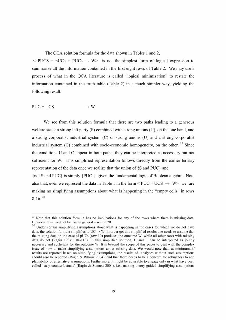
The QCA solution formula for the data shown in Tables 1 and 2,
< PUCS + pUCs + PUCs → W> is not the simplest form of logical expression to
summarize all the information contained in the first eight rows of Table 2. We may use a
process of what in the QCA literature is called “logical minimization” to restate the
information contained in the truth table (Table 2) in a much simpler way, yielding the
following result:
PUC + UCS → W
We see from this solution formula that there are two paths leading to a generous
welfare state: a strong left party (P) combined with strong unions (U), on the one hand, and
a strong corporatist industrial system (C) or strong unions (U) and a strong corporatist
industrial system (C) combined with socio-economic homogeneity, on the other. 19 Since
the conditions U and C appear in both paths, they can be interpreted as necessary but not
sufficient for W. This simplified representation follows directly from the earlier ternary
representation of the data once we realize that the union of {S and PUC} and
{not S and PUC} is simply {PUC }, given the fundamental logic of Boolean algebra. Note
also that, even we represent the data in Table 1 in the form < PUC + UCS → W> we are
making no simplifying assumptions about what is happening in the “empty cells” in rows
8-16. 20
19 Note that this solution formula has no implications for any of the rows where there is missing data.
However, this need not be true in general – see Fn 20. 20 Under certain simplifying assumptions about what is happening in the cases for which we do not have
data, the solution formula simplifies to UC → W. In order get this simplified results one needs to assume that
the missing data on the case of pUCs (row 10) produces the outcome W, while all other rows with missing
data do not (Ragin 1987: 104-118). In this simplified solution, U and C can be interpreted as jointly
necessary and sufficient for the outcome W. It is beyond the scope of this paper to deal with the complex
issue of how to make simplifying assumptions about missing data. We would note that, at minimum, if
results are reported based on simplifying assumptions, the results of analyses without such assumptions
should also be reported (Ragin & Rihoux 2004), and that there needs to be a concern for robustness to and
plausibility of alternative assumptions. Furthermore, it might be advisable to engage only in what have been
called ‘easy counterfactuals’ (Ragin & Sonnett 2004), i.e., making theory-guided simplifying assumptions
20
3.3.2.2 (2) Which aim is best achieved?
The aim of presenting QCA and fs/QCA results in the form of a solution formula is
to indicate which combinations of conditions are linked with the outcome. Solution
formulas thus put variables/conditions at the core of the reader’s attention. By making use
of Boolean operators, solution formulas are a powerful tool to succinctly express fairly
complex relationships among conditions and an outcome. They display conjunctive (OR)
and disjunctive (AND) equifinal relationships in a reader-friendly way. Solution formulas
are a very useful presentational form when conditions (variables) are put the center of
attention Solution formulas as such, however, do not inform the reader about any
individual cases, nor do they express the degree to which the solution fits the general
patterns in the data. Thus, they seem best adapted only for the first of our three
presentational and methodological goals.
3.3.2.3 (3) False friends
One set of problems that solution formulas pose for the quantitatively oriented
reader has already been alluded to, namely the use of + and * as symbols for indicating the
intersection (*) and the union (+) of sets rather than for the multiplication and addition of
numbers. Reading <A + B> as something other than < A added to B> goes against the
grain of our early childhood education, even though it is obviously a mistake to read and
interpret QCA solution formula as if they were linear arithmetic equations. Clearly ‘+’ and
‘*’ in their more common meanings are obvious “false friends” to how those symbols are
used in QCA. And we have also alluded to potential confusion in indicating negation by
changing the case of a letter -- although that is a practice sometimes found in other
political science work not involving QCA (e.g., work by one of the present authors).
Of course, the onus is basically on the reader to understand the symbols used by an
author as long as the author is clear about what his or her symbols mean, so, say, using a
“+” for OR ought not to be a problem, but still there is no need to confuse readers
unnecessarily. It is an unfortunate fact that, for accidental historical reasons, the symbols
only on a subset of the empty rows 8-16. Due to space considerations, we will not try to discuss other
potentially important features of good QCA practices.
21
used for OR and AND and NOT in the QCA literature are not those commonly used in
mathematics for those same operators, and, worse yet, the first two are ones commonly
used in mathematics and statistics to represent quite different mathematical operations.
That is clearly a major source of confusion, and what is perhaps almost as bad, it suggests
to more mathematically trained readers, even ones who are used to switching symbol
systems across different arenas of research, that QCA users are really not very
sophisticated mathematically. Indeed in our view it would be better and far less confusing
to henceforth present all QCA results in standard mathematical notation, e.g., ∩ for AND
(intersection) ∪ for OR (union) and ∼ for NOT (negation), although the conventions of
representing A∩B as AB and using lower case letters for negation do have the virtue of
simplicity!21
We might also remark on two other potential sources of terminological confusion
for those not familiar with QCA terminology, one involving the use of the term ‘equation,’
and the other the confusion of the absence of a condition ‘A’ from a solution with the
presence in a solution of ‘not-A.’
Most QCA scholars – and even Ragin in his seminal work from 1987 – use an
equal sign for implication. This wrongly (and unnecessarily) leads readers to equate the
truth functional statements in QCA with ordinary (linear) equations. To mitigate this
problem, we recommend that QCA users follow the advice made in recent publications
(e.g., Ragin & Rihoux 2004) to avoid the use of the equal sign, and we suggest referring to
statements like AB → Y as a solution formula or, even more correctly, as propositions.
Another source of misinterpretation stems from the fact that users of QCA analyses
sometimes use language that blurs the distinction between the ‘negation of a condition’ and
the ‘absence of a condition.’ Take the following example: Let A represent the set of
parliamentary democracies and B the set of rich countries and Y the set of consolidated
democracies. If we do not make any simplifying assumptions, let the most parsimonious
21 Our hunch is that + and * win over ∪ and ∩ for the simple practical reason that there is no direct key on standard keyboards to produce the latter signs. For consistency with the current practices and despite being incorrect and potentially confusing, we will continue to use the notation standard in QCA in the rest of the paper.
22
representation (minimization) of the truth table representing our empirical data about these
cases be:
Ab → Y
This expresses the statement that cases that are both parliamentary democracies and
not rich countries22 are consolidated democracies.
Now, compare this statement to an alternative solution we might hypothetically
obtain were we to making certain simplifying assumptions, namely:
A → Y
This latter Boolean proposition expresses the statement that all parliamentary
democracies are consolidated.23
Note that the condition B has now disappeared from the solution.24 However the
fact that condition B is absent from the second solution formula is not at all equivalent to
the statement that the combination of A and the absence of B ( i.e., the presence of b) is
sufficient for Y to occur. The expression A → Y comprises all cases with A, whereas
A*b → Y is more restrictive because it is limited to the cases that are not only a member of
A but also at the same time not a member of B.
22 NB. This does not necessarily mean that they are poor 23 Since A is the single path towards Y, the formula also indicates that all consolidated democracies (Y) are
parliamentary democracies (A). In short, A is necessary and sufficient for Y. 24 It disappeared presumably because it was logically redundant.
23
3.3.3 Consistency and Coverage (Raw Coverage, Solution Coverage and Unique
Coverage) as Measures of Fit
3.3.3.1 (1) Meaning
Recent developments, especially in fs/QCA (see Ragin 2003), have drawn attention
to the different ways in which the fit of analytic results to the underlying data can be
expressed in numerical terms. The two key parameters for assessing QCA and fs/QCA fit
are called consistency and coverage (Ragin 2005b). We will briefly explain their logic.
A set can be interpreted as a sufficient condition, x, if, whenever we see the
sufficient condition, we also see the outcome, y. But often we see data in which condition
x is associated with the outcome, but not in every instance. For example, this relation may
hold for a majority of cases but not all of them. For simple QCA, the measure for
consistency of sufficient conditions is the proportion of cases in which the relation holds
relative to the number of cases in which we observe the condition x.25
Once (combinations of) conditions are detected that display empirical patterns
consistent with the statement of sufficiency, one can assess how much of the outcome any
particular sufficient condition covers.26 Some of these conditions might be empirically
more important than others, i.e. more cases might be covered (or explained) by them. In
order to express the degree of coverage of a sufficient condition, we can sum up the
number of cases that display the condition and divide it by the number of cases to be
explained, i.e., all cases with the given outcome present. The coefficient for coverage
ranges from 0 to 1. A coverage of 1 indicates a complete overlap between x and y, i.e. the
condition x covers all cases with the outcome y.27
If we are interested not only in what share of the outcome is covered by any one
sufficient condition but in the total coverage of all the sufficient conditions leading to the
25 However, allowing a proportion that is less than 100% of the cases to justify an assertion that some
condition or set of conditions is sufficient for some outcome, has been argued to be a questionable move
(Achen 2005). In particular, the epistemological status of the statement that ‘a condition is more often than
not sufficient’ is not at all clear. In ordinary logic either a condition is sufficient for a given outcome or it is
not. 26 Remember, one of the core features of QCA is equifinality. Different conditions can lead to the same
outcome This is reflected by the logical operator OR (+) in a QCA solution. 27 NB, in this extreme case x can also be interpreted as necessary for y.

24
outcome, we can calculate the overall coverage (or solution coverage) of the solution
formula. This is done by simply calculating the membership score of each case in the
solution formula (i.e., the maximum score, because the different sufficient conditions are
connected by a logical OR)
In empirical applications of QCA and fs/QCA it often occurs that one and the same
case is covered by different sufficient conditions for the outcome. Thus, if we added up the
coverage values for different sufficient conditions we would count these cases more than
once, and end up with a coverage value higher than 1, which obviously would be
meaningless. Hence, in order to calculate what share of coverage can be uniquely
attributed to one and just one sufficient condition – the so-called unique coverage of that
condition, the following simple calculation is done: first, calculate the solution coverage;
second calculate the coverage of all sufficient conditions together except the one whose
unique coverage you are interested in, and subtract that value from the solution coverage.
The number you obtain will fall between 0 and 1, and it expresses how much of the
outcome is uniquely covered by one specific condition – net of all other sufficient
conditions.
We may calculate the consistency and coverage of PUC and UCS based on the
“crisp” QCA data. Table 2 shows that 7 cases display W. The expression PUC + UCS
covers all 7. Hence, the solution coverage, i.e. the overall coverage of all conjunctions, is
1. 28 PUC alone covers 6 cases (rows 1 and 3). Its raw coverage, coveragePUC , therefore, is
6/7. UCS also covers 6 cases (rows 1 and 2). Its coverage, coverageUCS, thus is also 6/7.
The unique coverage of PUC is calculated by subtracting the raw coverage of UCS (6/7)
from the solution coverage (7/7). Hence: unique coveragePUC = 1/7. Similarly, the unique
coverage of UCS is calculated by subtracting the raw coverage of PUC (6/7) from the
solution coverage (7/7). Hence: unique coverageUCS = 1/7. The shared coverage is then the
total coverage minus the sum of the unique coverages.
28 In crisp QCA this is always the case when there are no contradictions. The measure of consistency
becomes more interesting when dealing with fuzzy set QCA (see discussion below).

25
3.3.3.2 (2) Which aim is best achieved
The methods described above allow us to provide information on the overall and
path-specific goodness of fit of solution formulas. Thus these parameters primarily serve to
address the third of our three key methodological aims.
3.3.3.3 (3) False friends
The way the solution coverage is calculated exhibits some conceptual similarities to
the meaning of the R2 in multiple regressions. Similarly, unique coverage bears some
resemblance to partial regression coefficients. While drawing these conceptual parallels
might not be wrong, as such, it would be deceiving if readers and users of QCA and
fs/QCA believed that what counts most is to get a high value for the solution coverage.
Such a research strategy would put too much emphasis on the aim of achieving a high
coverage rather than seeking to find theoretically interesting conjunctions that might or
might not apply to many cases.
3.3.4 Venn Diagrams
3.3.4.1 (1) Meaning
Venn diagrams got their name from John Venn, who, like George Boole, the
inventor of Boolean algebra, was a 19th century mathematicians. Venn diagrams aim at
representing relations between sets by drawing intersecting circles in a rectangular box.
Each circle represents the group of elements (i.e. cases in empirical social research) that
share the property defined by the set. The rectangular around the intersecting circles
represents the universal set, i.e. all cases that are relevant for the study.
Venn diagrams are a graphical way of displaying all logically possible
combinations between dichotomous conditions. Assume we have a Venn diagram with
three conditions (A, B, C). From the discussion of truth tables we know that there are 23 =
8 logically possible combinations of conditions. If we count the different areas in the
respective Venn diagram we see that it has 8 such different areas, each representing one
logically possible combination of A, B, and C. Each domain could thus be expressed with
Boolean operators. For instance, the area in the top left describes all cases that have A but
not B and not C -- in short Abc.

26
ABOUT HERE Figure 1
A graphical way of displaying QCA results in a special Venn diagrams has been
introduced and frequently used by De Meur/Berg-Schlosser (see e.g. Berg-Schlosser & De
Meur 1997). It consists of 2K rectangular boxes (with k being the number of causally
relevant conditions) creating one large rectangular box. A convenient feature of this Venn-
diagram like graph is that it can be easily produced with the computer program Tosmana,
developed by Lasse Cronqvist (2006) - which is available free of charge at
http://www.tosmana.net.
Figure 2 displays the result of the truth table analysis on welfare states using this
approach from above. Recall that our result without simplifying assumptions was:
PUC + UCS → W. In this diagram, PUCS is 1111 and pucs is 0000.
ABOUT HERE Figure 2
Each box in Figure 2 is labeled with a four-digit binary number, identifying one of
the 16 logically possible combinations. The first number refers to the value of P, the
second, U, the third C, and the fourth S. For example, the area in the upper left corner is
labeled 0000, indicating that all four conditions score 0. C refers to ‘contradictory rows’,
i.e. truth table rows with cases that display different values in the outcome. R refers to
‘logical remainders’, i.e. the rows of a truth table without any empirical information.
Finally, ‘-‘ refers to missing values in the outcome of those truth table rows for which,
however, information on the values of the conditions is at hand.29
The three different values that are contained in the initial truth table in the column
for W are indicated by different shades of gray: W = 1, light shaded gray (in the center of
the graph), W = 0, middle-shaded gray (on the left of the graph), and W = - (the rows with
missing data, a.k.a the “logical remainders”) in dark-shaded grey (on the right of the
29 In our truth table that produces Figure 2, there are neither contradictory rows (C), nor any missing values (-). Consequently, Figure 2 does not display any area for C or -.

27
graph). This graph thus gives a graphical impression of the degree to which there is limited
diversity in this data set. More than half of the area is shaded in dark grey (we know
already from the truth table representation of the data, see Table 2, that 9 out of 16 rows
did not contain empirical evidence).
Commonly, we also wish to display the solution in the same graph. The graphical
solution offered by the Tosmana software does so by adding colored horizontal lines to the
cells found in the solution. Here these are the cells covered by the conjunctions PUC and
UCS. Since the area where W = 1 and the area indicating the solution term fully overlap,
we can also derive from this graph the fact that the solution we have found is fully
consistent, and covers all cases in the outcome.
Finally, the program provides a useful option that allows us to provide the case
name labels for the cases that fall into each cell (conjunction of parameters). As already
mentioned, five out of seven cases for which we have data fall into the intersection PUCS,
with only one each in pUCS and PUCs, respectively.
3.3.4.2 (2) Which aim is best achieved?
Clearly the Venn diagram approach in the form shown in Figure 2 can display a
considerable amount of information visually, including information about the outcomes
linked to each condition and the number of cases (as well as case names) located in each
cell. Also, by comparing shading for cases and for the solution we can probably get some
intuitive idea about the various forms of coverage and consistency. Unfortunately,
however, while the diagram shown in Figure 2 is a very important step in the right
direction, it violates a number of basic principles of good information display. The key
problems are:
(1) the varying sizes of the cells is visually distracting, while at the same time
conveying no actual information;
(2a) it is impossible to quickly locate any given combination since the cells are not
arranged in numerical order of any sort;
(2b) moreover, for that reason, intuitive comparisons of results across cell types (or
across potential alternative solution formula) is virtually impossible;
(3a) the color coding scheme makes no intuitive sense;
28
(3b) plus two of the color gradations are hard to distinguish;
(4) the method of crosshatching the solution formulas makes it hard to distinguish
the level of coverage of solutions of the cases.
While the pseudo Venn Diagram we propose Figure 3 is still far from ideal, it
represents, we think, an improvement. In particular, it addresses each of the four problems
we have identified.
ABOUT HERE Figure 3
(1) It uses a fixed cell size, one that is square rather than rectangular. This makes it
easier to read down rows and columns to find particular cells, and we have drawn
on that feature in the way we have labeled the cells.
(2) There is an easy trick to locating any particular formula. The cells are arranged
in “numerical” order according to their binary values from
(0, 0, 0, 0) =(not P, not U, not C, not S) in the upper left hand corner, to
(1, 1, 1, 1) = (P, U,C, S) in the bottom right hand corner. To find any given
combination of values, just look to the rows for the P and U values and to the
columns for the C and S values, and find the appropriate intersection(s). Also,
formulas with a given value on a given condition are either all located in adjacent
rows, or all in odd –numbered rows , or all in even-numbered rows; or all located
in adjacent columns, or all in odd –numbered columns, or all in even-numbered
columns.
(3) The color scheme is based on two visual codings that most people are already
familiar with. One is that ‘red’ means stop and ‘green’ means go, so that situations
where W = 1 “naturally” get coded ‘green,’ while situations where W = 0
“naturally” get coded ‘red.’ The second is that empty cells should be empty, and
‘white’ is the usual color to signal empty.30
30 If we had to do this in black and white we could use shadings of gray for the red and the green, since the white empty cells would clearly stand out from the cells where we had data; and by picking our grays appropriately, we

29
(4) The formulas in the cells that lie in the solution are highlighted in yellow. If all
the green cells have highlighted formulas then the solution coverage is complete.
3.3.4.3 (3) False friends
Venn diagrams do not really have a false friend in statistical approaches. As
mentioned, though, the relative lack of knowledge of its basic logic tends to lead the reader
into misinterpreting the size of the areas in terms of frequencies. Mostly due to the
unfamiliarity with the logic of Venn diagrams, readers seem to have a tendency to interpret
the size of the different areas in terms of their empirical importance, i.e. as if the size of the
areas expressed the number of cases that fall into it. This is usually not the case, however.
As with truth tables, Venn diagrams are aimed at displaying logical combinations, not
empirical frequencies. As previously noted, this problem does not arise with our new
alternative version of a Venn diagram presented in Figure 3.
A further problem with Venn diagrams is that with an increasing number of
conditions their intersections increase potentially and one quickly reaches a limit as to
what can be graphically put into practice. The Venn diagrams with four conditions are
already quite difficult to read. Adding a fifth condition would make it unintelligible.
3.3.5 Dendogram (Tree Representation)
3.3.5.1 (1) Meaning
Yet another way to present QCA and fs/QCA results is to express the data in the
form of a tree representation, i.e., as a dendogram. In such a graph, single causally relevant
conditions are represented as nodes. Nodes are shown connected by lines (a.k.a. branches)
With four dichotomous conditions, if there is a “natural” ordering (perhaps temporal) in
which the conditions might be expected to occur we have four nodes and a maximum of
sixteen branches in our tree representation of the data. Branches which are missing are
omitted from the tree representation. Each set of nodes connected by lines represents one
causal conjunction that is sufficient for the outcome. Conditions at the top and toward the
could distinguish W = 1 from W = 0. However, if we do use black and white, the darker gray should be for the cells where W = 1, since usually higher values are associated with darker values.
30
top of the figure represent the roots of one or more paths, while the conditions at the
bottom of the figure (the terminal nodes) are causal conjunctions.
Take the example on the conditions for a generous welfare state (W). One could
argue that there is a sequence by which the four conditions are likely to occur in a country.
Socio-economic homogeneity (S) is a structural feature of a society that is likely to change
only in the long run and thus it is in place before the other three conditions occur. Next to
it emerges (if it does emerge at all) a strong left wing party (P), which should go prior to
the emergence of strong unions (U).31 Finally, the presence of U seems to be a condition
that needs to be in place before a corporatist industrial system (C) can be effectively
working. The sequence of occurrence of the four conditions then is: S – P – U – C.32
A dendogram showing the data in Table 1 and Table 2 is shown in Figure 4. There are
three paths towards W =1 (green boxes) and three paths towards W = 0 (red boxes) shown
in the figure.33 In addition, an imputed internal sequential order of the paths is expressed in
that dendogram. Note also that, at the terminal nodes, one can indicate the names of
countries that follow any given path.34 Furthermore the extent to which all the possible
branching paths are shown in the dendogram (where branches that do not lead to any
terminal node of the tree for which we have data are dropped from the figure) is a useful
visual clue about how much missing data, or better limited diversity there is.
31 Of course, there is a probability that this sequence might be inverted, as strong unions help create a strong
left wing party, and there will often be a dynamic flow of mutual causality. 32 Let us again point out that this example serves only presentational purposes and is not meant to be a study
on welfare state development. The specific sequencing order of conditions we proposed could readily be
challenged based on theoretical and empirical grounds. At minimum it would be necessary to go into the
cases and check whether, in fact, the hypothesized sequence is historically plausible. Morever, determining,
a proper sequencing of conditions might well require looking at the inclusion of conditions measured at
different points in time so as to assess which sequence (or which sequences -- plural) could best be seen
undergirding the truth table data (see Caren & Panofsky 2005 for some ideas bearing on an appropriate
algorithm) . 33 Recall that our basic solution formula (and derived without any supplemental assumptions, and without
any further simplifications of the logical formulas) was
PUCS + pUCs + PUCs → W.
If, however, we take seriously the notion that S is temporally prior to P and P to U and U to C, then we
would, instead, choose to express this formula (equivalently) as:
SPUC + spUC + sPUC → W. 34 Recall, too, that there is a lot of overlap between the two components of our simplified solution formula,
PUC and UCS. Only Belgium (PUC) and Ireland (SUC) follow just one path.

31
ABOUT HERE Figure 4
3.3.5.2 (2) Which aim is best achieved?
To our knowledge, dendograms have not been used in the QCA and fs/QCA
literature. One reason for that might be the following: The notion of a beginning and an
end of a causal conjuncture already indicates that there must be a dimension with regard to
which a beginning and an end of a causal path can be established. The most likely
candidate for such a dimension is time. Now, one of the awkward black spots in the QCA
and fs/QCA literature is the virtual lack of systematic efforts to integrate any form of time
into the analysis (for some initial suggestions, see Caren & Panofsky 2005). In other
words, QCA and fs/QCA are essentially static techniques. This is awkward because one of
the defining features of small N qualitative methods is its sensitivity to time, timing, and
sequences.
We argue that dendograms are a powerful presentational form for displaying some
sequential order inherent to causal conjunctions. We would also emphasizes that the
ordering does not necessarily have to be strict calendar time, but could also refer to ideas
such as ‘causal distance to the outcome’, or ‘ontological relation between conditions’
(Gary Goertz & Mahoney 2005, Schneider & Wagemann 2006).
Focusing on sequential paths as in the dendogram shown in Figure 4 (recall that
we can experiment with alternative sequential ways to display the data) helps call attention
to potentially interesting theoretical implications. In particular, viewing the dendogram
emphasizes the importance of equifinality. One could argue that the type of reasons as to
why generous welfare states exist in Belgium is quite different from the reasons that apply
to Ireland: in Belgium, the reason for a welfare state involves a long-lasting and over time
fairly stable social structures (S). In Ireland, such stable structures do not exist and it is
only through the existence of a strong left party P (combined with U and C) that a generous
welfare state occurs. It might be hypothesized that this difference in ‘causal depths’ or
‘rootedness’ of welfare states has implications for their likelihood to resist situations of
crisis.

32
Alternatively, the different causal paths might lead the researcher to take a closer
look at the type of welfare state found in Ireland compared to that in Belgium. She might
find that, despite being of the same strength, these welfare states differ on some other
analytically interesting dimension.
Another advantage of using dendograms is that one can simultaneously display the
multiple paths leading to the outcome together with those leading to the non-occurrence of
the outcome. Sometimes, these different paths have single conditions in common. The
paths towards W and not W, thus, would intersect at one node. Looking at where in the
dendogram this intersection occurs may trigger some new ideas about the social and
political processes leading to the outcome. For example, from Figure 4, we see that the not
P branch can lead to both positive and negative outcomes. Also, one can show in a clear
way the “paths not taken,” i.e., the empty cells of the data matrix. Trying to understand the
reasons why we have missing data in these terms may, in and of itself, suggest some new
insights.
In sum, decision trees are very good for displaying the relations between variables,
the first of our three goals. They can also be used for giving information on cases, the
second of our aims, but are less useful in expressing/displaying the fit of the solution term
to the underlying data, which is our third methodological concern. A potential problem
with their use, however, is that, for display purposes, we must make a decision about
sequencing, and we may not have good theoretical reasons for dong so. Still, in some
ways, the same information is conveyed regardless what sequence is shown, albeit thinking
about sequences is, we think, a very important part of the analyst’s task. Hence, the more
emphasis is given to integrating a time dimension into QCA (especially from those
scholars who stick to the qualitative roots of this method and apply it to small to medium N
comparisons rather than large N studies), the more prominent will dendogram
representations become.
3.3.5.3 (3) False friends
Since the dendogram presentational form has not previously been applied to QCA
and fs/QCA, we can only speculate about future false friends. The most likely candidate is

33
a decision tree. Here the main source of confusion might be with ‘sequences’ as opposed to
‘choices’. The dendogram we use expresses the choices that have been made in real
polities or the (close to) unintentional and accidental sequential occurrence of factors,
while a decision tree is usually used to calculate optimal choices according to some
specified utility function and assignment of values to possible outcomes.
3.4 Two Additional Presentational Forms for fs/QCA
By introducing elements of fuzzy set theory into the general framework of analysis,
Ragin (Ragin 2000, 2005b, 2005) has extended his Boolean approach to comparative
social sciences based on crisp sets (dichotomous data). In the following, we briefly
introduce the idea of fuzzy sets and show how the concepts of necessity and sufficiency
translate into relations between fuzzy sets. After that we introduce two additional
presentational forms that are specific to Fuzzy Set QCA (a.k.a. fs/QCA).
Unlike classical crisp sets, fuzzy sets allow for different grades of set memberships
that falls in between the two extremes 1 (full membership) and 0 (full non-membership)
(Ragin 2000: 149-171). Fuzzy membership values thus can take any value between the two
qualitative anchors 0 and 1. The third qualitative anchor is the ‘point of indifference’ at 0.5
which indicates that elements receiving this score are neither more in nor more out of the
fuzzy set to be measured. In order to make the calibration of fuzzy sets meaningful and a
fuzzy set QCA analysis possible, all qualitative anchors need to be determined with great
theoretical care. The calculation for the logical AND, logical OR, and the negation of a set
are the same as for crisp sets and are described above.
Necessity and sufficiency in fs/QCA
As in QCA, also in fs/QCA the fundamental concepts for analysis the data are set
relations and their interpretation in terms of necessity and sufficiency. In crisp set QCA,
the structure of necessity and sufficiency is straightforward. For sufficiency, it must be
checked if all rows in which x = 1, also y = 1. If so, the condition could be interpreted as
sufficient for Y. In contrast, for necessity, we need to check whether in those cases that

34
display the outcome (y = 1) also the condition x is 1. If so, it could be interpreted as
necessary.
In fuzzy sets, where any value in the 0-1 interval is allowed, this translates in the
following way (Ragin 2000): A condition can be seen as sufficient if the scores on x across
cases are consistently smaller than or equal to y. In short:
Sufficiency: xi <=yi
In contrast to this, a condition can be seen as necessary if the scores for x across
cases are consistently higher than or equal to y. In short:
Necessity: xi >=yi
We will continue using the data from Ragin (2000 table 10.6). Table 3 contains the fuzzy
data. It is a normal data matrix - rows represent cases, columns represent
variables/conditions. For our fs/QCA analysis we use the truth table algorithm as described
in Ragin (2005b).
ABOT HERE Table 3
From our analysis above we know that the solution term is as follows:
PUC +UCS → W (without simplifying assumptions)
UC → W (with simplifying assumptions)
We have previously discussed the parameters of consistency and coverage for the
“crisp” data reported in Table 2. The same formulas apply in fuzzy set. Consistency is
calculated by dividing the number of cases with xi>=yi by the number of all cases with x >
0. The formula is:
∑∑
=i
ii
x
yx )min(condition sufficienty Consistenc
,
This coefficient ranges from 0 to 1. High values indicate high consistency with the
statement that x is sufficient for y. If all cases are consistent with the statement that x is

35
sufficient for y, i.e. if all cases have smaller values on x than on y, i.e. if all cases fall
above the main diagonal in an x-y plot (see below), then x is a perfect subset of , i.e. the
empirical pattern is 100% consistent with the statement that x is sufficient for y and,
consequentially, the coefficient takes on the value of 1.
Expressed in general terms so as also to be applicable to fuzzy sets, the formula for
coverage is:
∑
∑
=
==I
i
i
I
i
ii
y
yx
1
1
),min(
condition sufficient coverage
This formula expresses the relation of the sum of those x-values that are consistent with the
statement that x is sufficient for y and the sum of y values. If we apply the formula of
consistency and coverage to the fuzzy data we get the results shown in Table 4.35
ABOUT HERE Table 4
The solution term PUC + UCS is 100% consistent and it covers about 60% of the
fuzzy scores in the outcome W. The raw coverage of both PUC and UCS alone is about
50% but their unique coverage is rather low (PUC 7% and UCS 10%). From our crisp
QCA analysis we have already seen that both conjunctions strongly overlap and this is
expressed again here by the low unique coverage scores.
The solution term achieved when allowing for simplifying assumptions UC → W
has a slightly higher coverage (62%). Since there is only one conjunction, the value for
unique coverage is equal to the raw coverage and the solution coverage. The consistency of
the solution term UC is slightly lower than one indicating that some cases display higher
values in UC than in W.
35 There are attempts at expressing the consistency and coverage of set relations by making use of well-kknown statistical tools. While this has the advantage of not ‘unsettling the existing tool kit’ of many statistically trained scholars, so far, it seems to be difficult for the se apporaches to avoid overtly complex mathematical operations and implausible assumptions for something intuitively pretty straightforward. For some intersting attempts, see Eliason & Stryker 2005.

36
3.4.1 x-y plots
3.4.1.1 Meaning
A particularly powerful way of displaying set relations between fuzzy sets is the so-
called x-y plot. On the y-axis, the fuzzy membership values of the cases in the outcome to
be explained are displayed. On the x-axis, the cases fuzzy membership score in the
condition are shown.
An x-y plot has several important properties. First, the x-y plot has clearly defined
borders. Both the x-axis and the y-axis have their endpoints in 0 and 1. These endpoints
have substantive meaning - they denote the minimum and maximum level of membership.
Hence, all cases do fall somewhere within the square with well-defined endpoints. Second,
due to the equal scaling of the x and y axis, the main diagonal running from the point 0,0 to
1,1, defines a line on which cases have equal membership in x and y. This leads to a third
and probably most important feature of an x-y plot. The main diagonal cuts the square into
two triangles of similar size. The upper triangle delimits the zone in which xi <=yi . Hence,
an empirical pattern in which all cases fall above he main diagonal, indicates that the
condition x that we have plotted against the outcome y is a sufficient condition. In contrast,
the triangle below the main diagonal delimits the zone where xi >=yi Thus, if all cases fall
below the main diagonal the condition can be seen as necessary. Finally, if all cases fall on
the main diagonal, a condition is necessary and sufficient for y.
Finally ,the relation between the outcome and a condition can always be
represented in a bivariate form – regardless of whether there are several paths towards the
outcome, as there usually are in QCA and fs/QCA (equifinality) and regardless of whether
the condition is the conjunction of several single conditions, as is also usually the case
(conjunctural causation).
ABOUT HERE Figure 5

37
As mentioned, if all cases fall above the diagonal, the condition can be interpreted
as a sufficient for y. The more cases fall below the main diagonal, the less consistent is the
empirical pattern with the statement of sufficiency. Hence, x-y plot are a graphical way of
displaying the consistency of a sufficient condition; but not just that. Also the parameter of
coverage, expressing another aspect of the solution term to the data can be illustrated in an
x-y plot. Even if all cases fall above the main diagonal (consistency 100%), it might be that
this sufficient conditions does not cover much of the scores in the outcome Y. The degree
of coverage is roughly visualized by how many of the cases call close to the Y axis. Those
cases have much higher fuzzy membership scores in Y than in X. Hence, particularly
damaging to coverage are cases that fall into the upper left corner where the difference
between x and y scores is very pronounced. The x-y plot below depicts this trade-off
between coverage and consistency.
As we move away from the main diagonal to the left, we can be sure that
consistency is achieved but coverage decreases. In contrast, as we move to the right
towards the main diagonal, we increase coverage but run the risk decreasing the
consistency to such an extent that the given condition can no longer be perceived as a
sufficient condition for the outcome.36 Finally, if all cases fall on the main diagonal, the
consistency value is 1 both for being a necessary and a sufficient condition and the value
for coverage is 1, too.
Let us create some x-y plots for the solution term on generous welfare state
PUC + UCS → W
Let us use the x-y graph to look at how consistent the term PUC is and how much
coverage it has now that we are viewing things in fuzzy set terms. (Note that we have
already provided information about the results of such calculations in the previous section.)
First of all, we see that none of the cases falls below the main diagonal, indicating a
consistency of 1. This is not always the case. In case of a consistency less than 1, one or
more cases will fall below the main diagonal. By indicating the case labels, i.e. by
identifying the case that deviates from the general pattern of sufficiency, the analytical
38
interpretation of the finding can be enhanced compared to just stating that the coefficient
for consistency is lower than 1.
ABOUT HERE Figure 6
Second, some of the cases fall fairly close to the main diagonal. This means that
they are well covered by this path towards W. Other cases, however, are far away from the
main diagonal. Not only does this illustrate a coverage lower than 1 (in fact, it is 0.49), but
in addition to this it also indicates which specific cases are not covered well by PUC. In
our example, for instance, Italy and Ireland are two cases with fairly high membership
scores in y (0.64 and 0.67, respectively), but with very low scores on PUC (0.1 and 0.11,
respectively). Japan, which is still more in than out of the set of generous welfare states
(score in y = 0.52), is even left without any partial membership in PUC.
ABOUT HERE Figure 7
Let us therefore concentrate on the location of these countries in the second x-y plot
that plots UCS, the second paths, against W. We again see 100% consistency and less than
100% coverage (it is 0.53, see Table 4). But we see that Italy and particularly Ireland have
moved to the right and thus much closer to the main diagonal. This shows that UCS is the
path towards W that covers them better than PUC. Even Japan has a non-0 membership in
UCS.
Finally, if one is interested in the overall coverage of the entire solution term, i.e. of
all paths towards the outcome, one simply calculates each case’s membership score in the
expression PUC+UCS, making use of the minimum rule and the maximum rules and plots
these values against the outcome W.
ABOUT HERE Figure 8
36 As Ragin (personal communicatio, April 2005) points out, the calculation of consistency comes prior to the
calculation of coverage because it does not make sense to assess the coverage of a conjunction that is not

39
3.4.1.2 Which aim is best achieved?
Among the three general purposes of presenting data – focusing on relations
between conditions and the outcome, understanding cases, and assessing the fit between
the solution term and the data – x-y plots do best for the latter, but they can also be used
for drawing attention to cases.
3.4.1.3 False Friends
The logic of scatterplots seems straightforward and compelling. However, when
using them in order to present and discuss fs/QCA results, the untrained audience often has
difficulties to grasp their meaning. What seems to be happening is that many read the x-y
plot as if it was an ordinary scatterplot of interval level variables.
Reading x-y plots as scatterplots leads scholars on a wrong track because from
there it is only a small step to thinking that the measure of relation between x and y is some
sort of covariaton while, in fact, QCA and fs/QCA are based on set relations. If we read the
x-y plot as a scatterplot, the main diagonal then is misinterpreted as some kind of
regression line, i.e. a summary of the underlying data points. The consequence of such a
mistaken interpretation of an x-y plot as a scatterplot is severe. People conclude that x and
y do not correlate and thus that they are not related at all while, in fact, there might be a
perfect subset relation that can be interpreted as sufficiency relation between x and y (data
points in upper triangle) or necessity (data points in lower triangle).
Even if we plotted some standard variables that are bounded on their upper and
lower end and that had the same range (say, from 0 to 1), the resulting scatterplot would
still be different from an x-y plot, in which set membership scores are visualized. The
notion of x and y as sets allows us to assess their relation in terms of subset relations. Set
relations are asymmetric while covariation measures – the standard for common variables -
are symmetric measures.
consistent with the statement of sufficiency.
40
3.4.2 Tables
3.4.2.1 Meaning
One very simple and straightforward possibility to present the solution of an
fs/QCA analysis is to report in a table each case’s fuzzy membership score in the different
conjunctions that are sufficient conditions for the outcome. The rows of such a table
present the cases and the column the different causal combinations. The cells then contain
the fuzzy membership score of each case in each causal combination.
At the bottom of the table, it is convenient to also report the consistency, coverage
and unique overage of each conjunction the same as the overall coverage, i.e. the coverage
achieved by the entire solution term.
3.4.2.2 Which aim best achieved?
Among the three aims – focus on (a) variables, (b) cases, (c) fit to data – such
tables work best for focusing on cases. For each case one can directly see in which
conjunction the case has
- its maximum membership (this is the conjunction that covers the case best),
- a membership higher tan 0.5 (these are the paths that can be reasonably used for
interpreting the case),
- a membership lower than 0.5,
- a membership score of 0.
It often happens that one and the same case has a high membership in more than one
path and also that some cases have low or even zero membership in all conjunctions. The
former cases are explained/covered more than once, the latter cases are (virtually) left
unexplained by the solution found. In order to reveal the information in a digestible way, it
is convenient to only present the membership scores higher 0.5 or at least to mark them
using a bold font.
ABOUT HERE Table 5

41
As Table 5 indicates, most cases that have a membership higher than 0.5 have it in
both solution terms. Only Ireland and Belgium do not. We also see that apart from
Australia, Canada, and the USA all cases have a membership in the outcome W higher
than 0.5. At the same time, however, not all of these cases with W > 0.5 also display a
membership score higher 0.5 in any of the two conditions. In terms of consistency, this
situation (x < y) is not a problem. In terms of coverage, however, this big difference
between x and y is problematic. We therefore see that the consistency of both PUC and
UCS is 1, whereas their raw coverage is just about 50%. Their low unique coverage (less
than 10%) indicates the overlap between the two conjunctions (most cases have high
scores in both terms).
3.4.2.3 False Friends
One limitation of the table presentational form is that with a high number of cases
and/or a number of different causal conjunctions the information cannot be properly
digested anymore. Despite this, as a standard of good practice, we suggest that each
fs/QCA study in the appendix should include a table with the membership scores in the
solution terms plus the membership scores in the single conditions and the outcome. Such
a table provides all necessary information for reproducing the study and for generating all
the presentational forms we are discussing in this paper.
Presenting fs/QCA results in a table sometimes confuses the reader who tends to
interpret the fuzzy membership scores as factor loadings. This is not quite correct – despite
some conceptual similarities. Let us briefly discuss the similarities and differences of a
fs/QCA and factor analysis result.
Factor analysis is used for clustering variables based on their covariation. If their
joint variation is high, they are assumed to measure the same underlying concept and, thus,
can be aggregated into a one-dimensional index. Each case’s score in the several factors
can be calculated by multiplying each variable’s factor loading score with the score of a
case on the variables composing one factor. In a sense, also fs/QCA is clustering variables
and, as a virtue of this, cases. The difference, however, consists of the criteria that are used

42
for clustering variables into factors in factor analysis and conditions into and conjunctions
in QCA and fs/QCA. Here the difference is not only the more technical fact that clustering
in factor analysis is based on some sort of covariation and in fs/QCA it is based subset
relations.
What is more important is that in QCA and fs/QCA the subset relations are
calculated for conditions with regard to an outcome variable. In factor analysis, instead,
there are no dependent and independent variables. In cross-sectional research, therefore
factor analysis as such is not used for drawing causal inference. The question one tries to
answer with factor analysis is: Which set of different variables can be summarized into one
index without distorting the underlying information too much? The question at stake in
QCA and fs/QCA, instead, is: Which combinations of conditions are linked to an outcome?
And which group of cases is similar with regard to the conjunctions leading to the
outcome?
This decisive difference should be kept in mind when we now draw the attention to
some conceptual parallels between factor analysis and QCA and fs/QCA, especially if we
perceive the underlying dimension measured in factor analysis as some sort of dependent
variables and its constituting variables as the independent variables.
Let us explain this point by going back to the result of our analysis on generous
welfare state:
PUC + UCS → W
Four fundamental questions can be asked about this result:
1. Which countries are best explained by each of the two paths?
2. What is the overall explanatory power of the solution term and what is the
explanatory power of each single conjunction in this solution term?
3. Are the different conjunctions logically non-overlapping?
4. Are the conjunctions empirically non-overlapping?
These questions partially replicate the three general aims any type of presentational form
for analytic results has. The way we formulate the questions here, however, allows for
drawing some parallels to the logic of thinking about factor analysis. If we express
question 1-4 in terms of factor analysis, they “translate” as follows:
43
1. What countries have high factor scores on each of the factors?
2. What is the proportion of variance explained attributable to each factor, and the
overall proportion of variance explained by a combination of factors (e.g., the k
factors with eigenvalues above some cutoff)
3. Are the factors orthogonal or not?
4. Do some countries load on more than one factor?
In sum, these striking parallels are only valid if we treat the underlying latent
variable that is supposed to be measured in factor analysis by highly correlating variables
as some sort of dependent variable that needs to be explained. This might be technically
and conceptually the case, but it does not correspond to the logic of cross-sectional
research (under which also QCA and fs/QCA operate) where the dependent
variable/outcome is measured independent of the independent variables/conditions.
44
4 Conclusion
The presentation of analytic results, despite being a crucial element of
communicating findings, is hardly ever put into the center of attention of methodologists
and users of methodologies (see e.g., Tufte 2001 for an exception). This paper can be read
as a plea for far more attention to the “artistic” (as well as conceptual and methodological)
skills needed when presenting social science data and analytic results (Klass 2006).
Not making full use of the potentials of different presentational forms is
particularly damaging for QCA and fs/QCA because, first, it is a relatively new method
based on concepts that are largely unfamiliar to the standard reader and thus the way
results are presented are misleading to many; and, second, QCA and fs/QCA are meant to
be located at the intersection between qualitative, case-oriented and quantitative, variable-
oriented approaches to social science data. We therefore argued that QCA and fs/QCA can
afford less than any other method to skip one of the three main purposes of presenting
results by any social scientific data analysis method – unraveling variable relations,
understanding cases, and assessing the fit between analytic result and the underlying data.
We have discussed seven different forms of displaying analytic results. Each
presentational form is appropriate for fulfilling some, but never all of the general purposes
just mentioned. Furthermore, each presentational form has some false friends, that is, ways
of presenting analytic results that look similar but have a different meaning because they
stem from different research paradigms. Table 6 provides a summary of our arguments. In
addition to the strengths and weaknesses of each presentational form we provide two other
criteria that should help researchers to make their choice on which presentational form to
choose: whether or not a presentational form is suitable for large N and for a high number
of causal conditions. In that Table we indicate some software with which the respective
presentational forms can be generated.
ABOUT HERE Table 6
45
Any QCA and fs/QCA analysis should report (a) the crisp or fuzzy data for each
condition and the outcome in each case (best done in the appendix) and (b) the
membership scores of cases in all conjunctions in a table (also perhaps best done in an
appendix); (c) among the different presentational forms, to us the solution formula seems
to be compulsory. They should always be reported, preferably with the coefficients of
consistency and coverage. In addition to that, some but certainly not all of the other
presentational forms should be offered. In order to express the relation between conditions
and the outcome to be explained, truth tables, solution formulas, and dendograms should
be used. If the focus is on cases, x-y plots, Venn diagrams, dendograms with case labels, or
the table presentational format can be used. Finally, the fit of the model to the data is best
expressed in numeric terms through the parameters of consistency and coverage. A
graphical notion of this fit is also provided by x-y plots and Venn diagrams.
Up until now there is no single software package capable of producing all the
presentational forms mentioned here. The software packages fs/CQA (Ragin, Drass &
Davey 2003 and Tosmana (Cronqvist 2006) both produce solution formula and truth
tables. In addition, fs/QCA but not Tosmana calculates the parameters of consistency,
solution coverage, raw coverage, and unique coverage, while Tosmana but not fs/QCA is
able to produce a Venn diagram. Tables and x-y plots are still best produced with Excel37
and the dendograms we have drawn ‘by hand’ in Word. One important step forward in the
development of QCA and fs/QCA as methods in comparative social science is to develop
one (or more) programs that encompass all the important presentational forms.
We would also note that, contrary to the general belief that using QCA and fs/QCA
is impossible as the number of cases increases, it turns out that 6 out of 7 of the
presentational forms discussed here are suitable for displaying results even if the N is high,
as, for instance, when QCA and fs/QCA are applied to the analysis of individual level data.
More problematic is the task of presenting results that contain many conditions. Apart
from solution formulas and the use of coefficients, no other presentational form really
37 In order to get the case labels into the x-y plot, one needs to download a macro from the internet. The X Y
Chart Labeler for Excel 97 (which also works in more recemt versions) is available, for instance at
http://archive.baarns.com/excel/free/Exceluts.asp

46
works in a convincing way if there are more than, say, six paths to the outcome that
involve as many single conditions.
In sum, we view the issue of how to present analytic results as more than an esthetic
nuance. The development of presentational forms capable of displaying the different
information contained in QCA and fs/QCA results in a form easily interpretable for an
audience unfamiliar with QCA and fs/QCA is paramount for the acceptance and success of
these approaches within the academic community.
References
Achen, C.H. (2005). Two cheers for Charles Ragin, Studies in Comparative International Development 40
(1): 27-32.
Berg-Schlosser, D. & De Meur, G. (1997). Reduction of complexity for small-N analysis: a stepwise multi-
methodological approach, Comparative Social Research 16: 133-162.
Braumoeller, B.F. (2003). Causal complexity and the study of politics, Political Analysis 11: 209-233.
Caren, N. & Panofsky, A. (2005). TQCA. a technique for adding temporality to Qualitative Comparative
Analysis, Sociological Methods & Research 34 (2): 147-172.
Cronqvist, L. (2006). Tosmana - Tool for Small-N Analysis [SE Version 1.25]. Marburg. Internet:
http://www.tosmana.net.
Goertz, Gary & Mahoney, J. (2005). Two-level theories and fuzzy set analysis, Sociological Methods &
Research 33 (4): 497-538.
Klass, G. (2006). JPDA: just plain data analysis. Manuscript prepared for the American Political Science
Association Conference on Teaching and Learning in Political Science ,Washington D.C., February 18.
Ragin, C.C. (1987). The comparative method. moving beyond qualitative and quantitative strategies.
Berkeley/Los Angeles/London: University of California Press.
Ragin, C.C. (2000). Fuzzy-set social science. Chicago: University of Chicago Press.
Ragin, C.C. (2003). Recent advances in fuzzy-set methods and their application to policy questions.
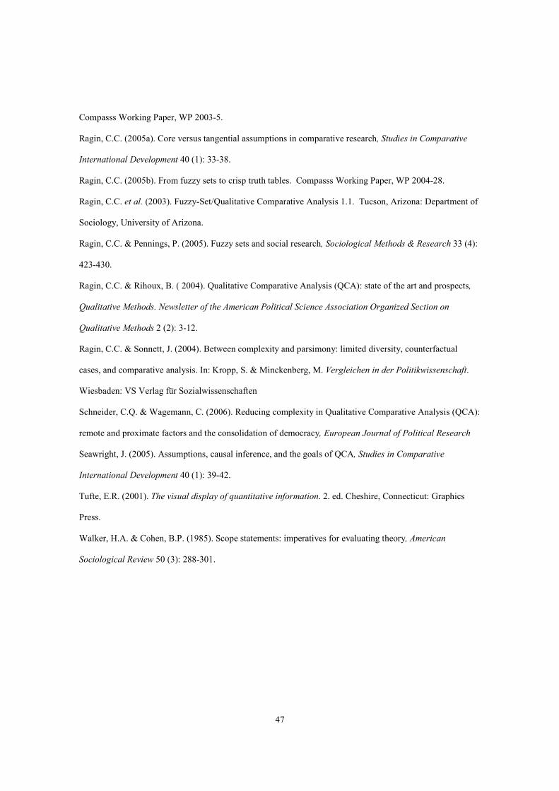
47
Compasss Working Paper, WP 2003-5.
Ragin, C.C. (2005a). Core versus tangential assumptions in comparative research, Studies in Comparative
International Development 40 (1): 33-38.
Ragin, C.C. (2005b). From fuzzy sets to crisp truth tables. Compasss Working Paper, WP 2004-28.
Ragin, C.C. et al. (2003). Fuzzy-Set/Qualitative Comparative Analysis 1.1. Tucson, Arizona: Department of
Sociology, University of Arizona.
Ragin, C.C. & Pennings, P. (2005). Fuzzy sets and social research, Sociological Methods & Research 33 (4):
423-430.
Ragin, C.C. & Rihoux, B. ( 2004). Qualitative Comparative Analysis (QCA): state of the art and prospects,
Qualitative Methods. Newsletter of the American Political Science Association Organized Section on
Qualitative Methods 2 (2): 3-12.
Ragin, C.C. & Sonnett, J. (2004). Between complexity and parsimony: limited diversity, counterfactual
cases, and comparative analysis. In: Kropp, S. & Minckenberg, M. Vergleichen in der Politikwissenschaft.
Wiesbaden: VS Verlag für Sozialwissenschaften
Schneider, C.Q. & Wagemann, C. (2006). Reducing complexity in Qualitative Comparative Analysis (QCA):
remote and proximate factors and the consolidation of democracy, European Journal of Political Research
Seawright, J. (2005). Assumptions, causal inference, and the goals of QCA, Studies in Comparative
International Development 40 (1): 39-42.
Tufte, E.R. (2001). The visual display of quantitative information. 2. ed. Cheshire, Connecticut: Graphics
Press.
Walker, H.A. & Cohen, B.P. (1985). Scope statements: imperatives for evaluating theory, American
Sociological Review 50 (3): 288-301.
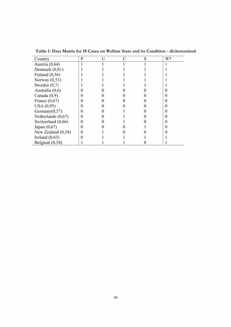
48
Table 1: Data Matrix for 18 Cases on Welfare State and its Condition - dichotomized
Country P U C S W*
Austria (0,64) 1 1 1 1 1
Denmark (0,81) 1 1 1 1 1
Finland (0,56) 1 1 1 1 1
Norway (0,53) 1 1 1 1 1
Sweden (0,7) 1 1 1 1 1
Australia (0,6) 0 0 0 0 0
Canada (0,9) 0 0 0 0 0
France (0,67) 0 0 0 0 0
USA (0,95) 0 0 0 0 0
Germany(0,57) 0 0 1 0 0
Netherlands (0,67) 0 0 1 0 0
Switzerland (0,66) 0 0 1 0 0
Japan (0,67) 0 0 0 1 0
New Zealand (0,54) 0 1 0 0 0
Ireland (0,63) 0 1 1 1 1
Belgium (0,54) 1 1 1 0 1

49
Table 2: Truth Table Generous Welfare State and Four Conditions
Condition Outcome
row P U C S W* n
1 1 1 1 1 1 5
2 0 1 1 1 1 1
3 1 1 1 0 1 1
4 0 0 0 0 0 4
5 0 0 1 0 0 3
6 0 0 0 1 0 1
7 0 1 0 0 0 1
8 0 0 1 1 - 0
9 0 1 0 1 - 0
10 0 1 1 0 - 0
11 1 0 0 0 - 0
12 1 0 0 1 - 0
13 1 0 1 0 - 0
14 1 0 1 1 - 0
15 1 1 0 0 - 0
16 1 1 0 1 - 0

50
Table 3: Fuzzy Data on Welfare State
Country P U C S W
Australia 0.25 0.4 0.17 0.25 0.26
Austria 0.7 0.64 0.83 0.67 0.72
Belgium 0.54 0.84 0.83 0.29 0.79
Canada 0 0.06 0.05 0.1 0.26
Denmark 0.85 0.81 0.83 0.86 0.86
Finland 0.56 0.86 0.83 0.72 0.76
France 0.12 0.1 0.33 0.31 0.57
Germany 0.43 0.2 0.67 0.3 0.68
Ireland 0.11 0.63 0.67 0.84 0.67
Italy 0.1 0.39 0.5 0.55 0.64
Japan 0 0.04 0.33 0.95 0.52
Netherlands 0.33 0.17 0.83 0.27 0.69
New Zealand 0.4 0.54 0.17 0.15 0.56
Norway 0.95 0.53 0.83 0.95 0.95
Sweden 0.98 1 0.95 0.7 0.98
Switzerland 0.34 0.13 0.67 0.1 0.53
UK 0.61 0.34 0.5 0.15 0.63
USA 0 0.04 0.05 0.05 0.09
Source: Ragin 2000

51
Table 4: Consistency and Coverage Solution for W – no simplifying assumptions
Raw
coverage
Unique
coverage
consistency
Without simplifying
assumptions P*U*C+ 0.49 0.07 1
U*C*S 0.53 0.1 1
solution coverage: 0.59
solution
consistency:
1
With simplifying
assumptions
U*C
0.62
0.62
0.98
solution coverage:
0.62
solution
consistency:
0.98

52
Table 5: Fuzzy Set Membership Scores in Causal Conjunctions and the Outcome
Conjunctions Outcome
Country PUC UCS W
AUS 0.17 0.17 0.26
AUT 0.64 0.64 0.72
BEL 0.54 0.29 0.79
CAN 0 0.05 0.26
DAN 0.81 0.81 0.86
FIN 0.56 0.72 0.76
FRA 0.1 0.1 0.57
GER 0.2 0.2 0.68
IRL 0.11 0.63 0.67
ITA 0.1 0.39 0.64
JAP 0 0.04 0.52
NET 0.17 0.17 0.69
NZ 0.17 0.15 0.56
NOR 0.53 0.53 0.95
SWE 0.95 0.7 0.98
CH 0.13 0.1 0.53
UK 0.34 0.15 0.63
USA 0 0.04 0.09
consistency 1 1
Raw Coverage .49 .53
Unique coverage .07 .1
Solution coverage
PUC+UCS
0.59

53
Table 6: Seven types of presentational forms – strengths, weaknesses, and false friends
Presentational Form Strength
a – b - c*
False friends/ problems High
N
Many
conditions
Software
Truth table
a - Data matrix
- Set relations not covariations
x Fs/QCA
Tosmana
Solution formula
a, c
- Regression equation x x Fs/QCA
Tosmana
Parameters of fit
c - R2, beta coefficients,
significance levels
- Disputable status of
inconsistently
sufficient/necessary
conditions
x x Fs/QCA
x-y plots
b, c
- scatterplot x Excel
Venn diagrams
b, c
- concept fairly unknown x Tosmana
Tables
b
- factor analysis
Excel
Dendograms
A, b
- decision tree x
* a) relation between variables; b) accounting for cases; c) assess fit with data

54
Figure 1: Venn Diagram – 3 Conditions
A B
B

55
Figure 2: Venn Diagram (Berg-Schlosser/ De Meur)

56
Figure 3: Pseudo Venn Diagram
(not P, not U, not C, not S) = (p, u, c, s) = (0, 0, 0, 0); (P, U, C, S) = (1, 1, 1, 1)
Not P
Not U
not P, no t U, not C, not S
not P, U. not C, S
not P, no t U. C, not S not P, not U. C, S
Not P
U
not P, U, not C, not S
not P, not U. not C, S
not P, U. C, not S not P, U. C, S
not P, not U. C, S
P, U. C, S
P, no t U, not C, not S
P, U, not C, not S
P, not U. not C, S
P, U. not C, S
P, no t U. C, not S
P, U. C, not S
P
Not U
P
U
C
Not S
C
S
Not C
Not S
Not C
S
AUS CAN FRA
USA
JAP
AUT DK FIN NOR
SWE
GER NET
CH
IRE
BEL
DDiagram

57
Figure 4: Conditions for Generous Welfare State in Dendogram Form
P
not S S
not P P not P
C C C C not C not C
0 0
not U
1 1 1
U
IRE
BEL
U U
AUT DK FIN
NOR
SWE
0
GER NET CH
not U not U
JAP AUS CAN FRA USA

58
Figure 5: x-y Plot
Coverage and Consistency for Sufficienct Conditions
0
0.1
0.2
0.3
0.4
0.5
0.6
0.7
0.8
0.9
1
0 0.1 0.2 0.3 0.4 0.5 0.6 0.7 0.8 0.9 1
sufficient condition
ou
tco
me
CONSISTENCY
increases decreases
COVERAGE
decreases increases

59
Figure 6: x-y Plot PUC
USA
UK
CH
SWE
NOR
NZ
NET
JAP
ITA
IRLGER
FRA
FIN
DAN
CAN
BEL
AUT
AUS
0
0.1
0.2
0.3
0.4
0.5
0.6
0.7
0.8
0.9
1
0 0.1 0.2 0.3 0.4 0.5 0.6 0.7 0.8 0.9 1
PUC
W
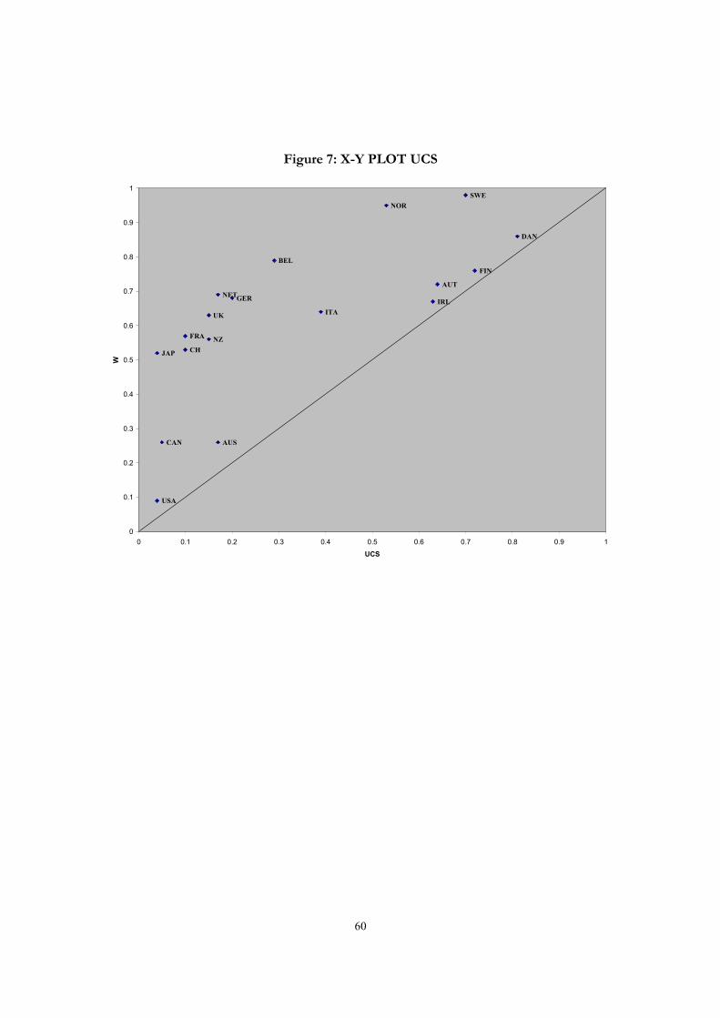
60
Figure 7: X-Y PLOT UCS
AUS
AUT
BEL
CAN
DAN
FIN
FRA
GERIRL
ITA
JAP
NET
NZ
NOR
SWE
CH
UK
USA
0
0.1
0.2
0.3
0.4
0.5
0.6
0.7
0.8
0.9
1
0 0.1 0.2 0.3 0.4 0.5 0.6 0.7 0.8 0.9 1
UCS
W
61
Figure 8: X-Y PLOT PUC+UCS
AUS
AUT
BEL
CAN
DAN
FIN
FRA
GERIRL
ITA
JAP
NET
NZ
NOR
SWE
CH
UK
USA
0
0.1
0.2
0.3
0.4
0.5
0.6
0.7
0.8
0.9
1
0 0.1 0.2 0.3 0.4 0.5 0.6 0.7 0.8 0.9 1
PUC+UCS
W