Embed Size (px)
Citation preview

JavaFX Documentation Project
Published 2018-06-28


Table of Contents
1. Introduction . . . . . . . . . . . . . . . . . . . . . . . . . . . . . . . . . . . . . . . . . . . . . . . . . . . . . . . . . . . . . . . . . . . . . . . . . . . . . 1
1.1. Contributors . . . . . . . . . . . . . . . . . . . . . . . . . . . . . . . . . . . . . . . . . . . . . . . . . . . . . . . . . . . . . . . . . . . . . . . . . 1
1.2. Contributing. . . . . . . . . . . . . . . . . . . . . . . . . . . . . . . . . . . . . . . . . . . . . . . . . . . . . . . . . . . . . . . . . . . . . . . . . 1
1.3. License. . . . . . . . . . . . . . . . . . . . . . . . . . . . . . . . . . . . . . . . . . . . . . . . . . . . . . . . . . . . . . . . . . . . . . . . . . . . . 1
2. Scene Graph . . . . . . . . . . . . . . . . . . . . . . . . . . . . . . . . . . . . . . . . . . . . . . . . . . . . . . . . . . . . . . . . . . . . . . . . . . . . . 3
2.1. Overview . . . . . . . . . . . . . . . . . . . . . . . . . . . . . . . . . . . . . . . . . . . . . . . . . . . . . . . . . . . . . . . . . . . . . . . . . . . 3
2.2. Transformations . . . . . . . . . . . . . . . . . . . . . . . . . . . . . . . . . . . . . . . . . . . . . . . . . . . . . . . . . . . . . . . . . . . . . . 5
2.3. Event Handling . . . . . . . . . . . . . . . . . . . . . . . . . . . . . . . . . . . . . . . . . . . . . . . . . . . . . . . . . . . . . . . . . . . . . . 9
2.4. Timing . . . . . . . . . . . . . . . . . . . . . . . . . . . . . . . . . . . . . . . . . . . . . . . . . . . . . . . . . . . . . . . . . . . . . . . . . . . . 10
3. UI Controls. . . . . . . . . . . . . . . . . . . . . . . . . . . . . . . . . . . . . . . . . . . . . . . . . . . . . . . . . . . . . . . . . . . . . . . . . . . . . 13
3.1. ChoiceBox . . . . . . . . . . . . . . . . . . . . . . . . . . . . . . . . . . . . . . . . . . . . . . . . . . . . . . . . . . . . . . . . . . . . . . . . . 13
3.2. ComboBox. . . . . . . . . . . . . . . . . . . . . . . . . . . . . . . . . . . . . . . . . . . . . . . . . . . . . . . . . . . . . . . . . . . . . . . . . 17
3.3. ListView . . . . . . . . . . . . . . . . . . . . . . . . . . . . . . . . . . . . . . . . . . . . . . . . . . . . . . . . . . . . . . . . . . . . . . . . . . 21
3.4. TableView . . . . . . . . . . . . . . . . . . . . . . . . . . . . . . . . . . . . . . . . . . . . . . . . . . . . . . . . . . . . . . . . . . . . . . . . . 28
3.5. ImageView. . . . . . . . . . . . . . . . . . . . . . . . . . . . . . . . . . . . . . . . . . . . . . . . . . . . . . . . . . . . . . . . . . . . . . . . . 33
3.6. LineChart . . . . . . . . . . . . . . . . . . . . . . . . . . . . . . . . . . . . . . . . . . . . . . . . . . . . . . . . . . . . . . . . . . . . . . . . . . 36
3.7. Pagination . . . . . . . . . . . . . . . . . . . . . . . . . . . . . . . . . . . . . . . . . . . . . . . . . . . . . . . . . . . . . . . . . . . . . . . . . 38
4. Layout . . . . . . . . . . . . . . . . . . . . . . . . . . . . . . . . . . . . . . . . . . . . . . . . . . . . . . . . . . . . . . . . . . . . . . . . . . . . . . . . 41
4.1. VBox and HBox . . . . . . . . . . . . . . . . . . . . . . . . . . . . . . . . . . . . . . . . . . . . . . . . . . . . . . . . . . . . . . . . . . . . 41
4.2. Absolute Positioning with Pane. . . . . . . . . . . . . . . . . . . . . . . . . . . . . . . . . . . . . . . . . . . . . . . . . . . . . . . . . 48
4.3. Clipping . . . . . . . . . . . . . . . . . . . . . . . . . . . . . . . . . . . . . . . . . . . . . . . . . . . . . . . . . . . . . . . . . . . . . . . . . . . 54
4.4. GridPane . . . . . . . . . . . . . . . . . . . . . . . . . . . . . . . . . . . . . . . . . . . . . . . . . . . . . . . . . . . . . . . . . . . . . . . . . . 58
4.5. GridPane Spanning . . . . . . . . . . . . . . . . . . . . . . . . . . . . . . . . . . . . . . . . . . . . . . . . . . . . . . . . . . . . . . . . . . 62
4.6. GridPane ColumnConstraints and RowConstraints . . . . . . . . . . . . . . . . . . . . . . . . . . . . . . . . . . . . . . . . . 67
4.7. AnchorPane . . . . . . . . . . . . . . . . . . . . . . . . . . . . . . . . . . . . . . . . . . . . . . . . . . . . . . . . . . . . . . . . . . . . . . . . 76
4.8. TilePane . . . . . . . . . . . . . . . . . . . . . . . . . . . . . . . . . . . . . . . . . . . . . . . . . . . . . . . . . . . . . . . . . . . . . . . . . . . 81
4.9. TitledPane . . . . . . . . . . . . . . . . . . . . . . . . . . . . . . . . . . . . . . . . . . . . . . . . . . . . . . . . . . . . . . . . . . . . . . . . . 88
5. CSS. . . . . . . . . . . . . . . . . . . . . . . . . . . . . . . . . . . . . . . . . . . . . . . . . . . . . . . . . . . . . . . . . . . . . . . . . . . . . . . . . . . 93
6. Performance . . . . . . . . . . . . . . . . . . . . . . . . . . . . . . . . . . . . . . . . . . . . . . . . . . . . . . . . . . . . . . . . . . . . . . . . . . . . 95
7. Application Structure . . . . . . . . . . . . . . . . . . . . . . . . . . . . . . . . . . . . . . . . . . . . . . . . . . . . . . . . . . . . . . . . . . . . . 97
7.1. The MVVM Pattern. . . . . . . . . . . . . . . . . . . . . . . . . . . . . . . . . . . . . . . . . . . . . . . . . . . . . . . . . . . . . . . . . . 97
7.2. Model Change with MVVM . . . . . . . . . . . . . . . . . . . . . . . . . . . . . . . . . . . . . . . . . . . . . . . . . . . . . . . . . . 105
7.3. The Dialog Class . . . . . . . . . . . . . . . . . . . . . . . . . . . . . . . . . . . . . . . . . . . . . . . . . . . . . . . . . . . . . . . . . . . 118
8. Best Practices . . . . . . . . . . . . . . . . . . . . . . . . . . . . . . . . . . . . . . . . . . . . . . . . . . . . . . . . . . . . . . . . . . . . . . . . . . 125
8.1. Styleable Properties . . . . . . . . . . . . . . . . . . . . . . . . . . . . . . . . . . . . . . . . . . . . . . . . . . . . . . . . . . . . . . . . . 125
8.2. Tasks . . . . . . . . . . . . . . . . . . . . . . . . . . . . . . . . . . . . . . . . . . . . . . . . . . . . . . . . . . . . . . . . . . . . . . . . . . . . 127
8.3. Avoid Nulls in ComboBoxes . . . . . . . . . . . . . . . . . . . . . . . . . . . . . . . . . . . . . . . . . . . . . . . . . . . . . . . . . . 134
8.4. Writing Javadoc for JavaFX Properties . . . . . . . . . . . . . . . . . . . . . . . . . . . . . . . . . . . . . . . . . . . . . . . . . . 140
8.5. Ignoring Warnings for Null Select Binding Expressions . . . . . . . . . . . . . . . . . . . . . . . . . . . . . . . . . . . . 141
8.6. POJO Binding . . . . . . . . . . . . . . . . . . . . . . . . . . . . . . . . . . . . . . . . . . . . . . . . . . . . . . . . . . . . . . . . . . . . . 142

Chapter 1. Introduction
The JavaFX Documentation Project aims to pull together useful information for JavaFX developers from all overthe web. The project is open source [http://www.github.com/FXDocs/docs] and encourages community participationto ensure that the documentation is as highly polished and useful as possible.
1.1. Contributors
This project was initiated by Jonathan Giles [http://jonathangiles.net], but anyone can contribute. Any questions,concerns, or feedback should be in the first instance be directed to Jonathan via email[mailto:[email protected]].
This project would not be possible without the contributors who work hard on the content contained within thisdocumentation. The authors of this document are:
• Abhinay Agarwal
• Almas Baimagambetov [https://almasb.github.io/]
• Carl Walker [http://bekwam.blogspot.com/]
• Christoph Nahr [http://kynosarges.org/]
• Jonathan Giles [http://jonathangiles.net]
• Gerrit Grunwald [https://harmoniccode.blogspot.com/]
1.2. Contributing
Contributing to this project is easy - fork the GitHub [http://www.github.com/FXDocs/docs] repo, edit the relevantfiles, and create a pull request! Once merged, your content will form a part of the documentation and you’ll havethe unending appreciation of the entire community!
The JavaFX Documentation Project uses AsciiDoc as the syntax of choice for writing the documentation. TheAsciiDoc Syntax Quick Reference [http://asciidoctor.org/docs/asciidoc-syntax-quick-reference/] guide is a great resourcefor those learning how to write AsciiDoc.
Authors are encouraged to add their name to the contributors list in the previous section.
1.3. License
This work is licensed under a Creative Commons Attribution-NonCommercial-NoDerivatives 4.0 InternationalLicense [http://creativecommons.org/licenses/by-nc-nd/4.0/].
1

2
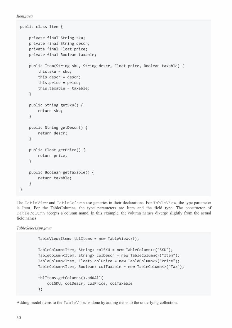
Chapter 2. Scene Graph
2.1. Overview
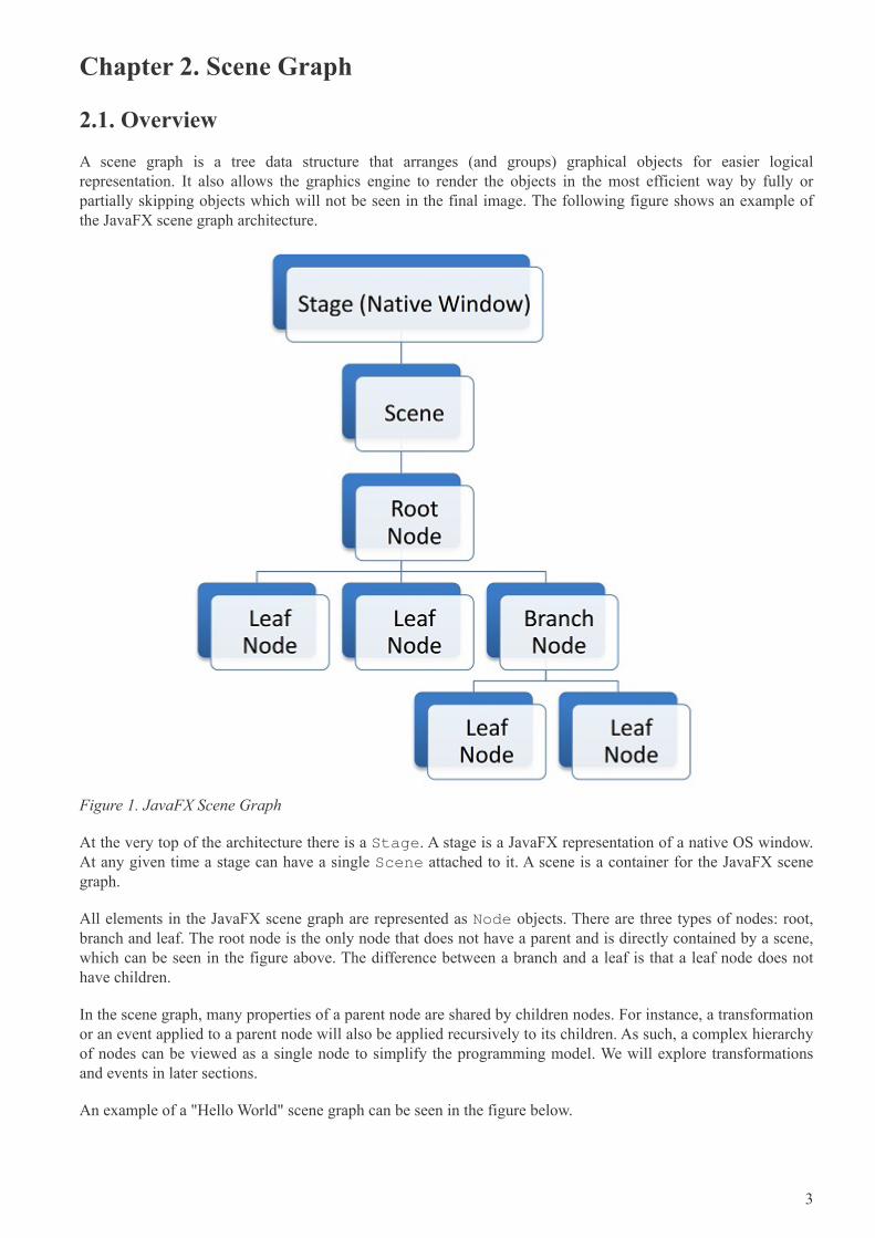
A scene graph is a tree data structure that arranges (and groups) graphical objects for easier logicalrepresentation. It also allows the graphics engine to render the objects in the most efficient way by fully orpartially skipping objects which will not be seen in the final image. The following figure shows an example ofthe JavaFX scene graph architecture.
Figure 1. JavaFX Scene Graph
At the very top of the architecture there is a Stage. A stage is a JavaFX representation of a native OS window.At any given time a stage can have a single Scene attached to it. A scene is a container for the JavaFX scenegraph.
All elements in the JavaFX scene graph are represented as Node objects. There are three types of nodes: root,branch and leaf. The root node is the only node that does not have a parent and is directly contained by a scene,which can be seen in the figure above. The difference between a branch and a leaf is that a leaf node does nothave children.
In the scene graph, many properties of a parent node are shared by children nodes. For instance, a transformationor an event applied to a parent node will also be applied recursively to its children. As such, a complex hierarchyof nodes can be viewed as a single node to simplify the programming model. We will explore transformationsand events in later sections.
An example of a "Hello World" scene graph can be seen in the figure below.
3
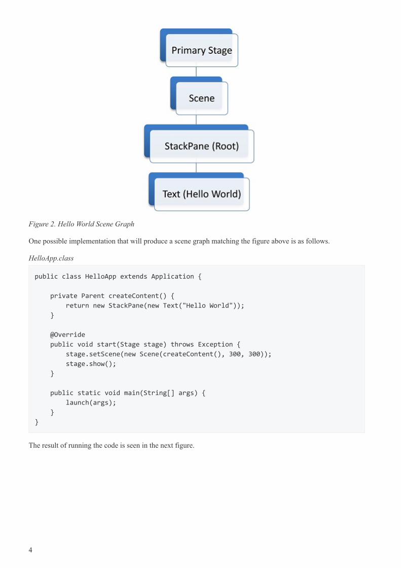
Figure 2. Hello World Scene Graph
One possible implementation that will produce a scene graph matching the figure above is as follows.
HelloApp.class
public class HelloApp extends Application {
private Parent createContent() {
return new StackPane(new Text("Hello World"));
}
@Override
public void start(Stage stage) throws Exception {
stage.setScene(new Scene(createContent(), 300, 300));
stage.show();
}
public static void main(String[] args) {
launch(args);
}
}
The result of running the code is seen in the next figure.
4
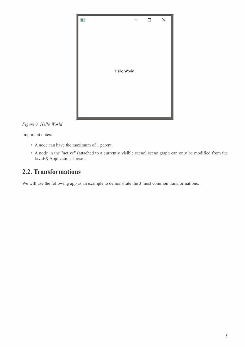
Figure 3. Hello World
Important notes:
• A node can have the maximum of 1 parent.
• A node in the "active" (attached to a currently visible scene) scene graph can only be modified from theJavaFX Application Thread.
2.2. Transformations
We will use the following app as an example to demonstrate the 3 most common transformations.
5
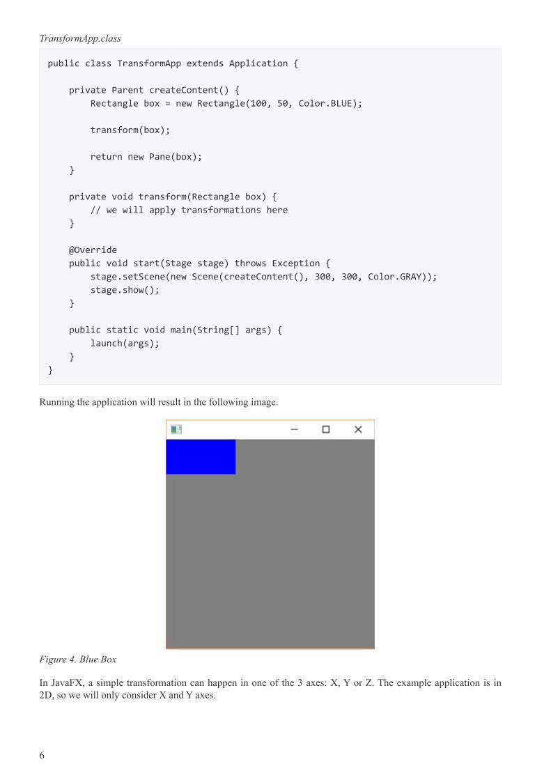
TransformApp.class
public class TransformApp extends Application {
private Parent createContent() {
Rectangle box = new Rectangle(100, 50, Color.BLUE);
transform(box);
return new Pane(box);
}
private void transform(Rectangle box) {
// we will apply transformations here
}
@Override
public void start(Stage stage) throws Exception {
stage.setScene(new Scene(createContent(), 300, 300, Color.GRAY));
stage.show();
}
public static void main(String[] args) {
launch(args);
}
}
Running the application will result in the following image.
Figure 4. Blue Box
In JavaFX, a simple transformation can happen in one of the 3 axes: X, Y or Z. The example application is in2D, so we will only consider X and Y axes.
6
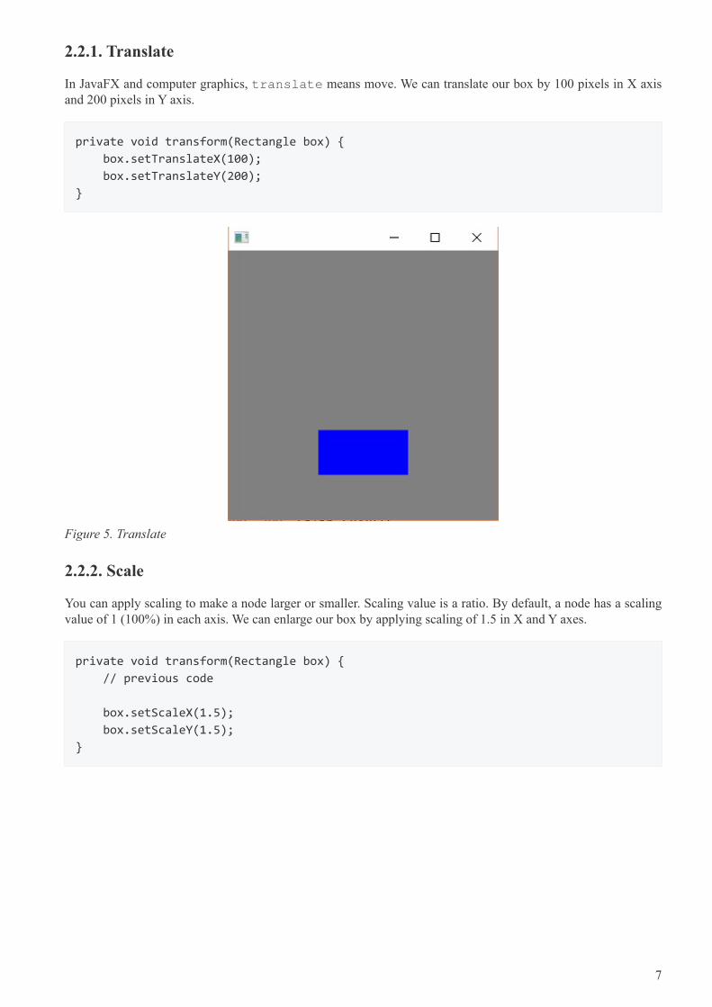
2.2.1. Translate
In JavaFX and computer graphics, translate means move. We can translate our box by 100 pixels in X axisand 200 pixels in Y axis.
private void transform(Rectangle box) {
box.setTranslateX(100);
box.setTranslateY(200);
}
Figure 5. Translate
2.2.2. Scale
You can apply scaling to make a node larger or smaller. Scaling value is a ratio. By default, a node has a scalingvalue of 1 (100%) in each axis. We can enlarge our box by applying scaling of 1.5 in X and Y axes.
private void transform(Rectangle box) {
// previous code
box.setScaleX(1.5);
box.setScaleY(1.5);
}
7
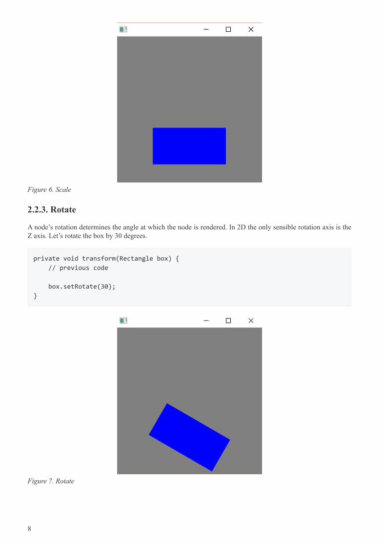
Figure 6. Scale
2.2.3. Rotate
A node’s rotation determines the angle at which the node is rendered. In 2D the only sensible rotation axis is theZ axis. Let’s rotate the box by 30 degrees.
private void transform(Rectangle box) {
// previous code
box.setRotate(30);
}
Figure 7. Rotate
8
2.3. Event Handling
An event notifies that something important has taken place. Events are typically the "primitive" of an eventsystem (aka event bus). Generally, an event system has the following 3 responsibilities:
• fire (trigger) an event,
• notify listeners (interested parties) about the event and
• handle (process) the event.
The event notification mechanism is done by the JavaFX platform automatically. Hence, we will only considerhow to fire events, listen for events and how to handle them.
First, let’s create a custom event.
public class UserEvent extends Event {
public static final EventType<UserEvent> ANY = new EventType<>(Event.ANY,
"ANY");
public static final EventType<UserEvent> LOGIN_SUCCEEDED = new EventType<>(ANY,
"LOGIN_SUCCEEDED");
public static final EventType<UserEvent> LOGIN_FAILED = new EventType<>(ANY,
"LOGIN_FAILED");
public UserEvent(EventType<? extends Event> eventType) {
super(eventType);
}
// any other fields of importance, e.g. data, timestamp
}
Since event types are fixed, they are usually created within the same source file as the event. We can see thatthere are 2 specific types of events: LOGIN_SUCCEEDED and LOGIN_FAILED. We can listen for such specifictypes of events:
Node node = ...
node.addEventHandler(UserEvent.LOGIN_SUCCEEDED, event -> {
// handle event
});
Alternatively, we can handle any UserEvent:
Node node = ...
node.addEventHandler(UserEvent.ANY, event -> {
// handle event
});
Finally, we are able to contruct and fire our own events:
9
UserEvent event = new UserEvent(UserEvent.LOGIN_SUCCEEDED);
Node node = ...
node.fireEvent(event);
For example, LOGIN_SUCCEEDED or LOGIN_FAILED could be fired when a user attempts to log in to an app.Depending on the login result we can allow the user access the app or lock him out of the app. Whilst the samefunctionality can be achieved with a simple if statement, there is one significant advantage of an event system.Event systems were designed to enable communication between various modules (sub-systems) in an applicationwithout tightly coupling them. As such, a sound might be played by an audio system when the user logs in. Thus,maintaining all audio related code in its own module. However, we will not delve deeper into architectural styles.
2.3.1. Input Events
Key and mouse events are the most common types of events used in JavaFX. Each Node provides so-called"convenience methods" for handling these events. For instance, we can run some code when a button is pressed:
Button button = ...
button.setOnAction(event -> {
// button was pressed
});
For more flexibility we can also use the following:
Button button = ...
button.setOnMouseEntered(e -> ...);
button.setOnMouseExited(e -> ...);
button.setOnMousePressed(e -> ...);
button.setOnMouseReleased(e -> ...);
The object e above is of type MouseEvent and can be queried to obtain various information about the event,e.g. x and y positions, number of clicks, etc. Finally, we can do the same with keys:
Button button = ...
button.setOnKeyPressed(e -> ...);
button.setOnKeyReleased(e -> ...);
The object e here is of type KeyEvent and it carries information about the key code, which can then bemapped to a real physical key on the keyboard.
2.4. Timing
It is important to understand the timing difference between the creation of JavaFX UI controls and the display ofthe controls. When creating the UI controls — either through direct API object creation or throughFXML — you may be missing certain screen geometry values such as the dimensions of a window. That isavailable later, at the instant when the screen is shown to the user. That showing event, called OnShown, is thetime at which a window has been allocated and the final layout computations completed.
To demonstrate this, consider the following program which displays the screen dimensions while the UI controlsare being created and the screen dimensions when the screen is shown. The following screenshot shows therunning of the program. When the UI controls are being created (new VBox(), new Scene(),
10
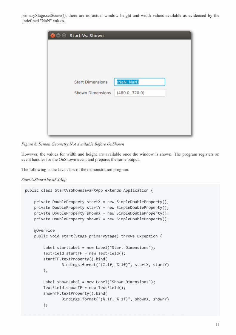
primaryStage.setScene()), there are no actual window height and width values available as evidenced by theundefined "NaN" values.
Figure 8. Screen Geometry Not Available Before OnShown
However, the values for width and height are available once the window is shown. The program registers anevent handler for the OnShown event and prepares the same output.
The following is the Java class of the demonstration program.
StartVsShownJavaFXApp
public class StartVsShownJavaFXApp extends Application {
private DoubleProperty startX = new SimpleDoubleProperty();
private DoubleProperty startY = new SimpleDoubleProperty();
private DoubleProperty shownX = new SimpleDoubleProperty();
private DoubleProperty shownY = new SimpleDoubleProperty();
@Override
public void start(Stage primaryStage) throws Exception {
Label startLabel = new Label("Start Dimensions");
TextField startTF = new TextField();
startTF.textProperty().bind(
Bindings.format("(%.1f, %.1f)", startX, startY)
);
Label shownLabel = new Label("Shown Dimensions");
TextField shownTF = new TextField();
shownTF.textProperty().bind(
Bindings.format("(%.1f, %.1f)", shownX, shownY)
);
11
GridPane gp = new GridPane();
gp.add( startLabel, 0, 0 );
gp.add( startTF, 1, 0 );
gp.add( shownLabel, 0, 1 );
gp.add( shownTF, 1, 1 );
gp.setHgap(10);
gp.setVgap(10);
HBox hbox = new HBox(gp);
hbox.setAlignment(CENTER);
VBox vbox = new VBox(hbox);
vbox.setAlignment(CENTER);
Scene scene = new Scene( vbox, 480, 320 );
primaryStage.setScene( scene );
// before show()...I just set this to 480x320, right?
startX.set( primaryStage.getWidth() );
startY.set( primaryStage.getHeight() );
primaryStage.setOnShown( (evt) -> {
shownX.set( primaryStage.getWidth() );
shownY.set( primaryStage.getHeight() ); // all available now
});
primaryStage.setTitle("Start Vs. Shown");
primaryStage.show();
}
public static void main(String[] args) {
launch(args);
}
}
Sometimes, you’ll know the screen dimensions in advance and can use those values at any point in the JavaFXprogram. This includes before the OnShown event. However, if your initialization sequence contains logic thatneeds these values, you’ll need to work with the OnShown event. A use case might be working with the lastsaved dimensions or dimensions based on program input.
12
Chapter 3. UI Controls
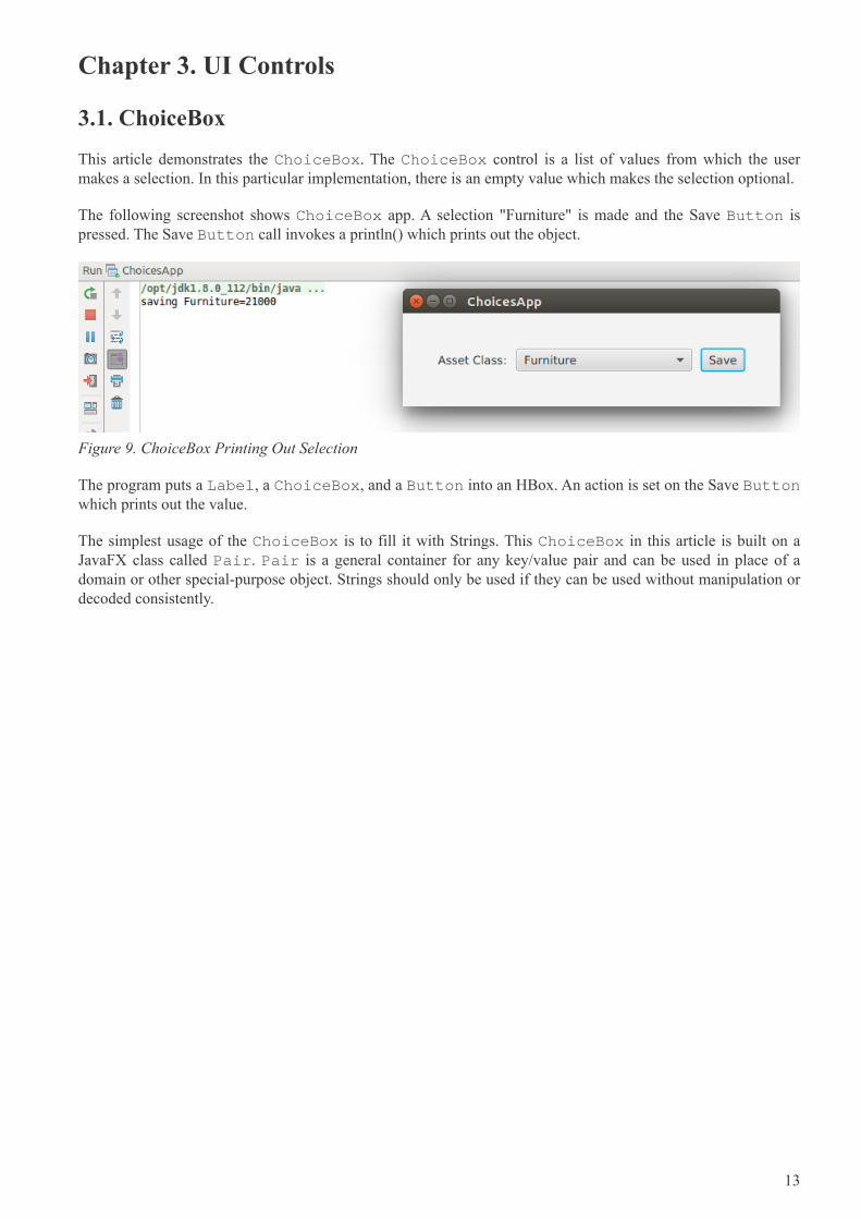
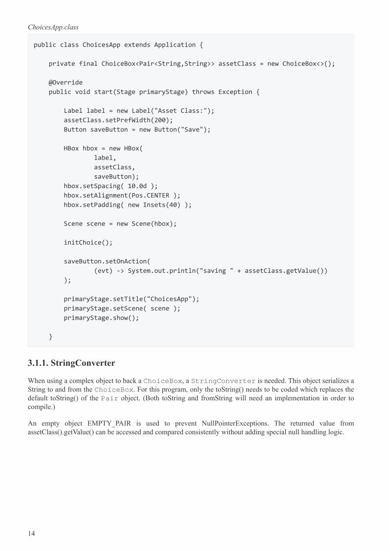
3.1. ChoiceBox
This article demonstrates the ChoiceBox. The ChoiceBox control is a list of values from which the usermakes a selection. In this particular implementation, there is an empty value which makes the selection optional.
The following screenshot shows ChoiceBox app. A selection "Furniture" is made and the Save Button ispressed. The Save Button call invokes a println() which prints out the object.
Figure 9. ChoiceBox Printing Out Selection
The program puts a Label, a ChoiceBox, and a Button into an HBox. An action is set on the Save Buttonwhich prints out the value.
The simplest usage of the ChoiceBox is to fill it with Strings. This ChoiceBox in this article is built on aJavaFX class called Pair. Pair is a general container for any key/value pair and can be used in place of adomain or other special-purpose object. Strings should only be used if they can be used without manipulation ordecoded consistently.
13
ChoicesApp.class
public class ChoicesApp extends Application {
private final ChoiceBox<Pair<String,String>> assetClass = new ChoiceBox<>();
@Override
public void start(Stage primaryStage) throws Exception {
Label label = new Label("Asset Class:");
assetClass.setPrefWidth(200);
Button saveButton = new Button("Save");
HBox hbox = new HBox(
label,
assetClass,
saveButton);
hbox.setSpacing( 10.0d );
hbox.setAlignment(Pos.CENTER );
hbox.setPadding( new Insets(40) );
Scene scene = new Scene(hbox);
initChoice();
saveButton.setOnAction(
(evt) -> System.out.println("saving " + assetClass.getValue())
);
primaryStage.setTitle("ChoicesApp");
primaryStage.setScene( scene );
primaryStage.show();
}
3.1.1. StringConverter
When using a complex object to back a ChoiceBox, a StringConverter is needed. This object serializes aString to and from the ChoiceBox. For this program, only the toString() needs to be coded which replaces thedefault toString() of the Pair object. (Both toString and fromString will need an implementation in order tocompile.)
An empty object EMPTY_PAIR is used to prevent NullPointerExceptions. The returned value fromassetClass().getValue() can be accessed and compared consistently without adding special null handling logic.
14
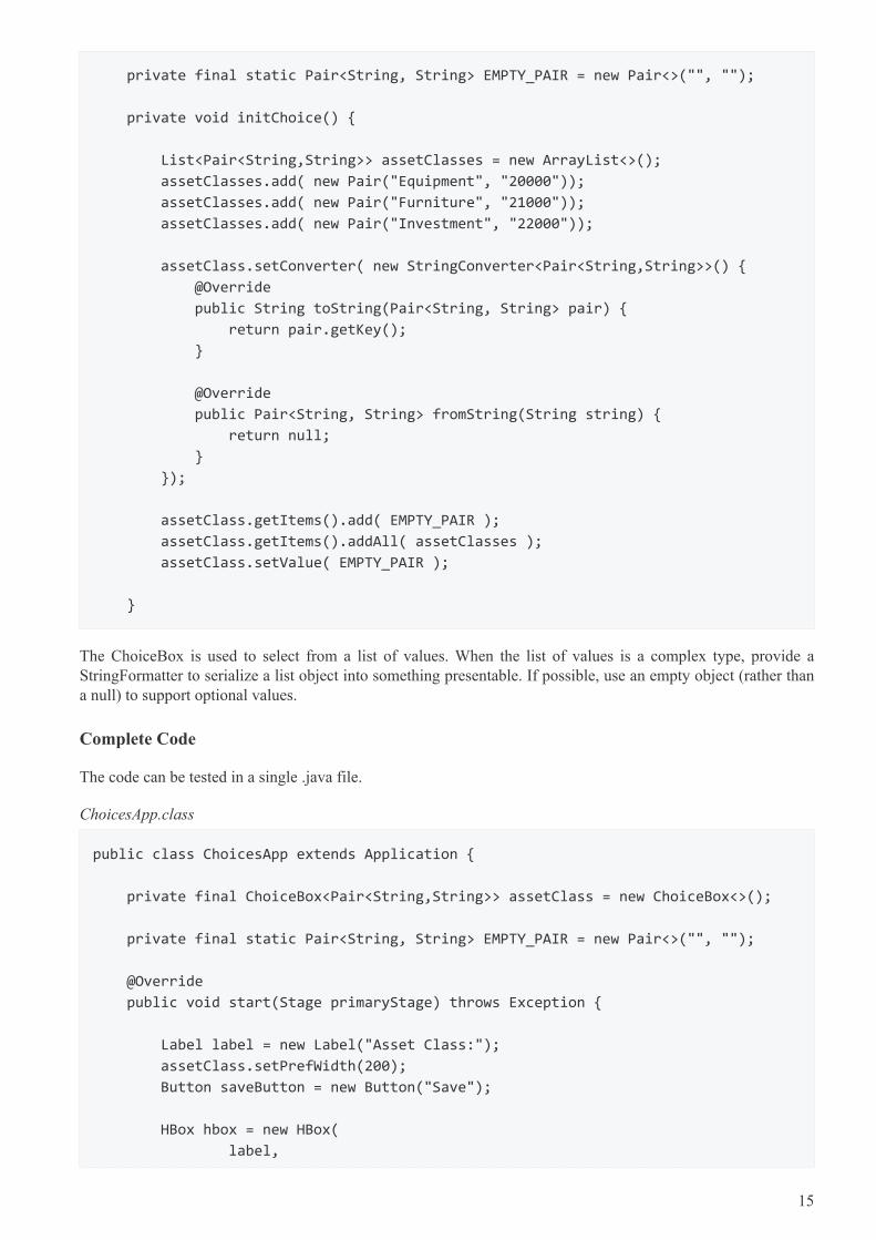
private final static Pair<String, String> EMPTY_PAIR = new Pair<>("", "");
private void initChoice() {
List<Pair<String,String>> assetClasses = new ArrayList<>();
assetClasses.add( new Pair("Equipment", "20000"));
assetClasses.add( new Pair("Furniture", "21000"));
assetClasses.add( new Pair("Investment", "22000"));
assetClass.setConverter( new StringConverter<Pair<String,String>>() {
@Override
public String toString(Pair<String, String> pair) {
return pair.getKey();
}
@Override
public Pair<String, String> fromString(String string) {
return null;
}
});
assetClass.getItems().add( EMPTY_PAIR );
assetClass.getItems().addAll( assetClasses );
assetClass.setValue( EMPTY_PAIR );
}
The ChoiceBox is used to select from a list of values. When the list of values is a complex type, provide aStringFormatter to serialize a list object into something presentable. If possible, use an empty object (rather thana null) to support optional values.
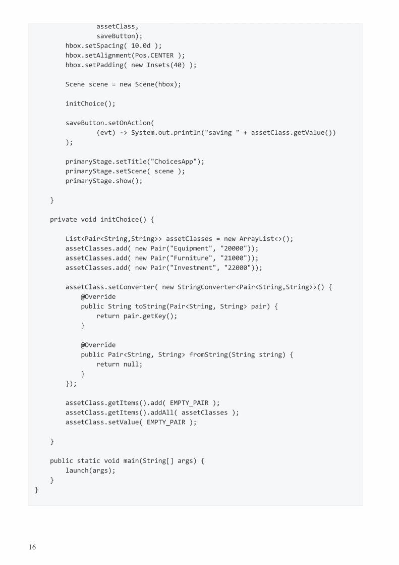
Complete Code
The code can be tested in a single .java file.
ChoicesApp.class
public class ChoicesApp extends Application {
private final ChoiceBox<Pair<String,String>> assetClass = new ChoiceBox<>();
private final static Pair<String, String> EMPTY_PAIR = new Pair<>("", "");
@Override
public void start(Stage primaryStage) throws Exception {
Label label = new Label("Asset Class:");
assetClass.setPrefWidth(200);
Button saveButton = new Button("Save");
HBox hbox = new HBox(
label,
15
assetClass,
saveButton);
hbox.setSpacing( 10.0d );
hbox.setAlignment(Pos.CENTER );
hbox.setPadding( new Insets(40) );
Scene scene = new Scene(hbox);
initChoice();
saveButton.setOnAction(
(evt) -> System.out.println("saving " + assetClass.getValue())
);
primaryStage.setTitle("ChoicesApp");
primaryStage.setScene( scene );
primaryStage.show();
}
private void initChoice() {
List<Pair<String,String>> assetClasses = new ArrayList<>();
assetClasses.add( new Pair("Equipment", "20000"));
assetClasses.add( new Pair("Furniture", "21000"));
assetClasses.add( new Pair("Investment", "22000"));
assetClass.setConverter( new StringConverter<Pair<String,String>>() {
@Override
public String toString(Pair<String, String> pair) {
return pair.getKey();
}
@Override
public Pair<String, String> fromString(String string) {
return null;
}
});
assetClass.getItems().add( EMPTY_PAIR );
assetClass.getItems().addAll( assetClasses );
assetClass.setValue( EMPTY_PAIR );
}
public static void main(String[] args) {
launch(args);
}
}
16
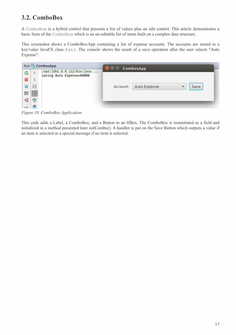
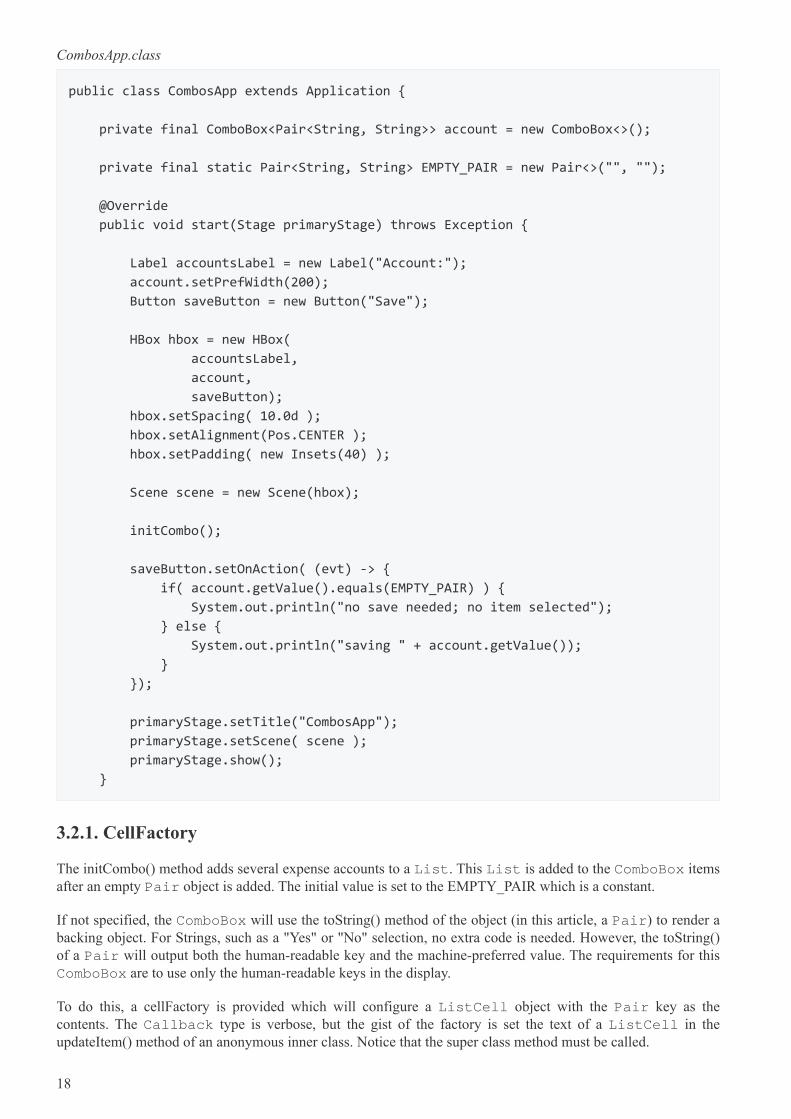
3.2. ComboBox
A ComboBox is a hybrid control that presents a list of values plus an edit control. This article demonstrates abasic form of the ComboBox which is an un-editable list of items built on a complex data structure.
This screenshot shows a ComboBoxApp containing a list of expense accounts. The accounts are stored in akey/value JavaFX class Pair. The console shows the result of a save operation after the user selects "AutoExpense".
Figure 10. ComboBox Application
This code adds a Label, a ComboBox, and a Button to an HBox. The ComboBox is instantiated as a field andinitialized in a method presented later initCombo(). A handler is put on the Save Button which outputs a value ifan item is selected or a special message if no item is selected.
17
CombosApp.class
public class CombosApp extends Application {
private final ComboBox<Pair<String, String>> account = new ComboBox<>();
private final static Pair<String, String> EMPTY_PAIR = new Pair<>("", "");
@Override
public void start(Stage primaryStage) throws Exception {
Label accountsLabel = new Label("Account:");
account.setPrefWidth(200);
Button saveButton = new Button("Save");
HBox hbox = new HBox(
accountsLabel,
account,
saveButton);
hbox.setSpacing( 10.0d );
hbox.setAlignment(Pos.CENTER );
hbox.setPadding( new Insets(40) );
Scene scene = new Scene(hbox);
initCombo();
saveButton.setOnAction( (evt) -> {
if( account.getValue().equals(EMPTY_PAIR) ) {
System.out.println("no save needed; no item selected");
} else {
System.out.println("saving " + account.getValue());
}
});
primaryStage.setTitle("CombosApp");
primaryStage.setScene( scene );
primaryStage.show();
}
3.2.1. CellFactory
The initCombo() method adds several expense accounts to a List. This List is added to the ComboBox itemsafter an empty Pair object is added. The initial value is set to the EMPTY_PAIR which is a constant.
If not specified, the ComboBox will use the toString() method of the object (in this article, a Pair) to render abacking object. For Strings, such as a "Yes" or "No" selection, no extra code is needed. However, the toString()of a Pair will output both the human-readable key and the machine-preferred value. The requirements for thisComboBox are to use only the human-readable keys in the display.
To do this, a cellFactory is provided which will configure a ListCell object with the Pair key as thecontents. The Callback type is verbose, but the gist of the factory is set the text of a ListCell in theupdateItem() method of an anonymous inner class. Notice that the super class method must be called.
18
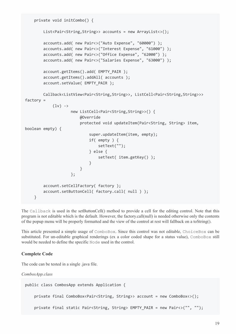
private void initCombo() {
List<Pair<String,String>> accounts = new ArrayList<>();
accounts.add( new Pair<>("Auto Expense", "60000") );
accounts.add( new Pair<>("Interest Expense", "61000") );
accounts.add( new Pair<>("Office Expense", "62000") );
accounts.add( new Pair<>("Salaries Expense", "63000") );
account.getItems().add( EMPTY_PAIR );
account.getItems().addAll( accounts );
account.setValue( EMPTY_PAIR );
Callback<ListView<Pair<String,String>>, ListCell<Pair<String,String>>>
factory =
(lv) ->
new ListCell<Pair<String,String>>() {
@Override
protected void updateItem(Pair<String, String> item,
boolean empty) {
super.updateItem(item, empty);
if( empty ) {
setText("");
} else {
setText( item.getKey() );
}
}
};
account.setCellFactory( factory );
account.setButtonCell( factory.call( null ) );
}
The Callback is used in the setButtonCell() method to provide a cell for the editing control. Note that thisprogram is not editable which is the default. However, the factory.call(null) is needed otherwise only the contentsof the popup menu will be properly formatted and the view of the control at rest will fallback on a toString().
This article presented a simple usage of ComboBox. Since this control was not editable, ChoiceBox can besubstituted. For un-editable graphical renderings (ex a color coded shape for a status value), ComboBox stillwould be needed to define the specific Node used in the control.
Complete Code
The code can be tested in a single .java file.
CombosApp.class
public class CombosApp extends Application {
private final ComboBox<Pair<String, String>> account = new ComboBox<>();
private final static Pair<String, String> EMPTY_PAIR = new Pair<>("", "");
19
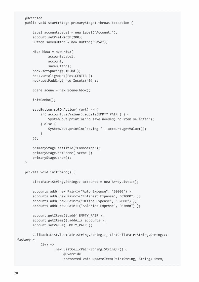
@Override
public void start(Stage primaryStage) throws Exception {
Label accountsLabel = new Label("Account:");
account.setPrefWidth(200);
Button saveButton = new Button("Save");
HBox hbox = new HBox(
accountsLabel,
account,
saveButton);
hbox.setSpacing( 10.0d );
hbox.setAlignment(Pos.CENTER );
hbox.setPadding( new Insets(40) );
Scene scene = new Scene(hbox);
initCombo();
saveButton.setOnAction( (evt) -> {
if( account.getValue().equals(EMPTY_PAIR ) ) {
System.out.println("no save needed; no item selected");
} else {
System.out.println("saving " + account.getValue());
}
});
primaryStage.setTitle("CombosApp");
primaryStage.setScene( scene );
primaryStage.show();
}
private void initCombo() {
List<Pair<String,String>> accounts = new ArrayList<>();
accounts.add( new Pair<>("Auto Expense", "60000") );
accounts.add( new Pair<>("Interest Expense", "61000") );
accounts.add( new Pair<>("Office Expense", "62000") );
accounts.add( new Pair<>("Salaries Expense", "63000") );
account.getItems().add( EMPTY_PAIR );
account.getItems().addAll( accounts );
account.setValue( EMPTY_PAIR );
Callback<ListView<Pair<String,String>>, ListCell<Pair<String,String>>>
factory =
(lv) ->
new ListCell<Pair<String,String>>() {
@Override
protected void updateItem(Pair<String, String> item,
20
boolean empty) {
super.updateItem(item, empty);
if( empty ) {
setText("");
} else {
setText( item.getKey() );
}
}
};
account.setCellFactory( factory );
account.setButtonCell( factory.call( null ) );
}
public static void main(String[] args) {
launch(args);
}
}
3.3. ListView
3.3.1. ListView Filtering in JavaFX
This article demonstrates how to filter a ListView in a JavaFX Application. Two lists are managed by theApplication. One list contains all of the items in the data model. The second list contains the items currentlybeing viewed. A scrap of comparison logic stored as a filter mediates between the two.
Binding is used heavily to keep the data structures in sync with what the user has selected.
This screenshot shows the Application which contains a top row of ToggleButtons which set the filter and aListView containing the objects.
21
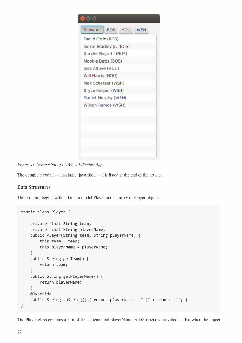
Figure 11. Screenshot of ListView Filtering App
The complete code — a single .java file — is listed at the end of the article.
Data Structures
The program begins with a domain model Player and an array of Player objects.
static class Player {
private final String team;
private final String playerName;
public Player(String team, String playerName) {
this.team = team;
this.playerName = playerName;
}
public String getTeam() {
return team;
}
public String getPlayerName() {
return playerName;
}
@Override
public String toString() { return playerName + " (" + team + ")"; }
}
The Player class contains a pair of fields, team and playerName. A toString() is provided so that when the object
22
is added to the ListView (presented later), a custom ListCell class is not needed.
The test data for this example is a list of American baseball players.
Player[] players = {new Player("BOS", "David Ortiz"),
new Player("BOS", "Jackie Bradley Jr."),
new Player("BOS", "Xander Bogarts"),
new Player("BOS", "Mookie Betts"),
new Player("HOU", "Jose Altuve"),
new Player("HOU", "Will Harris"),
new Player("WSH", "Max Scherzer"),
new Player("WSH", "Bryce Harper"),
new Player("WSH", "Daniel Murphy"),
new Player("WSH", "Wilson Ramos") };
Model
As mentioned at the start of the article, the ListView filtering is centered around the management of two lists. Allthe objects are stored in a wrapped ObservableList playersProperty and the objects that are currently viewableare stored in a wrapped FilteredList, viewablePlayersProperty. viewablePlayersProperty is built off ofplayersProperty so updates made to players that meet the FilteredList criteria will also be made toviewablePlayers.
ReadOnlyObjectProperty<ObservableList<Player>> playersProperty =
new SimpleObjectProperty<>(FXCollections.observableArrayList());
ReadOnlyObjectProperty<FilteredList<Player>> viewablePlayersProperty =
new SimpleObjectProperty<FilteredList<Player>>(
new FilteredList<>(playersProperty.get()
));
filterProperty() is a convenience to allow callers to bind to the underlying Predicate.
ObjectProperty<Predicate<? super Player>> filterProperty =
viewablePlayersProperty.get().predicateProperty();
The UI root is a VBox which contains an HBox of ToggleButtons and a ListView.
VBox vbox = new VBox();
vbox.setPadding( new Insets(10));
vbox.setSpacing(4);
HBox hbox = new HBox();
hbox.setSpacing( 2 );
ToggleGroup filterTG = new ToggleGroup();
23
Filtering Action
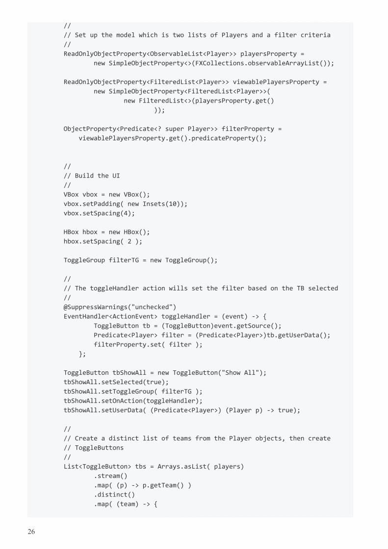
A handler is attached the ToggleButtons which will modify filterProperty. Each ToggleButton is supplied aPredicate in the userData field. toggleHandler uses this supplied Predicate when setting the filter property. Thiscode sets the special case "Show All" ToggleButton.
@SuppressWarnings("unchecked")
EventHandler<ActionEvent> toggleHandler = (event) -> {
ToggleButton tb = (ToggleButton)event.getSource();
Predicate<Player> filter = (Predicate<Player>)tb.getUserData();
filterProperty.set( filter );
};
ToggleButton tbShowAll = new ToggleButton("Show All");
tbShowAll.setSelected(true);
tbShowAll.setToggleGroup( filterTG );
tbShowAll.setOnAction(toggleHandler);
tbShowAll.setUserData( (Predicate<Player>) (Player p) -> true);
The ToggleButtons that filter a specific team are created at runtime based on the Players array. This Stream doesthe following.
1. Distill the list of Players down to a distinct list of team Strings
2. Create a ToggleButton for each team String
3. Set a Predicate for each ToggleButton to be used as a filter
4. Collect the ToggleButtons for addition into the HBox container
List<ToggleButton> tbs = Arrays.asList( players)
.stream()
.map( (p) -> p.getTeam() )
.distinct()
.map( (team) -> {
ToggleButton tb = new ToggleButton( team );
tb.setToggleGroup( filterTG );
tb.setOnAction( toggleHandler );
tb.setUserData( (Predicate<Player>) (Player p) ->
team.equals(p.getTeam()) );
return tb;
})
.collect(Collectors.toList());
hbox.getChildren().add( tbShowAll );
hbox.getChildren().addAll( tbs );
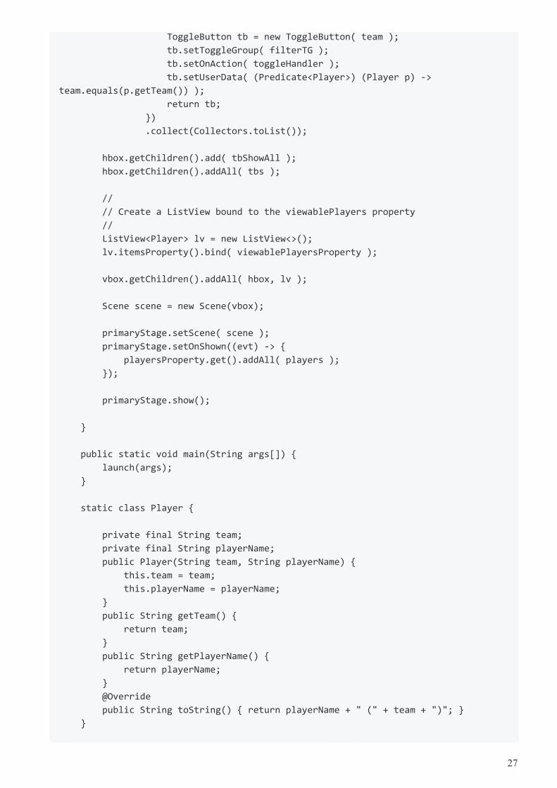
ListView
The next step creates the ListView and binds the ListView to the viewablePlayersProperty. This enables theListView to receive updates based on the changing filter.
24
ListView<Player> lv = new ListView<>();
lv.itemsProperty().bind( viewablePlayersProperty );
The remainder of the program creates a Scene and shows the Stage. onShown loads the data set into theplayersProperty and the viewablePlayersProperty lists. Although both lists are in sync in this partcular version ofthe program, if the stock filter is every different than "no filter", this code would not need to be modified.
vbox.getChildren().addAll( hbox, lv );
Scene scene = new Scene(vbox);
primaryStage.setScene( scene );
primaryStage.setOnShown((evt) -> {
playersProperty.get().addAll( players );
});
primaryStage.show();
This article used binding to tie a list of viewable Player objects to a ListView. The viewable Players wereupdated when a ToggleButton is selected. The selection applied a filter to a full set of Players which wasmaintained separately as a FilteredList (thanks @kleopatra_jx). Binding was used to keep the UI in sync and toallow for a separation of concerns in the design.
Further Reading
To see how such a design would implement basic add and remove functionality, visit the following pagehttps://courses.bekwam.net/public_tutorials/bkcourse_filterlistapp.php.
Complete Code
The code can be tested in a single .java file.
public class FilterListApp extends Application {
@Override
public void start(Stage primaryStage) throws Exception {
//
// Test data
//
Player[] players = {new Player("BOS", "David Ortiz"),
new Player("BOS", "Jackie Bradley Jr."),
new Player("BOS", "Xander Bogarts"),
new Player("BOS", "Mookie Betts"),
new Player("HOU", "Jose Altuve"),
new Player("HOU", "Will Harris"),
new Player("WSH", "Max Scherzer"),
new Player("WSH", "Bryce Harper"),
new Player("WSH", "Daniel Murphy"),
new Player("WSH", "Wilson Ramos") };
25
//
// Set up the model which is two lists of Players and a filter criteria
//
ReadOnlyObjectProperty<ObservableList<Player>> playersProperty =
new SimpleObjectProperty<>(FXCollections.observableArrayList());
ReadOnlyObjectProperty<FilteredList<Player>> viewablePlayersProperty =
new SimpleObjectProperty<FilteredList<Player>>(
new FilteredList<>(playersProperty.get()
));
ObjectProperty<Predicate<? super Player>> filterProperty =
viewablePlayersProperty.get().predicateProperty();
//
// Build the UI
//
VBox vbox = new VBox();
vbox.setPadding( new Insets(10));
vbox.setSpacing(4);
HBox hbox = new HBox();
hbox.setSpacing( 2 );
ToggleGroup filterTG = new ToggleGroup();
//
// The toggleHandler action wills set the filter based on the TB selected
//
@SuppressWarnings("unchecked")
EventHandler<ActionEvent> toggleHandler = (event) -> {
ToggleButton tb = (ToggleButton)event.getSource();
Predicate<Player> filter = (Predicate<Player>)tb.getUserData();
filterProperty.set( filter );
};
ToggleButton tbShowAll = new ToggleButton("Show All");
tbShowAll.setSelected(true);
tbShowAll.setToggleGroup( filterTG );
tbShowAll.setOnAction(toggleHandler);
tbShowAll.setUserData( (Predicate<Player>) (Player p) -> true);
//
// Create a distinct list of teams from the Player objects, then create
// ToggleButtons
//
List<ToggleButton> tbs = Arrays.asList( players)
.stream()
.map( (p) -> p.getTeam() )
.distinct()
.map( (team) -> {
26
ToggleButton tb = new ToggleButton( team );
tb.setToggleGroup( filterTG );
tb.setOnAction( toggleHandler );
tb.setUserData( (Predicate<Player>) (Player p) ->
team.equals(p.getTeam()) );
return tb;
})
.collect(Collectors.toList());
hbox.getChildren().add( tbShowAll );
hbox.getChildren().addAll( tbs );
//
// Create a ListView bound to the viewablePlayers property
//
ListView<Player> lv = new ListView<>();
lv.itemsProperty().bind( viewablePlayersProperty );
vbox.getChildren().addAll( hbox, lv );
Scene scene = new Scene(vbox);
primaryStage.setScene( scene );
primaryStage.setOnShown((evt) -> {
playersProperty.get().addAll( players );
});
primaryStage.show();
}
public static void main(String args[]) {
launch(args);
}
static class Player {
private final String team;
private final String playerName;
public Player(String team, String playerName) {
this.team = team;
this.playerName = playerName;
}
public String getTeam() {
return team;
}
public String getPlayerName() {
return playerName;
}
@Override
public String toString() { return playerName + " (" + team + ")"; }
}
27
}
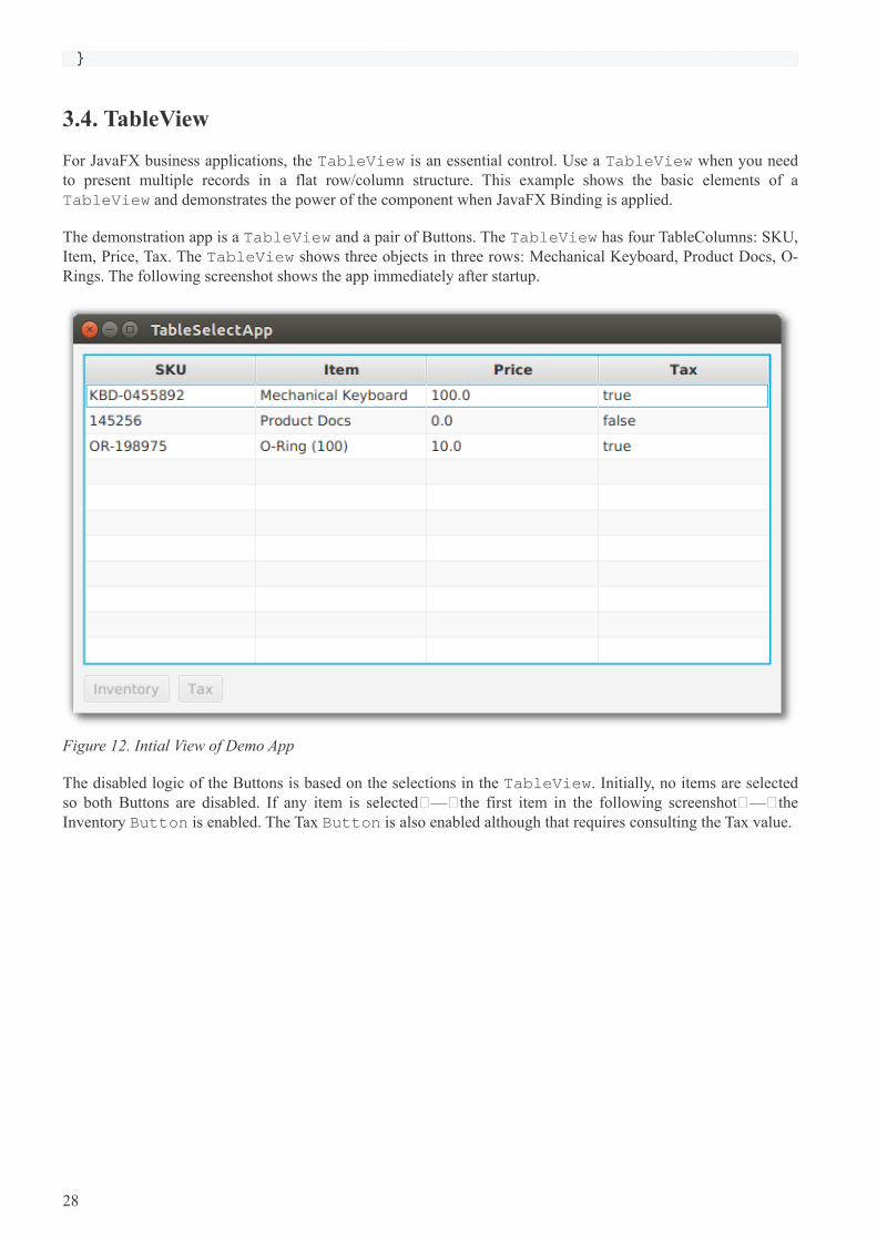
3.4. TableView
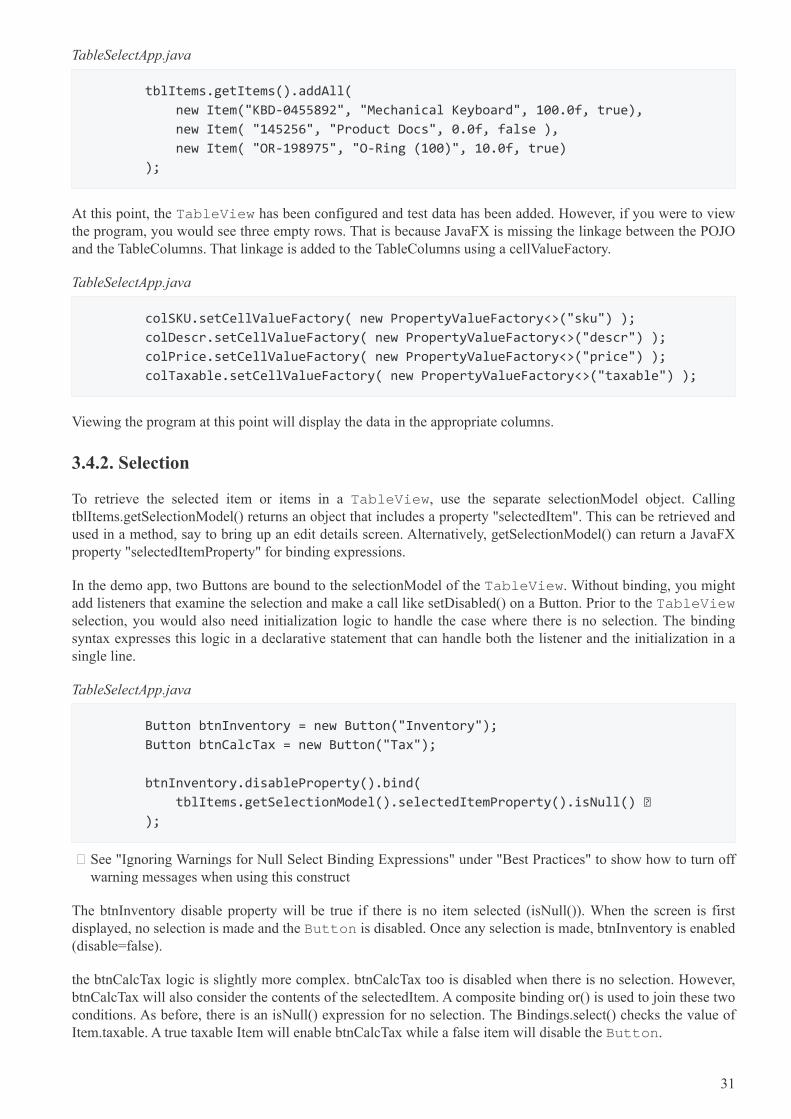
For JavaFX business applications, the TableView is an essential control. Use a TableView when you needto present multiple records in a flat row/column structure. This example shows the basic elements of aTableView and demonstrates the power of the component when JavaFX Binding is applied.
The demonstration app is a TableView and a pair of Buttons. The TableView has four TableColumns: SKU,Item, Price, Tax. The TableView shows three objects in three rows: Mechanical Keyboard, Product Docs, O-Rings. The following screenshot shows the app immediately after startup.
Figure 12. Intial View of Demo App
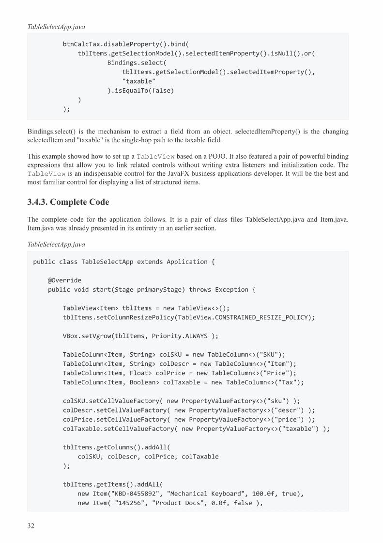
The disabled logic of the Buttons is based on the selections in the TableView. Initially, no items are selectedso both Buttons are disabled. If any item is selected — the first item in the following screenshot — theInventory Button is enabled. The Tax Button is also enabled although that requires consulting the Tax value.
28
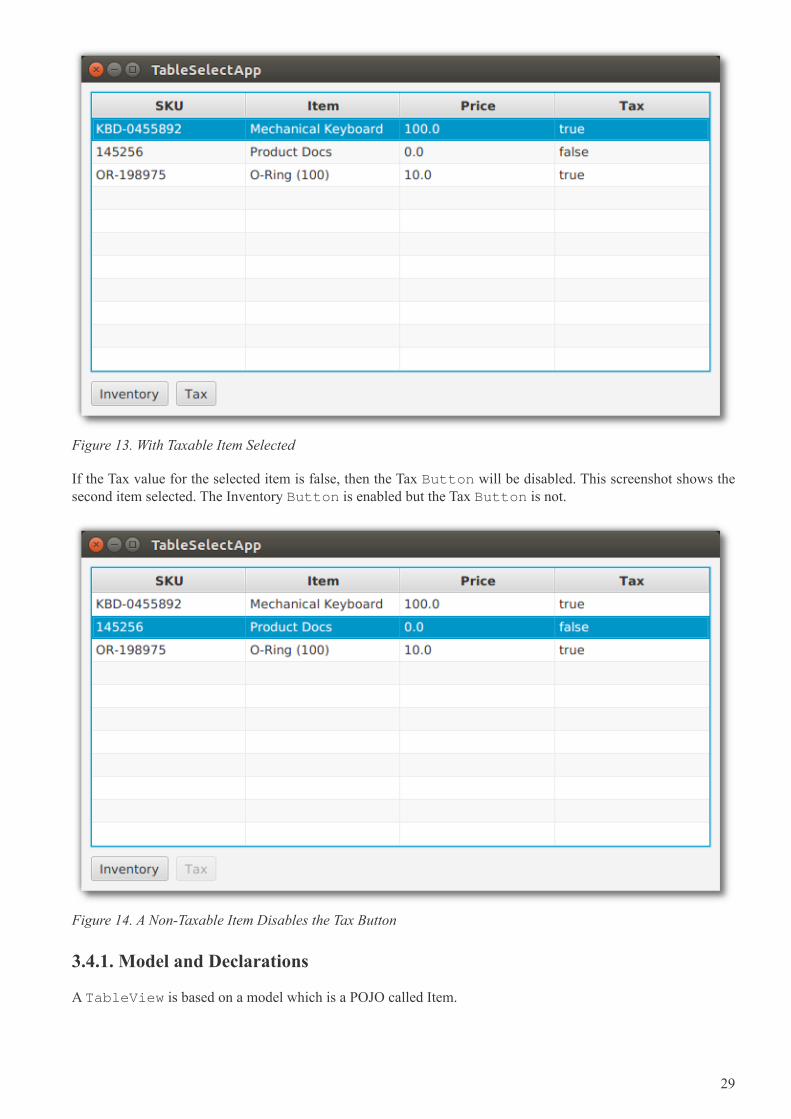
Figure 13. With Taxable Item Selected
If the Tax value for the selected item is false, then the Tax Button will be disabled. This screenshot shows thesecond item selected. The Inventory Button is enabled but the Tax Button is not.
Figure 14. A Non-Taxable Item Disables the Tax Button
3.4.1. Model and Declarations
A TableView is based on a model which is a POJO called Item.
29
Item.java
public class Item {
private final String sku;
private final String descr;
private final Float price;
private final Boolean taxable;
public Item(String sku, String descr, Float price, Boolean taxable) {
this.sku = sku;
this.descr = descr;
this.price = price;
this.taxable = taxable;
}
public String getSku() {
return sku;
}
public String getDescr() {
return descr;
}
public Float getPrice() {
return price;
}
public Boolean getTaxable() {
return taxable;
}
}
The TableView and TableColumn use generics in their declarations. For TableView, the type parameteris Item. For the TableColumns, the type parameters are Item and the field type. The constructor ofTableColumn accepts a column name. In this example, the column names diverge slightly from the actualfield names.
TableSelectApp.java
TableView<Item> tblItems = new TableView<>();
TableColumn<Item, String> colSKU = new TableColumn<>("SKU");
TableColumn<Item, String> colDescr = new TableColumn<>("Item");
TableColumn<Item, Float> colPrice = new TableColumn<>("Price");
TableColumn<Item, Boolean> colTaxable = new TableColumn<>("Tax");
tblItems.getColumns().addAll(
colSKU, colDescr, colPrice, colTaxable
);
Adding model items to the TableView is done by adding items to the underlying collection.
30
TableSelectApp.java
tblItems.getItems().addAll(
new Item("KBD-0455892", "Mechanical Keyboard", 100.0f, true),
new Item( "145256", "Product Docs", 0.0f, false ),
new Item( "OR-198975", "O-Ring (100)", 10.0f, true)
);
At this point, the TableView has been configured and test data has been added. However, if you were to viewthe program, you would see three empty rows. That is because JavaFX is missing the linkage between the POJOand the TableColumns. That linkage is added to the TableColumns using a cellValueFactory.
TableSelectApp.java
colSKU.setCellValueFactory( new PropertyValueFactory<>("sku") );
colDescr.setCellValueFactory( new PropertyValueFactory<>("descr") );
colPrice.setCellValueFactory( new PropertyValueFactory<>("price") );
colTaxable.setCellValueFactory( new PropertyValueFactory<>("taxable") );
Viewing the program at this point will display the data in the appropriate columns.
3.4.2. Selection
To retrieve the selected item or items in a TableView, use the separate selectionModel object. CallingtblItems.getSelectionModel() returns an object that includes a property "selectedItem". This can be retrieved andused in a method, say to bring up an edit details screen. Alternatively, getSelectionModel() can return a JavaFXproperty "selectedItemProperty" for binding expressions.
In the demo app, two Buttons are bound to the selectionModel of the TableView. Without binding, you mightadd listeners that examine the selection and make a call like setDisabled() on a Button. Prior to the TableViewselection, you would also need initialization logic to handle the case where there is no selection. The bindingsyntax expresses this logic in a declarative statement that can handle both the listener and the initialization in asingle line.
TableSelectApp.java
Button btnInventory = new Button("Inventory");
Button btnCalcTax = new Button("Tax");
btnInventory.disableProperty().bind(
tblItems.getSelectionModel().selectedItemProperty().isNull() ①
);
① See "Ignoring Warnings for Null Select Binding Expressions" under "Best Practices" to show how to turn offwarning messages when using this construct
The btnInventory disable property will be true if there is no item selected (isNull()). When the screen is firstdisplayed, no selection is made and the Button is disabled. Once any selection is made, btnInventory is enabled(disable=false).
the btnCalcTax logic is slightly more complex. btnCalcTax too is disabled when there is no selection. However,btnCalcTax will also consider the contents of the selectedItem. A composite binding or() is used to join these twoconditions. As before, there is an isNull() expression for no selection. The Bindings.select() checks the value ofItem.taxable. A true taxable Item will enable btnCalcTax while a false item will disable the Button.
31
TableSelectApp.java
btnCalcTax.disableProperty().bind(
tblItems.getSelectionModel().selectedItemProperty().isNull().or(
Bindings.select(
tblItems.getSelectionModel().selectedItemProperty(),
"taxable"
).isEqualTo(false)
)
);
Bindings.select() is the mechanism to extract a field from an object. selectedItemProperty() is the changingselectedItem and "taxable" is the single-hop path to the taxable field.
This example showed how to set up a TableView based on a POJO. It also featured a pair of powerful bindingexpressions that allow you to link related controls without writing extra listeners and initialization code. TheTableView is an indispensable control for the JavaFX business applications developer. It will be the best andmost familiar control for displaying a list of structured items.
3.4.3. Complete Code
The complete code for the application follows. It is a pair of class files TableSelectApp.java and Item.java.Item.java was already presented in its entirety in an earlier section.
TableSelectApp.java
public class TableSelectApp extends Application {
@Override
public void start(Stage primaryStage) throws Exception {
TableView<Item> tblItems = new TableView<>();
tblItems.setColumnResizePolicy(TableView.CONSTRAINED_RESIZE_POLICY);
VBox.setVgrow(tblItems, Priority.ALWAYS );
TableColumn<Item, String> colSKU = new TableColumn<>("SKU");
TableColumn<Item, String> colDescr = new TableColumn<>("Item");
TableColumn<Item, Float> colPrice = new TableColumn<>("Price");
TableColumn<Item, Boolean> colTaxable = new TableColumn<>("Tax");
colSKU.setCellValueFactory( new PropertyValueFactory<>("sku") );
colDescr.setCellValueFactory( new PropertyValueFactory<>("descr") );
colPrice.setCellValueFactory( new PropertyValueFactory<>("price") );
colTaxable.setCellValueFactory( new PropertyValueFactory<>("taxable") );
tblItems.getColumns().addAll(
colSKU, colDescr, colPrice, colTaxable
);
tblItems.getItems().addAll(
new Item("KBD-0455892", "Mechanical Keyboard", 100.0f, true),
new Item( "145256", "Product Docs", 0.0f, false ),
32
new Item( "OR-198975", "O-Ring (100)", 10.0f, true)
);
Button btnInventory = new Button("Inventory");
Button btnCalcTax = new Button("Tax");
btnInventory.disableProperty().bind(
tblItems.getSelectionModel().selectedItemProperty().isNull()
);
btnCalcTax.disableProperty().bind(
tblItems.getSelectionModel().selectedItemProperty().isNull().or(
Bindings.select(
tblItems.getSelectionModel().selectedItemProperty(),
"taxable"
).isEqualTo(false)
)
);
HBox buttonHBox = new HBox( btnInventory, btnCalcTax );
buttonHBox.setSpacing( 8 );
VBox vbox = new VBox( tblItems, buttonHBox );
vbox.setPadding( new Insets(10) );
vbox.setSpacing( 10 );
Scene scene = new Scene(vbox);
primaryStage.setTitle("TableSelectApp");
primaryStage.setScene( scene );
primaryStage.setHeight( 376 );
primaryStage.setWidth( 667 );
primaryStage.show();
}
public static void main(String[] args) {
launch(args);
}
}
3.5. ImageView
JavaFX provides the Image and ImageView classes to display BMP, GIF, JPEG, and PNG graphical images.Image is a class that holds the bytes of the image and optionally scaling information. The Image object is loadedby a background thread, and the Image class provides methods for interacting with the load operation. The Imageobject is used independently of ImageView to create cursors and app icons.
ImageView is a JavaFX Node that holds and Image object. ImageView makes an image available throughout theframework. An ImageView can be added to a container by itself or alongside other UI controls. For example animage can be added to a Label by setting the graphic property of the Label.
33
Images can also be displayed and manipulated using JavaFX CSS.
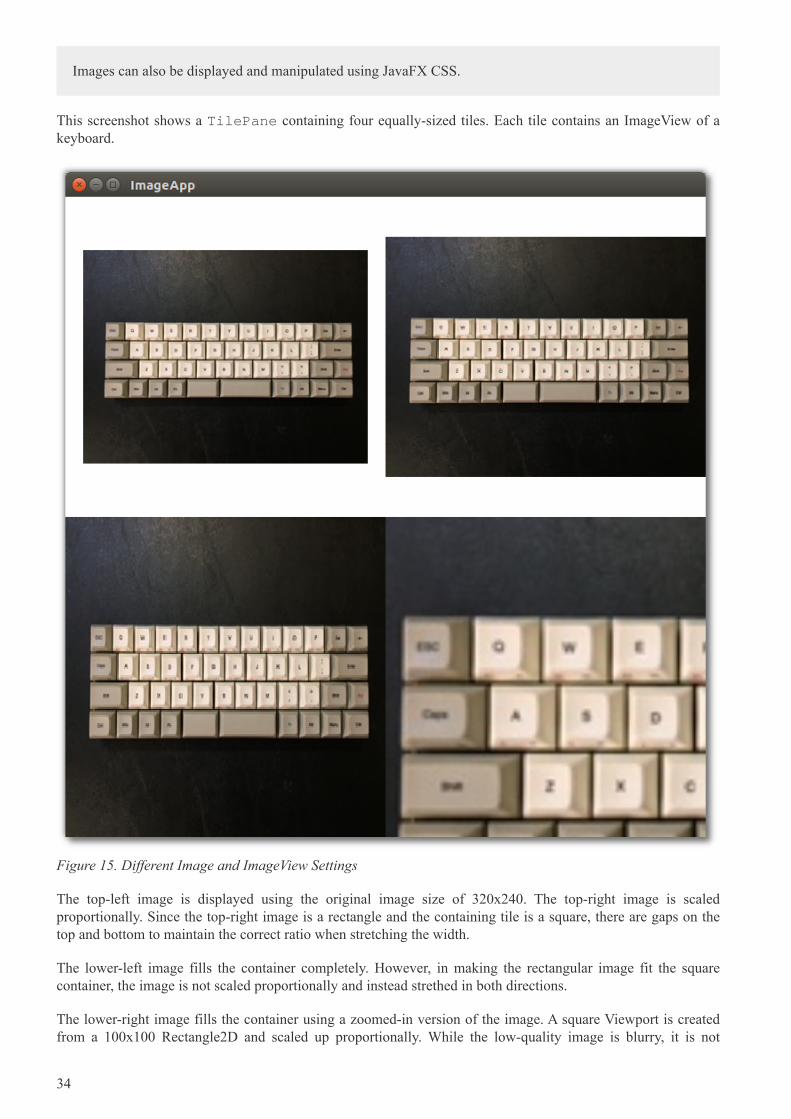
This screenshot shows a TilePane containing four equally-sized tiles. Each tile contains an ImageView of akeyboard.
Figure 15. Different Image and ImageView Settings
The top-left image is displayed using the original image size of 320x240. The top-right image is scaledproportionally. Since the top-right image is a rectangle and the containing tile is a square, there are gaps on thetop and bottom to maintain the correct ratio when stretching the width.
The lower-left image fills the container completely. However, in making the rectangular image fit the squarecontainer, the image is not scaled proportionally and instead strethed in both directions.
The lower-right image fills the container using a zoomed-in version of the image. A square Viewport is createdfrom a 100x100 Rectangle2D and scaled up proportionally. While the low-quality image is blurry, it is not
34
deformed.
3.5.1. Image
The Image class provides constructors to build an Image object from the image file dimensions or from atransformed object. These three constructor calls create the Image objects used in the top-right, bottom-left, andbottom-left tiles, respectively.
ImageApp.java
public class ImageApp extends Application {
private final static String IMAGE_LOC = "images/keyboard.jpg";
@Override
public void start(Stage primaryStage) throws Exception {
Image image2 = new Image(IMAGE_LOC, 360.0d, 360.0d, true, true );
Image image3 = new Image(IMAGE_LOC, 360.0d, 360.0d, false, true);
Image image4 = new Image(IMAGE_LOC);
The String URL passed in to all forms of the Image constructor is relative to the classpath. An absolute URLsuch as "https://www.bekwam.com/images/bekwam_logo_hdr_rounded.png" can also be used. Note that theabsolute URLs will not throw an error if their resource is not found.
image2 and image3 specify dimensions, forming a square larger than the rectangle of the original image. image2will preserve the aspect ratio ("true"). The constructor of image3 does not preserve the aspect ratio and willappear stretched.
3.5.2. ImageView
ImageView is a Node contain that allows the Image object to be used in JavaFX containers and UI controls. Inthe top-left image, a short form of ImageView is used which passes in only the image URL. It will honor theoriginal dimensions and does not require an additional Image object.
ImageApp.java
ImageView iv1 = new ImageView(IMAGE_LOC);
ImageView iv2 = new ImageView(image2);
ImageView iv3 = new ImageView(image3);
ImageView iv4 = new ImageView(image4);
iv4.setPreserveRatio(true);
iv4.setFitHeight(360);
iv4.setFitWidth(360);
Rectangle2D viewportRect = new Rectangle2D(20, 50, 100, 100);
iv4.setViewport(viewportRect);
iv3 and iv3 are based on the image2 and image3 objects. Recall that these objects produced transformed imagesthat fit the square container.
iv4 is also based on a transformed Image object, but in the case of iv4, the transformation is done through theImageView object rather than the Image. ImageView.setFitHeight is called rather than Image.setFitHeight.
35
Additionally, the Viewport of iv4 is adjusted. The Viewport controls the visible part of the ImageView. In thiscase, the Viewport is defined as a 100x100 section of the Image shifted left 50 pixels and up 100 pixels.
This section demonstrated the Image and ImageView classes which are used to display an image in a container orother UI control. These classes define the scaling behavior of the image and can be used with a Rectangle2DViewport to give additional image display customization.
3.5.3. Source
The complete source code and Gradle project can be found at the link below.
ImageApp Source Zip [https://courses.bekwam.net/public_tutorials/source/bkcourse_imageapp_sources.zip]
3.6. LineChart
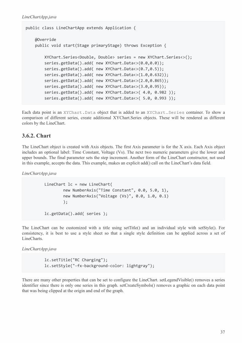
While you can plot a graph using a Line on a Canvas, JavaFX’s LineChart makes graphing easier. Inaddition to customizing standard charting components like axis legends, LineChart encapsulates the source dataof the graph. As with all JavaFX controls, LineChart enables you to style the graph using CSS.
This screenshot shows a plot of seven points. The X-Axis has units of Time Constants ranging from 0 to 5. TheY-Axis shows Voltage ranging from 0 to 1 with more frequent gradients than the X-Axis.
Figure 16. LineChartApp Screenshot
3.6.1. Data
LineChart includes an API for managing data. Data points are grouped into series. This particular example uses asingle series.
36
LineChartApp.java
public class LineChartApp extends Application {
@Override
public void start(Stage primaryStage) throws Exception {
XYChart.Series<Double, Double> series = new XYChart.Series<>();
series.getData().add( new XYChart.Data<>(0.0,0.0));
series.getData().add( new XYChart.Data<>(0.7,0.5));
series.getData().add( new XYChart.Data<>(1.0,0.632));
series.getData().add( new XYChart.Data<>(2.0,0.865));
series.getData().add( new XYChart.Data<>(3.0,0.95));
series.getData().add( new XYChart.Data<>( 4.0, 0.982 ));
series.getData().add( new XYChart.Data<>( 5.0, 0.993 ));
Each data point is an XYChart.Data object that is added to an XYChart.Series container. To show acomparison of different series, create additional XYChart.Series objects. These will be rendered as differentcolors by the LineChart.
3.6.2. Chart
The LineChart object is created with Axis objects. The first Axis parameter is for the X axis. Each Axis objectincludes an optional label: Time Constant, Voltage (Vs). The next two numeric parameters give the lower andupper bounds. The final parameter sets the step increment. Another form of the LineChart constructor, not usedin this example, accepts the data. This example, makes an explicit add() call on the LineChart’s data field.
LineChartApp.java
LineChart lc = new LineChart(
new NumberAxis("Time Constant", 0.0, 5.0, 1),
new NumberAxis("Voltage (Vs)", 0.0, 1.0, 0.1)
);
lc.getData().add( series );
The LineChart can be customized with a title using setTitle() and an individual style with setStyle(). Forconsistency, it is best to use a style sheet so that a single style definition can be applied across a set ofLineCharts.
LineChartApp.java
lc.setTitle("RC Charging");
lc.setStyle("-fx-background-color: lightgray");
There are many other properties that can be set to configure the LineChart. setLegendVisible() removes a seriesidentifier since there is only one series in this graph. setCreateSymbols() removes a graphic on each data pointthat was being clipped at the origin and end of the graph.
37
LineChartApp.java
lc.setCreateSymbols(false);
lc.setLegendVisible(false);
For modest reporting requirements, JavaFX provides classes like LineChart to plot multiple series of data pointsinto a graph. The LineChart object is highly customizable, giving control over the legends, lines, and data pointicons. Additionally, CSS styling is available to make a set of these reports consistent.
3.6.3. Source
The complete source code and Gradle project can be found at the link below.
ChartApp Source Zip [https://courses.bekwam.net/public_tutorials/source/bkcourse_chartapp_sources.zip]
3.7. Pagination
Pagination is a UI control that lets you step through blocks of results using next, previous, and direct indexingbuttons. The Pagination class can break up long lists when scrolling is not desired. This section presents a specialcase of single-item pages to form a slideshow.
3.7.1. SlideShow App
This screenshot shows the app which is a slideshow of three images. The Pagination control renders the customNode — an ImageView — and buttons at the bottom of the screen. For each of the three images, there is adirect access button 1, 2, and 3. There is also a pair of arrows to move to the next and previous image. A Labelmarks the image index and number of images to supplement the visual cues of the buttons themselves.
38
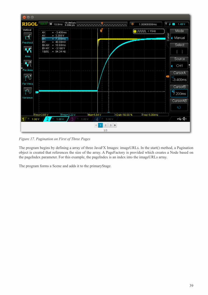
Figure 17. Pagination on First of Three Pages
The program begins by defining a array of three JavaFX Images: imageURLs. In the start() method, a Paginationobject is created that references the size of the array. A PageFactory is provided which creates a Node based onthe pageIndex parameter. For this example, the pageIndex is an index into the imageURLs array.
The program forms a Scene and adds it to the primaryStage.
39
SlideShowApp.java
public class SlideShowApp extends Application {
private Image[] imageURLs = {
new Image("https://www.bekwam.net/images/bekwam_rc_charging.png"),
new Image("https://www.bekwam.net/images/bekwam_rc_discharging.png"),
new Image("https://www.bekwam.net/images/bekwam_rl_scope.png")
};
@Override
public void start(Stage primaryStage) throws Exception {
Pagination pagination = new Pagination(imageURLs.length, 0);
pagination.setPageFactory(
pageIndex -> new ImageView(imageURLs[pageIndex])
);
VBox vbox = new VBox( pagination );
Scene scene = new Scene(vbox);
primaryStage.setScene( scene );
primaryStage.show();
}
public static void main(String[] args) {
launch(args);
}
}
The Pagination class is a simple control to iterate through a long list of items. This example used a single itemper page to form a slideshow. In both cases, this is an alternative to scrolling and is useful when you want the UIto be fixed in position.
40
Chapter 4. Layout
4.1. VBox and HBox
Layout in JavaFX begins with selecting the right container controls. The two layout controls I use most often areVBox and HBox. VBox is a container that arranges its children in a vertical stack. HBox arranges its children ina horizontal row. The power of these two controls comes from wrapping them and setting a few key properties:alignment, hgrow, and vgrow.
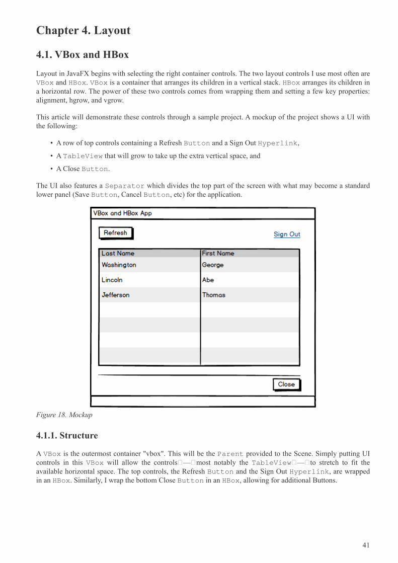
This article will demonstrate these controls through a sample project. A mockup of the project shows a UI withthe following:
• A row of top controls containing a Refresh Button and a Sign Out Hyperlink,
• A TableView that will grow to take up the extra vertical space, and
• A Close Button.
The UI also features a Separator which divides the top part of the screen with what may become a standardlower panel (Save Button, Cancel Button, etc) for the application.
Figure 18. Mockup
4.1.1. Structure
A VBox is the outermost container "vbox". This will be the Parent provided to the Scene. Simply putting UIcontrols in this VBox will allow the controls — most notably the TableView — to stretch to fit theavailable horizontal space. The top controls, the Refresh Button and the Sign Out Hyperlink, are wrappedin an HBox. Similarly, I wrap the bottom Close Button in an HBox, allowing for additional Buttons.
41
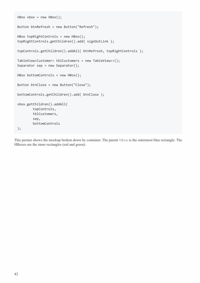
VBox vbox = new VBox();
Button btnRefresh = new Button("Refresh");
HBox topRightControls = new HBox();
topRightControls.getChildren().add( signOutLink );
topControls.getChildren().addAll( btnRefresh, topRightControls );
TableView<Customer> tblCustomers = new TableView<>();
Separator sep = new Separator();
HBox bottomControls = new HBox();
Button btnClose = new Button("Close");
bottomControls.getChildren().add( btnClose );
vbox.getChildren().addAll(
topControls,
tblCustomers,
sep,
bottomControls
);
This picture shows the mockup broken down by container. The parent VBox is the outermost blue rectangle. TheHBoxes are the inner rectangles (red and green).
42
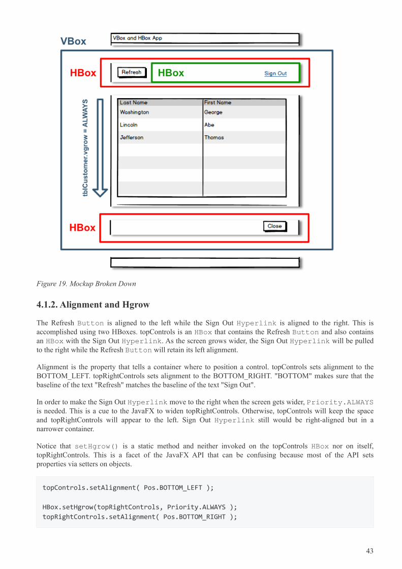
Figure 19. Mockup Broken Down
4.1.2. Alignment and Hgrow
The Refresh Button is aligned to the left while the Sign Out Hyperlink is aligned to the right. This isaccomplished using two HBoxes. topControls is an HBox that contains the Refresh Button and also containsan HBox with the Sign Out Hyperlink. As the screen grows wider, the Sign Out Hyperlink will be pulledto the right while the Refresh Button will retain its left alignment.
Alignment is the property that tells a container where to position a control. topControls sets alignment to theBOTTOM_LEFT. topRightControls sets alignment to the BOTTOM_RIGHT. "BOTTOM" makes sure that thebaseline of the text "Refresh" matches the baseline of the text "Sign Out".
In order to make the Sign Out Hyperlink move to the right when the screen gets wider, Priority.ALWAYSis needed. This is a cue to the JavaFX to widen topRightControls. Otherwise, topControls will keep the spaceand topRightControls will appear to the left. Sign Out Hyperlink still would be right-aligned but in anarrower container.
Notice that setHgrow() is a static method and neither invoked on the topControls HBox nor on itself,topRightControls. This is a facet of the JavaFX API that can be confusing because most of the API setsproperties via setters on objects.
topControls.setAlignment( Pos.BOTTOM_LEFT );
HBox.setHgrow(topRightControls, Priority.ALWAYS );
topRightControls.setAlignment( Pos.BOTTOM_RIGHT );
43
Close Button is wrapped in an HBox and positioned using the BOTTOM_RIGHT priority.
bottomControls.setAlignment(Pos.BOTTOM_RIGHT );
4.1.3. Vgrow
Since the outermost container is VBox, the child TableView will expand to take up extra horizontal spacewhen the window is widened. However, vertically resizing the window will produce a gap at the bottom of thescreen. The VBox does not automatically resize any of its children. As with the topRightControls HBox, a growindicator can be set. In the case of the HBox, this was a horizontal resizing instruction setHgrow(). For theTableView container VBox, this will be setVgrow().
VBox.setVgrow( tblCustomers, Priority.ALWAYS );
4.1.4. Margin
There are a few ways to space out UI controls. This article uses the margin property on several of the containersto add whitespace around the controls. These are set individually rather than using a spacing on the VBox so thatthe Separator will span the entire width.
VBox.setMargin( topControls, new Insets(10.0d) );
VBox.setMargin( tblCustomers, new Insets(0.0d, 10.0d, 10.0d, 10.0d) );
VBox.setMargin( bottomControls, new Insets(10.0d) );
The Insets used by tblCustomers omits any top spacing to keep the spacing even. JavaFX does not consolidatewhitespace as in web design. If the top Inset were set to 10.0d for the TableView, the distance between the topcontrols and the TableView would be twice as wide as the distance between any of the other controls.
Notice that these are static methods like the Priority.
This picture shows the application when run in its initial 800x600 size.
44
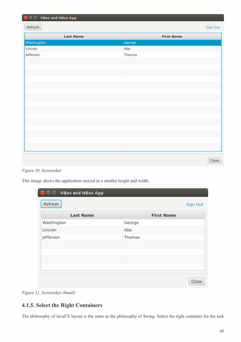
Figure 20. Screenshot
This image shows the application resized to a smaller height and width.
Figure 21. Screenshot (Small)
4.1.5. Select the Right Containers
The philosophy of JavaFX layout is the same as the philosophy of Swing. Select the right container for the task
45
at hand. This article presented the two most versatile containers: VBox and HBox. By setting properties likealignment, hgrow, and vgrow, you can build incredibly complex layouts through nesting. These are thecontainers I use the most and often are the only containers that I need.
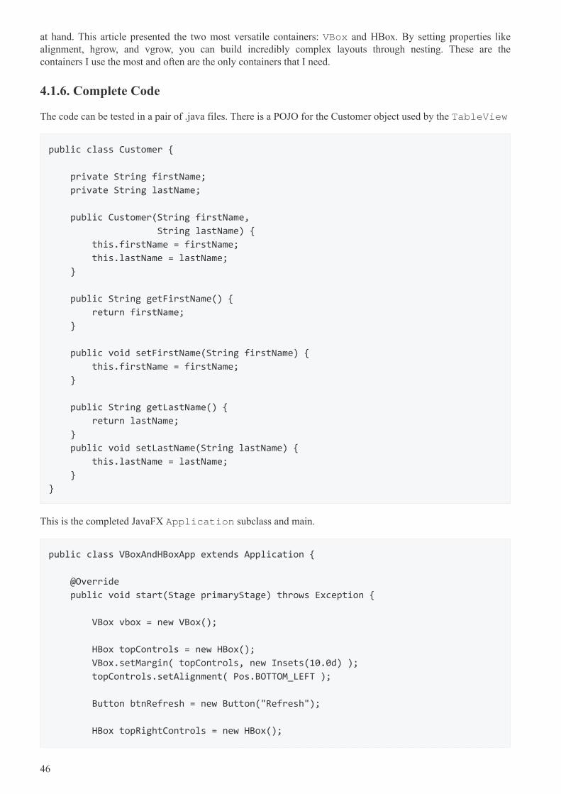
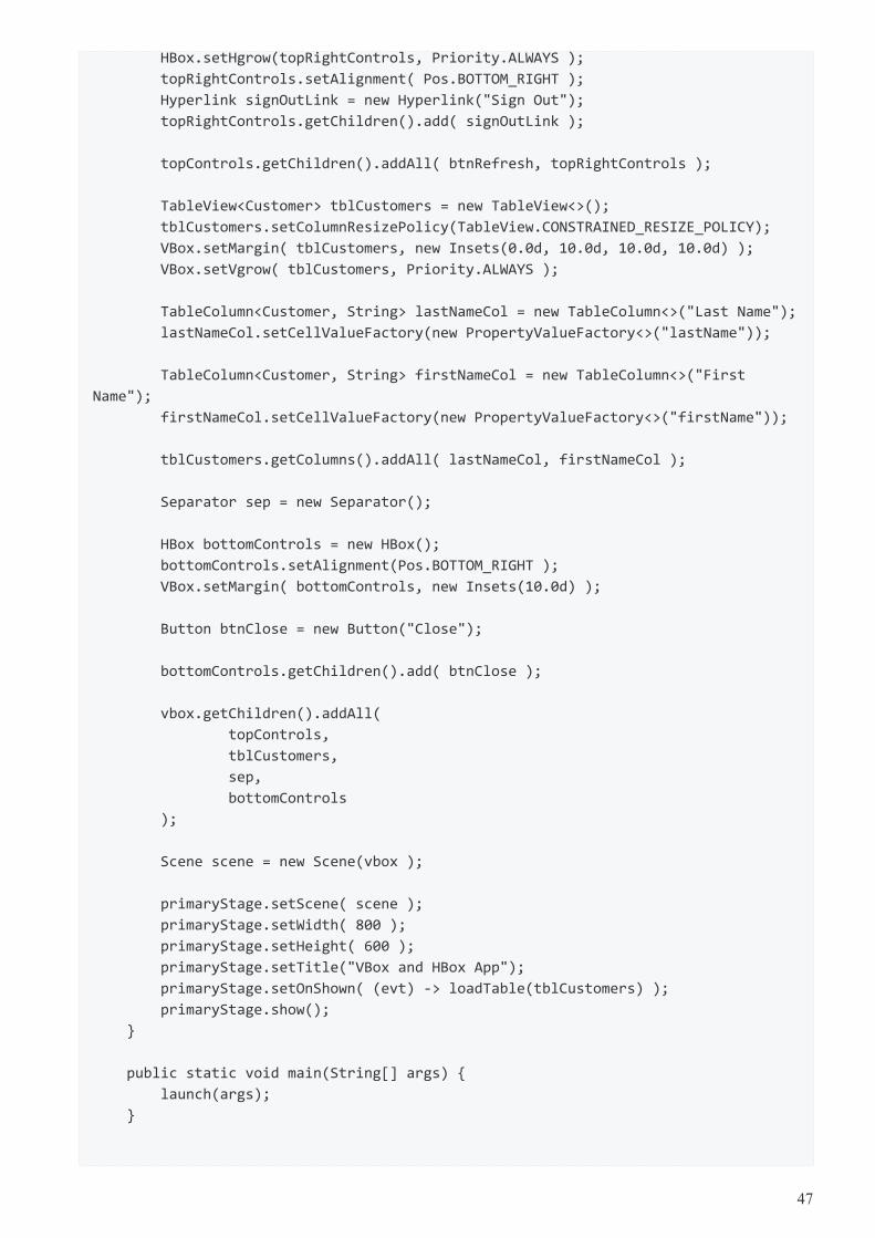
4.1.6. Complete Code
The code can be tested in a pair of .java files. There is a POJO for the Customer object used by the TableView
public class Customer {
private String firstName;
private String lastName;
public Customer(String firstName,
String lastName) {
this.firstName = firstName;
this.lastName = lastName;
}
public String getFirstName() {
return firstName;
}
public void setFirstName(String firstName) {
this.firstName = firstName;
}
public String getLastName() {
return lastName;
}
public void setLastName(String lastName) {
this.lastName = lastName;
}
}
This is the completed JavaFX Application subclass and main.
public class VBoxAndHBoxApp extends Application {
@Override
public void start(Stage primaryStage) throws Exception {
VBox vbox = new VBox();
HBox topControls = new HBox();
VBox.setMargin( topControls, new Insets(10.0d) );
topControls.setAlignment( Pos.BOTTOM_LEFT );
Button btnRefresh = new Button("Refresh");
HBox topRightControls = new HBox();
46
HBox.setHgrow(topRightControls, Priority.ALWAYS );
topRightControls.setAlignment( Pos.BOTTOM_RIGHT );
Hyperlink signOutLink = new Hyperlink("Sign Out");
topRightControls.getChildren().add( signOutLink );
topControls.getChildren().addAll( btnRefresh, topRightControls );
TableView<Customer> tblCustomers = new TableView<>();
tblCustomers.setColumnResizePolicy(TableView.CONSTRAINED_RESIZE_POLICY);
VBox.setMargin( tblCustomers, new Insets(0.0d, 10.0d, 10.0d, 10.0d) );
VBox.setVgrow( tblCustomers, Priority.ALWAYS );
TableColumn<Customer, String> lastNameCol = new TableColumn<>("Last Name");
lastNameCol.setCellValueFactory(new PropertyValueFactory<>("lastName"));
TableColumn<Customer, String> firstNameCol = new TableColumn<>("First
Name");
firstNameCol.setCellValueFactory(new PropertyValueFactory<>("firstName"));
tblCustomers.getColumns().addAll( lastNameCol, firstNameCol );
Separator sep = new Separator();
HBox bottomControls = new HBox();
bottomControls.setAlignment(Pos.BOTTOM_RIGHT );
VBox.setMargin( bottomControls, new Insets(10.0d) );
Button btnClose = new Button("Close");
bottomControls.getChildren().add( btnClose );
vbox.getChildren().addAll(
topControls,
tblCustomers,
sep,
bottomControls
);
Scene scene = new Scene(vbox );
primaryStage.setScene( scene );
primaryStage.setWidth( 800 );
primaryStage.setHeight( 600 );
primaryStage.setTitle("VBox and HBox App");
primaryStage.setOnShown( (evt) -> loadTable(tblCustomers) );
primaryStage.show();
}
public static void main(String[] args) {
launch(args);
}
47
private void loadTable(TableView<Customer> tblCustomers) {
tblCustomers.getItems().add(new Customer("George", "Washington"));
tblCustomers.getItems().add(new Customer("Abe", "Lincoln"));
tblCustomers.getItems().add(new Customer("Thomas", "Jefferson"));
}
}
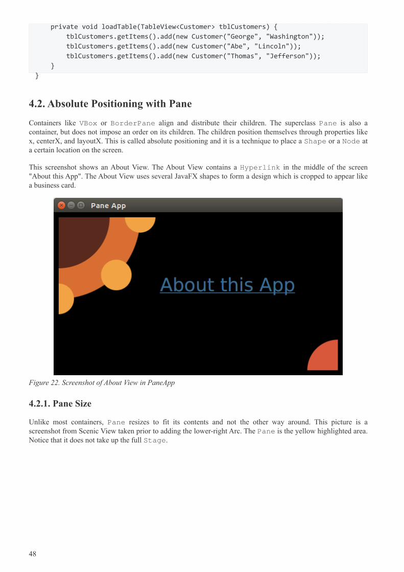
4.2. Absolute Positioning with Pane
Containers like VBox or BorderPane align and distribute their children. The superclass Pane is also acontainer, but does not impose an order on its children. The children position themselves through properties likex, centerX, and layoutX. This is called absolute positioning and it is a technique to place a Shape or a Node ata certain location on the screen.
This screenshot shows an About View. The About View contains a Hyperlink in the middle of the screen"About this App". The About View uses several JavaFX shapes to form a design which is cropped to appear likea business card.
Figure 22. Screenshot of About View in PaneApp
4.2.1. Pane Size
Unlike most containers, Pane resizes to fit its contents and not the other way around. This picture is ascreenshot from Scenic View taken prior to adding the lower-right Arc. The Pane is the yellow highlighted area.Notice that it does not take up the full Stage.
48
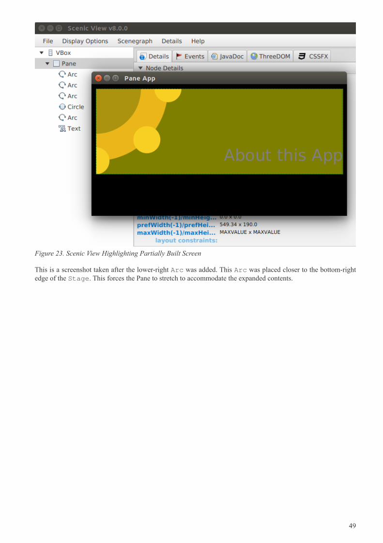
Figure 23. Scenic View Highlighting Partially Built Screen
This is a screenshot taken after the lower-right Arc was added. This Arc was placed closer to the bottom-rightedge of the Stage. This forces the Pane to stretch to accommodate the expanded contents.
49
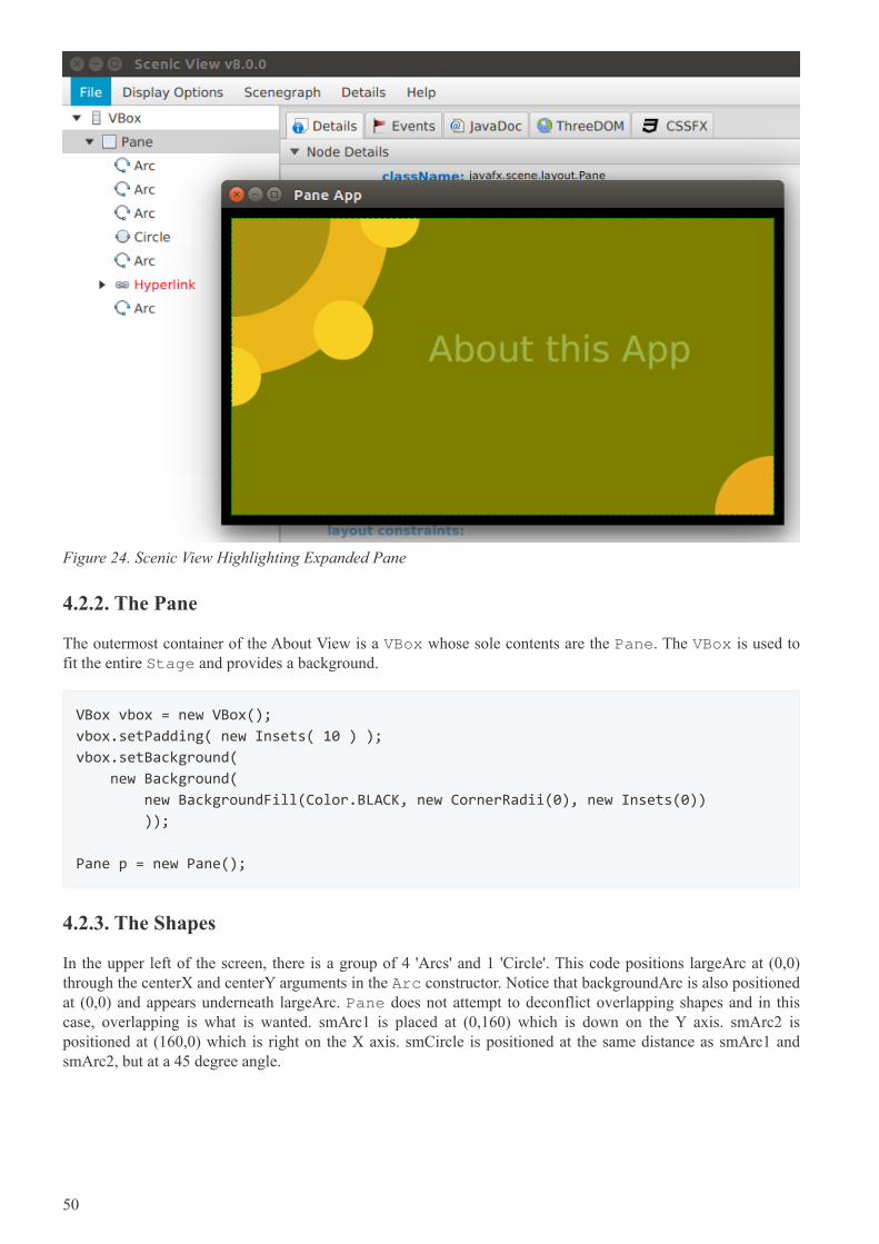
Figure 24. Scenic View Highlighting Expanded Pane
4.2.2. The Pane
The outermost container of the About View is a VBox whose sole contents are the Pane. The VBox is used tofit the entire Stage and provides a background.
VBox vbox = new VBox();
vbox.setPadding( new Insets( 10 ) );
vbox.setBackground(
new Background(
new BackgroundFill(Color.BLACK, new CornerRadii(0), new Insets(0))
));
Pane p = new Pane();
4.2.3. The Shapes
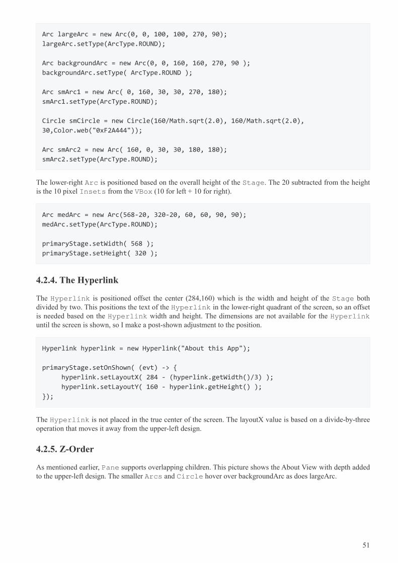
In the upper left of the screen, there is a group of 4 'Arcs' and 1 'Circle'. This code positions largeArc at (0,0)through the centerX and centerY arguments in the Arc constructor. Notice that backgroundArc is also positionedat (0,0) and appears underneath largeArc. Pane does not attempt to deconflict overlapping shapes and in thiscase, overlapping is what is wanted. smArc1 is placed at (0,160) which is down on the Y axis. smArc2 ispositioned at (160,0) which is right on the X axis. smCircle is positioned at the same distance as smArc1 andsmArc2, but at a 45 degree angle.
50
Arc largeArc = new Arc(0, 0, 100, 100, 270, 90);
largeArc.setType(ArcType.ROUND);
Arc backgroundArc = new Arc(0, 0, 160, 160, 270, 90 );
backgroundArc.setType( ArcType.ROUND );
Arc smArc1 = new Arc( 0, 160, 30, 30, 270, 180);
smArc1.setType(ArcType.ROUND);
Circle smCircle = new Circle(160/Math.sqrt(2.0), 160/Math.sqrt(2.0),
30,Color.web("0xF2A444"));
Arc smArc2 = new Arc( 160, 0, 30, 30, 180, 180);
smArc2.setType(ArcType.ROUND);
The lower-right Arc is positioned based on the overall height of the Stage. The 20 subtracted from the heightis the 10 pixel Insets from the VBox (10 for left + 10 for right).
Arc medArc = new Arc(568-20, 320-20, 60, 60, 90, 90);
medArc.setType(ArcType.ROUND);
primaryStage.setWidth( 568 );
primaryStage.setHeight( 320 );
4.2.4. The Hyperlink
The Hyperlink is positioned offset the center (284,160) which is the width and height of the Stage bothdivided by two. This positions the text of the Hyperlink in the lower-right quadrant of the screen, so an offsetis needed based on the Hyperlink width and height. The dimensions are not available for the Hyperlinkuntil the screen is shown, so I make a post-shown adjustment to the position.
Hyperlink hyperlink = new Hyperlink("About this App");
primaryStage.setOnShown( (evt) -> {
hyperlink.setLayoutX( 284 - (hyperlink.getWidth()/3) );
hyperlink.setLayoutY( 160 - hyperlink.getHeight() );
});
The Hyperlink is not placed in the true center of the screen. The layoutX value is based on a divide-by-threeoperation that moves it away from the upper-left design.
4.2.5. Z-Order
As mentioned earlier, Pane supports overlapping children. This picture shows the About View with depth addedto the upper-left design. The smaller Arcs and Circle hover over backgroundArc as does largeArc.
51
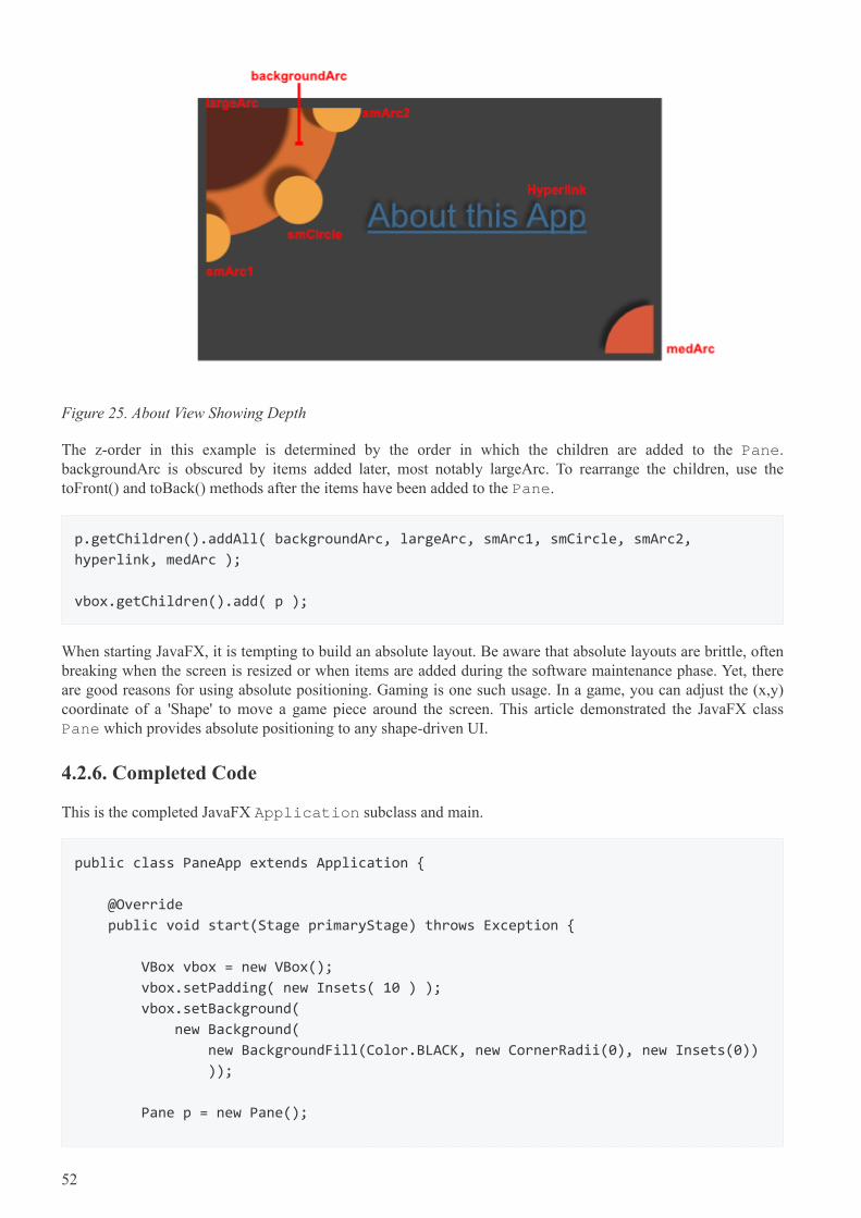
Figure 25. About View Showing Depth
The z-order in this example is determined by the order in which the children are added to the Pane.backgroundArc is obscured by items added later, most notably largeArc. To rearrange the children, use thetoFront() and toBack() methods after the items have been added to the Pane.
p.getChildren().addAll( backgroundArc, largeArc, smArc1, smCircle, smArc2,
hyperlink, medArc );
vbox.getChildren().add( p );
When starting JavaFX, it is tempting to build an absolute layout. Be aware that absolute layouts are brittle, oftenbreaking when the screen is resized or when items are added during the software maintenance phase. Yet, thereare good reasons for using absolute positioning. Gaming is one such usage. In a game, you can adjust the (x,y)coordinate of a 'Shape' to move a game piece around the screen. This article demonstrated the JavaFX classPane which provides absolute positioning to any shape-driven UI.
4.2.6. Completed Code
This is the completed JavaFX Application subclass and main.
public class PaneApp extends Application {
@Override
public void start(Stage primaryStage) throws Exception {
VBox vbox = new VBox();
vbox.setPadding( new Insets( 10 ) );
vbox.setBackground(
new Background(
new BackgroundFill(Color.BLACK, new CornerRadii(0), new Insets(0))
));
Pane p = new Pane();
52
Arc largeArc = new Arc(0, 0, 100, 100, 270, 90);
largeArc.setFill(Color.web("0x59291E"));
largeArc.setType(ArcType.ROUND);
Arc backgroundArc = new Arc(0, 0, 160, 160, 270, 90 );
backgroundArc.setFill( Color.web("0xD96F32") );
backgroundArc.setType( ArcType.ROUND );
Arc smArc1 = new Arc( 0, 160, 30, 30, 270, 180);
smArc1.setFill(Color.web("0xF2A444"));
smArc1.setType(ArcType.ROUND);
Circle smCircle = new Circle(
160/Math.sqrt(2.0), 160/Math.sqrt(2.0), 30,Color.web("0xF2A444")
);
Arc smArc2 = new Arc( 160, 0, 30, 30, 180, 180);
smArc2.setFill(Color.web("0xF2A444"));
smArc2.setType(ArcType.ROUND);
Hyperlink hyperlink = new Hyperlink("About this App");
hyperlink.setFont( Font.font(36) );
hyperlink.setTextFill( Color.web("0x3E6C93") );
hyperlink.setBorder( Border.EMPTY );
Arc medArc = new Arc(568-20, 320-20, 60, 60, 90, 90);
medArc.setFill(Color.web("0xD9583B"));
medArc.setType(ArcType.ROUND);
p.getChildren().addAll( backgroundArc, largeArc, smArc1, smCircle,
smArc2, hyperlink, medArc );
vbox.getChildren().add( p );
Scene scene = new Scene(vbox);
scene.setFill(Color.BLACK);
primaryStage.setTitle("Pane App");
primaryStage.setScene( scene );
primaryStage.setWidth( 568 );
primaryStage.setHeight( 320 );
primaryStage.setOnShown( (evt) -> {
hyperlink.setLayoutX( 284 - (hyperlink.getWidth()/3) );
hyperlink.setLayoutY( 160 - hyperlink.getHeight() );
});
primaryStage.show();
}
public static void main(String[] args) {
launch(args);
}
}
53
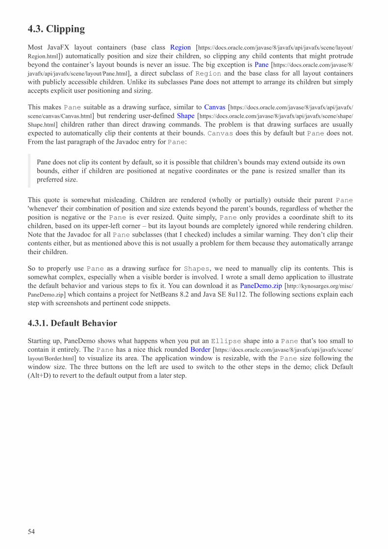
4.3. Clipping
Most JavaFX layout containers (base class Region [https://docs.oracle.com/javase/8/javafx/api/javafx/scene/layout/
Region.html]) automatically position and size their children, so clipping any child contents that might protrudebeyond the container’s layout bounds is never an issue. The big exception is Pane [https://docs.oracle.com/javase/8/
javafx/api/javafx/scene/layout/Pane.html], a direct subclass of Region and the base class for all layout containerswith publicly accessible children. Unlike its subclasses Pane does not attempt to arrange its children but simplyaccepts explicit user positioning and sizing.
This makes Pane suitable as a drawing surface, similar to Canvas [https://docs.oracle.com/javase/8/javafx/api/javafx/
scene/canvas/Canvas.html] but rendering user-defined Shape [https://docs.oracle.com/javase/8/javafx/api/javafx/scene/shape/
Shape.html] children rather than direct drawing commands. The problem is that drawing surfaces are usuallyexpected to automatically clip their contents at their bounds. Canvas does this by default but Pane does not.From the last paragraph of the Javadoc entry for Pane:
Pane does not clip its content by default, so it is possible that children’s bounds may extend outside its ownbounds, either if children are positioned at negative coordinates or the pane is resized smaller than itspreferred size.
This quote is somewhat misleading. Children are rendered (wholly or partially) outside their parent Pane'whenever' their combination of position and size extends beyond the parent’s bounds, regardless of whether theposition is negative or the Pane is ever resized. Quite simply, Pane only provides a coordinate shift to itschildren, based on its upper-left corner – but its layout bounds are completely ignored while rendering children.Note that the Javadoc for all Pane subclasses (that I checked) includes a similar warning. They don’t clip theircontents either, but as mentioned above this is not usually a problem for them because they automatically arrangetheir children.
So to properly use Pane as a drawing surface for Shapes, we need to manually clip its contents. This issomewhat complex, especially when a visible border is involved. I wrote a small demo application to illustratethe default behavior and various steps to fix it. You can download it as PaneDemo.zip [http://kynosarges.org/misc/
PaneDemo.zip] which contains a project for NetBeans 8.2 and Java SE 8u112. The following sections explain eachstep with screenshots and pertinent code snippets.
4.3.1. Default Behavior
Starting up, PaneDemo shows what happens when you put an Ellipse shape into a Pane that’s too small tocontain it entirely. The Pane has a nice thick rounded Border [https://docs.oracle.com/javase/8/javafx/api/javafx/scene/
layout/Border.html] to visualize its area. The application window is resizable, with the Pane size following thewindow size. The three buttons on the left are used to switch to the other steps in the demo; click Default(Alt+D) to revert to the default output from a later step.
54
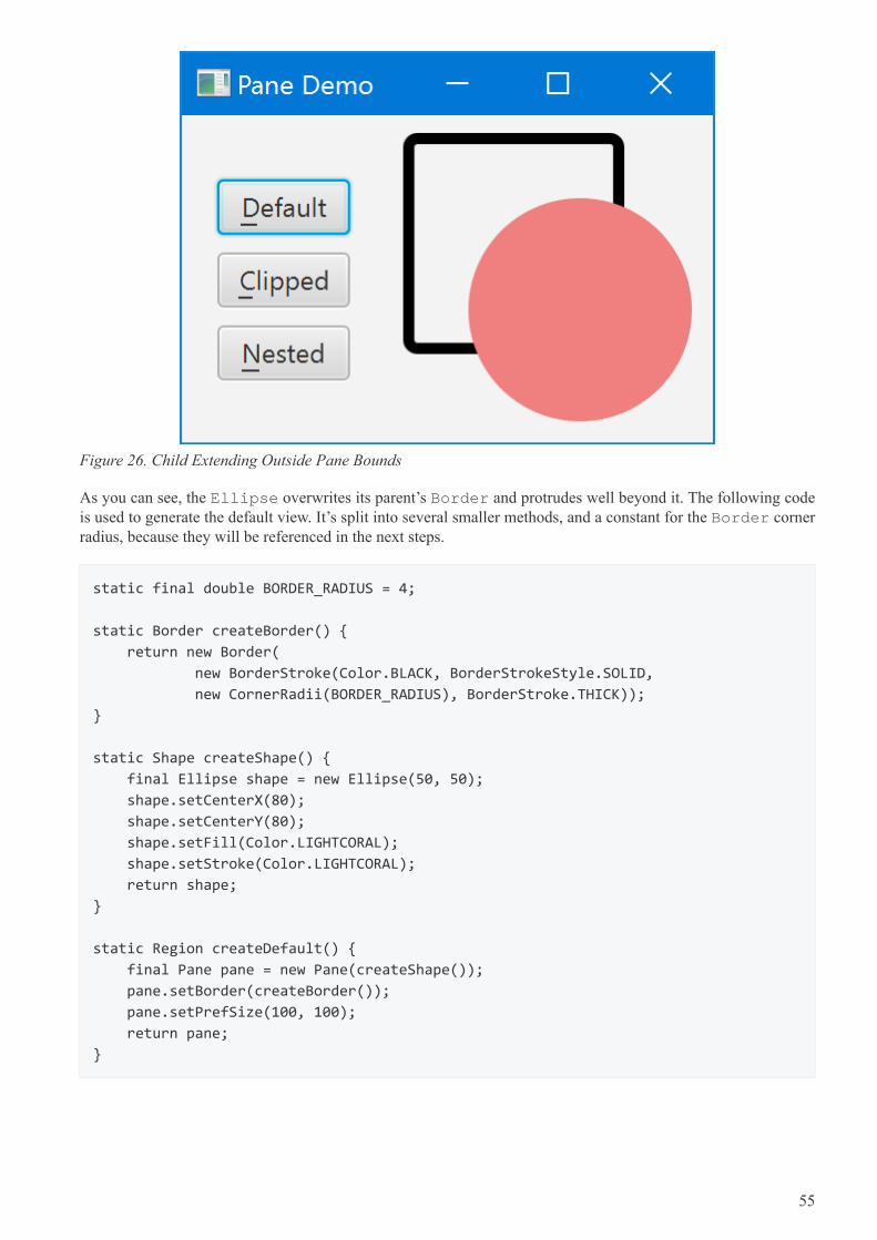
Figure 26. Child Extending Outside Pane Bounds
As you can see, the Ellipse overwrites its parent’s Border and protrudes well beyond it. The following codeis used to generate the default view. It’s split into several smaller methods, and a constant for the Border cornerradius, because they will be referenced in the next steps.
static final double BORDER_RADIUS = 4;
static Border createBorder() {
return new Border(
new BorderStroke(Color.BLACK, BorderStrokeStyle.SOLID,
new CornerRadii(BORDER_RADIUS), BorderStroke.THICK));
}
static Shape createShape() {
final Ellipse shape = new Ellipse(50, 50);
shape.setCenterX(80);
shape.setCenterY(80);
shape.setFill(Color.LIGHTCORAL);
shape.setStroke(Color.LIGHTCORAL);
return shape;
}
static Region createDefault() {
final Pane pane = new Pane(createShape());
pane.setBorder(createBorder());
pane.setPrefSize(100, 100);
return pane;
}
55
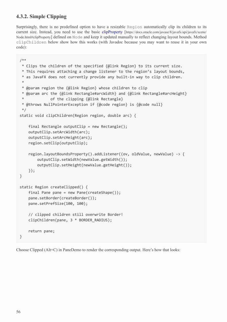
4.3.2. Simple Clipping
Surprisingly, there is no predefined option to have a resizable Region automatically clip its children to itscurrent size. Instead, you need to use the basic clipProperty [https://docs.oracle.com/javase/8/javafx/api/javafx/scene/
Node.html#clipProperty] defined on Node and keep it updated manually to reflect changing layout bounds. MethodclipChildren below show how this works (with Javadoc because you may want to reuse it in your owncode):
/**
* Clips the children of the specified {@link Region} to its current size.
* This requires attaching a change listener to the region’s layout bounds,
* as JavaFX does not currently provide any built-in way to clip children.
*
* @param region the {@link Region} whose children to clip
* @param arc the {@link Rectangle#arcWidth} and {@link Rectangle#arcHeight}
* of the clipping {@link Rectangle}
* @throws NullPointerException if {@code region} is {@code null}
*/
static void clipChildren(Region region, double arc) {
final Rectangle outputClip = new Rectangle();
outputClip.setArcWidth(arc);
outputClip.setArcHeight(arc);
region.setClip(outputClip);
region.layoutBoundsProperty().addListener((ov, oldValue, newValue) -> {
outputClip.setWidth(newValue.getWidth());
outputClip.setHeight(newValue.getHeight());
});
}
static Region createClipped() {
final Pane pane = new Pane(createShape());
pane.setBorder(createBorder());
pane.setPrefSize(100, 100);
// clipped children still overwrite Border!
clipChildren(pane, 3 * BORDER_RADIUS);
return pane;
}
Choose Clipped (Alt+C) in PaneDemo to render the corresponding output. Here’s how that looks:
56
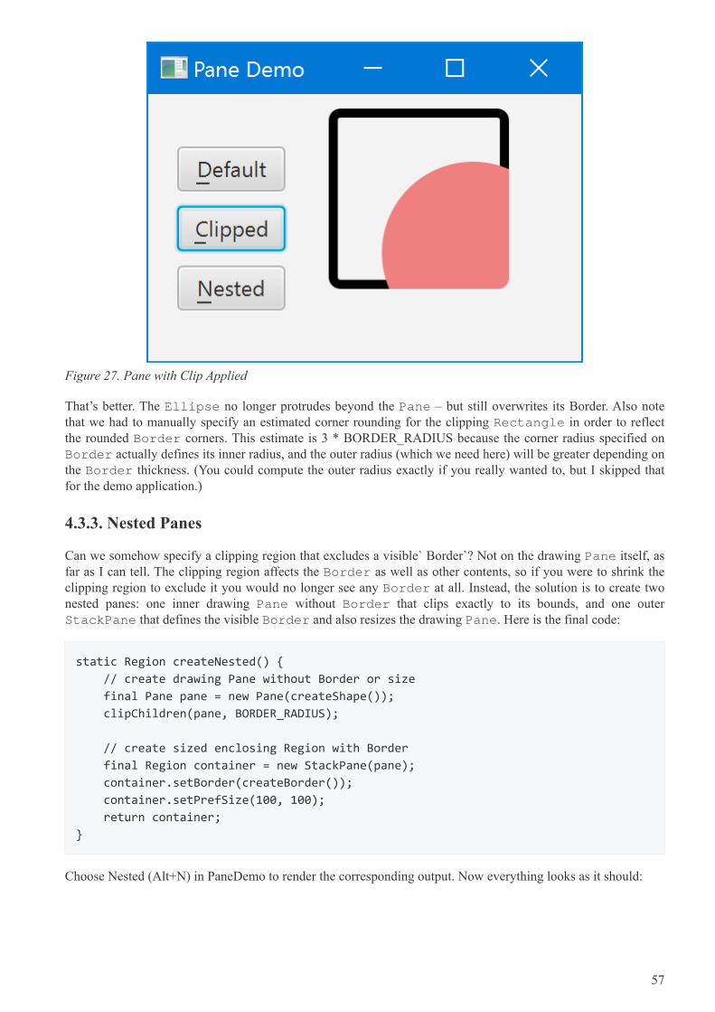
Figure 27. Pane with Clip Applied
That’s better. The Ellipse no longer protrudes beyond the Pane – but still overwrites its Border. Also notethat we had to manually specify an estimated corner rounding for the clipping Rectangle in order to reflectthe rounded Border corners. This estimate is 3 * BORDER_RADIUS because the corner radius specified onBorder actually defines its inner radius, and the outer radius (which we need here) will be greater depending onthe Border thickness. (You could compute the outer radius exactly if you really wanted to, but I skipped thatfor the demo application.)
4.3.3. Nested Panes
Can we somehow specify a clipping region that excludes a visible` Border`? Not on the drawing Pane itself, asfar as I can tell. The clipping region affects the Border as well as other contents, so if you were to shrink theclipping region to exclude it you would no longer see any Border at all. Instead, the solution is to create twonested panes: one inner drawing Pane without Border that clips exactly to its bounds, and one outerStackPane that defines the visible Border and also resizes the drawing Pane. Here is the final code:
static Region createNested() {
// create drawing Pane without Border or size
final Pane pane = new Pane(createShape());
clipChildren(pane, BORDER_RADIUS);
// create sized enclosing Region with Border
final Region container = new StackPane(pane);
container.setBorder(createBorder());
container.setPrefSize(100, 100);
return container;
}
Choose Nested (Alt+N) in PaneDemo to render the corresponding output. Now everything looks as it should:
57
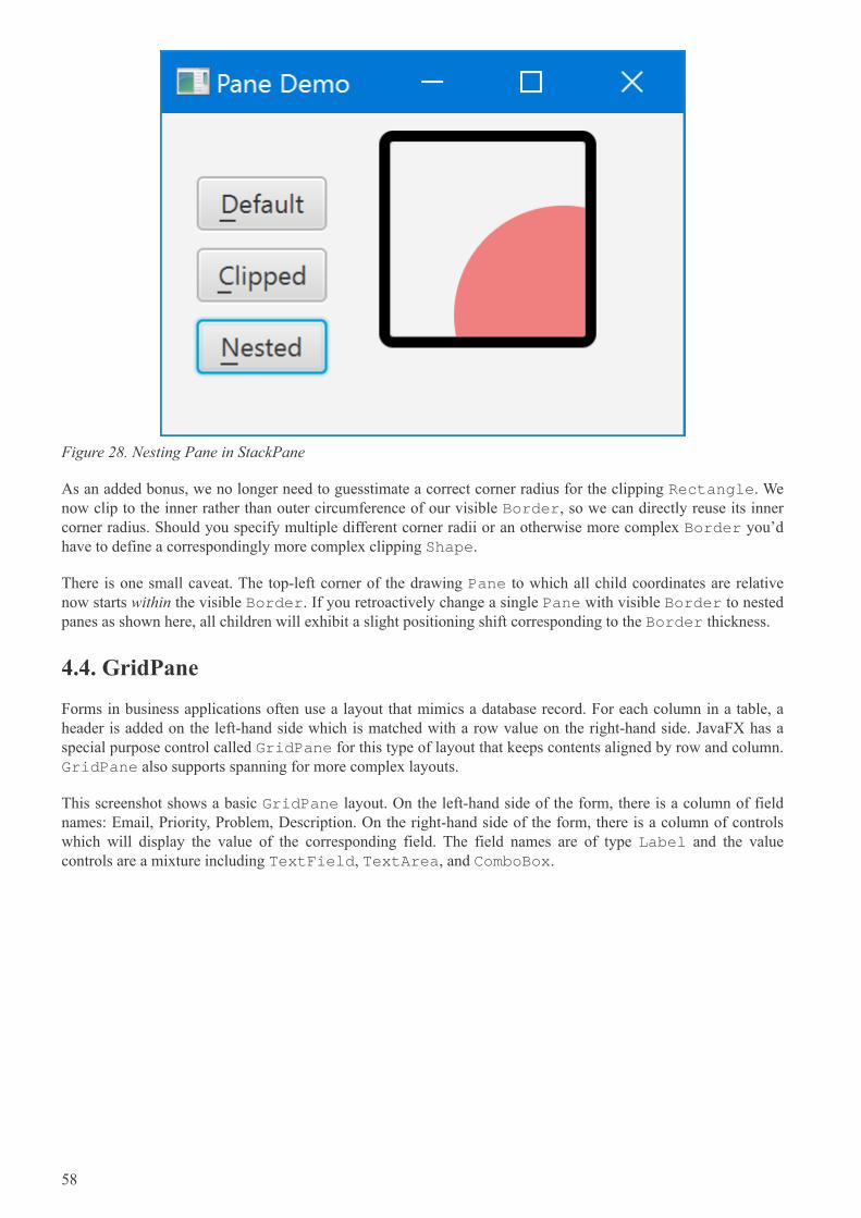
Figure 28. Nesting Pane in StackPane
As an added bonus, we no longer need to guesstimate a correct corner radius for the clipping Rectangle. Wenow clip to the inner rather than outer circumference of our visible Border, so we can directly reuse its innercorner radius. Should you specify multiple different corner radii or an otherwise more complex Border you’dhave to define a correspondingly more complex clipping Shape.
There is one small caveat. The top-left corner of the drawing Pane to which all child coordinates are relativenow starts within the visible Border. If you retroactively change a single Pane with visible Border to nestedpanes as shown here, all children will exhibit a slight positioning shift corresponding to the Border thickness.
4.4. GridPane
Forms in business applications often use a layout that mimics a database record. For each column in a table, aheader is added on the left-hand side which is matched with a row value on the right-hand side. JavaFX has aspecial purpose control called GridPane for this type of layout that keeps contents aligned by row and column.GridPane also supports spanning for more complex layouts.
This screenshot shows a basic GridPane layout. On the left-hand side of the form, there is a column of fieldnames: Email, Priority, Problem, Description. On the right-hand side of the form, there is a column of controlswhich will display the value of the corresponding field. The field names are of type Label and the valuecontrols are a mixture including TextField, TextArea, and ComboBox.
58
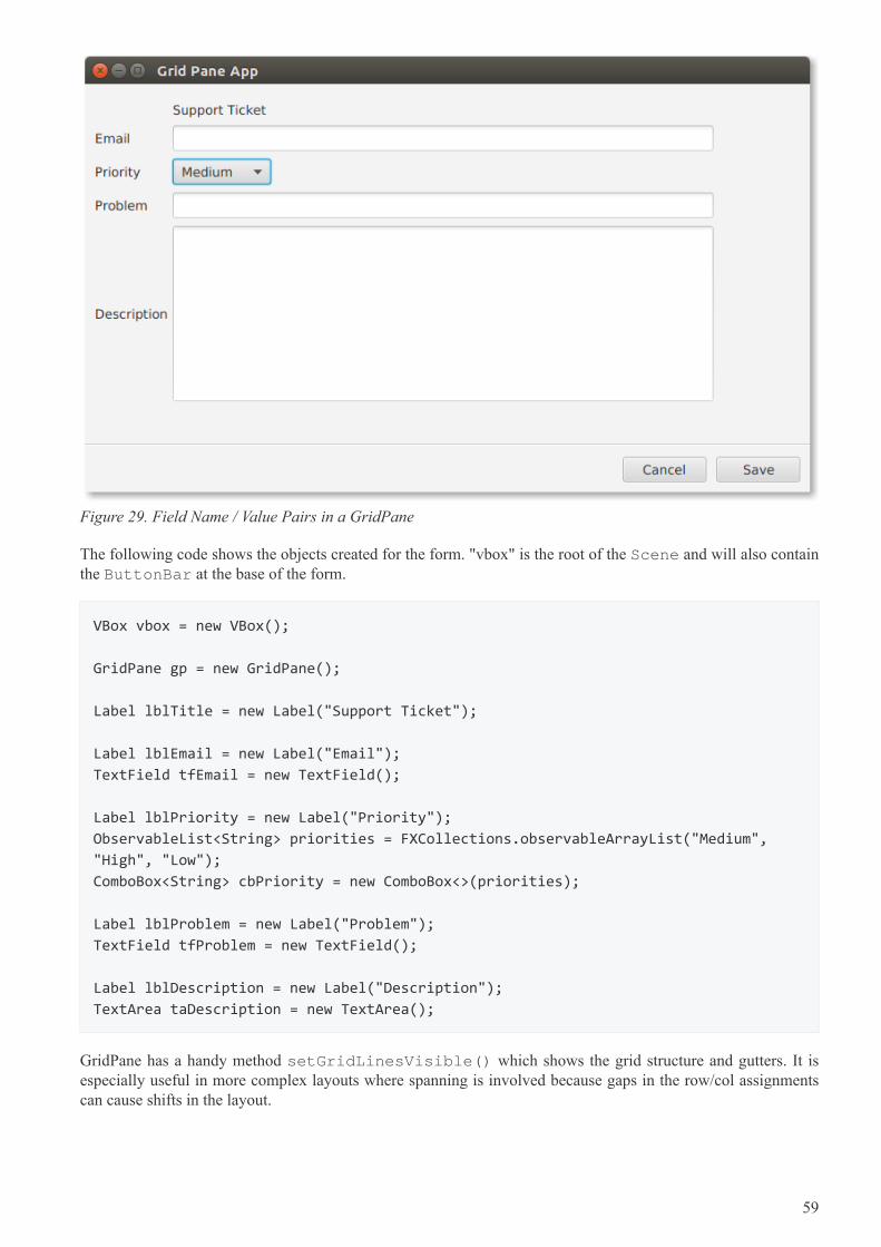
Figure 29. Field Name / Value Pairs in a GridPane
The following code shows the objects created for the form. "vbox" is the root of the Scene and will also containthe ButtonBar at the base of the form.
VBox vbox = new VBox();
GridPane gp = new GridPane();
Label lblTitle = new Label("Support Ticket");
Label lblEmail = new Label("Email");
TextField tfEmail = new TextField();
Label lblPriority = new Label("Priority");
ObservableList<String> priorities = FXCollections.observableArrayList("Medium",
"High", "Low");
ComboBox<String> cbPriority = new ComboBox<>(priorities);
Label lblProblem = new Label("Problem");
TextField tfProblem = new TextField();
Label lblDescription = new Label("Description");
TextArea taDescription = new TextArea();
GridPane has a handy method setGridLinesVisible() which shows the grid structure and gutters. It isespecially useful in more complex layouts where spanning is involved because gaps in the row/col assignmentscan cause shifts in the layout.
59
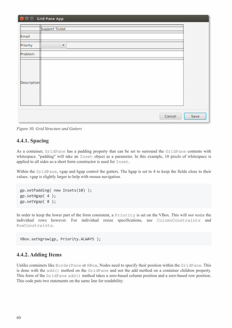
Figure 30. Grid Structure and Gutters
4.4.1. Spacing
As a container, GridPane has a padding property that can be set to surround the GridPane contents withwhitespace. "padding" will take an Inset object as a parameter. In this example, 10 pixels of whitespace isapplied to all sides so a short form constructor is used for Inset.
Within the GridPane, vgap and hgap control the gutters. The hgap is set to 4 to keep the fields close to theirvalues. vgap is slightly larger to help with mouse navigation.
gp.setPadding( new Insets(10) );
gp.setHgap( 4 );
gp.setVgap( 8 );
In order to keep the lower part of the form consistent, a Priority is set on the VBox. This will not resize theindividual rows however. For individual resize specifications, use ColumnConstraints andRowConstraints.
VBox.setVgrow(gp, Priority.ALWAYS );
4.4.2. Adding Items
Unlike containers like BorderPane or HBox, Nodes need to specify their position within the GridPane. Thisis done with the add() method on the GridPane and not the add method on a container children property.This form of the GridPane add() method takes a zero-based column position and a zero-based row position.This code puts two statements on the same line for readability.
60
gp.add( lblTitle, 1, 1); // empty item at 0,0
gp.add( lblEmail, 0, 2); gp.add(tfEmail, 1, 2);
gp.add( lblPriority, 0, 3); gp.add( cbPriority, 1, 3);
gp.add( lblProblem, 0, 4); gp.add( tfProblem, 1, 4);
gp.add( lblDescription, 0, 5); gp.add( taDescription, 1, 5);
lblTitle is put in the second column of the first row. There is no entry in the first column of the first row.
Subsequent additions are presented in pairs. Field name Label objects are put in the first column (columnindex=0) and value controls are put in the second column (column index=1). The rows are added by theincremented second value. For example, lblPriority is put in the fourth row along with its ComboBox.
GridPane is an important container in JavaFX business application design. When you have a requirement forname / value pairs, GridPane will be an easy way to support the strong column orientation of a traditionalform.
4.4.3. Completed Code
The following class is the complete code form the example. This include the definition of the ButtonBarwhich was not presented in the preceding sections focused on GridPane.
public class GridPaneApp extends Application {
@Override
public void start(Stage primaryStage) throws Exception {
VBox vbox = new VBox();
GridPane gp = new GridPane();
gp.setPadding( new Insets(10) );
gp.setHgap( 4 );
gp.setVgap( 8 );
VBox.setVgrow(gp, Priority.ALWAYS );
Label lblTitle = new Label("Support Ticket");
Label lblEmail = new Label("Email");
TextField tfEmail = new TextField();
Label lblPriority = new Label("Priority");
ObservableList<String> priorities =
FXCollections.observableArrayList("Medium", "High", "Low");
ComboBox<String> cbPriority = new ComboBox<>(priorities);
Label lblProblem = new Label("Problem");
TextField tfProblem = new TextField();
Label lblDescription = new Label("Description");
TextArea taDescription = new TextArea();
gp.add( lblTitle, 1, 1); // empty item at 0,0
61
gp.add( lblEmail, 0, 2); gp.add(tfEmail, 1, 2);
gp.add( lblPriority, 0, 3); gp.add( cbPriority, 1, 3);
gp.add( lblProblem, 0, 4); gp.add( tfProblem, 1, 4);
gp.add( lblDescription, 0, 5); gp.add( taDescription, 1, 5);
Separator sep = new Separator(); // hr
ButtonBar buttonBar = new ButtonBar();
buttonBar.setPadding( new Insets(10) );
Button saveButton = new Button("Save");
Button cancelButton = new Button("Cancel");
buttonBar.setButtonData(saveButton, ButtonBar.ButtonData.OK_DONE);
buttonBar.setButtonData(cancelButton, ButtonBar.ButtonData.CANCEL_CLOSE);
buttonBar.getButtons().addAll(saveButton, cancelButton);
vbox.getChildren().addAll( gp, sep, buttonBar );
Scene scene = new Scene(vbox);
primaryStage.setTitle("Grid Pane App");
primaryStage.setScene(scene);
primaryStage.setWidth( 736 );
primaryStage.setHeight( 414 );
primaryStage.show();
}
public static void main(String[] args) {
launch(args);
}
}
4.5. GridPane Spanning
For more complex forms implemented with GridPane, spanning is supported. Spanning allows a control toclaim the space of neighboring columns (colspan) and neighboring rows (rowspan). This screenshot shows aform that extends the example in the previous section. The two-column layout of the earlier version has beenreplaced with a multiple-column layout. Fields like Problem and Description retain the original structure. Butcontrols were added to the rows that formerly held only Email and Priority.
62
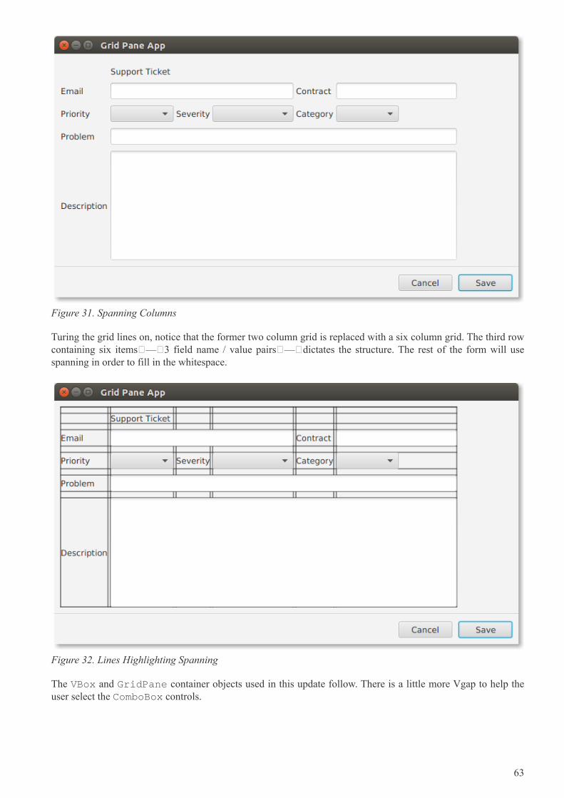
Figure 31. Spanning Columns
Turing the grid lines on, notice that the former two column grid is replaced with a six column grid. The third rowcontaining six items — 3 field name / value pairs — dictates the structure. The rest of the form will usespanning in order to fill in the whitespace.
Figure 32. Lines Highlighting Spanning
The VBox and GridPane container objects used in this update follow. There is a little more Vgap to help theuser select the ComboBox controls.
63
GridPane gp = new GridPane();
gp.setPadding( new Insets(10) );
gp.setHgap( 4 );
gp.setVgap( 10 );
VBox.setVgrow(gp, Priority.ALWAYS );
These are control creation statements from the updated example.
Label lblTitle = new Label("Support Ticket");
Label lblEmail = new Label("Email");
TextField tfEmail = new TextField();
Label lblContract = new Label("Contract");
TextField tfContract = new TextField();
Label lblPriority = new Label("Priority");
ObservableList<String> priorities =
FXCollections.observableArrayList("Medium", "High", "Low");
ComboBox<String> cbPriority = new ComboBox<>(priorities);
Label lblSeverity = new Label("Severity");
ObservableList<String> severities =
FXCollections.observableArrayList("Blocker", "Workaround", "N/A");
ComboBox<String> cbSeverity = new ComboBox<>(severities);
Label lblCategory = new Label("Category");
ObservableList<String> categories =
FXCollections.observableArrayList("Bug", "Feature");
ComboBox<String> cbCategory = new ComboBox<>(categories);
Label lblProblem = new Label("Problem");
TextField tfProblem = new TextField();
Label lblDescription = new Label("Description");
TextArea taDescription = new TextArea();
As in the earlier version, the controls are added to the GridPane using the add() method. A column and roware specified. In this snippet, the indexing it not straightforward as there are gaps expected to be filled in byspanning content.
64
gp.add( lblTitle, 1, 0); // empty item at 0,0
gp.add( lblEmail, 0, 1);
gp.add(tfEmail, 1, 1);
gp.add( lblContract, 4, 1 );
gp.add( tfContract, 5, 1 );
gp.add( lblPriority, 0, 2);
gp.add( cbPriority, 1, 2);
gp.add( lblSeverity, 2, 2);
gp.add( cbSeverity, 3, 2);
gp.add( lblCategory, 4, 2);
gp.add( cbCategory, 5, 2);
gp.add( lblProblem, 0, 3); gp.add( tfProblem, 1, 3);
gp.add( lblDescription, 0, 4); gp.add( taDescription, 1, 4);
Finally, the spanning definitions are set using a static method on GridPane. There is a similar method to dorow spanning. Title will take up 5 columns as will Problem and Description. Email shares a row with Contract,but will take up more columns. The third row of ComboBoxes is a set of three field/value pairs each taking upone column.
GridPane.setColumnSpan( lblTitle, 5 );
GridPane.setColumnSpan( tfEmail, 3 );
GridPane.setColumnSpan( tfProblem, 5 );
GridPane.setColumnSpan( taDescription, 5 );
Alternatively, a variation of the add() method will columnSpan and rowSpan arguments to avoid the subsequentstatic method call.
This expanded GridPane example demonstrated column spanning. The same capability is available for rowspanning which would allow a control to claim additional vertical space. Spanning keeps controls aligned evenin cases where the number of items in a given row (or column) varies. To keep the focus on the spanning topic,this grid allowed the column widths to vary. The article on ColumnConstraints and RowConstraintswill focus on building true modular and column typographical grids by better controlling the columns (androws).
4.5.1. Completed Code
The following is the completed code for the spanning GridPane example.
public class ComplexGridPaneApp extends Application {
@Override
public void start(Stage primaryStage) throws Exception {
VBox vbox = new VBox();
GridPane gp = new GridPane();
gp.setPadding( new Insets(10) );
gp.setHgap( 4 );
65
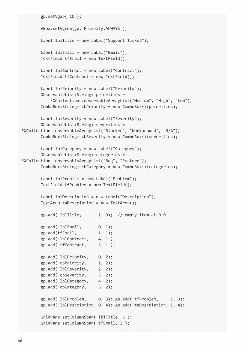
gp.setVgap( 10 );
VBox.setVgrow(gp, Priority.ALWAYS );
Label lblTitle = new Label("Support Ticket");
Label lblEmail = new Label("Email");
TextField tfEmail = new TextField();
Label lblContract = new Label("Contract");
TextField tfContract = new TextField();
Label lblPriority = new Label("Priority");
ObservableList<String> priorities =
FXCollections.observableArrayList("Medium", "High", "Low");
ComboBox<String> cbPriority = new ComboBox<>(priorities);
Label lblSeverity = new Label("Severity");
ObservableList<String> severities =
FXCollections.observableArrayList("Blocker", "Workaround", "N/A");
ComboBox<String> cbSeverity = new ComboBox<>(severities);
Label lblCategory = new Label("Category");
ObservableList<String> categories =
FXCollections.observableArrayList("Bug", "Feature");
ComboBox<String> cbCategory = new ComboBox<>(categories);
Label lblProblem = new Label("Problem");
TextField tfProblem = new TextField();
Label lblDescription = new Label("Description");
TextArea taDescription = new TextArea();
gp.add( lblTitle, 1, 0); // empty item at 0,0
gp.add( lblEmail, 0, 1);
gp.add(tfEmail, 1, 1);
gp.add( lblContract, 4, 1 );
gp.add( tfContract, 5, 1 );
gp.add( lblPriority, 0, 2);
gp.add( cbPriority, 1, 2);
gp.add( lblSeverity, 2, 2);
gp.add( cbSeverity, 3, 2);
gp.add( lblCategory, 4, 2);
gp.add( cbCategory, 5, 2);
gp.add( lblProblem, 0, 3); gp.add( tfProblem, 1, 3);
gp.add( lblDescription, 0, 4); gp.add( taDescription, 1, 4);
GridPane.setColumnSpan( lblTitle, 5 );
GridPane.setColumnSpan( tfEmail, 3 );
66
GridPane.setColumnSpan( tfProblem, 5 );
GridPane.setColumnSpan( taDescription, 5 );
Separator sep = new Separator(); // hr
ButtonBar buttonBar = new ButtonBar();
buttonBar.setPadding( new Insets(10) );
Button saveButton = new Button("Save");
Button cancelButton = new Button("Cancel");
buttonBar.setButtonData(saveButton, ButtonBar.ButtonData.OK_DONE);
buttonBar.setButtonData(cancelButton, ButtonBar.ButtonData.CANCEL_CLOSE);
buttonBar.getButtons().addAll(saveButton, cancelButton);
vbox.getChildren().addAll( gp, sep, buttonBar );
Scene scene = new Scene(vbox);
primaryStage.setTitle("Grid Pane App");
primaryStage.setScene(scene);
primaryStage.setWidth( 736 );
primaryStage.setHeight( 414 );
primaryStage.show();
}
public static void main(String[] args) {
launch(args);
}
}
4.6. GridPane ColumnConstraints and RowConstraints
Previous articles on GridPane showed how to create a two-column layout with field names on the left-handside and field values on the right-hand side. That example was expanded to add more controls to a given row andto use spanning handle gaps in content. This article introduces a pair of JavaFX classes ColumnConstraintsand RowConstraints. These classes give additional specification to a row or column. In this example, a rowcontaining a TextArea will be given all extra space when the window is resized. The two columns will be setto equals widths.
This screenshot shows an example modified from previous articles. The demo program for this article has arotated feel whereby the field names are paired with the field values vertically (on top of the values) rather thanhorizontally. Row spanning and column spanning is used to align items that are larger than a single cell.
67
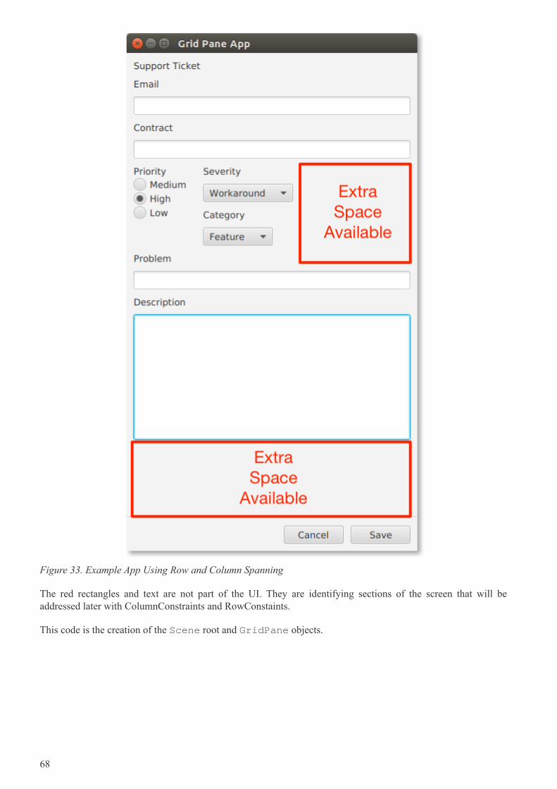
Figure 33. Example App Using Row and Column Spanning
The red rectangles and text are not part of the UI. They are identifying sections of the screen that will beaddressed later with ColumnConstraints and RowConstaints.
This code is the creation of the Scene root and GridPane objects.
68
VBox vbox = new VBox();
GridPane gp = new GridPane();
gp.setPadding( new Insets(10) );
gp.setHgap( 4 );
gp.setVgap( 10 );
VBox.setVgrow(gp, Priority.ALWAYS );
This code creates the UI controls objects used in the article. Notice that Priority is now implemented as a VBoxcontaining RadioButtons.
Label lblTitle = new Label("Support Ticket");
Label lblEmail = new Label("Email");
TextField tfEmail = new TextField();
Label lblContract = new Label("Contract");
TextField tfContract = new TextField();
Label lblPriority = new Label("Priority");
RadioButton rbMedium = new RadioButton("Medium");
RadioButton rbHigh = new RadioButton("High");
RadioButton rbLow = new RadioButton("Low");
VBox priorityVBox = new VBox();
priorityVBox.setSpacing( 2 );
GridPane.setVgrow(priorityVBox, Priority.SOMETIMES);
priorityVBox.getChildren().addAll( lblPriority, rbMedium, rbHigh, rbLow );
Label lblSeverity = new Label("Severity");
ObservableList<String> severities =
FXCollections.observableArrayList("Blocker", "Workaround", "N/A");
ComboBox<String> cbSeverity = new ComboBox<>(severities);
Label lblCategory = new Label("Category");
ObservableList<String> categories =
FXCollections.observableArrayList("Bug", "Feature");
ComboBox<String> cbCategory = new ComboBox<>(categories);
Label lblProblem = new Label("Problem");
TextField tfProblem = new TextField();
Label lblDescription = new Label("Description");
TextArea taDescription = new TextArea();
The Label and value control pairings of Email, Contract, Problem, and Description are put in a single column.They should take the full width of the GridPane so each has its columnSpan set to 2.
69
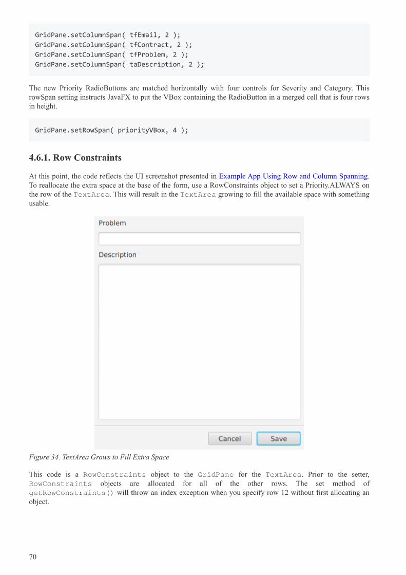
GridPane.setColumnSpan( tfEmail, 2 );
GridPane.setColumnSpan( tfContract, 2 );
GridPane.setColumnSpan( tfProblem, 2 );
GridPane.setColumnSpan( taDescription, 2 );
The new Priority RadioButtons are matched horizontally with four controls for Severity and Category. ThisrowSpan setting instructs JavaFX to put the VBox containing the RadioButton in a merged cell that is four rowsin height.
GridPane.setRowSpan( priorityVBox, 4 );
4.6.1. Row Constraints
At this point, the code reflects the UI screenshot presented in Example App Using Row and Column Spanning.To reallocate the extra space at the base of the form, use a RowConstraints object to set a Priority.ALWAYS onthe row of the TextArea. This will result in the TextArea growing to fill the available space with somethingusable.
Figure 34. TextArea Grows to Fill Extra Space
This code is a RowConstraints object to the GridPane for the TextArea. Prior to the setter,RowConstraints objects are allocated for all of the other rows. The set method ofgetRowConstraints() will throw an index exception when you specify row 12 without first allocating anobject.
70
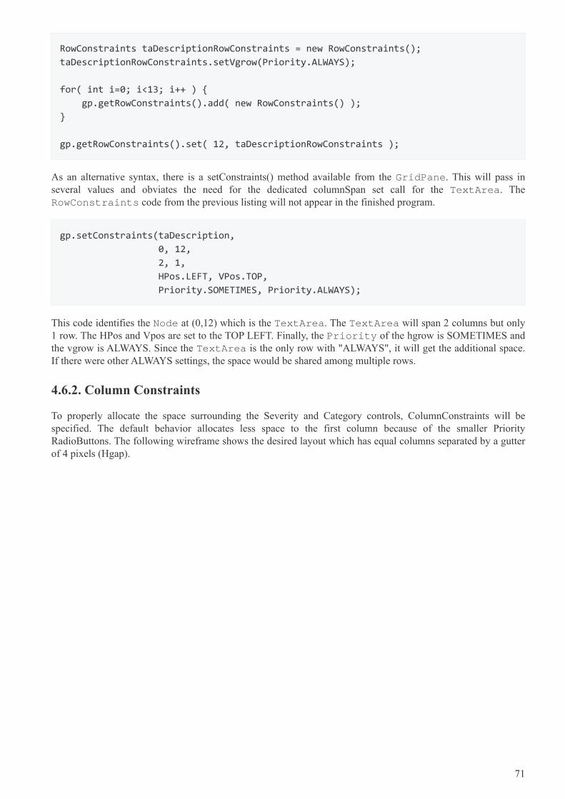
RowConstraints taDescriptionRowConstraints = new RowConstraints();
taDescriptionRowConstraints.setVgrow(Priority.ALWAYS);
for( int i=0; i<13; i++ ) {
gp.getRowConstraints().add( new RowConstraints() );
}
gp.getRowConstraints().set( 12, taDescriptionRowConstraints );
As an alternative syntax, there is a setConstraints() method available from the GridPane. This will pass inseveral values and obviates the need for the dedicated columnSpan set call for the TextArea. TheRowConstraints code from the previous listing will not appear in the finished program.
gp.setConstraints(taDescription,
0, 12,
2, 1,
HPos.LEFT, VPos.TOP,
Priority.SOMETIMES, Priority.ALWAYS);
This code identifies the Node at (0,12) which is the TextArea. The TextArea will span 2 columns but only1 row. The HPos and Vpos are set to the TOP LEFT. Finally, the Priority of the hgrow is SOMETIMES andthe vgrow is ALWAYS. Since the TextArea is the only row with "ALWAYS", it will get the additional space.If there were other ALWAYS settings, the space would be shared among multiple rows.
4.6.2. Column Constraints
To properly allocate the space surrounding the Severity and Category controls, ColumnConstraints will bespecified. The default behavior allocates less space to the first column because of the smaller PriorityRadioButtons. The following wireframe shows the desired layout which has equal columns separated by a gutterof 4 pixels (Hgap).
71
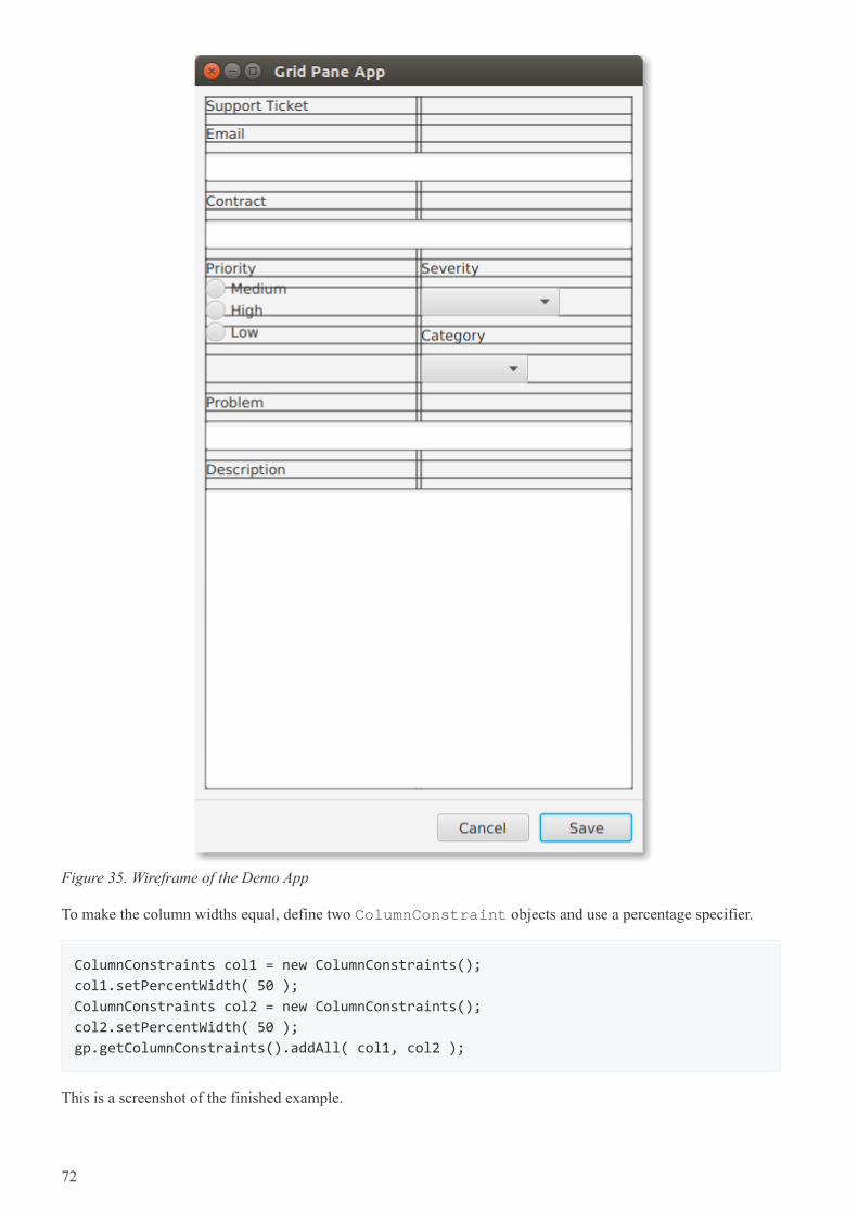
Figure 35. Wireframe of the Demo App
To make the column widths equal, define two ColumnConstraint objects and use a percentage specifier.
ColumnConstraints col1 = new ColumnConstraints();
col1.setPercentWidth( 50 );
ColumnConstraints col2 = new ColumnConstraints();
col2.setPercentWidth( 50 );
gp.getColumnConstraints().addAll( col1, col2 );
This is a screenshot of the finished example.
72
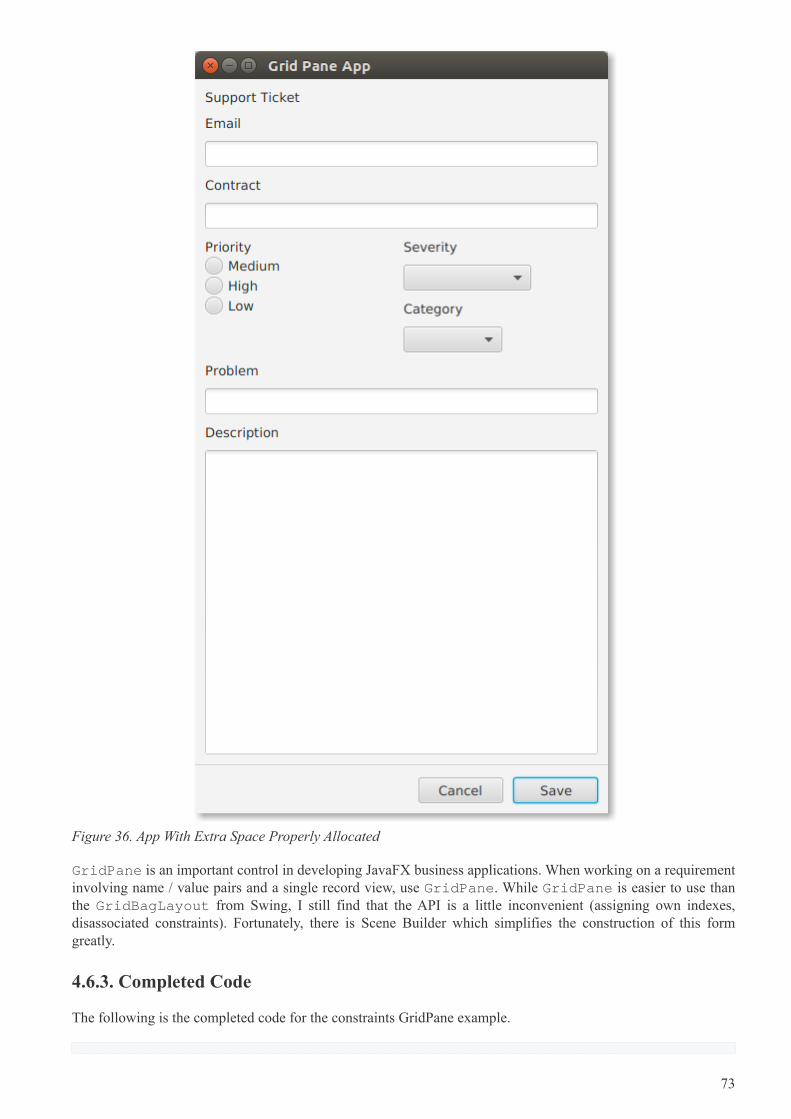
Figure 36. App With Extra Space Properly Allocated
GridPane is an important control in developing JavaFX business applications. When working on a requirementinvolving name / value pairs and a single record view, use GridPane. While GridPane is easier to use thanthe GridBagLayout from Swing, I still find that the API is a little inconvenient (assigning own indexes,disassociated constraints). Fortunately, there is Scene Builder which simplifies the construction of this formgreatly.
4.6.3. Completed Code
The following is the completed code for the constraints GridPane example.
73
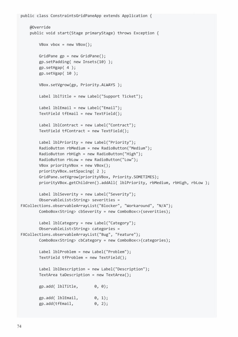
public class ConstraintsGridPaneApp extends Application {
@Override
public void start(Stage primaryStage) throws Exception {
VBox vbox = new VBox();
GridPane gp = new GridPane();
gp.setPadding( new Insets(10) );
gp.setHgap( 4 );
gp.setVgap( 10 );
VBox.setVgrow(gp, Priority.ALWAYS );
Label lblTitle = new Label("Support Ticket");
Label lblEmail = new Label("Email");
TextField tfEmail = new TextField();
Label lblContract = new Label("Contract");
TextField tfContract = new TextField();
Label lblPriority = new Label("Priority");
RadioButton rbMedium = new RadioButton("Medium");
RadioButton rbHigh = new RadioButton("High");
RadioButton rbLow = new RadioButton("Low");
VBox priorityVBox = new VBox();
priorityVBox.setSpacing( 2 );
GridPane.setVgrow(priorityVBox, Priority.SOMETIMES);
priorityVBox.getChildren().addAll( lblPriority, rbMedium, rbHigh, rbLow );
Label lblSeverity = new Label("Severity");
ObservableList<String> severities =
FXCollections.observableArrayList("Blocker", "Workaround", "N/A");
ComboBox<String> cbSeverity = new ComboBox<>(severities);
Label lblCategory = new Label("Category");
ObservableList<String> categories =
FXCollections.observableArrayList("Bug", "Feature");
ComboBox<String> cbCategory = new ComboBox<>(categories);
Label lblProblem = new Label("Problem");
TextField tfProblem = new TextField();
Label lblDescription = new Label("Description");
TextArea taDescription = new TextArea();
gp.add( lblTitle, 0, 0);
gp.add( lblEmail, 0, 1);
gp.add(tfEmail, 0, 2);
74
gp.add( lblContract, 0, 3 );
gp.add( tfContract, 0, 4 );
gp.add( priorityVBox, 0, 5);
gp.add( lblSeverity, 1, 5);
gp.add( cbSeverity, 1, 6);
gp.add( lblCategory, 1, 7);
gp.add( cbCategory, 1, 8);
gp.add( lblProblem, 0, 9);
gp.add( tfProblem, 0, 10);
gp.add( lblDescription, 0, 11);
gp.add( taDescription, 0, 12);
GridPane.setColumnSpan( tfEmail, 2 );
GridPane.setColumnSpan( tfContract, 2 );
GridPane.setColumnSpan( tfProblem, 2 );
GridPane.setRowSpan( priorityVBox, 4 );
gp.setConstraints(taDescription,
0, 12,
2, 1,
HPos.LEFT, VPos.TOP,
Priority.SOMETIMES, Priority.ALWAYS);
ColumnConstraints col1 = new ColumnConstraints();
col1.setPercentWidth( 50 );
ColumnConstraints col2 = new ColumnConstraints();
col2.setPercentWidth( 50 );
gp.getColumnConstraints().addAll( col1, col2 );
Separator sep = new Separator(); // hr
ButtonBar buttonBar = new ButtonBar();
buttonBar.setPadding( new Insets(10) );
Button saveButton = new Button("Save");
Button cancelButton = new Button("Cancel");
buttonBar.setButtonData(saveButton, ButtonBar.ButtonData.OK_DONE);
buttonBar.setButtonData(cancelButton, ButtonBar.ButtonData.CANCEL_CLOSE);
buttonBar.getButtons().addAll(saveButton, cancelButton);
vbox.getChildren().addAll( gp, sep, buttonBar );
Scene scene = new Scene(vbox);
primaryStage.setTitle("Grid Pane App");
75
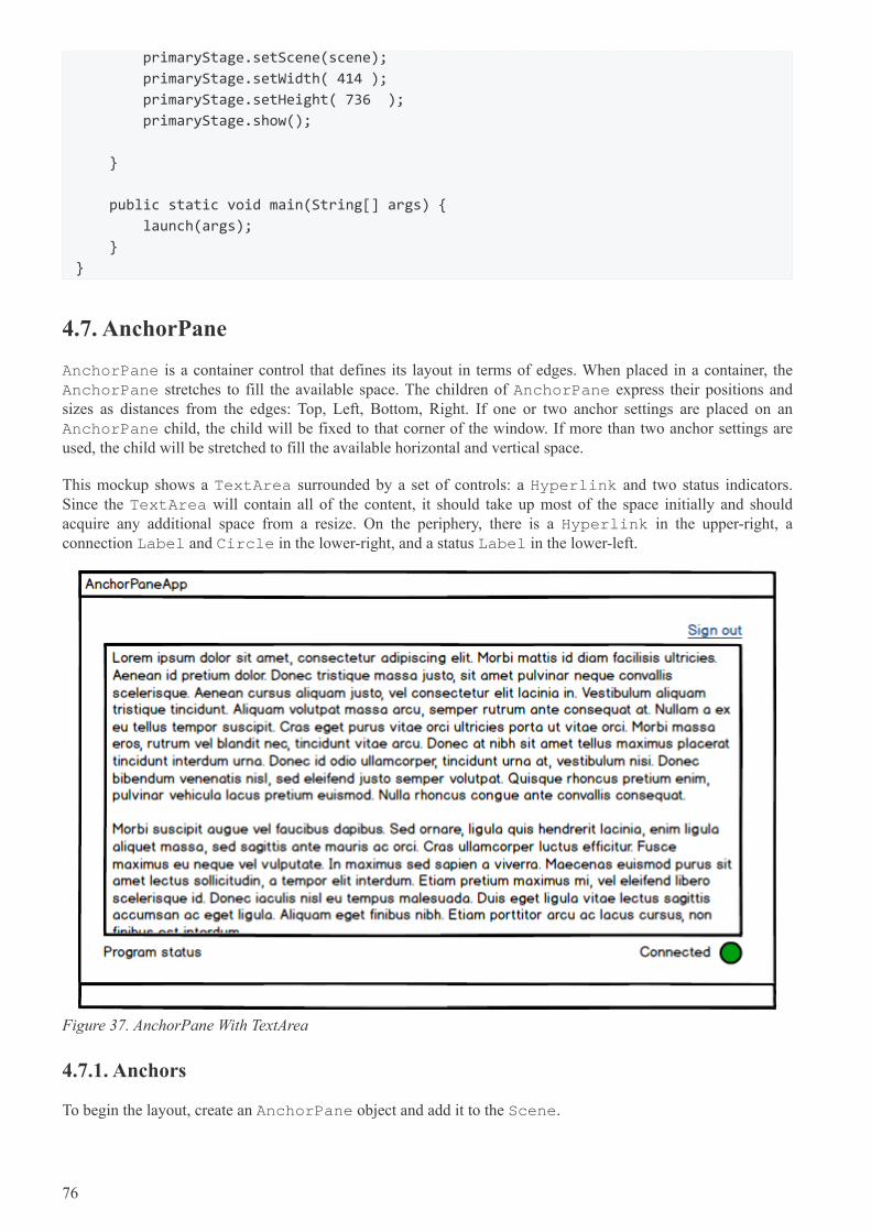
primaryStage.setScene(scene);
primaryStage.setWidth( 414 );
primaryStage.setHeight( 736 );
primaryStage.show();
}
public static void main(String[] args) {
launch(args);
}
}
4.7. AnchorPane
AnchorPane is a container control that defines its layout in terms of edges. When placed in a container, theAnchorPane stretches to fill the available space. The children of AnchorPane express their positions andsizes as distances from the edges: Top, Left, Bottom, Right. If one or two anchor settings are placed on anAnchorPane child, the child will be fixed to that corner of the window. If more than two anchor settings areused, the child will be stretched to fill the available horizontal and vertical space.
This mockup shows a TextArea surrounded by a set of controls: a Hyperlink and two status indicators.Since the TextArea will contain all of the content, it should take up most of the space initially and shouldacquire any additional space from a resize. On the periphery, there is a Hyperlink in the upper-right, aconnection Label and Circle in the lower-right, and a status Label in the lower-left.
Figure 37. AnchorPane With TextArea
4.7.1. Anchors
To begin the layout, create an AnchorPane object and add it to the Scene.
76
AnchorPane ap = new AnchorPane();
Scene scene = new Scene(ap);
Anchors are set using static methods of the AnchorPane class. The methods — one per edge — accept theNode and an offset. For the Hyperlink, an anchor to the top edge and an anchor to the right edge will be set.An offset of 10.0 is set for each edge so that the link is not compressed against the side.
Hyperlink signoutLink = new Hyperlink("Sign Out");
ap.getChildren().add( signoutLink );
AnchorPane.setTopAnchor( signoutLink, 10.0d );
AnchorPane.setRightAnchor( signoutLink, 10.0d );
When the screen is resized, the AnchorPane will resize and signoutLink will maintain its top-right position.Because neither the left nor bottom anchors are specified, signoutLink will not be stretched.
Next, the connection Label and Circle are added. These controls are wrapped in an HBox.
Circle circle = new Circle();
circle.setFill(Color.GREEN );
circle.setRadius(10);
Label connLabel = new Label("Connection");
HBox connHBox = new HBox();
connHBox.setSpacing( 4.0d );
connHBox.setAlignment(Pos.BOTTOM_RIGHT);
connHBox.getChildren().addAll( connLabel, circle );
AnchorPane.setBottomAnchor( connHBox, 10.0d );
AnchorPane.setRightAnchor( connHBox, 10.0d );
ap.getChildren().add( connHBox );
As with signoutLink, connHBox is fixed to a place on the screen. connHBox is set to be 10 pixels from thebottom edge and 10 pixels from the right edge.
The lower-left status Label is added. The left and the bottom anchors are set.
Label statusLabel = new Label("Program status");
ap.getChildren().add( statusLabel );
AnchorPane.setBottomAnchor( statusLabel, 10.0d );
AnchorPane.setLeftAnchor( statusLabel, 10.0d );
This is a screenshot of the finished app. The status and control labels are at the bottom of the screen, pinned tothe left and right edges respectively. The Hyperlink is pinned to the top-right.
77
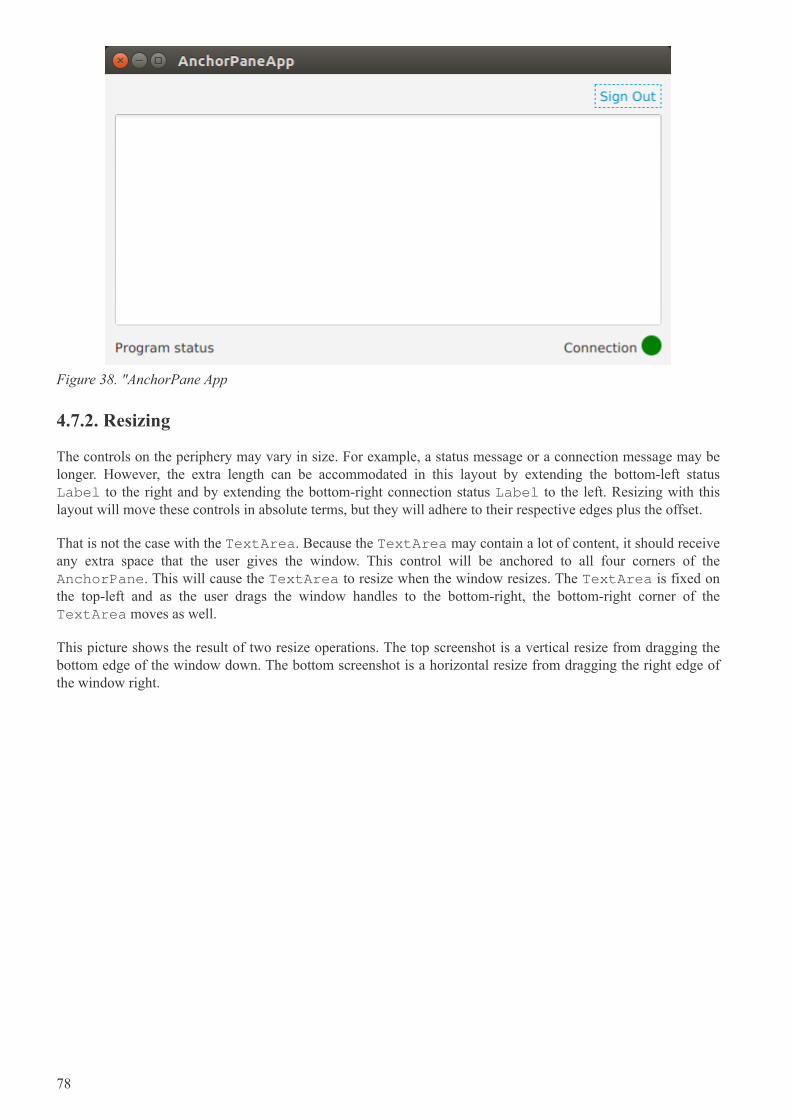
Figure 38. "AnchorPane App
4.7.2. Resizing
The controls on the periphery may vary in size. For example, a status message or a connection message may belonger. However, the extra length can be accommodated in this layout by extending the bottom-left statusLabel to the right and by extending the bottom-right connection status Label to the left. Resizing with thislayout will move these controls in absolute terms, but they will adhere to their respective edges plus the offset.
That is not the case with the TextArea. Because the TextArea may contain a lot of content, it should receiveany extra space that the user gives the window. This control will be anchored to all four corners of theAnchorPane. This will cause the TextArea to resize when the window resizes. The TextArea is fixed onthe top-left and as the user drags the window handles to the bottom-right, the bottom-right corner of theTextArea moves as well.
This picture shows the result of two resize operations. The top screenshot is a vertical resize from dragging thebottom edge of the window down. The bottom screenshot is a horizontal resize from dragging the right edge ofthe window right.
78
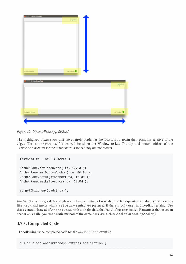
Figure 39. "AnchorPane App Resized
The highlighted boxes show that the controls bordering the TextArea retain their positions relative to theedges. The TextArea itself is resized based on the Window resize. The top and bottom offsets of theTextArea account for the other controls so that they are not hidden.
TextArea ta = new TextArea();
AnchorPane.setTopAnchor( ta, 40.0d );
AnchorPane.setBottomAnchor( ta, 40.0d );
AnchorPane.setRightAnchor( ta, 10.0d );
AnchorPane.setLeftAnchor( ta, 10.0d );
ap.getChildren().add( ta );
AnchorPane is a good choice when you have a mixture of resizable and fixed-position children. Other controlslike VBox and HBox with a Priority setting are preferred if there is only one child needing resizing. Usethese controls instead of AnchorPane with a single child that has all four anchors set. Remember that to set ananchor on a child, you use a static method of the container class such as AnchorPane.setTopAnchor().
4.7.3. Completed Code
The following is the completed code for the AnchorPane example.
public class AnchorPaneApp extends Application {
79
@Override
public void start(Stage primaryStage) throws Exception {
AnchorPane ap = new AnchorPane();
// upper-right sign out control
Hyperlink signoutLink = new Hyperlink("Sign Out");
ap.getChildren().add( signoutLink );
AnchorPane.setTopAnchor( signoutLink, 10.0d );
AnchorPane.setRightAnchor( signoutLink, 10.0d );
// lower-left status label
Label statusLabel = new Label("Program status");
ap.getChildren().add( statusLabel );
AnchorPane.setBottomAnchor( statusLabel, 10.0d );
AnchorPane.setLeftAnchor( statusLabel, 10.0d );
// lower-right connection status control
Circle circle = new Circle();
circle.setFill(Color.GREEN );
circle.setRadius(10);
Label connLabel = new Label("Connection");
HBox connHBox = new HBox();
connHBox.setSpacing( 4.0d );
connHBox.setAlignment(Pos.BOTTOM_RIGHT);
connHBox.getChildren().addAll( connLabel, circle );
AnchorPane.setBottomAnchor( connHBox, 10.0d );
AnchorPane.setRightAnchor( connHBox, 10.0d );
ap.getChildren().add( connHBox );
// top-left content; takes up extra space
TextArea ta = new TextArea();
ap.getChildren().add( ta );
AnchorPane.setTopAnchor( ta, 40.0d );
AnchorPane.setBottomAnchor( ta, 40.0d );
AnchorPane.setRightAnchor( ta, 10.0d );
AnchorPane.setLeftAnchor( ta, 10.0d );
Scene scene = new Scene(ap);
primaryStage.setTitle("AnchorPaneApp");
primaryStage.setScene( scene );
primaryStage.setWidth(568);
80
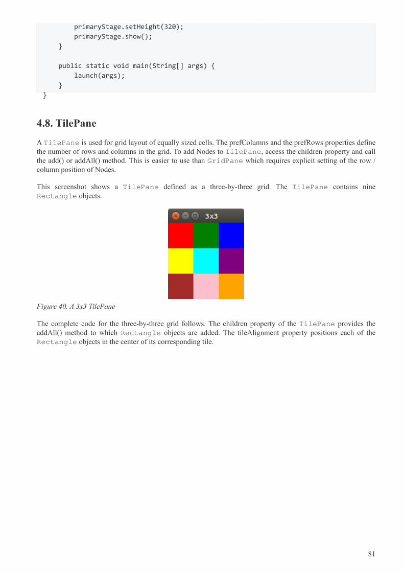
primaryStage.setHeight(320);
primaryStage.show();
}
public static void main(String[] args) {
launch(args);
}
}
4.8. TilePane
A TilePane is used for grid layout of equally sized cells. The prefColumns and the prefRows properties definethe number of rows and columns in the grid. To add Nodes to TilePane, access the children property and callthe add() or addAll() method. This is easier to use than GridPane which requires explicit setting of the row /column position of Nodes.
This screenshot shows a TilePane defined as a three-by-three grid. The TilePane contains nineRectangle objects.
Figure 40. A 3x3 TilePane
The complete code for the three-by-three grid follows. The children property of the TilePane provides theaddAll() method to which Rectangle objects are added. The tileAlignment property positions each of theRectangle objects in the center of its corresponding tile.
81
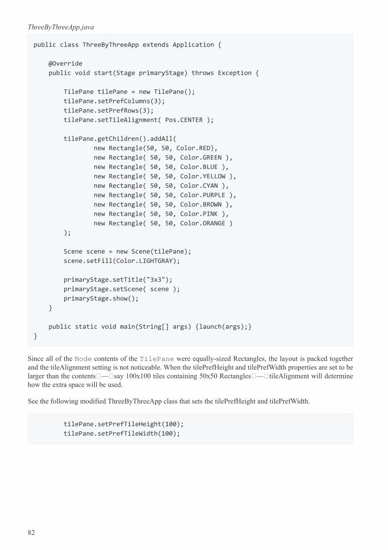
ThreeByThreeApp.java
public class ThreeByThreeApp extends Application {
@Override
public void start(Stage primaryStage) throws Exception {
TilePane tilePane = new TilePane();
tilePane.setPrefColumns(3);
tilePane.setPrefRows(3);
tilePane.setTileAlignment( Pos.CENTER );
tilePane.getChildren().addAll(
new Rectangle(50, 50, Color.RED),
new Rectangle( 50, 50, Color.GREEN ),
new Rectangle( 50, 50, Color.BLUE ),
new Rectangle( 50, 50, Color.YELLOW ),
new Rectangle( 50, 50, Color.CYAN ),
new Rectangle( 50, 50, Color.PURPLE ),
new Rectangle( 50, 50, Color.BROWN ),
new Rectangle( 50, 50, Color.PINK ),
new Rectangle( 50, 50, Color.ORANGE )
);
Scene scene = new Scene(tilePane);
scene.setFill(Color.LIGHTGRAY);
primaryStage.setTitle("3x3");
primaryStage.setScene( scene );
primaryStage.show();
}
public static void main(String[] args) {launch(args);}
}
Since all of the Node contents of the TilePane were equally-sized Rectangles, the layout is packed togetherand the tileAlignment setting is not noticeable. When the tilePrefHeight and tilePrefWidth properties are set to belarger than the contents — say 100x100 tiles containing 50x50 Rectangles — tileAlignment will determinehow the extra space will be used.
See the following modified ThreeByThreeApp class that sets the tilePrefHeight and tilePrefWidth.
tilePane.setPrefTileHeight(100);
tilePane.setPrefTileWidth(100);
82
Figure 41. 3x3 TilePane (Modified)
In the prior screenshots, nine Rectangle objects were provided to the three-by-three grid. If the contents do notmatch up with the TilePane definition, those cells will collapse. This modification adds only five Rectanglesrather than nine. The first row contains has content for all three tiles. The second row has content for only thefirst two files. The third row is missing entirely.
Figure 42. 3x3 App - Sparse
There is a property "orientation" that instructs TilePane to add items row-by-row (HORIZONTAL, thedefault) or column-by-column (VERTICAL). If VERTICAL is used, then the first column will have threeelements, the second column will have only the top two, and the third column will be missing. This screenshotshows the five Rectangles being added to the three-by-three grid (nine tiles) using VERTICAL orientation.
83
Figure 43. 3x3 App - VERTICAL
4.8.1. Algorithms
It is possible to create JavaFX grid layouts with other containers like GridPane, VBox, and HBox. TilePane isa convenience that defines the grid layout in advance and makes adding items to the grid a simple add() oraddAll() call. Unlike a grid layout built with a combination of nested VBox and HBox containers, theTilePane contents are direct children. This makes it easy to loop over the children during event processingwhich helps implement certain algorithms.
This example app places four Circles in a TilePane. An event handler is attached to the TilePane whichlooks for a selection of one of the Circles. If a Circle is selected, it is dimmed through the opacity setting. If theCircle is re-selected, its original color is restored. This screenshot shows the app with the blue Circleappearing purple-ish because it has been selected.
Figure 44. TileApp with Blue Circle Selected
The program begins by adding the items and setting a custom property "selected" using the Java 8 Stream API.
84
TileApp.java
TilePane tilePane = new TilePane();
tilePane.setPrefColumns(2);
tilePane.setPrefRows(2);
tilePane.setTileAlignment( Pos.CENTER );
Circle redCircle = new Circle(50, Color.RED);
Circle greenCircle = new Circle( 50, Color.GREEN );
Circle blueCircle = new Circle( 50, Color.BLUE );
Circle yellowCircle = new Circle( 50, Color.YELLOW );
List<Circle> circles = new ArrayList<>();
circles.add( redCircle );
circles.add( greenCircle );
circles.add( blueCircle );
circles.add( yellowCircle );
circles
.stream()
.forEach( (c) -> c.getProperties().put( "selected", Boolean.FALSE
));
tilePane.getChildren().addAll(
circles
);
Next, the event handler is attached to the mouse event. This is also using Java 8 Streams. The filter() method isdetermining whether or not a Circle is selected using the Node.contains() method on converted coordinates. Ifthat expression passes, findFirst() is used to retrieve the first (and in this case, only) match. The block of code inifPresent() sets the "selected" flag for keeping track of the Circle state and tweaks the opacity.
85
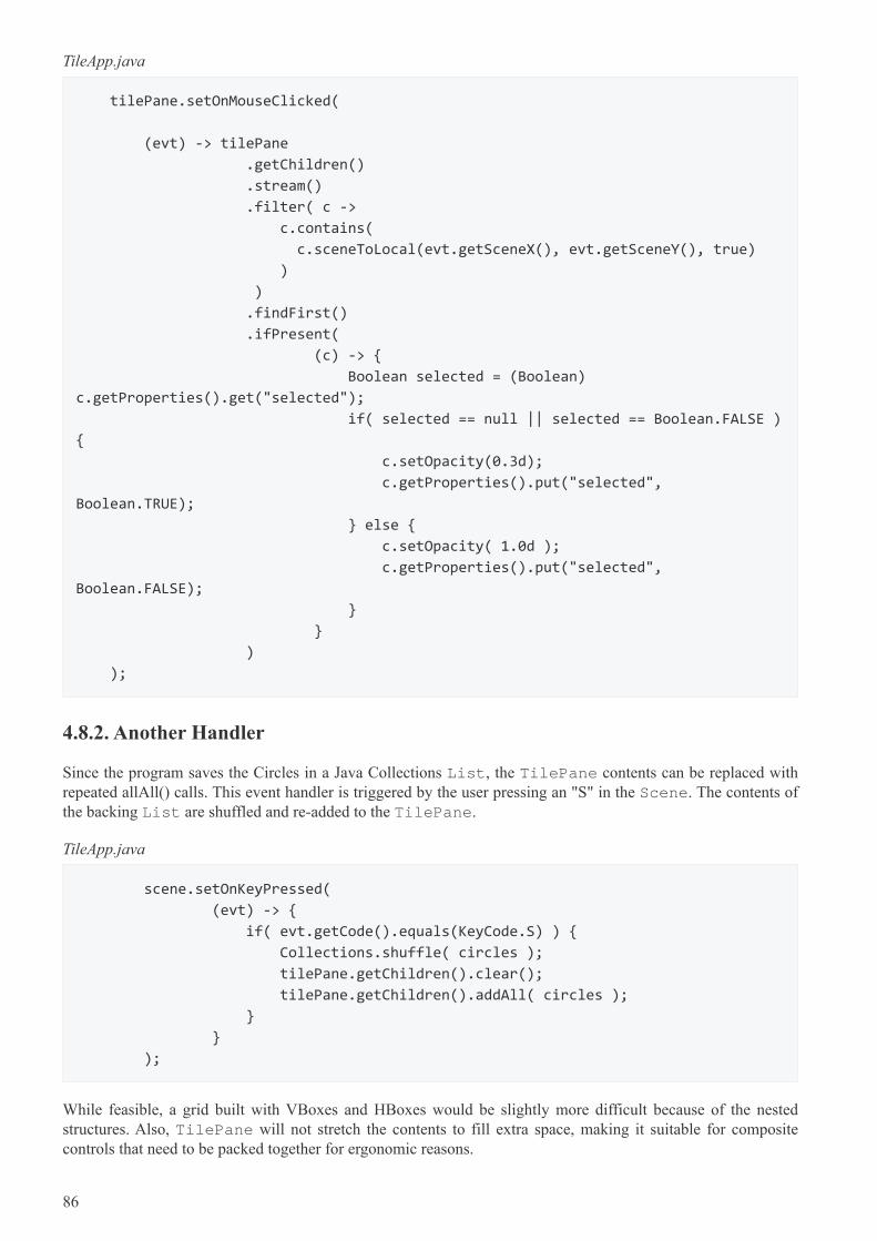
TileApp.java
tilePane.setOnMouseClicked(
(evt) -> tilePane
.getChildren()
.stream()
.filter( c ->
c.contains(
c.sceneToLocal(evt.getSceneX(), evt.getSceneY(), true)
)
)
.findFirst()
.ifPresent(
(c) -> {
Boolean selected = (Boolean)
c.getProperties().get("selected");
if( selected == null || selected == Boolean.FALSE )
{
c.setOpacity(0.3d);
c.getProperties().put("selected",
Boolean.TRUE);
} else {
c.setOpacity( 1.0d );
c.getProperties().put("selected",
Boolean.FALSE);
}
}
)
);
4.8.2. Another Handler
Since the program saves the Circles in a Java Collections List, the TilePane contents can be replaced withrepeated allAll() calls. This event handler is triggered by the user pressing an "S" in the Scene. The contents ofthe backing List are shuffled and re-added to the TilePane.
TileApp.java
scene.setOnKeyPressed(
(evt) -> {
if( evt.getCode().equals(KeyCode.S) ) {
Collections.shuffle( circles );
tilePane.getChildren().clear();
tilePane.getChildren().addAll( circles );
}
}
);
While feasible, a grid built with VBoxes and HBoxes would be slightly more difficult because of the nestedstructures. Also, TilePane will not stretch the contents to fill extra space, making it suitable for compositecontrols that need to be packed together for ergonomic reasons.
86
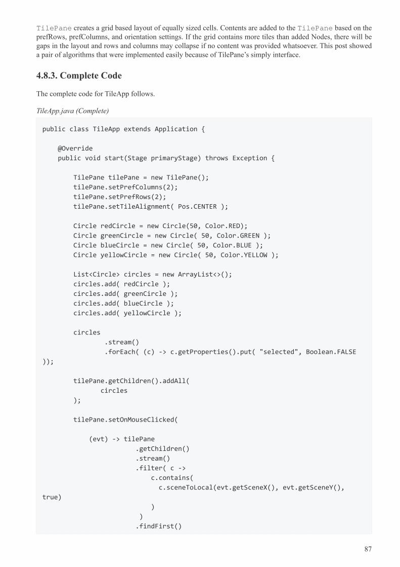
TilePane creates a grid based layout of equally sized cells. Contents are added to the TilePane based on theprefRows, prefColumns, and orientation settings. If the grid contains more tiles than added Nodes, there will begaps in the layout and rows and columns may collapse if no content was provided whatsoever. This post showeda pair of algorithms that were implemented easily because of TilePane’s simply interface.
4.8.3. Complete Code
The complete code for TileApp follows.
TileApp.java (Complete)
public class TileApp extends Application {
@Override
public void start(Stage primaryStage) throws Exception {
TilePane tilePane = new TilePane();
tilePane.setPrefColumns(2);
tilePane.setPrefRows(2);
tilePane.setTileAlignment( Pos.CENTER );
Circle redCircle = new Circle(50, Color.RED);
Circle greenCircle = new Circle( 50, Color.GREEN );
Circle blueCircle = new Circle( 50, Color.BLUE );
Circle yellowCircle = new Circle( 50, Color.YELLOW );
List<Circle> circles = new ArrayList<>();
circles.add( redCircle );
circles.add( greenCircle );
circles.add( blueCircle );
circles.add( yellowCircle );
circles
.stream()
.forEach( (c) -> c.getProperties().put( "selected", Boolean.FALSE
));
tilePane.getChildren().addAll(
circles
);
tilePane.setOnMouseClicked(
(evt) -> tilePane
.getChildren()
.stream()
.filter( c ->
c.contains(
c.sceneToLocal(evt.getSceneX(), evt.getSceneY(),
true)
)
)
.findFirst()
87
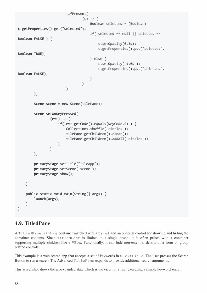
.ifPresent(
(c) -> {
Boolean selected = (Boolean)
c.getProperties().get("selected");
if( selected == null || selected ==
Boolean.FALSE ) {
c.setOpacity(0.3d);
c.getProperties().put("selected",
Boolean.TRUE);
} else {
c.setOpacity( 1.0d );
c.getProperties().put("selected",
Boolean.FALSE);
}
}
)
);
Scene scene = new Scene(tilePane);
scene.setOnKeyPressed(
(evt) -> {
if( evt.getCode().equals(KeyCode.S) ) {
Collections.shuffle( circles );
tilePane.getChildren().clear();
tilePane.getChildren().addAll( circles );
}
}
);
primaryStage.setTitle("TileApp");
primaryStage.setScene( scene );
primaryStage.show();
}
public static void main(String[] args) {
launch(args);
}
}
4.9. TitledPane
A TitledPane is a Node container matched with a Label and an optional control for showing and hiding thecontainer contents. Since TitledPane is limited to a single Node, it is often paired with a containersupporting multiple children like a VBox. Functionally, it can hide non-essential details of a form or grouprelated controls.
This example is a web search app that accepts a set of keywords in a TextField. The user presses the SearchButton to run a search. The Advanced TitlePane expands to provide additional search arguments.
This screenshot shows the un-expanded state which is the view for a user executing a simple keyword search.
88
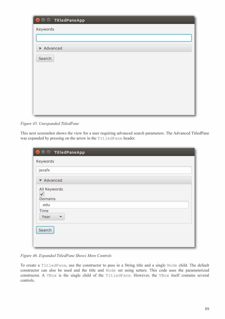
Figure 45. Unexpanded TitledPane
This next screenshot shows the view for a user requiring advanced search parameters. The Advanced TitledPanewas expanded by pressing on the arrow in the TitledPane header.
Figure 46. Expanded TitledPane Shows More Controls
To create a TitledPane, use the constructor to pass in a String title and a single Node child. The defaultconstructor can also be used and the title and Node set using setters. This code uses the parameterizedconstructor. A VBox is the single child of the TitledPane. However, the VBox itself contains severalcontrols.
89
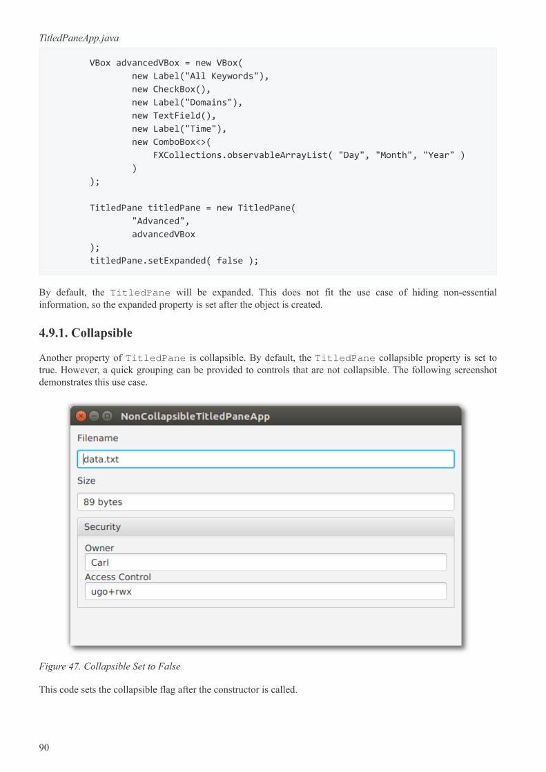
TitledPaneApp.java
VBox advancedVBox = new VBox(
new Label("All Keywords"),
new CheckBox(),
new Label("Domains"),
new TextField(),
new Label("Time"),
new ComboBox<>(
FXCollections.observableArrayList( "Day", "Month", "Year" )
)
);
TitledPane titledPane = new TitledPane(
"Advanced",
advancedVBox
);
titledPane.setExpanded( false );
By default, the TitledPane will be expanded. This does not fit the use case of hiding non-essentialinformation, so the expanded property is set after the object is created.
4.9.1. Collapsible
Another property of TitledPane is collapsible. By default, the TitledPane collapsible property is set totrue. However, a quick grouping can be provided to controls that are not collapsible. The following screenshotdemonstrates this use case.
Figure 47. Collapsible Set to False
This code sets the collapsible flag after the constructor is called.
90
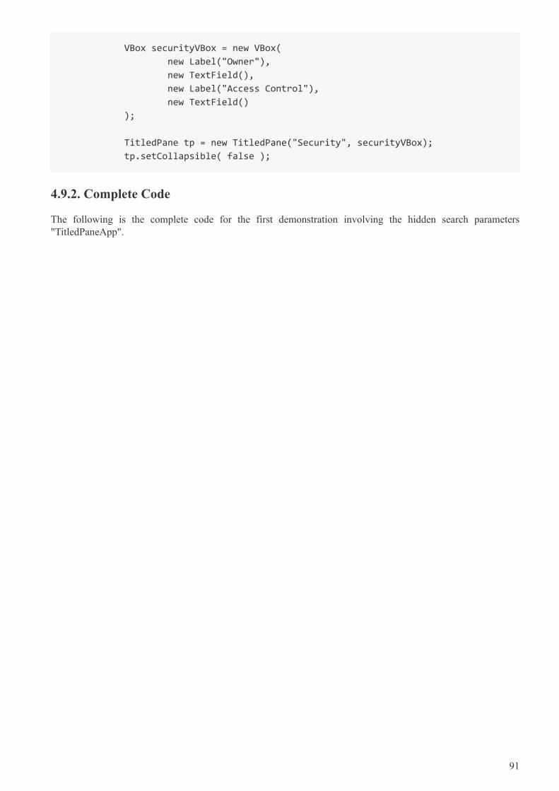
VBox securityVBox = new VBox(
new Label("Owner"),
new TextField(),
new Label("Access Control"),
new TextField()
);
TitledPane tp = new TitledPane("Security", securityVBox);
tp.setCollapsible( false );
4.9.2. Complete Code
The following is the complete code for the first demonstration involving the hidden search parameters"TitledPaneApp".
91
public class TitledPaneApp extends Application {
@Override
public void start(Stage primaryStage) throws Exception {
VBox vbox = new VBox(
new Label("Keywords" ),
new TextField()
);
vbox.setPadding( new Insets(10) );
vbox.setSpacing( 10 );
VBox advancedVBox = new VBox(
new Label("All Keywords"),
new CheckBox(),
new Label("Domains"),
new TextField(),
new Label("Time"),
new ComboBox<>(
FXCollections.observableArrayList( "Day", "Month", "Year" )
)
);
TitledPane titledPane = new TitledPane(
"Advanced",
advancedVBox
);
titledPane.setExpanded( false );
vbox.getChildren().addAll(
titledPane,
new Button("Search")
);
Scene scene = new Scene( vbox );
primaryStage.setTitle( "TitledPaneApp" );
primaryStage.setScene( scene );
primaryStage.setWidth( 568 );
primaryStage.setHeight( 320 );
primaryStage.show();
}
public static void main(String[] args) {
launch(args);
}
}
92

Chapter 5. CSS
Placeholder whilst things get built…
93

94

Chapter 6. Performance
Placeholder whilst things get built…
95

96
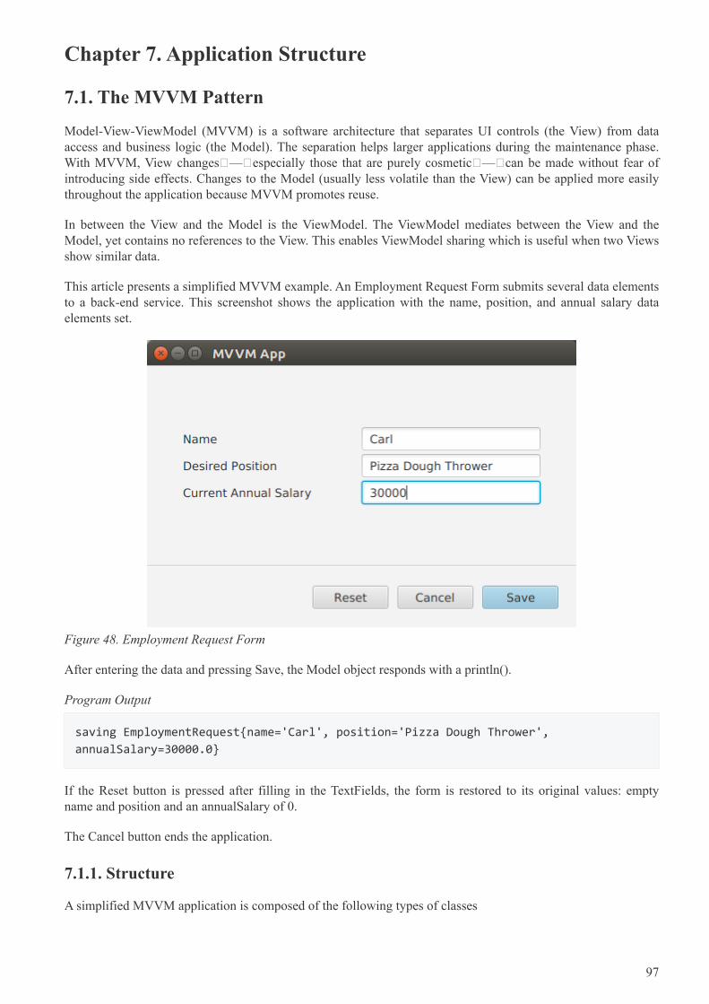
Chapter 7. Application Structure
7.1. The MVVM Pattern
Model-View-ViewModel (MVVM) is a software architecture that separates UI controls (the View) from dataaccess and business logic (the Model). The separation helps larger applications during the maintenance phase.With MVVM, View changes — especially those that are purely cosmetic — can be made without fear ofintroducing side effects. Changes to the Model (usually less volatile than the View) can be applied more easilythroughout the application because MVVM promotes reuse.
In between the View and the Model is the ViewModel. The ViewModel mediates between the View and theModel, yet contains no references to the View. This enables ViewModel sharing which is useful when two Viewsshow similar data.
This article presents a simplified MVVM example. An Employment Request Form submits several data elementsto a back-end service. This screenshot shows the application with the name, position, and annual salary dataelements set.
Figure 48. Employment Request Form
After entering the data and pressing Save, the Model object responds with a println().
Program Output
saving EmploymentRequest{name='Carl', position='Pizza Dough Thrower',
annualSalary=30000.0}
If the Reset button is pressed after filling in the TextFields, the form is restored to its original values: emptyname and position and an annualSalary of 0.
The Cancel button ends the application.
7.1.1. Structure
A simplified MVVM application is composed of the following types of classes
97
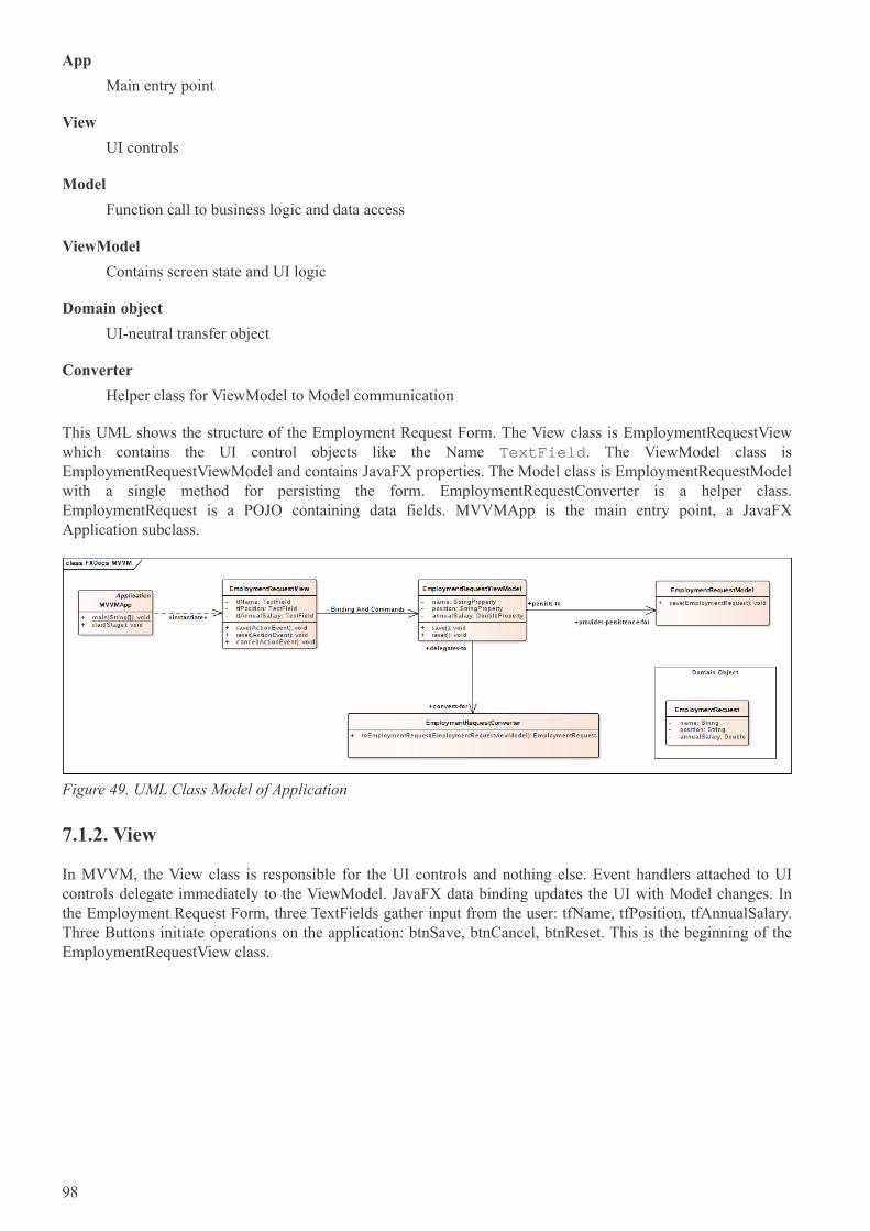
App
Main entry point
View
UI controls
Model
Function call to business logic and data access
ViewModel
Contains screen state and UI logic
Domain object
UI-neutral transfer object
Converter
Helper class for ViewModel to Model communication
This UML shows the structure of the Employment Request Form. The View class is EmploymentRequestViewwhich contains the UI control objects like the Name TextField. The ViewModel class isEmploymentRequestViewModel and contains JavaFX properties. The Model class is EmploymentRequestModelwith a single method for persisting the form. EmploymentRequestConverter is a helper class.EmploymentRequest is a POJO containing data fields. MVVMApp is the main entry point, a JavaFXApplication subclass.
Figure 49. UML Class Model of Application
7.1.2. View
In MVVM, the View class is responsible for the UI controls and nothing else. Event handlers attached to UIcontrols delegate immediately to the ViewModel. JavaFX data binding updates the UI with Model changes. Inthe Employment Request Form, three TextFields gather input from the user: tfName, tfPosition, tfAnnualSalary.Three Buttons initiate operations on the application: btnSave, btnCancel, btnReset. This is the beginning of theEmploymentRequestView class.
98
EmploymentRequestView.class
public class EmploymentRequestView extends VBox {
private GridPane gp = new GridPane();
private TextField tfName = new TextField();
private TextField tfPosition = new TextField();
private TextField tfAnnualSalary = new TextField();
private Button btnSave = new Button("Save");
private Button btnCancel = new Button("Cancel");
private Button btnReset = new Button("Reset");
public EmploymentRequestView() {
createView();
bindViewModel();
}
The View knows about the ViewModel and uses JavaFX binding to synchronize the UI with the ViewModel.This demo treats the ViewModel as a prototype object, created when the View object is created. Alternatively,the ViewModel can be a singleton or provided by CDI. Each UI field is bound bi-directionally to theViewModel. As the UI changes — say through entering a value in tfName — the corresponding field in theViewModel is updated. The more complicated expression for the tfAnnualSalary field is needed to convert theString-based TextField into a DoubleProperty.
EmploymentRequestView.class (cont.)
private final EmploymentRequestViewModel viewModel =
new EmploymentRequestViewModel();
private void bindViewModel() {
tfName.textProperty().bindBidirectional(viewModel.nameProperty());
tfPosition.textProperty().bindBidirectional(viewModel.positionProperty());
Bindings.bindBidirectional(
tfAnnualSalary.textProperty(),
viewModel.annualSalaryProperty(),
new NumberStringConverter()
);
}
The UI in this demo is built in code. The following createView() method handles the layout of the form and putsthe core controls (such as tfName and btnSave) in containers.
99
EmploymentRequestView.class (cont.)
private void createView() {
VBox gpwrap = new VBox();
gpwrap.setAlignment( Pos.CENTER );
gp.setPadding( new Insets(40) );
gp.setVgap( 4 );
gp.add(new Label("Name"), 0, 0); gp.add(tfName, 1, 0);
gp.add(new Label("Desired Position"), 0, 1); gp.add(tfPosition, 1, 1);
gp.add(new Label("Current Annual Salary"), 0, 2); gp.add(tfAnnualSalary, 1,
2);
final ColumnConstraints col = new ColumnConstraints();
col.setPercentWidth( 50 );
gp.getColumnConstraints().addAll( col, col );
gpwrap.getChildren().add( gp );
VBox.setVgrow( gpwrap, Priority.ALWAYS );
btnSave.setOnAction( this::save );
btnCancel.setOnAction( this::cancel );
btnReset.setOnAction( this::reset );
btnSave.setDefaultButton(true);
ButtonBar buttonBar = new ButtonBar();
buttonBar.setPadding( new Insets(20.0d) );
ButtonBar.setButtonData(btnSave, ButtonBar.ButtonData.OK_DONE);
ButtonBar.setButtonData(btnCancel, ButtonBar.ButtonData.CANCEL_CLOSE);
ButtonBar.setButtonData(btnReset, ButtonBar.ButtonData.OTHER);
buttonBar.getButtons().addAll( btnSave, btnCancel, btnReset );
this.getChildren().addAll(
gpwrap,
new Separator(),
buttonBar);
}
The class ends with handlers for the Buttons. These handlers delegate their actions to the ViewModel.
100
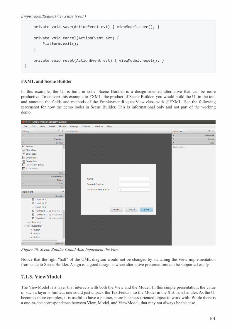
EmploymentRequestView.class (cont.)
private void save(ActionEvent evt) { viewModel.save(); }
private void cancel(ActionEvent evt) {
Platform.exit();
}
private void reset(ActionEvent evt) { viewModel.reset(); }
}
FXML and Scene Builder
In this example, the UI is built in code. Scene Builder is a design-oriented alternative that can be moreproductive. To convert this example to FXML, the product of Scene Builder, you would build the UI in the tooland annotate the fields and methods of the EmploymentRequestView class with @FXML. See the followingscreenshot for how the demo looks in Scene Builder. This is informational only and not part of the workingdemo.
Figure 50. Scene Builder Could Also Implement the View
Notice that the right "half" of the UML diagram would not be changed by switching the View implementationfrom code to Scene Builder. A sign of a good design is when alternative presentations can be supported easily.
7.1.3. ViewModel
The ViewModel is a layer that interacts with both the View and the Model. In this simple presentation, the valueof such a layer is limited; one could just unpack the TextFields into the Model in the Button handler. As the UIbecomes more complex, it is useful to have a plainer, more business-oriented object to work with. While there isa one-to-one correspondence between View, Model, and ViewModel, that may not always be the case.
101
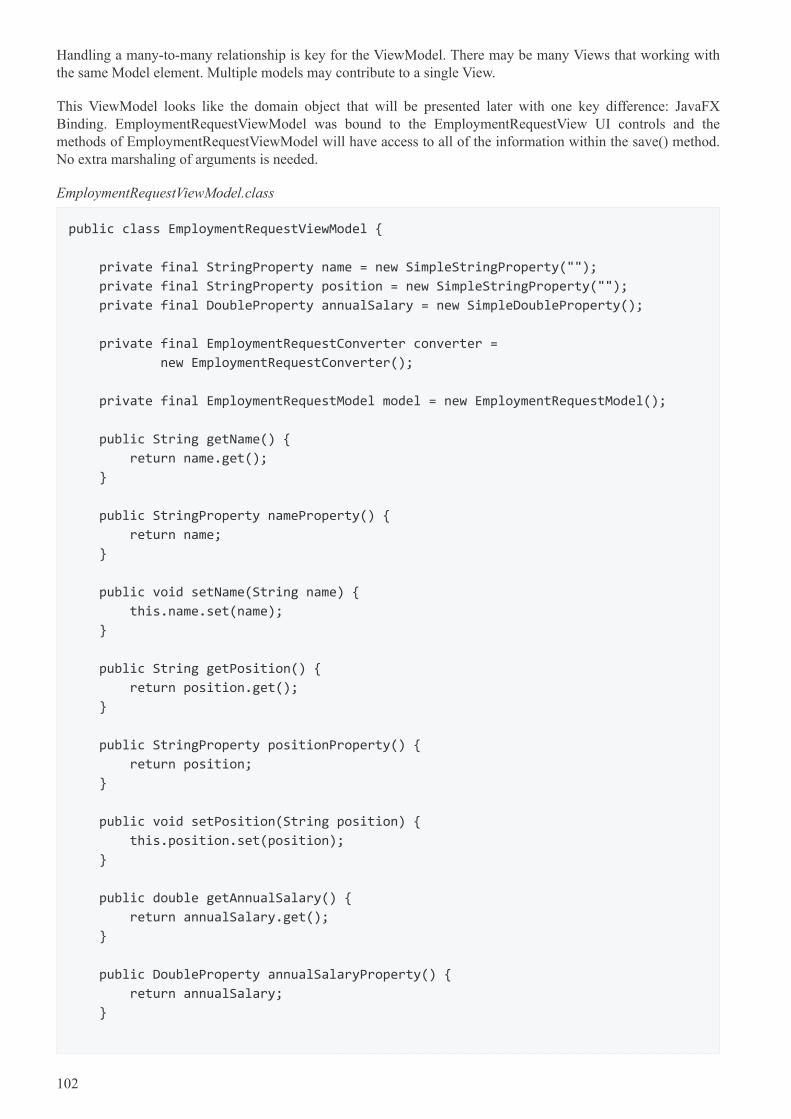
Handling a many-to-many relationship is key for the ViewModel. There may be many Views that working withthe same Model element. Multiple models may contribute to a single View.
This ViewModel looks like the domain object that will be presented later with one key difference: JavaFXBinding. EmploymentRequestViewModel was bound to the EmploymentRequestView UI controls and themethods of EmploymentRequestViewModel will have access to all of the information within the save() method.No extra marshaling of arguments is needed.
EmploymentRequestViewModel.class
public class EmploymentRequestViewModel {
private final StringProperty name = new SimpleStringProperty("");
private final StringProperty position = new SimpleStringProperty("");
private final DoubleProperty annualSalary = new SimpleDoubleProperty();
private final EmploymentRequestConverter converter =
new EmploymentRequestConverter();
private final EmploymentRequestModel model = new EmploymentRequestModel();
public String getName() {
return name.get();
}
public StringProperty nameProperty() {
return name;
}
public void setName(String name) {
this.name.set(name);
}
public String getPosition() {
return position.get();
}
public StringProperty positionProperty() {
return position;
}
public void setPosition(String position) {
this.position.set(position);
}
public double getAnnualSalary() {
return annualSalary.get();
}
public DoubleProperty annualSalaryProperty() {
return annualSalary;
}
102
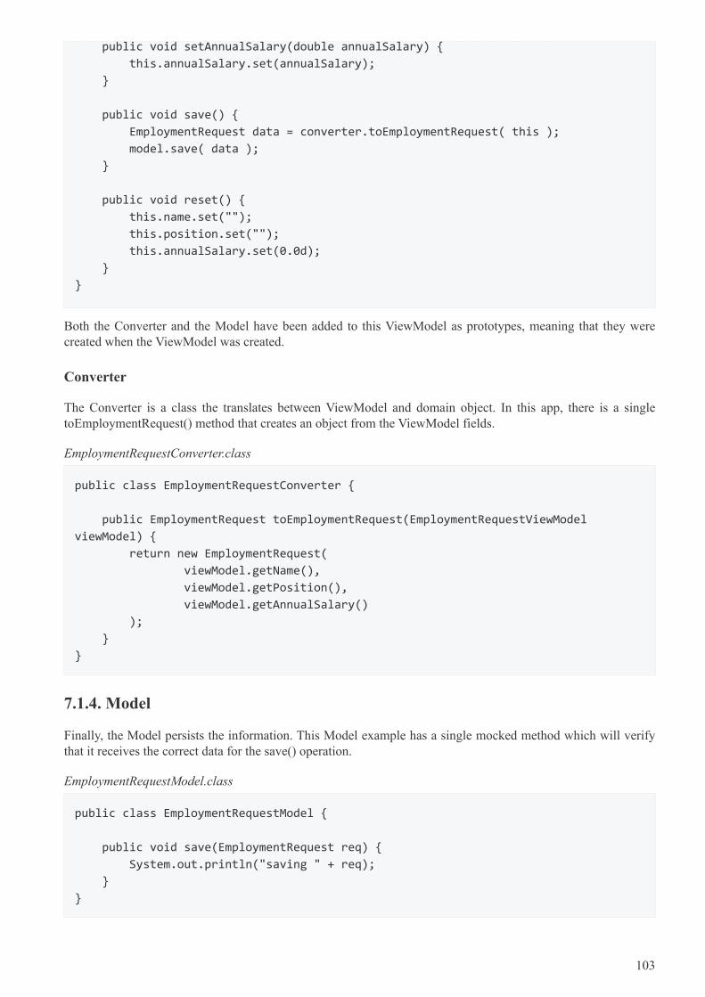
public void setAnnualSalary(double annualSalary) {
this.annualSalary.set(annualSalary);
}
public void save() {
EmploymentRequest data = converter.toEmploymentRequest( this );
model.save( data );
}
public void reset() {
this.name.set("");
this.position.set("");
this.annualSalary.set(0.0d);
}
}
Both the Converter and the Model have been added to this ViewModel as prototypes, meaning that they werecreated when the ViewModel was created.
Converter
The Converter is a class the translates between ViewModel and domain object. In this app, there is a singletoEmploymentRequest() method that creates an object from the ViewModel fields.
EmploymentRequestConverter.class
public class EmploymentRequestConverter {
public EmploymentRequest toEmploymentRequest(EmploymentRequestViewModel
viewModel) {
return new EmploymentRequest(
viewModel.getName(),
viewModel.getPosition(),
viewModel.getAnnualSalary()
);
}
}
7.1.4. Model
Finally, the Model persists the information. This Model example has a single mocked method which will verifythat it receives the correct data for the save() operation.
EmploymentRequestModel.class
public class EmploymentRequestModel {
public void save(EmploymentRequest req) {
System.out.println("saving " + req);
}
}
103
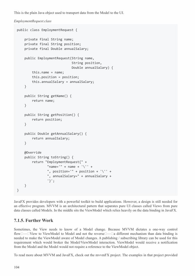
This is the plain Java object used to transport data from the Model to the UI.
EmploymentRequest.class
public class EmploymentRequest {
private final String name;
private final String position;
private final Double annualSalary;
public EmploymentRequest(String name,
String position,
Double annualSalary) {
this.name = name;
this.position = position;
this.annualSalary = annualSalary;
}
public String getName() {
return name;
}
public String getPosition() {
return position;
}
public Double getAnnualSalary() {
return annualSalary;
}
@Override
public String toString() {
return "EmploymentRequest{" +
"name='" + name + '\'' +
", position='" + position + '\'' +
", annualSalary=" + annualSalary +
'}';
}
}
JavaFX provides developers with a powerful toolkit to build applications. However, a design is still needed foran effective program. MVVM is an architectural pattern that separates pure UI classes called Views from puredata classes called Models. In the middle sits the ViewModel which relies heavily on the data binding in JavaFX.
7.1.5. Further Work
Sometimes, the View needs to know of a Model change. Because MVVM dictates a one-way controlflow — View to ViewModel to Model and not the reverse — a different mechanism than data binding isneeded to make the ViewModel aware of Model changes. A publishing / subscribing library can be used for thisrequirement which would broker the Model/ViewModel interaction. ViewModel would receive a notificationfrom the Model and the Model would not require a reference to the ViewModel object.
To read more about MVVM and JavaFX, check out the mvvmFX project. The examples in that project provided
104
the basis for this demonstration.
mvvmFX [https://github.com/sialcasa/mvvmFX]
7.1.6. Completed Code
The completed code in this example is available as a Gradle project here. There are two examples in the JAR.Run the class net.bekwam.bkcourse.mvvmapp.MVVMApp.
bkcourse_mvvmapp_sources.zip [https://courses.bekwam.net/public_tutorials/source/bkcourse_mvvmapp_sources.zip]
7.2. Model Change with MVVM
The previous article showed how to add a JavaFX binding-based ViewModel to an application architecture.However, the Model presented was a simple service call. This expands on the prior concepts and adds
1. Asynchrony,
2. A ProgressBar and status Label, and
3. Event broadcasting.
All operations taking more than a few milliseconds should be run on a separate Thread. Something that runsquickly but involves IO or the network often turns into a performance problem as code moves to new computersand new network configurations. A JavaFX Task is used to invoke the Model operation. While this potentiallylong process is running, feedback is given to the user via a ProgressBar and Label. The status Labelconveys messages to the user from the JavaFX Task.
It is important that the Model not hold a reference to the ViewModel, so an event notification scheme isintroduced. The ViewModel listens for an EVENT_MODEL_UPDATE message from the Model. Although thisexample uses only one ViewModel, this scheme makes it possible for more than one ViewModel to be aware ofdata changes from a single Model component.
7.2.1. Demo Program
The demo program in this section is a URL tester. The user enters a URL in the TextField and presses theSubmit Button. If the HTTP request to the specified URL returns successfully, the HTTP response status codeis displayed alongside the number of milliseconds the request took. This screenshot shows a successful usage.
105
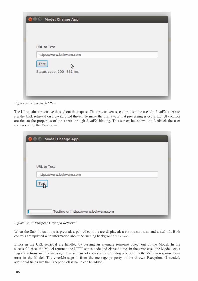
Figure 51. A Successful Run
The UI remains responsive throughout the request. The responsiveness comes from the use of a JavaFX Task torun the URL retrieval on a background thread. To make the user aware that processing is occurring, UI controlsare tied to the properties of the Task through JavaFX binding. This screenshot shows the feedback the userreceives while the Task runs.
Figure 52. In-Progress View of a Retrieval
When the Submit Button is pressed, a pair of controls are displayed: a ProgressBar and a Label. Bothcontrols are updated with information about the running background Thread.
Errors in the URL retrieval are handled by passing an alternate response object out of the Model. In thesuccessful case, the Model returned the HTTP status code and elapsed time. In the error case, the Model sets aflag and returns an error message. This screenshot shows an error dialog produced by the View in response to anerror in the Model. The errorMessage is from the message property of the thrown Exception. If needed,additional fields like the Exception class name can be added.
106
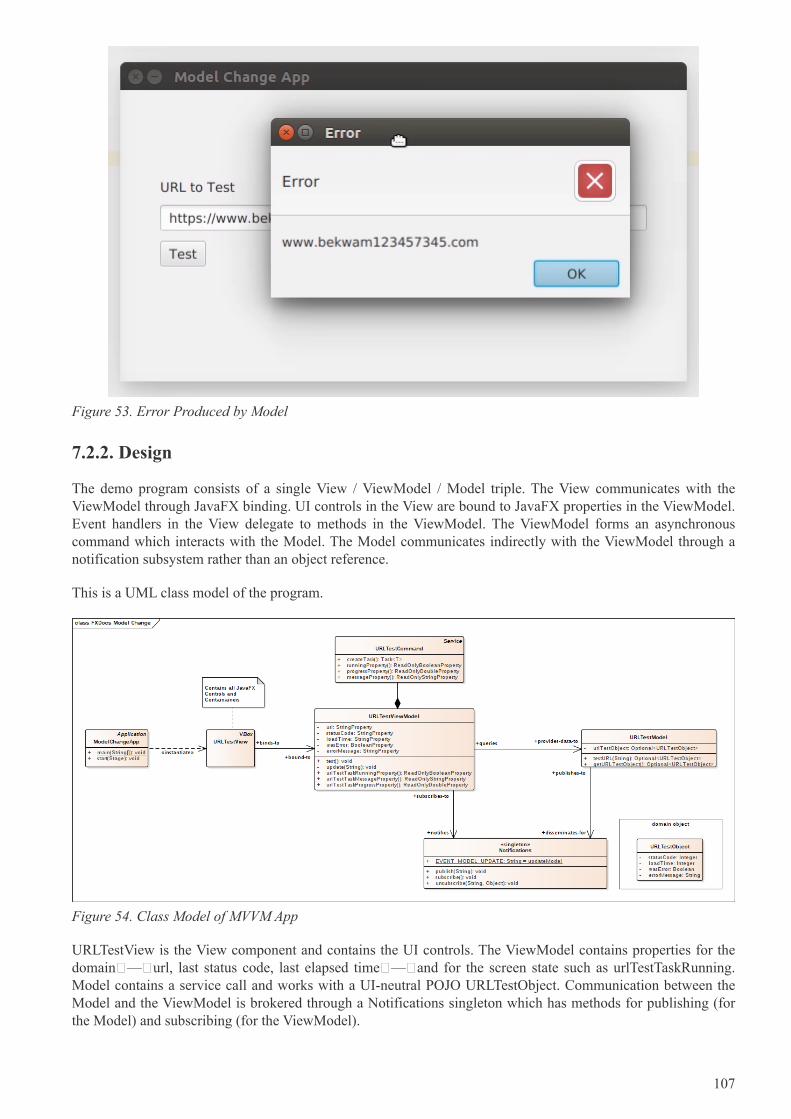
Figure 53. Error Produced by Model
7.2.2. Design
The demo program consists of a single View / ViewModel / Model triple. The View communicates with theViewModel through JavaFX binding. UI controls in the View are bound to JavaFX properties in the ViewModel.Event handlers in the View delegate to methods in the ViewModel. The ViewModel forms an asynchronouscommand which interacts with the Model. The Model communicates indirectly with the ViewModel through anotification subsystem rather than an object reference.
This is a UML class model of the program.
Figure 54. Class Model of MVVM App
URLTestView is the View component and contains the UI controls. The ViewModel contains properties for thedomain — url, last status code, last elapsed time — and for the screen state such as urlTestTaskRunning.Model contains a service call and works with a UI-neutral POJO URLTestObject. Communication between theModel and the ViewModel is brokered through a Notifications singleton which has methods for publishing (forthe Model) and subscribing (for the ViewModel).
107
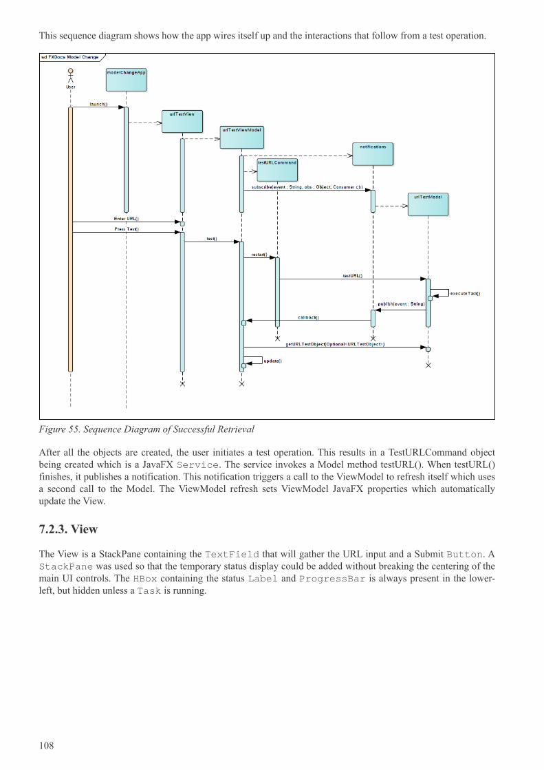
This sequence diagram shows how the app wires itself up and the interactions that follow from a test operation.
Figure 55. Sequence Diagram of Successful Retrieval
After all the objects are created, the user initiates a test operation. This results in a TestURLCommand objectbeing created which is a JavaFX Service. The service invokes a Model method testURL(). When testURL()finishes, it publishes a notification. This notification triggers a call to the ViewModel to refresh itself which usesa second call to the Model. The ViewModel refresh sets ViewModel JavaFX properties which automaticallyupdate the View.
7.2.3. View
The View is a StackPane containing the TextField that will gather the URL input and a Submit Button. AStackPane was used so that the temporary status display could be added without breaking the centering of themain UI controls. The HBox containing the status Label and ProgressBar is always present in the lower-left, but hidden unless a Task is running.
108
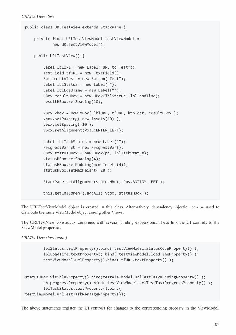
URLTestView.class
public class URLTestView extends StackPane {
private final URLTestViewModel testViewModel =
new URLTestViewModel();
public URLTestView() {
Label lblURL = new Label("URL to Test");
TextField tfURL = new TextField();
Button btnTest = new Button("Test");
Label lblStatus = new Label("");
Label lblLoadTime = new Label("");
HBox resultHBox = new HBox(lblStatus, lblLoadTime);
resultHBox.setSpacing(10);
VBox vbox = new VBox( lblURL, tfURL, btnTest, resultHBox );
vbox.setPadding( new Insets(40) );
vbox.setSpacing( 10 );
vbox.setAlignment(Pos.CENTER_LEFT);
Label lblTaskStatus = new Label("");
ProgressBar pb = new ProgressBar();
HBox statusHBox = new HBox(pb, lblTaskStatus);
statusHBox.setSpacing(4);
statusHBox.setPadding(new Insets(4));
statusHBox.setMaxHeight( 20 );
StackPane.setAlignment(statusHBox, Pos.BOTTOM_LEFT );
this.getChildren().addAll( vbox, statusHBox );
The URLTestViewModel object is created in this class. Alternatively, dependency injection can be used todistribute the same ViewModel object among other Views.
The URLTestView constructor continues with several binding expressions. These link the UI controls to theViewModel properties.
URLTestView.class (cont.)
lblStatus.textProperty().bind( testViewModel.statusCodeProperty() );
lblLoadTime.textProperty().bind( testViewModel.loadTimeProperty() );
testViewModel.urlProperty().bind( tfURL.textProperty() );
statusHBox.visibleProperty().bind(testViewModel.urlTestTaskRunningProperty() );
pb.progressProperty().bind( testViewModel.urlTestTaskProgressProperty() );
lblTaskStatus.textProperty().bind(
testViewModel.urlTestTaskMessageProperty());
The above statements register the UI controls for changes to the corresponding property in the ViewModel,
109
except for tfURL. tfURL uses a different binding direction since it is producing the value for the ViewModel. Insome cases, the binding may need to be bi-directional if a control can both be manipulated by the user and setfrom the ViewModel.
The action which initiates the testURL() operation is mapped to the Submit Button.
URLTestView.class (cont.)
btnTest.setOnAction( (evt) -> testViewModel.test() );
The URLTestView constructor finishes with a special ChangeListener binding to a ViewModel property. This is anotification that an error has occurred. When the errorMessage property of the ViewModel is notified, the Viewdisplays a popup dialog.
URLTestView.class (cont.)
testViewModel.errorMessageProperty().addListener(
(obs,ov,nv) -> {
if( nv != null && !nv.isEmpty() ) {
Alert alert = new Alert(
Alert.AlertType.ERROR, nv
);
alert.showAndWait();
}
}
);
7.2.4. ViewModel
URLTestView binds its UI controls to properties in URLTestViewModel. This section of the classURLTestViewModel shows the properties used by the View and their corresponding access methods. The test()method — which was mapped to the Submit Button press event — is also listed. The objecturlTestCommand will be presented later.
110
URLTestViewModel.class
public class URLTestViewModel {
// Data elements
private final StringProperty url = new SimpleStringProperty("");
private final StringProperty statusCode = new SimpleStringProperty("");
private final StringProperty loadTime = new SimpleStringProperty("");
// Status elements
private final BooleanProperty wasError = new SimpleBooleanProperty(false);
private final StringProperty errorMessage = new SimpleStringProperty("");
public StringProperty urlProperty() { return url; }
public StringProperty statusCodeProperty() { return statusCode; }
public StringProperty loadTimeProperty() { return loadTime; }
public StringProperty errorMessageProperty() { return errorMessage; }
public ReadOnlyBooleanProperty urlTestTaskRunningProperty() {
return urlTestCommand.runningProperty(); // presented later
}
public ReadOnlyStringProperty urlTestTaskMessageProperty() {
return urlTestCommand.messageProperty(); // presented later
}
public ReadOnlyDoubleProperty urlTestTaskProgressProperty() {
return urlTestCommand.progressProperty(); // presented later
}
public void test() {
urlTestCommand.restart(); // presented later
}
URLTestViewModel collaborates with two objects: URLTestModel and Notifications. URLTestViewModelsubscribes to a Notification in its constructor. A URLTestViewModel method "update" will be called when theNotifications object posts an EVENT_MODEL_UPDATE.
URLTestViewModel.class (cont.)
private final URLTestModel urlTestModel = new URLTestModel();
private final Notifications notifications = new Notifications();
public URLTestViewModel() {
notifications.subscribe(Notifications.EVENT_MODEL_UPDATE,
this,
this::update); // presented later
}
111
Command
urlTestCommand is a JavaFX Service object. As a part of the URLTestViewModel class, urlTestCommandhas access to the url property which provides a parameter for the call to the Model object. urlTestCommand alsouses the URLTestModel member to initiate the call to test the URL.
URLTestViewModel.class (cont.)
private final Service<Void> urlTestCommand = new Service<Void>() {
@Override
protected Task<Void> createTask() {
return new Task<Void>() {
@Override
protected Void call() throws Exception {
updateProgress(0.1d, 1.0d);
updateMessage("Testing url " + url.get());
urlTestModel.testURL( url.get() );
return null;
}
protected void failed() {
getException().printStackTrace(); // just in case
}
};
}
};
A JavaFX Service was used since the Service objects needs to always exist for binding purposes.URLTestView binds its ProgressBar, status Label, and container controls to the URLTestViewModel objectwhich will be available for the life of the app. Shown earlier, the URLTestViewModel properties delegate to theService object. A Task is a one-shot invocation and using that would not work for multiple test()invocations.
Asynchrony
The design in this article puts the burden of asynchronous processing on the ViewModel. This providesdirect feedback to View controls using JavaFX binding. An alternative approach is to use a general eventemitting scheme to listen for task starting, task ending, progress, and message events. This would supportbreaking out the urlTestCommand Service subclass into a separate code module.
The presentation of the URLTestViewModel class concludes with the update() method. This method issues a callto the Model, unpacks the results, and updates the ViewModel properties. Recall that the View has bound tothese properties and will automatically be updated (there is no similar update() method in the View.
112
URLTestViewModel.class (cont.)
private void update(String event) {
urlTestModel.getUrlTestObject().ifPresent(
(testObject) -> {
wasError.set( testObject.getWasError() );
if( !testObject.getWasError() ) {
statusCode.set(
"Status code: " +
String.valueOf(testObject.getStatusCode())
);
loadTime.set(
String.valueOf(testObject.getLoadTime()) +
" ms"
);
errorMessage.set(testObject.getErrorMessage());
} else {
statusCode.set(""); // use empty TextField, not 0
loadTime.set(""); // use empty TextField, not 0
errorMessage.set( testObject.getErrorMessage() );
}
});
}
7.2.5. Model
URLTestModel is presented in its entirety below. URLTestModel maintains a copy of a domain object. Uponinitialization, this object is empty so an Optional is used. A getter is provided for ViewModels. The testURL()method issues an HTTP GET call and records the results in the URLTestObject member. If the HTTP GET call issuccessful, the URLTestObject will contain the status code (probably 200) and an elapsed time. If unsuccessful,the URLTestObject will set a convenient wasError flag and an errorMessage.
When the Model has retrieved the contents at the URL or generated an error, the publish() method of theNotifications object is invoked. This prompts URLTestViewModel to update itself, but in a decoupled fashion. Itis important to note that URLTestModel does not hold a reference to a URLTestViewModel object.
113
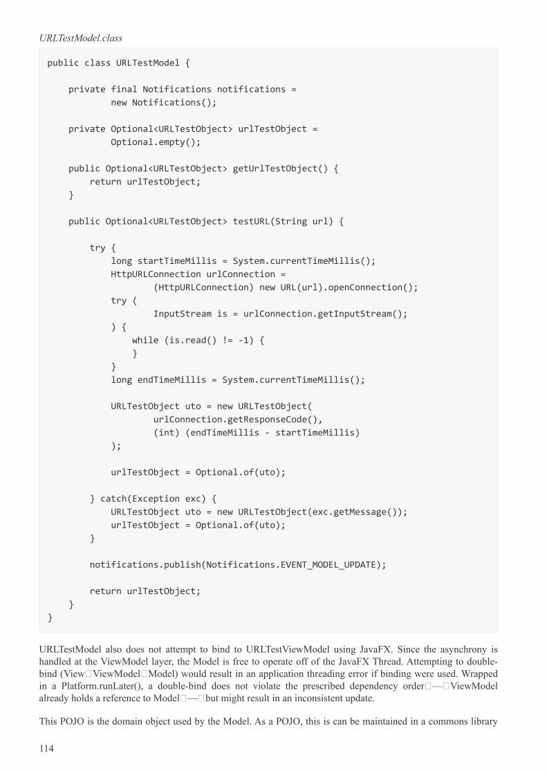
URLTestModel.class
public class URLTestModel {
private final Notifications notifications =
new Notifications();
private Optional<URLTestObject> urlTestObject =
Optional.empty();
public Optional<URLTestObject> getUrlTestObject() {
return urlTestObject;
}
public Optional<URLTestObject> testURL(String url) {
try {
long startTimeMillis = System.currentTimeMillis();
HttpURLConnection urlConnection =
(HttpURLConnection) new URL(url).openConnection();
try (
InputStream is = urlConnection.getInputStream();
) {
while (is.read() != -1) {
}
}
long endTimeMillis = System.currentTimeMillis();
URLTestObject uto = new URLTestObject(
urlConnection.getResponseCode(),
(int) (endTimeMillis - startTimeMillis)
);
urlTestObject = Optional.of(uto);
} catch(Exception exc) {
URLTestObject uto = new URLTestObject(exc.getMessage());
urlTestObject = Optional.of(uto);
}
notifications.publish(Notifications.EVENT_MODEL_UPDATE);
return urlTestObject;
}
}
URLTestModel also does not attempt to bind to URLTestViewModel using JavaFX. Since the asynchrony ishandled at the ViewModel layer, the Model is free to operate off of the JavaFX Thread. Attempting to double-bind (View→ViewModel→Model) would result in an application threading error if binding were used. Wrappedin a Platform.runLater(), a double-bind does not violate the prescribed dependency order — ViewModelalready holds a reference to Model — but might result in an inconsistent update.
This POJO is the domain object used by the Model. As a POJO, this is can be maintained in a commons library
114
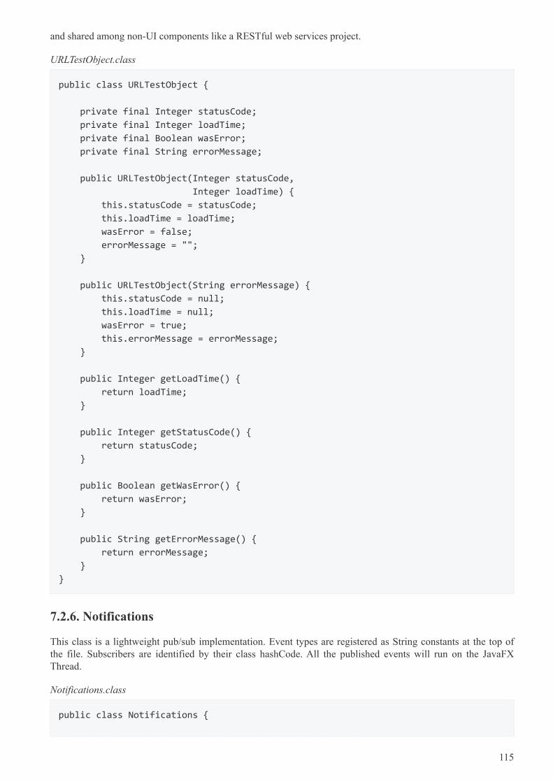
and shared among non-UI components like a RESTful web services project.
URLTestObject.class
public class URLTestObject {
private final Integer statusCode;
private final Integer loadTime;
private final Boolean wasError;
private final String errorMessage;
public URLTestObject(Integer statusCode,
Integer loadTime) {
this.statusCode = statusCode;
this.loadTime = loadTime;
wasError = false;
errorMessage = "";
}
public URLTestObject(String errorMessage) {
this.statusCode = null;
this.loadTime = null;
wasError = true;
this.errorMessage = errorMessage;
}
public Integer getLoadTime() {
return loadTime;
}
public Integer getStatusCode() {
return statusCode;
}
public Boolean getWasError() {
return wasError;
}
public String getErrorMessage() {
return errorMessage;
}
}
7.2.6. Notifications
This class is a lightweight pub/sub implementation. Event types are registered as String constants at the top ofthe file. Subscribers are identified by their class hashCode. All the published events will run on the JavaFXThread.
Notifications.class
public class Notifications {
115
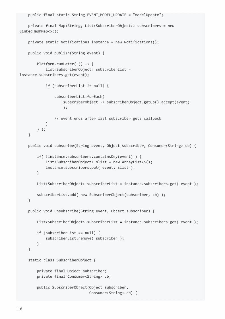
public final static String EVENT_MODEL_UPDATE = "modelUpdate";
private final Map<String, List<SubscriberObject>> subscribers = new
LinkedHashMap<>();
private static Notifications instance = new Notifications();
public void publish(String event) {
Platform.runLater( () -> {
List<SubscriberObject> subscriberList =
instance.subscribers.get(event);
if (subscriberList != null) {
subscriberList.forEach(
subscriberObject -> subscriberObject.getCb().accept(event)
);
// event ends after last subscriber gets callback
}
} );
}
public void subscribe(String event, Object subscriber, Consumer<String> cb) {
if( !instance.subscribers.containsKey(event) ) {
List<SubscriberObject> slist = new ArrayList<>();
instance.subscribers.put( event, slist );
}
List<SubscriberObject> subscriberList = instance.subscribers.get( event );
subscriberList.add( new SubscriberObject(subscriber, cb) );
}
public void unsubscribe(String event, Object subscriber) {
List<SubscriberObject> subscriberList = instance.subscribers.get( event );
if (subscriberList == null) {
subscriberList.remove( subscriber );
}
}
static class SubscriberObject {
private final Object subscriber;
private final Consumer<String> cb;
public SubscriberObject(Object subscriber,
Consumer<String> cb) {
116
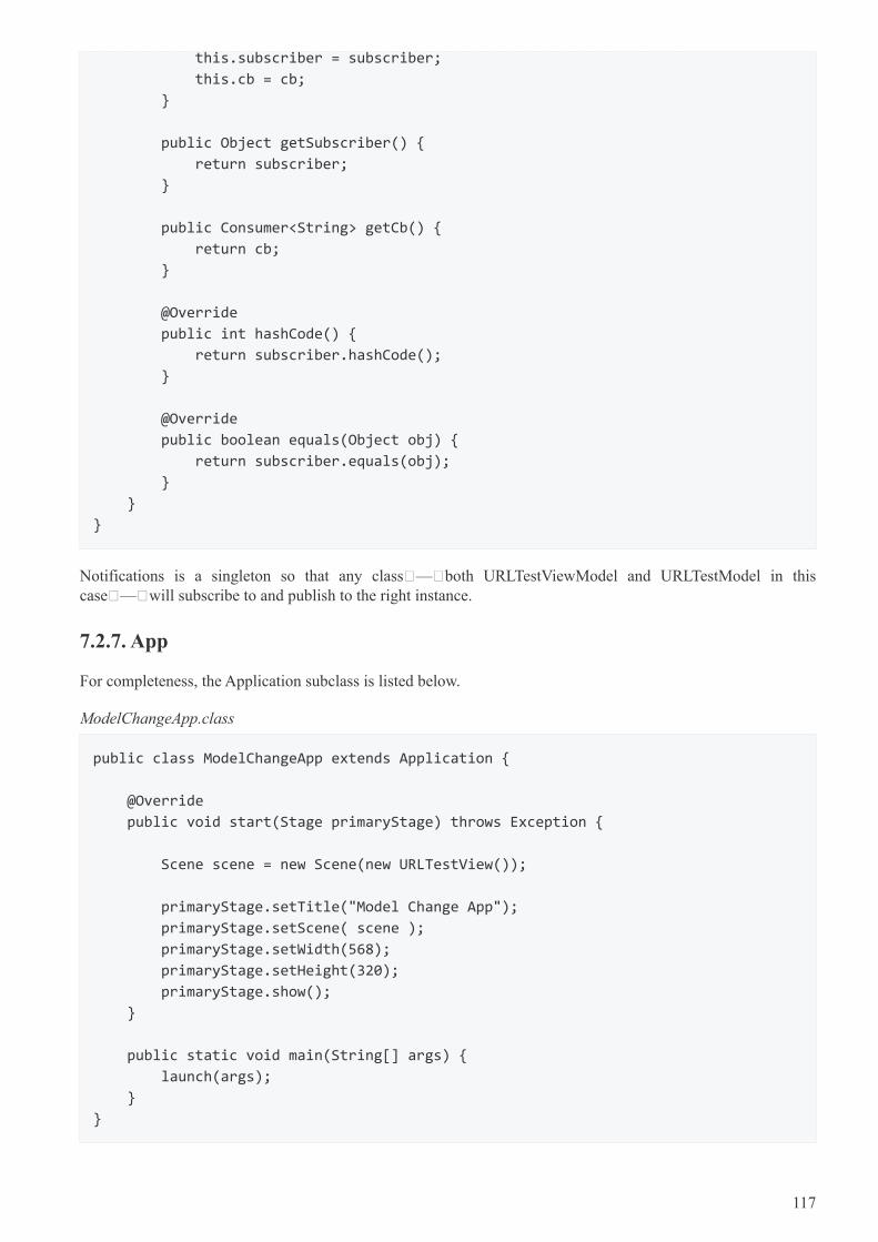
this.subscriber = subscriber;
this.cb = cb;
}
public Object getSubscriber() {
return subscriber;
}
public Consumer<String> getCb() {
return cb;
}
@Override
public int hashCode() {
return subscriber.hashCode();
}
@Override
public boolean equals(Object obj) {
return subscriber.equals(obj);
}
}
}
Notifications is a singleton so that any class — both URLTestViewModel and URLTestModel in thiscase — will subscribe to and publish to the right instance.
7.2.7. App
For completeness, the Application subclass is listed below.
ModelChangeApp.class
public class ModelChangeApp extends Application {
@Override
public void start(Stage primaryStage) throws Exception {
Scene scene = new Scene(new URLTestView());
primaryStage.setTitle("Model Change App");
primaryStage.setScene( scene );
primaryStage.setWidth(568);
primaryStage.setHeight(320);
primaryStage.show();
}
public static void main(String[] args) {
launch(args);
}
}
117
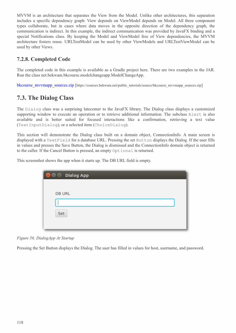
MVVM is an architecture that separates the View from the Model. Unlike other architectures, this separationincludes a specific dependency graph: View depends on ViewModel depends on Model. All three componenttypes collaborate, but in cases where data moves in the opposite direction of the dependency graph, thecommunication is indirect. In this example, the indirect communication was provided by JavaFX binding and aspecial Notifications class. By keeping the Model and ViewModel free of View dependencies, the MVVMarchitecture fosters reuse. URLTestModel can be used by other ViewModels and URLTestViewModel can beused by other Views.
7.2.8. Completed Code
The completed code in this example is available as a Gradle project here. There are two examples in the JAR.Run the class net.bekwam.bkcourse.modelchangeapp.ModelChangeApp.
bkcourse_mvvmapp_sources.zip [https://courses.bekwam.net/public_tutorials/source/bkcourse_mvvmapp_sources.zip]
7.3. The Dialog Class
The Dialog class was a surprising latecomer to the JavaFX library. The Dialog class displays a customizedsupporting window to execute an operation or to retrieve additional information. The subclass Alert is alsoavailable and is better suited for focused interactions like a confirmation, retrieving a text value(TextInputDialog), or a selected item (ChoiceDialog).
This section will demonstrate the Dialog class built on a domain object, ConnectionInfo. A main screen isdisplayed with a TextField for a database URL. Pressing the set Button displays the Dialog. If the user fillsin values and presses the Save Button, the Dialog is dismissed and the ConnectionInfo domain object is returnedto the caller. If the Cancel Button is pressed, an empty Optional is returned.
This screenshot shows the app when it starts up. The DB URL field is empty.
Figure 56. DialogApp At Startup
Pressing the Set Button displays the Dialog. The user has filled in values for host, username, and password.
118
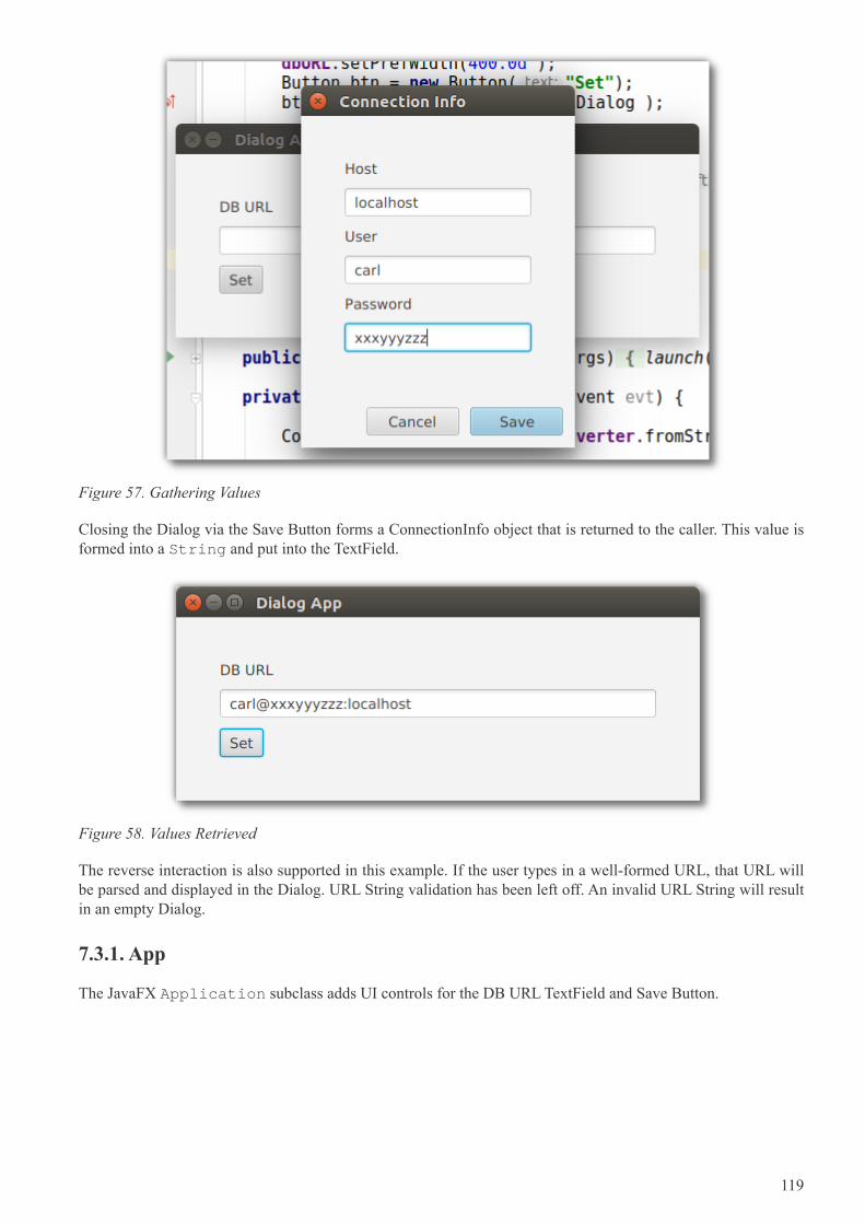
Figure 57. Gathering Values
Closing the Dialog via the Save Button forms a ConnectionInfo object that is returned to the caller. This value isformed into a String and put into the TextField.
Figure 58. Values Retrieved
The reverse interaction is also supported in this example. If the user types in a well-formed URL, that URL willbe parsed and displayed in the Dialog. URL String validation has been left off. An invalid URL String will resultin an empty Dialog.
7.3.1. App
The JavaFX Application subclass adds UI controls for the DB URL TextField and Save Button.
119
DialogApp.java
public class DialogApp extends Application {
private final TextField dbURL = new TextField();
@Override
public void start(Stage primaryStage) throws Exception {
Label label = new Label("DB URL");
dbURL.setPrefWidth(400.0d );
Button btn = new Button("Set");
btn.setOnAction( this::showSetDialog );
VBox vbox = new VBox(label, dbURL, btn );
vbox.setSpacing( 10.0d );
vbox.setPadding( new Insets(40.0d) );
Scene scene = new Scene( vbox );
primaryStage.setTitle("Dialog App");
primaryStage.setScene( scene );
primaryStage.show();
}
public static void main(String[] args) {
launch(args);
}
showSetDialog() is a method reference that initializes a ConnectionInfo object, displays the Dialog, and retrievesa value if set by the user.
DialogApp.java
private void showSetDialog(ActionEvent evt) {
ConnectionInfo fromURL = ciConverter.fromString( dbURL.getText() );
ConnectionDialog dialog = new ConnectionDialog(fromURL);
Optional<ConnectionInfo> ci = dialog.showAndWait();
ci.ifPresent( c -> dbURL.setText(
ciConverter.toString(c)
)
);
}
The app is using a JavaFX StringConverter to encapsulate the code behind forming a String from the set offields of the ConnectionInfo object. The StringConverter is stored as a field in the Application subclass.
120
DialogApp.java
private final ConnectionInfoStringConverter ciConverter =
new ConnectionInfoStringConverter();
class ConnectionInfoStringConverter extends StringConverter<ConnectionInfo> {
private final String format = "%s@%s:%s";
@Override
public String toString(ConnectionInfo c) {
return String.format( format, c.getUsername(), c.getPassword(),
c.getHost() );
}
@Override
public ConnectionInfo fromString(String s) {
if( s != null && s.contains("@") && s.contains(":") ) {
String[] toks = s.split("@");
String username = toks[0];
String[] secondPart = toks[1].split(":");
String password = secondPart[0];
String host = secondPart[1];
ConnectionInfo ci = new ConnectionInfo(
username, password, host
);
return ci;
}
return null;
}
}
7.3.2. Dialog
The Dialog subclass adds UI controls to the DialogPane field in the constructor. Notice the lack of explicitActionEvent handlers. When using Dialog or Alert, ButtonType and ButtonData are preferred over rawButton objects. These higher-order objects make the app UI more consistent because the Button placement,labeling, and behavior is handed in the Dialog abstraction.
The subclass contains a type parameter to the ConnectionInfo domain object.
121
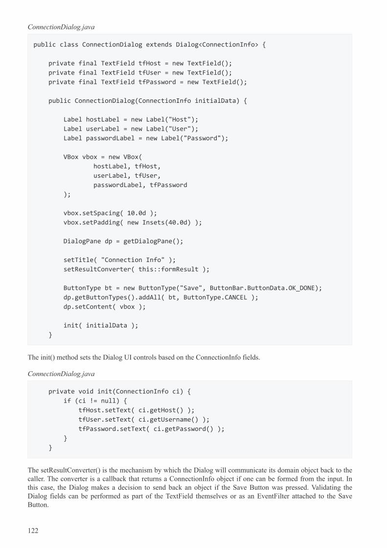
ConnectionDialog.java
public class ConnectionDialog extends Dialog<ConnectionInfo> {
private final TextField tfHost = new TextField();
private final TextField tfUser = new TextField();
private final TextField tfPassword = new TextField();
public ConnectionDialog(ConnectionInfo initialData) {
Label hostLabel = new Label("Host");
Label userLabel = new Label("User");
Label passwordLabel = new Label("Password");
VBox vbox = new VBox(
hostLabel, tfHost,
userLabel, tfUser,
passwordLabel, tfPassword
);
vbox.setSpacing( 10.0d );
vbox.setPadding( new Insets(40.0d) );
DialogPane dp = getDialogPane();
setTitle( "Connection Info" );
setResultConverter( this::formResult );
ButtonType bt = new ButtonType("Save", ButtonBar.ButtonData.OK_DONE);
dp.getButtonTypes().addAll( bt, ButtonType.CANCEL );
dp.setContent( vbox );
init( initialData );
}
The init() method sets the Dialog UI controls based on the ConnectionInfo fields.
ConnectionDialog.java
private void init(ConnectionInfo ci) {
if (ci != null) {
tfHost.setText( ci.getHost() );
tfUser.setText( ci.getUsername() );
tfPassword.setText( ci.getPassword() );
}
}
The setResultConverter() is the mechanism by which the Dialog will communicate its domain object back to thecaller. The converter is a callback that returns a ConnectionInfo object if one can be formed from the input. Inthis case, the Dialog makes a decision to send back an object if the Save Button was pressed. Validating theDialog fields can be performed as part of the TextField themselves or as an EventFilter attached to the SaveButton.
122
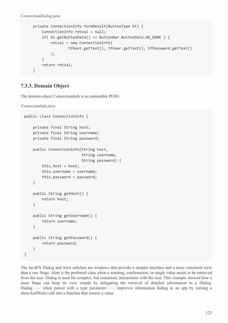
ConnectionDialog.java
private ConnectionInfo formResult(ButtonType bt) {
ConnectionInfo retval = null;
if( bt.getButtonData() == ButtonBar.ButtonData.OK_DONE ) {
retval = new ConnectionInfo(
tfHost.getText(), tfUser.getText(), tfPassword.getText()
);
}
return retval;
}
7.3.3. Domain Object
The domain object ConnectionInfo is an immutable POJO.
ConnectionInfo.java
public class ConnectionInfo {
private final String host;
private final String username;
private final String password;
public ConnectionInfo(String host,
String username,
String password) {
this.host = host;
this.username = username;
this.password = password;
}
public String getHost() {
return host;
}
public String getUsername() {
return username;
}
public String getPassword() {
return password;
}
}
The JavaFX Dialog and Alert subclass are windows that provide a simpler interface and a more consistent stylethan a raw Stage. Alert is the preferred class when a warning, confirmation, or single value needs to be retrievedfrom the user. Dialog is used for complex, but contained, interactions with the user. This example showed how amain Stage can keep its view simple by delegating the retrieval of detailed information to a Dialog.Dialog — when paired with a type parameter — improves information hiding in an app by turning ashowAndWait() call into a function that returns a value.
123
7.3.4. Source
The complete source code and Gradle project can be found at the link below.
DialogApp Source Zip [https://courses.bekwam.net/public_tutorials/source/bkcourse_dialogapp_sources.zip]
124
Chapter 8. Best Practices
8.1. Styleable Properties
A JavaFX property can be styled via css by using a StyleableProperty. This is useful when controls needproperties that can be set via css.
In order to use a StyleableProperty on a Control, one needs to create a new CssMetaData using theStyleableProperty. CssMetaData created for a control needs to be added to the List<CssMetaData> obtainedfrom the control’s ancestor. This new list is then returned from the getControlCssMetaData().
By convention, control classes that have CssMetaData will implement a static method getClassCssMetaData()and it is customary to have getControlCssMetaData() simply return getClassCssMetaData(). The purpose ofgetClassCssMetaData() is to allow sub-classes to easily include the CssMetaData of some ancestor.
125
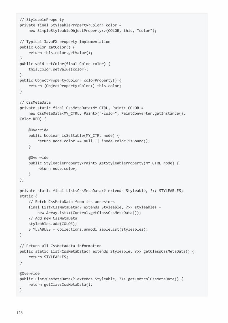
// StyleableProperty
private final StyleableProperty<Color> color =
new SimpleStyleableObjectProperty<>(COLOR, this, "color");
// Typical JavaFX property implementation
public Color getColor() {
return this.color.getValue();
}
public void setColor(final Color color) {
this.color.setValue(color);
}
public ObjectProperty<Color> colorProperty() {
return (ObjectProperty<Color>) this.color;
}
// CssMetaData
private static final CssMetaData<MY_CTRL, Paint> COLOR =
new CssMetaData<MY_CTRL, Paint>("-color", PaintConverter.getInstance(),
Color.RED) {
@Override
public boolean isSettable(MY_CTRL node) {
return node.color == null || !node.color.isBound();
}
@Override
public StyleableProperty<Paint> getStyleableProperty(MY_CTRL node) {
return node.color;
}
};
private static final List<CssMetaData<? extends Styleable, ?>> STYLEABLES;
static {
// Fetch CssMetaData from its ancestors
final List<CssMetaData<? extends Styleable, ?>> styleables =
new ArrayList<>(Control.getClassCssMetaData());
// Add new CssMetaData
styleables.add(COLOR);
STYLEABLES = Collections.unmodifiableList(styleables);
}
// Return all CssMetadata information
public static List<CssMetaData<? extends Styleable, ?>> getClassCssMetaData() {
return STYLEABLES;
}
@Override
public List<CssMetaData<? extends Styleable, ?>> getControlCssMetaData() {
return getClassCssMetaData();
}
126
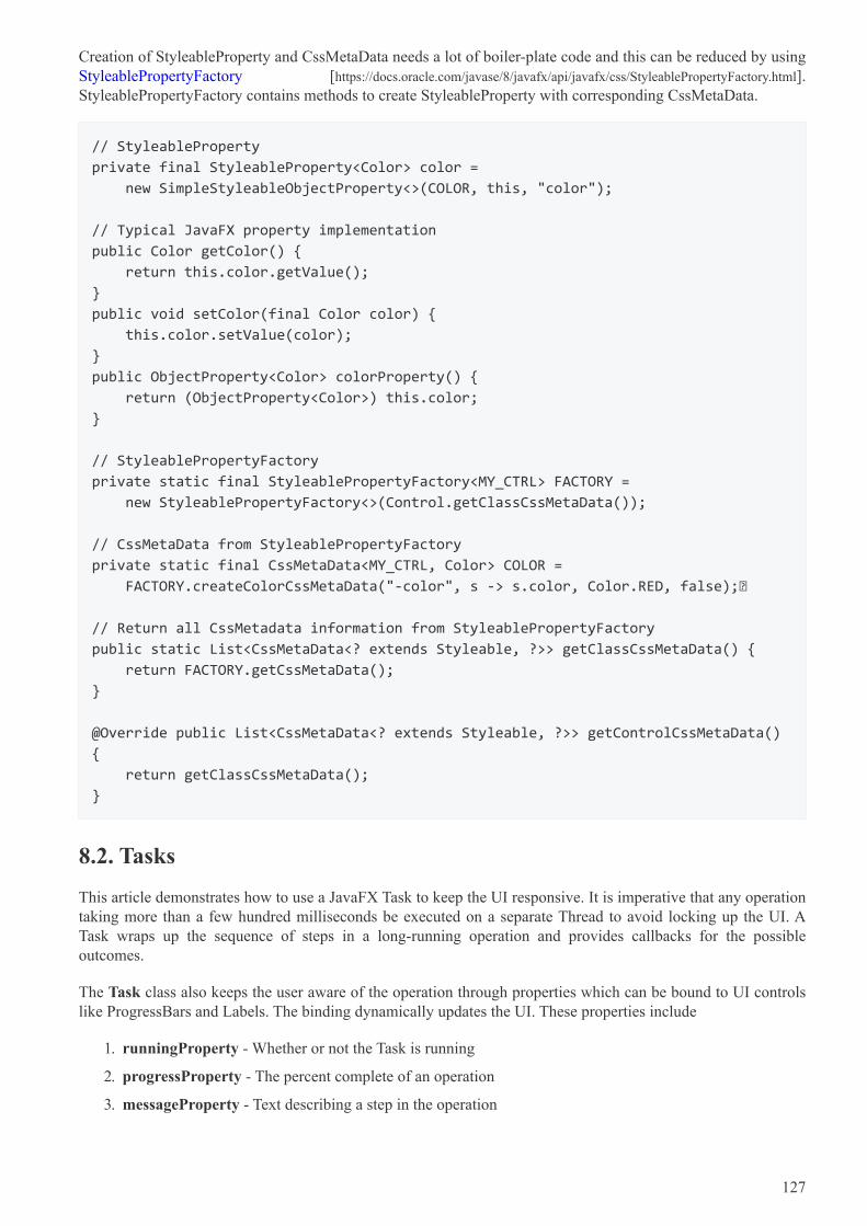
Creation of StyleableProperty and CssMetaData needs a lot of boiler-plate code and this can be reduced by usingStyleablePropertyFactory [https://docs.oracle.com/javase/8/javafx/api/javafx/css/StyleablePropertyFactory.html].StyleablePropertyFactory contains methods to create StyleableProperty with corresponding CssMetaData.
// StyleableProperty
private final StyleableProperty<Color> color =
new SimpleStyleableObjectProperty<>(COLOR, this, "color");
// Typical JavaFX property implementation
public Color getColor() {
return this.color.getValue();
}
public void setColor(final Color color) {
this.color.setValue(color);
}
public ObjectProperty<Color> colorProperty() {
return (ObjectProperty<Color>) this.color;
}
// StyleablePropertyFactory
private static final StyleablePropertyFactory<MY_CTRL> FACTORY =
new StyleablePropertyFactory<>(Control.getClassCssMetaData());
// CssMetaData from StyleablePropertyFactory
private static final CssMetaData<MY_CTRL, Color> COLOR =
FACTORY.createColorCssMetaData("-color", s -> s.color, Color.RED, false);
// Return all CssMetadata information from StyleablePropertyFactory
public static List<CssMetaData<? extends Styleable, ?>> getClassCssMetaData() {
return FACTORY.getCssMetaData();
}
@Override public List<CssMetaData<? extends Styleable, ?>> getControlCssMetaData()
{
return getClassCssMetaData();
}
8.2. Tasks
This article demonstrates how to use a JavaFX Task to keep the UI responsive. It is imperative that any operationtaking more than a few hundred milliseconds be executed on a separate Thread to avoid locking up the UI. ATask wraps up the sequence of steps in a long-running operation and provides callbacks for the possibleoutcomes.
The Task class also keeps the user aware of the operation through properties which can be bound to UI controlslike ProgressBars and Labels. The binding dynamically updates the UI. These properties include
1. runningProperty - Whether or not the Task is running
2. progressProperty - The percent complete of an operation
3. messageProperty - Text describing a step in the operation
127
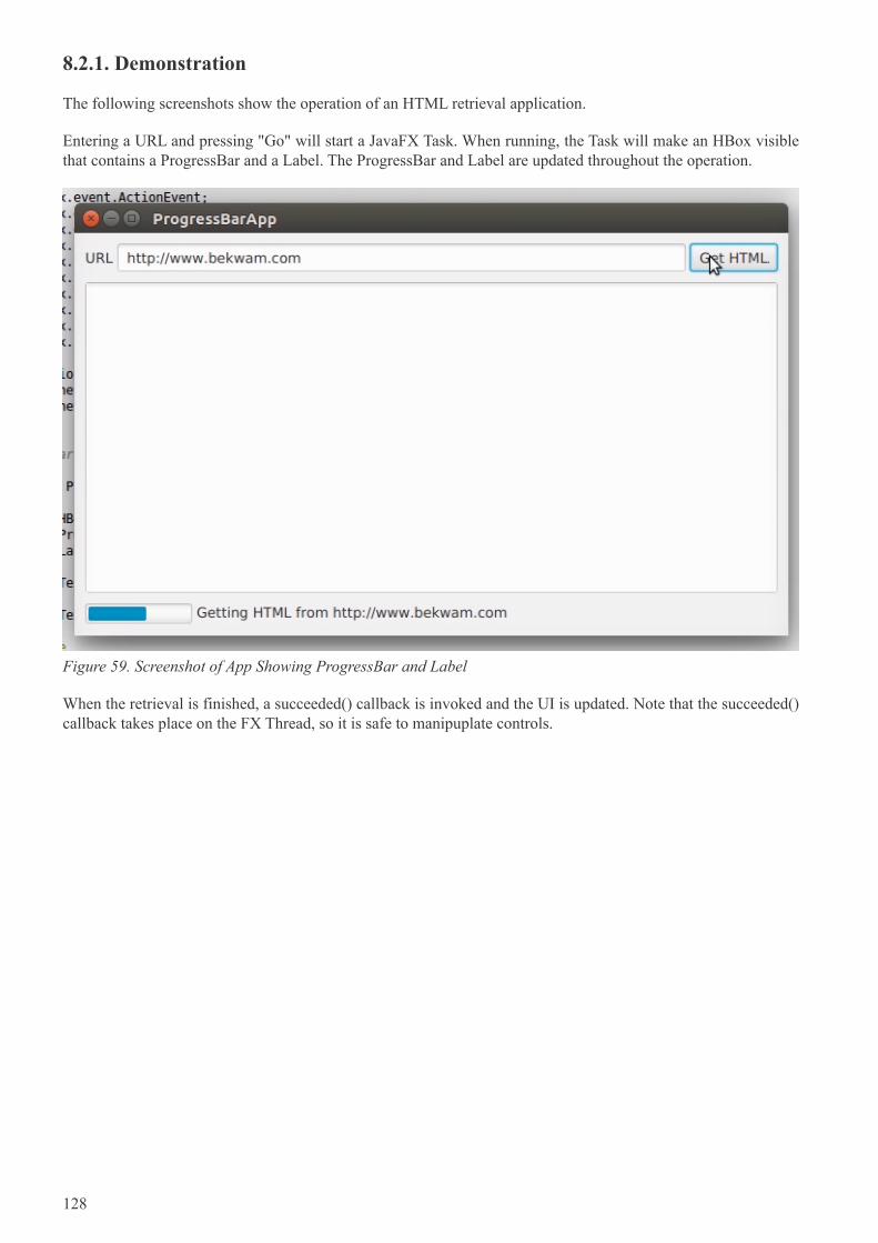
8.2.1. Demonstration
The following screenshots show the operation of an HTML retrieval application.
Entering a URL and pressing "Go" will start a JavaFX Task. When running, the Task will make an HBox visiblethat contains a ProgressBar and a Label. The ProgressBar and Label are updated throughout the operation.
Figure 59. Screenshot of App Showing ProgressBar and Label
When the retrieval is finished, a succeeded() callback is invoked and the UI is updated. Note that the succeeded()callback takes place on the FX Thread, so it is safe to manipuplate controls.
128
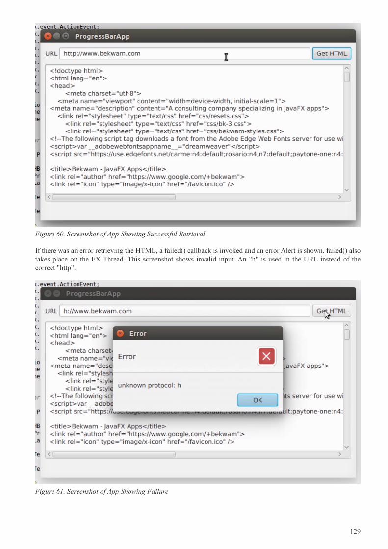
Figure 60. Screenshot of App Showing Successful Retrieval
If there was an error retrieving the HTML, a failed() callback is invoked and an error Alert is shown. failed() alsotakes place on the FX Thread. This screenshot shows invalid input. An "h" is used in the URL instead of thecorrect "http".
Figure 61. Screenshot of App Showing Failure
129
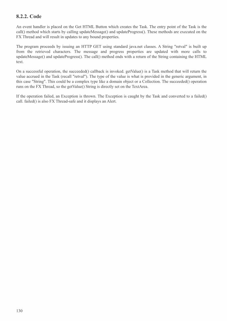
8.2.2. Code
An event handler is placed on the Get HTML Button which creates the Task. The entry point of the Task is thecall() method which starts by calling updateMessage() and updateProgress(). These methods are executed on theFX Thread and will result in updates to any bound properties.
The program proceeds by issuing an HTTP GET using standard java.net classes. A String "retval" is built upfrom the retrieved characters. The message and progress properties are updated with more calls toupdateMessage() and updateProgress(). The call() method ends with a return of the String containing the HTMLtext.
On a successful operation, the succeeded() callback is invoked. getValue() is a Task method that will return thevalue accrued in the Task (recall "retval"). The type of the value is what is provided in the generic argument, inthis case "String". This could be a complex type like a domain object or a Collection. The succeeded() operationruns on the FX Thread, so the getValue() String is directly set on the TextArea.
If the operation failed, an Exception is thrown. The Exception is caught by the Task and converted to a failed()call. failed() is also FX Thread-safe and it displays an Alert.
130
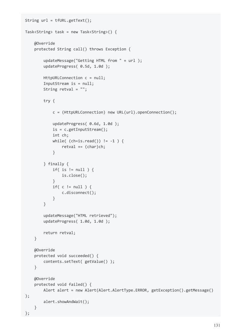
String url = tfURL.getText();
Task<String> task = new Task<String>() {
@Override
protected String call() throws Exception {
updateMessage("Getting HTML from " + url );
updateProgress( 0.5d, 1.0d );
HttpURLConnection c = null;
InputStream is = null;
String retval = "";
try {
c = (HttpURLConnection) new URL(url).openConnection();
updateProgress( 0.6d, 1.0d );
is = c.getInputStream();
int ch;
while( (ch=is.read()) != -1 ) {
retval += (char)ch;
}
} finally {
if( is != null ) {
is.close();
}
if( c != null ) {
c.disconnect();
}
}
updateMessage("HTML retrieved");
updateProgress( 1.0d, 1.0d );
return retval;
}
@Override
protected void succeeded() {
contents.setText( getValue() );
}
@Override
protected void failed() {
Alert alert = new Alert(Alert.AlertType.ERROR, getException().getMessage()
);
alert.showAndWait();
}
};
131
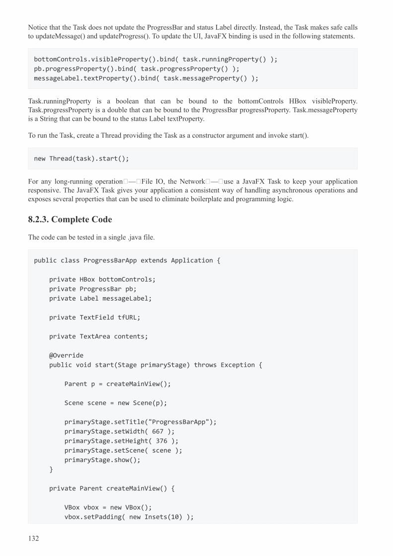
Notice that the Task does not update the ProgressBar and status Label directly. Instead, the Task makes safe callsto updateMessage() and updateProgress(). To update the UI, JavaFX binding is used in the following statements.
bottomControls.visibleProperty().bind( task.runningProperty() );
pb.progressProperty().bind( task.progressProperty() );
messageLabel.textProperty().bind( task.messageProperty() );
Task.runningProperty is a boolean that can be bound to the bottomControls HBox visibleProperty.Task.progressProperty is a double that can be bound to the ProgressBar progressProperty. Task.messagePropertyis a String that can be bound to the status Label textProperty.
To run the Task, create a Thread providing the Task as a constructor argument and invoke start().
new Thread(task).start();
For any long-running operation — File IO, the Network — use a JavaFX Task to keep your applicationresponsive. The JavaFX Task gives your application a consistent way of handling asynchronous operations andexposes several properties that can be used to eliminate boilerplate and programming logic.
8.2.3. Complete Code
The code can be tested in a single .java file.
public class ProgressBarApp extends Application {
private HBox bottomControls;
private ProgressBar pb;
private Label messageLabel;
private TextField tfURL;
private TextArea contents;
@Override
public void start(Stage primaryStage) throws Exception {
Parent p = createMainView();
Scene scene = new Scene(p);
primaryStage.setTitle("ProgressBarApp");
primaryStage.setWidth( 667 );
primaryStage.setHeight( 376 );
primaryStage.setScene( scene );
primaryStage.show();
}
private Parent createMainView() {
VBox vbox = new VBox();
vbox.setPadding( new Insets(10) );
132
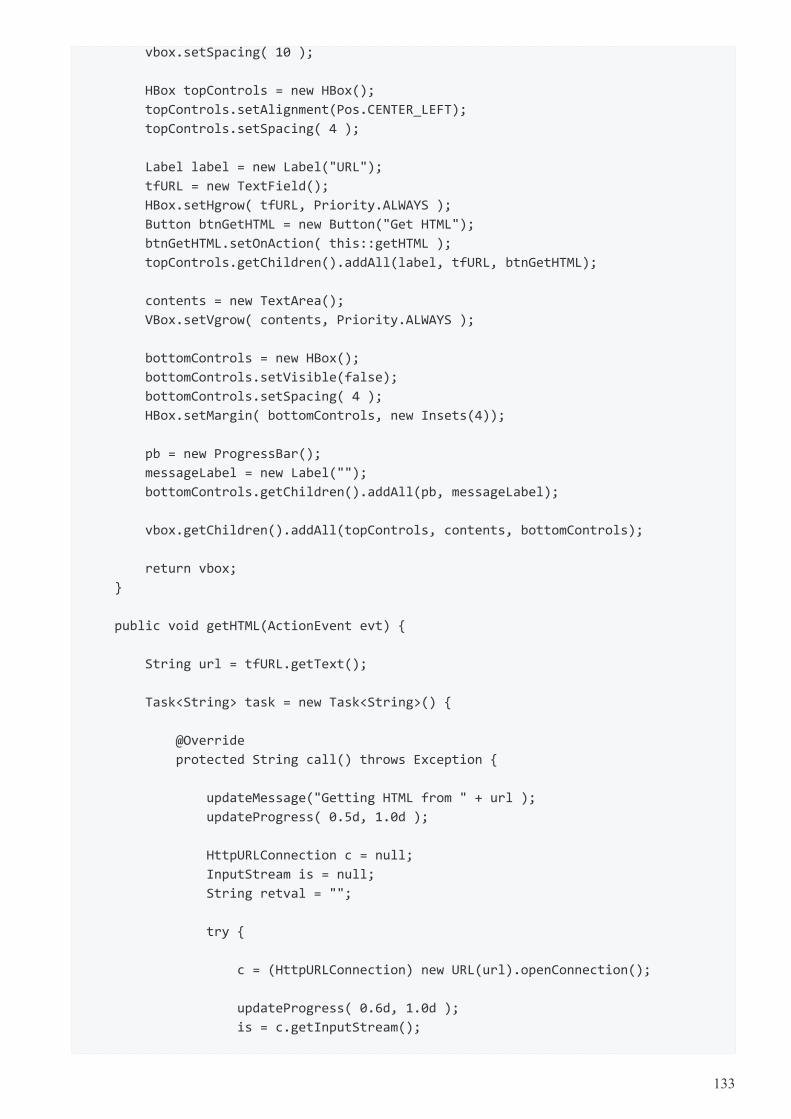
vbox.setSpacing( 10 );
HBox topControls = new HBox();
topControls.setAlignment(Pos.CENTER_LEFT);
topControls.setSpacing( 4 );
Label label = new Label("URL");
tfURL = new TextField();
HBox.setHgrow( tfURL, Priority.ALWAYS );
Button btnGetHTML = new Button("Get HTML");
btnGetHTML.setOnAction( this::getHTML );
topControls.getChildren().addAll(label, tfURL, btnGetHTML);
contents = new TextArea();
VBox.setVgrow( contents, Priority.ALWAYS );
bottomControls = new HBox();
bottomControls.setVisible(false);
bottomControls.setSpacing( 4 );
HBox.setMargin( bottomControls, new Insets(4));
pb = new ProgressBar();
messageLabel = new Label("");
bottomControls.getChildren().addAll(pb, messageLabel);
vbox.getChildren().addAll(topControls, contents, bottomControls);
return vbox;
}
public void getHTML(ActionEvent evt) {
String url = tfURL.getText();
Task<String> task = new Task<String>() {
@Override
protected String call() throws Exception {
updateMessage("Getting HTML from " + url );
updateProgress( 0.5d, 1.0d );
HttpURLConnection c = null;
InputStream is = null;
String retval = "";
try {
c = (HttpURLConnection) new URL(url).openConnection();
updateProgress( 0.6d, 1.0d );
is = c.getInputStream();
133
int ch;
while( (ch=is.read()) != -1 ) {
retval += (char)ch;
}
} finally {
if( is != null ) {
is.close();
}
if( c != null ) {
c.disconnect();
}
}
updateMessage("HTML retrieved");
updateProgress( 1.0d, 1.0d );
return retval;
}
@Override
protected void succeeded() {
contents.setText( getValue() );
}
@Override
protected void failed() {
Alert alert = new Alert(Alert.AlertType.ERROR,
getException().getMessage() );
alert.showAndWait();
}
};
bottomControls.visibleProperty().bind( task.runningProperty() );
pb.progressProperty().bind( task.progressProperty() );
messageLabel.textProperty().bind( task.messageProperty() );
new Thread(task).start();
}
public static void main(String[] args) {
launch(args);
}
}
8.3. Avoid Nulls in ComboBoxes
To use a ComboBox in JavaFX, declare a List of items and set an initial value using setValue(). The ComboBoxmethod getValue() retrieves the currently selected value. If an initial value is not provided, the control defaults toa null value.
The null value is a problem when the ComboBox drives other logic like an upper-case transformation or the
134
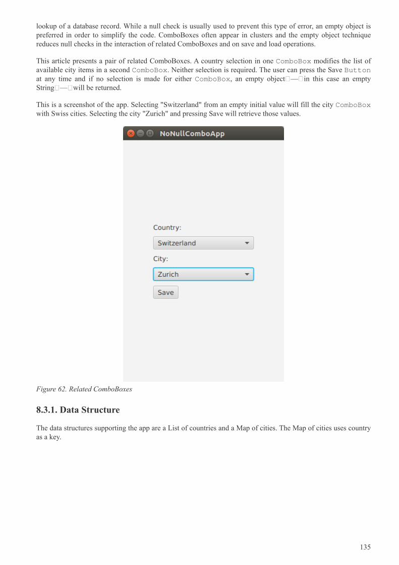
lookup of a database record. While a null check is usually used to prevent this type of error, an empty object ispreferred in order to simplify the code. ComboBoxes often appear in clusters and the empty object techniquereduces null checks in the interaction of related ComboBoxes and on save and load operations.
This article presents a pair of related ComboBoxes. A country selection in one ComboBox modifies the list ofavailable city items in a second ComboBox. Neither selection is required. The user can press the Save Buttonat any time and if no selection is made for either ComboBox, an empty object — in this case an emptyString — will be returned.
This is a screenshot of the app. Selecting "Switzerland" from an empty initial value will fill the city ComboBoxwith Swiss cities. Selecting the city "Zurich" and pressing Save will retrieve those values.
Figure 62. Related ComboBoxes
8.3.1. Data Structure
The data structures supporting the app are a List of countries and a Map of cities. The Map of cities uses countryas a key.
135
NoNullComboApp.class
public class NoNullComboApp extends Application {
private List<String> countries = new ArrayList<>();
private Map<String, List<String>> citiesMap = new LinkedHashMap<>();
private void initData() {
String COUNTRY_FR = "France";
String COUNTRY_DE = "Germany";
String COUNTRY_CH = "Switzerland";
countries.add(COUNTRY_FR); countries.add(COUNTRY_DE);
countries.add(COUNTRY_CH);
List<String> frenchCities = new ArrayList<>();
frenchCities.add("Paris");
frenchCities.add("Strasbourg");
List<String> germanCities = new ArrayList<>();
germanCities.add("Berlin");
germanCities.add("Cologne");
germanCities.add("Munich");
List<String> swissCities = new ArrayList<>();
swissCities.add("Zurich");
citiesMap.put(COUNTRY_FR, frenchCities );
citiesMap.put(COUNTRY_DE, germanCities );
citiesMap.put(COUNTRY_CH, swissCities );
}
To retrieve the set of cities for a given country, use the get() method of the Map. The containsKey() method canbe used to determine whether or not the Map contains a value for the specified country. In this example,containsKey() will be used to handle the empty object case.
8.3.2. UI
The UI is a pair of ComboBoxes with Labels and a Save Button. The controls are put in a VBox and left-justified. The VBox is wrapped in a TilePane and centered. The TilePane was used since it does not stretchthe VBox horizontally.
136
NoNullComboApp.class
@Override
public void start(Stage primaryStage) throws Exception {
Label countryLabel = new Label("Country:");
country.setPrefWidth(200.0d);
Label cityLabel = new Label("City:");
city.setPrefWidth(200.0d);
Button saveButton = new Button("Save");
VBox vbox = new VBox(
countryLabel,
country,
cityLabel,
city,
saveButton
);
vbox.setAlignment(Pos.CENTER_LEFT );
vbox.setSpacing( 10.0d );
TilePane outerBox = new TilePane(vbox);
outerBox.setAlignment(Pos.CENTER);
Scene scene = new Scene(outerBox);
initData();
8.3.3. Initial Values
As mentioned earlier, if a value is not specified for a ComboBox, then null will be returned in a getValue() call.Although there are several defensive techniques — if checks, Commons StringUtils methods — for fendingoff NullPointerExceptions, it is better to avoid them completely. This is especially true as the interactionsbecome complex or there are several ComboBoxes that allow empty selections.
NoNullComboApp.class
country.getItems().add("");
country.getItems().addAll( countries );
country.setValue( "" ); // empty selection is object and not null
city.getItems().add("");
city.setValue( "" );
In this app, the Country ComboBox will not be changed, so its items are added in the start() method. Countrystarts with an initial empty selection as does city. City — at this point — contains a single empty item.
8.3.4. Interaction
When the country value is changed, the contents of the city ComboBox should be replaced. It is common to useclear() on the backing list; however, this will produce a null value in the ComboBox (no items, no value).Instead, use removeIf() with a clause to keep a single empty item. With the list cleared of all data (except the
137
empty item), the newly-selected contents can be added with addAll().
NoNullComboApp.class
country.setOnAction( (evt) -> {
String cty = country.getValue();
city.getItems().removeIf( (c) -> !c.isEmpty() );
if( citiesMap.containsKey(cty) ) { // not an empty key
city.getItems().addAll( citiesMap.get(cty) );
}
});
saveButton.setOnAction( (evt) -> {
System.out.println("saving country='" + country.getValue() +
"', city='" + city.getValue() + "'");
});
The Save Button action will print out the values. In no case will a null value be returned from getValue().
If you’re a Java developer, you’ve written "if not null" thousands of times. Yet, project after project, I seeNullPointerExceptions highlighting cases that were missed or new conditions that have arisen. This articlepresented a technique for keeping empty objects in ComboBoxes by setting an initial value and using removeIf()rather than clear() when changing lists. Although, this example used String objects, this can be expanded to workwith domain objects that have an hashCode/equals implementation, an empty object representation, and acellFactory or toString() to produce an empty view.
8.3.5. Complete Code
The code can be tested in a single .java file.
NoNullComboApp.class
public class NoNullComboApp extends Application {
private final ComboBox<String> country = new ComboBox<>();
private final ComboBox<String> city = new ComboBox<>();
private List<String> countries = new ArrayList<>();
private Map<String, List<String>> citiesMap = new LinkedHashMap<>();
@Override
public void start(Stage primaryStage) throws Exception {
Label countryLabel = new Label("Country:");
country.setPrefWidth(200.0d);
Label cityLabel = new Label("City:");
city.setPrefWidth(200.0d);
Button saveButton = new Button("Save");
138
VBox vbox = new VBox(
countryLabel,
country,
cityLabel,
city,
saveButton
);
vbox.setAlignment(Pos.CENTER_LEFT );
vbox.setSpacing( 10.0d );
TilePane outerBox = new TilePane(vbox);
outerBox.setAlignment(Pos.CENTER);
Scene scene = new Scene(outerBox);
initData();
country.getItems().add("");
country.getItems().addAll( countries );
country.setValue( "" ); // empty selection is object and not null
city.getItems().add("");
city.setValue( "" );
country.setOnAction( (evt) -> {
String cty = country.getValue();
city.getItems().removeIf( (c) -> !c.isEmpty() );
if( citiesMap.containsKey(cty) ) { // not an empty key
city.getItems().addAll( citiesMap.get(cty) );
}
});
saveButton.setOnAction( (evt) -> {
System.out.println("saving country='" + country.getValue() +
"', city='" + city.getValue() + "'");
});
primaryStage.setTitle("NoNullComboApp");
primaryStage.setScene( scene );
primaryStage.setWidth( 320 );
primaryStage.setHeight( 480 );
primaryStage.show();
}
public static void main(String[] args) {
launch(args);
}
private void initData() {
139
String COUNTRY_FR = "France";
String COUNTRY_DE = "Germany";
String COUNTRY_CH = "Switzerland";
countries.add(COUNTRY_FR); countries.add(COUNTRY_DE);
countries.add(COUNTRY_CH);
List<String> frenchCities = new ArrayList<>();
frenchCities.add("Paris");
frenchCities.add("Strasbourg");
List<String> germanCities = new ArrayList<>();
germanCities.add("Berlin");
germanCities.add("Cologne");
germanCities.add("Munich");
List<String> swissCities = new ArrayList<>();
swissCities.add("Zurich");
citiesMap.put(COUNTRY_FR, frenchCities );
citiesMap.put(COUNTRY_DE, germanCities );
citiesMap.put(COUNTRY_CH, swissCities );
}
}
8.4. Writing Javadoc for JavaFX Properties
8.4.1. Background
Documenting JavaFX APIs may not appear very different from documenting a Java API but most of us areunaware of the tools present to ease our work.
While writing a JavaFX application or designing a JavaFX control, a developer adds various JavaFX propertieswhich normally consists of a field and three methods i.e. JavaFX property method, setter and getter. Thesemethods are generally public and therefore, should be documented. Writing Javadoc for all the three methodsdoesn’t makes sense when most of it is implied. Nevertheless, there should be some documentation and a way toshow a link between all these methods.
The JavaFX team has been very thoughtful and introduced a special option "-javafx" for the javadoc command.This option introduces the following flexibility:
• Generates HTML documentation using the JavaFX extensions to the standard doclet. The generateddocumentation includes a "Property Summary" section in addition to the other summary sectionsgenerated by the standard Java doclet. The listed properties are linked to the sections for the getter andsetter methods of each property.
• If there are no documentation comments written explicitly for getter and setter methods, thedocumentation comments from the property method are automatically copied to the generateddocumentation for these methods.
• Adds a new @defaultValue tag that allows documenting the default value for a property.
• Adds a new @treatAsPrivate tag that adds the flexibility to not publish the doc for a public methodwhich is a part of the implementation detail.
140
javadoc -javafx MyClass.java -d testdir
8.4.2. Example
Generally, if you introduce a JavaFX property field, you will add its corresponding property method along withsetter and getter. In this case, you are advised to bundle them together and document only the field. The "-javafx"option on the javadoc command will generate the appropriate documentation for the rest of the methods.
N.B. - You can document an individual method in case you want to add explicit information for the method.
/**
* Specifies whether this {@code Node} and its child nodes should be rendered
* as part of the scene graph. A node may be visible and yet not be shown
* in the rendered scene if, for instance, it is off the screen or obscured
* by another Node. Invisible nodes never receive mouse events or
* keyboard focus and never maintain keyboard focus when they become
* invisible.
*
* @defaultValue true
*/
private BooleanProperty visible = new SimpleBooleanProperty(this, "visible", true);
public final void setVisible(boolean value) {
visibleProperty().set(value);
}
public final boolean isVisible() {
return visible.get();
}
public final BooleanProperty visibleProperty() {
return visible;
}
8.5. Ignoring Warnings for Null Select Binding Expressions
When working with the JavaFX Bindings class, you may get evaluation warnings in the console log. Thisscenario arises when using a binding expression on an object that may be null. For example, a TableViewselection may drive the enabled state of Buttons. When the TableView is first displayed, there is no selection.This will display an error in the log of level WARNING.
Dec 31, 2016 9:11:14 AM com.sun.javafx.binding.SelectBinding$SelectBindingHelper
getObservableValue
WARNING: Exception while evaluating select-binding [taxable]
"taxable" is a Boolean property on a POJO. The expression that caused this message is the following.
141
btnCalcTax.disableProperty().bind(
tblItems.getSelectionModel().selectedItemProperty().isNull().or(
Bindings.select(
tblItems.getSelectionModel().selectedItemProperty(),
"taxable"
).isEqualTo(false)
)
);
The preceding statement disables the Calc Tax Button when there is no table selection or if there is a tableselection, the selected item has its taxable field set to false. That is, the Calc Tax Button should only be enabledwhen a taxable item is selected.
JavaFX Bindings uses Java Logging, so raising the verbosity to SEVERE will ignore the WARNING levelmessage. Conversely, if you want to lower the verbosity to see the stack trace supporting the WARNING, lowerthe verbosity to FINE. This statement is added to a logging.properties file. The program can be instructed to usethat file by specifying -Djava.util.logging.config.file in the command.
javafx.beans.level=SEVERE
For a quick check that does not require a separate file or command modification, you can add this to yourprogram. Because of the dependency on Sun classes, you should remove this prior to committing.
Logging.getLogger().setLevel(PlatformLogger.Level.FINE )
The JavaFX WARNING may be too strong for a common use case. There is a ticket JDK-8162600 that mayaddress this in a later JavaFX release.
8.6. POJO Binding
In larger apps involving non-JavaFX technologies, sharing POJOs is a great way to help with maintenance.Doing an impact analysis is quicker when an IDE can search for common accesses and extensions. Moreover,POJO-based validation, logic, and utilities can also be reused.
JavaFX has a collection of static methods in the Bindings class to work with both POJOs and JavaFX-enabledProperties. This section demonstrates the use of the select() method which will link the core data types from aPOJO to the JavaFX Property-based fields of a UI control. Once the core data type is repackaged as a Property,additional functionality from JavaFX can be chained such as string concantenation.
Because the data in this demonstration app is based on a POJO, an update needs to be made manually. Bi-directional binding works only when the source and the target are both Properties. This app uses a Track classwith core data type fields like String: "album". If the Track class were written using JavaFX properties — sayStringProperty : album — then a model change would automatically update the UI. A hybrid approach ispresented whereby the core data type on one of the POJO fields initializes a separate JavaFX Property field andthe update operation must change both fields.
142
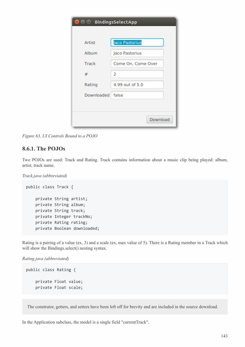
Figure 63. UI Controls Bound to a POJO
8.6.1. The POJOs
Two POJOs are used: Track and Rating. Track contains information about a music clip being played: album,artist, track name.
Track.java (abbreviated)
public class Track {
private String artist;
private String album;
private String track;
private Integer trackNo;
private Rating rating;
private Boolean downloaded;
Rating is a pairing of a value (ex, 3) and a scale (ex, max value of 5). There is a Rating member in a Track whichwill show the Bindings.select() nesting syntax.
Rating.java (abbreviated)
public class Rating {
private Float value;
private Float scale;
The construtor, getters, and setters have been left off for brevity and are included in the source download.
In the Application subclass, the model is a single field "currentTrack".
143
BindingsSelectApp.java
public class BindingsSelectApp extends Application {
private final Track currentTrack = new Track(
"Jaco Pastorious",
"Jaco Pastorious",
"Come On, Come Over",
2,
new Rating(4.99f, 5.00f),
false
);
Referring to the previous screenshot, the currentTrack fields are displayed in the TextFields(). "rating" issupplemented with a formatted String.
8.6.2. UI Code
The TextField controls and the Download Button are also Application subclass fields so that they can beused in both the Application.start() method and a private initBindings() method.
BindingsSelectApp.java (cont.)
private final TextField tfArtist = new TextField();
private final TextField tfAlbum = new TextField();
private final TextField tfTrack = new TextField();
private final TextField tfTrackNo = new TextField();
private final TextField tfRating = new TextField();
private final TextField tfDownloaded = new TextField();
private final Button downloadButton = new Button("Download");
private final BooleanProperty downloaded = new
SimpleBooleanProperty(currentTrack, "downloaded");
"downloaded" is a special JavaFX Property maintained alongside the field of the same name in the currentTrackobject. As mentioned earlier, the POJO will need to be updated manually. The BooleanProperty "downloaded" isa convenience that keeps the app from having to modify the tfDownload TextField directly.
The start() method begins by creating the top GridPane container and adding the TextField and Labelcontrols.
144
BindingsSelectApp.java (cont.)
@Override
public void start(Stage primaryStage) throws Exception {
GridPane gp = new GridPane();
gp.add(new Label("Artist"), 0, 0);
gp.add(tfArtist, 1, 0);
gp.add(new Label("Album"), 0, 1);
gp.add(tfAlbum, 1, 1);
gp.add(new Label("Track"), 0, 2);
gp.add(tfTrack, 1, 2);
gp.add(new Label("#"), 0, 3);
gp.add(tfTrackNo, 1, 3);
gp.add(new Label("Rating"), 0, 4);
gp.add(tfRating, 1, 4);
gp.add(new Label("Downloaded"), 0, 5);
gp.add(tfDownloaded, 1, 5);
gp.setHgap(4.0d);
gp.setVgap(8.0d);
VBox.setVgrow(gp, Priority.ALWAYS);
VBox.setMargin( gp, new Insets(40.0d) );
A ButtonBar container is used to hold the Download Button. The ButtonBar and GridPane are added to aVBox and separated via a Separator.
BindingsSelectApp.java (cont.)
ButtonBar buttons = new ButtonBar();
ButtonBar.setButtonData(downloadButton, ButtonBar.ButtonData.OTHER);
buttons.getButtons().add(downloadButton);
buttons.setPadding(new Insets(10.0d) );
VBox vbox = new VBox(
gp,
new Separator(),
buttons
);
8.6.3. Bindings
The bindings statements are in a private method "initBindings" which is called from the Application.start()method.
145
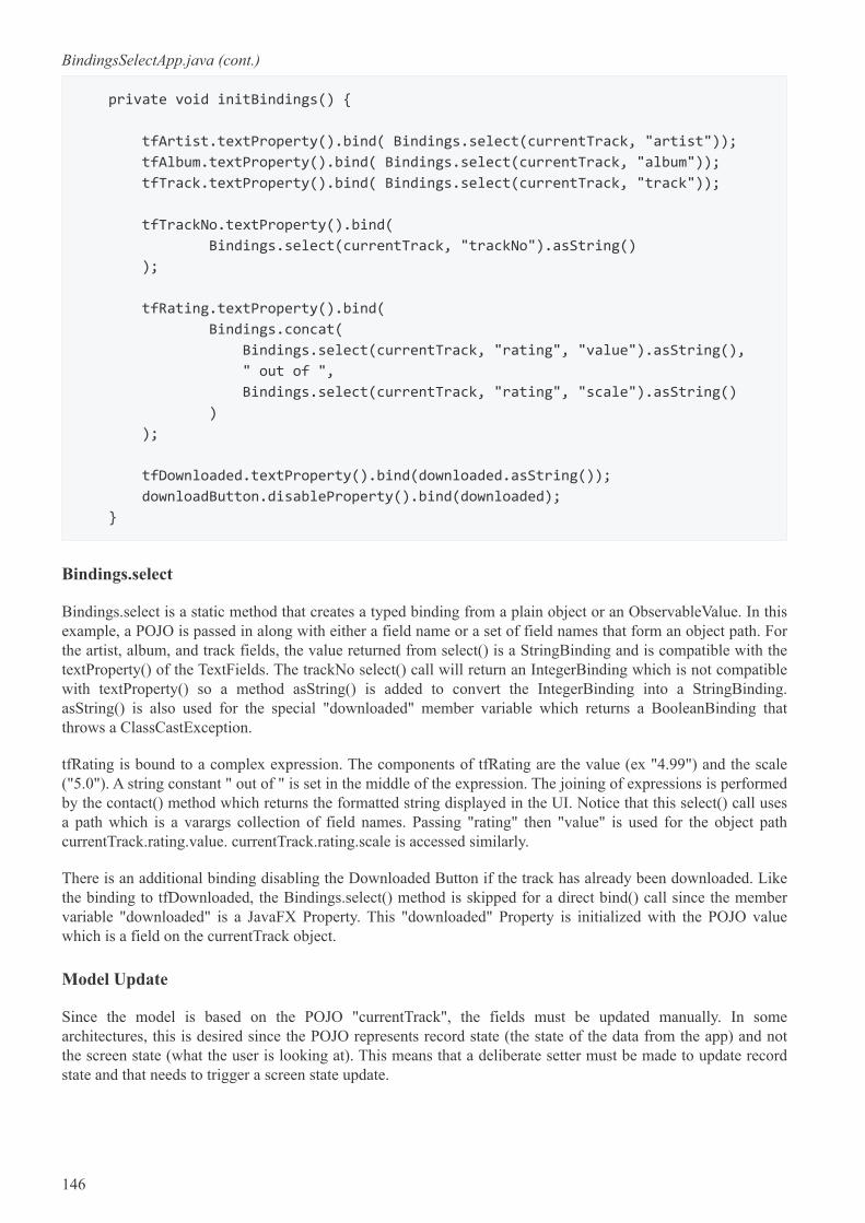
BindingsSelectApp.java (cont.)
private void initBindings() {
tfArtist.textProperty().bind( Bindings.select(currentTrack, "artist"));
tfAlbum.textProperty().bind( Bindings.select(currentTrack, "album"));
tfTrack.textProperty().bind( Bindings.select(currentTrack, "track"));
tfTrackNo.textProperty().bind(
Bindings.select(currentTrack, "trackNo").asString()
);
tfRating.textProperty().bind(
Bindings.concat(
Bindings.select(currentTrack, "rating", "value").asString(),
" out of ",
Bindings.select(currentTrack, "rating", "scale").asString()
)
);
tfDownloaded.textProperty().bind(downloaded.asString());
downloadButton.disableProperty().bind(downloaded);
}
Bindings.select
Bindings.select is a static method that creates a typed binding from a plain object or an ObservableValue. In thisexample, a POJO is passed in along with either a field name or a set of field names that form an object path. Forthe artist, album, and track fields, the value returned from select() is a StringBinding and is compatible with thetextProperty() of the TextFields. The trackNo select() call will return an IntegerBinding which is not compatiblewith textProperty() so a method asString() is added to convert the IntegerBinding into a StringBinding.asString() is also used for the special "downloaded" member variable which returns a BooleanBinding thatthrows a ClassCastException.
tfRating is bound to a complex expression. The components of tfRating are the value (ex "4.99") and the scale("5.0"). A string constant " out of " is set in the middle of the expression. The joining of expressions is performedby the contact() method which returns the formatted string displayed in the UI. Notice that this select() call usesa path which is a varargs collection of field names. Passing "rating" then "value" is used for the object pathcurrentTrack.rating.value. currentTrack.rating.scale is accessed similarly.
There is an additional binding disabling the Downloaded Button if the track has already been downloaded. Likethe binding to tfDownloaded, the Bindings.select() method is skipped for a direct bind() call since the membervariable "downloaded" is a JavaFX Property. This "downloaded" Property is initialized with the POJO valuewhich is a field on the currentTrack object.
Model Update
Since the model is based on the POJO "currentTrack", the fields must be updated manually. In somearchitectures, this is desired since the POJO represents record state (the state of the data from the app) and notthe screen state (what the user is looking at). This means that a deliberate setter must be made to update recordstate and that needs to trigger a screen state update.
146
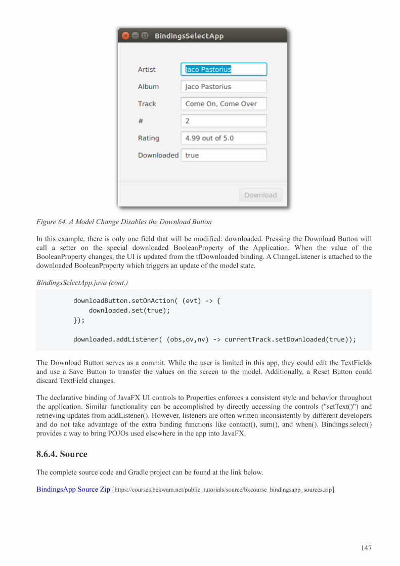
Figure 64. A Model Change Disables the Download Button
In this example, there is only one field that will be modified: downloaded. Pressing the Download Button willcall a setter on the special downloaded BooleanProperty of the Application. When the value of theBooleanProperty changes, the UI is updated from the tfDownloaded binding. A ChangeListener is attached to thedownloaded BooleanProperty which triggers an update of the model state.
BindingsSelectApp.java (cont.)
downloadButton.setOnAction( (evt) -> {
downloaded.set(true);
});
downloaded.addListener( (obs,ov,nv) -> currentTrack.setDownloaded(true));
The Download Button serves as a commit. While the user is limited in this app, they could edit the TextFieldsand use a Save Button to transfer the values on the screen to the model. Additionally, a Reset Button coulddiscard TextField changes.
The declarative binding of JavaFX UI controls to Properties enforces a consistent style and behavior throughoutthe application. Similar functionality can be accomplished by directly accessing the controls ("setText()") andretrieving updates from addListener(). However, listeners are often written inconsistently by different developersand do not take advantage of the extra binding functions like contact(), sum(), and when(). Bindings.select()provides a way to bring POJOs used elsewhere in the app into JavaFX.
8.6.4. Source
The complete source code and Gradle project can be found at the link below.
BindingsApp Source Zip [https://courses.bekwam.net/public_tutorials/source/bkcourse_bindingsapp_sources.zip]
147