Embed Size (px)
Citation preview

JideFX Fields Developer Guide
Table of Contents
PURPOSE OF THIS DOCUMENT ................................................................................................................. 2
WHAT IS JIDEFX FIELDS ............................................................................................................................ 2
PACKAGES ................................................................................................................................................ 2
DEPENDENCY ........................................................................................................................................... 2
MASKTEXTFIELD ....................................................................................................................................... 2
INPUTMASK ................................................................................................................................................... 3
CONVERSIONMASK ......................................................................................................................................... 4
REQUIREDMASK ............................................................................................................................................. 4
EXAMPLES ..................................................................................................................................................... 5
CUSTOMIZATION ............................................................................................................................................. 5
Change the Mask Character .................................................................................................................. 5
FORMATTEDTEXTFIELD ............................................................................................................................ 6
GROUP-BASED MASK, A.K.A. PATTERN ................................................................................................................ 7
Support for any Data Types ................................................................................................................... 9
MOUSE AND KEYBOARD SUPPORT .................................................................................................................... 11
Spinner Support ................................................................................................................................... 11
Keyboard Support ................................................................................................................................ 11
Mouse Support ..................................................................................................................................... 12
PATTERNVERIFIERS ........................................................................................................................................ 14
NUMBER SUPPORT ........................................................................................................................................ 18
DATE AND TIME ............................................................................................................................................ 18
DateFormat Support ............................................................................................................................ 18
DateTimeFormatter Support ................................................................................................................ 20
Additional Built-in PatternVerifiers for the various Date Types ........................................................... 23
COMPARISON OF THE TWO TEXTFIELDS ................................................................................................ 24
POPUPFIELD ........................................................................................................................................... 25
DEFINE A POPUPFIELD ................................................................................................................................... 26
CUSTOMIZE THE POPUP BUTTON ETC. ............................................................................................................... 30
FORMATTEDCOMBOBOXES ................................................................................................................... 31
SPINNERS ............................................................................................................................................... 33
SPINNERSTYLE .............................................................................................................................................. 34
FORMATTEDTEXTFIELD.ASSPINNER ................................................................................................................... 35

COPYRIGHT © 2002-2013 J IDE SOFTWARE. ALL RIGHTS RESERVED
2
Purpose of This Document
Welcome to the JideFX Fields, a collection of text fields and combo-boxes for to JavaFX platform. This document is for developers who want to develop applications using JideFX Fields.
What is JideFX Fields
This product is all about user input. There are several user input related controls in JavaFX. They are TextField, TextArea, ChoiceBox, and ComboBox. While they provided the basic features of those controls, some significant features are missing. That’s why we decided to introduce the JideFX Fields products to provide enhancements to those input controls.
Packages
The table below lists the packages in the JideFX Fields product.
Packages Description
jidefx.scene.control.field Controls that extend TextField
jidefx.scene.control.combobox Controls that extend ComboBox
jidefx.scene.control.popup PopupContent used by the PopupField or the FormattedComboBox
Dependency
The JideFX Fields product depends on the JideFX Common, JideFX Converters and the JideFX Decoration.
MaskTextField
One of the missing components in JavaFX is a JFormattedTextField equivalent as in Swing. The purpose of such a text field is to restrict user input so that only some characters can be entered. That’s why the “mask” was invented. Basically, a mask was used to specify the valid characters that can be entered for a particular position in the input string. For example, in Swing’s MaskFormatter, ‘#’ is a mask character for digits, so a mask “##” means the input string must be two digits such as “01”, “23”. All other non-digits characters will not be accepted.
Masks could be very useful. For example, an SSN is a 9 digit string with dashes in between; a serial number could be 25 digits or letters, all in uppercase with a dash every five letters; a MAC address is a 12 hexadecimal digits with a semi-colon every two digits. Those aforementioned strings can be easily handled by a mask text field, such as Swing’s JFormattedTextField. We call it

COPYRIGHT © 2002-2013 J IDE SOFTWARE. ALL RIGHTS RESERVED
3
position-based formatting because each character input can be enforced based on its position in the String. Usually, the final string has a fixed length.
That’s we created MaskTextField which leverages the mask concept. To make it easy to understand, unlike MaskFormatter which only has one mask, we have several masks for different purposes.
InputMask
MaskTextField uses setInputMask(String mask) to set the mask to restrict user input. This is the main mask and required. The pre-defined mask characters are:
Mask Predefined as fields Description
A INPUT_MASK_LETTER ASCII alphabetic character required. A-Z, a-z.
N INPUT_MASK_DIGIT_OR_LETTER ASCII alphanumeric character required. A-Z, a-z, 0-9.
X INPUT_MASK_ANY_NON_SPACE Any character required except spaces.
H INPUT_MASK_HAX Hexadecimal character required. A-F, a-f, 0-9.
D INPUT_MASK_DIGIT_NON_ZERO ASCII digit required. 1-9.
9 INPUT_MASK_DIGIT ASCII digit required. 0-9.
8 INPUT_MASK_DIGIT_0_TO_8 ASCII digit required. 0-8.
7, 6, 5, 4, 3, … and so on which means only allows from 0 to that number
2 INPUT_MASK_DIGIT_0_TO_2 ASCII digit required. 0-2.
1 INPUT_MASK_DIGIT_0_TO_1 ASCII digit required. 0-1, for example, a binary number
0 INPUT_MASK_DIGIT_ZERO 0 required
If the setInitialText is not called, the InputMask will be used to create the initial text for the field. We created it by replacing all mask characters with spaces or the specified placeholder characters, and left the non-mask characters where they are. The placeholder character can be set using setPlaceholderCharacter(char) method. See below. In both cases, the InputMask is 999-99-9999.
By default, the placeholderCharacter is whitespace. The initial text is

COPYRIGHT © 2002-2013 J IDE SOFTWARE. ALL RIGHTS RESERVED
4
If the placeholderCharacter is underscore ‘_’, then the initial text will become
To make the grammar easy to understand, we strictly enforced that there is only one mask character per position for the InputMask. Each character in the InputMask corresponds to a character in the input string.
ConversionMask
In addition to the Input Mask, we also have a separate ConversionMask which will automatically convert the entered character to another character. This mask is optional. It can be set using setConversionMask(String mask). If not set, there will be no conversion. If you ever set the mask, please make sure they have the exact same length as the InputMask, and have a valid conversion mask character at the exact position where there is an InputMask character.
Mask Predefined as Field Description
U CONVERSION_MASK_UPPER_CASE Uppercase required. If user enters a lowercase letter, it will be automatically converted to the corresponding uppercase letter.
L CONVERSION_MASK_LOWER_CASE Lowercase required. If user enters an uppercase letter, it will be automatically converted to the corresponding lowercase letter.
Any other undefined chars
CONVERSION_MASK_IGNORE No conversion
RequiredMask
The RequiredMask is to indicate whether the character on a particular position is required. It is again optional. It can be set using setRequiredMask(String mask). If not set, a valid non-space character is required on all the positions. If you ever set the mask, please make sure they have the same length as the InputMask, and have a valid required mask character at the exact position where there is an InputMask character.
Mask Predefined as Field Description
R REQUIRED_MASK_REQUIRED Required. Users must enter a valid character that matches with the mask on this position.

COPYRIGHT © 2002-2013 J IDE SOFTWARE. ALL RIGHTS RESERVED
5
Any other undefined chars
REQUIRED_MASK_NOT_REQUIRED Not required. User can enter a space at this position.
Examples
SSN InputMask: 999-99-9999
Serial Number (Used by most Microsoft products)
InputMask: NNNNN-NNNNN-NNNNN-NNNNN-NNNNN
ConversionMask: UUUUU_UUUUU_UUUUU_UUUUU_UUUUU
MAC Address InputMask: HH:HH:HH:HH:HH:HH
ConversionMask: UU_UU_UU_UU_UU_UU
Customization
The MaskTextField’s behavior is fully customizable.
Change the Mask Character
If you don’t like the mask character we chose or it conflicts with your input string, you can change it by change the inputMaskVerifiers map directly (or the conversions map for conversion mask characters). For example, to change INPUT_MASK_LETTER from ‘A’ to ‘B’, all you need to do is:
MaskTextField field = new MaskTextField();
ObservableMap<Character, Callback<Character, Boolean>> verifiers =
field.getInputMaskVerifiers();
// inherit the behavior from the old one
verifiers.put('B', verifiers.get(INPUT_MASK_LETTER));
// remove the old one Or if you want to automatically convert the entered character
// to another one, you can use the conversions map
verifiers.remove(INPUT_MASK_LETTER); .
Or to add a conversion mask character:
field.getConversions().put('+', new Callback<Character, Character>() {
public Character call(Character param) {
return (char) (param.charValue() + 1);
}
});
The code above will add a mask character ‘+’. It will automatically increases the ASCII of the input char by 1 if the corresponding conversion mask is ‘+’.
A quick note, it is confusing that some mask characters are pre-defined and others are user-defined. We intentionally used only upper case letters or digits as all the pre-defined

COPYRIGHT © 2002-2013 J IDE SOFTWARE. ALL RIGHTS RESERVED
6
masks. So we recommend you only use lower case letters as the user-defined masks. It is not required but highly recommended.
Figure 1 Some MaskTextFields
Figure 2 Non-editable MaskTextFields (with comboBoxLike flag set to true)
FormattedTextField
MaskTextField is great for its designed purpose. However there are another category of restricted input that cannot be enforced using the position-based mask as the MaskTextField does. We called it the group-based mask because the input characters can be divided into groups, and then the input can be enforced on each group, not on each character as in the MaskTextField.
For example, an IPv4 address is a four-group string in the format of “#.#.#.#.” Each # is a group that could be a number from 0 to 255, separated by dots. Because each group could be 1 to 3 digits, there is no way to represent it as a position-based mask using the MaskTextField. On the other hand, an IP address could be represented as a regular expression as below.
"\\b(([01]?\\d?\\d|2[0-4]\\d|25[0-5])\\.){3}([01]?\\d?\\d|2[0-4]\\d|25[0-5])\\b"

COPYRIGHT © 2002-2013 J IDE SOFTWARE. ALL RIGHTS RESERVED
7
However, the regular expression is only useful when doing the final validation, cannot be used to restrict and guide user inputs. Swing’s JFormattedTextField can’t handle it very well. As a matter for fact, we had to create a customized component called IPTextField for Swing and used four JTextFields internally. We were never satisfied with it because it is so limited (i.e. Ctrl-A can’t select all the text as they are in four different text fields).
We wanted to do something better for the JavaFX. Here comes the FormattedTextField – the most advanced text field that can restrict user inputs in the history of Java UI. I am not exaggerating.
Group-based Mask, a.k.a. Pattern
The group-based mask uses a String pattern to define the groups. The pattern could be in any format you want. The next thing is to define PatternVerifiers map to verify/restrict the input for each group. It is basically a callback to verify the text in each group.
It is easier to understand if we look at an example.
FormattedTextField<String> field = new FormattedTextField<>();
field.setPattern("n");
field.getPatternVerifiers().put("n", new IntegerRangePatternVerifier(0, 255));
The code above will create a text field will only accept a number from 0 to 255.
Next up is an example for an IPv4 address field.
FormattedTextField<String> field = new FormattedTextField<>();
field.getPatternVerifiers().put("h", new IntegerRangePatternVerifier(0, 255));
field.setPattern("h.h.h.h");
To initialize a FormattedTextField, you must set both pattern and the pattern verifiers together. The pattern is "h.h.h.h". As there is a verifier for “h”, so we know the pattern means that there are four groups, all named "h", separated by dots. In the PatternVerifiers map, we added a verifier which will make sure the input string for the group "h" is a number between 0 and 255. If there is no group definition for any text in the pattern, it is considered as fixed characters, such as "." in the above example, and will stay there all the time.
By the way, we will cover IntegerRangePatternVerifier etc. built-in verifiers and how to write custom verifiers later. For now, just remember this range verifier will enforce the text in the group is an integer between 0 and 255.
See below for a series of screenshots of the IP FormattedTextField in action.
Initial value: all fixed characters will be displayed initially with no spaces in between. Note that the validation icons are not there by default on the FormattedTextField but you can easily add valiation icons to the FormattedTextField using the Validation feature we provided.
User enters ‘2’ at the first position. Internally the verifier is called. Since ‘2’ is between 0 and 255, it is accepted.

COPYRIGHT © 2002-2013 J IDE SOFTWARE. ALL RIGHTS RESERVED
8
User enters ‘5’ next. The new group text “25” is still beween 0 and 255 so ‘5’ is accepted.
User enters ‘6’ right after ‘5’. Without the restriction from the FormattedTextField, the resulting text would be “256”. However, “256” is not a valid segment for an IP address so the FormattedTextField ignores the input at this position, automatically moves the caret to the next position. It will skip ‘.’ as it is a fixed char, and try to enter ‘6’ into the next group. The next group only has “6” and it is valid.
Now user types a ‘.’. Since the ‘.’ matches with the next non-mask char, so the caret automatically advanced to the next group. As a matter of fact, for an IP address field, user can type ‘.’ at any position and the caret will move to the next group.
Finally user enters ‘9’, ‘0’, ‘1’, ‘2’, ‘1’. The IP address is completed.
The validation icon nows show the IP address is valid. The validation code uses a regular expression to valid the IP address.
Let’s look at another example of a FormattedTextField for a date in the US standard format of Month/Day/Year. It is more complex than the IP address one.
/* EXAMPLE ONLY. DO NOT USE THIS CODE IN YOUR REAL APPLICATION */
FormattedTextField<String> field = new FormattedTextField<>();
field.getPatternVerifiers().put("MM", new IntegerRangePatternVerifier(1, 12,
true));
field.getPatternVerifiers().put("dd", new IntegerRangePatternVerifier(1, 31,
true));
field.getPatternVerifiers().put("yyyy", new IntegerRangePatternVerifier(0, 9999,
true));
field.setPattern("MM/dd/yyyy");
In this example, there are three groups that we defined, named "MM", "dd", "yyyy" respectively. The group "MM" is the month between 1 and 12. The group "dd" is the day in month so it must be between 1 and 31 (always 31? questionable). The group "yyyy" is the year which is from 0 to 9999.
Well, if you were us, you shouldn’t be satisfied with it because the restriction to the day in month group is far from enough. Some months only have 30 days or even 28 or 29 days for February. We can’t just allow 31 for all the months. So how about this code below? You don’t have to read the code. Just believe that all it does is to look at the month and year value (in underlined bold text below) and determine the maximum allowed days for that month.

COPYRIGHT © 2002-2013 J IDE SOFTWARE. ALL RIGHTS RESERVED
9
/* EXAMPLE ONLY. DO NOT USE THIS CODE IN YOUR REAL APPLICATION */
field.getPatternVerifiers().put("dd", new Callback<String, Boolean>() {
@Override
public Boolean call(String text) {
int m = 0;
int d = 0;
int y = 0;
try {
d = Integer.parseInt(text);
}
catch (NumberFormatException e) {
// ignore
}
try {
String month = field.getGroupText("MM");
m = Integer.parseInt(month);
}
catch (NumberFormatException e) {
// ignore
}
if (m == 1 || m == 3 || m == 5 || m == 7 || m == 8 || m == 10 || m == 12)
return d >= 1 && d <= 31;
else if (m == 4 || m == 6 || m == 9 || m == 11) return d >= 1 && d <= 30;
else if (m == 2) {
try {
String year = field.getGroupText("yyyy");
y = Integer.parseInt(year);
}
catch (NumberFormatException e) {
// ignore
}
if (y % 400 == 0) return d >= 1 && d <= 29;
else if (y % 100 == 0) return d >= 1 && d <= 28;
else if (y % 4 == 0) return d >= 1 && d <= 29;
else return d >= 1 && d <= 28;
}
else return d >= 1 && d <= 31;
}
});
Hope now you can see the potential of the FormattedTextField. The code is obviously too complex. The good news is, the code above is not the actual code that we are using to create a FormattedTextField for Date. Below is the actual code.
DateField field = new DateField("MM/dd/yyyy");
The code could be so simple because we provided full support for the DateFormat. We will cover it later in details.
Support for any Data Types
FormattedTextField can be used to edit any data types with the help of the StringConverter or JideFX’s ObjectConverter. See below for an example.
FormattedTextField<Color> colorField = new FormattedTextField<>();
colorField.setPattern("red, green, blue");
colorField.getPatternVerifiers().put("red", new IntegerRangePatternVerifier(0,
255));
colorField.getPatternVerifiers().put("green", new IntegerRangePatternVerifier(0,
255));
colorField.getPatternVerifiers().put("blue", new
IntegerRangePatternVerifier(0,255));

COPYRIGHT © 2002-2013 J IDE SOFTWARE. ALL RIGHTS RESERVED
10
// this converter will take care of the String <-> Color conversion
colorField.setStringConverter(new RgbColorConverter(false).toStringConverter());
// now you can set the value instead of using setText(String)
colorField.setValue(Color.WHITE);
See below for a screenshot of the FormattedTextField for Color.
As you can see from the example code above, FormattedTextField takes a generic type as the class paramater which would be the data type to be edited. In this case, you should call setStringConverter to setup a conversion beween the String and the data type. Once you did that, never call setText or getText again. TextField’s setText method is final. Otherwise we would have overridden it to throw an exception and warn you not to use it. You should always call setValue (instead of setText which doesn’t know anything about the format) or getValue (instead of getText and converts the text later).
We constantly test if the text user enterred is a valid value. This is done by the commitEdit method, which can be called programatically, or when user presses ENTER key. The reason we do that is because user could type something that is valid based on the PatternVerifier but not valid as the whole data. For example, in a date field, user typed
Note the year is not entered yet so the pattern verifiers can’t disallow user from entering "Feb 29" because “Feb 29” could be valid if user continued to enter “2000” after that. However, user enters "2001", which is not a leap year.
Now user presses ENTER.
As you can see the text is automatically changed to "Mar 1, 2001". That’s because the DateFormat parses "Feb 29, 2001", realized it is invalid so it converts automatically to "March 1, 2001"1.
1 For DateFormat, it will only do this kind of conversion when setLenient is set to true. It is true by default.
If it was set to false, “02/29/2001” will be treated as an invalid date string and the FormattedTextField will
revert the text to last known valid value.

COPYRIGHT © 2002-2013 J IDE SOFTWARE. ALL RIGHTS RESERVED
11
On the other hand, if the text is "Feb |,2001" where the red bar is the caret position, user cannot enter "29" because we know in the February of 2001, there are only 28 days. As you can see, that’s how FormattedTextField enforces the user input without losing any flexibility.
At any time, ESCAPE key will cancel the edit and revert the value to the last known valid value. The ENTER key will trigger a call to the commitEdit method, which parses the text. If succeed, it will set the value. Otherwise, it will call the cancelEdit method and revert to last known valid value.
Mouse and Keyboard Support
Spinner Support
By using the decoration feature in the JideFX Decoration product, FormattedTextField can show two spinner buttons on the right end of the field. The spinners are not useful when the pattern verifiers for the group implements the Adjustable interface. If so, the spinner buttons will increase or decrease the value in the current group (where the caret is located). If the field is not focused thus no caret, the first group will be adjusted.
Figure 3 Spinners
Spinner buttons support auto-repeat. It will keep increasing or decreasing the values as long as the mouse is pressed. By default, it will delay 500 milliseconds then repeat the action every 100 milliseconds.
Keyboard Support
FormattedTextField provides very extensive support for the keyboard. The UP/DOWN will increase/decrease the value by 1 unit, PAGE-UP/PAGE-DOWN by 10 units. By default, the value will restart from the beginning if reaching the end and vice versa. However, if the SHIFT key is hold at the same time, the value will not restart. While we kept HOME/END keys untouched because user usually uses them to go to the beginning and end in the text field, we override CTRL+HOME/CTRL+END to change the value to the minimum or the maximum allowed values for that group. The TAB key also works for the FormattedTextField. Instead of go to the next node, it will go to the next group and select the text in that group within the same FormattedTextField. The SHIFT+TAB will go to the previous group. The CTRL+TAB will go to the next focusable node outside the field, or pressing TAB at the last group in the field will do the same thing.
See below for an overview of the keyboard support.
Keyboard Shortcuts Description
UP/DOWN Increase/decrease the value by 1 unit in the current group, restart if reaching the end or the beginning
SHIFT+UP/ SHIFT+DOWN Increase/decrease the value by 1 unit in the current group, do

COPYRIGHT © 2002-2013 J IDE SOFTWARE. ALL RIGHTS RESERVED
12
not restart
PAGE-UP/PAGE-DOWN Increase/decrease the value by 10 unit in the current group, restart if reaching the end or the beginning
SHIFT+PAGE-UP/ SHIFT+PAGE-DOWN
Increase/decrease the value by 10 unit in the current group, do not restart
TAB Goes to the next group and select the text. If no next group, go to the next focusable control outside the field
SHIFT+TAB Goes to the previous group and select the text. If no previous group, go to the previous focusable control outside the field
CTRL+TAB Goes to the next focusable control outside the field
CTRL+SHIFT+TAB Goes to the previous focusable control outside the field
Mouse Support
Sometimes it is faster to use mouse than keyboard to increase/decrease the value. Keyboard could be clumsy. We support the mouse in two ways.
Mouse Wheel Support
At any time, you can use your mouse wheel to scroll the value. It knows which group the mouse is on and will adjust the value for that group only. If you hold the SHIFT key while scrolling the mouse wheel, each scroll event will adjust the value by 10 units at a time.
Figure 4 Mouse Wheel Scrolling
Adjustment Label Support
The second way to adjust value using mouse is when the field has a corresponding label. We added installAdjustmentMouseHandler methods to FormattedTextField.
Let’s say you have a FormattedTextField and a Label before it. You simply call
field.installAdjustmentMouseHandler(label);
The first thing you will notice is now the label has a horizontal resize cursor. See below. It measn you can now drag.
Figure 5 Adjustment Label

COPYRIGHT © 2002-2013 J IDE SOFTWARE. ALL RIGHTS RESERVED
13
While you drag to the right, the value goes up. To the left, the value goes down. It is same as the spinner buttons except now it is much easier to adjust the value than clicking on the buttons.
Figure 6 Drag the Adjustment Label
There are three such methods you can choose from which provide a couple of minor customizations.
public void installAdjustmentMouseHandler(final Node node)
public void installAdjustmentMouseHandler(final Node node, final int units)
public void installAdjustmentMouseHandler(final Node node, final int units, final
double threshold)
As you can see from the methods above, you can use any node as the adjustment node for the field because we use Node as the type of the first parameter. However, please make sure that the node doesn’t have a mouse handler registered. Otherwise it might be conflicting with our mouse handler.
Pressing on the adjustment node will make the field getting focus and select the current group. Dragging the node will adjust the value. Also when the SHIFT key is pressed during dragging, we will adjust the value by 10 units for each mouse dragged event (the same as units x 10). If the ALT key is pressed during dragging, it will take a 10 times longer dragging distance in order to trigger the value adjustment (the same as threshold x 10). Furthermore, if the field has multiple groups, A double-click will select the next group, A shift-double-click will select the previous group.
Because the singleton nature of this feature, we only support one adjustment node per field. Installing the mouse handler for another node will remove the previous mouse handler.
Because JavaFX automatically translates TouchEvent to MouseEvent so if you have a touch screen, touching the adjustment and dragging works too.
The table below shows a summary of the mouse support.
Mouse Description
On the FormattedTextField
Wheel Up/Down Increase/decrease the value by 1 unit in the current group, do not restart
SHIFT + Wheel Up/Down Increase/decrease the value by 10 unit in the current group, do not restart
On the Adjustment Label

COPYRIGHT © 2002-2013 J IDE SOFTWARE. ALL RIGHTS RESERVED
14
Mouse Drag Right/Left, Touch and Drag
Increase/decrease the value by 1 unit for each drag event in the current group, do not restart
SHIFT+Mouse Drag Right/Left
Increase/decrease the value by 10 unit for each drag event in the current group, do not restart
ALT+Mouse Drag Right/Left Takes 10 times longer distance to trigger one drag event. Can be used to fine tune the value
Double Click, Double Tap Goes to the next group and select the text. If no next group, go to the first group
SHIFT + Double Click Goes to the previous group and select the text. If no previous group, go to the last group
PatternVerifiers
So far, we covered very little about the verifiers except for IntegerRangePatternVerifier which we used several times in the example code above. We actually have a very powerful pattern verifying mechanism. Everything before this section is probably easy and straightforward. This section is where the things get tricky.
PatternVerifier is a Callback<String, Boolean>. It takes a text in the group after user entered something and returns true or false to indicate the text is valid or invalid for the group. If invalid, the FormattedTextField will prevent the last character from being entered. Depending how you plan to verify the text, there are a bunch of interfaces that can be implemented. Here are those interfaces and their methods. Any pattern verifiers can choose to implement all or some or none of those interfaces.
/**
* An interface that can be implemented by the pattern verifier if
* the verifier knows how to parse the text and return the value for that group.
*
* @param <T>
*/
public static interface Parser<T> {
T parse(String text);
}
/**
* An interface that can be implemented by the pattern verifier if the verifier
* knows how to format the value for that group.
*
* @param <T>
*/
public static interface Formatter<T> {
String format(T value);
}
/**
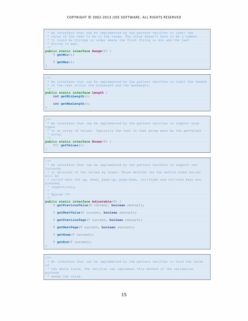
COPYRIGHT © 2002-2013 J IDE SOFTWARE. ALL RIGHTS RESERVED
15
* An interface that can be implemented by the pattern verifier to limit the
* value of the text to be in the range. The value doesn't have to be a number.
* It could be Strings in order where the first String is min and the last
* String is max.
*/
public static interface Range<T> {
T getMin();
T getMax();
}
/**
* An interface that can be implemented by the pattern verifier to limit the length
* of the text within the minLength and the maxLength.
*/
public static interface Length {
int getMinLength();
int getMaxLength();
}
/**
* An interface that can be implemented by the pattern verifier to support enum
types
* or an array of values. Typically the text in that group must be the getValues
* array.
*/
public static interface Enums<T> {
T[] getValues();
}
/**
* An interface that can be implemented by the pattern verifier to support the
increase
* or decrease of the values by steps. Those methods (as the method order below)
will be
* called when the up, down, page-up, page-down, ctrl+home and ctrl+end keys are
pressed,
* respectively.
*
* @param <T>
*/
public static interface Adjustable<T> {
T getPreviousValue(T current, boolean restart);
T getNextValue(T current, boolean restart);
T getPreviousPage(T current, boolean restart);
T getNextPage(T current, boolean restart);
T getHome(T current);
T getEnd(T current);
}
/**
* An interface that can be implemented by the pattern verifier to hold the value
of
* the whole field. The verifier can implement this method if the validation
process
* needs the value.

COPYRIGHT © 2002-2013 J IDE SOFTWARE. ALL RIGHTS RESERVED
16
*
* @param <T> the data type of the FormattedTextField
* @param <TV> the data type of the target value. The target value could be the
same as
* the FormattedTextField, could be the same as the value of the group
text,
* or the value of the several groups that are related.
*/
public static interface Value<T, TV> {
void setFieldValue(T fieldValue);
T getFieldValue();
TV toTargetValue(T fieldValue);
T fromTargetValue(T previousFieldValue, TV targetValue);
}
The last Value interface may be confusing. To help you understand, let’s introduce three terms which are all called “value”. We will use those terms when talking about the pattern verifiers.
Field value: The value of the FormattedTextField. The setValue and getValue of FormattedTextField is to set and get the field value. Not all verifiers need to know the field value. For example, for IP address, the verifier for a group doesn’t need to know the field value which is the whole IP address. For the date, you will need to know the field value in order to verify a group. In the latter case, you need to make sure your verifier implements the Value interface.
Target value: The target value is the value that an Adjustable interface will adjust if it is available. Or the Adjustable will adjust the group value. Not all verifiers need to know the target value.
Group value: it is the value for the group that the verifier works on. If a verifier doesn’t implement Value interface, the group value will be one being adjusted by the Adjustable interface.
Now let’s look at few examples of those three values.
Examples (the current group in red)
Field Value Target Value Group Value
IP: 233.23.123.12
Pattern: h:h:h:h
Not used Not used 123 (adjusted)
Floating Number: 23.5
Pattern: n.f
23.5 23.5 (adjusted) 5
Floating Number: 23.5 Pattern: f
Not used Not used 23.5 (adjusted)
Point2D: 13, 23 Point2D (13, 23) 23 (adjusted) 23

COPYRIGHT © 2002-2013 J IDE SOFTWARE. ALL RIGHTS RESERVED
17
Pattern: x, y
Font: Tahoma, Bold, 23.4
Pattern: family, style, n.f
Font (Tahoma, Bold, 23.4)
23.4 (adjusted) 23
Date: 12/31/2013
Pattern: MM/dd/yyyy
12/31/2013 (adjusted)
31 31
If a verifier wants to use the field value or the target value, the Value interface must be implemented. The Value interface has methods to set/get the field value and to convert between the target value and the field value. The methods on the Adjustable interface can decide if they want to adjust the field value or the target value. For example, for the Font example, the target value (the font size) is adjusted. For the Date, the whole date is adjusted because the fields in the date are related. Increasing 31 in the 12/31/2013 by 1 should change the date to 01/01/2014. That’s the main reason the Adjustable adjusts the whole date, not just the value for the group.
We also have many built-in verifiers that should cover a majority of the use cases. They are
RangePatternVerifier: abstract class. It can be extended by any verifiers that has a range. Interfaces implemented by this class are Range, Length, Adjustable, Parser and Formatter.
IntegerRangePatternVerifier: extends RangePatternVerifier. It makes sure the text can be parsed as integer and it is in the specified range and length.
NumberRangePatternVerifier: extends RangePatternVerifier. It makes sure the text can be parsed as Number and it is in the specified range and length. It also supports adjustmentMultiplier so that instead of increasing by 1 or 10 (for page), it could also be 0.01, 1000 etc. by multiplying the adjustmentMultiplier.
NumberValuePatternVerifier: extends NumberRangePatternVerifier, implements the Value interface. It also supports a valueMultiplier which will be used to multiply the target value before the value is adjusted. The two multipliers (value and adjustment) are used mainly for the DecimalFormat, such as the percentage format where there is a multiple of 100.
The main difference of this class and the NumberRangePatternVerifier is this class adjusts on the field value instead of the group value as NumberRangePatternVerifier does. For example, if we have a value of 21.9 with “n.f” as the pattern. If you use NumberRangePatternVerifier, adjust the “f” group by 1 will make the whole value 21.0. If using NumberValuePatternVerifier for the “f” group, increasing by 1 will make the whole value 22.0.
It is an abstract class. The only two methods yet to be implemented are toTargetValue and fromTargetValue which provide way to convert between the target value and the field value.
IntegerDigitsPatternVerifier: can be used for any number. It will take care of the verification of the integer digits.
FractionDigitsPatternVerifier: same as the previous one except the number is the faction portion of a number.

COPYRIGHT © 2002-2013 J IDE SOFTWARE. ALL RIGHTS RESERVED
18
ValuesPatternVerifier: takes an array of values. It will make sure the input text is in the array.
StringValuesPatternVerifier: extends ValuesPatternVerifier. The array is a String array.
Number Support
DecimalFormat can handle the formatting and parsing of any floating numbers, integers, percentages and currencies. NumberField, which extends FormattedTextField can use DecimalFormat to format any numbers.
NumberField amountField = new NumberField<>();
DecimalFormat currencyFormat = (DecimalFormat) NumberFormat.getCurrencyInstance();
currencyFormat.setMaximumIntegerDigits(4);
currencyFormat.setMaximumFractionDigits(2);
currencyFormat.setGroupingUsed(false);
currencyFormat.setMinimumFractionDigits(2);
amountField. setDecimalFormat(currencyFormat);
Internally, we will set a pattern based on the DecimalFormat and set corresponding PatternVerifiers for it. See below for a few NumberField examples.
Figure 7 Number Support
One of the useful flags for number with grouping is setAutoReformat(true). When you type the digits, the FormattedTextField will automatically add “,” between groups.
Figure 8 Number Group and AutoReformat
Date and Time
One of the most important usages of the FormattedTextField is to support the all the date related data types, such as java.utils.Date, java.utils.Calendar and java.time.LocalDate, java.time.LocalDateTime, java.time.LocalTime in the JDK8.
DateFormat Support
In pre-JDK8, the DateFormat is used to format and parse a Date object. However, it doesn’t provide a way to guide user input. DateField and CalendarField, which extend FormattedTextField, are created to support the DateFormat. They used the same string pattern used by DateFormat, but added the features to guide and restrict user input to make it easy for users to input a valid Date or Calendar string. Both fields are pretty much the same except DateField uses java.utils.Date and CalendarField uses java.utils.Calendar as the data type.
COPYRIGHT © 2002-2013 J IDE SOFTWARE. ALL RIGHTS RESERVED
19
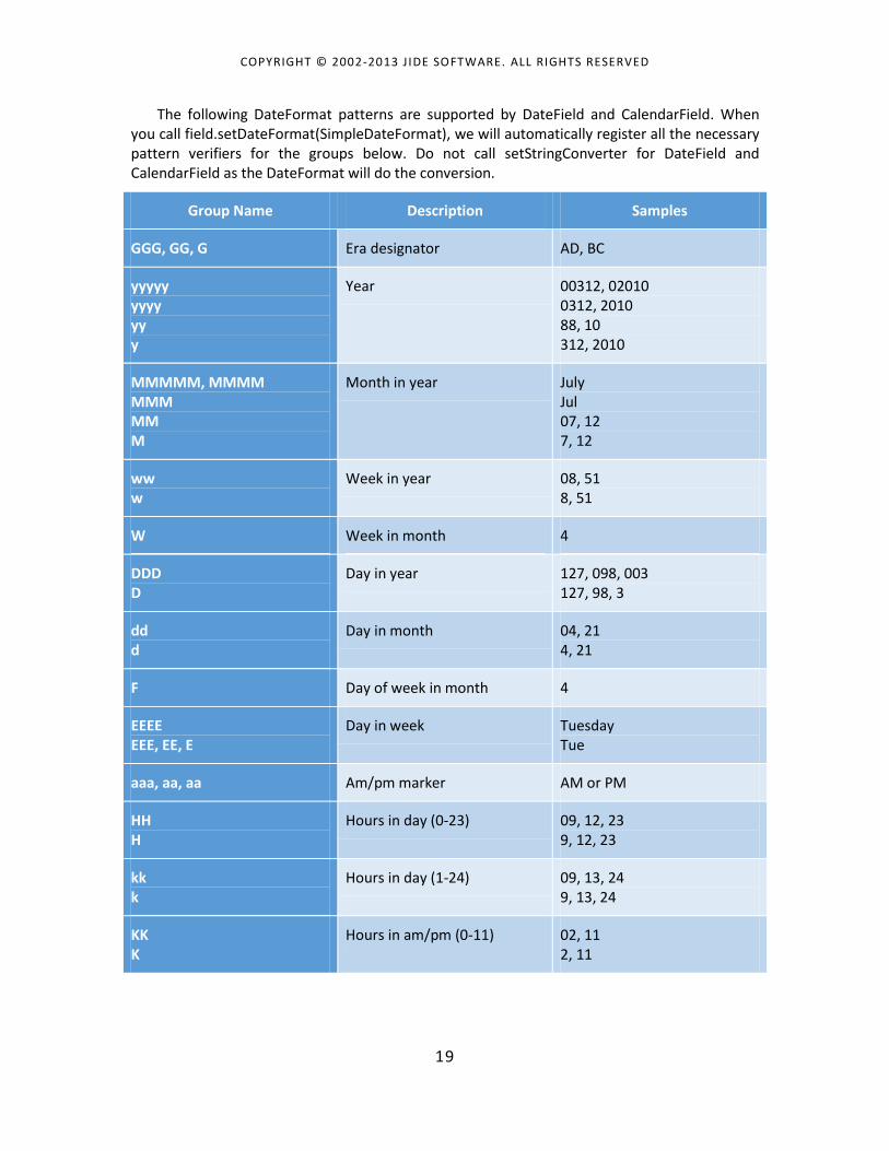
The following DateFormat patterns are supported by DateField and CalendarField. When you call field.setDateFormat(SimpleDateFormat), we will automatically register all the necessary pattern verifiers for the groups below. Do not call setStringConverter for DateField and CalendarField as the DateFormat will do the conversion.
Group Name Description Samples
GGG, GG, G Era designator AD, BC
yyyyy yyyy yy y
Year 00312, 02010 0312, 2010 88, 10 312, 2010
MMMMM, MMMM MMM MM M
Month in year July Jul 07, 12 7, 12
ww w
Week in year 08, 51 8, 51
W Week in month 4
DDD D
Day in year 127, 098, 003 127, 98, 3
dd d
Day in month 04, 21 4, 21
F Day of week in month 4
EEEE EEE, EE, E
Day in week Tuesday Tue
aaa, aa, aa Am/pm marker AM or PM
HH H
Hours in day (0-23) 09, 12, 23 9, 12, 23
kk k
Hours in day (1-24) 09, 13, 24 9, 13, 24
KK K
Hours in am/pm (0-11) 02, 11 2, 11

COPYRIGHT © 2002-2013 J IDE SOFTWARE. ALL RIGHTS RESERVED
20
hh h
Hours in am/pm (1-12) 02, 12 2, 12
mm m
Minutes in hours (0-59) 01, 49 1, 49
ss s
Seconds in minute (0-59) 01, 49 1, 49
SSS S
Milliseconds (0-999) 002, 013, 898 2, 13, 898
zzz, zz, z Time zone PDT, PST
Please note, although the support for the DateFormat is quite comprehensive, it is not 100% compete because of the following limitations.
1. Groups are better not to be adjacent. In the DateFormat, "hhmmss" is a valid pattern but doesn’t work well for the FormattedTextField. That’s because the FormattedTextFiel doesn’t know how to separate the groups. The whole “hhmmss” could be just one group name. You have to separate the groups with a non-group char, such as "hh:mm:ss". If you have to use adjacent groups, the only workaround is to make sure the corresponding group verifier has a fixed length so that the FormattedTextField will use the fixed length to separate the groups.
See below for a few examples using the DateFormat.
Figure 9 DateFormat Support
DateTimeFormatter Support
Since JDK8, a new data/time API was introduced (http://jcp.org/en/jsr/detail?id=310). There is a new formatter called DateTimeFormatter. FormattedTextField supports it as well. The pattern is almost the same as the DateFormat but is richer.
The following pattern letters are defined as in DateTimeFormatter. The browns rows are the pattern letters we currently don’t support because the DateTimeFormatter doesn’t support. Some of them are marked as not adjustable. It means you can’t adjust its value using keyboard or mouse.
Symbol Meaning Presentation Examples

COPYRIGHT © 2002-2013 J IDE SOFTWARE. ALL RIGHTS RESERVED
21
G era text AD; Anno Domini; A
u year year 2004; 04
y year-of-era (treated the same as ‘u’)
year 2004; 04
D day-of-year number 189
M/L month-of-year number/text 7; 07; Jul; July; J
d day-of-month number 10
Q/q quarter-of-year (unit is MONTHS for now as ChronoUnit.QARTERS is not defined for some reason)
number/text 3; 03; Q3; 3rd quarter
Y week-based-year (treated the same as ‘u’)
year 1996; 96
w week-of-week-based-year (not adjustable)
number 27
W week-of-month (not adjustable)
number 4
E day-of-week text Tue; Tuesday; T
e/c localized day-of-week (treated as day-of-week)
number/text 2; 02; Tue; Tuesday; T
F week-of-month (not adjustable)
number 3
a am-pm-of-day text PM
h clock-hour-of-am-pm (1-12) number 12
K hour-of-am-pm (0-11) number 0
k clock-hour-of-am-pm (1-24) number 0
H hour-of-day (0-23) number 0
m minute-of-hour number 30

COPYRIGHT © 2002-2013 J IDE SOFTWARE. ALL RIGHTS RESERVED
22
s second-of-minute number 55
S fraction-of-second (not adjustable)
fraction 978
A milli-of-day number 1234
n nano-of-second number 987654321
N nano-of-day number 1234000000
V time-zone ID zone-id America/Los_Angeles; Z; -08:30
z time-zone name zone-name Pacific Standard Time; PST
O localized zone-offset offset-O GMT+8; GMT+08:00; UTC-08:00;
X zone-offset 'Z' for zero offset-X Z; -08; -0830; -08:30; -083015; -08:30:15;
x zone-offset offset-x +0000; -08; -0830; -08:30; -083015; -08:30:15;
Z zone-offset offset-Z +0000; -0800; -08:00;
For each group, you can use one or more pattern letters as in the Symbol columns above.
For the values in the Presentation column:
Text: The text style is determined based on the number of pattern letters used. Less than 4 pattern letters will use the short form. Exactly 4 pattern letters will use the full form. Exactly 5 pattern letters will use the narrow form. Pattern letters 'L', 'c', and 'q' specify the stand-alone form of the text styles.
Number: If the count of letters is one, then the value is output using the minimum number of digits and without padding. Otherwise, the count of digits is used as the width of the output field, with the value zero-padded as necessary. The following pattern letters have constraints on the count of letters. Only one letter of 'c' and 'F' can be specified. Up to two letters of 'd', 'H', 'h', 'K', 'k', 'm', and 's' can be specified. Up to three letters of 'D' can be specified.
Number/Text: If the count of pattern letters is 3 or greater, use the Text rules above. Otherwise use the Number rules above.
Fraction: Outputs the nano-of-second field as a fraction-of-second. The nano-of-second value has nine digits, thus the count of pattern letters is from 1 to 9. If it is less than 9, then the nano-of-second value is truncated, with only the most significant digits being output. When parsing in strict mode, the number of parsed digits must match the count of pattern letters.

COPYRIGHT © 2002-2013 J IDE SOFTWARE. ALL RIGHTS RESERVED
23
When parsing in lenient mode, the number of parsed digits must be at least the count of pattern letters, up to 9 digits.
Year: The count of letters determines the minimum field width below which padding is used. If the count of letters is two, then a reduced two digit form is used. For printing, this outputs the rightmost two digits. For parsing, this will parse using the base value of 2000, resulting in a year within the range 2000 to 2099 inclusive. If the count of letters is less than four (but not two), then the sign is only output for negative years as per SignStyle.NORMAL. Otherwise, the sign is output if the pad width is exceeded, as per SignStyle.EXCEEDS_PAD.
At the moment, all zone pattern letters are not supported because the ChronoField doesn’t define any fields for the time zone.
Additional Built-in PatternVerifiers for the various Date Types
We added more pattern verifiers in order to support the Date/Calendar and LocalDate/LocalTime/LocalDateTime. We listed them below but you probably shouldn’t need to know them unless you want to customize the fields.
For Date/Calendar
Date/CalendarFieldPatternVerifier: The base verifier for the verification related to DateFormat.
IntegerDate/CalendarFieldPatternVerifier: to make sure the text can be parsed as integer and the value of the integer is a valid value for the specified Calendar field. For example, year field, day field, month field in the narrow format. Here are few examples.
// Year. 01996; 1996; 96
verifiers.put("yyyyy", new IntegerDateFieldPatternVerifier(Calendar.YEAR, 0, 99999,
true));
verifiers.put("yyyy", new IntegerDateFieldPatternVerifier(Calendar.YEAR, 0, 9999,
true));
verifiers.put("yy", new IntegerDateFieldPatternVerifier(Calendar.YEAR, 0, 99,
true));
verifiers.put("y", new IntegerDateFieldPatternVerifier(Calendar.YEAR, 0, 9999,
false));
// Day in year. 004; 4
verifiers.put("DDD", new IntegerDateFieldPatternVerifier(Calendar.DAY_OF_YEAR,
true));
verifiers.put("D", new IntegerDateFieldPatternVerifier(Calendar.DAY_OF_YEAR,
false));
StringDate/CalendarFieldPatternVerifier: to make sure the text is a valid string for the specified Calendar field. For example, month field in the long or short format, am/pm field, day of week field. Here are few examples.
// Month in year. July; Jul; 07; 7
String[] months = new DateFormatSymbols().getMonths();
verifiers.put("MMMM", new StringDateFieldPatternVerifier(Calendar.MONTH, months));
String[] shortMonths = new DateFormatSymbols().getShortMonths();
verifiers.put("MMM", new StringDateFieldPatternVerifier(Calendar.MONTH,
shortMonths));
// Day in week. Tuesday, Tue
String[] weekdays = new DateFormatSymbols().getWeekdays();

COPYRIGHT © 2002-2013 J IDE SOFTWARE. ALL RIGHTS RESERVED
24
verifiers.put("EEEE", new StringDateFieldPatternVerifier(Calendar.DAY_OF_WEEK,
weekdays));
String[] shortWeekdays = new DateFormatSymbols().getShortWeekdays();
StringDateFieldPatternVerifier dayInWeekVerifier = new
StringDateFieldPatternVerifier(Calendar.DAY_OF_WEEK, shortWeekdays);
verifiers.put("EEE", dayInWeekVerifier);
verifiers.put("EE", dayInWeekVerifier);
verifiers.put("E", dayInWeekVerifier);
// Am/pm marker. AM or PM
StringDateFieldPatternVerifier ampmVerifier = new
StringDateFieldPatternVerifier(Calendar.AM_PM, new
DateFormatSymbols().getAmPmStrings());
verifiers.put("aaa", ampmVerifier);
verifiers.put("aa", ampmVerifier);
verifiers.put("a", ampmVerifier);
For LocalDate/LocalDateTime/LocalTime
TemporalPatternVerifier: a verifier for Temporal such as LocalDate, LocalTime and LocalDateTime.
IntegerTemporalPatternVerifier: A TemporalPatternVerifier for any fields that can be represented as integer.
IntegerTemporalPatternVerifierNotAdjustable: Same as above except it doesn’t implement the Adjustable interface, which means the value cannot be adjusted for this group
LongTemporalPatternVerifier: A TemporalPatternVerifier for any fields that can be represented as long.
LongTemporalPatternVerifierNotAdjustable: Same as above except it doesn’t implement the Adjustable interface, which means the value cannot be adjusted for this group
Comparison of the Two TextFields
Since we have both MaskTextField and FormattedTextField, we prepared a simple table to compare the two fields to make it easy for you to make the choice.
MaskTextField FormattedTextField
Length of input string Fixed length Various length
Verifier Verify the input per character Verify the input per group
Auto-conversion Auto convert happens when user types a character. It only can convert the entered character
Auto convert happens when user enters the text and press enter, or when use arrow key to adjust value, or isAutoReformat is true. It can convert any portion of the text in the field, not just the

COPYRIGHT © 2002-2013 J IDE SOFTWARE. ALL RIGHTS RESERVED
25
text of the current group
Editing data type Only String Any data type that supports StringConverter
Arrow key support, tab key support
No Yes
Spinner buttons No Yes
Support placeholder characters
Yes No. No need because of the various length
Valid or invalid character set
Yes No. It is done on the pattern verifier level. Such a set is not very useful. The pattern verifier can do a lot more verification than just a set of valid chars.
PopupField
The FormattedTextField control opened possibilities to create better combo-box-like controls that are customized for different data types. On one hand, user can type the text to make up a valid value using the FormattedTextField. On the other hand, user can choose a value directly from the popup. PopupField is such a FormattedTextField with a popup button. Clicking on the popup button will show a balloon popup to edit the value. The popup can be set using setPopupContentFactory which is a factory that creates a PopupContent which is an interface we defined.

COPYRIGHT © 2002-2013 J IDE SOFTWARE. ALL RIGHTS RESERVED
26
Figure 10 A DateField with Popup
Define a PopupField
If you would like to create a PopupField for a customized data type, you need to do the following steps.
1. First of all, call setPopupContentFactory in the overridden initializeTextField method to set a popup content factory for this data type. The popup could extend any other class such as Pane, VBox, etc. but make sure it implements the PopupContent interface.
2. Customize the PopupField to use StringConverter to convert the data type to and from String. Set the pattern and pattern verifiers if needed. Do these in the overriden initializePattern() method.
3. Further customization. It all depends what you need for this customized data type. For example, for the ColorField in JideFX, we added a color rectangle to the left of the field to show the actual color of the current value. We also added a new ColorFormat flag so that user can choose what color format they would like to use such as RGB, RGBA (‘a’ stands for alpha), HEX_RGB or HEX_RGBA. Or you can set the field to not-editable by default. We suggest you do the customization in the overridden initializeTextField method. It will automatically get called. If you would like to add an additional style class to the field, call it in the overridden initializeStyle method. Both methods in addition to registerListeners are three standard methods that we used pretty consistently in our controls.
To make it easy to understand, we included the actual complete source code of the ColorField.
/**
* A <code>PopupField</code> for {@link Color}.
*/
public class ColorField extends PopupField<Color> {
public enum ColorFormat {RGB, RGBA, HEX_RGB, HEX_RGBA}
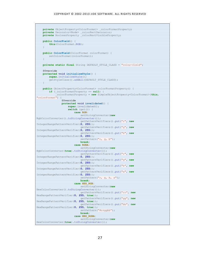
COPYRIGHT © 2002-2013 J IDE SOFTWARE. ALL RIGHTS RESERVED
27
private ObjectProperty<ColorFormat> _colorFormatProperty;
private Decorator<Node> _colorRectDecorator;
private BooleanProperty _colorRectVisibleProperty;
public ColorField() {
this(ColorFormat.RGB);
}
public ColorField(ColorFormat colorFormat) {
setColorFormat(colorFormat);
}
private static final String DEFAULT_STYLE_CLASS = "color-field";
@Override
protected void initializeStyle() {
super.initializeStyle();
getStyleClass().addAll(DEFAULT_STYLE_CLASS);
}
public ObjectProperty<ColorFormat> colorFormatProperty() {
if (_colorFormatProperty == null) {
_colorFormatProperty = new SimpleObjectProperty<ColorFormat>(this,
"colorFormat") {
@Override
protected void invalidated() {
super.invalidated();
switch (get()) {
case RGB:
setStringConverter(new
RgbColorConverter().toStringConverter());
getPatternVerifiers().put("r", new
IntegerRangePatternVerifier(0, 255));
getPatternVerifiers().put("g", new
IntegerRangePatternVerifier(0, 255));
getPatternVerifiers().put("b", new
IntegerRangePatternVerifier(0, 255));
setPattern("r, g, b");
break;
case RGBA:
setStringConverter(new
RgbColorConverter(true).toStringConverter());
getPatternVerifiers().put("r", new
IntegerRangePatternVerifier(0, 255));
getPatternVerifiers().put("g", new
IntegerRangePatternVerifier(0, 255));
getPatternVerifiers().put("b", new
IntegerRangePatternVerifier(0, 255));
getPatternVerifiers().put("a", new
IntegerRangePatternVerifier(0, 255));
setPattern("r, g, b, a");
break;
case HEX_RGB:
setStringConverter(new
HexColorConverter().toStringConverter());
getPatternVerifiers().put("rr", new
HexRangePatternVerifier(0, 255, true));
getPatternVerifiers().put("gg", new
HexRangePatternVerifier(0, 255, true));
getPatternVerifiers().put("bb", new
HexRangePatternVerifier(0, 255, true));
setPattern("#rrggbb");
break;
case HEX_RGBA:
setStringConverter(new
HexColorConverter(true).toStringConverter());

COPYRIGHT © 2002-2013 J IDE SOFTWARE. ALL RIGHTS RESERVED
28
getPatternVerifiers().put("aa", new
HexRangePatternVerifier(0, 255, true));
getPatternVerifiers().put("rr", new
HexRangePatternVerifier(0, 255, true));
getPatternVerifiers().put("gg", new
HexRangePatternVerifier(0, 255, true));
getPatternVerifiers().put("bb", new
HexRangePatternVerifier(0, 255, true));
setPattern("#aarrggbb");
break;
}
}
};
}
return _colorFormatProperty;
}
public ColorFormat getColorFormat() {
return colorFormatProperty().get();
}
public void setColorFormat(ColorFormat format) {
colorFormatProperty().set(format);
}
@Override
protected void initializeTextField() {
super.initializeTextField();
showColorRect();
setPopupContentFactory(new Callback<Color, PopupContent<Color>>() {
@Override
public PopupContent<Color> call(Color param) {
ColorPopupContent content = new ColorPopupContent();
content.setValue(getValue());
return content;
}
});
}
public BooleanProperty colorRectVisibleProperty() {
if (_colorRectVisibleProperty == null) {
_colorRectVisibleProperty = new SimpleBooleanProperty(this,
"colorRectVisible") {
@Override
protected void invalidated() {
super.invalidated();
boolean visible = get();
if (visible) {
showColorRect();
}
else {
hideColorRect();
}
}
};
}
return _colorRectVisibleProperty;
}
/**
* Checks if the popup button is visible. The popup button will show a popup to
choose a value for the field.
*
* @return true or false.
*/
public boolean isColorRectVisible() {

COPYRIGHT © 2002-2013 J IDE SOFTWARE. ALL RIGHTS RESERVED
29
return colorRectVisibleProperty().get();
}
/**
* Shows or hides the popup button.
*
* @param colorRectVisible true or false.
*/
public void setColorRectVisible(boolean colorRectVisible) {
colorRectVisibleProperty().set(colorRectVisible);
}
private void showColorRect() {
if (_colorRectDecorator == null) {
Rectangle rectangle = new Rectangle(16, 12);
rectangle.fillProperty().bind(valueProperty());
rectangle.setStroke(Color.GRAY);
rectangle.disableProperty().bind(disabledProperty());
_colorRectDecorator = new DefaultDecorator<Node>(rectangle,
Pos.CENTER_LEFT, new Insets(0, 0, 0, 120), new Point2D(90, 0), true);
}
DecorationUtils.install(this, _colorRectDecorator);
}
private void hideColorRect() {
if (_colorRectDecorator != null) {
DecorationUtils.uninstall(this, _colorRectDecorator);
}
}
}
We created the following PopupFields in the JideFX.
Figure 11 Existing PopupFields in JideFX Fields
Here are some screenshots.

COPYRIGHT © 2002-2013 J IDE SOFTWARE. ALL RIGHTS RESERVED
30
Figure 12 PopupFields
Figure 13 non-editable PopupField (with comboBoxLike flag set to true)
Customize the Popup Button etc.
You probably noticed that for the date related field, we used a customize popup button instead of the regular down arrow. You can do that by overriding the createPopupButtonDecorator method. See below for what we used in the DateField.
protected Decorator<Button> createPopupButtonDecorator() {

COPYRIGHT © 2002-2013 J IDE SOFTWARE. ALL RIGHTS RESERVED
31
return new PredefinedDecorators.AbstractButtonDecoratorFactory() {
@Override
public Decorator<Button> create() {
Shape calendarIcon =
PredefinedShapes.getInstance().createCalendarIcon(15);
Shape shape =
PredefinedShapes.getInstance().createArrowedIcon(calendarIcon, Pos.BOTTOM_RIGHT,
0.4);
return new DefaultDecorator<>(createButton(shape), Pos.CENTER_RIGHT,
new Insets(0, 100, 0, 0), new Point2D(-70, 0), true);
}
}.create();
}
The spinner buttons can be customzied too by overriding the following two methods. You can put the buttons on either side of the field, or on the outside of top and bottom of the field. For computer, the buttons maybe too far apart but for a touch user interface, it will be great.
/**
* Creates the decorator for the increase button. Subclass can override it to
create a
* different decorator.
*
* @return the decorator for the increase button
*/
protected Decorator<Button> createIncreaseSpinnerDecorator() {
return
PredefinedDecorators.getInstance().getIncreaseButtonDecoratorFactory().create();
}
/**
* Creates the decorator for the decrease button. Subclass can override it to
create a
* different decorator.
*
* @return the decorator for the decrease button
*/
protected Decorator<Button> createDecreaseSpinnerDecorator() {
return
PredefinedDecorators.getInstance().getDecreaseButtonDecoratorFactory().create();
}
FormattedComboBoxes
The purpose of the FormattedComboBox is the same as that of the PopupField, but from a different approach. FormattedComboBox extends ComboBoxBase. It uses a FormattedTextField as the editor. It has a same PopupContentFactory as the PopupField which can be used to create a PopupContent. Both PopupContentFactory can be shared.
We recommend you also create a PopupField for the same data type and use it internally to create the FormattedComboBox. Here is the actual complete source code for the ColorComboBox.
/**
* A <code>FormattedComboBox</code> for {@link Color}.
*/
public class ColorComboBox extends FormattedComboBox<Color> {
private static final String DEFAULT_STYLE_CLASS = "color-combo-box";

COPYRIGHT © 2002-2013 J IDE SOFTWARE. ALL RIGHTS RESERVED
32
public ColorComboBox() {
this(Color.WHITE);
}
public ColorComboBox(Color color) {
super(color);
}
@Override
protected void initializeStyle() {
super.initializeStyle();
getStyleClass().add(DEFAULT_STYLE_CLASS);
}
@Override
protected FormattedTextField<Color> createFormattedTextField() {
return new ColorField();
}
@Override
protected void initializeComboBox() {
super.initializeComboBox();
setPopupContentFactory(((ColorField)
getEditor()).getPopupContentFactory());
}
}
See below for a screenshot of the ColorComboBox.
Figure 14 ColorComboBox
We created the following FormattedComboBoxes in the JideFX.

COPYRIGHT © 2002-2013 J IDE SOFTWARE. ALL RIGHTS RESERVED
33
Figure 15 Existing FormattedComboBoxes in JideFX Fields
Here are some screenshots of the FormattedComboBoxes.
Figure 16 FormattedComboBoxes
Spinners
Introducing a spinner control as JSpinner in Swing? No, JideFX doesn’t have a separate spinner control. As a matter of fact, there is no need for it because FormattedTextField provides more features than what JSpinner can provide.
We added the spinner buttons using the feature in the JideFX Decoration product. But we provide further customizations for the spinner buttons.

COPYRIGHT © 2002-2013 J IDE SOFTWARE. ALL RIGHTS RESERVED
34
SpinnerStyle
There are 11 SpinnerStyles that you can see to customize the position of the spinner buttons. See the table below.
SpinnerStyle Result
INSIDE_RIGHT_VERTICAL
INSIDE_LEFT_VERTICAL
INSIDE_RIGHT_HORIZONTAL
INSIDE_LEFT_HORIZONTAL
INSIDE_CENTER_HORIZONTAL
OUTSIDE_RIGHT_VERTICAL
OUTSIDE_LEFT_VERTICAL

COPYRIGHT © 2002-2013 J IDE SOFTWARE. ALL RIGHTS RESERVED
35
OUTSIDE_CENTER_VERTICAL
OUTSIDE_RIGHT_HORIZONTAL
OUTSIDE_LEFT_HORIZONTAL
OUSIDE_CENTER_HORIZONTAL
FormattedTextField.asSpinner
To provide better support for the SpinnerStyles, especially for the styles whose spinner buttons are outside the field, we added two methods to FormattedTextField.
public Node asSpinner();
public Node asSpinner(SpinnerStyle style);
These two methods provide two benefits.
First, if you use asSpinner, you don’t need to add the FormattedTextField to a DecorationPane to show the spinner buttons because the Node itself is a DecorationPane.
Secondly, while they look exactly the same for all INSIDE_xxx styles, for OUTSIDE_xxx styles, they look different. See below.
Using the FormattedTextField itself:
Using FormattedTextField.asSpinner.

COPYRIGHT © 2002-2013 J IDE SOFTWARE. ALL RIGHTS RESERVED
36
The asSpinner approah clearly looks better as it put a border around the field and the spinner buttons so that they look like one control.
Again, nothing is absolute. You can customize the spinner buttons using css. If you choose large icons for those buttons or the buttons have their own border, using the field itself might look better. That’s why we give you both options.