Embed Size (px)
Citation preview

PLEASE SCROLL DOWN FOR ARTICLE
This article was downloaded by: [University of Maine]On: 17 December 2010Access details: Access Details: [subscription number 917247301]Publisher RoutledgeInforma Ltd Registered in England and Wales Registered Number: 1072954 Registered office: Mortimer House, 37-41 Mortimer Street, London W1T 3JH, UK
Journal of Behavioral FinancePublication details, including instructions for authors and subscription information:http://www.informaworld.com/smpp/title~content=t775648092
What Is Wrong with this Picture? A Problem with Comparative ReturnPlots on Finance Websites and a Bias Against Income-Generating AssetsPankaj Agrrawala; Richard Borgmana
a University of Maine,
Online publication date: 02 December 2010
To cite this Article Agrrawal, Pankaj and Borgman, Richard(2010) 'What Is Wrong with this Picture? A Problem withComparative Return Plots on Finance Websites and a Bias Against Income-Generating Assets', Journal of BehavioralFinance, 11: 4, 195 — 210To link to this Article: DOI: 10.1080/15427560.2010.526260URL: http://dx.doi.org/10.1080/15427560.2010.526260
Full terms and conditions of use: http://www.informaworld.com/terms-and-conditions-of-access.pdf
This article may be used for research, teaching and private study purposes. Any substantial orsystematic reproduction, re-distribution, re-selling, loan or sub-licensing, systematic supply ordistribution in any form to anyone is expressly forbidden.
The publisher does not give any warranty express or implied or make any representation that the contentswill be complete or accurate or up to date. The accuracy of any instructions, formulae and drug dosesshould be independently verified with primary sources. The publisher shall not be liable for any loss,actions, claims, proceedings, demand or costs or damages whatsoever or howsoever caused arising directlyor indirectly in connection with or arising out of the use of this material.

THE JOURNAL OF BEHAVIORAL FINANCE, 11: 195–210, 2010Copyright C© The Institute of Behavioral FinanceISSN: 1542-7560 print / 1542-7579 onlineDOI: 10.1080/15427560.2010.526260
What Is Wrong with this Picture? A Problem withComparative Return Plots on Finance Websitesand a Bias Against Income-Generating Assets
Pankaj Agrrawal and Richard BorgmanUniversity of Maine
This paper brings to light and discusses a systemic issue in the calculation and display ofrelative return information as currently seen on some of the most prominent finance websites;income-generating events such as dividends and interest are not included in relative returncalculations and all comparative return graphics. The resulting ranking of the securities, basedon such incomplete returns, is essentially meaningless from a total return perspective, yetthey are being served to millions of investors every day. This could lead to the formation ofa possible availability heuristic and an optical bias against fixed-income and other incomegenerating assets. This problem has gone unnoticed for many years with no discussion ofthe topic either in the academic or practitioner press. The ready availability of such unclearor inaccurate information from sources generally perceived to be credible can, in this age ofdo-it-yourself portfolio management, have serious and damaging financial consequences tothe unsuspecting investor. The paper also shows the effect of this return differential on thecalculation of the asset correlation matrices and the subsequent effect on the resulting asset-weight vectors that are used to generate Markowitz style mean-variance portfolios. The visualdiscrepancies are then supported by the application of the Gibbons, Ross and Shanken [1989]W-test for portfolio efficiency. The authors’ proposed correction, based on elementary finance,fixes the problem.
Keywords: Comparative return charting, Portfolio efficiency, Total returns, Dividends,Finance websites
Investors are concerned with total return. This is a basic tenetof finance. They may differ in their preferences for currentincome versus capital gains, but total return is what even-tually matters. Investors would not ignore a portion of thatreturn, either. So when we analyze the relative performanceof stocks, bonds, exchange traded funds (ETFs) or any se-curity over time, it is total return that we wish to examine.Unfortunately, that is not what we see when we utilize themost visible and trusted Web sources that provide informa-tion to more than 41 million retail and institutional investorsper month.1
This paper brings to light and discusses a systemic issuein the calculation and display of relative return informationas seen on some of the most prominent finance sites on the
Address correspondence to Pankaj Agrrawal, Finance, DPC BusinessBuilding, University of Maine, Orono, ME 04469. E-mail: [email protected]
Web: income-generating events such as dividends and inter-est are not included in return calculations and comparativereturn graphics, thus resulting in the formation of a possi-ble availability heuristic (Shefrin [2005]) and an optical biasagainst fixed-income and dividend paying securities. We callit the “Compare To” problem.
A deeper problem with the issue we have uncovered isthat, despite the structural simplicity and obvious implica-tion of the error, it has gone unnoticed for many years withno discussion of the topic either in the academic or prac-titioner press, yet its effects could be subliminal and far-reaching. The problem is algorithmically embedded withinthe feature and can, apart from creating confusion and bias,also lead to incorrect asset rankings and a mis-allocation offunds. As Elton, Gruber and Blake [2001] point out, “Alldata sets have errors. The types of errors that are most harm-ful are systematic errors that cause biases” (p. 2416). Thedownward bias introduced in the returns due to the exclu-sion of income events makes income generating assets seem
Downloaded By: [University of Maine] At: 06:23 17 December 2010

196 AGRRAWAL AND BORGMAN
relatively unattractive, especially when compared to assetsthat derive most of their growth from capital appreciationonly. This can have the undesirable effect of altering the finalasset mix weightings in a portfolio, even if valid investmentprinciples are present and adhered to. The paper also demon-strates this effect by deploying the classic Markowitz [1956]mean-variance optimization process.
This issue regarding the effect of non-inclusion ofincome-generating events, in the return calculations andrelative return graphics, exists on all the major financeportals that the authors have investigated—Google Finance,Yahoo! Finance, Bloomberg.com, Microsoft’s MSN Moneyand BigCharts.com. Most of these sites are now virtuallyhousehold names. BigCharts is a part of the Wall StreetJournal’s Digital Network and owned by Dow Jones & Com-pany. Bloomberg is very often a part of the essential toolkitof analytic software for most U.S.-based asset managers.
Following a brief example, we will discuss the importanceof looking at total returns, introduce the major online financesites and illustrate the effects of income exclusion on annu-alized returns for a set of securities, both with and withoutincome-generating events. We also will examine the effectof this pricing differential on the calculation of the asset cor-relation matrices and demonstrate the effect this can have onthe asset-weight vectors that are used to generate constrainedand unconstrained Markowitz style minimum-variance port-folios. The visual discrepancies are then supported by theapplication of the exact Gibbons, Ross and Shanken [1989]W-test for portfolio efficiency, in the mean-variance space.
A BRIEF EXAMPLE
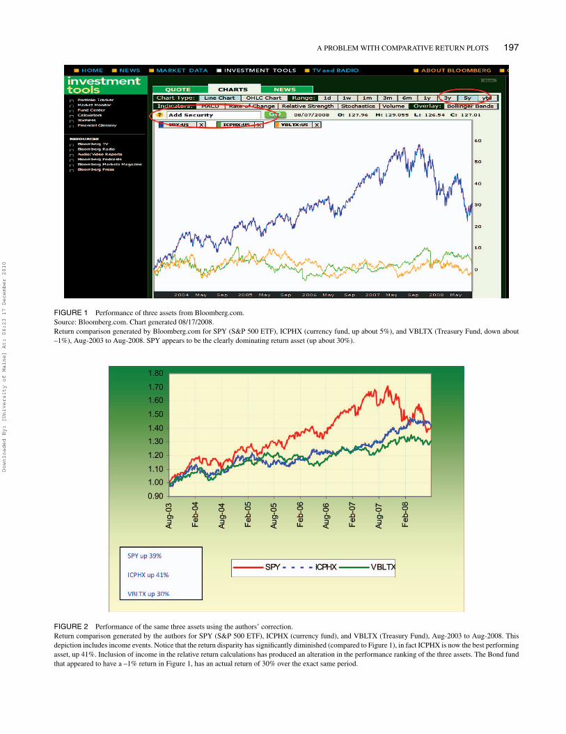
We illustrate the “Compare To” problem with an exampleand a chart. Figure 1 shows the five-year performance ofthree assets from August 2003 to August 2008 as seen on theBloomberg website. SPY is the S&P 500 index ETF and isthe line at the top of the graph. The other two assets mud-dling along, below the SPY, are the diversified currency fundICPHX and the long-term Treasury index fund VBLTX2.SPY appears to be the obvious and historically successful re-turn generating choice. From the graph, it appears that SPYhas a 30% return over this period, while ICPHX has a smallpositive return (about +5%) and VBLTX has a small net loss(about –1%). Unquestionably, based on this chart generatedby Bloomberg, most investors would have preferred to holdthe S&P 500 over this period, since the other two assets neverseem to be going anywhere; in fact, its recent weakness (asseen on the chart) could be seen by some as an opportunityto increase portfolio exposure towards it. The problem, how-ever, is that the returns and return differentials as implied inFigure 1 are not correct and would have consequently led tosuboptimal portfolio allocations and asset selections.
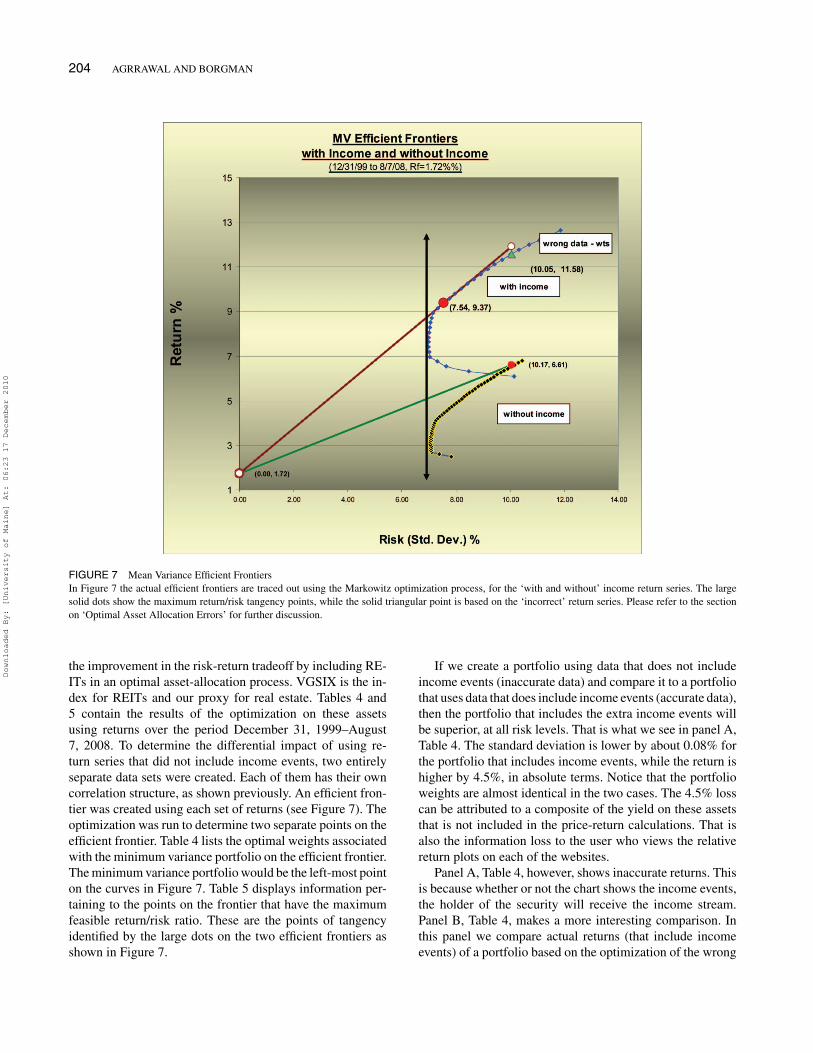
Figure 2 shows the same three securities over the exactsame period, but in this case the chart was generated by the
authors and based on their correction to the chart-generatingalgorithm. The correction incorporated income events in thereturn calculation. The return series is based on adjustedprices that include all income-generating events (e.g., div-idends, interest).3 This chart indicates that the currencyfund ICPHX outperformed the S&P 500, returning 41%over the period. The Treasury bond fund VBLTX actuallygenerated 30% over the period, contrary to the Bloombergchart, which seemed to imply a negative return (all assetshave a starting point of 1). Notice that the return on theS&P 500 is higher by about 9% in our corrected chart,which can be attributed to the inclusion of the dividendyield on the S&P 500 return (approximately 1.4% per an-num over five years). In this example, the Bloomberg chartdid not account for income events; our correction did. Thisomission causes a serious misrepresentation of asset per-formance and relative performance orderings, where well-performing assets could be dismissed due to perceived un-derperformance. Later in the paper, we will show that ina mean-variance optimization framework, the implicationof such an inversion in the ranking of relative returns canbe severe and lead to misallocation of funds as a result ofan incomplete and biased information set available to theinvestor.
As our example demonstrates, ignoring income events isa significant omission, leading to potentially significant er-rors in performance assessment and allocation decisions.4
Because dividend-paying firms are much larger and prof-itable than non-dividend paying firms (Grullon and Michaely[2002]), a bias against dividends is also a bias against largerfirms. It is also a major bias against the entire asset class offixed income securities.
DO DIVIDENDS AND INTEREST MATTER?
Dividends and interest do matter, and sometimes more thanother times. Dividends play a signaling role (e.g., Bhat-tacharya [1979], John and Williams [1985], Miller and Rock[1985]), reduce agency costs (Jensen [1986]) and have taximplications. There is evidence that investors prefer divi-dends more in down markets, apparently desiring the morecertain “bird-in-the-hand” of dividends at such times (Fullerand Goldstein [2005]).
What really matters is that dividends deliver a portion,often a large portion, of an investor’s return. Recall the basicformula for return (R) given price (P) and dividend (D):
Ri,t = (Pi,t − Pi,t−1 + Di,t)/Pi,t. (1)
Noer [2002] reminds us of a fascinating statistic: “One dollarinvested in the S&P 500 in 1926 would be worth around$2,260 now, including reinvested dividends. But take awaythe dividends and that same dollar would have grown to just$90. Much the same holds true today. Over the last 20 years,dividends have accounted for nearly 50% of the total return
Downloaded By: [University of Maine] At: 06:23 17 December 2010
A PROBLEM WITH COMPARATIVE RETURN PLOTS 197
FIGURE 1 Performance of three assets from Bloomberg.com.Source: Bloomberg.com. Chart generated 08/17/2008.Return comparison generated by Bloomberg.com for SPY (S&P 500 ETF), ICPHX (currency fund, up about 5%), and VBLTX (Treasury Fund, down about–1%), Aug-2003 to Aug-2008. SPY appears to be the clearly dominating return asset (up about 30%).
FIGURE 2 Performance of the same three assets using the authors’ correction.Return comparison generated by the authors for SPY (S&P 500 ETF), ICPHX (currency fund), and VBLTX (Treasury Fund), Aug-2003 to Aug-2008. Thisdepiction includes income events. Notice that the return disparity has significantly diminished (compared to Figure 1), in fact ICPHX is now the best performingasset, up 41%. Inclusion of income in the relative return calculations has produced an alteration in the performance ranking of the three assets. The Bond fundthat appeared to have a –1% return in Figure 1, has an actual return of 30% over the exact same period.
Downloaded By: [University of Maine] At: 06:23 17 December 2010

198 AGRRAWAL AND BORGMAN
of the S&P 500.” Fuller and Goldstein [2005] found thatfrom 1970 to 2000, dividend-paying stocks outperformednon-dividend paying stocks, the ones we often think of ashigh-growth stocks. The case for fixed income securities iseven simpler; not including the interest payments associatedwith the security severely reduces the associated total return(see Table 2). Thus we ignore total return at our peril. Theexclusion of dividends and interest, in the return-generatingmechanism, leads to a downward bias, and the use of suchreturns to rank securities would be essentially meaninglessfrom a total return perspective. Yet we continue to see relativereturn graphs all over the Internet that are based on partialtotal returns.
FINANCE WEBSITES
Individual investors are increasingly turning to the Web toobtain information on the financial markets. In addition, aca-demics and other researchers are increasingly using onlineresources, as methods are developed to retrieve financial data(e.g., Hasbrouck [2003], Corrado and Miller [2006], Mo-hamed and Al-Jaroodi [2007]). Google Finance, Yahoo! Fi-nance, Bloomberg, MSN Money and BigCharts are amongthe top finance websites. All finance portals provide a reason-ably rich and sophisticated set of graphing tools to the visitorat virtually no direct cost. They have multiple options whereentering a ticker brings up a graphical display of histori-cal performance and optional technical indicators. They alsoprovide earnings estimates, fundamental and even quantita-tive style data, apart from live news and fee-based researchreports. In a way they have done an outstanding job reducingthe informational asymmetries between the institutional andretail investor.
These sites have enormous reach. For example, BigChartsis one of the most comprehensive and developed sites thatdelivers financial analytics over the Web. It is owned by DowJones & Company and operates under the Wall Street JournalDigital Network. BigCharts also licenses and provides its out-put to visible industry members such as MerrillLynch.com,Morgan Stanley, UBS, Citibank, Fidelity.com, WSJ.com, Fi-nancial Times, New York Times, and Barron’s, as well asbrokers such as Ameritrade.com, Schwab.com and Market-watch.com. BigCharts’ clients form a financial who’s wholist (see Appendix A). BigCharts also licenses its technol-ogy and builds customized client solutions. The Wall StreetJournal Digital Network claims to service at least 39 mil-lion unique visitors per month with more than 616 millionmonthly page views [http://dowjonesonline.com]. An earlierreport by Nielsen/NetRatings released in September 2007indicates that the above-mentioned sites had an aggregate ofabout 41 million unique visitors for the month of August2007 (see Appendix B for individual site statistics). The vis-ibility and reporting burdens that come attached with accessto such a massive audience are immense.
TABLE 1Sample Portfolio Assets
Market InceptionAsset name Ticker Cap Date
S&P500 Depository Receipts(Spiders) S&P500 Tracking ETF
SPY 65B Jan, 1993
LT Treasury Bond Index - Vanguard VBLTX 2.8B Jun, 1996Total Int’l Stock Index –Vanguard VGTSX 27B Jun, 1996Fidelity Select Gold Fund FSAGX 2.3B Jan, 1987Franklin Tempelton Hard Currency
FundICPHX 0.69B Jun, 1995
REIT Index Fund – Vanguard VGSIX 7.29B Jun, 1996Pfizer Inc. PFE 130B Jan, 1982Genzyme Corp. GENZ 20B Mar, 1990
Table 1 lists the assets that we chose for the study, their tickers, marketcapitalizations and inception dates. Each security proxies for an asset classand is also a tradable liquid asset.
SECURITY SELECTION AND STUDY PERIOD
A synopsis of the problem was provided in our earlier ex-ample. In this section, we illustrate systematically what isoccurring when an investor uses any of these websites. Weselect a set of eight highly liquid securities; together thesesecurities cover all major asset classes, comprise a highly di-versified portfolio and were chosen to have minimal overlap.In addition, these securities are tradeable and have continu-ous pricing history available since December 31, 1999. Thiswas chosen as the starting point since Google begins all itsmutual fund charts only at this point. (Yahoo and BigChartshave the ability to go back earlier, while Bloomberg can onlygo back five years.) In addition, this period includes at leastone full bear market and one full bull market, thus insulatingthe study from any form of market-phase bias. The securitiesare a mixture of common stocks, mutual funds and an ETF.This also eliminates any specific security-class bias. We willshow that the problem applies to any type of traded security.The eight securities are listed in Table 1. All graphs weredrawn on August 7, 2008. The return data period, as a con-sequence for each of the selected assets was December 31,1999, to August 7, 2008.
There are two stocks in the study: one pays a steady streamof dividends (Pfizer, PFE) and the other has had no dividendssince its inception in 1990 (Genzyme, GENZ). Both are bell-wether stocks and have the highest market capitalization intheir respective industries (Pharmaceuticals, Biotechnology).Our ETF is the S&P 500 index tracking ETF (SPY), whichis the most actively traded security on the U.S. exchangeswith an average daily trading volume (three-month movingaverage) of about 260 million shares; by comparison the trad-ing volume of Pfizer, Genzyme, General Electric and ExxonMobil are 50 million, 3 million, 63 million and 29 millionshares, respectively.
In addition to the S&P 500 ETF, five mutual funds werechosen to create a diversified multiasset class portfolio.
Downloaded By: [University of Maine] At: 06:23 17 December 2010

A PROBLEM WITH COMPARATIVE RETURN PLOTS 199
FIGURE 3 Comparing the S&P 500 tracking ETF (SPY, top line) and the Long Term U.S. Treasury Index (VBLTX, bottom line) on BigCharts (12/1999 to8/2008).Figure 3 is what a user will see on the ‘advanced chart’ option on BigCharts, it includes the ‘% Compare’ sub-panel which plots the relative return differentialbetween the securities plotted. It appears the VBLTX has generated a cumulative return of about 14% over the 8- 1/2 year period. That seems to be very low,considering that VBLTX is a long-term Treasury index fund.
Between the SPY and the VGTSX, the largest and most liq-uid common stocks in the United States, Europe, Australasianand Emerging markets are represented. The Treasury bond,gold, hard currency and real-estate classes are proxied byVBLTX, FSAGX, ICPHX and VGSIX funds, respectively.5
This set of highly liquid assets is chosen to minimize re-dundancies, illustrate the effects of income exclusion fromprice series, yet have a relatively complete coverage of trade-able proxies for the broad asset classes (for mean-varianceoptimization purposes as shown later in the paper).
GENERATING A COMPARISON GRAPH
In the “Compare To,” “% Compare,” or “Compare” feature,one or more securities can be compared to a base security. Allof the online finance sites offer this feature in their chartingsection. It is a commonly used option for investors who wishto see how their investments are performing relative to a base-line security. Unlike the basic chart, which normally showsa security’s price over time, the Compare chart displays per-centage changes, on the Y-axis, over the time period selected.
Appendix C is a direct cutout from the BigCharts web-site, which explains what the % Compare feature does. Notethat the BigCharts explanation claims that the chart shows
“relative performance” and that the feature indicates if onecompany is outperforming or underperforming the stock ofanother. Outputs from Yahoo! Finance, Google Finance, Mi-crosoft’s MSN Money and Bloomberg are in similar percent-age return format and will be discussed shortly. Google evenprovides a percentage return number over the range of theperiod for which the chart is drawn. (See Appendix D forinstructions for generating the compare graph for a selectionof sites.)
Figure 3 is what a user will see if they choose BigChartsthen click on “advanced chart,” enter SPY followed byVBLTX, and choose % Compare on the lower indicator.A curious user may spend a few minutes to discern what% Compare is telling them (the lower panel in the chart).It appears that since the year 2000 (December 31, 1999,to be precise), which is entered in the Custom timeframebox, the VBLTX (Vanguard Long-term Treasury index) hasoutperformed the S&P 500 by about +25%. Moreover, itappears that VBLTX has generated a return of about 14%over the 8-1/2 year period (upper chart), which is about 1.6%per year. This second piece of information could raise aquestion in the mind of a user who is conversant with histor-ical attributes of various asset classes. The Ibbotson Report(SBBI [2006]) lists the average annual return on U.S. long-term Treasury bonds to be about 5.9%. Clearly something
Downloaded By: [University of Maine] At: 06:23 17 December 2010

200 AGRRAWAL AND BORGMAN
TABLE 2Annualized Returns (12/1999 to 8/2008)
Annualized Returns (12/31/1999 to 8/7/2008)
S&P500 LT Bonds Int’l Stocks Gold Currency REITs Pfizer GenzymeSPY VBLTX VGTSX FSAGX ICPHX VGSIX PFE GENZ
Without Income Events −1.5% 1.6% 1.9% 9.7% 0.4% 9.0% −5.5% 15.3%With Income Events −0.2% 7.5% 4.0% 16.8% 5.6% 14.7% −3.3% 15.3%
Return Differential 1.3% 5.9% 2.1% 7.1% 5.3% 5.7% 2.2% 0.0%
Table 2 lists the annualized returns for the set of securities listed in Table 1. The implication of not including income events is best seen in the last row ofthe table. Genzyme is the exception – because it is the only non-dividend paying security in this set of assets.
is missing, but there is little to indicate the omission and thecause for the discrepancy in the annual bond returns.
As we have suggested, this issue is not limited to theBloomberg or the BigCharts websites. An examination ofthree other major finance portals reveals the persistence ofthis omission. The information is the same at Microsoft’sMSN Money (Figure 4). To conserve space we have in-cluded PFE as well as a comparison with the SPY, alongwith VBLTX in the same graph. It may be a little harder toestimate the numerical numbers associated with the graphi-cal output but the VBLTX line is relatively flat at about 14%,SPY around –14%, and PFE at a –40% return over the exactsame period as the output from BigCharts above. Note thatwhile Pfizer did not do well in this period; its return whenincluding income events (dividends) was not quite as bad asit appears (−3.3% per annum in reality versus the −5.5% perannum, Table 2).
To complete the comparison, we also produced graphsof SPY, VBLTX and PFE from the Yahoo! Finance website(Figure 5) and the Google Finance site (Figure 6). In bothcases, the information and its presentation are similar. TheCompare graph from Google does appear to have one minoradvantage over the other sites; that is, it provides specificnumerical values of the percent returns associated with eachsecurity in the graph. For SPY, VBLTX and PFE, the num-bers are −13.28%, +14.55% and −43.71%, respectively.Thus the user does not have to guesstimate the numericalreturn values from the location of the lines on the graphi-cal output. There is, however, no indication to the viewerthat such comparative return information for Google doesnot include any income event whatsoever, and thus producesa downward bias in the cumulative return numbers or thegraphical ordering of the securities being researched. Notethat none of the sites includes an option for including incomeevents in the return comparison.
ANNUALIZED RETURNS WITH AND WITHOUTINCOME
The annualized returns associated with each of the selectedassets over the same time period (December 31, 1999–
August 7, 2008, as used in the graphs above) are presentedin Table 2. The non-inclusion of dividends or interest leadsto a different set of annualized returns. The effect is morepronounced for bonds, gold stocks, currency, real estateinvestment trusts (REITs)—assets that traditionally generatehigher income streams. The gold fund is underestimated by7.1%, long-term government bonds by 5.9%, REITs by 5.7%,and currency by 5.3%; recall these are annualized or per yearerrors. The compounded effect over time is extraordinary, tosay the least. The exclusion of such large annual returns froma comparative return analysis portrays a different imageof the asset, from what truly is the case. The total returndifferential can be thought of as an annual return loss that isnot available to the viewer and thus not part of the investorinformation set. The stock GENZ has a zero return differen-tial because it is a non-dividend paying stock. This securityalso illustrates the only scenario when the return comparisoncharts, in their current form, would be accurate. A suboptimalportfolio allocation decision can manifest as a result of the“availability heuristic” that the user would be automaticallysubject to; that is, agents tend to overweight informationthat is readily available and intuitive, relative to informationthat is less salient and more abstract, thus biasing judgments(Shefrin [2005]). The omission of such key information inwhat is made available to the users of these websites has thepotential to affect their portfolio selections adversely.
CORRELATIONS
Except for BigCharts, the other three sites—Google, MSNMoney, and Yahoo! Finance—allow the user to downloadprice data for a particular security and a specified daterange. Google’s price history does not even include anydividend payouts, while MSN Money and Yahoo! Financeprovide that information in the download. In fact, Yahoo!Finance provides an additional column of pricing datacalled the “adjusted close” that incorporates dividends,splits, stock dividends and similar corporate actions. Thefree availability of such pricing data on the Web has drawnusers to programmatically download such information andcompute their own devices for portfolio analytics (Agrrawal
Downloaded By: [University of Maine] At: 06:23 17 December 2010

A PROBLEM WITH COMPARATIVE RETURN PLOTS 201
FIGURE 4 MSN Money site comparison chart (12/1999 to 8/2008).Figure 4 shows that the relative return plotting problem persists for a different website – in this case Microsoft’s MSN Money. We also include Pfizer, a dividendpaying stock in this chart. This relative return plot excludes income over the entire period for which the three securities are plotted.
FIGURE 5 Yahoo! Finance site comparison chart (12/1999 to 8/2008).Figure 5 shows that the relative return plotting problem persists for yet another website – in this case the heavily visited Yahoo! Finance site. The same threesecurities are plotted here. This relative return plot also excludes income over the entire period for which the three securities are plotted. This graph looks verysimilar to Figure 4.
FIGURE 6 Google Finance site comparison chart (12/1999 to 8/2008).Figure 6 shows that the relative return-plotting problem persists for the Google Finance site as well. The same three securities are plotted here. This relativereturn plot also excludes income over the entire period for which the three securities are plotted, thus significantly understating the returns attributable to theTreasury bond index fund. Figures 4, 5 and 6 are very similar and neither one of them includes income events in the return graphics.
Downloaded By: [University of Maine] At: 06:23 17 December 2010

202 AGRRAWAL AND BORGMAN
TABLE 3Correlations (12/1999 to 8/2008)
Table 3 has two panels that show the correlation matrices for the without and with income returnseries. Changes to the correlations are modest. VBLTX and ICPHX correlations are the most affectedsince they have larger income events embedded in their total returns.
[2009]). This section illustrates the effect of using pricingdata that excludes dividends (such as provided by GoogleFinance), failing to adjust for it (as provided by MSNMoney) or using the raw close price instead of the adjustedclose price (as provided by Yahoo! Finance).
In addition to resulting in a total return differential, ignor-ing income events also affects asset correlations. The cor-relations among the chosen assets are presented in Table 3.These are calculated over the period from December 31,1999–August 7, 2008. The equation for the correlation coef-ficient is given by:
Correlation (x, y) =∑
(x − x) (y − y)√∑(x − x)2 ∑
(y − y)2(2)
where x-bar and y-bar are the sample means of x and y,respectively.
The estimation of the covariance between two assets isultimately affected, since cov (x,y) = σxσyρxy , where σ isstandard deviation and ρ is the correlation, which ultimatelyaffects the level of systemic risk (β) and portfolio allocations(asset weights).
Changes to the correlations (when we add income eventsto the returns) are modest but not without importance. Theones that change the most are those for bonds and currency(see the columns for VBLTX and ICPHX). It is expected thatif these two assets are included in a portfolio then the optimalweights for the assets will vary and be dependent on which ofthe two correlation matrices is utilized for the mean-varianceoptimization.6
Downloaded By: [University of Maine] At: 06:23 17 December 2010

A PROBLEM WITH COMPARATIVE RETURN PLOTS 203
TABLE 4Minimum Variance Portfolios (12/1999 to 8/2008)
Portfolio Weights
Portfolio St Dev Portfolio Return Return/ Risk SPY VBLTX VGTSX FSAGX ICPHX VGSIX
Panel A: Returns with and without incomeWith returns excluding Income 7.07 3.13 0.44 16.5 29 7 7 29 11.5With returns including Income 6.99 7.63 1.09 16.3 29 7 7 29 11.7
Panel B: Both returns including IncomeWeights calculated using wrong data 6.99 7.61 1.09 16.5 29 7 7 29 11.5Weights calculated using right data 6.99 7.63 1.09 16.3 29 7 7 29 11.7
Table 4 lists the optimal weights associated with the minimum variance portfolio on the efficient frontier. The minimum variance portfolio is also theleft-most point on the curves in Figure 7. The optimization is run on two separate return series, one that does not include income events and the other thatdoes. As seen in Panel A, the standard deviation is lower by about 0.08% for the portfolio that includes income events, while the return is higher by 4.5%, inabsolute terms. Notice that the portfolio weights are almost identical in the two cases (bounded by a min of 7% and a max of 29% to prevent corner solutions).
OPTIMAL ASSET ALLOCATION ERRORS
In this section we use actual data (returns for each of the eightassets are over the period December 31, 1999–August 7,2008) to simulate the various mean-variance frontier portfo-lios that can be created by using two separate return serieson the same set of assets. The series differ in their treatmentof income events, thus for each asset we have two returnvectors. We will assume the investor is interested in creatingefficient portfolios that utilize the Markowitz mean-varianceoptimization process. The mean-variance efficient portfolioselection problem is one where the investor seeks to mini-mize the portfolio variance subject to the budget and targetreturn constraint. A short selling non-negativity constraint isoptional, depending on the model. In this exercise the non-negativity constraint is enforced.7 Simply stated, the problemis to:
Minimize σ 2(x) = xT�x
subject to,
xTe = 1 where eT = [1, 1, . . . 1] (3)
xTµ = µp
and x ≥ o (optional)
where
µ and x are n-vectors composed of asset rates of returnand portfolio weights respectively;
� is an n x n positive-definite non-singular covariancematrix (the positive definiteness of � ensures that thevalue of the quadratic norm σ 2(x) will be positive for allx > 0, essentially ensuring a positive variance (Greene[1993]);
e is a unit vector; andand µp is a scalar equal to the targeted portfolio return.
Excluding the two stocks in our asset set, we have rep-resentation of all the primary asset classes—U.S. equi-ties (SPY), international equities (VGTSX), U.S. Treasuries(VBLTX), gold (FSAGX), real estate (VGSIX) and hard cur-rency (ICPHX). An Ibbotson-NAREIT [2006] report shows
TABLE 5Maximum Return/Risk Portfolios
Portfolio Weights
Portfolio St Dev Portfolio Return Return/ Risk SPY VBLTX VGTSX FSAGX ICPHX VGSIX
Panel AWith returns excluding income 10.17 6.61 0.65 7 29 7 20.2 7.8 29With returns including income 7.54 9.37 1.24 7 29 7 7.7 24.8 24.5
Panel B: Both returns including IncomeWeights calculated using wrong data 10.05 11.58 1.15 7 29 7 20.2 7.8 29Weights calculated using right data 7.54 9.37 1.24 7 29 7 7.7 24.8 24.5
Table 5 displays information pertaining to the points on the frontier that have the maximum feasible return/risk ratio. These points of tangency can beidentified by the large dots on the two efficient frontiers as shown separately in Figure 7. In Panel A one can see that the return of the income generatingportfolio is over 40% above that of the income excluding portfolio (9.37% versus 6.61%). The return/risk ratio jumps over 90% from 0.65 to 1.24, for theportfolio whose weights are determined using the correct set of returns. Notice that the portfolio calculated using the wrong (no income event) data has alower return/risk ratio. The portfolio weights have changed rather significantly as well, with a sharp reduction to FSAGX (gold) and an increase to ICPHX(currency). The distortion of returns created by omitting income events has real portfolio allocation and performance effects.
Downloaded By: [University of Maine] At: 06:23 17 December 2010
204 AGRRAWAL AND BORGMAN
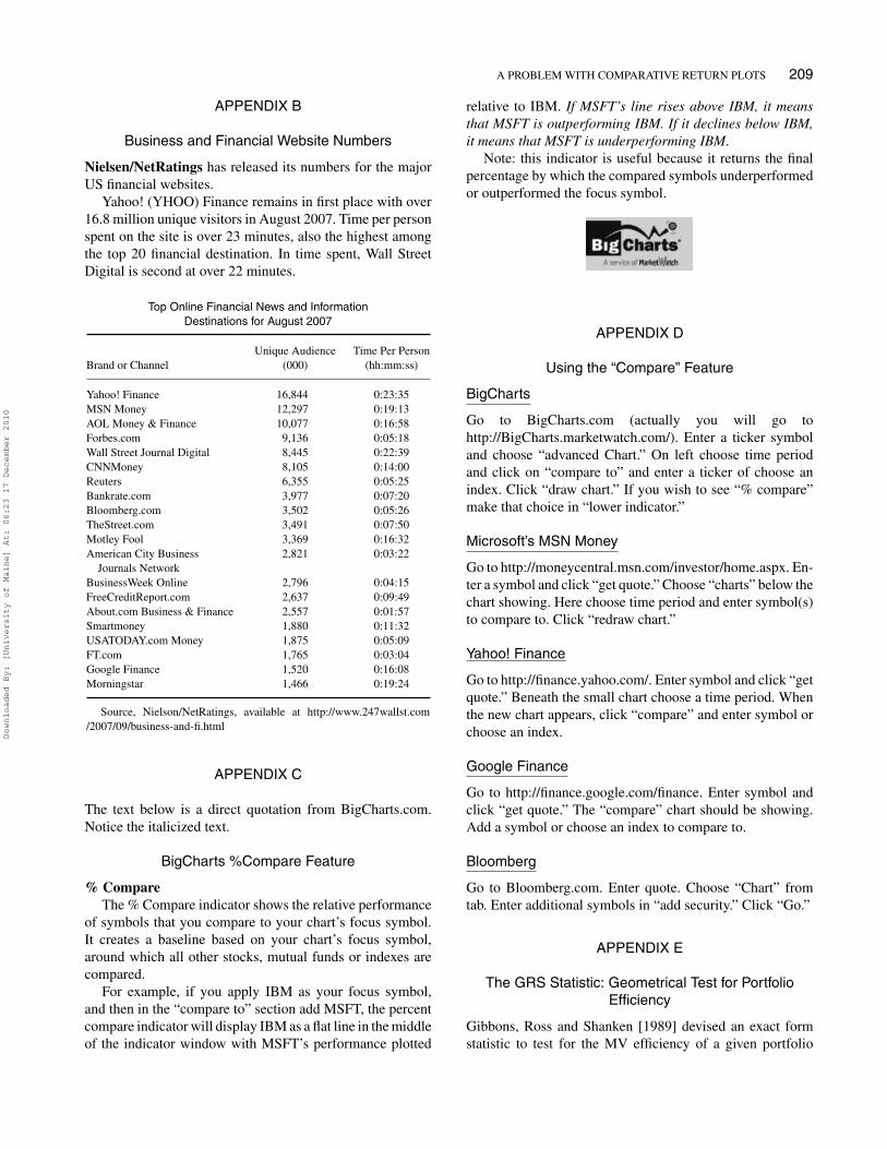
FIGURE 7 Mean Variance Efficient FrontiersIn Figure 7 the actual efficient frontiers are traced out using the Markowitz optimization process, for the ‘with and without’ income return series. The largesolid dots show the maximum return/risk tangency points, while the solid triangular point is based on the ‘incorrect’ return series. Please refer to the sectionon ‘Optimal Asset Allocation Errors’ for further discussion.
the improvement in the risk-return tradeoff by including RE-ITs in an optimal asset-allocation process. VGSIX is the in-dex for REITs and our proxy for real estate. Tables 4 and5 contain the results of the optimization on these assetsusing returns over the period December 31, 1999–August7, 2008. To determine the differential impact of using re-turn series that did not include income events, two entirelyseparate data sets were created. Each of them has their owncorrelation structure, as shown previously. An efficient fron-tier was created using each set of returns (see Figure 7). Theoptimization was run to determine two separate points on theefficient frontier. Table 4 lists the optimal weights associatedwith the minimum variance portfolio on the efficient frontier.The minimum variance portfolio would be the left-most pointon the curves in Figure 7. Table 5 displays information per-taining to the points on the frontier that have the maximumfeasible return/risk ratio. These are the points of tangencyidentified by the large dots on the two efficient frontiers asshown in Figure 7.
If we create a portfolio using data that does not includeincome events (inaccurate data) and compare it to a portfoliothat uses data that does include income events (accurate data),then the portfolio that includes the extra income events willbe superior, at all risk levels. That is what we see in panel A,Table 4. The standard deviation is lower by about 0.08% forthe portfolio that includes income events, while the return ishigher by 4.5%, in absolute terms. Notice that the portfolioweights are almost identical in the two cases. The 4.5% losscan be attributed to a composite of the yield on these assetsthat is not included in the price-return calculations. That isalso the information loss to the user who views the relativereturn plots on each of the websites.
Panel A, Table 4, however, shows inaccurate returns. Thisis because whether or not the chart shows the income events,the holder of the security will receive the income stream.Panel B, Table 4, makes a more interesting comparison. Inthis panel we compare actual returns (that include incomeevents) of a portfolio based on the optimization of the wrong
Downloaded By: [University of Maine] At: 06:23 17 December 2010

A PROBLEM WITH COMPARATIVE RETURN PLOTS 205
returns, and compare it to a portfolio based on the optimiza-tion of the correct returns. For the minimum-variance casethe effects are minor, although it does decrease the alloca-tion to SPY and increase VGSIX (real estate). The return torisk ratio is slightly improved if the correct data are used.We repeated the exercise, but now we created portfolios tomaximize the return/risk ratio (µ/σ ). This is where consid-erable migration of weights and change in portfolio returns isobserved (see Table 5). The (µ, σ ) parameters of the optimal
portfolios are higher than what was attained in the mini-mum variance case. In Panel A, Table 5, one can see thatthe return of the income generating portfolio is more than40% above that of the income excluding portfolio (9.37%versus 6.61%). This difference in returns is not due to bettersecurity performance; rather, it is simply due to the exclu-sion of income events in the underperforming portfolio andthe resulting shifts in the portfolio weights. The return/riskratio jumps over 90% from 0.65 to 1.24 for the portfolio
FIGURE 8 A comparison of the actual (as seen on the Internet) and corrected relative performance plots for VBLTX (bonds, top line in both) and SPY(equity, bottom line in both; 12/1999 to 8/2008).The two graph panels show relative performance (the ‘compare’ feature) for the same two securities (SPY, VBLTX), but they differ in the treatment of theincome generating events for the calculation of the returns and the return paths. The top graph does not include income-generating events while the bottomgraph does. The bottom graph shows accurate relative returns - notice the wider separation. The bottom panel depiction is not available on any finance websiteand is generated by the authors’ software that makes the income adjustment to returns. Contrary to the top panel, where long-term treasury bonds fund appearto be going nowhere, the bottom panel actually shows that the fund significantly outperformed equities and had a cumulative total return of about 85% for the81/2 year period.
Downloaded By: [University of Maine] At: 06:23 17 December 2010

206 AGRRAWAL AND BORGMAN
whose weights are determined using the correct set of re-turns. Once again, Panel B is the interesting panel. Noticethat the portfolio calculated using the wrong (no incomeevent) data has a lower return/risk ratio. The portfolio weightshave changed rather significantly, with a sharp reduction toFSAGX (gold) and an increase to ICPHX (currency). Theallocation to VGSIX (real estate) has also declined. The riskassociated with the suboptimal portfolio is about 10%, whichis about 33% higher on a relative basis compared to the op-timal portfolio that has a risk of about 7.5%. Clearly, thedistortion of returns created by omitting income events canhave real portfolio allocation and performance effects. In ad-dition, the impact of this omission leads to a reduced capitalallocation toward asset classes that derive a significant por-tion of their total return from income events. In the simula-tion shown above, these asset classes are gold, currency, andreal-estate.
Recall that the large (red/solid) dot in Figure 7 is thelocation of the maximum return/risk (tangency) portfolio foreach case (Panel A, Table 5, (µ, σ ) values). It can be safelysaid that the “with income” based frontier dominates theother—at each level of risk, the income including frontier hasa superior level of return compared to the no-income frontier.Also notice the point indicated with the (green/solid) triangle(10.05, 11.58). This is the maximum return/risk portfoliofrom Table 5, Panel B, the portfolio whose weights werecalculated using the wrong data (no income events included)but whose performance is based on actual returns. The pointto be made is that using the wrong data, as provided on thesefinance portals, leads to a portfolio with a lower return/riskratio. The visual determination (Figure 7) is confirmed byapplying the exact Gibbons, Ross and Shanken [1989] W-statistic, given as:
W =⎡⎣
√1 + θ̂2∗√1 + θ̂2
p
⎤⎦
2
− 1 ≡ ψ2 − 1 (4)
With a p-value of 6.27 × 10−49, the null hypothesis of portfo-lio efficiency is easily rejected (see Appendix E for details).All points on the line connecting the risk-free return (1.72%on the Y axis) and the portfolio shown by the triangularpoint (the optimal range of possible portfolios that mix therisk-free asset and the risky portfolio) lie below the possiblecombinations of the risk-free asset and the portfolio calcu-lated using accurate income inclusive returns (point 7.54,9.37).
With the way the comparative returns of two securitiesare displayed on some of the leading finance portals, theusers are most likely unknowingly operating off the efficientfrontier that lies within the attainable higher frontier. Thatwill likely lead to a suboptimal allocation of capital towardincome-generating asset classes.
CONCLUSION
This paper has demonstrated and brought to fore a long-standing and widespread distortion in the depiction of rela-tive return performance of financial securities on all of themajor finance Web portals; somehow this has evaded thescrutiny of millions of visitor investors. As shown earlier,the omission by the portals results in significant calculation,ranking, and portfolio allocation errors; the distortion willoccur with all income-generating securities. This error isserved up to a very large captive audience, and it is possiblethat their assessment of desirable securities is altered by thismisinformation.
To reinforce the message, in Figure 8 we replicate thedistortion found on the websites using our template. Thesecharts replicate/reverse-engineer the ‘compare’ feature inwhich the S&P 500 ETF (SPY) is the baseline, peggedto 1.00 (Y axis) at the beginning of the period. Thus theperformance of VBLTX (bonds) is relative to the S&P 500.The two graph panels show the same securities but theydiffer in the treatment of the income generating events forthe calculation of the returns and the price paths. In thefirst one it appears that VBLTX (long-term Treasury bonds)have outperformed the S&P 500 by 28% over a nine-yearperiod. This is the same view an internet user would findon Bloomberg, Yahoo! Finance, BigCharts, MSN Money orGoogle. In the bottom graph (of Figure 8) we find that theactual outperformance was significantly higher, at 89%. Thecomparative plots as seen on the internet understate the trueperformance of income-generating assets.
The result of these distortions is that assets that have ahigher income-generating component in their total returnswould appear to be less desirable holdings in a portfolio allo-cation scheme if such comparative graphing is utilized. Suchsecurity types include fixed income debt securities and divi-dend paying equity securities (at the stock, mutual fund, in-dex, or ETF level). If retail investors or financial advisors usethe “Compare To” option to estimate the relative attractive-ness of two securities, it is possible that they would surmisethat the high income-generating security is unattractive andas a result be under allocated to them. The financial crisisof 2008 has led many investors to look into and review theirportfolio holdings and allocations, and anecdotal evidenceindicates that a large majority were underexposed to assetsthat generated income or dividends. It would be a stretch toeven suggest that the compare feature created such massivelosses. It is possible, however, that such graphing featureshave subliminally and continually reinforced a perception, inthe mind of some investors, that income securities have beenperpetual under performers, when in fact they were deliver-ing steady returns (as shown in Table 2) and thus be one ofthe many contributory factors.
It does not have to be so. Most of the sites have divi-dends or interest income available in their historical pricedownloads (Google, however, offers only price information,
Downloaded By: [University of Maine] At: 06:23 17 December 2010

A PROBLEM WITH COMPARATIVE RETURN PLOTS 207
without consideration for dividends). All that these sites haveto do is include the income information while generatingcomparison graphs, by making a few alterations to their graphgenerating algorithms. That would give a more complete andaccurate picture of the relative return differentials over timefor the securities being compared and make available a betterinformation set to the investor. If for some reason it is notpossible for the providers to alter their comparative returngenerating algorithms, then the user has the right to see adisclaimer next to the chart, such as: “These return compari-son graphs do not include income events, which may result ina downward bias in the displayed end-period returns. The im-plication of this for ranking securities and allocation of fundsshould be considered carefully by the user, before basing anydecisions on the displayed chart.”
Ultimately these brand-name finance portals have a re-sponsibility to their visitors and should consider correctiveaction. What if an investor was making asset selections evenpartially influenced by a visual recall of the comparisoncharts? The problem becomes very real then. The ready avail-ability of such unclear or inaccurate information from sourcesgenerally perceived to be very credible can in this age ofdo-it-yourself portfolio management have serious and dam-aging financial consequences to the unsuspecting investor.This problem can, however, be easily rectified.
NOTES
1. About 41 million unique visitors per month forall of these websites: Google Finance, Yahoo! Fi-nance, Bloomberg.com, Microsoft’s MSN Money andBigCharts.com (Nielsen/NetRatings [2007]).
2. At this point, the reader is encouraged to verify this bygoing to the Bloomberg.com site, entering VBLTX inthe quote box, click on Chart, then enter SPY in the“Add Security” Box, click on Draw and finally click on“5y” for a five-year comparative graph. The numberswill be different from those shown in Chart 1 (fromAugust 2008), but the effect will be similar. This holdsfor other asset selections as well, as long as at least oneof the assets is rich in income events.
3. Numerical data was obtained from the Yahoo! Financewebsite (secondary provider), which provides pricehistory along with splits and dividend information, aswell as adjusted close prices that incorporate corporateaction and income events, for stocks, ETFs and mutualfunds. The primary source of the pricing data is Com-modity Systems, Inc. (CSI), the suppliers to GoogleFinance, Yahoo! Finance and MSN Money. Historicalpricing data for BigCharts.com is provided by Interac-tive Data Corp, a publicly traded company.
4. Although not common, there are occasional studies ondata reliability. For example, Elton, Gruber and Blake[2001] examine the bias resulting from omitted mutual
fund data in the CRSP database. Ince and Porter [2004]examine equity return data from Thomson Datastream(TDS).
5. These selections are tradeable diversified funds thatalso proxy the broader asset classes, and can be theconstituents of a typical portfolio for a visitor to thesesites. They are also highly capitalized and have markethistory going beyond 1999.
6. In the market decline since October 2007, there havebeen numerous instances where market pundits havebeen lamenting the limited exposure to these two assetclasses in client portfolios.
7. This can be relaxed without loss of generality, but sincemutual funds in the portfolio typically do not allow forshort selling, we apply the constraint.
REFERENCES
Agrrawal, Pankaj. “An Automation Algorithm for Harvesting Capital MarketInformation from the Web.” Managerial Finance, 35, (2009), pp. 427-438.
Bhattacharya, Sudipto. “Imperfect Information, Dividend Policy, and ‘TheBird in the Hand’ Fallacy.” Bell Journal of Economics, 10, (1979), pp.259–270.
Brennan, Michael, Ashley Wang and Yihong Xia. “Estimation and Testof a Simple Model of Intertemporal Capital Asset Pricing.” Journal ofFinance, 59, (2004), pp. 1743–1776.
Corrado, C.J. and T.W. Miller. “Estimating Expected Excess Returns UsingHistorical and Option-implied Volatility.” Journal of Financial Research,29, (2006), pp. 95–112.
Elton, Edwin J., Martin J. Gruber and Christopher R. Blake. “A First Lookat the Accuracy of the CRSP Mutual Fund Database and a Comparisonof the CRSP and Morningstar Mutual Fund Databases.” The Journal ofFinance, 56, (2001), pp. 2415–2430.
Fama, Eugene F. and Kenneth French. “Common Risk Factors in Returnson Stocks and Bonds.” Journal of Financial Economics, 33, (1993), pp.3–56.
Fama, Eugene F. and Kenneth French. “Multifactor Explanations of AssetPricing Anomalies.” Journal of Finance, 51, (1996), pp. 55–84.
Fuller, Kathleen and Michael Goldstein. “Do Dividends Mattermore in Declining Markets?” Working Paper. Available at SSRN:http://ssrn.com/abstract=687067, 2005.
Gibbons Michael R., Stephen Ross and Jay Shanken. “A Test of the Effi-ciency of the Given Portfolio.” Econometrica, 57, (1989), pp. 1121–1152.
Greene, William H. Econometric Analysis. (2nd Edition), (1993), New York,NY: Macmillan.
Grullon, Gustavo and Roni Michaely. “Dividends, Share Repurchases, andthe Substitution Hypothesis.” The Journal of Finance, 57, (2002), pp.1649–1684.
Hasbrouck, Joel. “Intraday Price Formation in U.S. Equity Index Markets.”Journal of Finance, 58, (2003), pp. 2375–2399.
Ibbotson Associates. Stocks, Bonds, Bills and Inflation 2006 Yearbook.(2006), Chicago, IL:Ibbotson Associates.
Ibbotson—National Association of Real Estate Investment Trusts(NAREIT). “Portfolio Diversification through REITs: A Look atthe Ibbotson Analysis.” NAREIT: Washington, DC. Available atwww.nareit.com/epubs/2006 Ibbotson.pdf, 2006.
Ince, Ozgur and R. Burt Porter. “Individual Equity Return Data From Thom-son Datastream: Handle with Care!” Working Paper, (2004), Universityof Florida.
Downloaded By: [University of Maine] At: 06:23 17 December 2010

208 AGRRAWAL AND BORGMAN
Jensen, Michael. “Agency Costs of Free Cash Flow, Corporate Finance, andTakeovers.” American Economic Review, 76, (1986), pp. 323-329.
John, K. and J. Williams. “Dividends, Dilution, and Taxes: a SignalingEquilibrium.” Journal of Finance, 40, (1985), pp. 1053–1070.
MacKinlay, Craig A. “Multifactor Models Do Not Explain Devia-tions from the CAPM.” Journal of Financial Economics, 38, (1995),pp. 3–28.
Markowitz, Harry. “The Optimization of a Quadratic Function Subject toLinear Constraints.” Naval Research Logistics Quarterly, 3, (1956), pp.111–133.
Miller, Merton and Kevin Rock. “Dividend Policy under Asymmetric Infor-mation.” Journal of Finance, 40, (1985), pp. 1031–1051.
Mohamed, Nader, and Jameela Al-Jaroodi. “A Simple and Effi-cient Approach for Retrieving Live HTML-based Internet Informa-
tion.” System and Information Sciences Notes, 1, (2007), pp. 221–224.
Nielsen/NetRatings. “Business And Financial Website Numbers.” Availableat http://www.247wallst.com/2007/09/business-and-fi.html, 2007.
Noer, Michael. “America’s Top Companies: Where Have The Div-idends Gone?” Forbes.com.” Available at http://www.forbes.com/2002/04/03/0403dividends print.html, April 3, 2002.
Roll, Richard and Stephen Ross. “On the Cross-Sectional Relationship be-tween Expected Returns and Betas.” Journal of Finance, 49, (1994), pp.101–121.
Shefrin, Hersh. Behavioral Corporate Finance. (2005), New York, NY:McGrawHill-Irwin.
Zhou, Guofu. “Asset-Pricing Tests under Alternative Distributions.” Journalof Finance, 48, (1993), pp. 1927–1942.
APPENDIX A
BigCharts Licensing Partners
Downloaded By: [University of Maine] At: 06:23 17 December 2010
A PROBLEM WITH COMPARATIVE RETURN PLOTS 209
APPENDIX B
Business and Financial Website Numbers
Nielsen/NetRatings has released its numbers for the majorUS financial websites.
Yahoo! (YHOO) Finance remains in first place with over16.8 million unique visitors in August 2007. Time per personspent on the site is over 23 minutes, also the highest amongthe top 20 financial destination. In time spent, Wall StreetDigital is second at over 22 minutes.
Top Online Financial News and InformationDestinations for August 2007
Unique Audience Time Per PersonBrand or Channel (000) (hh:mm:ss)
Yahoo! Finance 16,844 0:23:35MSN Money 12,297 0:19:13AOL Money & Finance 10,077 0:16:58Forbes.com 9,136 0:05:18Wall Street Journal Digital 8,445 0:22:39CNNMoney 8,105 0:14:00Reuters 6,355 0:05:25Bankrate.com 3,977 0:07:20Bloomberg.com 3,502 0:05:26TheStreet.com 3,491 0:07:50Motley Fool 3,369 0:16:32American City Business
Journals Network2,821 0:03:22
BusinessWeek Online 2,796 0:04:15FreeCreditReport.com 2,637 0:09:49About.com Business & Finance 2,557 0:01:57Smartmoney 1,880 0:11:32USATODAY.com Money 1,875 0:05:09FT.com 1,765 0:03:04Google Finance 1,520 0:16:08Morningstar 1,466 0:19:24
Source, Nielson/NetRatings, available at http://www.247wallst.com/2007/09/business-and-fi.html
APPENDIX C
The text below is a direct quotation from BigCharts.com.Notice the italicized text.
BigCharts %Compare Feature
% CompareThe % Compare indicator shows the relative performance
of symbols that you compare to your chart’s focus symbol.It creates a baseline based on your chart’s focus symbol,around which all other stocks, mutual funds or indexes arecompared.
For example, if you apply IBM as your focus symbol,and then in the “compare to” section add MSFT, the percentcompare indicator will display IBM as a flat line in the middleof the indicator window with MSFT’s performance plotted
relative to IBM. If MSFT’s line rises above IBM, it meansthat MSFT is outperforming IBM. If it declines below IBM,it means that MSFT is underperforming IBM.
Note: this indicator is useful because it returns the finalpercentage by which the compared symbols underperformedor outperformed the focus symbol.
APPENDIX D
Using the “Compare” Feature
BigCharts
Go to BigCharts.com (actually you will go tohttp://BigCharts.marketwatch.com/). Enter a ticker symboland choose “advanced Chart.” On left choose time periodand click on “compare to” and enter a ticker of choose anindex. Click “draw chart.” If you wish to see “% compare”make that choice in “lower indicator.”
Microsoft’s MSN Money
Go to http://moneycentral.msn.com/investor/home.aspx. En-ter a symbol and click “get quote.” Choose “charts” below thechart showing. Here choose time period and enter symbol(s)to compare to. Click “redraw chart.”
Yahoo! Finance
Go to http://finance.yahoo.com/. Enter symbol and click “getquote.” Beneath the small chart choose a time period. Whenthe new chart appears, click “compare” and enter symbol orchoose an index.
Google Finance
Go to http://finance.google.com/finance. Enter symbol andclick “get quote.” The “compare” chart should be showing.Add a symbol or choose an index to compare to.
Bloomberg
Go to Bloomberg.com. Enter quote. Choose “Chart” fromtab. Enter additional symbols in “add security.” Click “Go.”
APPENDIX E
The GRS Statistic: Geometrical Test for PortfolioEfficiency
Gibbons, Ross and Shanken [1989] devised an exact formstatistic to test for the MV efficiency of a given portfolio
Downloaded By: [University of Maine] At: 06:23 17 December 2010
210 AGRRAWAL AND BORGMAN
based on its geometric properties. The test is widely usedin studies addressing the issue of portfolio efficiency andCAPM deviations (Brennan, Wang, and Xia [2004], MacKin-lay [1995], Roll and Ross [1994], Zhou [1993] and Fama andFrench [1993, 1996]).
The GRS statistic measures the distance, in mean-standarddeviation space, between a test portfolio (market index) anda tangency portfolio (on the efficient frontier) and returns avalue, which is then used to assess the relative efficiency ofthe portfolio under consideration. The GRS statistic denotedby W is given as:
W =⎡⎣
√1 + θ̂2∗√1 + θ̂2
p
⎤⎦
2
− 1 ≡ ψ2 − 1 (5)
where, θ̂∗ is the Sharpe measure of the ex post efficient port-folio (ratio of expected excess return to the standard deviationof the excess return), and θ̂p is the Sharpe measure of the testportfolio. Essentially is a slope measure ( r̄/σ ) with excessreturn (r̄) and standard deviation of return (σ ), and is theray emanating from the origin on the Y-axis connecting toa portfolio in the first quadrant. Note that cannot be lessthan one since θ̂∗ is the slope of the ex post frontier andis based on all the assets in the test (including portfolio p).To accept the efficiency of the test portfolio, �2 should beclose to 1. Larger values of �2 imply portfolio inefficiencyarising out of the increased distance between the test port-folio and the global MV efficient portfolio on the frontier(W= −�2—1→0 implies efficiency). In other words, for
values of W close to zero, the test portfolio cannot be calledinefficient.
The test statistic is determined as:
[T(T − N − 1)/N(T − 2)]∗
⎡⎣
√1 + θ̂2∗√1 + θ̂2
p
⎤⎦
2
≡ XF (6)
It follows a F-distribution ∼ F(N, T-N-1), where N is thenumber of assets and T is the number of time series obser-vations on the underlying asset returns.
H0: Portfolio is efficient
The decision rule to reject H0 is: Rej. H0, iff. F(XF , N,T-N-1) < a threshold p-value
For the two portfolios discussed in Panel B of Table 5 thevarious parameters required to determine the GRS statisticcan be see in the table below:
Tangency Portfolio (∗) Test Portfolio (p)
mean, r 9.37 11.58rf 1.72 1.72sigma, σ 7.54 10.05θ = (r-rf)/σ 1.014 0.981GRS-W 0.033N 6 No. of AssetsT 448 No. of Weekly IntervalsXF 2.455p-value 6.2 7E-49 Rej. H0 (Efficiency)
The GRS test confirms that the test portfolio is not efficient,relative to the tangency portfolio.
Downloaded By: [University of Maine] At: 06:23 17 December 2010