Embed Size (px)
Citation preview

Kaplan University Writing Center • Citing Graphics and Visuals • July 2016, Version 2 • Page 1 of 10 © 2016 Kaplan University Writing Center, All Rights Reserved.
Kaplan University Writing Center
Sometimes writers may find that a picture is, indeed, worth a thousand words. Statistics and
laboratory results, for instance, are often best presented in the form of a table, and a well-
designed chart or graph can sum up pages of text. The American Psychological Association
(APA) distinguishes between two types of visuals: tables and figures. This tutorial explains
using, citing, and providing copyright statements for tables and figures in APA style.
Using Graphics and Visuals
Tables
Figures
Creating Visuals
Creating Visuals With Compiled Data
Citing Photographs
When using graphics and visuals, writers should address the
following areas.
The visual is essential to the meaning of the text as
the friendly reminder in Figure 1 explains.
You may want to analyze or further discuss the visual
in your text, but avoid repeating the same information
provided by the visual.
All graphics should be clearly labeled and easy to
understand.
Readers expect consistency throughout a paper, and this
also applies to visuals (figures and tables). Figures and
tables of equal importance should be similar in size,
numbered consecutively, and use the same font.
Readers should be able to interpret the figure or table
without the text, so all abbreviations and symbols
should be consistent as well as defined or explained
in the table notes or figure captions.
Back to Table of Contents
Table of Contents
Using Graphics and Visuals
Citing Graphics and Visuals in APA Style
Figure 1. Friendly reminder.
Writers should evaluate the
purpose of any visuals used.
Visuals should add to the
meaning of the text and not
merely be used to occupy space
or force an essay to meet a
word or page requirement.

Kaplan University Writing Center • Citing Graphics and Visuals • July 2016, Version 2 • Page 2 of 10 © 2016 Kaplan University Writing Center, All Rights Reserved.
Kaplan University Writing Center
Tables often compare data and are organized in a row and column format. Tables are
numbered as in “Table 1,” titled according to the table content, and captioned with a note below
the table that explains any abbreviations or symbols and provides source and copyright
information. Table 1, a “Quick Table” template in Microsoft Word 2007, illustrates basic table
design with rows and columns, a title, headings, and a note below the table.
Table 1
Enrollment in Local Colleges, 2005
College New students Graduating students Change
Undergraduate
Cedar University 110 103 +7
Elm College 223 214 +9
Maple Academy 197 120 +77
Pine College 134 121 +13
Oak Institute 202 210 -8
Graduate
Cedar University 24 20 +4
Elm College 43 53 -10
Maple Academy 3 11 -8
Pine College 9 4 +5
Oak Institute 53 52 +1
Total 998 908 90
Note. + = more students enrolled than graduated; - = more students graduated than enrolled.
From “Quick Tables,” by Microsoft Word, 2007. Copyright 2007 by Microsoft Word.
The following guidelines apply to tables in APA style.
Tables with fewer than two rows or columns are not needed. The information or data should
be presented in the text only with appropriate in-text and reference citations.
Tables

Kaplan University Writing Center • Citing Graphics and Visuals • July 2016, Version 2 • Page 3 of 10 © 2016 Kaplan University Writing Center, All Rights Reserved.
Kaplan University Writing Center
Refer to each table in the text and
describe its contents: “Table 1 shows
these results” or “As illustrated in
Table 2, . . ..”
Number tables consecutively in the
order they appear in the text.
Create a title that offers a brief
explanation of the table.
Capitalize only the first word of the title
and words normally capitalized in
sentences.
Provide a heading for each row and
column, even the first column.
Separate rows with horizontal lines,
but do not use vertical lines to
separate columns.
Place notes directly below the table.
Double space tables; however, to fit
on the page or make a table easier to
read, single or one-and-a-half line
spacing is acceptable (APA, 2016b).
Use Times New Roman, 12-point font.
There can be up to three notes,
ordered by type: general information
about the table, specific information
about individual columns or rows, and
probability explanations, which explain
any asterisks or symbols used in data
from statistical testing. Refer to the
explanation of probability notes on
this page for more details.
Table Checklist
Is the table necessary?
Is the table referred to in the text?
Is the table inserted as close to where
it is mentioned in the text as possible?
Is the title brief but explanatory?
Does every column have a heading?
Are all abbreviations, symbols, and
special uses of dashes, italics, or
boldface explained?
Probability Notes
Probability notes are used in statistical hypothesis testing that rules out something occurring due to chance alone. In statistical testing, researchers use a probability level between 0 to 1 to describe the chance of an event occurring, with 0 meaning the event will never occur and 1 meaning the event will always occur. In a table or figure, probability levels are assigned asterisks to indicate a range in probability such as *p < .05 and **p < .01, and ***p < .001 (APA, 2010). The fewest number of asterisks indicates the largest probability and the most asterisks indicate the smallest probability level.
Plus (+) and minus (-) signs are also used in probability notes to show confidence intervals. For example, the results of an opinion poll may show 56% of the respondents prefer candidate A. If the confidence interval is +/-3, then 53%-59% of the population agrees with those sampled. Probability notes may also provide confidence levels to indicate how certain the researcher is that the general population will agree with the poll respondents. For example, if the confidence level is 95%, then there is a 95% certainty that 53% to 59% of the population agrees with those polled. Researchers typically use a 95% confidence level. Example of a probability note:
Note. The poll revealed that respondents prefer . . ..
YA = ages 18-30. A=ages 31-43. Adapted from
“Title of Article,” by A. Author, Year, Copyright
Year by Copyright Holder.
Data are for all genders.
*p < .05. **p < .01.
In this example, the first note provides general information about the content in the table such as definitions and the copyright information; the second note, on a separate line, provides more specific information about the data in the rows or columns; and the final note, on another new line, provides the probability (p) levels.

Kaplan University Writing Center • Citing Graphics and Visuals • July 2016, Version 2 • Page 4 of 10 © 2016 Kaplan University Writing Center, All Rights Reserved.
Kaplan University Writing Center
Are the notes in the following order: general note, specific note, probability note?
Are all vertical lines eliminated?
If the table is for statistical testing, are probability levels identified? If more than one table is
used, are probability level asterisks consistent from table to table? With statistical testing
data, are confidence intervals reported and consistent for all tables in the paper?
If all or part of a copyrighted table is reproduced or adapted, do the table notes give full
credit to the copyright owner?
Back to Table of Contents
All visuals that are not tables are figures.
Figures include charts, as shown in Figure 2,
graphs, pictures, maps, and more. Below are
some APA (2010) guidelines specific to figures:
Number figures consecutively (Figure 1;
Figure 2, Figure 3 . . .).
Always refer to the figure within the text
(Figure 1 illustrates . . .; Figure 2
demonstrates . . .).
Figure titles and a caption providing a short
explanation go below the figure.
Captions should be descriptive and specific.
In the caption, capitalize the first word and
and words normally capitalized in
sentences.
Figure Checklist
Is the figure necessary?
Is the figure inserted as close to where it is
mentioned in the text as possible?
Does the figure title describe the figure content?
Are all elements of the figure clearly labeled?
Are all figures numbered consecutively?
Is the figure mentioned in the text?
Is proper credit given to the source of the figure in the figure caption?
If copied and pasted into the text, is the resolution clear enough to be understood?
Does the text explain how the figure is relevant to the discussion in the paper without
repeating all the information from the figure in the text?
Back to Table of Contents
Figures
Figure 2. Chart of Bloom’s taxonomy for the ways
of learning. Charts and graphics such as this are
“figures.” Writers can create graphics similar to
this pyramid with the Microsoft Word SmartArt
tool.

Kaplan University Writing Center • Citing Graphics and Visuals • July 2016, Version 2 • Page 5 of 10 © 2016 Kaplan University Writing Center, All Rights Reserved.
Kaplan University Writing Center
Microsoft Word and Microsoft PowerPoint allow
writers like the student hard at work in Figure 3 to
create tables and charts and insert them directly
into their documents and presentations. The
types of charts and graphs available include
column, bar, pie, scatter, line, area, bubble, radar,
stock, surface, and doughnut. With so many
types of visuals to choose from, writers should
carefully consider which type will best present the
information. For example,
a column chart displays categories of
variables;
a bar chart demonstrates comparisons
between single items;
a pie chart shows percentages;
a scatter plot illustrates correlations; and
a line graph demonstrates relationships.
The Microsoft Office Support webpage provides
examples of these types of charts and more.
Some of those examples are pasted below in
Figures 4-8 with example APA style captions for
graphics or images from a website.
Figure 4. Clustered column chart. From “Available Chart Types,” by Microsoft Office Support,
2016 (http://bit.ly/29NFxZv). Copyright 2016 by Microsoft. Used with permission from
Microsoft.
Creating Visuals
Figure 3. Hard at work. With practice, creating
tables in Microsoft Word and Excel can be a cinch
and add much-needed context to your writing and
research!

Kaplan University Writing Center • Citing Graphics and Visuals • July 2016, Version 2 • Page 6 of 10 © 2016 Kaplan University Writing Center, All Rights Reserved.
Kaplan University Writing Center
Figure 5. Bar chart in 3-D. From “Available Chart Types,” by Microsoft Office Support, 2016
(http://bit.ly/2aaEx6p). Copyright 2016 by Microsoft. Used with permission from Microsoft.
Figure 6. Pie chart in 3-D. From “Available Chart Types,” by Microsoft Office Support, 2016
(http://bit.ly/29USa4I). Copyright 2016 by Microsoft. Used with permission from Microsoft.
Figure 7. XY (scatter) chart. From “Available Chart Types,” by Microsoft Office Support, 2016
(http://bit.ly/29N8R2h). Copyright 2016 by Microsoft. Used with permission from Microsoft.
Kaplan University Writing Center • Citing Graphics and Visuals • July 2016, Version 2 • Page 7 of 10 © 2016 Kaplan University Writing Center, All Rights Reserved.
Kaplan University Writing Center
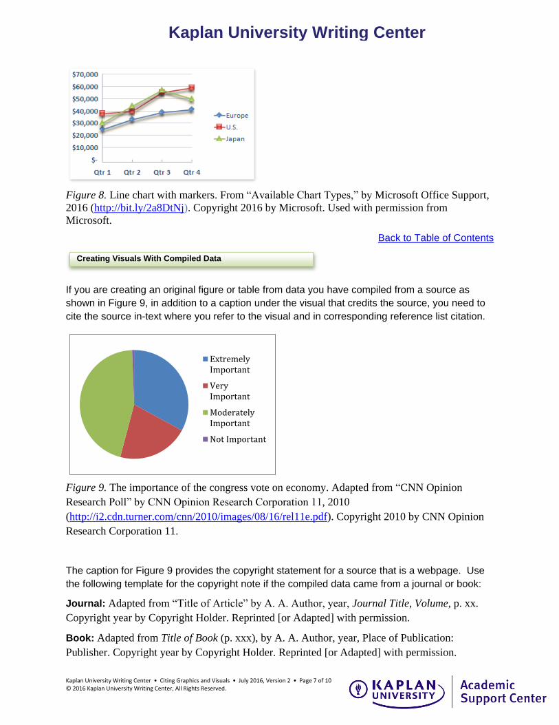
Figure 8. Line chart with markers. From “Available Chart Types,” by Microsoft Office Support,
2016 (http://bit.ly/2a8DtNj). Copyright 2016 by Microsoft. Used with permission from
Microsoft.
Back to Table of Contents
If you are creating an original figure or table from data you have compiled from a source as
shown in Figure 9, in addition to a caption under the visual that credits the source, you need to
cite the source in-text where you refer to the visual and in corresponding reference list citation.
Figure 9. The importance of the congress vote on economy. Adapted from “CNN Opinion
Research Poll” by CNN Opinion Research Corporation 11, 2010
(http://i2.cdn.turner.com/cnn/2010/images/08/16/rel11e.pdf). Copyright 2010 by CNN Opinion
Research Corporation 11.
The caption for Figure 9 provides the copyright statement for a source that is a webpage. Use
the following template for the copyright note if the compiled data came from a journal or book:
Journal: Adapted from “Title of Article” by A. A. Author, year, Journal Title, Volume, p. xx.
Copyright year by Copyright Holder. Reprinted [or Adapted] with permission.
Book: Adapted from Title of Book (p. xxx), by A. A. Author, year, Place of Publication:
Publisher. Copyright year by Copyright Holder. Reprinted [or Adapted] with permission.
Creating Visuals With Compiled Data
ExtremelyImportant
VeryImportant
ModeratelyImportant
Not Important

Kaplan University Writing Center • Citing Graphics and Visuals • July 2016, Version 2 • Page 8 of 10 © 2016 Kaplan University Writing Center, All Rights Reserved.
Kaplan University Writing Center
Sample in-text citations for the source of data compiled into a table or figure:
The pie chart in Figure 9 illustrates that . . . (CNN Opinion Research Corporation 11, 2010).
The results from the CNN Opinion Research Corporation 11 (2010) poll in Figure 9 show . . ..
Sample reference citation for the information in Figure 9 that came from a webpage:
CNN Opinion Research Corporation 11. (2010, August 6-10). CNN opinion research poll.
Retrieved from http://i2.cdn.turner.com/cnn/2010/images/08/16/rel11e.pdf
Back to Table of Contents
Like other types of research, graphics and visuals, such as photographs, borrowed or copied
directly from a source have to be cited both in the text and on a reference list. On the other
hand, if you use your own photography in your paper or you own the copyright license for the
visual as Kaplan University owns the copyright licenses for the photographs in Figures 1, 2, and
3, you will not need to cite them in text or on the reference page or provide a copyright notice.
However, for borrowed images, such as those in Figures 10-12, the source of the photograph
must be credited in a caption with a copyright statement and in a corresponding reference
citation (APA, 2016a). Since photographs are figures in APA style, the copyright statement,
which begins with “From” or “Adapted from,” follows a figure number and a caption.
Figure 10 Lilies After Rain [Photograph]. From “Scotland Cairns Flickr Photostream,” by C.
Rios, 2015 (https://www.flickr.com/photos/scotlandcairns/19461114229/in/datetaken-public/).
Copyright 2015 by C. Rios. Reprinted with permission.
Sample reference citation for a photograph licensed for free use with attribution:
Rios, C. (Photographer). (2015, July 6). Lilies after rain [Photograph]. Retrieved from
https://www.flickr.com/photos/scotlandcairns/19461114229/in/datetaken-public/
Citing Photographs

Kaplan University Writing Center • Citing Graphics and Visuals • July 2016, Version 2 • Page 9 of 10 © 2016 Kaplan University Writing Center, All Rights Reserved.
Kaplan University Writing Center
Figure 11. Water lily [Photograph]. From S. Carlson, 2009. Copyright 2009 by S. Carlson.
Reprinted with permission.
Sample reference citation for an unpublished photograph from a photographer:
Carlson, S. (Photographer). (2009). Water lily [Photograph]. Retrieved from the photographer.
Figure 12. Study for the cellist. From “Olga’s Gallery,” by A. Modigliani, 1909
(http://www.abcgallery.com/M/modigliani/modigliani12.html). In the public domain.
Sample reference citation for a photograph in the public domain on the web:
Modigliani, A. (Painter). (1909). Study for the cellist [Oil on canvas]. Retrieved from
http://www.abcgallery.com/M/modigliani/modigliani12.html.
Back to Table of Contents
Public Domain
Figure 12 is artwork, digitally reproduced online
and found in the “public domain.” An image in the
public domain with an expired copyright, such as
an image created before 1923, will still need a
credit to the source in the caption below the image,
and it will also need a reference citation to indicate
where the photo can be retrieved; however, an
image from the public domain will not need a
copyright notice. Instead, write “In the public
domain” as shown in Figure 12.

Kaplan University Writing Center • Citing Graphics and Visuals • July 2016, Version 2 • Page 10 of 10 © 2016 Kaplan University Writing Center, All Rights Reserved.
Kaplan University Writing Center
References
American Psychological Association (APA). (2010). Chapter 5: Displaying results. In
Publication manual of the American psychological association (6th ed., pp. 150-167).
Washington, D.C.: American Psychological Association.
American Psychological Association (APA). (2016a). Navigating copyright for reproduced
images: Part 4: Writing the copyright statement. Retrieved from
http://blog.apastyle.org/apastyle/2016/01/navigating-copyright-part-4.html
American Psychological Association (APA). (2016b). Quick answers—Formatting. Retrieved
from http://www.apastyle.org/learn/quick-guide-on-formatting.aspx
Carlson, S. (Photographer). (2009). Water lily [Photograph]. Retrieved from the photographer.
CNN Opinion Research Corporation 11. (2010, August 6-10). CNN opinion research poll.
Retrieved from http://i2.cdn.turner.com/cnn/2010/images/08/16/rel11e.pdf
Microsoft. (2016). Bar chart in 3-D [Screenshot]. Retrieved from http://bit.ly/2aaEx6p
Microsoft. (2016). Clustered column chart [Screenshot]. Retrieved from http://bit.ly/29NFxZv
Microsoft. (2016). Line chart with markers [Screenshot]. Retrieved from http://bit.ly/2a8DtNj
Microsoft. (2016). Pie chart in 3-D [Screenshot]. Retrieved from http://bit.ly/29USa4I
Microsoft. (2016). XY (scatter) chart [Screenshot]. Retrieved from http://bit.ly/29N8R2h
Microsoft Word. (2007). Quick tables [Template]. Retrieved from Microsoft Word 2007.
Modigliani, A. (Painter). (1909). Study for the cellist [Oil on canvas]. Retrieved from
http://www.abcgallery.com/M/modigliani/modigliani12.html
Rios, C. (Photographer). (2015, July 6). Lilies after rain [Photograph]. Retrieved from
https://www.flickr.com/photos/scotlandcairns/19461114229/in/datetaken-public/
Back to Table of Contents