Embed Size (px)
Citation preview

Visual Analytics with Multivariate Data
Klaus Mueller
Visual Analytics and Imaging Lab
Computer Science Department
Stony Brook University and SUNY Korea

Visual Analytics and Imaging (VAI) Lab
Prof. Klaus Mueller
Information Visualization
3D Ultrasound Breast Mammography CT Structural Biology CT
Image Processing Color

Big Data

Visualization of 1-3 Dimensional Data
1D signal f(x)
4D signal f(x, y, z, t=time)
example: 3D heart in motion
2D signal f(x, y)
2D signal, shown as height field
3D signal f(x, y, z)

But… Big Data Are Typically High-
Dimensional
Consider the salient features of a car (not really big data): miles per gallon (MPG)
top speed
acceleration
number of cylinders
horsepower
weight
year
country origin
brand
number of seats
number of doors
reliability (average number of breakdowns)
and so on...

Can You See Patterns in a Spreadsheet?
Very hard….

Parallel Coordinates
a car as a 7-dimensional data point
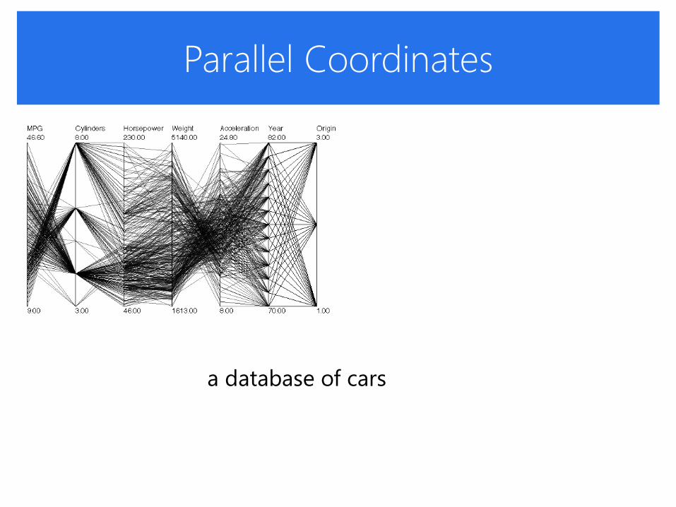
Parallel Coordinates
a database of cars
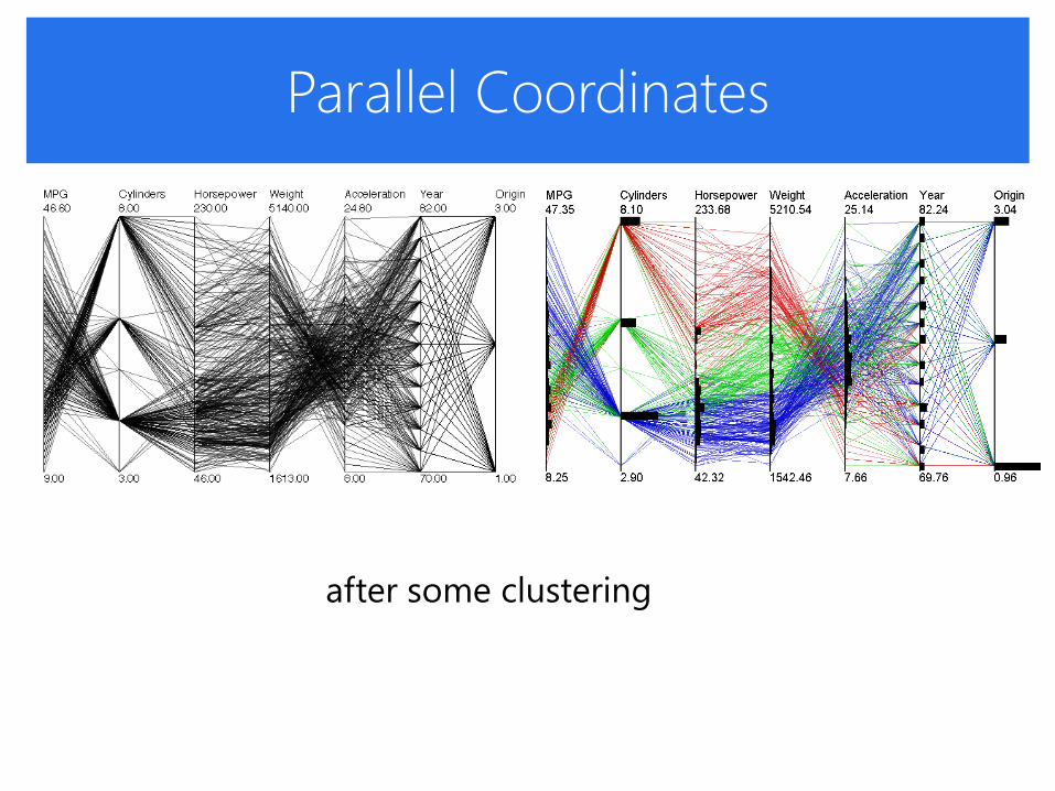
Parallel Coordinates
after some clustering
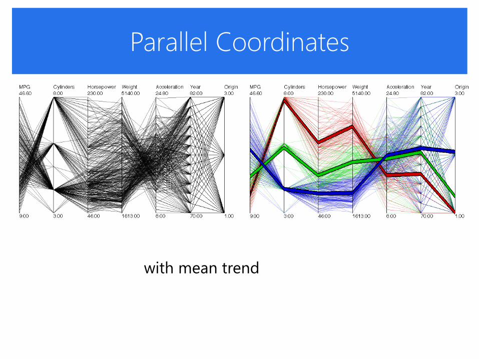
Parallel Coordinates
with mean trend

PC With Illustrative Abstraction
individual polylines

PC With Illustrative Abstraction
completely abstracted away

PC With Illustrative Abstraction
blended partially

PC With Illustrative Abstraction
all put together – three clusters
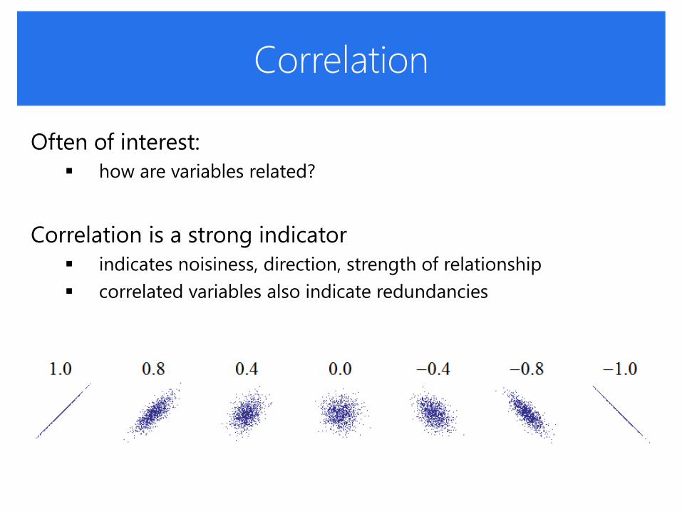
Correlation
Often of interest:
how are variables related?
Correlation is a strong indicator
indicates noisiness, direction, strength of relationship
correlated variables also indicate redundancies

Correlation
Often of interest:
how are variables related?
Correlation is a strong indicator
Pearson’s correlation
sample correlation
[( )( )]( , )( , )
x y
x y x y
E X YCov X YCorr X Y
1
2 2
1 1
( )( )
( ) ( )
n
i i
ixy
n n
i i
i i
x x y y
r
x x y x

Correlation Matrix
Build a matrix of pairwise Pearson’s correlations
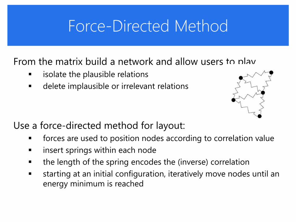
Force-Directed Method
From the matrix build a network and allow users to play
isolate the plausible relations
delete implausible or irrelevant relations
Use a force-directed method for layout:
forces are used to position nodes according to correlation value
insert springs within each node
the length of the spring encodes the (inverse) correlation
starting at an initial configuration, iteratively move nodes until an
energy minimum is reached

Correlation Graph
In the resulting network, for all attribute pairs
• vertices: attributes
• edges: correlation between attributes

Example:
Multivariate Analysis of University Data
Fused dataset of 50 US colleges
US News: academic rankings
College Prowler: survey on campus life attributes
Some interesting findings:
high variety in university settings
two clusters: academic + social
not overly correlated
higher academics fuller classes
lower income better sports
better academics lousy sports
higher population great nightlife

Case Study: Sales Strategy Analysis

Anatomy of a Sales Pipeline

The Setup
Scene:
a meeting of sales executives of a large corporation, Vandelay
Industries
Mission:
review the strategies of their various sales teams
Evidence:
data of three sales teams with a couple of hundred sales people
in each team
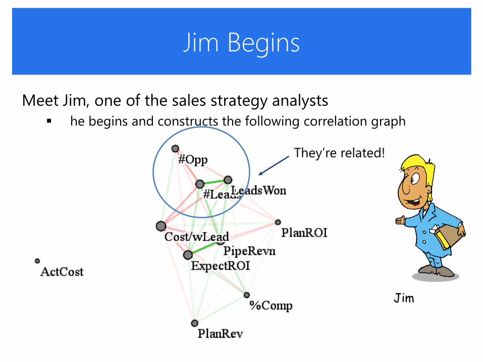
Jim Begins
Meet Jim, one of the sales strategy analysts
he begins and constructs the following correlation graph
Jim
They’re related!

Jim’s Story
He asks the TSP to compute an initial route
It gives rise to this parallel coordinate display

Jim’s Story
He asks the TSP to compute an initial route
It gives rise to this parallel coordinate display

Jim’s Story
He asks the TSP to compute an initial route
It gives rise to this parallel coordinate display

Kate Steps In
Now meet Kate, another sales analyst in the meeting room:
“Hey, cost/won lead is nearby and it has a positive correlation with
#opportunities but also a negative correlation with #won leads”
Kate

Kate’s Story
“Let’s go and make a more revealing route!”
so she uses the mouse and designs the route shown

Kate’s Story
“Let’s go and make a more revealing route!”
so she uses the mouse and designs the route shown
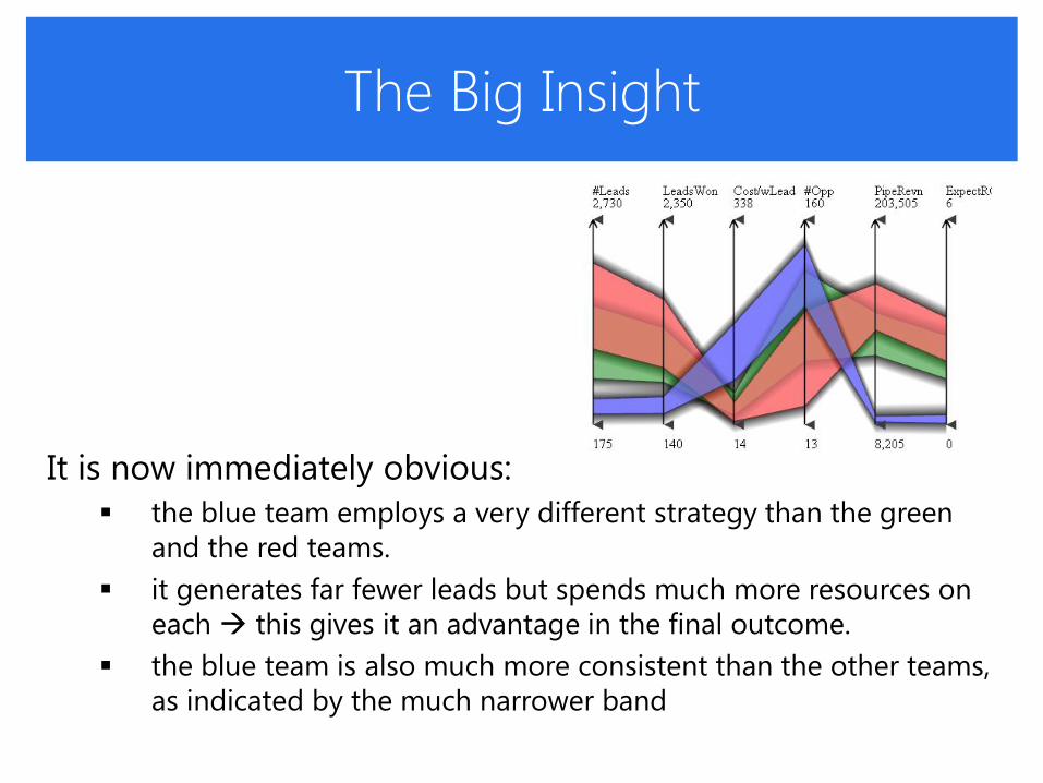
The Big Insight
It is now immediately obvious:
the blue team employs a very different strategy than the green
and the red teams.
it generates far fewer leads but spends much more resources on
each this gives it an advantage in the final outcome.
the blue team is also much more consistent than the other teams,
as indicated by the much narrower band

Further Insight
Kate notices something else:
now looking at the red team
there seems to be a spread in effectiveness among the team
the team splits into three distinct groups
She recommends: “Maybe fire the least effective group or at
least retrain them”

The Ultimate Goal:
Compute a Causal Model
Controversial topic
correlation causation
some promising casual inferencing algorithms exist
but inferring causation from observational data remains shaky
Gives correlation links casual directions
have the domain expert examine these and possible change them

Sales Team Example
The Visual Causality Analyst
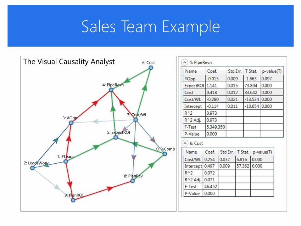
Sales Team Example
The Visual Causality Analyst

Another Ultimate Goal:
Arrive at a Good Decision
Often there is no perfectly optimal solution
choose the most acceptable solution among many options
take into account all factors and weigh the tradeoffs
Illustrative example
parents look for the best university
for their child
only so much money for tuition
but want great academics
and good athletics to boot

Tuition
Academic Score
Athletics
no dream school here: good athletics, low tuition, high academic score
tuition < financial means
tuition > financial means
1 2
3

Implementation

The ND-Scope
Parallel Coordinate Plot
Dynamic Scatterplot
Sight Map
Network Display
Geospatial Display
Spreadsheet

Related Publications
E. Papenhausen, B. Wang, S. Ha, A. Zelenyuk, D. Imre, K. Mueller, “GPU-Accelerated Incremental Correlation Clustering of Large Data with Visual Feedback,” 1st Workshop on Big Data Visualization, October, 2013
Z. Zhang, X. Tong, K. McDonnell, A. Zelenyuk, D. Imre, K. Mueller. "An Interactive Visual Analytics Framework for Multi-Field Data in a Geo-Spatial Context" Tsinghua Science and Technology on Visualization and Computer Graphics, 18(2), April, 2013.
J. Nam, K. Mueller, "TripAdvisorN-D: A Tourism-Inspired High-Dimensional Space Exploration Framework with Overview and Detail," IEEE Transactions on Visualization and Computer Graphics, 19(2): 291-305, 2013.
Z. Zhang, K. McDonnell, K. Mueller, "A Network-Based Interface for the Exploration of High-Dimensional Data Spaces, " IEEE Pacific Vis, Songdo, Korea, pp. 17-24, March, 2012
E. Nam, Y. Han, K. Mueller, A. Zelenyuk, and D. Imre, "ClusterSculptor: A Visual Analytics tool for high-dimensional data," IEEE Symposium on Visual Analytics Science and Technology 2007 (VAST '07),pp. 75-82, November, 2007

Support and Collaborators
Support from NSF, NIH, DOE, BNL, PNL, CEWIT
Faculty: Kevin T. McDonnell (Dowling College),
Domain scientists: Dr. Alla Zelenyuk, Dr. Dan Imre (PNL), Yangan Liu (BNL)
PhD students (at Stony Brook and SUNY Korea): Zhiyuan Zhang, Hyunjung Lee, Nafees Ahmed, Bing Wang,
Puripant (Joe) Ruchikachorn, Sungsoo Ha,, Jisung Kim, Eric Papenhausen, Salman Mahmood, Shenghui Cheng, Ziyi Zheng (PhD, now at Amazon). Julia EunJu Nam (PhD, now at Microsoft), Wei Xu (PhD, now at BNL)

More detail? Visit my Webpage…
http://www.cs.stonybrook.edu/~mueller
(for videos see dedicated paper web pages)
http://nd-scope.net
Any questions?

Application in Climate Science

Aerosol Mass Spectral Analysis
Collaborators:
Dr. Alla Zelenyuk (PNL)
Dr. Dan Imre
Data
particle mass spectra (450-D)
concentrations
size distributions
shape and density
atmospheric temperature
time and 3D location of acquisition
…

Aerosol Mass Spectral Analysis
Goals:
to understand the processes that control the atmos. aerosol life
cycle
to find the origins of climate change
to uncover and model the relationship between atmospheric
aerosols and climate
SPLAT II
can acquire up to 100 particles per second
sizes between 50-3,000 nm at a precision of 1 nm
creates a 450-D mass spectrum for each particle
acquires billions of particles per flight

Visualize Aggregations
Most widely used techniques in Climate Research:
pie charts
histogram
Came up with a
combined primitive

Visualize Relationships
Abstracted parallel coordinate display
show correlations directly within the display

Support Geo-Spatial References
Data are acquired in 3D
flight path and altitude matter

Support Coordinated Displays
All data Response Abstracted
Selection

Datasets - Global Seawater Oxygen-18
26,000 seawater measurements from all around the world
8 variables
longitude, latitude, month, year, depth, temperature, salinity,
oxygen composition ratio (18O )
18O good tracer of water origin
varies regionally and seasonally under some specific conditions
e,g. when salinity is nearly 0 psu, then the 18O typically has a
wide range of values
possible reasons can be precipitation, river flow, or glacier calving

Findings
Brushing PC plot to select data that have near-zero salinity
Observations
salinity is nearly 0 psu while the 18O has widely differing values
clearly see that all remaining points are at mouths of rivers
conclude that the most influencing factor appears to be junctures where fresh water meets salty water.
St. Lawrence River
Obskaya Gulf

Dataset – ISDAC
Acquired by SPLAT II on Flight 26 (F26), April 19-20, 2008
ISDAC = Indirect and Semi-Direct Aerosol Campaign
a month-long field campaign at the North Slope of Alaska
began in Barrow, Alaska and ended in Fairbanks, Alaska
short transit over a Department of Environment (DOE) ground site
followed by about 90 minutes of sampling a cloud at low-altitude.
then perform a spiral, climbing to an altitude of about 7000 m
proceed to Fairbanks

GE Embedded Visualization

Particle Compositions and Size Changes

Cloud Data Analysis

The ND-Scope
Parallel Coordinate Plot
Dynamic Scatterplot
Sight Map
Network Display
Geospatial Display
Spreadsheet

Related Publications
E. Papenhausen, B. Wang, S. Ha, A. Zelenyuk, D. Imre, K. Mueller, “GPU-Accelerated Incremental Correlation Clustering of Large Data with Visual Feedback,” 1st Workshop on Big Data Visualization, October, 2013
Z. Zhang, X. Tong, K. McDonnell, A. Zelenyuk, D. Imre, K. Mueller. "An Interactive Visual Analytics Framework for Multi-Field Data in a Geo-Spatial Context" Tsinghua Science and Technology on Visualization and Computer Graphics, 18(2), April, 2013.
J. Nam, K. Mueller, "TripAdvisorN-D: A Tourism-Inspired High-Dimensional Space Exploration Framework with Overview and Detail," IEEE Transactions on Visualization and Computer Graphics, 19(2): 291-305, 2013.
Z. Zhang, K. McDonnell, K. Mueller, "A Network-Based Interface for the Exploration of High-Dimensional Data Spaces, " IEEE Pacific Vis, Songdo, Korea, pp. 17-24, March, 2012
E. Nam, Y. Han, K. Mueller, A. Zelenyuk, and D. Imre, "ClusterSculptor: A Visual Analytics tool for high-dimensional data," IEEE Symposium on Visual Analytics Science and Technology 2007 (VAST '07),pp. 75-82, November, 2007

Support and Collaborators
Support from NSF, NIH, DOE, BNL, PNL, CEWIT
Faculty: Kevin T. McDonnell (Dowling College),
Domain scientists: Dr. Alla Zelenyuk, Dr. Dan Imre (PNL), Yangan Liu (BNL)
PhD students (at Stony Brook and SUNY Korea): Zhiyuan Zhang, Hyunjung Lee, Nafees Ahmed, Bing Wang,
Puripant (Joe) Ruchikachorn, Sungsoo Ha,, Jisung Kim, Eric Papenhausen, Salman Mahmood, Shenghui Cheng, Ziyi Zheng (PhD, now at Amazon). Julia EunJu Nam (PhD, now at Microsoft), Wei Xu (PhD, now at BNL)

More detail? Visit my Webpage…
http://www.cs.stonybrook.edu/~mueller
(for videos see dedicated paper web pages)
http://nd-scope.net
Any questions?


Scatterplots
Familiar for the display of bivariate relationships

Scatterplots
Multivariate relationships arranged in scatterplot matrices
not overly intuitive to perceive multivariate relationships

Scatterplot Matrices
Can’t see multivariate relationships
especially not when D is high

High-D Space is Hard to Navigate
And this is why you need…
Klaus Mueller Klaus Mueller

Taking a Trip in Real Life
1. Identify the sights
• use a map to identify the sights of interest and their location
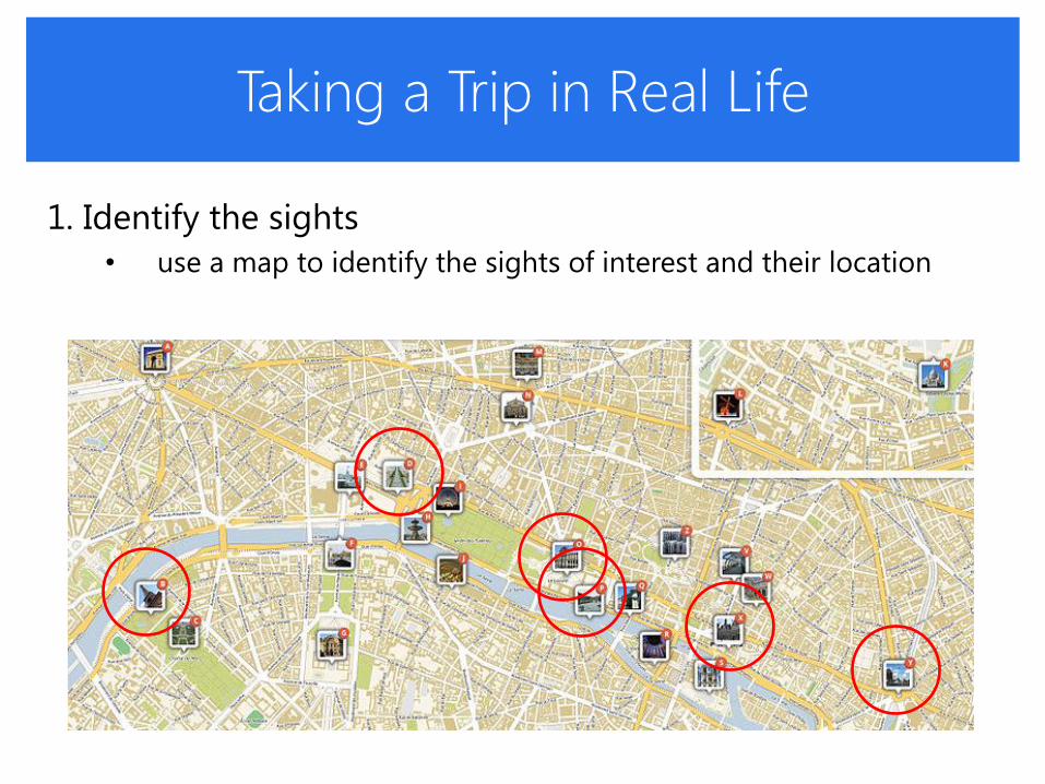
Taking a Trip in Real Life
1. Identify the sights
• use a map to identify the sights of interest and their location
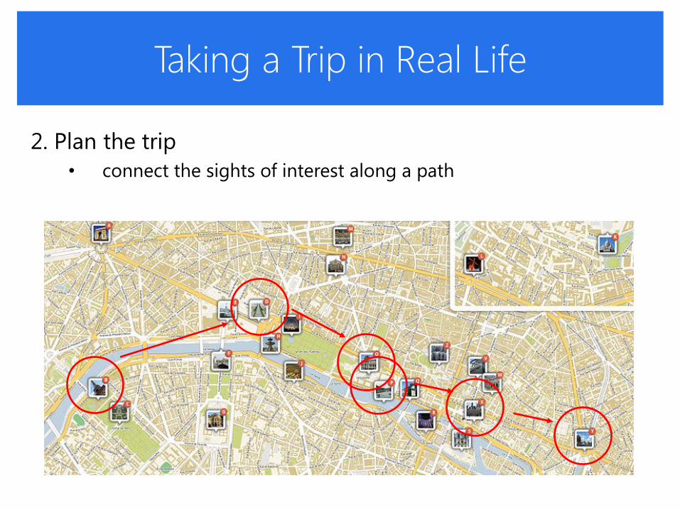
Taking a Trip in Real Life
2. Plan the trip
• connect the sights of interest along a path

Taking a Trip in Real Life
3. Go on the trip
• travel along the route
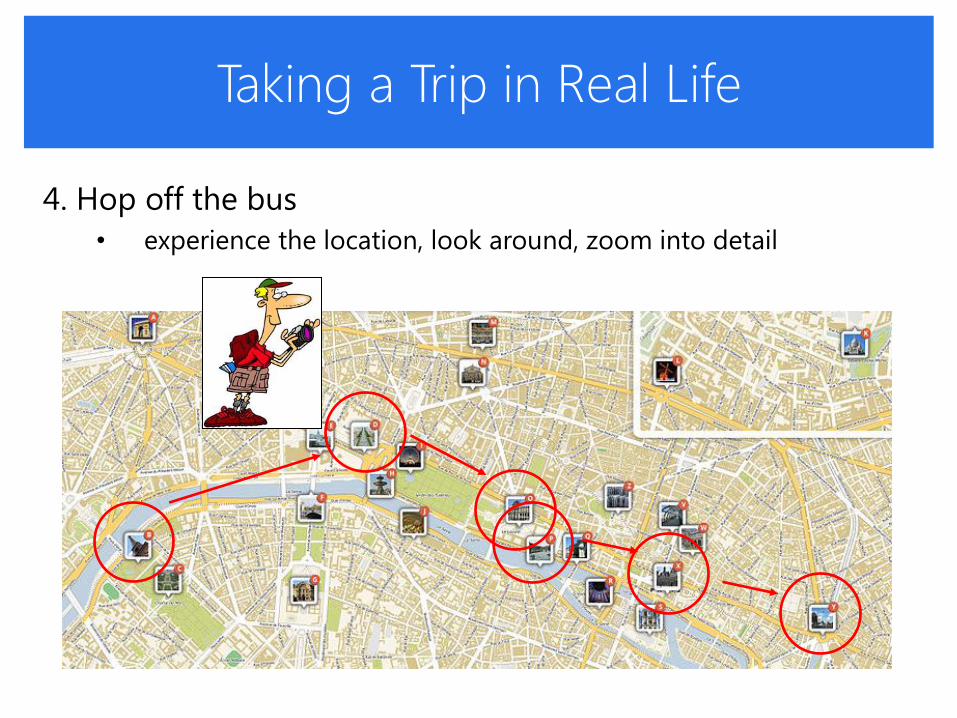
Taking a Trip in Real Life
4. Hop off the bus
• experience the location, look around, zoom into detail

Taking a Trip in Real Life
5. Orient and localize
• regain bearings in the map

Touring High-D Space…
Exploration goals find data configurations that best fit a personal preference in the
presence of trade-offs
find a data partitioning (a clustering) that best fits an exploratory domain model
Initial Sights key projections as obtained via PCA, projection pursuit, ..
key clusterings as obtained via k-means, affinity propagation, ..
In the tour… refine outcome of these automated routines
tune their parameters to better fit specific goals

User Interface: Sight Map

User Interface: Sight Map

User Interface: Sight Explorer

Alternative to Touchpad
Directly embed the touchpad into a trackball (latest version)