Embed Size (px)
Citation preview
1
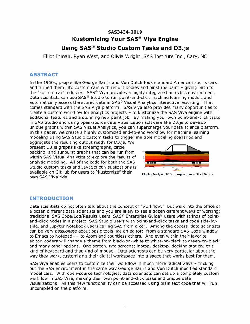
SAS3434-2019
Kustomizing Your SAS® Viya Engine
Using SAS® Studio Custom Tasks and D3.js
Elliot Inman, Ryan West, and Olivia Wright, SAS Institute Inc., Cary, NC
ABSTRACT
In the 1950s, people like George Barris and Von Dutch took standard American sports cars
and turned them into custom cars with rebuilt bodies and pinstripe paint – giving birth to
the “kustom car” industry. SAS® Viya provides a highly integrated analytics environment.
Data scientists can use SAS® Studio to run point-and-click machine learning models and
automatically access the scored data in SAS® Visual Analytics interactive reporting. That
comes standard with the SAS Viya platform. SAS Viya also provides many opportunities to
create a custom workflow for analytics projects – to kustomize the SAS Viya engine with
additional features and a stunning new paint job. By making your own point-and-click tasks
in SAS Studio and using open-source data visualization software like D3.js to develop
unique graphs within SAS Visual Analytics, you can supercharge your data science platform.
In this paper, we create a highly customized end-to-end workflow for machine learning
modeling using SAS Studio custom tasks to trigger multiple modeling scenarios and
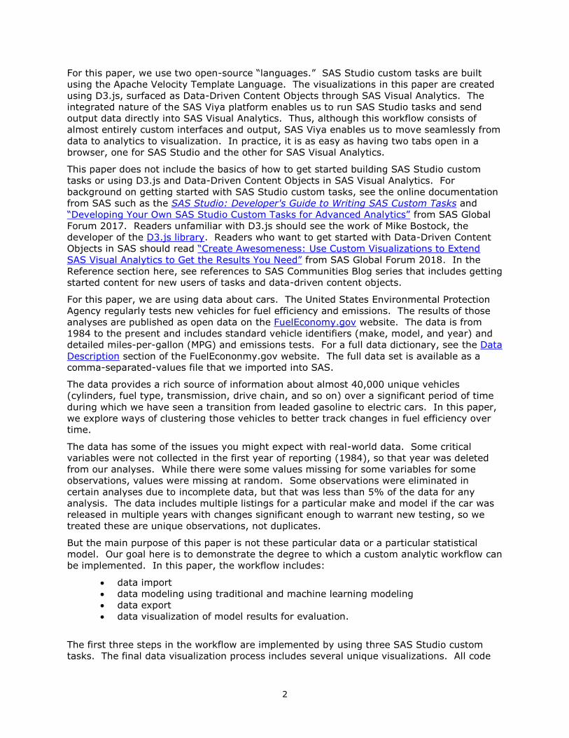
aggregate the resulting output ready for D3.js. We
present D3.js graphs like streamgraphs, circle
packing, and sunburst graphs that can be run from
within SAS Visual Analytics to explore the results of
analytic modeling. All of the code for both the SAS
Studio custom tasks and JavaScript visualizations is
available on GitHub for users to “kustomize” their
own SAS Viya ride.
INTRODUCTION
Data scientists do not often talk about the concept of “workflow.” But walk into the office of
a dozen different data scientists and you are likely to see a dozen different ways of working:
traditional SAS Code/Log/Results users, SAS® Enterprise Guide® users with strings of point-
and-click nodes in a project, SAS Studio users with point-and-click tasks and code side-by-
side, and Jupyter Notebook users calling SAS from a cell. Among the coders, data scientists
can be very passionate about basic tools like an editor: from a standard SAS Code window
to Emacs to Notepad++ to Atom and countless others. And even within their favorite
editor, coders will change a theme from black-on-white to white-on-black to green-on-black
and many other options. One screen, two screens; laptop, desktop, docking station; this
kind of keyboard and that kind of mouse. Data scientists can be very particular about the
way they work, customizing their digital workspace into a space that works best for them.
SAS Viya enables users to customize their workflow in much more radical ways – tricking
out the SAS environment in the same way George Barris and Von Dutch modified standard
model cars. With open-source technologies, data scientists can set up a completely custom
workflow in SAS Viya, making their own point-and-click tasks and unique data
visualizations. All this new functionality can be accessed using plain text code that will run
uncompiled on the platform.
2
For this paper, we use two open-source “languages.” SAS Studio custom tasks are built
using the Apache Velocity Template Language. The visualizations in this paper are created
using D3.js, surfaced as Data-Driven Content Objects through SAS Visual Analytics. The
integrated nature of the SAS Viya platform enables us to run SAS Studio tasks and send
output data directly into SAS Visual Analytics. Thus, although this workflow consists of
almost entirely custom interfaces and output, SAS Viya enables us to move seamlessly from
data to analytics to visualization. In practice, it is as easy as having two tabs open in a
browser, one for SAS Studio and the other for SAS Visual Analytics.
This paper does not include the basics of how to get started building SAS Studio custom
tasks or using D3.js and Data-Driven Content Objects in SAS Visual Analytics. For
background on getting started with SAS Studio custom tasks, see the online documentation
from SAS such as the SAS Studio: Developer's Guide to Writing SAS Custom Tasks and
“Developing Your Own SAS Studio Custom Tasks for Advanced Analytics” from SAS Global
Forum 2017. Readers unfamiliar with D3.js should see the work of Mike Bostock, the
developer of the D3.js library. Readers who want to get started with Data-Driven Content
Objects in SAS should read “Create Awesomeness: Use Custom Visualizations to Extend
SAS Visual Analytics to Get the Results You Need” from SAS Global Forum 2018. In the
Reference section here, see references to SAS Communities Blog series that includes getting
started content for new users of tasks and data-driven content objects.
For this paper, we are using data about cars. The United States Environmental Protection
Agency regularly tests new vehicles for fuel efficiency and emissions. The results of those
analyses are published as open data on the FuelEconomy.gov website. The data is from
1984 to the present and includes standard vehicle identifiers (make, model, and year) and
detailed miles-per-gallon (MPG) and emissions tests. For a full data dictionary, see the Data
Description section of the FuelEcononmy.gov website. The full data set is available as a
comma-separated-values file that we imported into SAS.
The data provides a rich source of information about almost 40,000 unique vehicles
(cylinders, fuel type, transmission, drive chain, and so on) over a significant period of time
during which we have seen a transition from leaded gasoline to electric cars. In this paper,
we explore ways of clustering those vehicles to better track changes in fuel efficiency over
time.
The data has some of the issues you might expect with real-world data. Some critical
variables were not collected in the first year of reporting (1984), so that year was deleted
from our analyses. While there were some values missing for some variables for some
observations, values were missing at random. Some observations were eliminated in
certain analyses due to incomplete data, but that was less than 5% of the data for any
analysis. The data includes multiple listings for a particular make and model if the car was
released in multiple years with changes significant enough to warrant new testing, so we
treated these are unique observations, not duplicates.
But the main purpose of this paper is not these particular data or a particular statistical
model. Our goal here is to demonstrate the degree to which a custom analytic workflow can
be implemented. In this paper, the workflow includes:
• data import
• data modeling using traditional and machine learning modeling
• data export
• data visualization of model results for evaluation.
The first three steps in the workflow are implemented by using three SAS Studio custom
tasks. The final data visualization process includes several unique visualizations. All code
3
for the SAS Studio custom tasks is available on the Task Tuesdays GitHub. All code for the
D3.js visualizations is available on the D3 Thursdays GitHub. These examples are also
described in greater detail in SAS Communities Blog Series posts for the Custom Task
Tuesdays series written by Olivia Wright and D3 Thursdays series written by Ryan West.
THREE CUSTOM TASKS
For our analytics workflow, we created three SAS Studio custom tasks. The first and last
tasks are utility tasks for loading data and saving scored output data and results. The
middle task is an all-in-one analytics process.
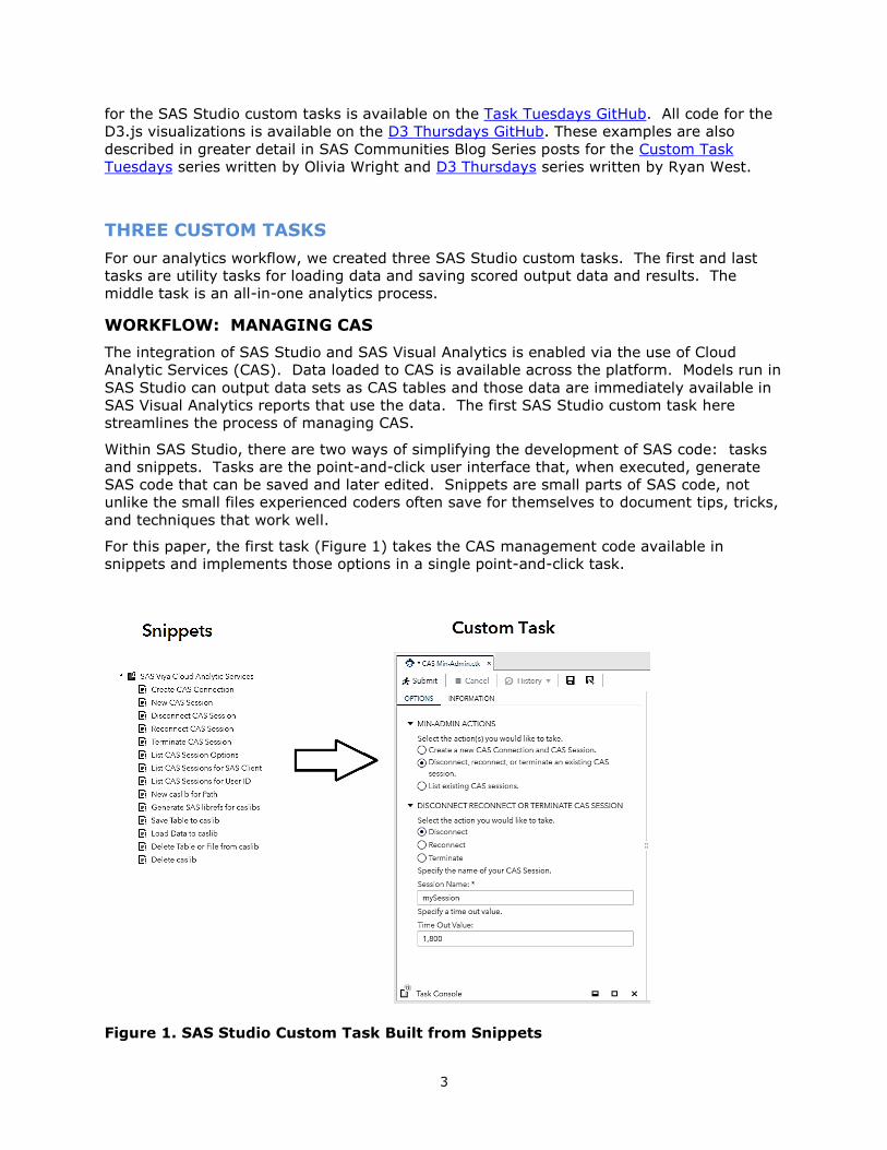
WORKFLOW: MANAGING CAS
The integration of SAS Studio and SAS Visual Analytics is enabled via the use of Cloud
Analytic Services (CAS). Data loaded to CAS is available across the platform. Models run in
SAS Studio can output data sets as CAS tables and those data are immediately available in
SAS Visual Analytics reports that use the data. The first SAS Studio custom task here
streamlines the process of managing CAS.
Within SAS Studio, there are two ways of simplifying the development of SAS code: tasks
and snippets. Tasks are the point-and-click user interface that, when executed, generate
SAS code that can be saved and later edited. Snippets are small parts of SAS code, not
unlike the small files experienced coders often save for themselves to document tips, tricks,
and techniques that work well.
For this paper, the first task (Figure 1) takes the CAS management code available in
snippets and implements those options in a single point-and-click task.
Figure 1. SAS Studio Custom Task Built from Snippets
4
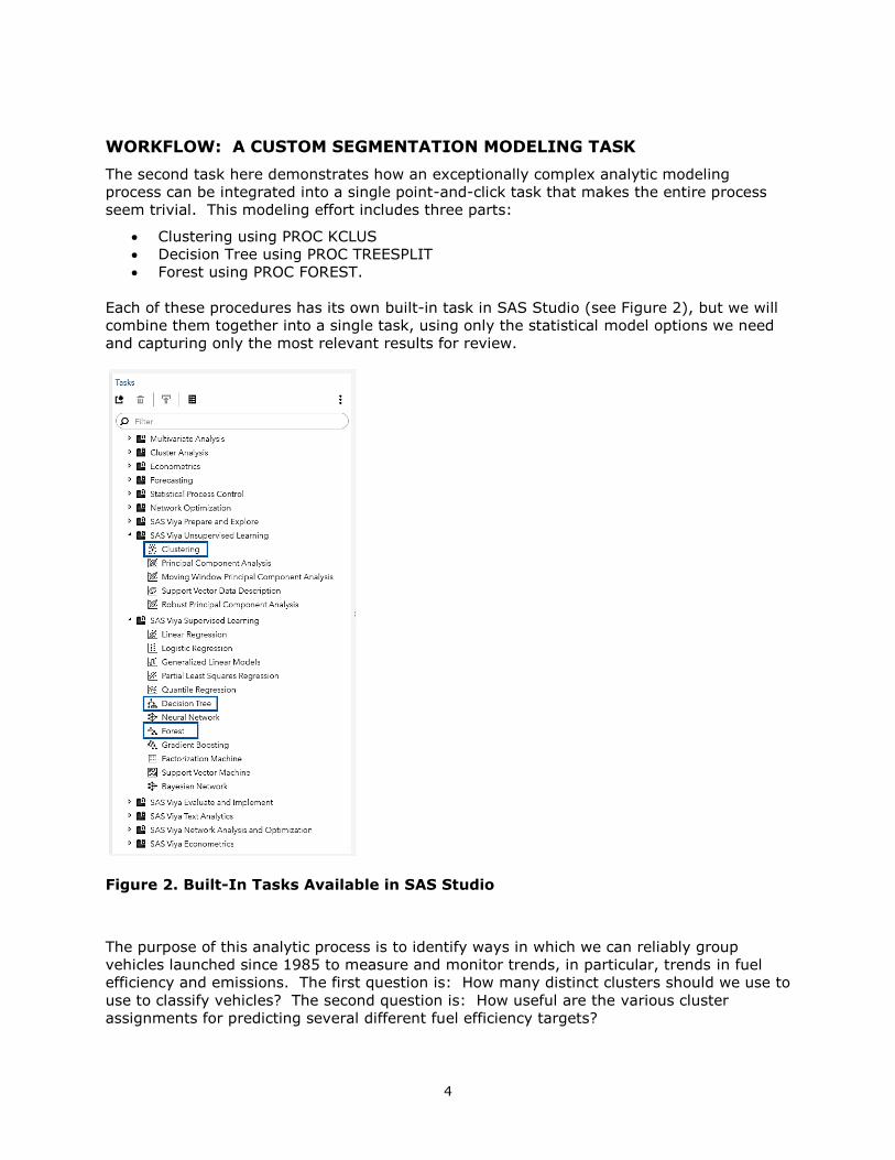
WORKFLOW: A CUSTOM SEGMENTATION MODELING TASK
The second task here demonstrates how an exceptionally complex analytic modeling
process can be integrated into a single point-and-click task that makes the entire process
seem trivial. This modeling effort includes three parts:
• Clustering using PROC KCLUS
• Decision Tree using PROC TREESPLIT
• Forest using PROC FOREST.
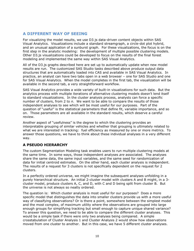
Each of these procedures has its own built-in task in SAS Studio (see Figure 2), but we will
combine them together into a single task, using only the statistical model options we need
and capturing only the most relevant results for review.
Figure 2. Built-In Tasks Available in SAS Studio
The purpose of this analytic process is to identify ways in which we can reliably group
vehicles launched since 1985 to measure and monitor trends, in particular, trends in fuel
efficiency and emissions. The first question is: How many distinct clusters should we use to
use to classify vehicles? The second question is: How useful are the various cluster
assignments for predicting several different fuel efficiency targets?

5
To determine the optimal number of clusters, we could rely on statistical measures like the
cubic clustering criterion, but our task here is a bit more complex. We want to be able to
group similar vehicles using clustering, independent of a specific target variable, because we
actually have more than one target. If we had only one target, we might simply implement
a decision tree or forest model, but we want to develop a clustering of vehicles that will be
useful for measuring multiple targets like mpg, emissions, and others. We want to be able
to evaluate multiple potential clustering solutions with the goal of finding a sufficiently good
clustering that will be useful for predicting several different targets.
For this process, the selection of variables was determined by the availability of the variable
over time and the degree to which the variable represented something of general
importance that was not uniquely identifying for a particular vehicle. Thus, we chose these
variables:
• the number of cylinders (cylinders)
• the engine displacement in liters (displ)
• the drive axle type (drive)
• the fuel type (fuelType)
• the transmission type (trany).
Our process automatically implements a set of independent cluster analysis models, each
with an increasing number of clusters specified per user input. In the following example,
the task will produce a solution for 2 clusters, 3 clusters, 4 clusters, 5 clusters, and 6
clusters. Figure 3 on the next page shows a screenshot of custom Segmentation Modeling
task and a partial listing of code generated by it.
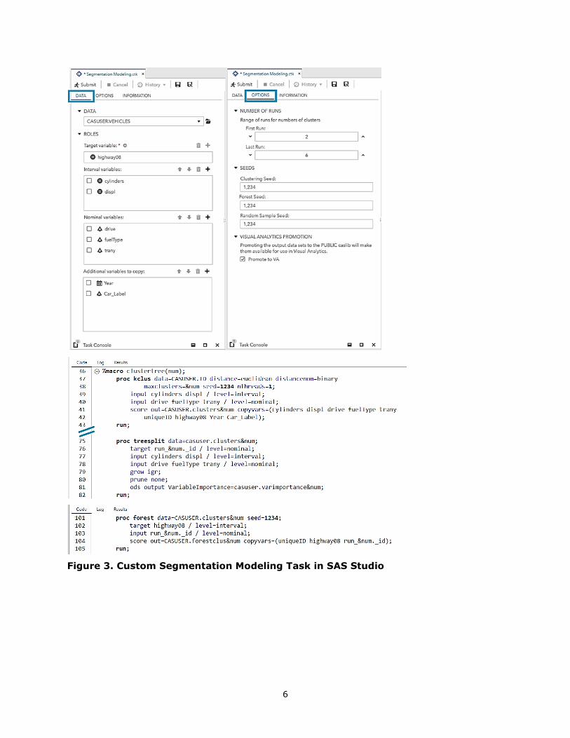
6
Figure 3. Custom Segmentation Modeling Task in SAS Studio
7
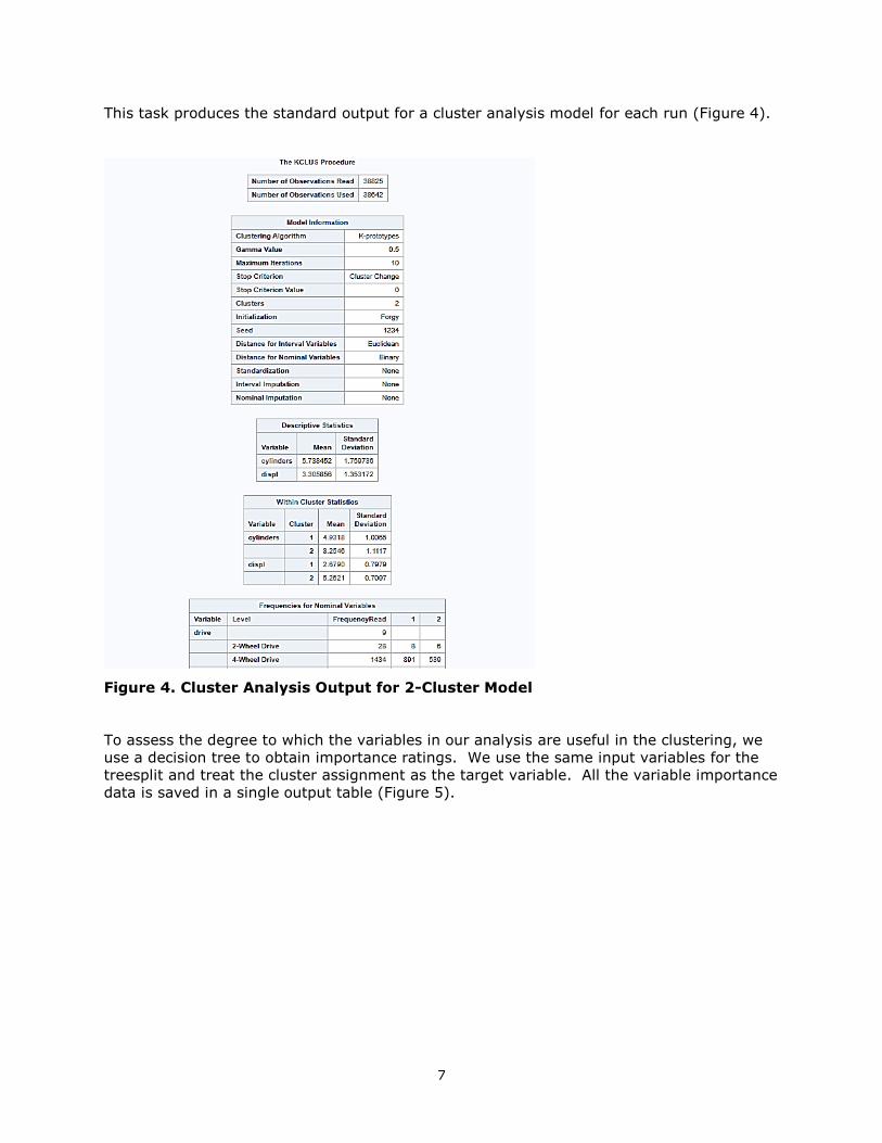
This task produces the standard output for a cluster analysis model for each run (Figure 4).
Figure 4. Cluster Analysis Output for 2-Cluster Model
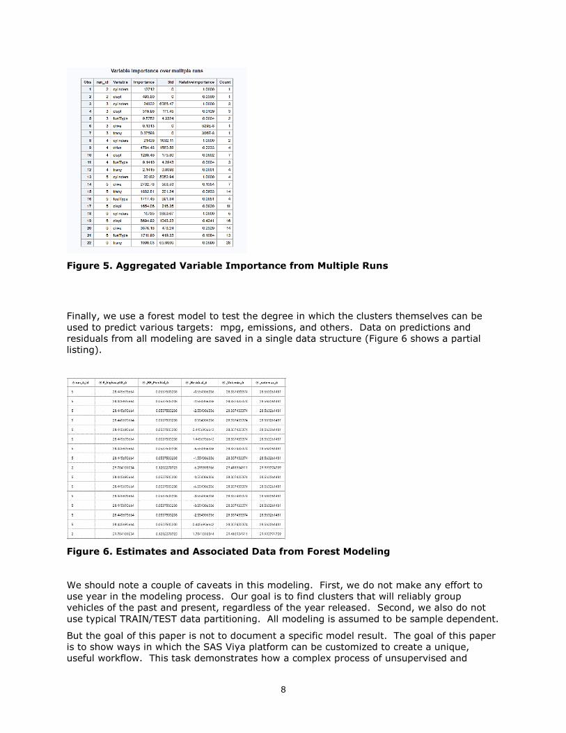
To assess the degree to which the variables in our analysis are useful in the clustering, we
use a decision tree to obtain importance ratings. We use the same input variables for the
treesplit and treat the cluster assignment as the target variable. All the variable importance
data is saved in a single output table (Figure 5).
8
Figure 5. Aggregated Variable Importance from Multiple Runs
Finally, we use a forest model to test the degree in which the clusters themselves can be
used to predict various targets: mpg, emissions, and others. Data on predictions and
residuals from all modeling are saved in a single data structure (Figure 6 shows a partial
listing).
Figure 6. Estimates and Associated Data from Forest Modeling
We should note a couple of caveats in this modeling. First, we do not make any effort to
use year in the modeling process. Our goal is to find clusters that will reliably group
vehicles of the past and present, regardless of the year released. Second, we also do not
use typical TRAIN/TEST data partitioning. All modeling is assumed to be sample dependent.
But the goal of this paper is not to document a specific model result. The goal of this paper
is to show ways in which the SAS Viya platform can be customized to create a unique,
useful workflow. This task demonstrates how a complex process of unsupervised and
9
supervised traditional and machine learning modeling can be combined into a single custom
task. While this example used vehicle data, the same custom task can be used with any
type of data for which an analyst wants to determine how many clusters would be best to
reliably classify entities over time relative to multiple targets of interest. This custom task
is portable and can easily be shared among analysts.
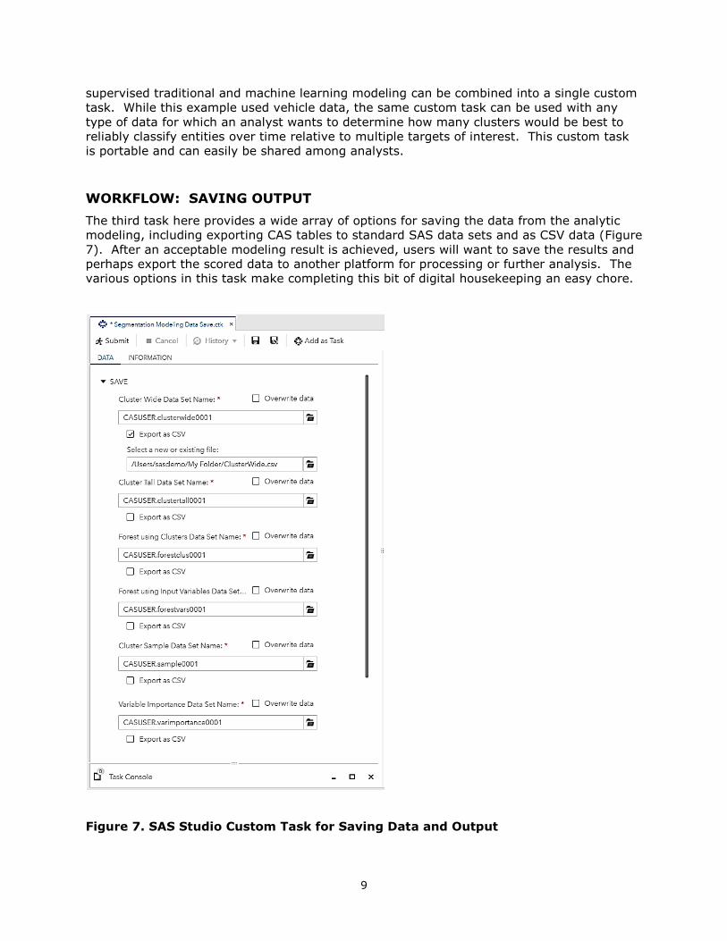
WORKFLOW: SAVING OUTPUT
The third task here provides a wide array of options for saving the data from the analytic
modeling, including exporting CAS tables to standard SAS data sets and as CSV data (Figure
7). After an acceptable modeling result is achieved, users will want to save the results and
perhaps export the scored data to another platform for processing or further analysis. The
various options in this task make completing this bit of digital housekeeping an easy chore.
Figure 7. SAS Studio Custom Task for Saving Data and Output
10
A DIFFERENT WAY OF SEEING
For visualizing the model results, we use D3.js data-driven content objects within SAS
Visual Analytics. Visualizations include a standard streamgraph, a circle-dot plot hybrid,
and an unusual application of a sunburst graph. For these visualizations, the focus is on the
first step in the analytic modeling: the development of multiple possible clustering models.
Other D3.js visualizations could be developed to focus on the results of the final forest
modeling and implemented the same way within SAS Visual Analytics.
All of the D3.js graphs described here are set up to automatically update when new model
results are run. The customized SAS Studio tasks described above produce output data
structures that are automatically loaded into CAS and available in SAS Visual Analytics. In
practice, an analyst can have two tabs open in a web browser – one for SAS Studio and one
for SAS Visual Analytics. When the model completes in the first tab, the visualization will be
available in the second tab, a very straightforward workflow.
SAS Visual Analytics provides a wide variety of built-in visualizations for such data. But the
analytics process with multiple iterations of alternative clustering models doesn’t lend itself
to standard visualizations. In the cluster analysis process, analysts can force a specific
number of clusters, from 2 to n. We want to be able to compare the results of those
independent analyses to see which will be most useful for our purposes. Part of the
question of “useful” is the statistical parameters that define fit, variable importance, and so
on. Those parameters are all available in the standard results, which deserve a careful
review.
Another aspect of “usefulness” is the degree to which the clustering provides an
interpretable grouping of similar vehicles and whether that grouping is ultimately related to
what we are interested in tracking: fuel efficiency as measured by one or more metrics. To
answer those questions, we have to think about these individual analyses in a very different
way.
A PSEUDO HIERARCHY
The custom Segmentation Modeling task enables users to run multiple clustering models at
the same time. In some ways, those independent analyses are associated. The analyses
share the same data, the same input variables, and the same seed for randomization of
data for initial centroid estimates. On the other hand, each cluster analysis is independent.
The results of a request for 3 clusters is not specifically dependent on the request for 2
clusters.
In a perfectly ordered universe, we might imagine the subsequent analyses unfolding in a
purely hierarchical structure. An initial 2-cluster model with clusters A and B might, in a 3-
cluster model, produce clusters A, C, and D, with C and D being split from cluster B. But
the universe is not always so neatly ordered.
The question is: Which cluster analysis is most useful for our purposes? Does a more
specific model that distinguishes the data into smaller clusters provide us with a more useful
way of classifying observations? Or is there a point, somewhere between the simplest model
and the most complex, of maximum utility where the observations are grouped into large
enough groups for simplifying tracking but small enough to capture unique shared variance?
To answer this question, we need to be able to compare the different cluster analyses. This
would be a simple task if there were only two analyses being compared. A simple
crosstabulation of Cluster Analysis 1 and Cluster Analysis 2 would show how observations
moved from one cluster to another. But in this case, we have 5 different cluster analyses.

11
This is a prime opportunity for data visualization to provide the data scientist with additional
insight, illuminating the space between pure quantitative and qualitative evaluation. But to
perform this comparison, we need to treat the individual analyses in an unusual manner.
We are going to assume that the individual analyses are related in what we might call a
“pseudo hierarchy.”
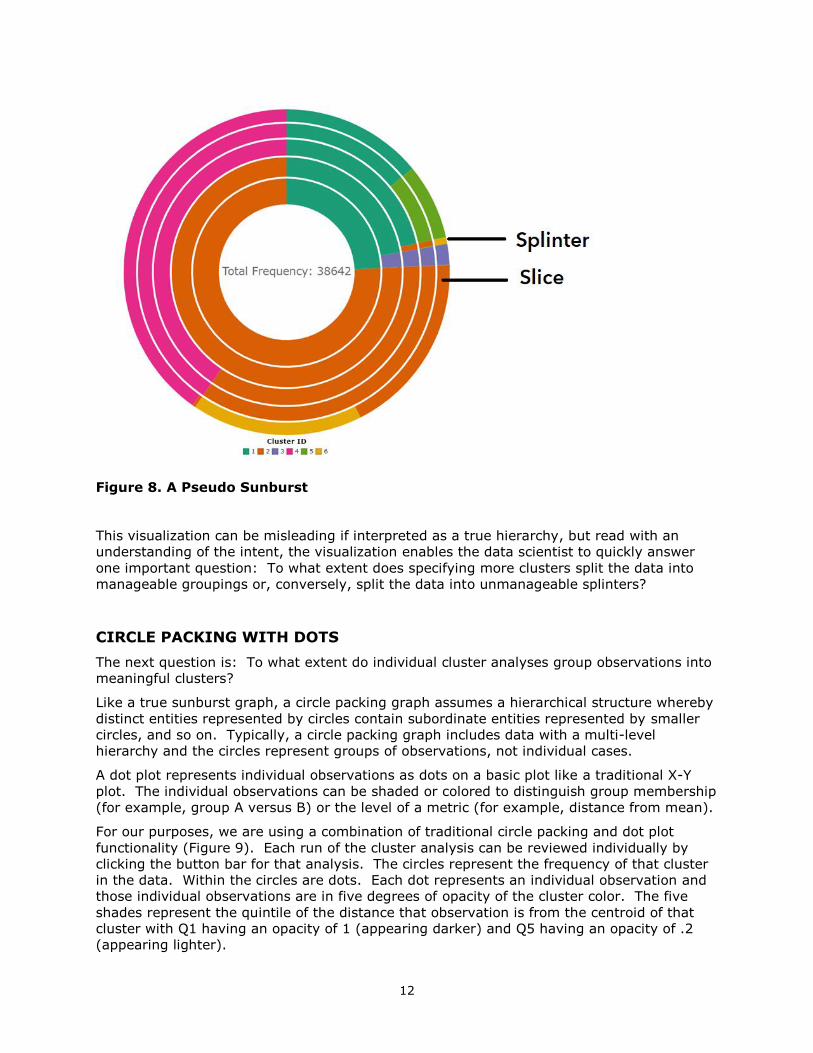
A PSEUDO SUNBURST
A sunburst graph is a type of hierarchical, multi-ring pie chart where outer rings represent
subsegments of the previous inner rings. This graph is commonly used for truly hierarchical
data where the inner ring is a superordinate category and the outer rings are subordinate to
their antecedents. For our purposes, we are treating each clustering analysis as a ring of
the sunburst to assess the degree to which subsequent modeling is or is not simply splitting
previous clusters into smaller clusters.
While this might initially seem like a complex visual task, in the end, it is actually quite
simple. The sunburst graph should be read from the middle out. The question is: Are
increasingly outermost rings made up of “slices” (large groups of observations) or
“splinters” (small groups of observations)?
In Figure 8, reading outward, you see that dividing the data into a greater number of
clusters does not result in much splintering. The initial innermost 2-cluster solution is
divided into two clusters (the green and orange slices). Going out one ring, in the 3-cluster
solution, there is a third slice (purple) that is actually a relatively small proportion of the
data. Moving outward from the 3-cluster to 4-cluster solution, we have the first appearance
of a splinter (thin orange splinter), a very small number of cases broken apart in from a
previous cluster, all of which were derived from one of the two initial clusters. The
outermost ring includes 6 slices, but only one true splinter. The 6-cluster solution seems to
work just as well as the others in defining substantial groupings of similar vehicles,
providing greater specificity without resulting in too many small, over-specified groupings.
12
Figure 8. A Pseudo Sunburst
This visualization can be misleading if interpreted as a true hierarchy, but read with an
understanding of the intent, the visualization enables the data scientist to quickly answer
one important question: To what extent does specifying more clusters split the data into
manageable groupings or, conversely, split the data into unmanageable splinters?
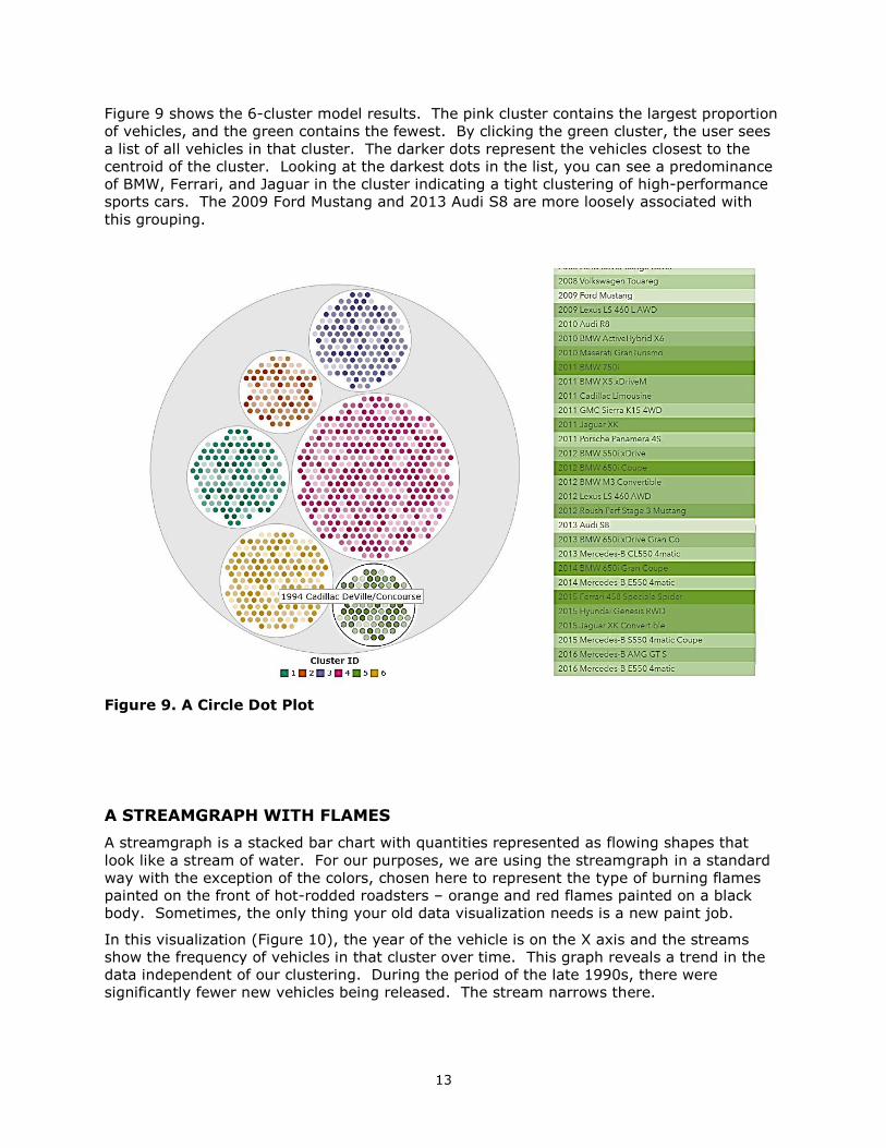
CIRCLE PACKING WITH DOTS
The next question is: To what extent do individual cluster analyses group observations into
meaningful clusters?
Like a true sunburst graph, a circle packing graph assumes a hierarchical structure whereby
distinct entities represented by circles contain subordinate entities represented by smaller
circles, and so on. Typically, a circle packing graph includes data with a multi-level
hierarchy and the circles represent groups of observations, not individual cases.
A dot plot represents individual observations as dots on a basic plot like a traditional X-Y
plot. The individual observations can be shaded or colored to distinguish group membership
(for example, group A versus B) or the level of a metric (for example, distance from mean).
For our purposes, we are using a combination of traditional circle packing and dot plot
functionality (Figure 9). Each run of the cluster analysis can be reviewed individually by
clicking the button bar for that analysis. The circles represent the frequency of that cluster
in the data. Within the circles are dots. Each dot represents an individual observation and
those individual observations are in five degrees of opacity of the cluster color. The five
shades represent the quintile of the distance that observation is from the centroid of that
cluster with Q1 having an opacity of 1 (appearing darker) and Q5 having an opacity of .2
(appearing lighter).
13
Figure 9 shows the 6-cluster model results. The pink cluster contains the largest proportion
of vehicles, and the green contains the fewest. By clicking the green cluster, the user sees
a list of all vehicles in that cluster. The darker dots represent the vehicles closest to the
centroid of the cluster. Looking at the darkest dots in the list, you can see a predominance
of BMW, Ferrari, and Jaguar in the cluster indicating a tight clustering of high-performance
sports cars. The 2009 Ford Mustang and 2013 Audi S8 are more loosely associated with
this grouping.
Figure 9. A Circle Dot Plot
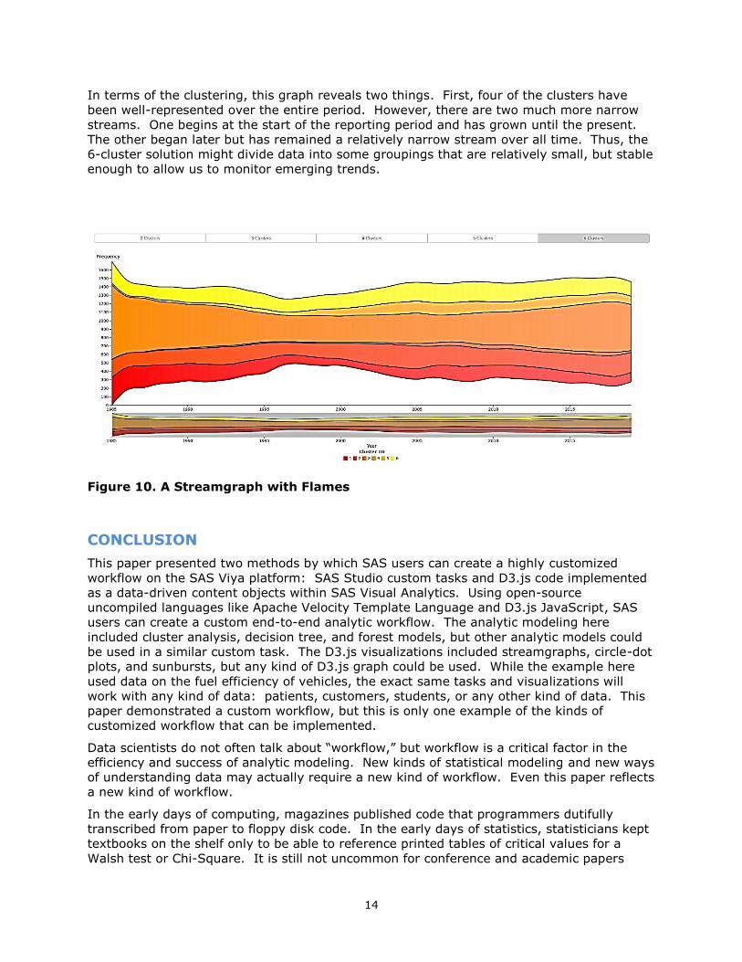
A STREAMGRAPH WITH FLAMES
A streamgraph is a stacked bar chart with quantities represented as flowing shapes that
look like a stream of water. For our purposes, we are using the streamgraph in a standard
way with the exception of the colors, chosen here to represent the type of burning flames
painted on the front of hot-rodded roadsters – orange and red flames painted on a black
body. Sometimes, the only thing your old data visualization needs is a new paint job.
In this visualization (Figure 10), the year of the vehicle is on the X axis and the streams
show the frequency of vehicles in that cluster over time. This graph reveals a trend in the
data independent of our clustering. During the period of the late 1990s, there were
significantly fewer new vehicles being released. The stream narrows there.
14
In terms of the clustering, this graph reveals two things. First, four of the clusters have
been well-represented over the entire period. However, there are two much more narrow
streams. One begins at the start of the reporting period and has grown until the present.
The other began later but has remained a relatively narrow stream over all time. Thus, the
6-cluster solution might divide data into some groupings that are relatively small, but stable
enough to allow us to monitor emerging trends.
Figure 10. A Streamgraph with Flames
CONCLUSION
This paper presented two methods by which SAS users can create a highly customized
workflow on the SAS Viya platform: SAS Studio custom tasks and D3.js code implemented
as a data-driven content objects within SAS Visual Analytics. Using open-source
uncompiled languages like Apache Velocity Template Language and D3.js JavaScript, SAS
users can create a custom end-to-end analytic workflow. The analytic modeling here
included cluster analysis, decision tree, and forest models, but other analytic models could
be used in a similar custom task. The D3.js visualizations included streamgraphs, circle-dot
plots, and sunbursts, but any kind of D3.js graph could be used. While the example here
used data on the fuel efficiency of vehicles, the exact same tasks and visualizations will
work with any kind of data: patients, customers, students, or any other kind of data. This
paper demonstrated a custom workflow, but this is only one example of the kinds of
customized workflow that can be implemented.
Data scientists do not often talk about “workflow,” but workflow is a critical factor in the
efficiency and success of analytic modeling. New kinds of statistical modeling and new ways
of understanding data may actually require a new kind of workflow. Even this paper reflects
a new kind of workflow.
In the early days of computing, magazines published code that programmers dutifully
transcribed from paper to floppy disk code. In the early days of statistics, statisticians kept
textbooks on the shelf only to be able to reference printed tables of critical values for a
Walsh test or Chi-Square. It is still not uncommon for conference and academic papers
15
published as a PDF to include pages of code that are, at best, copied and clumsily
reformatted into usable code.
This paper is not that paper. The fuel economy data for this paper was retrieved from the
internet as open data. Information about Apache Velocity Template Language and D3.js is
readily available on the internet with numerous user forums populated by helpful (mostly)
programmers and data scientists willing to answer questions from beginners. The manuals
SAS once printed, manuals for SAS Studio custom tasks and manuals for SAS Visual
Analytics, are now available at no cost online.
This paper, itself, is a kind of antiquated artifact, like a folded paper map or a vinyl record.
But this is just a guide. Readers of this paper are invited to access all the code for these
examples and to contribute their own code and comments to our shared efforts to develop
better ways of understanding data. All of the code for the SAS Studio custom tasks and
D3.js visualizations presented in this paper is available on GitHub and described in greater
detail in an associated SAS Communities Blog Series -- a virtual community of real data
scientists. We look forward to working with you there.
REFERENCES
Inman, Elliot and Olivia Wright. 2018. “Developing Your Own SAS Studio Custom Tasks for
Advanced Analytics.” Proceedings of the SAS Global Forum 2017 Conference. Cary, NC:
SAS Institute Inc. Available
https://support.sas.com/resources/papers/proceedings17/SAS0677-2017.pdf
Powell, Robby and Renato Luppi. 2018. “Create Awesomeness: Use Custom Visualizations to
Extend SAS Visual Analytics to Get the Results You Need.” Proceedings of the SAS Global
Forum 2018 Conference. Cary, NC: SAS Institute Inc. Available https://www.sas.com/content/dam/SAS/support/en/sas-global-forum-proceedings/2018/1800-2018.pdf
Task Tuesdays GitHub.
https://github.com/sassoftware/sas-studio-tasks/tree/master/contributed/tasktuesdays
Task Tuesdays Communities.
https://communities.sas.com/t5/tag/Custom%20Task%20Tuesday/tg-p/board-id/library
D3 Thursday GitHub. https://github.com/sassoftware/sas-visualanalytics-thirdpartyvisualizations/tree/master/samples/D3Thursday
D3 Thursday Communities.
https://communities.sas.com/t5/tag/D3%20Thursday/tg-p/board-id/library
U.S. Department of Energy, Vehicle Data from Fuel Economy. Accessed February 27, 2019.
Available https://www.fueleconomy.gov/feg/epadata/vehicles.csv.zip

16
CONTACT INFORMATION
Your comments and questions are valued and encouraged. Contact the authors at:
Elliot Inman, Ph.D.
Manager, Software Development
SAS Global Hosting and US Professional Services Division
(919) 531-1717
Ryan West
Software Developer
SAS Global Hosting and US Professional Services Division
(919) 531-4837
Twitter: @rbwest48
https://www.linkedin.com/in/ryanbwest/
Olivia Wright
Software Developer
SAS Global Hosting and US Professional Services Division
(919) 531-3262
Twitter: @OliviaJWright https://www.linkedin.com/in/oliviajwright/
SAS and all other SAS Institute Inc. product or service names are registered trademarks or
trademarks of SAS Institute Inc. in the USA and other countries. ® indicates USA
registration.
Other brand and product names are trademarks of their respective companies.