Embed Size (px)
Citation preview

Judgment and Decision Making, Vol. 9, No. 1, January 2014, pp. 1–14
Lay understanding of probability distributions
Daniel G. Goldstein∗ David Rothschild∗
Abstract
How accurate are laypeople’s intuitions about probability distributions of events? The economic and psychological
literatures provide opposing answers. A classical economic view assumes that ordinary decision makers consult perfect
expectations, while recent psychological research has emphasized biases in perceptions. In this work, we test laypeople’s
intuitions about probability distributions. To establish a ground truth against which accuracy can be assessed, we control
the information seen by each subject to establish unambiguous normative answers. We find that laypeople’s statistical
intuitions can be highly accurate, and depend strongly upon the elicitation method used. In particular, we find that eliciting
an entire distribution from a respondent using a graphical interface, and then computing simple statistics (such as means,
fractiles, and confidence intervals) on this distribution, leads to greater accuracy, on both the individual and aggregate
level, than the standard method of asking about the same statistics directly.
Keywords: probability, polling, graphical interface, distribution, expectation, frequencies, biases.
1 Introduction
How accurate are laypeople’s statistical intuitions about
probability distributions? Turning to the literature, eco-
nomics and psychology seem to provide opposing answers
to this question. Classical economics assumes people ar-
rive at perfect expectations, while psychological research
has emphasized that perceptions of means and variances
are subject to many biases. For example, anchoring and
underadjustment (Tversky & Kahneman, 1974), and pri-
macy and recency effects (Deese & Kaufman, 1957) are
thought to cause subjective expectations to deviate system-
atically from the objective truth.
When people’s statistical intuitions about a problem de-
viate from a normative answer, a few possible paths merit
exploration. One is to question the normative answer (i.e.,
what information and assumptions are used to arrive at
the supposedly correct answer?), a second is to question
people’s general cognitive capacities (i.e., given the nec-
essary information and assumptions, are people’s mental
representations systematically deficient?), and a third is
to ask how the question was asked (e.g., does the elici-
tation technique distort respondents’ ability to communi-
cate what they know?). In this work, we test the accuracy
of people’s intuitions about probability distributions. To
settle the question of what is normative, we use a con-
trolled task in which normative answers can be computed
for each subject. To shed light on whether deviations from
the normative answers are due to biased mental represen-
Copyright: © 2013. The authors license this article under the terms
of the Creative Commons Attribution 3.0 License.∗Microsoft Research, NYC, 641 6th Ave., 7th Floor, NYC, NY
10011. Emails: [email protected]; [email protected].
tations or difficulty with specific response formats, we test
two different methods of eliciting information about distri-
butions from laypeople. One method is graphical and the
other is stated. Should both methods result in similarly in-
correct responses, it would be consistent with biased men-
tal representations. However, if one response method all
but eliminates deviations from the normative answers on
a number of different metrics, it would be consistent with
the idea that people have rather accurate underlying men-
tal representations that they are better able to express in
some response formats than in others.
Our specific objective in this work is to test the accuracy
of laypeople’s forecasts about numeric information in the
environment. We chose numeric information because the
information stream of contemporary life is permeated with
numbers—such as the prices, weights, distances, dura-
tions, temperatures, and scores found in the news media—
on which economic forecasts are often based. We com-
pare a graphical elicitation procedure (henceforth graphi-
cal method) in which respondents visually “draw” an en-
tire probability distribution to a standard, stated method
(henceforth standard method) in which key statistics and
fractiles of a distribution are asked about directly.
We find that the graphical method is substantially bet-
ter than the standard method in both individual-level ac-
curacy (the mean absolute difference between individuals’
answers and the correct answers) and aggregated-level ac-
curacy (the mean absolute difference between averaged
individual responses and the correct answers). The re-
sults are robust across 10 different measures and several
methods of assessing accuracy. Further, they hold even
when the standard method is helped as much as possible
by cleaning data ex-post. In addition to obtaining more in-
formation than the standard method, the graphical method
1
Judgment and Decision Making, Vol. 9, No. 1, January 2014 Lay understanding of probability distributions 2
also seems to mitigate irrelevant presentation effects.
We describe here the task at a high level; a more de-
tailed description will come in the Methods section. In
the experiment, subjects sit at a computer screen and are
told that they will see 100 numbers (which represent a
sample from a larger population) flash before their eyes
in rapid succession. Their task is to predict how a future
sample from this same population might look. Subjects
in the graphical method condition use an interactive tool
to specify this hypothetical future sample: they essentially
draw a histogram using a simple interface. Subjects in the
standard method condition, in contrast, are asked to re-
spond to direct questions about how a future sample would
look, specifying, for instance its extreme values, median,
fractiles, and the like. Both techniques are ways of elicit-
ing distributions. Since the normative properties of future
samples are known in this task, the elicited distributions
can be compared in terms of accuracy on a variety of mea-
sures.
We next review the relevant literature, describe a multi-
condition experiment and its results, and conclude with a
discussion of implications for survey research as well as
economic and psychological studies of decision making.
1.1 Literature review
The notion of people as intuitive statisticians has a long
history, dating back to Laplace and embraced in the 20th
century by Brunswik (Peterson & Beach, 1967). This view
holds that probability theory and statistics both serve as a
norm against which intuitive inference can be judged, as
well as a codification of how people think. As Laplace said
of probability theory, it is but “common sense reduced to
a calculus” (Laplace 1814/1951). For useful reviews of
this extensive literature, see O’Hagan et al., (2006), Jenk-
inson (2005), Gigerenzer & Murray (1987) and Wallsten
& Budescu (1983). From this broad topic, we isolate here
a set of themes that are particularly relevant to this inves-
tigation.
Eliciting statistics of a univariate distribution. Eliciting
subjective statistical information from experts is a com-
mon problem with applications to forecasting, decision-
making, risk assessment and providing priors for Bayesian
statistical analysis (for a review, see O’Hagan et al., 2006).
There are several ways to assess beliefs about univariate
distributions. Fractile-based methods (e.g., Lau, Lau, &
Ho, 1998) ask people to state values such that various per-
centages of observations fall above or below them. For
instance, respondents might be asked to state what they
believe to be the 90th percentile of a distribution. Alterna-
tively, a probability-based method provides the respondent
with a value, and then asks the respondents to state the
percentage of observations they feel would fall above or
below that value. For example, respondents may be asked
what percentage of a distribution is greater than the value
750. Whether providing fractiles and recording respon-
dents’ estimated values, or providing values and recording
respondents’ estimated fractiles, distributions can be fit to
the responses. Neither method seems to dominate in terms
of obtaining calibrated estimates (O’Hagan et al., p. 102).
An often-reported finding with this approach is that esti-
mated subjective distributions tend to be too narrow. In
one characterization of an “overconfidence effect” confi-
dence intervals that are supposed to be 90% likely to con-
tain a true answer are often found to bracket the truth 50%
of the time or less (Lichtenstein et al., 1982). In what fol-
lows, we shall see if this holds in both elicitation formats.
An alternative method to elicit a histogram is to pro-
vide respondents bins of values and have them assign per-
centages of values that would fall within each bin. The
earliest reference we find to this method is Kabus (1976,
pointed to by Jenkinson, 2005), which provides an exam-
ple in which respondents are given bins consisting of in-
terest rates one year in the future (e.g, 4%, 4.25%, . . . ,
6.75%) and asked to assign probabilities to each bin such
that they sum to 100%. A similar method has been used
for decades by the Federal Reserve Bank of Philadel-
phia’s Survey of Professional Forecasters, in which expert
economists assign probabilities to ranges of variables such
as inflation.1 The histogram method is developed further
by Van Noortwijk et al. (1992), who created a computer in-
terface (for use by experts with the assistance of a trained
analyst) that allows respondents to alter the number (and
accordingly size) of bins as well as the expected number
of events that would fall within each. While the method
looks promising, it is hard to draw conclusions about its
effectiveness as the authors do not report an experiment or
provide a view of the user interface.
Goldstein, Sharpe and colleagues (Sharpe, Goldstein,
& Blythe, 2000; Goldstein, Johnson, & Sharpe, 2008)
created the graphical Distribution Builder methodology in
which bins are fixed and subjects assign probabilities to
bins by dragging stacks of markers into the bins. For
instance, when there are 100 markers, each represents a
probability of 1% and all 100 must be dragged into bins for
the distribution to be submitted. The authors cite psycho-
logical principles on which the method is based and find it
to have good test-retest reliability and validity for predict-
ing risk preferences, even a year into the future. More re-
cently, Delavande & Rohwedder (2008) introduced a sim-
ilar “balls and bins” method in which respondents are told
they must allocate a certain number (e.g., 20) of chances
or balls into a fixed set of bins by clicking icons to al-
ter the quantity in each bin while being shown the total
number of balls they need to re-allocate. Most recently,
1Here is a sample form from 1981: http://www.phil.frb.org/research-
and-data/real-time-center/survey-of-professional-forecasters/form-
examples/form81.pdf.
Judgment and Decision Making, Vol. 9, No. 1, January 2014 Lay understanding of probability distributions 3
Haran, Moore and Morewedge (2010) describe a “Subjec-
tive Probability Interval Estimate” (SPIES) method. As it
presents bins and asks people to state numeric probabili-
ties, it is similar to the histogram method of Kabus, with
the exception that its bins are assumed to be exhaustive
and that probabilities are forced not to exceed 100%.
The graphical method we present here is closest to the
Distribution Builder and the “balls and bins” methods. In-
stead of eliciting numerical fractiles or values, we present
subjects with 100 graphical markers. We chose this graph-
ical interface to confer the advantages of expressing prob-
abilities as frequencies (X out of 100) and because, by
design, it elicits only distributions with probabilities that
sum to 100%. Furthermore, it necessarily eliminates con-
fused, non-monotonic patterns of response that can arise in
fractile- and probability-based methods (e.g., stating that
the probability of exceeding a future income of $100,000
is less than the probability of exceeding a future income of
$200,000). A last advantage of a visual histogram method
is that Ibrekk and Morgan (1987, p. 527) found untrained
laypeople to prefer seeing information in histogram form,
relative to eight other roughly-equivalent representations,
such as CDFs, continuous densities, point ranges, box
plots, etc. While these properties of the graphical method
seem desirable from a psychological point of view, choice
of method should be an empirical decision. The literature
is silent on which method is superior, a topic we turn to
next.
Evaluating elicited distributions. To our knowledge,
very little testing has been done to compare graphical
and stated elicitation techniques when a “ground truth”
is known. Much is written on the topic of eliciting sub-
jective belief distributions, (e.g., Winkler, 1967; Staël von
Holstein, 1971; Van Lenthe, 1993a, b), however it is dif-
ficult to judge whether a subjective distribution has been
“well elicited” or not. Proxies to deal with this problem
have been proposed, for instance: checking how often
90% confidence intervals derived from elicited distribu-
tions bracket a correct answer across a number of prob-
lems (Haran, Moore, & Morewedge, 2010). Generaliza-
tions from this research have been that standard fractiles
and probability-based methods elicit confidence intervals
that are too narrow (e.g., Lichtenstein et al., 1982). An-
other metric for evaluating elicitation techniques is test-
retest reliability (Van Lenthe, 1993a, b; Goldstein, John-
son, Sharpe, 2008). While authors have appreciated that
different elicitation techniques lead to varying degrees of
calibration, and that method-induced bias is a basic prob-
lem, it was noted some years ago that “there is no con-
sensus about the question of which elicitation technique is
to be preferred” (van Lenthe, 1993b, p. 385). We believe
that this remains the case. However, insight can perhaps
be gained by moving away from studying belief distribu-
tions that cannot be judged in terms of accuracy (except
for calibration in aggregate) and towards distributions that
can be compared to a normative answer. In what follows,
we present the same sample of information to all subjects
(to provide a common base of knowledge) and then pose
questions about future samples that can be compared to a
normative ground truth.
Experienced frequencies. At the beginning of the ex-
perimental session, we chose to present numbers visually
in rapid succession for two reasons. First, we wanted to
establish a controlled sample of information that is fixed
within groups of subjects so that we could calculate nor-
mative answers. Second, we wanted to exploit an infor-
mation format that communicates probabilities in a way
people find easy to understand. A large literature on fre-
quency encoding (e.g., Hasher & Zacks, 1979; Hasher
& Zacks, 1984) suggests that encoding in frequencies is
relatively automatic and accurate. Kaufmann, Weber, &
Haisley (2013) find people experiencing frequencies over
time in a graphical risk tool had a better understanding of
the characteristics of a risky asset than those who were
simply provided with summary statics or a static distri-
bution. In addition, Hogarth & Soyer (2011) find that
people’s assessments of probabilities are much more ac-
curate when they are based on simulated experiences as
opposed to forecasting models. Note that the “decisions
from experience” literature (e.g., Hertwig et al, 2004; Hau,
Pleskac, & Hertwig, 2010), finds that people may under-
weight experienced probabilities relative to stated proba-
bilities. These results are generally based on choices be-
tween mixed gambles and involve the weighting of finan-
cial payoffs and risk attitudes. As such, it is difficult to
disentangle accuracy of perceptions from complexity of
preferences. Underweighting in choice is not the same as
underestimating in a forecast. The unambiguous norma-
tive answers in our task will allow us to directly test for
over- and under-estimation of probabilities in forecasts.
Cognitive biases. In the experiment that follows, we
present respondents with samples of numerical informa-
tion as a sequence of numbers and then ask the respon-
dents for generalizations about future samples. The in-
formation is presented sequentially over time. However,
these temporal and sequential aspects are irrelevant to the
generalization task, just as the order of values that occur in
a series of die rolls is irrelevant for determining whether
the die is loaded. Nonetheless, the workings of human
cognition can make irrelevant information hard to ignore.
Beliefs are influenced by the order in which information
is presented (Hogarth & Einhorn, 1992). Primacy and
recency effects (Deese & Kaufman, 1957) might suggest
that the first and last items sampled may have special influ-
ence when generalizing to future samples. Anchoring ef-
fects (Tversky & Kahneman, 1974) might cause responses
to be pulled in the direction of a prominent number, such
as the mode of a distribution. Peak-end biases in remem-
Judgment and Decision Making, Vol. 9, No. 1, January 2014 Lay understanding of probability distributions 4
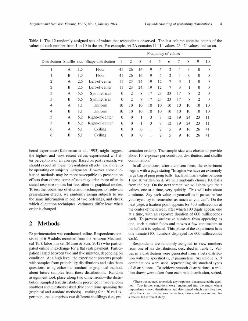
Table 1: The 12 randomly-assigned sets of values that respondents observed. The last column contains counts of the
values of each number from 1 to 10 in the set. For example, set 2A contains 11 “1” values, 23 “2” values, and so on.
Frequency of values
Distribution Shuffle α,β Shape distribution 1 2 3 4 5 6 7 8 9 10
1 A 1,5 Floor 41 26 16 9 5 2 1 0 0 0
1 B 1,5 Floor 41 26 16 9 5 2 1 0 0 0
2 A 2,5 Left-of-center 11 23 24 19 12 7 3 1 0 0
2 B 2,5 Left-of-center 11 23 24 19 12 7 3 1 0 0
3 A 5,5 Symmetrical 0 2 8 17 23 23 17 8 2 0
3 B 5,5 Symmetrical 0 2 8 17 23 23 17 8 2 0
4 A 1,1 Uniform 10 10 10 10 10 10 10 10 10 10
4 B 1,1 Uniform 10 10 10 10 10 10 10 10 10 10
5 A 5,2 Right-of-center 0 0 1 3 7 12 19 24 23 11
5 B 5,2 Right-of-center 0 0 1 3 7 12 19 24 23 11
6 A 5,1 Ceiling 0 0 0 1 2 5 9 16 26 41
6 B 5,1 Ceiling 0 0 0 1 2 5 9 16 26 41
bered experience (Kahneman et al., 1993) might suggest
the highest and most recent values experienced will al-
ter perceptions of an average. Based on past research, we
should expect all these “presentation effects” and more, to
be operating on subjects’ judgments. However, some elic-
itation methods may be more susceptible to presentation
effects than others; some effects may arise more often in
stated response modes but less often in graphical modes.
To test the robustness of elicitation techniques to irrelevant
presentation effects, we randomly assign subjects to see
the same information in one of two orderings, and check
which elicitation techniques’ estimates differ least when
order is changed.
2 Methods
Experimentation was conducted online. Respondents con-
sisted of 619 adults recruited from the Amazon Mechani-
cal Turk labor market (Mason & Suri, 2012) who partici-
pated online in exchange for a flat cash payment. Partici-
pation lasted between two and five minutes, depending on
condition. At a high level, the experiment presents people
with samples from probability distributions and asks them
questions, using either the standard or graphical method,
about future samples from these distributions. Random
assignment took place along two dimensions—the distri-
bution sampled (six distributions presented in two random
shuffles) and questions asked (five conditions spanning the
graphical and standard methods)—making for a 30 cell ex-
periment that comprises two different shufflings (i.e., pre-
sentation orders). The sample size was chosen to provide
about 10 responses per condition, distribution, and shuffle
combination.2
In all conditions, after a consent form, the experiment
begins with a page stating “Imagine we have an extremely
large bag of ping pong balls. Each ball has a value between
1 and 10 written on it. We will randomly choose 100 balls
from the bag. On the next screen, we will show you their
values, one at a time, very quickly. This will take about
a minute. Say each value to yourself as it passes before
your eyes; try to remember as much as you can”. On the
next page, a fixation point appears for 450 milliseconds at
the center of the screen, after which 100 digits appear, one
at a time, with an exposure duration of 600 milliseconds
each. To prevent successive numbers from appearing as
one, each number fades and moves a few centimeters to
the left as it is replaced. This phase of the experiment lasts
one minute (100 numbers displayed for 600 milliseconds
each).
Respondents are randomly assigned to view numbers
from one of six distributions, described in Table 1. Val-
ues in a distribution were generated from a beta distribu-
tion with the specified α, β parameters. Six unique α, β
combinations were used, representing six standard types
of distributions. To achieve smooth distributions, a mil-
lion draws were taken from each beta distribution, sorted,
2There was no need to exclude any responses that answered the ques-
tion. Two further conditions were randomized into the study, where
respondents viewed distributions and determined which ones they saw,
rather than create distributions themselves; those conditions are used for
a related, but different study.
Judgment and Decision Making, Vol. 9, No. 1, January 2014 Lay understanding of probability distributions 5
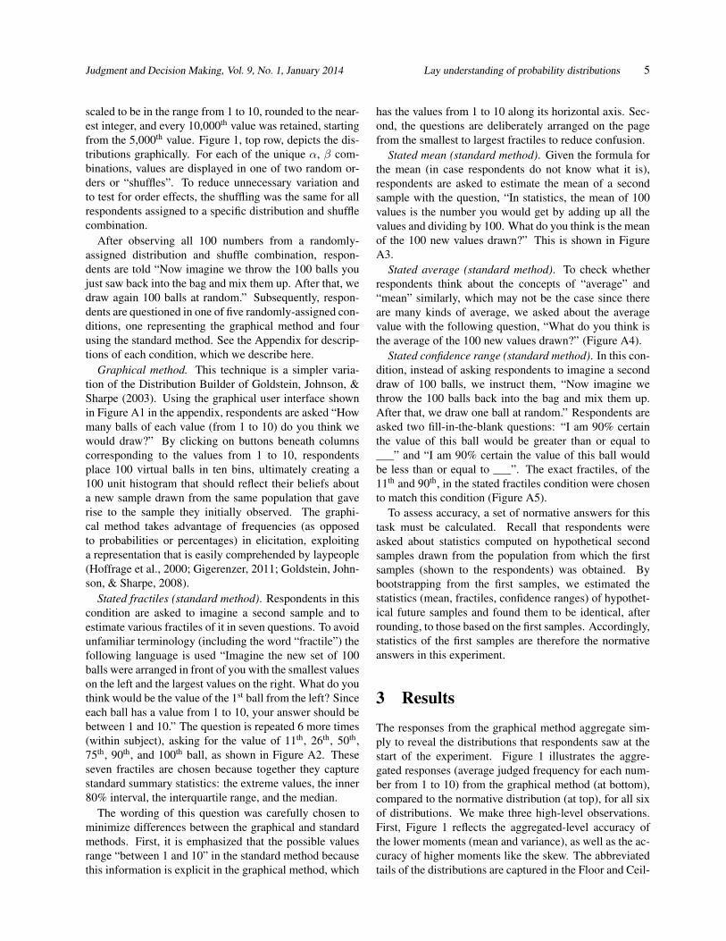
scaled to be in the range from 1 to 10, rounded to the near-
est integer, and every 10,000th value was retained, starting
from the 5,000th value. Figure 1, top row, depicts the dis-
tributions graphically. For each of the unique α, β com-
binations, values are displayed in one of two random or-
ders or “shuffles”. To reduce unnecessary variation and
to test for order effects, the shuffling was the same for all
respondents assigned to a specific distribution and shuffle
combination.
After observing all 100 numbers from a randomly-
assigned distribution and shuffle combination, respon-
dents are told “Now imagine we throw the 100 balls you
just saw back into the bag and mix them up. After that, we
draw again 100 balls at random.” Subsequently, respon-
dents are questioned in one of five randomly-assigned con-
ditions, one representing the graphical method and four
using the standard method. See the Appendix for descrip-
tions of each condition, which we describe here.
Graphical method. This technique is a simpler varia-
tion of the Distribution Builder of Goldstein, Johnson, &
Sharpe (2003). Using the graphical user interface shown
in Figure A1 in the appendix, respondents are asked “How
many balls of each value (from 1 to 10) do you think we
would draw?” By clicking on buttons beneath columns
corresponding to the values from 1 to 10, respondents
place 100 virtual balls in ten bins, ultimately creating a
100 unit histogram that should reflect their beliefs about
a new sample drawn from the same population that gave
rise to the sample they initially observed. The graphi-
cal method takes advantage of frequencies (as opposed
to probabilities or percentages) in elicitation, exploiting
a representation that is easily comprehended by laypeople
(Hoffrage et al., 2000; Gigerenzer, 2011; Goldstein, John-
son, & Sharpe, 2008).
Stated fractiles (standard method). Respondents in this
condition are asked to imagine a second sample and to
estimate various fractiles of it in seven questions. To avoid
unfamiliar terminology (including the word “fractile”) the
following language is used “Imagine the new set of 100
balls were arranged in front of you with the smallest values
on the left and the largest values on the right. What do you
think would be the value of the 1st ball from the left? Since
each ball has a value from 1 to 10, your answer should be
between 1 and 10.” The question is repeated 6 more times
(within subject), asking for the value of 11th, 26th, 50th,
75th, 90th, and 100th ball, as shown in Figure A2. These
seven fractiles are chosen because together they capture
standard summary statistics: the extreme values, the inner
80% interval, the interquartile range, and the median.
The wording of this question was carefully chosen to
minimize differences between the graphical and standard
methods. First, it is emphasized that the possible values
range “between 1 and 10” in the standard method because
this information is explicit in the graphical method, which
has the values from 1 to 10 along its horizontal axis. Sec-
ond, the questions are deliberately arranged on the page
from the smallest to largest fractiles to reduce confusion.
Stated mean (standard method). Given the formula for
the mean (in case respondents do not know what it is),
respondents are asked to estimate the mean of a second
sample with the question, “In statistics, the mean of 100
values is the number you would get by adding up all the
values and dividing by 100. What do you think is the mean
of the 100 new values drawn?” This is shown in Figure
A3.
Stated average (standard method). To check whether
respondents think about the concepts of “average” and
“mean” similarly, which may not be the case since there
are many kinds of average, we asked about the average
value with the following question, “What do you think is
the average of the 100 new values drawn?” (Figure A4).
Stated confidence range (standard method). In this con-
dition, instead of asking respondents to imagine a second
draw of 100 balls, we instruct them, “Now imagine we
throw the 100 balls back into the bag and mix them up.
After that, we draw one ball at random.” Respondents are
asked two fill-in-the-blank questions: “I am 90% certain
the value of this ball would be greater than or equal to
___” and “I am 90% certain the value of this ball would
be less than or equal to ___”. The exact fractiles, of the
11th and 90th, in the stated fractiles condition were chosen
to match this condition (Figure A5).
To assess accuracy, a set of normative answers for this
task must be calculated. Recall that respondents were
asked about statistics computed on hypothetical second
samples drawn from the population from which the first
samples (shown to the respondents) was obtained. By
bootstrapping from the first samples, we estimated the
statistics (mean, fractiles, confidence ranges) of hypothet-
ical future samples and found them to be identical, after
rounding, to those based on the first samples. Accordingly,
statistics of the first samples are therefore the normative
answers in this experiment.
3 Results
The responses from the graphical method aggregate sim-
ply to reveal the distributions that respondents saw at the
start of the experiment. Figure 1 illustrates the aggre-
gated responses (average judged frequency for each num-
ber from 1 to 10) from the graphical method (at bottom),
compared to the normative distribution (at top), for all six
of distributions. We make three high-level observations.
First, Figure 1 reflects the aggregated-level accuracy of
the lower moments (mean and variance), as well as the ac-
curacy of higher moments like the skew. The abbreviated
tails of the distributions are captured in the Floor and Ceil-
Judgment and Decision Making, Vol. 9, No. 1, January 2014 Lay understanding of probability distributions 6
Figure 1: The aggregated responses from the graphical method (bottom) compared to the distributions rapidly presented
to subjects at the start of the experiment, which is the normative distribution (top).
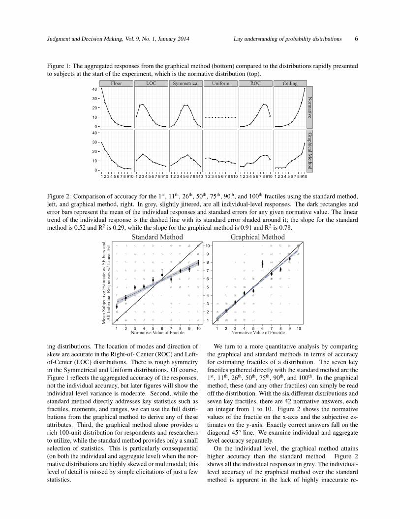
Figure 2: Comparison of accuracy for the 1st, 11th, 26th, 50th, 75th, 90th, and 100th fractiles using the standard method,
left, and graphical method, right. In grey, slightly jittered, are all individual-level responses. The dark rectangles and
error bars represent the mean of the individual responses and standard errors for any given normative value. The linear
trend of the individual response is the dashed line with its standard error shaded around it; the slope for the standard
method is 0.52 and R2 is 0.29, while the slope for the graphical method is 0.91 and R2 is 0.78.
ing distributions. The location of modes and direction of
skew are accurate in the Right-of- Center (ROC) and Left-
of-Center (LOC) distributions. There is rough symmetry
in the Symmetrical and Uniform distributions. Of course,
Figure 1 reflects the aggregated accuracy of the responses,
not the individual accuracy, but later figures will show the
individual-level variance is moderate. Second, while the
standard method directly addresses key statistics such as
fractiles, moments, and ranges, we can use the full distri-
butions from the graphical method to derive any of these
attributes. Third, the graphical method alone provides a
rich 100-unit distribution for respondents and researchers
to utilize, while the standard method provides only a small
selection of statistics. This is particularly consequential
(on both the individual and aggregate level) when the nor-
mative distributions are highly skewed or multimodal; this
level of detail is missed by simple elicitations of just a few
statistics.
We turn to a more quantitative analysis by comparing
the graphical and standard methods in terms of accuracy
for estimating fractiles of a distribution. The seven key
fractiles gathered directly with the standard method are the
1st, 11th, 26th, 50th, 75th, 90th, and 100th. In the graphical
method, these (and any other fractiles) can simply be read
off the distribution. With the six different distributions and
seven key fractiles, there are 42 normative answers, each
an integer from 1 to 10. Figure 2 shows the normative
values of the fractile on the x-axis and the subjective es-
timates on the y-axis. Exactly correct answers fall on the
diagonal 45° line. We examine individual and aggregate
level accuracy separately.
On the individual level, the graphical method attains
higher accuracy than the standard method. Figure 2
shows all the individual responses in grey. The individual-
level accuracy of the graphical method over the standard
method is apparent in the lack of highly inaccurate re-
Judgment and Decision Making, Vol. 9, No. 1, January 2014 Lay understanding of probability distributions 7
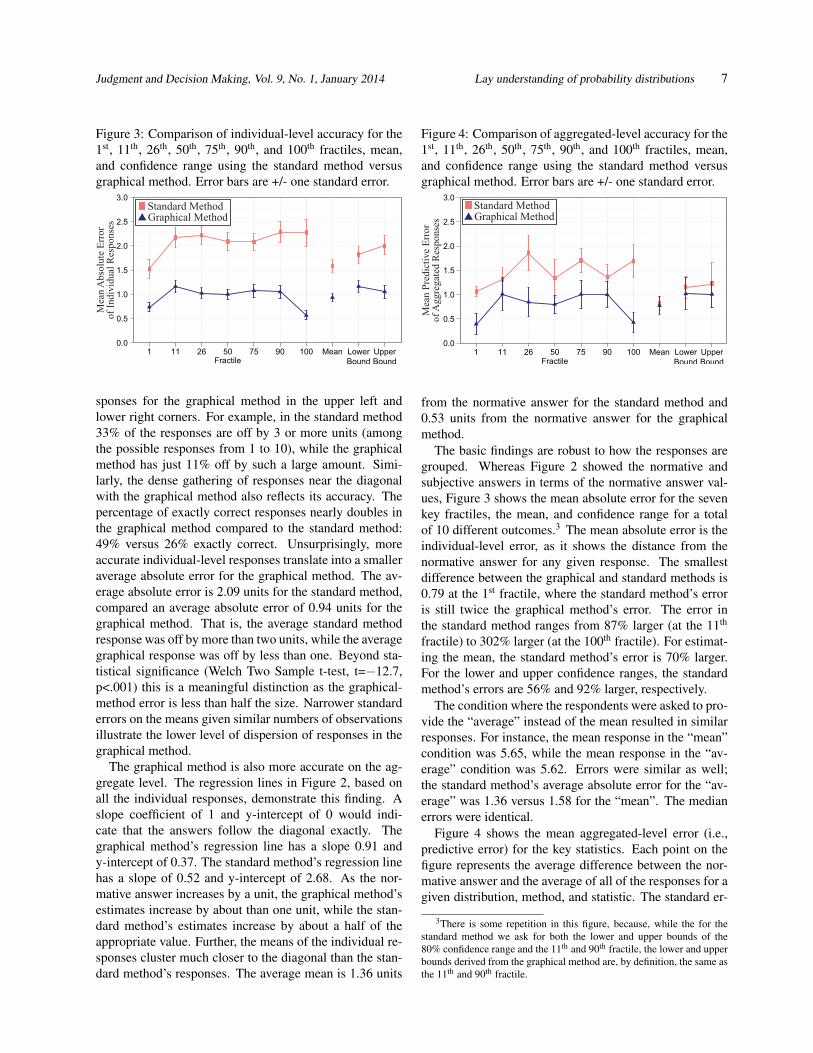
Figure 3: Comparison of individual-level accuracy for the
1st, 11th, 26th, 50th, 75th, 90th, and 100th fractiles, mean,
and confidence range using the standard method versus
graphical method. Error bars are +/- one standard error.
sponses for the graphical method in the upper left and
lower right corners. For example, in the standard method
33% of the responses are off by 3 or more units (among
the possible responses from 1 to 10), while the graphical
method has just 11% off by such a large amount. Simi-
larly, the dense gathering of responses near the diagonal
with the graphical method also reflects its accuracy. The
percentage of exactly correct responses nearly doubles in
the graphical method compared to the standard method:
49% versus 26% exactly correct. Unsurprisingly, more
accurate individual-level responses translate into a smaller
average absolute error for the graphical method. The av-
erage absolute error is 2.09 units for the standard method,
compared an average absolute error of 0.94 units for the
graphical method. That is, the average standard method
response was off by more than two units, while the average
graphical response was off by less than one. Beyond sta-
tistical significance (Welch Two Sample t-test, t=−12.7,
p<.001) this is a meaningful distinction as the graphical-
method error is less than half the size. Narrower standard
errors on the means given similar numbers of observations
illustrate the lower level of dispersion of responses in the
graphical method.
The graphical method is also more accurate on the ag-
gregate level. The regression lines in Figure 2, based on
all the individual responses, demonstrate this finding. A
slope coefficient of 1 and y-intercept of 0 would indi-
cate that the answers follow the diagonal exactly. The
graphical method’s regression line has a slope 0.91 and
y-intercept of 0.37. The standard method’s regression line
has a slope of 0.52 and y-intercept of 2.68. As the nor-
mative answer increases by a unit, the graphical method’s
estimates increase by about than one unit, while the stan-
dard method’s estimates increase by about a half of the
appropriate value. Further, the means of the individual re-
sponses cluster much closer to the diagonal than the stan-
dard method’s responses. The average mean is 1.36 units
Figure 4: Comparison of aggregated-level accuracy for the
1st, 11th, 26th, 50th, 75th, 90th, and 100th fractiles, mean,
and confidence range using the standard method versus
graphical method. Error bars are +/- one standard error.
from the normative answer for the standard method and
0.53 units from the normative answer for the graphical
method.
The basic findings are robust to how the responses are
grouped. Whereas Figure 2 showed the normative and
subjective answers in terms of the normative answer val-
ues, Figure 3 shows the mean absolute error for the seven
key fractiles, the mean, and confidence range for a total
of 10 different outcomes.3 The mean absolute error is the
individual-level error, as it shows the distance from the
normative answer for any given response. The smallest
difference between the graphical and standard methods is
0.79 at the 1st fractile, where the standard method’s error
is still twice the graphical method’s error. The error in
the standard method ranges from 87% larger (at the 11th
fractile) to 302% larger (at the 100th fractile). For estimat-
ing the mean, the standard method’s error is 70% larger.
For the lower and upper confidence ranges, the standard
method’s errors are 56% and 92% larger, respectively.
The condition where the respondents were asked to pro-
vide the “average” instead of the mean resulted in similar
responses. For instance, the mean response in the “mean”
condition was 5.65, while the mean response in the “av-
erage” condition was 5.62. Errors were similar as well;
the standard method’s average absolute error for the “av-
erage” was 1.36 versus 1.58 for the “mean”. The median
errors were identical.
Figure 4 shows the mean aggregated-level error (i.e.,
predictive error) for the key statistics. Each point on the
figure represents the average difference between the nor-
mative answer and the average of all of the responses for a
given distribution, method, and statistic. The standard er-
3There is some repetition in this figure, because, while the for the
standard method we ask for both the lower and upper bounds of the
80% confidence range and the 11th and 90th fractile, the lower and upper
bounds derived from the graphical method are, by definition, the same as
the 11th and 90th fractile.
Judgment and Decision Making, Vol. 9, No. 1, January 2014 Lay understanding of probability distributions 8
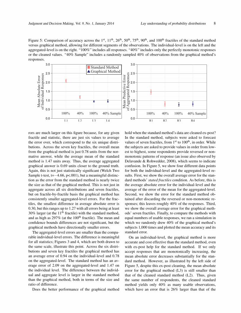
Figure 5: Comparison of accuracy across the 1st, 11th, 26th, 50th, 75th, 90th, and 100th fractiles of the standard method
versus graphical method, allowing for different segments of the observations. The individual-level is on the left and the
aggregated-level is on the right. “100%” includes all responses. “40%” includes only the perfectly monotonic responses
or the cleaned values. “40% Sample” includes a randomly sampled 40% of observations from the graphical method’s
responses.
rors are much larger on this figure because, for any given
fractile and statistic, there are just six values to average
the error over, which correspond to the six unique distri-
butions. Across the seven key fractiles, the overall mean
from the graphical method is just 0.78 units from the nor-
mative answer, while the average mean of the standard
method is 1.47 units away. Thus, the average aggregated
graphical answer is 0.69 units closer to the ground truth.
Again, this is not just statistically significant (Welch Two
Sample t-test, t=−4.66, p<.001), but a meaningful distinc-
tion as the error from the standard method is nearly twice
the size as that of the graphical method. This is not just in
aggregate across all six distributions and seven fractiles,
but on fractile-by-fractile basis the graphical method has
consistently smaller aggregated-level errors. For the frac-
tiles, the smallest difference in average absolute error is
0.30, but this ranges up to 1.27 with all errors being at least
30% larger (at the 11th fractile) with the standard method,
and as high as 297% (at the 100th fractile). The mean and
confidence bounds differences are not significant, but the
graphical methods have directionally smaller errors.
The aggregated-level errors are smaller than the compa-
rable individual-level errors. The difference is meaningful
for all statistics; Figures 3 and 4, which are both drawn to
the same scale, illustrate this point. Across the six distri-
butions and seven key fractiles the graphical method has
an average error of 0.94 on the individual-level and 0.78
on the aggregated-level. The standard method has an av-
erage error of 2.09 on the aggregated-level and 1.47 on
the individual level. The difference between the individ-
ual and aggregate level is larger in the standard method
than the graphical method, both in terms of the size and
ratio of difference.
Does the better performance of the graphical method
hold when the standard method’s data are cleaned ex-post?
In the standard method, subjects were asked to forecast
values of seven fractiles, from 1st to 100th, in order. While
the subjects are asked to provide values in order from low-
est to highest, some respondents provide reversed or non-
monotonic patterns of response (an issue also observed by
Delavande & Rohwedder, 2008), which seems to indicate
confusion. In Figure 5, we show four different data points
for both the individual-level and the aggregated-level re-
sults. First, we show the overall average error for the stan-
dard methods’ stated fractiles condition. As before, this is
the average absolute error for the individual-level and the
average of the error of the mean for the aggregated-level.
Second, we show the error for the standard method ob-
tained after discarding the reversed or non-monotonic re-
sponses; this leaves roughly 40% of the responses. Third,
we show the overall average error for the graphical meth-
ods’ seven fractiles. Finally, to compare the methods with
equal numbers of usable responses, we ran a simulation in
which we randomly drew 40% of the graphical method’s
subjects 1,000 times and plotted the mean accuracy and its
standard error.
On an individual-level, the graphical method is more
accurate and cost effective than the standard method, even
with ex-post help for the standard method. If we only
accept responses that are monotonically increasing, the
mean absolute error decreases substantially for the stan-
dard method. However, as illustrated by the left side of
Figure 5, despite this ex-post cleaning, the mean absolute
error for the graphical method (L3) is still smaller than
that of the cleaned standard method (L2). Thus, given
the same number of respondents, the cleaned standard
method yields only 40% as many usable observations,
which have an error that is 26% larger than that of the
Judgment and Decision Making, Vol. 9, No. 1, January 2014 Lay understanding of probability distributions 9
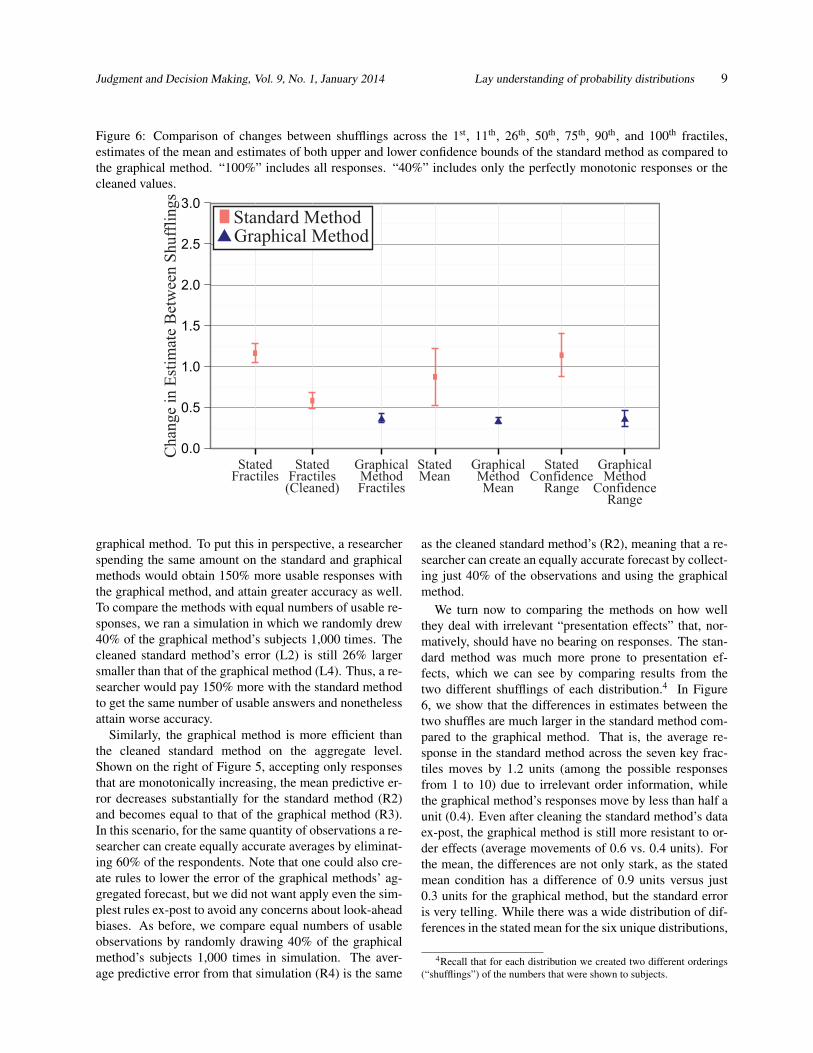
Figure 6: Comparison of changes between shufflings across the 1st, 11th, 26th, 50th, 75th, 90th, and 100th fractiles,
estimates of the mean and estimates of both upper and lower confidence bounds of the standard method as compared to
the graphical method. “100%” includes all responses. “40%” includes only the perfectly monotonic responses or the
cleaned values.
graphical method. To put this in perspective, a researcher
spending the same amount on the standard and graphical
methods would obtain 150% more usable responses with
the graphical method, and attain greater accuracy as well.
To compare the methods with equal numbers of usable re-
sponses, we ran a simulation in which we randomly drew
40% of the graphical method’s subjects 1,000 times. The
cleaned standard method’s error (L2) is still 26% larger
smaller than that of the graphical method (L4). Thus, a re-
searcher would pay 150% more with the standard method
to get the same number of usable answers and nonetheless
attain worse accuracy.
Similarly, the graphical method is more efficient than
the cleaned standard method on the aggregate level.
Shown on the right of Figure 5, accepting only responses
that are monotonically increasing, the mean predictive er-
ror decreases substantially for the standard method (R2)
and becomes equal to that of the graphical method (R3).
In this scenario, for the same quantity of observations a re-
searcher can create equally accurate averages by eliminat-
ing 60% of the respondents. Note that one could also cre-
ate rules to lower the error of the graphical methods’ ag-
gregated forecast, but we did not want apply even the sim-
plest rules ex-post to avoid any concerns about look-ahead
biases. As before, we compare equal numbers of usable
observations by randomly drawing 40% of the graphical
method’s subjects 1,000 times in simulation. The aver-
age predictive error from that simulation (R4) is the same
as the cleaned standard method’s (R2), meaning that a re-
searcher can create an equally accurate forecast by collect-
ing just 40% of the observations and using the graphical
method.
We turn now to comparing the methods on how well
they deal with irrelevant “presentation effects” that, nor-
matively, should have no bearing on responses. The stan-
dard method was much more prone to presentation ef-
fects, which we can see by comparing results from the
two different shufflings of each distribution.4 In Figure
6, we show that the differences in estimates between the
two shuffles are much larger in the standard method com-
pared to the graphical method. That is, the average re-
sponse in the standard method across the seven key frac-
tiles moves by 1.2 units (among the possible responses
from 1 to 10) due to irrelevant order information, while
the graphical method’s responses move by less than half a
unit (0.4). Even after cleaning the standard method’s data
ex-post, the graphical method is still more resistant to or-
der effects (average movements of 0.6 vs. 0.4 units). For
the mean, the differences are not only stark, as the stated
mean condition has a difference of 0.9 units versus just
0.3 units for the graphical method, but the standard error
is very telling. While there was a wide distribution of dif-
ferences in the stated mean for the six unique distributions,
4Recall that for each distribution we created two different orderings
(“shufflings”) of the numbers that were shown to subjects.
Judgment and Decision Making, Vol. 9, No. 1, January 2014 Lay understanding of probability distributions 10
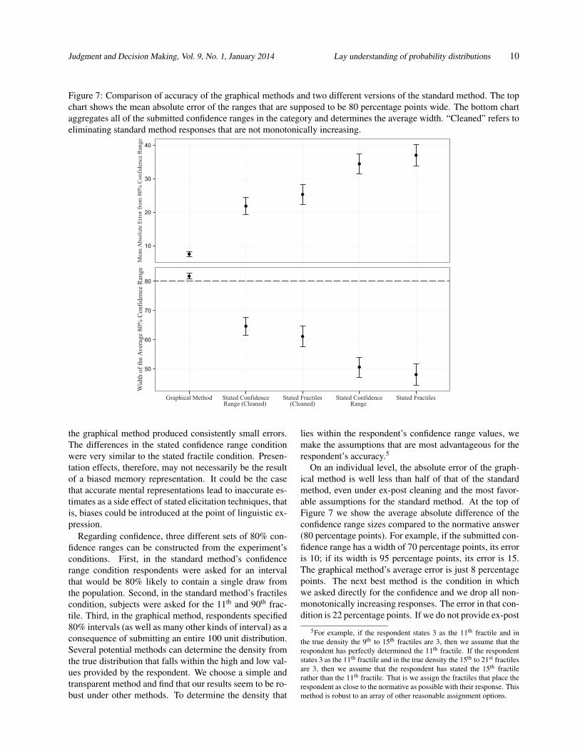
Figure 7: Comparison of accuracy of the graphical methods and two different versions of the standard method. The top
chart shows the mean absolute error of the ranges that are supposed to be 80 percentage points wide. The bottom chart
aggregates all of the submitted confidence ranges in the category and determines the average width. “Cleaned” refers to
eliminating standard method responses that are not monotonically increasing.
the graphical method produced consistently small errors.
The differences in the stated confidence range condition
were very similar to the stated fractile condition. Presen-
tation effects, therefore, may not necessarily be the result
of a biased memory representation. It could be the case
that accurate mental representations lead to inaccurate es-
timates as a side effect of stated elicitation techniques, that
is, biases could be introduced at the point of linguistic ex-
pression.
Regarding confidence, three different sets of 80% con-
fidence ranges can be constructed from the experiment’s
conditions. First, in the standard method’s confidence
range condition respondents were asked for an interval
that would be 80% likely to contain a single draw from
the population. Second, in the standard method’s fractiles
condition, subjects were asked for the 11th and 90th frac-
tile. Third, in the graphical method, respondents specified
80% intervals (as well as many other kinds of interval) as a
consequence of submitting an entire 100 unit distribution.
Several potential methods can determine the density from
the true distribution that falls within the high and low val-
ues provided by the respondent. We choose a simple and
transparent method and find that our results seem to be ro-
bust under other methods. To determine the density that
lies within the respondent’s confidence range values, we
make the assumptions that are most advantageous for the
respondent’s accuracy.5
On an individual level, the absolute error of the graph-
ical method is well less than half of that of the standard
method, even under ex-post cleaning and the most favor-
able assumptions for the standard method. At the top of
Figure 7 we show the average absolute difference of the
confidence range sizes compared to the normative answer
(80 percentage points). For example, if the submitted con-
fidence range has a width of 70 percentage points, its error
is 10; if its width is 95 percentage points, its error is 15.
The graphical method’s average error is just 8 percentage
points. The next best method is the condition in which
we asked directly for the confidence and we drop all non-
monotonically increasing responses. The error in that con-
dition is 22 percentage points. If we do not provide ex-post
5For example, if the respondent states 3 as the 11th fractile and in
the true density the 9th to 15th fractiles are 3, then we assume that the
respondent has perfectly determined the 11th fractile. If the respondent
states 3 as the 11th fractile and in the true density the 15th to 21st fractiles
are 3, then we assume that the respondent has stated the 15th fractile
rather than the 11th fractile. That is we assign the fractiles that place the
respondent as close to the normative as possible with their response. This
method is robust to an array of other reasonable assignment options.
Judgment and Decision Making, Vol. 9, No. 1, January 2014 Lay understanding of probability distributions 11
cleaning to the standard response, the difference in the
error is even more dramatic, with the standard method’s
absolute error of 34 percentage points. The “stated con-
fidence range” condition is just slightly, but not signifi-
cantly, more accurate than the “stated fractile” condition.
On the aggregate level, the graphical method does not
suffer from the common issue of overly narrow confidence
ranges that are observed with the standard method. On the
bottom of Figure 7 we show the size of the average range,
where the normative range size is 80 percentage points.
On average, the respondents are very well calibrated us-
ing the graphical method. The bottom of Figure 7 shows
that about 82% of answers fall within average graphical
method response’s 80% confidence range. This stands
in sharp contrast with the standard method conditions, in
which only 48% (stated fractile condition) to 65% (stated
confidence range, cleaned for non-monotonic responses)
of answers fall within the 80% confidence ranges.
4 Discussion
We began by noting a difference in the psychological and
economic literatures concerning the statistical intuitions
of laypeople. Part of this difference is likely due to an
emphasis on aggregated-level accuracy in economics (the
wisdom of the crowds) and individual-level accuracy in
psychology. We see in our results, as one would expect,
that aggregated-level estimates are more accurate. How-
ever, we also observe that accuracy varies between elicita-
tion techniques. Both at the individual and the aggregate
level, laypeople’s responses are significantly more accu-
rate using the graphical rather than the standard method
that unfortunately is most used in experimental research.
This result holds across ten different measures (seven key
fractiles, means, upper and lower confidence bounds),
even after we apply a generous ex-post correction to the
standard method. Further tests reveal that irrelevant “pre-
sentation effects” seem to be much more of a problem un-
der the standard method. To get accurate estimates about
various statistics of a subjective probability distribution,
our findings suggest it may be better to elicit the entire
distribution graphically and compute arbitrary statistics,
rather than asking about the statistics directly.
We pause here to think about how the experiment might
have turned out. Had both the standard and graphical
methods exhibited strong, systematic errors and biases at
the individual and aggregate levels, it could be consistent
with a view that mental representations are systematically
and stubbornly biased (or with the idea that we simply
didn’t test a suitable elicitation method). Had the stan-
dard method turned out to be better, or had both meth-
ods turned out to be highly and equally accurate, it would
have been puzzling since there is ample evidence in the
literature that the standard method leads to biased esti-
mates. Lastly, the experiment could have turned out as
it did, with the graphical technique emerging as better.
This result seems consistent with two possibilities. First,
it could be the case that laypeople’s mental representa-
tions are fundamentally inaccurate but that the graphical
elicitation method somehow corrects them in spite of the
user, much like the spelling correction in a word proces-
sor causes those who do not know the spelling of a word
appear as if they do. Or, second, it could be the case that
underlying mental representations are accurate, but some-
thing about stated elicitation corrupts this accuracy at the
point when answers are articulated. We have doubts about
the first idea. While it is possible that the graphical method
could create the illusion of accuracy on one or two out-
come measures, we find it unlikely that it would have this
strong ameliorative effect on some ten measures, presen-
tation effects, and confidence ranges at both the individual
and aggregate levels, especially after the stated method’s
data have been cleaned. Furthermore, the second account
seems plausible. For example, a bias we see in the stated
method is that people tend to report answers that are biased
towards the middle of the distribution. Note the flatter re-
gression line in Figure 2 and the too-narrow confidence
ranges in Figure 7. Since we do not observe this in the
graphical method, people’s stated estimates could be bi-
ased at the moment they express them, similar to the phe-
nomenon of anchoring on a prominent number in memory
(here, the mode of the distribution).
In future work, we shall test this idea by collecting
process data about how people create distributions with
the graphical method. One hypothesis is that graphical
method may be causing people, bit by bit, to recall (and
extrapolate from) the full observed distribution rather than
taking a quick sample that is biased towards the center of
the distribution. This would happen if people initially re-
trieve values that are near the center but then, with the
requirement of producing 100 values, search memory to
retrieve more extreme observations. Conversely, in Figure
1 we note one asymmetry, with slightly too much weight
on the lower numbers in the normatively uniformly distri-
bution. That could be caused people starting on the lower
numbers and working upward. Either working from the
outside to the inside or the inside to the outside, the graph-
ical method may just induce people to think of the full pic-
ture. By using mouse-tracking technology, we can record
distributions as they are built and test whether they expand
from the inside out, or from low to high values.
When responding using the standard method, respon-
dents may use heuristics that make it seem as if they
are incapable of taking a mean or providing a confidence
range. This can be tested with a two-step method of hav-
ing respondents attempt to define the fractiles, mean, etc.,
from a distribution they have first provided in the graphical
Judgment and Decision Making, Vol. 9, No. 1, January 2014 Lay understanding of probability distributions 12
method. This two-step test would disentangle the accuracy
in generating future samples from accuracy in providing
summary statistics.
One limitation our of experiment is that, in the real
world, people make decisions on data they saw days,
weeks, or months in the past, while we tested people num-
bers they observed only minutes ago. People could store
and retrieve recent and distant stimuli differently (Lind-
skog et al., 2013). We assume that both methods drop off
in accuracy over long time periods, but it may be the case
that they do so at different rates, and this is a topic for our
future research.
To conclude, we find that laypeople’s intuitions about
probability distributions can be rather accurate when the
graphical elicitation technique is used, a finding that
brings the views from psychology and economics a bit
closer together. With the increasing pervasiveness of com-
puting power in everyday devices such as smartphones and
tablets, the graphical method holds promise for improving
the accuracy and efficiency of individual-level decisions
and aggregate-level polls and forecasts.
References
Deese, J. R., & Kaufman, A. (1957). Serial effects in re-
call of unorganized and sequentially organized verbal
material. Journal of Experimental Psychology, 54, 180–
187.
Delavande, A., & Rohwedder. S. (2008). Eliciting sub-
jective probabilities in Internet surveys. Public Opinion
Quarterly, 72, 866–891.
Gigerenzer, G. (2011). What are natural frequencies?
Doctors need to find better ways to communicate risk
to patients. BMJ, 343:d6386. http://dx.doi.org/10.1136/
bmj.d6386.
Gigerenzer, G., & Murray, D. J. (1987). Cognition as in-
tuitive statistics. Hillsdale, NJ: Erlbaum.
Goldstein, D. G., Johnson, E. J., & Sharpe, W. F.
(2008). Choosing outcomes versus choosing products:
Consumer-focused retirement investment advice. Jour-
nal of Consumer Research, 35, 440–456.
Haran, U., Moore D. A., & Morewedge, C. K. (2010).
A simple remedy for overprecision in judgment. Judg-
ment and Decision Making, 5, 467–476.
Hasher, L., & Zacks, R. T. (1984). Automatic process-
ing of fundamental information: the case of frequency
of occurrence. The American Psychologist, 39, 1372–
1388.
Hasher, L., & Zacks, R. T. (1979). Automatic and effortful
processes in memory, Journal of Experimental Psychol-
ogy: General, 108, 56–388.
Hau, R., Pleskac, T. J., & Hertwig, R. (2010). Deci-
sions from experience and statistical probabilities: Why
they trigger different choices than a priori probabilities.
Journal of Behavioral Decision Making, 23, 48–68.
Hertwig, R., Barron, G., Weber, E. U., & Erev, I. (2004).
Decisions from experience and the effect of rare events
in risky choice. Psychological Science, 15, 534–539.
Hoffrage, U., Lindsey, S., Hertwig, R., & Gigerenzer, G.
(2000). Communicating statistical information. Sci-
ence, 290, 2261–2262.
Hogarth, R. M., & Einhorn, H. J. (1992). Order effects in
belief updating: The belief-adjustment model. Cogni-
tive Psychology, 24, 1–55.
Hogarth, R. M., & Soyer, E. (2011). Sequentially sim-
ulated outcomes: Kind experience vs. non-transparent
description. Journal of Experimental Psychology: Gen-
eral, 140, 434–463.
Ibrekk, H., Morgan, & M. G. (1987). Graphical commu-
nication of uncertain quantities to nontechnical people.
Risk Analysis, 7, 519–529.
Jenkinson, D. J. (2005). The elicitation of probabilities– a
review of the statistical literature. BEEP working paper,
University of Sheffield, UK.
Kahneman, D., Fredrickson, B. L., Schreiber, C. A., &
Redelmeier, D. A. (1993). When more pain is preferred
to less: Adding a better end. Psychological Science, 4,
401–405.
Kabus, I. (1976). You can bank on uncertainty, Harvard
Business Review, May-June, 95–105.
Kaufmann, C., Weber, M., & Haisley, E.C. (2013). The
role of experience sampling and graphical displays on
one’s investment risk appetite, Management Science,
59, 323–340.
Laplace, P.-S. (1951). A philosophical essay on probabil-
ities (F.W. Truscott & F.L. Emory, Trans.). New York:
Dover. (Original work published 1814).
Lau, H., Lau, A., & Ho, C. (1998). Improved moment-
estimation formulas using more than three subjective
fractiles. Management Science, 44, 346—351.
Lichtenstein, S., Fischhoff, B., & Phillips, L. D. (1982).
In D. Kahneman, P. Slovic and A. Tversky (Eds.), Judg-
ment Under Uncertainty: Heuristics and Biases. Cam-
bridge: Cambridge University Press.
Lindskog, M., Winman, A., & Juslin, P. (2013). Naïve
point estimation. Journal of experimental psychology:
learning, memory, and cognition, 39, 782.
Mason, W., & Suri, S. (2012). Conducting behavioral re-
search on Amazon’s Mechanical Turk. Behavior Re-
search Methods, 44, 1–23.
O’Hagan, A, Buck, C. E., Daneshkhah, A., Eiser, J. R.,
Garthwaite, P. H., Jenkinson, D. J., Oakley, J. E., &
Judgment and Decision Making, Vol. 9, No. 1, January 2014 Lay understanding of probability distributions 13
Rakow, T. (2006). Uncertain Judgments: Eliciting Ex-
perts’ Probabilities. New York: Wiley.
Peterson, C. R., & Beach, L. R. (1967). Man as intuitive
statistician. Psychological Bulletin, 68, 29—46.
Sharpe, W., Goldstein, D. G., & Blythe, P. (2000).
The distribution builder: A tool for infer-
ring investor preferences. Available online at:
http://www.stanford.edu/˜wfsharpe/art/qpaper/qpaper.pdf.
Staël von Holstein, C.-A. S. (1971). Two techniques for
assessment of subjective probability distributions — An
experimental study. Acta Psychologica, 35, 478–494.
Tversky, A., & Kahneman, D. (1974). Judgment under
uncertainty: Heuristics and biases. Science, 185, 1124–
1130.
Wallsten, T. S., & Budescu, D. V. (1983). Encoding sub-
jective probabilities: A psychological and psychometric
review. Management Science, 29, 151—173.
Winkler, R. L. (1967). The assessment of prior distribu-
tions in Bayesian analysis. Journal of the American
Statistical Association 62, 776–800.
Van Lenthe, J. (1993a). A blueprint of ELI: A new meth-
ods for eliciting subjective probability distributions. Be-
havior Research Methods Instruments & Computers,
25, 425–433.
Van Lenthe, J. (1993b). ELI: An interactive elicitation
technique for subjective probability distributions. Or-
ganizational Behavior & Human Decision Processes,
55, 379–413.
Van Noortwijk, J. M., Dekker, A., Cooke, R. M., & Maz-
zuchi, T. A. (1992). Expert judgment in maintenance
optimization. Reliability, IEEE Transactions on, 41,
427–432.
Appendix: Questions
Step 1, Introduction:
Imagine we have an extremely large bag of ping pong
balls. Each ball has a value between 0 and 10 written on
it. We will randomly choose 100 balls from the bag.
On the next screen we will show you their values, one
at a time, very quickly. This will take about a minute.
Say each value to yourself as it passes before your eyes;
try to remember as much as you can.
Please answer the below question and then Press Con-
tinue to Start.
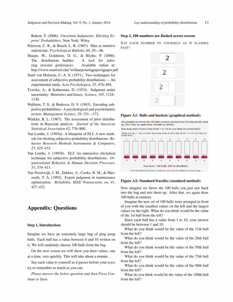
Step 2, 100 numbers are flashed across screen:
SAY EACH NUMBER TO YOURSELF AS IT FLASHES
PAST!
Figure A1: Balls and buckets (graphical method):
Figure A2: Standard fractiles (standard method):
Now imagine we throw the 100 balls you just saw back
into the bag and mix them up. After that, we again draw
100 balls at random.
Imagine the new set of 100 balls were arranged in front
of you with the smallest values on the left and the largest
values on the right. What do you think would be the value
of the 1st ball from the left?
Since each ball has a value from 1 to 10, your answer
should be between 1 and 10.
What do you think would be the value of the 11th ball
from the left?
What do you think would be the value of the 26th ball
from the left?
What do you think would be the value of the 50th ball
from the left?
What do you think would be the value of the 75th ball
from the left?
What do you think would be the value of the 90th ball
from the left?
What do you think would be the value of the 100th ball
from the left?

Judgment and Decision Making, Vol. 9, No. 1, January 2014 Lay understanding of probability distributions 14
Figure A3: Stated mean (standard method):
Now imagine we throw the 100 balls you just saw back
into the bag and mix them up. After that, we again draw
100 balls at random.
In statistics, the mean of 100 values is the number you
would get by adding up all the values and dividing by
100. What do you think is the mean of the 100 new values
drawn?
Since each ball has a value from 1 to 10, your answer
should be between 1 and 10.
Figure A4: Stated average (standard method):
Now imagine we throw the 100 balls you just saw back
into the bag and mix them up. After that, we again draw
100 balls at random.
What do you think is the average of the 100 new values
drawn?
Since each ball has a value from 1 to 10, your answer
should be between 1 and 10.
Figure A5: Stated confidence range (standard
method):
Now imagine we throw the 100 balls you just saw back
into the bag and mix them up. After that, we draw 1 ball
at random.
I am 90% certain the value of this ball would be greater
than or equal to:
I am 90% certain the value of this ball would be less
than or equal to: