Embed Size (px)
Citation preview

Layout Tips &
Techniques
Module 3
Developed byKatie Straka
Summer 2014

The “Works-Every-Time” Layout
Why does it work every time?
The 7 parts of the layout include:
1) Margins
2) Columns
3) Visual
4) Cutline
5) Headline
6) Copy
7) Tags
Visual
Cutline
HeadlineColumns Columns
Margins Margins
Tags
Copycopycopycopycopy copy copy copy
Copycopycopycopycopy copy copy copy
Margins
Margins

The “Works-Every-Time” Layout Examples
Common Layout Errors
What’s wrong with the layout?
1) Centering everything.
2) Warped or naked photos.
3) Too many fonts or tacky type emphasis.
4) Corners and clutter.
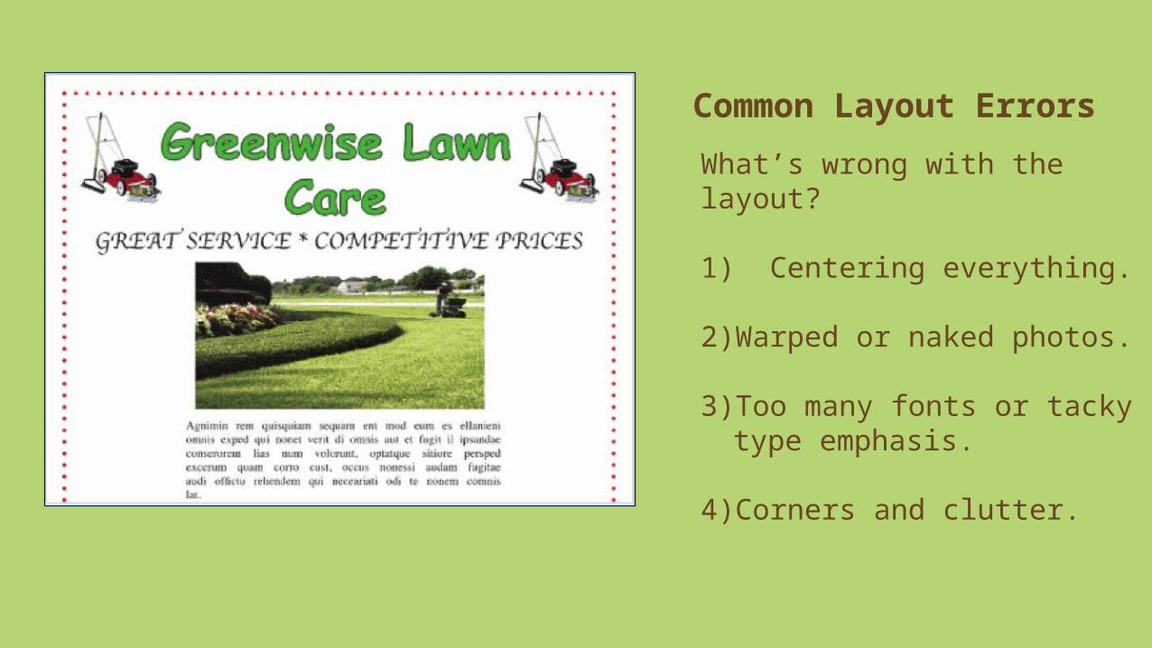
Common Layout Errors
What’s wrong with the layout?
5) Busy backgrounds.
6) Right justifying.

Common Layout Errors
What’s wrong with the layout?
7) Trapped negative space.

Common Layout Errors
What’s wrong with the layout?
8) Cheated or missing margins.

Common Layout Errors
9) Bad bullets.

Which ad is better?Source: Hagen & Golombisky, 2013

The Rule of Thirds (aka The Golden Ratio)• Or place the subject(s) along the lines.
• It’s a 3x3 grid for creating asymmetrical visual designs.
• Simply place the focal point at one of the intersection points.

Your TurnActivity 3: Critiquing PowerPoint Layout1. Exchange a PowerPoint with another
member of your group.
2. Critique the PowerPoint using the works-every-time layout tips, the common layout errors, and the rule of thirds as a resource.• What errors do you see?• What suggestions do you have to
improve the PowerPoint?
3. Give the written feedback to the PowerPoint’s creator.
4. Review the feedback and identify two slides to update.
5. Save those slides as a new file. Copy each slide and paste it right after the original slide. You are creating “before” and “after” slides.
6. Update the “after” slides.
7. Upload your PowerPoint to our class Wikispace and write a brief description to go with your work noting what was improved.
8. Reflection: What’s worth remembering about good
layouts? What can I use in my own classroom from module 3?

References
Baylen, D. M. (2014). Visual and media literacy for teaching and learning (MEDT 7490). University of West Georgia.
Hagen, R., & Golombisky, K. (2013). White space is not your enemy: A beginner’s guide to communicating visually through graphic,
web & multimedia design. Burlington, MA: Focal Press.
Image references are included with the appendices.