Embed Size (px)
Citation preview

1
1
Outline
• Frequency distribution, histogram, frequency polygon• Relative frequency histogram• Cumulative relative frequency graph• Stem-and-leaf plots• Scatter diagram • Pie charts, bar chart, line chart• Some special frequency distribution forms
LESSON 2: FREQUENCY DISTRIBUTION
2
FREQUENCY DISTRIBUTION
Consider the following data that shows days to maturity for 40 short-term investments
70 64 99 55 64 89 87 6562 38 67 70 60 69 78 3975 56 71 51 99 68 95 8657 53 47 50 55 81 80 9851 31 63 66 85 79 83 70

2
3
• First, construct a frequency distribution– An arrangement or table that groups data into
non-overlapping intervals called classes and records the number of observations in each class
• Approximate number of classesNumber of observation Number of classes
Less than 50 5-750-200 7-9200-500 9-10500-1,000 10-111,000-5,000 11-135,000-50,000 13-17More than 50,000 17-20
FREQUENCY DISTRIBUTION
4
• Approximate class width is obtained as follows:
classes of Numbervalue Smallest-value Largest
widthclass eApproximat =
FREQUENCY DISTRIBUTION

3
5
Classes and counts for the days-to-maturity data
Days to Maturity
TALLY Number of Investments
FREQUENCY DISTRIBUTION
6
HISTOGRAM
0
2
4
6
8
10
12
40 50 60 70 80 90 100
Number of Days to Maturity
Fre
qu
ency

4
7
HISTOGRAMClasses: Categories for grouping data.Frequency: The number of observations that fall in a class.Frequency distribution: A listing of all classes along with theirfrequencies.Relative frequency: The ratio of the frequency of a class to the totalnumber of observations.Relative-frequency distribution: A listing of all classes along withtheir relative frequencies.Lower cutpoint: The smallest value that can go in a class.Upper cutpoint: The smallest value that can go in the next higherclass. The upper cutpoint of a class is the same as the lower cutpointof the next higher class.Midpoint: The middle of a class, obtained by taking the average of itslower and upper cutpoints.Width: The difference between the upper and lower cutpoints of aclass.
8
FREQUENCY POLYGON
• A frequency polygon is a graph that displays the data by using lines that connect points plotted for frequencies at the midpoint of classes. The frequencies represent the heights of the midpoints.

5
9
FREQUENCY POLYGON
Classes Mid-value Frequency
10
FREQUENCY POLYGON
0
2
4
6
8
10
12
35 45 55 65 75 85 95
Number of Days to Maturity
Fre
qu
ency

6
11
Frequency histogram: A graph that displays the classes onthe horizontal axis and the frequencies of the classes on thevertical axis. The frequency of each class is represented by avertical bar whose height is equal to the frequency of the class.
Relative-frequency histogram: A graph that displays theclasses on the horizontal axis and the relative frequencies ofthe classes on the vertical axis. The relative frequency of eachclass is represented by a vertical bar whose height is equal tothe relative frequency of the class.
RELATIVE FREQUENCY HISTOGRAM
12
• Class relative frequency is obtained as follows:
nsobservatio of number Totalfrequency Class
frequency relative Class =
RELATIVE FREQUENCY HISTOGRAM

7
13
RELATIVE FREQUENCY HISTOGRAMRelative-frequency distribution for the days-to-maturity data
Days toMaturity
Relative Frequency
14
RELATIVE FREQUENCY HISTOGRAM
0.00%
5.00%
10.00%
15.00%
20.00%
25.00%
30.00%
40 50 60 70 80 90 100
Number of Days to Maturity
Rel
ativ
e F
req
uen
cy

8
15
OGIVECUMULATIVE RELATIVE FREQUENCY GRAPH
• A cumulative relative frequency graph or ogive is a graph that represents the cumulative frequencies for the classes in a frequency distribution.
16
OGIVECUMULATIVE RELATIVE FREQUENCY GRAPH
Class Frequency RelativeFrequency
CumulativeRelative
Frequency

9
17
OGIVE
CUMULATIVE RELATIVE FREQUENCY GRAPH
0.075 0.100
0.300
0.550
0.725
0.9001.000
0.000
0.200
0.400
0.600
0.800
1.000
40 50 60 70 80 90 100
Number of Days to Maturity
Cu
mu
lati
ve F
req
uen
cy
18
STEM-AND-LEAF DISPLAY
• When summarizing the data by a group frequency distribution, some information is lost. The actual values in the classes are unknown. A stem-and-leaf display offsets this loss of information.
• The stem is the leading digit.• The leaf is the trailing digit.

10
19
STEM-AND-LEAF DISPLAY
Diagrams for days-to-maturity data: (a) stem-and-leaf (b) ordered stem-and-leaf
Stem Leaves Stem Leaves3 34 45 56 67 78 89 9
(a) (b)
20
SCATTTER DIAGRAM
• Often, we are interested in two variables. For example, we may want to know the relationship between – advertising and sales– experience and time required to produce an unit of
a product

11
21
SCATTTER DIAGRAM
• Scatter diagrams show how two variables are related to one another– To draw a scatter diagram, we need a set of two
variables– Label one variable x and the other y– Each pair of values of x and y constitute a point on
the graph
22
SCATTTER DIAGRAM
• In some cases, the value of one variable may depend on the value of the other variable. For example,– sales depend on advertising– time required to produce an item of a product
depend on the number of units produced before• In such cases, the first variable is called dependent
variable and the second variable is called independent variable. For example,Independent variable Dependent variableAdvertising SalesNumber of units produced Production time/unit

12
23
SCATTTER DIAGRAM
• Usually, independent variable is plotted on the horizontal axis (x axis) and the dependent variable on the vertical axis (y axis)
• Sometimes, two variables show some relationships– positive relationship: two variables move together
i.e., one variable increases (or decreases) whenever the other increases (or, decreases). Example: advertising and sales.
– negative relationship: one variable increases (or, decreases) whenever the other decreases (increases). Example: number of units produced and production time/unit
24
SCATTTER DIAGRAM
• Relationship between two variables may be linear or non-linear. For example, – the relationship between advertising and sales
may be linear. – the relationship between number of units
produced and the production time/unit may be nonlinear.

13
25
SCATTTER DIAGRAM (EXAMPLE)
Advertizing Sales1,000 of dollars 1,000 of dollars
1 303 405 404 502 355 503 352 25
26
SCATTER DIAGRAM
20
40
60
0 2 4 6
Advertising
Sal
es

14
27
SCATTTER DIAGRAM (EXAMPLE)
Number of units Production timeproduced hours/unit
10 9.2225 4.8510 3.8250 2.44500 1.71000 1.035000 0.610000 0.5
28
SCATTER DIAGRAM
0
5
10
0 2000 4000 6000 8000 10000 12000
Number of units produced
Pro
duct
ion
time
(hou
rs)/u
nit

15
29
PIE CHART
• A pie chart is the most popular graphical method for summarizing quantitative/nominal data
• A pie chart is a circle is subdivided into a number of slices
• Each slice represents a category• Angle allocated to a slice is proportional to the
proportion of times the corresponding category is observed
• Since the entire circle corresponds to 3600, every 1% of the observations corresponds to 0.01 × 3600 = 3.60
30
Code Area Number Proportion Angles on aof Area of Graduates of Graduates Pie Chart
1 Accounting 732 Finance 523 General Mgmnt 364 Marketing 645 Other 28
PIE CHART (EXAMPLE)

16
31
PIE CHART
129%
221%
314%
425%
511%
More0%
12345More
32
BAR CHART
• Bar charts graphically represent the frequency or relative frequency of each category as a bar rising vertically
• The height of each bar is proportional to the frequency or the relative frequency
• All the bars must have the same width• A space may be left between bars• Bar charts may be used for qualitative data or
categories that should be presented in a particular order such as years 1995, 1996, 1997, ...

17
33
Code Area Numberof Area of Graduates
1 Accounting 732 Finance 523 General Mgmnt 364 Marketing 645 Other 28
BAR CHART (EXAMPLE)
34
BAR CHART
01020304050607080
1 2 3 4 5
Area
Co
un
t of A
rea
18
35
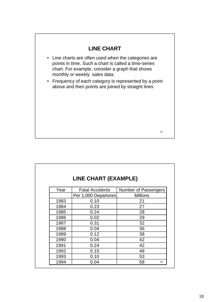
LINE CHART
• Line charts are often used when the categories are points in time. Such a chart is called a time-series chart. For example, consider a graph that shows monthly or weekly sales data.
• Frequency of each category is represented by a point above and then points are joined by straight lines
36
LINE CHART (EXAMPLE)
Year Fatal Accidents Number of PassengersPer 1,000 Departures Millions
1983 0.10 211984 0.23 271985 0.24 281986 0.02 291987 0.31 321988 0.04 361989 0.12 381990 0.04 421991 0.24 421992 0.15 481993 0.10 531994 0.04 58

19
37
Line Chart
0.00
0.05
0.10
0.15
0.20
0.25
0.30
0.35
1 2 3 4 5 6 7 8 9 10 11 12
Year
Fat
al A
ccid
ents
P
er 1
,000
Dep
artu
res
38
Line Chart
0
10
20
30
40
50
60
70
1 2 3 4 5 6 7 8 9 10 11 12
Year
Nu
mb
er o
f P
asse
ng
ers
(Mill
ions
)

20
39
CHOICE OF A CHART• Pie chart
– Small / intermediate number of categories – Cannot show order of categories– Emphasizes relative values e.g., frequencies
• Bar chart– Small / intermediate/large number of categories– Can present categories in a particular order, if any– Emphasizes relative values e.g., frequencies
40
• Bar chart– Small/intermediate/large number of categories– Can present categories in a particular order, if any – Emphasizes relative values e.g., frequencies
• Line chart– Small/intermediate/large number of categories– Can present categories in a particular order, if any – Emphasizes trend, if any
CHOICE OF A CHART

21
41
SYMMETRIC HISTOGRAM
0
2
4
6
8
10
12
14
14 15 16 17 18 19 20 21 22 23 24 25 26
Number of Units Sold
Fre
qu
ency
42
SYMMETRIC HISTOGRAM
0
2
4
6
8
10
12
14 15 16 17 18 19 20 21 22 23 24 25 26
Number of Units Sold
Fre
qu
ency

22
43
POSITIVELY SKEWED HISTOGRAM
02468
10121416
14 15 16 17 18 19 20 21 22 23 24 25 26
Number of Units Sold
Fre
qu
ency
44
NEGATIVELY SKEWED HISTOGRAM
02468
10121416
14 15 16 17 18 19 20 21 22 23 24 25 26
Number of Units Sold
Fre
qu
ency
23
45
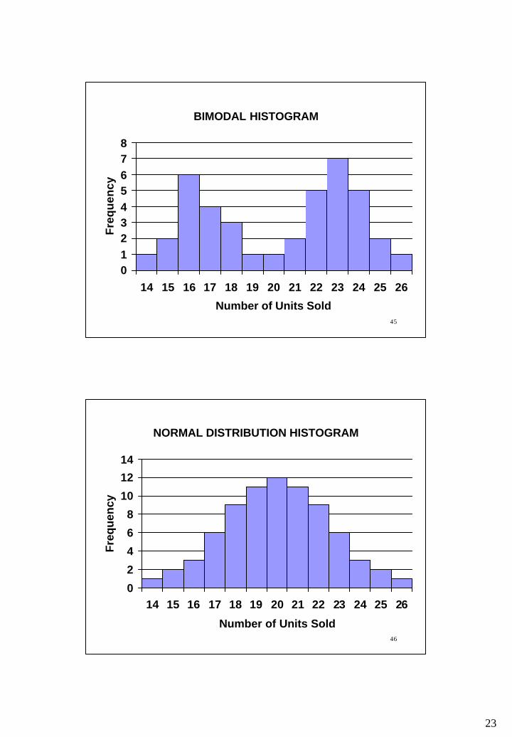
BIMODAL HISTOGRAM
012345678
14 15 16 17 18 19 20 21 22 23 24 25 26
Number of Units Sold
Fre
qu
ency
46
NORMAL DISTRIBUTION HISTOGRAM
0
2
4
6
8
10
12
14
14 15 16 17 18 19 20 21 22 23 24 25 26
Number of Units Sold
Fre
qu
ency

24
47
EXPONENTIAL DISTRIBUTION HISTOGRAM
05
1015202530354045
14 15 16 17 18 19 20 21 22 23 24 25 26
Number of Units Sold
Fre
qu
ency
48
UNIFORM DISTRIBUTION HISTOGRAM
0
1
2
3
4
5
6
7
14 15 16 17 18 19 20 21 22 23 24 25 26
Number of Units Sold
Fre
qu
ency

25
49
READING AND EXERCISES
Lesson 2
Reading: Section 2-1, pp. 22-33
Exercises: 2-1, 2-9, 2-13, 2-14