Embed Size (px)
Citation preview
0LispWorks® for the Windows® Operating System
CAPI User GuideVersion 4.1
Copyright and TrademarksLispWorks for the Windows Operating System CAPI User Guide
Version 4.1
November 1998
Part number: 3LBDT2A15NF
Copyright © 1994–1998 by Harlequin Group plc.
All Rights Reserved. No part of this publication may be reproduced, stored in a retrieval system, or transmitted, in any form or by anymeans, electronic, mechanical, photocopying, recording, or otherwise, without the prior written permission of Harlequin Group plc.
The information in this publication is provided for information only and is subject to change without notice. Harlequin Group plc and itsaffiliates assume no responsibility or liability for any loss or damage that may arise from the use of any information in this publication. Thesoftware described in this book is furnished under license and may only be used or copied in accordance with the terms of that license.
LispWorks is a registered trademark of Harlequin Group plc. Harlequin, Delivery, Transducer/PC, The Authoring Book, ClassWorks, andKnowledgeWorks are all trademarks of Harlequin Group plc.
Adobe and PostScript are registered trademarks of Adobe Systems Incorporated. Other brand or product names are the registered trade-marks or trademarks of their respective holders.
The code for walker.lisp and compute-combination-points is excerpted with permission from PCL, Copyright © 1985, 1986, 1987, 1988 XeroxCorporation.
CLX and CLUE bear the following copyright notice, which applies to the parts of LispWorks derived therefrom:Texas Instruments Incorporated, P.O. Box 149149, MS 2151, Austin, Texas 78714-9149Copyright © 1987, 1988, 1989, 1990, 1991 Texas Instruments Incorporated.Permission is granted to any individual or institution to use, modify and distribute this software, provided that this complete copyright andpermission notice is maintained, intact, in all copies and documentation. Texas Instruments Incorporated provides this software “as is” with-out express or implied warranty.
The XP Pretty Printer bears the following copyright notice, which applies to the parts of LispWorks derived therefrom:Copyright © 1989 by the Massachusetts Institute of Technology, Cambridge, Massachusetts.Permission to use, copy, modify, and distribute this software and its documentation for any purpose and without fee is hereby granted, pro-vided that this copyright and permission notice appear in all copies and supporting documentation, and that the name of M.I.T. not be usedin advertising or publicity pertaining to distribution of the software without specific, written prior permission. M.I.T. makes no representa-tion about the suitability of this software for any purpose. It is provided “as is” without express or implied warranty. M.I.T. disclaims allwarranties with regard to this software, including all implied warranties of merchantability and fitness. In no event shall M.I.T. be liable forany special, indirect or consequential damages or any damages whatsoever resulting from loss of use, data or profits, whether in an action ofcontract, negligence or other tortious action, arising out of or in connection with the use or performance of this software.
US Government Use
The LispWorks Software is a computer software program developed at private expense and is subject to the following Restricted Rights Leg-end: “Use, duplication, or disclosure by the United States Government is subject to restrictions as set forth in (i) FAR 52.227-14 Alt III or (ii)FAR 52.227-19, as applicable. Use by agencies of the Department of Defense (DOD) is subject to Harlequin’s customary commercial licenseas contained in the accompanying license agreement, in accordance with DFAR 227.7202-1(a). For purposes of the FAR, the Software shall bedeemed to be `unpublished’ and licensed with disclosure prohibitions, rights reserved under the copyright laws of the United States.Harlequin Incorporated, One Cambridge Center, Cambridge, Massachusetts 02142.”
http://www.harlequin.com/
Europe:
Harlequin LimitedBarrington HallBarringtonCambridge CB2 5RGUK
telephone +44 1223 873 800fax +44 1223 873 873
North America:
Harlequin IncorporatedOne Cambridge CenterCambridge, MA 02142USA
telephone +1 617 374 2400fax +1 617 252 6505
Asia Pacific:
Harlequin Australia Pty. Ltd.Level 1212 Moore StreetCanberra, ACT 2601Australia
telephone +61 2 6206 5522fax +61 2 6206 5525
Contents
Preface vii
1 Introduction to the CAPI 1
What is the CAPI? 1The history of the CAPI 2The CAPI model 2
2 Getting Started 5
Loading the CAPI 6Creating a window 6Linking code into CAPI elements 8
3 Creating Common Windows 11
Generic properties 11Specifying titles 13Displaying and entering text 15Stream panes 16Miscellaneous button elements 17
4 Choices 21
Choice classes 22List panels 24Graph panes 28Option panes and drop-down list boxes 30
iii
iv
Menu components 31General properties of choices 31
5 Laying Out CAPI Panes 35
Organizing panes in columns and rows 36Other types of layout 38Combining different layouts 39Constraining the size of layouts 40Advanced pane layouts 42
6 Creating Menus 45
Creating a menu 45Grouping menu items together 46Creating individual menu items 49The CAPI menu hierarchy 50Disabling menu items 51
7 Defining Interface Classes 53
The define-interface macro 53An example interface 54Adapting the example 56Connecting an interface to an application 61
8 Prompting for Input 65
Some simple dialogs 65Prompting for values 67Creating your own dialogs 73
9 Creating Your Own Panes 79
Displaying graphics 79Receiving input from the user 82Creating graphical objects 83
10 Graphics Ports 89
Introduction 89Features 90Graphics state 90
Graphics state transforms 93Pixmap graphics ports 95Portable font descriptions 96
11 The Color System 99
Introduction 99Reading the color database 100Color specs 101Color aliases 102Color models 103Loading the color database 105Defining new color models 106
12 Printing from the CAPI—the Hardcopy API 109
Printers 109Print jobs 109Handling pages—page on demand printing 110Handling pages—page sequential printing 110Printing a page 110Other printing functions 111
Index 113
v

vi
Preface
This preface contains information you need when using the rest of the CAPIdocumentation. It discusses the purpose of this manual, the typographicalconventions used, and gives a brief description of the rest of the contents.
Assumptions
The CAPI documentation assumes that you are familiar with:
• LispWorks
• Common Lisp and CLOS, the Common Lisp Object System
• The Windows environment
Conventions used in the manual
Throughout this manual, certain typographical conventions have beenadopted to aid readability.
1. Whenever an instruction is given, is numbered and printed like this.
Text which you should type explicitly is printed like this .
A Description of the Contents
This guide forms an introductory course in developing applications using theCAPI. Please note that, like the rest of the LispWorks documentation, it doesassume knowledge of Common Lisp.
vii
viii
Chapter 1, Introduction to the CAPI, introduces the principles behind the CAPI,some of its fundamental concepts, and what it sets out to achieve.
Chapter 2, Getting Started, presents a series of simple examples whose aim isto familiarize you with some of the most important elements and functions.
Chapter 3, Creating Common Windows, introduces more of the fundamentalCAPI elements. These elements are explained in greater detail in the remain-der of the manual.
Chapter 4, Choices, explains the key CAPI concept of the choice. A choicegroups CLOS objects together and provides the notion of there being aselected object amongst that group of objects. Button panels and list panels areexamples of choices.
Chapter 5, Laying Out CAPI Panes introduces the idea of layouts. These let youcombine different CAPI elements inside a single window.
Chapter 6, Creating Menus, shows you how to add menus to a window.
Chapter 7, Defining Interface Classes, introduces the macro define-interface .This macro can be used to define interface classes composed of CAPI elements— either the predefined elements explained elsewhere in this manual or yourown.
Chapter 8, Prompting for Input, discusses the ways in which dialog boxes maybe used to prompt a user for input.
Chapter 9, Creating Your Own Panes, shows you how you can define your ownclasses when those provided by the CAPI are not sufficient for your needs.
Chapter 10, Graphics Ports, provides information on the Graphics Ports pack-age, which provides a selection of drawing and image tranformation func-tions. Although not part of the CAPI package, and therefore not strictly part ofthe CAPI, the Graphics Ports functions are used in conjunction with CAPIpanes, and are therefore documented in this manual and the CAPI ReferenceManual.
Chapter 11, The Color System, allows applications to use keyword symbols asaliases for colors in Graphics Ports drawing functions. They can also be usedfor backgrounds and foregrounds of windows and CAPI objects.
The Reference Manual
The second part of the CAPI documentation is the CAPI Reference Manual. Thisprovides a complete description of every CAPI class and function, and alsoprovides a reference chapter on the Graphics Port functions. Entries are listedalphabetically, and the typographical conventions used are similar to thoseused in Common Lisp: the Language (2nd Edition) (Steele, 1990).
ix

x
1
1Introduction to the CAPI
1.1 What is the CAPI?The CAPI (Common Application Programmer’s Interface) is a library forimplementing portable window-based application interfaces. It is a conceptu-ally simple, CLOS-based model of interface elements and their interaction. Itprovides a standard set of these elements and their behaviors, as well as giv-ing you the opportunity to define elements of your own.
The CAPI’s model of window-based user interfaces is an abstraction of theconcepts that are shared between all contemporary window systems, suchthat you do not need to consider the details of a particular system. These hid-den details are taken care of by a back end library written for that systemalone.
An advantage of making this abstraction is that each of the system-specificlibraries can be highly specialized, concentrating on getting things right forthat particular window system. Furthermore, because the implementationlibraries and the CAPI model are completely separate, libraries can be writtenfor new window systems without affecting either the CAPI model or theapplications you have written with it.
The CAPI currently runs under X Window System with Motif, and MicrosoftWindows.
1
Introduction to the CAPI
2
1.2 The history of the CAPIUntil recently, window-based applications written with LispWorks used CLX,CLUE, and the LispWorks Toolkit. Such applications are restricted to runningunder X Windows. Because we and our customers wanted a way to write por-table window code, we decided to develop a new system for this purpose: theCAPI.
Part of this portability exercise was undertaken before the development of theCAPI, for graphics ports, the generic graphics library. This includes the porta-ble color, font, and image systems in LispWorks. The CAPI is built on top ofthis technology.
All Lisp-based environment and application development in Harlequin nowuses the CAPI. We recommend that you use the CAPI for window-basedapplication development in preference to the systems mentioned earlier.
1.3 The CAPI modelThe CAPI provides an abstract hierarchy of classes which represent differentsorts of window interface elements, along with functions for interacting withthem. Instances of these classes represent window objects in an application,with their slots representing different aspects of the object, such as the text ona button, or the items on a menu. These instances are not actual windowobjects but provide a convenient representation of them for you. When youask the CAPI to display your object, it creates a real window system object torepresent it. This means that if you display a CAPI button, a real Windowsbutton is created for it when running on Windows, and a real Motif buttonwhen running on Motif.
A different approach would have been to simulate the window objects andtheir look and feel. This approach is problematic. Because the library makesitself entirely responsible for the application’s look and feel, it may not simu-late it correctly in obscure cases. Also, manufacturers occasionally change thelook and feel of their window systems. Applications written with a librarythat simulates window objects will continue to have the old look and feel untilthe application is recompiled with an updated library.
The CAPI’s approach makes the production of the screen objects the responsi-bility of the native window system, so it always produces the correct look and
1.3 The CAPI model
feel. Furthermore, the CAPI’s use of the real interface to the window systemmeans that it does not need to be upgraded to account for look and feelchanges, and anything written with it is upwardly compatible, just like anywell-written application.
1.3.1 CAPI Classes
There are four basic objects in the CAPI model: interfaces, menus, panes and lay-outs.
Everything that the CAPI displays is contained within an interface (aninstance of the class interface ). When an interface is displayed a windowappears containing all the menus and panes you have specified for it.
An interface can contain a number of menus which are collected together on amenu bar. Each menu on the menu bar can contain menu items or othermenus. Items can be grouped together visually and functionally inside menucomponents. Menus, menu items, and menu components are, respectively,instances of the classes menu, menu-item , and menu-component .
Panes are window objects such as buttons and lists. They can be positionedanywhere in an interface. The CAPI provides many different kinds of paneclass, among them push-button , list-panel , editor-pane , and graph-pane .
The positions of panes are controlled by a layout, which allows objects to becollected together and positioned either regularly (with instances of theclasses column-layout or row-layout ) or arbitrarily using a pinboard-lay-
out . Layouts themselves can be laid out by other layouts — for example, arow of buttons can be laid out above a list by placing both the row-layout andthe list in a column-layout .
3

Introduction to the CAPI
4
2
2Getting Started
This chapter introduces some of the most basic CAPI elements and functions.The intention is simply that you should become familiar with the most usefulelements available, before learning how you can use them constructively. Youshould work through the examples in this chapter.
A CAPI application consists of a hierarchy of CAPI objects, in much the sameway as an application written using the LispWorks Toolkit consists of Toolkitobjects. CAPI objects are created using make-instance , and although they arestandard CLOS objects, CAPI features should generally be accessed in theways described in this manual, and not using the CLOS slot-value function.You should not rely on slot-value because the implementation of the CAPIclasses may evolve.
Once an instance of a CAPI object has been created in an interface, it can bedisplayed on your screen using the function display .
5
Getting Started
6
2.1 Loading the CAPIAll symbols in this manual are exported from either the CAPI or COMMON-LISP packages unless explicitly stated otherwise. You should use the CAPIpackage in your code to access them:
(defpackage "MY-PACKAGE"(:add-use-defaults t)(:use "CAPI")
)
This creates and loads a package containing all the CAPI commandsrequired to try out the examples in this guide.
2.2 Creating a windowThis section shows how easy it is to create a simple window, and how toinclude CAPI elements, such as panes, in your window.
1. Type the following in a listener
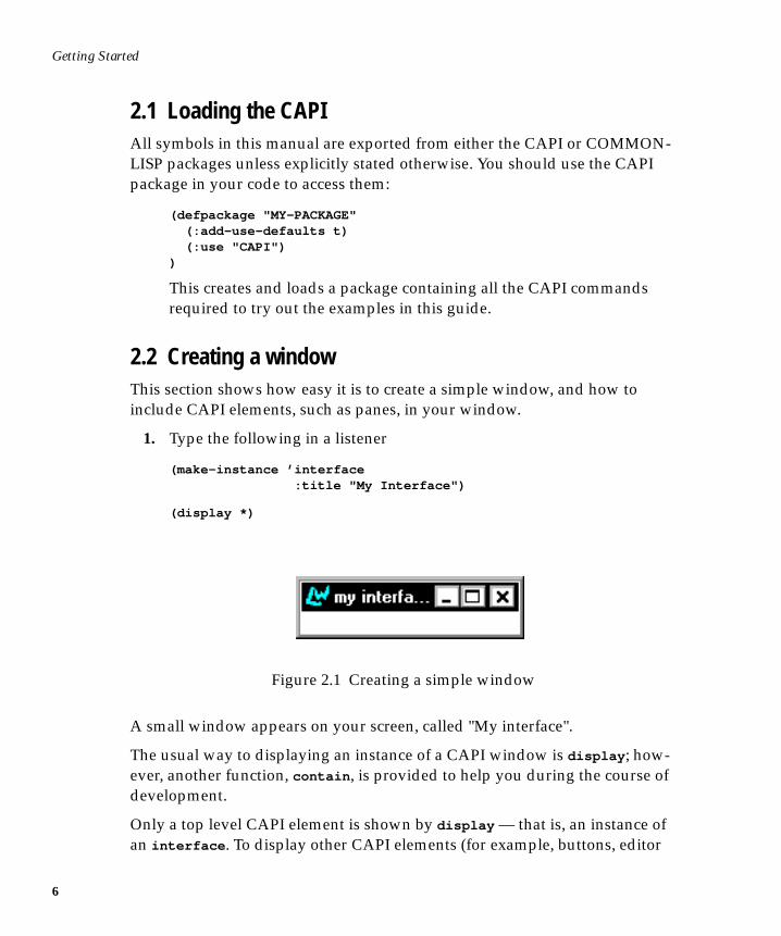
(make-instance ’interface :title "My Interface")
(display *)
Figure 2.1 Creating a simple window
A small window appears on your screen, called "My interface".
The usual way to displaying an instance of a CAPI window is display ; how-ever, another function, contain , is provided to help you during the course ofdevelopment.
Only a top level CAPI element is shown by display — that is, an instance ofan interface . To display other CAPI elements (for example, buttons, editor
2.2 Creating a window
panes, and so on), you must provide information about how they are to bearranged in the window. Such an arrangement is called a layout — you willlearn more about layouts in Chapter 5.
On the other hand, contain automatically provides a default layout for anyCAPI element you specify, and subsequently displays it. During develop-ment, it can be useful for displaying individual elements of interest on yourscreen, without having to create an interface for them explicitly. However,contain is only provided as a development tool, and should not be used forthe final implementation of a CAPI element. See Chapter 7, “Defining Inter-face Classes” on how to display CAPI elements in an interface.
This is how you can create and display a button using contain .
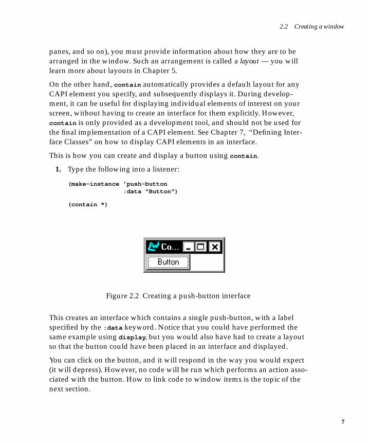
1. Type the following into a listener:
(make-instance ’push-button :data "Button")
(contain *)
Figure 2.2 Creating a push-button interface
This creates an interface which contains a single push-button, with a labelspecified by the :data keyword. Notice that you could have performed thesame example using display , but you would also have had to create a layoutso that the button could have been placed in an interface and displayed.
You can click on the button, and it will respond in the way you would expect(it will depress). However, no code will be run which performs an action asso-ciated with the button. How to link code to window items is the topic of thenext section.
7
Getting Started
8
2.3 Linking code into CAPI elementsGetting a CAPI element to perform an action is done by specifying a callback.This is a function which is performed whenever you change the state of aCAPI element. It calls a piece of code whenever a choice is made in a window.
Note that the result of the callback function is ignored, and that its usefulnessis in its side-effects.
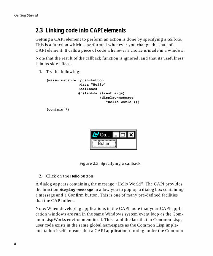
1. Try the following:
(make-instance ’push-button :data "Hello" :callback #’(lambda (&rest args) (display-message "Hello World")))
(contain *)
Figure 2.3 Specifying a callback
2. Click on the Hello button.
A dialog appears containing the message “Hello World”. The CAPI providesthe function display-message to allow you to pop up a dialog box containinga message and a Confirm button. This is one of many pre-defined facilitiesthat the CAPI offers.
Note: When developing applications in the CAPI, note that your CAPI appli-cation windows are run in the same Windows system event loop as the Com-mon LispWorks environment itself. This - and the fact that in Common Lisp,user code exists in the same global namespace as the Common Lisp imple-mentation itself - means that a CAPI application running under the Common
2.3 Linking code into CAPI elements
LispWorks environment can modify the same values as you can concurrentlymodify from one of the environment's programming tools.
For example, your CAPI application might have a button that, when pressed,sets a slot in a particular object that you could also set by hand in the listener.This situation can lead to unexpected values and behavior in your CAPIapplication, which may seem to reveal bugs in the application or the CommonLisp product that do not in fact exist.
9

Getting Started
10
3
3Creating Common Windows
So far you have only seen two types of CAPI element: the interface (which isthe top level CAPI element, and is present in any CAPI window) and thepush-button. This section shows how you can use the CAPI to create othercommon windowing elements you are likely to need.
Before trying out the examples in this chapter, define the functions test-
callback and hello in your Listener. The first displays the list of arguments itis given, and returns nil . The second just displays a message.
(defun test-callback (data interface) (display-message "Data ~S in interface ~S" data interface))
(defun hello (data interface) (declare (ignore data interface)) (display-message "Hello World"))
We will use these callbacks in future examples.
3.1 Generic propertiesBecause CAPI elements are just like CLOS classes, many elements share acommon set of properties. This section describes the properties that all theclasses described in this chapter inherit.
11
Creating Common Windows
12
3.1.1 Scroll bars
The CAPI lets you specify horizontal or vertical scroll bars for any subclass ofthe simple pane element (including all of the classes described in this chapter).
Horizontal and vertical scroll bars can be specified using the keywords:horizontal-scroll and :vertical-scroll . By default, :vertical-scroll
is set to t , and :horizontal-scroll is set to nil .
3.1.2 Background and foreground colors
All subclasses of the simple pane element can have different foreground andbackground colors, using the :background and :foreground keywords. Forexample, including
:background :blue:foreground :yellow
in the make-instance of a text pane would result in a pane with a blue back-ground and yellow text.
3.1.3 Fonts
The CAPI interface supports the use of other fonts for text in title panes andother CAPI objects, such as buttons, through the use of the :font keyword. Ifthe CAPI cannot find the specified font it reverts to the default font. The :font
keyword applies to data following the :text keyword, and uses the graphicsport package command gf . The weight of the lettering can be one of :bold ,:medium , :demibold , and :light . The slant of the lettering can be :roman ,:italic , :oblique , :reverse-oblique and :reverse-italic .
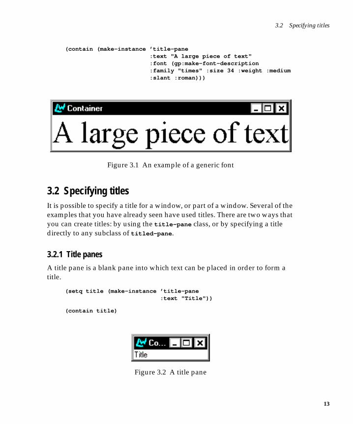
Here is an example of a title pane with an explicit font:
(contain (make-instance ’title-pane :text "A title pane" :font (gp:make-font-description
:family "times" :size 12 :weight :medium:slant :roman)))
Here is an example of using :font to produce a title pane with larger lettering.Note that the CAPI automatically resized the pane to fit around the text.
3.2 Specifying titles
(contain (make-instance ’title-pane :text "A large piece of text" :font (gp:make-font-description
:family "times" :size 34 :weight :medium:slant :roman)))
Figure 3.1 An example of a generic font
3.2 Specifying titlesIt is possible to specify a title for a window, or part of a window. Several of theexamples that you have already seen have used titles. There are two ways thatyou can create titles: by using the title-pane class, or by specifying a titledirectly to any subclass of titled-pane .
3.2.1 Title panes
A title pane is a blank pane into which text can be placed in order to form atitle.
(setq title (make-instance ’title-pane :text "Title"))
(contain title)
Figure 3.2 A title pane
13
Creating Common Windows
14
3.2.2 Specifying titles directly
You can specify a title directly to all CAPI panes, using the :title keyword.This is much easier than using title-panes, since it does not necessitate using alayout to group two elements together.
Any class that is a subclass of titled-pane supports the :title keyword. Allof the standard CAPI panes inherit from this class. You can find out all thesubclasses of titled-pane by graphing them using the class browser.
The position of any title can be specified by using the :title-position key-word. Most panes default the title-position to :top , although some use :left .
The title of a CAPI element may be changed interactively with the use of setf ,if you wish.
1. Create a push button by evaluating the code below:
(setq button (make-instance ’push-button :text "Hello" :title "Press: " :title-position :left :callback ’hello))
(contain button)
2. Now evaluate the following:
(setf (titled-pane-title button) "Press here: ")
As soon as the form is evaluated, the title of the pane you just created changes.Notice how the window automatically resizes to make allowance for the sizeof the new title.
3.2.3 Display panes
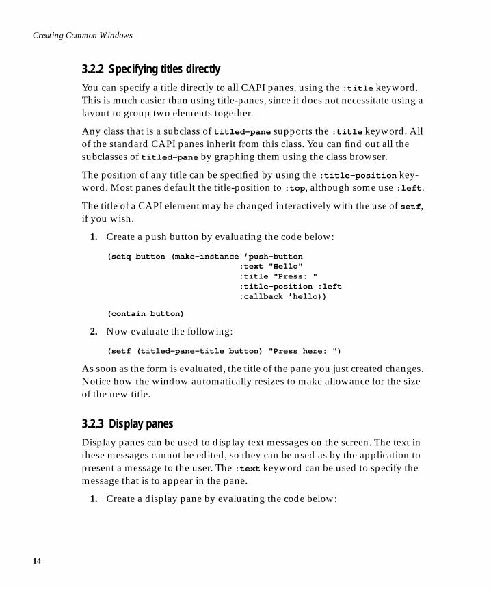
Display panes can be used to display text messages on the screen. The text inthese messages cannot be edited, so they can be used as by the application topresent a message to the user. The :text keyword can be used to specify themessage that is to appear in the pane.
1. Create a display pane by evaluating the code below:
3.3 Displaying and entering text
(setq display (make-instance ’display-pane :text "This is a message"))
(contain display)
Figure 3.3 A display pane
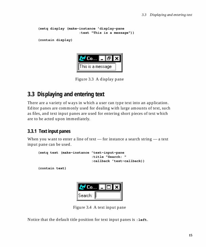
3.3 Displaying and entering textThere are a variety of ways in which a user can type text into an application.Editor panes are commonly used for dealing with large amounts of text, suchas files, and text input panes are used for entering short pieces of text whichare to be acted upon immediately.
3.3.1 Text input panes
When you want to enter a line of text — for instance a search string — a textinput pane can be used.
(setq text (make-instance ’text-input-pane :title "Search: " :callback ’test-callback))
(contain text)
Figure 3.4 A text input pane
Notice that the default title position for text input panes is :left .
15
Creating Common Windows
16
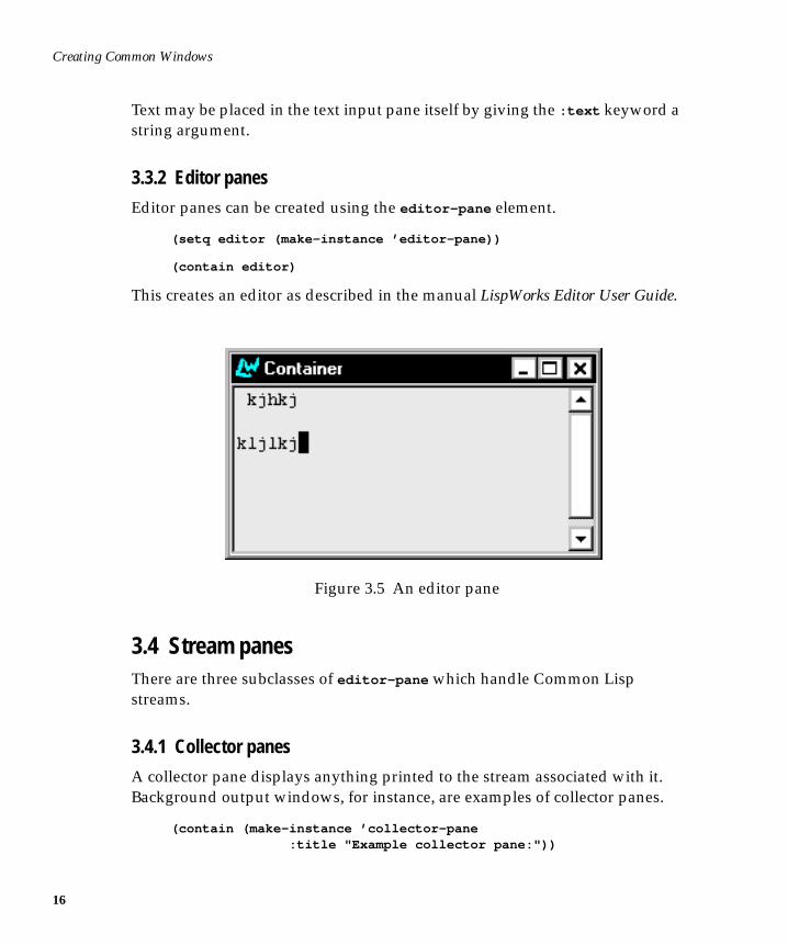
Text may be placed in the text input pane itself by giving the :text keyword astring argument.
3.3.2 Editor panes
Editor panes can be created using the editor-pane element.
(setq editor (make-instance ’editor-pane))
(contain editor)
This creates an editor as described in the manual LispWorks Editor User Guide.
Figure 3.5 An editor pane
3.4 Stream panesThere are three subclasses of editor-pane which handle Common Lispstreams.
3.4.1 Collector panes
A collector pane displays anything printed to the stream associated with it.Background output windows, for instance, are examples of collector panes.
(contain (make-instance ’collector-pane :title "Example collector pane:"))
3.5 Miscellaneous button elements
3.4.2 Interactive streams
An interactive stream is the building block on which a listener pane is built.
(contain (make-instance ’interactive-stream :title "Stream:"))
3.4.3 Listener panes
The listener-pane class is a subclass of interactive-stream , and allows youto create interactive Common Lisp sessions. You may occasionally want toinclude a listener pane in a tool (as, for instance, Common LispWorks doeswith the Debugger).
(contain (make-instance ’listener-pane :title "Listener:"))
3.5 Miscellaneous button elementsA variety of different buttons can be created for use in an application. Theseinclude push buttons, which you have already seen, and check buttons. But-ton panels can also be created, and are described in Chapter 4, “Choices”.
3.5.1 Push buttons
You have already seen push buttons in earlier examples. The :enabled key-word can be used to specify whether or not the button should be selectablewhen it is displayed. This can be useful for disabling a button in certain situa-tions.
The following code creates a push button which cannot be selected.
(setq offbutton (make-instance ’push-button :data "Button" :enabled nil))
(contain offbutton)
These setf expansions enable and disable the button:
(setf (button-enabled offbutton) t)
(setf (button-enabled offbutton) nil)
17
Creating Common Windows
18
All subclasses of the button class can be disabled in this way.
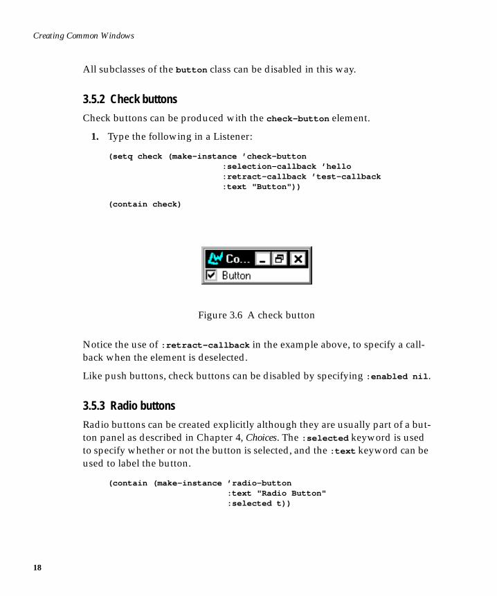
3.5.2 Check buttons
Check buttons can be produced with the check-button element.
1. Type the following in a Listener:
(setq check (make-instance ’check-button :selection-callback ’hello :retract-callback ’test-callback :text "Button"))
(contain check)
Figure 3.6 A check button
Notice the use of :retract-callback in the example above, to specify a call-back when the element is deselected.
Like push buttons, check buttons can be disabled by specifying :enabled nil .
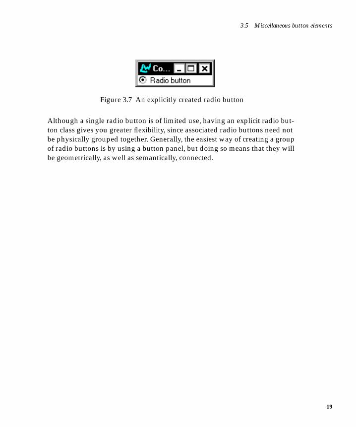
3.5.3 Radio buttons
Radio buttons can be created explicitly although they are usually part of a but-ton panel as described in Chapter 4, Choices. The :selected keyword is usedto specify whether or not the button is selected, and the :text keyword can beused to label the button.
(contain (make-instance ’radio-button :text "Radio Button" :selected t))
3.5 Miscellaneous button elements
Figure 3.7 An explicitly created radio button
Although a single radio button is of limited use, having an explicit radio but-ton class gives you greater flexibility, since associated radio buttons need notbe physically grouped together. Generally, the easiest way of creating a groupof radio buttons is by using a button panel, but doing so means that they willbe geometrically, as well as semantically, connected.
19

Creating Common Windows
20
4
4Choices
Some elements of a window interface contain collections of items, for examplerows of buttons, lists of filenames, and groups of menu items. Such elementsare known in the CAPI as collections.
In most collections, items may be selected by the user — for example, a row ofbuttons. Collections whose items can be selected are known as choices. Eachbutton in a row of buttons is either checked or unchecked, showing somethingabout the application’s state — perhaps that color graphics are switched onand sound is switched off. This selection state came about as the result of achoice the user made when running the application, or default choices madeby the application itself.
The CAPI provides a convenient way of producing groups of items fromwhich collections and choices can be made. The abstract class collection pro-vides a means of specifying a group of items. The subclass choice providesgroups of selectable items, where you may specify what initial state they arein, and what happens when the selection is changed. Subclasses of collec-
tion and choice used for producing particular kinds of grouped elements aredescribed in the sections that follow.
All the choices described in this chapter can be given a print function via the:print-function keyword. This allows you to control the way in which itemsin the element are displayed. For example, passing the argument ’string-
21
Choices
22
capitalize to :print-function would capitalize the initial letters of all thewords of text that an instance of a choice displays.
Some of the examples in this chapter require the functions test-callback andhello which were introduced in Chapter 3, “Creating Common Windows”.
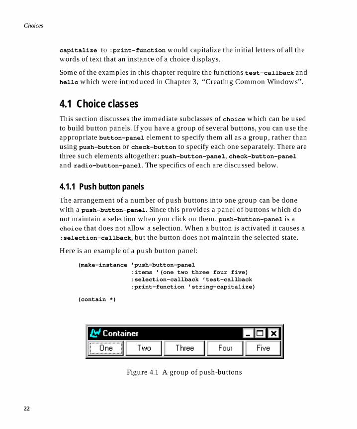
4.1 Choice classesThis section discusses the immediate subclasses of choice which can be usedto build button panels. If you have a group of several buttons, you can use theappropriate button-panel element to specify them all as a group, rather thanusing push-button or check-button to specify each one separately. There arethree such elements altogether: push-button-panel , check-button-panel
and radio-button-panel . The specifics of each are discussed below.
4.1.1 Push button panels
The arrangement of a number of push buttons into one group can be donewith a push-button-panel . Since this provides a panel of buttons which donot maintain a selection when you click on them, push-button-panel is achoice that does not allow a selection. When a button is activated it causes a:selection-callback , but the button does not maintain the selected state.
Here is an example of a push button panel:
(make-instance ’push-button-panel :items ’(one two three four five) :selection-callback ’test-callback :print-function ’string-capitalize)
(contain *)
Figure 4.1 A group of push-buttons
4.1 Choice classes
The layout of a button panel (for instance, whether items are listed verticallyor horizontally) can be specified using the :layout-class keyword. This cantake two values: ’column-layout if you wish buttons to be listed vertically,and ’row-layout if you wish them to be listed horizontally. The default valueis ’row-layout . If you define your own layout classes, you can also use theseas values to :layout-class . Layouts, which apply to many other CAPIobjects, are discussed in detail in Chapter 5, “Laying Out CAPI Panes”.
4.1.2 Radio button panels
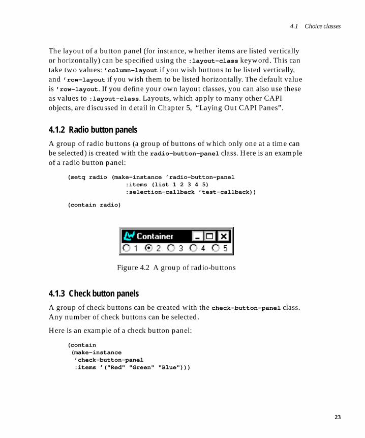
A group of radio buttons (a group of buttons of which only one at a time canbe selected) is created with the radio-button-panel class. Here is an exampleof a radio button panel:
(setq radio (make-instance ’radio-button-panel :items (list 1 2 3 4 5) :selection-callback ’test-callback))
(contain radio)
Figure 4.2 A group of radio-buttons
4.1.3 Check button panels
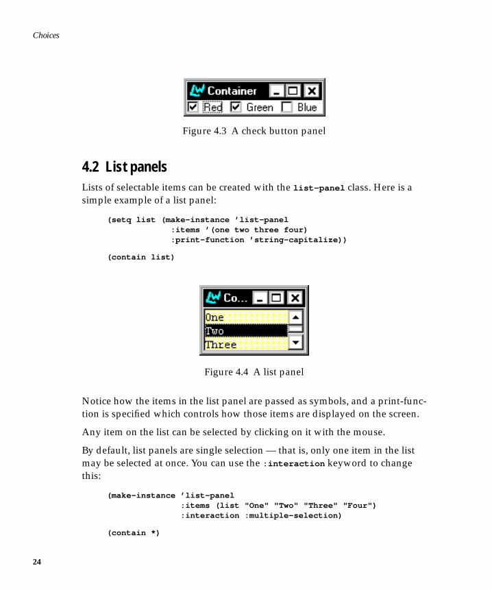
A group of check buttons can be created with the check-button-panel class.Any number of check buttons can be selected.
Here is an example of a check button panel:
(contain (make-instance ’check-button-panel :items ’("Red" "Green" "Blue")))
23
Choices
24
Figure 4.3 A check button panel
4.2 List panelsLists of selectable items can be created with the list-panel class. Here is asimple example of a list panel:
(setq list (make-instance ’list-panel :items ’(one two three four) :print-function ’string-capitalize))
(contain list)
Figure 4.4 A list panel
Notice how the items in the list panel are passed as symbols, and a print-func-tion is specified which controls how those items are displayed on the screen.
Any item on the list can be selected by clicking on it with the mouse.
By default, list panels are single selection — that is, only one item in the listmay be selected at once. You can use the :interaction keyword to changethis:
(make-instance ’list-panel :items (list "One" "Two" "Three" "Four") :interaction :multiple-selection)
(contain *)
4.2 List panels
You can add callbacks to any items in the list using the :selection-callback
keyword.
(make-instance ’list-panel :items (list "One" "Two" "Three" "Four") :selection-callback ’test-callback)
(contain *)
4.2.1 List interaction
If you select different items in the list, only the last item you select remainshighlighted. The way in which the items in a list panel interact upon selectioncan be controlled with the :interaction keyword.
The list produced in the example above is known as a single-selection listbecause only one item at a time may be selected. List panels are :single-
selection by default.
There are also multiple-selection and extended-selection lists available. Thepossible interactions for list panels are:
• :single-selection — only one item may be selected
• :multiple-selection — more than one item may be selected
• :extended-selection — see Section 4.2.2
To get a particular interaction, supply one of the values above to the :inter-
action keyword, like this:
(contain (make-instance ’list-panel :items ’("Red" "Green" "Blue") :interaction :multiple-selection))
Note that :no-selection is not a supported choice for list panels. To display alist of items with no selection possible you should use a display pane.
4.2.2 Extended selection
Application users often want to make single and multiple selections from alist. Some of the time they want a new selection to deselect the previous one,so that only one selection remains — just like a :single-selection panel. On
25
Choices
26
other occasions, they want new selections to be added to the previous ones —just like a :multiple-selection panel.
The :extended-selection interaction combines these two interactions. Hereis an extended-selection list panel:
(contain (make-instance ’list-panel :items ’("Item" "Thing" "Object") :interaction :extended-selection))
Before continuing, here are the definitions of a few terms. The action you per-form to select a single item is called the selection gesture. The action performedto select additional items is called the extension gesture. There are two exten-sion gestures. To add a single item to the selection, the extension gesture is aclick of the left button while holding down the Control key. For selecting arange of items, it is a click of the left button whilst holding down the Shift key.
4.2.3 Deselection, retraction, and actions
As well as selecting items, users often want to deselect them. Items inmultiple-selection and extended-selection lists may be deselected.
In a multiple-selection list, deselection is done by clicking on the selected itemagain with either of the selection or extension gestures.
In an extended-selection list, deselection is done by performing the extensiongesture upon the selected item. (If this was done using the selection gesture,the list would behave as a single-selection list and all other selections wouldbe lost.)
Just like a selection, a deselection — or retraction — can have a callback associ-ated with it.
For a multiple-selection list pane, there may be the following callbacks:
• :selection-callback — called when a selection is made
• :retract-callback — called when a selection is retracted
Consider the following example. The function set-title changes the title ofthe interface to the value of the argument passed to it. By using this as the call-back to the check-button-panel , the title of the interface is set to the current
4.2 List panels
selection. The function retract-callback returns a message dialog with thename of the button retracted.
(defun set-title (data interface) (setf (interface-title interface) (format nil "~S" data)))
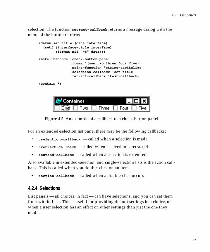
(make-instance ’check-button-panel :items ’(one two three four five) :print-function ’string-capitalize :selection-callback ’set-title :retract-callback ’test-callback)
(contain *)
Figure 4.5 An example of a callback to a check-button panel
For an extended-selection list pane, there may be the following callbacks:
• :selection-callback — called when a selection is made
• :retract-callback — called when a selection is retracted
• :extend-callback — called when a selection is extended
Also available in extended-selection and single-selection lists is the action call-back. This is called when you double-click on an item.
• :action-callback — called when a double-click occurs
4.2.4 Selections
List panels — all choices, in fact — can have selections, and you can set themfrom within Lisp. This is useful for providing default settings in a choice, orwhen a user selection has an effect on other settings than just the one theymade.
27
Choices
28
The selection is represented as a vector of offsets into the list of the choice’sitems, unless it is a single-selection choice, in which case it is just representedas an offset.
The initial selection is controlled with the initarg :selection . The accessorchoice-selection is provided.
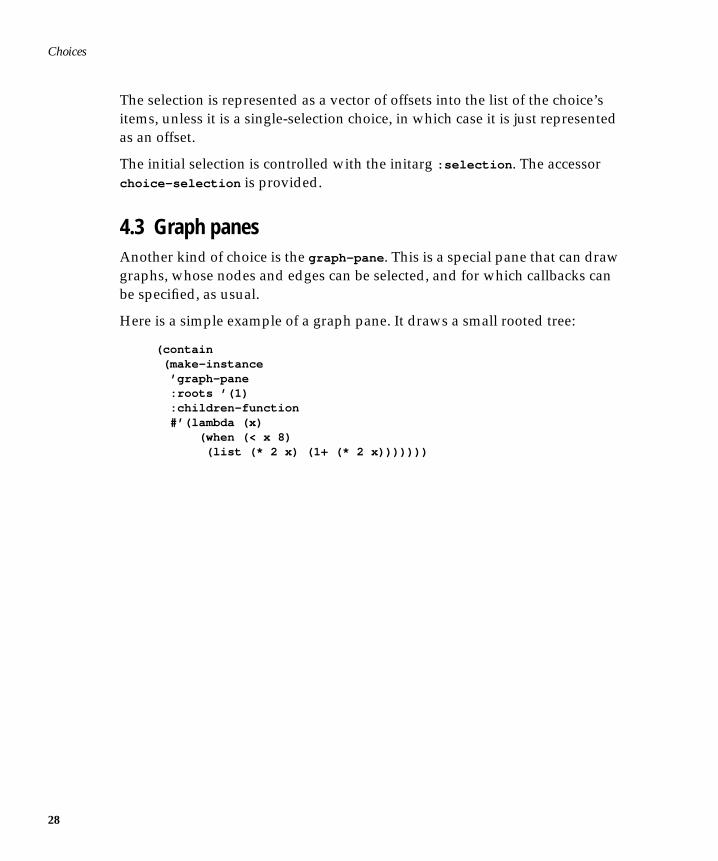
4.3 Graph panesAnother kind of choice is the graph-pane . This is a special pane that can drawgraphs, whose nodes and edges can be selected, and for which callbacks canbe specified, as usual.
Here is a simple example of a graph pane. It draws a small rooted tree:
(contain (make-instance ’graph-pane :roots ’(1) :children-function #’(lambda (x) (when (< x 8) (list (* 2 x) (1+ (* 2 x)))))))
4.3 Graph panes
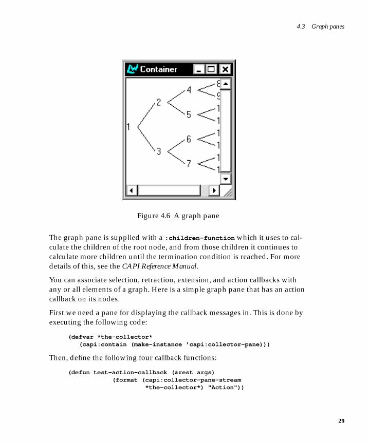
Figure 4.6 A graph pane
The graph pane is supplied with a :children-function which it uses to cal-culate the children of the root node, and from those children it continues tocalculate more children until the termination condition is reached. For moredetails of this, see the CAPI Reference Manual.
You can associate selection, retraction, extension, and action callbacks withany or all elements of a graph. Here is a simple graph pane that has an actioncallback on its nodes.
First we need a pane for displaying the callback messages in. This is done byexecuting the following code:
(defvar *the-collector* (capi:contain (make-instance ’capi:collector-pane)))
Then, define the following four callback functions:
(defun test-action-callback (&rest args) (format (capi:collector-pane-stream *the-collector*) "Action"))
29
Choices
30
(defun test-selection-callback (&rest args) (format (capi:collector-pane-stream *the-collector*) "Selection"))
(defun test-extend-callback (&rest args) (format (capi:collector-pane-stream *the-collector*) "Extend"))
(defun test-retract-callback (&rest args) (format (capi:collector-pane-stream *the-collector*) "Retract"))
Now create an extended selection graph pane which uses each of these call-backs, the callback used depending on the action taken:
(contain (make-instance ’graph-pane :interaction :extended-selection :roots ’(1) :children-function #’(lambda (x) (when (< x 8) (list (* 2 x) (1+ (* 2 x))))) :action-callback ’test-action-callback :selection-callback ’test-selection-callback :extend-callback ’test-extend-callback :retract-callback ’test-retract-callback))
The selection callback function is called whenever any node in the graph isselected.
The extension callback function is called when the selection is extended bymiddle clicking on another node (thus selecting it too).
The retract callback function is called whenever an already selected node isdeselected.
The action callback function is called whenever an action is performed on anode (that is, whenever it is double clicked on).
4.4 Option panes and drop-down list boxesOption panes, created with the option-pane class, display the current selec-tion from a single-selection list. When you click on the option pane, the list
4.5 Menu components
appears and you can make another selection from it. Once the selection ismade, it is displayed in the option pane.
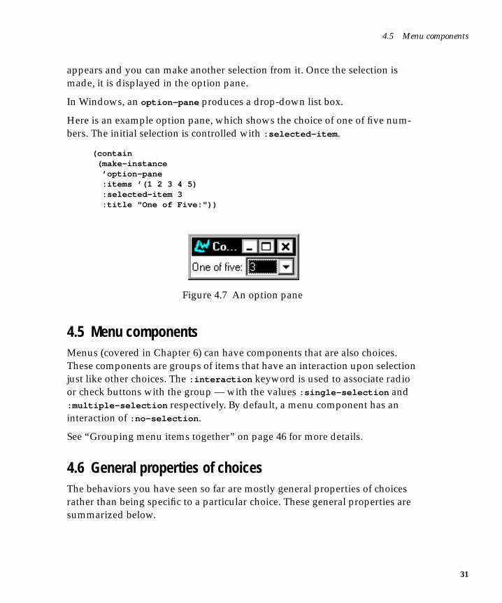
In Windows, an option-pane produces a drop-down list box.
Here is an example option pane, which shows the choice of one of five num-bers. The initial selection is controlled with :selected-item .
(contain (make-instance ’option-pane :items ’(1 2 3 4 5) :selected-item 3 :title "One of Five:"))
Figure 4.7 An option pane
4.5 Menu componentsMenus (covered in Chapter 6) can have components that are also choices.These components are groups of items that have an interaction upon selectionjust like other choices. The :interaction keyword is used to associate radioor check buttons with the group — with the values :single-selection and:multiple-selection respectively. By default, a menu component has aninteraction of :no-selection .
See “Grouping menu items together” on page 46 for more details.
4.6 General properties of choicesThe behaviors you have seen so far are mostly general properties of choicesrather than being specific to a particular choice. These general properties aresummarized below.
31
Choices
32
4.6.1 Interaction
All choices have a selection interaction, controlled by the :interaction ini-targ. The radio-button-panel and check-button-panel are simply button-
panels with their interactions set appropriately. The interaction possibilitiesare listed below.
Set :interaction to :single-selection to force single selection. Onlyone item may be selected at a time: selecting an item deselects any otherselected item.
Set :interaction to the value :multiple-selection to create a multipleselection choice element. This lets you select as many items as you want.A selected item may be deselected by clicking on it again.
Set :interaction to the value :extended-selection to create anextended selection element. This is a combination of the other two: Onlyone item may be selected, but the selection may be extended to morethan one item.
Set :interaction to the value :no-selection to force no interaction.Note that this option is not available for list panels. To display a list ofitems with no selection you should use a display pane instead.
Specifying an interaction that is invalid for a particular choice causes a compi-lation error.
The accessor choice-interaction is provided for inspecting a choice’s inter-action.
4.6.2 Selections
All choices have a selection. This is a state representing the items currentlyselected. The selection is represented as a vector of offsets into the list of thechoice’s items, unless it is a single-selection choice, in which case it is just rep-resented as an offset.
The initial selection is controlled with the initarg :selection . The accessorchoice-selection is provided.
Generally, it is easier to refer to the selection in terms of the items selected,rather than by offsets, so the CAPI provides the notion of a selected item and
4.6 General properties of choices
the selected items. The first of these is the selected item in a single-selectionchoice. The second is a list of the selected items in any choice.
The accessors choice-selected-item and choice-selected-items and theinitargs :selected-item and :selected-items provide access to these con-ceptual slots.
4.6.3 Callbacks
All choices can have callbacks associated with them. These callbacks are acti-vated when the application user makes a selection, and different sorts of ges-ture can have different sorts of callback associated with them.
The following callbacks are available: :selection-callback , :retract-call-
back (called when a deselection is made), :extend-callback , and :action-
callback (called when a double-click occurs). What makes one choice differ-ent from another is that they permit different combinations of these callbacks.This is a consequence of the differing interactions. For example, you cannothave an :extend-callback in a radio button panel, because you cannotextend selection in one.
Callbacks pass data to the function they call. There are default arguments foreach type of callback. Using the :callback-type keyword allows you tochange these defaults. It can take any of the following arguments.
:interface causes the interface to be passed as an argument to thecallback function.
:data causes the value of the selected data to be passed to thecallback function.
:item causes the selected item to be passed as an argument tothe callback function.
The following combinations of two of the above are also allowed –:interface-data , :interface-item , :data-interface and :item-
interface . In each of these cases two arguments are passed to the callbackfunction.
A final option is to pass no arguments, using the :none keyword The follow-ing example uses a push button and a callback function to display the argu-ments it receives.
33
Choices
34
(defun show-callback-args (arg1 arg2) (display-message "The arguments were ~S and ~S" arg1 arg2))
(setq example-button (make-instance ’push-button :text "Push Me" :callback ’show-callback-args :data "Here is some data" :callback-type :data-interface))
(contain example-button)
Try changing the :callback-type to other types.
If you do not use the :callback-type argument and you do not know whatthe default is, you can include a &rest args statement in your callback func-tion to account for all the arguments that might be passed.
Specifying a callback that is invalid for a particular choice causes a compila-tion error.
5
5Laying Out CAPI Panes
So far, you have seen how you can create a variety of different window ele-ments using the CAPI. Up to now, though, you have only created interfaceswhich contain one of these elements. The CAPI provides a series of layout ele-ments which allow you to combine several elements in a single window. Thischapter provides an introduction to the different types of layout available andthe ways in which each can be used.
Layouts are created just like any other CAPI element, by using make-
instance . Each layout must contain a description of the CAPI elements it con-tains, given as a list to the :description keyword.
A layout is used to group any instances of simple-pane and its subclasses (forinstance all the elements you met in the last chapter), and pinboard object andits subclasses (discussed in Chapter 9, “Creating Your Own Panes”). Onceagain, you should make sure you have defined the test-callback functionbefore attempting any of the examples in this chapter. Its definition isrepeated here for convenience.
(defun test-callback (data interface) (display-message "Data ~S in interface ~S" data interface))
35
Laying Out CAPI Panes
36
5.1 Organizing panes in columns and rowsYou will frequently need to organize a number of different elements in rowsand columns. The column-layout and row-layout elements are provided tomake this easy.
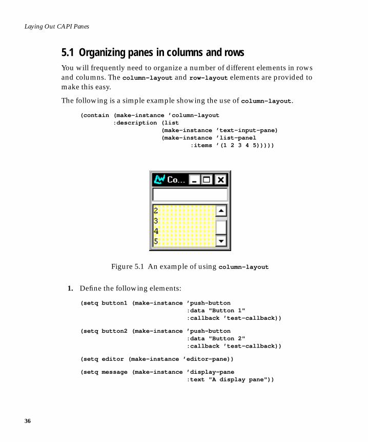
The following is a simple example showing the use of column-layout .
(contain (make-instance ’column-layout :description (list (make-instance ’text-input-pane) (make-instance ’list-panel :items ’(1 2 3 4 5)))))
Figure 5.1 An example of using column-layout
1. Define the following elements:
(setq button1 (make-instance ’push-button :data "Button 1" :callback ’test-callback))
(setq button2 (make-instance ’push-button :data "Button 2" :callback ’test-callback))
(setq editor (make-instance ’editor-pane))
(setq message (make-instance ’display-pane :text "A display pane"))
5.1 Organizing panes in columns and rows
(setq text (make-instance ’text-input-pane :title "Text: " :title-position :left :callback ’test-callback))
These will be used in the examples throughout the rest of this chapter.
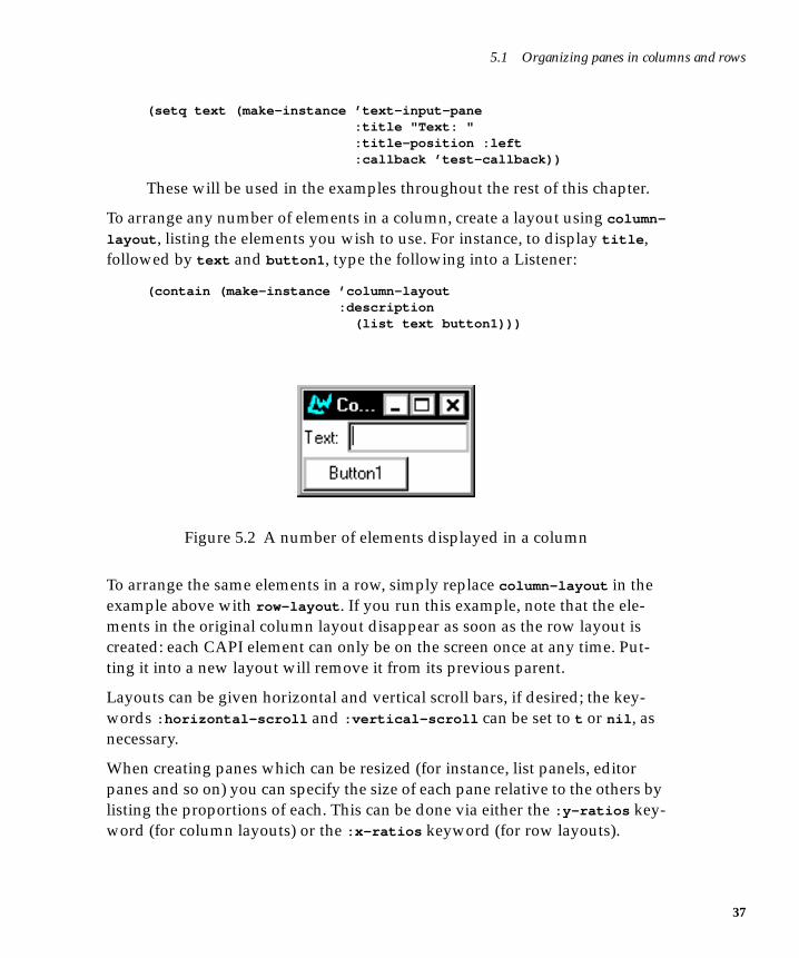
To arrange any number of elements in a column, create a layout using column-
layout , listing the elements you wish to use. For instance, to display title ,followed by text and button1 , type the following into a Listener:
(contain (make-instance ’column-layout :description (list text button1)))
Figure 5.2 A number of elements displayed in a column
To arrange the same elements in a row, simply replace column-layout in theexample above with row-layout . If you run this example, note that the ele-ments in the original column layout disappear as soon as the row layout iscreated: each CAPI element can only be on the screen once at any time. Put-ting it into a new layout will remove it from its previous parent.
Layouts can be given horizontal and vertical scroll bars, if desired; the key-words :horizontal-scroll and :vertical-scroll can be set to t or nil , asnecessary.
When creating panes which can be resized (for instance, list panels, editorpanes and so on) you can specify the size of each pane relative to the others bylisting the proportions of each. This can be done via either the :y-ratios key-word (for column layouts) or the :x-ratios keyword (for row layouts).
37
Laying Out CAPI Panes
38
(contain (make-instance ’column-layout :description (list (make-instance ’display-pane) (make-instance ’editor-pane) (make-instance ’listener-pane)) :y-ratios ’(1 5 3)))
You may need to resize this window in order to see the size of each pane.
Note that the heights of the three panes are in the proportions specified. The:x-ratios keyword will adjust the width of panes in a row-layout in a similarway.
5.2 Other types of layoutRow and column layouts are the most basic type of layout class available inthe CAPI, and will be sufficient for many things you want to do. A variety ofother layouts are available as well, as described in this section.
5.2.1 Grid layouts
Whereas row and column layouts only allow you to position a pane horizon-tally or vertically (depending on which class you use), grid layouts let youspecify both, thus allowing you to create a complete grid of different CAPIpanes.
5.2.2 Simple layouts
Simple layouts control the layout of only one pane. Where possible, the paneis resized to fit the layout. Simple layouts are sometimes useful when youneed to encapsulate a pane.
5.2.3 Pinboard layouts
Pinboard layouts allow you to position a pane anywhere within a window, byspecifying the x and y coordinates of the pane precisely. They are a means ofletting you achieve any effect which you cannot create using the other avail-able layouts, although their use can be correspondingly more complex. Theyare discussed in more detail in Chapter 9, “Creating Your Own Panes”.
5.3 Combining different layouts
5.3 Combining different layoutsYou will not always want to arrange all your elements in a single row or col-umn. You can include other layouts in the list of elements used in any layout,thus enabling you to specify precisely how panes in a window should bearranged.
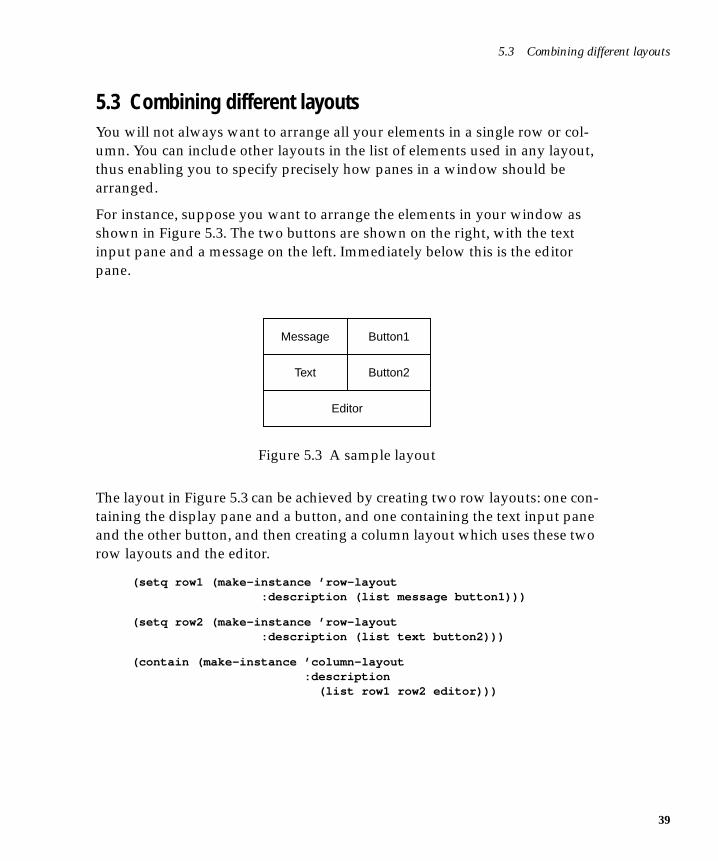
For instance, suppose you want to arrange the elements in your window asshown in Figure 5.3. The two buttons are shown on the right, with the textinput pane and a message on the left. Immediately below this is the editorpane.
Figure 5.3 A sample layout
The layout in Figure 5.3 can be achieved by creating two row layouts: one con-taining the display pane and a button, and one containing the text input paneand the other button, and then creating a column layout which uses these tworow layouts and the editor.
(setq row1 (make-instance ’row-layout :description (list message button1)))
(setq row2 (make-instance ’row-layout :description (list text button2)))
(contain (make-instance ’column-layout :description (list row1 row2 editor)))
Message
Text
Button1
Button2
Editor
39
Laying Out CAPI Panes
40
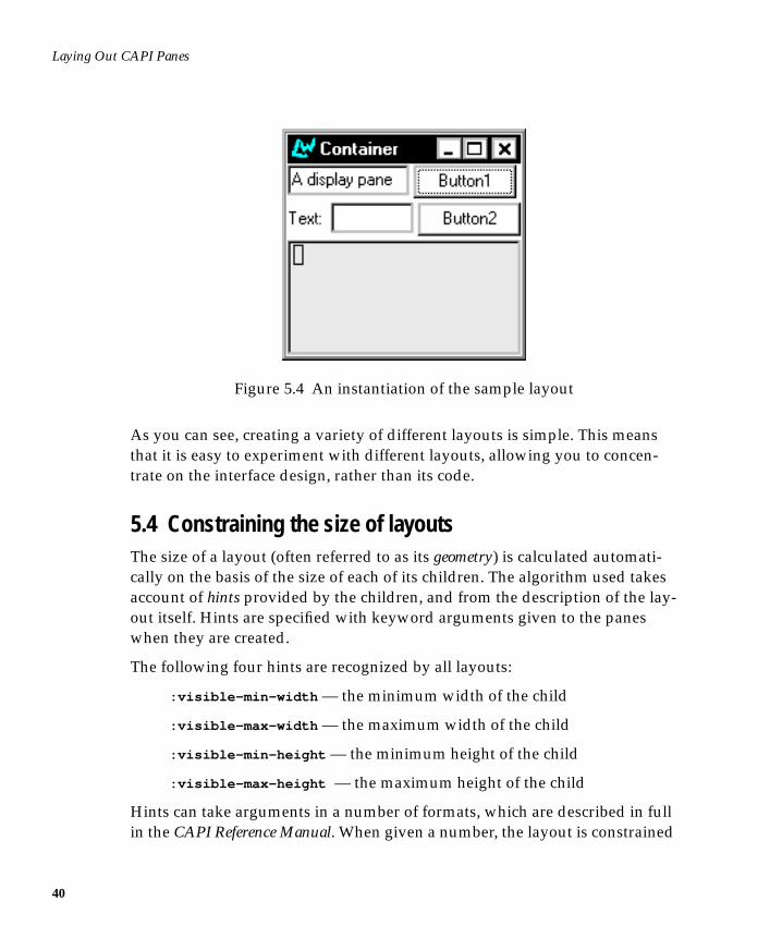
Figure 5.4 An instantiation of the sample layout
As you can see, creating a variety of different layouts is simple. This meansthat it is easy to experiment with different layouts, allowing you to concen-trate on the interface design, rather than its code.
5.4 Constraining the size of layoutsThe size of a layout (often referred to as its geometry) is calculated automati-cally on the basis of the size of each of its children. The algorithm used takesaccount of hints provided by the children, and from the description of the lay-out itself. Hints are specified with keyword arguments given to the paneswhen they are created.
The following four hints are recognized by all layouts:
:visible-min-width — the minimum width of the child
:visible-max-width — the maximum width of the child
:visible-min-height — the minimum height of the child
:visible-max-height — the maximum height of the child
Hints can take arguments in a number of formats, which are described in fullin the CAPI Reference Manual. When given a number, the layout is constrained
5.4 Constraining the size of layouts
to that number of pixels. A number of characters can also be specified, asshown in the next example.
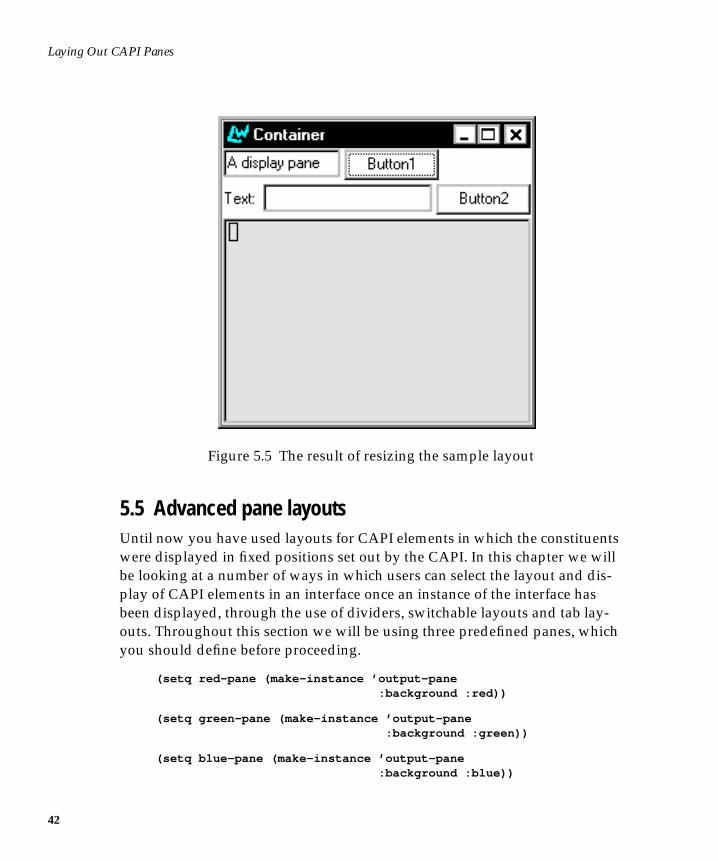
In the last section, you created a window with five panes, by combining rowand column layouts. Now consider changing the definition of the editor paneso that it required to have a minimum size. This would be a sensible change tomake, because editor panes need to be large enough to work with comfort-ably.
(setq editor2 (make-instance ’editor-pane :visible-min-width ’(:character 30) :visible-min-height ’(:character 10)))
You will now have to place this new editor into the layouts that contained theold one. Only one layout is affected: the overall column layout which bringsall the panes together.
Before typing the following into the listener, you should close down all thewindows created in this chapter in order to free up the instances of Button1 ,Button2 and so forth.
(contain (make-instance ’column-layout :description (list row1 row2 editor2)))
41
Laying Out CAPI Panes
42
Figure 5.5 The result of resizing the sample layout
5.5 Advanced pane layoutsUntil now you have used layouts for CAPI elements in which the constituentswere displayed in fixed positions set out by the CAPI. In this chapter we willbe looking at a number of ways in which users can select the layout and dis-play of CAPI elements in an interface once an instance of the interface hasbeen displayed, through the use of dividers, switchable layouts and tab lay-outs. Throughout this section we will be using three predefined panes, whichyou should define before proceeding.
(setq red-pane (make-instance ’output-pane :background :red))
(setq green-pane (make-instance ’output-pane :background :green))
(setq blue-pane (make-instance ’output-pane :background :blue))
5.5 Advanced pane layouts
5.5.1 Switchable layouts
A switchable layout allows you to place CAPI objects on top of one anotherand determine which object is displayed on top through Lisp code, possiblylinked to a button or menu option through a callback. Switchable layouts areset up using a switchable-layout element in a make-instance . As with theother layouts, such as column-layout and row-layout , the elements to beorganized are given as a list to the :description keyword. Here is an exam-ple:
(setq switching-panes (make-instance ’switchable-layout :description (list red-pane green-pane)))
(contain switching-panes)
Note that the default pane to be displayed is the red pane, which was the firstpane in the description list. The two panes can now be switched betweenusing switchable-layout-visible-child :
(setf (switchable-layout-visible-child switching-panes) green-pane)
(setf (switchable-layout-visible-child switching-panes) red-pane)
5.5.2 Tab layouts
In its simplest mode, a tab layout is similar to a switchable layout, except thateach pane is provided with a labelled tab, like the tabs on filing cabinet foldersor address books. If the tab is clicked on by the user, the pane it is attached tois pulled to the front.
(make-instance ’tab-layout :items (list (list "one" red-pane) (list "two" green-pane) (list "three" blue-pane)) :print-function ’car :visible-child-function ’second)
(contain *)
43
Laying Out CAPI Panes
44
The example needs the :print-function to be car , or else the tabs will belabelled with the object numbers of the panes as well as the title provided inthe list.
However, a tab layout can also be used in a non-switchable manner, with eachtab responding with a callback to alter the appearance of only one pane. Inthis mode the :description keyword is used to describe the main layout ofthe tab pane. In the following example the tabs alter the choice of startingnode for one graph pane, by using a callback to the graph-pane-roots acces-sor:
(defun tab-graph (items) (let* ((gp (make-instance ’graph-pane)) (tl (make-instance ’tab-layout :description (list gp) :items items :visible-child-function nil :key-function nil :print-function (lambda (x) (format nil "~R" x)) :callback-type :data :selection-callback #’(lambda (data) (setf (graph-pane-roots gp) (list data)))))) (contain tl)))
(tab-graph ’(1 2 4 5 7))
5.5.3 Dividers
Sometimes you may wish to have two or more panes presented in a columnlayout, with a horizontal divider between them. This is to allow the user theoption of resizing one pane into the space of the other. By clicking on the barbetween the two panes produced in the layout below, and then dragging it upor down the panes are resized.
(contain (make-instance ’column-layout :description (list green-pane :divider red-pane)))
Dividers can also be placed between panes in a row-layout or even combina-tions of row and column layouts.
6
6Creating Menus
You can create menus for an application using the menu class.
You should make sure you have defined the test-callback and hello func-tions before attempting any of the examples in this chapter. Their definitionsare repeated here for convenience.
(defun test-callback (data interface) (display-message "Data ~S in interface ~S" data interface))
(defun hello (data interface) (declare (ignore data interface)) (display-message "Hello World"))
6.1 Creating a menuA menu can be created in much the same way as any of the CAPI classes youhave already met.
1. Type the following into a Listener:
(make-instance ’menu :title "Foo" :items ’("One" "Two" "Three" "Four") :callback ’test-callback)
45
Creating Menus
46
(make-instance ’interface :menu-bar-items (list *))
(display *)
This creates a CAPI interface with a menu, Foo , which contains four items.Choosing any of these items displays its arguments. Each item has the call-back specified by the :callback keyword.
A submenu can be created simply by specifying a menu as one of the items ofthe top-level menu.
2. Type the following into a Listener:
(make-instance ’menu :title "Bar" :items ’("One" "Two" "Three" "Four") :callback ’test-callback)
(make-instance ’menu :title "Baz" :items (list 1 2 * 4 5) :callback ’test-callback)
(contain *)
This creates an interface which has a menu, called Baz, which itself containsfive items. The third item is another menu, Bar, which contains four items.Once again, selecting any item returns its arguments.
Menus can be nested as deeply as required using this method.
6.2 Grouping menu items togetherThe menu-component class lets you group related items together in a menu.This allows similar menu items to share properties, such as callbacks, and tobe visually separated from other items in the menus. Menu components areactually choices.
Here is a simple example of a menu component. This creates a menu calledItems , which has four items. Menu 1 and Menu 2 are ordinary menu items, butItem 1 and Item 2 are created from a menu component, and are thereforegrouped together on the menu bar.
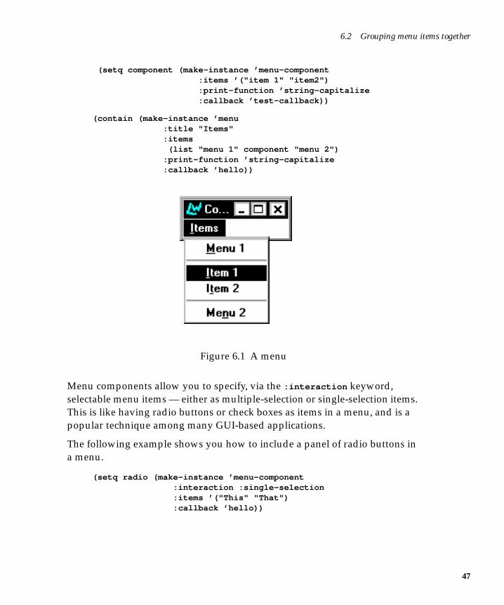
6.2 Grouping menu items together
(setq component (make-instance ’menu-component :items ’("item 1" "item2") :print-function ’string-capitalize :callback ’test-callback))
(contain (make-instance ’menu :title "Items" :items (list "menu 1" component "menu 2") :print-function ’string-capitalize :callback ’hello))
Figure 6.1 A menu
Menu components allow you to specify, via the :interaction keyword,selectable menu items — either as multiple-selection or single-selection items.This is like having radio buttons or check boxes as items in a menu, and is apopular technique among many GUI-based applications.
The following example shows you how to include a panel of radio buttons ina menu.
(setq radio (make-instance ’menu-component :interaction :single-selection :items ’("This" "That") :callback ’hello))
47
Creating Menus
48
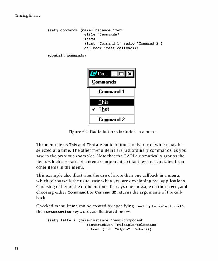
(setq commands (make-instance ’menu :title "Commands" :items (list "Command 1" radio "Command 2") :callback ’test-callback))
(contain commands)
Figure 6.2 Radio buttons included in a menu
The menu items This and That are radio buttons, only one of which may beselected at a time. The other menu items are just ordinary commands, as yousaw in the previous examples. Note that the CAPI automatically groups theitems which are parts of a menu component so that they are separated fromother items in the menu.
This example also illustrates the use of more than one callback in a menu,which of course is the usual case when you are developing real applications.Choosing either of the radio buttons displays one message on the screen, andchoosing either Command1 or Command2 returns the arguments of the call-back.
Checked menu items can be created by specifying :multiple-selection tothe :interaction keyword, as illustrated below.
(setq letters (make-instance ’menu-component :interaction :multiple-selection :items (list "Alpha" "Beta")))
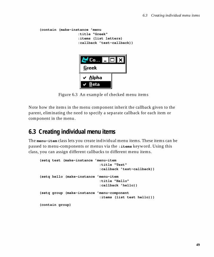
6.3 Creating individual menu items
(contain (make-instance ’menu :title "Greek" :items (list letters) :callback ’test-callback))
Figure 6.3 An example of checked menu items
Note how the items in the menu component inherit the callback given to theparent, eliminating the need to specify a separate callback for each item orcomponent in the menu.
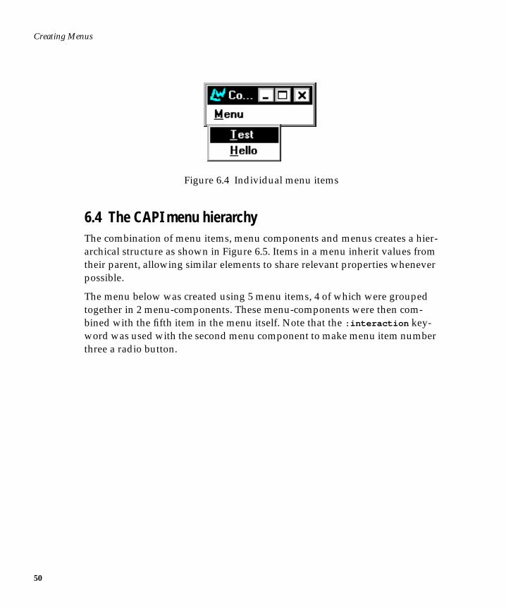
6.3 Creating individual menu itemsThe menu-item class lets you create individual menu items. These items can bepassed to menu-components or menus via the :items keyword. Using thisclass, you can assign different callbacks to different menu items.
(setq test (make-instance ’menu-item :title "Test" :callback ’test-callback))
(setq hello (make-instance ’menu-item :title "Hello" :callback ’hello))
(setq group (make-instance ’menu-component :items (list test hello)))
(contain group)
49
Creating Menus
50
Figure 6.4 Individual menu items
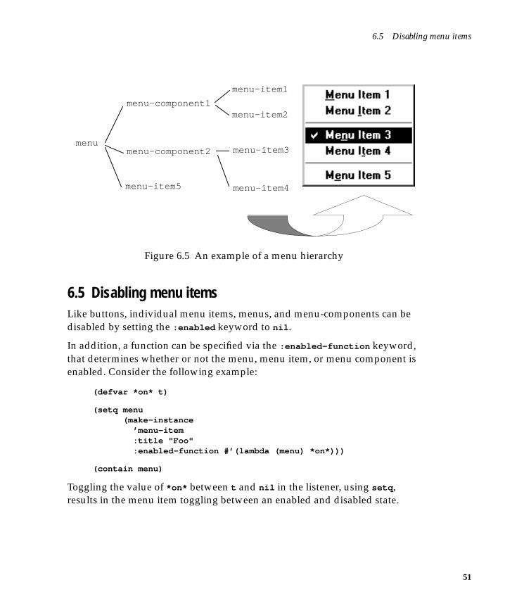
6.4 The CAPI menu hierarchyThe combination of menu items, menu components and menus creates a hier-archical structure as shown in Figure 6.5. Items in a menu inherit values fromtheir parent, allowing similar elements to share relevant properties wheneverpossible.
The menu below was created using 5 menu items, 4 of which were groupedtogether in 2 menu-components. These menu-components were then com-bined with the fifth item in the menu itself. Note that the :interaction key-word was used with the second menu component to make menu item numberthree a radio button.
6.5 Disabling menu items
Figure 6.5 An example of a menu hierarchy
6.5 Disabling menu itemsLike buttons, individual menu items, menus, and menu-components can bedisabled by setting the :enabled keyword to nil .
In addition, a function can be specified via the :enabled-function keyword,that determines whether or not the menu, menu item, or menu component isenabled. Consider the following example:
(defvar *on* t)
(setq menu (make-instance ’menu-item :title "Foo" :enabled-function #’(lambda (menu) *on*)))
(contain menu)
Toggling the value of *on* between t and nil in the listener, using setq ,results in the menu item toggling between an enabled and disabled state.
menu-item1
menu-component1
menumenu-component2
menu-item2
menu-item3
menu-item4menu-item5
51

Creating Menus
52
7
7Defining Interface Classes
So far we have looked at various components for building interfaces. TheCAPI provides all these and more, but instead of continuing with our explora-tion of the various classes provided, let us see how what we have learned sofar can be combined into a single, non-trivial interface class.
7.1 The define-interface macroThe macro define-interface is used to define subclasses of interface , thesuperclass of all CAPI interface classes.
It is an extension to defclass , which provides the functionality of that macroas well as the specification of the panes, layouts, and menus from which aninterface is composed. It takes the same arguments as defclass , and supportsthe additional options :panes , :layouts , :menus , and :menu-bar .
Each component of the interface is named in the code, and a slot of that nameis added to the class created. When an instance of the class is made, each com-ponent is created automatically and placed in its slot.
When defining a component, you can use other components within the defini-tion simply by giving its name. You can refer to the interface itself by the spe-cial name interface .
53
Defining Interface Classes
54
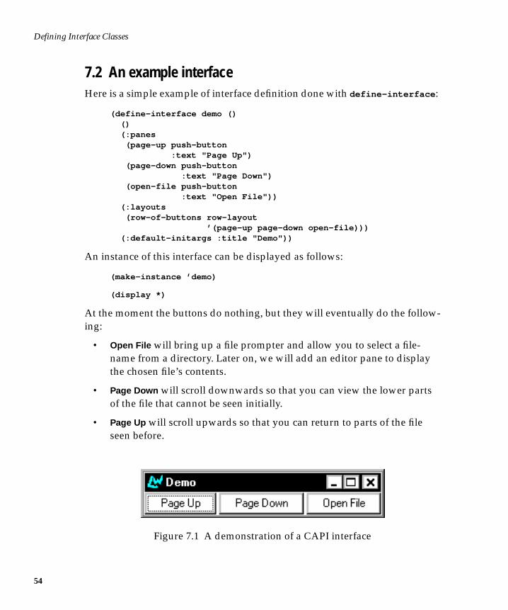
7.2 An example interfaceHere is a simple example of interface definition done with define-interface :
(define-interface demo () () (:panes (page-up push-button :text "Page Up") (page-down push-button :text "Page Down") (open-file push-button :text "Open File")) (:layouts (row-of-buttons row-layout ’(page-up page-down open-file))) (:default-initargs :title "Demo"))
An instance of this interface can be displayed as follows:
(make-instance ’demo)
(display *)
At the moment the buttons do nothing, but they will eventually do the follow-ing:
• Open File will bring up a file prompter and allow you to select a file-name from a directory. Later on, we will add an editor pane to displaythe chosen file’s contents.
• Page Down will scroll downwards so that you can view the lower partsof the file that cannot be seen initially.
• Page Up will scroll upwards so that you can return to parts of the fileseen before.
Figure 7.1 A demonstration of a CAPI interface
7.2 An example interface
Later on, we will specify callbacks for these buttons to provide this functional-ity.
The (:default-initargs :title "Demo") part at the end is necessary togive the interface a title. If no title is given, the default name is “Untitled CAPIInterface”.
7.2.1 How the example works
Examine the define-interface call to see how this interface was built. Thefirst part of the call to define interface is shown below:
(define-interface demo () ()
This part of the macro is identical to defclass — you provide:
• The name of the interface class being defined
• The superclasses of the interface (defaulting to interface )
• The slot descriptions
The interesting part of the define-interface call occurs after these defclass -like preliminaries. The remainder of a define-interface call lists all elementsthat define the interface’s appearance. Here is the :panes part of the defini-tion:
(:panes (page-up push-button :text "Page Up") (page-down push-button :text "Page Down") (open-file push-button :text "Open File"))
Two arguments — the name and the class — are required to produce a pane.You can supply slot values as you would for any pane.
Here is the :layouts part of the definition:
(:layouts (row-of-buttons row-layout ’(page-up page-down open-file)))
55
Defining Interface Classes
56
Three arguments — the name, the class, and any child layouts — are requiredto produce a layout. Notice how the children of the layout are specified byusing their component names.
The interface information given so far is a series of specifications for panesand layouts. It could also specify menus and a menu bar. In this case, threebuttons are defined. The layout chosen is a row layout, which displays thethree buttons side by side at the top of the pane.
7.3 Adapting the exampleThe :panes and :layouts keywords can take a number of panes and layouts,each specified one after the other. By listing several panes, menus, and so on,complicated interfaces can be constructed quickly.
To see how simply this is done, let us add an editor pane to our interface. Weneed this to display the text contained in the file chosen with the Open File but-ton.
The editor pane needs a layout. It could be added to the row-layout alreadybuilt, or another layout could be made for it. Then, the two layouts wouldhave to be put inside a third to contain them (see Chapter 5, Laying Out CAPIPanes).
The first thing to do is add the editor pane to the panes description. The oldpanes description read:
(:panes (page-up push-button :text "Page Up") (page-down push-button :text "Page Down") (open-file push-button :text "Open File"))
The new one includes an editor pane named viewer .
7.3 Adapting the example
(:panes (page-up push-button :text "Page Up") (page-down push-button :text "Page Down") (open-file push-button :text "Open File") (viewer editor-pane :title "File:" :text "No file selected." :visible-min-height ’(:character 8) :reader viewer-pane))
This specifies the editor pane, with a stipulation that it must be at least 8 char-acters high. This allows you to see a worthwhile amount of the file beingviewed in the pane.
Note the use of :reader , which defines a reader method for the interfacewhich returns the editor pane. You can also specify writers or accessors in thisway.
The interface also needs a layout for the editor pane in the layouts section. Theold layouts description read:
(:layouts (row-of-buttons row-layout ’(page-up page-down open-file)))
The new one reads:
(:layouts (main-layout column-layout ’(row-of-buttons row-with-editor-pane)) (row-of-buttons row-layout ’(page-up page-down open-file)) (row-with-editor-pane row-layout ’(viewer)))
This creates another row-layout for the new pane and then encapsulates thetwo row layouts into a third column-layout called main-layout . This is usedas the default layout, specified by setting the :layout initarg to main-layout
in the :default-initargs section. If there is no default layout specified,define-interface uses the first one listed.
57
Defining Interface Classes
58
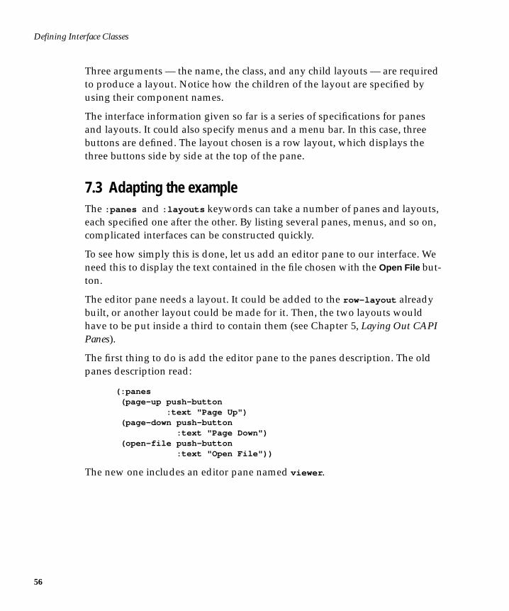
By putting the layout of buttons and the layout with the editor pane in a col-umn layout, their relative position has been controlled: the buttons appear ina row above the editor pane.
The code for the new interface is now as follows:
(define-interface demo () () (:panes (page-up push-button :text "Page Up") (page-down push-button :text "Page Down") (open-file push-button :text "Open File") (viewer editor-pane :title "File:" :text "No file selected." :visible-min-height ’(:character 8) :reader viewer-pane)) (:layouts (main-layout column-layout ’(row-of-buttons row-with-editor-pane)) (row-of-buttons row-layout ’(page-up page-down open-file)) (row-with-editor-pane row-layout ’(viewer))) (:default-initargs :title "Demo"))
Displaying an instance of the interface by entering the line of code below pro-duces the window in Figure 7.2:
(display (make-instance ’demo))
7.3 Adapting the example
Figure 7.2 A CAPI interface with editor pane
7.3.1 Adding menus
To add menus to your interface you must first specify the menus themselves,and then a menu bar of which they will be a part.
Let us add some menus that duplicate the proposed functionality for the but-tons. We will add:
• A File menu with a Open option, to do the same thing as Open File
• A Page menu with Page Up and Page Down options, to do the samethings as the buttons with those names
The extra code needed in the define-interface call is this:
(:menus (file-menu "File" ("Open")) (page-menu "Page" ("Page Up" "Page Down"))) (:menu-bar file-menu page-menu)
59
Defining Interface Classes
60
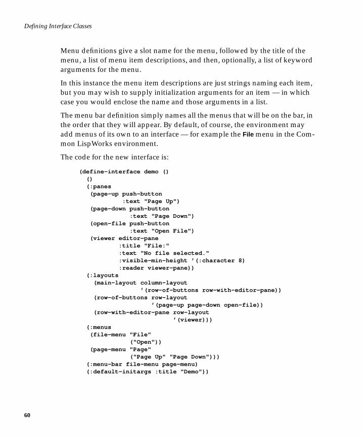
Menu definitions give a slot name for the menu, followed by the title of themenu, a list of menu item descriptions, and then, optionally, a list of keywordarguments for the menu.
In this instance the menu item descriptions are just strings naming each item,but you may wish to supply initialization arguments for an item — in whichcase you would enclose the name and those arguments in a list.
The menu bar definition simply names all the menus that will be on the bar, inthe order that they will appear. By default, of course, the environment mayadd menus of its own to an interface — for example the File menu in the Com-mon LispWorks environment.
The code for the new interface is:
(define-interface demo () () (:panes (page-up push-button :text "Page Up") (page-down push-button :text "Page Down") (open-file push-button :text "Open File") (viewer editor-pane :title "File:" :text "No file selected." :visible-min-height ’(:character 8) :reader viewer-pane)) (:layouts (main-layout column-layout ’(row-of-buttons row-with-editor-pane)) (row-of-buttons row-layout ’(page-up page-down open-file)) (row-with-editor-pane row-layout ’(viewer))) (:menus (file-menu "File" ("Open")) (page-menu "Page" ("Page Up" "Page Down"))) (:menu-bar file-menu page-menu) (:default-initargs :title "Demo"))
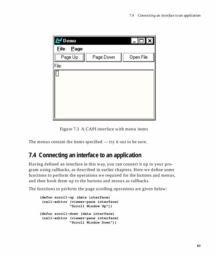
7.4 Connecting an interface to an application
Figure 7.3 A CAPI interface with menu items
The menus contain the items specified — try it out to be sure.
7.4 Connecting an interface to an applicationHaving defined an interface in this way, you can connect it up to your pro-gram using callbacks, as described in earlier chapters. Here we define somefunctions to perform the operations we required for the buttons and menus,and then hook them up to the buttons and menus as callbacks.
The functions to perform the page scrolling operations are given below:
(defun scroll-up (data interface) (call-editor (viewer-pane interface) "Scroll Window Up"))
(defun scroll-down (data interface) (call-editor (viewer-pane interface) "Scroll Window Down"))
61
Defining Interface Classes
62
The functions use the CAPI function call-editor which calls an editor com-mand (given as a string) on an instance of an editor-pane . The editor com-mands Scroll Window Up and Scroll Window Down perform the necessaryoperations for Page Up and Page Down respectively.
The function to perform the file-opening operation is given below:
(defun file-choice (data interface) (let ((file (prompt-for-file "Select A File:"))) (when file
(setf (titled-pane-title (viewer-pane interface))(format nil "File: ~S" file))
(setf (editor-pane-text (viewer-pane interface))(with-open-file (stream file) (let ((buffer (make-array 1024 :element-type (stream-
element-type stream) :adjustable t :fill-pointer 0)))
(do ((char (read-char stream nil nil) (read-char streamnil nil)))
((null char)) (vector-push-extend char buffer))
(subseq buffer 0)))))))
This function prompts for a filename and then displays the file in the editorpane.
The function first produces a file prompter through which a file may beselected. Then, the selected file name is shown in the title of the editor pane(using titled-pane-title ). Finally, the file name is used to get the contents ofthe file and display them in the editor pane (using editor-pane-text ).
The correct callback information for the buttons is specified as shown below:
7.4 Connecting an interface to an application
(:panes (page-up push-button :text "Page Up" :selection-callback ’scroll-up) (page-down push-button :text "Page Down" :selection-callback ’scroll-down) (open-file push-button :text "Open File" :selection-callback ’file-choice) (viewer editor-pane :title "File:" :text "No file selected." :visible-min-height ’(:character 8) :reader viewer-pane))
All the buttons and menu items operate on the editor pane viewer . A reader isset up to allow access to it.
The correct callback information for the menus is specified as shown below:
(:menus (file-menu "File" (("Open")) :selection-callback ’file-choice) (page-menu "Page" (("Page Up" :selection-callback ’scroll-up) ("Page Down" :selection-callback ’scroll-down)))
In this case, each item in the menu has a different callback. The complete codefor the interface is listed below — try it out.
63
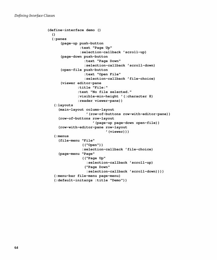
Defining Interface Classes
64
(define-interface demo () () (:panes (page-up push-button :text "Page Up" :selection-callback ’scroll-up) (page-down push-button :text "Page Down" :selection-callback ’scroll-down) (open-file push-button :text "Open File" :selection-callback ’file-choice) (viewer editor-pane :title "File:" :text "No file selected." :visible-min-height ’(:character 8) :reader viewer-pane)) (:layouts (main-layout column-layout ’(row-of-buttons row-with-editor-pane)) (row-of-buttons row-layout ’(page-up page-down open-file)) (row-with-editor-pane row-layout ’(viewer))) (:menus (file-menu "File" (("Open")) :selection-callback ’file-choice) (page-menu "Page" (("Page Up" :selection-callback ’scroll-up) ("Page Down" :selection-callback ’scroll-down)))) (:menu-bar file-menu page-menu) (:default-initargs :title "Demo"))
8
8Prompting for Input
A dialog is a window that receives some input from the user and returns it tothe application. For instance, if the application wants to know where to save afile, it could prompt the user with a file dialog. Dialogs can also be cancelled,meaning that the application should cancel the current operation.
In order to let you know whether or not the dialog was cancelled, CAPI dia-logs always return two values. The first value is the return value itself, and thesecond value is t if the dialog returned normally and nil if the dialog wascancelled.
The CAPI provides both a large set of predefined dialogs and the means tocreate your own. This chapter takes you through some example uses of thepredefined dialogs, and then shows you how to create custom built dialogs.
8.1 Some simple dialogsThe simplest form of dialog is a message dialog. The function display-
message behaves very much like format .
(display-message "Hello world")
65
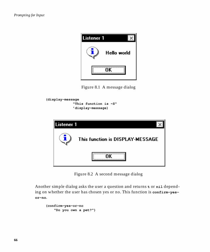
Prompting for Input
66
Figure 8.1 A message dialog
(display-message "This function is ~S" ’display-message)
Figure 8.2 A second message dialog
Another simple dialog asks the user a question and returns t or nil depend-ing on whether the user has chosen yes or no. This function is confirm-yes-
or-no .
(confirm-yes-or-no "Do you own a pet?")
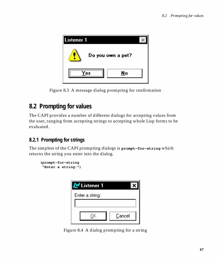
8.2 Prompting for values
Figure 8.3 A message dialog prompting for confirmation
8.2 Prompting for valuesThe CAPI provides a number of different dialogs for accepting values fromthe user, ranging from accepting strings to accepting whole Lisp forms to beevaluated.
8.2.1 Prompting for strings
The simplest of the CAPI prompting dialogs is prompt-for-string whichreturns the string you enter into the dialog.
(prompt-for-string "Enter a string:")
Figure 8.4 A dialog prompting for a string
67
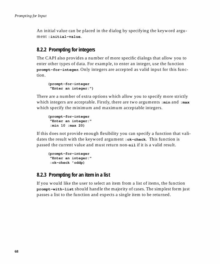
Prompting for Input
68
An initial value can be placed in the dialog by specifying the keyword argu-ment :initial-value .
8.2.2 Prompting for integers
The CAPI also provides a number of more specific dialogs that allow you toenter other types of data. For example, to enter an integer, use the functionprompt-for-integer . Only integers are accepted as valid input for this func-tion.
(prompt-for-integer "Enter an integer:")
There are a number of extra options which allow you to specify more strictlywhich integers are acceptable. Firstly, there are two arguments :min and :max
which specify the minimum and maximum acceptable integers.
(prompt-for-integer "Enter an integer:" :min 10 :max 20)
If this does not provide enough flexibility you can specify a function that vali-dates the result with the keyword argument :ok-check . This function ispassed the current value and must return non-nil if it is a valid result.
(prompt-for-integer "Enter an integer:" :ok-check ’oddp)
8.2.3 Prompting for an item in a list
If you would like the user to select an item from a list of items, the functionprompt-with-list should handle the majority of cases. The simplest form justpasses a list to the function and expects a single item to be returned.
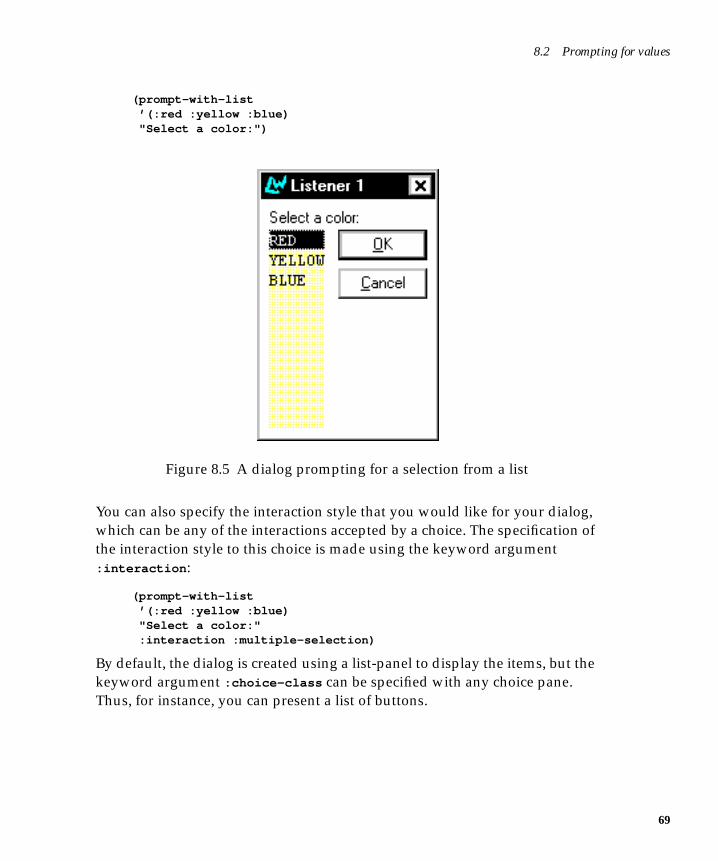
8.2 Prompting for values
(prompt-with-list ’(:red :yellow :blue) "Select a color:")
Figure 8.5 A dialog prompting for a selection from a list
You can also specify the interaction style that you would like for your dialog,which can be any of the interactions accepted by a choice. The specification ofthe interaction style to this choice is made using the keyword argument:interaction :
(prompt-with-list ’(:red :yellow :blue) "Select a color:" :interaction :multiple-selection)
By default, the dialog is created using a list-panel to display the items, but thekeyword argument :choice-class can be specified with any choice pane.Thus, for instance, you can present a list of buttons.
69
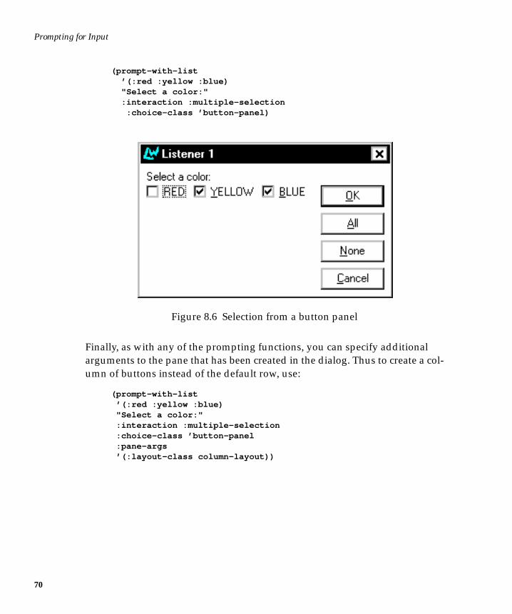
Prompting for Input
70
(prompt-with-list ’(:red :yellow :blue) "Select a color:" :interaction :multiple-selection :choice-class ’button-panel)
Figure 8.6 Selection from a button panel
Finally, as with any of the prompting functions, you can specify additionalarguments to the pane that has been created in the dialog. Thus to create a col-umn of buttons instead of the default row, use:
(prompt-with-list ’(:red :yellow :blue) "Select a color:" :interaction :multiple-selection :choice-class ’button-panel :pane-args ’(:layout-class column-layout))
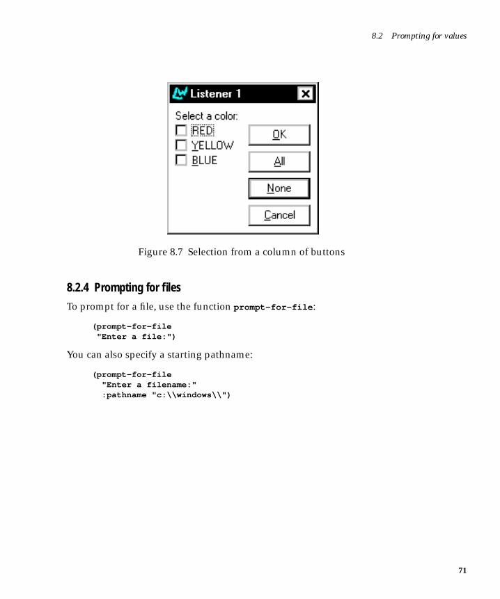
8.2 Prompting for values
Figure 8.7 Selection from a column of buttons
8.2.4 Prompting for files
To prompt for a file, use the function prompt-for-file :
(prompt-for-file "Enter a file:")
You can also specify a starting pathname:
(prompt-for-file "Enter a filename:" :pathname "c:\\windows\\")
71
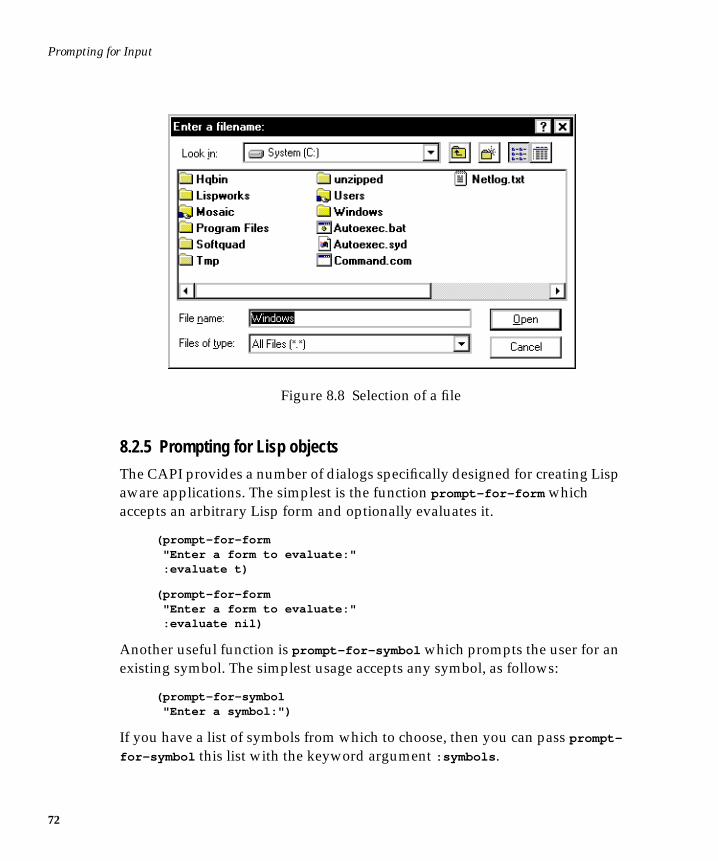
Prompting for Input
72
Figure 8.8 Selection of a file
8.2.5 Prompting for Lisp objects
The CAPI provides a number of dialogs specifically designed for creating Lispaware applications. The simplest is the function prompt-for-form whichaccepts an arbitrary Lisp form and optionally evaluates it.
(prompt-for-form "Enter a form to evaluate:" :evaluate t)
(prompt-for-form "Enter a form to evaluate:" :evaluate nil)
Another useful function is prompt-for-symbol which prompts the user for anexisting symbol. The simplest usage accepts any symbol, as follows:
(prompt-for-symbol "Enter a symbol:")
If you have a list of symbols from which to choose, then you can pass prompt-
for-symbol this list with the keyword argument :symbols .
8.3 Creating your own dialogs
Finally, using :ok-check you can accept only certain symbols. For example, toonly accept a symbol which names a class, use:
(prompt-for-symbol "Enter a symbol:" :ok-check #’(lambda (symbol) (find-class symbol nil)))
8.3 Creating your own dialogsThe CAPI provides a number of built-in dialogs which should cover themajority of most peoples needs. However, there is always the occasional needto create custom built dialogs, and the CAPI makes this very simple, using thefunction display-dialog which displays any CAPI interface as a dialog, andthe functions exit-dialog and abort-dialog as the means to return fromsuch a dialog.
8.3.1 Using display-dialog
Here is a very simple example that displays a Cancel button in a dialog, andwhen that button is pressed the dialog is cancelled. Note that display-dialog
must receive an interface, so an interface is created for the button by using thefunction make-container .
(display-dialog (make-container (make-instance ’push-button :text "Press this button to cancel" :callback ’abort-dialog) :title "My Dialog"))
Figure 8.9 A cancel button
73
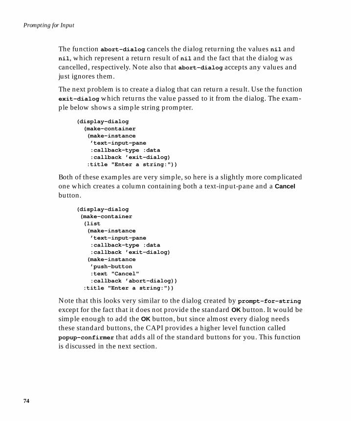
Prompting for Input
74
The function abort-dialog cancels the dialog returning the values nil andnil , which represent a return result of nil and the fact that the dialog wascancelled, respectively. Note also that abort-dialog accepts any values andjust ignores them.
The next problem is to create a dialog that can return a result. Use the functionexit-dialog which returns the value passed to it from the dialog. The exam-ple below shows a simple string prompter.
(display-dialog (make-container (make-instance ’text-input-pane :callback-type :data :callback ’exit-dialog) :title "Enter a string:"))
Both of these examples are very simple, so here is a slightly more complicatedone which creates a column containing both a text-input-pane and a Cancelbutton.
(display-dialog (make-container (list (make-instance ’text-input-pane :callback-type :data :callback ’exit-dialog) (make-instance ’push-button :text "Cancel" :callback ’abort-dialog)) :title "Enter a string:"))
Note that this looks very similar to the dialog created by prompt-for-string
except for the fact that it does not provide the standard OK button. It would besimple enough to add the OK button, but since almost every dialog needsthese standard buttons, the CAPI provides a higher level function calledpopup-confirmer that adds all of the standard buttons for you. This functionis discussed in the next section.
8.3 Creating your own dialogs
8.3.2 Using popup-confirmer
The function popup-confirmer is a higher level function provided to add thestandard buttons to user dialogs, and it is nearly always used in preference todisplay-dialog . In order to create a dialog using popup-confirmer , all youneed to do is to supply a pane to be placed inside the dialog along with thebuttons and the title. The function also expects a title, like all of the prompterfunctions described earlier.
(popup-confirmer (make-instance ’text-input-pane :callback-type :data :callback ’exit-dialog) "Enter a string")
A common thing to want to do with a dialog is to get the return value fromsome state in the pane specified. For instance, in order to create a dialog thatprompts for an integer the string entered into the text-input-pane would needto be converted into an integer. It is possible to do this once the dialog hasreturned, but popup-confirmer has a more convenient mechanism. The func-tion provides a keyword argument, :value-function , which gets passed thepane, and this function should return the value to return from the dialog. Itcan also indicate that the dialog cannot return by returning a second valuewhich is non-nil .
In order to do this conversion, popup-confirmer provides an alternative exitfunction to the usual exit-dialog . This is called exit-confirmer , and it doesall of the necessary work on exiting.
You now have enough information to write a primitive version of prompt-
for-integer .
(defun text-input-pane-integer (pane) (let* ((text (text-input-pane-text pane)) (integer (parse-integer text :junk-allowed t))) (or (and (integerp integer) integer) (values nil t))))
75
Prompting for Input
76
(popup-confirmer (make-instance ’text-input-pane :callback ’exit-confirmer) "Enter an integer:" :value-function ’text-input-pane-integer)
Note that the dialog’s OK button never becomes activated, yet pressing Return
once you have entered a valid integer will return the correct value. This isbecause the OK button is not being dynamically updated on each keystroke inthe text-input-pane so that it activates when the text-input-pane contains avalid integer. The activation of the OK button is recalculated by the functionredisplay-interface , and the CAPI provides a standard callback, :redis-
play-interface , which calls this as appropriate.
Thus, to have an OK button that becomes activated and deactivated dynami-cally, you need to specify the change-callback for the text-input-pane to be:redisplay-interface .
(popup-confirmer (make-instance ’text-input-pane :change-callback :redisplay-interface :callback ’exit-confirmer) "Enter an integer:" :value-function ’text-input-pane-integer)
Note that the OK button now changes dynamically so that it is only ever activewhen the text in the text-input-pane is a valid integer.
The next thing that you might want to do with your integer prompter is tomake it accept only certain values. For instance, you may only want to acceptnegative numbers. This can be specified to popup-confirmer by providing avalidation function with the keyword argument :ok-check . This functionreceives the potential return value (the value returned by the value function)and it must return non-nil if that value is valid. Thus to accept only negativenumbers we could pass minusp as the :ok-check .
8.3 Creating your own dialogs
(popup-confirmer (make-instance ’text-input-pane :change-callback :redisplay-interface :callback ’exit-confirmer) "Enter an integer:" :value-function ’text-input-pane-integer :ok-check ’minusp)
77

Prompting for Input
78
9
9Creating Your Own Panes
The CAPI provides a wide range of built-in panes, but it is still fairly commonto need to create panes of your own. In order to do this, you need to specifyboth the input behavior of the pane (how it reacts to keyboard and mouseevents) and its output behavior (how it displays itself). The class output-pane
is provided for this purpose.
An output-pane is a fully functional graphics port. This allows it to use all ofthe graphics ports functionality to create graphics, and it also has a powerfulinput model which allows it to receive mouse and keyboard input.
9.1 Displaying graphicsThe following is a simple example demonstrating how to create an output-pane and then how to draw a circle on it.
(setq output-pane (contain (make-instance ’output-pane) :best-width 300 :best-height 300)))
79
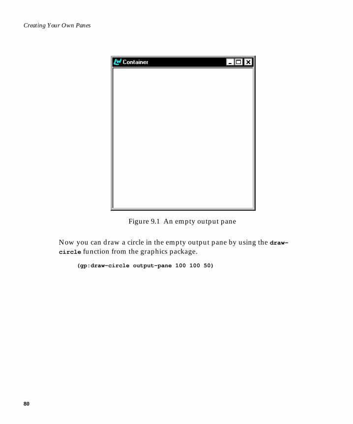
Creating Your Own Panes
80
Figure 9.1 An empty output pane
Now you can draw a circle in the empty output pane by using the draw-
circle function from the graphics package.
(gp:draw-circle output-pane 100 100 50)
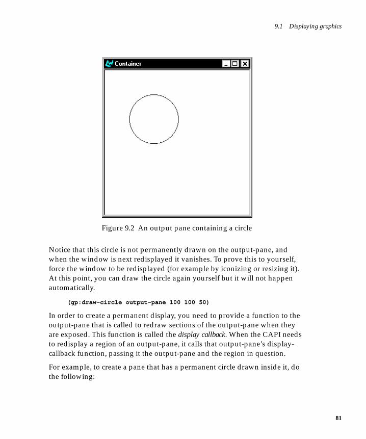
9.1 Displaying graphics
Figure 9.2 An output pane containing a circle
Notice that this circle is not permanently drawn on the output-pane, andwhen the window is next redisplayed it vanishes. To prove this to yourself,force the window to be redisplayed (for example by iconizing or resizing it).At this point, you can draw the circle again yourself but it will not happenautomatically.
(gp:draw-circle output-pane 100 100 50)
In order to create a permanent display, you need to provide a function to theoutput-pane that is called to redraw sections of the output-pane when theyare exposed. This function is called the display callback. When the CAPI needsto redisplay a region of an output-pane, it calls that output-pane’s display-callback function, passing it the output-pane and the region in question.
For example, to create a pane that has a permanent circle drawn inside it, dothe following:
81
Creating Your Own Panes
82
(defun draw-a-circle (pane x y width height) (gp:draw-circle pane 100 100 50))
(contain(make-instance ’output-pane :display-callback ’draw-a-circle) :best-width 300 :best-height 300)
Notice that the callback in this example ignores the region that needs redraw-ing and just redraws everything. This is possible because the CAPI clips thedrawing to the region that needs redisplaying, and hence only the needed partof the drawing gets done. For maximum efficiency, it would be better to onlydraw the minimum area necessary.
The keywords :best-width and :best-height keywords specify the initialwidth and height of the circle pinboard object. More detail can be found in theCAPI Reference Manual.
Now that we can create output-panes with our own display functions, we cancreate a new class of window by using defclass as follows.
(defclass circle-pane (output-pane) () (:default-initargs :display-callback ’draw-a-circle))
(contain (make-instance ’circle-pane))
9.2 Receiving input from the userYou now know enough to be able to create new classes of window which candisplay arbitrary graphics, but to be able to create interactive windows youneed to be able to receive events. The CAPI supports this through the use ofan input model, which is a mapping of events to the callbacks that should berun when they occur.
When the event callback is called, it gets passed the output-pane and the xand y coordinates of the mouse pointer at the time of the event. A few eventsalso pass additional information as necessary; for example, keyboard eventsalso pass the key that was pressed.
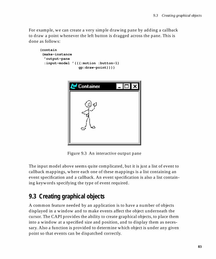
9.3 Creating graphical objects
For example, we can create a very simple drawing pane by adding a callbackto draw a point whenever the left button is dragged across the pane. This isdone as follows:
(contain (make-instance ’output-pane :input-model ’(((:motion :button-1) gp:draw-point))))
Figure 9.3 An interactive output pane
The input model above seems quite complicated, but it is just a list of event tocallback mappings, where each one of these mappings is a list containing anevent specification and a callback. An event specification is also a list contain-ing keywords specifying the type of event required.
9.3 Creating graphical objectsA common feature needed by an application is to have a number of objectsdisplayed in a window and to make events affect the object underneath thecursor. The CAPI provides the ability to create graphical objects, to place theminto a window at a specified size and position, and to display them as neces-sary. Also a function is provided to determine which object is under any givenpoint so that events can be dispatched correctly.
83
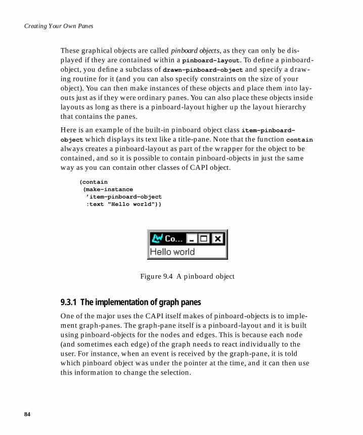
Creating Your Own Panes
84
These graphical objects are called pinboard objects, as they can only be dis-played if they are contained within a pinboard-layout . To define a pinboard-object, you define a subclass of drawn-pinboard-object and specify a draw-ing routine for it (and you can also specify constraints on the size of yourobject). You can then make instances of these objects and place them into lay-outs just as if they were ordinary panes. You can also place these objects insidelayouts as long as there is a pinboard-layout higher up the layout hierarchythat contains the panes.
Here is an example of the built-in pinboard object class item-pinboard-
object which displays its text like a title-pane. Note that the function contain
always creates a pinboard-layout as part of the wrapper for the object to becontained, and so it is possible to contain pinboard-objects in just the sameway as you can contain other classes of CAPI object.
(contain (make-instance ’item-pinboard-object :text "Hello world"))
Figure 9.4 A pinboard object
9.3.1 The implementation of graph panes
One of the major uses the CAPI itself makes of pinboard-objects is to imple-ment graph-panes. The graph-pane itself is a pinboard-layout and it is builtusing pinboard-objects for the nodes and edges. This is because each node(and sometimes each edge) of the graph needs to react individually to theuser. For instance, when an event is received by the graph-pane, it is toldwhich pinboard object was under the pointer at the time, and it can then usethis information to change the selection.
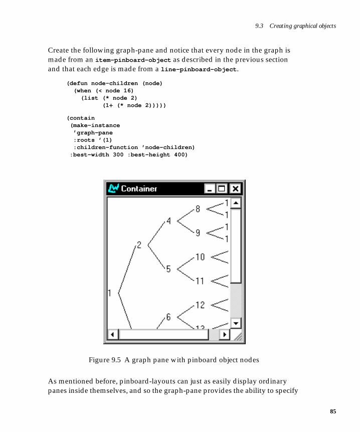
9.3 Creating graphical objects
Create the following graph-pane and notice that every node in the graph ismade from an item-pinboard-object as described in the previous sectionand that each edge is made from a line-pinboard-object .
(defun node-children (node) (when (< node 16) (list (* node 2) (1+ (* node 2)))))
(contain (make-instance ’graph-pane :roots ’(1) :children-function ’node-children) :best-width 300 :best-height 400)
Figure 9.5 A graph pane with pinboard object nodes
As mentioned before, pinboard-layouts can just as easily display ordinarypanes inside themselves, and so the graph-pane provides the ability to specify
85
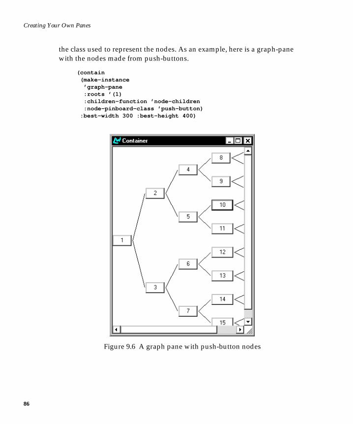
Creating Your Own Panes
86
the class used to represent the nodes. As an example, here is a graph-panewith the nodes made from push-buttons.
(contain (make-instance ’graph-pane :roots ’(1) :children-function ’node-children :node-pinboard-class ’push-button) :best-width 300 :best-height 400)
Figure 9.6 A graph pane with push-button nodes
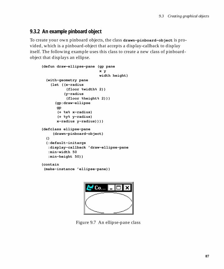
9.3 Creating graphical objects
9.3.2 An example pinboard object
To create your own pinboard objects, the class drawn-pinboard-object is pro-vided, which is a pinboard-object that accepts a display-callback to displayitself. The following example uses this class to create a new class of pinboard-object that displays an ellipse.
(defun draw-ellipse-pane (gp pane x y width height) (with-geometry pane (let ((x-radius (floor %width% 2)) (y-radius (floor %height% 2))) (gp:draw-ellipse gp (+ %x% x-radius) (+ %y% y-radius) x-radius y-radius))))
(defclass ellipse-pane (drawn-pinboard-object) () (:default-initargs :display-callback ’draw-ellipse-pane :min-width 50 :min-height 50))
(contain (make-instance ’ellipse-pane))
Figure 9.7 An ellipse-pane class
87
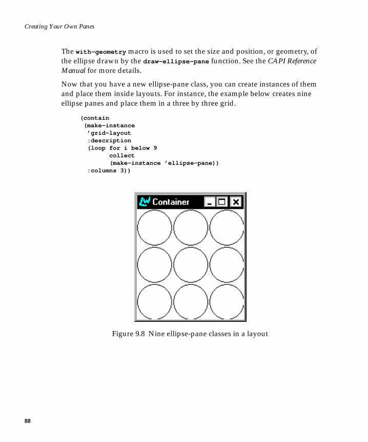
Creating Your Own Panes
88
The with-geometry macro is used to set the size and position, or geometry, ofthe ellipse drawn by the draw-ellipse-pane function. See the CAPI ReferenceManual for more details.
Now that you have a new ellipse-pane class, you can create instances of themand place them inside layouts. For instance, the example below creates nineellipse panes and place them in a three by three grid.
(contain (make-instance ’grid-layout :description (loop for i below 9 collect (make-instance ’ellipse-pane)) :columns 3))
Figure 9.8 Nine ellipse-pane classes in a layout
10
10Graphics Ports
10.1 IntroductionGraphics Ports allow users to write source-compatible applications for differ-ent host window systems. Graphics Ports are the destinations for drawingprimitives. They are implemented with a generic host-independent part and asmall host-specific part.
Graphics Ports implement a set of drawing functions and a mechanism forspecifying the graphics state to be used in each drawing function call. Thereare two types of Graphics Port: on-screen ports and off-screen ports. On-screen graphics ports correspond to visible windows, while off-screen graph-ics ports can be used for building up graphical images for subsequent copyingto the screen.
See the CAPI Reference Manual for full reference entries on all the GraphicsPort functions, macros, classes and types.
10.1.1 The package
All graphics port symbols are interned in and exported from the graphics-
ports package, nicknamed gp .
89
Graphics Ports
90
10.1.2 The system
The graphics ports system is available in the default LispWorks image. Allsymbols in the gp package are available to you as soon as you start LispWorks.
10.1.3 Creating instances
Pixmap graphics ports are usually required only temporarily and the macrowith-pixmap-graphics-port allocates one for you from a cache of suchobjects.
10.2 FeaturesThe main features of graphics-ports are:
1. Each port has a “graphics state” which holds all the information aboutdrawing parameters such as line thickness, fill pattern, line-end-styleetc. A graphics state object can also be created independently of any par-ticular graphics port.
2. The graphics state contents can either be enumerated in each drawingfunction call, bound to values for the entirety of a set of calls, or perma-nently changed.
3. The graphics state includes a transform which implements generalizedcoordinate transformations on the port’s coordinates.
4. Off-screen ports can compute the horizontal and vertical bounds of theresults of a set of drawing function calls, thus facilitating image or pix-map generation.
10.3 Graphics stateThe graphics-state object associated with each port holds values for the fol-lowing parameters:
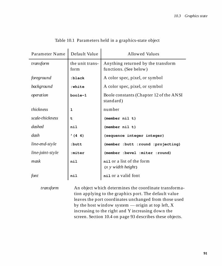
10.3 Graphics state
transform An object which determines the coordinate transforma-tion applying to the graphics port. The default valueleaves the port coordinates unchanged from those usedby the host window system — origin at top left, Xincreasing to the right and Y increasing down thescreen. Section 10.4 on page 93 describes these objects.
Table 10.1 Parameters held in a graphics-state object
Parameter Name Default Value Allowed Values
transform the unit trans-form
Anything returned by the transformfunctions. (See below)
foreground :black A color spec, pixel, or symbol
background :white A color spec, pixel, or symbol
operation boole-1 Boole constants (Chapter 12 of the ANSIstandard)
thickness 1 number
scale-thickness t (member nil t)
dashed nil (member nil t)
dash ’(4 4) (sequence integer integer)
line-end-style :butt (member :butt :round :projecting)
line-joint-style :miter (member :bevel :miter :round)
mask nil nil or a list of the form( x y width height)
font nil nil or a valid font
91
Graphics Ports
92
foreground Determines the foreground color used in drawing func-tions. A color can be a pixel value, a color name symbol,a color name string or a color object. Using pixel valuesresults in better performance.
background Determines the background color used in drawingfunctions which use a stipple. Valid values are the sameas for foreground .
operation The combination function used in the drawing primi-tives. Valid values are 0 to 15, being the same logicalvalues as the op arg to the Common Lisp functionboole (CLtL2).
thickness The thickness of lines drawn. If scale-thickness isnon-nil , the value is in port (transformed) coordinates,otherwise it is in pixels.
scale-thickness If non-nil means interpret the thickness parameter intransformed port coordinates, otherwise interpret it inpixels.
dashed If non-nil draws a dashed line using dash as the mark-space specifier.
dash If non-nil should be a two element list specifying themark and space for dashed lines. The mark and spacevalues are interpreted in pixels only.
line-end-style One of :butt :round or :projecting and specifies howto draw the ends of lines.
line-joint-style One of :bevel :miter :round and specifies how todraw the areas where the edges of polygons meet.
mask Either nil or a list of the form ( x y width height) , defin-ing a rectangle inside which the drawing is done. Themask is not tiled. A mask is not transformed by thetransform parameter.
mask-x An integer specifying where in the port the X coordi-nate of the mask origin is to be considered to be. Thevalue is in window coordinates.
10.4 Graphics state transforms
font Either nil or a valid font name or font object to be usedby the draw-character and draw-string functions. Avalid font is a portable font description. See Section 10.6on page 96.
10.3.1 Setting the graphics state
The graphics state values associated with a drawing function call to a graphicsport are set by one of three mechanisms.
1. Enumeration in the drawing function call. For example:
(draw-line port 1 1 100 100 :thickness 10 :scale-thickness nil :foreground :red)
2. Bound using the with-graphics-state macro. For example:
(with-graphics-state (port :thickness 10 :scale-thickness nil :foreground :red) (draw-line port 1 1 100 100) (draw-rectangle port 2 2 40 50 :filled t))
3. Set by the set-graphics-state function. For example:
(set-graphics-state port :thickness 10 :scale-thickness nil :foreground :red)
The first two mechanisms change the graphics state temporarily. The last onechanges it permanently, effectively altering the “default” state.
10.4 Graphics state transformsCoordinate systems for windows generally have the origin (0,0) positioned atthe upper left corner of the window with X positive to the right and Y positivedownwards. This is the “window coordinates” system. Generalized coordi-nates are implemented using scaling, rotation and translation operations suchthat any Cartesian coordinates can be used within a window. The GraphicsPorts system uses a transform object to achieve this.
93
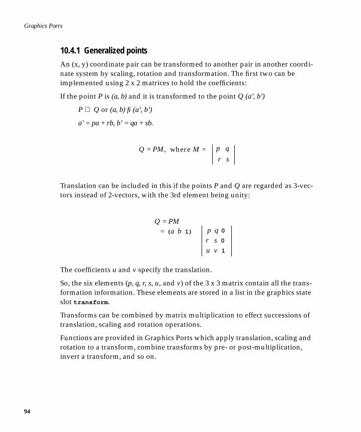
Graphics Ports
94
10.4.1 Generalized points
An (x, y) coordinate pair can be transformed to another pair in another coordi-nate system by scaling, rotation and transformation. The first two can beimplemented using 2 x 2 matrices to hold the coefficients:
If the point P is (a, b) and it is transformed to the point Q (a’, b’)
P ⇒ Q or (a, b) fi (a’, b’)
a’ = pa + rb, b’ = qa + sb.
Translation can be included in this if the points P and Q are regarded as 3-vec-tors instead of 2-vectors, with the 3rd element being unity:
The coefficients u and v specify the translation.
So, the six elements (p, q, r, s, u, and v) of the 3 x 3 matrix contain all the trans-formation information. These elements are stored in a list in the graphics stateslot transform .
Transforms can be combined by matrix multiplication to effect successions oftranslation, scaling and rotation operations.
Functions are provided in Graphics Ports which apply translation, scaling androtation to a transform, combine transforms by pre- or post-multiplication,invert a transform, and so on.
Q = PM,r sp qwhere M =
Q = PM = ( a b 1)
r s 0
u v 1
p q 0
10.5 Pixmap graphics ports
10.4.2 Drawing functions
The scan-line conversions of the drawing functions are very much host-dependent. In other words, you cannot assume that, for example (draw-point
port x y) has exactly the same effect on all machines. Some machines mightput pixels down and to the right of integer coordinates (x y) while others maycenter the pixel at (x y).
See also the LispWorks Reference Manual entries for draw-circle (which drawsa circle) and draw-ellipse (which draws an ellipse), and the CAPI ReferenceManual for full reference entries of all the drawing functions.
10.5 Pixmap graphics portsPixmap graphics ports are drawing destinations which exist only as pixelarrays whose contents are not directly accessible. They can be drawn to usingthe draw- thing functions, and their contents can be copied onto other graphicsports. However this copying can be meaningless unless the conversion of col-ors uses the same color device on both ports. Because color devices are associ-ated with regular graphics ports (Windows) rather than pixmap graphicsports, you have to connect a pixmap graphics port to a regular graphics portfor color conversion. This is the purpose of the owner slot in pixmap-
graphics-port-mixin . The conversion of colors to pixel values is done in thesame way as for regular graphics ports, but the pixmap graphics port’s owneris used to find a color device. You can draw to pixmap graphics ports usingpre-converted colors to avoid color conversion altogether, in which case a nullcolor owner is OK for a pixmap graphics port.
10.5.1 Relative drawing in pixmap graphics ports
Many of the drawing functions have a relative argument. If non-nil , it speci-fies that when drawing functions draw to the pixmap, the extremes of thepixel coordinates reached are accumulated. If the drawing strays beyond anyedge of the pixmap port (into negative coordinates or beyond its width orheight), then the drawing origin is shifted so that it all fits on the port. If thedrawing extremes exceed the total size available, some are inevitably lost. Ifrelative is nil , any part of the drawing which extends beyond the edges of thepixmap is lost. If relative is nil and collect non-nil , the drawing bounds are
95
Graphics Ports
96
collected for later reading, but no relative shifting of the drawing is per-formed. The collected bounds are useful when you need to know the graphicsmotion a series of drawing calls causes. The rest args are host-dependent.They usually include a :width and :height pair.
10.6 Portable font descriptionsPortable font descriptions are designed to solve the following problems:
• Specify enough information to uniquely determine a real font.
• Query which real fonts match a partial specification.
• Allow font specification to be recorded and reused in a later run.
All the symbols described below are exported from the gp package. Fontobjects returned by find-matching-fonts and find-best-font can be used incalls to the Graphics Ports drawing functions and as the :font argument forCAPI panes.
10.6.1 Font attributes and font descriptions
Font attributes are properties of a font, which can be combined to uniquelyspecify a font on a given platform. There are some portable attributes whichcan be used on all platforms; other attributes are platform specific and will beignored or signal errors when used on the wrong platform.
Font descriptions are externalizable objects which contain a set of fontattributes. When using a font description in a font lookup operation, missingattributes are treated as wildcards (as are those with value :wild ) and invalidattributes signal errors. The result of a font lookup contains all the attributesneeded to uniquely specify a font on that platform.
Fonts are the objects used in drawing operations. They are made by a fontlookup operation on a pane, using a font description as a pattern.
These are the current set of portable font attributes and their portable types:
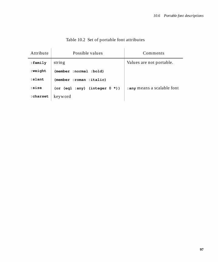
10.6 Portable font descriptions
Table 10.2 Set of portable font attributes
Attribute Possible values Comments
:family string Values are not portable.
:weight (member :normal :bold)
:slant (member :roman :italic)
:size (or (eql :any) (integer 0 *)) :any means a scalable font
:charset keyword
97

Graphics Ports
98
11
11The Color System
11.1 IntroductionThe LispWorks Color System allows applications to use keyword symbols asaliases for colors in Graphics Ports drawing functions. They can also be usedfor backgrounds and foregrounds of windows and CAPI objects.
For example, the call
(gp:draw-line my-port x1 y1 x2 y2 :foreground :navyblue)
uses the keyword symbol :navyblue for the color of the line.
Colors are looked up in a color database. The LispWorks image is deliveredwith a large color database already loaded (approximately 650 entries.) Thecolor database contains color-specs which define the colors in terms of a stan-dard color model. When the drawing function is executed, the color-spec isconverted into a colormap index (or “pixel” value).
The LispWorks Color System has facilities for:
• Defining new color aliases in one of several color models
• Loading the color database from a file of color descriptions
• Converting color specifications between color models
99
The Color System
100
• Defining new color models
It is accessible from the COLOR package, and all symbols described in this chap-ter are assumed to be external to this package unless otherwise stated.
The color-models available by default are RGB, HSV and GRAY.
11.2 Reading the color databaseTo find out what colors are defined in the color database, use the followingfunctions:
apropos-color-names Function
apropos-color-names substring
This returns a list of symbols whose symbol-names contain substring andwhich are present in the color-database defining color aliases. By con-vention these are in the keyword package.
TEST-4> (color:apropos-color-names "RED") (:ORANGERED3 :ORANGERED1 :INDIANRED3 :INDIANRED1 :PALEVIOLETRED :RED :INDIANRED :INDIANRED2 :INDIANRED4 :ORANGERED :MEDIUMVIOLETRED :VIOLETRED :ORANGERED2 :ORANGERED4 :RED1 :RED2 :RED3 :RED4 :PALEVIOLETRED1 :PALEVIOLETRED2 :PALEVIOLETRED3 :PALEVIOLETRED4 :VIOLETRED3 :VIOLETRED1 :VIOLETRED2 :VIOLETRED4)
apropos-color-alias-names Function
apropos-color-alias-names substring
This functions like apropos-color-names but returns only those sym-bols that have been defined as color aliases.
apropos-color-spec-names Function
apropos-color-spec-names substring
This functions like apropos-color-names but returns only those sym-bols that were defined as original entries in the color database.
11.3 Color specs
get-all-color-names Function
get-all-color-names &optional sort
This returns a list of all color-names in the color database. By conventionthese are symbols in the keyword package. The returned list is alphanu-merically sorted on the symbol-names if the optional argument is non-nil .
11.3 Color specsA color spec is an object which numerically defines a color in some color-model. For example the object returned by the call:
(color:make-rgb 0.0s0 1.0s0 0.0s0) => #(:RGB 0.0s0 1.0s0 0.0s0)
defines the color green in the RGB color model. (Note that short-floats areused; this results in the most efficient color conversion process. However, anyfloating-point number type can be used.)
To find out what color-spec is associated with a color name, use the followingfunction.
get-color-spec Function
get-color-spec color-name
Returns the color-spec associated with the symbol color-name. If there isno color-spec associated with color-name, this function returns nil . Ifcolor-name is the name of a color alias, the color alias is dereferenceduntil a color-spec is found.
Color-specs are made using standard functions make-rgb , make-hsv andmake-gray . For Example:
(color:make-rgb 0.0s0 1.0s0 0.0s0)(color:make-hsv 1.2s0 0.5s0 0.9s0)(color:make-gray 0.66667s0)
The predicate color-spec-p can be used to test for color-spec objects. Thefunction color-spec-model returns the model in which a color-spec object hasbeen defined.
101
The Color System
102
11.4 Color aliasesYou can enter a color alias in the color database using the function define-
color-alias . You can remove an entry in the color database using delete-
color-translation .
define-color-alias Function
define-color-alias name alias-for &optional ( if-exists (first ’(:replace :error :ignore)))
This makes an entry in the color database under name, which should be asymbol. LispWorks by convention uses keyword symbols. alias-for iseither a color-spec or another color name (symbol). Attempting to makean alias for an original entry in the color database results in an error. Anoriginal entry means one present in a new LispWorks image or oneentered via the color database loading functions described below. If theentry is already present and is a color alias, then the value of the if-existsargument is used to determine how to continue.
(color:define-color-alias :wire-color :darkslategray)
delete-color-translation Function
delete-color-translation color-name
This removes an entry from the color-database. Both original entries andaliases can be removed.
As described in Section 11.3 on page 101, the function get-color-spec returnsthe color-spec associated with a color alias. The function get-color-alias-
translation returns the ultimate color name for an alias.
get-color-alias-translation Function
get-color-alias-translation color-alias
This returns the ultimate color name associated with color-alias.
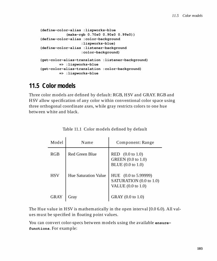
11.5 Color models
(define-color-alias :lispworks-blue (make-rgb 0.70s0 0.90s0 0.99s0))(define-color-alias :color-background :lispworks-blue)(define-color-alias :listener-background :color-background)
(get-color-alias-translation :listener-background) => :lispworks-blue(get-color-alias-translation :color-background) => :lispworks-blue
11.5 Color modelsThree color models are defined by default: RGB, HSV and GRAY. RGB andHSV allow specification of any color within conventional color space usingthree orthogonal coordinate axes, while gray restricts colors to one huebetween white and black.
The Hue value in HSV is mathematically in the open interval [0.0 6.0). All val-ues must be specified in floating point values.
You can convert color-specs between models using the available ensure-
functions . For example:
Table 11.1 Color models defined by default
Model Name Component: Range
RGB Red Green Blue RED (0.0 to 1.0)GREEN (0.0 to 1.0)BLUE (0.0 to 1.0)
HSV Hue Saturation Value HUE (0.0 to 5.99999)SATURATION (0.0 to 1.0)VALUE (0.0 to 1.0)
GRAY Gray GRAY (0.0 to 1.0)
103
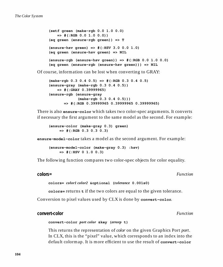
The Color System
104
(setf green (make-rgb 0.0 1.0 0.0) => #(:RGB 0.0 1.0 0.0))(eq green (ensure-rgb green)) => T
(ensure-hsv green) => #(:HSV 3.0 0.0 1.0)(eq green (ensure-hsv green) => NIL
(ensure-rgb (ensure-hsv green)) => #(:RGB 0.0 1.0 0.0)(eq green (ensure-rgb (ensure-hsv green))) => NIL
Of course, information can be lost when converting to GRAY:
(make-rgb 0.3 0.4 0.5) => #(:RGB 0.3 0.4 0.5)(ensure-gray (make-rgb 0.3 0.4 0.5)) => #(:GRAY 0.39999965)(ensure-rgb (ensure-gray (make-rgb 0.3 0.4 0.5))) => #(:RGB 0.39999965 0.39999965 0.39999965)
There is also ensure-color which takes two color-spec arguments. It convertsif necessary the first argument to the same model as the second. For example:
(ensure-color (make-gray 0.3) green) => #(:RGB 0.3 0.3 0.3)
ensure-model-color takes a model as the second argument. For example:
(ensure-model-color (make-gray 0.3) :hsv) => #(:HSV 0 1.0 0.3)
The following function compares two color-spec objects for color equality.
colors= Function
colors= color1 color2 &optional ( tolerance 0.001s0)
colors= returns t if the two colors are equal to the given tolerance.
Conversion to pixel values used by CLX is done by convert-color .
convert-color Function
convert-color port color &key ( errorp t)
This returns the representation of color on the given Graphics Port port.In CLX, this is the “pixel” value, which corresponds to an index into thedefault colormap. It is more efficient to use the result of convert-color
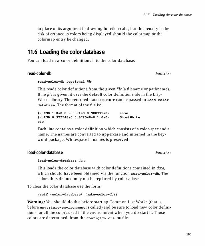
11.6 Loading the color database
in place of its argument in drawing function calls, but the penalty is therisk of erroneous colors being displayed should the colormap or thecolormap entry be changed.
11.6 Loading the color databaseYou can load new color definitions into the color database.
read-color-db Function
read-color-db &optional file
This reads color definitions from the given file (a filename or pathname).If no file is given, it uses the default color definitions file in the Lisp-Works library. The returned data structure can be passed to load-color-
database . The format of the file is:
#(:RGB 1.0s0 0.980391s0 0.980391s0) snow#(:RGB 0.972548s0 0.972548s0 1.0s0) GhostWhiteetc
Each line contains a color definition which consists of a color-spec and aname. The names are converted to uppercase and interned in the key-word package. Whitespace in names is preserved.
load-color-database Function
load-color-database data
This loads the color database with color definitions contained in data,which should have been obtained via the function read-color-db . Thecolors thus defined may not be replaced by color aliases.
To clear the color database use the form:
(setf *color-database* (make-color-db))
Warning: You should do this before starting Common LispWorks (that is,before env:start-environment is called) and be sure to load new color defini-tions for all the colors used in the environment when you do start it. Thosecolors are determined from the config\colors.db file.
105
The Color System
106
You can remove a color database entry with delete-color-translation .
11.7 Defining new color modelsBefore using the definition described here, you should evaluate the form:
(require "color-defmodel")
The macro define-color-models can be used to define new color models foruse in the color system.
define-color-models Macro
define-color-models model-descriptors
This defines all the color models. model-descriptors is a list, each elementbeing a model-descriptor. A model descriptor has the syntax:
( model-name component-descr*)
A component-descr is a list:
( component-name lowest-value highest-value)
The default color models are defined by the following form:
(define-color-models ((:rgb (red 0.0 1.0) (green 0.0 1.0) (blue 0.0 1.0)) (:hsv (hue 0.0 5.99999) (saturation 0.0 1.0) (value 0.0 1.0)) (:gray (level 0.0 1.0))))
11.7 Defining new color models
For example, to define a new color model YMC and keep the existing RGB,HSV and GRAY models:
(define-color-models ((:rgb (red 0.0 1.0) (green 0.0 1.0) (blue 0.0 1.0)) (:hsv (hue 0.0 5.99999) (saturation 0.0 1.0) (value 0.0 1.0)) (:gray (level 0.0 1.0)) (:ymc (yellow 0.0 1.0) (magenta 0.0 1.0) (cyan 0.0 1.0))))
You must then define some functions to convert YMC color-specs to othercolor-specs. In this example, those functions are named
make-ymc-from-rgbmake-ymc-from-hsvmake-ymc-from-gray
and
make-rgb-from-ymcmake-hsv-from-ymcmake-gray-from-ymc
You can make this easier, of course, by defining the functions
make-ymc-from-hsvmake-ymc-from-graymake-hsv-from-ymcmake-gray-from-ymc
in terms of make-ymc-from-rgb and make-rgb-from-ymc .
If you never convert between YMC and any other model, you need onlydefine the function make-rgb-from-ymc .
107

The Color System
108
12
12Printing from the CAPI—theHardcopy API
The CAPI hardcopy API is a mechanism for printing a Graphics Port (andhence a CAPI output-pane) to a printer. It is arranged in a hierarchy of con-cepts: printers, print jobs, pagination and outputting.
Printers correspond to the hardware accessible to the OS. Print jobs controlconnection to a printer and any printer-specific initialization. Pagination con-trols the number of pages and which output appears on which page. Output-ting is the operation of drawing to a page. This is accomplished using thestandard Graphics Ports drawing functions and is not discussed here.
12.1 PrintersYou can obtain the current printer, or ask the user to select one, by using cur-
rent-printer . You can ask the user about configuration by using the func-tions page-setup-dialog and print-dialog which display the standard PageSetup and Print dialogs.
12.2 Print jobsA Print job is contained within a use of the macro with-print-job , whichhandles connection to the printer and sets up a graphics port for drawing tothe printer.
109
Printing from the CAPI—the Hardcopy API
110
12.3 Handling pages—page on demand printingIn Page on Demand Printing, the application provides code to print an arbitrarypage. The application should be prepared to print pages in any order. This isthe preferred means of implementing printing. Page on Demand printing usesthe with-document-pages macro, which iterates novel all pages in the docu-ment.
12.4 Handling pages—page sequential printingPage Sequential Printing may be used when it is inconvenient for the applica-tion to implement Page on Demand printing. In Page Sequential Printing, theapplication prints each page of the document in order. Page on Demand print-ing uses the with-page macro, with each invocation of the with-page macrocontributing a new page to the document.
12.5 Printing a pageIn either mode of printing, the way in which a page is printed is the same. Asuitable transformation must be established between the coordinate system ofthe output-pane or printer-port object and the physical page being printed.The page is then drawn using normal Graphics Ports operations.
12.5.1 Establishing a page transform
The with-page-transform macro can be used to establish a page transformthat maps a rectangular region of the document to the whole page beingprinted. Any number of invocations of with-page-transform may occur dur-ing the printing of a page. For instance, it may be convenient to use a differentpage transform when printing headers and footers to the page from that usedwhen printing the main body of the page.
A helper function, get-page-area , is provided to simplify the calculation ofsuitable rectangles for use with with-page-transform . It calculates the widthand height of the rectangle in the user’s coordinate space that correspond toone printable page, based on the logical resolution of the user’s coordinatespace in dpi.
12.6 Other printing functions
For more specific control over the page transform, the printer metrics can bequeried using get-printer-metrics and the various printer-metrics acces-sors.
12.6 Other printing functionsA simple printing API is available via simple-print-port , which prints thecontents of an output-pane to a printer.
The Hardcopy API also provides a means of printing plain text to a printer.The functions printer-text, print-file and print-editor-buffer can beused for this.
111

Printing from the CAPI—the Hardcopy API
112
Index
Aabort-dialog function 73, 74action-callback keyword 27, 30, 33apropos-color-alias-names
function 100apropos-color-names function 100apropos-color-spec-names function 100
B:background keyword 92best-height keyword 82best-width keyword 82bold keyword 12button panels
orientation 23prompting with 69–71
button-1 keyword 83button-enabled accessor 17button-panel class 22buttons
check 18push 17radio 18
Ccallback keyword 15callbacks
description of 8general properties 33graph panes 29in interfaces 61–64used for choices 26–27using callback functions 11
callback-type keyword 33, 74call-editor function 62
CAPIbasic objects 3description of 1–3linking code into 8loading the ??–6menu hierarchy 50
changing titles interactively 14character keyword 41check button panels 23check buttons 18check-button class 18, 22check-button-panel class 22, 23, 27, 32children-function keyword 28, 29choice class 21choice-class keyword 69choice-interaction accessor 32choices 21–34
callbacks available 33description of 21–34general properties 31–34relationship to menus 31
choice-selected-item accessor 33choice-selected-items accessor 33choice-selection accessor 28, 32classes
collections 22creating your own 79–88
CLUE 2CLX 2collection class 21collections
description of 21collector panes 16collector-pane class 16colors= function 104column-layout class 23, 36, 57
113
114
column-layout function 37combo boxes 30confirm-yes-or-no function 66contain function 6, 7, 84convert-color function 104creating menus 45creating submenus 46
D:dash keyword 92:dashed keyword 92data keyword 7, 17, 33data-interface keyword 33default settings
selections 27default-initargs keyword 55, 57, 82defclass macro 53, 55, 82define-color-alias function 102define-color-models function 106define-interface macro 53
arguments supplied to 55defpackage function 6delete-color-translation
function 102demibold keyword 12description keyword 36description of the CAPI 1–3dialogs
creating your own 73–77description of 65–77
display callback 81display function 6, 7display panes 14display-callback keyword 82display-dialog function 73, 75displaying text on screen 14display-message function 8, 65display-pane class 15, 38draw-circle function 80drawn-pinboard-object class 84, 87draw-point function 83drop-down list box 31
Eeditor panes 16editor-pane class 16, 38, 62
subclasses 16editor-pane-text accessor 62elements
creating your own 79–88generic properties of 11–12
enabled keyword 17, 51enabled-function keyword 51evaluate keyword 72exit-confirmer function 75exit-dialog function 73, 74, 75extend-callback keyword 27, 30, 33extended selection
specifying 32using on diferent platforms 32
extended-selection keyword 25–26, 32extension gesture 26
Ffiles
prompting for 71–72:font keyword 93font keyword 12fonts 12:foreground keyword 92functions
apropos-color-alias-names 100apropos-color-names 100apropos-color-spec-names 100colors= 104convert-color 104define-color-alias 102define-color-models 106delete-color-translation 102get-all-color-names 101get-color-alias-translation 102get-color-spec 101load-color-database 105read-color-db 105sample 11
Ggeneric properties of elements 11–12geometry of layouts, specifying 40–42get-all-color-names function 101get-color-alias-translation
function 102get-color-spec function 101graph panes
callbacks 29graphics
changing interactively 82–83creating permanent displays 81displaying 79–82
graphics ports 89drawing functions 95pixmap 95
graph-pane class 28implementation of 84
grid-layout class 38
Hhardcopy API 109–111hierarchy of menus 50hints 40horizontal-scroll keyword 12, 37
Iinitial-value keyword 68input-model keyword 83integers
prompting for 68interaction
general properties 32in lists 25
interaction keyword 25, 31, 32, 47, 69interactive streams 17interactive-stream class 17interface class 3, 6, 53interface keyword 33interface-data keyword 33interface-item keyword 33interfaces
defining 53–64description of 53layouts, specifying 55menus, specifying 59–61panes, specifying 55title, specifying 55
interface-title accessor 27italic keyword 12item keyword 33item-interface keyword 33item-pinboard-object class 84items keyword 24, 45, 49
Kkeywords
:background 92:dash 92:dashed 92:font 93:foreground 92:line-end-style 92:line-joint-style 92:mask 92:mask-x 92:operation 92
:scale-thickness 92:thickness 92:transform 91
Llayout-class keyword 23layouts
combining different 39–40description of 35–42introduction to 7specifying geometry 40–42specifying size of panes in 37
layouts keyword 53left keyword 15light keyword 12:line-end-style keyword 92:line-joint-style keyword 92Lisp forms
prompting for 72list function 36list items, specifying 24list panels 24listener panes 17listener-pane class 17, 38list-panel class 24lists
actions in 26deselection in 26extended selection in 25extended selections 25interaction in 25multiple selection in 25prompting with 68–71retraction in 26single selection in 25
load-color-database function 105loading the CAPI 6
Mmake-container function 73make-instance function 5:mask keyword 92:mask-x keyword 92max keyword 68medium keyword 12menu class 3, 45menu-bar keyword 53, 59, 60menu-bar-items keyword 46menu-component class 46menu-component class 3menu-item class 3, 49
115
116
menuscomponents 31creating 45creating submenus 46description of 45–51disabling items in 51grouping items together 46–49individual items in 49menu hierarchy 50nesting 46
menus keyword 53, 59, 60min keyword 68motion keyword 83multiple-selection keyword 25, 31,
32, 48
Nnone keyword 33no-selection keyword 31, 32
Ooblique keyword 12ok-check keyword 68, 73, 76:operation keyword 92option panes 30option-pane class 30organizing panes 36output-pane class 79
Ppane-args keyword 70panel
button layout 23panels
check button 23list 24push button 22radio button 23
panescollector 16creating your own 79–88default title position 14display 14editor 16graphs 28listener 17option 30organizing 36sizing 37text input 15title 13
panes keyword 53pathname keyword 71pinboard objects 84
creating your own 87–88pinboard-layout class 38, 84pinboard-object class 84popup-confirmer function 74, 75portable font descriptions 96print function 21print-function keyword 21, 24prompt-for-file function 62, 71prompt-for-form function 72prompt-for-integer function 68, 75prompt-for-string function 67, 74prompt-for-symbol function 72prompt-with-list function 68push button panels
creating 22push buttons 17push-button class 7, 17, 22push-button-panel class 22
Rradio button panels
creating 23radio buttons 18radio-button class 18radio-button-panel class 22, 23, 32read-color-db function 105reader keyword 57redisplay-interface function 76redisplay-interface keyword 76retract-callback keyword 18, 26, 30, 33reverse-italic keyword 12reverse-oblique keyword 12roman keyword 12row-layout class 23, 36, 57row-layout function 37
S:scale-thickness keyword 92scroll bars
specifying 12scroll bars, specifying 12selected keyword 18selected-item keyword 31, 33selected-items keyword 33selection gesture 26selection keyword 28, 32selection-callback keyword 22, 26, 30,
33, 63
selection-callback , keyword 25selections 25–28
default settings 27extending 25general properties 32specifying multiple 32
setf function 14, 17single selection
specifying 32single-selection keyword 25, 31, 32, 47slot 5slot-value function 5specifying window titles 13–15streams
interactive 17strings
prompting for 67subclasses
finding 14subclasses, finding 14symbols
prompting for 72–73
Ttext
displaying 15displaying on screen 14entering 15
text input panes 15text keyword 12, 13, 14text-input-pane class 15:thickness keyword 92title keyword 14, 55title panes 13titled-pane class 13titled-pane-title accessor 62title-pane class 13title-position keyword 14, 37titles
changing interactively 14specifying 13, 13–15
top keyword 14:transform keyword 91
Uuser input 65–77using callback functions 11
Vvalue-function keyword 75values
prompting for 67–73vertical-scroll keyword 12, 37visible-max-height keyword 40visible-max-width keyword 40visible-min-height keyword 40visible-min-width keyword 40
Wwindow titles
specifying 13–15
Xx-ratios keyword 37
Yy-ratios keyword 37
117

118


![May the LISP be with You - Nerd2NerdWhy Lisp? More on Macros [ What Lisp?, How Lisp? ]Problems/Features [ When Lisp? ] May the LISP be with You Andrew (kqb) Easton nerd2nerd: nerdend](https://img.pdfslide.net/doc/110x75/5ed9946d1b54311e7967d3e5/may-the-lisp-be-with-you-nerd2nerd-why-lisp-more-on-macros-what-lisp-how.jpg)