Embed Size (px)
Citation preview

MailEnable API Guide: Developing Skins To develop a new skin for MailEnable Webmail, duplicate the “Oceano” folder (version 6) under the skins directory, and use this as the base to develop the new skin upon (Oceano is designed to allow easier re-skinning). The skins directory is located at: Mail Enable\bin\NETWebMail\Mondo\Skins Duplicating the folder and renaming it will make it automatically appear in the Skin drop down option on the login page. Login Page
Image File / Dimensions (px) CSS Classes Description/Notes optionsPanel_top.jpg (270x21) .optionsPanel_top_div Update background color (#2F5E86) to match the ending color of your
new background gradient loginPanel_topLeft.png (11x30)
.loginPanel_topLeft .PNG with transparent background. Image has transparent gradient around edges as shadow effect. .GIF version of the same image can also be found in the images directory (used as replacement for IE6 since it does not support transparent PNG’s). Update this .GIF to maintain a consistent look in IE6.
loginPanel_topRight.png (11x30)
.loginPanel_topRight (as above)
login_bg.jpg (1x600) .loginScreen_shell Update background color (#7197B3) to match the ending color of your new background gradient
MailEnable API Guide: Developing Skins TopNav banner
Image File / Dimensions (px) CSS Classes Description/Notes topNav_bttn_bg_selected.jpg (1x75)
.topNav_bttn_selected -
topNav_bttn_bg.jpg (1x142) .topNav_bttn 2 images in 1, contains default/rollover states. topNav_bttn_divider.gif (2x146) .topNav_bttn_divider
.topNav_bttn_divider_selected -
topNav_bttn_border_right.jpg (5x215)
.topNav_bttn_border_right
.topNav_bttn_border_right_selected
.topNav_bttn:hover .topNav_bttn_border_right
3 images in 1, contains default/rollover/selected states.
topNav_bg.jpg (1x73) .topNav Image includes status bar border. topNav_bar_bg.jpg (1x142) .topNav_bar Image includes status bar border.
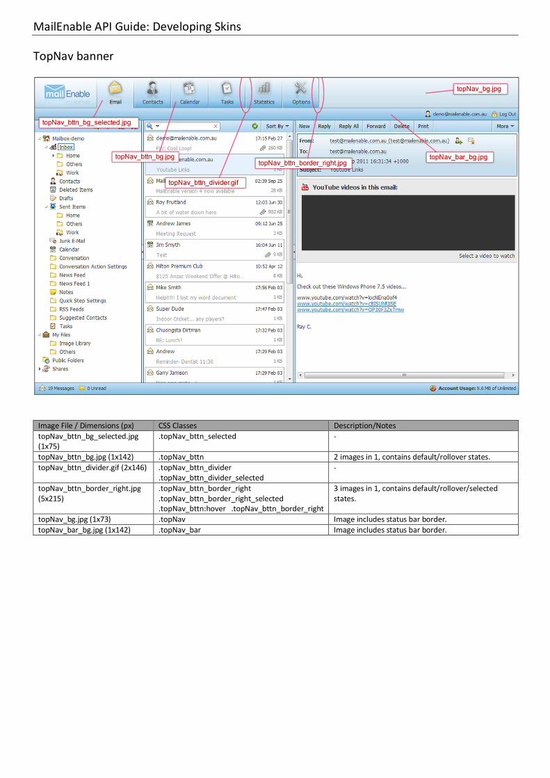
MailEnable API Guide: Developing Skins Toolbar, Dropdown Menu & Message Header
Image File / Dimensions (px) CSS Classes Description/Notes toolbar_primary_bg.jpg (1x28) .toolbar_primary
.print_toolbar -
toolbar_divider_bg.jpg (2x1) .bttn_toolbar_primary_divider - Toolbar_primary_bg_hover.jpg (1x28)
.bttn_toolbar_primary_left:hover
.bttn_dropDown_float_left:hover
.bttn_dropDown_float_right:hover
This is usually a lighter version of the “toolbar_primary_bg.jpg” image
msgHeader_bg.jpg (1x80) .msgHeader_table Update background color (#C8DFED) to match the ending color of your new background gradient
- .dropDown_shell_right .dropDown_shell_left
These classes contain border & background color values

MailEnable API Guide: Developing Skins Footers & Tab-Panels
Image File / Dimensions (px) CSS Classes Description/Notes footer_bg.jpg (1x27) .footer_shell - footNav_bg.jpg (1x37) .contacts_foot_shell - tabbedPanel_head_bg.jpg (1x25) .popupWin_tabbedPanel_head
.options_tabbedPanel_head
.calendar_tabbedPanel_head
Update background color (#82ABC7) to match the ending color of your new background gradient
tabbedPanel_head_tabs.jpg (1x70)
.popupWin_tabbedPanel_head li
.options_tabbedPanel_head li
.calendar_tabbedPanel li
2 images in 1, contains default/rollover states. Note that the top image is slightly longer than the bottom, to give enough space for the tabs in case the text area needs to expand. Update background color (#98BBD2/#72A6CB) to match the ending color of your new background gradient.

MailEnable API Guide: Developing Skins Collapsible Panel Borders & Loading Panel
Image File / Dimensions (px) CSS Classes Description/Notes splitter_vertical_left.gif (6x1000) .resizer-west-dragging
.resizer-west-open:hover
.resizer-west-open * html .resizer-west-open
-
splitter_vertical_right.gif (6x1000) .resizer-east-dragging .resizer-east-open:hover .resizer-east-open * html .resizer-east-open
-
splitter_horizontal_up.gif (1000x6) .resizer-north-open - splitter_horizontal_down.gif (1000x6)
.resizer-south-open -
splitter_vertical_bg.jpg (6x1) .bodyCol_splitter_vertical - splitter_horizontal_bg.jpg (1x6) .bodyCol_splitter_horizontal - splitter_collapsed_bg_vertical.gif (42x1)
.resizer-west-closed
.resizer-east-closed 2 images in 1, contains default/rollover states. Rollover image on the right.
splitter_collapsed_bg_horizontal.gif (1x42)
.resizer-north-closed,
.resizer-south-closed 2 images in 1, contains default/rollover states. Rollover image at the bottom.
Image File / Dimensions (px) CSS Classes Description/Notes loadPanel_bg.jpg (1x72) .loadPanel_body Update background color (#65B0E4) to match the ending color
of your new background gradient loadPanel_top.png (312x15) .loadPanel_top .PNG with transparent background. Image has transparent
gradient around edges as shadow effect. .GIF version of the same image can also be found in the images directory (used as replacement for IE6 since it does not support transparent PNG’s). Update this .GIF to maintain a consistent look in IE6.
loadPanel_bot.png (312x15) .loadPanel_bot (as above)
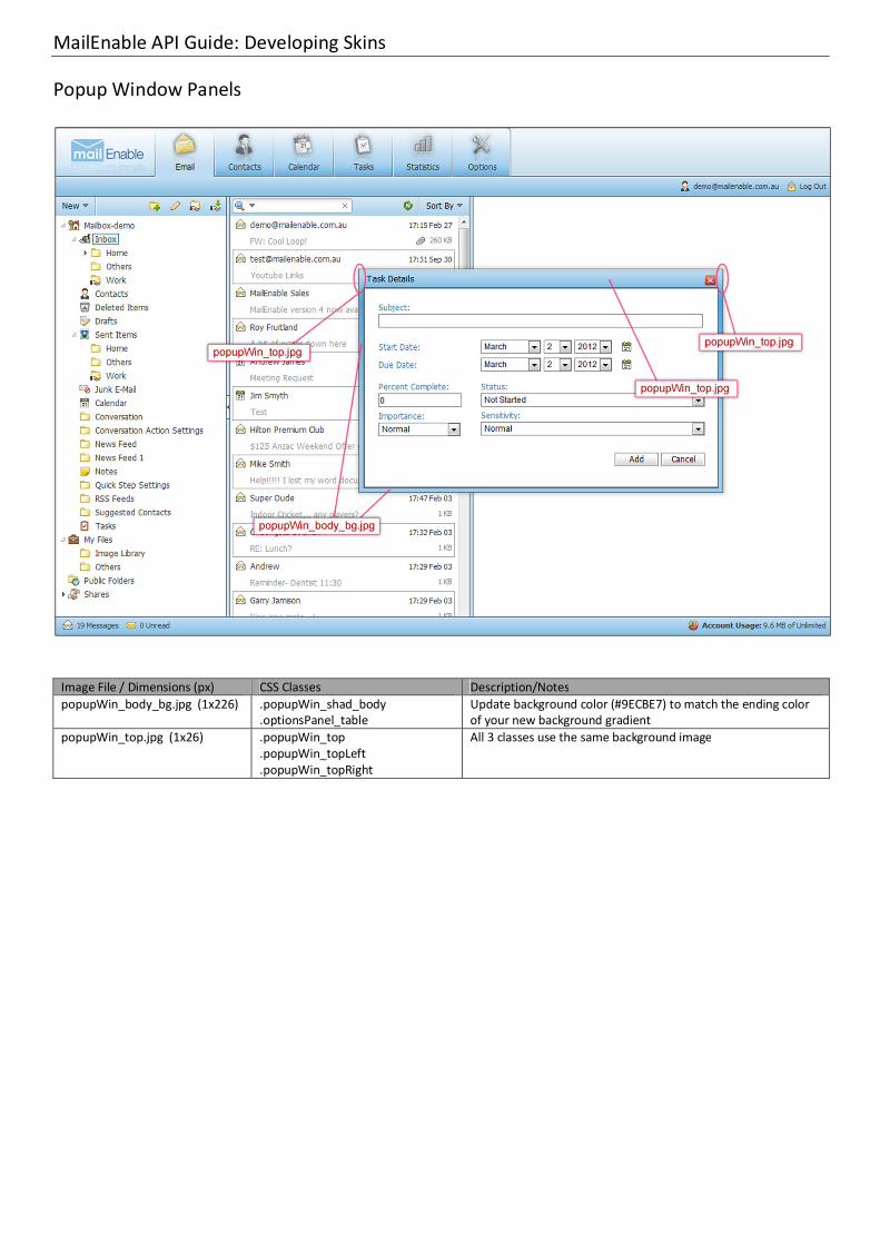
MailEnable API Guide: Developing Skins Popup Window Panels
Image File / Dimensions (px) CSS Classes Description/Notes popupWin_body_bg.jpg (1x226) .popupWin_shad_body
.optionsPanel_table Update background color (#9ECBE7) to match the ending color of your new background gradient
popupWin_top.jpg (1x26) .popupWin_top .popupWin_topLeft .popupWin_topRight
All 3 classes use the same background image

MailEnable API Guide: Developing Skins Options
Image File / Dimensions (px) CSS Classes Description/Notes options_footer_bg.jpg (1x33) .options_footer Update background color (#ABD3EE) to match the ending color
of your new background gradient popupWin_top.jpg (1x26) .optionsPanel_table_top
.optionsPanel_table_topLeft
.optionsPanel_table_topRight
Update background color (#83BEE6) to match the ending color of your new background gradient

MailEnable API Guide: Developing Skins iPhone/iPad Interface
Image File / Dimensions (px) CSS Classes Description/Notes itopNav_tab_left.jpg (250x68) .itopNav_bttn_left 2 images in 1, contains default/rollover states. Rollover image
on bottom. itopNav_tab_right.jpg (3x68) .itopNav_bttn_right 2 images in 1, contains default/rollover states. Rollover image
on bottom. itopNav_bg.jpg (1x43) .itopNav -