Embed Size (px)
Citation preview

Graphing with Excel - 101“Make & Take” Training
Prepared by: Karen Austin, Kim Gonzalez, Michael Kelleher, Eileen Lyons, and Kevin Murdock
Hillsborough County Public Schools
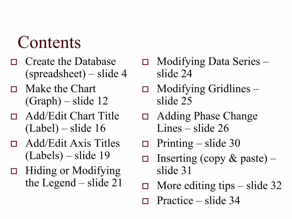
ContentsCreate the Database (spreadsheet) – slide 4Make the Chart (Graph) – slide 12Add/Edit Chart Title (Label) – slide 16Add/Edit Axis Titles (Labels) – slide 19Hiding or Modifying the Legend – slide 21
Modifying Data Series –slide 24Modifying Gridlines –slide 25Adding Phase Change Lines – slide 26Printing – slide 30Inserting (copy & paste) –slide 31More editing tips – slide 32Practice – slide 34
Actual screen views are included in this presentation to illustrate precisely how to use Excel.The screen views are from Excel 2007. Most are similar to Excel 2003. When differences exist, Excel 2003 procedures are highlighted in blue.
Create the DatabaseOpen ExcelInput Dates
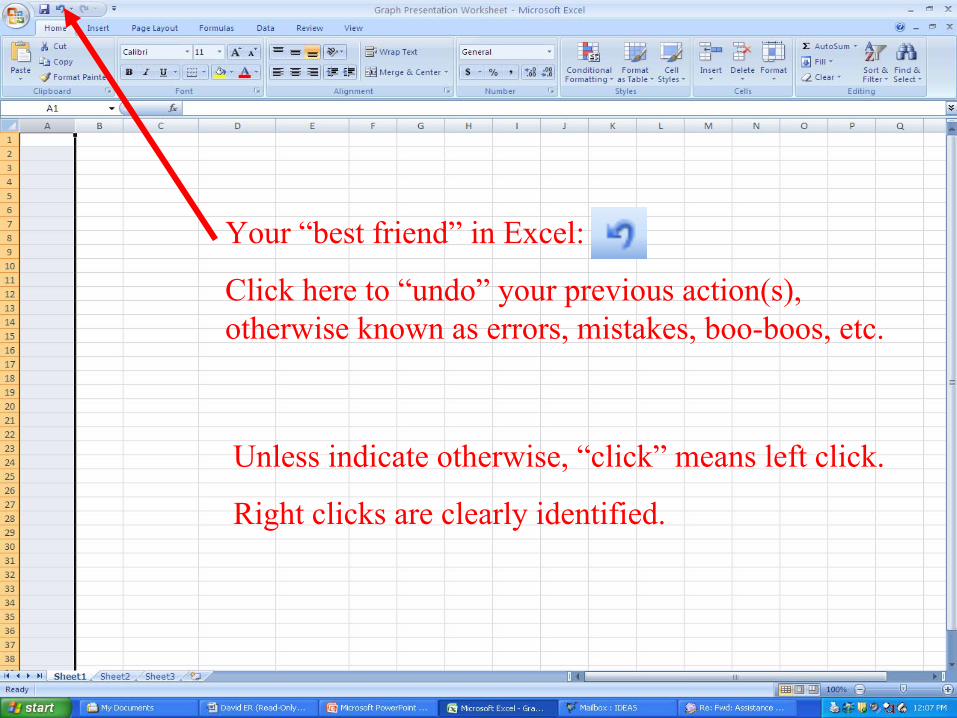
Your “best friend” in Excel:
Click here to “undo” your previous action(s), otherwise known as errors, mistakes, boo-boos, etc.
Unless indicate otherwise, “click” means left click.
Right clicks are clearly identified.
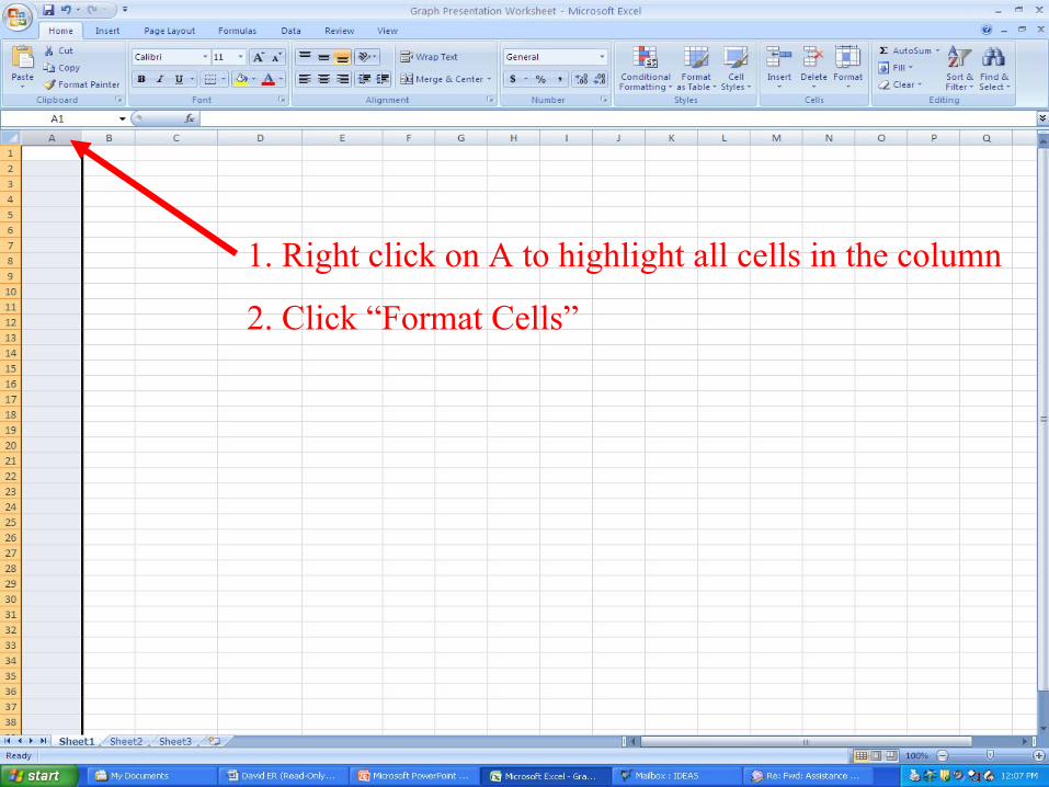
1. Right click on A to highlight all cells in the column
2. Click “Format Cells”
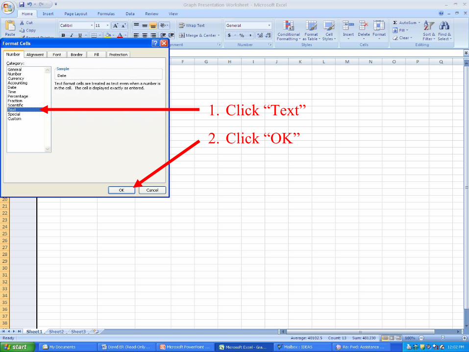
1. Click “Text”
2. Click “OK”
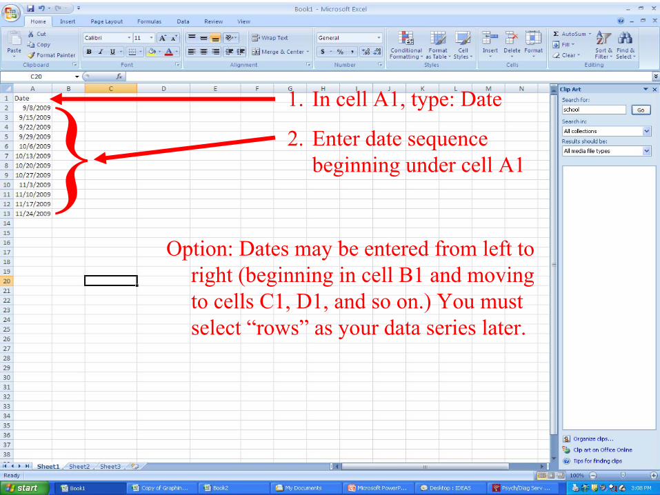
1. In cell A1, type: Date
2. Enter date sequence beginning under cell A1
Option: Dates may be entered from left to right (beginning in cell B1 and moving to cells C1, D1, and so on.) You must select “rows” as your data series later.
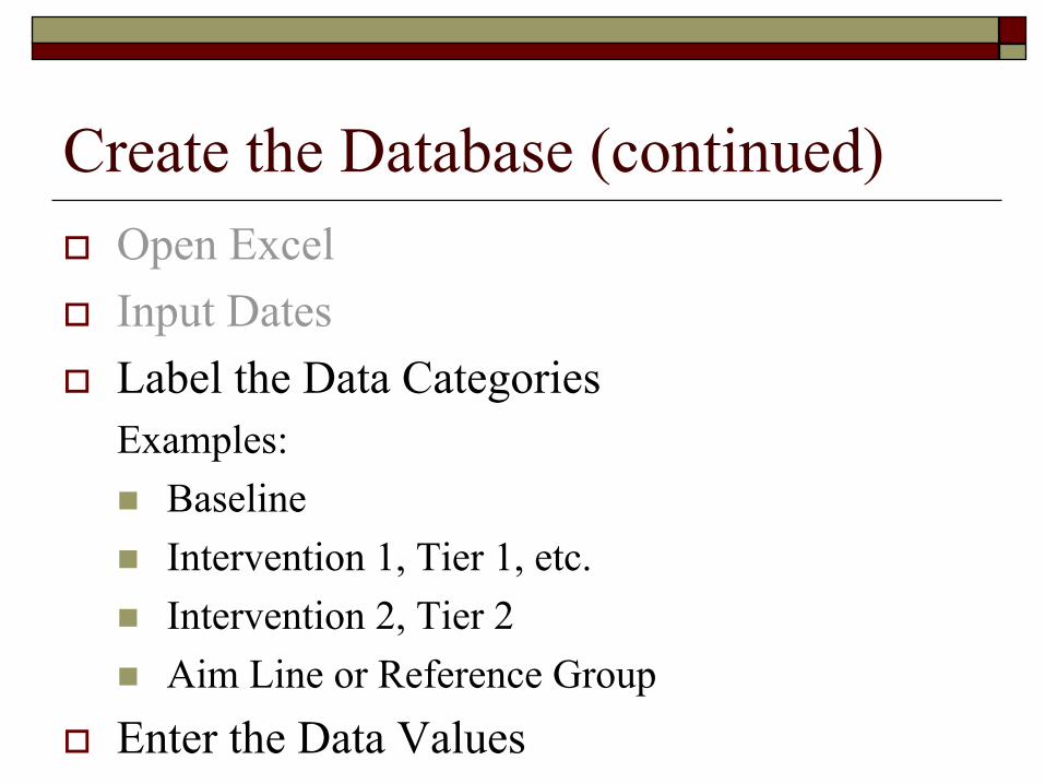
Create the Database (continued)Open ExcelInput DatesLabel the Data CategoriesExamples:
BaselineIntervention 1, Tier 1, etc.Intervention 2, Tier 2Aim Line or Reference Group
Enter the Data Values
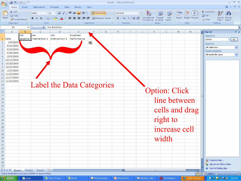
Label the Data CategoriesOption: Click
line between cells and drag right to increase cell width
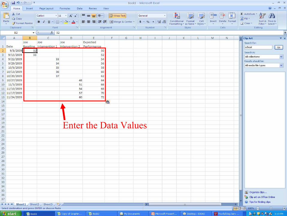
Enter the Data Values
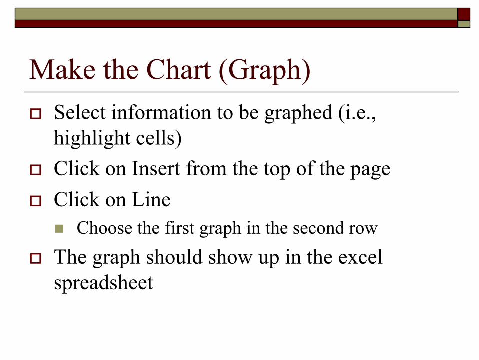
Make the Chart (Graph)Select information to be graphed (i.e., highlight cells)Click on Insert from the top of the pageClick on Line
Choose the first graph in the second rowThe graph should show up in the excel spreadsheet
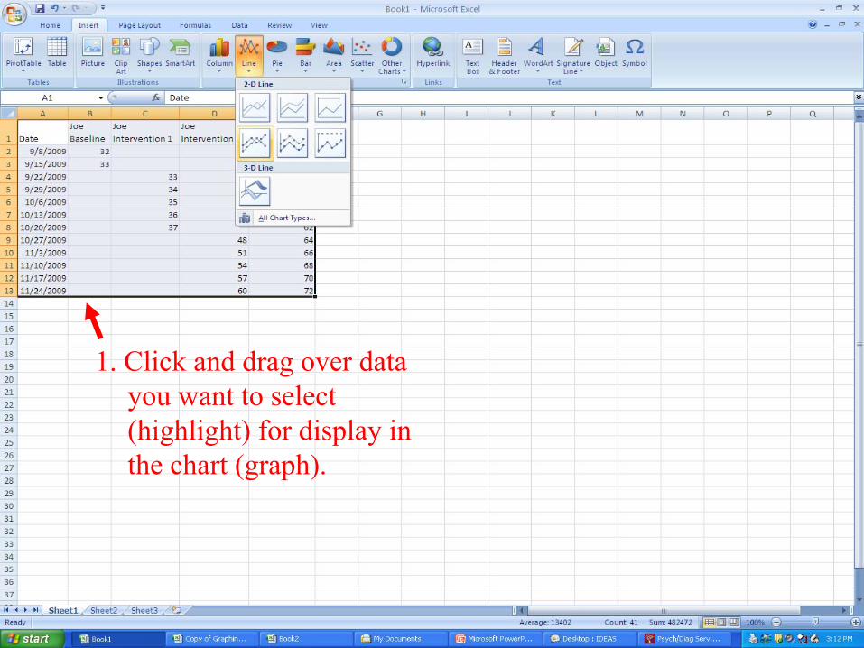
1. Click and drag over data you want to select (highlight) for display in the chart (graph).
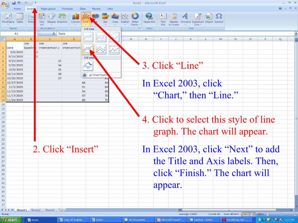
2. Click “Insert”
3. Click “Line”
In Excel 2003, click “Chart,” then “Line.”
4. Click to select this style of line graph. The chart will appear.
In Excel 2003, click “Next” to add the Title and Axis labels. Then, click “Finish.” The chart will appear.
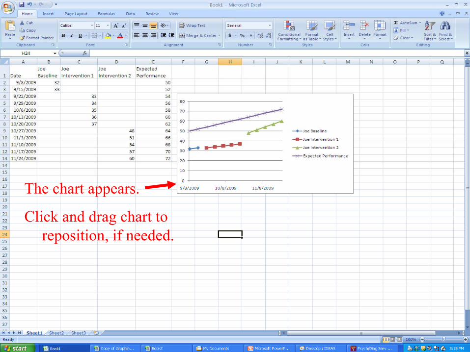
The chart appears.
Click and drag chart to reposition, if needed.
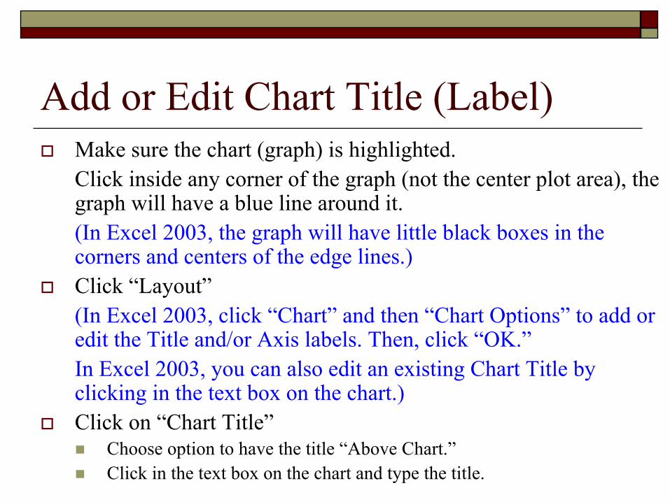
Add or Edit Chart Title (Label)Make sure the chart (graph) is highlighted. Click inside any corner of the graph (not the center plot area), the graph will have a blue line around it. (In Excel 2003, the graph will have little black boxes in the corners and centers of the edge lines.)Click “Layout”(In Excel 2003, click “Chart” and then “Chart Options” to add or edit the Title and/or Axis labels. Then, click “OK.”In Excel 2003, you can also edit an existing Chart Title by clicking in the text box on the chart.)Click on “Chart Title”
Choose option to have the title “Above Chart.”Click in the text box on the chart and type the title.
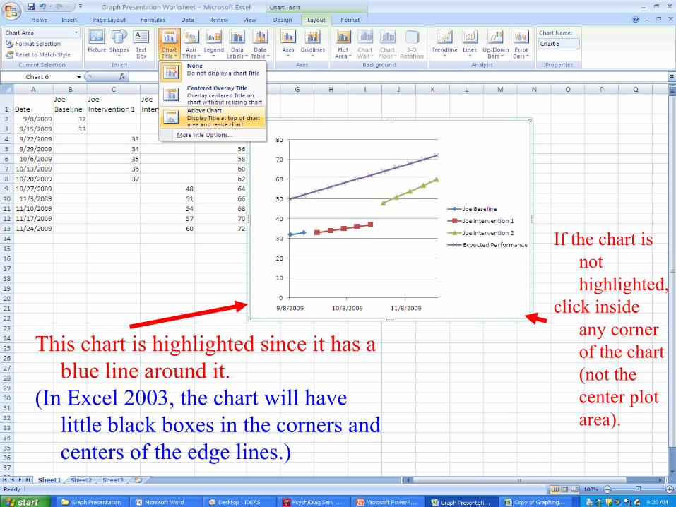
This chart is highlighted since it has a blue line around it.
(In Excel 2003, the chart will have little black boxes in the corners and centers of the edge lines.)
If the chart is not highlighted,
click inside any corner of the chart (not the center plot area).
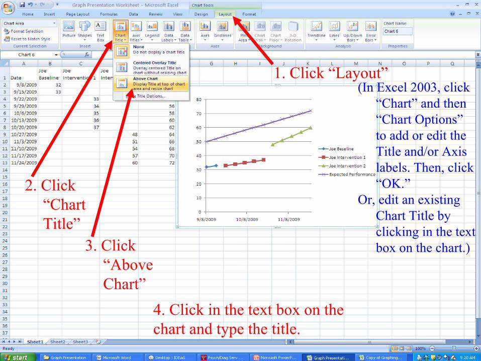
1. Click “Layout”(In Excel 2003, click
“Chart” and then “Chart Options”to add or edit the Title and/or Axis labels. Then, click “OK.”
Or, edit an existing Chart Title by clicking in the text box on the chart.)
2. Click “Chart Title”
3. Click “Above Chart”
4. Click in the text box on the chart and type the title.
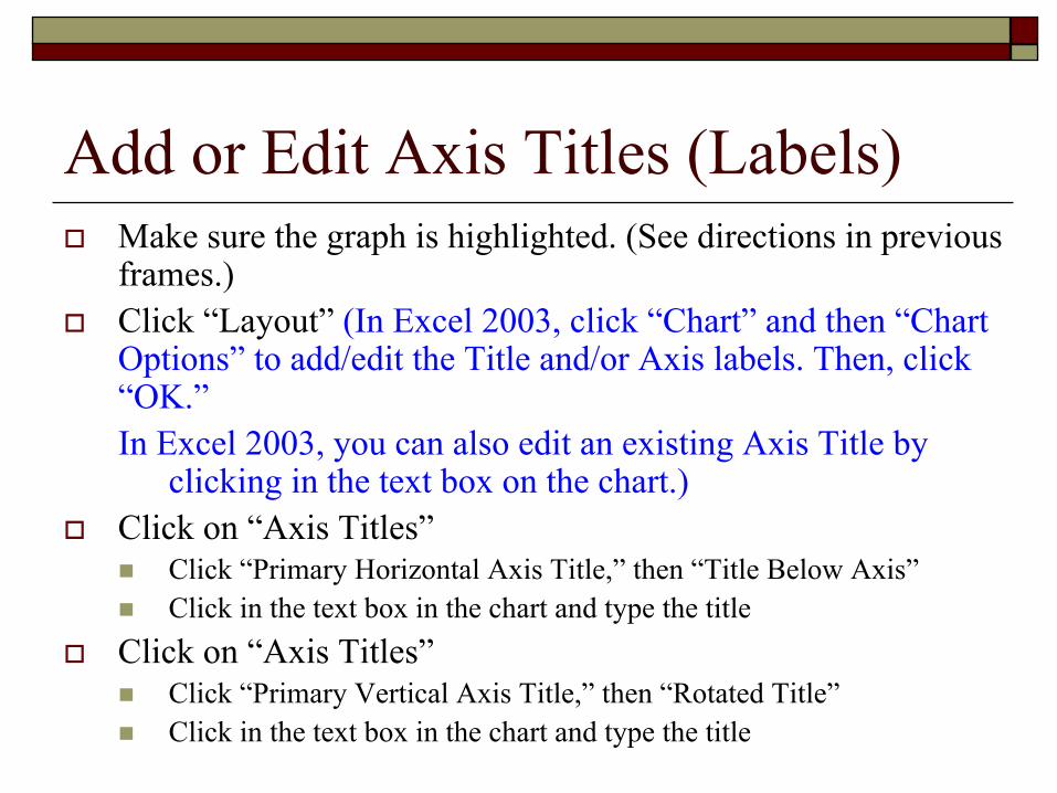
Add or Edit Axis Titles (Labels)Make sure the graph is highlighted. (See directions in previous frames.)Click “Layout” (In Excel 2003, click “Chart” and then “Chart Options” to add/edit the Title and/or Axis labels. Then, click “OK.”In Excel 2003, you can also edit an existing Axis Title by
clicking in the text box on the chart.)Click on “Axis Titles”
Click “Primary Horizontal Axis Title,” then “Title Below Axis”Click in the text box in the chart and type the title
Click on “Axis Titles”Click “Primary Vertical Axis Title,” then “Rotated Title”Click in the text box in the chart and type the title
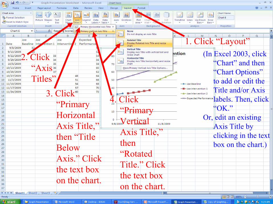
1. Click “Layout”(In Excel 2003, click
“Chart” and then “Chart Options”to add or edit the Title and/or Axis labels. Then, click “OK.”
Or, edit an existing Axis Title by clicking in the text box on the chart.)
2. Click “Axis Titles”
3. Click “Primary Horizontal Axis Title,”then “Title Below Axis.” Click the text box on the chart.
4. Click “Primary Vertical Axis Title,”then “Rotated Title.” Click the text box on the chart.
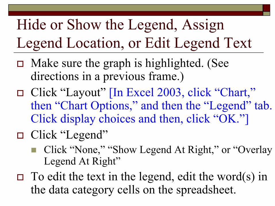
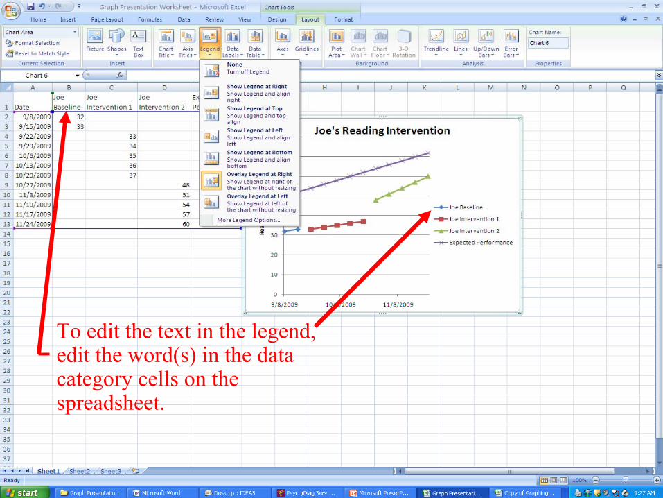
Hide or Show the Legend, Assign Legend Location, or Edit Legend Text
Make sure the graph is highlighted. (See directions in a previous frame.)Click “Layout” [In Excel 2003, click “Chart,”then “Chart Options,” and then the “Legend” tab. Click display choices and then, click “OK.”] Click “Legend”
Click “None,” “Show Legend At Right,” or “Overlay Legend At Right”
To edit the text in the legend, edit the word(s) in the data category cells on the spreadsheet.
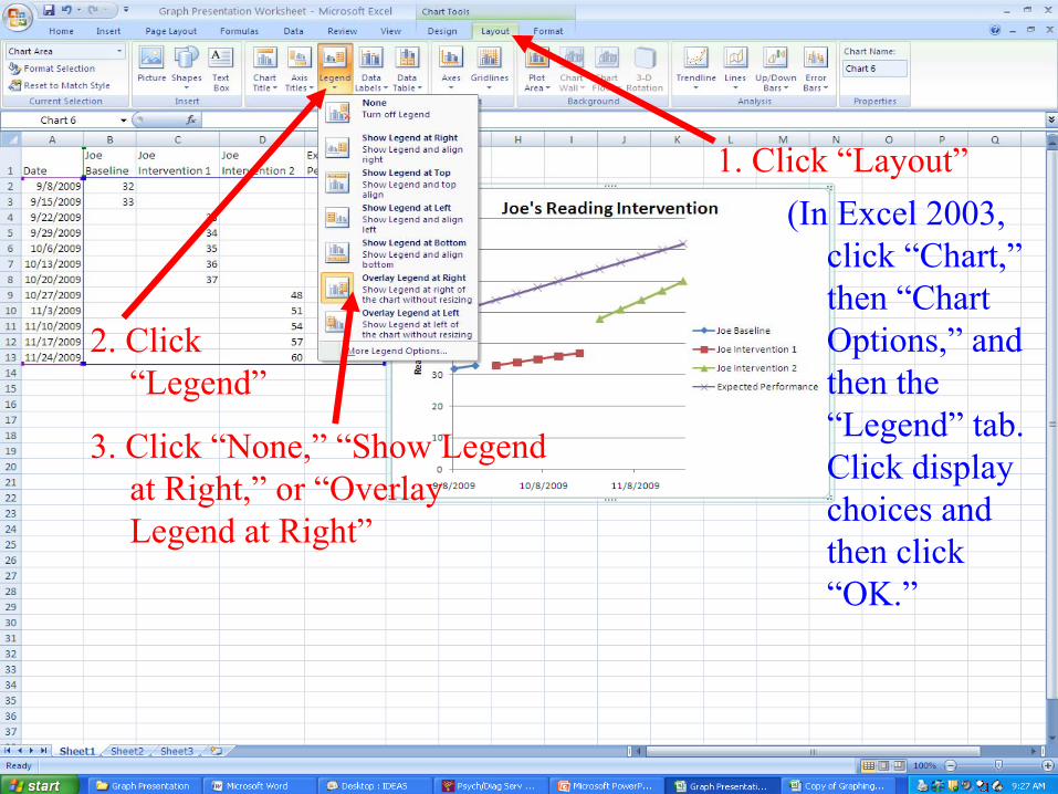
1. Click “Layout”(In Excel 2003,
click “Chart,”then “Chart Options,” and then the “Legend” tab. Click display choices and then click “OK.”
2. Click “Legend”
3. Click “None,” “Show Legend at Right,” or “Overlay Legend at Right”
To edit the text in the legend, edit the word(s) in the data category cells on the spreadsheet.
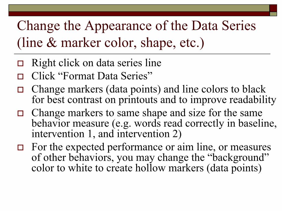
Change the Appearance of the Data Series (line & marker color, shape, etc.)
Right click on data series lineClick “Format Data Series”Change markers (data points) and line colors to black for best contrast on printouts and to improve readabilityChange markers to same shape and size for the same behavior measure (e.g. words read correctly in baseline, intervention 1, and intervention 2)For the expected performance or aim line, or measures of other behaviors, you may change the “background”color to white to create hollow markers (data points)
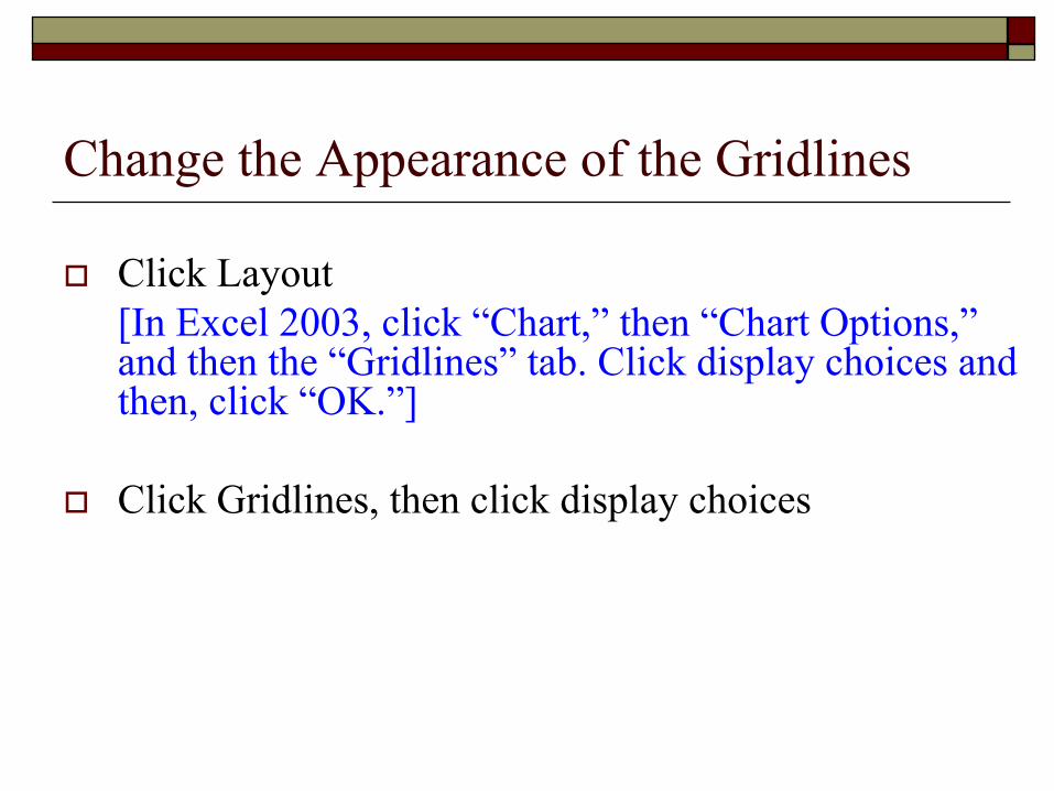
Change the Appearance of the Gridlines
Click Layout [In Excel 2003, click “Chart,” then “Chart Options,”and then the “Gridlines” tab. Click display choices and then, click “OK.”]
Click Gridlines, then click display choices
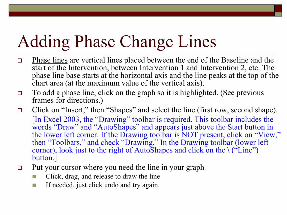
Adding Phase Change LinesPhase lines are vertical lines placed between the end of the Baseline and the start of the Intervention, between Intervention 1 and Intervention 2, etc. The phase line base starts at the horizontal axis and the line peaks at the top of the chart area (at the maximum value of the vertical axis).To add a phase line, click on the graph so it is highlighted. (See previous frames for directions.)Click on “Insert,” then “Shapes” and select the line (first row, second shape).[In Excel 2003, the “Drawing” toolbar is required. This toolbar includes the words “Draw” and “AutoShapes” and appears just above the Start button in the lower left corner. If the Drawing toolbar is NOT present, click on “View,”then “Toolbars,” and check “Drawing.” In the Drawing toolbar (lower left corner), look just to the right of AutoShapes and click on the \ (“Line”) button.]Put your cursor where you need the line in your graph
Click, drag, and release to draw the lineIf needed, just click undo and try again.

1. Click “Insert”
2. Click “Shapes”3. Click this line type
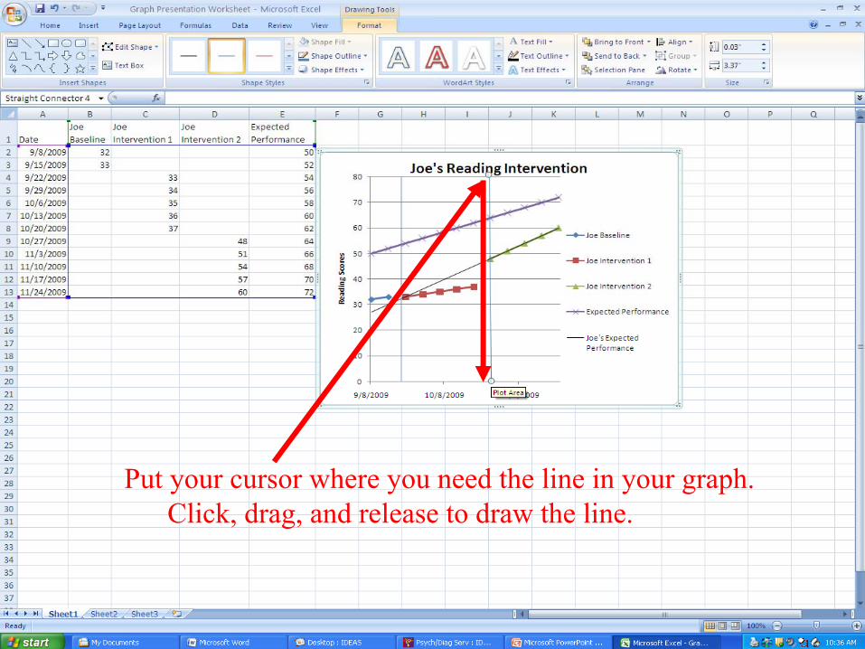
Put your cursor where you need the line in your graph.Click, drag, and release to draw the line.
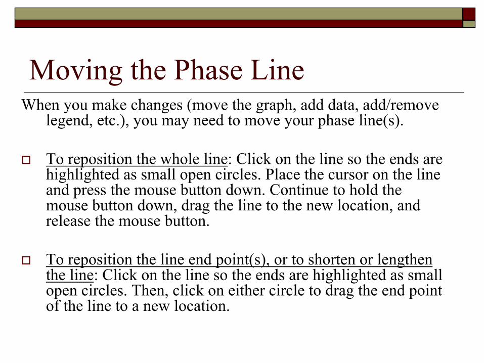
Moving the Phase LineWhen you make changes (move the graph, add data, add/remove
legend, etc.), you may need to move your phase line(s).
To reposition the whole line: Click on the line so the ends are highlighted as small open circles. Place the cursor on the line and press the mouse button down. Continue to hold the mouse button down, drag the line to the new location, and release the mouse button.
To reposition the line end point(s), or to shorten or lengthen the line: Click on the line so the ends are highlighted as small open circles. Then, click on either circle to drag the end pointof the line to a new location.
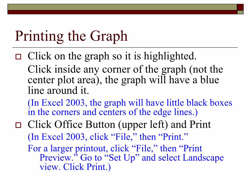
Printing the GraphClick on the graph so it is highlighted. Click inside any corner of the graph (not the center plot area), the graph will have a blue line around it. (In Excel 2003, the graph will have little black boxes in the corners and centers of the edge lines.)Click Office Button (upper left) and Print(In Excel 2003, click “File,” then “Print.”For a larger printout, click “File,” then “Print
Preview.” Go to “Set Up” and select Landscape view. Click Print.)
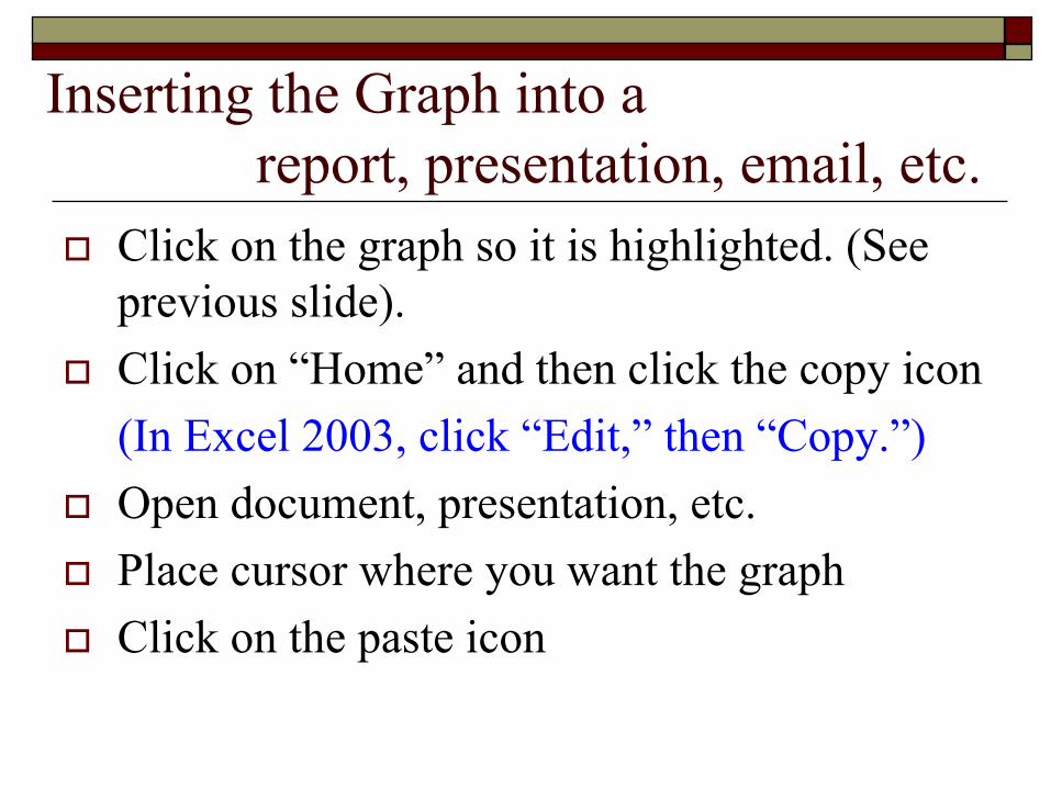
Inserting the Graph into a report, presentation, email, etc.
Click on the graph so it is highlighted. (See previous slide).Click on “Home” and then click the copy icon(In Excel 2003, click “Edit,” then “Copy.”)Open document, presentation, etc.Place cursor where you want the graphClick on the paste icon
More Editing TipsEditing Chart or Axis Titles
Click in the text boxes on the chartHighlight text and right clickSelect desired font, style, size, color, etc.
Don’t be afraid to click and experiment (play) until you get what you wantRight click on any part of graph to edit it Adding data
See slides 12 through 15 to select new data for display on the graph
Remember…We are all learning different things this year.Feel free to play around with program.Rely on those with graphing expertise. Pick up the phone and call for help.Keep it simple.Templates are available if you are confused.
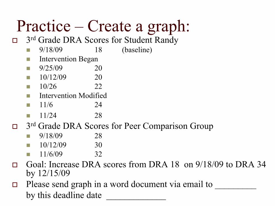
Practice – Create a graph:3rd Grade DRA Scores for Student Randy
9/18/09 18 (baseline)Intervention Began9/25/09 2010/12/09 2010/26 22Intervention Modified11/6 2411/24 28
3rd Grade DRA Scores for Peer Comparison Group9/18/09 2810/12/09 3011/6/09 32
Goal: Increase DRA scores from DRA 18 on 9/18/09 to DRA 34 by 12/15/09Please send graph in a word document via email to _________ by this deadline date _____________