Embed Size (px)
Citation preview

Mapping Heart Disease, Stroke and Other Chronic Diseases: A Program to Enhance GIS Capacity within Health Departments
Map Highlights from State Health Departments: Alaska, Arizona, New Jersey, North Dakota, and West Virginia; and Local Health Departments: California Counties- Merced and Stanislaus; Kansas Counties- Douglas, Johnson, and Wyandotte.
Submitted to the US Centers for Disease Control and Prevention, Division for Heart Disease and Stroke Prevention, and the National Association of Chronic Disease Directors
Prepared by the Children’s Environmental Health Initiative, Rice University, July 2017

Acknowledgements
The following staff from each of the participating agencies provided valuable contributions to the success of this project’s ability to enhance the use of GIS within health departments for the prevention and treatment of heart disease, stroke, and other chronic diseases.
i
AlaskaNelly AyalaMJ DanisonJessie DohertyJanice GrayRochelle GreenleyCheley GrigsbyDeb Hull-JilllyMarie JackmanLauren KelseyAnn LovejoyTazlina MannixJeff MayTodd McDowellAbigail Newby-KewDavid O’BrienJared ParrishJopeel QuimpoAmy ShawRay TrocheCharles Utermohle
ArizonaAlexandria DrakeOmar Contreras Jillian PapaAmanda White
New JerseyPamela AgovinoLisa A. Asare Melita JordanJie Li
North DakotaClint BootsCheri KieferGrace NjauJesse TranMilan Vu
West VirginiaScott Eubank Keaton HughesTony LeachLora Lipscomb
Merced County, CAKathryn JeanfreauKaty OestmanIleisha SandersKristynn Sullivan
Stanislaus County, CAKyle FlifletKathryn NormanGreg ShupingAaron Wilson
Douglas County, KSCharlie BryanMargaret GathunguriVince RomeroDee Vernberg
Johnson County, KSAshley FollettElizabeth HolzschuhCaitlin Walls
Wyandotte County, KSWesley McKainKari NeillJoanna Sabally
National Association of Chronic Disease DirectorsMaryCatherine Jones
Children’s Environmental Health Initiative at Rice UniversityHannah AbramsBrandi GihJocelyn HwangBeena KadakkuzhaRuiyang LiMarie Lynn MirandaJoshua Tootoo
US Centers for Disease Control and PreventionMichele CasperSophia GreerRaymond KingElvira McIntyreLinda Schieb

ii
IntroductIon
Geographic Information Systems (GIS) offer powerful tools for enhancing the ability of health departments to address the public health burden of heart disease, stroke, and other chronic diseases. In order to build the capacity of health departments to utilize GIS for the surveillance and prevention of chronic diseases, the Division for Heart Disease and Stroke Prevention at the National Centers for Disease Control and Prevention (CDC) funds a collaborative training project with the National Association of Chronic Disease Directors (NACDD), and The Children’s Environmental Health Initiative (CEHI). The central objective of this GIS Surveillance Training Project is to enhance the ability of health departments to integrate the use of GIS into daily operations that support existing priorities for surveillance and prevention of heart disease, stroke, and other chronic diseases. Staff members from health departments receive training regarding the use of GIS surveillance and mapping to address four major purposes:
• Documenting geographic disparities • Informing policy and program decisions • Enhancing partnerships with external agencies • Facilitating collaboration within agencies
In 2016, the following state health departments were competitively selected to participate in this GIS Surveillance Training Project: State Health Departments: Alaska, Arizona, New Jersey, North Dakota, and West Virginia; and Local Health Departments: California Counties - Merced and Stanislaus; Kansas Counties - Douglas, Johnson, and Wyandotte.
The project is intentionally designed to develop a GIS infrastructure that can serve a vast array of chronic disease areas, yet with a focus on heart disease and stroke. The maps displayed in this document highlight examples of how each participating health department produced maps to support their chronic disease priorities by documenting the burden, informing program and policy development, and enhancing partnerships. The extent of collaboration among chronic disease units within each health department is evident in the diversity of the teams that participated in the training and have continued to work to strengthen GIS infrastructure within their respective health departments.

1
AlAskA
Heart Disease Death Rates in Alaska by Gender & Public Health Region, 2008-2012
209.1 - 269.4
203.7 - 209.0
179.0 - 203.6
173.1 - 178.9
173.0
Men
State: 193.4
0 470 940235 Miles
133.6 - 143.6
109.3 - 133.5
108.3 - 109.2
102.5 - 108.2
102.4
Women
State: 102.4
'
'
'
'
'
'
'
'
'
'
''
'
'
'
'
'
'
'
'
'
'
'
'
'
'
'
'
''
'
'
'
''
'
'
'
'
'
'
'
'
'
'
'
'
'
'
'
'
'
'
'
'
'
'
'
'
'
'
'
'
'
'
'
'
'
'
'
' '
'
'
'
''
'
''
'
'
'
'
'
'
'
'
'
'
'
'
'
'
'
'
'
'
'
'
'
''
' '
' '
'
'
'
'
'
'
'
'
'
'
'
'
'
'
'
'
'
'
' '
'
'
'
'
'
'
'
'
'
'
'
'
'
'
'
'
'
'
'
'
'
'
'
'
'
'
''
'
'
'
'
'
'
'
'
'
'
'
'
Total PopulationDeath Rate*
Federally Qualified Health Center
163.4 - 205.5
156.9 - 163.3
149.6 - 156.8
140.9 - 149.5
140.8
State: 149.9
*All rates are per 100,000 & age-adjusted to the 2000 US Standard Population Source: CDC/National Center for Health Statistics National Mortality Database accessed with SEER*Stat statistical software, HRSA Data Warehouse
Key Points
● Heart disease is the second leading cause of death in Alaska from 2000 - 2013, behind cancer.
● Heart Disease most commonly affects adults after middle age. Though the population in Alaska has historically been younger, an increasing elderly population in Alaska puts health programs across the state in a unique position to address heart disease.
● The purpose of this map is to display heart disease mortality rates by gender and public health region, in relation to the location of Feder-ally Qualified Health Centers(FQHCs). FQHCs provide services to undersrved areas or populations, offering a sliding fee scale, and are critical to rural areas receiving healthcare.

2
SOUTH HIGH
29
28
12
10
4
2
10
17
32
ElmendorfAir Force
Base FortRichardson
SOUTH HIGH
CHUGIAK HIGH
EAGLE RIVER HIGH
EAST HIGH
WEST HIGH
DIMOND HIGH SERVICE HIGH
BARTLETT HIGH
Chugach State Park
Parental Permission to Participate in the YRBS
< 60%
60% - 64%
65% - 68%
Percentage of Students Speakinga Non-English Primary Language*
ANCHORAGESCHOOL DISTRICT
%
0 5 102.5Miles
0 750375Miles
AlAskA
Language as a Potential Barrier to Obtaining Parental Permission to Participate in the Alaska Youth Risk Behavior Survey (YRBS)
by School District in Anchorage, 2015
*Data from the 2015-2016 school yearSources: Anchorage School District: Assessment and Evaluation Department, English Language Learners Program, Demographics-GIS Services
Key Points●The Youth Risk Behavior Survey (YRBS) is a biennial survey of adolescent health-risk behaviors established by the Centers for Disease Control and Prevention (CDC) and first implemented in Alaska in 1995.
● Due to a state statute requiring written parental permission to survey, Alaska struggles to meet the 60% overall participation rate required for weighted, or representative, data. In the Anchor-age School District (ASD), Alaska’s largest and most racially and ethnically diverse district, language is thought to be one potential barrier to obtaining parental permission.
● This map displays YRBS parental permission rates and the per-centage of students who speak a primary language other than Eng-lish, as a proxy for the percentage of non-English speaking parents, by ASD high school. This map has been used in discussions with ASD about student registration processes and parent outreach, and it continues to inform 2017 YRBS planning.
SOUTH HIGH
29
28
12
10
4
2
10
17
32
ElmendorfAir Force
Base FortRichardson
SOUTH HIGH
CHUGIAK HIGH
EAGLE RIVER HIGH
EAST HIGH
WEST HIGH
DIMOND HIGH SERVICE HIGH
BARTLETT HIGH
Chugach State Park
Parental Permission to Participate in the YRBS
< 60%
60% - 64%
65% - 68%
Percentage of Students Speakinga Non-English Primary Language*
ANCHORAGESCHOOL DISTRICT
%
0 5 102.5Miles
0 750375Miles

3
Female Late Stage Breast Cancer Diagnosis, Percent of Uninsured Women and Mammography Facilities by County
ArIzonA
Source: Arizona Cancer Registry, 2010-2013; U.S. Census- Small Area Health Insurance Estimates, 2013; Arizona Radiation Regulatory Agency, Data current as of 6/29/2016
PIMA
COCONINOMOHAVE
APACHENAVAJO
GILA
YAVAPAI
YUMAPINAL
MARICOPA
COCHISE
LA PAZ
GRAHAM
SANTA CRUZ
GR
EENLEE
Percent of Diagnosesat Late Stage
22.2% - 23.9%24.0% - 25.0%25.1% - 27.7%27.8% - 29.5%29.6% - 37.5%
±0 30 60 90 12015
Miles
Percent ofUninsured Women
10.1% - 14.6%
14.7% - 18.4%
18.5% - 22.0%
Mammography Facilities Active Facility
Key Points
● Several factors that could influence delayed diagnosis include a lack of insurance and the lack of proximate screening locations; the purpose of this map is to show how these factors intersect in Arizona.
● Interestingly, the three counties with the highest percentage of late stage diagnoses (Graham, Gila, and Coconino) are not in the highest category of uninsured women but they do have very few mammography facilities.
● Some counties have a high percentage of late stage diagnoseseven though they have multiple licensed mammography facilities as well as a small percentage of uninsured women while other counties have a low percentage of late stage diagnoses withlimited to no mammography facilities and varying levels of unin-sured women.
● This map provides a visual representation of where there is room for improvement diagnosis of breast cancer at an earlier stage and increasing access to insurance, and the locations of mammography units in relationship to towns and other popu-lated areas.

4
Stroke Death Rates and 60 Minute Drive Time Areas to an Accredited Stroke Center, Arizona, 2011-2013
GF
GF
GF GF
GFGF
GFGFGF
GF
GF
GF
GF
GF
GF
GF
GF
GFGF
GFGF
GFGF
GF
GFGF
GFGF
GFGFGF
GFGFGF
GF
GFGF
GFGFGF
PIMA
COCONINO
MOHAVE
APACHE
NAVAJO
GILA
YAVAPAI
YUMA
PINALMARICOPA
COCHISE
LA PAZ
GRAHAM
SANTA CRUZ
GREENLEE
0 20 40 60 8010Miles±
Stroke CentersGF60 minute Drive Time from Stroke Centers
Age-Adjusted Stroke Death Rates 65+ per 100,000180.1 - 193.0193.1 - 206.4206.5 - 212.2212.3 - 214.0214.1 - 237.0
ArIzonA
Data Source: CDC Interactive Atlas for Heart Disease and Stroke, 2011-2013.Age standardized to 2000 US Standard Population per 100,000 population. Accredited stroke centers were compiled from Joint Commission, DNV GL, and Health Facilities Accreditation Program (HFAP).
Key Points
● This map displays stroke death rates for ages 65 year and older along with 60 minutes’ drive time to any accredited stroke center located in Arizona, and neighboring counties in Nevada and Utah.
● Additional analyses indicate that in Arizona, 74% of the popu-lation aged 65+ live within 60 minutes of an accredited stroke center.
● Of the 15 counties in Arizona, Navajo, Cochise, and Santa Cruz counties have the highest stroke death rates. The majority of the people living in Cochise and Santa Cruz counties are not within a 60-minute drive time of an accredited stroke center.
● The counties with the lowest stroke death rates include Yuma, Maricopa, and Pinal. Maricopa and Pinal counties have more ac-credited stroke centers than any other county, and the largest percentage of people living within a 60 minute drive time to an accredited stroke center.

5
Demand vs. Capacity for Colorectal Cancer Screening
0 3 61.5 Miles0 0.35 0.70.175 Miles 0 0.35 0.70.175 Miles0 0.3 0.60.15 Miles
Insets of Metropolitan AreasWilliams County: Williston Stark County: Dickinson Burleigh County: Bismarck Cass County: Fargo
Bottineau
Sioux
Divide
Pierce
Towner
Cavalier
Dunn
Bowman Adams
GrantEmmons Logan
McIntosh Sargent
Griggs Steele
Nelson
Eddy
FosterSheridan
OliverBillings
GoldenValley
Slope Hettinger
BurkeRenville
Kidder
Mountrail
Ward
McLeanMcKenzie
Williams
Mercer
Stark Morton
Burleigh
McHenry
StutsmanCass
Barnes
Richland
LaMoure
Dickey
Ransom
Grand Forks
Ramsey
Benson
Wells
Walsh
PembinaRolette
Traill
0Miles
30 60 90 12015
4
1
32
1 432
3500 - 37882
1500 - 3500
850 - 1500
291 - 850
By County, 2014Total Population Age 50-75
3001 - 13000
501 - 3000
0 - 500
Used Capacity Unused Capacity
By Facility, 2016Maximum Annual Colonoscopy Capacity
North Dakota
Key Points● Colorectal cancer screening is recommended for all adults beginning at age 50 and continuing until age 75.
● The U.S. Preventative Services Task Force recom-mends screening for colorectal cancer using colonoscopy, sigmoidoscopy, or fecal occult blood testing.
● This maps shows that while a number of facilities in high demand settings are meeting their full capacity for colonoscopy screening, many are not. This map will help to identify opportunities to build capacity for colorectal screening, and guide strategic planning to address caps in services.
Data Sources: 2014 American Community Survey 5-year; North Dakota Department of Health; U.S. Preventive Services Task Force

6
Heart Disease Mortality and Risk Factors in North Dakota
Diabetes Prevalence, 2013
Prevalence of Diabetes
6.5% - 7
.1%
7.2% - 7
.5%
7.6% - 7
.9%
8.6% - 1
3.6%
8% - 8
.5%
Heart Disease Mortality
Per 100,000, 2012-2014Heart Disease Death Rate
191.5
- 280
.5
280.6
- 301
.8
301.9
- 321
.3
321.4
- 345
.9
346.0
- 566
.6
Prevalence Obesity
Obesity Prevalence, 2013
25.9%
- 29.8
%
29.9%
- 31.4
%
31.5%
- 32.8
%
32.9%
- 33.3
%
33.4%
- 41%
north dAkotA
Sources: CDC Interactive Atlas of Heart Disease and Stroke; CDC Diabetes Interactive Atlas. All data are by county.
Key Points
● Heart disease was the leading cause of death in North Dakota from 2012 to 2014.
● Obesity is a risk factor for cardiovascular disease and has been strongly associated with diabetes. The prevalence of obesity in North Dakota in 2013 was 31.0%.
● According to the National Institute of Diabetes and Digestive and Kidney Diseases, people with diabetes are at least twice as likely as people without diabetes to have heart disease or a stroke. Diabetes prevalence in North Dakota in 2013 was 8.9%.
Diabetes Prevalence, 2013
Prevalence of Diabetes
6.5% - 7
.1%
7.2% - 7
.5%
7.6% - 7
.9%
8.6% - 1
3.6%
8% - 8
.5%
Heart Disease Mortality
Per 100,000, 2012-2014Heart Disease Death Rate
191.5
- 280
.5
280.6
- 301
.8
301.9
- 321
.3
321.4
- 345
.9
346.0
- 566
.6
Prevalence Obesity
Obesity Prevalence, 2013
25.9%
- 29.8
%
29.9%
- 31.4
%
31.5%
- 32.8
%
32.9%
- 33.3
%
33.4%
- 41%

7
Heart Disease Mortality Rate by Municipality of Residence,Cumberland County, New Jersey 2008-2012
Vineland
Millville
Downe Township
Fairfield Township
Lawrence Township
Maurice River Township
Hopewell Township
Commercial Township
Upper Deerfield Township
Greenwich Township
Deerfield TownshipStow Creek Township
Bridgeton
Salem
Shiloh Borough
Mortality Rate per 100,000, All Ages
²
73 - 206
207 - 328
329 - 557
558 - 1,152
Statewide heart disease mortality rate for 2008 - 2012 was 210
Suppressed
new Jersey
Key Points
● Cumberland County ranks last for health out-comes and health factors in New Jersey accord-ing to the 2016 County Health Rankings.
● This map displays the 2008-2012 heart disease mortality rates by municipality of residence within the county.
● Since these mortality rates are not age-adjust-ed, the higher heart disease death rates in some municipalities may be a reflection of older popu-lations – for instance the percentage of residents aged 65+ years was 22.2% in Hopewell Township and 21.7% in Downe Township, compared to 13.0% for Cumberland County overall.
Note: Rates suppressed when the numerator or denominator < 20 Mortality Rate Data Source: New Jersey Death Certificate Database, New Jersey Department of Health

8
Colorectal Cancer Incidence in New Jersey
2011 2012 2013*
Age-adjusted Rate** per 100,000
43.5
- 55.2
55.3
- 59.0
59.1
- 62.7
62.8
- 66.6
66.7
- 80.0Ü
Colorectal Cancer Incidence Rates 2011-2013, Ages 20+, by County, New Jersey
new Jersey
Ocean-3
Atlantic-3.9
Burlington-1.7
Morris-4.4
Sussex-4.5
Salem-2
Warren-2.4
Monmouth-3.4
Hunterdon-2.1
Cumberland-1.5
Bergen-4
Mercer-3.3
Somerset-4.8
Middlesex-3.2
Gloucester-3.5
Cape May-3
Passaic-2.9
Essex-3
Union-3.9
Camden-2.4
Hudson-3.2
Annual Percent Change of Colorectal Cancer Incidence Ages 20+, by County, New Jersey, 2004-2013
Ü Statistically Significant Decline
Average Annual Percent Change
-4.8 - -4.4
-4.3 - -3.9
-3.8 - -2.9
-2.8 - -2.0
-1.9 - -1.5
*2013 data are preliminary. **Rates are per 100,000 and age-adjusted to the 2000 US population standard. Data source: New Jersey State Cancer Registry January 2016 file, New Jersey Department of Health.
Key Points
● From 2011-2013, counties had age-adjusted colorectal cancer incidence rates rang-ing from 43.5 to 80 per 100,000.
● From 2004 to 2013, all counties showed a decline in colorectal cancer incidence rates; 15 out of 21 counties showed a statistically significant decline.
● As a next step, analysis could be performed to examine county-level screening rates and colorectal cancer incidence by stage. Higher screening could result in lower colorectal cancer incidence by the detection and removal of polyps. Higher screening could also result in a higher proportion of colorectal cancers diagnosed at early stage.

9
Stroke Death Rates, 2011-2013
west VIrgInIA
Age-Adjusted Rate per 100,00034.20 - 39.40
39.41 - 43.30
43.31 - 45.50
45.51 - 47.00
47.01 - 50.80Ü 0 20 40 60 8010Miles
2011-2013, 3 years combined Age-standardized to 2000 U.S. standard population, rate per 100,000 population. Rate for adults ages 35 and older Deaths National Vital Statistics System. Bridged-Race Postcensal Population Estimates from National Center for Health Statistics.
Key Points
● Stroke was the third leading cause of death in West Virginia in 2014.
● The total cost of stroke—health care ser-vices, treatment medications, and missed days of work—in the United States is roughly $34 billion each year (Mozaffarian et al, 2016).
● Counties with the highest stroke death rates in West Virginia were concentrated primarily in the southern region of the state.

10
Heart Disease Mortality and Risk Factors in West Virginia
Data from the National Vital Statistics System for Mortality. 2011-20133 years combined Rate Age-standardized to 2000 U.S. standard population.Spatially smoothed rate per 100,000 population. Rate for all ages.CDC Interactive Atlas of Heart Disease and Stroke.
Age-Adjusted Rate per 100,000165.7 - 183.0
183.1 - 197.9
198.0 - 208.4
208.5 - 219.1
219.2 - 264.3
Heart Disease Death Rates, 2011-2013
Obesity data from the CDC Diabetes Atlas of Interactive Data.County data from United States Census Bureau, 2010.
27.5 - 32.3
32.4 - 34.7
34.8 - 37.4
37.5 - 41.5
iPercentage of Obesity n West Virginia Counties
Prevalence of Obesity, 2012
Data from US Department of Agriculture, Economic Research Service Database, County Level Data, United States Census Bureau 2010
Percentage of Poverty in West Virginia Counties
24.5 - 34.9
18.6 - 24.4
14.0 - 18.5
10.0 - 13.9
0 20 40 60 8010Miles
Percent of Population in Poverty, 2014
west VIrgInIA
Key Points
● Heart disease was the second leading cause of death in West Virginia in 2014.
●According to the American Heart Association, obesity is a major risk factor for cardiovascular disease; obesity prevalence in West Virginia in 2015 was 35.6%. Social Economic Status (SES) accounts for disparity in mortality rates for major diseases including cardiovascular disease (Cohen, Farley, and Mason, 2003). In 2013, 18.5 % of West Virginians had incomes below the poverty line ($23,834 for a family of four).
●A number of counties with high heart disease death rates, particularly in the southwestern portion of the state, also show high prevalences of obesity and high percentages of population in poverty.
11
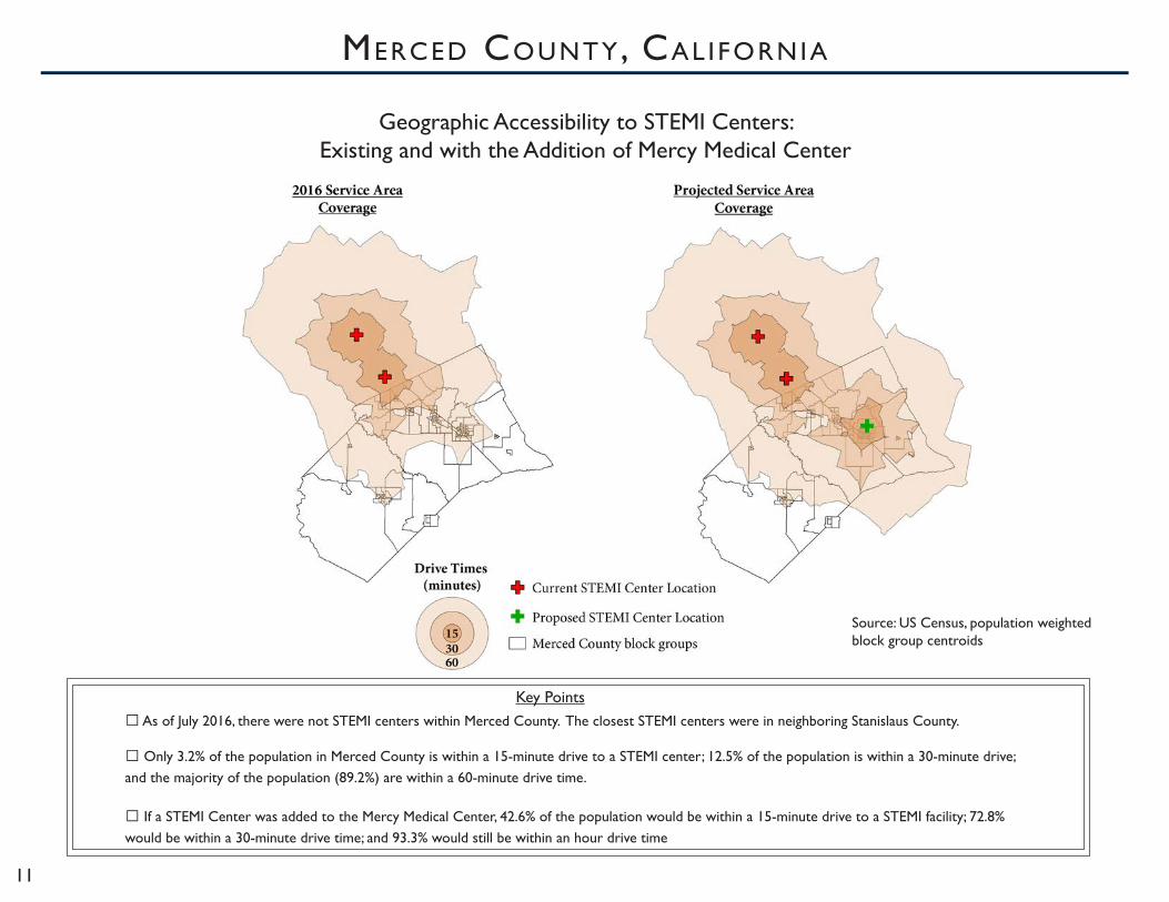
Geographic Accessibility to STEMI Centers:Existing and with the Addition of Mercy Medical Center
merced county, cAl IfornIA
Key Points● As of July 2016, there were not STEMI centers within Merced County. The closest STEMI centers were in neighboring Stanislaus County.
● Only 3.2% of the population in Merced County is within a 15-minute drive to a STEMI center; 12.5% of the population is within a 30-minute drive; and the majority of the population (89.2%) are within a 60-minute drive time.
● If a STEMI Center was added to the Mercy Medical Center, 42.6% of the population would be within a 15-minute drive to a STEMI facility; 72.8% would be within a 30-minute drive time; and 93.3% would still be within an hour drive time
Source: US Census, population weighted block group centroids

12
Prevalence of Unhealthy Food Locations within a Walkable Distance of a School or Head Start Facility in Stanislaus County, 2013
Ü 0 4 8 122 Miles
Percent of Residents Under185% Federal Poverty Level,by Census Tract
0% - 49.9%50% - 100%
Unhealthy Food Outlets
SNAP-Ed Qualifying UnhealthyFood Outlets within 1/2 Mile ofan Educational Facility
a
Half Mile Radius Aroundan Educational Facility(School or Head Start)
b
0 Miles1 2
City of Modesto
stAnIslAus county, cAl IfornIA
aUnhealthy Food Outlets were determined using 2013 NAICS data and consist of locations for Unhealthy Food Retail Outlets and Fast Food Outlets. NAICS codes contributing to the locations are: Unhealthy Food Retail Outlets: 445120, 445310, 446110, 447190; Fast Food Outlets: 722511, 722513bSNAP-Ed Qualifying food outlets are defined as retail locations contained within a census tract with greater than 50 percent of residents under 185% of the Federal Poverty Level, based on 2010-2014 ACS estimates.
Data Source: California Department of Public Health Nutrition Education & Obesity Prevention Branch, US Census Bureau ACS Estimates, NAICS
Key Points
● This map represents the density of unhealthy food outlets in relation to school and Head Start facilities, as well as identifying the number of locations that qualify for SNAP-Ed retail inter-ventions.
● Surveys and observations indicate that students with greater access to stores selling unhealthy foods are more likely to pur-chase unhealthy food items in their travel to and from school, considered in this map as a half mile walkable distance.
● Based on this analysis, roughly 60 percent of unhealthy food outlets in Stanislaus County are within a half mile of an edu-cational facility, and approximately 35 percent of those near schools qualify for SNAP-Ed programmingb.

13
Where are the 2016 Food Deserts in Lawrence, Kansas?
²·
²·
²·
²·
²·
²·²·
²·
²·
²·
²·
²·²·
²·
¬«10
¬«10
£¤40
§̈¦70
Lawrence Airport
ClintonLake
Future Waste Water Treatment Plant
Riverfront Park
Kansas River
Lakeview L ake
£¤24
£¤59
N 1800
9th
Clinton
N 1200
15th
¬«10
§̈¦70
E 900
19thKas
old
E 10
00
23rd
31st
6th
2nd
Iow
a
Bob Billings
£¤40
Mon
tere
y
Loui
sian
a
Mas
sach
uset
ts
£¤59
Mic
higa
n
N 1150
N 1550
E 1300
McD
onal
d
Wakarusa
E 1625
Iow
a
11th
Kas
old
15th
Has
kell
Has
kell
15th
Kas
old
11th
Iow
a
E 1625
Wakarusa
McD
onal
d
N 1550
Mic
higa
n
£¤59
Mas
sach
uset
ts
Loui
sian
a
Mon
tere
y
£¤40
Bob Billings
Iow
a
2nd
6th
31st
23rd
Kas
old
19th
E 900
§̈¦70
¬«10
15th
N 1200
Clinton
9th
N 1800
¬«10
¬«10
£¤40
§̈¦70
Lawrence Airport
Future Waste Water Treatment Plant
ClintonLake
Riverfront Park
Kansas River
Lakeview L ake
£¤24
£¤59
E 10
00
²·
²·
²·
²·
²·
²·²·
²·
²·
²·
²·
²·²·
²·
Has
kell
15th
Kas
old
11th
Iow
a
E 1625
Wakarusa
McD
onal
d
N 1550
Mic
higa
n
£¤59
Mas
sach
uset
ts
Loui
sian
a
Mon
tere
y
£¤40
Bob Billings
Iow
a
2nd
6th
31st
23rd
Kas
old
19th
E 900
§̈¦70
¬«10
15th
N 1200
Clinton
9th
N 1800
¬«10
¬«10
£¤40
§̈¦70
Lawrence Airport
Riverfront Park
Future Waste Water Treatment Plant
Kansas River
ClintonLake
L akeview L ake
£¤24
£¤59
E 10
00
E 1300
Low Access Areas Food Desert Areas
0 2 41 Miles
A food desert is an area with both low access to healthy food and low income.
+ Low Income Areas =
Legend
²· 2016 Grocery/Supermarket
Major StreetHighwayWater Bodies
Rural AreaMajority of Population Living in Student Housing
²
Low Access Area : Not a Low Access Area : Food Desert Area: Not a Food Desert Area :
+ =
A low income area is an area where more than 20% of people live below 200% poverty. A family of four living below 200% poverty earns less than $48,600 in 2016. People living at or below 200% poverty level may qualify for government assistant programs (i.e. SNAP, WIC).
Areas with low access to healthy food are areas where the majority of population lives more than 1 mile away from a supermarket, supercenter or grocery store.
Percent of People Living Below Poverty : 36% - 55% 56% - 84%21% - 35%<= 20%
douglAs county, kAnsAs
Data source: American Community Survey 2014 5-year Estimates Modified by Margaret Gathunguri; Douglas County GIS 2016; ReferenceUSA, US Business Database 2015 Modified by Douglas County Food Policy Council and Margaret Gathunguri
Key Points
● Research shows that living closer to healthy food retail is among the factors associated with better eating habits and decreased risk for obesity and diet-related diseases.
● This food desert map incorporates new information available after publication of the USDA 2010 food desert map (e.g. new grocery store locations and current 2014 census data).
● Within Douglas County, the majority (75.5%) of residents live in the city of Lawrence, KS. Within Lawrence, 28% of the population lives in a food desert (n=24,385).

14
Life Expectancy at Birth in Johnson County, 2009-2013
Stillwell
67 YRS Zip:66018
78 YRS Zip:66083
79 YRS Zip:66021
86 YRS Zip:66219
78 YRS Zip:66202
79 YRS Zip:66061
86 YRS Zip:66085
82 YRS Zip:66226
88 YRS Zip:66211
Olathe
Overland Park
Lenexa
Shawnee
LeawoodDeSoto
Gardner
Spring HillEdgerton
!(7
!(7
!(7
!(10!(10
§̈¦35
§̈¦35
§̈¦35
§̈¦435§̈¦435
§̈¦435
£¤69
£¤56£¤69
£¤69
£¤169
Johnson County LifeExpectancy: 81 years
10 Miles
JohnsonCounty
KansasCity, MO
Kansas Missouri
¯
Wyandotte County
Miami County
Dou
glas
Cou
nty
Mis
sour
i
£¤56
Johnson county, kAnsAs
Key Points
● Life expectancy at birth is defined as the estimated number of years a newborn can expect to live if current age-specific death rates in that population remained the same over time.
● This measure is particularly useful for examining community-level disparities because it reflects the impact of major illnesses and injuries and their un-derlying causes, enables direct comparisons across geographies and time, and is simpler and more intuitive to the public and policy makers than are other measures of death.
● Life expectancy in Johnson County ranges from 67 years in DeSoto to 88 years in Leawood – a distance of 19 miles.
Data Source: Kansas Department of Health and Environment Vital Statistics

15
Stores Selling Tobacco near Middle, High, and Post-Secondary Schools and Rec Centersin Wyandotte County, Kansas (2016)
-0 2 41 Miles
LegendTobacco Retail (Non Supermarket)
¥B£ Colleges/Universities/Tech Schools
! !Unified Government Commission Districts
Rec Centers With 1/2 Mile Outline
High Schools With 1/2 Mile Outline
Middle Schools With 1/2 Mile Outline
Streets
Tobacco Retail Not CoveredBy Tobacco 21 (Edwardsville, KS)
nm
nm
District 1
District 4
District 2
District 3
District 8
District 6
District 7
District 5
! !
!(
wyAndotte county, kAnsAs
Key Points
● In late 2015 and early 2016, the cities of Kansas City, Kansas and Bonner Springs passed laws raising the legal purchase age of tobacco products from 18 years to 21 years of age.
● Raising the legal purchasing age has been shown to reduce smoking by teens by up to 15%.
● This map shows where tobacco can be purchased within a walking distance of a half mile from places where teens spend a substantial amount of time.
● Of the locations where children spend time (rec centers, high and middle schools) 9 do not have any tobacco retail within 1/2 mile. 6 sites have 6 or more tobacco retail stores within a 1/2 mile, 8 have 3 to 4 within 1/2 mile and 13 have either 1 or 2 sites within 1/2 mile.
Data Sources: 2016 Kansas Department of Revenue Cigarette/Tobacco Active Licensees and Unified Government of Wyandotte County school data

16
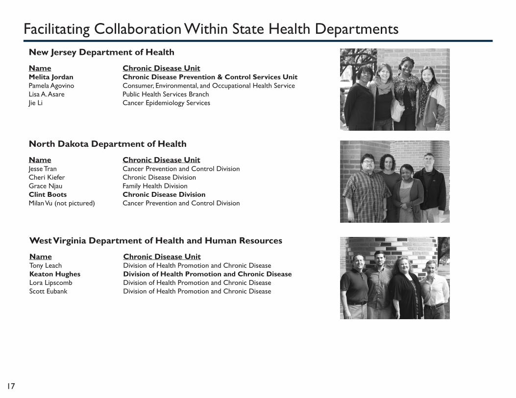
Facilitating Collaboration Within State Health DepartmentsThe GIS Surveillance Training Program was intentionally designed to develop a GIS infrastructure that would facilitate collaboration among an array of chronic disease units within each health department, yet with a focus on heart disease and stroke. To that end, the staff members from each health department that participated in the training represented different chronic disease units. Each health department was led by a member of the heart disease and stroke unit (bold). The following lists the chronic disease units that were represented in each of the participating health departments: Alaska Department of Health and Social Services
Name Chronic Disease Unit Jessie Doherty Women’s Children’s and Family HealthTazlina Mannix Chronic Disease Prevention and Health PromotionDavid O’Brien Alaska Cancer RegistryMarie Jackman Department of Health and Social ServicesCheley Grigsby Women’s Children’s and Family HealthRochelle Greenley Department of Health and Social ServicesJanice Gray Heart Disease and Stroke PreventionRay Troche Surveillance and Evaluation TeamAnn Lovejoy Mountain-Pacific Quality HealthLauren Kelsey Obesity Prevention and ControlAmy Shaw Department of Health and Social ServicesCharles Utermohle Surveillance and Evaluation TeamJopeel Quimpo Emergency Programs: Health Emergency ResponseDeborah Hull-Jilly Injury Surveillance ProgramMJ Danison Finance & Management ServicesTodd McDowell Emergency Programs: Health Emergency ResponseJeff May Tobacco Prevention and ControlAbigail Newby-Kew Maternal & Child HealthJared Parrish Maternal & Child HealthNelly Ayala (not pictured)
Arizona Department of Health Services
Name Chronic Disease Unit Alexandria Drake Bureau of Health Systems DevelopmentAmanda White Bureau of Nutrition and Physical ActivityJillian Papa Bureau of Nutrition and Physical ActivityOmar Contreras Chronic Disease
17
New Jersey Department of Health
Name Chronic Disease Unit Melita Jordan Chronic Disease Prevention & Control Services UnitPamela Agovino Consumer, Environmental, and Occupational Health ServiceLisa A. Asare Public Health Services BranchJie Li Cancer Epidemiology Services
North Dakota Department of Health
Name Chronic Disease Unit Jesse Tran Cancer Prevention and Control DivisionCheri Kiefer Chronic Disease DivisionGrace Njau Family Health DivisionClint Boots Chronic Disease DivisionMilan Vu (not pictured) Cancer Prevention and Control Division
Facilitating Collaboration Within State Health Departments
West Virginia Department of Health and Human Resources
Name Chronic Disease Unit Tony Leach Division of Health Promotion and Chronic DiseaseKeaton Hughes Division of Health Promotion and Chronic DiseaseLora Lipscomb Division of Health Promotion and Chronic DiseaseScott Eubank Division of Health Promotion and Chronic Disease

18
Merced County, CA
Ileisha SandersKristynn SullivanKathryn JeanfreauKaty Oestman
Facilitating Collaboration Within Local Health Departments
Johnson County, KS Ashley FollettElizabeth HolzschuhCaitlin Walls
Douglas County, KS
Margaret GathunguriDee VernbergVince RomeroCharlie Bryan
Wyandotte County, KS
Wesley McKainKari NeillJoanna Sabally
Stanislaus County, CA
Aaron WilsonKyle FlifletGreg ShupingKathryn Norman

19
PArtIcIPAtIng heAlth dePArtments to dAte
500
Miles
100
Miles
500
Miles
Hawaii
CT
NJ
CaliforniaKansas
South Dakota
VT
New Mexico
Utah
Idaho
Montana
Colorado
Nebraska
Oklahoma
Texas
Arkansas
Louisiana
MS
FL
South Carolina
NC
Iowa
MNMN
Wisconsin
Michigan
OhioIndiana
Pennsylvania
New York
NHMA
Maine
Oregon
Washington
Nevada
Arizona
Wyoming
North Dakota
Missouri
Illinois
Kentucky
Tennessee
Alabama Georgia
VirginiaWV
MDDE
Alaska
State health departments that have participated
Clusters of local health departments that have participated
State health departments yet to participate
RI
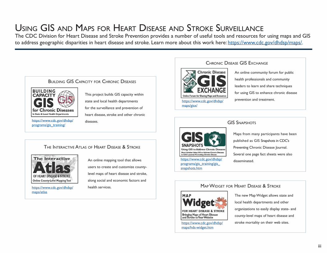
usIng gIs And mAPs for heArt dIseAse And stroke surVeIllAnceThe CDC Division for Heart Disease and Stroke Prevention provides a number of useful tools and resources for using maps and GIS to address geographic disparities in heart disease and stroke. Learn more about this work here: https://www.cdc.gov/dhdsp/maps/.
iii
mAP wIdget for heArt dIseAse & stroke
The new Map Widget allows state and
local health departments and other
organizations to easily display state- and
county-level maps of heart disease and
stroke mortality on their web sites.https://www.cdc.gov/dhdsp/maps/hds-widget.htm
gIs snAPshots
Maps from many participants have been
published as GIS Snapshots in CDC’s
Preventing Chronic Disease Journal.
Several one page fact sheets were also
disseminated. https://www.cdc.gov/dhdsp/programs/gis_training/gis_snapshots.htm
chronIc dIseAse gIs exchAnge
An online community forum for public
health professionals and community
leaders to learn and share techniques
for using GIS to enhance chronic disease
prevention and treatment.https://www.cdc.gov/dhdsp/maps/gisx/
the InterActIVe AtlAs of heArt dIseAse & stroke
An online mapping tool that allows
users to create and customize county-
level maps of heart disease and stroke,
along social and economic factors and
health services.https://www.cdc.gov/dhdsp/maps/atlas
BuIldIng gIs cAPAcIty for chronIc dIseAses
This project builds GIS capacity within
state and local health departments
for the surveillance and prevention of
heart disease, stroke and other chronic
diseases.https://www.cdc.gov/dhdsp/programs/gis_training/