Embed Size (px)
Citation preview
Marketing Research: Uncovering Competitive Advantages
Warren F. Kuhfeld, SAS Institute Inc., Cary N.C.
Presented at SEUGI '92 by Gerhard Held, SAS Institute
Abstract
The SAS® System provides a variety of methods for analyzing marketing data including conjoint analysis, correspondence analysis, preference mapping, multidimensional preference analysis, and multidimensional scaling. These methods allow you to analyze purchasing decision trade-offs, display product positioning, and examine differences in customer preferences. They can help you gain insight into your products, your customers, and your competition. This paper discusses these methods and their implementation in the SAS System.
Introd uction
Marketing research is an area of applied data analysis whose purpose is to support marketing decision making. Marketing researchers ask many questions, including:
• Who are my customers?
• Who else should be my customers?
• Who are my competitors' customers?
• Where is my product positioned relative to my competitors' products?
• Why is my product positioned there?
• How can I reposition my existing products?
• What new products should I create?
• What audience should I target for my new products?
Marketing researchers try to answer these questions using both standard data analysis methods, such as descriptive statistics and crosstabulations, and more specialized marketing research methods. This paper discusses two families of specialized marketing research methods, perceptual mapping and conjoint analysis.
185
Perceptual mapping methods produce plots that display product positioning, product preferences, and differences between customers in their product preferences. Conjoint analysis is used to investigate how consumers trade off product attributes when making a purchasing decision.
Perceptual Mapping
Perceptual mapping methods, including correspondence analysis (CA), multiple correspondence analysis (MCA), preference mapping (PREFMAP), multidimensional preference analysis (MDPREF), and multidimensional scaling (MDS), are data analysis methods that generate graphical displays from data matrices. These methods are used to investigate relationships among products as well as individual differences in preferences for those products.
CA and MCA can be used to display demographic and survey data. CA simultaneously displays in a scatterplot the row and column labels from a two-way contingency table (crosstabulation) constructed from two categorical variables. MCA simultaneously displays in a scatterplot the category labels from more than two categorical variables.
MDPREF displays products positioned by overall preference patterns. MDPREF also displays differences in how customers prefer products. MDPREF displays in a scatterplot both the row labels (products) and column labels (consumers) from a data matrix of continuous variables.
MDS is used to investigate product positioning. MDS displays a set of object labels (products) whose perceived similarity or dissimilarity has been measured.
PREFMAP is used to interpret preference patterns and help determine why products are positioned where they are. PREFMAP displays rating scale data in the same plot as an MDS or MDPREF plot. PREFMAP shows both products and product attributes in one plot.
MDPREF, PREFMAP, CA, and MCA are all similar in spirit to the biplot, so first the biplot is discussed

Product Product Product Product
Con!lumer
llj
Consumer 1 2 o 2
Figure 1. Preference Data Matrix
Consumer 3
il to provide a foundation for discussing these methods.
The Biplot. A biplot (Gabriel, 1981) simultaneously displays the row and column labels of a data matrix in a low-dimensional (typically two-dimensional) plot. The "bi" in "biplot" refers to the joint display of rows and columns, not to the dimensionality of the plot. Typically, the row coordinates are plotted as points, and the column coordinates are plotted as vectors.
Consider the artificial preference data matrix in Figure 1. Consumers were asked to rate their preference for products on a 0 to 9 scale where 0 means little preference and 9 means high preference. Consumer 1 's preference for Product 1 is 4. Consumer 1 's most preferred product is Product 4, which has a preference of 6.
The biplot is based on the idea of a matrix decomposition. The (n x m) data matrix Y is decomposed into the product of an (n X q) matrix A and a (q X m) matrix B/. Figure 2 shows a decomposition of the data in Figure 1.* The rows of A are coordinates in a two-dimensional plot for the row points in Y, and the columns of B' are coordinates in the same twodimensional plot for the column points in Y. In this artificial example, the entries in Yare exactly reproduced by scalar products of coordinates. For example, the (1,1) entry in Y is Yll = all X bll + a12 X b12 = 4=lx2+2x1.
The rank of Y is q ::; M IN(n, m). The rank of a matrix is the minimum number of dimensions that are required to represent the data without loss of information. The rank of Y is the full number of columns in A and B. In the example, q = 2. When the rows of A and B are plotted in a two-dimensional scatterplot, the scalar product of the coordinates of ai and hj exactly equals the data value Yij. This kind of scatterplot is a biplot. When q > 2 and the first two dimensions are plotted, then AB' is approximately equal to Y, and the display is an approximate biplot. t The best values for A and B, in terms of minimum squared error in approximating Y, are found using a singular value
"Figure 2 does not contain the decomposition that would be used for an actual biplot. Small integers were chosen to simplify the arithmetic.
tIn practice, the term biplot is sometimes used without qualification to refer to an approximate biplot.
186
[1
y
1
2 o 2
= A
il c [! 11 Figure 2. Preference Data Decomposition
8'
1 o
decomposition (SVD).+ An approximate biplot is constructed by plotting the first two columns of A and B.
When q > 2, the full geometry of the data cannot be represented in two dimensions. The first two columns of A and B provide the best approximation of the high dimensional data in two dimensions. Consider a cloud of data in the shape of an American football. The data are three dimensional. The best one dimensional representation of the data-the first principal component-is the line that runs from one end of the football, through the center of gravity or centroid and to the other end. It is the longest line that can run through the football. The second principal component also runs through the centroid and is perpendicular or orthogonal to the first line. It is the longest line that can be drawn through the centroid that is perpendicular to the first. If the football is a little thicker at the laces, the second principal component runs from the laces through the centroid and to the other side of the football. All of the points in the football shaped cloud can be projected into the plane of the first two principal components. The resulting scatterplot will show the approximate shape of the data. The two longest dimensions are shown, but the information in the other dimensions are lost. This is the principle behind approximate biplots. See Gabriel (1981) for more information on the biplot.
Multidimensional Preference Analysis. Multidimensional Preference Analysis (Carroll, 1972) or MDPREF is a biplot analysis for preference data. Data are collected by asking respondents to rate their preference for a set of objects-products in marketing research.
Questions that can be addressed with MDPREF analyses include: Who are my customers? Who else should be my customers? Who are my competitors' customers? Where is my product positioned relative to my competitors' products? What new products should I create? What audience should I target for my new products?
For example, consumers were asked to rate their pref-
tSVD is sometimes referred to in the psychometric literature as an Eckart-Young (1936) decomposition. SVD is closely tied to the statistical method of principal component analysis.
D i • I
-I
YDPREf Anolysi! of hlo.obiles Manufaclured in 1980
Conlinenlal I Eldorado 16
-2 24
-2 -I
Dinnin 1
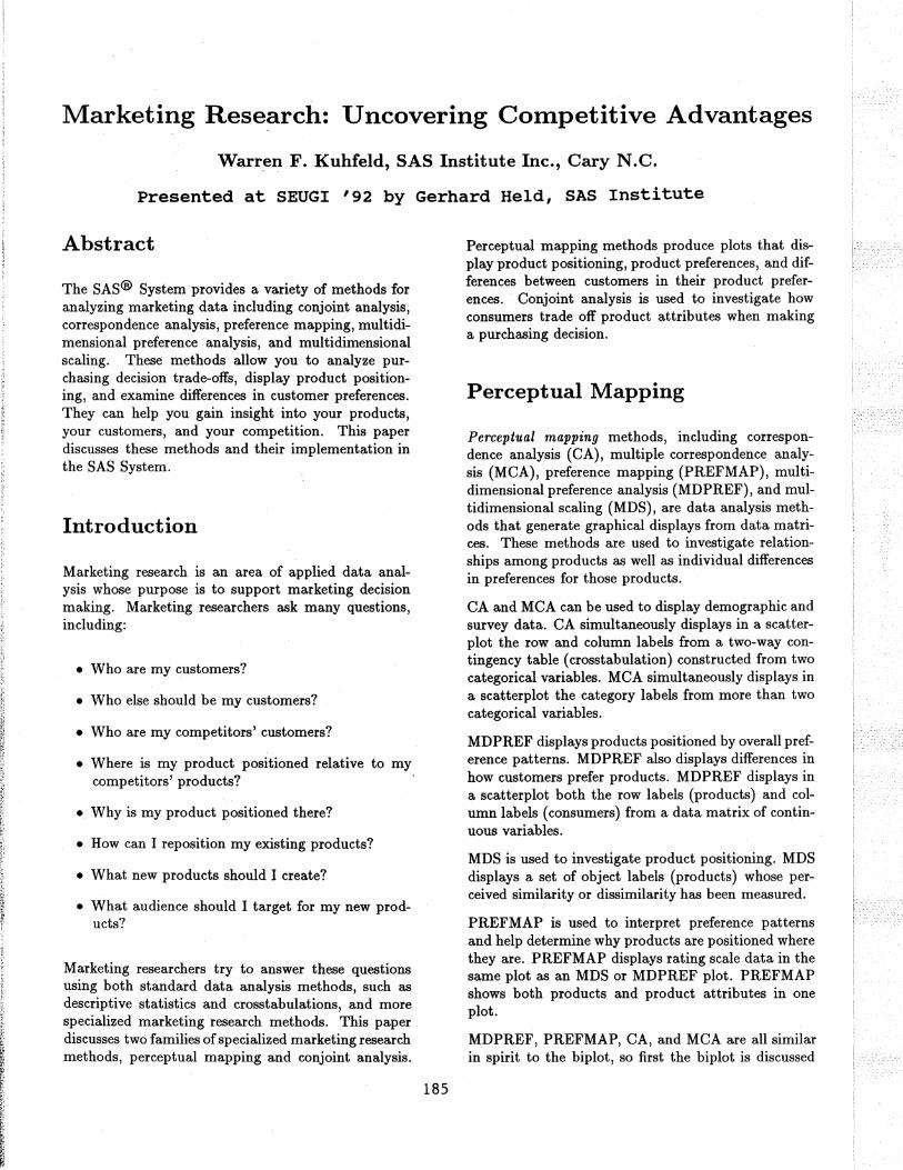
Figure 3. Multidimensional Preference Analysis
erence for a group of automobiles on a 0 to 9 scale, where 0 means no preference and 9 means high preference. Y is an (n x m) matrix that contains ratings of the n. products by the m consumers. Figure 3 displays an example in which 25 consumers rated their preference for 17 new (at the time) 1980 automobiles. Each consumer is a vector in the space, and each car is a point identified by an asterisk (*). Each consumer's vector points in approximately the direction of the cars that the consumer most preferred.
The dimensions of this plot are the first two principal components. The plot differs from a proper biplot of Y due to scaling factors. At one end of the plot of the first principal component are the most preferred automobiles; the least preferred automobiles are at the other end. The American cars on the average were least preferred, and the European and Japanese cars were most preferred. The second principal component is the longest dimension that is orthogonal to the first principal component. In the example, the larger cars tend to be at the top and the smaller cars tend to be at the bottom.
The automobile that projects farthest along a consumer vector is that consumer's most preferred automobile. To project a point onto a vector, draw an imaginary line through a point crossing the vector at a right angle. The point where the line crosses the vector is the projection. The length of this projection differs from the predicted preference, the scalar product, by a factor of the length of the consumer vector, which is constant within each consumer. Since the goal is to look at projections of points onto the vectors, the ab-
187
solute length of a consumer's vector is unimportant. The relative lengths of the vectors indicate fit, with longer vectors indicating better fit. The coordinates for the endpoints of the vectors were multiplied by 2.5 to extend the vectors and create a better graphical display. The direction of the preference scale is important. The vectors point in the direction of increasing values of the data values. If the data had been ranks, with 1 the most preferred and n the least preferred, then the vectors would point in the direction of the least preferred automobiles.
Consumers 9 and 16, in the top left portion of the plot, most prefer the large American cars. Other consumers, with vectors pointing up and nearly vertical, also show this pattern of preference. There is a large cluster of consumers, from 14 through 20, who prefer the Japanese and European cars. A few consumers, most notably consumer 24, prefer the small and inexpensive American cars. There are no consumer vectors pointing through the bottom left portion of the plot between consumers 24 and 25, which suggests that the smaller American cars are generally not preferred by any of these consumers.
Some cars have a similar pattern of preference, most notably Continental and Eldorado, which share a symbol in the plot. This indicates that marketers of Continental or Eldorado may want to try to distinguish their car from the competition. Dasher, Accord, and Rabbit were rated similarly, as were Malibu, Mustang, Volare, and Horizon. Several vectors point into the open area between Continental/Eldorado and the European and Japanese cars. The vectors point away from the small American cars, so these consumers do not prefer the small American cars. What car would these consumers like? Perhaps they would like a Mercedes or BMW.
Preference Mapping. Preference mapping* (Carroll, 1972) or PREFMAP plots resemble biplots, but are based on a different model. The goal in PREFMAP is to project external information into a configuration of points, such as the set of coordinates for the cars in the MDPREF example in Figure 3. The external information can aid interpretation.
Questions that can be addressed with PREFMAP analyses include: Where is my product positioned relative to my competitors' products? Why is my product positioned there? How can I reposition my existing products? What new products should I create?
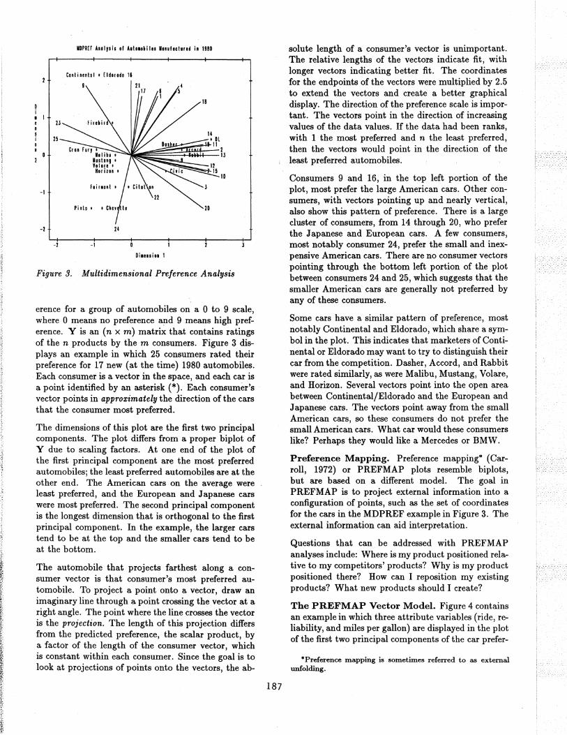
The PREFMAP Vector Model. Figure 4 contains an example in which three attribute variables (ride, reliability, and miles per gallon) are displayed in the plot of the first two principal components of the car prefer-
·Preference mapping is sometimes referred to as external unfolding.
-1
-2
P"feIIlCI Ylppin! 101 AutOiobiin hnullctu"d in UBO
CORlinental • [ldallda
F ire.i " , Ri'e
• e,u FUI, lllib. ,
luslal, • • Yo 1111
• HuizaR
• DISher , Accold ... Hit
FaillOnl' • Citalion Iii .. ,II 111I.n
Pi nlD' • Chnell.
-2 -1
Oilusi .. 1
• OL
Figure 4. Preference Mapping, Vector Model
ence data. Each of the automobiles was rated on a 1 to 5 scale, where 1 is poor and 5 is good. The end points for the attribute vectors are obtained by projecting the attribute variables into the car space. Orthogonal projections of the car points on an attribute vector give an approximate ordering of the cars on the attribute rating. The ride vector points almost straight up, indicating that the larger cars, such as the Eldorado and Continental, have the best ride. Figure 3 shows that most consumers preferred the DL, Japanese cars, and larger American cars. Figure 4 shows that the DL and Japanese cars were rated the most reliable and have the best fuel economy. The small American cars were not rated highly on any of the three dimensions.
Figure 4 is based on the simplest version of PREFMAP-the vector model. The vector model operates under the assumption that some is good and more is always better. This model is appropriate for miles per gallon and reliability-the more miles you can travel without refueling or breaking down, the better.
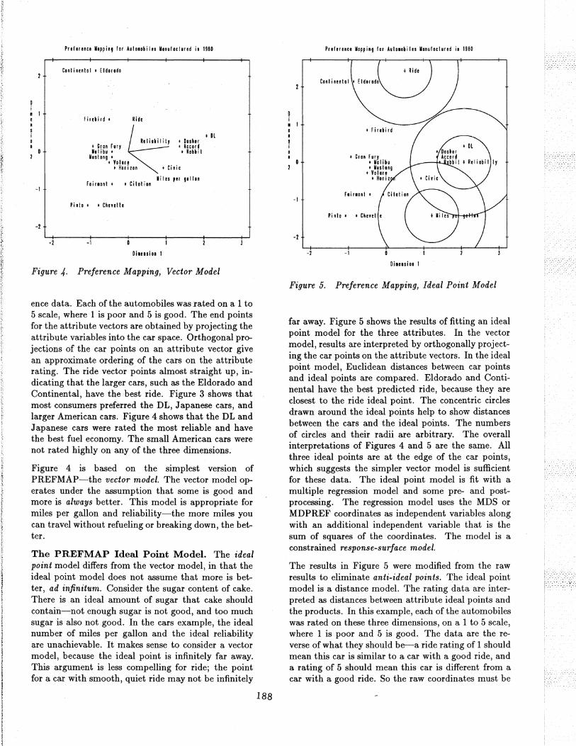
The PREFMAP Ideal Point Model. The ideal point model differs from the vector model, in that the ideal point model does not assume that more is better, ad infinitum. Consider the sugar content of cake. There is an ideal amount of sugar that cake should contain-not enough sugar is not good, and too much sugar is also not good. In the cars example, the ideal number of miles per gallon and the ideal reliability are unachievable. It makes sense to consider a vector model, because the ideal point is infinitely far away. This argument is less compelling for ride; the point for a car with smooth, quiet ride may not be infinitely
188
P'lh,"CI Yapping I., blOl.hi les Yanulaclured in 1980
·1
-2
-2 -1
OillniOi I
Figure 5. Preference Mapping, Ideal Point Model
far away. Figure 5 shows the results of fitting an ideal point model for the three attributes. In the vector model, results are interpreted by orthogonally projecting the car points on the attribute vectors. In the ideal point model, Euclidean distances between car points and ideal points are compared. Eldorado and Continental have the best predicted ride, because they are closest to the ride ideal point. The concentric circles drawn around the ideal points help to show distances between the cars and the ideal points. The numbers of circles and their radii are arbitrary. The overall interpretations of Figures 4 and 5 are the same. All three ideal points are at the edge of the car points, which suggests the simpler vector model is sufficient for these data. The ideal point model is fit with a multiple regression model and some pre- and postprocessing. The regression model uses the MDS or MDPREF coordinates as independent variables along with an additional independent variable that is the sum of squares of the coordinates. The model is a constrained response-surface model.
The results in Figure 5 were modified from the raw results to eliminate anti-ideal points. The ideal point model is a distance model. The rating data are interpreted as distances between attribute ideal points and the products. In this example, each of the automobiles was rated on these three dimensions, on a 1 to 5 scale, where 1 is poor and 5 is good. The data are the reverse of what they should be--a ride rating of 1 should mean this car is similar to a car with a good ride, and a rating of 5 should mean this car is different from a car with a good ride. So the raw coordinates must be
multiplied by -1 to get ideal points. Even if the scoring had been reversed, anti-ideal points can occur. If the coefficient for the sum-of-squ~res variable is negative, the point is an anti-ideal point. In this example, there is the possibility of anti-anti-ideal points. When the coefficient for the sum-of~squares variable is negative, the two multiplications by -1 cancel, and the coordinates are ideal points. When the coefficient for the sum-of-squares variable is positive, the coordinates are multiplied by -1 to get an ideal point.
Correspondence Analysis. Correspondence analysis (CA) is used to find a low-dimensional graphical representation of the association between rows and columns of a contingency table (crosstabulation). It graphically shows relationships between the rows and columns of a table; it graphically shows the relationships that the ordinary chi-square statistic tests. Each row and column is represented by a point in a Euclidean space determined from cell frequencies. CA is a popular data analysis method in France and Japan. In France, CA analysis was developed under the strong influence of Jean-Paul Ben2:ecri; in Japan, under Chikio Hayashi. CA is described in Lebart, Morineau, and Warwick (1984); Greenacre (1984); Nishisato (1980); Tenenhaus and Young (1985); Gifi (1990); Greenacre and Hastie (1987); and many other sources. Hoffman and Franke (1986) provide a good introductory treatment using examples from marketing research.
Questions that can be addressed with CA and MCA include: Who are my customers'? Who else should be my customers'? Who are my competitors' customers'? Where is my product positioned relative to my competitors' products? Why is my product positioned there'? How can I reposition my existing products'? What new products should I create'? What audience should I target for my new products'?
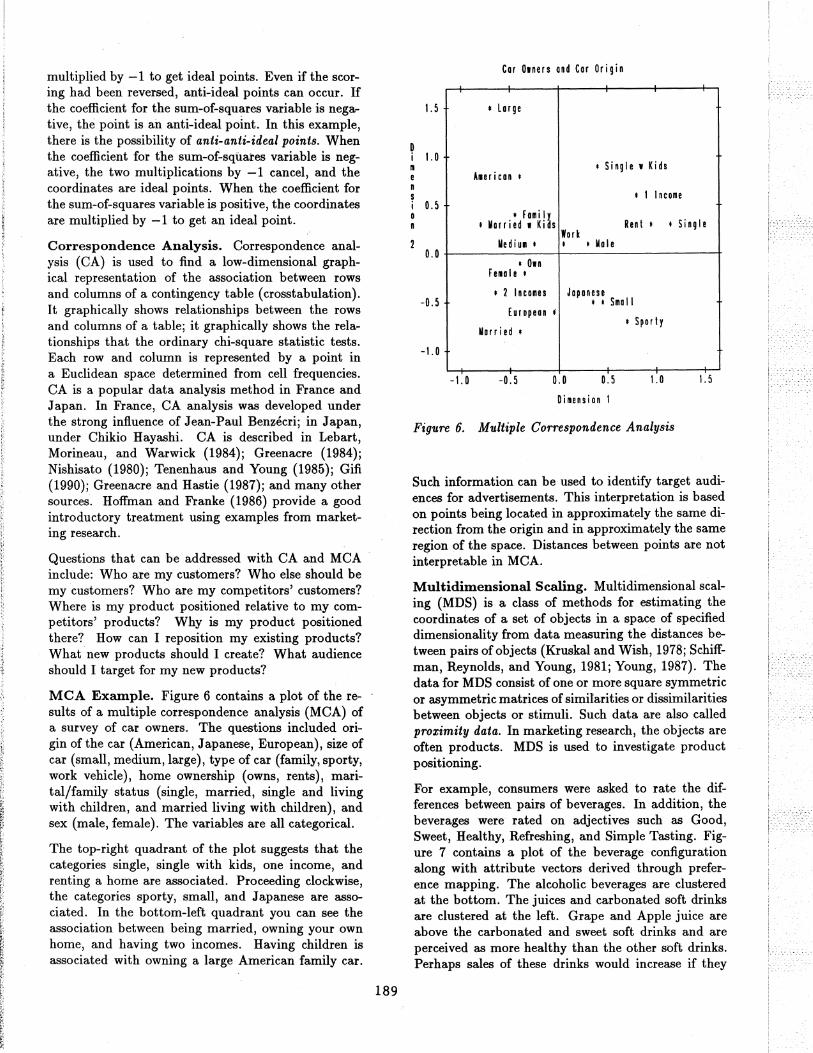
MCA Example. Figure 6 contains a plot of the results of a multiple correspondence analysis (MCA) of a survey of car owners. The questions included origin of the car (American, Japanese, European), size of car (small, medium, large), type of car (family, sporty, work vehicle), home ownership (owns, rents), marital/family status (single, married, single and living with children, and married living with children), and sex (male, female). The variables are all categorical.
The top-right quadrant of the plot suggests that the categories single, single with kids, one income, and renting a home are associated. Proceeding clockwise, the categories sporty, small, and Japanese are associated. In the bottom-left quadrant you can see the association between being married, owning your own home, and having two incomes. Having children is associated with owning a large American family car.
189
Car D.ners and Cor Origin
1.5 , lorge
D i 1.0 m e Alericon ,
' Single. Kids
n s , 1 Income i u.s a n
dOlllily' Ren t , , Single , Married I Kias
Work Mediul , , , Male
D.O I Din
Felole I
-0.5 , 2 Incoliles Japanese
, , SlIIa II European f
I Sporty Married'
-1.0
-1.0 -0.5 0.0 0.5 1.0 1.5
Dimension 1
Figure 6. Multiple Correspondence Analysis
Such information can be used to identify target audiences for advertisements. This interpretation is based on points being located in approximately the same direction from the origin and in approximately the same region of the space. Distances between points are not interpretable in MCA.
Multidimensional Scaling. Multidimensional scaling (MDS) is a class of methods for estimating the coordinates of a set of objects in a space of specified dimensionality from data measuring the distances between pairs of objects (Kruskal and Wish, 1978; Schiffman, Reynolds, and Young, 1981; Young, 1987). The data for MDS consist of one or more square symmetric or asymmetric matrices of similarities or dissimilarities between objects or stimuli. Such data are also called proximity data. In marketing research, the objects are often products. MDS is used to investigate product positioning.
For example, consumers were asked to rate the differences between pairs of beverages. In addition, the beverages were rated on adjectives such as Good, Sweet, Healthy, Refreshing, and Simple Tasting. Figure 7 contains a plot of the beverage configuration along with attribute vectors derived through preference mapping. The alcoholic beverages are clustered at the bottom. The juices and carbonated soft drinks are clustered at the left. Grape and Apple juice are above the carbonated and sweet soft drinks and are perceived as more healthy than the other soft drinks. Perhaps sales of these drinks would increase if they
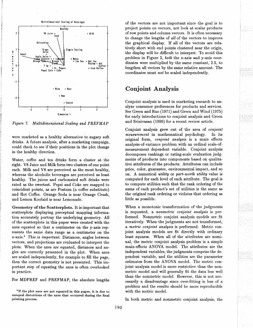
D i • e • I i 0 o ,
-1
-2
Mulli/i.,"io,,1 Sculi'g 01 B .. "uges
V8 J, i" • ClOd
Heo 1Ih,
Sio,le Tosling
• hi er
, Mi It
, Ice Tea 'Hoi Tea
1 Up , • Dr. Pepper
P"si C.I, • Cute
• lile • Beer
• RUllI
, Scolch
-1 -I
Di .... ion I
POI In , Hoi Coif ..
• Iced Coff ..
Figure 7. Multidimensional Scaling and PREFMAP
were marketed as a healthy alternative to sugary soft drinks. A future analysis, after a marketing campaign, could check to see if their positions in the plot change in the healthy direction.
Water, coffee and tea drinks form a cluster at the right. V8 Juice and Milk form two clusters of one point each. Milk and V8 are perceived as the most healthy, whereas the alcoholic beverages are perceived as least healthy. The juices and carbonated soft drinks were rated as the sweetest. Pepsi and Coke are mapped to coincident points, as are Postum (a coffee substitute) and Hot Coffee. Orange Soda is near Orange Crush, and Lemon Koolaid is near Lemonade.
Geometry of the Scatterplots. It is important that scatterplots displaying perceptual mapping information accurately portray the underlying geometry. All of the scatterplots in this paper were created with the axes equated so that a centimeter on the y-axis represents the same data range as a centimeter on the x-axis. * This is important. Distances, angles between vectors, and projections are evaluated to interpret the plots. When the axes are equated, distances and angles are correctly presented in the plot. When axes are scaled independently, for example to fill the page, then the correct geometry is not presented. This important step of equating the axes is often overlooked in practice.
For MDPREF and PREFMAP, the absolute lengths
*If the plot axes are not equated in this paper, it is due to unequal distortions of the axes that occurred during the final printing process.
190
of the vectors are not important since the goal is to project points on vectors, not look at scalar products of row points and column vectors. It is often necessary to change the lengths of all of the vectors to improve the graphical display. If all of the vectors are relatively short with end points clustered near the origin, the display will be difficult to interpret. To avoid this problem in Figure 3, both the x-axis and y-axis coordinates were multiplied by the same constant, 2.5, to lengthen all vectors by the same relative amount. The coordinates must not be scaled independently.
Conjoint Analysis
Conjoint analysis is used in marketing research to analyze consumer preferences for products and services. See Green and Rao (1971) and Green and Wind (1975) for early introductions to conjoint analysis and Green and Srinivasan (1990) for a recent review article.
Conjoint analysis grew out of the area of conjoint measurement in mathematical psychology. In its original form, conjoint analysis is a main effects analysis-of-variance problem with an ordinal scale-ofmeasurement dependent variable. Conjoint analysis decomposes rankings or rating-scale evaluation judgments of products into components based on qualitative attributes of the products. Attributes can include price, color, guarantee, environmental impact, and so on. A numerical utility or part-worth utility value is computed for each level of each attribute. The goal is to compute utilities such that the rank ordering of the sums of each product's set of utilities is the same as the original rank ordering or violates that ordering as little as possible.
When a monotonic transformation of the judgments is requested, a nonmetric conjoint analysis is performed. Nonmetric conjoint analysis models are fit iteratively. When the judgments are not transformed, a metric conjoint analysis is performed. Metric conjoint analysis models are fit directly with ordinary least squares. When all of the attributes are nominal, the metric conjoint analysis problem is a simple main-effects ANOVA model. The attributes are the independent variables, the judgments comprise the dependent variable, and the utilities are the parameter estimates from the ANOVA model. The metric conjoint analysis model is more restrictive than the nonmetric model and will generally fit the data less well than the nonmetric model. However, this is not necessarily a disadvantage since over-fitting is less of a problem and the results should be more reproducible with the metric model.
In both metric and nonmetric conjoint analysis, the
respondents are typically not asked to rate all possible combinations of the attributes. For example, with five attributes, three with three levels and two with two levels, there are 3 x 3 x 3 x 2 x 2- = 108 possible combinations. Rating that many combinations would be difficult for consumers, so typic(!.lly only a small fraction of the combinations are rated. It is still possible to compute utilities, even if not all combinations are rated. Typically, combinations are chosen from an orthogonal array which is a fractional factorial design. In an orthogonal array, the zer%ne dummy variables are un correlated for all pairs in which the two dummy variables are not from the same factor. The main effects are orthogonal but are confounded with interactions. These interaction effects are typically assumed to be zero.
Questions that can be addressed with conjoint analysis include: How can I reposition my existing products? What new products should I create? What audience should I target for my new products?
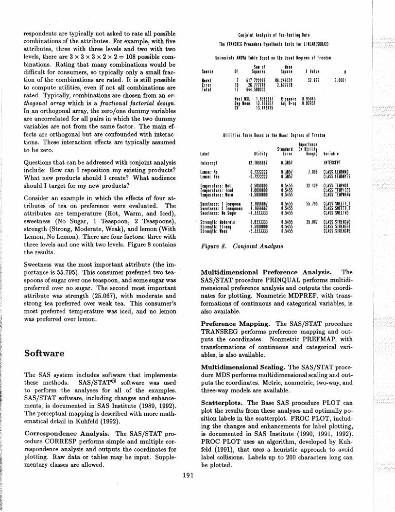
Consider an example in which the effects of four attributes of tea on preference were evaluated. The attributes are temperature (Hot, Warm, and Iced), sweetness (No Sugar, 1 Teaspoon, 2 Teaspoons), strength (Strong, Moderate, Weak), and lemon (With Lemon, No Lemon). There are four factors: three with three levels and one with two levels. Figure 8 contains the results.
Sweetness was the most important attribute (the importance is 55.795). This consumer preferred two teaspoons of sugar over one teaspoon, and some sugar was preferred over no sugar. The second most important attribute was strength (25.067), with moderate and strong tea preferred over weak tea. This consumer's most preferred temperature was iced, and no lemon was preferred over lemon.
Software
The SAS system includes software that implements these methods. SAS/STAT@ software was used to perform the analyses for all of the examples. SAS/STAT software, including changes and enhancements, is documented in SAS Institute (1989, 1992). The perceptual mapping is described with more mathematical detail in Kuhfeld (1992).
Correspondence Analysis. The SAS/STAT procedure CORRESP performs simple and multiple correspondence analysis and outputs the coordinates for plotting. Raw data or tables may be input. Supplementary classes are allowed.
191
Conjoint Analysis of Teo-Iosting Data
Tie TRAHSm Procedure Hypothesis Tests for lIMEAR(SUBJ2)
Unimiate ANOYA Table Based on the Usual Degrees of FreedOi
SUI of Yean Some OF Squares Square F Yalue
Model 7 617.722222 BR.mm 32.955 0.0001 Error 10 26.717118 2.671778 Tolal 17 644.500000
Root MSE 1.6363917 R-square 0.95845 Dep Mean 12.166667 Ad j R-sq 0.92937 CY 13.449795
Utilities Table Based 01 lhe Unol Degrees of FreedoM
Staldard I'portance (I Uti I i 1\
Lobe I ut iii ty £ r ror Range Variable
Intercept 12 .1666667 0.3857 I NTERC£PI
Lnon: No 0.7222222 0.3857 7.008 CLASS.mONNO L!IOn: Yes -0.7222222 OJ857 CLASS. L £UONYES
Ielperalure: Hot 0.5000000 0.5455 12.129 CLASS. TEUPHOI Ielperature: Iced 1.0000000 0.5455 CLASS.mPIC£D Ielperalure: 'arl -I. 5000000 0.5455 CLASS.l£MPWARU
Sleetness: 1 leaspoon 3.1666661 0.m5 55.195 CLASS.SlmU Sleetness: 2 leaspaons 4.1666667 0.5455 CLASS.SlmU Sleetness: No Sugar -7.3333333 0.m5 CLASS.SWEETNO
Strength: Uoderote 1.Bmm 0.5455 25.067 CLASS. SIR£NCUO Strength: Strong 1.5000000 0.5455 CLASS.SlRENCSI Strength: leak -l.3mm 0.5455 CLASS. SIRENm
Figure 8. Conjoint Analysis
Multidimensional Preference Analysis. The SAS/STAT procedure PRINQUAL performs multidimensional preference analysis and outputs the coordinates for plotting. Nonmetric MDPREF, with transformations of continuous and categorical variables, is also available.
Preference Mapping. The SAS/STAT procedure TRANSREG performs preference mapping and outputs the coordinates. Nonmetric PREFMAP, with transformations of continuous and categorical variables, is also available.
Multidimensional Scaling. The SAS/STAT procedure MDS performs multidimensional scaling and outputs the coordinates. Metric, nonmetric, two-way, and three-way models are available.
Scatterplots. The Base SAS procedure PLOT can plot the results from these analyses and optimally position labels in the scatterplot. PROC PLOT, including the changes and enhancements for label plotting, is documented in SAS Institute (1990, 1991, 1992). PROC PLOT uses an algorithm, developed by Kuhfeld (1991), that uses a heuristic approach to avoid label collisions. Labels up to 200 characters long can be plotted.
A macro, using SAS/GRAPH® software, was used to create graphical output from PROC PLOT. In the macro, PROC PLOT creates a printer plot, which is written to a file that the user can edit to modify label positioning. Then the macro reads the edited plot and creates the final graph .. There are options to draw vectors to certain symbols and draw circles around other symbols. This macro is available free of charge. Send requests to Sue Glenn. For electronic mail, use [email protected]. If you do not have access to electronic mail, use: Sue Glenn, Applications Division, SAS Institute Inc., Cary NC, 27513-2414.
Conjoint Analysis. The SAS/STAT procedure TRANSREG can perform both metric and nonmetric conjoint analysis. PROC TRANSREG can handle both holdout observations and simulations. Holdouts are ranked by the consumers but are excluded from contributing to the analysis. They are used to validate the results of the study. Simulation observations' are not rated by the consumers and do not contribute to the analysis. They are scored as passive observations. Simulations are what-if combinations. They are combinations that are entered to get a prediction of what their utility would have been if they had been rated.
The SAS/QC® procedures OPTEX and FACTEX, along with the ADX menu system, can generate orthogonal designs for both main-effects models and models with interactions. Nonorthogonal designsfor example, when strictly orthogonal designs require too many observations-can be generated with the SAS/QC procedure OPTEX. Nonorthogonal designs can be used in conjoint analysis studies to minimize the number of stimuli when there are many attributes and levels.
Other Data Analysis Methods. Other procedures that are useful for marketing research include the SAS/STAT procedures for regression, ANOVA, discriminant analysis, principal component analysis, factor analysis, categorical data analysis, covariance analysis (structural equation models), and the SAS/ETS® procedures for econometrics, time series, and forcasting.
Conclusions
Marketing research helps you understand your customers and your competition. Correspondence analysis compactly displays survey data to aid in determining what kinds of consumerS are buying your products. Multidimensional preference analysis and multidimensional scaling show product positioning, group preferences, and individual preferences. Plots from these
192
methods may suggest how to reposition your product to appeal to a broader audience. They may also suggest new groups of customers to target. Preference mapping is used as an aid in understanding MDPREF and MDS results. PREFMAP displays product attributes in the same plot as the products. Conjoint analysis is used to investigate how consumers trade off product attributes when making a purchasing decision.
The insight gained from perceptual mapping and conjoint analysis can be a valuable asset in marketing decision making. These techniques can help you gain insight into your products, your customers, and your competition. They can give you the edge in gaining a competitive advantage.
References
Carroll, J.D. (1972), "Individual Differences and Multidimensional Scaling," in Multidimensional Scaling: Theory and Applications in the Behavioral Sciences (Volume 1), in Shepard, R.N., Romney, A.K., and Nerlove, S.B. (Editors), New York: Seminar Press.
Eckart, C., and Young, G. (1936), "The Approximation of One Matrix by Another of Lower Rank," Psychometrika, 1, 211-218.
Gabriel, K.R. (1981), "Biplot Display of Multivariate Matrices for Inspection of Data and Diagnosis," Interpreting Multivariate Data, V. Barnett (Editor), London: John Wiley & Sons, Inc.
Gifi, A. (1990), Nonlinear multivariate analysis. Chichester UK: Wiley.
Green, P.E. and Rao., V.R. (1971), "Conjoint Measurement for Quantifying Judgmental Data," Journal of Marketing Research, 8, 355-363.
Green, P.E. and Srinivasan, V. (1990), "Conjoint Analysis in Marketing: New Developments with Implications for Research and Practice," Journal of Marketing, 54, 3-19.
Green, P.E. and Wind, Y. (1975), "New Way to Measure Consumers' Judgments," Harvard Business Review, July-August, 107-117.
Greenacre, M.J., and Hastie, T. (1987), "The Geometric Interpretation of Correspondence Analysis," Journal of the American Statistical Association, 82, 437-447.
Greenacre, M.J. (1984), Theory and Applications of Correspondence Analysis, London: Academic Press.