Embed Size (px)
Citation preview

Losing'Ground:'
School&Segregation&in&Massachusetts&
Jennifer'B.'Ayscue'and'Alyssa'Greenberg'with'
John'Kucsera'and'Genevieve'Siegel<Hawley'
Foreword'by'
Gary'Orfield'
May&2013&
3rd'in'a'Series'

Table of Contents
Acknowledgements ......................................................................................................................... ii
List of Figures ................................................................................................................................ iii
List of Tables .................................................................................................................................. iv
Foreword .......................................................................................................................................... v
Executive Summary ..................................................................................................................... viii
Background and Context ................................................................................................................. 1
Segregation and Desegregation: What the Evidence Says .............................................................. 7
Data and Methods .......................................................................................................................... 12
State Trends ................................................................................................................................... 13
Metropolitan Trends ...................................................................................................................... 23
Discussion ...................................................................................................................................... 52
Recommendations ......................................................................................................................... 54
Appendix A: Additional Data Tables ............................................................................................ 58
Appendix B: Data Sources and Methodology ............................................................................... 76

ii
Acknowledgements
We would like to thank Gary Orfield and Genevieve Siegel-Hawley for sharing their expertise by providing helpful guidance, invaluable feedback, and continued support throughout our work on this report. We also want to thank John Kucsera and Greg Flaxman for their productive assistance with data collection and analysis. We would like to acknowledge Susan Eaton and Gina Chirichigno for sharing their knowledge and providing helpful suggestions for this report. In addition, we want to express our appreciation to Laurie Russman, coordinator of the Civil Rights Project/ Proyecto Derechos Civiles, for her encouraging support and editorial assistance.
This report is the third in a series of 12 reports from the Civil Rights Project analyzing school segregation in the Northeast and Mid-Atlantic states.

iii
List of Figures
Figure 1: Public School Enrollment by Race, Massachusetts ....................................................... 14 Figure 2: Black Students in Minority Segregated Schools, Massachusetts ................................... 16 Figure 3: Latino Students in Minority Segregated Schools, Massachusetts .................................. 17 Figure 4: Students in Multiracial Schools by Race, Massachusetts .............................................. 18 Figure 5: White Students in School Attended by Typical Student of Each Race,
Massachusetts ................................................................................................................ 19 Figure 6: Racial Composition of School Attended by Typical Black Student,
Massachusetts ................................................................................................................ 20 Figure 7: Racial Composition of School Attended by Typical Latino Student,
Massachusetts ................................................................................................................ 20 Figure 8: Racial Composition of School Attended by Typical Student by Race,
Massachusetts ................................................................................................................ 21 Figure 9: Exposure to Low-Income Students by Race, Massachusetts .......................................... 22 Figure 10: Public School Enrollment by Race, Boston-Worcester-Lawrence-
Lowell-Brockton Metro Area ....................................................................................... 24 Figure 11: Black Students in Minority Segregated Schools, Boston-Worcester-
Lawrence-Lowell-Brockton ......................................................................................... 27 Figure 12: Latino Students in Minority Segregated Schools, Boston-Worcester-
Lawrence-Lowell-Brockton ......................................................................................... 28 Figure 13: Students in Multiracial Schools by Race, Boston-Worcester-Lawrence-
Lowell-Brockton Metropolitan Area ........................................................................... 29 Figure 14: White Students in School Attended by Typical Student of Each Race,
Boston-Worcester-Lawrence-Lowell-Brockton Metropolitan Area ............................ 30 Figure 15: Racial Composition of School Attended by Typical Black Student,
Boston-Worcester-Lawrence-Lowell-Brockton Metropolitan Area ............................ 30 Figure 16: Racial Composition of School Attended by Typical Latino Student,
Boston-Worcester-Lawrence-Lowell-Brockton Metropolitan Area ............................ 31 Figure 17: Racial Composition of School Attended by Typical Student by Race,
Boston-Worcester-Lawrence-Lowell-Brockton Metropolitan Area ............................ 32 Figure 18: Exposure to Low-Income Students by Race, Boston-Worcester-
Lawrence-Lowell-Brockton Metropolitan Area .......................................................... 33 Figure 19: Racial Transition by District, Boston-Worcester-Lawrence-
Lowell-Brockton Metropolitan Area ........................................................................... 34 Figure 20: Degree and Type of Racial Transition, Boston-Worcester-
Lawrence-Lowell-Brockton Metropolitan Area, 1999 to 2010 ................................... 36 Figure 21: Rapid or Moderate Racial Transition by District Type for Top 10 Highest Enrolling
Districts, Boston-Worcester-Lawrence-Lowell-Brockton Metropolitan Area ............ 37 Figure 22: Public School Enrollment by Race, Springfield Metropolitan Area ............................ 38 Figure 23: Black Students in Minority Segregated Schools, Springfield Metropolitan Area ........ 41 Figure 24: Latino Students in Minority Segregated Schools, Springfield Metropolitan Area ...... 41 Figure 25: Students in Multiracial Schools, Springfield Metropolitan Area ................................. 42 Figure 26: White Students in School Attended by Typical Student of Each Race,
Springfield Metropolitan Area ..................................................................................... 43 Figure 27: Racial Composition of School Attended by Typical Black Student,
Springfield Metropolitan Area ..................................................................................... 44

iv
Figure 28: Racial Composition of School Attended by Typical Latino Student, Springfield Metropolitan Area ..................................................................................... 45
Figure 29: Racial Composition of School Attended by Typical Student by Race, Springfield Metropolitan Area ..................................................................................... 46
Figure 30: Exposure to Low-Income Students by Race, Springfield Metropolitan Area .............. 47 Figure 31: Racial Transition by District, Springfield Metropolitan Area ..................................... 48 Figure 32: Degree and Type of Racial Transition, Springfield Metropolitan Area,
1999 to 2010 ................................................................................................................ 50 Figure 33: Moderate Racial Transition by District Type, Springfield Metropolitan Area ............ 51
List of Tables
Table 1: Public School Enrollment, Massachusetts, Northeast, and the Nation ........................... 13!Table 2: Multiracial and Minority Segregated Schools, Massachusetts ....................................... 15!Table 3: Students Who Are Low-Income in Multiracial and Minority Segregated Schools,
Massachusetts ................................................................................................................. 15!Table 4: Public School Enrollment by Race in Urban and Suburban Schools,
Boston-Worcester-Lawrence-Lowell-Brockton Metropolitan Area ................................ 25!Table 5: Multiracial and Minority Segregated Schools, Boston-Worcester-
Lawrence-Lowell-Brockton Metropolitan Area .............................................................. 26!Table 6: Students Who Are Low-Income in Multiracial and Minority Segregated Schools,
Boston-Worcester-Lawrence-Lowell-Brockton Metropolitan Area ................................ 26!Table 7: Entropy Index Values, Overall and Within and Between School Districts,
Boston-Worcester-Lawrence-Lowell-Brockton Metropolitan Area ................................ 33!Table 8: White Proportion and Classification in Metropolitan Area and Top 10 Highest Enrolling
Districts, Boston-Worcester-Lawrence-Lowell-Brockton Metropolitan Area ..................... 35!Table 9: Public School Enrollment by Race in Urban and Suburban Schools,
Springfield Metropolitan Area ........................................................................................ 39!Table 10: Multiracial and Minority Segregated Schools, Springfield Metropolitan Area ............ 40!Table 11: Students Who Are Low-Income in Multiracial and Minority Segregated Schools,
Springfield Metropolitan Area ...................................................................................... 40!Table 12: Entropy Index Values, Overall and Within and Between School Districts,
Springfield Metropolitan Area ...................................................................................... 47!Table 13: White Proportion and Classification in Metropolitan Area and Top 10 Highest
Enrolling Districts, Springfield Metropolitan Area ...................................................... 49!
v
Foreword
The statistics on deep and increasing segregation in a state rich in educational opportunities is a sad commentary on a generation of neglect of a basic issue. In the U.S., nearly 120 years after the Supreme Court’s “separate but equal” decision, Plessy v. Ferguson, no state has provided equal segregated schools in spite of a handful of outstanding individual schools. Massachusetts has many good schools, nationally recognized for high achievement, which serve their students well. But there are huge gaps within the state’s highly stratified system. Although the state was a pioneer a half century ago in recognizing the serious educational and social problems of isolation by race and poverty in unequal schools, it lost that vision decades ago and has embraced the conservative model of education reform born in the South in the l970s, popularized by the Reagan Administration in the l980s, and imposed on the country in a deeply counterproductive form in the No Child Left Behind law of 2001. This was a strategy that ignored the enormous differences in human resources and opportunities in schools segregated by race and poverty and sometimes by home language.
The high stakes accountability model ignores the problems of race and poverty and imposes limits and sanctions on schools, teachers, and students if they do not meet test-based standards set by the state government. It assumes that schools that are not run by public school systems, the charter schools, are better and deserve better treatment than policies and programs that actually give disadvantaged students the right to attend some of the Commonwealth’s excellent public schools in other districts. The fundamental idea is that the inequalities with roots outside the schools are irrelevant and that everything can be fixed inside the schools if there are sufficient sanctions or by the creation of charter schools which will be better because they are not parts of a school district. Many leaders of Massachusetts understood the fundamental unfairness of segregation by race and poverty a half century ago, but the state seems to have forgotten what they knew then. Some of the current policies actually intensify segregation.
When the Civil Rights Project was headquartered at Harvard for a decade, we carried out a number of studies of school segregation in the metropolitan Boston region and the housing segregation on which it is based. Those studies showed that families of color preferred to live in integrated areas but ended up living in areas that were often segregated and which had far higher concentrations of poor families than the neighborhoods where whites with similar incomes lived. A survey showed that blacks and Latinos in the region experienced various forms of discrimination and often did not feel welcome. There was a very strong preference for integrated schools and both African Americans and Latinos in the region thought more should be done. The studies showed that the strong pre-collegiate schools with abundant AP classes were white. The schools with the high dropout rates tended to be nonwhite and have concentrated poverty. Highly concentrated poverty in school—which is linked to many forms of unequal preparation for schooling and unequal opportunity, including less well prepared teachers—was virtually nonexistent in white schools in the metro Boston region but was the norm in segregated black and Latino schools.1 For many years, the METCO program has enabled some Boston students to transfer in small numbers to more than 30 suburban school districts. When we surveyed METCO
1 See metro Boston studies in the Metro Boston Equity Initiative section of the website, civilrightsproject.ucla.edu, and in the report of the Harvard Joint Center for Housing Studies by Orfield, G., & McArdle, N. (2006). The vicious cycle: Segregated housing, schools and intergenerational inequality. Cambridge, MA: Harvard Joint Center for Housing Studies, WO 6-4.

vi
parents, we found that more than a fourth of them had registered their children when they were one-year-old or younger. The state government has for many years given METCO school districts much less money to educate the students that transfer than students who go to charter schools, which tend to be highly segregated, and has refused to expand METCO, which has a huge waiting list and solid educational benefits, while pushing to expand charters.2 For many years, Boston’s Mayor Tom Menino pressed for a return to neighborhood schools and a version of that plan has now been adopted. Although this would have little impact on desegregation in a school district that has few whites (only about a fiftieth of the white students in the metro region attend the city’s schools), it means that students living in the city’s segregated and impoverished neighborhoods will often lose access to better schools in other neighborhoods and that the students in more affluent neighborhoods will have an unchallenged right to those schools. In a city long polarized by race and class, the schools will further reinforce inequalities.
Although all of the growth in the Massachusetts population has been nonwhite for a good long time and the state has experienced both a low white birthrate and a net outmigration of white population, there has been little attention to the issues that particularly affect the growing population of nonwhite students. The growth of the student enrollment has been greatest among Latinos, by far the largest minority community, but there has been no initiative to integrate Latino students. Sadly, the state is one of only three to adopt a law against using bilingual education, a law which research has linked to an increase in the educational problems of Latino students.3
Massachusetts is still a state with a large white majority and metropolitan Boston is one of the nation’s whitest large metropolitan areas. It faces much less difficult racial problems than many other states, yet there has been a singular lack of attention and leadership on these issues. The number of white births in the state has fallen sharply. Between 1990 and 1999, the decline was 17%. Between 2000 and 2009, the decline was a further 18%. The number of black births fell significantly in the 1990s but rose in the next decade. Asian and Hispanic births grew substantially in each decade while the state’s overall birth rate fell significantly over these decades.4 These trends and the migration patterns mean that in the future there will be many fewer whites and the state is going to have to increasingly depend upon students who are attending segregated and unequal schools. Its future will be imperiled unless those students have better opportunities and all groups have the chance to learn to understand and work together in the state’s communities and businesses.
The time has come for Massachusetts to get serious about dealing more effectively with its diversity. Because the nonwhite populations have historically been small and there is a general white attitude that the state is progressive and has done enough, the issues are often ignored. Since the city of Boston had what was probably the worst leadership of any U.S. city
2 For a description of the long-term impacts of the METCO program, see Eaton, S. (2011). The Other Boston Busing Story, What’s won and lost across the boundary line. New Haven, CT: Yale University Press, and Orfield, G., Arenson, J., Jackson, T., & Bohrer, C. (1997). City-suburban desegregation, parent and student perspectives. Cambridge, MA: Harvard Project on School Desegregation. 3 Gándara, P., & Hopkins, M. (2010). Forbidden language: English learners and restrictive language policy. New York: Teachers College Press. 4 Massachusetts Dept. of Public Health. (August 2011). Massachusetts births 2009. Boston, MA: Massachusetts Department of Public Health Bureau of Health Information, Statistics, Research and Evaluation, Tables 1-3.

vii
during its school desegregation order, people have tended to conclude not that the city failed but that integration failed and could not be accomplished. They tend to ignore the very different and far more successful history in Cambridge, right across the Charles River, of the METCO program, and the very positive experiences documented by the courts in nearby Lynn or the fact that long ago the mandatory plan in Boston was replaced by a choice plan and a great many Boston families voluntarily chose other schools. However, the idea that integration was a failure and that nothing could be done became a justification for doing nothing and ignoring the spreading segregation and inequality.
The state offers many opportunities to achieve more positive outcomes than the dismal decline and profound separation we see in many old urban complexes. Massachusetts needs to move beyond self-satisfaction, think of positive ways to create and maintain successful interracial communities and schools, and get to work at the state level, in the press, at the community level, in the schools and school districts, and in the foundations and organizations that play an important role in the state’s life. We can see the results of doing nothing and pretending that the issues do not exist and witness the loss of potential talent and leadership. When President Kennedy sent Congress the first great civil rights bill of the 20th century a few months before he was assassinated, he asked Americans to put themselves in the shoes of those who had never had a fair chance. It is time for people in the state’s many successful and affluent communities to think about what it means to be in a school where many do not graduate, where serious preparation for college doesn’t exist, and where few are prepared well to cross the lines of race and class they must move across in college and work places. It is now time to look at the successes in the state and build on positive examples and to focus some of the state’s abundant public and private talent on turning in a better direction. Integrated communities and schools would not be a panacea and there are many other hard issues of inequality in jobs and housing that need to be addressed. But diverse and stable communities and schools, where they are feasible, offer much richer possibilities for students and communities. Segregation has a vicious, self-perpetuating logic of its own that will proceed to spread and damage communities in more suburban and satellite cities unless it is cut off by serious strategies and determination. Ignoring the issue means failing to take advantage of the potentials offered by gentrification for building more successful schools that would offer benefits for all students and increase support for public schools. Massachusetts could do far better.
Gary Orfield

viii
Executive Summary
Though once a leader in school integration, Massachusetts has regressed over the last two decades as its students of color have experienced intensifying school segregation. In 1965 Massachusetts passed the Racial Imbalance Act, becoming an emerging leader in school integration. In 1966, the Metropolitan Council for Educational Opportunity (METCO) was established in Boston and Springfield to provide for inter-district transfers between city and suburban schools. In 1974, an amendment was signed into law that prohibited the state from enacting mandatory assignment for desegregation but that provided valuable incentives for local school districts to create voluntary school desegregation plans. In the 1980s and 1990s, 22 school districts adopted such plans. Meanwhile, choice options, such as magnet schools throughout the state, charter and pilot schools in Boston, and controlled choice in Cambridge, have had both positive and negative effects on achieving diverse schools in the state. Alongside multiple court decisions restricting the use of race in student assignment plans, districts in Massachusetts, including Boston and Cambridge, began to use other approaches, to achieve diversity in their schools during the late 1990s and early 2000s,such as socioeconomic status with a race-conscious backup factor in instances in which socioeconomic status resulted in segregation. In the late 1990s, the state’s Department of Education eliminated the Bureau of Equal Educational Opportunity, which had overseen desegregation efforts. In 2001, the state eliminated the incentives that had been previously provided to school districts that chose to adopt desegregation plans. The interdistrict transfer program METCO continues to operate in 2013, though funding is historically unstable and insufficient to meet demand for the program.
This report investigates trends in school segregation in Massachusetts over the last two decades by examining concentration, exposure, and evenness measures by both race and class. After exploring the overall enrollment patterns and segregation trends at the state level, this report turns to two main metropolitan areas within the state—Boston and Springfield—to analyze similar measures of segregation for each metropolitan area.
Major findings in the report include:
Massachusetts
• The white share of Massachusetts’s public school enrollment decreased from 81.6% in 1989-1990 to 68.5% in 2010-2011, and during the same time period the Latino share of enrollment increased by 102.7%, a substantial increase from 7.4% to 15%.
• The typical black student attends a school with 59.4% low-income students and the typical Latino student attends a school with 65.0% low-income students as compared to the typical white student who attends a school that is 23.3% low-income.
• Relatively high and increasing percentages of low-income students are enrolled in intensely segregated schools; their share of the enrollment increased from 71.1% in 1999-2000 to 84.8% in 2010-2011.
• Over the last two decades, the percentage of majority minority schools has more than doubled, intensely segregated schools have increased by more than seven times their original share, and in 2010-2011, a small share of apartheid schools existed that did not exist two decades earlier.
• In 2010-2011, a large share of Massachusetts’s black students (69.4%) and Latino students (68.5%) were enrolled in majority minority schools.

ix
• In 2010-2011, the typical black student attended a school with 36% white students and the typical Latino attended a school with 35.6% white students despite the fact that white students made up 68.5% of the overall enrollment in the state. Conversely, the typical white student attended a school that was 80.6% white.
Metro Boston5
• The white share of Boston’s public school enrollment decreased from 81.4% in 1989-1990 to 68.3% in 2010-2011, and the Latino share of enrollment increased by 107.3%, a notable increase from 6.9% to 14.3%.
• The typical black student attends a school with 58.7% low-income students and the typical Latino student attends a school with 63.5% low-income students, which is two to three times the share of low-income students in schools attended by the typical white student (21.9%).
• Very high and increasing percentages of low-income students are enrolled in majority minority schools; in 2010-2011, majority minority schools enrolled 72.3% low-income students, intensely segregated schools enrolled 83.7% low-income students, and apartheid schools enrolled 81.3% low-income students.
• Over the last two decades, the percentage of majority minority schools has more than doubled, intensely segregated schools have more than quintupled their original share, and in 2010-2011, a small share of apartheid schools existed that did not exist two decades earlier.
• In 2010-2011, a large share of Boston’s black students (69.9%) and Latino students (67.7%) were enrolled in majority minority schools.
• In 2010-2011, even though the overall white student enrollment in Boston was 68.3%, the typical black student attended a school with 35.7% white students and the typical Latino attended a school with 36.4% white students while the typical white student attended a school that was 80.2% white.
• In 2010-2011, the average school was 31% less diverse than the entire intrastate metropolitan area of Boston, and 90% of this difference in diversity between the average public school and the entire metro area was due to segregation across district boundaries rather than within districts.
• All ten of the highest enrolling districts in the metro area that were opened in all time periods had a smaller proportion of white students enrolled in 2010-2011 than in 1989-1990, and in three of those districts the white proportion of students in 2010-2011 had dropped to half or less of what it had been two decades earlier.
• In 1989-1990, three of the ten highest enrolling districts in the metro were predominantly white; however, by 2010-2011 all three of those districts were diverse. Of the five districts that were diverse in 1989, four of them were predominantly nonwhite in 2010-2011. The other two districts, which were predominantly nonwhite in 1989-1990, remained predominantly nonwhite in 2010-2011.
5 Data for metro Boston includes METCO students and counts them as members of the district in which they are enrolled.

x
Metro Springfield
• The white share of Springfield’s public school enrollment decreased from 73.8% in 1989-1990 to 62% in 2010-2011, and during the same time period the Latino share of enrollment increased from 15.4% to 25%.
• The typical white student attends a school that is 32.4% low-income while the typical black student attends a school that is 70.3% low-income, and the typical Latino student’s school is 74.4% low-income.
• Very high and increasing percentages of low-income students are enrolled in majority minority and intensely segregated schools, indicating that Springfield’s students are segregated by race and class; the share of low-income students in intensely segregated schools increased from 75.2% in 1999-2000 to 89.9% in 2010-2011.
• Over the last two decades, the share of majority minority schools has increased from 22.2% to 27.4%, and intensely segregated schools, which did not even exist in Springfield two decades ago, accounted for 9.1% of schools in 2010-2011.
• In 2010-2011, the vast majority of Springfield’s black (80.8%) and Latino students (78.3%) was enrolled in majority minority schools.
• In 2010-2011, the typical black student attended a school with 28.2% white students and the typical Latino attended a school with 28.3% white students even though white students made up 62% of the overall enrollment in the metro area. Conversely, the typical white student attended a school that was 80.2% white.
• In 2010-2011, the average school was 34% less diverse than the entire intrastate metropolitan area of Springfield, and 94% of this difference in diversity between the average public school and the entire metro area was due to segregation across district boundaries rather than within districts.
• All ten of the highest enrolling districts in the metro that were open in all time periods had a smaller share of white students enrolled in 2010-2011 than in 1989-1990.
• In 1989-1990, eight of the metro’s ten highest enrolling districts were predominantly white; however, by 2010-2011 only five of those districts remained predominantly white, and the other three were diverse. Both districts that were predominantly nonwhite in 1989-1990 remained that way in 2010-2011.
These findings highlight the deepening segregation by race and class of Massachusetts’s public school students. These trends toward increasing segregation for the last two decades will undoubtedly have lasting negative impacts both for minority communities and for the community at large. Decades of social science research indicate that segregated schools are strongly related to many forms of unequal educational opportunity and outcomes. Minority segregated schools have fewer experienced and less qualified teachers, high levels of teacher turnover, inadequate facilities and learning materials, high dropout rates, and less stable enrollments. Conversely, desegregated schools are linked to profound benefits for all students. Desegregated learning environments are related to improved academic achievement for minority students with no corresponding detrimental impact for white students, improved critical thinking skills, loftier educational and career expectations, reduction in students’ willingness to accept stereotypes, heightened ability to communicate and make friends across racial lines, and high levels of civic and communal responsibility.

xi
This report provides multiple recommendations for those who are seeking to address resegregation in Massachusetts’s schools:
• Massachusetts needs to develop state-level policies that focus on reducing racial isolation and promoting diverse schools. Such policies should address how districts can create student assignment policies that foster diverse schools, discuss how to recruit a diverse teaching staff, provide a framework for developing and supporting inter-district programs, and require that districts report to the state on diversity-related matters for both public and charter schools.
• State and local officials should work to promote diversity in charter school enrollments and consider pursuing litigation against charter schools that are receiving public funds but are intentionally segregated, serving only one racial or ethnic group, or refusing service to English language learners.
• Fair housing agencies and state and local housing officials need to regularly audit discrimination in housing markets and ensure that potential home buyers are not being steered away from areas with diverse schools.
• Local fair housing organizations should monitor land use and zoning decisions and advocate for low-income housing to be set aside in new communities that are attached to strong schools.
• Housing officials need to strengthen and enforce site selection policies so that they support integrated schools.
• Schools—both public and charter—should not be built or opened in racially isolated areas of the district.
• Local educational organizations and neighborhood associations should vigorously promote diverse communities and schools as highly desirable places to live and learn.
• Efforts should be made to foster the development of suburban coalitions to influence state-level policy-making around issues of school diversity and equity.
• Districts should develop policies that consider race among other factors in creating diverse schools.
• Magnet schools and transfer programs within district borders should also be used to promote more racially integrated schools. The state should build on the programs which are already in place and achieving success, such as METCO. Funding for METCO should be increased so that the program can expand by increasing the number of suburban districts that enroll METCO students.
• Local organizations and parents should ask the school board to address and correct noncompliance and violations of long-standing desegregation plans.
• Interested citizens and elected officials should support judicial appointees who understand and seem willing to address the history of segregation and minority inequality and appear ready to listen with open minds to sensitive racial issues that are brought into their court rooms.
It is necessary that Massachusetts now take steps to reverse these trends by being proactive in addressing the segregated nature of its public schools. The state’s students of color are already experiencing high levels of segregation. Given the trends presented in this report, it is likely that segregation will only continue to intensify if nothing is done to address it.

1
LOSING GROUND: SCHOOL SEGREGATION IN MASSACHUSETTS
This report investigates trends in school segregation in Massachusetts over the last two decades. First, we provide a brief overview of the history of school desegregation in the state and in several prominent school districts. We then summarize several decades of social science research highlighting the harms of segregation and the benefits of diverse learning environments. The next section describes the report’s data and methods. We examine enrollment patterns and several measures of segregation at the state level. After exploring trends at the state level, we turn to the Boston and Springfield metropolitan areas and provide similar measures of segregation for each metro; in this section we also discuss the degree and type of racial transition occurring in the ten largest districts in each metro. The report concludes with a discussion of our findings and multiple recommendations for those who seek to address segregation in Massachusetts’s schools. Additional fact sheets documenting segregation trends in four of Massachusetts’s metro areas also accompany this report.
Background and Context
Massachusetts has long been a leader in innovative state policy. In 1965, Massachusetts passed the Racial Imbalance Act, which stated that any non-white student who attended a school that was racially imbalanced could transfer to a school that was racially isolated and any white student who attended a school that was racially isolated could transfer to a school that was racially imbalanced.6 Racial imbalance was defined as a school that was more than 50% non-white, and racial isolation was defined as a school that was less than 30% non-white. The intent of this act was to implement desegregation according to the ruling made in Brown v. Board of Education of Topeka (1954) and to realize a balance of minority and white students in Massachusetts’s public schools.7 This Act was somewhat unique because most desegregation efforts outside of Massachusetts were not guided by state policy. This state-level policy encouraged cities across Massachusetts to create plans and programs that would achieve these goals within their districts.
In 1974, an amendment was signed into law that prohibited the state from enacting mandatory assignment for desegregation but that provided valuable incentives for local school districts to create voluntary school desegregation plans by increasing school construction reimbursements, increasing METCO reimbursements, and funding magnet schools and numerous other programs designed to improve desegregated schools. In the 1980s and 1990s, 22 school districts adopted such plans.
Many districts implemented voluntary magnet schools, which were often successful at achieving higher levels of diversity. Magnet schools use special programs to make each school desirable to a diverse set of students and their parents. Furthermore, these schools often used race as a criterion to determine admissions because most magnet schools have diversity goals that focus on achieving racial diversity. They also include free transportation so that race and class do not affect which school a student is able to attend. Part of magnet schools’ success is parent
6 Racial Imbalance Act, Mass. Gen. Laws Ann. ch. 71, § 37D (West through 2011 Sess.). 7 Gere, E. A. (1973). Review of Northern schools and civil rights: The Racial Imbalance Act of Massachusetts, by Frank Levy. American Political Science Review, 67(2), 623-625.

2
satisfaction regardless of distance from the home. In 1983, 36% of white parents and 51% of minority parents in Worcester said they would send their child to a distant magnet school.8 However, magnet schools are not always successful in fostering diversity. Although in Boston the racial composition of magnet schools was proportional to the general school district population, with the magnet schools being 71.4% minority and the district population being 71% minority, in Springfield, the magnet schools were disproportionately minority as of 1982, with magnet schools averaging 61.7% minority even though the school district’s population was only 52% minority.9
In the late 1990s, the state’s Department of Education eliminated the Bureau of Equal Educational Opportunity, which had overseen desegregation efforts. In 2001, the state eliminated the incentives that had been previously provided to school districts that chose to adopt desegregation plans.
In 2007, the Supreme Court ruled in Parents Involved in Community Schools v. Seattle School District No. 1 that the “compelling interest of diversity in higher education could not justify districts' use of racial classifications in student assignment plans.”10 The specific plans in the case, even if they sought to achieve a compelling interest, were not narrowly tailored as defined by Grutter v. Bollinger (2003) and were therefore unconstitutional. This decision restricted the ways in which schools across the nation could use individual racial classifications as a factor in student assignment policies. In Massachusetts, a shift toward more race-neutral factors was already occurring in several locations; for example, in 1998 Wessman v. Gittens prohibited Boston’s specialty high schools from using race-based affirmative action. In 2002, Cambridge began using socioeconomic status instead of race in its “controlled choice” student assignment policy.11
Boston
The Metropolitan Council for Educational Opportunity (METCO) program was established in 1966 with the aim of voluntarily transferring students from low-performing schools in the cities of Boston and Springfield to the high-performing schools in the surrounding suburbs.12 Although only a small number of students could participate each year—currently around 3,000—those who did, on average, experienced an increased likelihood of graduating on time and achieving higher test scores. In 2009, METCO students graduated on time at a rate of 93% compared to the Massachusetts statewide rate of 81.5% and 61% in Boston and
8 Rossell, C. H., & Glenn, C. L. (1988). The Cambridge controlled choice plan. Urban Review, 20(2), 78. 9 Rossell, C. H. (1988). How effective are voluntary plans with magnet schools? Educational Evaluation and Policy Analysis, 10(4), 330. 10 Parents Involved in Cmty. Sch. v. Seattle Sch. Dist. No. 1, 551 U.S. 701 (2007) (West). 11 Controlled choice is a system in which parents are provided with choice while the school district also maintains racial diversity that reflects that of the district. Zones, rather than neighborhood attendance areas, are created and parents can rank the schools in their zones. Students are sent to schools based on their parents’ rankings as long as their parents choices do not upset the racial diversity of the school. Cambridge, Massachusetts was the first district to implement a controlled choice student assignment plan in 1981. 12 Angrist, J. D., & Lang, K. (2004). Does school integration generate peer effects? Evidence from Boston’s Metco Program. IZA. http://anon-ftp.iza.org/dp976.pdf

3
Springfield.13 Additionally, from 2006 to 2010, the METCO students’ test scores on average were substantially higher than their counterparts in Boston and Springfield.14 Though funding is historically unstable and insufficient to meet demand for the program, the continuing academic success of METCO students implies that this program could help achieve the goal of desegregation, especially if the program were to be expanded to serve more students.
In 1974, in Morgan v. Hennigan, black plaintiff parents filed a federal lawsuit against the Boston School Committee charging that the school committee had engaged in a series of policies that led to racial segregation. The plantiffs also charged that racial discrimination played a role in the hiring and assignment of teachers and administrators and that the school committee allocated less money to schools where relatively large shares of black students were enrolled. The federal district court ruled that the Boston School Committee and Superintendent of Schools acted with the intent of segregating Boston public schools, and therefore caused the segregation of Boston public schools in violation of the 14th Amendment of the U.S. Constitution, which officials had an affirmative duty to reverse. 15 The judge ordered a mandatory desegregation plan in a city where whites were already a minority, a plan which remained basically unchanged until 1988. Although federal law required a showing of intentional segregation in order to justify busing and other mandatory remedies, the Massachusetts Racial Imbalance Act did not rely on such proof. Shortly after the Morgan v. Hennigan ruling, the amendments to the Racial Imbalance Act rescinded the state Board of Education’s authority to require mandatory assignment and busing of students and instead offered financial incentives for voluntary transfers. Any type of regional remedy, which could have been effective in this situation, was prohibited by the 1974 Milliken v. Bradley decision in which the Court decided that interdistrict, city-suburban desegregation remedies could not be used to integrate racially isolated city schools.16
In 1988, Boston’s school admissions Choice Plan, which took race into account, was modified and eventually eliminated for the 2000-2001 school year. Prior to its elimination, in 1998, Wessman v. Gittens found that Boston’s use of race as a determining factor in admissions decisions for the district’s examination high schools was unconstitutional, thus eliminating affirmative action in Boston’s specialty high schools.17 A second case, Boston's Children First v. Boston School Committee, challenged Boston’s Choice Plan altogether.18 However, by the time the Massachusetts district court heard the case, Boston had already moved to a race-neutral assignment plan. While the court’s ruling in Boston's Children First did not prevent Boston from using race again in future plans, the preemptive actions to exclude race from the Choice Plan effectively ended busing for desegregation in Boston. The district did not replace its consideration of race with another equity measure, such as socioeconomic status. Thus, its “controlled choice” plan, which created three zones within the district and allowed parents to choose from among numerous schools so long as their choice did not disturb the racial diversity of the school, continued to foster “choice” without diversity and equity as goals. After years of
13 Eaton, S., & Chirichigno, G. (2011). METCO merits more: The history and status of METCO. A Pioneer Institute White Paper in collaboration with The Houston Institute for Race and Justice at Harvard Law School, 74. http://www.pioneerinstitute.org/pdf/110616_ METCOMeritsMore.pdf 14 Ibid. 15 Morgan v. Hennigan, 379 F. Supp. 410 (1974) (West). 16 Milliken v. Bradley, 418 U.S. 717 (1974). 17 Wessman v. Gittens, 160 F.3d 790 (1st Cir. 1998). 18 Boston's Children First v. Boston Sch. Comm., 260 F. Supp. 2d 318, 321 (2003) (West).

4
unsuccessful attempts to change its school assignment plan, the district approved a new student assignment plan in 2013.
Since the establishment of the first charter school in Boston after the Massachusetts Education Reform Act of 1993, charter schools have been advanced as another strategy to “reverse the vast and growing educational inequalities in the Commonwealth.”19 A charter school is a type of public school that is not subject to many of the rules and regulations of other public schools but is responsible for producing certain agreed-upon results. Charter schools, in Boston and nationally, have had mixed results. Boston has district-run charters as well as charters that are essentially seen as independent school districts. Charter schools are possible sites of integration as they are not bound by district boundaries. Another type of public school, known as “pilot schools,” were created in 1995. Pilot schools are another form of autonomous schools in the district. They must abide by collectively bargained pay scales and seniority protections but have flexibility in determining budgets, staffing, and curriculum.20 Both charter schools and pilot schools provide different forms of school choice in Boston. These schools could aid in desegregation efforts by breaking the link between schools and housing if policy modifications were made to include racial diversity as a goal; however, at present, they do not seek to achieve any type of integration.
Resegregation trends, which have been occurring in most public schools since the 1990s, were even more intense in charter schools that black students attended.21 In the 2007-2008 school year, although nearly 75% of the children enrolled in Massachusetts’ public schools were white, only 45% of charter school enrollment was white. 22 Similarly, while less than 10% of the public school enrollment was black, nearly 30% of Massachusetts’ charter school enrollment was black.23 Meanwhile, the number of charter schools in Massachusetts has increased by 83% from 2000 to 2007, totaling nearly 3% of public school enrollment.24 Therefore, it seems that the success in achieving improved testing results in charter schools has not been translated into a more integrated school environment, which has been shown to provide benefits of its own for students growing up in a diverse and global world.25
In addition to segregation within public and charter schools, housing segregation both contributes to, and is reinforced by, school segregation. Residential segregation by race and poverty in metropolitan Boston has been systematically linked to segregated and unequal schools for white students and students of color.26 For example, in 2000, the Boston metropolitan area 19 Charles Hamilton Houston Institute for Race and Justice (2009). Creating charter schools that reduce segregation in Massachusetts. http://www.charleshamiltonhouston.org/assets/documents/news/CHHIRJ%20Charter%20Statement.pdf 20 Abdulkadiroglu, A., Angrist, J., Cohodes, S., Dynarski, S., Fullerton, J., Kane, T., & Pathak, P. (2009). Informing the debate: Comparing Boston’s charter, pilot and transitional schools (p. 7). Boston, MA: The Boston Foundation. 14 Frankenberg, E., Siegel-Hawley, G., & Wang, J. (2010). Choice without equity: Charter school segregation and the need for civil rights standards (pp. 81-82). Los Angeles, CA: The Civil Rights Project/Proyecto Derechos Civiles. 22 Ibid., 32. 23 Ibid, 33. 24 Ibid., 22, 25. 25 Linn, R., & Welner, K. (2007). Race concious policies for assigning students to schools: Social science research and the Supreme Court cases. Washington, DC: National Academy of Education. 26 Orfield, G., & McArdle, N. (2006). The vicious cycle: Segregated housing, schools and intergenerational inequality. Cambridge, MA: Joint Center for Housing Studies.

5
was 81% white, but the typical black child lived in a census tract that was only 42% white; the typical public school was 75% white, but the typical black student was enrolled in a school that was only 38% white.27 Schooling inequalities include disparate shares of credentialed teachers and differential access to advanced-level courses, which have a demonstrable effect on student outcomes, including graduation rates and pass rates on state tests.28 Residential segregation in Boston limits children’s opportunities for academic and later-life success and facilitates intergenerational inequality.
In 2005, the First Circuit Court of Appeals in Boston ruled in Comfort v. Lynn School Committee that the district's race-concious transfer policy was narrowly tailored and provided a compelling interest.29 This plan encouraged voluntary transfers that would increase racial integration and decrease racial isolation and denied transfers that would increase racial isolation. Comfort v. Lynn was considered a landmark victory for civil rights groups seeking to promote racial diversity in K-12 public schools. The Supreme Court declined to take Comfort v. Lynn up on appeal. A few years later, the Court placed limits on, but did not totally prohibit, the use of race in student assignment in Parents Involved in Community Schools, decided in 2007.
Policy decisions surrounding student assignment plans have been hotly debated in Boston. The city’s Mayor Thomas Menino has criticized the current system for disrupting neighborhoods by sending children from the same neighborhoods to different schools and has asked school officials to develop a new student assignment plan that would keep students closer to their homes.30 For many years, minority communities opposed a shift to neighborhood schools because if this shift occurred, their children would be left to attend lower quality schools. At present, the city is split into three zones and parents can choose from about two dozen schools in their zone, a plan that was developed under court-ordered desegregation and has been in place since 1989. Three options for new plans were submitted in January 2013, and in mid-March, the Boston School Committee selected a new student assignment plan that will be implemented in the fall of 2014. The new plan uses a computer-generated algorithm to create a list of six schools from which parents can select their children’s school; the school options will be based on several factors, including distance to the school, test scores, and capacity.31 School officials say that at least four of the six schools on each student’s list will be of medium or high quality; however, others are concerned that the new policy will result in limited high-quality options for black and Latino students who live in communities with fewer high-quality schools, resulting in a distribution of students to schools that will be vastly unequal.32 According to Howard Manly of The Bay State Banner: “As it is now, the majority of the city’s low- and under-performing schools are in Dorchester, Roxbury, Mattapan, and Jamaica Plain. Without significant improvements in those schools, critics argue that minority students will be disproportionately 27 Ibid., 22. 28 Ibid., 40-47. 29 Comfort v. Lynn Sch. Comm., 418 F.3d 1, 6 (2005) (West) 30 Vaznis, J. Boston school plans would decrease travel time. The Boston Globe, January 22, 2013, accessed January 28, 2013, http://www.bostonglobe.com/metro/2013/01/22/boston-student-assignment-proposals-released/unzQBaFPJAaBZMgCnQZ7wL/story.html 31 Vaznis, J. Boston adopts new school assignment plan. The Boston Globe, March 13, 2013, accessed March 28, 2013, http://www.bostonglobe.com/metro/2013/03/13/boston-school-committee-expected-take-historic-vote-student-assignment/WNqa3hYG1YNFgkTnEqV8NI/story.html!32 Manly, H. BPS assignment plan sparks debate on quality choices. The Bay State Banner, March 21, 2013, accessed March 27, 2013, http://www.baystatebanner.com/local12-2013-03-21

6
impacted by the new student assignment plan.”33 As the district’s demographics do not allow for meaningful integration, a metropolitan integration plan would be more effective. Conversations about student assignment plans in Boston, and in other areas of Massachusetts, will undoubtedly continue into the future.
Springfield
The 1974 Milliken decision, which prohibited interdistrict, city-suburban desegregation remedies as tools for integrating racially isolated city schools, affected other integration programs that were in place because of the Racial Imbalance Act, such as the one in Springfield.34 In the 1965-1966 school year, 78.5% of the black students in Springfield were enrolled in imbalanced schools.35 By 1972-1973, only 52.1% of black students were in imbalanced schools. However, most of the change happened before 1968 and then leveled out. In 1974, Springfield’s plan was changed and renamed the Six-District Plan. This plan split Springfield into six districts, five of which had one imbalanced school. At the beginning of the program in 1974, about 40% of the students who were bused were black and 60% were white.36 After just the first year, the percentage of black students in the racially imbalanced schools dropped between 32.4% and 49.9%.37 Importantly, this plan focused on minimizing distance traveled rather than students bused. This way, the burden was spread more equally among the population, leading to the plan’s popularity and success. Although more than one-third of the population was bused, no one had to be bused more than six miles.38
1n 1991, Massachusetts developed an interdistrict school choice program that, unlike most other states’ programs, had no guidelines for maintaining racial diversity. The program is voluntary and depends upon districts’ willingness to accept transfer students. Transporation is not provided to transferring students. Because of these conditions, the average interdistrict choice student tends to be affluent, academically skilled, and white.39 In 2002, 89.8% of students in interdistrict choice program were white as compared to 75% of the state’s overall white enrollment.40 Without any diversity standards built into the program, in Springfield, this has resulted in white students leaving the city to attend suburban schools instead. In 2007, Springfield lost the most students of any district in the state—550 students—to surrounding districts.41 This pattern of transfers has led to greater segregation between the city and suburbs in Springfield.
33!Ibid.!34 Milliken v. Bradley, 418 U.S. 717 (1974). 35 Massachusetts Advisory Committee to the U.S. Commission on Civil Rights. (1976). The six-district plan: Integration of the Springfield, Mass., elementary schools (p. 15). Washington, DC: Author. 36 Ibid., 17. 37 Ibid., 19. 38 Ibid., 20. 39 Armor, D. J. & Peiser, B. M. (1997). Book summary: Competition in education: A case study of interdistrict choice (p. 3). Boston, MA: Pioneer Institute for Public Policy Research. 40 Center for Education Research and Policy at MassINC (2003). Mapping school choice in Massachusetts: Data and Findings 2003 (p. 5). Boston, MA: Author. !41!Dillon, E. (2008). Lost in transit: Low-income students and Massachusetts' statewide school choice program. Washington, DC: Education Sector.

7
Cambridge
In Cambridge, from 1974 when magnet schools were implemented until 1978, segregation actually increased because the transfers were not closely monitored.42 In an effort to resolve this issue, in 1981, Cambridge was the first school district in the nation to adopt a controlled choice policy, the goal of which was to achieve racial diversity in the district’s schools.43 Parents could express preferences for their children to attend particular schools but the district made the final decision in students’ assignments. For the most part, the controlled choice plan was successful in achieving diversity in the district’s schools; however, it was not as successful in improving overall student achievement and narrowing gaps among students of different races and socioeconomic classes.44 It is possible that track-like differentiation was occurring within the schools, which prevented successful narrowing of the achievement gap. Believing that class had a larger impact on student achievement than race in Cambridge, in 2002, the district changed its controlled choice policy and adopted the aim of achieving socioeconomic rather than racial diversity.45 After this shift, racial diversity among the district’s schools slightly increased but there was also an increase in more heavily nonwhite schools.46 There have also been gains in test scores for low-income students in Cambridge since this shift, so that low-income students in Cambridge outperform their counterparts in the state, and 90% of low-income students in Cambridge are graduating compared to 65% of low-income students in the state.47
Segregation and Desegregation: What the Evidence Says48
The consensus of nearly 60 years of social science research on the harms of school segregation is clear: separate remains extremely unequal. Racially and socioeconomically isolated schools are strongly related to an array of factors that limit educational opportunities and outcomes. These factors include less experienced and less qualified teachers, high levels of teacher turnover, less successful peer groups, and inadequate facilities and learning materials.
Teachers are the most powerful influence on academic achievement in schools.49 One recent longitudinal study showed that having a strong teacher in elementary grades had a long-lasting, positive impact on students’ lives, including reduced teenage pregnancy rates, higher
42 Rossell, C. H. & Glenn, C. L. (1988). The Cambridge controlled choice plan. Urban Review, 20(2), 81. 43 Fiske, E. B. (2002). Controlled choice in Cambridge, Massachusetts, (p. 173) in D. D. Chaplin & Century Foundation Task Force on the Common School, Divided we fail: Coming together through public school choice. New York: The Century Foundation. 44 Ibid., 168-169. 45 Ibid., 175. 46 Siegel-Hawley, G. (2011). Is class working? Socioeconmic student assignment plans in Wake County, North Carolina, and Cambridge, Massachusetts. (p. 216). In E. Frankenberg & E. DeBray (Eds.), Integrating schools in a changing society: New policies and legal options for a multiracial generation. Chapel Hill, NC: The University of North Carolina Press. 47 Ibid., 218. The plan had a race-conscious backup factor should the socioeconomic plan produce segregation. 48 This section is adapted from Orfield, G., Kuscera, J., & Siegel-Hawley, G. (2012). E pluribus … separation? Deepening double segregation for more students. Los Angeles, CA: UCLA Civil Rights Project. Available at: http://civilrightsproject.ucla.edu/research/k-12-education/integration-and-diversity/mlk-national/e-pluribus...separation-deepening-double-segregation-for-more-students 49 Rivkin, S. G., Hanushek, E. A., & Kain, J. F. (2005). Teachers, schools, and academic achievement. Econometrica, 73(2), 417-58.
8
levels of college-going, and higher job earnings.50 Unfortunately, despite the clear benefits of strong teaching, we also know that highly qualified51 and experienced52 teachers are spread very unevenly across schools, and are much less likely to remain in segregated or resegregating settings.53 In 2000-2001 in Boston, 94% of the teachers in schools with less than 10% poor and minority students were certified as compared to only 78% of teachers who were certified in schools with at least 50% minority and 50% poor students.54 Teachers’ salaries and advanced training are also lower in schools of concentrated poverty.55
Findings showing that the academic performance of classmates is strongly linked to educational outcomes for poor students date back to the famous 1966 Coleman Report. The central conclusion of that report (as well as numerous follow-up analyses) was that the concentration of poverty in a school influenced student achievement more than the poverty status of an individual student. 56 This finding is largely related to whether or not high academic achievement, homework completion, regular attendance, and college-going are normalized by peers.57 Attitudinal differences toward schooling among low- and middle-to-high income students stem from a variety of internal and external factors, including the difficulty level and relevance of the learning materials that are provided to students in different school settings. Schools serving low-income and segregated neighborhoods have been shown to provide less challenging curricula than schools in more affluent communities that largely serve populations of white and Asian students. 58 The impact of the standards and accountability era has been felt 50 Chetty, R., Friedman, J. N., & Rockoff, J. E. (2011). The long-term impacts of teachers: Teacher value-added and student outcomes in adulthood (NBER Working Paper # 17699). Retrieved from: http:// obs.rc.fas.har vard.edu/chetty/value_added.pdf 51 Clotfelter, C., Ladd, H., & Vigdor, J. (2005). Who teaches whom? Race and the distribution of novice teachers. Economics of Education Review, 24(4), 377-392; Rivkin, Hanushek, & Kain, (2005). 52 See, for example, Lankford, H., Loeb, S., & Wyckoff, J. (2002). Teacher sorting and the plight of urban schools: A descriptive analysis. Educational Evaluation and Policy Analysis, 24(1), 37-62; Watson, S. (2001), Recruiting and retaining teachers: Keys to improving the Philadelphia public schools. Philadelphia: Consortium for Policy Research in Education. In addition, one research study found that in California schools, the share of unqualified teachers is 6.75 times higher in high-minority schools (more than 90% minority) than in low-minority schools (less than 30% minority). See Darling-Hammond, L. (2001). Apartheid in American education: How opportunity is rationed to children of color in the United States, In T. Johnson, J. E. Boyden, & W. J. Pittz (Eds.), Racial profiling and punishment in U.S. public schools (pp. 39-44). Oakland, CA: Applied Research Center. 53 Clotfelter, C., Ladd, H., & Vigdor, J. (2010). Teacher mobility, school segregation, and pay-based policies to level the playing field. Education, Finance, and Policy, 6(3), 399-438; Jackson, K. (2009). Student demographics, teacher sorting, and teacher quality: Evidence from the end of school desegregation. Journal of Labor Economics, 27(2), 213-256. 54!Lee, C. (2004). Racial segregation and educational outcomes in metropolitan Boston (pp. 21-22). Cambridge, MA: The Civil Rights Project.!55 Miller, R. (2010). Comparable, schmomparable. Evidence of inequity in the allocation of funds for teacher salary within California’s public school districts. Washington, DC: Center for American Progress; Roza, M., Hill, P. T., Sclafani, S., & Speakman, S. (2004). How within-district spending inequities help some schools to fail. Washington, DC: Brookings Institution; U.S. Department of Education. (2011). Comparability of state and local expenditures among schools within districts: A report from the study of school-level expenditures. Washington, DC: Author. 56 Borman, G., & Dowling, M. (2010). Schools and inequality: A multilevel analysis of Coleman’s equality of educational opportunity data. Teachers College Record, 112(5), 1201-1246. 57 Kahlenberg, R. (2001). All together now: Creating middle class schools through public school choice. Washington, DC: Brookings Institution Press. 58 Rumberger, R. W., & Palardy, G. J. (2005). Does segregation still matter? The impact of student composition on academic achievement in high school. Teachers College Record, 107(9), 1999-2045; Hoxby, C. M.

9
more acutely in minority-segregated schools where a focus on rote skills and memorization, in many instances, takes the place of creative, engaging teaching.59 By contrast, students in middle-class schools normally have little trouble with high-stakes exams, so the schools and teachers are free to broaden the curriculum. Segregated school settings are also significantly less likely than more affluent settings to offer AP- or honors-level courses that help boost student GPAs and garner early college credits.60
All these things taken together tend to produce lower educational achievement and attainment—which in turn limits lifetime opportunities—for students who attend high poverty, high minority school settings.61 Additional findings on expulsion rates, dropout rates, success in college, test scores, and graduation rates underscore the negative impact of segregation. Student discipline is harsher and the rate of expulsion is much higher in minority-segregated schools than in wealthier, whiter ones.62 Dropout rates are significantly higher in segregated and impoverished schools (nearly all of the 2,000 “dropout factories” are doubly segregated by race and poverty),63 and if students do graduate, research indicates that they are less likely to be successful in college, even after controlling for test scores.64 There are striking differences in test scores as well. Of the tenth graders who took the Massachusetts Comprehensive Assessment System (MCAS) (2000). Peer effects in the classroom: Learning from gender and race variation (NBER Working Paper No. 7867). Cambridge: National Bureau of Economic Research; Schofield, J. W. (2006). Ability grouping, composition effects, and the achievement gap. In J. W. Schofield (Ed.), Migration background, minority-group membership and academic achievement research evidence from social, educational, and development psychology (pp. 67-95). Berlin: Social Science Research Center. 59 Knaus, C. (2007). Still segregated, still unequal: Analyzing the impact of No Child Left Behind on African-American students. In The National Urban League (Ed.), The state of Black America: Portrait of the Black male (pp. 105-121). Silver Spring, MD: Beckham Publications Group. 60 Orfield, G., & Eaton, S. E. (1996). Dismantling desegregation: The quiet reversal of Brown v. Board of Education. New York: The New Press; Orfield, G., & Lee, C. (2005). Why segregation matters: Poverty and educational inequality. Cambridge, MA: Civil Rights Project. 61 Mickelson, R. A. (2006). Segregation and the SAT. Ohio State Law Journal, 67, 157-200; Mickelson, R. A. (2001). First- and second-generation segregation in the Charlotte-Mecklenburg schools. American Educational Research Journal, 38(2), 215-252; Borman, K. A. (2004). Accountability in a postdesegregation era: The continuing significance of racial segregation in Florida’s schools. American Educational Research Journal, 41(3), 605-631; Swanson, C. B. (2004). Who graduates? Who doesn’t? A statistical portrait of public high school graduation, Class of 2001. Washington, DC: The Urban Institute; Benson, J., & Borman, G. (2010). Family, neighborhood, and school settings across seasons: When do socioeconomic context and racial composition matter for the reading achievement growth of young children? Teachers College Record, 112(5), 1338-1390; Borman, G., & Dowling, M. (2010). Schools and inequality: A multilevel analysis of Coleman’s equality of educational opportunity data. Teachers College Record, 112(5), 1201-1246; Crosnoe, R. (2005). The diverse experiences of Hispanic students in the American educational system. Sociological Forum, 20, 561-588. 62 Exposure to draconian, “zero tolerance” discipline measures is linked to dropping out of school and subsequent entanglement with the criminal justice system, a very different trajectory than attending college and developing a career. Advancement Project & The Civil Rights Project (2000). Opportunities suspended: The devastating consequences of zero tolerance and school discipline policies. Cambridge, MA: Civil Rights Project. Retrieved from http://civilrightsproject.ucla.edu/research/k-12-education/school-discipline/opportunities-suspended-the-devastating-consequences-of-zero-tolerance-and-school-discipline-policies/. 63 Balfanz, R., & Legters, N. E. (2004). Locating the dropout crisis: Which high schools produce the nation’s dropouts? In G. Orfield (Ed.), Dropouts in America: Confronting the graduation rate crisis (pp. 57-84). Cambridge: Harvard Education Press, 2004; Swanson, C. (2004). Sketching a portrait of public high school graduation: Who graduates? Who doesn’t? In G. Orfield, (Ed.), Dropouts in America: Confronting the graduation rate crisis (pp. 13-40). Cambridge, MA: Harvard Education Press. 64 Camburn, E. (1990). College completion among students from high schools located in large metropolitan areas. American Journal of Education, 98(4), 551-569.

10
English Language Arts test in 2002-2003, 96% of students passed from schools with less than 10% minority and poor students while only 61% of students passed who attended schools that were at least 90% minority and at least 50% poor. 65 Similar differences in graduation rates are also evident. Only 45% of students from high poverty and majority minority schools—those with more than 50% poor students and more than 50% minority students—graduated on time compared to 79% of students in low-poverty and low-minority—those with less than 50% poor students and less than 50% minority students—who graduated on time.66 Segregation, in short, has strong and lasting impacts on students’ success in school and later life.67
On the other hand, there is also a mounting body of evidence indicating that desegregated schools are linked to profound benefits for all children. In terms of social outcomes, racially integrated educational contexts provide students of all races with the opportunity to learn and work with children from a range of backgrounds. These settings foster critical thinking skills that are increasingly important in our multiracial society—skills that help students understand a variety of different perspectives.68 Relatedly, integrated schools are linked to reduction in students’ willingness to accept stereotypes.69 Students attending integrated schools also report a heightened ability to communicate and make friends across racial lines.70
Studies have shown that desegregated settings are associated with heightened academic achievement for minority students,71 with no corresponding detrimental impact for white students.72 These trends later translate into loftier educational and career expectations,73 and high
65 Lee, C. (2004). Racial segregation and educational outcomes in metropolitan Boston (p. 23). Cambridge, MA: The Civil Rights Project. 66 Ibid., 25-26. 67 Wells, A. S., & Crain, R. L. (1994). Perpetuation theory and the long-term effects of school desegregation. Review of Educational Research, 64, 531-555; Braddock, J. H., & McPartland, J. (1989). Social-psychological processes that perpetuate racial segregation: The relationship between school and employment segregation. Journal of Black Studies, 19(3), 267-289. 68 Schofield, J. (1995). Review of research on school desegregation's impact on elementary and secondary school students. In J. A. Banks & C. A. M. Banks (Eds.), Handbook of multicultural education (pp. 597–616). New York: Macmillan Publishing. 69 Mickelson, R., & Bottia, M. (2010). Integrated education and mathematics outcomes: A synthesis of social science research. North Carolina Law Review, 88, 993; Pettigrew, T., & Tropp, L. (2006). A meta-analytic test of intergroup contact theory. Journal of Personality and Social Psychology, 90(5), 751-783; Ready, D., & Silander, M. (2011). School racial and ethnic composition and young children’s cognitive development: Isolating family, neighborhood and school influences. In E. Frankenberg & E. DeBray (Eds.), Integrating schools in a changing society: New policies and legal options for a multiracial generation (pp. 91-113). Chapel Hill, NC: The University of North Carolina Press. 70 Killen, M., Crystal, D., & Ruck, M (2007). The social developmental benefits of intergroup contact among children and adolescents. In E. Frankenberg & G. Orfield (Eds.), Lessons in integration: Realizing the promise of racial diversity in American schools (pp. 31-56). Charlottesville, VA: University of Virginia Press. 71 Braddock, J. (2009). Looking back: The effects of court-ordered desegregation. In C. Smrekar & E. Goldring (Eds.), From the courtroom to the classroom: The shifting landscape of school desegregation (pp. 3-18). Cambridge, MA: Harvard Education Press; Crain, R., & Mahard, R. (1983). The effect of research methodology on desegregation-achievement studies: A meta-analysis. American Journal of Sociology, 88(5), 839-854; Schofield, J. (1995). Review of research on school desegregation's impact on elementary and secondary school students. In J. A. Banks & C. A. M. Banks (Eds.), Handbook of multicultural education (pp. 597–616). New York: Macmillan Publishing. 72 Hoschild, J., & Scrovronick, N. (2004). The American dream and the public schools. New York: Oxford University Press.

11
levels of civic and communal responsibility.74 Black students who attended desegregated schools are substantially more likely to graduate from high school and college, in part because they are more connected to challenging curriculum and social networks that support such goals.75 Earnings and physical well-being are also positively impacted: a recent study by a Berkeley economist found that black students who attended desegregated schools for at least five years earned 25% more than their counterparts in segregated settings. By middle age, the same group was also in far better health.76 Perhaps most important of all, evidence indicates that school desegregation can have perpetuating effects across generations. Students of all races who attended integrated schools are more likely to seek out integrated colleges, workplaces, and neighborhoods later in life, which may in turn provide integrated educational opportunities for their own children.77
In the aftermath of Brown, we learned a great deal about how to structure diverse schools to make them work for students of all races. In 1954, a prominent Harvard social psychologist, Gordon Allport, suggested that four key elements are necessary for positive contact across different groups.78 Allport theorized that all group members needed to be given equal status, that guidelines needed to be established for working cooperatively, that group members needed to work toward common goals, and that strong leadership visibly supportive of intergroup relationship building was necessary. Over the past 60-odd years, Allport’s conditions have held up in hundreds of studies of diverse institutions across the world.79 In schools those crucial elements can play out in multiple ways, including efforts to detrack students and integrate them at the classroom level, ensuring cooperative, heterogonous groupings in classrooms and highly visible, positive modeling from teachers and school leaders around issues of diversity.80
73 Crain, R. L. (1970). School integration and occupational achievement of Negroes. American Journal of Sociology, 75, 593-606; Dawkins, M. P. (1983). Black students’ occupational expectations: A national study of the impact of school desegregation. Urban Education, 18, 98-113; Kurlaender, M., & Yun, J. (2005). Fifty years after Brown: New evidence of the impact of school racial composition on student outcomes. International Journal of Educational Policy, Research, and Practice, 6(1), 51-78. 74 Braddock, J. (2009). Looking back: The effects of court-ordered desegregation. In C. Smrekar & E. Goldring (Eds.), From the courtroom to the classroom: The shifting landscape of school desegregation (pp. 3-18). Cambridge, MA: Harvard Education Press. 75 Guryan, J. (2004). Desegregation and Black dropout rates. The American Economic Review 94(4), 919-943; Kaufman, J. E., & Rosenbaum, J. (1992). The education and employment of low-income black youth in white suburbs. Education Evaluation and Policy Analysis,14, 229-240. 76 Johnson, R. C., & Schoeni, R. (2011). The influence of early-life events on human capital, health status, and labor market outcomes over the life course. The B.E. Journal of Economic Analysis & Policy Advances, 11(3), 1-55. 77 Mickelson, R. (2011). Exploring the school-housing nexus: A synthesis of social science evidence. In P. Tegeler (Ed.), Finding common ground: Coordinating housing and education policy to promote integration (pp. 5-8). Washington, DC: Poverty and Race Research Action Council; Wells, A.S., & Crain, R. L. (1994). Perpetuation theory and the long-term effects of school desegregation. Review of Educational Research, 6, 531-555. 78 Allport, G. (1954). The nature of prejudice. Cambridge: Addison-Wesley. 79 Pettigrew, T., & Tropp, L. (2006). A meta-analytic test of intergroup contact theory. Journal of Personality and Social Psychology, 90(5), 751-783. 80 Hawley, W. D. (2007). Designing schools that use student diversity to enhance learning of all students. In E. Frankenberg & G. Orfield (Eds.), Lessons in integration: Realizing the promise of racial diversity in American schools (pp. 31-56). Charlottesville, VA: University of Virginia Press.

12
Data and Methods
In this report, we explore the demographic and segregation trends over the last two decades for the state of Massachusetts and for each main metropolitan area of the state—those areas with greater than 100,000 students enrolled in 1989. For each main metropolitan area, we also investigate district racial stability over time. Below is an overview of our data, as well as the segregation and district racial stability analyses. See Appendix B for more details.
This study explores demographic, segregation, and district racial stability patterns by analyzing education data from the National Center for Education Statistics. Data consisted of 1989-1990, 1999-2000, and 2010-2011 Common Core of Data (CCD), Public Elementary/Secondary School Universe Survey and Local Education Agency data files.
The segregation analyses consisted of three different dimensions of school segregation over time: average exposure or contact with racial group members and low-income students, evenness or even distribution of racial group members, and the concentration of students in segregated and diverse schools. Exposure or isolation rates were calculated by exploring the percent of a certain group of students (e.g., Latino students) in school with a particular student (e.g., white student) in a larger geographical area and finding the average of all these results. This measure might conclude, for example, that the average white student in a particular district attends a school with 35% Latino students. That average is a rough measure of the potential contact between these groups of students.
The evenness of racial group members across schools in a larger area was assessed using the dissimilarity index and the multi-group entropy (or diversity) index. These measures compare the actual pattern of student distribution to what it would be if proportions were distributed evenly by race. For example, if the metropolitan area were .35 (or 35%) black and .65 (or 65%) white students and each school had this same proportion, the indices would reflect perfect evenness. At the other end, maximum possible segregation or uneven distribution would be present if all of the schools in the metropolitan area were either all white or all Latino. With the dissimilarity index, a value above .60 indicates high segregation (above .80 is extreme), while a value below .30 indicates low segregation. For the multi-group entropy index, a value above .25 indicates high segregation (above .40 is extreme), while a value below .10 indicates low segregation.
School segregation patterns by the proportion or concentration of each racial group in segregated schools (50-100% of the student body are students of color), intensely segregated schools (90-100% of the student body are students of color), and apartheid schools (99-100% of the schools are students of color) were also explored. Such schools, especially hypersegregated and apartheid schools are nearly always associated with stark gaps in educational opportunity.81 To provide estimates of diverse environments, the proportion of each racial group in multiracial schools (schools with any three races representing 10% or more of the total student body) was calculated.
81 Carroll, S., Krop, C., Arkes, J., Morrison, P., & Flanagan, A. (2005). California's K-12 public schools: How are they doing? Santa Monica, CA: RAND Corporation; Orfield, G., Siegel-Hawley, G., & Kucsera, J. (2011). Divided we fail: Segregated and unequal schools in the Southland. Los Angeles, CA: The Civil Rights Project.

13
It is important to note that each of these segregation measures tells us something important but also has very significant limitations. For one, they do not make conclusions about the causes of segregation, but only the degree and associated ramifications of segregation.
To explore district stability patterns in main metropolitan areas—those areas with greater than 100,000 students enrolled in 1989—districts, as well as their metropolitan area, were categorized into predominantly white (those with 80% or more white students), diverse (those with more than 20% but less than 60% nonwhite students), and predominantly nonwhite (with 60% or more nonwhite students) types.82 The degree to which district white enrollment has changed in comparison to the overall metropolitan area was explored, resulting in three different degrees of change: rapidly changing, moderately changing, and stable. Following, the type and direction (i.e., white or nonwhite) of the change in school districts was assessed, which allowed us to determine whether districts are resegregating, integrating, or remaining segregated or stably diverse.
State Trends
Massachusetts shows an increase in public school enrollment from 1989-1990 to 1999-2000 and then a slight decrease in enrollment from 1999-2000 to 2010-2011 (Table 1). Enrollment fell 2.4% from 1999-2000 to 2010-2011. Changes in the public school enrollment in Massachusetts over the last two decades have been similar to the changes experienced across the Northeast. While it matches the overall growth pattern of the Northeast, Massachusetts’s pattern is inconsistent with the national trend of a steadily increasing public school enrollment over the last two decades.
Table 1 – Public School Enrollment, Massachusetts, Northeast, and the Nation Total
Enrollment Massachusetts
1989-1990 794,035 1999-2000 934,039 2010-2011 911,659
Northeast 1989-1990 6,940,135 1999-2000 8,007,804 2010-2011 7,780,729
Nation 1989-1990 39,937,135 1999-2000 46,737,341 2010-2011 48,782,384
Note: The Northeast includes Connecticut, Maine, Massachusetts, New Hampshire, New Jersey, New York, Pennsylvania, Rhode Island, and Vermont. Source: U.S. Department of Education, National Center for Education Statistics, Common Core of Data (CCD), Public Elementary/Secondary School Universe Survey Data
82 Similar typography has been used with residential data; See Orfield, M., & Luce, T. (2012). America’s racially diverse suburbs: Opportunities and challenges. Minneapolis, MN: Institute on Metropolitan Opportunity.

14
Driven by an increase in the share of Latino students and a corresponding decline in the white enrollment, the racial composition of Massachusetts’s public schools has shifted considerably since 1989-1990 (Figure 1). The white share of public school enrollment shrank from 81.6% in 1989-1990 to 68.5% in 2010-2011, which is a decrease of 16.1%. During this same time, the black share of public school enrollment remained stable at about 8%. Showing the most dramatic change, the Latino share of enrollment more than doubled, jumping from 7.4% in 1989-1990 to 15% in 2010-2011, an increase of 102.7%. The Asian share of enrollment also increased from 3.3% in 1989-1990 to 5.8% in 2010-2011, a 75.8% change. Major growth in the Latino portion of public school enrollment contributed to a shifting overall composition in which whites remain a majority that is quickly decreasing.
Figure 1 – Public School Enrollment by Race, Massachusetts
Note: American Indian is less than 1% of total enrollment. Source: U.S. Department of Education, National Center for Education Statistics, Common Core of Data (CCD), Public Elementary/Secondary School Universe Survey Data
Similar to the growth patterns for the number of students enrolled in Massachusetts’s public schools, the number of schools in Massachusetts increased from 1989-1990 to 1999-2000 and then decreased from 1999-2000 to 2010-2011 (Table 2). Among these schools, there are four different types of schools with varying levels of concentration of minority students—multiracial schools, majority minority schools, intensely segregated schools, and apartheid schools.
Multiracial schools are schools in which at least one-tenth of the students represent at least three racial groups. The percentage of multiracial schools in Massachusetts increased from 1989-1990 to 1999-2000 and then remained stable until 2010-2011. Majority minority schools are schools in which 50-100% of the student enrollment is comprised of minority students. The percentage of majority minority schools has more than doubled since 1989-1990. In intensely segregated schools, those that are 90-100% minority, there was an even more extreme increase from 1.1% in 1989-1990 to 7.9% in 2010-2011, an increase of 618.2%. Apartheid schools are schools in which are 99-100% of the student enrollment is comprised of minority students. In Massachusetts, apartheid schools account for a negligible proportion of the total schools. Taken together, these changes show an increasing isolation of minority students in minority schools.
82%!
8%!3%! 7%!
1989$1990&
White!
Black!
Asian!
Latino!
69%!8%!
6%!
15%!2%!
2010$2011&
White!
Black!
Asian!
Latino!
Mixed!

15
Table 2 – Multiracial and Minority Segregated Schools, Massachusetts
Total Schools % of
Multiracial Schools
% of 50-100% Minority Schools
% of 90-100% Minority Schools
% of 99-100% Minority Schools
Massachusetts 1989-1990 1750 10.3% 11.1% 1.1% NS 1999-2000 1826 15.8% 17.7% 3.9% 0.3% 2010-2011 1749 15.9% 23.6% 7.9% 0.7%
Note: NS = No Schools. Minority school represents black, Latino, American Indian, and Asian students. Multiracial schools are those with any three races representing 10% or more of the total student enrollment. Source: U.S. Department of Education, National Center for Education Statistics, Common Core of Data (CCD), Public Elementary/Secondary School Universe Survey Data
In addition to the concentration of students by race, it is important to consider the concentration of low-income students in each type of school. Schools that are isolated by race and class are often places that limit students’ educational opportunities and outcomes. Many factors, including fewer qualified and less experienced teachers, less stability in the teaching force, less successful peers, and inadequate facilities and resources, contribute to the inequalities found in segregated schools.
In 2010-2011, there was a larger share of low-income students in both multiracial and minority schools than there was in 1999-2000 (Table 3). This is likely reflective of the economic crisis during the latter half of the decade, which resulted in an overall increase in low-income students. A larger share of students in minority schools were low-income than those in multiracial schools; a minimum of 73.7% of students in minority schools were low-income in 2010-2011 as compared to 65.8% of students in multiracial schools. Very high and increasing percentages of low-income students are found in intensely segregated schools. This data suggests that students in racially isolated schools are also far more likely to attend schools with higher percentages of low-income students, segregating students not only by race but also by class.
Table 3 – Students Who Are Low-Income in Multiracial and Minority Segregated Schools, Massachusetts
% Low-Income in
Multiracial Schools
% Low-Income in 50-100% Minority Schools
% Low-Income in 90-100% Minority Schools
% Low-Income in 99-100% Minority Schools
Massachusetts 1999-2000 55.0% 64.6% 71.1% 85.5%
2010-2011 65.8% 73.7% 84.8% 81.2%
Note: Minority school represents black, Latino, American Indian, and Asian students. Multiracial schools are those with any three races representing 10% or more of the total student enrollment. Source: U.S. Department of Education, National Center for Education Statistics, Common Core of Data (CCD), Public Elementary/Secondary School Universe Survey Data

16
Over the last two decades, shares of both Latino and black students who were enrolled in minority schools have steadily increased (Figure 2 and Figure 3). In intensely segregated schools, the share of black students has more than doubled, from 11.4% in 1989-1990 to 25.6% in 2010-2011. During the same time, the share of Latino students in intensely segregated schools more than quintupled, from 5.5% in 1989-1990 to 28.1% in 2010-2011. Similar shares of Latino and black students are currently enrolled in minority schools in Massachusetts with one exception. Almost 4% of black students as opposed to 1.5% of Latino students are enrolled in apartheid schools.
Figure 2 – Black Students in Minority Segregated Schools, Massachusetts
Note: Minority school represents black, Latino, American Indian, and Asian students. Source: U.S. Department of Education, National Center for Education Statistics, Common Core of Data (CCD), Public Elementary/Secondary School Universe Survey Data
58.3'
11.4'
65.8'
23.9'
1.4'
69.4'
25.6'
3.9'
0!
10!
20!
30!
40!
50!
60!
70!
80!
50<100%'Minority'School'
90<100%'Minority'School'
99<100%'Minority'School'
Percent&
1989<1990'
1999<2000'
2010<2011'

17
Figure 3 – Latino Students in Minority Segregated Schools, Massachusetts
'Note: Minority school represents black, Latino, American Indian, and Asian students. Source: U.S. Department of Education, National Center for Education Statistics, Common Core of Data (CCD), Public Elementary/Secondary School Universe Survey Data
Since 1989-1990, multiracial schools in Massachusetts—those that have any three races representing at least one-tenth of the total student enrollment—have drawn much larger shares of black, Asian, and Latino students than white students (Figure 4). In 2010-2011, only 8.4% of white students attended multiracial schools whereas black and Latino students enrolled in multiracial schools at the highest rates—46.5% of black students and 35.4% of Latino students. During the past two decades, nearly half of all black students attended multiracial schools.
58.2'
5.5'
64.5'
16.6'
0.7'
68.5'
28.1'
1.5'0!
10!
20!
30!
40!
50!
60!
70!
80!
50<100%'Minority'School'
90<100%'Minority'School'
99<100%'Minority'School'
Percent&
1989<1990'
1999<2000'
2010<2011'

18
Figure 4 – Students in Multiracial Schools by Race, Massachusetts
Note: Multiracial schools are those with any three races representing 10% or more of the total student enrollment respectively. Source: U.S. Department of Education, National Center for Education Statistics, Common Core of Data (CCD), Public Elementary/Secondary School Universe Survey Data
In addition to the concentration of students in schools, another approach for determining levels of segregation in schools is by examining exposure rates, which measure the level of interracial contact among students. In Figure 5, the black column represents the overall share of white students in the state. For each time point, the next three columns represent the exposure rate of the typical white, black, and Latino student to white students. The exposure rate of the typical student of each race should be compared to the percentage of white student enrollment. Overexposure to white students is indicated by an exposure rate that is greater than the percentage of white students and underexposure to white students is indicated by an exposure rate that is less than the percentage of white students.
Although the percentage of white students in Massachusetts’s public schools has steadily decreased from 81.6% in 1989-1990 to 68.5% in 2010-2011, white students continue to attend schools where their classmates are overwhelmingly white (Figure 5). Over the last two decades, both the typical black and the typical Latino student have attended schools with decreasing percentages of white students, from around 45% white students in 1989-1990 to around 36% in 2010-2011. The decrease in exposure to white students could be, in part, due to the decrease in the overall white share of public school enrollment. However, the typical black and the typical Latino student are still disproportionately underexposed to white students in Massachusetts.
6.4'8.7' 8.4'
43.5'47.0'
46.5'
36.1'
43.4'
33.4'
37.4' 40.3' 35.4'
25.8' 24.2'26.9'
0!
5!
10!
15!
20!
25!
30!
35!
40!
45!
50!
1989?1990! 1999?2000! 2010?2011!
Percent&
White'
Black'
Asian'
LaOno'
American'Indian'

19
Figure 5 – White Students in School Attended by Typical Student of Each Race, Massachusetts
Source: U.S. Department of Education, National Center for Education Statistics, Common Core of Data (CCD), Public Elementary/Secondary School Universe Survey Data
The racial composition of the school that a typical black student in Massachusetts attends has shifted over the last two decades to become more Latino but less white, while remaining approximately one-third black (Figure 6). Changes have occurred in the white and Latino enrollment of these schools. In 1989-1990, the typical black student attended a school that was almost half white but the typical black student in 2010-2011 attended a school that was only slightly over one-third white. In 1989-1990 the typical black student attended a school with 15% Latino students whereas in 2010-2011, the typical black student attended a school that had a student enrollment that was approximately 25% Latino students. This data shows that the typical black student attends a school that is now more than half black and Latino, with shrinking shares of white students.
81.6' 76.8'
68.5'
88.9' 86.7'
80.6'
45.5'39.6' 36.0'
45.9'
40.4'
35.6'
0.0'
10.0'
20.0'
30.0'
40.0'
50.0'
60.0'
70.0'
80.0'
90.0'
100.0'
1989<1990' 1999<2000' 2010<2011'
Percent&
%'White'
Typical'White'Student'
Typical'Black'Student'
Typical'LaOno'Student'

20
Figure 6 – Racial Composition of School Attended by Typical Black Student, Massachusetts
Source: U.S. Department of Education, National Center for Education Statistics, Common Core of Data (CCD), Public Elementary/Secondary School Universe Survey Data
The racial composition of the school that a typical Latino student in Massachusetts attends is different than that of the typical black student although it too has become increasingly more Latino and less white (Figure 7). The share of black students at the school of a typical Latino student has remained relatively stable and small over the last two decades at about 14%. This data shows that the typical Latino student attends a school that is now more than 40% Latino, with a shrinking share of white students and a relatively small but stable share of black students.
Figure 7 – Racial Composition of School Attended by Typical Latino Student, Massachusetts
Source: U.S. Department of Education, National Center for Education Statistics, Common Core of Data (CCD), Public Elementary/Secondary School Universe Survey Data
45.5'39.6' 36'
33.9' 35.2' 29.3'
15.3' 18.9'25.1'
0'10'20'30'40'50'60'70'80'90'100'
1989<1990' 1999<2000' 2010<2011'
Percent&
Year&
White'
Black'
LaOno'
45.9'40.4'
35.6'
15.9' 16.4' 13.6'
33.5' 37.5'
42.6'
0'10'20'30'40'50'60'70'80'90'
100'
1989<1990' 1999<2000' 2010<2011'
Percent&
Year&
White'
Black'
LaOno'

21
A side-by-side comparison of the racial composition of schools that the typical student of each race in Massachusetts attends illustrates the average make-up of the school attended by students of different races. It also shows the inconsistent distribution of students by race in Massachusetts’s public schools (Figure 8). White students tend to go to schools that are heavily white with small proportions of black, Asian, and Latino students. Black students tend to go to schools that are more evenly split among white, black, and Latino students with a small proportion of Asian students. Latino students tend to go to schools that are largely Latino with some white students and small shares of black and Asian students. Asian students tend to go to schools that are largely white and have the largest share of other Asian students. The racial composition of schools attended by Asian students reflects the overall public school enrollment of the state by race more closely than does the racial composition of schools attended by any other racial group in Massachusetts, indicating that Asian students are the most integrated group in the state.
Figure 8 – Racial Composition of School Attended by Typical Student by Race, Massachusetts
Note: Other includes American Indian students and students identifying with two or more races. Source: U.S. Department of Education, National Center for Education Statistics, Common Core of Data (CCD), Public Elementary/Secondary School Universe Survey Data
Again, it is essential to consider students’ exposure levels to low-income students as well as their exposure to students of each racial group. Figure 9 shows the inequitable and disparate distribution of low-income students between white students as compared to black and Latino students. Despite the fact that 33.5% of public school students in Massachusetts are low-income, the typical white student goes to a school where only 23.3% of his/her classmates are low-
80.6'
36'
57.8'
35.6'
4.3'
29.3'
9.1'
13.6'
4.9'
6.5'
15.9'
5.5'
7.8'
25.1'14.2'
42.6'
2.4' 3.1' 3' 2.7'
0'
10'
20'
30'
40'
50'
60'
70'
80'
90'
100'
White'Student' Black'Student' Asian'Student' LaOno'Student'2010$2011&
%'Other'
%'LaOno'
%'Asian'
%'Black'
%'White'

22
income. Conversely, the typical black student attends a school where 59.4% of his/her classmates are low-income. Similarly, the typical Latino student attends a school in which 65.0% of his/her classmates are low-income. This shows the disproportionate distribution of low-income students to schools where black and Latino students are enrolled, which again emphasizes the double segregation that black and Latino students experience by attending schools that are segregated not only by race but also by class.
Figure 9 – Exposure to Low-Income Students by Race, Massachusetts
Source: U.S. Department of Education, National Center for Education Statistics, Common Core of Data (CCD), Public Elementary/Secondary School Universe Survey Data
State-level trends indicate that segregation for black and Latino students in Massachusetts has intensified over the last two decades. There has been a decrease in the white share of public school enrollment and an increase in the Latino share of enrollment. Shares of black and Latino students enrolled in majority minority, intensely segregated, and apartheid schools have increased. The typical black and the typical Latino student in Massachusetts have experienced decreasing exposure to white students in their schools. Asian students are the most integrated of all groups in Massachusetts. The distribution of low-income students in Massachusetts’s public schools is disparate with black and Latino students attending schools with disproportionately high levels of low-income students. There is an increasing double segregation of Massachusetts’s black and Latino students by race and class. Similar trends exist in the metropolitan areas of Boston and Springfield.
33.5'
23.3'
59.4'65.0'
0.0'
10.0'
20.0'
30.0'
40.0'
50.0'
60.0'
70.0'
%'Low<Income' White'Exposure'to'Low<Income'
Black'Exposure'to'Low<Income'
LaOno'Exposure'to'Low<Income'
Percent&
2010$2011&
23
Metropolitan Trends83
As enrollments around the country grow more diverse, the racial makeup of school systems in metropolitan areas often shifts rapidly. A district that appears integrated or diverse at one point in time can transition to a resegregating district in a matter of years. A recent study of neighborhoods, based on census data from the 50 largest metropolitan areas, found that diverse areas with nonwhite population shares over 23 percent in 1980 were more likely to become predominantly nonwhite over the ensuing 25 years than to remain integrated.84 School districts reflect similar signs of instability. Nearly one-fifth of suburban school districts in the 25 largest metro areas are experiencing rapid racial change.85
The process of transition is fueled by a number of factors, including pervasive housing discrimination (to include steering families of color into specific neighborhoods), the preferences of families and individuals, and school zoning practices that intensify racial isolation. Importantly, schools that are transitioning to minority segregated learning environments are much more likely than other types of school settings to be associated with negative factors like high levels of teacher turnover.86
Stably diverse schools and districts, on the other hand, are linked to a number of positive indicators. Compared to students and staff at schools in racial transition, teachers, administrators, and students experience issues of diversity differently in stable environments. In a 2005 survey of over 1,000 educators, those working in stable, diverse schools were more likely to think that their faculty peers could work effectively with students from all races and ethnicities.87 They were also significantly more likely to say that students did not self-segregate. And though white and nonwhite teachers perceived levels of tension somewhat differently, survey respondents reported that tension between racial groups was lowest in schools with stable enrollments and much higher in rapidly changing schools.88 It stands to reason, then, that school and housing policies should help foster stable diversity—and prevent resegregation—whenever possible.
The following section explores the enrollment, segregation, and poverty concentration patterns of public school students in Massachusetts's two largest metropolitan areas. The degree and type of racial transition occurring in the largest school districts of each metro is also presented. The analysis in the following section includes only the districts in each metropolitan area that are located in the Commonwealth of Massachusetts.
83 We used the Census Reference Bureau's 1999 Metropolitan Statistical Area (MSA) as the unit of metropolitan analysis for all years. A MSA must contain at least one urbanized area of 50,000 or more inhabitants. See Appendix B for further details. 84 Orfield, M., & Luce, T. (2012). America’s racially diverse suburbs: Opportunities and challenges. Minneapolis, MN: Institute on Metropolitan Opportunity. 85 Frankenberg, E. (2012). Understanding suburban school district transformation: A typology of suburban districts. In E. Frankenberg & G. Orfield, (Eds.), The resegregation of suburban schools: A hidden crisis in education (pp. 27-44). Cambridge, MA: Harvard Education Press. 86 Jackson, (2009). 87 Siegel-Hawley, G., & Frankenberg, E. (2012). Spaces of inclusion: Teachers’ perceptions of school communities with differing student racial and socioeconomic contexts. Los Angeles, CA: The Civil Rights Project. 88 Ibid.

24
Boston-Worcester-Lawrence-Lowell-Brockton Metropolitan Area89
The racial composition of metro Boston’s public schools has experienced major transition over the last two decades with a decreasing share of white enrollment and increasing shares of Latino and Asian enrollment (Figure 10). The share of white students enrolled in metro Boston’s public schools has declined by 16%, from 81.4% in 1989-1990 to 68.3% in 2010-2011. The overall share of black student enrollment has remained stable at around 8%. The Asian share of enrollment has increased by 73.0%, from 3.7% to 6.4%. The Latino share of enrollment has increased by 107.3% from 6.9% in 1989-1990 to 14.3% in 2010-2011.
Figure 10 – Public School Enrollment by Race, Boston-Worcester-Lawrence-Lowell-Brockton Metro Area
Note: American Indian is less than 1% of total enrollment. Total CBSA enrollment in 1989 was 651,819. In 2010, total enrollment was 766,898. Source: U.S. Department of Education, National Center for Education Statistics, Common Core of Data (CCD), Public Elementary/Secondary School Universe Survey Data
Within metro Boston, the share of white enrollment in both urban and suburban schools has decreased since 1989-1990 while the share of Asian and Latino enrollment has increased (Table 4).90 The share of black enrollment increased in suburban schools and decreased overall in urban schools with a slight increase in 1999-2000. In 2010-2011, despite their overall declining enrollment, white students comprised the largest segment of the enrollment in both urban and suburban schools. In 2010-2011, the share of black students in urban schools was almost four times the share in suburban schools. The share of Latino students in urban schools was more than double the share in suburban schools. So despite an increasing share of black, Latino, and Asian students in the suburban schools, those schools remain heavily white.
89 From this point forward, we use “Boston” to refer to the Boston-Worcester-Lawrence-Lowell-Brockton, MA-NH metropolitan area. In this report our data includes only the districts in this metropolitan area that are located in the Commonwealth of Massachusetts. The 1999 MSA boundaries included Bristol County, Essex County, Hampden County, Middlesex County, Norfolk County, Plymouth County, Suffolk County, Worcester County, and Rockingham County. 90!Data for metro Boston includes METCO students and counts them as members of the district in which they are enrolled.!
81%'
8%'4%' 7%'
1989$1990&
White'
Black'
Asian'
LaOno'68%'
8%'
7%'
14%'3%'
2010$2011&
White'
Black'
Asian'
LaOno'
Mixed'

25
Table 4 – Public School Enrollment by Race in Urban and Suburban Schools, Boston-Worcester-Lawrence-Lowell-Brockton Metropolitan Area
Urban Schools Suburban Schools White Black Asian Latino Other White Black Asian Latino Other
Boston-Worcester- Lawrence-Lowell- Brockton Metro
1989-1990 58.9% 21.4% 6.4% 13.1% 0.2% 89.5% 3.2% 3.0% 4.2% 0.1% 1999-2000 50.8% 22.3% 8.5% 18.0% 0.4% 84.3% 4.5% 4.4% 6.5% 0.2% 2010-2011 38.2% 21.1% 9.1% 28.2% 3.4% 73.6% 5.8% 6.3% 11.9% 2.4%
Note: Urban schools refer to those inside an urbanized area and a principal city. Suburban schools refer to those inside an urbanized area but outside a principal city. Other includes American Indian students and students who identify with two or more races. Data comprises schools open 1989-2010, 1989-1999-2010, 1999-2010, and only 2010. We apply 2010 boundary codes to all years. Source: U.S. Department of Education, National Center for Education Statistics, Common Core of Data (CCD), Public Elementary/Secondary School Universe Survey Data
Similar to the growth patterns for the number of students enrolled in metro Boston’s public schools, the number of schools in metro Boston increased from 1989-1990 to 1999-2000 and then decreased from 1999-2000 to 2010-2011 (Table 5). Just as described above on a statewide level, there are four different types of schools with varying levels of concentration of minority students in metro Boston’s public schools—multiracial schools, majority minority schools, intensely segregated schools, and apartheid schools.
The percentage of multiracial schools in metro Boston—schools in which at least one-tenth of the students represent at least three racial groups—has increased over the last two decades and so has the percentage of minority schools. Majority minority schools—those in which 50-100% of the student enrollment is comprised of minority students—have more than doubled since 1989-1990. In intensely segregated schools—those that are 90-100% minority—there was an even more extreme increase from 1.4% in 1989-1990 to 8.3% in 2010-2011, an increase of 492.86%. Apartheid schools—those in which 99-100% of the student enrollment is comprised of minority students—represent a negligible proportion of the total schools in metro Boston. Taken together, these changes show an increasing isolation of minority students in minority schools.

26
Table 5 – Multiracial and Minority Segregated Schools, Boston-Worcester-Lawrence-Lowell-Brockton Metropolitan Area
Total Schools
% of Multiracial
Schools
% of 50-100%
Minority Schools
% of 90-100%
Minority Schools
% of 99-100%
Minority Schools
Boston-Worcester-Lawrence-Lowell-Brockton Metro
1989-1990 1404 10.1% 10.8% 1.4% NS
1999-2000 1477 16.6% 17.9% 4.5% 0.4%
2010-2011 1421 16.6% 24.7% 8.3% 0.8%
Note: NS = No Schools. Multiracial schools are those with any three races representing 10% or more of the total student enrollment. Source: U.S. Department of Education, National Center for Education Statistics, Common Core of Data (CCD), Public Elementary/Secondary School Universe Survey Data
In 2010-2011, there was a larger share of low-income students in multiracial, majority minority, and intensely segregated schools than there was in 1999-2000 (Table 6). The economic crisis during this decade likely accounts for the increase in low-income students. A larger share of students in minority schools are low-income than are those in multiracial schools; a minimum of 72.3% of students in minority schools were low-income in 2010-2011 as compared to 65.1% of students in multiracial schools. This data suggests that students in racially isolated schools are also more likely to attend schools with higher percentages of low-income students, segregating students not only by race but also by class.
Table 6 – Students Who Are Low-Income in Multiracial and Minority Segregated Schools, Boston-Worcester-Lawrence-Lowell-Brockton Metropolitan Area
Overall % Low-
Income in Metro
% Low-Income in
Multiracial Schools
% Low-Income in 50-100% Minority Schools
% Low-Income in 90-100% Minority Schools
% Low-Income in 99-100% Minority Schools
Boston-Worcester-Lawrence-Lowell-Brockton Metro
1999-2000 23.2% 52.6% 63.4% 70.9% 85.5%
2010-2011 32.1% 65.1% 72.3% 83.7% 81.3%
Note: Minority school represents black, Latino, American Indian, and Asian students. Multiracial schools are those with any three races representing 10% or more of the total student enrollment. Source: U.S. Department of Education, National Center for Education Statistics, Common Core of Data (CCD), Public Elementary/Secondary School Universe Survey Data

27
Over the last two decades, shares of both Latino and black students who were enrolled in minority schools have steadily increased (Figure 11 and Figure 12). In intensely segregated schools, the share of black students has almost doubled from 13.4% in 1989-1990 to 26% in 2010-2011; during the same time the share of Latinos in intensely segregated schools almost quadrupled, from 7.1% in 1989-1990 to 27.6% in 2010-2011. Similar shares of Latino and black students are currently enrolled in metro Boston’s minority schools.
Figure 11 – Black Students in Minority Segregated Schools, Boston-Worcester-Lawrence-Lowell-Brockton
Note: Minority school represents black, Latino, American Indian, and Asian students. Source: U.S. Department of Education, National Center for Education Statistics, Common Core of Data (CCD), Public Elementary/Secondary School Universe Survey Data
58.6'
13.4'
65.2'
26.9'
1.6'
69.9'
26'
4.5'
0'
10'
20'
30'
40'
50'
60'
70'
80'
50<100%'Minority'School'
90<100%'Minority'School'
99<100%'Minority'School'
Percent&
1989<1990'
1999<2000'
2010<2011'
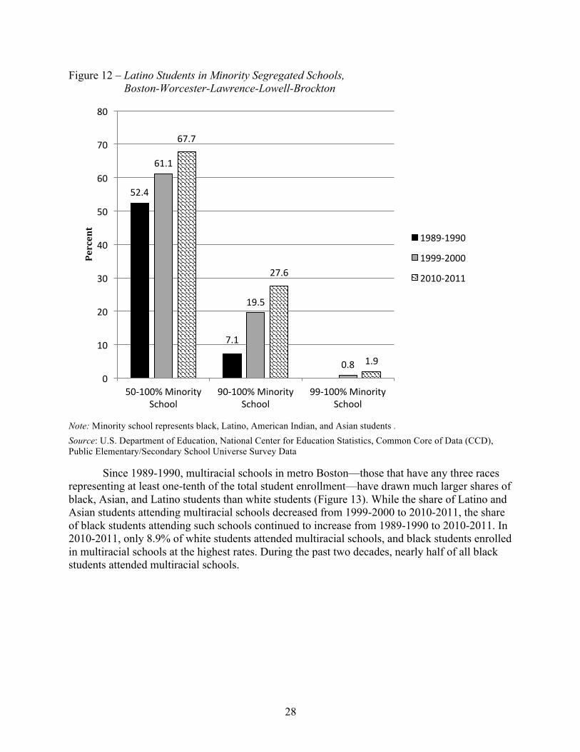
28
Figure 12 – Latino Students in Minority Segregated Schools, Boston-Worcester-Lawrence-Lowell-Brockton
Note: Minority school represents black, Latino, American Indian, and Asian students . Source: U.S. Department of Education, National Center for Education Statistics, Common Core of Data (CCD), Public Elementary/Secondary School Universe Survey Data
Since 1989-1990, multiracial schools in metro Boston—those that have any three races representing at least one-tenth of the total student enrollment—have drawn much larger shares of black, Asian, and Latino students than white students (Figure 13). While the share of Latino and Asian students attending multiracial schools decreased from 1999-2000 to 2010-2011, the share of black students attending such schools continued to increase from 1989-1990 to 2010-2011. In 2010-2011, only 8.9% of white students attended multiracial schools, and black students enrolled in multiracial schools at the highest rates. During the past two decades, nearly half of all black students attended multiracial schools.
52.4'
7.1'
61.1'
19.5'
0.8'
67.7'
27.6'
1.9'
0'
10'
20'
30'
40'
50'
60'
70'
80'
50<100%'Minority'School'
90<100%'Minority'School'
99<100%'Minority'School'
Percent&
1989<1990'
1999<2000'
2010<2011'
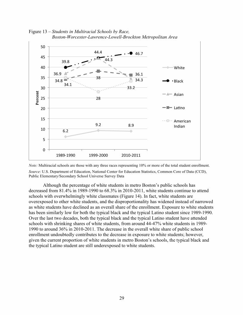
29
Figure 13 – Students in Multiracial Schools by Race, Boston-Worcester-Lawrence-Lowell-Brockton Metropolitan Area
Note: Multiracial schools are those with any three races representing 10% or more of the total student enrollment. Source: U.S. Department of Education, National Center for Education Statistics, Common Core of Data (CCD), Public Elementary/Secondary School Universe Survey Data
Although the percentage of white students in metro Boston’s public schools has decreased from 81.4% in 1989-1990 to 68.3% in 2010-2011, white students continue to attend schools with overwhelmingly white classmates (Figure 14). In fact, white students are overexposed to other white students, and the disproportionality has widened instead of narrowed as white students have declined as an overall share of the enrollment. Exposure to white students has been similarly low for both the typical black and the typical Latino student since 1989-1990. Over the last two decades, both the typical black and the typical Latino student have attended schools with shrinking shares of white students, from around 44-47% white students in 1989-1990 to around 36% in 2010-2011. The decrease in the overall white share of public school enrollment undoubtedly contributes to the decrease in exposure to white students; however, given the current proportion of white students in metro Boston’s schools, the typical black and the typical Latino student are still underexposed to white students.
6.2'9.2' 8.9'
39.8'
44.4' 46.7'
36.9'
44.3'
34.3'34.1'
38'36.1'
34.8'
28'
33.2'
0'
5'
10'
15'
20'
25'
30'
35'
40'
45'
50'
1989<1990' 1999<2000' 2010<2011'
Percent&
White'
Black'
Asian'
LaOno'
American'Indian'

30
Figure 14 – White Students in School Attended by Typical Student of Each Race, Boston-Worcester-Lawrence-Lowell-Brockton Metropolitan Area
Source: U.S. Department of Education, National Center for Education Statistics, Common Core of Data (CCD), Public Elementary/Secondary School Universe Survey Data
The racial composition of the school that a typical black student in metro Boston attends has shifted notably over the last two decades to become less white and black but more Latino (Figure 15). Despite the fact that the overall share of white enrollment in metro Boston is 68.3%, the typical black student now attends a school where only 35.7% of his/her classmates are white.
Figure 15 – Racial Composition of School Attended by Typical Black Student, Boston-Worcester-Lawrence-Lowell-Brockton Metropolitan Area
Source: U.S. Department of Education, National Center for Education Statistics, Common Core of Data (CCD), Public Elementary/Secondary School Universe Survey Data
81.4' 76.4'68.3'
88.8' 86.3'80.2'
44.0'38.8' 35.7'
47.2'40.9' 36.4'
0'10'20'30'40'50'60'70'80'90'100'
1989<1990' 1999<2000' 2010<2011'
Percent&
%'White'
Typical'White'Student'
Typical'Black'Student'
Typical'LaOno'Student'
44.0'
38.8'35.7'
35.8' 37.1'30.9'
14.3'17.2'
23.3'
0.0'
5.0'
10.0'
15.0'
20.0'
25.0'
30.0'
35.0'
40.0'
45.0'
50.0'
1989<1990' 1999<2000' 2010<2011'
Percent& White'
Black'
LaOno'

31
The racial composition of the school that a typical Latino student in metro Boston attends has also changed considerably over the last two decades such that the typical Latino student now attends a school where he/she has fewer black and white classmates but more Latino classmates than in the past (Figure 16). Even though the overall share of the Latino enrollment is only 14.3% in metro Boston, the typical Latino student is exposed to more Latino students than any other race of students.
Figure 16 – Racial Composition of School Attended by Typical Latino Student, Boston-Worcester-Lawrence-Lowell-Brockton Metropolitan Area
Source: U.S. Department of Education, National Center for Education Statistics, Common Core of Data (CCD), Public Elementary/Secondary School Universe Survey Data
Figure 17 shows the inconsistent distribution of students by race in metro Boston’s public schools. The typical white student attends a school that is predominantly white with small proportions of black, Asian, and Latino students. The typical black student is enrolled in a school that is more evenly split among white, black, and Latino students with a small proportion of Asian students. Latino students tend to go to schools that are largely Latino with some white students and small shares of black and Asian students. The typical Asian student tends to go to a school that is heavily white and has the largest share of other Asian students. The racial composition of schools attended by Asian students reflects the overall public school enrollment of Boston by race more closely than does the racial composition of schools attended by any other racial group, indicating that Asian students are the most integrated group in metro Boston. These patterns match those of the state very closely.
47.2'40.9'
36.4'
16.4' 16.1' 13.7'
30.8'
36.3'
41.1'
0.0'
5.0'
10.0'
15.0'
20.0'
25.0'
30.0'
35.0'
40.0'
45.0'
50.0'
1989<1990' 1999<2000' 2010<2011'
Percent& White'
Black'
LaOno'

32
Figure 17 – Racial Composition of School Attended by Typical Student by Race, Boston-Worcester-Lawrence-Lowell-Brockton Metropolitan Area
Note: Other includes American Indian students and students identifying with two or more races. Source: U.S. Department of Education, National Center for Education Statistics, Common Core of Data (CCD), Public Elementary/Secondary School Universe Survey Data
Figure 18 shows the inequitable and disparate distribution of low-income students among students of different races with black and Latino students in metro Boston attending schools with two to three times as large a share of low-income students as white students. In metro Boston, 32.1% of students are low-income. The typical white student goes to a school where only 21.9% of his/her classmates are low-income. Conversely, the typical black student attends a school where 58.7% of his/her classmates are low-income. Similarly, the typical Latino student attends a school in which 63.5% of his/her classmates are low-income. This shows the disproportionate distribution of low-income students to schools where black and Latino students are enrolled, which highlights the double segregation that black and Latino students experience by attending schools that are segregated not only by race but also by class.
80.2'
35.7'
57.1'
36.4'
4.4'
30.9'
9.2'
13.7'
5.4'
7.1'
16.7'
6.3'
7.6'
23.3' 14.0'
41.1'
2.4' 3.0' 3.0' 2.5'
0.0'
10.0'
20.0'
30.0'
40.0'
50.0'
60.0'
70.0'
80.0'
90.0'
100.0'
White'Student' Black'Student' Asian'Student' LaOno'Student'2010$2011&
%'Other'
%'LaOno'
%'Asian'
%'Black'
%'White'

33
Figure 18 – Exposure to Low-Income Students by Race, Boston-Worcester-Lawrence-Lowell-Brockton Metropolitan Area
Source: U.S. Department of Education, National Center for Education Statistics, Common Core of Data (CCD), Public Elementary/Secondary School Universe Survey Data
Over the last two decades, the distribution of racial groups throughout the Boston metropolitan area’s public schools has been highly uneven. In 2010-2011, the average school was 31% less diverse than the entire intrastate metropolitan area, indicating a high degree of segregation (Table 7). Further, 90% of this unevenness or difference in diversity between the average public school and the entire metro area was due to segregation across district boundaries rather than within districts. It is likely that this difference is due to the existence of districts that are largely comprised of students of only one race. The level of segregation between different school districts in the Boston metro has remained relatively stable and high at around .29. During the same time, the already low level of segregation within districts in the Boston metro has decreased slightly.
Table 7 – Entropy Index Values, Overall and Within and Between School Districts, Boston-Worcester-Lawrence-Lowell-Brockton Metropolitan Area
H
H Within
Districts
H Between Districts
Boston-Worcester-Lawrence-Lowell-Brockton Metro
1989-1990 0.35 0.06 0.29
1999-2000 0.35 0.04 0.30
2010-2011 0.31 0.03 0.28
Source: U.S. Department of Education, National Center for Education Statistics, Common Core of Data (CCD), Public Elementary/Secondary School Universe Survey Data
32.1'
21.9'
58.7'63.5'
0.0'
10.0'
20.0'
30.0'
40.0'
50.0'
60.0'
70.0'
%'Low<Income' White'Exposure'to'Low<Income'
Black'Exposure'to'Low<Income'
LaOno'Exposure'to'Low<Income'
Percent&
2010$2011&

34
School districts across the Boston metropolitan area have experienced a considerable amount of racial transition over the last two decades. A decade-by-decade look at the composition of the metro area as a whole underscores these changes (Figure 19). From 1989-1990 to 1999-2000, district changes created a metro area that had more diverse districts, slightly more predominantly nonwhite districts, and fewer predominantly white districts. However, there was even greater change from 1999-2000 to 2010-2011, when far more of the metro’s districts became diverse and predominantly nonwhite and many fewer of the metro’s districts were predominantly white.
Figure 19 – Racial Transition by District, Boston-Worcester-Lawrence-Lowell-Brockton Metropolitan Area
Note: Diverse districts are those with more than 20% but less than 60% nonwhite students. Predominantly non-white districts are those with 60% or more nonwhite students. Predominantly white districts are those with 80% or more white students. N=207 districts for 1989, 1999 and 2010 with greater than 100 students enrolled across the three time periods. Source: U.S. Department of Education, National Center for Education Statistics, Common Core of Data (CCD), Public Elementary/Secondary School Universe Survey Data
All ten of the highest enrolling districts in the metro area had a smaller proportion of white students enrolled in 2010 than in 1989, and in three of those districts—Brockton, Lynn, and Lawrence—the white proportion of students in 2010 had dropped to half or less of what it had been two decades earlier (Table 8). Striking changes can also be observed when districts are classified over this time period according to one of three categories: predominantly white—80% or more white; predominantly nonwhite—60% or more nonwhite; or diverse—more than 20% but less than 60% nonwhite. In 1989, three of the ten districts—Newton, Fall River, and Quincy—were predominantly white; however, by 2010 all three of those districts were diverse. Of the five districts that were diverse in 1989, four of them—Worcester, Brockton, Lowell, and Lynn—were predominantly nonwhite in 2010. The other two districts—Boston and Lawrence—which were predominantly nonwhite in 1989, remained predominantly nonwhite in 2010. By
1.4' 1.9' 5.3'6.8'
12.1' 23.7'
91.8' 86.0'
71.0'
0%'
10%'
20%'
30%'
40%'
50%'
60%'
70%'
80%'
90%'
100%'
1989<1990' 1999<2000' 2010<2011'
Predominantly'White'
Diverse'
Predominantly'Nonwhite'
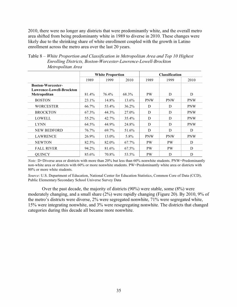
35
2010, there were no longer any districts that were predominantly white, and the overall metro area shifted from being predominanty white in 1989 to diverse in 2010. These changes were likely due to the shrinking share of white enrollment coupled with the growth in Latino enrollment across the metro area over the last 20 years.
Table 8 – White Proportion and Classification in Metropolitan Area and Top 10 Highest Enrolling Districts, Boston-Worcester-Lawrence-Lowell-Brockton Metropolitan Area
White Proportion Classification
1989 1999 2010 1989 1999 2010 Boston-Worcester-Lawrence-Lowell-Brockton Metropolitan 81.4% 76.4% 68.3% PW D D
BOSTON 23.1% 14.8% 13.6% PNW PNW PNW WORCESTER 66.7% 53.4% 36.2% D D PNW BROCKTON 67.3% 44.3% 27.0% D D PNW LOWELL 55.2% 42.7% 35.4% D D PNW LYNN 64.5% 44.9% 24.8% D D PNW NEW BEDFORD 76.7% 69.7% 51.6% D D D LAWRENCE 26.9% 13.0% 5.8% PNW PNW PNW NEWTON 82.5% 82.0% 67.7% PW PW D FALL RIVER 94.2% 81.6% 67.5% PW PW D QUINCY 85.6% 70.8% 53.5% PW D D
Note: D=Diverse area or districts with more than 20% but less than 60% nonwhite students. PNW=Predominantly non-white area or districts with 60% or more nonwhite students. PW=Predominantly white area or districts with 80% or more white students. Source: U.S. Department of Education, National Center for Education Statistics, Common Core of Data (CCD), Public Elementary/Secondary School Universe Survey Data
Over the past decade, the majority of districts (90%) were stable, some (8%) were moderately changing, and a small share (2%) were rapidly changing (Figure 20). By 2010, 9% of the metro’s districts were diverse, 2% were segregated nonwhite, 71% were segregated white, 15% were integrating nonwhite, and 3% were resegregating nonwhite. The districts that changed categories during this decade all became more nonwhite.

36
Figure 20 – Degree and Type of Racial Transition, Boston-Worcester-Lawrence-Lowell-Brockton Metropolitan Area, 1999 to 2010
Note: N=207 districts for 1989, 1999 and 2010 with greater than 100 students enrolled across the three time periods. For the degree of change categories: Rapidly changing districts are those with white % change 3 times greater than metro white % change. Moderately changing districts are those with white student % change 2 times but less than 3 times greater than metro white % change, or those that experienced a white % change less than 2 times the metro white % change but classified as predominantly white, nonwhite or diverse in the earlier time period and classified as a new category in the later period. Stable districts are those that experienced a white % change less than 2 times the metro white % change. For the type of change: Resegregating districts are those classified as predominantly white, nonwhite or diverse in the earlier time period and classified as the other predominantly type in the later period. Integrating districts are those classified as predominantly white or nonwhite in the earlier time period and diverse in the later period. Segregated districts are those classified as predominantly white or nonwhite in both time periods. Diverse districts are those classified as diverse in both periods. Source: U.S. Department of Education, National Center for Education Statistics, Common Core of Data (CCD), Public Elementary/Secondary School Universe Survey Data
In 1989, three of the seven of Boston metropolitan area’s districts that would be rapidly or moderately transitioning districts over the next two decades had an enrollment of white students that was higher than the metro’s white enrollment (Figure 21). All three of these districts—Fall River, Quincy, and Newton—were predominantly white in 1989 and have since been integrating. The other four districts—Brockton, Worcester, Lynn, and Lowell—had white enrollments lower than the metro’s overall white enrollment in 1989 and have been resegregating over the last two decades. Of the seven districts, more (four) were resegregating than integregating (three) during these two decades. Three of the four resegregating districts had the greatest percent change in their white share of enrollment from 1989 to 2010—Lynn (-61.6%), Brockton (-59.9%), and Worcester (-45.7%).
0%' 10%' 20%' 30%' 40%' 50%' 60%' 70%' 80%'
ResegregaOng'White'
ResegregaOng'Nonwhite'
IntegraOng'White'
IntegraOng'Nonwhite'
Segregated'White'
Segregated'Nonwhite'
Diverse'
Percentage of Total Districts
Rapidly'Changing' Moderately'Changing' Stable'

37
Figure 21 – Rapid or Moderate Racial Transition by District Type for Top 10 Highest Enrolling Districts, Boston-Worcester-Lawrence-Lowell-Brockton Metropolitan Area
Note: Rapidly changing districts are those with white % change 3 times greater than metro white % change. Moderately changing districts are those with white student % change 2 times but less than 3 times greater than metro white % change, or those that experienced a white % change less than 2 times the metro white % change but classified as predominantly white, nonwhite or diverse in the earlier time period and classified as a new category in the later period. Resegregating districts are those classified as predominantly white, nonwhite or diverse in the prior year and classified as the other predominantly type in the latter year. Integrating are districts classified as predominantly white or nonwhite in the prior year and diverse in the latter year. Segregating districts are those classified as predominantly white or nonwhite in both periods but experienced a white % change greater than 2 times the metro white % change. Source: U.S. Department of Education, National Center for Education Statistics, Common Core of Data (CCD), Public Elementary/Secondary School Universe Survey Data
1989! 1999! 2010!Metro! 81.4%! 76.4%! 68.3%!WORCESTER!(Resegregating)! 66.7%! 53.4%! 36.2%!
BROCKTON!(Resegregating)! 67.3%! 44.3%! 27.0%!
LOWELL!(Resegregating)! 55.2%! 42.7%! 35.4%!LYNN!(Resegregating)! 64.5%! 44.9%! 24.8%!NEWTON!(Integrating)! 82.5%! 82.0%! 67.7%!FALL!RIVER!(Integrating)! 94.2%! 81.6%! 67.5%!QUINCY!(Integrating)! 85.6%! 70.8%! 53.5%!
20%!
30%!
40%!
50%!
60%!
70%!
80%!
90%!
100%!
White&Percentage&

38
Metropolitan-level trends indicate that segregation of metro Boston’s black and Latino students has become more extreme since 1989-1990. While the black share of public school enrollment has remained relatively stable, there has been a decrease in the white share of public school enrollment and an increase in the Latino and Asian shares of enrollment. The share of black students in majority minority and apartheid schools has increased; the share of Latino students in majority minority, intensely segregated, and apartheid schools has increased. Of all racial groups in metro Boston, Asian students are the most integrated. The typical black and the typical Latino student in metro Boston have experienced decreasing exposure to white students in their schools. Schools in metro Boston are less diverse than the overall metropolitan area. The vast majority of the uneven distribution of students by race is due to segregation between districts rather than within districts, although all of the districts in the metro area have become more nonwhite over the last two decades. The distribution of low-income students in metro Boston’s public schools is also unequal; black and Latino students attend schools with disproportionately high levels of low-income students, which reveals an intensified double segregation of metro Boston’s black and Latino students by both race and class.
Springfield Metropolitan Area91
The racial composition of metro Springfield’s public schools has experienced notable transition over the last two decades with a decrease in white students and an increase in Latino students (Figure 22). The share of white students enrolled in metro Springfield’s public schools has declined by 16%, from 73.8% in 1989-1990 to 62% in 2010-2011. The overall share of black student enrollment has remained fairly consistent at about 8-9%; the Asian share of enrollment has also remained stable at about 2%. The Latino share of enrollment has increased by 62.3%, from 15.4% in 1989-1990 to 25% in 2010-2011.
Figure 22 – Public School Enrollment by Race, Springfield Metropolitan Area
Note: American Indian is less than 1% of total enrollment. Total CBSA enrollment in 1989 was 83,499. In 2010, total enrollment was 98,994. Source: U.S. Department of Education, National Center for Education Statistics, Common Core of Data (CCD), Public Elementary/Secondary School Universe Survey Data
91 From this point forward, we use “Springfield” to refer to the Springfield metropolitan area. In this report our data includes only the districts in this metropolitan area that are located in the Commonwealth of Massachusetts. The 1999 MSA boundaries included Franklin County, Hampden County, and Hampshire County.
74%'
9%'
2%'
15%'
1989$1990&
White'
Black'
Asian'
LaOno'62%'
8%'2%'
25%'
3%'
2010$2011&
White'
Black'
Asian'
LaOno'
Mixed'

39
The share of white enrollment in both urban and suburban schools in metro Springfield has decreased since 1989-1990 (Table 9). The share of black enrollment increased in suburban schools. In urban schools, the share of black enrollment increased from 1989-1990 to 1999-2000 but then decreased from 1999-2000 to 2010-2011. Asian enrollment remained relatively stable in urban schools with a slight decrease from 1989-1990 to 1999-2000 and increased in suburban schools. Latino enrollment increased in both urban and suburban schools. The black and Asian shares of enrollment in suburban schools increased slightly, while the Latino share of suburban enrollment more than doubled. In 2010-2011, Latino students comprised the majority of enrollment in urban schools and white students comprised the majority of enrollment in suburban schools. In metro Springfield’s urban and suburban schools, the increasing share of Latino enrollment alongside the decreasing share of white enrollment is noteworthy.
Table 9 – Public School Enrollment by Race in Urban and Suburban Schools, Springfield Metropolitan Area
Urban Schools Suburban Schools White Black Asian Latino Other White Black Asian Latino Other
Springfield Metro
1989-1990 39.0% 27.9% 2.3% 30.7% 0.0% 88.3% 1.8% 1.6% 8.3% 0.1% 1999-2000 26.7% 30.0% 2.2% 40.9% 0.2% 84.7% 2.1% 1.6% 11.4% 0.2% 2010-2011 15.2% 23.0% 2.2% 55.7% 3.9% 74.5% 2.6% 2.6% 18.6% 1.7%
Note: Urban schools refer to those inside an urbanized area and a principal city. Suburban schools refer to those inside an urbanized area but outside a principal city. Other includes American Indian students and students who identify with two or more races. Data comprises schools open 1989-2010, 1989-1999-2010, 1999-2010, and only 2010. We apply 2010 boundary codes to all years. Source: U.S. Department of Education, National Center for Education Statistics, Common Core of Data (CCD), Public Elementary/Secondary School Universe Survey Data
To meet the demands of a growing student enrollment, the total number of schools in Springfield also increased from 1989-1990 to 1999-2000 and then decreased from 1999-2000 to 2010-2011 (Table 10). Just as at the state level, among these schools are four different types of schools with varying levels of concentration of minority students—multiracial schools, majority minority schools, intensely segregated schools, and apartheid schools.
The percentage of multiracial schools in metro Springfield—those with at least one-tenth of the students who represent at least three racial groups—has decreased over the last two decades; however, the percentage of minority schools in metro Springfield has increased over the same time period. Majority minority schools—with 50-100% of the student enrollment comprised of minority students—have increased from 22.2% in 1989-1990 to 27.4% in 2010-2011. Intensely segregated schools—those with 90-100% minority students—are of particular concern in Springfield. In 2010-2011, 9.1% of schools in metro Springfield were intensely segregated, which is more than quadruple the proportion of such schools only 10 years earlier. However, what is even more noteworthy is that this extreme isolation did not even exist in metro Springfield’s schools in 1989-1990 but now accounts for almost one-tenth of the area’s schools.

40
Table 10 – Multiracial and Minority Segregated Schools, Springfield Metropolitan Area
Total Schools
% of Multiracial
Schools
% of 50-100%
Minority Schools
% of 90-100%
Minority Schools
% of 99-100%
Minority Schools
Springfield Metro 1989-1990 189 19.6% 22.2% NS NS
1999-2000 226 19.5% 25.7% 2.2% NS
2010-2011 219 15.5% 27.4% 9.1% NS
Note: NS = No Schools. Minority school represents black, Latino, American Indian, and Asian students. Multiracial schools are those with any three races representing 10% or more of the total student enrollment. Source: U.S. Department of Education, National Center for Education Statistics, Common Core of Data (CCD), Public Elementary/Secondary School Universe Survey Data
In 2010-2011, there was a much larger share of low-income students in all types of schools than there was only 10 years earlier in 1999-2000 (Table 11). Just as at the state level, this is likely reflective of the economic crisis during the latter half of the decade. A larger share of students in minority schools were low-income than those in multiracial schools. In fact, as the level of racial isolation increases, so too does the level of low-income students in the school. This data demonstrates that students in racially isolated schools are also far more likely to attend schools with higher percentages of low-income students, which results in schools that are not only segregating students by race but also by class.
Table 11 – Students Who Are Low-Income in Multiracial and Minority Segregated Schools, Springfield Metropolitan Area
Overall % Low-Income
in Metro
% Low-Income in
Multiracial Schools
% Low-Income in 50-100% Minority Schools
% Low-Income in 90-100% Minority Schools
% Low-Income in 99-100% Minority Schools
Springfield Metro 1999-2000 36.2% 67.3% 69.9% 75.2% NS
2010-2011 46.6% 73.8% 81.1% 89.9% NS
Note: NS = No Schools. Minority school represents black, Latino, American Indian, and Asian students. Multiracial schools are those with any three races representing 10% or more of the total student enrollment. Source: U.S. Department of Education, National Center for Education Statistics, Common Core of Data (CCD), Public Elementary/Secondary School Universe Survey Data
Over the last two decades, shares of both Latino and black students who were enrolled in minority schools have increased (Figure 23 and Figure 24). In majority minority schools, shares of both Latino and black students increased from 1989-1990 to 1999-2000 and then decreased slightly from 1999-2000 to 2010-2011. However, during the same time, the share of both Latino and black students enrolled in intensely segregated schools increased dramatically. The share of Latino students in intensely segregated schools increased by 457.6%, from 5.9% in 1999-2000 to 32.9% in 2010-2011. The share of black students in intensely segregated schools increased by 271.4%, from 7.7% in 1999-2000 to 28.6% in 2010-2011. This data suggests that while the overall share of Latino and black students who are enrolled in majority minority schools may

41
have leveled off in the last decade, a larger share of these students are in intensely segregated schools than they were only a decade ago.
Figure 23 – Black Students in Minority Segregated Schools, Springfield Metropolitan Area
Note: Minority school represents black, Latino, American Indian, and Asian students. Source: U.S. Department of Education, National Center for Education Statistics, Common Core of Data (CCD), Public Elementary/Secondary School Universe Survey Data
Figure 24 – Latino Students in Minority Segregated Schools, Springfield Metropolitan Area
Note: Minority school represents black, Latino, American Indian, and Asian students. Source: U.S. Department of Education, National Center for Education Statistics, Common Core of Data (CCD), Public Elementary/Secondary School Universe Survey Data
69'
84'
7.7'
80.8'
28.6'
0'
10'
20'
30'
40'
50'
60'
70'
80'
90'
50<100%'Minority'School' 90<100%'Minority'School'
Percent& 1989<1990'
1999<2000'
2010<2011'
81.4' 82.5'
5.9'
78.3'
32.9'
0'
10'
20'
30'
40'
50'
60'
70'
80'
90'
50<100%'Minority'School' 90<100%'Minority'School'
Percent& 1989<1990'
1999<2000'
2010<2011'

42
Since 1989-1990, multiracial schools in metro Springfield—those that have any three races representing at least one-tenth of the total student enrollment—have drawn much larger shares of black, Asian, and Latino students than white students (Figure 25). For each racial group, the share of students enrolled in multiracial schools has decreased from 1989-1990 to 2010-2011. Although there were some increases in 1999-2000 (Latino, Asian, and American Indian), the general trend shows decreasing enrollment of all racial groups in multiracial schools, which is consistent with the findings in Table 10 that show an overall decrease in the percentage of schools that are multiracial over the last two decades. The spike in the percentage of American Indians attending multiracial schools in 1999-2000 should be interpreted with caution; because they are such a small share of the total enrollment, even a small fluctuation can appear large. More than half, and sometimes closer to three-quarters, of all black students attended multiracial schools during the last two decades.
Figure 25 – Students in Multiracial Schools, Springfield Metropolitan Area
Note: Multiracial schools are those with any three races representing 10% or more of the total student enrollment. Source: U.S. Department of Education, National Center for Education Statistics, Common Core of Data (CCD), Public Elementary/Secondary School Universe Survey Data
Although the percentage of white students in metro Springfield’s public schools has steadily decreased from 73.8% in 1989-1990 to 62.0% in 2010-2011, white students continue to attend schools where their classmates are overwhelmingly white (Figure 26). In fact, white students are disproportionately exposed to other white students, and the gap has widened instead of narrowed during the time when white students have declined as an overall share of the enrollment. Exposure to white students has been low for both the typical black and the typical Latino student since 1989-1990. Over the last two decades, both the typical black and the typical Latino student have experienced decreasing contact with white students. In 1989-1990, the
13.7'
10.2'6.8'
78.4'
75.8'
50.8'
33.8'37.9'
25.0'
50.7'52.4'
33.8'
13.5!
36.1!
10.6!
0.0'
10.0'
20.0'
30.0'
40.0'
50.0'
60.0'
70.0'
80.0'
90.0'
1989<1990' 1999<2000' 2010<2011'
Percent&
White'
Black'
Asian'
LaOno'
American'Indian'

43
typical black student in Springfield attended a school that was 45.7% white, but in 2010-2011 the typical black student’s school was only 28.2% white. Similarly, in 1989-1990 the typical Latino student attended a school that was 38.9% white, but in 2010-2011 the typical Latino student attended a school that was only 28.3% white. The typical black and the typical Latino student are underexposed to white students in metro Springfield and have less contact with white students than one would expect if all races were distributed evenly across the area’s schools.
Figure 26 – White Students in School Attended by Typical Student of Each Race, Springfield Metropolitan Area
Source: U.S. Department of Education, National Center for Education Statistics, Common Core of Data (CCD), Public Elementary/Secondary School Universe Survey Data
The typical black student now attends a school in which there are fewer black and white students but almost double the Latino students than in the past (Figure 27). Despite the fact that the overall share of white enrollment in metro Springfield is 62%, the typical black student now attends a school where only 28.2% of the school is made up of white students.
73.8' 71.4'
62'
84.7' 85.2'80.2'
45.7'
34.8'28.2'
38.9'34.9'
28.3'
0'
10'
20'
30'
40'
50'
60'
70'
80'
90'
1989<1990' 1999<2000' 2010<2011'
Percent&
%'White'
Typical'White'Student'
Typical'Black'Student'
Typical'LaOno'Student'

44
Figure 27 – Racial Composition of School Attended by Typical Black Student, Springfield Metropolitan Area
Source: U.S. Department of Education, National Center for Education Statistics, Common Core of Data (CCD), Public Elementary/Secondary School Universe Survey Data
The typical Latino student now attends a school where he/she has fewer black and white classmates but more Latino classmates than two decades ago (Figure 28). The typical Latino student is exposed to more Latino students than students of any other race even though the overall share of the Latino enrollment in metro Springfield is only 25%.
45.7'
34.8'
28.2'26.7' 27.9'
21.3'
25.2'
34.9'
44.4'
0'
5'
10'
15'
20'
25'
30'
35'
40'
45'
50'
1989<1990' 1999<2000' 2010<2011'
Percent&
White'
Black'
LaOno'

45
Figure 28 – Racial Composition of School Attended by Typical Latino Student, Springfield Metropolitan Area
Source: U.S. Department of Education, National Center for Education Statistics, Common Core of Data (CCD), Public Elementary/Secondary School Universe Survey Data
The average make-up of the school attended by the typical student of each race in Springfield shows the inconsistent distribution of students by race in metro Springfield’s public schools (Figure 29). White students tend to go to schools that are heavily white with a small proportion of Latino students and a very small share of black students. Both black and Latino students tend to go to schools that are largely Latino with smaller shares of black and white students. The minimal exposure of black and Latino students to white students in metro Springfield is even more extreme than the exposure of black and Latino students to white students in metro Boston (Figure 17) and the state as a whole (Figure 8).
38.9'
34.9'
28.3'
14.5'
18.6'
13.9'
44.6' 44.6'
52.9'
0'
10'
20'
30'
40'
50'
60'
1989<1990' 1999<2000' 2010<2011'
Percent&
White'
Black'
LaOno'
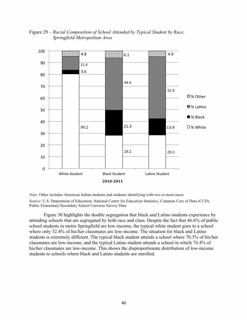
46
Figure 29 – Racial Composition of School Attended by Typical Student by Race, Springfield Metropolitan Area
Note: Other includes American Indian students and students identifying with two or more races. Source: U.S. Department of Education, National Center for Education Statistics, Common Core of Data (CCD), Public Elementary/Secondary School Universe Survey Data
Figure 30 highlights the double segregation that black and Latino students experience by attending schools that are segregated by both race and class. Despite the fact that 46.6% of public school students in metro Springfield are low-income, the typical white student goes to a school where only 32.4% of his/her classmates are low-income. The situation for black and Latino students is extremely different. The typical black student attends a school where 70.3% of his/her classmates are low-income, and the typical Latino student attends a school in which 74.4% of his/her classmates are low-income. This shows the disproportionate distribution of low-income students to schools where black and Latino students are enrolled.
80.2!
28.2! 28.3!
3.6'
21.3' 13.9'
11.4'
44.4'
52.9'
4.8' 6.1' 4.9'
0'
10'
20'
30'
40'
50'
60'
70'
80'
90'
100'
White'Student' Black'Student' LaOno'Student'
2010$2011&
%'Other'
%'LaOno'
%'Black'
%'White'

47
Figure 30 – Exposure to Low-Income Students by Race, Springfield Metropolitan Area
Source: U.S. Department of Education, National Center for Education Statistics, Common Core of Data (CCD), Public Elementary/Secondary School Universe Survey Data
Since, 1989-1990 there has been a highly uneven distribution of racial groups throughout Springfield metropolitan area’s public schools. In 2010-2011, the average school was 34% less diverse than the entire intrastate metropolitan area, which indicates a high degree of segregation (Table 12). It is important to note that 94% of this unevenness or difference in diversity between the average public school and the entire metro area was due to segregation across district boundaries rather than within districts. This is likely due to the existence of districts that are largely comprised of students of only one race. The level of segregation between different school districts in the Springfield metro has increased slightly from 1989-1990 to 2010-2011. During the same time, the level of segregation within districts in the Springfield metro has declined slightly from 1989-1990 to 2010-2011.
Table 12 – Entropy Index Values, Overall and Within and Between School Districts, Springfield Metropolitan Area
H
H Within
Districts
H Between Districts
Springfield Metro 1989-1990 .35 .05 .29 1999-2000 .35 .03 .33 2010-2011 .34 .02 .32
Source: U.S. Department of Education, National Center for Education Statistics, Common Core of Data (CCD), Public Elementary/Secondary School Universe Survey Data
46.6'
32.4'
70.3'74.4'
0.0'
10.0'
20.0'
30.0'
40.0'
50.0'
60.0'
70.0'
80.0'
%'Low<Income' White'Exposure'to'Low<Income'
Black'Exposure'to'Low<Income'
LaOno'Exposure'to'Low<Income'
Percent&
2010$2011&

48
School districts across the Springfield metropolitan area have experienced racial transition over the last two decades. A decade-by-decade comparison of the Springfield metro area as a whole underscores these changes (Figure 31). From 1989-1990 to 1999-2000, districts within the metro remained stable, but from 1999-2000 to 2010-2011, district changes created a metro area that had more diverse districts and fewer predominantly white districts. Districts that had been predominantly nonwhite in 1989-1990 continued that way during these two decades.
Figure 31 – Racial Transition by District, Springfield Metropolitan Area
Note: Diverse districts are those with more than 20% but less than 60% nonwhite students. Predominantly non-white districts are those with 60% or more nonwhite students. Predominantly white districts are those with 80% or more white students. N=34 districts for 1989, 1999 and 2010 Source: U.S. Department of Education, National Center for Education Statistics, Common Core of Data (CCD), Public Elementary/Secondary School Universe Survey Data
All ten of the highest enrolling districts in the metro had a smaller share of white students enrolled in 2010 than in 1989 (Table 13). Additional changes can also be observed when districts are classified over this time period according to one of three categories: predominantly white—80% or more white; predominantly nonwhite—60% or more nonwhite; or diverse—more than 20% but less than 60% nonwhite. In 1989, eight of the districts—Chicopee, Westfield, Agawam, West Springfield, Northampton, Longmeadow, Ludlow, and East Longmeadow— were predominantly white; however, by 2010 only five of those districts—Westfield, Agawam, Longmeadow, Ludlow, and East Longmeadow—remained predominantly white and the other three—Chicopee, West Springfield, and Northampton—were diverse. Both districts that were predominantly nonwhite in 1989—Springfield and Holyoke—remained that way in 2010.
5.9' 5.9' 5.9'5.9' 5.9'
14.7'
88.2' 88.2'
79.4'
0%'
10%'
20%'
30%'
40%'
50%'
60%'
70%'
80%'
90%'
100%'
1989<1990' 1999<2000' 2010<2011'
Predominantly'White'
Diverse'
Predominantly'Nonwhite'

49
Table 13 – White Proportion and Classification in Metropolitan Area and Top 10 Highest Enrolling Districts, Springfield Metropolitan Area
White Proportion Classification
1989 1999 2010 1989 1999 2010 Springfield Metro 73.8% 71.4% 62.0% D D D
SPRINGFIELD 38.8% 26.3% 14.4% PNW PNW PNW HOLYOKE 34.0% 27.4% 19.8% PNW PNW PNW CHICOPEE 90.1% 80.0% 65.5% PW PW D WESTFIELD 92.5% 90.2% 86.0% PW PW PW AGAWAM 98.0% 96.5% 91.6% PW PW PW WEST SPRINGFIELD 93.2% 87.5% 74.8% PW PW D NORTHAMPTON 85.6% 80.2% 74.2% PW PW D LONGMEADOW 92.7% 93.2% 87.7% PW PW PW LUDLOW 98.8% 96.9% 90.2% PW PW PW EAST LONGMEADOW 96.6% 96.0% 90.1% PW PW PW
Note: D=Diverse area or districts with more than 20% but less than 60% nonwhite students. PNW=Predominantly non-white area or districts with 60% or more nonwhite students. PW=Predominantly white area or districts with 80% or more white students. Source: U.S. Department of Education, National Center for Education Statistics, Common Core of Data (CCD), Public Elementary/Secondary School Universe Survey Data
Over the past decade, 91% of the districts in the Springfield metropolitan area were stable, 9% were moderately changing, and none were rapidly changing (Figure 32). Among these districts, 79% were segregated white, 6% were segregated nonwhite, and 6% were diverse; all of the diverse and segregated districts were stable. The remaining 9% of districts were moderately changing and integrating nonwhite.

50
Figure 32 – Degree and Type of Racial Transition, Springfield Metropolitan Area, 1999 to 2010
Note: N=34 districts. For the degree of change categories: Rapidly changing districts are those with white % change 3 times greater than metro white % change. Moderately changing districts are those with white student % change 2 times but less than 3 times greater than metro white % change, or those that experienced a white % change less than 2 times the metro white % change but classified as predominantly white, nonwhite or diverse in the earlier time period and classified as a new category in the later period. Stable districts are those that experienced a white % change less than 2 times the metro white % change. For the type of change: Resegregating districts are those classified as predominantly white, nonwhite or diverse in the earlier time period and classified as the other predominantly type in the later period. Integrating districts are those classified as predominantly white or nonwhite in the earlier time period and diverse in the later period. Segregated districts are those classified as predominantly white or nonwhite in both time periods. Diverse districts are those classified as diverse in both periods. Source: U.S. Department of Education, National Center for Education Statistics, Common Core of Data (CCD), Public Elementary/Secondary School Universe Survey Data
In 1989, all three of the metro area’s moderately transitioning districts—Chicopee, West Springfield, and Northampton—had an enrollment of white students that was higher than the metro’s white enrollment as a whole; in fact, all of these districts were predominantly white in 1989 (Figure 33). All three of the districts were integrating from 1989 to 2010. Of the three districts, Chicopee had the greatest percent change in the white share of enrollment with a decrease of 27.3%.
9%'
79%'
6%'
6%'
0%' 20%' 40%' 60%' 80%'
ResegregaOng'White'
ResegregaOng'Nonwhite'
IntegraOng'White'
IntegraOng'Nonwhite'
Segregated'White'
Segregated'Nonwhite'
Diverse'
Percentage of Total Districts
Rapidly'Changing' Moderately'Changing' Stable'

51
Figure 33 – Moderate Racial Transition by District Type, Springfield Metropolitan Area
Note: Rapidly changing districts are those with white % change 3 times greater than metro white % change. Moderately changing districts are those with white student % change 2 times but less than 3 times greater than metro white % change, or those that experienced a white % change less than 2 times the metro white % change but classified as predominantly white, nonwhite or diverse in the earlier time period and classified as a new category in the later period. Resegregating districts are those classified as predominantly white, nonwhite or diverse in the prior year and classified as the other predominantly type in the latter year. Integrating are districts classified as predominantly white or nonwhite in the prior year and diverse in the latter year. Segregating districts are those classified as predominantly white or nonwhite in both periods but experienced a white % change greater than 2 times the metro white % change. Source: U.S. Department of Education, National Center for Education Statistics, Common Core of Data (CCD), Public Elementary/Secondary School Universe Survey Data
Metropolitan-level trends indicate that segregation for black and Latino students in Springfield has become increasingly worse over the last two decades. There has been a decrease in the white share of public school enrollment and an increase in the Latino share of enrollment. The shares of black and Latino students in intensely segregated schools have increased. The typical black and the typical Latino student in the Springfield metro have experienced decreasing exposure to white students in their schools and their levels of exposure to white students are even less than those of black and Latino students in Boston and the state as a whole. Schools in
1989! 1999! 2010!Metro! 73.8%! 71.4%! 62.0%!CHICOPEE!(Integrating)! 90.1%! 80.0%! 65.5%!WEST!SPRINGFIELD!
(Integrating)! 93.2%! 87.5%! 74.8%!
NORTHAMPTON!(Integrating)! 85.6%! 80.2%! 74.2%!
50%!
60%!
70%!
80%!
90%!
100%!Percent&w
hite&students&
52
Springfield are less diverse than the overall metropolitan area. The vast majority of the uneven distribution of students by race is due to segregation across districts rather than within districts, although all of the districts in the metro area have become more nonwhite over the last two decades. The distribution of low-income students in metro Springfield’s public schools is also disparate with black and Latino students attending schools with disproportionately high levels of low-income students. There is an increasing double segregation of metro Springfield’s black and Latino students by race and class.
Discussion
Both state-level and metropolitan-level patterns raise serious concerns about the experience of black and Latino students in Massachusetts’s public schools. The increasing concentration of black and Latino students in minority schools and the decreasing exposure of black and Latino students to white students contribute to the increasing racial segregation of black and Latino students in Massachusetts. The same students are also disproportionately exposed to high levels of low-income students. The result is a situation in which Massachusetts’s black and Latino students experience double segregation by race and class.
In exploring segregation measures, it is essential to consider the demographic composition of the state. At all levels, Massachusetts has been experiencing major demographic change during the last two decades. At the state level, the Latino share of public school enrollment has increased by 102.7% and the white share of public school enrollment has decreased by 16.1%. Similar changes are reflected at the metropolitan level with increases of the Latino share of public school enrollment of 107.3% in Boston and 62.3% in Springfield and decreases in the white share of public school enrollment of 16.1% in Boston and 16.0% in Springfield. Similar demographic change will undoubtedly continue into the future, making it imperative for Massachusetts and the districts within it to consider the impact of racial change on the racial composition of their schools. Without such planning, the current trends toward increasing isolation of black and Latino students will almost certainly be intensified.
An increasing concentration of black and Latino students in minority schools is also apparent at all levels. Since 1989-1990, the number of minority schools has increased at all levels. Majority minority schools, which have 50-100% minority enrollment, have increased by 112.6% in Massachusetts, 128.7% in Boston, and 23.4% in Springfield. During the same time, the increase in intensely segregated schools, which have 90-100% minority enrollment, is even more dramatic with an increase of 618.2% in Massachusetts, 492.9% in Boston, and in just one decade from 1999-2000 to 2009-2010 such schools have increased by 313.6% in Springfield. The increasing number of minority schools is indicative of the increasing number of minority students who attend such schools.
The shares of black and Latino students in minority schools have increased, particularly for Latino students. From 1989-1990 to 2010-2011, in intensely segregated schools, the share of black enrollment increased by 124.6% in Massachusetts and by 94.0% in Boston. In only one decade, from 1999-2000 to 2010-2011, the share of black enrollment in intensely segregated schools in Springfield increased by 271.4%. From 1989-1990 to 2010-2011, the share of Latino enrollment in intensely segregated schools increased by 410.9% in Massachusetts and 288.7% in Boston. In only one decade, from 1999-2000 to 2010-2011, the share of Latino enrollment in intensely segregated schools in Springfield increased by 457.6%. As of yet, apartheid schools,

53
which have 99-100% minority enrollment, have not been a significant proportion of schools in Massachusetts; however, these extraordinarily high levels of expanding shares of black and Latino enrollment in intensely segregated schools must be halted and reversed.
Black and Latino students’ exposure to white students has steadily decreased throughout Massachusetts, resulting in less contact among racial groups in schools. In 2010-2011, the white share of enrollment was 68.5% in Massachusetts, 68.3% in Boston, and 62.0% in Springfield. However, in 2010-2011, black students went to schools where the white share of their classmates was 36.0% in Massachusetts, 35.7% in Boston, and 28.2% in Springfield. Similarly, in 2010-2011, Latino students went to schools where the white share of their classmates was 35.6% in Massachusetts, 36.4% in Boston, and 28.3% in Springfield. Not only were both black and Latino students underexposed to white students in 2010-2011, but they had become even more so since 1989-1990 when exposure levels to white students were higher for both black and Latino students. The decreasing contact among students across racial lines is dangerous for all students in this increasingly diverse state and country.
Within Boston and Springfield, districts are becoming more nonwhite. In 2010, four of Boston’s ten highest enrolling districts were diverse, and eight of Springfield’s ten highest enrolling districts were either predominantly white or diverse, suggesting that with strong leadership and thoughtful planning these transitioning districts have the potential to become or remain diverse districts where resegregation resulting in predominantly nonwhite districts could be prevented. However, without this leadership and planning, these districts will undoubtedly continue their transition to become predominantly nonwhite and more racially segregated.
In addition to the increasing trend toward racial segregation, black and Latino students in Massachusetts also experience segregation by class. Black students attend schools that are 59.4% low-income at the state level, 58.7% low-income in Boston, and 70.3% low-income in Springfield. Latino students attend schools that are 65.0% low-income at the state level, 63.5% low-income in Boston, and 74.4% low-income in Springfield. In striking contrast, white students attend schools that are 23.3% low-income at the state level, 21.9% low-income in Boston, and 32.4% low-income in Springfield. At all levels of analysis, black and Latino students experience increasing levels of double segregation by race and class, which has grave implications for the quality of schooling provided to these students.

54
Recommendations92
State Level
Many steps can be taken at the state level to create and maintain integrated schools. State-level policies that focus on reducing racial isolation and promoting diverse schools are critical. Massachusetts’s Racial Imbalance Act is an example of such state policy. Ohio recently developed an updated version of policies that could provide direction for Massachusetts as well. Ohio’s policy, which applies to both regular public schools and charter schools, provides guidance to school districts concerning the development of student assignment policies that foster diverse schools and reduce concentrated poverty. The policy encourages inter-district transfer programs and regional magnet schools. Ohio’s policy promotes the recruitment of a diverse group of teachers and also requires districts to report to the Ohio state Superintendent of Public Instruction on diversity-related matters.
State-level policies to promote diversity in schools are needed across the United States. Policies should provide guidance about how districts can create student assignment policies that foster diverse schools. Policies should also consider how to recruit a diverse teaching staff and states should set credentialing standards for training a more diverse teaching force. Additionally, states should require that districts report to the state on diversity-related matters for both public and charter schools.
Given that most segregation exists between different school districts in Massachusetts, it is also important for state-level policies to provide a framework for developing and supporting inter-district programs in the form of city-suburban transfers and regional magnet schools, and states should play a role in setting up such schools. The state should build on the programs which are already in place and achieving success, such as METCO. Funding for METCO should be increased so that the program can expand by increasing the number of suburban districts that enroll METCO students, therefore allowing more students to participate without overwhelming the current receiving schools. Incentives will need to be given to these schools including reimbursements for expenses, grants for teacher training, and support for installing new innovative programs.93 Furthermore, the receiving schools need to find additional ways to support the minority students who find themselves for the first time in a majority white school. This program could be vital, as the cost of participation in METCO is less than other programs.
Fair housing agencies and state and local housing officials need to regularly audit discrimination in housing markets, particularly in and around areas with diverse school districts. The same groups should bring significant prosecutions for violations. Housing officials need to strengthen and enforce site selection policies for projects receiving federal direct funding or tax credit subsidies so that they support integrated schools rather than foster segregation.
State and local officials should work to promote diversity in charter school enrollments, in part by encouraging extensive outreach to diverse communities, interdistrict enrollment, and 92 This section is adapted from Orfield, G., Kuscera, J., & Siegel-Hawley, G. (2012). E pluribus … separation? Deepening double segregation for more students. Los Angeles, CA: The Civil Rights Project. 93 Eaton, S., & Chirichigno, G. (2011). METCO merits more: The history and status of METCO (p. 26). A Pioneer Institute White Paper in collaboration with The Houston Institute for Race and Justice at Harvard Law School 74. http://www.pioneerinstitute.org/pdf/110616_ METCOMeritsMore.pdf

55
the provision of free transportation. Officials should also consider pursuing litigation against charter schools that are receiving public funds but are intentionally segregated, serving only one racial or ethnic group, or refusing service to English language learners. They should investigate charter schools that are virtually all white in diverse areas or schools that provide no free lunch program, making it impossible to serve students who need these subsidies in order to eat and therefore excluding a large share of nonwhite students.
Local Level
At the local level, raising awareness is an essential step in preventing further resegregation and encouraging integrated schooling. Civil rights organizations and community organizations in nonwhite communities should study the existing trends and observe and participate in political and community processes and action related to boundary changes, school siting decisions, and other key policies that make schools more segregated or more integrated. Local communities and fair housing organizations must monitor their real estate market to ensure that potential home buyers are not being steered away from areas with diverse schools. Community institutions and churches need to facilitate conversations about the values of diverse education and help raise community awareness about its benefits. Local journalists should cover the relationships between segregation and unequal educational outcomes and realities, in addition to providing coverage of high quality, diverse schools.
Many steps can be taken in terms of advocacy as well. Local fair housing organizations should monitor land use and zoning decisions and advocate for low-income housing to be set aside in new communities that are attached to strong schools, as has been done in Montgomery County, Maryland, just outside Washington, D.C. New schools—both public and charter—should not be built or opened in racially isolated areas of the district unless they are part of a magnet strategy and hold promise to result in diverse student bodies. Local educational organizations and neighborhood associations should vigorously promote diverse communities and schools as highly desirable places to live and learn. Communities need to provide consistent and vocal support for promoting school diversity and recognize the power of local school boards to either advocate for integration or work against it. Efforts should be made to foster the development of suburban coalitions to influence state-level policy-making around issues of school diversity and equity.
School district policy-makers also have control over student assignment policies and thus can directly influence the levels of diversity within each school. Districts should develop policies that consider race among other factors in creating diverse schools. Magnet schools and transfer programs within district borders can also be used to promote more racially integrated schools.
The enforcement of laws guiding school segregation is essential. Many communities have failed to comply with long-standing desegregation plans and have not been released by the federal courts. Such noncompliance and/or more contemporary violations are grounds for a new or revised desegregation order. Many suburban districts never had a desegregation order because they were virtually all white during the civil rights era. However, many of them are now diverse and may be engaged in classic abuses of racial gerrymandering of attendance boundaries, school site selection that intensifies segregation and choice plans, or operating choice plans with methods and policies that undermine integration and foster segregation. Where such violations exist, local organizations and parents should ask the school board to address and correct them. If
56
there is no positive response they should register complaints with the U.S. Department of Justice or the Office for Civil Rights of the Department of Education.
Educational Organizations and Universities
Professional associations, teachers’ organizations, and colleges of education need to make educators and communities fully aware of the nature and costs of existing segregation. Foundations should fund research dedicated to exploring the continued harms of segregation and the benefits of integration. Education opinion leaders must not continue to reinforce the notion that separate schools are equal schools, or that school reform efforts can make them equal while largely ignoring the politically sensitive issues of increasing racial and economic segregation. Researchers and advocates need to analyze and publicize the racial patterns and practices of public charter schools. Nonprofits and foundations funding charter schools should not incentivize the development of racially and economically isolated programs but instead they should support civil rights and academic institutions working on these issues.
Institutions of higher education can also influence the development of more diverse K-12 schools by informing students and families that their institutions are diverse and that students who have not been in diverse K-12 educational settings might be unprepared for the experiences they will encounter at such institutions of higher education. Admission staffs of colleges and universities should also consider the skills and experiences that students from diverse high schools will bring to their campuses when reviewing college applications and making admissions decisions.
Private and public civil rights organizations should also contribute to enforcing laws. They need to create a serious strategy to enforce the rights of Latino students in districts where they have never been recognized and major inequalities exist.
The Courts
The most important public policy changes affecting desegregation have been made not by elected officials or educators but by the courts. The U.S. Supreme Court has changed basic elements of desegregation policy by 180 degrees, particularly in the 2007 Parents Involved decision, which sharply limited voluntary action with desegregation policies by school districts using choice and magnet school plans. The Court left intact race-conscious school desegregation policies that did not dictate the assignment of individual students, such as consideration of race in school siting, teacher assignment, and the racial composition of neighborhoods. The Court is now divided 5-4 in its support of these limits and many of the Courts of Appeals are deeply divided, as are courts at the state and local level. Since we give our courts such sweeping power to define and eliminate rights, judicial appointments are absolutely critical. Interested citizens and elected officials should support judicial appointees who understand and seem willing to address the history of segregation and minority inequality and appear ready to listen with open minds to sensitive racial issues that are brought into their court rooms.
Federal Level
At the federal level, our country needs leadership that expresses the value of diverse learning environments and encourages local action to achieve school desegregation. The federal government should establish a joint planning process between the Department of Education, the Department of Justice, and the Department of Housing and Urban Development to review

57
programs and regulations that will result in successful, lasting community and school integration. Federal equity centers should provide effective desegregation planning, which was their original goal when they were created under the Civil Rights Act of 1964.
Federal choice policies should include civil rights standards. Without such requirements, choice policies, particularly those guiding charter schools, often foster increased racial segregation.
Federal policy should recognize and support the need for school districts to diversify their teaching staff. The federal government should provide assistance to districts in preparing their own paraprofessionals, who tend to represent a more diverse group, to become teachers.
Building on the Obama administration’s grant program for Technical Assistance for Student Assignment Plans, a renewed program of voluntary assistance for integration should be reenacted. This renewed program should add a focus on diversifying suburbs and gentrifying urban neighborhoods. The program should provide funding for preparing effective student assignment plans, reviewing magnet plans, implementing summer catch-up programs for students transferring from weaker to stronger schools, supporting partnerships with universities, and reaching out to diverse groups of parents.
The Justice Department and the Office for Civil Rights need to take enforcement actions in some substantial school districts to revive a credible sanction in federal policy for actions that foster segregation or ignore responsibilities under desegregation plans.
Courts that continue to supervise existing court orders and consent decrees should monitor them for full compliance before dissolving the plan or order. In a number of cases, courts have rushed to judgment to simplify their dockets without any meaningful analysis of the degree of compliance.
As an important funding source for educational research, the federal government should support a research agenda that focuses on trends of racial change and resegregation, causes and effects of resegregation, the value of alternative approaches to achieving integration and closing gaps in student achievement, and creating housing and school conditions that support stable neighborhood integration.

58
Appendix A: Additional Data Tables
State-Level Data
Table A-1 – Exposure Rates to White Students in Public Schools
% White
White Exposure to White
Black Exposure to White
Asian Exposure to White
Latino Exposure to White
Massachusetts 1989-1990 81.6% 88.9% 45.5% 63.7% 45.9% 1999-2000 76.8% 86.7% 39.6% 60.2% 40.4% 2010-2011 68.5% 80.6% 36.0% 57.8% 35.6%
Northeast 1989-1990 73.9% 89.0% 26.6% 58.7% 28.4% 1999-2000 68.5% 86.5% 25.0% 50.5% 26.4% 2010-2011 61.1% 80.7% 24.2% 45.7% 27.0%
Nation 1989-1990 68.4% 83.2% 35.4% 49.4% 32.5% 1999-2000 61.2% 80.2% 31.4% 44.8% 26.7% 2010-2011 52.1% 73.1% 27.8% 39.6% 25.1%
Source: U.S. Department of Education, National Center for Education Statistics, Common Core of Data (CCD), Public Elementary/Secondary School Universe Survey Data
Table A-2 – Exposure Rates to Black Students in Public Schools
% Black
White Exposure to Black
Black Exposure to Black
Asian Exposure to Black
Latino Exposure to Black
Massachusetts 1989-1990 7.6% 4.3% 33.9% 11.7% 15.9% 1999-2000 8.7% 4.5% 35.2% 11.7% 16.4% 2010-2011 8.1% 4.3% 29.3% 9.1% 13.6%
Northeast 1989-1990 14.6% 5.3% 55.4% 14.1% 26.0% 1999-2000 15.2% 5.5% 53.0% 13.6% 22.9% 2010-2011 14.6% 5.8% 47.3% 11.8% 19.4%
Nation 1989-1990 16.5% 8.6% 54.6% 11.0% 11.5% 1999-2000 16.8% 8.6% 54.5% 11.7% 10.9% 2010-2011 15.7% 8.4% 49.4% 10.8% 10.9%
Source: U.S. Department of Education, National Center for Education Statistics, Common Core of Data (CCD), Public Elementary/Secondary School Universe Survey Data

59
Table A-3 – Exposure Rates to Asian Students in Public Schools
% Asian
White Exposure to Asian
Black Exposure to Asian
Asian Exposure to Asian
Latino Exposure to Asian
Massachusetts 1989-1990 3.3% 2.6% 5.0% 14.5% 4.5% 1999-2000 4.3% 3.4% 5.9% 15.3% 5.4% 2010-2011 5.8% 4.9% 6.5% 15.9% 5.5%
Northeast 1989-1990 3.0% 2.4% 2.9% 13.6% 4.8% 1999-2000 4.3% 3.1% 3.8% 18.3% 6.3% 2010-2011 6.2% 4.7% 5.0% 23.0% 6.8%
Nation 1989-1990 3.3% 2.4% 2.2% 23.8% 4.6% 1999-2000 4.1% 3.0% 2.9% 24.4% 4.6% 2010-2011 5.0% 3.8% 3.5% 24.2% 4.6%
Source: U.S. Department of Education, National Center for Education Statistics, Common Core of Data (CCD), Public Elementary/Secondary School Universe Survey Data
Table A-4 – Exposure Rates to Latino Students in Public Schools
%
Latino
White Exposure to Latino
Black Exposure to Latino
Asian Exposure to Latino
Latino Exposure to Latino
Massachusetts 1989-1990 7.4% 4.1% 15.3% 10.1% 33.5% 1999-2000 10.0% 5.2% 18.9% 12.5% 37.5% 2010-2011 15.0% 7.8% 25.1% 14.2% 42.6%
Northeast 1989-1990 8.4% 3.2% 15.0% 13.4% 40.6% 1999-2000 11.8% 4.6% 17.8% 17.4% 44.1% 2010-2011 16.6% 7.3% 22.0% 18.2% 45.6%
Nation 1989-1990 10.8% 5.2% 7.5% 15.2% 50.8% 1999-2000 16.6% 7.2% 10.8% 18.4% 57.1% 2010-2011 23.6% 11.4% 16.5% 21.7% 56.9%
Source: U.S. Department of Education, National Center for Education Statistics, Common Core of Data (CCD), Public Elementary/Secondary School Universe Survey Data

60
Table A-5 – Black and Latino Exposure Rates to White and Asian Students in Public Schools
White and Asian Share of School Enrollment
Black and Latino Exposure to White and Asian Students Difference
Massachusetts 1989-1990 84.9% 50.5% -34.4% 1999-2000 81.1% 45.6% -35.5% 2010-2011 74.3% 41.6% -32.7%
Northeast 1989-1990 76.9% 30.7% -46.2% 1999-2000 72.7% 30.5% -42.2% 2010-2011 67.3% 31.6% -35.7%
Nation 1989-1990 71.7% 37.7% -34.0% 1999-2000 65.4% 32.8% -32.6% 2010-2011 57.1% 30.3% -26.8%
Source: U.S. Department of Education, National Center for Education Statistics, Common Core of Data (CCD), Public Elementary/Secondary School Universe Survey Data
Table A-6 – Exposure Rates to Low-Income Students in Public Schools
Low-Income Students Share of School Enrollment
White Exposure to Low-Income Students
Black Exposure to Low-Income Students
Asian Exposure to Low-Income Students
Latino Exposure to Low-Income Students
Massachusetts 1999-2000 24.3% 16.5% 50.7% 34.0% 57.0% 2010-2011 33.5% 23.3% 59.4% 35.2% 65.0%
Northeast 1999-2000 32.2% 20.4% 59.8% 37.4% 63.3% 2010-2011 39.5% 26.8% 64.5% 39.9% 64.4%
Nation 1999-2000 36.9% 26.3% 55.1% 35.7% 57.9% 2010-2011 48.3% 37.7% 64.5% 39.9% 62.2%
Source: U.S. Department of Education, National Center for Education Statistics, Common Core of Data (CCD), Public Elementary/Secondary School Universe Survey Data

61
Table A-7 – Differential Distribution (Evenness) of White, Black, Asian, and Latino Students Across All Public Schools, and the Degree of Evenness Within and Between School Districts
H HW HB
Massachusetts 1989-1990 .35 .05 .30 1999-2000 .35 .04 .31 2010-2011 .32 .03 .29
Northeast 1989-1990 .45 .10 .36 1999-2000 .46 .09 .36 2010-2011 .40 .07 .33
Nation 1989-1990 .44 .07 .38 1999-2000 .46 .08 .39 2010-2011 .41 .07 .34
Note: H = Multi-Group Entropy Index or Theil’s H. HW = the degree of un/evenness (H) that is within (W) districts. HB = the degree of un/evenness (H) that is between (B) districts. Source: U.S. Department of Education, National Center for Education Statistics, Common Core of Data (CCD), Public Elementary/Secondary School Universe Survey Data
Table A-8 – Differential Distribution (Evenness) of Two Racial Groups Across Public Schools
Dissimilarity Index White Black
White Asian
White Latino
Black Asian
Black Latino
Asian Latino
Massachusetts 1989-1990 .67 .55 .71 .58 .51 .63 1999-2000 .67 .55 .70 .57 .49 .59 2010-2011 .65 .51 .66 .56 .45 .60
Northeast 1989-1990 .76 .58 .77 .69 .56 .62 1999-2000 .76 .61 .76 .68 .55 .60 2010-2011 .73 .59 .71 .66 .51 .60
Nation 1989-1990 .67 .63 .74 .74 .75 .65 1999-2000 .69 .63 .73 .73 .73 .66 2010-2011 .67 .61 .68 .70 .66 .63
Source: U.S. Department of Education, National Center for Education Statistics, Common Core of Data (CCD), Public Elementary/Secondary School Universe Survey Data

62
Metropolitan-Level Data
Table A-9 – Enrollment in Urban, Suburban, and Other Schools, Boston-Worcester-Lawrence-Lowell-Brockton Metropolitan Area
Total Enrollment
Urban Schools
Suburban Schools
Other Schools
Boston-Worcester-Lawrence-Lowell-Brockton Metro
1989-1990 500,564 111,797 339,112 49,655 1999-2000 681,295 134,115 475,181 71,999 2010-2011 766,898 149,794 540,286 76,818
Note: Urban schools refer to those inside an urbanized area and a principal city. Suburban schools refer to those inside an urbanized area but outside a principal city. Other schools refer to those in a town or rural area. Data comprises schools open 1989-2010, 1989-1999-2010, 1999-2010, and only 2010. We apply 2010 boundary codes to all years. Source: U.S. Department of Education, National Center for Education Statistics, Common Core of Data (CCD), Public Elementary/Secondary School Universe Survey Data
Table A-10 – Enrollment in Urban, Suburban, and Other Schools, Springfield Metropolitan Area Total
Enrollment Urban Schools
Suburban Schools
Other Schools
Springfield Metro 1989-1990 62,102 16,395 34,514 11,193 1999-2000 95,442 24,392 45,867 25,183 2010-2011 98,994 25,795 47,937 25,262
Note: Urban schools refer to those inside an urbanized area and a principal city. Suburban schools refer to those inside an urbanized area but outside a principal city. Other schools refer to those in a town or rural area. Data comprises schools open 1989-2010, 1989-1999-2010, 1999-2010, and only 2010. We apply 2010 boundary codes to all years. Source: U.S. Department of Education, National Center for Education Statistics, Common Core of Data (CCD), Public Elementary/Secondary School Universe Survey Data

63
Table A-11 – Differential Distribution (Evenness) of Two Racial Groups Across Public Schools
Dissimilarity Index White Black
White Asian
White Latino
Black Asian
Black Latino
Asian Latino
Boston MSA 1989-1990 .65 * .68 * .48 *
1999-2000 .68 * .71 * .49 *
2010-2011 .65 .51 .66 .54 .44 .57
Springfield MSA 1989-1990 .70 * .71 * .47 *
1999-2000 .74 * .72 * .33 *
2010-2011 .72 * .70 * .32 *
Note: * Less than one-twentieth of a racial enrollment. Source: U.S. Department of Education, National Center for Education Statistics, Common Core of Data (CCD), Public Elementary/Secondary School Universe Survey Data
Table A-12 – Racial Transition by District, Boston-Worcester-Lawrence-Lowell-Brockton Metropolitan Area, 1989-1999
1989 Classification
1999 Classification Predominantly
Nonwhite Diverse Predominantly White Total
Predominantly Nonwhite 3(100%) (0%) (0%) 3(100%) Diverse 1(7%) 13(93%) (0%) 14(100%) Predominantly white (0%) 12(6%) 178(94%) 190(100%) Total 4(2%) 25(12%) 178(86%) 207(100%)
Source: U.S. Department of Education, National Center for Education Statistics, Common Core of Data (CCD), Public Elementary/Secondary School Universe Survey Data
Table A-13 – Racial Transition by District, Boston-Worcester-Lawrence-Lowell-Brockton Metropolitan Area, 1999-2010
1999 Classification
2010 Classification Predominantly
Nonwhite Diverse Predominantly White Total
Predominantly Nonwhite 4(100%) (0%) (0%) 4(100%) Diverse 7(28%) 18(72%) (0%) 25(100%) Predominantly white (0%) 31(17%) 147(83%) 178(100%) Total 11(5%) 49(24%) 147(71%) 207(100%)
Source: U.S. Department of Education, National Center for Education Statistics, Common Core of Data (CCD), Public Elementary/Secondary School Universe Survey Data
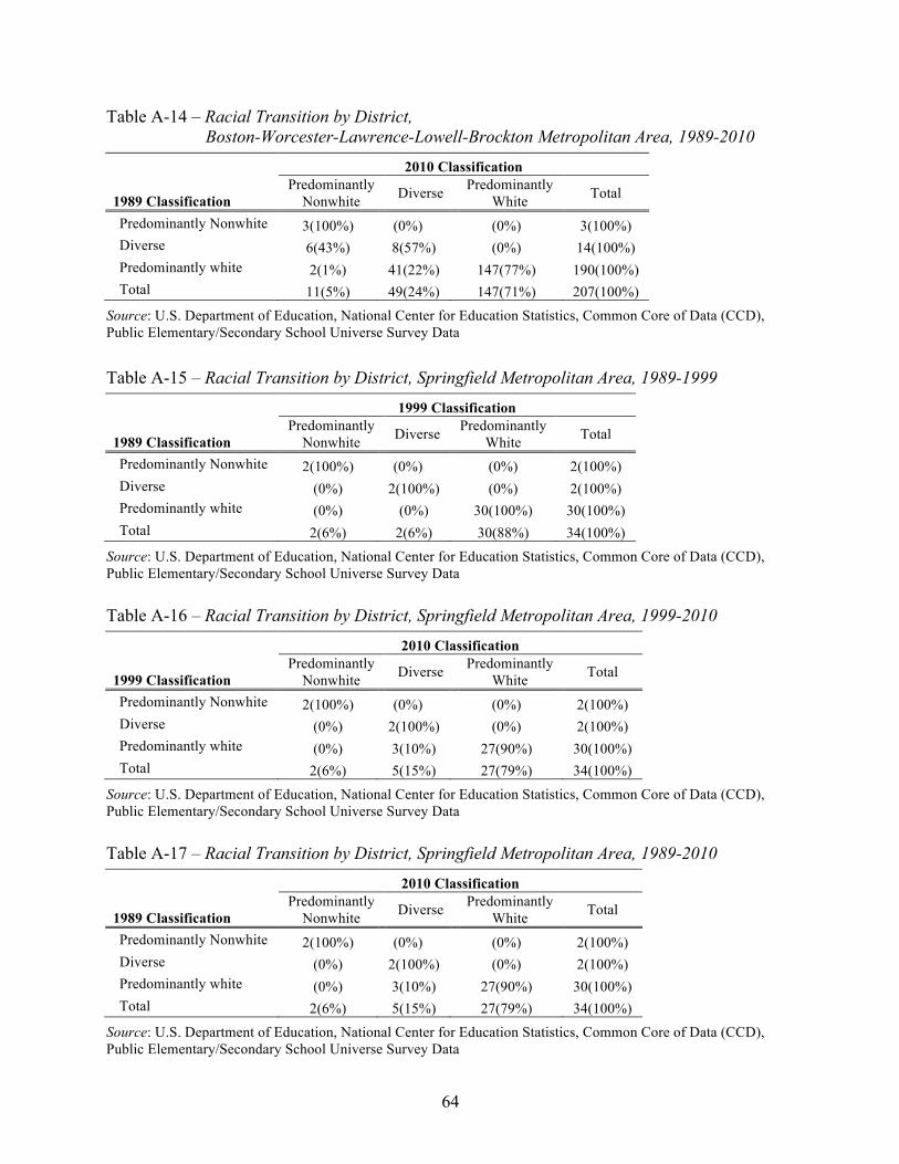
64
Table A-14 – Racial Transition by District, Boston-Worcester-Lawrence-Lowell-Brockton Metropolitan Area, 1989-2010
1989 Classification
2010 Classification Predominantly
Nonwhite Diverse Predominantly White Total
Predominantly Nonwhite 3(100%) (0%) (0%) 3(100%) Diverse 6(43%) 8(57%) (0%) 14(100%) Predominantly white 2(1%) 41(22%) 147(77%) 190(100%) Total 11(5%) 49(24%) 147(71%) 207(100%)
Source: U.S. Department of Education, National Center for Education Statistics, Common Core of Data (CCD), Public Elementary/Secondary School Universe Survey Data
Table A-15 – Racial Transition by District, Springfield Metropolitan Area, 1989-1999
1989 Classification
1999 Classification Predominantly
Nonwhite Diverse Predominantly White Total
Predominantly Nonwhite 2(100%) (0%) (0%) 2(100%) Diverse (0%) 2(100%) (0%) 2(100%) Predominantly white (0%) (0%) 30(100%) 30(100%) Total 2(6%) 2(6%) 30(88%) 34(100%)
Source: U.S. Department of Education, National Center for Education Statistics, Common Core of Data (CCD), Public Elementary/Secondary School Universe Survey Data
Table A-16 – Racial Transition by District, Springfield Metropolitan Area, 1999-2010
1999 Classification
2010 Classification Predominantly
Nonwhite Diverse Predominantly White Total
Predominantly Nonwhite 2(100%) (0%) (0%) 2(100%) Diverse (0%) 2(100%) (0%) 2(100%) Predominantly white (0%) 3(10%) 27(90%) 30(100%) Total 2(6%) 5(15%) 27(79%) 34(100%)
Source: U.S. Department of Education, National Center for Education Statistics, Common Core of Data (CCD), Public Elementary/Secondary School Universe Survey Data
Table A-17 – Racial Transition by District, Springfield Metropolitan Area, 1989-2010
1989 Classification
2010 Classification Predominantly
Nonwhite Diverse Predominantly White Total
Predominantly Nonwhite 2(100%) (0%) (0%) 2(100%) Diverse (0%) 2(100%) (0%) 2(100%) Predominantly white (0%) 3(10%) 27(90%) 30(100%) Total 2(6%) 5(15%) 27(79%) 34(100%)
Source: U.S. Department of Education, National Center for Education Statistics, Common Core of Data (CCD), Public Elementary/Secondary School Universe Survey Data

65
Top 10 Districts in Massachusetts
Table A-18 – Public School Enrollment, 2010-2011
Urbanicity Total Enrollment
Percentage White Black Asian Latino AI Mixed
Boston MSA BOSTON urban 50,127 13.6% 34.7% 9.1% 40.5% 0.4% 1.8% WORCESTER urban 21,500 36.2% 13.6% 8.6% 38.0% 0.3% 3.2% BROCKTON suburban 15,706 27.0% 52.0% 2.8% 14.4% 0.5% 3.3% LOWELL suburban 13,600 35.4% 6.6% 29.1% 26.6% 0.3% 2.1% LYNN suburban 12,738 24.8% 12.5% 10.0% 48.9% 0.4% 3.4% NEW BEDFORD urban 12,538 51.6% 11.7% 1.4% 27.8% 0.9% 6.5% LAWRENCE suburban 12,091 5.8% 1.7% 2.1% 90.3% 0.0% 0.1% NEWTON urban 11,934 67.7% 5.3% 15.1% 6.6% 0.1% 5.1% FALL RIVER urban 9,856 67.5% 6.8% 4.6% 17.5% 0.3% 3.3% QUINCY urban 9,125 53.5% 6.1% 32.9% 4.8% 0.3% 2.4%
Springfield MSA SPRINGFIELD urban 23,325 14.4% 21.2% 2.3% 58.2% 0.1% 3.8% CHICOPEE suburban 7,766 65.5% 2.9% 1.7% 27.2% 0.2% 2.4% WESTFIELD suburban 5,454 86.0% 1.3% 1.7% 10.1% 0.1% 0.8% HOLYOKE suburban 5,059 19.8% 3.8% 1.0% 75.2% 0.0% 0.2% AGAWAM suburban 4,230 91.6% 1.4% 2.0% 3.9% 0.1% 1.1% WEST SPRINGFIELD suburban 3,932 74.8% 3.5% 4.6% 14.6% 0.2% 2.2% HAMPDEN-WILBRAHAM suburban 3,596 88.4% 3.0% 3.2% 3.7% 0.1% 1.6% LONGMEADOW suburban 3,011 87.7% 2.6% 6.2% 2.3% 0.0% 1.2% LUDLOW 2,987 90.2% 2.0% 0.9% 5.7% 0.0% 1.1% EAST LONGMEADOW suburban 2,846 90.1% 3.2% 4.1% 2.4% 0.1% 0.2%
Note: AI = American Indian. Blank urbanicity represents rural, missing, or other. Source: U.S. Department of Education, National Center for Education Statistics, Common Core of Data (CCD), Public Elementary/Secondary School Universe Survey Data

66
Table A-19 – Number and Percentage of Multiracial and Minority Segregated Schools, 2010-2011
Total Schools
% of Multiracial
Schools
% of 50-100%
Minority Schools
% of 90-100%
Minority Schools
% of 99-100%
Minority Schools
Boston MSA BOSTON 114 43.0% 97.4% 58.8% 5.3% WORCESTER 41 75.6% 75.6% 2.4% BROCKTON 20 75.0% 100.0% LOWELL 21 95.2% 85.7% LYNN 23 82.6% 87.0% 13.0% NEW BEDFORD 26 53.8% 53.8% LAWRENCE 26 100.0% 80.8% NEWTON 22 FALL RIVER 16 12.5% QUINCY 18 22.2% 44.4%
Springfield MSA SPRINGFIELD 43 65.1% 100.0% 32.6% CHICOPEE 14 14.3% WESTFIELD 11 HOLYOKE 9 100.0% 33.3% AGAWAM 8 WEST SPRINGFIELD 8 HAMPDEN-WILBRAHAM 7 LONGMEADOW 6 LUDLOW 5 EAST LONGMEADOW 5
Note: Blank cells represent no schools or other. Minority school represents black, Latino, American Indian, and Asian students. Multiracial schools are those with any three races representing 10% or more of the total student enrollment. Source: U.S. Department of Education, National Center for Education Statistics, Common Core of Data (CCD), Public Elementary/Secondary School Universe Survey Data

67
Table A-20 – Percentage of Students Who Are Low-Income in Multiracial and Minority Segregated Schools, 2010-2011
% Low-Income in
Multiracial Schools
% Low-Income in 50-100% Minority Schools
% Low-Income in 90-100% Minority Schools
% Low-Income in 99-100% Minority Schools
Boston MSA BOSTON 67.3% 75.3% 82.5% 80.8% WORCESTER 73.3% 75.1% 97.8% BROCKTON 73.2% 72.7% LOWELL 73.1% 73.1% LYNN 79.5% 80.5% 90.2% NEW BEDFORD 75.3% 75.1% LAWRENCE 87.0% 89.0% NEWTON FALL RIVER 86.3% QUINCY 56.4% 54.0%
Springfield MSA SPRINGFIELD 80.8% 84.3% 90.4% CHICOPEE 82.6% WESTFIELD HOLYOKE 80.9% 95.6% AGAWAM WEST SPRINGFIELD HAMPDEN-WILBRAHAM LONGMEADOW LUDLOW EAST LONGMEADOW
Note: Blank cells represent no schools. Minority school represents black, Latino, American Indian, and Asian students. Multiracial schools are those with any three races representing 10% or more of the total student enrollment. Source: U.S. Department of Education, National Center for Education Statistics, Common Core of Data (CCD), Public Elementary/Secondary School Universe Survey Data

68
Table A-21 – Percentage of Racial Group in Minority Segregated School, 2010-2011 50-100% Minority
School 90-100% Minority
School 99-100% Minority
School % of
Latino % of Black
% of Latinos
% of Blacks
% of Latinos
% of Blacks
Boston MSA BOSTON 98.8% 99.2% 59.8% 71.2% 4.8% 8.2% WORCESTER 94.1% 91.0% 4.5% 1.2% BROCKTON 100.0% 100.0% LOWELL 90.0% 92.8% LYNN 96.6% 94.2% 19.7% 14.0% NEW BEDFORD 75.0% 79.8% LAWRENCE 100.0% 100.0% 84.4% 79.6% NEWTON FALL RIVER QUINCY 44.0% 47.1%
Springfield MSA SPRINGFIELD 100.0% 100.0% 42.4% 33.0% CHICOPEE 20.8% 13.6% WESTFIELD HOLYOKE 100.0% 100.0% 37.4% 31.1% AGAWAM WEST SPRINGFIELD HAMPDEN-WILBRAHAM LONGMEADOW LUDLOW EAST LONGMEADOW
Note: Blank cells represent no schools. Minority school represents black, Latino, American Indian, and Asian students. Source: U.S. Department of Education, National Center for Education Statistics, Common Core of Data (CCD), Public Elementary/Secondary School Universe Survey Data

69
Table A-22 – Percentage of Racial Group in Multiracial Schools, 2010-2011 White % Black % Asian % Latino % AI %
Boston MSA BOSTON 77.9% 38.6% 88.4% 39.7% 48.9% WORCESTER 76.1% 90.6% 85.6% 85.1% 96.0% BROCKTON 80.1% 80.0% 77.0% 88.6% 86.7% LOWELL 94.0% 97.7% 99.2% 94.0% 97.4% LYNN 84.4% 91.8% 91.2% 89.9% 85.1% NEW BEDFORD 54.3% 82.3% 64.8% 74.0% 78.2% LAWRENCE NEWTON FALL RIVER 4.5% 6.6% 9.6% 5.0% 3.4% QUINCY 17.4% 38.8% 15.8% 37.8% 26.7%
Springfield MSA SPRINGFIELD 82.2% 66.4% 69.8% 56.1% 54.5% CHICOPEE WESTFIELD HOLYOKE AGAWAM WEST SPRINGFIELD HAMPDEN-WILBRAHAM LONGMEADOW LUDLOW EAST LONGMEADOW
Note: Blank cells represent no schools. AI = American Indian. Multiracial schools are those with any three races representing 10% or more of the total student population. Source: U.S. Department of Education, National Center for Education Statistics, Common Core of Data (CCD), Public Elementary/Secondary School Universe Survey Data

70
Table A-23 – Exposure Rates to White Students in Public Schools, 2010-2011
% White
White Exposure to White
Black Exposure to White
Asian Exposure to White
Latino Exposure to White
Boston MSA BOSTON 13.6% 29.1% 9.2% 18.2% 10.9% WORCESTER 36.2% 43.4% 34.6% 34.2% 30.2% BROCKTON 27.0% 30.2% 25.7% 25.4% LOWELL 35.4% 38.9% 35.6% 31.4% 35.3% LYNN 24.8% 32.9% 24.1% 23.0% 21.2% NEW BEDFORD 51.6% 55.3% 47.2% 46.8% LAWRENCE 5.8% 8.6% 5.6% NEWTON 67.7% 68.2% 67.0% 66.2% 67.3% FALL RIVER 67.5% 68.2% 66.6% 65.4% QUINCY 53.5% 56.4% 51.1% 49.5%
Springfield MSA SPRINGFIELD 14.4% 18.5% 14.8% 13.1% CHICOPEE 65.5% 67.9% 59.8% WESTFIELD 86.0% 86.2% 84.4% HOLYOKE 19.8% 27.2% 17.9% AGAWAM 91.6% 91.7% WEST SPRINGFIELD 74.8% 75.4% 72.8% HAMPDEN-WILBRAHAM 88.4% 88.4% LONGMEADOW 87.7% 87.8% 87.3% LUDLOW 90.2% 90.2% 90.0% EAST LONGMEADOW 90.1% 90.1%
Note: Blank cells represent only one school or less than one-twentieth of a racial enrollment. Source: U.S. Department of Education, National Center for Education Statistics, Common Core of Data (CCD), Public Elementary/Secondary School Universe Survey Data

71
Table A-24 – Exposure Rates to Black Students in Public Schools, 2010-2011
% Black
White Exposure to Black
Black Exposure to Black
Asian Exposure to Black
Latino Exposure to Black
Boston MSA BOSTON 34.7% 23.4% 45.8% 27.5% 30.6% WORCESTER 13.6% 13.0% 14.8% 13.6% 13.8% BROCKTON 52.0% 49.5% 53.9% 50.2% LOWELL 6.6% 6.6% 8.0% 6.2% 6.6% LYNN 12.5% 12.1% 12.9% 12.4% 12.6% NEW BEDFORD 11.7% 10.7% 13.8% 12.5% LAWRENCE 1.7% NEWTON 5.3% 5.3% 5.8% 5.3% 5.5% FALL RIVER 6.8% 6.7% 7.5% 6.9% QUINCY 6.1% 5.9% 8.8% 5.7%
Springfield MSA SPRINGFIELD 21.2% 21.8% 23.0% 20.3% CHICOPEE 2.9% WESTFIELD 1.3% HOLYOKE 3.8% AGAWAM 1.4% WEST SPRINGFIELD 3.5% HAMPDEN-WILBRAHAM 3.0% LONGMEADOW 2.6% LUDLOW 2.0% EAST LONGMEADOW 3.2%
Note: Blank cells represent only one school or less than one-twentieth of a racial enrollment. Source: U.S. Department of Education, National Center for Education Statistics, Common Core of Data (CCD), Public Elementary/Secondary School Universe Survey Data

72
Table A-25 – Exposure Rates to Asian Students in Public Schools, 2010-2011
% Asian
White Exposure to Asian
Black Exposure to Asian
Asian Exposure to Asian
Latino Exposure to Asian
Boston MSA BOSTON 9.1% 12.3% 7.2% 25.8% 5.9% WORCESTER 8.6% 8.1% 8.6% 10.2% 8.7% BROCKTON 2.8% LOWELL 29.1% 25.8% 27.6% 35.0% 27.3% LYNN 10.0% 9.3% 9.9% 11.0% 10.2% NEW BEDFORD 1.4% LAWRENCE 2.1% NEWTON 15.1% 14.8% 15.1% 16.9% 14.9% FALL RIVER 4.6% QUINCY 32.9% 30.4% 30.6% 37.9%
Springfield MSA SPRINGFIELD 2.3% CHICOPEE 1.7% WESTFIELD 1.7% HOLYOKE 1.0% AGAWAM 2.0% WEST SPRINGFIELD 4.6% HAMPDEN-WILBRAHAM 3.2% LONGMEADOW 6.2% 6.1% 5.9% 6.7% LUDLOW 0.9% EAST LONGMEADOW 4.1%
Note: Blank cells represent only one school or less than one-twentieth of a racial enrollment. Source: U.S. Department of Education, National Center for Education Statistics, Common Core of Data (CCD), Public Elementary/Secondary School Universe Survey Data

73
Table A-26 – Exposure Rates to Latino Students in Public Schools, 2010-2011
%
Latino
White Exposure to Latino
Black Exposure to Latino
Asian Exposure to Latino
Latino Exposure to Latino
Boston MSA BOSTON 40.5% 32.7% 35.7% 26.3% 50.6% WORCESTER 38.0% 31.7% 38.6% 38.6% 43.9% BROCKTON 14.4% 13.6% 13.9% 17.8% LOWELL 26.6% 26.5% 26.7% 24.9% 28.5% LYNN 48.9% 41.8% 49.4% 50.0% 52.3% NEW BEDFORD 27.8% 25.2% 29.7% 32.1% LAWRENCE 90.3% 86.7% 90.7% NEWTON 6.6% 6.6% 6.9% 6.5% 7.0% FALL RIVER 17.5% 17.0% 17.9% 19.3% QUINCY 4.8%
Springfield MSA SPRINGFIELD 58.2% 52.9% 55.8% 60.8% CHICOPEE 27.2% 24.8% 33.1% WESTFIELD 10.1% 10.0% 11.7% HOLYOKE 75.2% 67.9% 77.1% AGAWAM 3.9% WEST SPRINGFIELD 14.6% 14.2% 16.2% HAMPDEN-WILBRAHAM 3.7% LONGMEADOW 2.3% LUDLOW 5.7% 5.7% 5.9% EAST LONGMEADOW 2.4%
Note: Blank cells represent only one school or less than one-twentieth of a racial enrollment. Source: U.S. Department of Education, National Center for Education Statistics, Common Core of Data (CCD), Public Elementary/Secondary School Universe Survey Data

74
Table A-27 – Black and Latino Exposure Rates to White and Asian Students in Public Schools, 2010-2011
White and Asian Share of School Enrollment
Black and Latino Exposure to White and Asian Students Difference
Boston MSA BOSTON 22.7% 16.7% -6.0% WORCESTER 44.8% 40.0% -4.8% BROCKTON 29.8% 28.3% -1.5% LOWELL 64.5% 62.7% -1.8% LYNN 34.8% 31.9% -2.9% NEW BEDFORD 53.0% 48.3% -4.7% LAWRENCE 7.9% 7.6% -0.3% NEWTON 82.8% 82.2% -0.6% FALL RIVER 72.1% 70.4% -1.7% QUINCY 86.3% 81.9% -4.4%
Springfield MSA SPRINGFIELD 16.8% 15.8% -1.0% CHICOPEE 67.3% 61.6% -5.7% WESTFIELD 87.7% 86.3% -1.4% HOLYOKE 20.8% 18.9% -1.9% AGAWAM 93.5% 92.6% -0.9% WEST SPRINGFIELD 79.5% 77.8% -1.7% HAMPDEN-WILBRAHAM 91.6% 91.3% -0.3% LONGMEADOW 93.9% 93.8% -0.1% LUDLOW 91.1% 90.9% -0.2% EAST LONGMEADOW 94.1% 93.7% -0.4%
Source: U.S. Department of Education, National Center for Education Statistics, Common Core of Data (CCD), Public Elementary/Secondary School Universe Survey Data
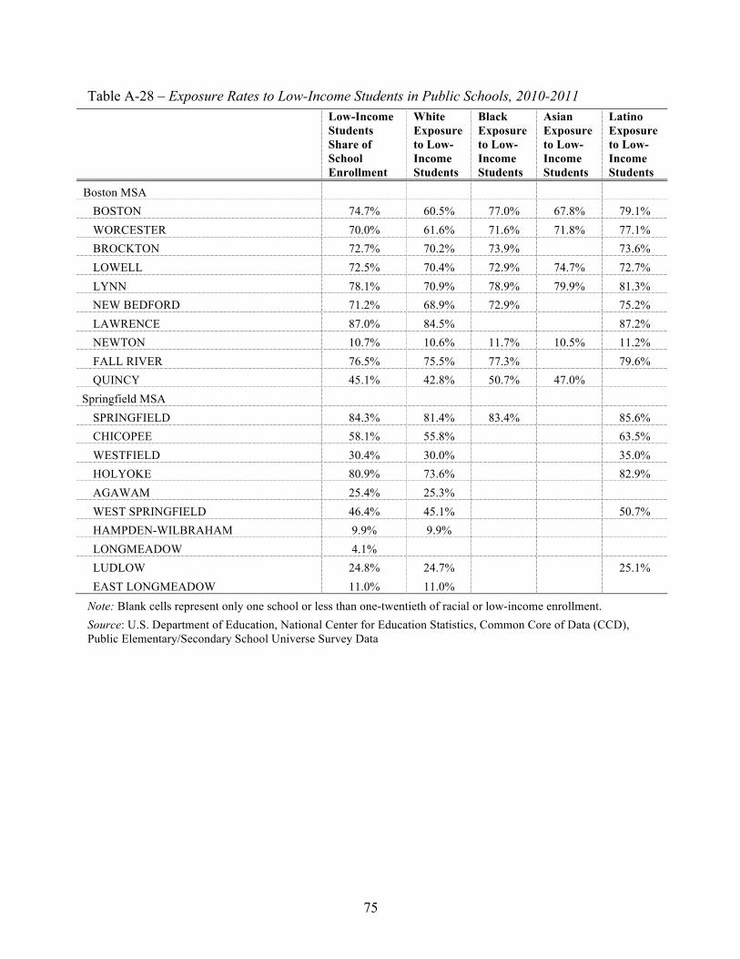
75
Table A-28 – Exposure Rates to Low-Income Students in Public Schools, 2010-2011
Low-Income Students Share of School Enrollment
White Exposure to Low-Income Students
Black Exposure to Low-Income Students
Asian Exposure to Low-Income Students
Latino Exposure to Low-Income Students
Boston MSA BOSTON 74.7% 60.5% 77.0% 67.8% 79.1% WORCESTER 70.0% 61.6% 71.6% 71.8% 77.1% BROCKTON 72.7% 70.2% 73.9% 73.6% LOWELL 72.5% 70.4% 72.9% 74.7% 72.7% LYNN 78.1% 70.9% 78.9% 79.9% 81.3% NEW BEDFORD 71.2% 68.9% 72.9% 75.2% LAWRENCE 87.0% 84.5% 87.2% NEWTON 10.7% 10.6% 11.7% 10.5% 11.2% FALL RIVER 76.5% 75.5% 77.3% 79.6% QUINCY 45.1% 42.8% 50.7% 47.0%
Springfield MSA SPRINGFIELD 84.3% 81.4% 83.4% 85.6% CHICOPEE 58.1% 55.8% 63.5% WESTFIELD 30.4% 30.0% 35.0% HOLYOKE 80.9% 73.6% 82.9% AGAWAM 25.4% 25.3% WEST SPRINGFIELD 46.4% 45.1% 50.7% HAMPDEN-WILBRAHAM 9.9% 9.9% LONGMEADOW 4.1% LUDLOW 24.8% 24.7% 25.1% EAST LONGMEADOW 11.0% 11.0%
Note: Blank cells represent only one school or less than one-twentieth of racial or low-income enrollment. Source: U.S. Department of Education, National Center for Education Statistics, Common Core of Data (CCD), Public Elementary/Secondary School Universe Survey Data

76
Appendix B: Data Sources and Methodology
Data
The data in this study consisted of 1989-1990, 1999-2000, and 2010-2011 Common Core of Data (CCD), Public Elementary/Secondary School Universe Survey and Local Education Agency data files from the National Center for Education Statistics (NCES). Using this data, we explored demographic and segregation patterns at the national, regional, state, metropolitan, and district levels. We also explored district racial stability patterns for each main metropolitan area in Massachusetts—those areas with greater than 100,000 students enrolled in 1989.
Geography
National estimates in this report reflect all 50 U.S. states, outlying territories, Department of Defense (overseas and domestic), and the Bureau of Indian Affairs. Regional analyses include the following regions and states:
• Border: Delaware, Kentucky, Maryland, Missouri, Oklahoma, West Virginia • Northeast: Connecticut, Maine, Massachusetts, New Hampshire, New Jersey, New
York, Pennsylvania, Rhode Island, Vermont • South: Alabama, Arkansas, Florida, Georgia, Louisiana, Mississippi, North Carolina,
South Carolina, Tennessee, Texas, Virginia.
Patterns for metropolitan areas are restricted to schools within each state, due to some metropolitan boundaries spanning across two or more states. In this report, as well as in the accompanying metropolitan factsheets, we provide a closer analysis for main metropolitan areas, including 2010 numbers for the ten highest enrolling districts in larger metros.
Data Analysis
We explored segregation patterns by first conducting two inversely related indices, exposure and isolation, both of which help describe the demographic and socioeconomic composition of schools that the average member of a racial/ethnic group attends. Exposure of one group to other groups is called the index of exposure, while exposure of a group to itself is called the index of isolation. Both indices range from 0 to 1, where higher values on the index of exposure but lower values for isolation indicate greater integration.
We also reported the share of minority students in schools with concentrations of students of color—those where more than half the students are from minority groups—along with the percent of minorities in intensely segregated schools, places where 90-100% of students are minority youth, and apartheid schools—schools where 99-100% of students are minority. To provide estimates of diverse environments, we calculated the proportion of each racial group in multiracial schools (schools in which any three races represent 10% or more of the total student body).
Finally, we explored the segregation dimension of evenness using the index of dissimilarity and the multi-group entropy (or diversity) index, both of which measure how evenly race/ethnic population groups are distributed among schools compared with their larger geographic area. The dissimilarity index is a dual-group evenness measure that indicates the degree students of two racial groups are evenly distributed among schools. Higher values (up to 1) indicate that the two

77
groups are unevenly distributed across schools in a geographic area while lower values (closer to 0) reflect more of an even distribution or more integration. A rough heuristic for interpreting score value includes: above .60 indicating high segregation (above .80 is extreme), .30 to .60 indicating moderate segregation, and a value below .30 indicating low segregation.94
The multi-group entropy index measures the degree students of multiple groups are evenly distributed among schools. H is also an evenness index that measures the extent to which members from multiple racial groups are evenly distributed among neighborhoods in a larger geographic area. More specifically, the index measures the difference between the weighted average diversity (or racial composition) in schools to the diversity in the larger geographical area. So, if H is .20, the average school is 20% less diverse than the metropolitan area as a whole. Similar to D, higher values (up to 1) indicate that multiple racial groups are unevenly distributed across schools across a geographic area while lower values (closer to 0) reflect more of an even distribution. However, H has often been viewed superior to D, as it is the only index that obeys the “principle of transfers,” (the index declines when an individual of group X moves from unit A to unit B, where the proportion of persons of group X is higher in unit A than in unit B).95 In addition, H can be statistically decomposed into between and within-unit components, allowing us, for example, to identify how much the total segregation depends on the segregation between or within districts. A rough heuristic for interpreting score value includes: above .25 indicating high segregation (above .40 is extreme), between .10 and .25 indicating moderate segregation, and a value below .10 indicating low segregation.
To explore district stability patterns for key metropolitan areas, we restricted our analysis to districts open across all three data periods (1989-1990, 1999-2000, and 2010-2011), districts with 100 or greater students in 1989, and districts in metropolitan areas that experienced a white enrollment change greater than 1%. With this data, we categorized districts, as well as their metropolitan area, into predominantly white (those with 80% or more white students), diverse (those with more than 20% but less than 60% nonwhite students), and predominantly nonwhite (with 60% or more nonwhite students) types.96 We then identified the degree to which district white enrollment has changed in comparison to the overall metropolitan area. This analysis resulted in three different degrees of change: rapidly changing, moderately changing, and stable.97 We classified rapidly changing districts as those with a white percentage change three times greater than the metro white percentage change. For moderately changing districts, the white student percentage changed two times but less than three times greater than the metropolitan white percentage change. Also included in the category of moderate change were those districts that experienced a white percentage change less than two times the metropolitan white percentage change but were classified as predominantly white, nonwhite or diverse in the earlier time period and classified as a new category in the later period. We identified stable
94 Massey, D. S., & Denton, N. A. (1993). American apartheid: Segregation and the making of the underclass. Cambridge, MA: Harvard University Press. 95 Reardon, S. F., & Firebaugh, G. (2002). Measures of multigroup segregation. Sociological Methodology, 32, 33-67. 96 Similar typography has been used with residential data; See Orfield, M., & Luce, T. (2012). America’s racially diverse suburbs: Opportunities and challenges. Minneapolis, MN: Institute on Metropolitan Opportunity. 97 Similar typography has been used in Frankenberg, E. (2012). Understanding suburban school district transformation: A typology of suburban districts. In E. Frankenberg and G. Orfield (Eds.), The resegregation of suburban schools: A hidden crisis in education (pp. 27-44). Cambridge, MA: Harvard Education Press.

78
districts as those that experienced a white percentage change less than two times the metropolitan white percentage change.
Next, we explored the type and direction of change in school districts, which resulted in the following categories: resegregating white or nonwhite, integrating white or nonwhite, segregated white or nonwhite, or diverse. Resegregating districts are those classified as predominantly white, nonwhite or diverse in the earlier time period and classified as the other predominantly type in the later period. Integrating districts are those classified as predominantly white or nonwhite in the earlier time period and diverse in the later period. Segregated districts are those classified as predominantly white or nonwhite in both time periods. Diverse districts are those classified as diverse in both periods.
Data Limitations and Solutions
Due to advancements in geocoding technology, as well as changes from the Office of Management and Budget and Census Bureau, metropolitan areas and locale school boundaries have changed considerably since 1989. To explore metropolitan patterns over time, we used the historical metropolitan statistical area (MSA) definitions (1999) defined by the Office of Management and Budget as the metropolitan area base. We then matched and aggregated enrollment counts for these historical metropolitan area definitions with the current definitions of Core Based Statistical Areas (CBSA) (2010) using the 1999 MSA to 2003 CBSA crosswalk to make these areas geographically comparable over time. To control for locale school boundary changes over time, data for the analysis only comprised schools open 1989-2010, 1989-1999-2010, 1999-2010, and only 2010. We then applied 2010 boundary codes to all years, although there were 11 schools missing 2010 boundary codes for the state of Massachusetts.
Another issue relates to missing or incomplete data. Because compliance with NCES reporting is voluntary for state education agencies (though virtually all do comply), some statewide gaps in the reporting of student racial composition occur. To address this limitation, particularly for our national and regional analyses, we obtained student membership, racial composition, and free reduced status from the nearest data file year these variables were available. Below we present the missing or incomplete data by year and state, and how we attempted to address each limitation.

79
Data Limitation Data Solution
1999-2000: • States missing FRL and racial
enrollment: o Arizona o Idaho o Illinois o Tennessee o Washington
1998-1999: • Tennessee: racial enrollment only
2000-2001: • Arizona: racial enrollment only • Idaho: FRL and racial enrollment
2001-2002: • Illinois: FRL and racial enrollment • Washington: FRL and racial
enrollment
1989-1999: • Many states missing FRL
enrollment for this year • States missing racial enrollment:
o Georgia o Maine o Missouri o Montana o South Dakota o Virginia o Wyoming
1990-1991: • Montana: racial enrollment only • Wyoming: racial enrollment only
1991-1992: • Missouri: racial enrollment only
1992-1993: • South Dakota: racial enrollment
only • Virginia: racial enrollment only
1993-1994: • Georgia: racial enrollment only • Maine: racial enrollment only
Other: • Idaho is missing racial composition
data from 1989 to 1999 and thus excluded from this year
A final issue relates to the fact that all education agencies are now collecting and reporting multiracial student enrollment counts for the 2010-2011 data collection. However, because the Department of Education did not require these states to collect further information on the race/ethnicity of multiracial students, as we suggested they do (http://civilrightsproject.ucla.edu/ research/k-12-education/integration-and-diversity/data-proposals-threaten-education-and-civil-rights-accountability), it is difficult to accurately compare racial proportion and segregation findings from 2010 to prior years due to this new categorical collection. We remain very concerned about the severe problems of comparison that began nationally in the 2010 data. The Civil Rights Project and dozens of civil rights groups, representing a wide variety of racial and ethnic communities, recommended against adopting the Bush-era changes in the debate over the federal regulation.


![Massachusetts Military Reservation · Otis Air National Guard/Camp Edwards, Falmouth, Massachusetts (Massachusetts Military Reservation [MMR], Cape Cod, Massachusetts)](https://img.pdfslide.net/doc/110x75/5af853a37f8b9a44658c3974/massachusetts-military-reservation-air-national-guardcamp-edwards-falmouth-massachusetts.jpg)