Embed Size (px)
Citation preview
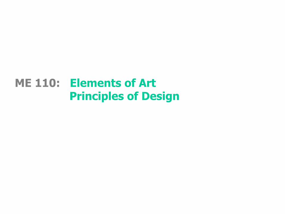
ME 110: Elements of ArtPrinciples of Design
Wayne Li [email protected]: Confidential -2-
Elements of Art
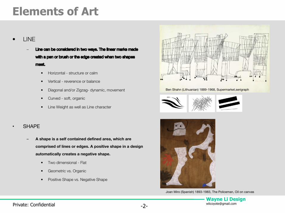
• LINE– Line can be considered in two ways. The linear marks made
with a pen or brush or the edge created when two shapes
meet.
• Horizontal - structure or calm
• Vertical - reverence or balance
• Diagonal and/or Zigzag- dynamic, movement
• Curved - soft, organic
• Line Weight as well as Line character
• SHAPE
– A shape is a self contained defined area, which are
comprised of lines or edges. A positive shape in a design
automatically creates a negative shape.
• Two dimensional - Flat
• Geometric vs. Organic
• Positive Shape vs. Negative Shape
Ben Shahn (Lithuanian) 1889-1968, Supermarket,serigraph
Joan Miro (Spanish) 1893-1983, The Policeman, Oil on canvas
Wayne Li [email protected]: Confidential -3-
Elements of Art
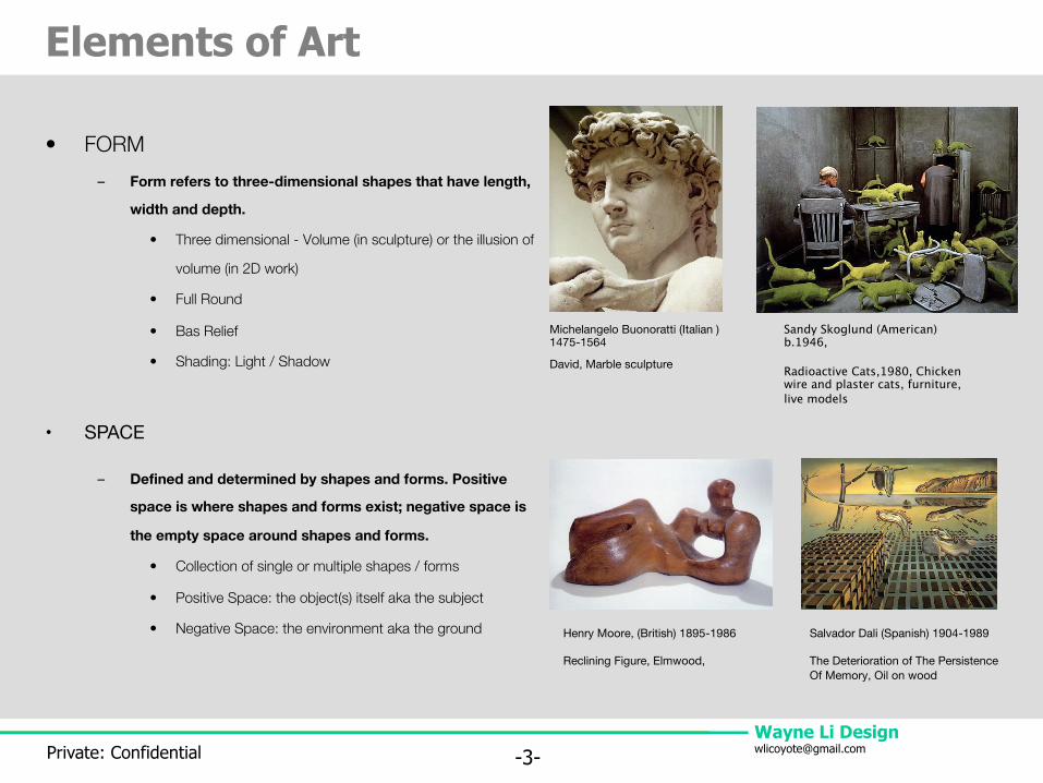
• FORM– Form refers to three-dimensional shapes that have length,
width and depth.
• Three dimensional - Volume (in sculpture) or the illusion of
volume (in 2D work)
• Full Round
• Bas Relief
• Shading: Light / Shadow
• SPACE
– Defined and determined by shapes and forms. Positive
space is where shapes and forms exist; negative space is
the empty space around shapes and forms.
• Collection of single or multiple shapes / forms
• Positive Space: the object(s) itself aka the subject
• Negative Space: the environment aka the ground
Michelangelo Buonoratti (Italian ) 1475-1564
David, Marble sculpture
Henry Moore, (British) 1895-1986
Reclining Figure, Elmwood,
Sandy Skoglund (American) b.1946,
Radioactive Cats,1980, Chicken wire and plaster cats, furniture, live models
Salvador Dali (Spanish) 1904-1989
The Deterioration of The Persistence Of Memory, Oil on wood
Wayne Li [email protected]: Confidential -4-
Elements of Art
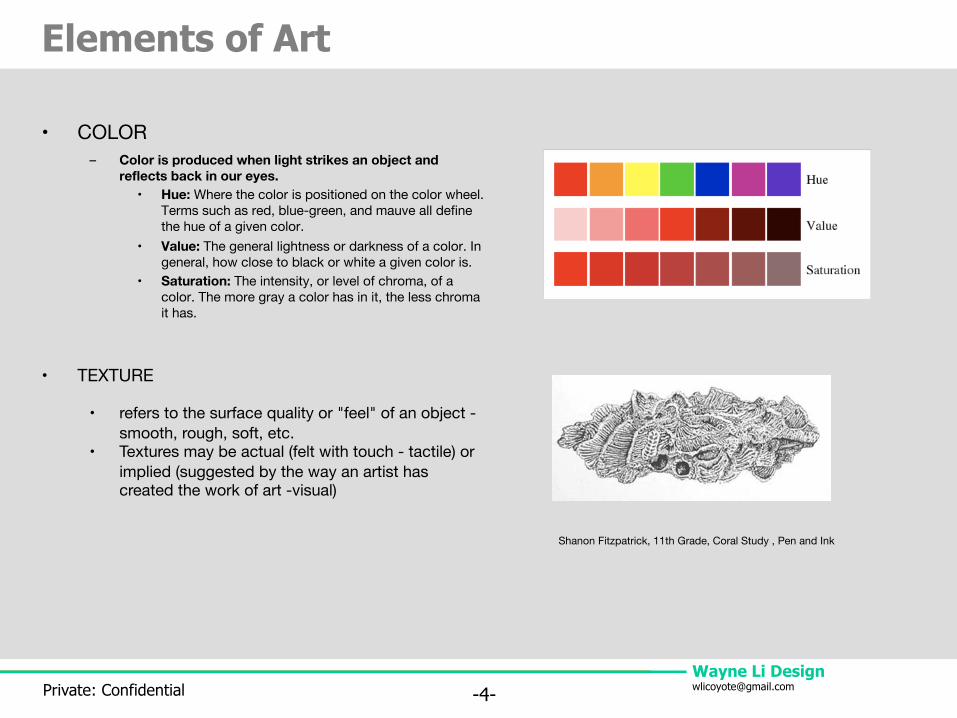
• COLOR– Color is produced when light strikes an object and
reflects back in our eyes.• Hue: Where the color is positioned on the color wheel.
Terms such as red, blue-green, and mauve all define the hue of a given color.
• Value: The general lightness or darkness of a color. In general, how close to black or white a given color is.
• Saturation: The intensity, or level of chroma, of a color. The more gray a color has in it, the less chroma it has.
• TEXTURE
• refers to the surface quality or "feel" of an object -smooth, rough, soft, etc.
• Textures may be actual (felt with touch - tactile) or implied (suggested by the way an artist has created the work of art -visual)
Shanon Fitzpatrick, 11th Grade, Coral Study , Pen and Ink
Wayne Li [email protected]: Confidential -5-
Principles of Design
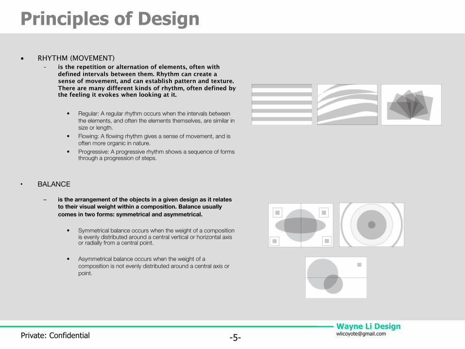
• RHYTHM (MOVEMENT)– is the repetition or alternation of elements, often with
defined intervals between them. Rhythm can create a sense of movement, and can establish pattern and texture. There are many different kinds of rhythm, often defined by the feeling it evokes when looking at it.
• Regular: A regular rhythm occurs when the intervals between the elements, and often the elements themselves, are similar in size or length.
• Flowing: A flowing rhythm gives a sense of movement, and is often more organic in nature.
• Progressive: A progressive rhythm shows a sequence of forms through a progression of steps.
• BALANCE
– is the arrangement of the objects in a given design as it relates to their visual weight within a composition. Balance usually comes in two forms: symmetrical and asymmetrical.
• Symmetrical balance occurs when the weight of a composition is evenly distributed around a central vertical or horizontal axis or radially from a central point.
• Asymmetrical balance occurs when the weight of a composition is not evenly distributed around a central axis or point.
Wayne Li [email protected]: Confidential -6-
Principles of Design
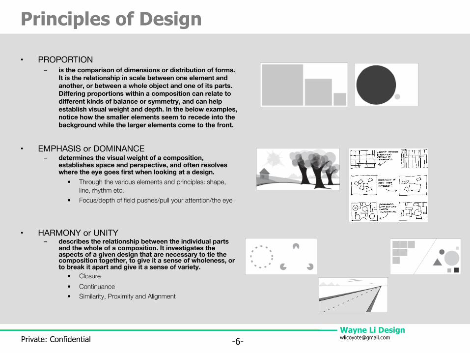
• PROPORTION– is the comparison of dimensions or distribution of forms.
It is the relationship in scale between one element and another, or between a whole object and one of its parts. Differing proportions within a composition can relate to different kinds of balance or symmetry, and can help establish visual weight and depth. In the below examples, notice how the smaller elements seem to recede into the background while the larger elements come to the front.
• EMPHASIS or DOMINANCE– determines the visual weight of a composition,
establishes space and perspective, and often resolves where the eye goes first when looking at a design.
• Through the various elements and principles: shape, line, rhythm etc.
• Focus/depth of field pushes/pull your attention/the eye
• HARMONY or UNITY– describes the relationship between the individual parts
and the whole of a composition. It investigates the aspects of a given design that are necessary to tie the composition together, to give it a sense of wholeness, or to break it apart and give it a sense of variety.
• Closure• Continuance• Similarity, Proximity and Alignment
Wayne Li [email protected]: Confidential -7-
Q & A
Sources:http://www.brigantine.atlnet.org/GigapaletteGALLERY/websites/ARTiculationFinal/MainP
ages/PrinciplesMain.htmhttp://members.cox.net/mrsparker2/intro.htmhttp://www.digital-web.com/articles/principles_of_design/http://www.johnlovett.com/test.htm