Embed Size (px)
Citation preview

HAL Id: hal-02317291https://hal-descartes.archives-ouvertes.fr/hal-02317291
Submitted on 15 Oct 2019
HAL is a multi-disciplinary open accessarchive for the deposit and dissemination of sci-entific research documents, whether they are pub-lished or not. The documents may come fromteaching and research institutions in France orabroad, or from public or private research centers.
L’archive ouverte pluridisciplinaire HAL, estdestinée au dépôt et à la diffusion de documentsscientifiques de niveau recherche, publiés ou non,émanant des établissements d’enseignement et derecherche français ou étrangers, des laboratoirespublics ou privés.
Memory effects on color perceptionChristoph Witzel, Thorsten Hansen
To cite this version:Christoph Witzel, Thorsten Hansen. Memory effects on color perception. Handbook of Color Psy-chology, pp.641-659, 2015, �10.1017/CBO9781107337930.032�. �hal-02317291�
brought to you by COREView metadata, citation and similar papers at core.ac.uk
provided by Archive Ouverte en Sciences de l'Information et de la Communication
Published in Handbook of Color Psychology. Edited by Andrew J. Elliot, Mark D. Fairchild, Anna Franklin. Doi 10.1017/CBO9781107337930.032
Please contact the publisher for permission to re-use or reprint the material,
Memory effects on color perception Christoph Witzel and Thorsten Hansen
Introduction
Does knowledge about an object’s typical color influence how we perceive the actual color of
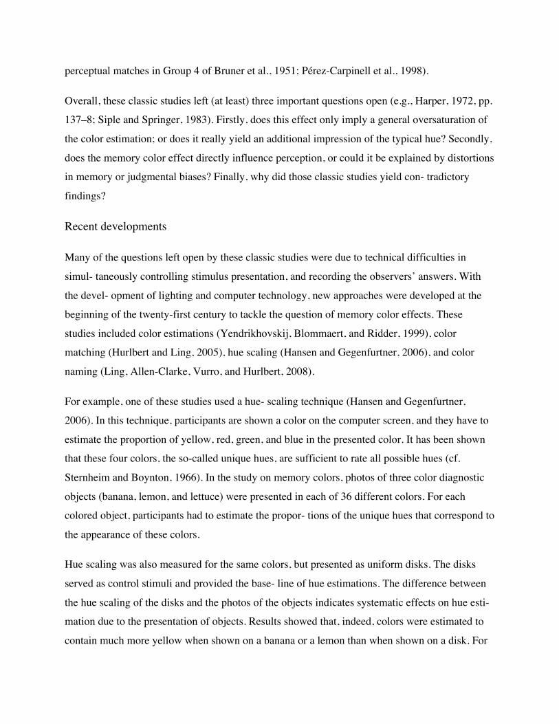
this object? For example, Germans know that a German mailbox is yellow (cf. left side of Figure
31.1). Does such knowledge influence how we see the actual color of a mailbox? Or can we
perceive the color independently of our prior knowledge? These are the questions at the core of
research on the so-called memory color effect.
A memory color is the typical color of an object that we memorized through our experience with
the respective object (for a review, see Witzel and Gegenfurtner, 2013). In some areas of
research, the term “canonical colors” is used to refer to memory colors. An object that has a
memory color, such as a ripe banana or a German mailbox, is called color diagnostic because the
color is informative about the identity of the object (and vice versa). For example, yellow is a
character- istic feature of a ripe banana and a German mail- box. In contrast, objects that are not
associated with a typical color, such as cars, may be called color-neutral to indicate that they are
not color diagnostic.
Memory colors affect several aspects of color perception, including object and scene recogni-
tion, color memory, color naming, and color con- stancy. The memory color effect even shows
that memory colors directly influence color appear- ance. Color appearance refers to how a color
subjectively appears or “looks” to the beholder. According to the idea of a memory color effect,
the color of an object is not perceived indepen- dently of the object itself. Instead, the identifica-

tion of the object automatically brings about the impression of its typical color.
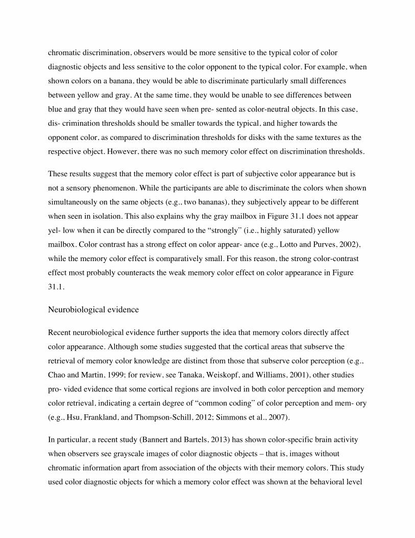
This idea is illustrated in Figure 31.1. According to the memory color effect, the gray mailbox on
the right should appear yellow to a German observer. This idea may seem surprising or even
absurd since the right mailbox looks rather gray in comparison to the left mailbox in Figure 31.1.
Nevertheless, numerous studies found strong evidence for such a memory color effect. Highly
color diagnostic objects are per- ceived slightly tinted with their typical color, when they are
actually gray (Hansen, Olkkonen, Walter, and Gegenfurtner, 2006; Olkkonen, Hansen, and
Gegenfurtner, 2008; Witzel, Valkova, Hansen, and Gegenfurtner, 2011).
Memory color effects show how memory and expectations based on prior experience can influ-
ence the perception of color (see also Olkkonen, Hansen, and Gegenfurtner, 2012). Evidence for
memory colors is relevant from two perspectives (e.g., Witzel et al., 2011). On the one hand, it
provides insight about color perception. On the other hand, it constitutes a prime example to
answer questions about the influence of learning and experience on perception in general. For this
reason, memory color effects are relevant to a wide range of fundamental questions, such as
functional segregation, cognitive penetrability, constructivism, and color realism. These ques-
tions span different disciplines, ranging from psy- chology and neuroscience to philosophy.

Figure 31.1 Memory color of a German mailbox. The left side shows a German mailbox in its typical color. The right side separates the object from its color. According to the memory color effect, we cannot perceive the actual color of the mailbox independently of its typical color. More precisely, a gray mailbox like the one on the top right looks slightly yellowish. This kind of memory color effect is the main topic of this chapter.
The present chapter reviews research on how memory and expectations based on prior experi-
ence can influence the perception of color. It is organized as follows. The first section gives an
overview of the evidence for memory effects on color appearance. The second section outlines
the effects of memory colors on other aspects of color perception, such as object recognition,
color naming, memory, and constancy. Determinants of memory color effects are summarized in
the third section. The fourth and final section briefly discusses how the memory color effect is
related to fundamental questions about the human mind.
Memory color effects on color appearance
Already in the twentieth century, there were sev- eral empirical attempts to show memory color
effects on color appearance. However, the results were contradictory and, due to methodological
concerns, not unambiguously interpretable. Only during the last few years, could it be shown that
“memory modulates color appear- ance” (Hansen et al., 2006).
The idea of memory color effects
The idea that memory and experience influence the way we perceive the colors of objects in our
environment had already been suggested by Hermann von Helmholtz in 1867. He claimed that “a
large part of our perceptual-image may be due to factors of memory and experience.” (von
Helmholtz, 1925/1867, p. 11). With respect to color, he proposed, for example, that the light-
ness of a white sheet of paper may be influenced by the “unconscious influence of experience”
(von Helmholtz, 1924/1867, p. 131).
The actual notion of memory color was intro- duced by Hering in 1878 in a famous passage (see
also Harper, 1972; Jameson and Hurvich, 1989; Olkkonen et al., 2012):
The color in which we have most consistently seen an external object is impressed indelibly on
our memory and becomes a fixed property of the mem- ory image. What the layman calls the real

color of an object is a color of the object that has become fixed, as it were, in his memory; I
should like to call it the memory color of the object. . . Moreover, the mem- ory color of the
object need not to be rigorously fixed but can have a certain range of variation depending on its
derivation. . . All objects that are already known to us from experience, or that we regard as
familiar by their color, we see through the spectacles of memory color, and on that account quite
differently from the way we would otherwise see them. (Hering, 1964/1878, pp. 7–8).
The quotation above also highlights that Hering’s original notion of a memory color already
implied the idea of a memory color effect – namely, that memory colors affect how we per- ceive
the colors of objects.
Classic studies
During the twentieth century, several studies pur- sued Hering’s idea (Adams, 1923; Bartleson,
1960; Bolles, Hulicka, and Hanly, 1959; Bruner, Postman, and Rodrigues, 1951; Delk and
Fillenbaum, 1965; Duncker, 1939; Fisher, Hull, and Holtz, 1956; Harper, 1953; Herring and
Bryden, 1970; Leibovich and Paolera, 1970; sup- plementary Experiment 3 of Newhall,
Burnham, and Clark, 1957; Pérez-Carpinell, Fez, Baldoví, and Soriano, 1998; Siple and Springer,
1983; White and Montgomery, 1976). These classic studies typically asked observers to pick a
color that matches the memory color of a color diagnostic object (Bartleson, 1960; memory
matches in Bruner et al., 1951; Newhall et al., 1957; Pérez-Carpinell et al., 1998; Siple and
Springer, 1983), or to match a comparison color to the color of outline shapes (Bolles et al., 1959;
perceptual matches in Bruner et al., 1951; Delk and Fillenbaum, 1965; Duncker, 1939; Harper,
1953) such as the outline shapes of a rose leaf and a donkey used by Duncker (1939). Most of
these studies have shown that observers exagge- rate the saturation when the color is congruent
with the typical color of the object (Adams, 1923; Bartleson, 1960; Bruner et al., 1951; Delk and
Fillenbaum, 1965; Duncker, 1939; Harper, 1953; Herring and Bryden, 1970; supplementary
Experiment 3 of Newhall et al., 1957; Siple and Springer, 1983; White and Montgomery, 1976).
For example, they would estimate a green fabric as more saturated when shown as the outline of
a rose leaf than when shown as the outline of a donkey (Duncker, 1939). However, other studies
could not find such effects of memory colors (Fisher et al., 1956; Leibovich and Paolera, 1970) or
found inconsistent results across objects and experimental conditions (Bolles et al., 1959;
perceptual matches in Group 4 of Bruner et al., 1951; Pérez-Carpinell et al., 1998).
Overall, these classic studies left (at least) three important questions open (e.g., Harper, 1972, pp.
137–8; Siple and Springer, 1983). Firstly, does this effect only imply a general oversaturation of
the color estimation; or does it really yield an additional impression of the typical hue? Secondly,
does the memory color effect directly influence perception, or could it be explained by distortions
in memory or judgmental biases? Finally, why did those classic studies yield con- tradictory
findings?
Recent developments
Many of the questions left open by these classic studies were due to technical difficulties in
simul- taneously controlling stimulus presentation, and recording the observers’ answers. With
the devel- opment of lighting and computer technology, new approaches were developed at the
beginning of the twenty-first century to tackle the question of memory color effects. These
studies included color estimations (Yendrikhovskij, Blommaert, and Ridder, 1999), color
matching (Hurlbert and Ling, 2005), hue scaling (Hansen and Gegenfurtner, 2006), and color
naming (Ling, Allen-Clarke, Vurro, and Hurlbert, 2008).
For example, one of these studies used a hue- scaling technique (Hansen and Gegenfurtner,
2006). In this technique, participants are shown a color on the computer screen, and they have to
estimate the proportion of yellow, red, green, and blue in the presented color. It has been shown
that these four colors, the so-called unique hues, are sufficient to rate all possible hues (cf.
Sternheim and Boynton, 1966). In the study on memory colors, photos of three color diagnostic
objects (banana, lemon, and lettuce) were presented in each of 36 different colors. For each
colored object, participants had to estimate the propor- tions of the unique hues that correspond to
the appearance of these colors.
Hue scaling was also measured for the same colors, but presented as uniform disks. The disks
served as control stimuli and provided the base- line of hue estimations. The difference between
the hue scaling of the disks and the photos of the objects indicates systematic effects on hue esti-
mation due to the presentation of objects. Results showed that, indeed, colors were estimated to
contain much more yellow when shown on a banana or a lemon than when shown on a disk. For
the salad vegetable, observers estimated a higher amount of green.
Another recent study (Lupyan, 2013) repli- cated the classic observation of memory color effects
on afterimages (White and Montgomery, 1976) with a cancelation technique and a wide range of
color diagnostic stimulus scenes. Color afterimages consist of the perception of a color (e.g., a
greenish shade) in the absence of a corre- sponding stimulation that occurs after sustained
fixation of an area with a complementary color (e.g., a red disk). According to Lupyan (2013)
and White and Montgomery (1976), the colors of afterimages appear to be shifted towards
memory colors when shown on color diagnostic objects (but see Leibovich and Paolera, 1970, for
contra- dictory findings).
In sum, the results of these more recent studies confirmed that people overestimate the amount of
the typical hue in color diagnostic objects (Hansen and Gegenfurtner, 2006; Hurlbert and Ling,
2005; Ling et al., 2008; Figure 5 in Yendrikhovskij et al., 1999, p. 5). Methods such as hue
scaling (Hansen and Gegenfurtner, 2006) also show that memory color effects are not just a
general oversaturation, but specifically increase the perceived saturation of the typical hue.
Moreover, these methods do not involve any memorization, so that the effects may really be
attributable to color appreciation. However, it might still be objected that these effects may be
attributable to judgment bias rather than to a proper alteration of color perception.
Achromatic adjustments
If memory colors directly affect color perception, the color diagnostic object should result in the
perceptual impression of its typical color even when the object does not have any color, such as
the grayscale mailbox in Figure 31.1. An achro- matic adjustment method has been developed to
test this idea (Hansen et al., 2006).
In this method, observers adjust the color of color diagnostic objects on the computer screen so
that they appear to be completely achromatic – that is, gray – to them. According to the memory
color effect, the achromatic gray objects should still produce the subjective impression of their
typical color. If this is indeed the case, the parti- cipants have to shift the color of the objects
towards the opponent color of the typical color in order to make them subjectively appear to be
gray.

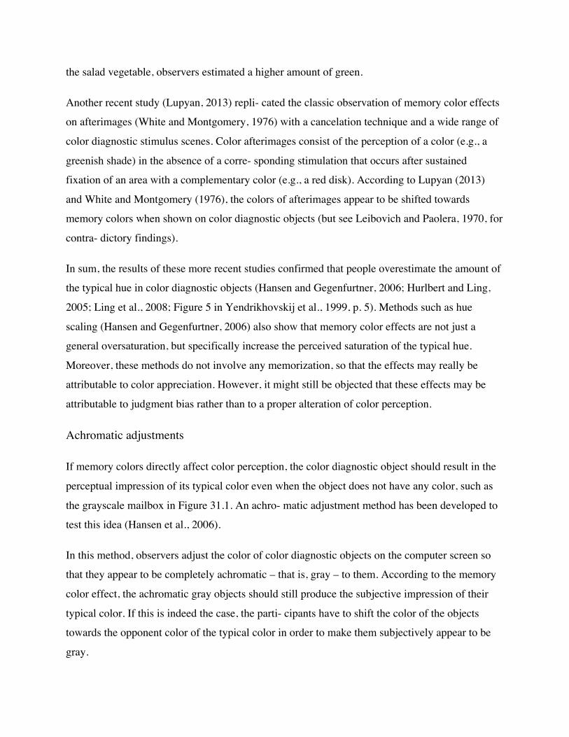
Figure 31.2 illustrates this idea with the exam- ple of the German mailbox. The German mailbox
is typically yellow. Its achromatic adjustment is indeed slightly shifted towards its opponent
color, which is blue. This implies that German obser- vers perceive the gray mailbox as slightly
yellow, and counteract this impression by adding blue in order that it subjectively appear as gray.
Such memory color effects have been consis- tently shown for photos of fruits and vegetables
(Hansen et al., 2006; Olkkonen et al., 2008; Witzel, 2012); for photos of color diagnostic man-
made objects, such as the mailbox (Witzel, 2012; Witzel et al., 2011); and for Japanese brand
logos (Kimura et al., 2013). In order to ascertain that these effects really involve color
appearance, several methodological controls were implemented in the achromatic adjustment
experiments, three of which will be briefly discussed below.
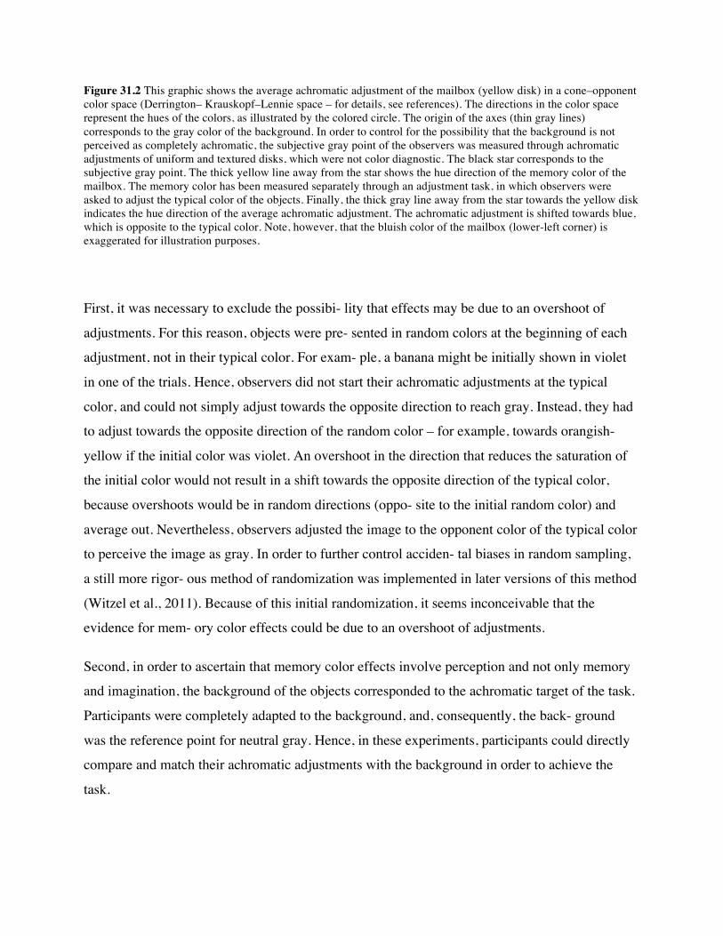
Figure 31.2 This graphic shows the average achromatic adjustment of the mailbox (yellow disk) in a cone–opponent color space (Derrington– Krauskopf–Lennie space – for details, see references). The directions in the color space represent the hues of the colors, as illustrated by the colored circle. The origin of the axes (thin gray lines) corresponds to the gray color of the background. In order to control for the possibility that the background is not perceived as completely achromatic, the subjective gray point of the observers was measured through achromatic adjustments of uniform and textured disks, which were not color diagnostic. The black star corresponds to the subjective gray point. The thick yellow line away from the star shows the hue direction of the memory color of the mailbox. The memory color has been measured separately through an adjustment task, in which observers were asked to adjust the typical color of the objects. Finally, the thick gray line away from the star towards the yellow disk indicates the hue direction of the average achromatic adjustment. The achromatic adjustment is shifted towards blue, which is opposite to the typical color. Note, however, that the bluish color of the mailbox (lower-left corner) is exaggerated for illustration purposes.
First, it was necessary to exclude the possibi- lity that effects may be due to an overshoot of
adjustments. For this reason, objects were pre- sented in random colors at the beginning of each
adjustment, not in their typical color. For exam- ple, a banana might be initially shown in violet
in one of the trials. Hence, observers did not start their achromatic adjustments at the typical
color, and could not simply adjust towards the opposite direction to reach gray. Instead, they had
to adjust towards the opposite direction of the random color – for example, towards orangish-
yellow if the initial color was violet. An overshoot in the direction that reduces the saturation of
the initial color would not result in a shift towards the opposite direction of the typical color,
because overshoots would be in random directions (oppo- site to the initial random color) and
average out. Nevertheless, observers adjusted the image to the opponent color of the typical color
to perceive the image as gray. In order to further control acciden- tal biases in random sampling,
a still more rigor- ous method of randomization was implemented in later versions of this method
(Witzel et al., 2011). Because of this initial randomization, it seems inconceivable that the
evidence for mem- ory color effects could be due to an overshoot of adjustments.
Second, in order to ascertain that memory color effects involve perception and not only memory
and imagination, the background of the objects corresponded to the achromatic target of the task.
Participants were completely adapted to the background, and, consequently, the back- ground
was the reference point for neutral gray. Hence, in these experiments, participants could directly
compare and match their achromatic adjustments with the background in order to achieve the
task.
Figure 31.3 Achromatic adjustments of color-neutral objects. Achromatic adjustments of the color-neutral sock (gray circle) and the achromatic golf ball are shown together with the adjustments of the uniform and the textured disks (black symbols), and two color diagnostic objects, the blue Nivea tin (blue symbol) and the yellow mailbox (yellow symbol). Details about stimuli and results are provided in Witzel et al. (2011). The adjustments of the two disks are used to determine the subjective gray point (black star, covered by other symbols). Horizontal and vertical lines around the symbols indicate standard errors of the mean (SEM). Note that the sock and the golf ball do not differ from the subjective gray point, indicating that the shifts of the mailbox and the Nivea tin are specific to their memory colors.
The role of the background as the achromatic reference of the adjustments has been further
highlighted in a follow-up study (Olkkonen et al., 2008), where the achromatic adjustments were
done under different illuminations – namely, red, green, blue, and yellow. As a result, the
background and the adaptation of the observer changed towards the respective illumination, and
the perceptual point of reference for neutral gray became the colored background. In these experi-
ments, memory color effects appeared relative to this background. For example, under blue
illumi- nation, participants shifted their achromatic adjustment of a banana image more towards
blue than their achromatic adjustments of the disks. Consequently, they shifted their adjust-
ments to the opponent color of the typical color in order that it appears in the same color as the

background. This implies that the memory color effect is guided by the perceptual comparison
with the background and cannot be due to mem- ory or imagination.
Third, the observed effects were specific to memory colors. The typical colors of the different
objects were very different, and hence the oppo- nent colors of the typical colors also varied
depending on the object. The memory color effect was evaluated specifically in the opposite
direc- tion of the typical color. The study with man-made objects sampled objects with typical
colors across the whole color space, including blue and purple colors (Witzel et al., 2011). Blue
and purple colors are in the opposite direction of the typical colors of fruits and vegetables.
Hence, memory color effects consist of shifts of achromatic adjustments to the opposite direction
for those objects than for fruits and vegetables. Nevertheless, the memory color effect also
occurred for purple and blue objects. Moreover, color-neutral objects, such as a sock or a golf
ball, reproduced the same sub- jective white point as the disks even though they had complex
color distributions (Witzel et al., 2011). These findings are illustrated by Figure 31.3. These
results show that the observed effects go in the direction determined by the memory colors, and
are not unspecific biases of achromatic adjustments. Finally, memory color effects could also be
produced on a monitor back- ground without an illumination chamber (Witzel, 2012). Hence the
memory color effects are not bound to the set-up with the light chamber, as used in the original
experiments.
In sum, the achromatic adjustment experi- ments (Hansen et al., 2006; Kimura et al., 2013;
Olkkonen et al., 2008; Witzel, 2011, 2012) showed that the memory color effect occurs spe-
cifically in the direction of the typical color. This implies that it is directly related to the typical
color, and is not a general bias to oversaturate or overshoot. Moreover, in the color-adjustment
experiments, observers could directly compare the hue of the image with the gray of the back-
ground. The fact that they still exhibited memory color effects shows that memory color effects
do not only consist of judgment biases but also mod- ulate color appearance.
Color discrimination
A follow-up study investigated whether memory colors influence even chromatic discrimination
and sensitivity to color differences (Hansen, Giesel, and Gegenfurtner, 2008). Sensitivity is the
basic ability to see differences between two colors. If memory colors affect sensitivity and
chromatic discrimination, observers would be more sensitive to the typical color of color
diagnostic objects and less sensitive to the color opponent to the typical color. For example, when
shown colors on a banana, they would be able to discriminate particularly small differences
between yellow and gray. At the same time, they would be unable to see differences between
blue and gray that they would have seen when pre- sented as color-neutral objects. In this case,
dis- crimination thresholds should be smaller towards the typical, and higher towards the
opponent color, as compared to discrimination thresholds for disks with the same textures as the
respective object. However, there was no such memory color effect on discrimination thresholds.
These results suggest that the memory color effect is part of subjective color appearance but is
not a sensory phenomenon. While the participants are able to discriminate the colors when shown
simultaneously on the same objects (e.g., two bananas), they subjectively appear to be different
when seen in isolation. This also explains why the gray mailbox in Figure 31.1 does not appear
yel- low when it can be directly compared to the “strongly” (i.e., highly saturated) yellow
mailbox. Color contrast has a strong effect on color appear- ance (e.g., Lotto and Purves, 2002),
while the memory color effect is comparatively small. For this reason, the strong color-contrast
effect most probably counteracts the weak memory color effect on color appearance in Figure
31.1.
Neurobiological evidence
Recent neurobiological evidence further supports the idea that memory colors directly affect
color appearance. Although some studies suggested that the cortical areas that subserve the
retrieval of memory color knowledge are distinct from those that subserve color perception (e.g.,
Chao and Martin, 1999; for review, see Tanaka, Weiskopf, and Williams, 2001), other studies
pro- vided evidence that some cortical regions are involved in both color perception and memory
color retrieval, indicating a certain degree of “common coding” of color perception and mem- ory
(e.g., Hsu, Frankland, and Thompson-Schill, 2012; Simmons et al., 2007).
In particular, a recent study (Bannert and Bartels, 2013) has shown color-specific brain activity
when observers see grayscale images of color diagnostic objects – that is, images without
chromatic information apart from association of the objects with their memory colors. This study
used color diagnostic objects for which a memory color effect was shown at the behavioral level
in previous studies, including the images of a banana, a lettuce, and a strawberry (Olkkonen et al.,
2008), and the images of a Nivea can, a German traffic sign, a Coca-Cola can, and a tennis ball
(Witzel, 2012; Witzel et al., 2011). Grayscale, achromatic versions of these images produced
color-specific responses in the primary visual cor- tex (V1). There was also some evidence for
con- nections between the primary visual cortex and extrastriate cortical structures, more
precisely the human visual area 4 (hV4) and the ventral occipi- tal lobe. Since the primary visual
cortex processes fundamental aspects of color perception, these results provide neurobiological
evidence that memory colors produce a perceptual impression of color (see also Vandenbroucke,
Fahrenfort, Meuwese, Scholte, and Lamme, in press).
Memory color effects on other aspects of color perception
Apart from the effects on color appearance, mem- ory colors affect color vision in scene and
object recognition, in color memory, in color naming, and in color constancy.
Scene and object recognition
Since color is a characteristic feature of color diagnostic objects, memory colors interfere with
color perception in scene and object recognition. Object recognition is better (faster and/or more
accurate) when color diagnostic objects are presented in their typical color than in an atypical
color or in grayscale (Goffaux, Jacques, Mouraux, Oliva, and Schyns, 2005; Nagai and
Yokosawa, 2003; Naor-Raz, Tarr, and Kersten, 2003; Nicholson and Humphrey, 2004; Rossion
and Pourtois, 2004; Tanaka and Presnell, 1999; Therriault, Yaxley, and Zwaan, 2009; Uttl, Graf,
and Santacruz, 2006). For example, the iden- tification of a banana is faster when it is shown in
yellow than in violet. Memory colors also support the recognition of material changes, such as
the decay of fruits (Yoonessi and Zaidi, 2010).
Moreover, the presence of typical colors improves scene recognition (Gegenfurtner and Rieger,
2000; Oliva and Schyns, 2000; Wichmann, Sharpe, and Gegenfurtner, 2002). While some studies
did not find any particular effect of color diagnosticity on object and scene recognition (e.g.,
Wurm, Legge, Isenberg, and Luebker, 1993), the majority of studies suggest that memory colors
increase the importance of color for scene recognition. The presence of color in scenes has a
stronger impact on object and scene recognition when the objects are color diagnostic (Bramao,

Reis, Petersson, and Faisca, 2011; Tanaka et al., 2001). Finally, memory colors also affect eye
movements during scene exploration (e.g., Ho-Phuoc, Guyader, Landragin, and Guérin-Dugué,
2012). In sum, memory colors improve object and scene recog- nition when objects and scenes
are seen in their typical colors (for review, see Bramao et al., 2011; Tanaka et al., 2001).
In addition, the object-color associations of memory colors have more far-reaching effects on the
role of color in object identification. When observers are exposed to these object- color
associations, memory colors prepare them to perceive certain objects, and they direct their
attention towards particular colors and objects in a scene. In particular, the presence of a certain
object automatically directs the observer’s atten- tion to its typical color in the scene even if it
occurs on other objects (Huettig and Altmann, 2011). Moreover, the color-object associations of
memory colors produce several kinds of prim- ing effects. In particular, seeing a color affects the
recognition of grayscale color diagnostic objects (Lewis, Pearson, and Khuu, 2013), and the
recog- nition of words that refer to such objects (Nijboer, van Zandvoort, and de Haan, 2006).
Such interference effects have also been found in chil- dren at the age of 3.5 years with an object-
Stroop paradigm (Prevor and Diamond, 2005), and for 2–3-year-old children in a free-looking
paradigm (Johnson and Huettig, 2011; Johnson, McQueen, and Huettig, 2011). However, these
priming and attentional effects do not necessarily involve color perception; instead they may
occur on a purely semantic basis, as in semantic priming (Joseph and Proffitt, 1996; Naor-Raz et
al., 2003; Nijboer et al., 2006; Yee, Ahmed, and Thompson-Schill, 2012).
Color memory
Color memory consists of memorizing a particu- lar color over time. There is some evidence that
appropriate colors that agree with the memory color of an object are remembered more accu-
rately (Ratner and McCarthy, 1990; Van Gulick and Tarr, 2010). For example, an orange color is
recalled more accurately than other colors when shown on a Halloween pumpkin, which is typi-
cally orange. Moreover, as with color appearance, color memory exaggerates the saturation of the
color when it is shown on a color diagnostic fruit or vegetable. However, shifts of memorized
col- ors towards the typical hue were not observed (Siple and Springer, 1983).
Color naming
In color naming, colors are assigned to color terms that define color categories, such as red, pink,
purple, etc. Colors are named differently when shown on color diagnostic objects. In parti- cular,
the yellow category is extended in size when colors are shown on a banana (Ling et al., 2008).
Moreover, when an ambiguous color is shown on a color diagnostic object, observers adapt, or
“recalibrate,” their linguistic categories to include this color in the category that corre- sponds to
the object’s memory color (Mitterer and de Ruiter, 2008). For example, if an ambig- uous
orange-yellow color is shown on a banana, observers widen their yellow category to include this
color, and begin to call it yellow even when it is shown on a color-neutral sock.
However, object-specific effects on color nam- ing are not simply due to a shift towards the
memory color. They also occur for language- specific associations between objects and color
names. Even though the middle, yellow traffic light has the same color in Germany and the
Netherlands, it is called differently in German and Dutch – namely, yellow and orange, respec-
tively. Consequently, in a color-naming task with yellow-orange colors, Germans call more
colors yellow than Dutch people when they are pre- sented on the middle traffic light (Mitterer,
Horschig, Musseler, and Majid, 2009).
Color constancy
Color constancy refers to the stability of color appearance across changes of illumination. It has
been suggested that the comparison between actual and memory colors allows for estimating the
color change that is due to the illumination (for a discussion, see Hurlbert and Ling, 2005; Ling
and Hurlbert, 2006; Olkkonen et al., 2008). For example, the presence of a banana could help to
compare the greenish yellow under a green illumination in a given scene with the typical yellow
under a white illumination in memory.
However, evidence in support of this idea is ambiguous. On the one hand, there is evidence that
color constancy improves in the presence of color diagnostic objects. Color diagnostic objects
seem to serve as cues when estimating colors under water (Emmerson and Ross, 1987) and
matching colors simultaneously across strongly different illuminations (Granzier and
Gegenfurtner, 2012). On the other hand, color constancy barely improves in successive matches

of colors in the presence of a banana (Kanematsu and Brainard, 2014). In addition, the presence
of color diagnostic objects does not improve the recognition of illuminations (Pearce, Crichton,
seems to be some impact of memory colors on color constancy, but the effect is small compared
to other determinants of color constancy.
Summary and implications
In addition to the classic memory color effects on color appearance, memory colors also
automati- cally influence how color information is used in perceptual tasks. They constitute
points of refer- ence for several kinds of visual evaluations and judgments, and hence interfere
with the percep- tual information about color. In natural environ- ments, where objects usually
appear in their typical color, the interference effects strengthen color information about objects.
When color information is used in everyday life, there are considerable levels of uncertainty.
Features of objects and materials may vary across different instances of these objects and
materials (e.g., different examples of apples). Moreover, comparing object colors across time
involves the uncertainty of memory. Finally, changes of illumination introduce another source of
variabil- ity about object colors. The effects of memory colors help to deal with the uncertainty
that arises from these sources of noise and variability.
Determinants of memory color effects
Memory color effects do not occur to the same extent for all objects. Some objects have been
repeatedly shown to produce particularly strong memory color effects. This is the case for the
banana, for which achromatic adjustments were shifted up to 17% (Olkkonen et al., 2008, and
still higher in preliminary pilot studies), and which also yielded particularly strong memory color
effects in other studies (e.g., Lewis et al., 2013). In contrast, there is barely any evidence for
memory colors for red objects, such as a heart (Harper, 1953; Witzel et al., 2011) or a strawberry
(Olkkonen et al., 2008). Several factors modulate the strength of memory color effects.
Mackiewicz, Finlayson, and Hurlbert, 2014). When the evidence is taken together, there
Perceptual information and recognizabilityMemory color effects directly depend on percep-
tual information other than color. In this context, perceptual information refers to perceptual char-
acteristics that allow the observer to recognize and identify the object. These characteristics

comprise the two-dimensional outline shape, sur- face texture, three-dimensionality, and
polychro- maticity (i.e., the fact that object surfaces consist of color distributions rather than
uniformly colored areas).
Outline shapes, such as those used in classic studies of memory color effects, are void of texture
and three-dimensional cues. Memory color effects have been shown to be much weaker for
outline shapes than for photos of fruits in hue scaling (Hansen and Gegenfurtner, 2006) and in
achro- matic adjustment (Olkkonen et al., 2008). Moreover, Olkkonen and colleagues also mea-
sured memory color effects for photos of painted fruits, which do not have natural texture
(Olkkonen et al., 2008). Memory color effects were highest for the original photos with most
perceptual infor- mation, while they were least for the outline shapes with the least perceptual
information.
These effects of perceptual information are further clarified by the finding that memory col- ors
of fruits are more accurate and more precise for representations that are three-dimensional,
textured, and polychromatic (Vurro, Ling, and Hurlbert, 2013). The fact that impoverished
representations, such as outline shapes, imply only vague memory colors explains why their
memory color effects are comparatively weak. Moreover, as with memory color effects, three-
dimensional polychromatic images of bananas still have more accurate memory color associa-
tions than other fruits (Vurro et al., 2013).
However, what is important for memory color effects is not the mere fact that stimuli are three-
dimensional, textured, and polychromatic. The fact that memory color effects also occurred for
artificial objects shows that these effects are not particular to natural objects and natural color
distributions. The man-made objects that pro- duced memory color effects included two-
dimensional objects with uniform color areas, such as an image of a smurf. Finally, there is
evidence that low rather than high spatial fre- quencies are important for memory color effects in
color priming of achromatic fruits. This finding further undermines the idea that texture, which is
defined by high spatial frequencies, is central to memory color effects (Lewis et al., 2013).
Hence, memory color effects depend neither on three-dimensionality nor on color distribu- tion,
but rather on the recognizability of the object. Recognizability refers to how clearly the
characteristic features of the object are visi- ble so that the object (e.g., a particular banana) can
be identified as an instance of its object class (e.g., bananas). This idea is supported by the
observation that performance in reporting mem- ory colors for gray representations of the objects
increases with increasing recognizability (Witzel et al., 2011).
Color diagnosticity and familiarity
Color diagnosticity has an objective and a sub- jective side (Witzel and Gegenfurtner, 2013). On
the objective side, an object or object class is color diagnostic when instances of these objects
vary in a limited range of colors that defines their typical color. On the subjective side, an object
is only color diagnostic if the observer is familiar with that object, and knows its typical color.
Not surprisingly, subjective color diagnosticity is cor- related with the strength of memory color
effects (Witzel et al., 2011). Objects with low color diag- nosticity are unlikely to produce
memory color effects (Kimura et al., 2013; Witzel et al., 2011).
However, there is no study in which memory color effects occurred for object-color associa- tions
that were acquired under controlled condi- tions. For example, in an additional study, we
familiarized observers with a novel object. The novel object was a yellow, woolen pompom that
was put on the office desk of the observers for 2–3 months. However, this familiarization
procedure seems not to have been sufficient. Although mea- sures of subjective color
diagnosticity and mem- ory color effects tended to be higher for the familiarized observers than
for a control group that saw the object only briefly before measure- ments, these tendencies were
not statistically sig- nificant (Witzel, 2012). Another unpublished follow-up study by Gesche
Huebner and Martin Giesel (personal communication) trained obser- vers to associate particular
colors with geometri- cal shapes (circles, triangles, and squares), but did not find memory color
effects with these acquired memory colors either. In summary, memory color effects in
achromatic adjustments could be shown only for the most color diagnostic objects with which
observers had been familiar throughout their lives.
Daylight axis and asymmetries of color spaceMemory color effects on color appearance
occur most strongly along the daylight axis, which cor- responds to a curve that goes
approximately through typical blue and yellow (Witzel et al., 2011). Adjustments of achromatic
colors (gray levels) vary most strongly along the daylight axis, even for color-neutral objects,
such as the disks, the golf ball, and the sock. Due to the uncertainty along the daylight axis,

memory col- ors may have a stronger effect on color appear- ance. In fact, a recent study even
showed that observers are particularly insensitive to changes of colors in the blue direction of
daylight (Pearce et al., 2014). The insensitivity of the changes towards blue also explains the
systematic bias of the subjective white point towards blue (cf. the black star in Figures 31.2 and
31.3), since varia- tion in this direction produces shifts of the mean into that direction.
Adaptation and measurement precision
The light chamber used in the original achromatic adjustment studies enhances adaptation, and
hence the precision of color appreciation (also shown for color naming by Hansen, Walter, and
Gegenfurtner, 2007). The study without the light chamber yielded much weaker memory color
effects, even for stimuli that were the same as in previous studies, such as the mailbox or the
banana (Witzel, 2012). These findings highlight the fact that the control of adaptation and the
precision of color-appearance measurements affect the measurement of memory colors.
Summary and implications
In sum, the characteristics of stimuli and material strongly modulate the strength of memory color
effects. Variation in stimulus and material may also explain why some of the classic experiments
in the past found consistent memory color effects (e.g., Delk and Fillenbaum, 1965; Duncker,
1939), and some did not (in particular, see Bolles et al., 1959; Bruner et al., 1951; Fisher et al.,
1956; Leibovich and Paolera, 1970; Pérez- Carpinell et al., 1998). Low perceptual informa- tion
and recognizabilty result in weak and unstable memory color effects. In particular, the weak
memory color effects for outline shapes explain why some of the classic studies that used outline
shapes yielded inconsistent findings. The lack of rigorous control of color diagnosticity provides
another explanation of why classic stu- dies may have yielded inconsistent results. The role of the
daylight axis for memory color effects also suggests that those classic studies might have
obtained weaker and less stable memory color effects because they concentrated on objects with
red (Bruner et al., 1951; Fisher et al., 1956) and green (Bolles et al., 1959) memory colors.
Finally, incomplete adaptation and measurement imprecision may also yield inconsistent results
for memory color effects across studies.
At the same time, some differences across objects still remain unexplained. It is unclear why

bananas yield particularly strong memory color effects since they did not seem to be parti- cularly
recognizable or color diagnostic (cf. Figure 1 in Witzel et al., 2011). It seems that bananas have a
particularly characteristic three- dimensional shape and polychromatic texture, supporting the
accuracy of the association between bananas and their typical yellow (Vurro et al., 2013). This
might explain why bananas yield the highest memory color effects.
Moreover, memory color effects were particu- larly rare for objects with red memory colors
throughout a wide range of studies. This was the case even though red objects, such as the straw-
berry and the heart, yielded particularly high per- formances in the measurement of subjective
color diagnosticity (Witzel et al., 2011). Moreover, the effect of the daylight axes cannot explain
why red objects yield even lower memory color effects than green objects. However, the lack of
memory color effects for those red objects seems not to be simply related to the color red since
red brand logos seem to produce memory color effects (Kimura et al., 2013).
Broader implications and conclusions
Memory colors affect several aspects of color perception. The observation of such effects has
implications for questions about functional seg- regation, about modularity and cognitive penetr-
ability, about the influence of learning and the origin of perceptual features, and about whether
color corresponds to a physical, objective, or a psychological, subjective reality.
Functional segregation
Functional segregation in high-level vision is a major topic in color research (Gegenfurtner,
2003; Gegenfurtner and Kiper, 2003). Functional segregation refers to the idea that color is
perceived independently of other elemen- tary visual attributes, such as shape, texture, or depth.
In particular, this idea implies that infor- mation about color is processed by cortical cells that are
functionally separable from those that process other visual attributes (Miceli et al., 2001;
Wandell, 1995).
Memory color effects contradict this idea (Ling and Hurlbert, 2004; Naor-Raz et al., 2003;
Olkkonen et al., 2008; Witzel et al., 2011). They show that color perception depends on the
objects on which the colors are shown. Consequently, color is not perceived independently of

other visual features that determine the identity of the objects. The evidence from neuroimaging
(Bannert and Bartels, 2013) shows that the effects of object identity may even interact with color
vision in the primary visual cortex, in a very early stage of color processing.
Modularity and cognitive penetrability
More generally, memory color effects undermine the idea that psychological functions and phe-
nomena, such as perception, cognition, memory, and consciousness, are necessarily modular.
Similar to functional segregation, modularity refers to the idea that different psychological
phenomena are independent of each other and correspond to separate neural processes and
structures (Stokes, 2013). Contrary to the idea of modularity, memory color effects suggest that
memory and perception are not independent func- tions and phenomena.
Since knowledge and memory are considered to be part of cognition, memory color effects have
been taken as evidence for the cognitive penetrability of visual perception (Lyons, 2011;
MacPherson, 2012; Siegel, 2012; Toribio, 2014). Cognitive penetrability refers to the idea that
perception may be influenced or “penetrated” by cognition (Collins and Olson, 2014; Deroy,
2013; Lyons, 2011).
Critics of the idea of cognitive penetrability have argued that memory color effects are evidence
for increased object sensitivity at a per- ceptual rather than cognitive level (Deroy, 2013). In this
case, the knowledge about the color diagnostic object, including its memory color, that allows the
recognition of the object is included in perception. Other critics have argued that memory color
effects in achromatic adjust- ments are due to changes in the criterion of jud- ging the presence or
absence of a color, rather than to changes in sensitivity (Zeimbekis, 2013). However, this
argument implies that low-level sensory sensitivity is the main element of percep- tion. With
respect to these arguments, it is crucial to clearly distinguish between what belongs to perception
and what to cognition (Stokes, 2013).
Empirically, there is no evidence that memory colors affect low-level sensory perception in terms
of discrimination thresholds (Hansen et al., 2008). Hence, observers are able to see when the
color changes from gray to the opponent direction independently of the memory color.
Nevertheless, a banana and a German mailbox subjectively look gray when they are shown in a

slightly bluish color, but not when they are in exactly the same gray color as their background
(Hansen et al., 2006; Olkkonen et al., 2008; Witzel et al., 2011). Consequently, memory colors
affect how “higher-level” perception uses sensory information to determine the subjective
impression of color.
In contrast to a modular conception, percep- tion and cognition could be the result of the same, or
at least overlapping, brain functions. In this case, cognition is not independent of perception, but
is situated or grounded in sensor- imotor experience (Barsalou, 2008; King, 2000; O’Connor and
Glenberg, 2003). In particular, the idea of neural network models illustrates that memory and
knowledge might be an emer- gent property of perception itself (Fuster, 1997; Versace et al.,
2014). In this case, memory color effects would be inherent in the learning of the statistical
regularities that takes place during perception. Neurobiological results that find overlaps between
neural processing of color perception and memory (Bannert and Bartels, 2013; Hsu et al., 2012)
could be explained by this idea.
Perceptual learning and constructivism
Memory color effects support the idea that learn- ing and experience influence or even shape per-
ception (Adams, 1923; Baker and Mackintosh, 1955; Bruner et al., 1951; Duncker, 1939; Fisher
et al., 1956; Harper, 1953; Hering, 1964/1878; von Helmholtz, 1925/1867). Memory color effects
are due to the association between object and color. The association between an object and its
memory color must be due to the experience of the observer with this object. This is particularly
clear for man-made objects that are specific to a certain cultural context and do not exist in nature
(Witzel et al., 2011). Hence, memory color effects support the idea that learning and experi- ence
influence perception.
Past experiences with regularities in the environment produce expectations about what kinds of
events and regularities are most likely to happen in the future. Experience with sys- tematic
associations between an object (e.g., a banana or a mailbox) and a certain range of typical colors
(e.g., different shades of yellow) produce expectations about the possible colors of a new instance
of that object class. For exam- ple, from experience that ripe bananas are mainly yellow, it might
be unexpected that, under some circumstances, bananas are actually blue (Moser et al., 2008).
Memory color effects support the idea that such expectations shape and modulate conscious
perception (Cheung and Bar, 2012; Gosselin and Schyns, 2003; Panichello, Cheung, and Bar,
2012).
Visual experience shapes perception through perceptual learning (Fahle, 2009; Goldstone, 1998;
Lu, Hua, Huang, Zhou, and Dosher, 2011). Perceptual learning may even occur during mere
exposure to statistical patterns (e.g., Watanabe, Náñez, and Sasaki, 2001). Hence, per- ceptual
learning may explain how the repeated experience of objects (e.g., bananas or mail- boxes) in
particular colors (e.g., shades of yellow) produces a bias in color perception.
The effects of past experience and perceptual learning also explain why a beholder perceives
stable object features in the first place. In parti- cular, perceptual learning of regularities in the
visual environment may create features that may be used to identify objects (e.g., Dorffner, 1998;
Rumelhart and Zipser, 1985; Schyns, Goldstone, and Thibaut, 1998; St. Julien, 1997). Which fea-
tures these are, and to what extent they are a product of perceptual learning or of innate prop-
erties of the visual system, are empirical ques- tions. The memory color effect shows that even
the basic feature of color is malleable to visual experience, and hence it supports the general idea
that features are shaped, and may be produced through learning and experience. In this way, it
also supports the constructivist idea that per- ceived reality is shaped through interaction with the
physical and social environment (Watzlawick, 1984; Wittgenstein, 1953).
Concept of color and color realism
The impact of learning and prior experience on color perception also implies that color
perception is influenced by subjective experience. In this way, memory color effects highlight the
subjective dimension of color perception. For example, red might be a memory color of the
banana, if the beholder was familiar, not with yellow Cavendish bananas, but with red Dacca
bananas (Witzel and Gegenfurtner, 2013). For this reason, memory color effects are also relevant
to the understanding of what color actually is. This question is discussed in the debate on color
realism (e.g., Byrne and Hilbert, 2003). Color realism claims that color is a property of the
physical environment (Broackes, 1992; Byrne and Hilbert, 2003; Hyman, 2005; Ross, 2001). In
contrast, color subjectivism claims that color is a purely psychological phenomenon (Hardin,
1988), and color relationalism postulates that color is defined by the relationship between
physical properties and the observer (e.g., Cohen,
2006). In both the last two cases, color is assumed to be relative to the observer.
Although memory color effects indicate that color appearance changes with the observer’s
personal experience, they do not imply that color appearance is completely subjective and
arbitrary. The influence of memory colors on color appearance goes in a direction that stabi- lizes
the association between the perceptual impression of color and the characteristics of objects in
the environment. In this way, memory color stabilizes the perception of the object as it naturally
occurs in the visual environment. It reduces uncertainty about object and color iden- tity by
combining different kinds of information so as to yield the most likely percept. From this
perspective, memory color effects make color perception more realistic by reinforcing the link
between perceived colors and other object prop- erties. Hence, they increase the reliability of
reference between the subjective impression and the physical characteristics of objects in the
envir- onment (Witzel, 2011, 2012).
For the concept of color, the observation of memory color effects suggests that the nature of color
is not the subjective impression alone, inde- pendent of stimulation through the visual envir-
onment, nor is it a characteristic of the physical environment (e.g., Cohen, 2006; Wright, 2010).
Instead, it may be understood as the product of “unconscious inference” (von Helmholtz, 1925/
1867) that establishes a link between the physical environment and the subjective impression.
The reliability of this link constitutes the reality of color. Research on the memory color effect
high- lights how this link is “constructed” through the experience of the visual system with the
visual environment.
Acknowledgements
CW’s contribution to this chapter was financed by J. Kevin O’Regan’s ERC Advanced Grant
“FEEL” (#323674).
References
Adams, G. K. (1923). An experimental study of memory color and related phenomena. American Journal of
Psychology, 34(3), 359–407.
Baker, K. E., and Mackintosh, I. (1955). The influence of past associations upon attributive color judgments.
Journal of Experimental Psychology, 49(4), 281–6.
Bannert, M. M., and Bartels, A. (2013). Decoding the yellow of a gray banana. Current Biology, 23(22), 2268–
72.
Barsalou, L. W. (2008). Grounded cognition. Annual Review of Psychology, 59, 617–45.
Bartleson, C. J. (1960). Memory colors of familiar objects. Journal of the Optical Society of America, 50, 73–7.
Bolles, R. C., Hulicka, I. M., and Hanly, B. (1959). Color judgment as a function of stimulus conditions and
memory color. Canadian Journal of Psychology, 13, 175–85.
Bramao, I., Reis, A., Petersson, K. M., and Faisca, L. (2011). The role of color information on object
recognition: a review and meta-analysis. Acta Psychologica, 138(1), 244–53.
Broackes, J. (1992). The autonomy of color. In K. Lennon and D. Charles (eds.), Reduction, Explanation and
Realism (pp. 421–65). Oxford University Press.
Bruner, J. S., Postman, L., and Rodrigues, J. (1951). Expectation and the perception of color. American Journal
of Psychology, 64(2), 216–27.
Byrne, A., and Hilbert, D. R. (2003). Color realism and color science. Behavioral and Brain Sciences, 26(1), 3–
21; discussion 22–63.
Chao, L. L., and Martin, A. (1999). Cortical regions associated with perceiving, naming, and knowing about
colors. Journal of Cognitive Neuroscience, 11(1), 25–35.
Cheung, O. S., and Bar, M. (2012). Visual prediction and perceptual expertise. International Journal of
Psychophysiology, 83(2), 156–63.
Cohen, J. (2006). Color and perceptual variation revisited: unknown facts, alien modalities, and perfect
psychosemantics. Dialectica, 60(3), 307–19.
Collins, J. A., and Olson, I. R. (2014). Knowledge is power: how conceptual knowledge transforms visual
cognition. Psychonomic Bulletin & Review, 21(4), 843–60.
Delk, J. L., and Fillenbaum, S. (1965). Differences in perceived color as a function of characteristic color.
American Journal of Psychology, 78, 290–3.
Deroy, O. (2013). Object-sensitivity versus cognitive penetrability of perception. Philosophical Studies, 162(1),
87–107.
Dorffner, G. (1998). Flexible features, connectionism, and computational learning theory. Behavioral and Brain
Sciences, 21, 24–5.
Duncker, K. (1939). The influence of past experience upon perceptual properties. American Journal of
Psychology, 52(2), 255–65.
Emmerson, P. G., and Ross, H. E. (1987). Variation in color constancy with visual information in the
underwater environment. Acta Psychologica, 65(2), 101–13.
Fahle, M. (2009). Perceptual learning and sensomotor flexibility: cortical plasticity under attentional control?
Philosophical Transactions of the Royal Society of London. Series B, Biological Sciences, 364(1515), 313–19.
Fisher, S. C., Hull, C., and Holtz, P. (1956). Past experience and perception: memorycolor. American Journal
of Psychology, 69(4), 546–60.
Fuster, J. M. (1997). Network memory. Trends in Neurosciences, 20(10), 451–9.
Gegenfurtner, K. R. (2003). Cortical mechanisms of color vision. Nature Reviews Neuroscience, 4, 563–72.
Gegenfurtner, K. R., and Kiper, D. C. (2003). Color vision. Annual Review of Neuroscience, 26(1), 181–206.
Gegenfurtner, K. R., and Rieger, J. (2000). Sensory and cognitive contributions of color to the recognition of
natural scenes. Current Biology, 10(13), 805–8.
Goffaux, V., Jacques, C., Mouraux, A., Oliva, A., and Schyns, P. G. (2005). Diagnostic colours contribute to
early stages of scene categorization: behavioural and neurophysiological evidence. Visual Cognition, 12(6),
878–92.
Goldstone, R. L. (1998). Perceptual learning. Annual Review of Psychology, 49, 585–612.
Gosselin, F., and Schyns, P. G. (2003). Superstitious perceptions reveal properties of internal representations.
Psychological Science, 14(5),
505–9.Granzier, J. J. M., and Gegenfurtner, K. R. (2012). Effects
of memory color on color constancy for unknown
colored objects. i-Perception, 3(3), 190–215. Hansen, T., and Gegenfurtner, K. R. (2006). Color

scaling of discs and natural objects at different luminance levels. Visual Neuroscience, 23(3–4), 603–10.
Hansen, T., Giesel, M., and Gegenfurtner, K. R. (2008). Chromatic discrimination of natural objects. Journal of
Vision, 8(1), 2, 1–19.
Hansen, T., Olkkonen, M., Walter, S., and Gegenfurtner, K. R. (2006). Memory modulates color appearance.
Nature Neuroscience, 9(11), 1367–8.
Hansen, T., Walter, S., and Gegenfurtner, K. R. (2007). Effects of spatial and temporal context on color
categories and color constancy. Journal of Vision, 7(4), 1–15.
Hardin, C. L. (1988). Color for Philosophers: Unweaving the Rainbow. Indianapolis, IN: Hackett.
Harper, R. S. (1953). The perceptual modification of colored figures. American Journal of Psychology, 66(1),
86–9.
(1972). Human Senses in Action. Edinburgh: Churchill Livingstone.
Hering, E. (1964/1878). Outlines of a Theory of the Light Sense, trans. M. Hurvich and D. Jameson.
Cambridge, MA: Harvard University Press.
Herring, B. S., and Bryden, M. P. (1970). Memory color effects as a function of viewing time. Canadian
Journal of Psychology, 24, 127–32.
Ho-Phuoc, T., Guyader, N., Landragin, F., and Guérin- Dugué, A. (2012). When viewing natural scenes, do
abnormal colors impact on spatial or temporal parameters of eye movements? Journal of Vision, 12(2).
Hsu, N. S., Frankland, S. M., and Thompson-Schill, S. L. (2012). Chromaticity of color perception and object
color knowledge. Neuropsychologia, 50(2), 327–33.
Huettig, F., and Altmann, G. T. (2011). Looking at anything that is green when hearing “frog”: how object
surface color and stored object color knowledge influence language-mediated overt attention. Quarterly Journal
of Experimental
Psychology, 64(1), 122–45.Hurlbert, A. C., and Ling, Y. (2005). If it’s a banana, it
must be yellow: the role of memory colors in color
constancy. Journal of Vision, 5(8), 787–7. Hyman, J. (2005). What, if anything, are colors relative

to? Philosophy, 80(04), 475–94.Jameson, D., and Hurvich, L. M. (1989). Essay
concerning color constancy. Annual Review of
Psychology, 40, 1–22.Johnson, E. K., and Huettig, F. (2011). Eye movements
during language-mediated visual search reveal a strong link between overt visual attention and lexical
processing in 36-month-olds. Psychological Research, 75(1), 35–42.
Johnson, E. K., McQueen, J. M., and Huettig, F. (2011). Toddlers’ language-mediated visual search: they need
not have the words for it. QuarterlyJournal of Experimental Psychology, 64(9), 1672–82.
Joseph, J. E., and Proffitt, D. R. (1996). Semantic versus perceptual influences of color in object recognition.
Journal of Experimental Psychology: Learning, Memory, and Cognition, 22(2), 407–29.
Kanematsu, E., and Brainard, D. H. (2014). No measured effect of a familiar contextual object on color
constancy. Color Research & Application, 39(4), 347–59.
Kimura, A., Wada, Y., Masuda, T., Goto, S., Tsuzuki, D., Hibino, H., and Dan, I. (2013). Memory color effect
induced by familiarity of brand logos. PLoS ONE, 8(7), e68474.
King, A. (2000). Situated cognition. In A. E. Kazdin (ed.), Encyclopedia of Psychology (vol. VII, pp. 289–91).
New York: Oxford University Press.
Leibovich, B., and Paolera, M. B. (1970). Research on color perception and after-image in relation to
significant images. Annales Médico- Psychologiques, 128(5), 735–42.
Lewis, D. E., Pearson, J., and Khuu, S. K. (2013). The color “fruit”: object memories defined by color. PLoS
ONE, 8(5), e64960.
Ling, Y., Allen-Clarke, L., Vurro, M., and Hurlbert, A. C. (2008). The effect of object familiarity and changing
illumination on color categorization. Perception, 37(ECVP Abstract Suppl.), 149.
Ling, Y., and Hurlbert, A. C. (2004). Color and size interactions in a real 3D object similarity task. Journal of
Vision, 4(9), 721–34.
(2006). Color-memory-dependent color constancy: 2D vs 3D real surfaces. Paper presented at the Third
European Conference on Color in Graphics, Imaging, and Vision (CGIV).
Lotto, R. B., and Purves, D. (2002). The empirical basis of color perception. Consciousness and Cognition,
11(4), 609–29.
Lu, Z. L., Hua, T., Huang, C. B., Zhou, Y., and Dosher, B. A. (2011). Visual perceptual learning. Neurobiology
of Learning and Memory, 95(2), 145–51.
Lupyan, G. (2013). Semantic effects on color afterimages. Journal of Vision, 13(9), 466. Lyons, J. (2011).
Circularity, reliability, and the
cognitive penetrability of perception.
Philosophical Issues, 21(1), 289–311. MacPherson, F. (2012). Cognitive penetration of color
experience. Philosophy and Phenomenological
Research, 84(1), 24–62.Miceli, G., Fouch, E., Capasso, R., Shelton, J. R.,
Tomaiuolo, F., and Caramazza, A. (2001). The dissociation of color from form and function knowledge. Nature
Neuroscience, 4(6), 662–7.
Mitterer, H., and de Ruiter, J. P. (2008). Recalibrating color categories using world knowledge. Psychological
Science, 19(7), 629–34.
Mitterer, H., Horschig, J. M., Musseler, J., andMajid, A. (2009). The influence of memory on perception: it’s
not what things look like, it’s what you call them. Journal of Experimental Psychology: Learning, Memory, and
Cognition, 35(6), 1557–62.
Moser, S., Muller, T., Ebert, M. O., Jockusch, S., Turro, N. J., and Krautler, B. (2008). Blue luminescence of
ripening bananas. Angewandte Chemie International Edition, 47 (46), 8954–7.
Nagai, J.-I., and Yokosawa, K. (2003). What regulates the surface color effect in object recognition: color
diagnosticity or category? Technical Report on Attention and Cognition, 28.
Naor-Raz, G., Tarr, M. J., and Kersten, D. (2003). Is color an intrinsic property of object representation?
Perception, 32(6), 667–80.
Newhall, S. M., Burnham, R. W., and Clark, J. R. (1957). Comparison of successive with simultaneous color
matching. Journal of the Optical Society of America, 47, 43–54.
Nicholson, K. G., and Humphrey, G. K. (2004). The effect of color congruency on shape discriminations of
novel objects. Perception, 33(3), 339–53.
Nijboer, T. C., van Zandvoort, M. J., and de Haan, E. H. (2006). Seeing red primes tomato: evidence for
comparable priming from color and color name primes to semantically related word targets. Cognitive
Processing, 7(4), 269–74.
O’Connor, K., and Glenberg, A. M. (2003). Situated cognition. In L. Nadel (ed.), Encyclopedia of Cognitive
Science (vol. IV, pp. 19–25). London: Nature Publishing Group.
Oliva, A., and Schyns, P. G. (2000). Diagnostic colors mediate scene recognition. Cognitive Psychology, 41(2),
176–210.
Olkkonen, M., Hansen, T., and Gegenfurtner, K. R. (2008). Color appearance of familiar objects: effects of
object shape, texture, and illumination changes. Journal of Vision, 8(5), 1–16.
(2012). High-level perceptual influences on color appearance. In G. Hatfield and A. Sarah (eds.), Visual
Experience: Sensation, Cognition, and Constancy (pp. 179–98). Oxford University Press.
Panichello, M. F., Cheung, O. S., and Bar, M. (2012). Predictive feedback and conscious visual experience.
Frontiers in Psychology, 3, 620.
Pearce, B., Crichton, S., Mackiewicz, M.,Finlayson, G. D., and Hurlbert, A. (2014). Chromatic illumination
discrimination ability reveals that human color constancy is optimised for blue daylight illuminations. PLoS
ONE, 9(2), e87989.
Pérez-Carpinell, J., Fez, M. D., Baldoví, R., and Soriano, J. C. (1998). Familiar objects and memory color.
Color Research & Application, 23(6), 416–27.
Prevor, M. B., and Diamond, A. (2005). Color-object interference in young children: a Stroop effect in children
3(1/2)–6(1/2) years old. Cognitive Development, 20(2), 256–78.
Ratner, C., and McCarthy, J. (1990). Ecologically relevant stimuli and color memory. Journal of General
Psychology, 117(4), 369–77.
Ross, P. W. (2001). The location problem for color subjectivism. Consciousness and Cognition, 10(1), 42–58.
Rossion, B., and Pourtois, G. (2004). Revisiting Snodgrass and Vanderwart’s object pictorial set: the role of
surface detail in basic-level object recognition. Perception, 33(2), 217–36.
Rumelhart, D. E., and Zipser, D. (1985). Feature discovery by competitive learning. Cognitive Science, 9, 75–
112.
Schyns, P. G., Goldstone, R. L., and Thibaut, J.-P. (1998). The development of features inobject concepts.
Behavioral and Brain Sciences, 21, 1–17.
Siegel, S. (2012). Cognitive penetrability and perceptual justification. Noûs, 46(2), 201–22.
Simmons, W. K., Ramjee, V., Beauchamp, M. S., McRae, K., Martin, A., and Barsalou, L. W. (2007). A
common neural substrate for perceiving and knowing about color. Neuropsychologia, 45(12), 2802–10.
Siple, P., and Springer, R. M. (1983). Memory and preference for the colors of objects. Perception and
Psychophysics, 34(4), 363–70.
Sternheim, C. E., and Boynton, R. M. (1966). Uniqueness of perceived hues investigated with a continuous
judgmental technique. Journal of Experimental Psychology, 72(5), 770–6.
St. Julien, J. (1997). Explaining learning: the research trajectory of situated cognition and the implications of
connectionism. In D. Kirshner and J. A. Whitson (eds.), Situated Cognition: Social, Semiotic, and
Psychological Perspectives
(pp. 261–80). Mahwah, NJ: Lawrence Erlbaum
Associates.Stokes, D. (2013). Cognitive penetrability of
perception. Philosophy Compass, 8(7), 646–63. Tanaka, J. W., and Presnell, L. M. (1999). Color
diagnosticity in object recognition. Perception
and Psychophysics, 61(6), 1140–53.Tanaka, J. W., Weiskopf, D., and Williams, P. (2001).
The role of color in high-level vision. Trends in
Cognitive Sciences, 5(5), 211–15. Therriault, D. J., Yaxley, R. H., and Zwaan, R. A.
(2009). The role of color diagnosticity in object recognition and representation. Cognitive Processing, 10(4),
335–42.
Toribio, J. (2014). Nonconceptualism and the cognitive impenetrability of early vision. Philosophical
Psychology, 27(5), 621–42.
Uttl, B., Graf, P., and Santacruz, P. (2006). Object color affects identification and repetition priming.
Scandinavian Journal of Psychology, 47(5), 313–25.

Van Gulick, A. E., and Tarr, M. J. (2010). Is object color memory categorical? Journal of Vision, 10(7), 407.
Vandenbroucke, Fahrenfort, Meuwese, Scholte, and Lamme. (in press). Prior knowledge about objects
determines neural color representation in human visual cortex. Cerebral Cortex.
Versace, R., Riou, B., Vallet, G. T., Lesourd, M., Labeye, É., and Brunel, L. (2014). ACT-IN: an integrated
view of memory mechanisms. Journal of Cognitive Psychology, 26, 280–306.
von Helmholtz, H. (1924/1867). Treatise on Physiological Optics, vol. II (J. P. C. Southall ed.). Menasha, WI:
Optical Society of America.
(1925/1867). Treatise on Physiological Optics, vol. III (J. P. C. Southall, ed.). Menasha, WI: Optical Society of
America.
Vurro, M., Ling, Y., and Hurlbert, A. C. (2013). Memory color of natural familiar objects: effects of surface
texture and 3-D shape. Journal of Vision, 13(7), 20.
Wandell, B. A. (1995). Foundations of Vision. Sunderland, MA: Sinaur Associates.
Watanabe, T., Náñez, J. E., and Sasaki, Y. (2001). Perceptual learning without perception. Nature, 413, 844–8.
Watzlawick, P. (ed.) (1984). The Invented Reality: How Do We Know What We Believe We Know?
Contributions to Constructivism. New York: Norton.
White, C. W., and Montgomery, D. A. (1976). Memory colors in afterimages: a bicentennial demonstration.
Perception and Psychophysics, 19(4), 371–4.
Wichmann, F. A., Sharpe, L. T., and Gegenfurtner, K. R. (2002). The contributions of color to recognition
memory for natural scenes. Journal of Experimental Psychology: Learning, Memory, and Cognition, 28(3),
509–20.
Wittgenstein, L. (1953). Philosophical Investigations, 3rd edn. Trans. G. E. M. Anscombe. New York:
Macmillan.
Witzel, C. (2011). Unterschiede in der Farbwahrnehmung. In A. Groh (ed.), Was ist Farbe? – Bunte Beiträge
aus der Wissenschaft (pp. 39–62). Berlin: Weidler.
(2012). Colours’ Appearance in the Light of Language and Experience. Doctoral dissertation, Justus-Liebig-
Universität, Gießen.
Witzel, C., and Gegenfurtner, K. R. (2013). Memory color. In R. Luo (ed.), Encyclopedia of Color Science and
Technology (http://link.springer.com/ referenceworkentry/10.1007/978-3-642-27851- 8_58-8). Heidelberg:
Springer-Verlag.
Witzel, C., Valkova, H., Hansen, T., and Gegenfurtner, K. R. (2011). Object knowledge modulates color
appearance. i-Perception, 2(1), 13–49.
Wright, W. (2010). Perception, color, and realism. Erkenntnis, 73, 19–40.
Wurm, L. H., Legge, G. E., Isenberg, L. M., and Luebker, A. (1993). Color improves object recognition in
normal and low vision. Journal of Experimental Psychology: Human Perception and Performance, 19(4), 899–
911.
Yee, E., Ahmed, S. Z., and Thompson-Schill, S. L. (2012). Colorless green ideas (can)prime furiously.
Psychological Science, 23(4), 364–9.
Yendrikhovskij, S. N., Blommaert, F. J. J., and Ridder, H. D. (1999). Representation of memory prototype for
an object color. Color Research & Application, 24(6), 393–410.
Yoonessi, A., and Zaidi, Q. (2010). The role of color in recognizing material changes. Ophthalmic and
Physiological Optics, 30(5), 626–31.
Zeimbekis, J. (2013). Color and cognitive penetrability. Philosophical Studies, 165, 167–75.