Embed Size (px)
Citation preview
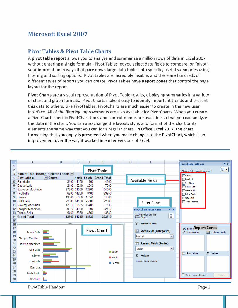
PivotTable Handout Page 1
Microsoft Excel 2007
Pivot Tables & Pivot Table Charts A pivot table report allows you to analyze and summarize a million rows of data in Excel 2007 without entering a single formula. Pivot Tables let you select data fields to compare, or “pivot”, your information in ways that pare down large data tables into specific, useful summaries using filtering and sorting options. Pivot tables are incredibly flexible, and there are hundreds of different styles of reports you can create. Pivot Tables have Report Zones that control the page layout for the report.
Pivot Charts are a visual representation of Pivot Table results, displaying summaries in a variety of chart and graph formats. Pivot Charts make it easy to identify important trends and present this data to others. Like PivotTables, PivotCharts are much easier to create in the new user interface. All of the filtering improvements are also available for PivotCharts. When you create a PivotChart, specific PivotChart tools and context menus are available so that you can analyze the data in the chart. You can also change the layout, style, and format of the chart or its elements the same way that you can for a regular chart. In Office Excel 2007, the chart formatting that you apply is preserved when you make changes to the PivotChart, which is an improvement over the way it worked in earlier versions of Excel.
Report Zones
Pivot Chart
Pivot Table
Available Fields
Filter Pane
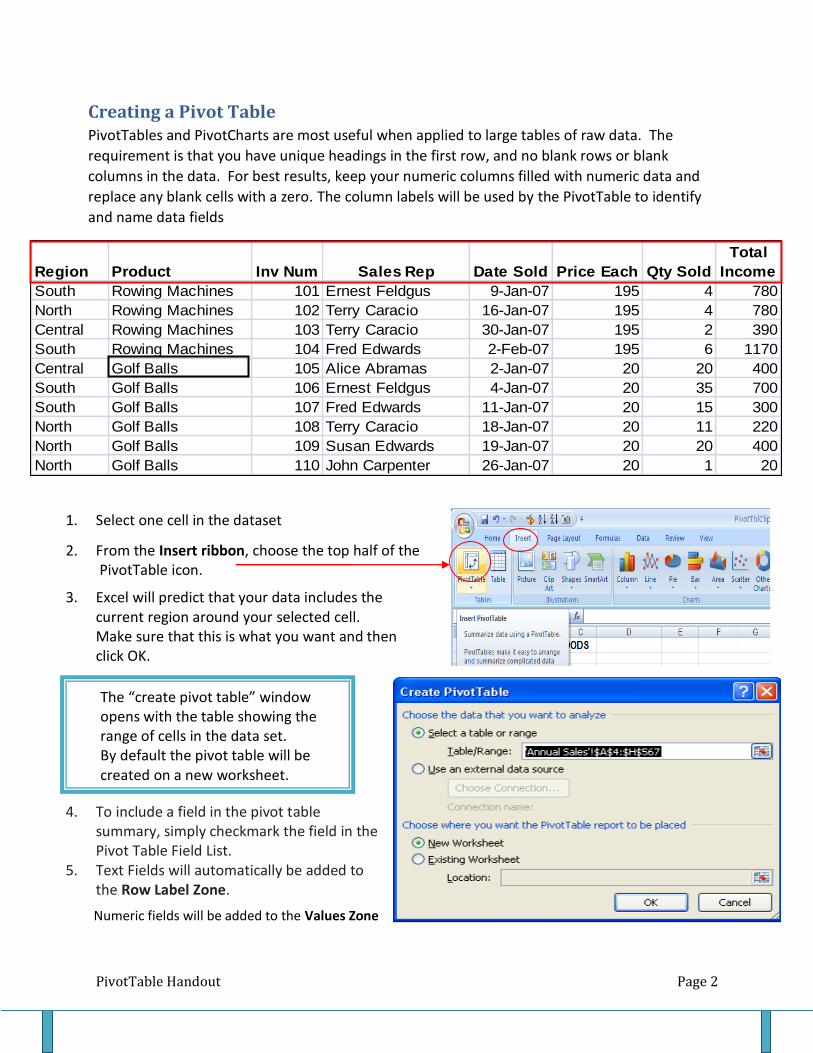
PivotTable Handout Page 2
Region Product Inv Num Sales Rep Date Sold Price Each Qty Sold
Total
Income
South Rowing Machines 101 Ernest Feldgus 9-Jan-07 195 4 780
North Rowing Machines 102 Terry Caracio 16-Jan-07 195 4 780
Central Rowing Machines 103 Terry Caracio 30-Jan-07 195 2 390
South Rowing Machines 104 Fred Edwards 2-Feb-07 195 6 1170
Central Golf Balls 105 Alice Abramas 2-Jan-07 20 20 400
South Golf Balls 106 Ernest Feldgus 4-Jan-07 20 35 700
South Golf Balls 107 Fred Edwards 11-Jan-07 20 15 300
North Golf Balls 108 Terry Caracio 18-Jan-07 20 11 220
North Golf Balls 109 Susan Edwards 19-Jan-07 20 20 400
North Golf Balls 110 John Carpenter 26-Jan-07 20 1 20
1. Select one cell in the dataset
2. From the Insert ribbon, choose the top half of the PivotTable icon.
3. Excel will predict that your data includes the current region around your selected cell. Make sure that this is what you want and then click OK.
4. To include a field in the pivot table summary, simply checkmark the field in the Pivot Table Field List.
5. Text Fields will automatically be added to the Row Label Zone.
Creating a Pivot Table PivotTables and PivotCharts are most useful when applied to large tables of raw data. The
requirement is that you have unique headings in the first row, and no blank rows or blank
columns in the data. For best results, keep your numeric columns filled with numeric data and
replace any blank cells with a zero. The column labels will be used by the PivotTable to identify
and name data fields
The “create pivot table” window opens with the table showing the range of cells in the data set. By default the pivot table will be created on a new worksheet.
Numeric fields will be added to the Values Zone

PivotTable Handout Page 3
Filtering or Sorting Data in a Pivot Table The Sales Rep field has been placed in the Report Filter zone. As you can see from the example on the right, all of the Sales Reps are represented in the report but if you wanted to analyze the performance of only “1” rep, you could uncheck all and select only those reps you want to see in the report. One of the new features to pivot tables is the option to select multiple items to query.
When you “hover” your mouse over a field in one of the zones, you’ll see a menu that offers choices where you can sort or filter the field. Use filters to narrow the range of information displayed in a PivotTable report. Filtering is a good way to emphasize or ‘get at’ important or relevant information within a larger set of data. Label filters will allow you to filter using comparative criteria.
This report shows the Products in the
row labels zone, the Region in the
column labels zone and the data is
summarized using the Sun Function in
the values zone. The Sales Rep field has
been placed in the Report Filter zone.
One could create a query to analyze the
activity of one particular Sales Rep.
It is easy to change a pivot table report.
Simply check or uncheck fields in the
top half of the Pivot Table field list. You
can always rearrange the order of fields
by dragging the fields around the
bottom half of the field list.
PivotTable Handout Page 4
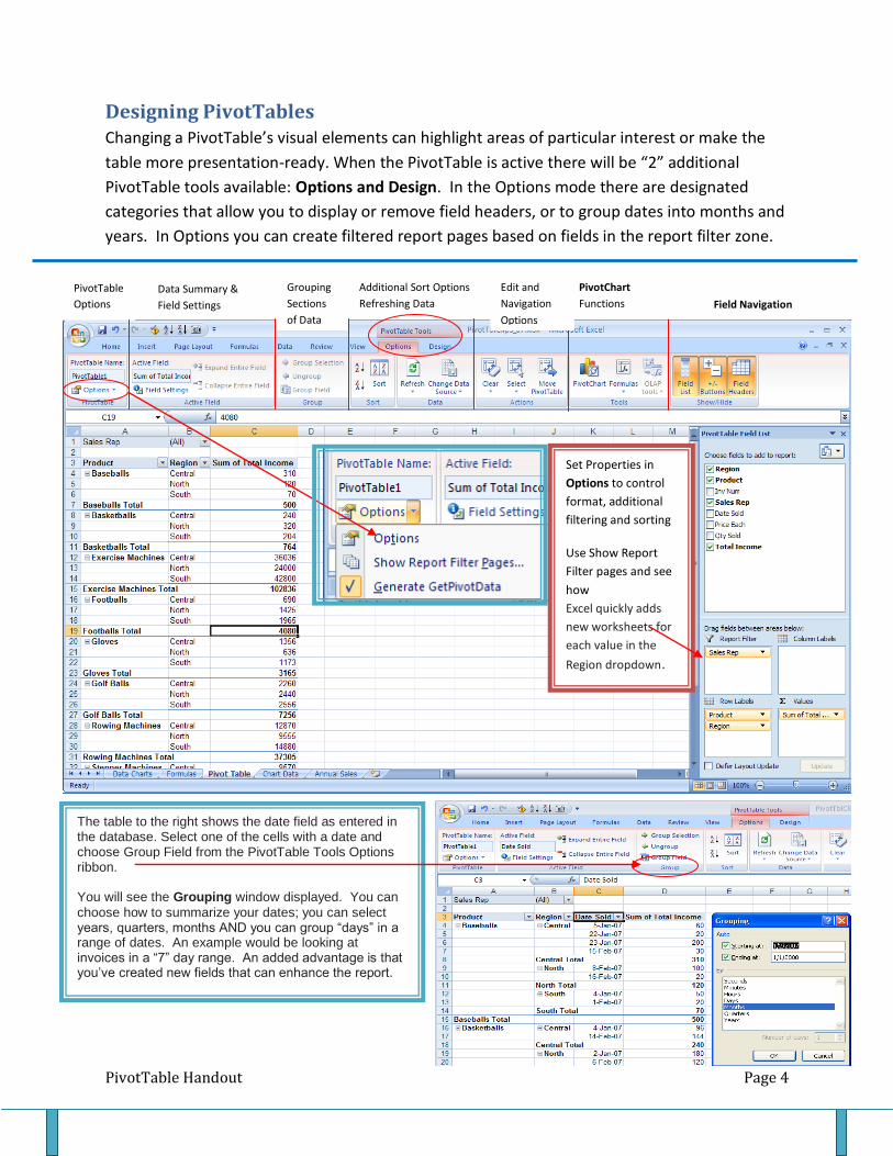
Designing PivotTables Changing a PivotTable’s visual elements can highlight areas of particular interest or make the
table more presentation-ready. When the PivotTable is active there will be “2” additional
PivotTable tools available: Options and Design. In the Options mode there are designated
categories that allow you to display or remove field headers, or to group dates into months and
years. In Options you can create filtered report pages based on fields in the report filter zone.
PivotTable
Options
Data Summary &
Field Settings
Grouping
Sections
of Data
Additional Sort Options
Refreshing Data
Edit and
Navigation
Options
PivotChart
Functions
Field Navigation
Set Properties in
Options to control
format, additional
filtering and sorting
Use Show Report
Filter pages and see
how
Excel quickly adds
new worksheets for
each value in the
Region dropdown.
The table to the right shows the date field as entered in the database. Select one of the cells with a date and choose Group Field from the PivotTable Tools Options ribbon. You will see the Grouping window displayed. You can
choose how to summarize your dates; you can select years, quarters, months AND you can group “days” in a range of dates. An example would be looking at invoices in a “7” day range. An added advantage is that you’ve created new fields that can enhance the report.
PivotTable Handout Page 5
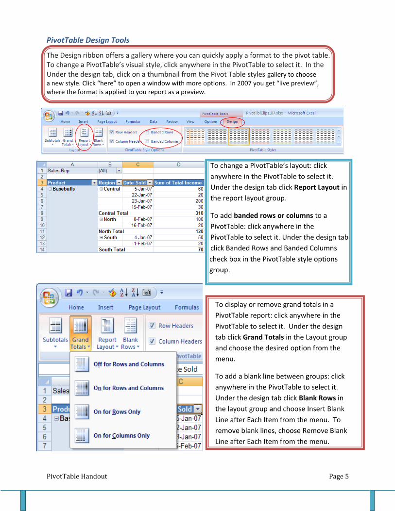
PivotTable Design Tools
The Design ribbon offers a gallery where you can quickly apply a format to the pivot table. To change a PivotTable’s visual style, click anywhere in the PivotTable to select it. In the Under the design tab, click on a thumbnail from the Pivot Table styles gallery to choose a new style. Click “here” to open a window with more options. In 2007 you get “live preview”, where the format is applied to you report as a preview.
To change a PivotTable’s layout: click
anywhere in the PivotTable to select it.
Under the design tab click Report Layout in
the report layout group.
To add banded rows or columns to a
PivotTable: click anywhere in the
PivotTable to select it. Under the design tab
click Banded Rows and Banded Columns
check box in the PivotTable style options
group.
To display or remove grand totals in a
PivotTable report: click anywhere in the
PivotTable to select it. Under the design
tab click Grand Totals in the Layout group
and choose the desired option from the
menu.
To add a blank line between groups: click
anywhere in the PivotTable to select it.
Under the design tab click Blank Rows in
the layout group and choose Insert Blank
Line after Each Item from the menu. To
remove blank lines, choose Remove Blank
Line after Each Item from the menu.

PivotTable Handout Page 6
Creating a Basic PivotChart
PivotCharts provide a graphic representation of data relationships and trends, drawn from the
way information is arranged in a PivotTable report.
To add a PivotChart: click anywhere in an existing PivotTable to select it. Under the options tab
click PivotChart in the Tools group.
In the Insert Chart dialog box, select a desired chart type (column, line, pie). Click ok to insert
the selected chart. When you select the PivotChart, the PivotChart Filter Pane will display by
default. Once your chart is active, you will have “3” tabs in Chart Tools; Design, Layout, and
Format, where you can format PivotCharts and add or remove PivotChart Elements.