Embed Size (px)
Citation preview

Mobile Web DonationsAdventures in Usability

2
Background
• President of Carbon8, an interactive, digital marketing agency headquartered in Denver’s Highlands neighborhood founded in 2009.
– 48 employees in U.S. and Vietnam who blend cutting edge creative with strong technology
– Carbon8 provides award-winning work in websites, video, search marketing, and branding.
• President of the Board, Parkinson Association of the Rockies
Carbon8 Nha Trang, Vietnam Office
8 years of experience building websites just about every size of business in every industry.
Carbon8 Highlands Office


Watch your storeYour analytics are trying
to talk to you.
5
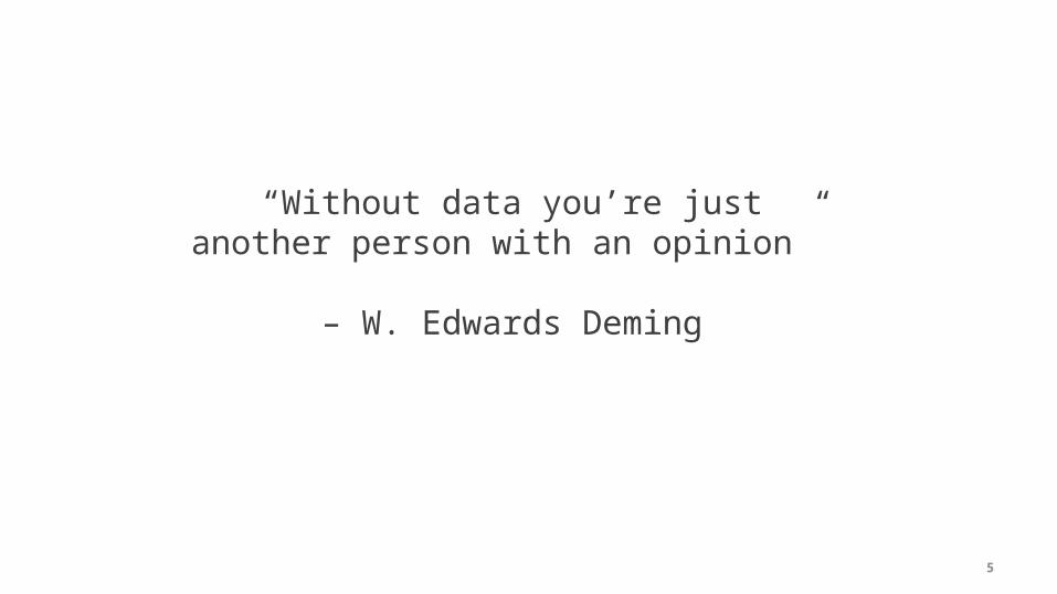
“Without data you’re just another person with an opinion”
– W. Edwards Deming

6
So what does the web research tell us?

7
A whole hellofalot.

8
“There have always been noisy lunatics on the fringes of the advertising business. Their
stock in trade includes eccentric art direction, contempt for
research, and their self proclaimed genius.”
David Ogilvy
9
Would you want to watch a movie while sitting in this chair?
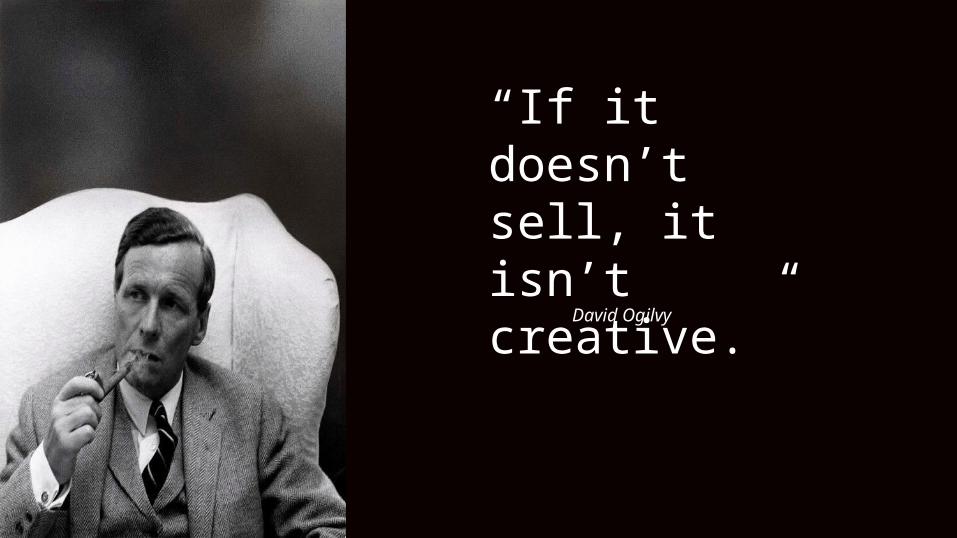
“If it doesn’t sell, it isn’t creative.”
David Ogilvy

10
Is this site creative?

12
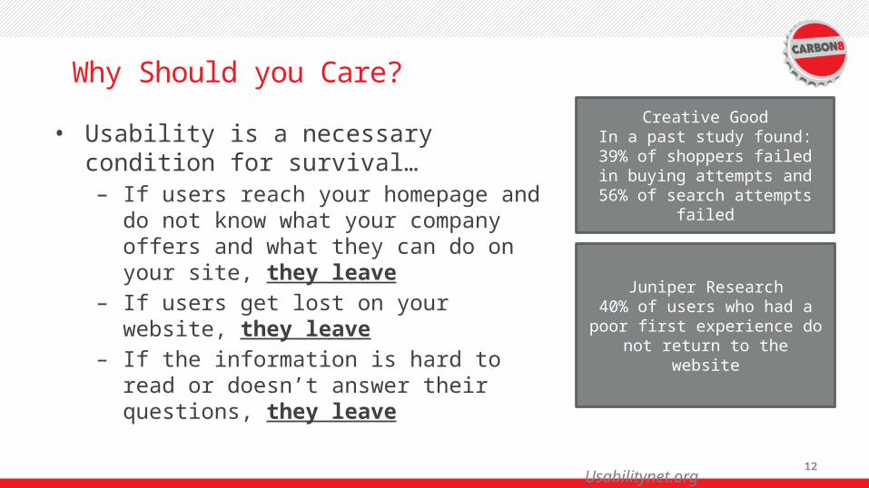
Why Should you Care?
• Usability is a necessary condition for survival…– If users reach your homepage and do
not know what your company offers and what they can do on your site, they leave
– If users get lost on your website, they leave
– If the information is hard to read or doesn’t answer their questions, they leave
Creative GoodIn a past study found: 39% of
shoppers failed in buying attempts and 56% of search attempts failed
Juniper Research40% of users who had a poor first experience do not return to the
website
Usabilitynet.org

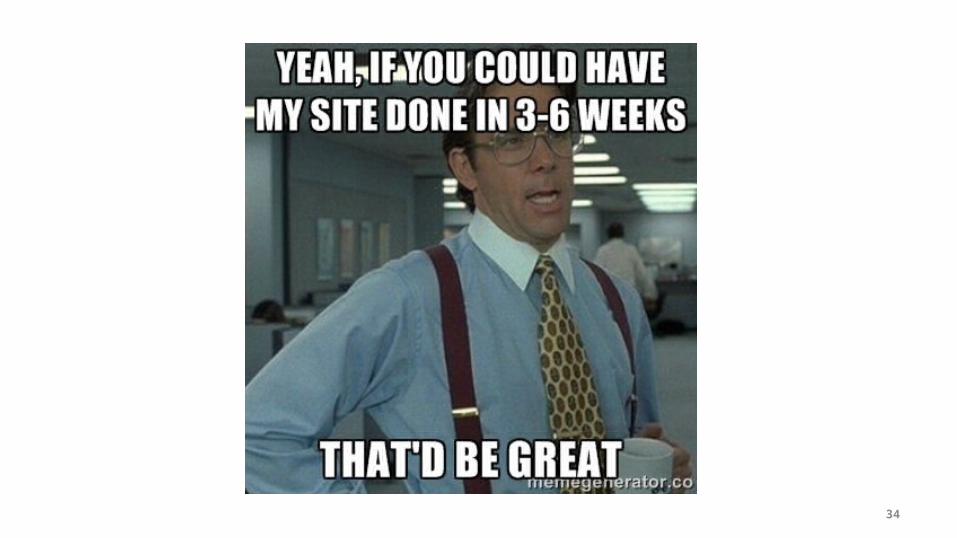
Let’s get donations 10 Sure Fire, Darn Tootin’, Button
Pushin’ ways to get more $$$’s
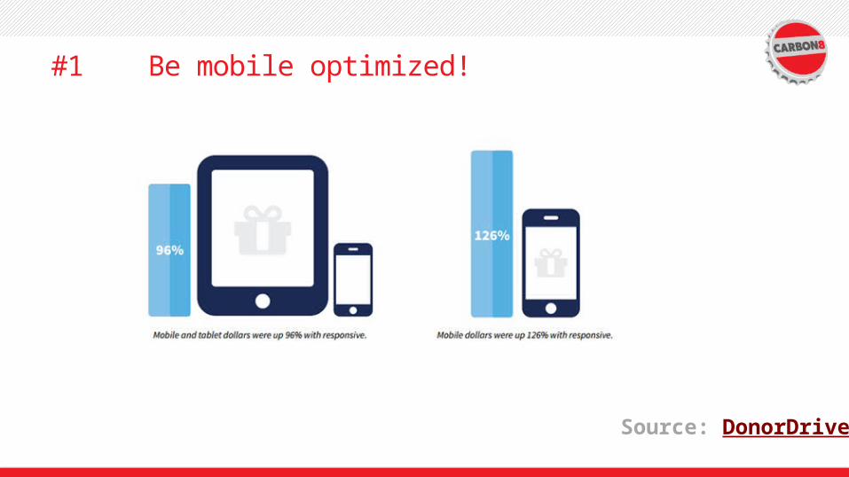
#1 Be mobile optimized!
Source: DonorDrive
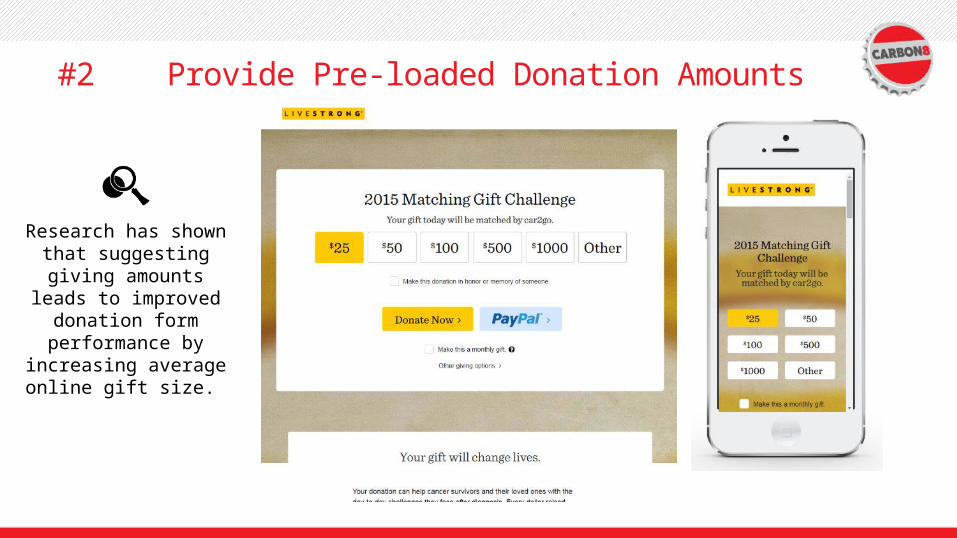
#2 Provide Pre-loaded Donation Amounts
Research has shown that suggesting giving amounts
leads to improved donation form performance by
increasing average online gift size.
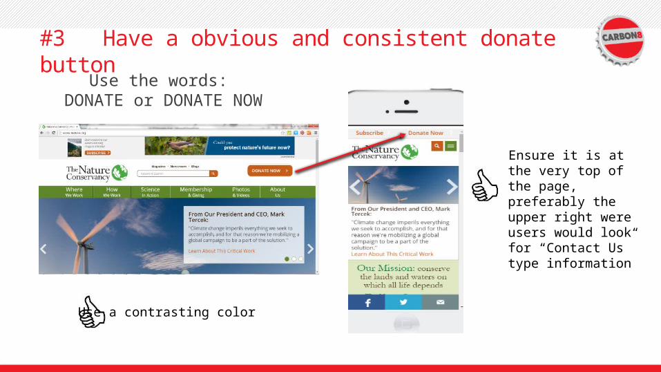
#3 Have a obvious and consistent donate buttonUse the words:
DONATE or DONATE NOW
Ensure it is at the very top of the page, preferably the upper right were users would look for “Contact Us” type information
Use a contrasting color
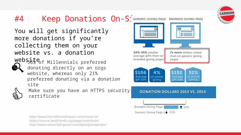
#4 Keep Donations On-Site
56% of Millennials preferred donating directly on an orgs website, whereas only 21% preferred donating via a donation site
http://www.themillennialimpact.com/research/https://secure.bestfriends.org/page/contribute/http://www.networkforgood.com/digitalgivingindex/
You will get significantly more donations if you’re collecting them on your website vs. a donation website
Make sure you have an HTTPS security certificate
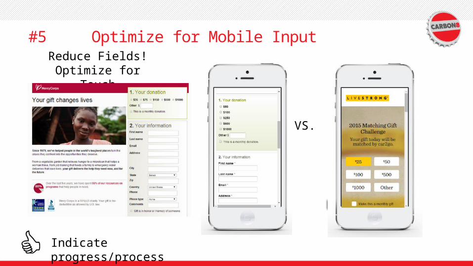
#5 Optimize for Mobile InputReduce Fields!
Optimize for Touch
VS.
Indicate progress/process

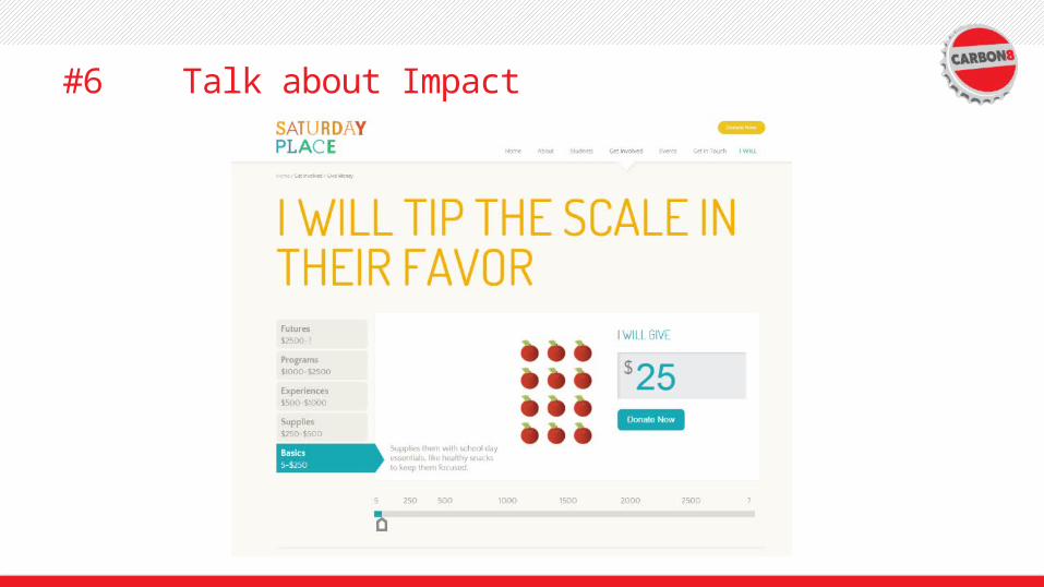
#6 Talk about Impact
SHOW how donors make an impact and where the money goes
77% OF Millennials indicated they’d be somewhat or very likely to stop donating to a nonprofit that didn’t tell them how their donation was making an impact
Those who couldn’t find the information were aggravated and thought the organization was inefficient or trying to bury those details.
(http://www.themillennialimpact.com/research/) (http://www.nngroup.com/articles/donations-nonprofit-charity-online/)
Display third party endorsements• Organization ratings• High profile endorsements• Testimonials• Name recognition• Years in operation
#6 Talk about Impact

#7 Provide an Emotional Image

#8 Consistent Translation

Not an attractive website but donate now translates great.
Consistent Translation

Great Translation
Donate now and with a great image!
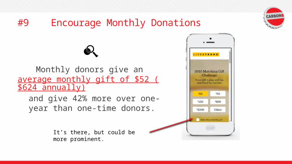
#9 Encourage Monthly Donations
Monthly donors give an average monthly gift of $52 ($624 annually) and give 42% more over one-year
than one-time donors.
It’s there, but could be more prominent.
26

27
#10: Test, Test, Test! And, Analyze, Analyze, Analyze
The only way to really know what works and what doesn’t is to test it!
Analytics User Research
In-page analytics Usability testing
Heat Maps Surveys – satisfaction, intent, feedback
Click Maps Customer service data
Link Analytics Contextual Inquiry
Form Analytics Card sorting
Conversion funnels
Who, What, Where
Why

28
Good news though…testing isn’t that hard.
Tests with just five users will reveal about 85% of all problems with your
website
29
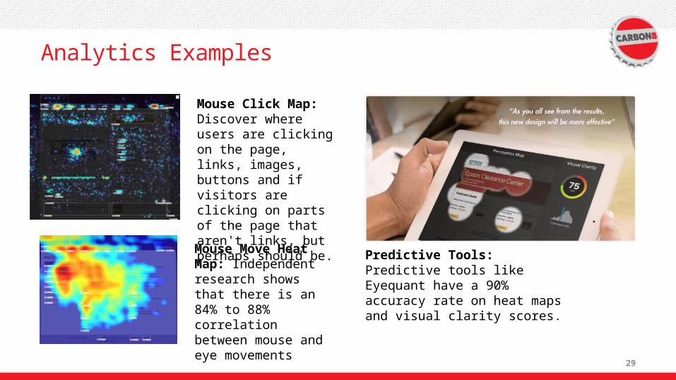
Analytics Examples
Mouse Move Heat Map: Independent research shows that there is an 84% to 88% correlation between mouse and eye movements
Mouse Click Map: Discover where users are clicking on the page, links, images, buttons and if visitors are clicking on parts of the page that aren't links, but perhaps should be.
Predictive Tools: Predictive tools like Eyequant have a 90% accuracy rate on heat maps and visual clarity scores.

And now for a test
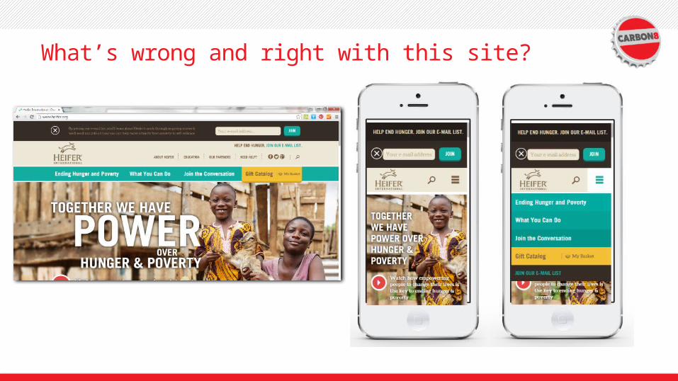
What’s wrong and right with this site?

What happened to the menu? Gift catalog- What’s that?
Test Time!

Congrats. You are now mobile donation experts.
34
35
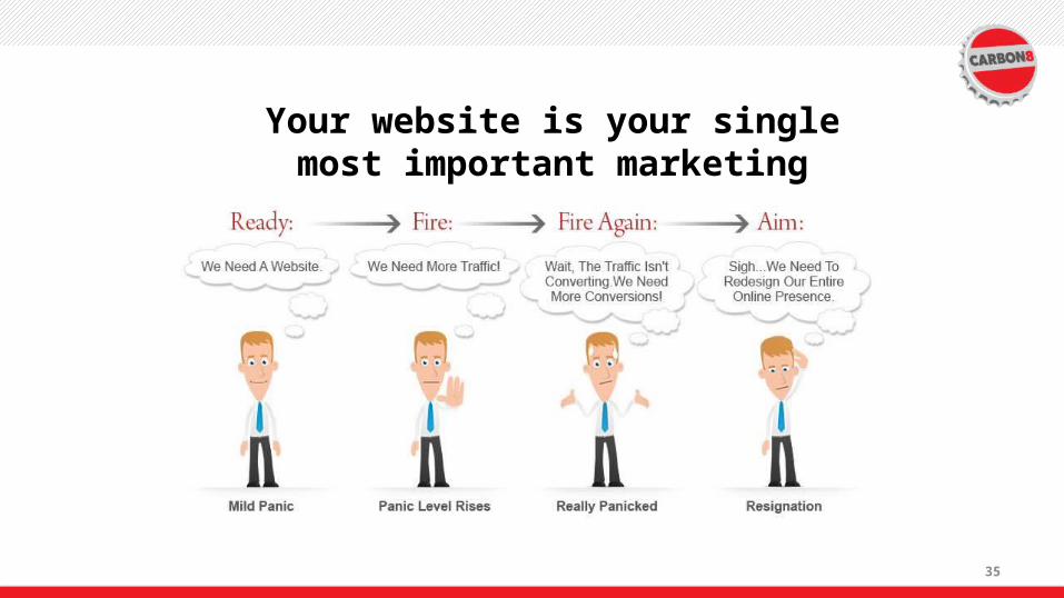
Your website is your single most important marketing
asset yet…

36

37

38
In what decade was this research
provided?“Research suggests that if you set the copy in black type on a white background, more people will read it than if you set it in white type
on a black background.”
“Research suggests that if you set the copy in black type on a white background, more people will read it than if you set it in white type
on a black background.”

39
Be suspicious of “everybody is doing it.”

40
Carousels. Sliders. Rotating banners… whatever you call them
they don’t work!

41
Parallax Design!
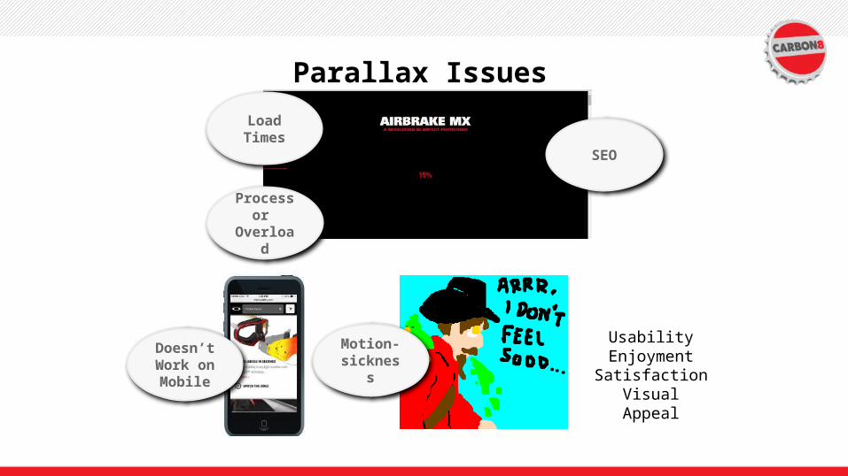
Parallax Issues
Load Times
Processor Overload
Doesn’t Work on Mobile
Motion-sickness
UsabilityEnjoymentSatisfaction
Visual Appeal
SEO
43
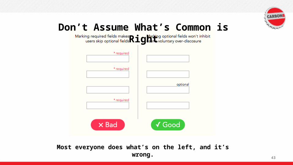
Don’t Assume What’s Common is Right
Most everyone does what’s on the left, and it’s wrong.

44
45
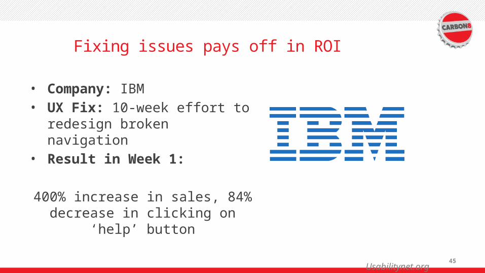
Fixing issues pays off in ROI
• Company: IBM• UX Fix: 10-week effort to
redesign broken navigation• Result in Week 1:
400% increase in sales, 84% decrease in clicking on ‘help’
button
Usabilitynet.org

46
Top 3 Common Misconceptions About Popular Website Design Practices
47
#1: I need movement on my homepage or it will look stale

48
#1: We Need Movement
• Idea: movement is exciting • Reality: movement is distracting
• Users are task oriented• Animated elements = danger• Banner blindness is a real thing

49
#2: Mobile Traffic Surpassed Desktop Traffic

50
#2: Mobile Traffic Surpassed Desktop Traffic
• Idea: mobile traffic surpassed desktop traffic
• Reality: mobile APP traffic surpassed desktop traffic
Yes, mobile is a big deal
It’s still commonly about 5% of B2B web traffic
Prioritize accordingly

51
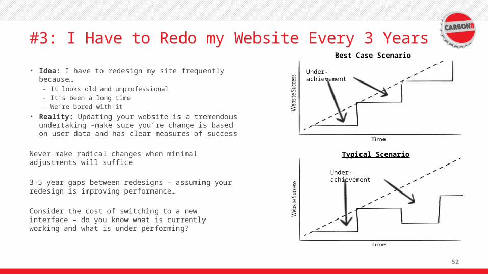
#3: I Have to Rebuild my Website Every 3 Years
52
#3: I Have to Redo my Website Every 3 Years
• Idea: I have to redesign my site frequently because…
– It looks old and unprofessional– It’s been a long time– We’re bored with it
• Reality: Updating your website is a tremendous undertaking –make sure you’re change is based on user data and has clear measures of success
Never make radical changes when minimal adjustments will suffice
3-5 year gaps between redesigns – assuming your redesign is improving performance…
Consider the cost of switching to a new interface – do you know what is currently working and what is under performing?
Under-achievement
Best Case Scenario
Under-achievement
Typical Scenario

53
#3: I Have to Redo my Website Every 3 Years

54

55
How to Identify, fix (or Avoid) the top 5 ways Websites Annoy Potential Customers
56
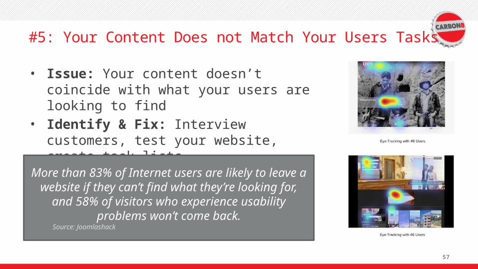
#5: Your Content Does not Match Your Users Tasks
57
#5: Your Content Does not Match Your Users Tasks
• Issue: Your content doesn’t coincide with what your users are looking to find
• Identify & Fix: Interview customers, test your website, create task lists
More than 83% of Internet users are likely to leave a website if they can’t find what they’re looking for, and
58% of visitors who experience usability problems won’t come back.
Source: Joomlashack

58
#4: Your Information Architecture is Confusing

59
#4: Your IA is Confusing
• Issue: Your IA is confusing– Organized by internal
process and/or branded terms
– Missing category landing pages
– Inconsistent (changes)
• Identify: User testing• Fix: Open or closed
card sorting, tree sorting, user testing

60
#4: Your IA is Confusing
Open and closed card sorting

61
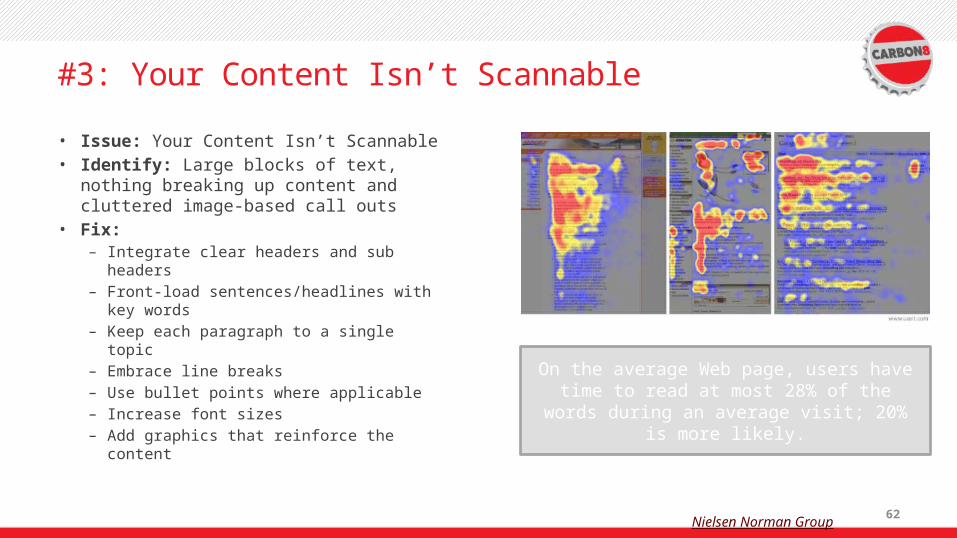
#3: Your Content Isn’t Scannable
62
#3: Your Content Isn’t Scannable
• Issue: Your Content Isn’t Scannable• Identify: Large blocks of text,
nothing breaking up content and cluttered image-based call outs
• Fix: – Integrate clear headers and sub
headers– Front-load sentences/headlines with
key words– Keep each paragraph to a single
topic– Embrace line breaks – Use bullet points where applicable– Increase font sizes– Add graphics that reinforce the
content
On the average Web page, users have time to read at most 28% of the words during an average visit; 20% is
more likely.
Nielsen Norman Group

63
#3: Your Content Isn’t Scannable

64
Break Print Grammar Rules…Very carefully.
Version A: Our solar system consists of eight planets. There are four planets that have rings around them.
Version B: Our solar system consists of 8 planets. There are 4 planets that have rings around them.
Which version is easier to read?
Numbers
Web users will leave sites in 11 seconds if they don’t find what they need.

65
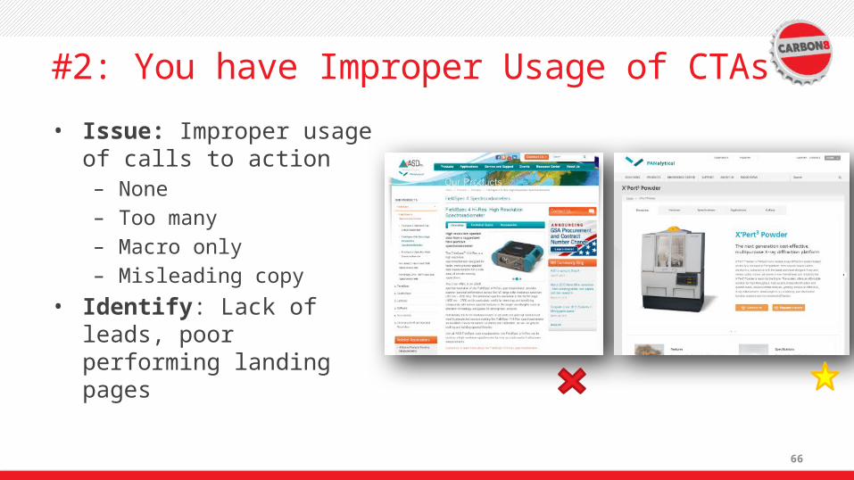
#2: You have Improper Usage of Calls to Action
66
#2: You have Improper Usage of CTAs
• Issue: Improper usage of calls to action– None– Too many– Macro only– Misleading copy
• Identify: Lack of leads, poor performing landing pages

67
#2: You have Improper Usage of CTAs
• Fix: – Every page should start
and end with a CTA– Hyperlink to next steps
content within your site– Create tiers of conversions
(macro and micro)– Clearly identify the payoff– Use a contrasting color– Use 1st person

68
Don’t take before you give

69
#2: You have Improper Usage of CTAs

70
Designing for a conversion

71
And where should those field descriptions be?
Left Justified, Above the box.
72
Summary
• The top 5 ways websites annoy potential customers– #5: Your Content Does not Match Your Users Tasks– #4: Your Information Architecture is Confusing– #3: Your Content Isn’t Scannable– #2: You Have Improper Usage of CTAs– #1: You Have no Pricing Listed
73
Let’s Bring it Home

74
75
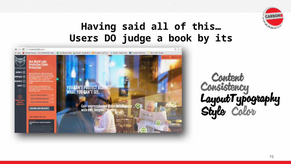
Having said all of this…Users DO judge a book by its
cover.