Embed Size (px)
Citation preview
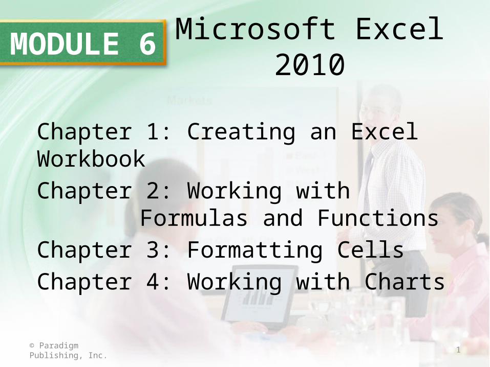
MODULE 6 Microsoft Excel 2010
Chapter 1: Creating an Excel WorkbookChapter 2: Working with Formulas and
FunctionsChapter 3: Formatting CellsChapter 4: Working with Charts
1© Paradigm Publishing, Inc.
2© Paradigm Publishing, Inc.
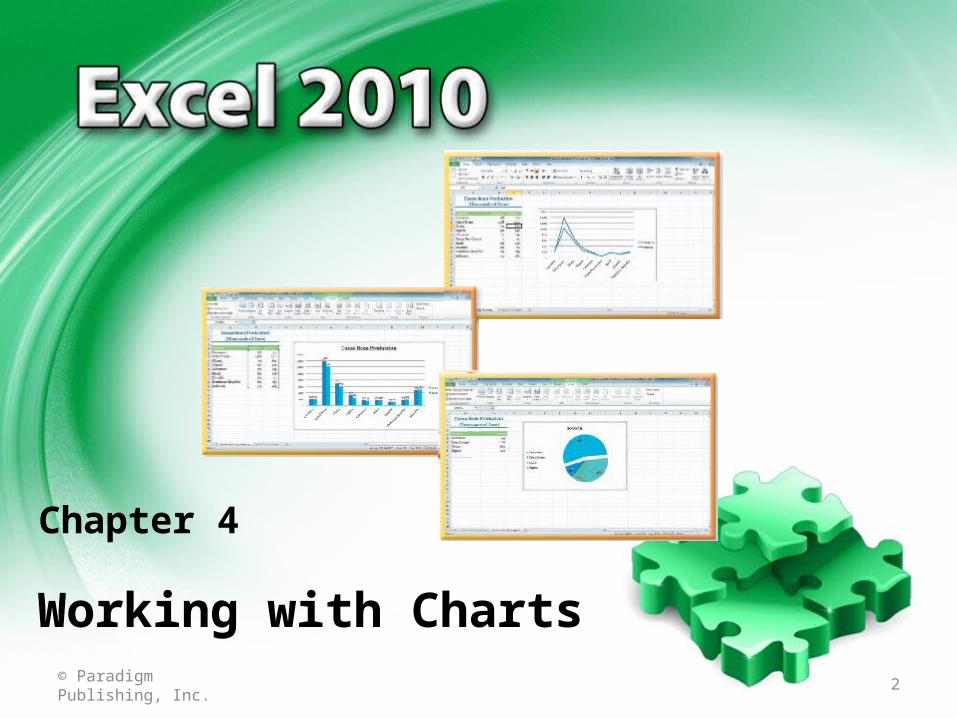
Chapter 4
Working with Charts
3
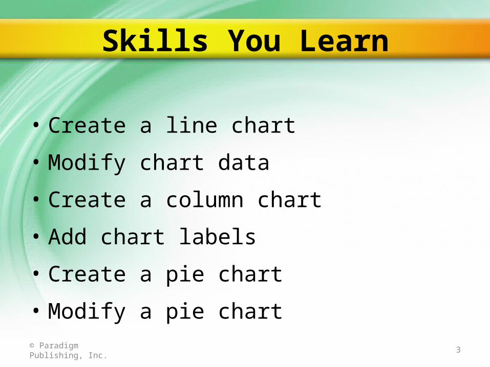
Skills You Learn
© Paradigm Publishing, Inc.
• Create a line chart
• Modify chart data
• Create a column chart
• Add chart labels
• Create a pie chart
• Modify a pie chart
4
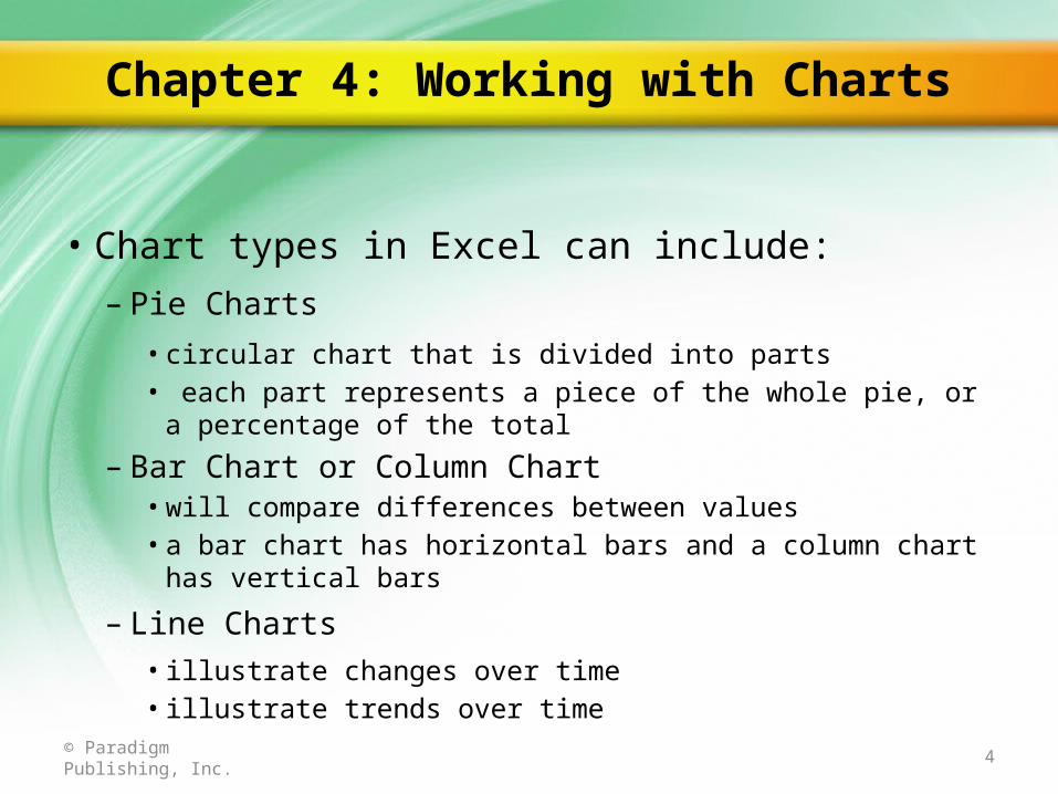
Chapter 4: Working with Charts
© Paradigm Publishing, Inc.
• Chart types in Excel can include:– Pie Charts
• circular chart that is divided into parts• each part represents a piece of the whole pie, or a percentage of
the total
– Bar Chart or Column Chart• will compare differences between values• a bar chart has horizontal bars and a column chart has vertical bars
– Line Charts• illustrate changes over time• illustrate trends over time
5© Paradigm Publishing, Inc.
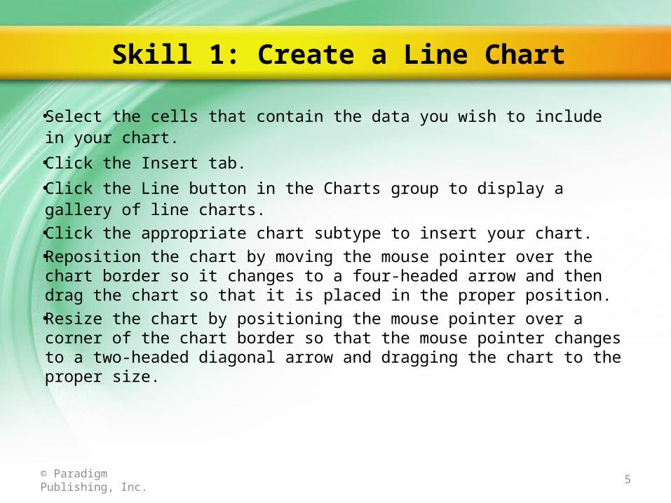
• Select the cells that contain the data you wish to include in your chart.• Click the Insert tab.• Click the Line button in the Charts group to display a gallery of line
charts.• Click the appropriate chart subtype to insert your chart.• Reposition the chart by moving the mouse pointer over the chart
border so it changes to a four-headed arrow and then drag the chart so that it is placed in the proper position.
• Resize the chart by positioning the mouse pointer over a corner of the chart border so that the mouse pointer changes to a two-headed diagonal arrow and dragging the chart to the proper size.
Skill 1: Create a Line Chart
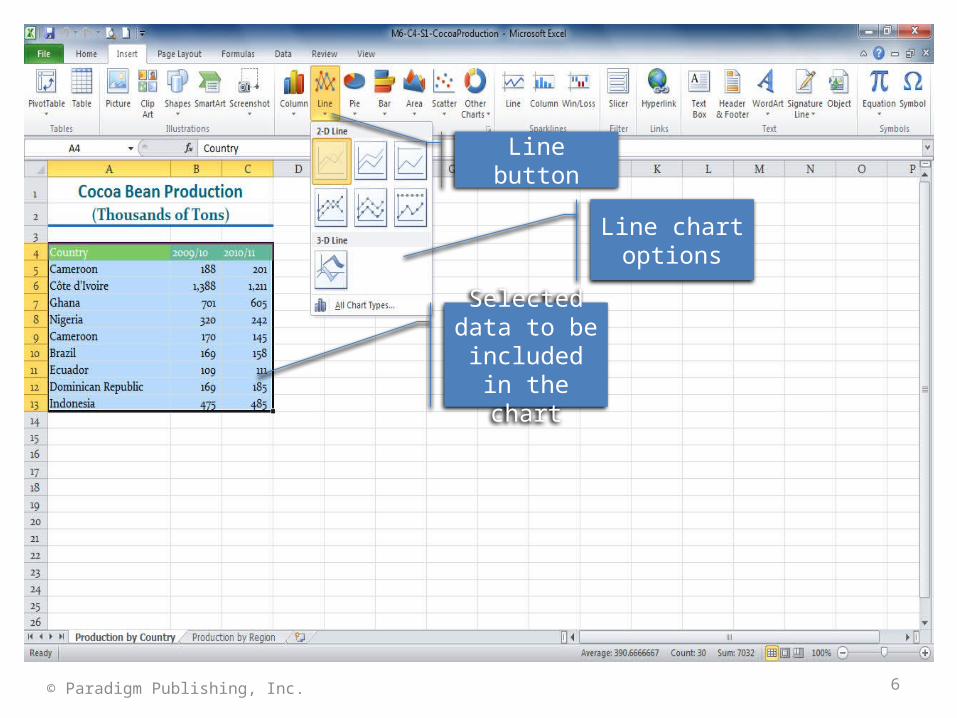
6© Paradigm Publishing, Inc.
Line button
Line chart options
Selected data to be included
in the chart
7© Paradigm Publishing, Inc.
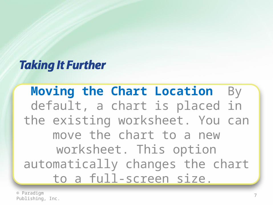
Moving the Chart Location By default, a chart is placed in the existing worksheet. You can
move the chart to a new worksheet. This option automatically changes the chart to a
full-screen size.
8© Paradigm Publishing, Inc.
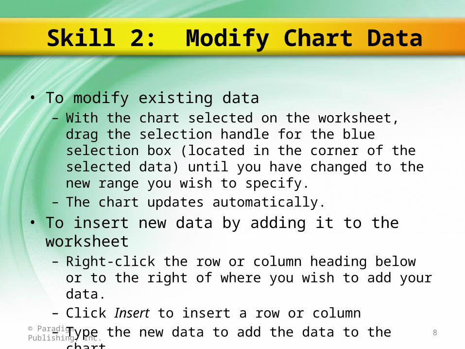
• To modify existing data– With the chart selected on the worksheet, drag the selection
handle for the blue selection box (located in the corner of the selected data) until you have changed to the new range you wish to specify.
– The chart updates automatically.• To insert new data by adding it to the worksheet
– Right-click the row or column heading below or to the right of where you wish to add your data.
– Click Insert to insert a row or column– Type the new data to add the data to the chart– The chart will update automatically.
Skill 2: Modify Chart Data
9© Paradigm Publishing, Inc.
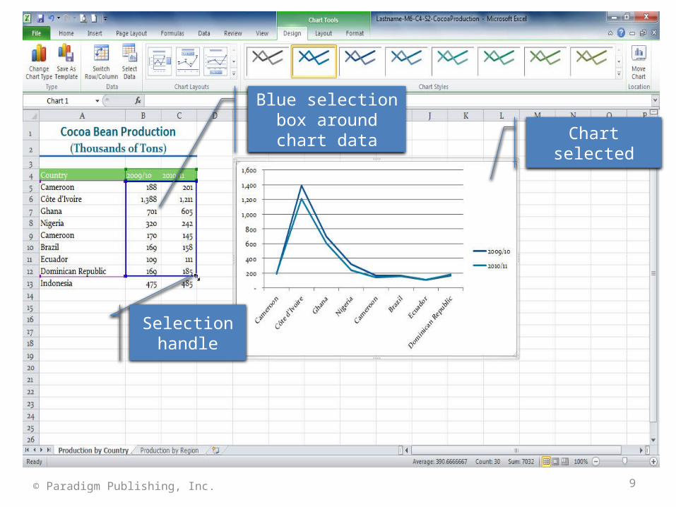
Chart selected
Blue selection box around chart data
Selection handle
10© Paradigm Publishing, Inc.
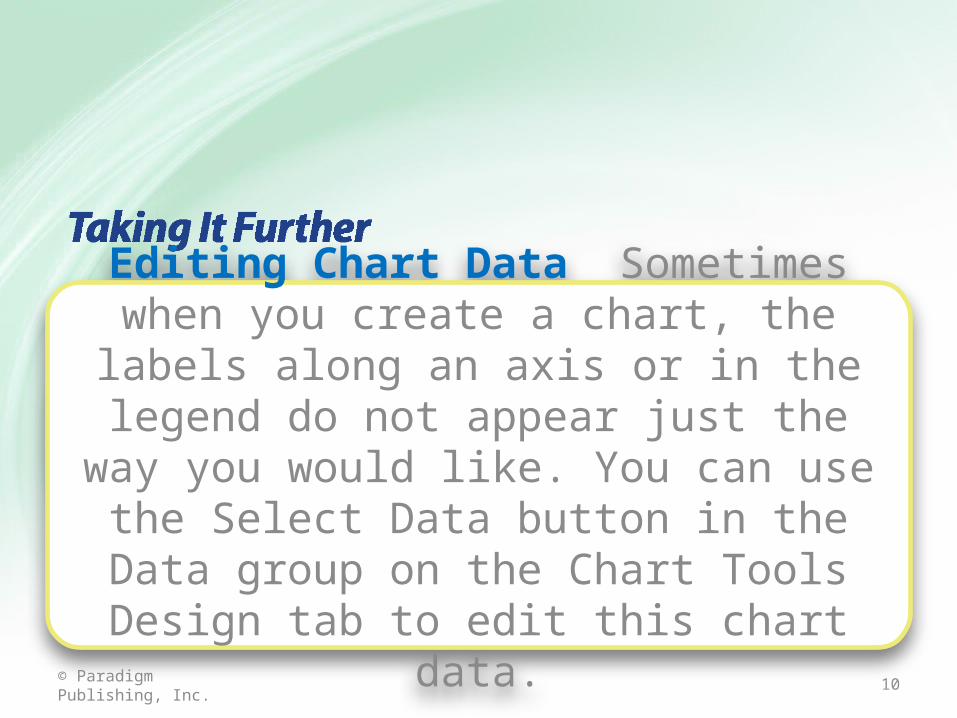
Editing Chart Data Sometimes when you create a chart, the labels along an axis or in the legend do not appear just the way you would like. You can use the Select Data button in the Data group on the Chart Tools Design tab to
edit this chart data.
11© Paradigm Publishing, Inc.
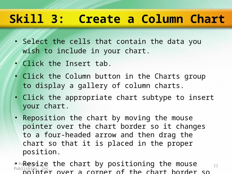
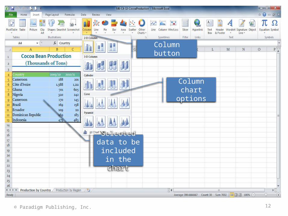
• Select the cells that contain the data you wish to include in your chart.
• Click the Insert tab.
• Click the Column button in the Charts group to display a gallery of column charts.
• Click the appropriate chart subtype to insert your chart.
• Reposition the chart by moving the mouse pointer over the chart border so it changes to a four-headed arrow and then drag the chart so that it is placed in the proper position.
• Resize the chart by positioning the mouse pointer over a corner of the chart border so that the mouse pointer changes to a two-headed diagonal arrow and dragging the chart to the proper size.
Skill 3: Create a Column Chart
12© Paradigm Publishing, Inc.
Column button
Column chart options
Selected data to be included
in the chart
13© Paradigm Publishing, Inc.
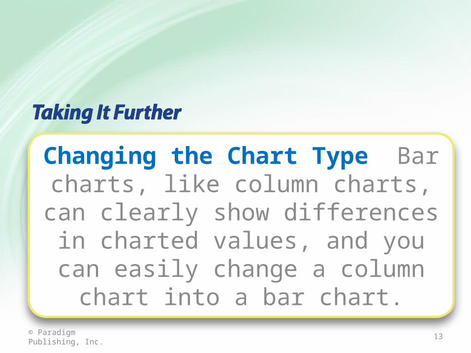
Changing the Chart Type Bar charts, like column charts, can clearly show
differences in charted values, and you can easily change a column chart into a bar
chart.
14© Paradigm Publishing, Inc.
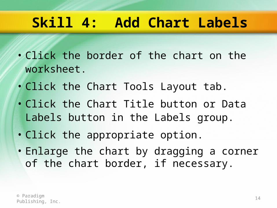
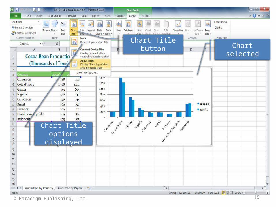
• Click the border of the chart on the worksheet.
• Click the Chart Tools Layout tab.
• Click the Chart Title button or Data Labels button in the Labels group.
• Click the appropriate option.
• Enlarge the chart by dragging a corner of the chart border, if necessary.
Skill 4: Add Chart Labels
15© Paradigm Publishing, Inc.
Chart selectedChart Title button
Chart Title options displayed
16© Paradigm Publishing, Inc.
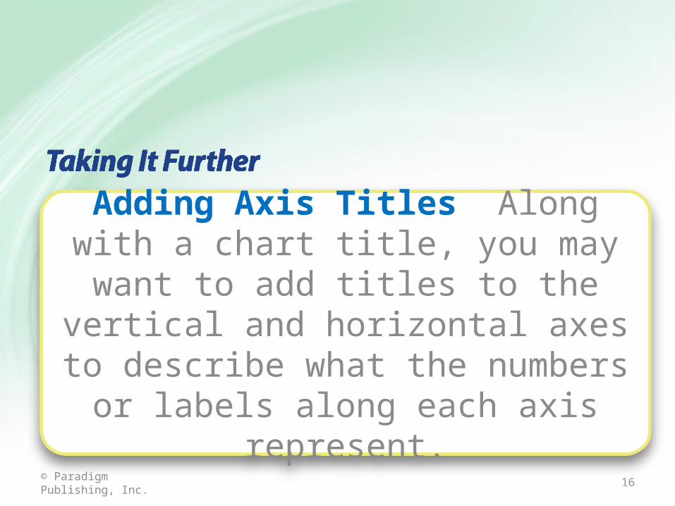
Adding Axis Titles Along with a chart title, you may want to add titles to the vertical and horizontal axes to describe what the numbers or labels along each
axis represent.
17© Paradigm Publishing, Inc.
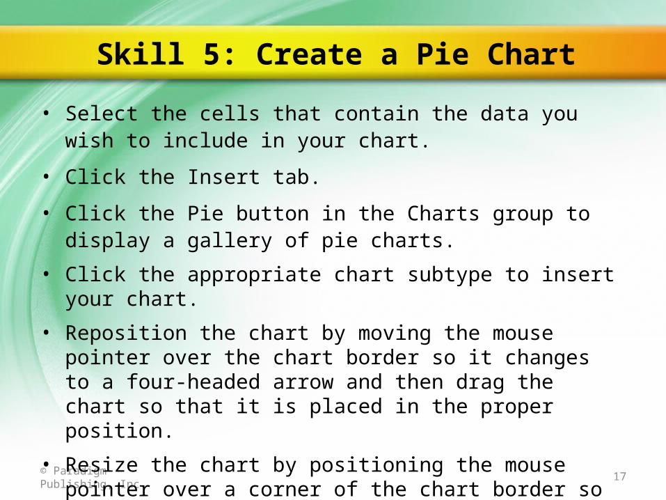
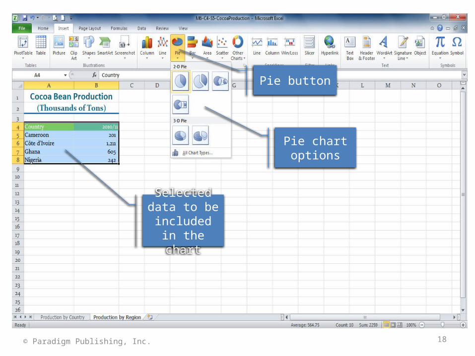
• Select the cells that contain the data you wish to include in your chart.
• Click the Insert tab.
• Click the Pie button in the Charts group to display a gallery of pie charts.
• Click the appropriate chart subtype to insert your chart.
• Reposition the chart by moving the mouse pointer over the chart border so it changes to a four-headed arrow and then drag the chart so that it is placed in the proper position.
• Resize the chart by positioning the mouse pointer over a corner of the chart border so that the mouse pointer changes to a two-headed diagonal arrow and dragging the chart to the proper size.
Skill 5: Create a Pie Chart
18© Paradigm Publishing, Inc.
Pie button
Pie chart options
Selected data to be included
in the chart
19© Paradigm Publishing, Inc.
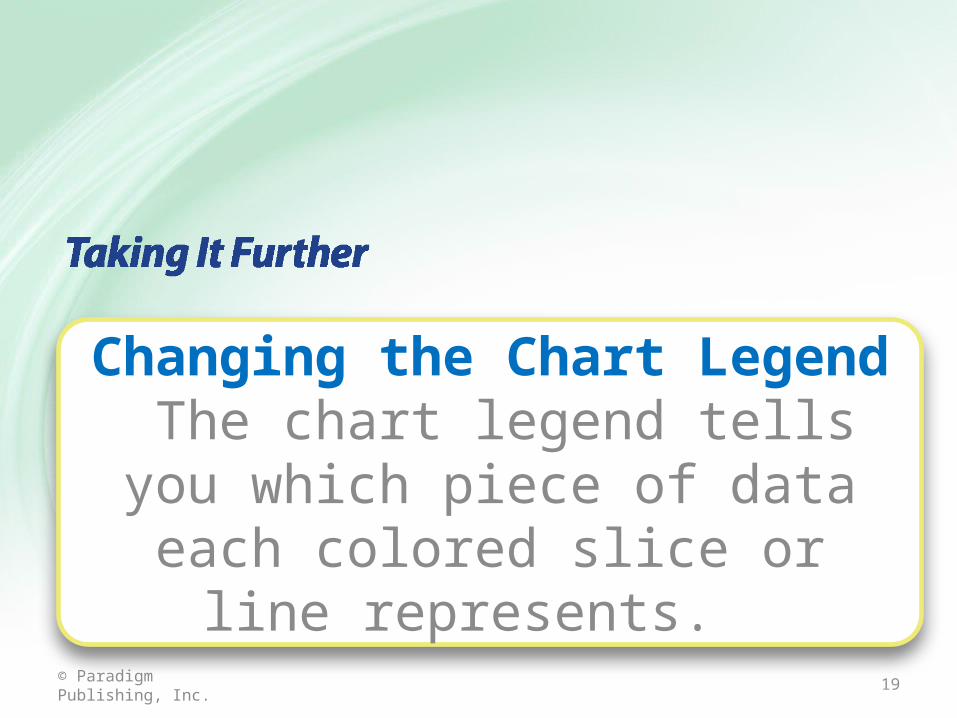
Changing the Chart Legend The chart legend tells you which piece of data
each colored slice or line represents.
20© Paradigm Publishing, Inc.
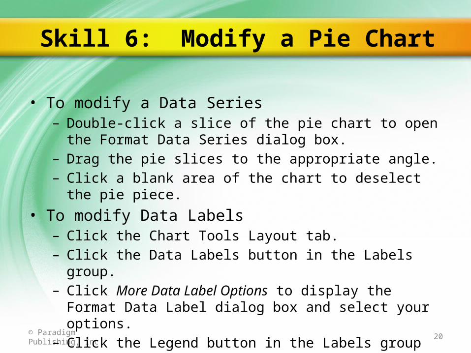
• To modify a Data Series– Double-click a slice of the pie chart to open the Format Data Series
dialog box.– Drag the pie slices to the appropriate angle.– Click a blank area of the chart to deselect the pie piece.
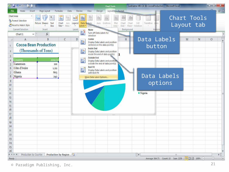
• To modify Data Labels– Click the Chart Tools Layout tab.– Click the Data Labels button in the Labels group.– Click More Data Label Options to display the Format Data Label
dialog box and select your options.– Click the Legend button in the Labels group to format the legend.
Skill 6: Modify a Pie Chart
21© Paradigm Publishing, Inc.
Data Labels options
Chart Tools Layout tab
Data Labels button
22© Paradigm Publishing, Inc.
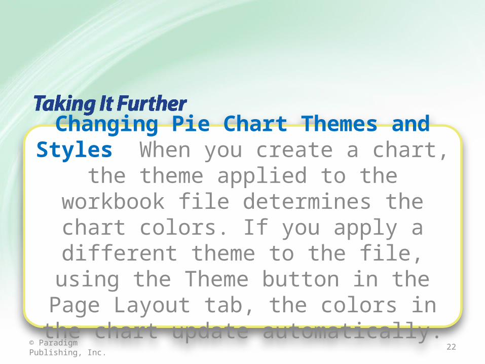
Changing Pie Chart Themes and Styles When you create a chart, the theme applied to the workbook file determines the chart colors. If you apply a different theme to the file, using the Theme button in the Page Layout tab, the
colors in the chart update automatically.
23© Paradigm Publishing, Inc.
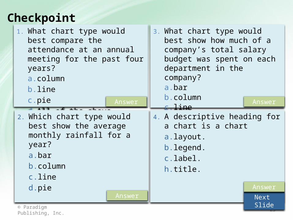
Checkpoint 1. What chart type would best compare
the attendance at an annual meeting for the past four years?a. columnb. linec. pied. All of the above
2. Which chart type would best show the average monthly rainfall for a year?a. barb. columnc. lined. pie
3. What chart type would best show how much of a company’s total salary budget was spent on each department in the company?a. barb. columnc. lined. pie
4. A descriptive heading for a chart is a charta. layout.b. legend.c. label.h. title.
Answer
Answer
Answer
Next Slide
Answer
24© Paradigm Publishing, Inc.
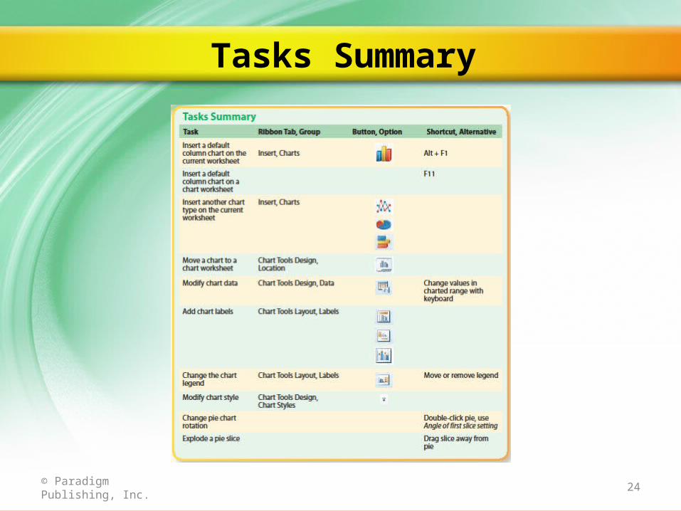
Tasks Summary