Embed Size (px)
Citation preview

Module 9Module 9Data Visualization
Andrew JaffeInstructor
Basic Plots
We covered some basic plots previously, but we are going to expand the ability to customizethese basic graphics first.
2/46
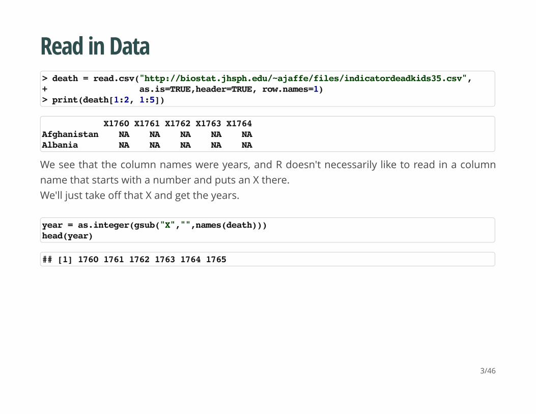
Read in Data
We see that the column names were years, and R doesn't necessarily like to read in a columnname that starts with a number and puts an X there.We'll just take off that X and get the years.
> death = read.csv("http://biostat.jhsph.edu/~ajaffe/files/indicatordeadkids35.csv",+ as.is=TRUE,header=TRUE, row.names=1)> print(death[1:2, 1:5])
X1760 X1761 X1762 X1763 X1764Afghanistan NA NA NA NA NAAlbania NA NA NA NA NA
year = as.integer(gsub("X","",names(death)))head(year)
## [1] 1760 1761 1762 1763 1764 1765
3/46
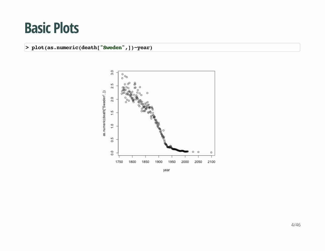
Basic Plots
> plot(as.numeric(death["Sweden",])~year)
4/46
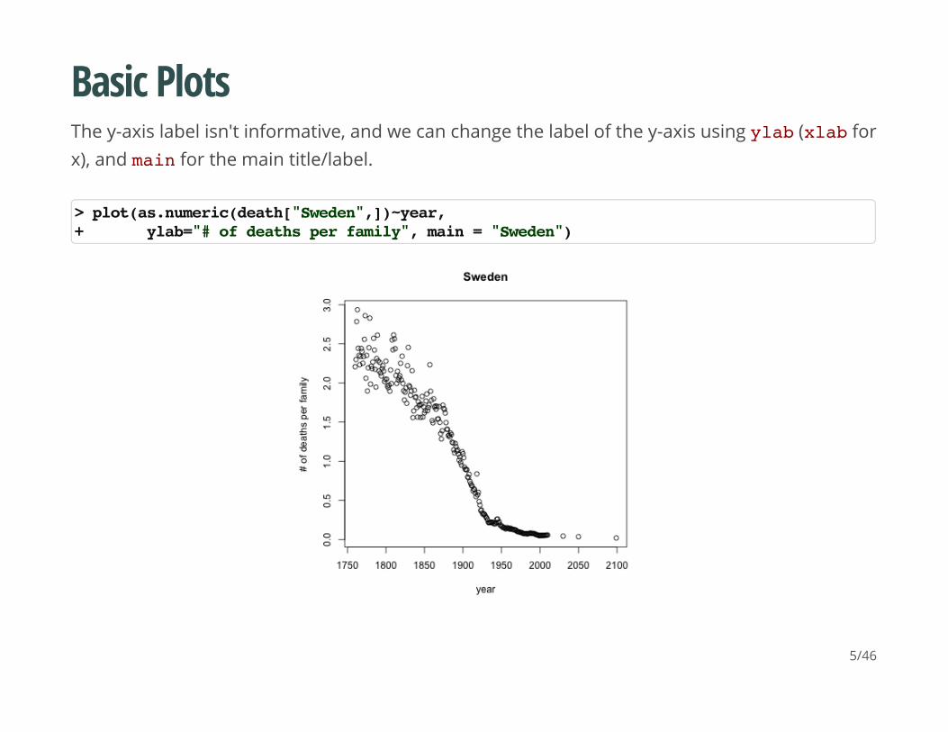
Basic Plots
The y-axis label isn't informative, and we can change the label of the y-axis using ylab (xlab forx), and main for the main title/label.
> plot(as.numeric(death["Sweden",])~year,+ ylab="# of deaths per family", main = "Sweden")
5/46
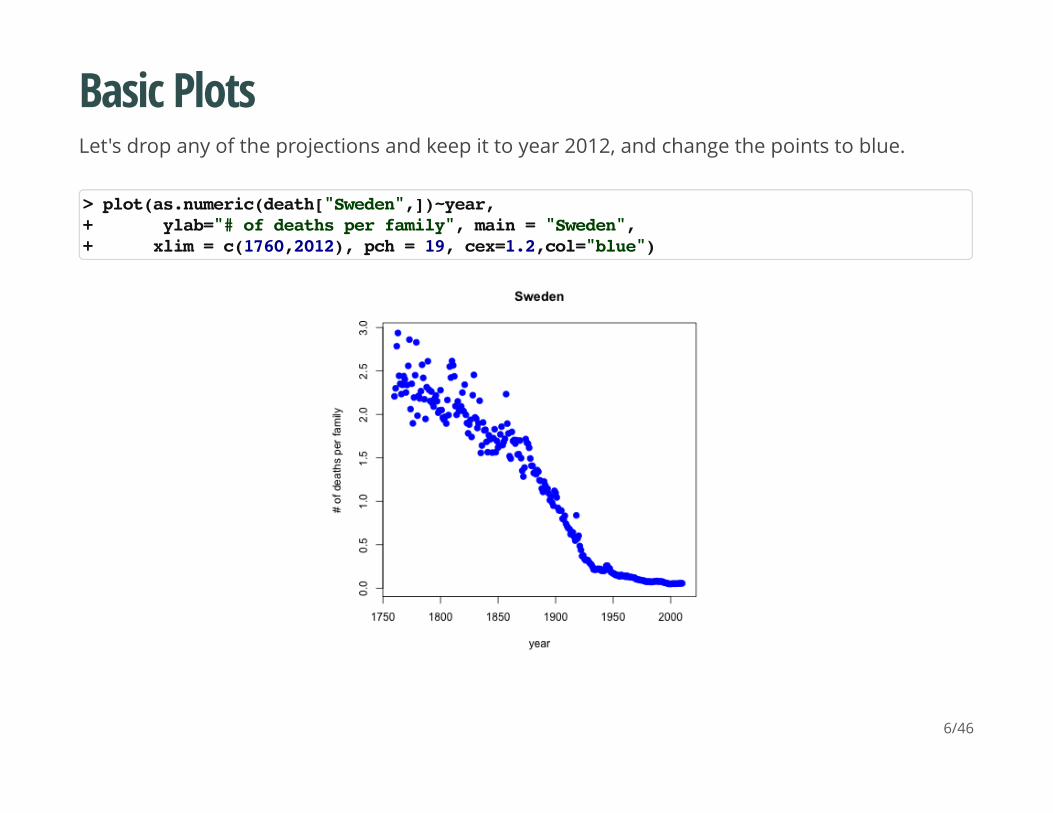
Basic Plots
Let's drop any of the projections and keep it to year 2012, and change the points to blue.
> plot(as.numeric(death["Sweden",])~year,+ ylab="# of deaths per family", main = "Sweden",+ xlim = c(1760,2012), pch = 19, cex=1.2,col="blue")
6/46
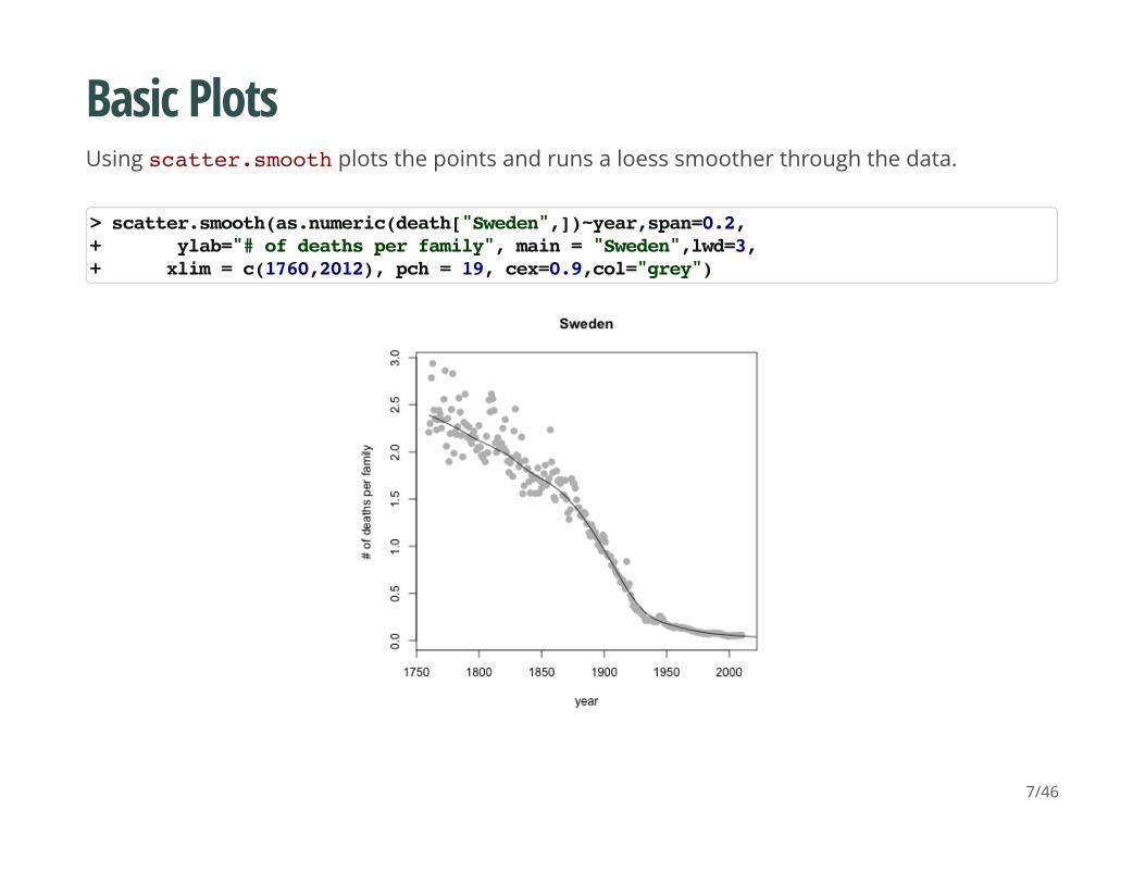
Basic Plots
Using scatter.smooth plots the points and runs a loess smoother through the data.
> scatter.smooth(as.numeric(death["Sweden",])~year,span=0.2,+ ylab="# of deaths per family", main = "Sweden",lwd=3,+ xlim = c(1760,2012), pch = 19, cex=0.9,col="grey")
7/46
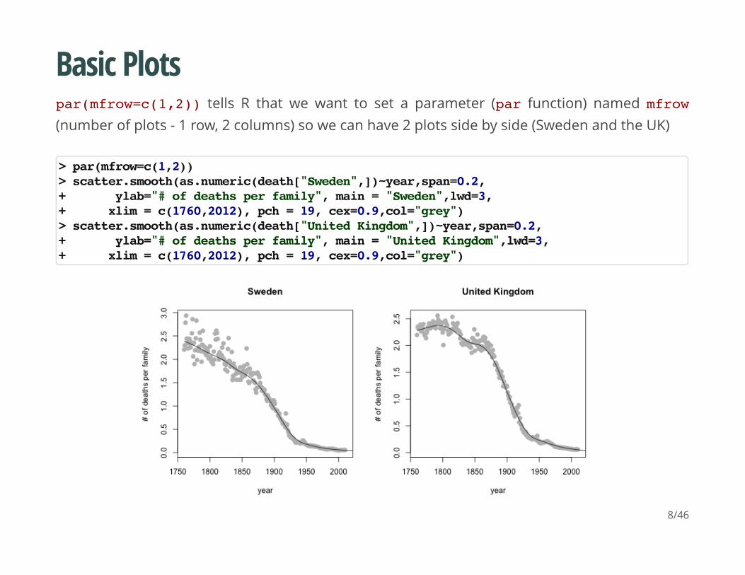
Basic Plots
par(mfrow=c(1,2)) tells R that we want to set a parameter (par function) named mfrow(number of plots - 1 row, 2 columns) so we can have 2 plots side by side (Sweden and the UK)
> par(mfrow=c(1,2))> scatter.smooth(as.numeric(death["Sweden",])~year,span=0.2,+ ylab="# of deaths per family", main = "Sweden",lwd=3,+ xlim = c(1760,2012), pch = 19, cex=0.9,col="grey")> scatter.smooth(as.numeric(death["United Kingdom",])~year,span=0.2,+ ylab="# of deaths per family", main = "United Kingdom",lwd=3,+ xlim = c(1760,2012), pch = 19, cex=0.9,col="grey")
8/46
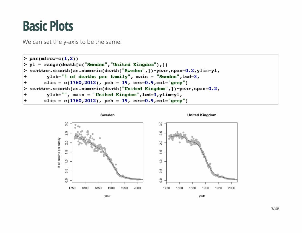
Basic Plots
We can set the y-axis to be the same.
> par(mfrow=c(1,2))> yl = range(death[c("Sweden","United Kingdom"),])> scatter.smooth(as.numeric(death["Sweden",])~year,span=0.2,ylim=yl,+ ylab="# of deaths per family", main = "Sweden",lwd=3,+ xlim = c(1760,2012), pch = 19, cex=0.9,col="grey")> scatter.smooth(as.numeric(death["United Kingdom",])~year,span=0.2,+ ylab="", main = "United Kingdom",lwd=3,ylim=yl,+ xlim = c(1760,2012), pch = 19, cex=0.9,col="grey")
9/46
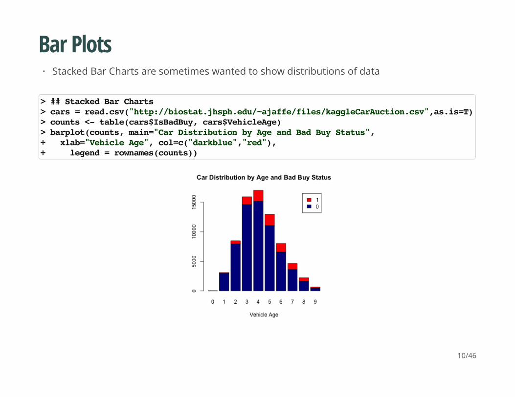
Bar Plots
Stacked Bar Charts are sometimes wanted to show distributions of data·
> ## Stacked Bar Charts> cars = read.csv("http://biostat.jhsph.edu/~ajaffe/files/kaggleCarAuction.csv",as.is=T)> counts <- table(cars$IsBadBuy, cars$VehicleAge)> barplot(counts, main="Car Distribution by Age and Bad Buy Status",+ xlab="Vehicle Age", col=c("darkblue","red"),+ legend = rownames(counts))
10/46
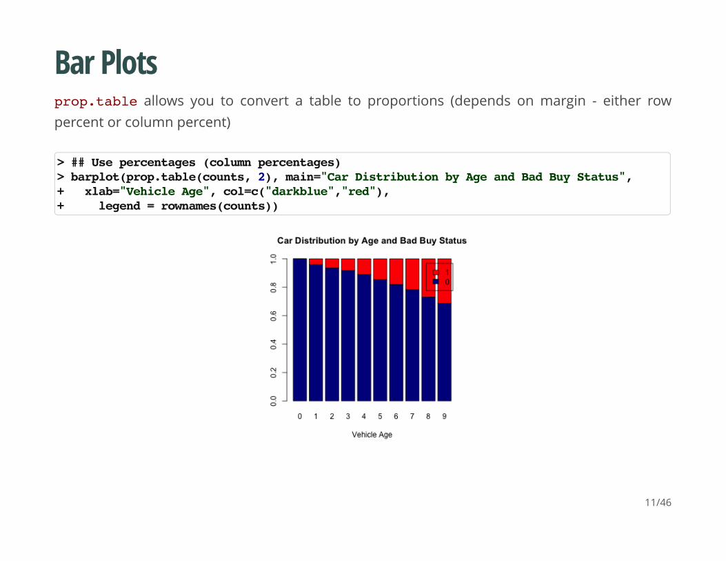
Bar Plots
prop.table allows you to convert a table to proportions (depends on margin - either rowpercent or column percent)
> ## Use percentages (column percentages)> barplot(prop.table(counts, 2), main="Car Distribution by Age and Bad Buy Status",+ xlab="Vehicle Age", col=c("darkblue","red"),+ legend = rownames(counts))
11/46
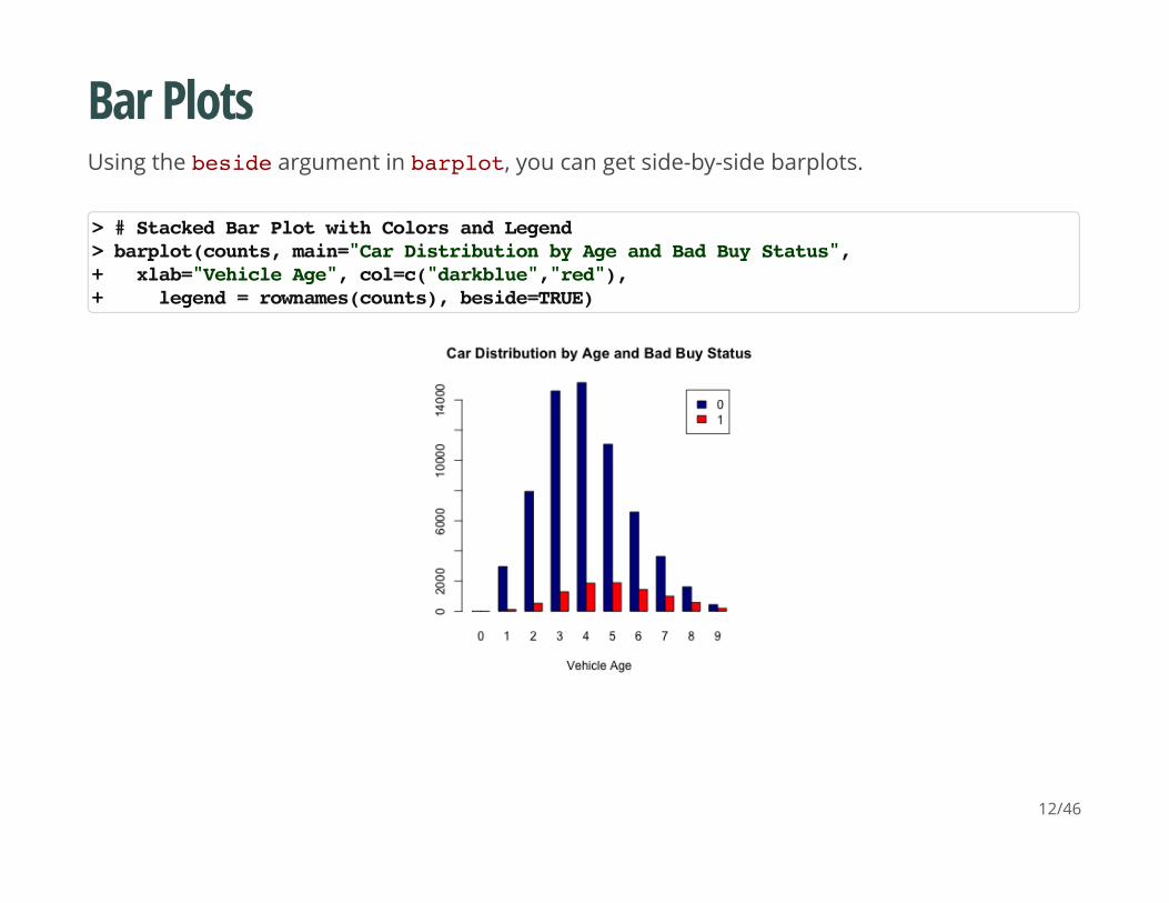
Bar Plots
Using the beside argument in barplot, you can get side-by-side barplots.
> # Stacked Bar Plot with Colors and Legend > barplot(counts, main="Car Distribution by Age and Bad Buy Status",+ xlab="Vehicle Age", col=c("darkblue","red"),+ legend = rownames(counts), beside=TRUE)
12/46
Graphics parameters
Set within most plots in the base 'graphics' package:
pch = point shape, http://voteview.com/symbols_pch.htm
cex = size/scale
xlab, ylab = labels for x and y axes
main = plot title
lwd = line density
col = color
cex.axis, cex.lab, cex.main = scaling/sizing for axes marks, axes labels, and title
·
·
·
·
·
·
·
13/46
Devices
By default, R displays plots in a separate panel. From there, you can export the plot to a varietyof image file types, or copy it to the clipboard.
However, sometimes its very nice to save many plots made at one time to one pdf file, say, forflipping through. Or being more precise with the plot size in the saved file.
R has 5 additional graphics devices: bmp(), jpeg(), png(), tiff(), and pdf()
The syntax is very similar for all of them:
Basically, you are creating a pdf file, and telling R to write any subsequent plots to that file.Once you are done, you turn the device off. Note that failing to turn the device off will create apdf file that is corrupt, that you cannot open.
pdf("filename.pdf", width=8, height=8) # inchesplot() # plot 1plot() # plot 2# etcdev.off()
14/46
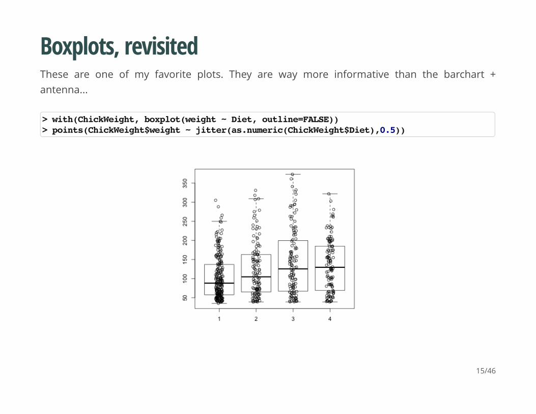
Boxplots, revisited
These are one of my favorite plots. They are way more informative than the barchart +antenna...
> with(ChickWeight, boxplot(weight ~ Diet, outline=FALSE))> points(ChickWeight$weight ~ jitter(as.numeric(ChickWeight$Diet),0.5))
15/46
Formulas
Formulas have the format of y ~ x and functions taking formulas have a data argumentwhere you pass the data.frame. You don't need to use $ or referencing when using formulas:
boxplot(weight ~ Diet, data=ChickWeight, outline=FALSE)
16/46
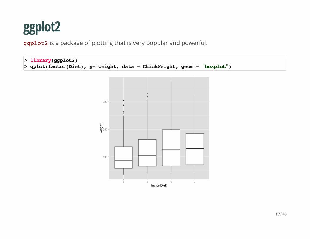
ggplot2
ggplot2 is a package of plotting that is very popular and powerful.
> library(ggplot2)> qplot(factor(Diet), y= weight, data = ChickWeight, geom = "boxplot")
17/46
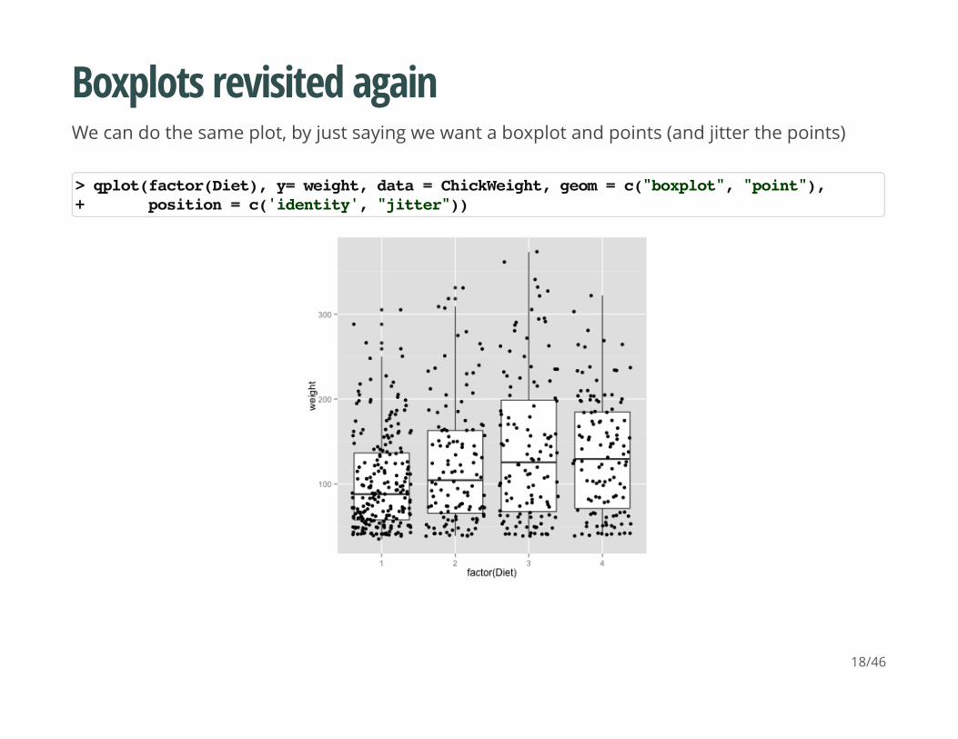
Boxplots revisited again
We can do the same plot, by just saying we want a boxplot and points (and jitter the points)
> qplot(factor(Diet), y= weight, data = ChickWeight, geom = c("boxplot", "point"),+ position = c('identity', "jitter"))
18/46
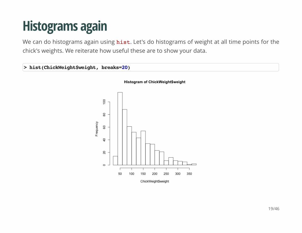
Histograms again
We can do histograms again using hist. Let's do histograms of weight at all time points for thechick's weights. We reiterate how useful these are to show your data.
> hist(ChickWeight$weight, breaks=20)
19/46
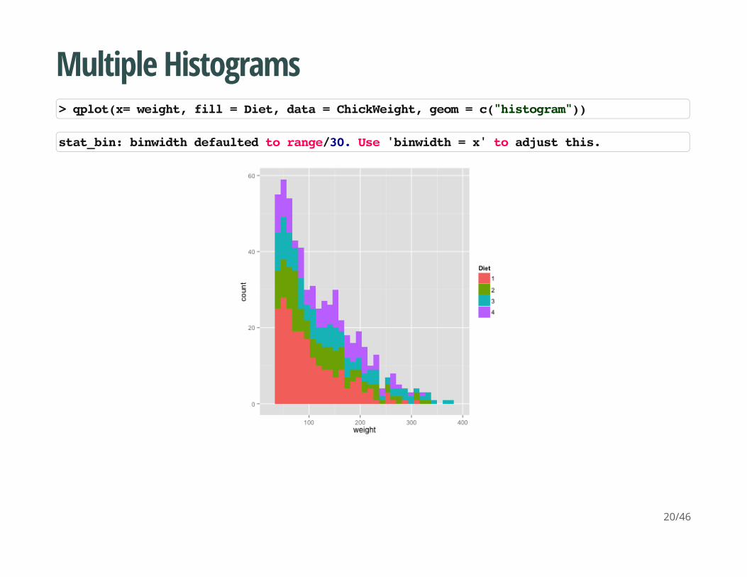
Multiple Histograms
> qplot(x= weight, fill = Diet, data = ChickWeight, geom = c("histogram"))
stat_bin: binwidth defaulted to range/30. Use 'binwidth = x' to adjust this.
20/46
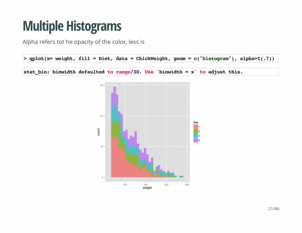
Multiple Histograms
Alpha refers tot he opacity of the color, less is
> qplot(x= weight, fill = Diet, data = ChickWeight, geom = c("histogram"), alpha=I(.7))
stat_bin: binwidth defaulted to range/30. Use 'binwidth = x' to adjust this.
21/46
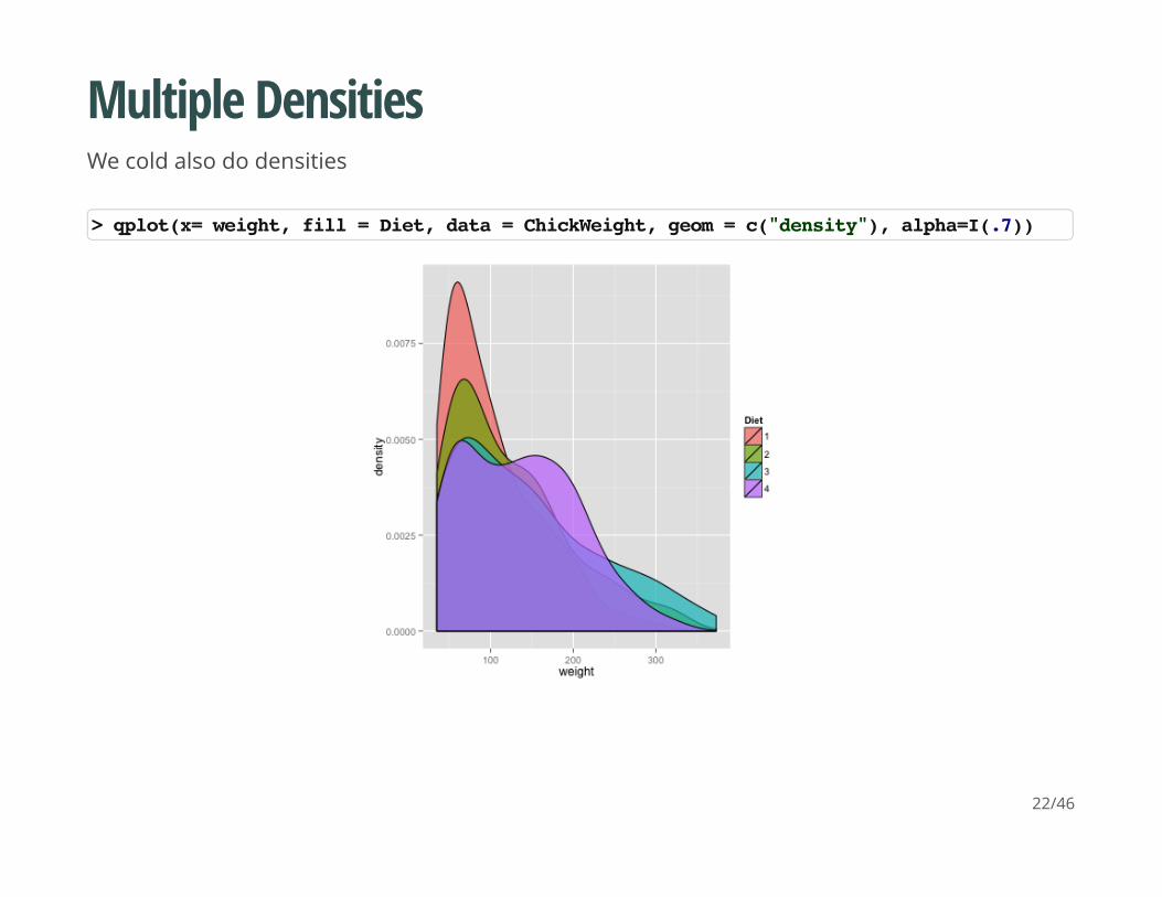
Multiple Densities
We cold also do densities
> qplot(x= weight, fill = Diet, data = ChickWeight, geom = c("density"), alpha=I(.7))
22/46
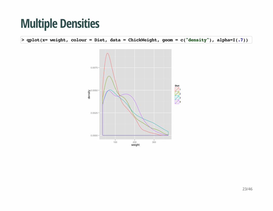
Multiple Densities
> qplot(x= weight, colour = Diet, data = ChickWeight, geom = c("density"), alpha=I(.7))
23/46
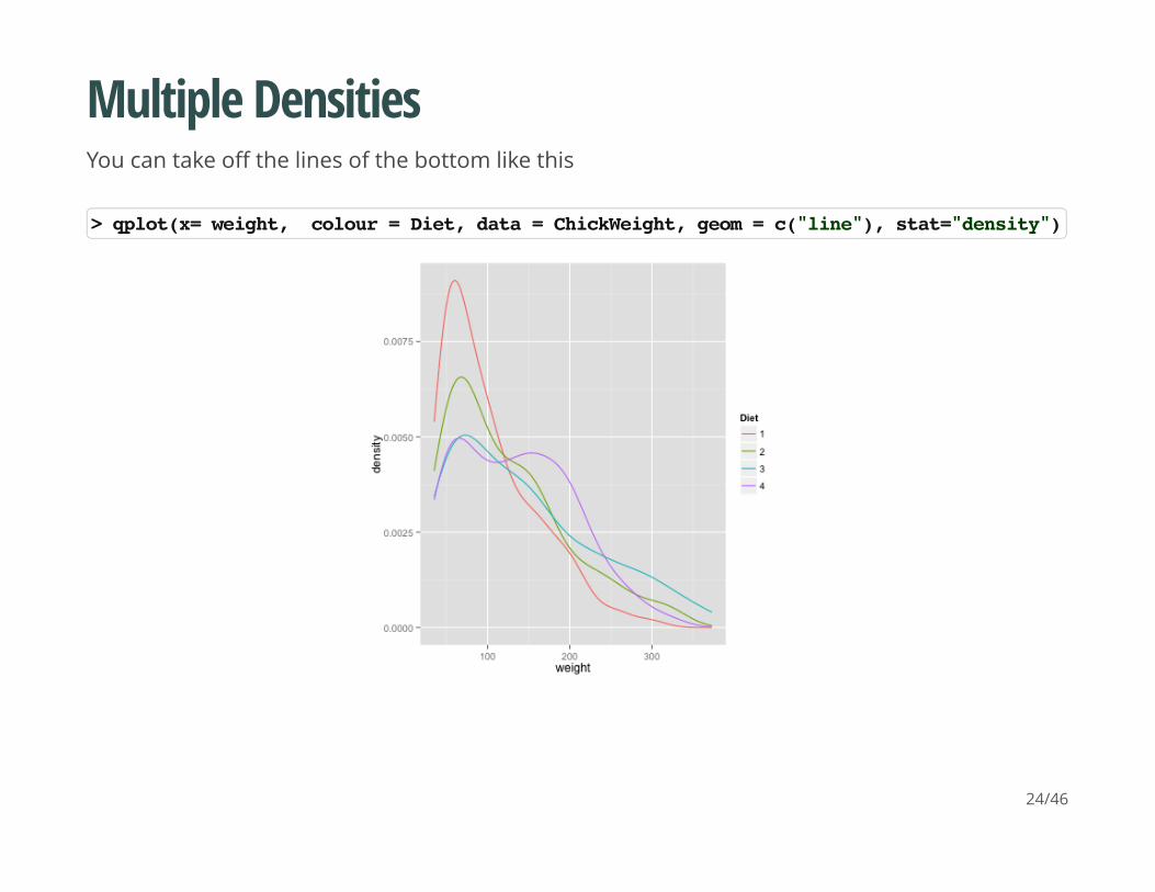
Multiple Densities
You can take off the lines of the bottom like this
> qplot(x= weight, colour = Diet, data = ChickWeight, geom = c("line"), stat="density")
24/46
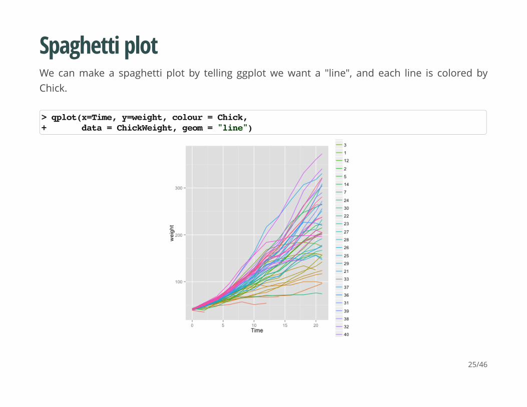
Spaghetti plot
We can make a spaghetti plot by telling ggplot we want a "line", and each line is colored byChick.
> qplot(x=Time, y=weight, colour = Chick, + data = ChickWeight, geom = "line")
25/46
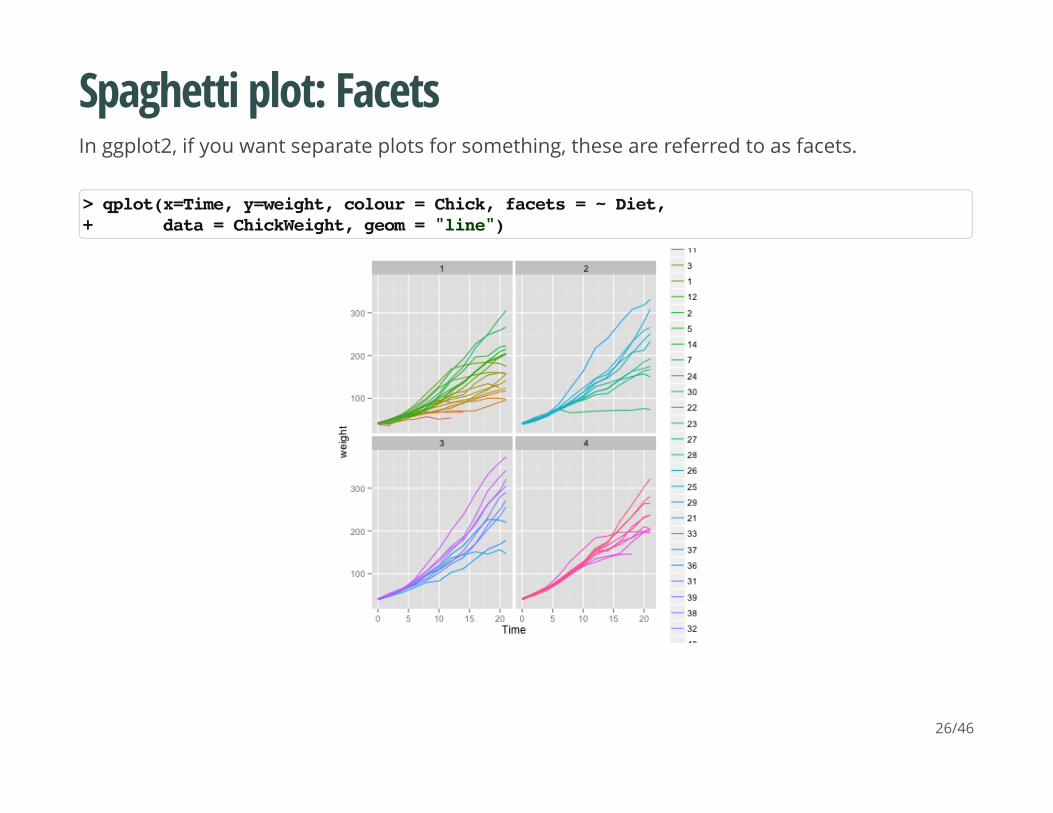
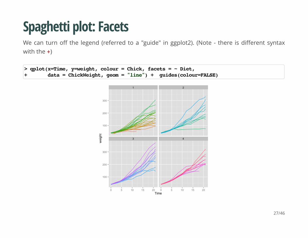
Spaghetti plot: Facets
In ggplot2, if you want separate plots for something, these are referred to as facets.
> qplot(x=Time, y=weight, colour = Chick, facets = ~ Diet, + data = ChickWeight, geom = "line")
26/46
Spaghetti plot: Facets
We can turn off the legend (referred to a "guide" in ggplot2). (Note - there is different syntaxwith the +)
> qplot(x=Time, y=weight, colour = Chick, facets = ~ Diet, + data = ChickWeight, geom = "line") + guides(colour=FALSE)
27/46
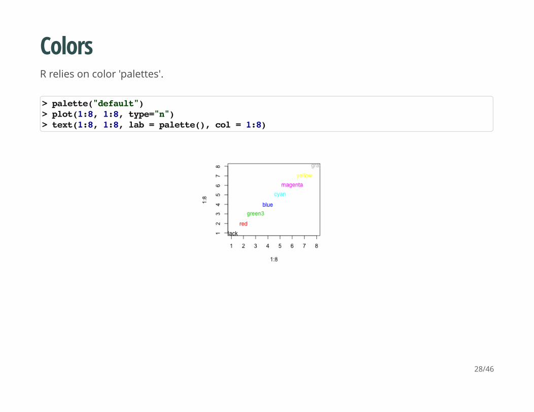
Colors
R relies on color 'palettes'.
> palette("default")> plot(1:8, 1:8, type="n")> text(1:8, 1:8, lab = palette(), col = 1:8)
28/46
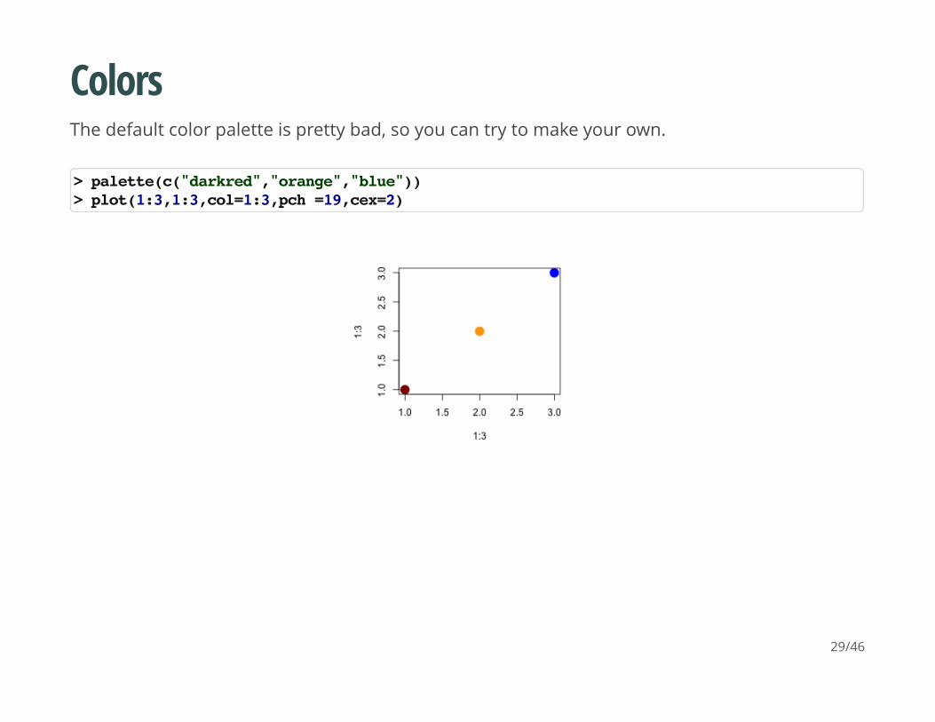
Colors
The default color palette is pretty bad, so you can try to make your own.
> palette(c("darkred","orange","blue"))> plot(1:3,1:3,col=1:3,pch =19,cex=2)
29/46
Colors
It's actually pretty hard to make a good color palette. Luckily, smart and artistic people havespent a lot more time thinking about this. The result is the 'RColorBrewer' package
RColorBrewer::display.brewer.all() will show you all of the palettes available. You can even printit out and keep it next to your monitor for reference.
The help file for brewer.pal() gives you an idea how to use the package.
You can also get a "sneak peek" of these palettes at: www.colorbrewer2.com . You wouldprovide the number of levels or classes of your data, and then the type of data: sequential,diverging, or qualitative. The names of the RColorBrewer palettes are the string after 'pick acolor scheme:'
30/46
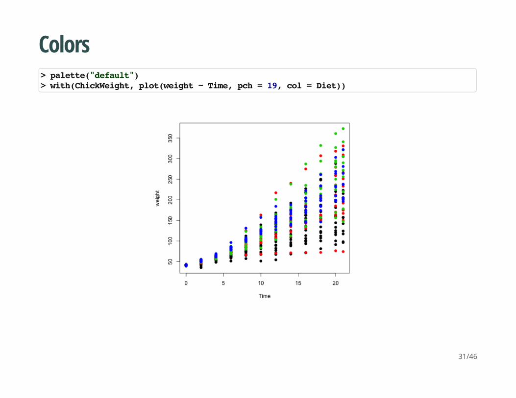
Colors
> palette("default")> with(ChickWeight, plot(weight ~ Time, pch = 19, col = Diet))
31/46
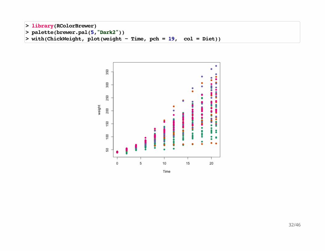
> library(RColorBrewer)> palette(brewer.pal(5,"Dark2"))> with(ChickWeight, plot(weight ~ Time, pch = 19, col = Diet))
32/46
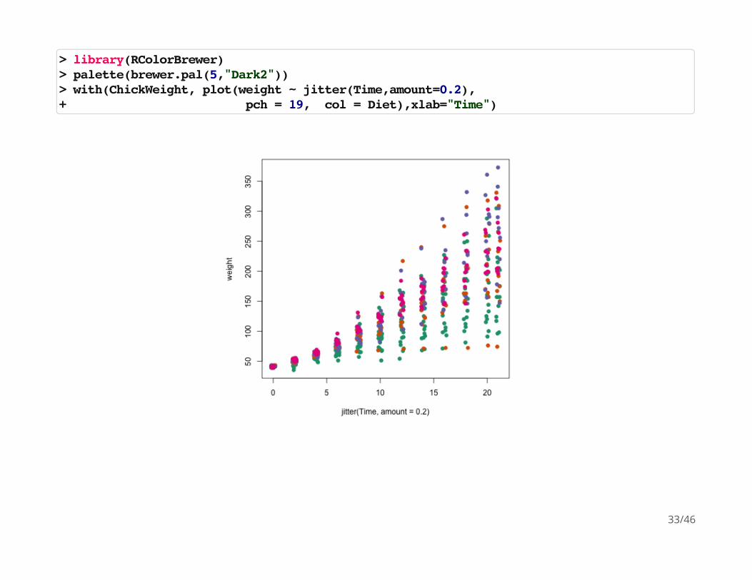
> library(RColorBrewer)> palette(brewer.pal(5,"Dark2"))> with(ChickWeight, plot(weight ~ jitter(Time,amount=0.2),+ pch = 19, col = Diet),xlab="Time")
33/46
Adding legends
The legend() command adds a legend to your plot. There are tons of arguments to pass it.
x, y=NULL: this just means you can give (x,y) coordinates, or more commonly just give x, as acharacter string: "top","bottom","topleft","bottomleft","topright","bottomright".
legend: unique character vector, the levels of a factor
pch, lwd: if you want points in the legend, give a pch value. if you want lines, give a lwd value.
col: give the color for each legend level
34/46
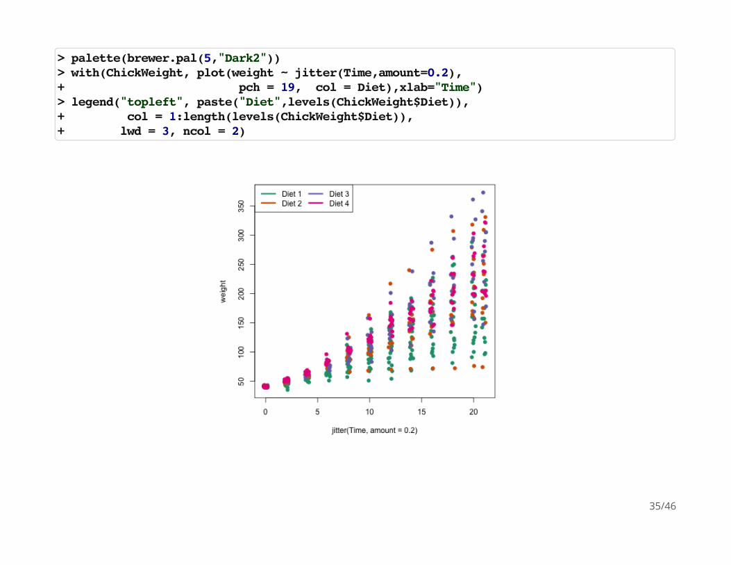
> palette(brewer.pal(5,"Dark2"))> with(ChickWeight, plot(weight ~ jitter(Time,amount=0.2),+ pch = 19, col = Diet),xlab="Time")> legend("topleft", paste("Diet",levels(ChickWeight$Diet)), + col = 1:length(levels(ChickWeight$Diet)),+ lwd = 3, ncol = 2)
35/46
Coloring by variable
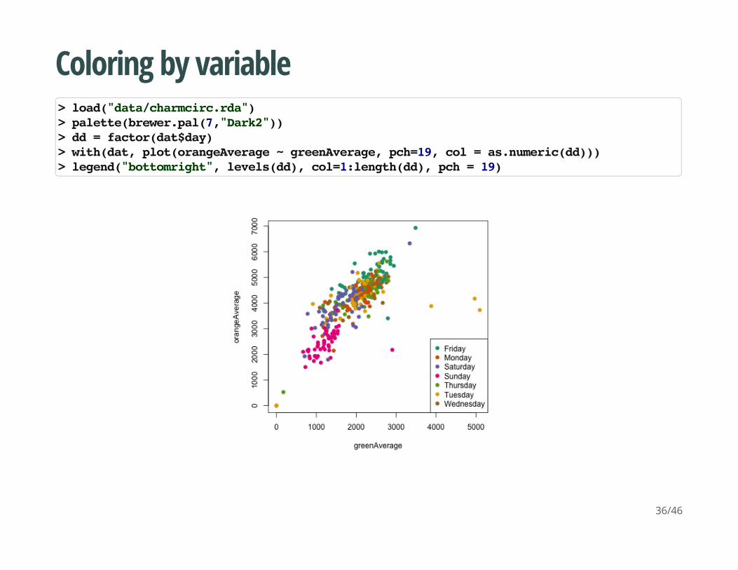
> load("data/charmcirc.rda")> palette(brewer.pal(7,"Dark2"))> dd = factor(dat$day)> with(dat, plot(orangeAverage ~ greenAverage, pch=19, col = as.numeric(dd)))> legend("bottomright", levels(dd), col=1:length(dd), pch = 19)
36/46
Coloring by variable
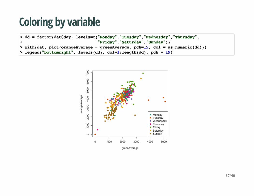
> dd = factor(dat$day, levels=c("Monday","Tuesday","Wednesday","Thursday",+ "Friday","Saturday","Sunday"))> with(dat, plot(orangeAverage ~ greenAverage, pch=19, col = as.numeric(dd)))> legend("bottomright", levels(dd), col=1:length(dd), pch = 19)
37/46
More powerful graphics
There are two very common packages for making very nice looking graphics.
lattice: http://lmdvr.r-forge.r-project.org/figures/figures.html
ggplot2: http://docs.ggplot2.org/current/index.html
38/46
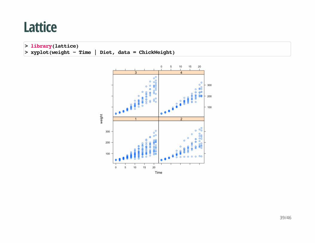
Lattice
> library(lattice)> xyplot(weight ~ Time | Diet, data = ChickWeight)
39/46
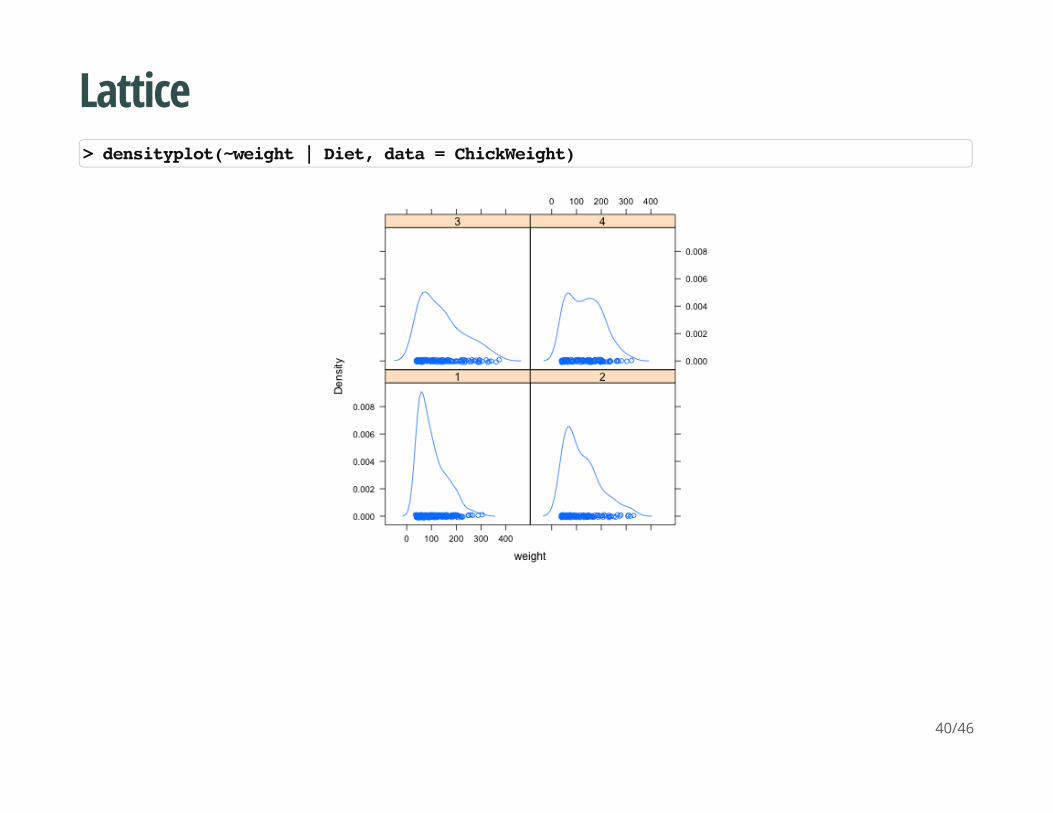
Lattice
> densityplot(~weight | Diet, data = ChickWeight)
40/46
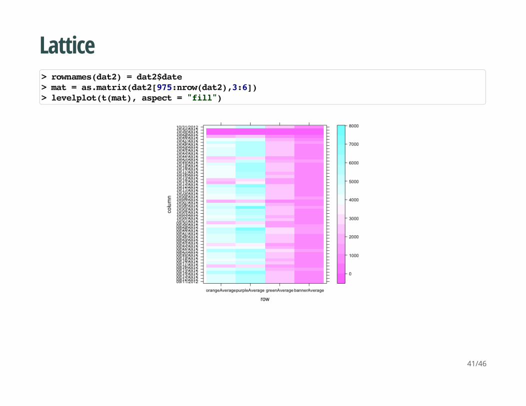
Lattice
> rownames(dat2) = dat2$date> mat = as.matrix(dat2[975:nrow(dat2),3:6])> levelplot(t(mat), aspect = "fill")
41/46
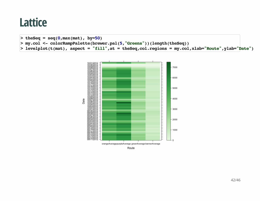
Lattice
> theSeq = seq(0,max(mat), by=50)> my.col <- colorRampPalette(brewer.pal(5,"Greens"))(length(theSeq))> levelplot(t(mat), aspect = "fill",at = theSeq,col.regions = my.col,xlab="Route",ylab="Date")
42/46
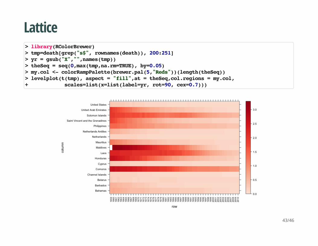
Lattice
> library(RColorBrewer)> tmp=death[grep("s$", rownames(death)), 200:251]> yr = gsub("X","",names(tmp))> theSeq = seq(0,max(tmp,na.rm=TRUE), by=0.05)> my.col <- colorRampPalette(brewer.pal(5,"Reds"))(length(theSeq))> levelplot(t(tmp), aspect = "fill",at = theSeq,col.regions = my.col,+ scales=list(x=list(label=yr, rot=90, cex=0.7)))
43/46
ggplot2
Useful links:
http://docs.ggplot2.org/0.9.3/index.html
http://www.cookbook-r.com/Graphs/
·
·
44/46

45/46

46/46