Embed Size (px)
Citation preview
Mortality and Demographic Data2011
DisclaimerThe purpose of this publication is to inform discussion and assist policy development. The opinions expressed in the publication do not necessarily reflect the official views of the Ministry of Health.
All care has been taken in the production of this publication; the data was considered to be accurate at the time of publication, but may be subject to slight changes over time as further information is received. It is advisable to check the current status of figures given here with the Ministry of Health before quoting or using them in further analysis.
The Ministry of Health makes no warranty, expressed or implied, nor assumes any legal liability or responsibility for the accuracy, correctness, completeness or use of the information or data in this publication. Further, the Ministry of Health will not be liable for any loss or damage arising directly or indirectly from the information or data presented in this publication.
Citation: Ministry of Health. 2014. Mortality and Demographic Data 2011. Wellington: Ministry of Health.Published in December 2014
by the Ministry of HealthPO Box 5013, Wellington 6145, New Zealand
ISBN: 978-0-478-44452-0 (online)HP 6080
This document is available at www.health.govt.nz

This work is licensed under the Creative Commons Attribution 4.0 International licence. In essence, you are free to: share ie, copy and redistribute the material in any medium or format; adapt ie, remix, transform and build upon the material. You must give appropriate credit, provide a link to the licence and indicate if changes were made.
AcknowledgementsMany people have assisted in the production of this publication. In particular, the Ministry of Health thanks the peer reviewers for their valuable contribution.
The Ministry of Health would also like to thank the following organisations: Department of Internal Affairs, Births, Deaths, Marriages and Citizenship Ministry of Justice, coroners and the Coronial Services Unit Land Transport New Zealand Water Safety New Zealand district health boards.
iv Mortality and Demographic Data 2011

Mortality and Demographic Data 2011 v

ContentsAcknowledgements
IntroductionLate dataEthnicity data and analysisStatistical notesFurther mortality data
Quick factsMortality 2011 – numbers and ratesSelected causes of mortality 2011
Major causes of mortalityOverview of mortality statisticsSelected causes of mortalityMortality by region
Selected trendsCancer (C00–C96, D45–D47)Trachea, bronchus and lung cancer (C33–C34)Female breast cancer (C50)Prostate cancer (C61)Malignant melanoma of the skin (C43)Cervical cancer (C53)Ischaemic heart disease (I20–I25)Cerebrovascular disease (I60–I69)Diabetes mellitus (E10–E14)Motor vehicle accidents (selected codes: V02–V89)Suicide (X60–X84)
Further mortality-related informationStatistical mortality data tablesOther mortality-related Ministry of Health publicationsOther mortality-related publicationsPopulation and demographic dataMortality data available from the Ministry of HealthAdditional information available from the Ministry of Health
vi Mortality and Demographic Data 2011

Explanatory notesMortality notesPopulation notesEthnicity notesStatistical notes
References
List of TablesTable 1: Mortality rates by age group, sex and ethnicity, 2011Table 2: Numbers and age-standardised mortality rates by sex, 1980–2011Table 3: Age-standardised mortality rates for selected causes, by sex and
ethnicity, 2011Table 4: Numbers and age-standardised mortality rates from cancer, by sex,
1980–2011Table 5: Age distribution of deaths from cancer, percentages and age-
specific rates, by ethnicity and sex, 2011Table 6: Numbers and age-standardised mortality rates from lung cancer, by
sex,1980–2011
Table 7: Age distribution of deaths from lung cancer, percentages and age-specific rates, by ethnicity and sex, 2011
Table 8: Numbers and age-standardised mortality rates from breast cancer in females, 1980–2011
Table 9: Age distribution of deaths from breast cancer in females, percentages and age-specific rates, by ethnicity, 2011
Table 10: Numbers and age-standardised mortality rates from prostate cancer,1980–2011
Table 11: Age distribution of deaths from prostate cancer in males, percentages and age-specific rates, by ethnicity, 2011
Table 12: Numbers and age-standardised mortality rates from malignant melanoma of the skin, by sex, 1980–2011
Table 13: Age distribution of deaths from malignant melanoma of the skin, percentages and age-specific rates, by ethnicity and sex, 2011
Table 14: Numbers and age-standardised mortality rates from cervical cancer,1980–2011
Table 15: Age distribution of deaths from cervical cancer, percentages and age-specific rates, by ethnicity, 2011
Table 16: Numbers and age-standardised mortality rates from ischaemic heart disease, by sex, 1980–2011
Table 17: Age distribution of deaths from ischaemic heart disease, percentages and age-specific rates, by ethnicity and sex, 2011
Mortality and Demographic Data 2011 vii
Table 18: Numbers and age-standardised mortality rates for cerebrovascular disease, by sex, 1980–2011
Table 19: Age distribution of deaths from cerebrovascular disease, percentages and age-specific rates, by ethnicity and sex, 2011
Table 20: Numbers and age-standardised mortality rates for diabetes mellitus, by sex, 1980–2011
Table 21: Age distribution of deaths from diabetes mellitus, percentages and age-specific rates, by ethnicity and sex, 2011
Table 22: Numbers and age-standardised mortality rates for motor vehicle accidents, by sex, 1980–2011
Table 23: Age distribution of deaths from motor vehicle accidents, percentages and age-specific rates, by ethnicity and sex, 2011
Table 24: Numbers and age-standardised mortality rates for suicide, by sex, 1980–2011
Table 25: Age distribution of deaths from suicide, percentages and age-specific rates, by ethnicity and sex, 2011
Table 26: Mortality data available from the Ministry of HealthTable 27: Codes used to define amenable mortalityTable 28: Estimated resident population of New Zealand, by sex and five-year
age group, mean year ended 31 December 2011Table 29: The WHO World Standard Population
List of FiguresFigure 1: Stages of processing cause of death data in New ZealandFigure 2: Numbers and age-standardised mortality rates by sex, 1950–2011Figure 3: Age-standardised mortality rates by sex and ethnicity, 1996–2011Figure 4: Age-standardised mortality rates for the five major causes of
mortality,1980–2011
Figure 5: Age at death, rates by ethnicity, 2011Figure 6: Amenable mortality rates per 100,000 people aged 0–74 years, by
sex and ethnicity, 2000–2011Figure 7: Comparison of DHB region mortality rates with national rate, 2011Figure 8: Age-standardised mortality rates, by DHB region, total population,
2011Figure 9: Age-standardised mortality rates, by DHB region, Māori population,
2011Figure 10:Age-standardised mortality rates, by DHB region, non-Māori
population, 2011Figure 11:Numbers and age-standardised mortality rates from cancer, by sex,
1950–2011Figure 12:Age-standardised mortality rates from cancer, by sex and ethnicity,
1996–2011
viii Mortality and Demographic Data 2011
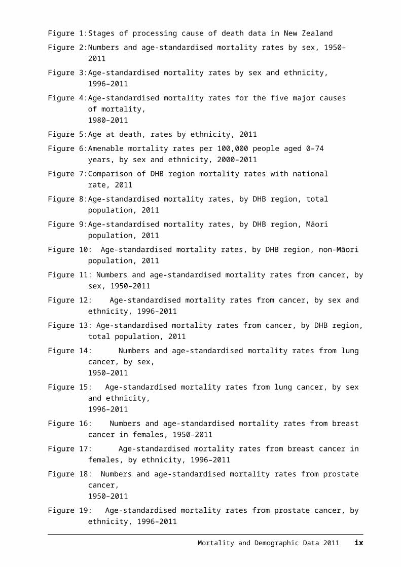
Figure 13:Age-standardised mortality rates from cancer, by DHB region, total population, 2011
Figure 14:Numbers and age-standardised mortality rates from lung cancer, by sex,1950–2011
Figure 15:Age-standardised mortality rates from lung cancer, by sex and ethnicity,1996–2011
Figure 16:Numbers and age-standardised mortality rates from breast cancer in females, 1950–2011
Figure 17:Age-standardised mortality rates from breast cancer in females, by ethnicity, 1996–2011
Figure 18:Numbers and age-standardised mortality rates from prostate cancer,1950–2011
Figure 19:Age-standardised mortality rates from prostate cancer, by ethnicity, 1996–2011
Figure 20:Numbers and age-standardised mortality rates from malignant melanoma of the skin, by sex, 1950–2011
Figure 21:Numbers and age-standardised mortality rates from cervical cancer,1950–2011
Figure 22:Age-standardised mortality rates from cervical cancer, by ethnicity, 1996–2011
Figure 23:Numbers and age-standardised mortality rates from ischaemic heart disease, by sex, 1950–2011
Figure 24:Age-standardised mortality rates from ischaemic heart disease, by sex and ethnicity, 1996–2011
Figure 25:Age-standardised mortality rates from acute myocardial infarction (ICD I21) and chronic ischaemic heart disease (ICD I25), by sex and ethnicity, 2011
Figure 26:Age-standardised mortality rates for ischaemic heart disease, by DHB region, total population, 2011
Figure 27:Numbers and age-standardised mortality rates for cerebrovascular disease, by sex, 1950–2011
Figure 28:Numbers and age-standardised mortality rates for cerebrovascular disease, by sex and ethnicity, 1996–2011
Figure 29:Age-standardised mortality rates for cerebrovascular disease, by specific disease classification and sex, 2011
Figure 30:Age-standardised mortality rates for cerebrovascular disease, by DHB region, total population, 2011
Figure 31:Numbers and age-standardised mortality rates for diabetes mellitus, by sex, 1950–2011
Figure 32:Age-standardised mortality rates for diabetes mellitus, by sex and ethnicity, 1996–2011
Figure 33:Age-standardised mortality rates for diabetes mellitus, by diabetes type and sex, 2011
Mortality and Demographic Data 2011 ix
Figure 34:Numbers and age-standardised mortality rates for motor vehicle accidents, by sex, 1950–2011
Figure 35:Age-standardised mortality rates for motor vehicle accidents, by sex and ethnicity, 1996–2011
Figure 36:Mortality and hospitalisation rates for motor vehicle accidents, and ratio of hospitalisations to deaths, 1996–2011
Figure 37:Numbers and age-standardised mortality rates for suicide, by sex, 1950–2011
Figure 38:Age-standardised mortality rates for suicide, by sex and ethnicity, 1996–2011
Figure 39:Male mortality and hospitalisation rates for intentional self-harm, and ratio of hospitalisations to deaths, 1996–2011
Figure 40:Female mortality and hospitalisation rates for intentional self-harm, and ratio of hospitalisations to deaths, 1996–2011
Figure 41:Māori 2011 population, non-Māori 2011 population and WHO World Standard Population, by age group
x Mortality and Demographic Data 2011
IntroductionMortality and Demographic Data 2011 presents data on the underlying causes of all deaths registered in New Zealand in the 2011 calendar year. The causes of death were coded to the International Statistical Classification of Diseases and Related Health Problems, Tenth Revision, Australian Modification, Sixth Edition (ICD-10-AM). In this publication, the abbreviation ICD is used to refer to the ICD-10-AM coding system (National Centre for Classification in Health 2008).
Underlying cause of death, as defined by the World Health Organization (WHO), is ‘(a) the disease or injury which initiated the train of morbid events leading directly to death, or (b) the circumstances of the accident or violence which produced the fatal injury’ (WHO 1979).
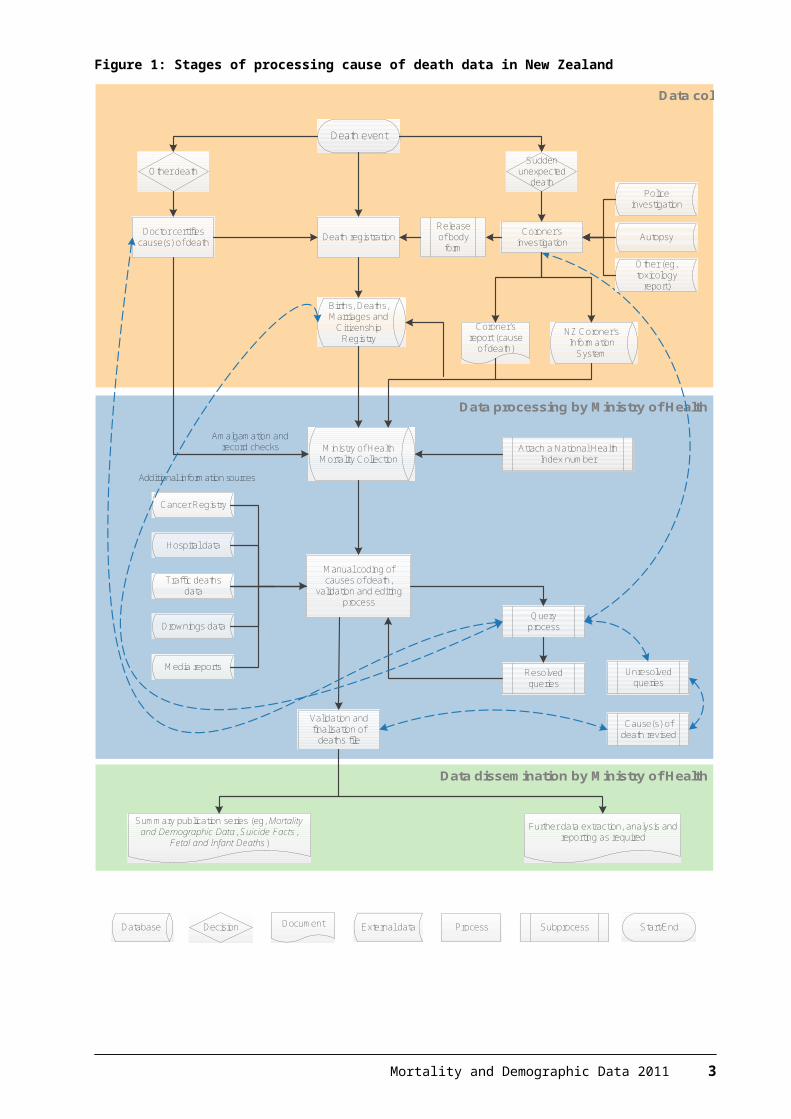
The three main sources of information for mortality data are: certificates of cause of death from doctors and coroners post-mortem reports death registration forms, which are usually completed by a funeral director.
Figure 1 illustrates the stages of processing cause of death data in New Zealand.
Late dataDue to the extended length of time that some coronial inquiries take, the Ministry of Health, at the time of publication of this document, has been unable to assign specific ICD codes to a small number of deaths. These deaths are included in the statistics under the ICD codes R99 (‘other ill-defined and unspecified causes of mortality’) and X59 (‘exposure to unspecified factor’). Because the Ministry of Health Mortality Collection is a dynamic database, the records for these deaths will be updated with specific underlying cause of death codes once coroners’ findings are received. This means there may be small differences between later extracts of mortality data and data contained in this publication.
The data for this publication was extracted on 21 May 2014. At that time, the deaths of three infants (aged under one year) were provisionally coded to underlying causes R99 and X59, and the deaths of eight infants, three children (aged 1–14 years), 12 youths (aged 15–24 years) and 58 adults (aged 25 years and over) were provisionally coded to other causes. Coronial inquiries had not been completed for these deaths, and the Ministry of Health did not have sufficient information to code them.
Mortality and Demographic Data 2011 1
Figure 1: Stages of processing cause of death data in New Zealand
Data processing by Ministry of Health
Data dissemination by Ministry of Health
Data collection
Key
Other deathSudden
unexpected death
Doctor certifies cause(s) of death Death registration Coroner’s
investigation
Police investigation
Autopsy
Other (eg, toxicology
report)
Births, Deaths, Marriages and
Citizenship Registry
Coroner’s report (cause
of death)
NZ Coroner’s Information
System
Ministry of HealthMortality Collection
Amalgamation and record checks
Manual coding of causes of death,
validation and editing process
Release of body
form
Query process
Resolved queries
Cancer Registry
Hospital data
Traffic deaths data
Drownings data
Media reports
Validation and finalisation of
deaths file
Cause(s) of death revised
Unresolved queries
Summary publication series (eg, Mortality and Demographic Data, Suicide Facts,
Fetal and Infant Deaths)
Further data extraction, analysis and reporting as required
Additional information sources
Attach a National Health Index number
Death event
ProcessDecision SubprocessDocumentDatabase External data Start/End
2 Mortality and Demographic Data 2011

Ethnicity data and analysisTwo ethnic groupings are used in the Mortality and Demographic Data publication: Māori and non-Māori. The Māori population includes everyone who was identified as Māori, and the non-Māori population includes everyone else.
Because of changes in the Births, Deaths, Marriages and Relationships Registration Act 1995 that came into force in September 1995, Māori and non-Māori rates from 1996 onwards are not comparable with earlier data. For this reason, the ethnicity trend data in this publication covers a smaller range (ie, 1996 to 2011) than that of the total population data (see ‘Ethnicity notes’ for a discussion of issues associated with ethnicity coding).
Statistical notesIn this publication, numbers are generally presented to one decimal place. However, calculations are made from the full string (ie, all the numbers after the decimal place), thereby providing more precise reporting.
Age-specific and age-standardised ratesThis publication uses age-specific and age-standardised rates.
Age-specific mortality rates represent the number of deaths in relation to the population size of a particular age group. The number of deaths within an age group is divided by the population of that age group and then multiplied by 100,000.
Age-standardised rates account for differences in population structure, and can be used to compare groups with different age structures (eg, males and females, or Māori and non-Māori) and data from different years. In the present publication, the population structure used is the WHO World Standard Population, and age-standardised rates are per 100,000 population (see ‘Statistical notes’).
Confidence intervalsWhere appropriate, confidence intervals have been calculated at the 95 percent or 99 percent level to aid the interpretation of mortality incidence (Keyfitz 1966). A confidence interval is a range of values used to illustrate the uncertainty around a single value (such as an age-standardised rate). Confidence intervals are calculated with a stated probability; for example 95 percent (which would indicate that there is a 95 percent chance that the true value lies within the confidence interval).
Note that Māori populations have lower numbers relative to the total population. This can result in greater variance (and thus larger confidence intervals) when calculating age-standardised rates. Any precise calculations made in the present publication (such as percentage differences between ethnic mortality rates) must be interpreted with this caveat in mind.
Mortality and Demographic Data 2011 3
Further mortality dataOther Ministry of Health publications contain further mortality-related data. These include publications on fetal and infant deaths, suicide, and cancer incidence and mortality.
More detailed information on numbers and rates of live births and on fetal, neonatal and post-neonatal deaths is published in the annual publication series Fetal and Infant Deaths (www.health.govt.nz/nz-health-statistics/health-statistics-and-data-sets/fetal-and-infant-deaths-series).
Information on hospitalisations and mortality from suicide can be found in Suicide Facts: Deaths and intentional self-harm hospitalisations (www.health.govt.nz/nz-health-statistics/health-statistics-and-data-sets/suicide-facts-deaths-and-intentional-self-harm-hospitalisations-series).
Information on cancer registrations and mortality can be found in Cancer: New Registrations and Deaths (www.health.govt.nz/nz-health-statistics/health-statistics-and-data-sets/cancer-new-registrations-and-deaths-series).
For a complete listing of other mortality-related data, see ‘Further mortality-related information’.
4 Mortality and Demographic Data 2011
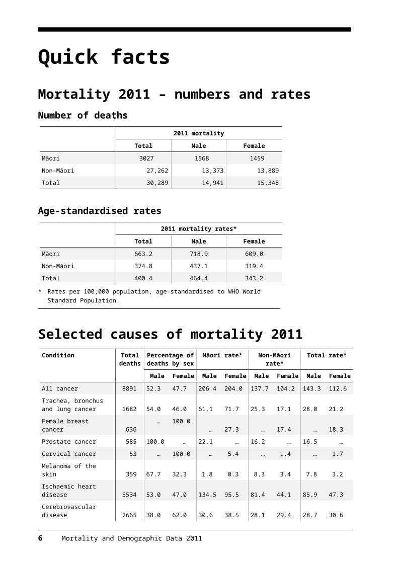
Quick factsMortality 2011 – numbers and ratesNumber of deaths
2011 mortality
Total Male Female
Māori 3027 1568 1459
Non-Māori 27,262 13,373 13,889
Total 30,289 14,941 15,348
Age-standardised rates2011 mortality rates*
Total Male Female
Māori 663.2 718.9 609.0
Non-Māori 374.8 437.1 319.4
Total 400.4 464.4 343.2
* Rates per 100,000 population, age-standardised to WHO World Standard Population.
Selected causes of mortality 2011Condition Total
deathsPercentage of deaths by sex
Māori rate* Non-Māori rate* Total rate*
Male Female Male Female Male Female Male Female
All cancer 8891 52.3 47.7 206.4 204.0 137.7 104.2 143.3 112.6
Trachea, bronchus and lung cancer 1682 54.0 46.0 61.1 71.7 25.3 17.1 28.0 21.2
Female breast cancer 636 … 100.0 … 27.3 … 17.4 … 18.3
Prostate cancer 585 100.0 … 22.1 … 16.2 … 16.5 …
Cervical cancer 53 … 100.0 … 5.4 … 1.4 … 1.7
Melanoma of the skin 359 67.7 32.3 1.8 0.3 8.3 3.4 7.8 3.2
Ischaemic heart disease 5534 53.0 47.0 134.5 95.5 81.4 44.1 85.9 47.3
Cerebrovascular disease 2665 38.0 62.0 30.6 38.5 28.1 29.4 28.7 30.6
Diabetes mellitus 835 52.5 47.5 55.5 36.0 10.5 7.6 13.7 9.4
Motor vehicle accidents 305 72.5 27.5 16.2 5.1 8.5 3.0 9.8 3.3
Suicide 493 76.5 23.5 26.3 9.5 14.9 4.0 17.0 5.1
* Rates per 100,000 population, age-standardised to WHO World Standard Population.
... = Not applicable.
Mortality and Demographic Data 2011 5
Major causes of mortalityThis section presents an overview of mortality statistics in 2011, describes trends in mortality over time and reviews selected major causes of mortality in 2011. Included in the 2011 figures are the 185 people who lost their lives in the Christchurch earthquake on 22 February 2011.
Overview of mortality statisticsThere were 30,289 deaths registered in New Zealand in 2011. This represents a 13.5 percent increase in the number of deaths since 1980. An increase in the total number of deaths is not surprising bearing in mind that the total population of New Zealand increased at the same time. A more useful measure of mortality is the age-standardised death rate, allowing comparisons to be made over time and between differing groups.1 Figure 2 shows the age-standardised rates for all causes of death from 1950 to 2011.
Figure 2: Numbers and age-standardised mortality rates by sex, 1950–2011
Note: Rates per 100,000 population, age-standardised to WHO World Standard Population.
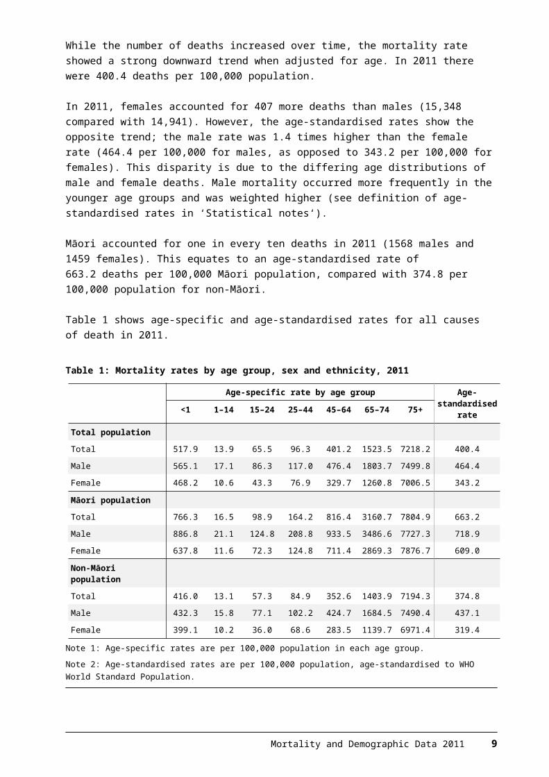
While the number of deaths increased over time, the mortality rate showed a strong downward trend when adjusted for age. In 2011 there were 400.4 deaths per 100,000 population.
In 2011, females accounted for 407 more deaths than males (15,348 compared with 14,941). However, the age-standardised rates show the opposite trend; the male rate was 1.4 times higher than the female rate (464.4 per 100,000 for males, as opposed to 343.2 per 100,000 for females). This disparity is due to the differing
1 For information on age-standardised rates see ‘Statistical notes’.
6 Mortality and Demographic Data 2011
age distributions of male and female deaths. Male mortality occurred more frequently in the younger age groups and was weighted higher (see definition of age-standardised rates in ‘Statistical notes‘).
Māori accounted for one in every ten deaths in 2011 (1568 males and 1459 females). This equates to an age-standardised rate of 663.2 deaths per 100,000 Māori population, compared with 374.8 per 100,000 population for non-Māori.
Table 1 shows age-specific and age-standardised rates for all causes of death in 2011.
Table 1: Mortality rates by age group, sex and ethnicity, 2011
Age-specific rate by age group Age-standardised
rate<1 1–14 15–24 25–44 45–64 65–74 75+
Total population
Total 517.9 13.9 65.5 96.3 401.2 1523.5 7218.2 400.4
Male 565.1 17.1 86.3 117.0 476.4 1803.7 7499.8 464.4
Female 468.2 10.6 43.3 76.9 329.7 1260.8 7006.5 343.2
Māori population
Total 766.3 16.5 98.9 164.2 816.4 3160.7 7804.9 663.2
Male 886.8 21.1 124.8 208.8 933.5 3486.6 7727.3 718.9
Female 637.8 11.6 72.3 124.8 711.4 2869.3 7876.7 609.0
Non-Māori population
Total 416.0 13.1 57.3 84.9 352.6 1403.9 7194.3 374.8
Male 432.3 15.8 77.1 102.2 424.7 1684.5 7490.4 437.1
Female 399.1 10.2 36.0 68.6 283.5 1139.7 6971.4 319.4
Note 1: Age-specific rates are per 100,000 population in each age group.
Note 2: Age-standardised rates are per 100,000 population, age-standardised to WHO World Standard Population.
Table 2 shows numbers and age-standardised rates of death from 1980 to 2011.
The age-standardised mortality rate per 100,000 population for both males and females declined steadily between 1980 and 2011. The age-standardised rate for males in 2011 was 54.2 percent lower than in 1980, and the female rate was 45.8 percent lower.
Mortality and Demographic Data 2011 7
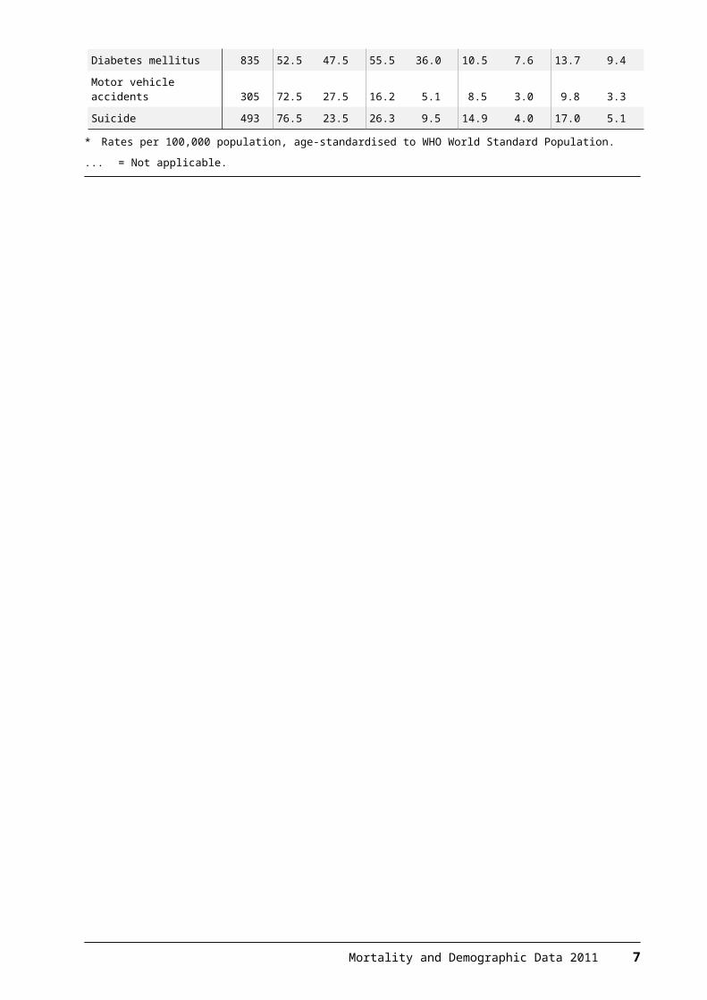
Table 2: Numbers and age-standardised mortality rates by sex, 1980–2011
Year Male Female Total
No. Rate No. Rate No. Rate
1980 14,338 1013.6 12,350 633.1 26,688 795.1
1981 13,672 935.8 11,475 564.4 25,147 726.2
1982 13,834 927.2 11,713 564.8 25,547 721.4
1983 13,986 920.0 12,021 562.9 26,007 717.2
1984 13,773 888.6 11,610 531.4 25,383 685.5
1985 14,534 922.4 12,950 575.1 27,484 725.7
1986 14,533 892.1 12,519 545.6 27,052 698.1
1987 14,472 873.4 12,958 554.3 27,430 694.5
1988 14,567 865.8 12,840 535.7 27,407 681.7
1989 14,332 836.3 12,712 522.2 27,044 661.3
1990 13,967 795.7 12,557 506.2 26,524 633.9
1991 13,810 775.6 12,680 497.3 26,490 620.3
1992 14,573 793.1 12,679 476.9 27,252 615.9
1993 14,178 755.3 13,031 480.8 27,209 601.1
1994 14,169 738.0 12,924 463.1 27,093 583.1
1995 14,528 742.3 13,428 471.4 27,956 589.6
1996 14,523 723.8 13,856 471.3 28,379 581.8
1997 14,297 680.1 13,315 433.9 27,612 542.9
1998 13,661 635.0 12,796 408.0 26,457 508.5
1999 14,348 649.3 13,876 427.5 28,224 526.0
2000 13,817 609.2 12,906 391.1 26,723 487.6
2001 14,166 606.7 13,968 402.4 28,134 493.0
2002 14,195 590.4 14,164 398.7 28,360 484.0
2003 14,066 568.6 13,995 385.8 28,061 467.7
2004 14,201 556.8 14,435 388.8 28,636 464.3
2005 13,494 514.8 13,647 357.8 27,141 429.9
2006 14,023 518.0 14,366 364.9 28,389 434.9
2007 14,333 511.8 14,268 355.3 28,601 427.2
2008 14,591 503.7 14,721 356.9 29,312 424.8
2009 14,615 488.5 14,589 346.0 29,204 412.1
2010 14,337 461.9 14,304 330.2 28,641 391.6
2011 14,941 464.4 15,348 343.2 30,289 400.4
Note: Rates per 100,000 population, age-standardised to WHO World Standard Population.
Figure 3 shows age-standardised mortality rates by sex and ethnicity from 1996 to 2011.
8 Mortality and Demographic Data 2011

Figure 3: Age-standardised mortality rates by sex and ethnicity, 1996–2011
Note 1: Rates per 100,000 population, age-standardised to WHO World Standard Population.
Note 2: Some rates differ from those previously published due to updates in the calculations.
Over the period shown above, Māori males consistently had the highest mortality rate. In 2011, the mortality rate for Māori males was 1.6 times the non-Māori male rate (718.9 and 437.1 per 100,000 population respectively).
Between 1996 and 2011, age-standardised mortality rates for Māori males decreased by 40.2 percent, while mortality rates for non-Māori males decreased by 36.2 percent.
In 2011, Māori females had an age-standardised mortality rate almost twice the rate for non-Māori females (609.0 and 319.4 per 100,000 population respectively).
The age-standardised mortality rate for Māori females decreased by 29.5 percent between 1996 and 2011; the mortality rate for non-Māori females decreased by 27.6 percent over the same period.
Figure 4 shows age-standardised mortality rates from 1980 to 2011 for the five major causes of mortality: cancer, ischaemic heart disease, cerebrovascular disease, chronic lower respiratory disease and other forms of heart disease.
In 2011, these five major causes accounted for 66.5 percent of all deaths. Cancer accounted for 29.4 percent of deaths, ischaemic heart disease accounted for 18.3 percent, and the remaining three of these five causes together accounted for 18.9 percent.
Between 1980 and 2011, mortality rates for all five major causes decreased. Specifically: ischaemic heart disease and cerebrovascular disease rates decreased by more
than two-thirds (69.9 percent and 67.5 percent respectively)
Mortality and Demographic Data 2011 9
death rates for other forms of heart disease and chronic lower respiratory diseases halved (decreasing by 53.1 percent and 50.8 percent respectively)
the mortality rate for cancer decreased by 22.4 percent.
Figure 4: Age-standardised mortality rates for the five major causes of mortality,1980–2011
Note: Rates per 100,000 population, age-standardised to WHO World Standard Population.
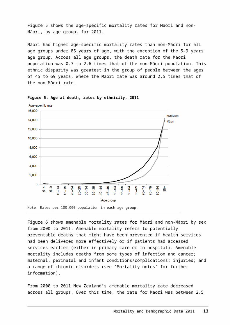
Figure 5 shows the age-specific mortality rates for Māori and non-Māori, by age group, for 2011.
Māori had higher age-specific mortality rates than non-Māori for all age groups under 85 years of age, with the exception of the 5–9 years age group. Across all age groups, the death rate for the Māori population was 0.7 to 2.6 times that of the non-Māori population. This ethnic disparity was greatest in the group of people between the ages of 45 to 69 years, where the Māori rate was around 2.5 times that of the non-Māori rate.
10 Mortality and Demographic Data 2011
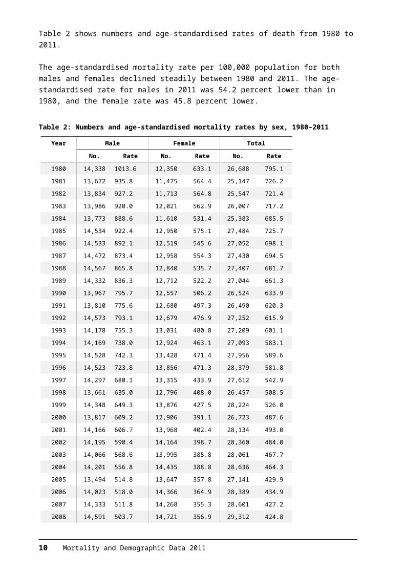
Figure 5: Age at death, rates by ethnicity, 2011
Note: Rates per 100,000 population in each age group.
Figure 6 shows amenable mortality rates for Māori and non-Māori by sex from 2000 to 2011. Amenable mortality refers to potentially preventable deaths that might have been prevented if health services had been delivered more effectively or if patients had accessed services earlier (either in primary care or in hospital). Amenable mortality includes deaths from some types of infection and cancer; maternal, perinatal and infant conditions/complications; injuries; and a range of chronic disorders (see ‘Mortality notes’ for further information).
From 2000 to 2011 New Zealand’s amenable mortality rate decreased across all groups. Over this time, the rate for Māori was between 2.5 to three times the rate for non-Māori. For both ethnic groups the amenable mortality rate was higher for males than for females.
Mortality and Demographic Data 2011 11
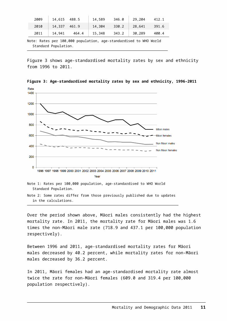
Figure 6: Amenable mortality rates per 100,000 people aged 0–74 years, by sex and ethnicity, 2000–2011
Note: Rates per 100,000 population, age-standardised to WHO World Standard Population aged0–74 years.
Selected causes of mortalityTable 3 shows age-standardised mortality rates for selected causes of death for Māori, non-Māori and the total population in 2011.
Table 3: Age-standardised mortality rates for selected causes, by sex and ethnicity, 2011
ICD code Cause of death Total population Māori population Non-Māori population
Total Male Female Total Male Female Total Male Female
C00–C96, D45–D47
Total cancer 125.9 143.3 112.6 204.6 206.4 204.0 118.9 137.7 104.2
C33–C34 Lung cancer* 24.2 28.0 21.2 66.8 61.1 71.7 20.8 25.3 17.1
C50 Breast cancer 9.7 0.2 18.3 14.7 0.0 27.3 9.3 0.2 17.4
C61 Prostate cancer … 16.5 … … 22.1 … … 16.2 …
C43 Malignant melanoma of the skin 5.3 7.8 3.2 0.9 1.8 0.3 5.7 8.3 3.4
C53 Cervical cancer … … 1.7 … … 5.4 … … 1.4
I20–I25 Ischaemic heart disease 65.4 85.9 47.3 114.7 134.5 95.5 61.5 81.4 44.1
I60–I69 Cerebrovascular disease 30.2 28.7 30.6 35.1 30.6 38.5 29.2 28.1 29.4
J40–J47 Chronic lower respiratory diseases
22.1 25.5 19.9 54.2 49.7 57.9 19.7 23.6 17.1
J40–J44 COPD‡ 19.8 23.6 17.4 45.5 41.4 49.0 18.0 22.3 15.1
I30–I52 Other forms of heart disease§ 15.0 16.8 13.3 27.0 24.5 27.6 14.0 15.6 12.4
E10–E14 Diabetes mellitus 11.5 13.7 9.4 45.3 55.5 36.0 9.0 10.5 7.6
V00–V99 Transport accidents 7.4 11.6 3.5 11.5 18.4 5.1 6.7 10.2 3.2
V02–V89≠ Motor vehicle accidents 6.5 9.8 3.3 10.5 16.2 5.1 5.7 8.5 3.0
X60–X84 Suicide 10.9 17.0 5.1 17.5 26.3 9.5 9.4 14.9 4.0
12 Mortality and Demographic Data 2011

F00–F09 Organic, including symptomatic, mental disorders~
10.8 9.2 11.6 12.0 12.5 11.5 10.8 9.1 11.6
J09–J18 Pneumonia and influenza 6.5 6.6 6.3 4.4 4.7 4.2 6.3 6.4 6.2
Q00–Q99 Congenital anomalies 4.2 4.5 3.9 5.6 5.7 5.2 3.8 3.8 3.8
I10–I15 Hypertensive disease 4.3 4.4 4.0 10.0 8.6 10.5 3.9 4.0 3.6
I05–I09 Chronic rheumatic heart disease
1.4 1.0 1.8 6.8 5.4 8.0 0.9 0.6 1.1
X85–Y09 Assault 1.2 1.6 0.8 1.8 2.5 1.3 1.1 1.5 0.7
All causes of death 400.4 464.4 343.2 663.2 718.9 609.0 374.8 437.1 319.4
Note: Rates per 100,000 population, age-standardised to WHO World Standard Population.* Includes cancer of the trachea, bronchus and lung.‡ Chronic obstructive pulmonary disease.§ Includes pericardial diseases, valve disorders, myocarditis, cardiomyopathy, conduction disorders, cardiac arrest and heart
failure, but excludes chronic rheumatic heart disease.≠ Selected codes from V02–V89 range.~ Includes dementia, amnesic syndrome, delirium and other mental disorders due to brain damage and dysfunction and to
physical disease.... = Not applicable.
The highest age-standardised mortality rates in the total population in 2011 were from: cancer ischaemic heart disease cerebrovascular disease.
The highest age-standardised mortality rates in the Māori population in 2011 were from: cancer ischaemic heart disease chronic lower respiratory diseases.
Lung cancer was the leading cause of cancer death by age-standardised rate for both Māori and non-Māori in 2011.
Sex-based differences in mortalityTable 3 shows that mortality rates for males were generally higher than for females. For example, in 2011 males had: an age-standardised mortality rate for all causes that was 1.4 times the rate for
females more than three times the age-standardised mortality rate for females from
suicide and transport accidents almost 2.5 times the age-standardised mortality rate for females from melanoma twice the age-standardised mortality rate for females from assault nearly twice the age-standardised mortality rate for females from ischaemic
heart disease 1.5 times the age-standardised mortality rate for females from diabetes.
Mortality and Demographic Data 2011 13
Ethnicity-based differences in mortalityIn 2011, Māori had a total mortality rate that was 1.8 times the rate for non-Māori (the age-standardised rates were 663.2 and 374.8 respectively).
Māori had a higher age-standardised mortality rate than non-Māori for most of the causes shown in Table 3, except for melanoma and pneumonia and influenza.
In 2011, the two largest differences between age-standardised mortality rates for Māori and non-Māori were for: chronic rheumatic heart disease, where the rate for Māori was more than 7.5
times that of non-Māori (the age-standardised rates were 6.8 and 0.9 respectively)
diabetes mellitus, where the rate for Māori was more than five times that of non-Māori (the age-standardised rates were 45.3 and 9.0 respectively).
In addition, Māori had mortality rates for lung cancer and cervical cancer that were more than three times the equivalent non-Māori rates, and rates for chronic lower respiratory diseases (including chronic obstructive pulmonary disease) and hypertensive disease that were at least twice the equivalent non-Māori rates.
Note that the percentages and rates discussed here present a snapshot from 2011. Mortality rates for Māori tend to vary more widely than those for non-Māori, due to the lower number of deaths they are based on. Thus it is useful, whenever possible, to examine the pattern of their incidence over several years. This helps to determine whether the mortality figures for a particular year and condition are a statistical spike or representative of the general trend.
Selected causes of death, broken down by sex and ethnicity, are discussed further in ‘Selected trends’.
Mortality by regionThis section presents mortality data by district health board (DHB) region of residence by age-standardised rate. Note that the populations used in this section are different to the populations used in the remainder of the publication. This means that some results in this section differ very slightly from those given in other sections (see ‘Population notes’).
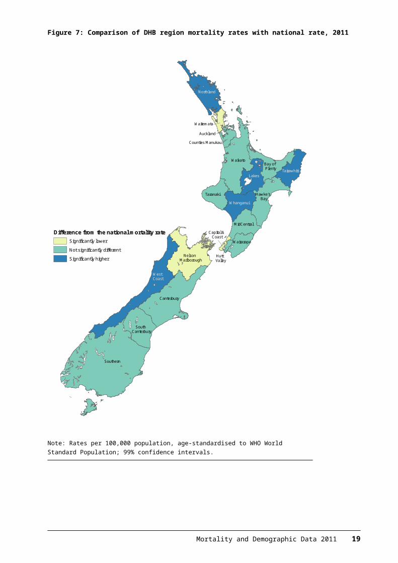
Total populationFigure 7 shows a map of total age-standardised mortality rates by DHB region of residence. The different shades shown on the map distinguish between DHB regions that have significantly higher or lower rates of mortality relative to the national rate.
Three DHB regions had mortality rates that were significantly lower than the national rate: Waitemata, Nelson Marlborough and Capital & Coast. Five had mortality rates that were significantly higher than the national rate: West Coast, Tairawhiti, Lakes, Whanganui and Northland. The remaining DHB regions had rates with 99 percent confidence limits that overlapped with the New Zealand
14 Mortality and Demographic Data 2011

mortality rate (see ‘Explanatory notes’), meaning they were not significantly different from the national rate.
Some factors that influence regional mortality rates that have not been adjusted for in the data presented here include: demographic factors (such as sex, ethnicity, deprivation and socioeconomic
status) geographic factors (such as the average distance travelled to access health
services) population risk factors (such as smoking rates, obesity rates, diabetes rates, mix
of occupations and occupational mortality rates, and population health literacy).
For example, different regions have different proportions of Māori in their populations, and Māori exhibit higher rates of mortality. Similarly, smoking and obesity rates are known to be higher among people living in more deprived areas (Ministry of Health 2012), and some DHBs have a relatively higher proportion of such areas. This data cannot be used to assess the quality of care being provided by DHBs to their populations.
Mortality and Demographic Data 2011 15

Figure 7: Comparison of DHB region mortality rates with national rate, 2011
Southern
Waikato
Canterbury
West Coast
Lakes
Northland
Nelson Marlborough
Taranaki
Tairawhiti
Whanganui
MidCentral
Hawke's Bay
South Canterbury
Bay of Plenty
Wairarapa
Waitemata
Counties Manukau
Hutt Valley
Capital & Coast
Auckland
Difference from the national mortality rateSignificantly lower
Not significantly different
Significantly higher
Note: Rates per 100,000 population, age-standardised to WHO World Standard Population; 99% confidence intervals.
16 Mortality and Demographic Data 2011
Figure 8 shows the same information as the above map, along with the age-standardised rate and the 99 percent confidence intervals for each DHB region.
Figure 8: Age-standardised mortality rates, by DHB region, total population, 2011
Note 1: Rates per 100,000 population, age-standardised to WHO World Standard Population; 99% confidence intervals.
Note 2: This figure shows confidence intervals for DHB regions. Confidence intervals for the national rate are not shown but are included in the analysis.
Mortality and Demographic Data 2011 17
Māori populationFigure 9 shows age-standardised mortality rates by DHB region of residence for Māori compared with the rate for all Māori in 2011.
Overall, three DHBs had an age-standardised mortality rate for Māori that was significantly higher than the national rate, and five had a significantly lower rate. The highest Māori age-standardised rates of death were for Lakes (953.4 per 100,000 population; 215 deaths) and Counties Manukau (900.2; n=349) DHBs. The lowest was for South Canterbury DHB (220.1; n=8).
The rates for some DHBs have very wide confidence intervals, due to low mortality numbers (eg, South Canterbury (n=8) and West Coast (n=11)). Rates for these DHBs should be interpreted with caution.
Figure 9: Age-standardised mortality rates, by DHB region, Māori population, 2011
Note 1: Rates per 100,000 population, age-standardised to WHO World Standard Population; 99% confidence intervals.
Note 2: This figure shows confidence intervals for DHB regions. Confidence intervals for the national rate are not shown but are included in the analysis.
18 Mortality and Demographic Data 2011
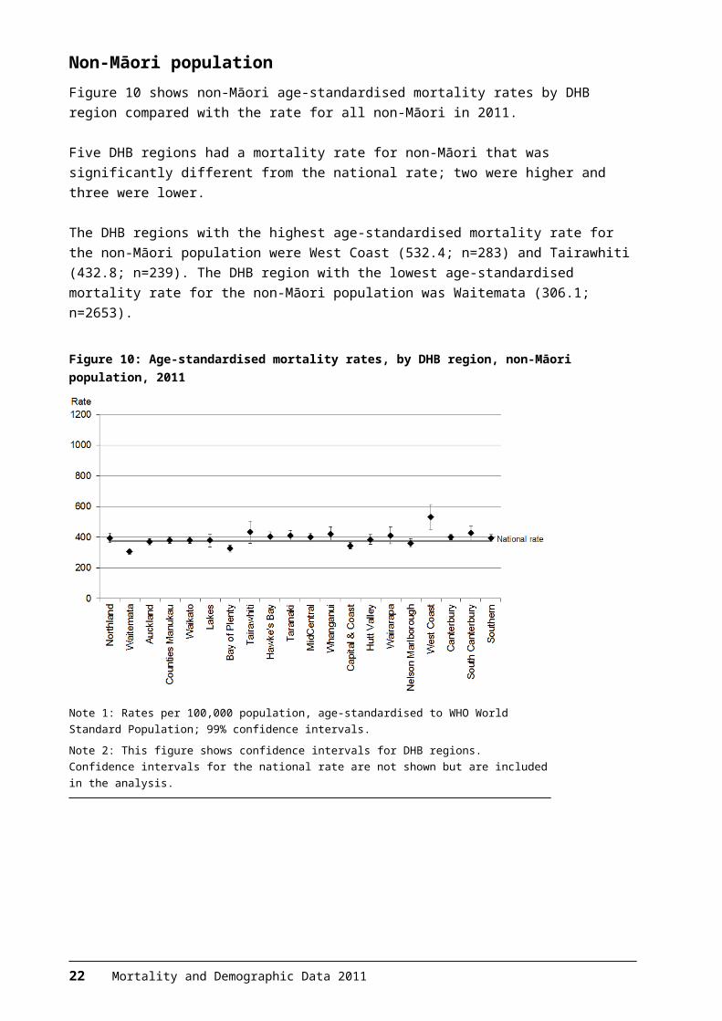
Non-Māori populationFigure 10 shows non-Māori age-standardised mortality rates by DHB region compared with the rate for all non-Māori in 2011.
Five DHB regions had a mortality rate for non-Māori that was significantly different from the national rate; two were higher and three were lower.
The DHB regions with the highest age-standardised mortality rate for the non-Māori population were West Coast (532.4; n=283) and Tairawhiti (432.8; n=239). The DHB region with the lowest age-standardised mortality rate for the non-Māori population was Waitemata (306.1; n=2653).
Figure 10: Age-standardised mortality rates, by DHB region, non-Māori population, 2011
Note 1: Rates per 100,000 population, age-standardised to WHO World Standard Population; 99% confidence intervals.
Note 2: This figure shows confidence intervals for DHB regions. Confidence intervals for the national rate are not shown but are included in the analysis.
Mortality and Demographic Data 2011 19
Selected trendsThis section examines mortality statistics for several conditions in greater depth. These analyses, while addressing the most salient conditions, are not intended to be a definitive account of the mortality and health issues facing the New Zealand population.
Conditions covered in this section are: cancer (malignant neoplasm) lung cancer (malignant neoplasm of the trachea, bronchus and lung) female breast cancer (malignant neoplasm of the female breast) prostate cancer (malignant neoplasm of the prostate) melanoma of the skin (malignant melanoma of the skin) cervical cancer (malignant neoplasm of the cervix uteri) ischaemic heart diseases (angina pectoris, myocardial infarction and other
forms of acute and chronic ischaemic heart disease) cerebrovascular diseases (cerebral haemorrhage (subarachnoid, intracerebral
and other non-traumatic), cerebral infarction, occlusion and stenosis of precerebral and cerebral arteries and other cerebrovascular diseases)
diabetes mellitus, Type 1 (insulin dependent) and Type 2 (adult onset diabetes) motor vehicle accidents (accidents associated with motorised transport) suicide (intentional self-harm).
Cancer (C00–C96, D45–D47)Cancer, or malignant neoplasm, is a general term that covers a large number of diseases. This section is concerned with the total mortality impact of malignant neoplasms (a neoplasm is an abnormal growth of tissue, which may prove to be benign or malignant). Collectively, malignant neoplasms are a major cause of mortality in the New Zealand population.
In the third edition of the International Classification of Diseases for Oncology (ICD-O), the range of neoplasms considered to be malignant was expanded. Specifically, polycythaemia vera, myelodysplastic syndromes and chronic myeloproliferative disorders are considered to be malignant in the third edition of ICD-O, whereas in the second edition these diseases were considered to be of uncertain behaviour. The ICD-10 codes for these additional malignancies are in the range D45–D47. This change took effect from 2003. Mortality and Demographic Data 2004 was the first publication in this series to include the D45–D47 range in cancer analyses.
There were 8891 deaths from cancer in 2011 (4650 males and 4241 females). Cancer was the leading cause of death for both males and females in 2011.
20 Mortality and Demographic Data 2011
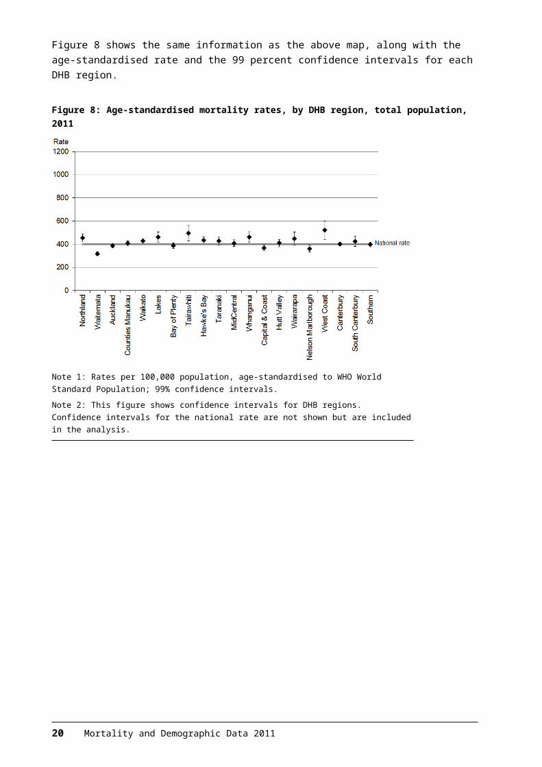
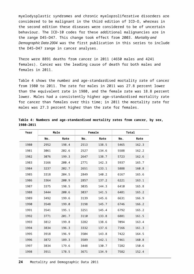
Table 4 shows the number and age-standardised mortality rate of cancer from 1980 to 2011. The rate for males in 2011 was 27.8 percent lower than the equivalent rate in 1980, and the female rate was 18.8 percent lower. Males had a consistently higher age-standardised mortality rate for cancer than females over this time; in 2011 the mortality rate for males was 27.3 percent higher than the rate for females.
Table 4: Numbers and age-standardised mortality rates from cancer, by sex, 1980–2011
Year Male Female Total
No. Rate No. Rate No. Rate
1980 2952 198.4 2513 138.5 5465 162.3
1981 3061 202.6 2527 134.6 5588 162.2
1982 3076 199.3 2647 138.7 5723 162.6
1983 3166 200.4 2771 142.3 5937 165.7
1984 3237 202.7 2651 133.1 5888 160.8
1985 3318 204.5 2849 140.2 6167 165.6
1986 3364 200.9 2857 137.2 6221 163.1
1987 3375 198.5 3035 144.3 6410 165.8
1988 3444 200.6 3037 141.5 6481 165.2
1989 3492 199.6 3139 145.6 6631 166.9
1990 3548 199.0 3198 145.7 6746 166.2
1991 3541 195.1 3251 145.4 6792 165.2
1992 3771 201.7 3110 133.8 6881 161.5
1993 3812 199.8 3282 138.6 7094 163.4
1994 3834 196.3 3332 137.6 7166 161.3
1995 3918 196.9 3504 143.8 7422 164.5
1996 3872 189.3 3589 142.1 7461 160.8
1997 3834 179.6 3448 130.7 7282 150.6
1998 3911 178.5 3671 134.9 7582 152.4
1999 4063 181.3 3611 130.7 7674 151.4
2000 4120 178.1 3500 123.2 7620 146.1
2001 4166 175.7 3644 124.6 7810 145.5
2002 4125 168.9 3675 120.9 7800 140.7
2003 4292 170.1 3735 121.7 8027 141.8
2004 4246 164.1 3899 124.1 8145 140.7
2005 4184 156.6 3787 116.9 7971 133.6
2006 4144 151.3 3950 118.5 8094 132.4
2007 4539 159.4 3980 117.3 8519 135.1
2008 4561 154.9 4005 115.3 8566 132.3
2009 4402 145.4 4035 112.6 8437 126.8
2010 4511 143.9 4082 110.6 8593 125.2
2011 4650 143.3 4241 112.6 8891 125.9
Note: Rates per 100,000 population, age-standardised to WHO World Standard Population.
Mortality and Demographic Data 2011 21
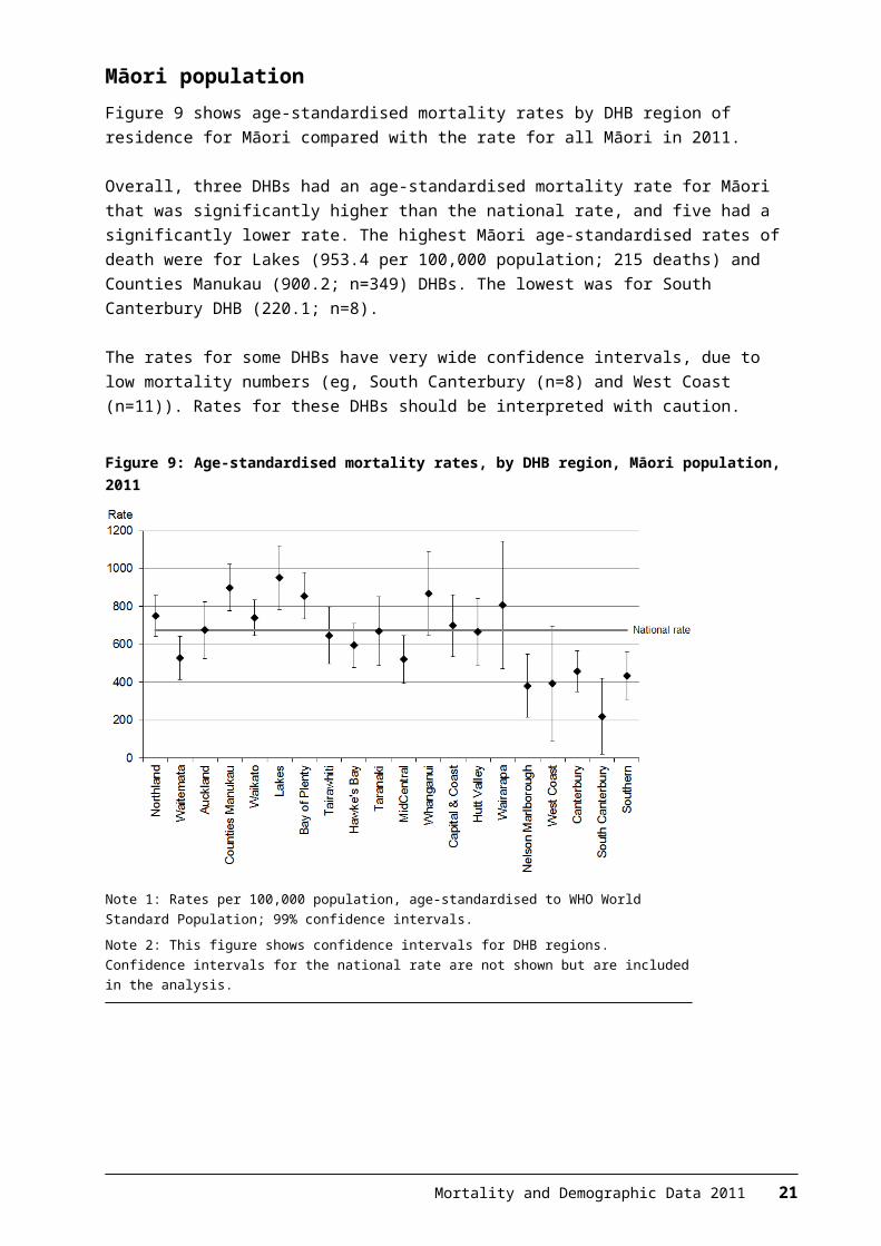
Figure 11 shows how the numbers and mortality rates from cancer have changed since 1950. Although the number of deaths has increased steadily for both males and females, matching the general rise in population, the rate has shown a different trend.
Male rates showed a general increase, with a high point in 1985, and then showed a gradual decline to below the levels seen in the 1950s. Female rates showed more stability, but reached their highest level in 1990. The male rate in 2011 was the lowest seen since 1950, while the female rate in 2010 was the lowest over the entire period.
Figure 11: Numbers and age-standardised mortality rates from cancer, by sex, 1950–2011
Note: Rates per 100,000 population, age-standardised to WHO World Standard Population.
Table 5 shows the 2011 percentage distribution of deaths and age-specific mortality rates from cancer for four age groupings for Māori and non-Māori.
Table 5: Age distribution of deaths from cancer, percentages and age-specific rates, by ethnicity and sex, 2011
Age group
Percentage Age-specific mortality rate
Māori Non-Māori Māori Non-Māori
Total Male Female Total Male Female Total Male Female Total Male Female
<25 1.1 1.4 0.8 0.5 0.5 0.5 2.8 3.3 2.3 3.6 3.8 3.3
25–44 6.7 5.1 8.0 2.8 2.2 3.4 37.6 28.0 46.1 22.0 19.1 24.8
45–64 41.7 39.3 43.8 21.0 20.0 22.2 336.5 305.1 364.6 167.8 173.1 162.7
65+ 50.5 54.2 47.4 75.7 77.3 73.9 1460.3 1563.3 1373.4 1084.1 1285.4 914.2
Note: Rates per 100,000 population.
22 Mortality and Demographic Data 2011
The distribution is skewed toward the 65 years and over age group. However, a large proportion of cancer-related deaths also occurred in the 45–64 years age band. Cancer deaths were relatively rare in age groups below this.
Compared with non-Māori, a greater proportion of Māori deaths occurred in the youngest three age groups (almost half of Māori cancer deaths occurred in those aged less than 65; for non-Māori, this figure was 24.3 percent).
Figure 12 shows age-standardised cancer mortality rates by sex and ethnicity from 1996 to 2011.
Figure 12: Age-standardised mortality rates from cancer, by sex and ethnicity, 1996–2011
Note: Rates per 100,000 population, age-standardised to WHO World Standard Population.
Between 1996 and 2011, the Māori population had a consistently higher rate of cancer deaths than the non-Māori population. Māori males had a higher rate than Māori females in every year except 2008.
In 2011, the rate of cancer deaths for Māori males was 1.5 times that for non-Māori males. The rate for Māori females was twice that for non-Māori females.
There was a significant difference in cancer mortality rates between non-Māori males and non-Māori females between 1996 and 2011 (using 95 percent confidence intervals).2 The difference between the Māori male and Māori female rates was not significant in 2011.
2 Confidence intervals were calculated for all rates, although they are not shown in Figure 12. For more information on confidence intervals, see ‘Statistical notes’.
Mortality and Demographic Data 2011 23
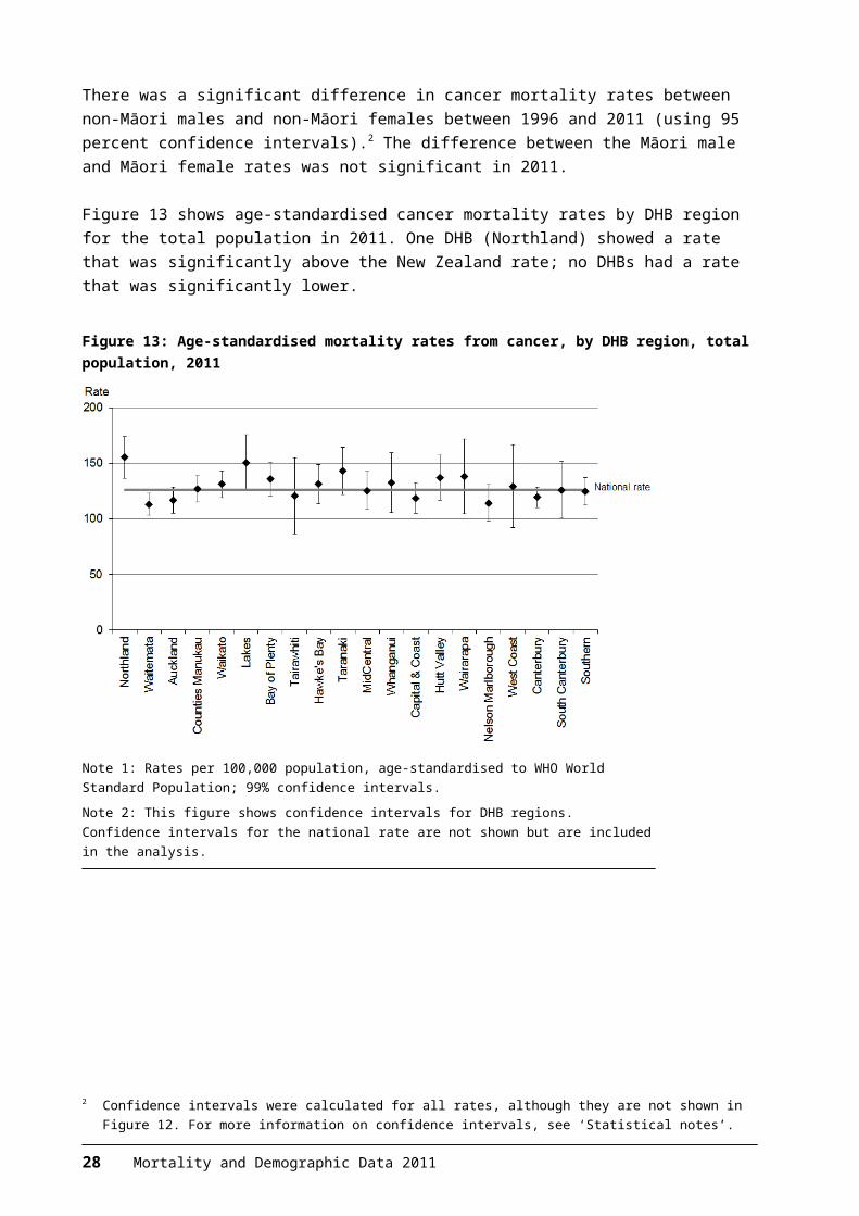
Figure 13 shows age-standardised cancer mortality rates by DHB region for the total population in 2011. One DHB (Northland) showed a rate that was significantly above the New Zealand rate; no DHBs had a rate that was significantly lower.
Figure 13: Age-standardised mortality rates from cancer, by DHB region, total population, 2011
Note 1: Rates per 100,000 population, age-standardised to WHO World Standard Population; 99% confidence intervals.
Note 2: This figure shows confidence intervals for DHB regions. Confidence intervals for the national rate are not shown but are included in the analysis.
24 Mortality and Demographic Data 2011
Trachea, bronchus and lung cancer(C33–C34)This section covers ICD codes C33 and C34 (C33: malignant neoplasm of trachea; C34: malignant neoplasm of bronchus and lung). In this publication, these conditions are collectively referred to as lung cancer.
Lung cancer was the leading cause of cancer death in 2011, accounting for 18.9 percent of cancer deaths (1682 deaths). The majority of those who died from lung cancer were males (54.0 percent).
Table 6 shows deaths from lung cancer from 1980 to 2011. The age-standardised mortality rate for males decreased by 50.3 percent over this period, while the rate for females showed the opposite trend, increasing by 46.5 percent.
Mortality and Demographic Data 2011 25

Table 6: Numbers and age-standardised mortality rates from lung cancer, by sex,1980–2011
Year Male Female Total
No. Rate No. Rate No. Rate
1980 868 56.4 265 14.5 1133 32.8
1981 889 57.3 298 15.8 1187 33.8
1982 844 53.4 298 15.4 1142 31.7
1983 948 58.3 291 15.0 1239 34.0
1984 975 59.4 307 15.2 1282 34.4
1985 866 52.6 331 16.6 1197 31.9
1986 949 55.5 329 15.9 1278 33.1
1987 950 54.7 396 18.9 1346 34.5
1988 892 51.2 395 18.4 1287 32.7
1989 896 50.5 411 19.7 1307 32.9
1990 903 50.0 433 20.2 1336 33.0
1991 869 47.1 427 19.8 1296 31.6
1992 947 50.0 445 19.5 1392 32.5
1993 892 46.1 444 19.4 1336 30.9
1994 919 46.3 484 20.7 1403 31.7
1995 892 44.3 514 21.6 1406 31.5
1996 904 43.8 502 20.2 1406 30.5
1997 882 40.8 530 21.2 1412 29.6
1998 855 38.8 526 20.2 1381 28.1
1999 874 38.6 569 21.4 1443 28.8
2000 860 37.0 546 19.7 1406 27.3
2001 841 35.1 594 21.4 1435 27.3
2002 866 35.1 605 20.7 1471 26.9
2003 848 33.4 618 21.6 1466 26.6
2004 929 35.9 626 21.5 1555 27.8
2005 864 32.3 587 19.2 1451 25.0
2006 798 29.2 659 21.2 1457 24.7
2007 864 30.3 664 20.4 1528 24.7
2008 889 30.1 745 22.6 1634 25.7
2009 876 28.8 717 21.0 1593 24.4
2010 893 28.7 757 21.2 1650 24.6
2011 909 28.0 773 21.2 1682 24.2
Note: Rates per 100,000 population, age-standardised to WHO World Standard Population.
26 Mortality and Demographic Data 2011
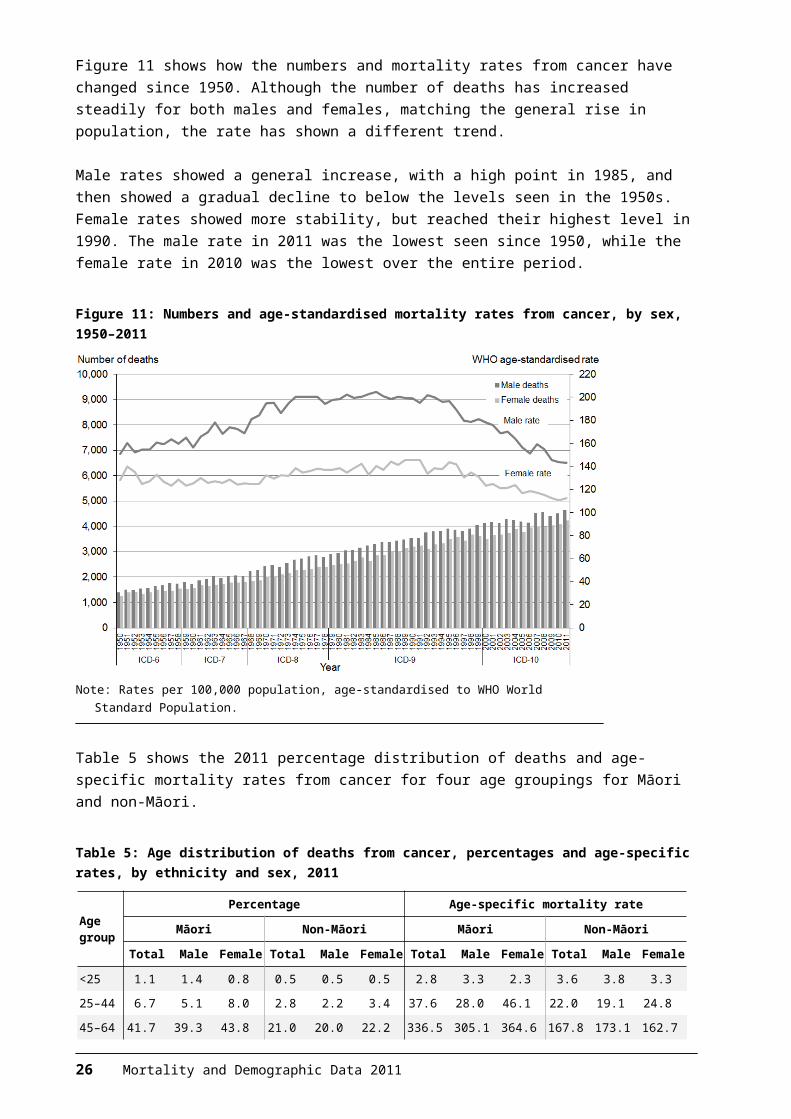
Figure 14 shows trends in numbers and rates of death from lung cancer for both males and females. Mortality rates for males peaked in the mid-1980s and then showed a strong downward trend. Female rates showed a general upward trend from 1950 before stabilising in the 1990s.
Figure 14: Numbers and age-standardised mortality rates from lung cancer, by sex,1950–2011
Note: Rates per 100,000 population, age-standardised to WHO World Standard Population.
Table 7 shows the 2011 percentage distribution of deaths and age-specific mortality rates from lung cancer for four age groupings for Māori and non-Māori.
Table 7: Age distribution of deaths from lung cancer, percentages and age-specific rates, by ethnicity and sex, 2011
Age group
Percentage Age-specific rate
Māori Non-Māori Māori Non-Māori
Total Male Female Total Male Female Total Male Female Total Male Female
<25 0.0 0.0 0.0 0.1 0.0 0.2 0.0 0.0 0.0 0.1 0.0 0.2
25–44 2.3 2.3 2.3 0.7 0.4 1.0 4.2 3.8 4.5 0.9 0.6 1.2
45–64 45.2 47.3 43.7 22.1 20.8 23.9 117.6 110.8 123.7 30.6 33.3 28.1
65+ 52.5 50.4 54.0 77.2 78.8 75.0 489.8 438.0 533.5 191.6 242.3 148.9
Note: Rates per 100,000 population.
The age distribution evident in Table 7 is similar to that for cancer deaths as a whole; the great majority of deaths occurred in those aged 45 years and over.
Among Māori, a greater proportion of deaths occurred in those aged 45–64 years (over twice that of non-Māori), and the Māori age-specific rate was almost four times that of non-Māori. In the 65 years and over age group, the Māori rate was 2.6 times that of non-Māori.
Mortality and Demographic Data 2011 27
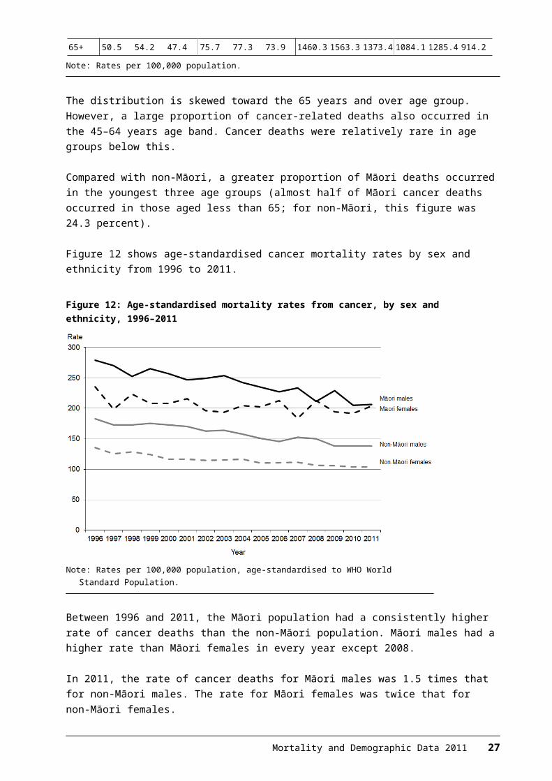
Figure 15 shows age-standardised death rates from lung cancer, by sex and ethnicity. Between 1996 and 2011, mortality rates for Māori males and females from lung cancer were higher than the equivalent non-Māori rates. During this period, the mortality rate for Māori males from lung cancer decreased by 42.6 percent, while the Māori female rate showed no obvious trend.
In 2011, the age-standardised mortality rate of lung cancer in Māori males was almost 2.5 times that of the non-Māori male population. The rate for Māori females was over four times that of non-Māori females.
Figure 15: Age-standardised mortality rates from lung cancer, by sex and ethnicity,1996–2011
Note: Rates per 100,000 population, age-standardised to WHO World Standard Population.
28 Mortality and Demographic Data 2011
Female breast cancer (C50)Breast cancer, or malignant neoplasm of the breast, was the second leading cause of cancer death among females in 2011 after lung cancer.3 National breast screening commenced at the end of 1998 for women aged 50–69 years; from July 2008 the minimum screening age was lowered to 45.4
A total of 636 females died from breast cancer in 2011; this accounted for 15.0 percent of female deaths from cancer.
Table 8 shows the numbers and age-standardised mortality rates for females from breast cancer from 1980 to 2011. While the actual number of deaths increased, the mortality rate decreased by 38 percent.
3 This section discusses cancer of the female breast; breast cancer can occur in males but is rare (there were five male deaths in 2011, giving an age-standardised rate of 0.2 deaths per 100,000 male population).
4 For further information on the BreastScreen Aotearoa programme, see www.nsu.govt.nz
Mortality and Demographic Data 2011 29
Table 8: Numbers and age-standardised mortality rates from breast cancer in females,1980–2011
Year No. Rate
1980 509 29.5
1981 478 27.3
1982 524 29.4
1983 537 29.8
1984 504 26.8
1985 565 29.5
1986 529 27.6
1987 607 31.5
1988 593 30.0
1989 605 30.0
1990 635 31.2
1991 588 28.6
1992 569 26.6
1993 584 26.6
1994 567 25.5
1995 638 28.4
1996 681 28.6
1997 620 25.8
1998 629 25.2
1999 647 25.3
2000 622 23.6
2001 615 22.7
2002 625 22.4
2003 647 23.1
2004 642 22.4
2005 648 21.7
2006 614 20.3
2007 643 20.8
2008 618 19.1
2009 658 19.9
2010 641 19.1
2011 636 18.3
Note: Rates per 100,000 female population, age-standardised to WHO World Standard Population.
30 Mortality and Demographic Data 2011
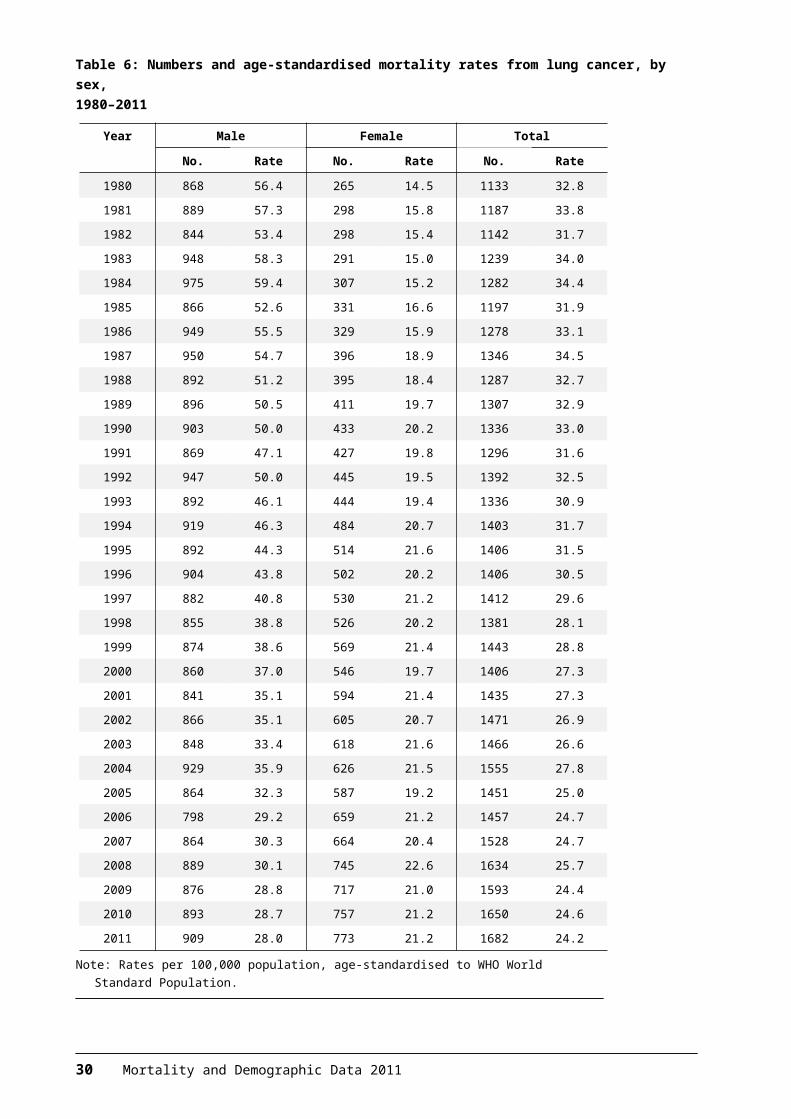
Figure 16 shows that although the number of deaths due to breast cancer increased between 1950 and 2011, when adjusted for age and the change in population, the rate showed a general downward trend after the mid-1980s. The mortality rate for 2011 (18.3 deaths per 100,000 females) was the lowest over the entire period.
Figure 16: Numbers and age-standardised mortality rates from breast cancer in females, 1950–2011
Note: Rates per 100,000 female population, age-standardised to WHO World Standard Population.
Table 9 shows the 2011 percentage distribution of deaths and age-specific mortality rates from breast cancer in females for four age groupings for Māori and non-Māori.
Table 9: Age distribution of deaths from breast cancer in females, percentages and age-specific rates, by ethnicity, 2011
Age groupPercentage Age-specific rate
Māori female Non-Māori female Māori female Non-Māori female
<25 0.0 0.0 0.0 0.0
25–44 11.1 7.8 9.0 8.5
45–64 54.2 34.9 63.5 38.8
65+ 34.7 57.3 141.9 107.1
Note: Rates per 100,000 population.
The highest proportions of deaths from breast cancer were seen in the 45–64 age group for Māori, and the 65 and over age group for non-Māori.
Mortality and Demographic Data 2011 31
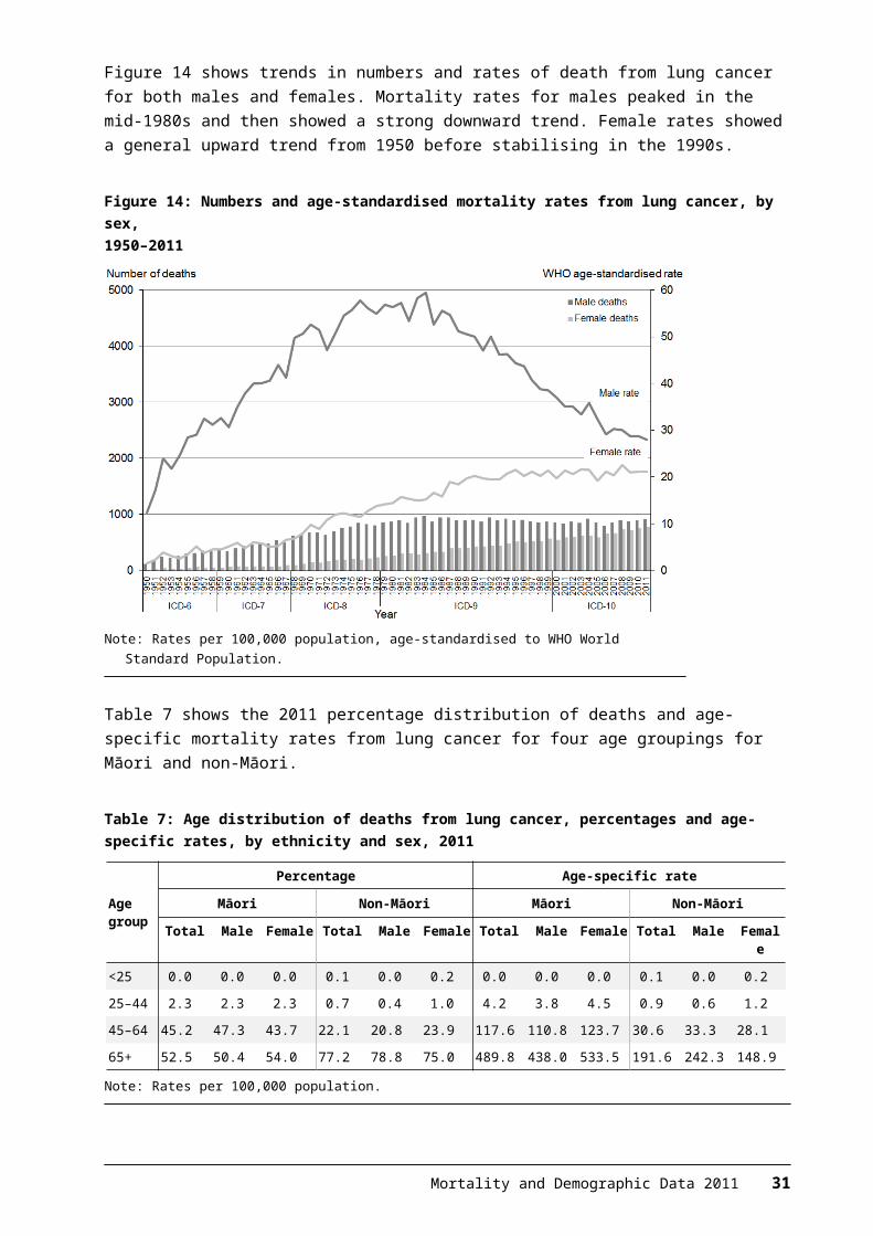
Figure 17 shows age-standardised mortality rates for breast cancer by ethnicity from 1996 to 2011.
Figure 17: Age-standardised mortality rates from breast cancer in females, by ethnicity, 1996–2011
Note: Rates per 100,000 female population, age-standardised to WHO World Standard Population; 95% confidence intervals.
In 2011, non-Māori females had a breast cancer mortality rate that was 56.6 percent lower than the Māori rate. The confidence intervals indicate that for most years Māori rates were significantly higher than non-Māori rates.
The Māori age-standardised mortality rate for breast cancer shows greater variability than that of non-Māori, which may be partially explained by the lower number of Māori deaths (72 in 2011). The wide confidence intervals associated with the Māori figures highlight this issue, and indicate no significant change in breast cancer death rates among Māori between 1996 and 2011. For non-Māori females, the mortality rate for 2011 was significantly lower than the 1996 rate.
32 Mortality and Demographic Data 2011

Prostate cancer (C61)Prostate cancer, or malignant neoplasm of the prostate, is one of the leading causes of male cancer registration,5 and, in 2011, was also one of the leading causes of male cancer death. There were 585 deaths from prostate cancer in 2011 (an age-standardised rate of 16.5 deaths per 100,000 male population), accounting for 12.6 percent of total male cancer deaths.
Table 10 shows numbers and age-standardised mortality rates for prostate cancer deaths between 1980 and 2011.
5 See the publication series Cancer: New Registrations and Deaths atwww.health.govt.nz/nz-health-statistics/health-statistics-and-data-sets/cancer-new-registrations-and-deaths-series
Mortality and Demographic Data 2011 33
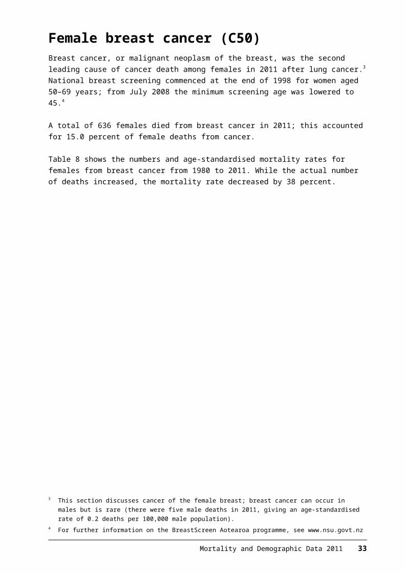
Table 10: Numbers and age-standardised mortality rates from prostate cancer, 1980–2011
Year No. Rate
1980 311 22.4
1981 293 20.2
1982 289 20.3
1983 325 21.8
1984 335 21.5
1985 351 22.5
1986 360 22.1
1987 365 21.5
1988 402 23.7
1989 425 24.5
1990 436 24.5
1991 423 23.1
1992 478 25.5
1993 520 26.9
1994 517 25.8
1995 554 27.3
1996 502 24.0
1997 525 24.3
1998 524 23.3
1999 552 23.8
2000 594 24.9
2001 592 24.1
2002 591 23.3
2003 556 21.0
2004 583 21.5
2005 564 19.9
2006 559 19.4
2007 574 19.0
2008 670 21.5
2009 562 17.3
2010 589 17.4
2011 585 16.5
Note: Rates per 100,000 male population, age-standardised to WHO World Standard Population.
34 Mortality and Demographic Data 2011
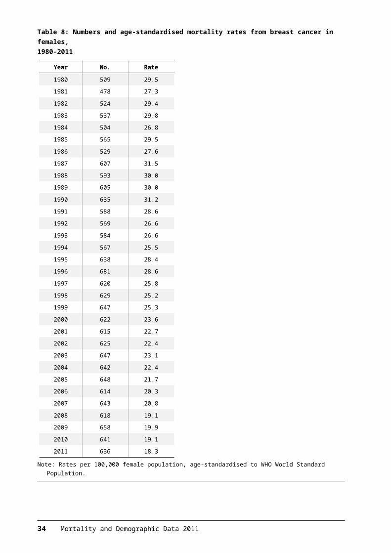
Figure 18 shows the number of deaths and mortality rates for prostate cancer between 1950 and 2011. Mortality rates from this cancer showed an overall increase until a peak in 1995. Thereafter, rates showed a downward trend; the 2011 rate was similar to rates in the 1950s.
Figure 18: Numbers and age-standardised mortality rates from prostate cancer, 1950–2011
Note: Rates per 100,000 male population, age-standardised to WHO World Standard Population.
Table 11 shows the 2011 percentage distribution of deaths and age-specific mortality rates from prostate cancer for four age groupings for Māori and non-Māori.
Table 11: Age distribution of deaths from prostate cancer in males, percentages and age-specific rates, by ethnicity, 2011
Age groupPercentage Age-specific rate
Māori male Non-Māori male Māori male Non-Māori male
<25 0.0 0.0 0.0 0.0
25–44 0.0 0.0 0.0 0.0
45–64 16.2 7.3 10.9 8.2
65+ 83.8 92.7 208.9 200.1
Note: Rates per 100,000 male population.
Prostate cancer mortality in 2011 primarily occurred in the 65 and over age group. The distribution of deaths for this particular cancer was more skewed toward the older age group than it was for cancer deaths as a whole.
Mortality and Demographic Data 2011 35

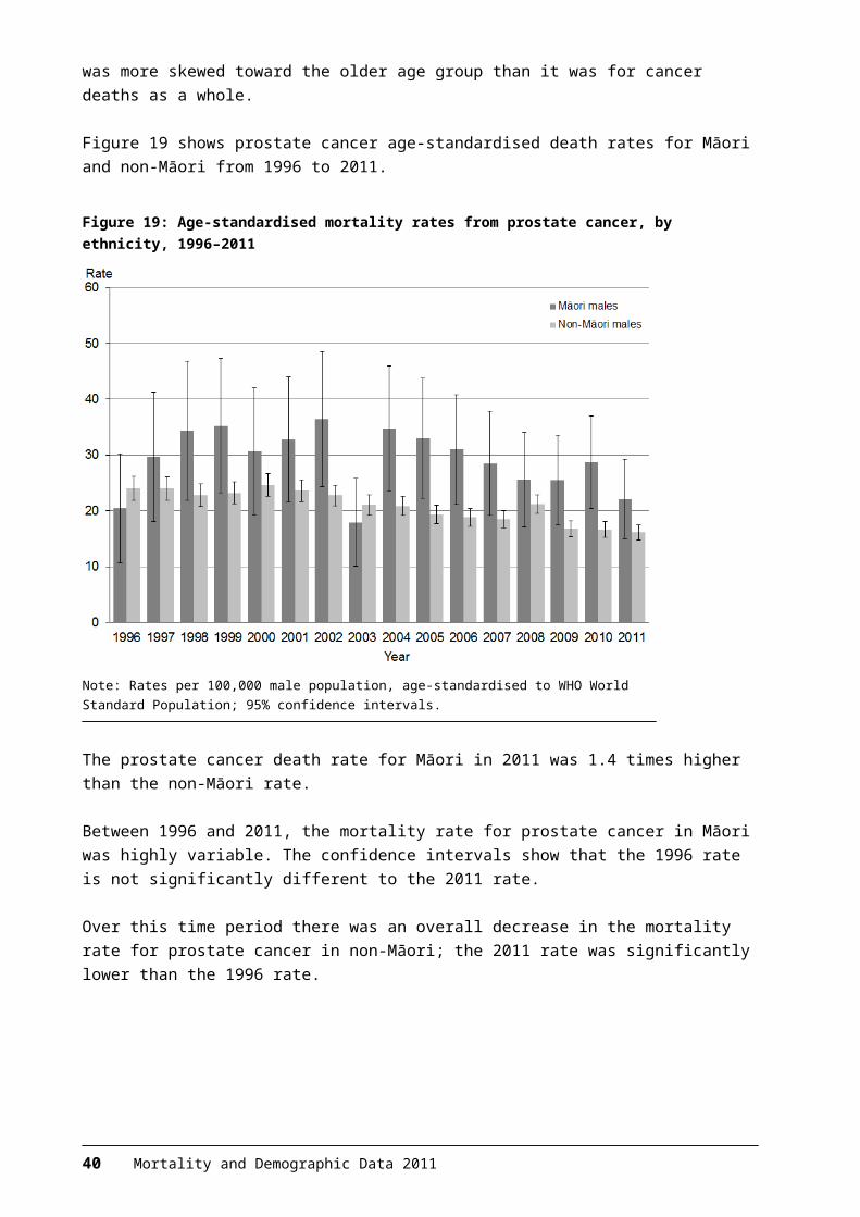
Figure 19 shows prostate cancer age-standardised death rates for Māori and non-Māori from 1996 to 2011.
Figure 19: Age-standardised mortality rates from prostate cancer, by ethnicity, 1996–2011
Note: Rates per 100,000 male population, age-standardised to WHO World Standard Population; 95% confidence intervals.
The prostate cancer death rate for Māori in 2011 was 1.4 times higher than the non-Māori rate.
Between 1996 and 2011, the mortality rate for prostate cancer in Māori was highly variable. The confidence intervals show that the 1996 rate is not significantly different to the 2011 rate.
Over this time period there was an overall decrease in the mortality rate for prostate cancer in non-Māori; the 2011 rate was significantly lower than the 1996 rate.
36 Mortality and Demographic Data 2011

Malignant melanoma of the skin (C43)While malignant melanoma of the skin is a common cause of cancer registration, it was not a leading cause of cancer death in 2011.6 However, male mortality incidence from this condition has been trending upwards since the 1950s.
There were 359 deaths from malignant melanoma of the skin in 2011, representing 4.0 percent of total cancer deaths. Two-thirds of those who died from this condition were males (67.7 percent).
Table 12 shows numbers and age-standardised mortality rates for malignant melanoma of the skin from 1980 to 2011.
Table 12: Numbers and age-standardised mortality rates from malignant melanoma of the skin, by sex, 1980–2011
Year Male Female Total
No. Rate No. Rate No. Rate
1980 74 5.1 50 2.9 124 3.9
1981 74 5.0 47 2.8 121 3.8
1982 84 5.5 57 3.4 141 4.3
1983 80 4.9 54 3.1 134 4.0
1984 90 5.6 71 4.0 161 4.7
1985 100 6.3 60 3.2 160 4.6
1986 88 5.3 71 3.6 159 4.4
1987 83 5.0 67 3.5 150 4.2
1988 101 5.8 69 3.4 170 4.5
1989 95 5.5 71 3.5 166 4.4
1990 115 6.5 73 3.4 188 4.9
1991 109 6.2 71 3.4 180 4.7
1992 99 5.5 83 3.8 182 4.5
1993 112 6.0 82 3.5 194 4.6
1994 114 6.0 79 3.4 193 4.6
1995 126 6.5 71 3.2 197 4.6
1996 107 5.3 87 3.7 194 4.4
1997 121 5.8 80 3.2 201 4.3
1998 143 6.6 105 4.0 248 5.2
1999 146 6.7 85 3.3 231 4.8
2000 155 7.0 98 3.7 253 5.2
2001 156 6.7 88 3.1 244 4.7
2002 149 6.3 86 3.1 235 4.6
2003 174 7.1 111 3.6 285 5.2
2004 152 6.1 97 3.0 249 4.4
2005 156 6.1 113 3.7 269 4.8
2006 173 6.4 114 3.4 287 4.7
6 See the publication series Cancer: New Registrations and Deaths atwww.health.govt.nz/nz-health-statistics/health-statistics-and-data-sets/cancer-new-registrations-and-deaths-series
Mortality and Demographic Data 2011 37
2007 178 6.4 114 3.4 292 4.8
2008 202 7.2 115 3.2 317 5.1
2009 213 7.2 113 3.3 326 5.1
2010 199 6.5 125 3.5 324 4.9
2011 243 7.8 116 3.2 359 5.3
Note: Rates per 100,000 population, age-standardised to WHO World Standard Population.
Figure 20 shows numbers of deaths from melanoma and the associated mortality rate for each sex. The age-standardised mortality rate for males from malignant melanoma of the skin showed an upward trend between 1950 and 2011. The mortality rate for females diverged from the male rate in the late 1970s, and after that time remained relatively level, oscillating at around three to four deaths per 100,000 female population. In 2011 the rate for males was almost 2.5 times the rate for females.
Figure 20: Numbers and age-standardised mortality rates from malignant melanoma of the skin, by sex, 1950–2011
Note: Rates per 100,000 population, age-standardised to WHO World Standard Population.
Table 13 shows the 2011 percentage distribution of deaths and age-specific mortality rates from melanoma of the skin for four age groupings for Māori and non-Māori. Melanoma is uncommon among Māori; in 2011 there were four Māori deaths from melanoma of the skin.
Table 13: Age distribution of deaths from malignant melanoma of the skin, percentages and age-specific rates, by ethnicity and sex, 2011
Age group
Percentage Age-specific rate
Māori Non-Māori Māori Non-Māori
Total Male Female Total Male Female Total Male Female Total Male Female
<25 0.0 0.0 0.0 0.3 0.4 0.0 0.0 0.0 0.0 0.1 0.2 0.0
25–44 50.0 33.3 100.0 6.8 5.8 8.7 1.2 1.3 1.1 2.4 2.9 1.9
38 Mortality and Demographic Data 2011

45–64 0.0 0.0 0.0 30.1 31.3 27.8 0.0 0.0 0.0 10.8 15.4 6.3
65+ 50.0 66.7 0.0 62.8 62.5 63.5 6.2 13.5 0.0 40.2 59.1 24.2
Note: Rates per 100,000 population.
Mortality and Demographic Data 2011 39

Cervical cancer (C53)Between 1980 and 2011, the number of women dying from cervical cancer, or malignant neoplasm of the cervix uteri, decreased significantly. A significant factor in the decrease seen in later years may be the establishment of the National Cervical Screening Programme in 1991.7 There were 53 deaths from cervical cancer in 2011, accounting for 1.2 percent of total female cancer deaths. Table 14 shows the number and age-standardised rate of female deaths from cervical cancer between 1980 and 2011.
Table 14: Numbers and age-standardised mortality rates from cervical cancer, 1980–2011
Year No. Rate
1980 94 5.8
1981 95 5.5
1982 110 6.4
1983 90 5.3
1984 98 5.8
1985 97 5.5
1986 89 4.8
1987 117 6.3
1988 99 5.3
1989 85 4.6
1990 101 5.5
1991 106 5.3
1992 84 4.1
1993 80 3.8
1994 77 3.7
1995 96 4.6
1996 82 3.8
1997 73 3.2
1998 77 3.2
1999 71 3.0
2000 66 2.7
2001 63 2.4
2002 65 2.4
2003 58 2.1
2004 71 2.7
2005 54 1.9
2006 52 1.7
2007 65 2.2
2008 59 1.9
2009 44 1.4
2010 52 1.7
7 For further information, see the National Screening Unit‘s website: www.nsu.govt.nz
40 Mortality and Demographic Data 2011
2011 53 1.7
Note: Rates per 100,000 female population, age-standardised to WHO World Standard Population.
Figure 21 shows the trend in numbers and rates of deaths from cervical cancer between 1950 and 2011. Over this period the age-standardised mortality rate decreased by almost 80 percent (from 8.1 in 1950 to 1.7 in 2011).
Figure 21: Numbers and age-standardised mortality rates from cervical cancer, 1950–2011
Note: Rates per 100,000 female population, age-standardised to WHO World Standard Population
Table 15 shows the 2011 percentage distribution of deaths and age-specific mortality rates from cervical cancer for four age groupings for Māori and non-Māori.
Table 15: Age distribution of deaths from cervical cancer, percentages and age-specific rates, by ethnicity, 2011
Age groupPercentage Age-specific rate
Māori female Non-Māori female Māori female Non-Māori female
<25 0.0 5.1 0.0 0.3
25–44 14.3 15.4 2.2 1.2
45–64 42.9 28.2 9.8 2.2
65+ 42.9 51.3 34.1 6.6
Note: Rates per 100,000 female population.
Mortality and Demographic Data 2011 41
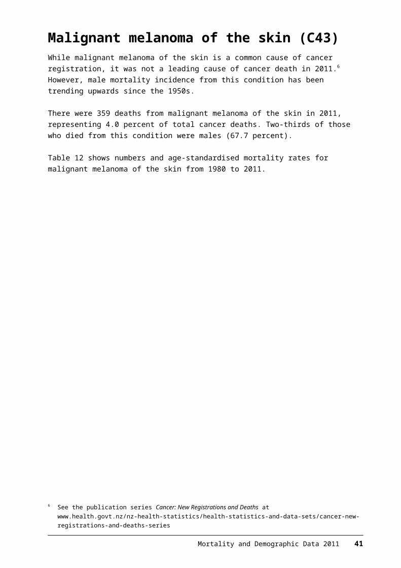
Figure 22 shows cervical cancer age-standardised mortality rates for Māori and non-Māori between 1996 and 2011.
Figure 22: Age-standardised mortality rates from cervical cancer, by ethnicity, 1996–2011
Note: Rates per 100,000 female population, age-standardised to WHO World Standard Population; 95% confidence intervals.
The Māori rate of cervical cancer death decreased by 58.7 percent between 1996 and 2011, while the non-Māori rate decreased by 52.5 percent.
Māori accounted for one-quarter (26.4 percent) of cervical cancer deaths in 2011, and the Māori age-standardised death rate was almost four times higher than the non-Māori rate.
The confidence intervals in Figure 22 show that between 1996 and 2011 there was a significant decrease in cervical cancer death rates for non-Māori women but not for Māori women. (Note that the Māori numbers here are low (2011 Māori n=14); the confidence intervals reflect the large potential variance associated with such small totals.)
42 Mortality and Demographic Data 2011
Ischaemic heart disease (I20–I25)Ischaemic (or coronary) heart disease is a condition in which fatty deposits accumulate in the cells lining the wall of the coronary arteries – a process called atherosclerosis. The progressive narrowing and hardening of the arteries over time results in an inability to provide adequate oxygen to the heart muscle (called ischaemia). This can cause damage to the heart muscle or, in more severe cases, lead to myocardial infarction (a heart attack).
Ischaemic heart disease was the second leading cause of death after cancer in 2011, accounting for 5534 deaths (18.3 percent of all deaths). Males accounted for 53.0 percent of these deaths.
Table 16 shows numbers and age-standardised mortality rates for ischaemic heart disease from 1980 to 2011. The male mortality rate showed a downward trend over this period, decreasing by 71.8 percent. Similarly, the mortality rate for females decreased by 68.3 percent.
The male age-standardised mortality rate from ischaemic heart disease was consistently higher than the female rate over this time: it was approximately double the equivalent female rate for most of the period. In 2011 the male rate was 1.8 times the female rate.
Mortality and Demographic Data 2011 43

Table 16: Numbers and age-standardised mortality rates from ischaemic heart disease, by sex, 1980–2011
Year Male Female Total
No. Rate No. Rate No. Rate
1980 4413 304.4 3046 149.2 7459 217.4
1981 4259 285.3 2883 134.7 7142 201.6
1982 4362 285.0 2939 133.6 7301 200.9
1983 4241 274.8 2904 128.3 7145 192.6
1984 4245 268.2 2951 127.5 7196 189.6
1985 4234 262.9 3106 128.8 7340 188.8
1986 4346 263.4 3109 126.6 7455 187.4
1987 4379 260.1 3235 128.7 7614 187.8
1988 4173 243.4 3079 118.8 7252 174.9
1989 4071 233.4 2964 111.9 7035 166.3
1990 3884 217.5 2923 108.4 6807 157.3
1991 3789 208.6 2954 105.8 6743 151.7
1992 4064 217.3 3034 104.0 7098 155.1
1993 3842 201.0 3056 102.7 6898 146.7
1994 3718 190.5 2901 94.9 6619 137.2
1995 3810 191.2 2887 90.8 6697 135.9
1996 3729 182.0 2904 87.8 6633 130.1
1997 3614 168.0 2755 79.9 6369 119.4
1998 3479 158.1 2724 75.3 6203 112.3
1999 3646 160.9 2925 79.2 6571 115.6
2000 3269 140.3 2704 71.2 5973 102.2
2001 3389 140.2 2982 75.2 6371 104.1
2002 3333 134.2 2954 71.4 6287 99.8
2003 3243 126.7 2953 68.4 6196 94.9
2004 3366 127.6 2947 67.0 6313 94.4
2005 3057 111.8 2750 60.5 5807 83.9
2006 3133 110.9 2779 58.6 5912 82.5
2007 3015 103.4 2619 54.4 5634 77.2
2008 2960 97.4 2594 51.9 5554 72.9
2009 3039 96.6 2514 48.6 5553 70.7
2010 2900 88.0 2489 47.5 5389 66.3
2011 2934 85.9 2600 47.3 5534 65.4
Note: Rates per 100,000 population, age-standardised to WHO World Standard Population.
44 Mortality and Demographic Data 2011

Figure 23 shows trends in numbers and rates of deaths from ischaemic heart disease for both sexes from 1950 to 2011. Mortality rates for 2011 were the lowest they have been over this period for males and females. From 1950, males consistently had a higher mortality rate than females, although this gap became less marked after its peak in the late 1960s and early 1970s.
Figure 23: Numbers and age-standardised mortality rates from ischaemic heart disease, by sex, 1950–2011
Note: Rates per 100,000 population, age-standardised to WHO World Standard Population.
Table 17 shows the 2011 percentage distribution of deaths and age-specific mortality rates from ischaemic heart disease for four age groupings for Māori and non-Māori.
Table 17: Age distribution of deaths from ischaemic heart disease, percentages and age-specific rates, by ethnicity and sex, 2011
Age group
Percentage Age-specific rate
Māori Non-Māori Māori Non-Māori
Male Female Total Male Female Total Male Female Total Male Female Total
<25 0.0 0.0 0.0 0.0 0.0 0.0 0.0 0.0 0.0 0.1 0.2 0.0
25–44 4.3 6.8 1.0 0.8 1.5 0.1 11.9 22.9 2.2 4.3 8.2 0.6
45–64 33.0 37.7 26.7 9.7 14.7 4.1 132.2 181.6 87.9 49.3 80.5 19.5
65+ 62.7 55.5 72.3 89.4 83.8 95.7 902.6 990.6 828.6 816.3 880.8 761.7
Note: Rates per 100,000 population.
The majority of ischaemic heart disease deaths occurred in the 65 years and over age group (81.2 percent of males and 93.9 percent of females). Deaths from ischaemic heart disease occurred at a younger age among Māori than non-Māori.
Mortality and Demographic Data 2011 45
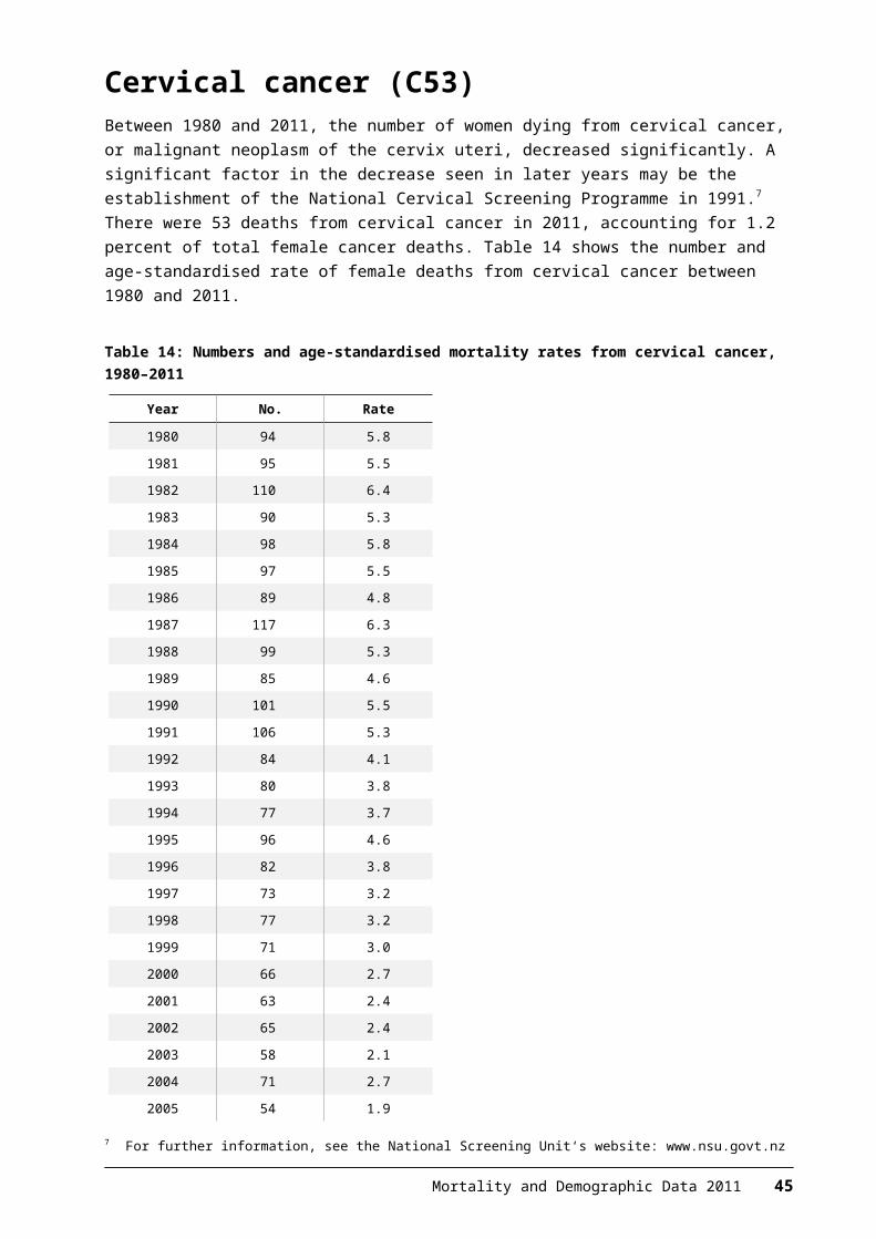
Figure 24 shows mortality rates from ischaemic heart disease for Māori and non-Māori between 1996 and 2011.
Figure 24: Age-standardised mortality rates from ischaemic heart disease, by sex and ethnicity, 1996–2011
Note: Rates per 100,000 population, age-standardised to WHO World Standard Population.
Of the four groups represented in Figure 24, the Māori male population had the highest age-standardised rate of ischaemic heart disease deaths in 2011. This rate was 1.7 times the rate for non-Māori males. The rate for Māori females was more than twice the rate for non-Māori females.
Between 1996 and 2011, the age-standardised rate for Māori males was consistently higher than rates for all the other groups shown in Figure 24.
The five conditions that make up the ischaemic heart disease ICD classification grouping for mortality coding are: I20 angina pectoris I21 acute myocardial infarction I22 subsequent myocardial infarction I24 other acute ischaemic heart diseases I25 chronic ischaemic heart disease.
Of these conditions, acute myocardial infarction (I21) and chronic ischaemic heart disease (I25) together account for the majority of the ischaemic heart disease deaths reported for 2011 (98.8 percent). Chronic ischaemic heart disease alone was responsible for 52.8 percent.
46 Mortality and Demographic Data 2011
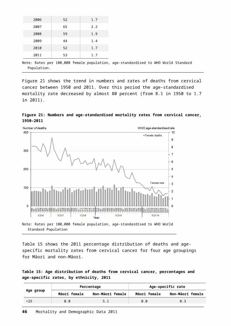
Figure 25 compares age-standardised mortality rates, by ethnicity and sex, of acute myocardial infarction and chronic ischaemic heart disease in 2011. The figure suggests the pattern of mortality incidence for these two conditions is generally similar. Males had a higher age-standardised mortality rate (within the ethnic groups) for both conditions.
Figure 25: Age-standardised mortality rates from acute myocardial infarction (ICD I21) and chronic ischaemic heart disease (ICD I25), by sex and ethnicity, 2011
Note: Rates per 100,000 population, age-standardised to WHO World Standard Population; 95% confidence intervals.
Mortality and Demographic Data 2011 47
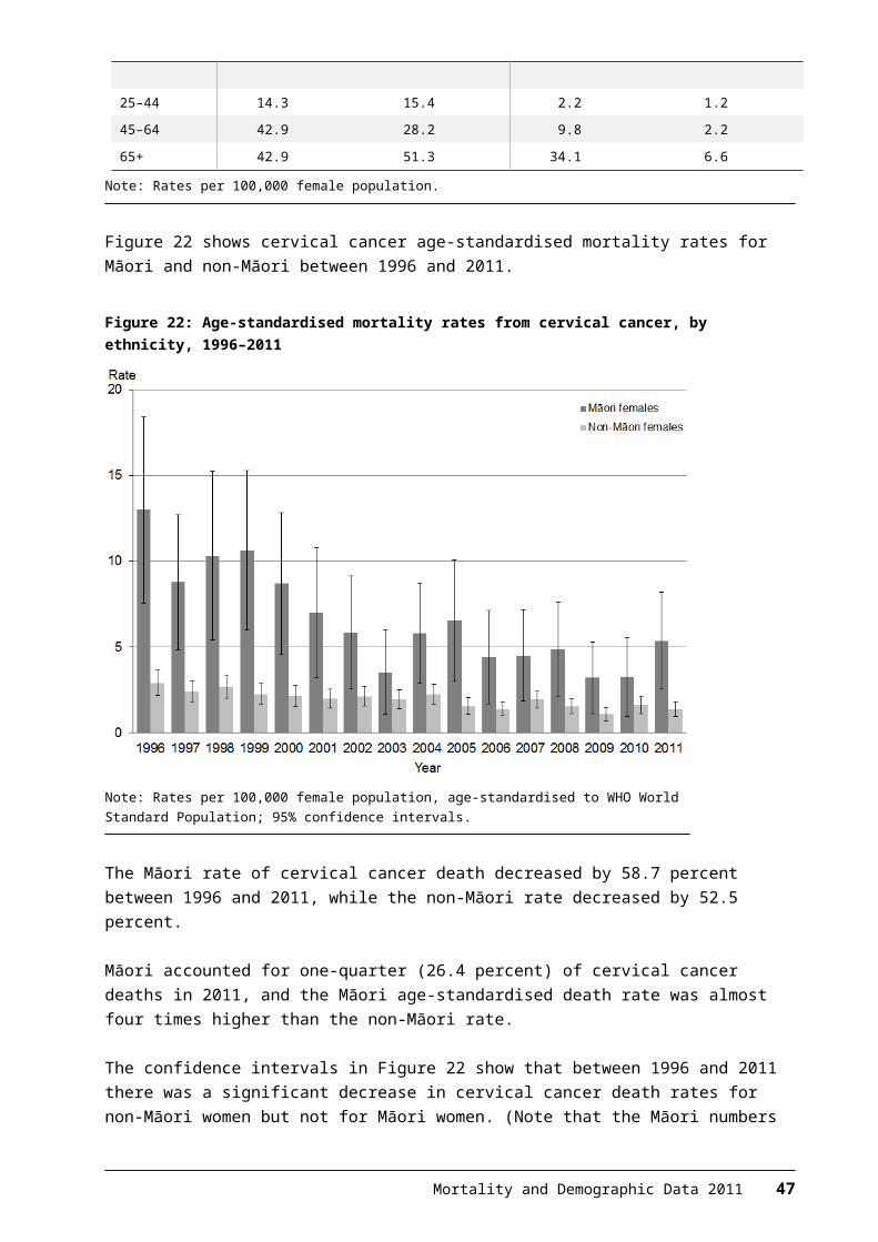
Figure 26 shows age-standardised mortality rates for ischaemic heart disease by DHB region of residence for the total population in 2011.
Waitemata and Bay of Plenty DHB regions had an ischaemic heart disease death rate that was significantly lower than the New Zealand rate. No DHBs had a rate that was significantly higher.
Figure 26: Age-standardised mortality rates for ischaemic heart disease, by DHB region, total population, 2011
Note 1: Rates per 100,000 population, age-standardised to WHO World Standard Population; 99% confidence intervals.
Note 2: This figure shows confidence intervals for DHB regions. Confidence intervals for the national rate are not shown but are included in the analysis.
48 Mortality and Demographic Data 2011
Cerebrovascular disease (I60–I69)Cerebrovascular disease is a general term that encompasses a variety of diseases affecting the arteries that supply the brain. This condition is commonly associated with stroke (ie, the sudden death of brain cells due to lack of oxygen when the blood flow to part of the brain is impaired by blockage or rupture of an artery in the brain). A stroke is sometimes called a cerebrovascular accident. Risk factors associated with the narrowing of the arteries (atherosclerosis) that characterises cerebrovascular disease include high blood cholesterol level, high blood pressure, smoking, diabetes and a family history of atherosclerotic disease. Atherosclerosis also occurs with ageing.
Cerebrovascular disease was the third leading cause of death in the total population in 2011, after cancer and ischaemic heart disease.
There were 2665 deaths from cerebrovascular disease in 2011, the majority of which (62.0 percent) were females.
Table 18 shows the number of deaths and age-standardised mortality rates from cerebrovascular disease from 1980 to 2011. The mortality rate from cerebrovascular disease for males in 2011 was 70.3 percent lower than it was in 1980, and the female rate was 66.0 percent lower. Males and females had similar annual mortality rates over this period (see Figure 27).
Mortality and Demographic Data 2011 49

Table 18: Numbers and age-standardised mortality rates for cerebrovascular disease, by sex, 1980–2011
Year Male Female Total
No. Rate No. Rate No. Rate
1980 1288 96.8 1870 90.0 3158 92.8
1981 1175 84.4 1745 79.4 2920 82.3
1982 1155 80.7 1651 72.6 2806 76.6
1983 1229 84.1 1708 73.5 2937 78.2
1984 1108 74.5 1703 71.4 2811 73.0
1985 1160 76.0 1723 69.7 2883 72.9
1986 1145 70.5 1710 67.7 2855 69.8
1987 1076 66.3 1675 64.4 2751 65.8
1988 1077 64.8 1616 59.2 2693 62.5
1989 1072 63.3 1597 58.3 2669 60.8
1990 1021 57.9 1579 56.6 2600 57.9
1991 1036 58.1 1624 56.0 2660 57.6
1992 1113 60.5 1621 54.0 2734 56.8
1993 1061 55.9 1727 56.0 2788 56.4
1994 1096 56.6 1631 50.4 2727 53.4
1995 1070 53.9 1645 49.0 2715 51.5
1996 1045 51.3 1614 47.2 2659 49.1
1997 966 44.9 1600 44.5 2566 45.1
1998 960 43.5 1532 41.6 2492 42.7
1999 1129 49.3 1706 44.5 2835 47.0
2000 1048 44.6 1620 41.4 2668 42.9
2001 1036 42.4 1748 42.7 2784 43.1
2002 1078 42.7 1751 41.3 2829 42.3
2003 969 37.4 1723 39.8 2692 39.3
2004 1050 38.8 1756 38.9 2806 39.4
2005 940 33.7 1647 36.0 2587 35.5
2006 1000 34.6 1673 35.8 2673 35.8
2007 987 32.9 1638 33.4 2625 33.7
2008 970 30.9 1641 32.9 2611 32.4
2009 937 29.0 1551 30.7 2488 30.4
2010 945 28.1 1522 29.2 2467 29.1
2011 1012 28.7 1653 30.6 2665 30.2
Note: Rates per 100,000 population, age-standardised to WHO World Standard Population.
50 Mortality and Demographic Data 2011
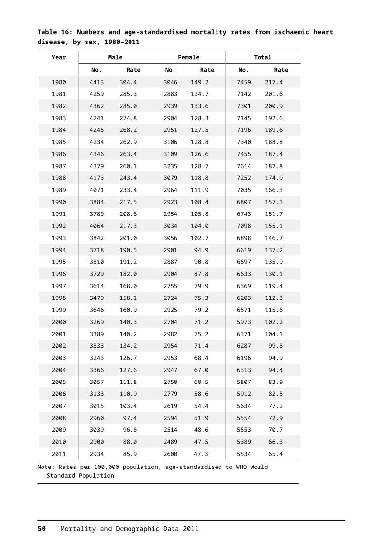
Figure 27 shows the trend in male and female deaths (numbers and rates) from cerebrovascular disease between 1950 and 2011.
Figure 27: Numbers and age-standardised mortality rates for cerebrovascular disease, by sex, 1950–2011
Note: Rates per 100,000 population, age-standardised to WHO World Standard Population.
The mortality rates from cerebrovascular disease were similar and on the decline for both males and females between the early 1970s and 2011.
Table 19 shows the 2011 percentage distribution of deaths and age-specific mortality rates from cerebrovascular disease for four age groupings for Māori and non-Māori.
Table 19: Age distribution of deaths from cerebrovascular disease, percentages and age-specific rates, by ethnicity and sex, 2011
Age group
Percentage Age-specific rate
Māori Non-Māori Māori Non-Māori
Total Male Female Total Male Female Total Male Female Total Male Female
<25 0.7 0.0 1.1 0.1 0.2 0.1 0.3 0.0 0.6 0.3 0.3 0.2
25–44 11.6 13.6 10.2 0.5 0.8 0.3 10.2 10.2 10.1 1.3 1.6 1.0
45–64 31.3 30.5 31.8 6.4 8.3 5.2 39.5 32.7 45.6 16.2 16.2 16.1
65+ 56.5 55.9 56.8 93.0 90.7 94.4 255.7 222.4 283.8 421.6 340.4 490.0
Note: Rates per 100,000 population.
Among non-Māori, 93.0 percent of deaths from cerebrovascular disease occurred in those aged 65 years and over in 2011. Among Māori, however, a greater proportion of deaths occurred in younger age groups. The percentage of Māori deaths from cerebrovascular disease that occurred below the age of 65 was 43.5; the equivalent figure for non-Māori was 7.0 percent.
Mortality and Demographic Data 2011 51
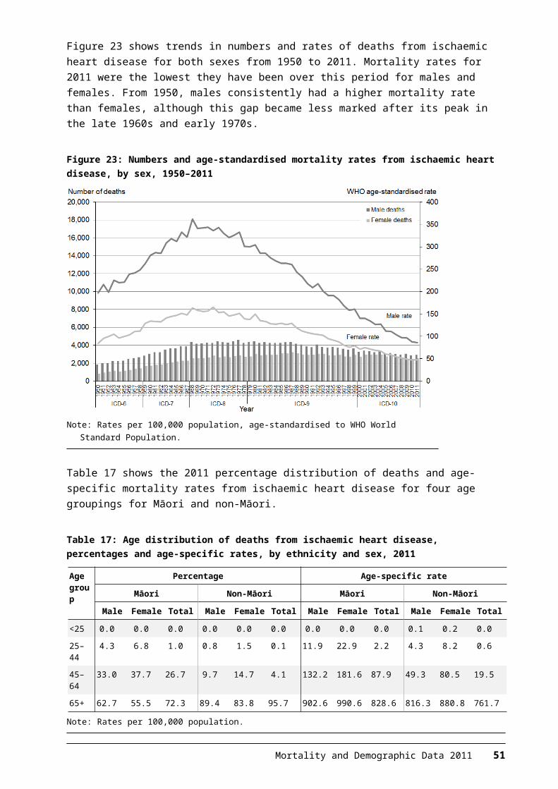
Figure 28 shows numbers and age-standardised mortality rates from cerebrovascular disease, by sex and ethnicity, between 1996 and 2011.
Figure 28: Numbers and age-standardised mortality rates for cerebrovascular disease, by sex and ethnicity, 1996–2011
Note: Rates per 100,000 population, age-standardised to WHO World Standard Population.
Of the four population groups shown in Figure 28, Māori females had the highest age-standardised mortality rate for cerebrovascular disease in 2011, followed by Māori males. The mortality rate for Māori females was 31.1 percent higher than for non-Māori females, and the equivalent rate was slightly higher for Māori males than for non-Māori males (8.9 percent).
Compared with 2010, rates for non-Māori males and females increased in 2011, while rates for Māori males and females decreased.
The seven codes that make up the cerebrovascular disease ICD classification grouping for mortality coding are: I60 subarachnoid haemorrhage I61 intracerebral haemorrhage I62 other non-traumatic intracranial haemorrhage I63 cerebral infarction I64 stroke, not specified as haemorrhage or infarction I67 other cerebrovascular diseases I69 sequelae8 of cerebrovascular disease.
8 The term ‘sequelae’ refers to conditions that follow as a consequence of a disease.
52 Mortality and Demographic Data 2011
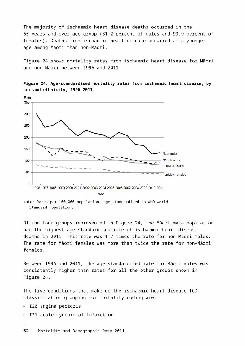
Figure 29 shows mortality rates for the total population for these codes, by sex, in 2011.
Figure 29: Age-standardised mortality rates for cerebrovascular disease, by specific disease classification and sex, 2011
Note: Rates per 100,000 population, age-standardised to WHO World Standard Population; 95% confidence intervals.
‘Stroke, not specified as haemorrhage or infarction’ (I64) accounted for 40.7 percent of cerebrovascular disease-related mortality in 2011.
The three other major causes of cerebrovascular disease-related mortality in 2011 were: I69 sequelae of cerebrovascular disease (16.8 percent) I63 cerebral infarction (15.6 percent) I61 intracerebral haemorrhage (13.2 percent).
Together, these four conditions accounted for 86.2 percent of mortality from cerebrovascular disease in 2011.
Females had significantly higher rates of stroke (I64), while males had higher rates of sequelae of cerebrovascular disease (I69).
Mortality and Demographic Data 2011 53
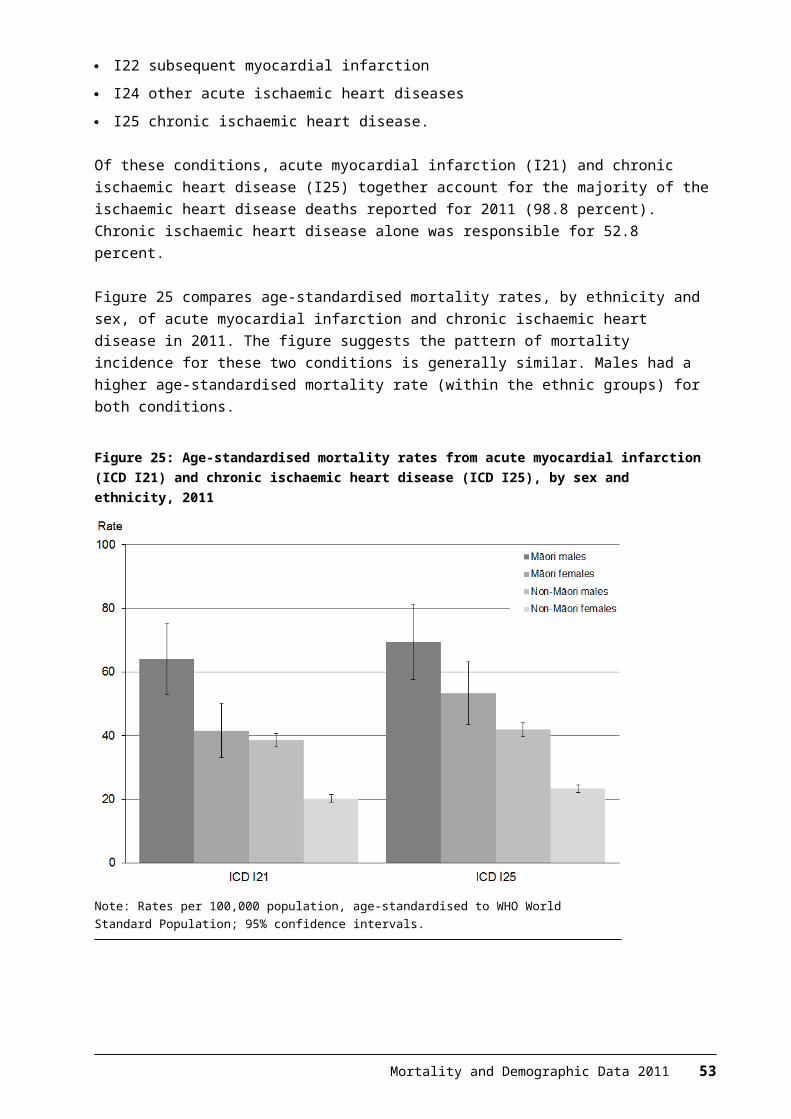
Figure 30 shows cerebrovascular disease age-standardised death rates by DHB region of residence for the total population in 2011. No DHB regions had rates that were significantly different to the national rate.
Figure 30: Age-standardised mortality rates for cerebrovascular disease, by DHB region, total population, 2011
Note 1: Rates per 100,000 population, age-standardised to WHO World Standard Population; 99% confidence intervals.
Note 2: This figure shows confidence intervals for DHB regions. Confidence intervals for the national rate are not shown but are included in the analysis.
54 Mortality and Demographic Data 2011
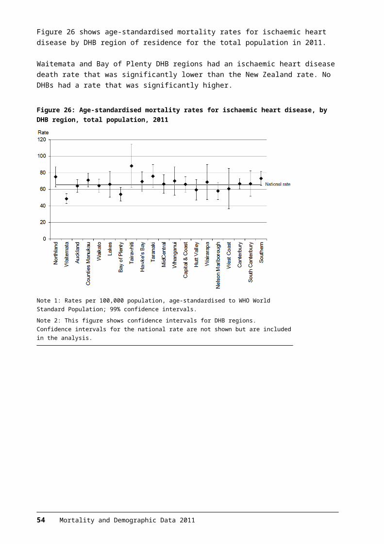
Diabetes mellitus (E10–E14)Diabetes mellitus, commonly known as diabetes, is a chronic disease associated with abnormally high levels of glucose in the blood (hyperglycaemia). There are two main types of diabetes: Type 1 (insulin-dependent diabetes mellitus) and Type 2 (adult-onset diabetes). Type 2 diabetes is much more common than Type 1.
A person with Type 1 diabetes does not produce sufficient insulin – they might make only a little, or none at all. Type 1 diabetes usually starts in the teenage years or when puberty begins, although onset can occur later in life.
A person with Type 2 diabetes produces insulin, but the cells upon which the insulin should act are not sufficiently sensitive to its action. Type 2 diabetes commonly starts later in life (typically in people over 30 years of age). Common risk factors include: genetic predisposition (eg, ethnicity or a family history of Type 2 diabetes), obesity, lack of exercise and lower socioeconomic status. People suffering from Type 2 diabetes can become insulin-dependent as the disease progresses.
There were 835 deaths from diabetes mellitus in 2011. Males accounted for 52.5 percent of these.
Table 20 shows the number of deaths and age-standardised mortality rates for diabetes mellitus from 1980 to 2011.
Mortality and Demographic Data 2011 55

Table 20: Numbers and age-standardised mortality rates for diabetes mellitus, by sex, 1980–2011
Year Male Female Total
No. Rate No. Rate No. Rate
1980 198 13.8 248 12.4 446 13.1
1981 201 13.8 187 9.6 388 11.2
1982 184 12.0 190 9.2 374 10.4
1983 197 13.0 172 8.0 369 10.1
1984 149 10.0 192 8.9 341 9.2
1985 204 12.5 193 8.7 397 10.3
1986 202 11.9 207 9.6 409 10.5
1987 184 11.0 189 8.5 373 9.6
1988 192 11.3 205 8.9 397 10.0
1989 196 11.5 209 9.0 405 10.0
1990 203 11.4 211 9.3 414 10.1
1991 226 12.3 177 7.4 403 9.6
1992 220 11.6 238 9.7 458 10.5
1993 228 12.0 231 9.4 459 10.6
1994 228 11.8 258 10.1 486 10.7
1995 255 13.0 253 10.0 508 11.2
1996 306 15.0 289 10.5 595 12.4
1997 316 14.8 317 10.6 633 12.5
1998 387 17.8 343 11.3 730 14.2
1999 385 17.3 355 11.5 740 14.1
2000 408 17.6 394 12.3 802 14.6
2001 405 17.1 377 11.4 782 13.9
2002 427 17.2 378 11.1 805 13.8
2003 436 17.2 411 11.9 847 14.3
2004 438 16.9 405 11.2 843 13.7
2005 447 16.7 392 10.8 839 13.4
2006 447 16.1 413 11.2 860 13.4
2007 440 15.5 407 10.5 847 12.9
2008 463 15.6 414 10.6 877 12.9
2009 482 15.8 387 9.3 869 12.3
2010 391 12.5 377 9.0 768 10.7
2011 438 13.7 397 9.4 835 11.5
Note: Rates per 100,000 population, age-standardised to WHO World Standard Population.
Figure 31 shows numbers and mortality rates from diabetes mellitus between 1950 and 2011.
The mortality rate for males was generally lower than that of females until the early 1970s, after which the male rate was consistently higher than the female rate (in 2011 it was 45.3 percent higher).
56 Mortality and Demographic Data 2011
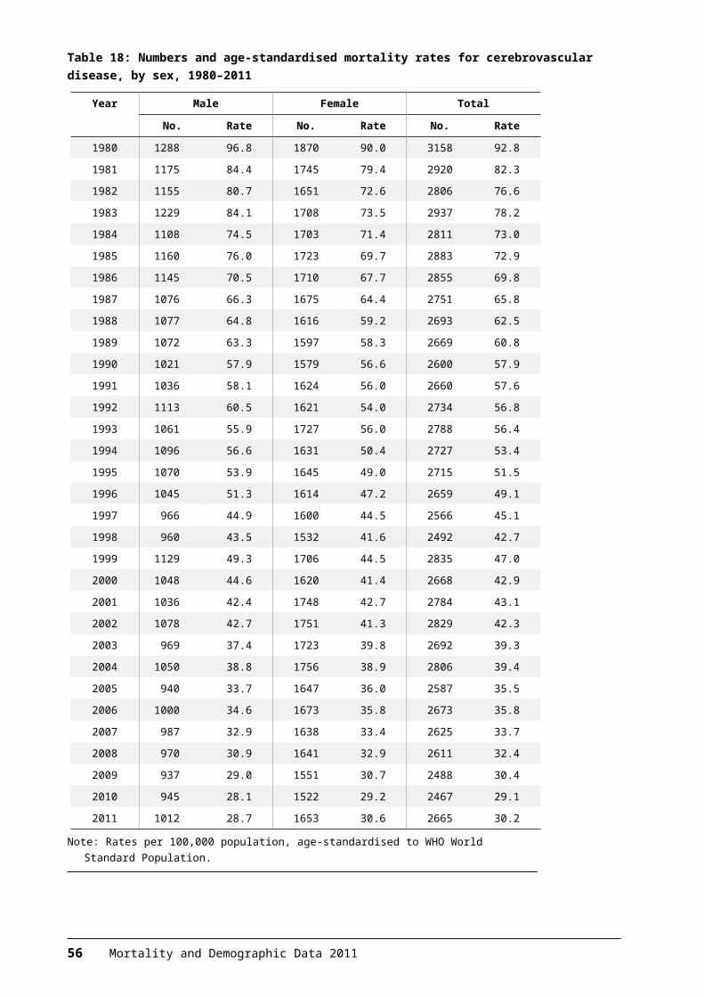
Figure 31: Numbers and age-standardised mortality rates for diabetes mellitus, by sex, 1950–2011
Note: Rates per 100,000 population, age-standardised to WHO World Standard Population.
Table 21 shows the 2011 percentage distribution of deaths and age-specific mortality rates from diabetes mellitus for four age groupings for Māori and non-Māori.
Table 21: Age distribution of deaths from diabetes mellitus, percentages and age-specific rates, by ethnicity and sex, 2011
Age group
Percentage Age-specific rate
Māori Non-Māori Māori Non-Māori
Total Male Female Total Male Female Total Male Female Total Male Female
<25 0.0 0.0 0.0 0.6 1.2 0.0 0.0 0.0 0.0 0.3 0.7 0.0
25–44 5.1 5.2 4.9 2.2 1.9 2.5 6.0 7.6 4.5 1.4 1.2 1.6
45–64 31.6 37.4 23.5 13.0 16.7 9.2 53.2 78.1 30.9 8.3 11.1 5.7
65+ 63.3 57.4 71.6 84.2 80.2 88.3 382.0 444.7 329.2 96.9 102.0 92.6
Note: Rates per 100,000 population.
Diabetes mortality in 2011 was largely confined to those aged 45 years and older; only a small proportion of deaths occurred below this age. There were a greater proportion of deaths among Māori in the 45–64 year age group than among non-Māori in this age group.
Mortality and Demographic Data 2011 57
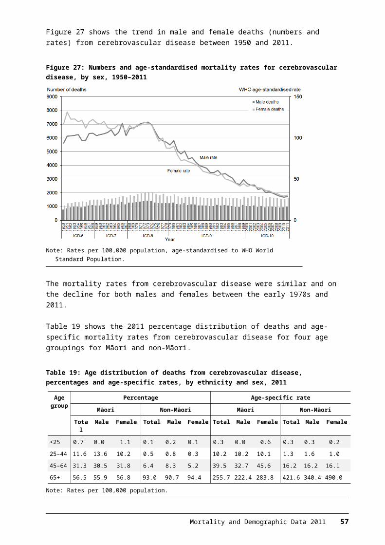
Figure 32 shows age-standardised mortality rates from diabetes mellitus by sex and ethnicity between 1996 and 2011.
Figure 32: Age-standardised mortality rates for diabetes mellitus, by sex and ethnicity, 1996–2011
Note: Rates per 100,000 population, age-standardised to WHO World Standard Population.
Of the four population groups represented in Figure 32, Māori males had the highest age-standardised mortality rate for diabetes mellitus, followed by Māori females. The age-standardised rate for Māori was five times higher than for non-Māori in 2011.
The four codes that make up the diabetes mellitus ICD classification grouping are: E10 Type 1 diabetes mellitus E11 Type 2 diabetes mellitus E13 other specified diabetes mellitus E14 unspecified diabetes mellitus.
58 Mortality and Demographic Data 2011
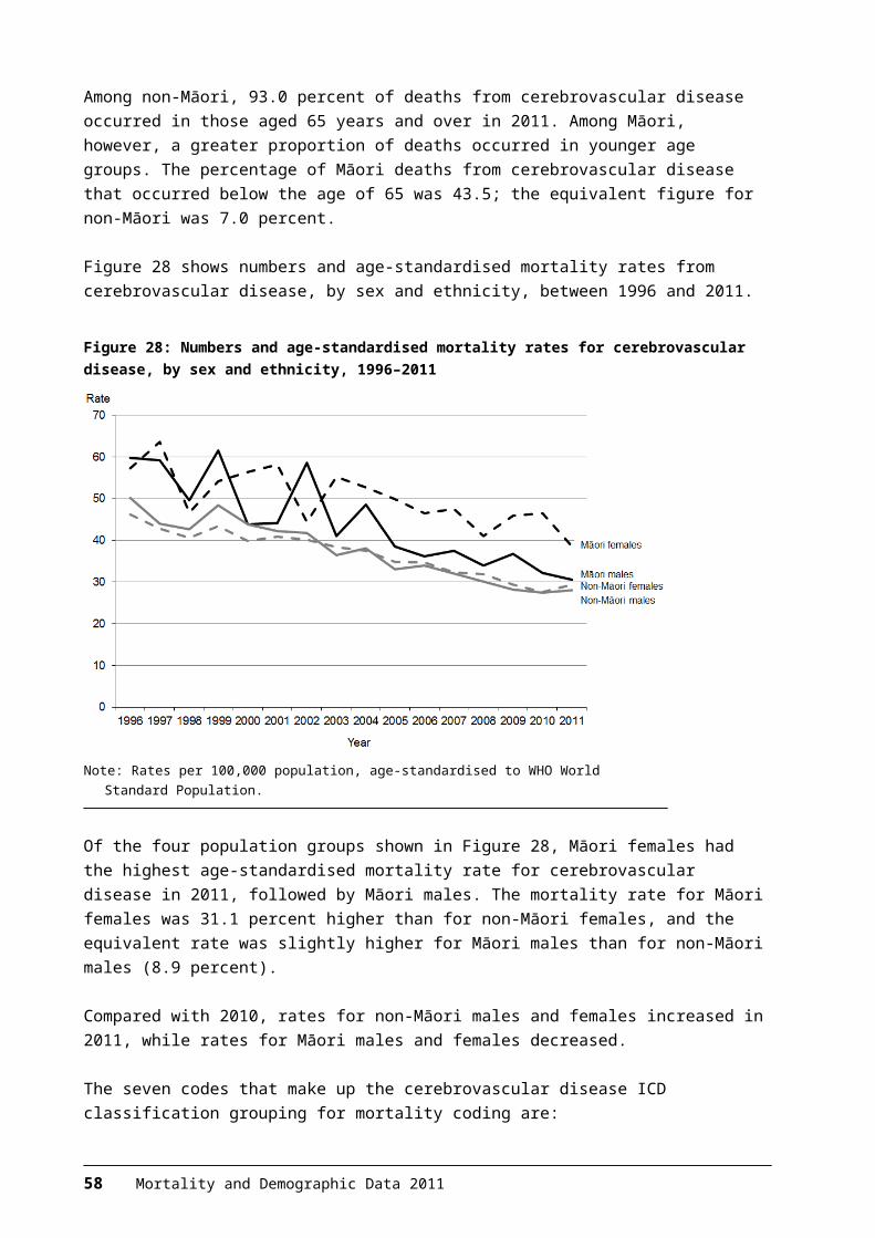
Figure 33 shows age-standardised death rates for Type 1 (E10) and Type 2 (E11) diabetes mellitus by sex in 2011.
Figure 33: Age-standardised mortality rates for diabetes mellitus, by diabetes type and sex, 2011
Note: Rates per 100,000 population, age-standardised to WHO World Standard Population; 95% confidence intervals.
Type 2 diabetes mellitus accounted for 92.1 percent of diabetes mortality in 2011. Very few cases (n=10) were classified as unspecified diabetes mellitus (E14).
Males had a significantly higher rate of Type 2 diabetes mortality than females in 2011.
Mortality and Demographic Data 2011 59
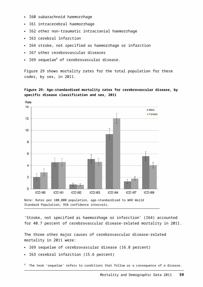
Motor vehicle accidents (selected codes: V02–V89)The classification ‘motor vehicle accidents’ primarily covers accidents associated with motorised transport (both on-road and off-road), including cars, two- or three-wheeler vehicles and heavy transport vehicles. It also includes pedestrians or cyclists involved in accidents with motor vehicles. The classification excludes road traffic accidents that did not include some form of motorised transport; for example, a collision between a pedestrian and a pedal cyclist, or a collision between a pedal cyclist and a railway train. It also excludes accidents involving watercraft and aircraft. The codes from the V02–V89 range discussed here therefore exclude those that do not meet these criteria.
Motor vehicle accidents are a major cause of mortality in New Zealand and other industrialised countries. The first recorded motor vehicle accident fatality in New Zealand was in Christchurch in 1908. For most of the 20th century, the motor vehicle accident rate rose in concert with the increasing number of vehicles on New Zealand roads. Since the late 1980s this trend has reversed, and there has been a steady decline in deaths from motor vehicle accidents. This decline may be related to a variety of factors, including a greater societal awareness of the dangers of drink driving, excessive speed and driver fatigue; a rise in seatbelt use; better trauma treatment; and the increasing safety of roads and modern motor vehicles. The open road speed limit in New Zealand has varied over the years from 80 km/h (set in 1948 and again in 1974) to 100 km/h (the current limit, set in 1985). Blood alcohol and breath testing procedures were introduced in New Zealand in 1969, and seatbelt use became compulsory in 1975. Speed cameras were introduced in 1993.
Table 22 shows numbers and age-standardised rates of motor vehicle accident deaths between 1980 and 2011.
The rate of motor vehicle accident deaths showed a downward trend after the late 1980s, decreasing by 64.4 percent among males and 70.7 percent among females between 1980 and 2011. Males had a higher age-standardised rate of motor vehicle accident deaths over this time; in 2011 the male rate was three times that of the female rate. Compared with 2010, the number and rate of motor vehicle accidents deaths in 2011 was substantially lower for males and females.
60 Mortality and Demographic Data 2011
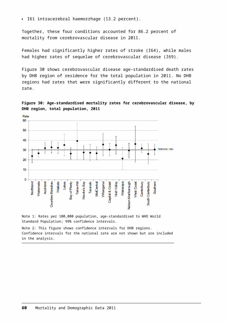
Table 22: Numbers and age-standardised mortality rates for motor vehicle accidents, by sex, 1980–2011
Year Male Female Total
No. Rate No. Rate No. Rate
1980 438 27.4 184 11.3 622 19.3
1981 476 29.6 231 13.6 707 21.6
1982 538 33.0 192 11.6 730 22.2
1983 461 27.6 186 10.8 647 19.2
1984 517 30.8 193 11.1 710 21.0
1985 516 30.4 231 13.4 747 21.8
1986 567 33.7 215 12.4 782 23.0
1987 570 33.4 265 15.0 835 24.2
1988 537 31.6 206 11.5 743 21.5
1989 557 32.5 242 13.8 799 23.1
1990 545 31.7 219 12.2 764 22.0
1991 471 27.8 210 11.7 681 19.7
1992 462 27.1 194 10.9 656 18.8
1993 438 25.3 179 10.0 617 17.6
1994 419 24.0 183 10.0 602 16.9
1995 407 23.4 205 10.9 612 17.1
1996 381 21.9 156 8.5 537 15.1
1997 383 20.8 167 8.6 550 14.5
1998 358 19.4 171 8.7 529 14.0
1999 349 18.7 184 9.1 533 13.8
2000 322 17.3 157 7.7 479 12.5
2001 318 17.2 151 7.2 469 12.1
2002 314 16.2 142 6.8 456 11.4
2003 336 17.2 158 7.4 494 12.3
2004 314 15.6 149 7.1 463 11.2
2005 307 15.2 127 6.0 434 10.6
2006 283 13.6 120 5.1 403 9.2
2007 300 14.7 150 6.6 450 10.6
2008 261 12.7 135 5.8 396 9.2
2009 286 13.5 134 5.7 420 9.5
2010 296 13.4 120 4.9 416 9.1
2011 221 9.8 84 3.3 305 6.5
Note: Rates per 100,000 population, age-standardised to WHO World Standard Population.
Mortality and Demographic Data 2011 61
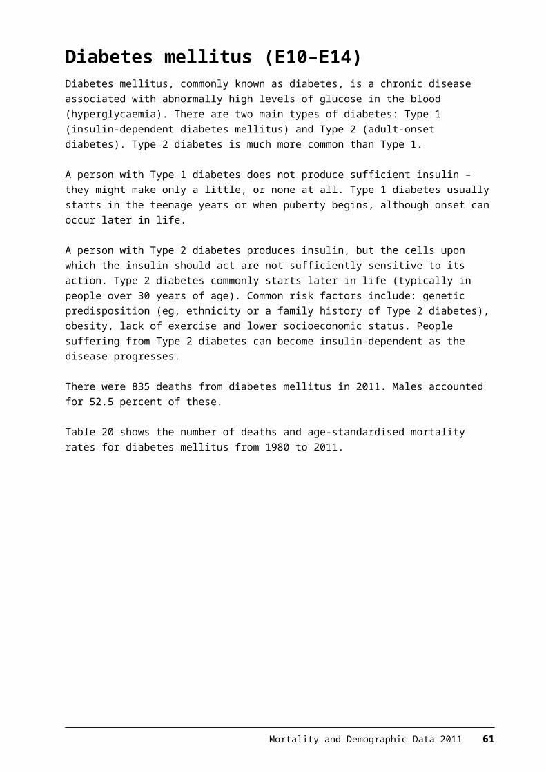
Figure 34 shows numbers and rates of deaths from motor vehicle accidents between 1950 and 2011. Mortality rates in 2011 were the lowest of all years shown for both sexes (9.8 per 100,000 for males and 3.3 per 100,000 for females).
Figure 34: Numbers and age-standardised mortality rates for motor vehicle accidents, by sex, 1950–2011
Note: Rates per 100,000 population, age-standardised to WHO World Standard Population.
Table 23 shows the 2011 percentage distribution of deaths and age-specific mortality rates from motor vehicle accidents for four age groupings for Māori and non-Māori.
Table 23: Age distribution of deaths from motor vehicle accidents, percentages and age-specific rates, by ethnicity and sex, 2011
Age group
Percentage Age-specific rate
Māori Non-Māori Māori Non-Māori
Total Male Female Total Male Female Total Male Female Total Male Female
<25 48.5 46.2 56.3 27.8 29.6 23.5 9.2 13.1 5.2 5.6 8.2 2.8
25–44 26.5 30.8 12.5 23.6 24.9 20.6 10.7 20.4 2.2 5.6 8.6 2.7
45–64 19.1 21.2 12.5 23.6 26.6 16.2 11.2 20.0 3.3 5.6 9.2 2.2
65+ 5.9 1.9 18.8 24.9 18.9 39.7 12.3 6.7 17.0 10.6 12.6 9.0
Note: Rates per 100,000 population.
Motor vehicle accident deaths within the Māori population were distributed toward the younger age groups in 2011; almost half occurred in people below the age of 25.
The non-Māori population had a more even distribution of deaths from motor vehicle accidents, although for non-Māori females two in every five deaths occurred in those aged 65 and over.
62 Mortality and Demographic Data 2011
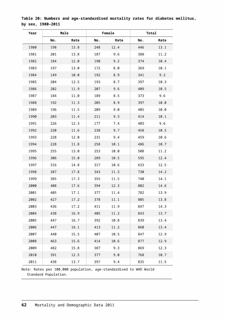
Figure 35 shows age-standardised mortality rates for motor vehicle accidents by sex and ethnicity from 1996 to 2011. For all groups, rates were significantly lower in 2011 compared with 1996 (using 95 percent confidence intervals).
Figure 35: Age-standardised mortality rates for motor vehicle accidents, by sex and ethnicity, 1996–2011
Note: Rates per 100,000 population, age-standardised to WHO World Standard Population.
In 2011, death rates for Māori were around 50 percent less than the equivalent 2010 rates, while for non-Māori, 2011 rates were around 20 percent lower.
The disparity in motor vehicle accident deaths between Māori and non-Māori narrowed markedly from 2010 to 2011. The mortality rate for Māori males was nearly three times the rate for non-Māori males in 2010, but only 1.9 times the rate for non-Māori males in 2011 (16.2 per 100,000 Māori males and 8.5 per 100,000 non-Māori males).
For females the same trend occurred. The mortality rate for Māori females was 2.9 times the rate for non-Māori females in 2010, and 1.7 times the rate for non-Māori females in 2011 (5.1 per 100,000 compared with 3.0 per 100,000).
Mortality and Demographic Data 2011 63
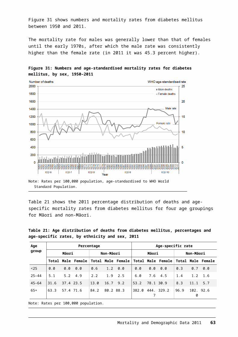
Figure 36 shows the rate of hospitalisations alongside the mortality rate from motor vehicle accidents between 1996 and 2011. Note that, in the interests of making the data comparable between DHBs, the hospitalisation data used to produce this figure excluded short-stay emergency department data.
Figure 36: Mortality and hospitalisation rates for motor vehicle accidents, and ratio of hospitalisations to deaths, 1996–2011
Note: Rates per 100,000 population, age-standardised to WHO World Standard Population.
Both the hospitalisation and the mortality trends showed a significant decline over this period. The motor vehicle accident mortality rate fell from 15.1 deaths per 100,000 total population in 1996 to 6.5 in 2011. The hospitalisation rate fell from 236.6 per 100,000 total population in 1996 to 149.3 in 2011.
The ratio line shows how many motor vehicle hospitalisation incidents occurred for every mortality incident over these years. In 2011, for example, there were 23 motor vehicle accident-related hospitalisations for every death. The steady upward trend of the hospitalisations to mortality ratio line suggests that over this time period people who were injured in a motor vehicle accident were less likely to die.
Note that some events will have been included in both the hospitalisation and the mortality count, taking into account people who were injured then subsequently died in hospital.
64 Mortality and Demographic Data 2011

Suicide (X60–X84)The ICD-10-AM code range X60–X84 covers acts of intentional self-harm. Mortality from intentional self-harm is commonly referred to as suicide. This section provides an overview of suicide mortality; for a more detailed analysis see the Ministry of Health publication series Suicide Facts: Deaths and Intentional Self-harm Hospitalisations.9 The numbers presented here are taken from the final data for 2011 suicide mortality, and so differ slightly from the provisional data in the 2011 Suicide Facts publication.
In 2011, 493 suicides occurred in New Zealand, as determined following coronial investigation. Table 24 shows numbers and age-standardised rates of suicide deaths between 1980 and 2011 by sex. The male suicide rate was consistently higher than the female rate. In 2011 the male rate was 3.4 times the female rate.
9 www.health.govt.nz/nz-health-statistics/health-statistics-and-data-sets/suicide-facts-deaths-and-intentional-self-harm-hospitalisations-series
Mortality and Demographic Data 2011 65
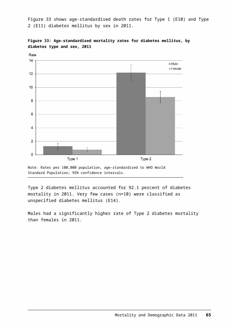
Table 24: Numbers and age-standardised mortality rates for suicide, by sex, 1980–2011
Year Male Female Total
No. Rate No. Rate No. Rate
1980 225 14.8 112 7.0 337 10.8
1981 241 15.8 79 4.8 320 10.2
1982 257 16.3 107 6.6 364 11.3
1983 250 15.5 102 6.2 352 10.7
1984 297 18.3 92 5.4 389 11.7
1985 255 15.5 83 4.9 338 10.0
1986 301 18.3 113 6.6 414 12.3
1987 363 21.7 100 5.8 463 13.6
1988 381 22.4 103 5.7 484 13.9
1989 372 21.8 93 5.3 465 13.4
1990 363 21.1 92 5.1 455 13.0
1991 380 22.3 94 5.4 474 13.7
1992 397 23.1 96 5.4 493 14.1
1993 349 19.9 94 5.2 443 12.5
1994 409 23.1 103 5.5 512 14.1
1995 427 23.9 116 6.3 543 15.0
1996 428 23.8 112 6.1 540 14.7
1997 440 23.7 121 6.3 561 14.8
1998 445 23.7 132 6.8 577 15.1
1999 385 20.4 131 6.8 516 13.4
2000 375 20.0 83 4.2 458 11.9
2001 388 20.3 119 5.9 507 12.9
2002 353 18.0 113 5.6 466 11.6
2003 376 18.4 141 6.6 517 12.4
2004 379 18.6 109 5.2 488 11.7
2005 380 18.6 131 6.0 511 12.2
2006 388 18.6 138 6.3 526 12.2
2007 371 17.4 116 5.0 487 11.0
2008 381 17.6 139 6.2 520 11.8
2009 393 17.9 117 5.0 510 11.3
2010 386 17.3 149 6.6 535 11.8
2011 377 17.0 116 5.1 493 10.9
Note: Rates per 100,000 population, age-standardised to WHO World Standard Population.
66 Mortality and Demographic Data 2011
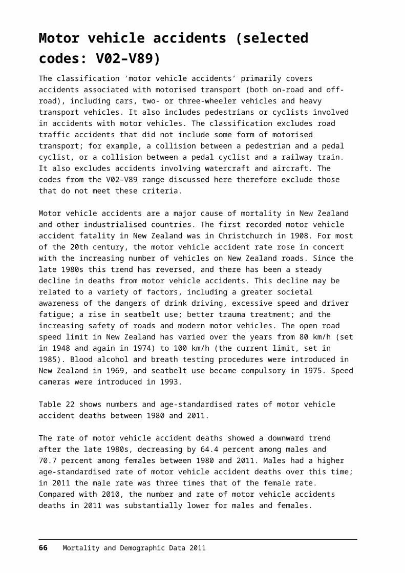
Figure 37 shows numbers and rates of death from suicide between 1950 and 2011. The male rate reached a peak in 1995, and fell by 29.1 percent between that year and 2011. The female rate remained relatively stable between 1950 and 2011.
Figure 37: Numbers and age-standardised mortality rates for suicide, by sex, 1950–2011
Note: Rates per 100,000 population, age-standardised to WHO World Standard Population.
Table 25 shows the 2011 percentage distribution of deaths and age-specific mortality rates from suicide for five age groupings for Māori and non-Māori.
Table 25: Age distribution of deaths from suicide, percentages and age-specific rates, by ethnicity and sex, 2011
Age group
Percentage Age-specific rate
Māori Non-Māori Māori Non-Māori
Total Male Female Total Male Female Total Male Female Total Male Female
5–14 3.5 2.4 6.3 0.5 0.3 1.2 2.9 2.8 2.9 0.5 0.4 0.5
15–24 43.0 40.2 50.0 21.1 21.4 20.2 38.8 51.5 25.7 15.5 23.6 6.8
25–44 39.5 41.5 34.4 31.1 32.5 26.2 26.9 43.3 12.4 11.8 19.7 4.3
45–64 14.0 15.9 9.4 35.4 35.3 35.7 13.7 23.6 4.9 13.5 21.4 5.9
65+ 0.0 0.0 0.0 11.9 10.5 16.7 0.0 0.0 0.0 8.1 12.2 4.6
Note: Rates per 100,000 population.
Note that Table 25 uses different age groups to similar tables in this publication, in order to show suicide incidence in the child (5–14 years) and youth (15–24 years) age groups.
Mortality and Demographic Data 2011 67
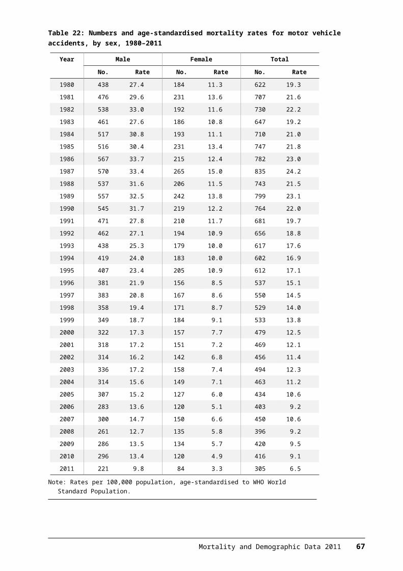
Figure 38 shows age-standardised mortality rates for suicide by sex and ethnicity from 1996 to 2011. Compared with their female counterparts, both Māori males and non-Māori males had significantly higher mortality rates in 2011 (using 95 percent confidence intervals).
Figure 38: Age-standardised mortality rates for suicide, by sex and ethnicity, 1996–2011
Note: Rates per 100,000 population, age-standardised to WHO World Standard Population.
Figures 39 and 40 show the rate of hospitalisations alongside mortality rates for intentional self-harm between 1996 and 2011 for males and females. Note that the hospitalisation figures exclude short-stay emergency department data, in line with the methodology used for motor vehicle accident hospitalisations in this publication and in line with that used in the Suicide Facts publication series.
68 Mortality and Demographic Data 2011
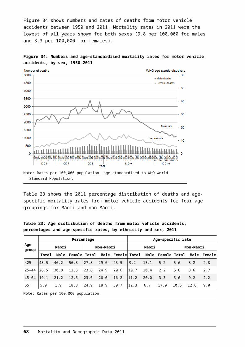
Figure 39: Male mortality and hospitalisation rates for intentional self-harm, and ratio of hospitalisations to deaths, 1996–2011
Note: Rates per 100,000 population, age-standardised to WHO World Standard Population.
Figure 40: Female mortality and hospitalisation rates for intentional self-harm, and ratio of hospitalisations to deaths, 1996–2011
Note: Rates per 100,000 population, age-standardised to WHO World Standard Population.
There appears to be a distinct gender difference in intentional self-harm hospitalisation rates relative to mortality rates. Males have a lower ratio of hospitalisations to deaths than females.
Mortality and Demographic Data 2011 69

70 Mortality and Demographic Data 2011
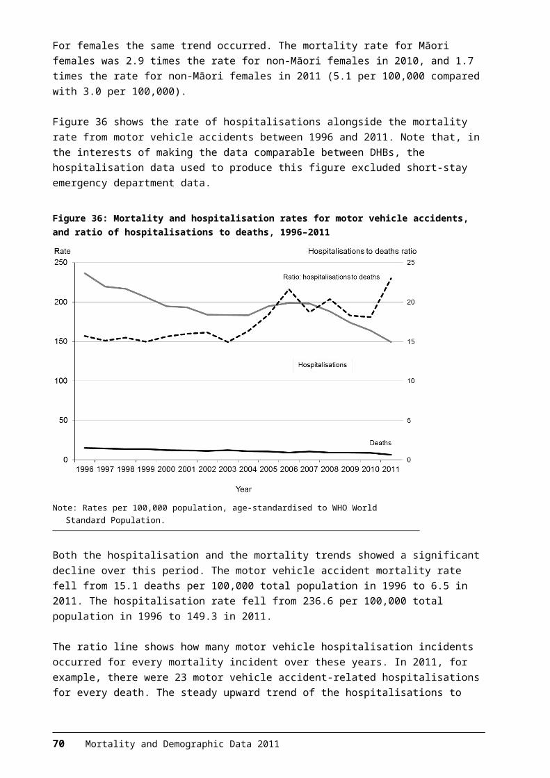
Further mortality-related informationStatistical mortality data tablesStatistical mortality data tables are available online in Excel format alongside the Mortality and Demographic Data publication at: www.health.govt.nz/nz-health-statistics/health-statistics-and-data-sets/mortality-and-demographic-series
These tables contain mortality data for the complete range of ICD-10-AM classifications, in sex and five-year age groupings. The data is grouped at national, regional and ethnic level.
Other mortality-related Ministry of Health publications Further detailed information on numbers and rates of live births, and fetal,
neonatal and post-neonatal deaths, is published in the annual series Fetal and Infant Deaths (www.health.govt.nz/nz-health-statistics/health-statistics-and-data-sets/fetal-and-infant-deaths-series).
Further information on cancer incidence and mortality can be found in the annual series Cancer: New registrations and deaths (www.health.govt.nz/nz-health-statistics/health-statistics-and-data-sets/cancer-new-registrations-and-deaths-series).
Information on hospitalisations and mortality from intentional self-harm can be found in the annual series Suicide Facts: Deaths and intentional self-harm hospitalisations (www.health.govt.nz/nz-health-statistics/health-statistics-and-data-sets/suicide-facts-deaths-and-intentional-self-harm-hospitalisations-series). Suicide prevention information can be found at www.health.govt.nz/our-work/mental-health-and-addictions/suicide-prevention
These publications, and others produced by the Ministry of Health, can be found through www.health.govt.nz/nz-health-statistics/health-statistics-and-data-sets
Other mortality-related publicationsSerious injury outcome indicator reportsStatistics New Zealand produces annual serious injury outcome indicator reports. These reports include numbers and rates of death from suicide, assault and motor vehicle traffic crashes (MVTC). The information for these reports is also sourced from the New Zealand Mortality Collection, and is therefore broadly comparable with the information published in Mortality and Demographic Data. However, the Mortality Collection is a dynamic database; any small discrepancies in data
Mortality and Demographic Data 2011 71
between the two publications are therefore likely to be due to updates to records in the database over time.
The serious injury outcome indicator reports also present data on ‘serious non-fatal intentional self-harm injury’ and ‘serious non-fatal MVTC injury’. These indicators cover only a subset of the self-harm hospitalisation data and motor vehicle accidents data analysed in this publication, and therefore cannot be directly compared.
For more information and access to the serious injury outcome indicator reports see www.stats.govt.nz/browse_for_stats/health/injuries/serious-injury-outcome-indicators-reports.aspx
For further information relating to the methodology, classifications and processes used to produce this publication, and how they differ between publications, contact [email protected]
Population and demographic dataFor population and other demographic data, contact the Ministry of Health (email: [email protected]) or Statistics New Zealand (www.stats.govt.nz or email: [email protected]).
Mortality data available from the Ministry of HealthThe Ministry of Health collects and records the information presented in Table 26 for all deaths in New Zealand. For a full listing of available fields, please refer to the Mortality Collection Data Dictionary (available at: www.health.govt.nz/publication/mortality-collection-data-dictionary).
For data enquiries, contact [email protected]
72 Mortality and Demographic Data 2011
Table 26: Mortality data available from the Ministry of Health
Item Notes
1 Health care user number
Also known as National Health Index number. Restricted access.
2 Domicile code Based on Statistics New Zealand Standard Area Unit code used for the 2006 Census.
3 Sex Male, female, indeterminate.
4 Ethnicity Based on Statistics New Zealand Standard Classification 1996 (Level 2); for example, NZ Māori, NZ European or Pākeha, Other European, Samoan, Chinese and so on. Up to three ethnicities are recorded and prioritised.
5 Age Age in days, weeks, months or years, as applicable.
6 Date of birth Day, month, year.
7 Country of birth From Statistics New Zealand Standard Country Code list, 1986.
8 Time deceased was in New Zealand
Number of years in New Zealand if not born in New Zealand.
9 Date of death Day, month, year.
10 Year of registration Year in which the death was registered.
11 Place died Place of death as recorded on the death registration.
12 Underlying cause of death
Codes from ICD-10-AM from 2000 onwards.
13 Selected contributing disease or condition
Codes from ICD-10-AM for selected conditions that contributed to death but were not the underlying cause of death (eg, diabetes mellitus, drug abuse and injuries) from 2000 onwards.
14 Mesh block Statistics New Zealand’s smallest area unit code, based on deceased’s residential address, from 2003 onwards. Restricted access.
15 Cot death indicator Sudden Infant Death Syndrome indicator.
16 Maternal death indicator
Indicates whether the death is the death of a woman while pregnant or within 42 days of termination of pregnancy, irrespective of the duration and the site of the pregnancy, from any cause related to or aggravated by the pregnancy or its management, but not from accidental or incidental causes.
17 Pregnancy-related indicator
Indicates if a woman died while pregnant or within 42 days of termination of pregnancy, irrespective of the cause of death.
18 Post-mortem code Indicates whether a post-mortem was performed and/or used in classification by the Ministry of Health.
19 Death certifier code Certified by doctor, or coroner with/without inquest, coroner’s interim report.
20 Death information source code
Code indicating the most accurate source of the information used to classify the underlying cause of death; for example, Births, Deaths, Marriages and Citizenship, Coronial Services, Land Transport New Zealand, Water Safety New Zealand.
21 Comments Free text field for additional comments relating to the death (eg, may include details of accidents or time sequence of conditions). Restricted access.
22 Occupation Text description of deceased’s usual occupation (or former occupation, if retired). Collected since 1998.
23 Work-related indicator
Recorded if the cause of death was known to be due to an accident while at work from 2000 onwards.
24 Alcohol-involved indicator
Records if alcohol consumption preceded death, when reported from 2000 onwards. Only recorded for deaths certified by a coroner.
25 Blood alcohol level Recorded in mg/100 mL blood, when reported from 2000 onwards. Only recorded for deaths certified by a coroner.
26 Birthweight Weight at birth in grams. Recorded when known for deaths of infants less than one year of age and for stillbirths.
27 Gestation Gestation (in weeks) of infant at birth. Recorded when known for deaths of infants less than one year of age and for stillbirths.
Mortality and Demographic Data 2011 73
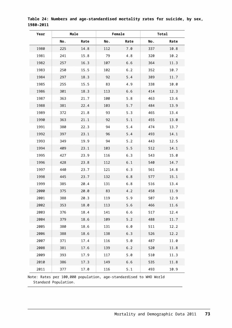
Additional information available from the Ministry of HealthYou may require information not included in this report or in the online statistical tables. The Ministry of Health is able to produce customised data extracts tailored to your needs. These may incur a charge (at Official Information Act rates). If you require additional data or analysis, contact:
Analytical ServicesMinistry of HealthPO Box 5013Wellington, 6145New ZealandPhone (04) 496 2000Fax (04) 816 2898Email: [email protected] visit: www.health.govt.nz
The Ministry of Health welcomes comments and suggestions about this publication.
74 Mortality and Demographic Data 2011
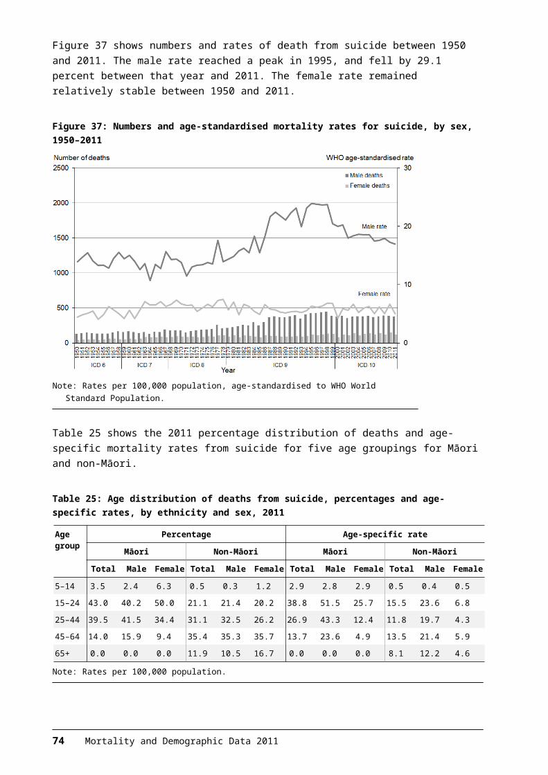
Explanatory notesMortality notesDeathsEvery death occurring in New Zealand must be registered with Births, Deaths, Marriages and Citizenship within three working days after the day of burial or cremation in a city or borough, or seven working days in any other case. The law does not impose any limit of time after which a death may not be registered. The statistics in this publication relate to registrations during the year 2011, rather than the actual number of deaths during the year 2011.
Causes of deathThe ICD-10-AM was used to classify causes of death throughout this report (National Centre for Classification in Health 2008). The World Health Organization regularly revises the ICD publication, and updates are issued in the form of new revisions; for example, ICD-10 is the Tenth Revision of ICD.
If more than one cause is entered on a medical certificate, the Mortality Collection follows WHO mortality rules and guidelines (as specified in ICD-10) for identifying the underlying cause of death. This is largely determined from the statement of the certifying doctor or coroner, but reference is also made to post-mortem reports received, and cancer registrations. On some occasions, coded hospital inpatient event summaries are compared with entries on the medical certificate in order to obtain more specific information. Information is also obtained from letters to certifying doctors and medical records departments, from data supplied by Land Transport New Zealand and Water Safety New Zealand, from the internet and from Coronial Services.
When a death is due to an external cause, such as an accident, the external cause and not the resulting injury is coded as the underlying cause of death. For example, if a death is due to a head injury as a result of a motor vehicle crash, the motor vehicle crash will be coded as the cause of death. Sites and types of injuries are coded as contributing causes, if reported.
Amenable mortalityThe ICD-10-AM codes used to define amenable mortality in this publication are shown in the following table.
Mortality and Demographic Data 2011 75
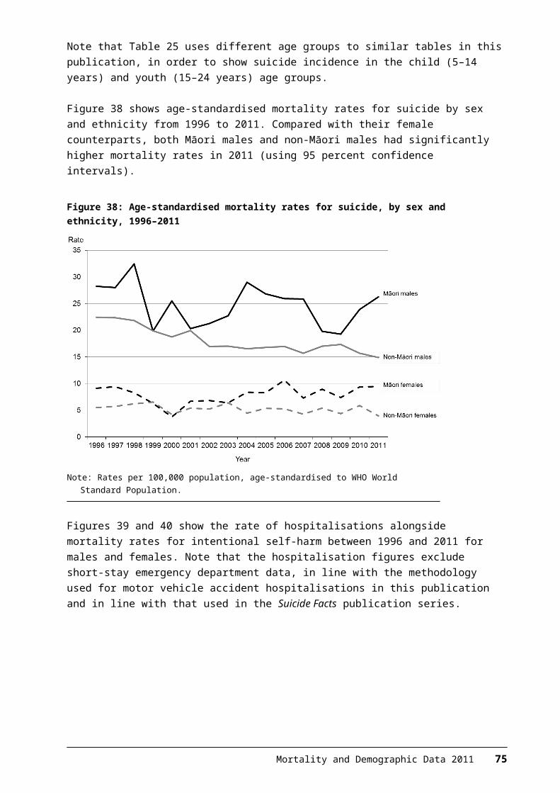
Table 27: Codes used to define amenable mortality
Group Condition ICD-10-AM code(s) Notes
Infections Pulmonary tuberculosis A15–A16
Meningococcal disease A39
Pneumococcal disease A40.3, G00.1, J13
HIV/AIDS B20–B24
Cancers Stomach cancer C16
Rectal cancer C19–C21
Bone and cartilage cancer C40–C41
Melanoma of skin C43
Female breast cancer C50 Females only
Cervical cancer C53
Prostate cancer C61
Testis cancer C62
Thyroid cancer C73
Hodgkin lymphoma C81
Acute lymphoblastic leukaemia C91.0 Ages 0–44 years
Maternal and infant
Complications of pregnancy O00–O96, O98–O99
Complications of perinatal period P01–P03, P05–P94
Cardiac septal defect Q21
Chronic disorders
Diabetes E10–E14
Valvular heart disease I01, I05–I09, I33–I37
Hypertensive diseases I10–I13
Coronary disease I20–I25
Pulmonary embolism I26
Heart failure I50
Cerebrovascular diseases I60–I69
COPD J40–J44
Asthma J45–J46
Peptic ulcer disease K25–K27
Cholelithiasis K80
Renal failure N17–N19
Injuries Land transport accidents excluding trains
V01–V04, V06–V14, V16–V24, V26–V34, V36–V44, V46–V54, V56–V64, V66–V74, V76–V79, V80.0–V80.5, V80.7–V80.9, V82–V86, V87.0–V87.5, V87.7–V87.9, V88.0–V88.5, V88.7–V88.9, V89, V98–V99
Include V00 if using ICD-10-AM-VI (from 2008 onwards)
Accidental falls on same level W00–W08, W18
Fire X00–X09
Suicide X60–X84
Treatment injury Y60–Y82
76 Mortality and Demographic Data 2011
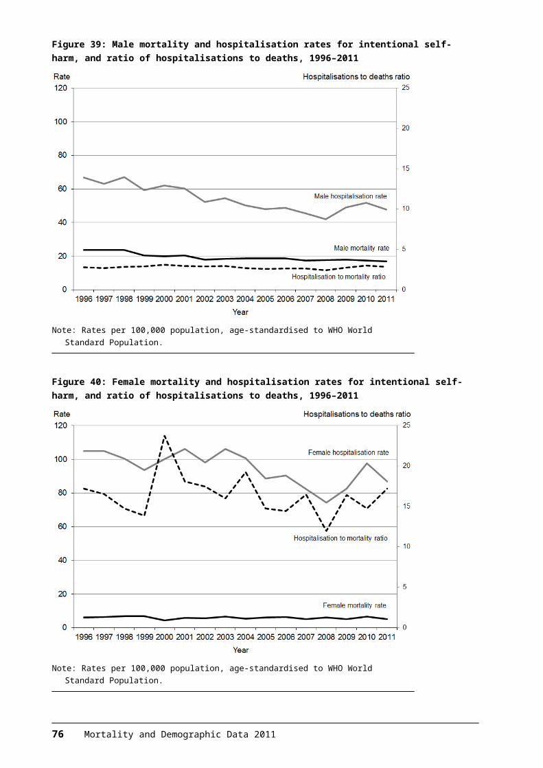
Population notesDomicileIn general, the domicile code of the deceased is classified according to the usual residence at time of death. The domicile code used for health collections is the four-digit Health Domicile Code originally created by Statistics New Zealand from its six-digit Census Area Unit Code. In 2011, the Health Domicile Code used was based on the 2006 Census Area Unit Code.
Changes to population dataStatistics New Zealand produces national population estimates based on the concept of the ‘usually resident population’. Previously, both national and subnational estimates were based on the ‘de facto population’ concept, which included all people in New Zealand at a given time, including overseas visitors, and excluded New Zealanders temporarily overseas on Census night. Statistics New Zealand considers that the resident population concept produces a more accurate estimate. Usually resident population estimates date from 1991.
The most significant outcome of this change is that the resulting demographic indices are slightly lower. This is because of a smaller numerator (because registrations of births, deaths and marriages of overseas visitors while in New Zealand are excluded) and a bigger denominator (due to the slightly larger population estimates).
Population dataThis publication uses the following population data for all but the regional analysis.
Mortality and Demographic Data 2011 77
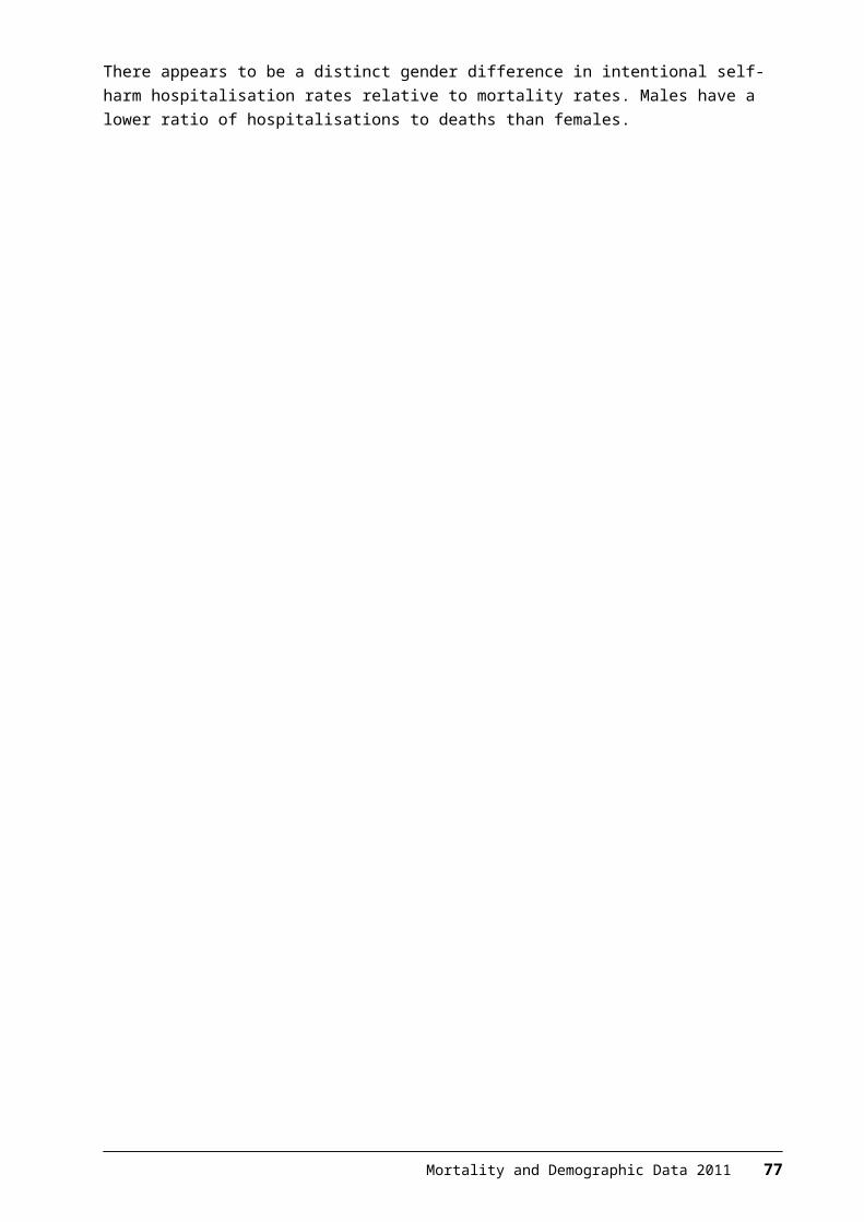
Table 28: Estimated resident population of New Zealand, by sex and five-year age group, mean year ended 31 December 2011
Age group
Total Māori Non-Māori
Total Male Female Total Male Female Total Male Female
0–4 314,290 161,370 152,920 91,410 47,240 44,170 222,880 114,130 108,750
5–9 287,290 147,070 140,220 70,500 36,140 34,360 216,790 110,930 105,860
10–14 292,730 149,820 142,910 68,660 35,150 33,520 224,070 114,670 109,390
15–19 317,630 163,390 154,250 67,410 34,720 32,690 250,220 128,670 121,560
20–24 325,580 167,850 157,730 58,960 29,390 29,570 266,620 138,460 128,160
25–29 294,370 146,820 147,550 42,510 20,250 22,260 251,860 126,570 125,290
30–34 272,940 131,440 141,500 41,790 19,540 22,260 231,150 111,900 119,240
35–39 290,460 138,170 152,290 42,140 19,590 22,540 248,320 118,580 129,750
40–44 312,730 149,250 163,480 41,030 19,150 21,880 271,700 130,100 141,600
45–49 319,040 154,200 164,840 38,770 18,250 20,520 280,270 135,950 144,320
50–54 298,640 145,580 153,050 33,480 15,760 17,720 265,160 129,820 135,330
55–59 257,440 126,190 131,240 25,040 11,940 13,100 232,400 114,250 118,140
60–64 236,590 116,060 120,540 19,200 9110 10,090 217,390 106,950 110,450
65–69 180,920 88,330 92,590 12,640 5960 6690 168,280 82,370 85,900
70–74 145,300 69,570 75,720 9570 4480 5090 135,730 65,090 70,630
75–79 105,970 49,260 56,710 5610 2540 3070 100,360 46,720 53,640
80–84 82,580 36,030 46,550 2980 1230 1750 79,600 34,800 44,800
85+ 72,900 25,500 47,500 1660 630 1020 71,240 24,870 46,480
Total 4,407,400 2,165,900 2,241,600 673,400 331,100 342,300 3,734,000 1,834,800 1,899,300
Source: Statistics New Zealand 2013a
Note: Because of rounding, individual figures in this table do not always sum to the stated totals.
The regional population data used to calculate rates of mortality by DHB differs to that used in the rest of the publication. This means that some results in that section differ very slightly from those given in other sections. The best available populations sourced from Statistics New Zealand have been used for regional analysis. Total population rates by DHB were calculated using the estimated resident population as at 30 June 2011, broken down by DHB region of domicile. Māori and non-Māori rates by DHB were calculated using population projections for 2011 (using the 2006 base population). These regional populations are available online in Excel format alongside this Mortality and Demographic Data publication.
The accuracy of the population estimates used to calculate the regional rates for 2011 may be compromised as a result of population movement that occurred following the significant 2010 and 2011 earthquakes in the Canterbury region. Some people moved out of the Canterbury region permanently, or temporarily, and others permanently or temporarily moved into the Canterbury region. This population movement, and its effect on population sizes of different regions across New Zealand, are difficult to quantify. Caution is therefore needed when interpreting regional rates for 2011.
78 Mortality and Demographic Data 2011
Ethnicity notesEthnicityEthnicity data for deaths mainly come from Births, Deaths, Marriages and Citizenship. Ethnicity data is provided to funeral directors by family members or others assisting with the death registration and recorded on the BDM28 Notification of Death for Registration form.
Ethnicity data for the New Zealand population is based on prioritised ethnicity. Changes in ethnicity recording came into effect in September 1995. Previously, ethnicity had been based on ancestry, with only one ethnic group ascribed to each individual (the ‘sole ethnic origin’ concept). The 1995 changes introduced the self-identified ethnicity model, which allows an individual to choose multiple ethnicities based on their preferences or self-concept. Multiple selected ethnicities are then prioritised into a hierarchy.
The system recognises the following key characteristics of ethnicity. Ethnicity is self-perceived, so people should identify their own ethnic affiliation
whenever feasible. A person can belong to more than one ethnic group. The ethnicities with which a person identifies can change over time or in
different contexts.
Ethnicity is a social construct of group affiliation and identity. The present Ministry of Health statistical standard for ethnicity states that ‘ethnicity is the ethnic group or groups that people identify with or feel they belong to’. Thus, ethnicity is self-perceived, complex and multidimensional.
This definition is based on the work of Anthony Smith (Smith 1986).
PrioritisationThis publication uses ‘prioritised ethnicity’, where each person is allocated to one ethnic group using the priority system Māori > non-Māori (Ministry of Health 2004). The aim of prioritisation is to ensure that when it is necessary to assign people to a single ethnic group, ethnic groups that are small or important in terms of policy are not swamped by the European ethnic group. This method is also a more robust method of dealing with the low rate of multiple ethnicities in health sector data.
Further information on ethnicity data protocols for the health and disability sector is available at www.health.govt.nz/publication/ethnicity-data-protocols-health-and-disability-sector
Mortality and Demographic Data 2011 79
Statistical notesAge-specific and age-standardised ratesAge-specific rateAn age-specific rate is the rate at which a particular event (eg, death or disease incidence) occurs in each age group of a population as some unit of the population-at-risk or person-years-at-risk.
An age-specific rate is simply the crude rate for the specific age group. For example, to calculate the age-specific rate of a disease for people aged 45–49, the total number of cases in the age group is divided by the population in that age group and multiplied by a constant (a unit of population: 100,000 in this publication). This process produces death rates showing the number of deaths per 100,000 population in each age group in a particular year (Borman 1995).
Age-standardised rateAge-standardised death rates adjust for differences in age distribution of the populations being compared. Age-standardised rates are artificially created figures that allow comparisons to be made with differing groups; they should only be compared with other adjusted rates that have been computed using the same ‘standard’ population.
Age-standardised rates are calculated by multiplying age-specific rates by a standard population. The standard population used in these calculations is the WHO World Standard Population (see below). The WHO World Standard Population is a widely used New Zealand and international standard.
Further information on age-specific and age-standardised rates can be found in the Ministry of Health/Public Health Commission document Standardising Rates of Disease: see www.health.govt.nz/publication/standardising-rates-disease
80 Mortality and Demographic Data 2011
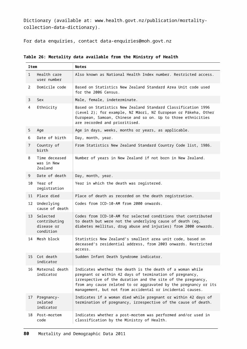
Table 29: The WHO World Standard Population
Age group Population
0–4 8860
5–9 8690
10–14 8600
15–19 8470
20–24 8220
25–29 7930
30–34 7610
35–39 7150
40–44 6590
45–49 6040
50–54 5370
55–59 4550
60–64 3720
65–69 2960
70–74 2210
75–79 1520
80–84 910
85+ 635
Total 100,035
Source: Waterhouse et al 1976
Figure 41 shows the Māori and non-Māori populations used in Mortality and Demographic Data 2011, as well as the WHO World Standard Population for comparative purposes.
Figure 41: Māori 2011 population, non-Māori 2011 population and WHO World Standard Population, by age group
Mortality and Demographic Data 2011 81
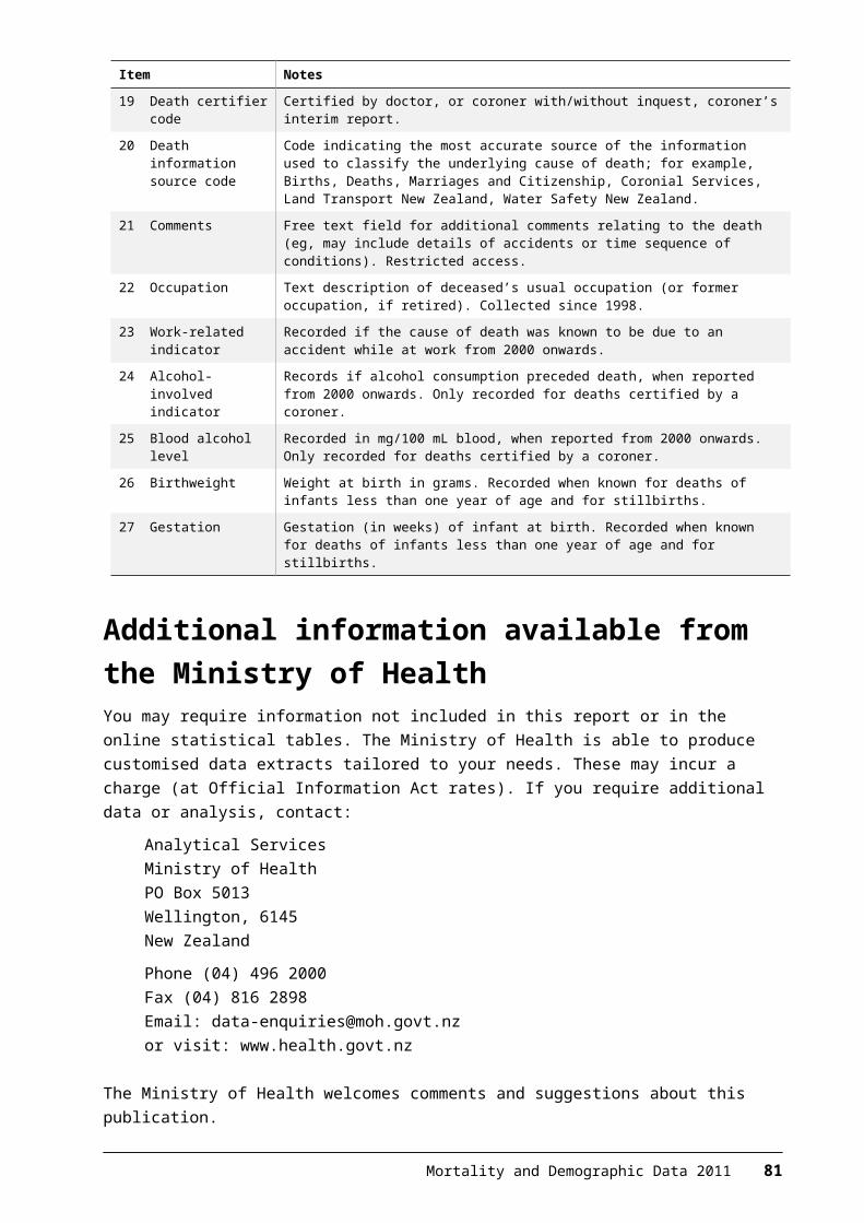
Sources: Statistics New Zealand 2013a and Waterhouse et al 1976
Age-standardisation and Māori ratesAs noted above, age-standardisation is intended to make two population groups comparable. Different population standards will produce different mortality rates, different rankings for causes of death and different confidence intervals. For example, comparing the WHO standard population used in this publication and a Māori population shows that the all-cause mortality rate for Māori is higher using the WHO standard, and that the relative rankings of some causes of Māori death (eg, deaths from external causes) are lower (Robson et al 2007).
Confidence intervalsConfidence intervals have been calculated for age-standardised rates at the 95 percent or 99 percent level using the method presented in Keyfitz (1966).
A confidence interval is a range of values used to describe the uncertainty around a single value (such as an age-standardised rate). It is used to estimate the true value in a population, such as the underlying or true rate. Confidence intervals are calculated with a stated probability; for example 95 percent (which would indicate that there is a 95 percent chance that the true value lies within the confidence interval).
Confidence intervals may assist in comparing rates over time or between different groups. If two confidence intervals do not overlap, then it is reasonable to assume that the difference is not due to chance. If two confidence intervals do overlap, it would only be possible to make any conclusion about the significance of any difference between the rates by conducting a statistical test of difference.
Note that the use of a standardised population such as the WHO World Standard Population tends to produce wider Māori confidence intervals than the use of a Māori-specific population.
82 Mortality and Demographic Data 2011

ReferencesAhmad O, Boschi-Pinto C, Lopez A, et al. 2001. Age Standardization of Rates: A new WHO standard. GPE Discussion Paper Series: No. 31. Geneva: World Health Organization.
Borman B. 1995. Standardising Rates of Disease. Wellington: Public Health Commission.
Keyfitz N. 1966. Sampling variance of standardized mortality rates. Human Biology38: 309–17.
Ministry of Health. 2004. Ethnicity Data Protocols for the Health and Disability Sector. Wellington: Ministry of Health.
Ministry of Health. 2012. The Health of New Zealand Adults 2011/12: Key findings for the New Zealand Health Survey. Wellington: Ministry of Health.
National Centre for Classification in Health. 2008. The International Statistical Classification of Diseases and Related Health Problems, Tenth Revision, Australian Modification, Sixth Edition (ICD-10-AM). Sydney: National Centre for Classification in Health.
Robson B, Purdie G, Cram F, et al. 2007. Age standardisation – an indigenous standard? Emerging Themes in Epidemiology 4(3).
Smith A. 1986. The Ethnic Origins of Nations. Oxford: Blackwell Publishers Ltd.
Statistics New Zealand. 2013a. Demographic Trends: 2012. Wellington: Statistics New Zealand. URL: www.stats.govt.nz/browse_for_stats/population/estimates_and_projections/demographic-trends-2012.aspx (accessed 23 July 2014).
Statistics New Zealand. 2013b. Serious Injury Outcome Indicators – Technical Report 2013. Wellington: Statistics New Zealand. URL: www.stats.govt.nz/browse_for_stats/health/injuries/serious-injury-outcome-tech-report-2013.aspx (accessed 29 July 2014).
Statistics New Zealand. 2013c. Serious Injury Outcome Indicators: 2000–12. Wellington: Statistics New Zealand. URL: www.stats.govt.nz/browse_for_stats/health/injuries/serious-injury-outcome-indicators-2000-12.aspx (accessed 29 July 2014).
Waterhouse J, Muir C, Correa P, et al (eds). 1976. Cancer Incidence in Five Continents, Vol III. IARC Scientific Publications No. 15. Lyon, France: International Agency for Research on Cancer.
WHO. 1979. Medical Certification of Cause of Death: Instruction for physicians on use of international form of medical certificate of cause of death. Geneva: World Health Organization.
Mortality and Demographic Data 2011 83