Embed Size (px)
Citation preview

MTTTS17
Dimensionality Reduction and Visualization
Spring 2020Jaakko Peltonen
Lecture 4: Graphical Excellence
Slides originally by Francesco Corona 1

Outline
Information visualization
Edward Tufte
The visual display of quantitative information
Graphical excellenceData mapsTime seriesSpace-time narrativesRelational graphics
Graphical integrityDistortion in data graphicsDesign and data variationVisual area and numerical measure
2

Information visualizationData graphics visually display measured quantities by means of the combined use ofpoints, lines, a coordinate system, numbers, words, shading and colour
The use of abstract, non-representational pictures to show numbers is a surprisingly recentinvention, perhaps because of the diversity of skills required:
- visual-artistic, empirical-statistical, and mathematical
It was not until 1750-1800 that statistical graphics were invented, long after Cartesiancoordinates, logarithms, the calculus, and the basics of probability theory
William Playfair (1759-1823) developed/improved upon(nearly) all fundamental graphical designs, seeking to replaceconventional tables of numbers with systematic visualrepresentations
A Scottish engineer and a political economistThe founder of graphical methods of statisticsA pioneer of information graphics
3
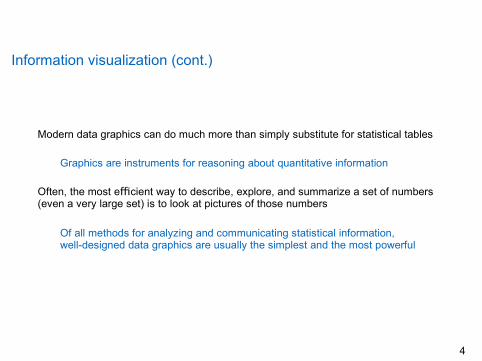
Information visualization (cont.)
Modern data graphics can do much more than simply substitute for statistical tables
Graphics are instruments for reasoning about quantitative information
Often, the most e cient way to describe, explore, and summarize a set of numbersffi(even a very large set) is to look at pictures of those numbers
Of all methods for analyzing and communicating statistical information,well-designed data graphics are usually the simplest and the most powerful
4
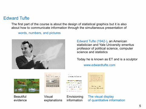
Edward TufteThe first part of the course is about the design of statistical graphics but it is alsoabout how to communicate information through the simultaneous presentation of
words, numbers, and pictures
Edward Tufte (1942-), an Americanstatistician and Yale University emeritusprofessor of political science, computerscience and statistics
Today he is known as ET and is a sculptor
www.edwardtufte.com
Beautifulevidence
Visualexplanations
Envisioninginformation
The visual displayof quantitative information
5

The visual display of quantitative information
The visual display of quantitative information (1983 and2009) is a classic on data graphics, charts and tables
A landmark book, a wonderful book. FrederickMosteller, HarvardA tour de force. John Tukey, Bell Labs & PrincetonThe century’s best book on statistical graphicsComputing ReviewsOne of the best books you will ever see. DatamationBest 100 non-fiction books of the 20th century.Amazon.comReading it is a must to understand how you arebeing lied to by politicians. djinni111@thepiratebay
6

The visual display of quantitative information (cont.)
The first part is about reviewing Graphical practice of the two centuries since Playfair
Graphical excellence: Historical glories for the main types of graphical designs(Data maps, Time series, Space-time narrative and Relational graphics)Graphical integrity: Lapses and lost opportunities (Distortion, Design and datavariation, Visual area and numerical measure and Context)Sources of integrity and sophistication
7

Excellence
Graphical excellence is all about the well-designed presentation of interesting dataExcellence is a matter of substance, of statistics, and of designComplex ideas communicated with clarity, precision, and efficiency
Graphical excellence is that which gives to the viewer the greatest number of ideas inthe shortest time with the least ink in the smallest space
It is nearly always multivariateIt tells the truth about the data
Graphical excellence is illustrated for fundamental graphical designs (Data maps, Timeseries, Space-time narrative and Relational graphics), and serve multiple purposes
providing a set of high-quality graphicsconstructing a theory of data graphicshelping to demonstrate a descriptive terminologytelling about the history of graphical developmentseeing how good statistical graphics can be
8
Integrity
For many the first word that comes to mind when they think about infocharts is LIE
Some graphics do distort the data, making it hard for the viewer to learn the truthData graphics are no different from words in this regard, for any means of communication can be used to deceive
There is no reason to believe that graphics are especially vulnerable toexploitation by liars
Most of us have excellent graphical lie detectors that help us see through frauds
False graphics are still with us, deception must always be confronted and demolishedGraphical excellence begins with telling the truth about the data
9
The visual display of quantitative information (cont.)
The second part is about providing a simple language for the Theory of data graphics
Data-ink and redesign: Empirical measures of graphical performance andsequential improvement of graphics through revision and editingChartjunk: Bad graphical displays and why graphics do not become attractiveand interesting through the addition of ornamental hatchingData-ink maximization, Malfunctioning elements, High-resolution and Aesthetics
10

Data-ink and redesign
Five principles in the theory of data graphics produce substantial changes in designAbove all show the dataMaximize the data-ink ratioErase non data-inkErase redundant data-ink
These principles apply to many graphics and yield a large series of design optionsRevise and edit
11

Chartjunk and data-ink maximization
Ornamental hatching leading to chartjunk does not achieve the goals of its propagators
Graphics do not become attractive and interesting through chartjunk and ducksChartjunk can turn bores into disasters but it can never rescue a thin data set
The best designs are intriguing and curiosity-provoking, drawing the viewer into thewonder of data, sometimes by narrative power, sometimes by immense detail andsometimes by elegant presentation of simple but interesting data
No information, no sense of discovery, and no wonder is generated by chartjunk
Most of the graphic’s ink should vary only in response to data variationMaximizing data-ink is but a single dimension of a complex design task
12
Graphical practice
Graphical displays should:
Show the dataInduce the viewer to think about thesubstance rather than about methodology, graphic design, the technology of graphicproduction, or something else
Avoid distorting what the data have to say
Present many numbers in a small place
Make large datasets coherent
Encourage the eye to comparedifferent pieces of dataReveal the data at several levels ofdetail, from a broad overview to thefine structureServe a reasonably clear purpose:Description, exploration, tabulation, ordecorationBe closely integrated with thestatistical and verbal descriptions of adataset
Graphics must reveal data
13

Graphical excellence
Excellence in statistical graphics is all about communicating complex ideas withClarityPrecisionEfficiency
Graphical excellence is illustrated here for fundamental graphical designsData-mapsTime-seriesSpace-time narrative graphicsRelational graphics
14

Data maps
It was not until the seventeenth centurythat the combination of cartography andstatistical skills required to construct adata map came together
5000 years after the first geographicmaps were drawn on clay tablets
... and many highly sophisticatedgeographic maps were produced centuriesbefore the first map containing anystatistical material was drawn
15

Data maps (cont.)The map of the tracks of Y¬u the great described by Joseph Needham in Science andcivilization of China (1959) is a detailed map engraved during the 11th century A.D.
... the most remarkable cartographic workof its age, in any culture
Full grid (100 li scale), a relativelyfirm coastline, an extraordinaryprecision of the network of riversThere is nothing like it in Europe tillabout 1550 A.D.
16

Data maps (cont.)
By that time, European cartography hadcome close to achieving statisticalgraphicacy, even approaching scatterplots
No one had made the quantitativeabstraction of placing a measuredquantity on the map’s surface
Let alone the more difficultabstraction of replacing latitude andlongitude with some other dimensions
17

Data maps (cont.)
One of the first data maps is a world chart showing trade winds and monsoons (1689)
Edmond Halley (1656-1742) was an English astronomer,geophysicist, mathematician, meteorologist, and physicist
Best known for computing the orbit of a comet
18

Data maps (cont.)
An early and worthy use of a map to chart non-geographical patterns is the famous
Dot map of Cholera deaths in LondonOn August 31, 1854, cholera brokeout in the Broad Street area (Soho)of Central LondonOver 500 people diedAt that time such diseases werebelievedto becaused by bad air
Aphysician, Dr. John Snow (1813-1858),was skeptical about this theory
On a map of the area, he markeddeaths by dotsThe area’s eleven water pumps werelocated by crosses
19

Data maps (cont.)
From the scatter over the surface of the map, Snow observed that cholera occurredalmost entirely among those who lived near (and drank from) the Broad St. pump
He thought he had discovered aprobable cause for the epidemics
Chemical and microscope analysiscould not conclusively prove it
His argument on pattern of thedisease was convincing enough topersuade the local council to disablethe pump by removing its handle
20

Data maps (cont.)
The outbreak ended when thehandle was removed
Now they sell it as a souvenir
Why was the mystery solved andwhy was Snow taken seriously?
Data were placed in anappropriate contextThe relation between causeand effect highlighted
21

Data maps (cont.)
22

Data maps (cont.)
Computerized cartography and modern photographic techniques have increased thedensity of information some 5K-fold in current data maps compared to Halley’s
The most extensive data maps, place millions of bits of information on a single page
No other method for the display of statistical information is so powerful
23

Data maps (cont.)
Paul Butler: Visualizing friendships (2010), http://paulbutler.org/archives/visualizing-facebook-friends/
24

Data maps (cont.)
Olivier H. Beauchesne: Map of scientific collaboration between researchers (2011)http://olihb.com/2011/01/23/map-of-scientific-collaboration-between-researchers/
25
Data maps (cont.)
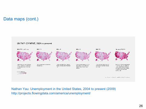
Nathan Yau: Unemployment in the United States, 2004 to present (2009)http://projects.flowingdata.com/america/unemployment/
26

Data maps (cont.)
Aaron Koblin: 24-hour flight patterns over the US (2009)http://www.aaronkoblin.com/work/flightpatterns/index.html
27

Peter Miller: A year of edits of OpenStreetMap (2009-)http://www.itoworld.com/static/openstreetmap_year_of_edits.html
28
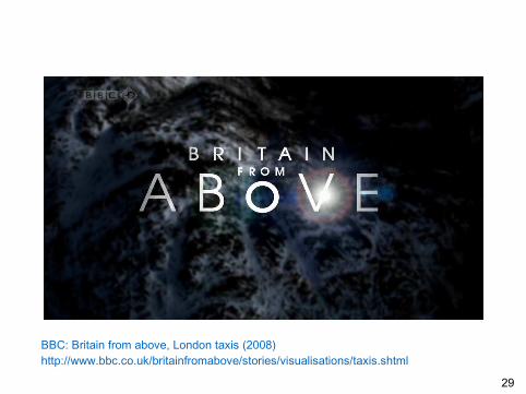
BBC: Britain from above, London taxis (2008)http://www.bbc.co.uk/britainfromabove/stories/visualisations/taxis.shtml
29

Time series
The time series plot is the most frequently used form of graphic design
With one dimension marching alongthe regular rhythm of seconds,minutes, hours, days, weeks, months,years, centuries, or millenniaThe natural ordering of the time scalegives this design a strength andefficiency of interpretation found in noother graphic arrangement
Also time series plots started appearing in the 10th or 11st century
30

Time series (cont.)
Not until the late 1700s that time series charts began to appear in scientific writings
This drawing of Johann Lambert shows theperiodic variation in soil temperature inrelation to the depth under the surface
The greater the depth, the greater thetime lag in temperature responsiveness
Modern graphic designs showing timeseries differ little from those of Lambert,although the data bases are far larger
Time series displays are always at their best for big data sets with proper variabilityWhy waste the power of data graphics on simple linear changes, which canusually be better summarized in one or two numbers?
31

Time series (cont.)
The train schedulefrom Paris to Lyon
Eti enne- Jules M arey(1830-1904) was aFrench scientist andchronophotographer
● Arrivals and departures from a station are located along the horizontal● Length of stop at a station is indicated by the length of the horizontal line● Stations are separated in proportion to their actual distance apart● The slope of the line reflects the speed of the train
32

Time series (cont.)
Johann Heinrich Lambert (1727-1777)A Swiss mathematician, physicist, astronomer, ...Hyperbolic geometry and properties of map projectionsThe law of light absorption (Beer-Lambert Law)
William Playfair (1759-1823)A Scottish engineer and a political economistThe founder of graphical methods of statisticsA pioneer of information graphics
33

Time series (cont.)
Playfair published the first known time series chart using economic data (1786)
Playfair contrasted his graphical methodwith the tabular presentation of data
Graphics were preferable to tables becausegraphics showed the shape of the data in acomparative perspective
Note the graphical arithmetic showing theshifting balance of trade by the differencebetween the import export time series
34

Time series (cont.)
The problem with time series is that the simple passage of time is not a goodexplanatory variable: Descriptive chronology is not causal explanation
There are exceptions, especially when there isa clear mechanism that drives the Y-variable
The outgoing mail of the US House ofRepresentative peaks every two years, justbefore the election daysThis time series does testify about causality
The graphic is worth at least 700 words
35

Time series (cont.)
36
Space-time narratives
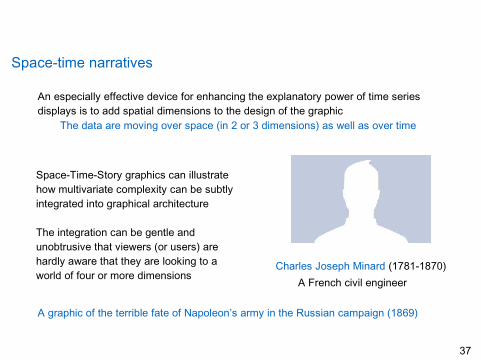
An especially effective device for enhancing the explanatory power of time seriesdisplays is to add spatial dimensions to the design of the graphic
The data are moving over space (in 2 or 3 dimensions) as well as over time
Space-Time-Story graphics can illustratehow multivariate complexity can be subtlyintegrated into graphical architecture
The integration can be gentle andunobtrusive that viewers (or users) arehardly aware that they are looking to aworld of four or more dimensions
Charles Joseph Minard (1781-1870)A French civil engineer
A graphic of the terrible fate of Napoleon’s army in the Russian campaign (1869)
37

Space-time narratives (cont.)
Polish-Russian border, Niemen river (June 1812) Invasion →
← Retreat The sack of Moscow (September 1812)
38

Space-time narratives (cont.)
Minard’s graphics tells a rich and yet very coherent story with its multivariate data... far far far more enlightening that just a number bouncing over time
Several variables are plotted● the size of the army● its location on a two dimensional surface● the direction of the army’s movement● the temperature at various dates during the retreat
It may well be the best statistical graphic ever drawn
39

Space-time narratives (cont.)
(from the United States Holocaust Memorial Museum)
... and animated maps aren’t much better!
40

Relational graphics
The invention of data graphics required replacing the latitude-longitude coordinates ofthe map with more abstracts measures not based on geographical analogy
● Moving from maps to statistical graphics was a BIG step● Thousands of years passed before this step was taken● Lambert and Playfair again (and others) in the 18th century
Here Playfair, who lacked mathematical skills, had a forerunner, for Lambert couldthink more clearly about the abstract problems of graphical design than he did
41

Relational graphics (cont.)
A graphical derivation of the evaporation rate of water as a function of temperature
Lambert’s analysis begins with two time-seriesDEF, the decreasing height of water in acapillary tubeABC, the corresponding behavior oftemperature
The slope of the curve DEF is then taken (notethe tangent DEG) at a number of places,yielding the rate of evaporation
J. H. Lambert, Essai d’hygrométrie ou sur la mesure de l’humidité, Mémoires del’Académie Royale des Science et Belles-Lettres, 1769.
42
Relational graphics (cont.)
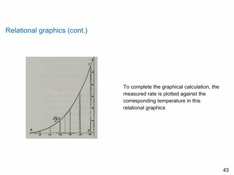
To complete the graphical calculation, themeasured rate is plotted against thecorresponding temperature in thisrelational graphics
43

Relational graphics (cont.)
Lambert in Beyträge zum Gerbrauche der Mathematik und deren Anwendung (1765)
We have in general two variable quantities X and Y, which will be collated to oneother by observation, so that we can determine for each value of X, which may beconsidered as an abscissa, the corresponding ordinate Y
Were the experiments or observations completely accurate, these coordinateswould give a number of points through which a straight or a curved line shouldbe drawn
But as this is not so, the line deviates to a greater or lesser extent from theobservational points. It must therefore be drawn in such a way that it comes asnear as possible to its true position and goes, as it were, through the middle ofthe given points
44

Graphical excellence, again
In summary, graphical excellence is the well-designed presentation of interesting datait is a matter of substance, of statistics and of design
Graphical excellence consists of complex ideas communicated with clarity, precisionand efficiency or, if you like, it is what gives to the viewer
● the greatest number of ideas● in the shortest time● with the least ink● in the smallest space
45

Graphical integrity
The first word that comes to mind when they think about statistical charts is LIEIt is very true that some graphics do distort the underlying dataNo doubt that that makes it hard for the viewer to learn the truth
Data graphics are not different from wordsThere is no reason to believe that graphics are especially vulnerableMost of us have good graphical lie detectors that help us to see the truth
46

Graphical integrity (cont.)
Much of the 20th century thinking about graphics has focused on the question of howcharts might fool a viewer
The use of graphics for serious data analysis was largely ignored
At the core of the preoccupation was the assumption that data graphics were mainlydevices for showing the obvious to the ignorant, which led to two fruitless paths
The graphics had to be alive, communicatively dynamic, overdecorated andexaggerated (otherwise, the dullards would fall asleep)The main task of graphical analysis was to detect and denounce deception(because the dullards could not protect themselves)
47

Graphical integrity (cont.)
It was only in the 1960s that John Tukey (1915-2000) started making statistical chartsrespectable, putting an end to the view that graphics were only for decorating numbers
American mathematician and aworld-class data analyst
New designs and their effective use inthe exploration of complex data
A forerunner of interactive graphics
Not a word about deception, just beautiful graphics as instruments for reasoning
48

Graphical integrity (cont.)
False graphics are still with us, deception must always be confronted and demolished
Lie detection is no longer at the fore front of researchExcellence begins with telling the truth about the data
49

Distortion in data graphics
A graphic does not distort if the visual and numerical representations are consistent
What then is the visual representation of the data?As physically measured on the surface of the graphics?or, as perceived visual effect?
How do we know that the visual image really represents the underlying numbers?
50

Distortion in data graphics (cont.)
Many experiments on visual perception of graphics have been conductedHaving people look at lines of varying length, circles of different areas and thenrecording their assessments of the numerical quantities
Experiments revealed very approximated power laws relating the numericalmeasures to the perceived measure
E.G., the perceived area of a circle grows more slowly than the actual measured area
Perceived area = (Actual area)α , with α = 0.8 ± 0.3
However, different persons see the same ares somewhat differentlyPerceptions change with experiencePerceptions are context-based
51

Distortion in data graphics (cont.)
The best we can hope for is some uniformity in graphics (if not in the perceivers) andsome assurance that the perceiver has some fair chance to get the numbers right
Two principles lead towards thosegoals and thus try to enhance Graphical integrity
1. The representation of numbers, asphysically measured on the surface ofthe graphics itself, should be directlyproportional to the numericalquantities represented
2. Clear, detailed and thorough labelingshould be used to defeat graphicaldistortion and ambiguity (write outexplanations and label importantevents in the data)
52

Distortion in data graphics (cont.)
Violations of the first principle are one form of graphic misinterpretation
It is measured by theLie factor, LF Lie factor =
Size of effect shown in graphicsSize of effect in data
If the Lie factor equals one, then the graphic may be doing a reasonable job● Accurate representation of the underlying data
If the Lie factor is greater than 1.05 or smaller than 0.95, then graphics distort● Beyond the unavoidable accuracies in plotting
The logarithm of theLF is usually taken tocompare errors
Overstating (log LF > 0)Understating (log LF < 0)
Overstating is the most common distortion, with Lie factors of two to five
53

Distortion in data graphics (cont.)
An extreme example in 1978: A series offuel economy standards to be met byautomobile manufacturers
From 18 mpg (in 1978)To 27.5 mpg (by 1985)
These standardsand the dates fortheir attainmentwere plotted
Lie Factor = 14.853% increasein numb ers783% increasein length
54

Distortion in data graphics (cont.)
Other peculiarities of the display, ...In most roads, the future is in front of us, toward the horizonThe dates remain of constant size, as we move toward the horizon
The numbers (as well asthe width of the road)shrink because of twosimultaneous effects
changes in valuesperspective
55

Distortion in data graphics (cont.)
The non-lying version, with proper contextNew cars standards compared withaverage cars on the road
Notice the revealed dynamics of fueleconomy (slow startup, fast growthand final stabilization)
The New York Times (1978)
56

Design and data variation
Each part of a graphic generates visual expectations about its other partsThese expectations determine, very often, what the eyes actually seeAn incorrect extrapolation of visual expectations, generated at one place on thegraphics, leads to deceptive results in other places
A typical example is a scale moving at regular intervals, ... it is also expected to moveto the very end in a coherent fashion
Let’s see what happens with the muddling or trickery of non-uniform changes ...
57
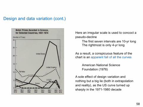
Design and data variation (cont.)
Here an irregular scale is used to concoct apseudo-decline
The first seven intervals are 10-yr longThe rightmost is only 4-yr long
As a result, a conspicuous feature of thechart is an apparent fall of all the curves
American National ScienceFoundation (1976)
A sole effect of design variation andnothing but a big lie (both in extrapolationand reality), as the US curve turned upsharply in the 1971-1980 decade
58

Design and data variation (cont.)
A correction with the actual dataThe confounding of design variationwith actual data variation generatedambiguity and deception
The eye can mix up changes in thedesign with changes in the data
Show data variation, not design variation!
59

Design and data variation (cont.)
Another example where design variationinfected a graphic
An increase of 454% is depicted as anincrease of 4280%
Lie Factor?
The viewer gets mixed up by the fact thatarea (2D) is used to show 1D data, toconfuse data variation with design variation
The Time magazine (1979)
60

Visual area and numerical measure
The problem is that many published works using areas to show magnitudes make theelementary mistake to change both dimensions simultaneously
Again, there are considerable ambiguities in how people perceive a 2D surfaceand then convert that perception into a number
Changes in physical area on the surface of a graphic do not reliably produceappropriately proportional changes in the perceived areas
61

Visual area and numerical measure (cont.)
When areas are tricked up into volumes(3D), then the problem is all the worse
Try and take the barrel metaphormore seriously and, assume that theVolume of the barrel , not its Area,represents the actual price changes
The 1973-1979 increase (454%) is shownas 27K%, for a Lie Factor of 59.4
62
Visual area and numerical measure (cont.)
The use of 2 (or 3) varying dimensions to show 1D data is weak and inefficientIt generates errors in design and ambiguity in perception
The use of this technique causes so many problems that it should be avoided
63

Graphical integrity, again
Graphical integrity is more likely to result if● Numbers measured on the graphics are directly proportional to the numerical quantities represented● Clear and detailed labeling is used to defeat distortion and ambiguity● Data variation is shown, instead of design variation● Deflated and standardized units are used● The number of information carrying dimensions does not exceed the number of dimensions in the data
Graphics must not quote data out of context
64
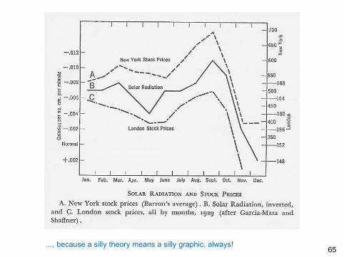
..., because a silly theory means a silly graphic, always!65