Embed Size (px)
Citation preview

NA387(3) Lecture 2:NA387(3) Lecture 2:Populations, Samples, and Populations, Samples, and
Frequency AnalysisFrequency Analysis
(Devore, Ch. 1.1-1.2)
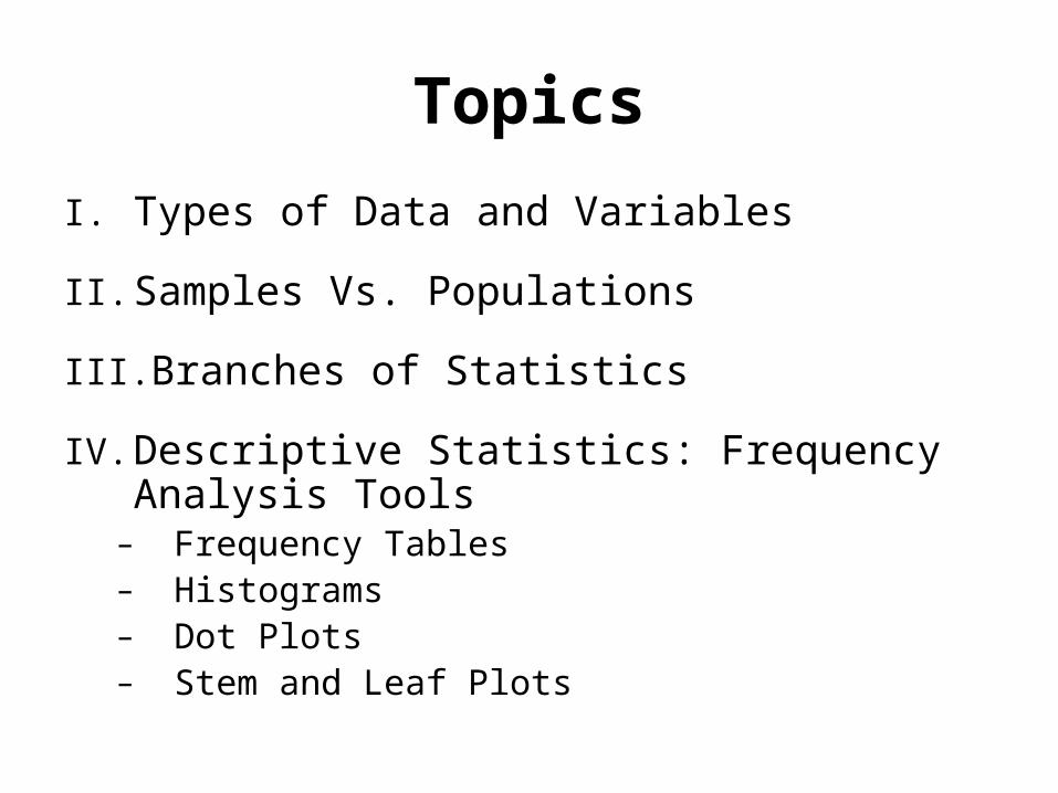
Topics
I. Types of Data and Variables
II. Samples Vs. Populations
III. Branches of Statistics
IV. Descriptive Statistics: Frequency Analysis Tools
– Frequency Tables– Histograms– Dot Plots– Stem and Leaf Plots

I. Data Characteristics• Categorical Data (Qualitative)
– Nominal Data (e.g., different colors, types of defect)– Binary Data (e.g., defective / not defective)– Note: often convert categorical data to numbers for analysis.
• Numerical Data (Quantitative)– Numbers (e.g., diameter is 25 mm, the service time is 15.2
minutes).
• Variable – any characteristic whose value may change from one object to another in a population.
• Data Sets– Univariate – observations on a single variable– Bivariate – observations made on each of 2 variables– Multivariate – observations on more than 2 variables
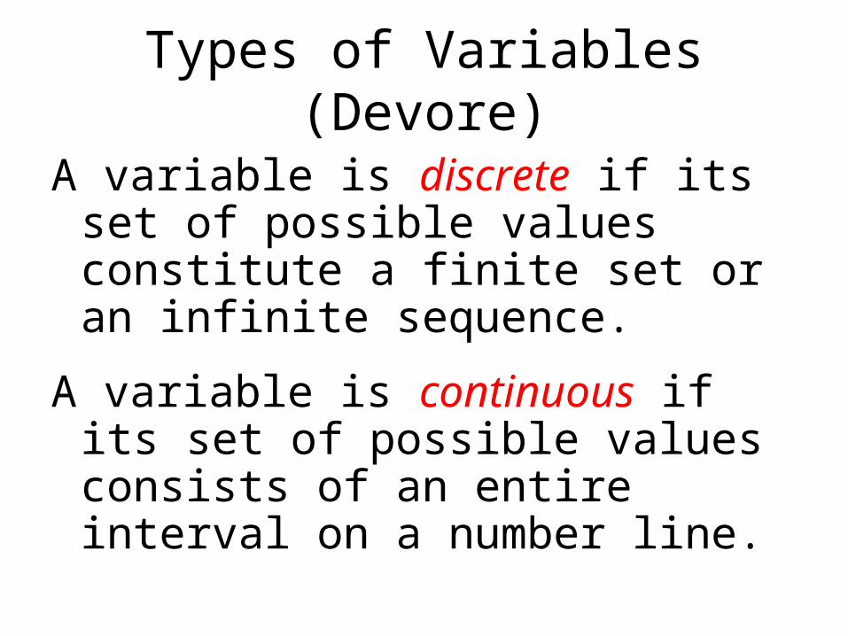
Types of Variables (Devore)
A variable is discrete if its set of possible values constitute a finite set or an infinite sequence.
A variable is continuous if its set of possible values consists of an entire interval on a number line.

Discrete Vs. Continuous Variables
• Discrete variables - vary by whole units• # of students in class, sum of rolling 2 dice
• Continuous variables - vary to any degree, limited only by precision of measurement system.
• Height of students in a class, • Length of an object, • miles per gallon.
• Precision of Measurement System Concept: – Continuous variables can always be broken down further
with greater measurement precision. For example, • Length could be noted: 10 mm, 10.0 mm, 10.01 mm,
10.008 mm …

II. Samples Vs. Population
• When describing a variable, we often collect a sample of data from a population.
– Population - All items in a set (obtain via census).• Describe populations using parameters such as the
population mean ( m )
– Sample - Subset of Population.• Estimate parameters using statistics, mean
• Example: suppose we produce ball bearings. We might measure a sample from among all the bearings produced (population) to assess if we are meeting our engineering specifications.

Population Example(all possible outputs are known)
• What is the population for all possible combinations of the sum of rolling two dice?
Combination Sum Frequency (1,1) 2 1 (1,2) (2,1) 3 2 (1,3) (3,1) (2,2) 4 3 (1,4) (4,1) (2,3) (3,2) 5 4 (1,5) (5,1) (2,4) (4,2) (3,3) 6 5 (1,6) (6,1) (2,5) (5,2) (3,4) (4,3) 7 6 (2,6) (6,2) (3,5) (5,3) (4,4) 8 5 (3,6) (6,3) (4,5) (5,4) 9 4 (4,6) (6,4) (5,5) 10 3 (5,6) (6,5) 11 2 (6,6) 12 1 Total 36

Understanding Samples • If you roll two dice 10 times (10 samples), you
will generally observe different combinations each time.
• Key Sampling Concepts:– You don’t need to measure every observation
to understand a population.– Knowledge of a population increases with the
number and size of samples but eventually the value of this information may converge.
• The notion that we may understand populations by only measuring samples drives the field of statistics.
www.seeingstatistics.com >> Chapter 6.2 – probability of rolling two dice
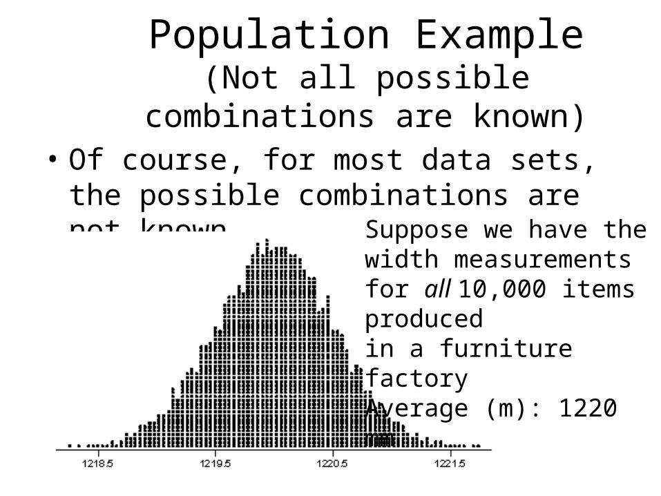
Population Example(Not all possible combinations are
known)• Of course, for most data sets, the
possible combinations are not known. Suppose we have the
width measurements for all 10,000 items produced in a furniture factoryAverage (m): 1220 mm

Samples from Continuous Populations
• Suppose you take a sample of 3 from this population– Width Measurements: 1219.1, 1220.1, 1220.5
1219.1
1220.1
1220.5

Samples from Continuous Populations
• If you take another sample of 3 from this population, you likely will get a different set of values.
• As samples become larger, they likely will converge or form a pattern (if the population does NOT change.) – “Underlying Distribution”
1220.25
1219.5
1218.5

III. Branches of Statistics• Descriptive Statistics – to summarize and
describe data (chapter 1 in textbook)– Graphical methods: histograms, boxplots, dotplots, etc.– Numerical measures: means, medians, standard
deviations, correlations
• Inferential Statistics – based on a sample from a population, make an inference (some conclusion or educated guess) about the population (chapters 6-16 in Devore)– Point estimation, confidence intervals, hypothesis
testing, ANOVA, linear regression, SPC, reliability analysis, etc, etc…
– Examples: Estimate the durability of a component based on a life test, determine if machine settings have a significant impact on a quality characteristic.
– How about probability? Bridge between descriptive and inferential statistics (chapters 2-5)!

Relationship Between Probability and Inferential Statistics (Devore)
Population Sample
Probability
Inferential
Statistics

Other Concepts: Concrete vs Conceptual Population, Enumerative vs Analytical
Studies:• Concrete population (well defined) versus
conceptual/hypothetical population (might not yet exist). Examples:– Concrete: Newspapers published in 2002– Conceptual: Students with a GPA of 4.0 in graduating
class of 2005• Enumerative versus Analytical Studies
– Enumerative - focused on a finite, unchanging collection of individuals/objects from a population (sampling frame)
– Analytical – collection of individuals/objects can change. Focus is on improving a future product. For instance, study 5 parts produced in the same machine during the same time period, adjust settings based on the analysis to improve output.

IV. Descriptive Statistics -Frequency Analysis
• Frequency Analysis Tools– Frequency Table– Histograms– Dot Plot
• Understanding Data Patterns– Distribution Shapes– Outliers
16
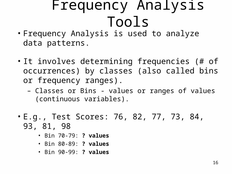
Frequency Analysis Tools• Frequency Analysis is used to analyze data
patterns.
• It involves determining frequencies (# of occurrences) by classes (also called bins or frequency ranges).– Classes or Bins - values or ranges of values
(continuous variables).
• E.g., Test Scores: 76, 82, 77, 73, 84, 93, 81, 98• Bin 70-79: ? values• Bin 80-89: ? values• Bin 90-99: ? values

Example: Miles per Gallon Data
• Suppose you conduct an experiment on gas mileage.
• spec: 21 +/- 2 mpg
• You collect 100 samples ~ measure number of miles per gallon based on full tanks.
Samples (all values are in miles per gallon - mpg) 1- 20 21- 40 41 - 60 61 - 80 81 - 10018.7 19.5 20.7 20.9 18.020.5 19.8 21.1 19.4 21.021.2 19.5 19.0 21.9 19.220.6 21.6 19.4 21.5 20.920.1 21.4 19.3 20.3 18.919.5 21.6 18.6 17.7 18.820.9 17.6 20.4 20.5 19.919.8 19.1 19.2 20.5 20.921.2 18.2 20.8 18.8 20.619.4 21.2 18.7 21.0 18.920.4 20.3 20.1 21.8 21.120.2 18.0 21.7 19.5 20.522.2 21.3 18.5 18.6 19.422.1 20.1 21.2 19.2 20.622.2 18.5 18.7 19.2 21.718.8 17.7 18.8 18.3 20.721.9 19.0 18.0 22.0 18.920.2 18.2 20.4 18.8 22.423.0 20.9 21.9 19.8 19.719.3 18.7 20.3 19.7 20.6

Frequency Table
• To understand the distribution, we first create a frequency table.
• In general, Frequency (or BIN)
Ranges are equal widths ~ 0.4 mpg
• Inclusion of end values of ranges is often software dependent.
• For Excel:– 17.4 - 17.8 would be read
as:– 17.4 < X <= 17.8
Frequency Range Frequency (# Samples)< 17.4 0
17.4 - 17.8 317.8 - 18.2 418.2 - 18.6 518.6 - 19 1419 - 19.4 9
19.4 - 19.8 1019.8 - 20.2 720.2 - 20.6 1320.6 - 21 1021 - 21.4 9
21.4 - 21.8 621.8 - 22.2 722.2 - 22.6 222.6 - 23 1
> 23 0
total 100
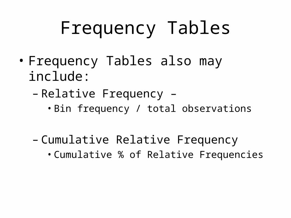
Frequency Tables
• Frequency Tables also may include:– Relative Frequency –
• Bin frequency / total observations
– Cumulative Relative Frequency• Cumulative % of Relative Frequencies

Frequency Table Example
Freq Range
FrequencyRelative
Frequency
Cumulative Relative
Frequency< 17.4 0 0% 0%
17.4 - 17.8 3 3% 3%17.8 - 18.2 4 4% 7%18.2 - 18.6 5 5% 12%18.6 - 19 14 14% 26%19 - 19.4 9 9% 35%
19.4 - 19.8 10 10% 45%19.8 - 20.2 7 7% 52%20.2 - 20.6 13 13% 65%20.6 - 21 10 10% 75%21 - 21.4 9 9% 84%
21.4 - 21.8 6 6% 90%21.8 - 22.2 7 7% 97%22.2 - 22.6 2 2% 99%22.6 - 23 1 1% 100%
> 23 0 0% 100%100 100%

Treatment of Observations Falling Exactly on Frequency
Range Limits• In Excel, a range of 17.4 – 17.8 implies all values greater
than 17.4 and less than or equal to 17.8.
• In other software (e.g., Minitab), a range of 17.4 – 17.8 would mean all values greater than or equal to 17.4 and less than 17.8.
• Neither is wrong, it is merely a matter of convention (agreement).
• To avoid confusion, try to use more discriminatory (precise) limits:
– Example: 17.400 – 17.799, 17.800 – 18.199 etc.

• Most statistical software (including Excel / Minitab) automatically create frequency bin ranges given a data set.
• If creating own ranges, some general rules:
– # of ranges ~
– Between 5 – 20 ranges is usually sufficient
Frequency Ranges (Classes)
nsobservatio #

Histograms
• A histogram is a graphical representation of a frequency table.
• It is used to:– show distribution shape for one
variable (conveys the location, dispersion, and symmetry).
– identify outliers

Histograms: Discrete Data
• Determine the frequency and relative frequency for each value of x.
• Then mark possible x values on a horizontal scale.
• Above each value, draw a rectangle whose height is the relative frequency of that value.

Ex. (Devore) Students from a small college were asked how many charge cards that they carry. x is the variable representing the number of cards. Results are in table below:
x #people
0 12
1 42
2 57
3 24
4 9
5 4
6 2
Rel. Freq
0.08
0.28
0.38
0.16
0.06
0.03
0.01
Frequency Distribution

Histograms (Devore)
x Rel. Freq.
0 0.08
1 0.28
2 0.38
3 0.16
4 0.06
5 0.03
6 0.01
Credit card results:
Relative Frequency
0
0.1
0.2
0.3
0.4
0 1 2 3 4 5 6
Number of Cards
ix

Histograms, Continuous Data: Equal Class Widths
• Determine the frequency and relative frequency for each class.
• Then mark the class boundaries on a horizontal measurement axis.
• Above each class interval, draw a rectangle whose height is the relative frequency.

Histograms, Continuous Data: Unequal Widths
• After determining frequencies and relative frequencies, calculate the height of each rectangle using:
• Rectangle height=(class relative frequency)/(class witdh)
• The resulting heights are called densities and the vertical scale is the density scale.

Histogram Example: MPG Data
• Typical Y-Axis: – frequency or relative frequency
Histogram
02468
10121416
< 1
7.4
17
.4 -
17
.8
17
.8 -
18
.2
18
.2 -
18
.6
18
.6 -
19
19
- 1
9.4
19
.4 -
19
.8
19
.8 -
20
.2
20
.2 -
20
.6
20
.6 -
21
21
- 2
1.4
21
.4 -
21
.8
21
.8 -
22
.2
22
.2 -
22
.6
22
.6 -
23
> 2
3
Bin Range
Fre
qu
ency
(N
=10
0)
Mean = 20StdDev = 1.26

Common Histogram Shapes:
• Histogram shapes may be used to help identify the underlying distribution types.
Skewed Right Skewed Left
Exponential Bi-Modal Normal (Bell Curve)

Histogram Shape Example
• Which shape is shown in this histogram?• Is this shape likely explainable or unexplainable?
17 18 19 20 21 22 23
0
5
10
15
MPG
Fre
qu
en
cy
Histogram of MPG

Dot Plots, Example
• Another tool (provided by most advanced statistical software) is the “Dot Plot”.
• Dot Plots are shown without grouping into ranges – typically are used with smaller data sets.
• Example: Dot Plot Using Minitab for our MPG Data.

Stem-and- Leaf Displays
1. Select one or more leading digits for the stem values. The trailing digits become the leaves.
2. List stem values in a vertical column.
3. Record the leaf for every observation.
4. Indicate the units for the stem and leaf on the display.

Stem-and-Leaf Example
• Observed values: 9, 10, 15, 22, 9, 15, 16,
24,11
0 9 9
1 1 0 5 5 6
2 2 4 • Stem: tens digit; Leaf: units digit

Stem-and- Leaf Displays
• Identify typical value
• Extent of spread about a value
• Presence of gaps
• Extent of symmetry
• Number and location of peaks
• Presence of outlying values

Frequency Analysis & Sample Size• General rules for creating histograms
and assessing distribution shapes.– minimum 30 samples ~ prefer 100 or more
• Avoid using relative frequency (%) unless at least 30 samples are available.
• Later in this course, we will address this further when discussing estimation and confidence intervals.