Embed Size (px)
Citation preview

Page 1 of 78
NIA Companion User Guide NOTE: This document is a work-in-progress. New and updated sections will be filled in over time. If you have a particular question for a part of the program that has not yet been document, please feel free to contact us.
Overview Welcome to the NIA Companion User Guide. This document is meant to explain and illustrate most, if not all, of the functionality of this program. The NIA Companion program is actually both a website that is used on laptop and desktop computers, and a pair of native mobile apps that can be used on most Android and iOS phones and tablets. The two different ‘programs’ share 99% of their functionality, however due to differing form factors the look and feel between them will certainly vary. NIA Companion aims to unify and integrate several important functions that most insulator collectors would benefit from, each of which is accessed via its own area within the program:
• Community – where members can create, view and respond to topics and posts from like-minded collectors
• Marketplace – where members can create, view and take advantage of ads for sale, trade or want.
• Shows & Events – where members can create, view and discus upcoming (and past) shows and events.
• My Collection – where members can create, view, manage and share an on-line collection. Note that these are just the initial goals of the program – we hope to add additional functions in the coming months and years. The program is developed as an internet-based program, meaning that it relies on the internet to “get data” and to “save data”. There is no “local” or “on-device” database. Instead there is an enterprise-class database that resides on the hosting company’s server and which provides near limitless storage and strong, performant capabilities. The program is divided up into six areas at this time, plus a navigation system. Besides the four areas referenced above there is a membership directory and a home/welcome screen. The navigation system is essentially a list of the areas and is found on the left side of the page (desktop version) and within a slide-in menu under the hamburger symbol on the mobile versions. This document aims at explaining and illustrating the various areas of the program as well as a few smaller but equally important capabilities. We hope you enjoy it!
Joining NIA Companion contains both public and private data, and as such it needs to be able know who is using the program at any time so it can decide what data to show them, or which functions to allow. Therefore, users are encouraged to join the program. Joining the program begins by clicking the Join button, either at the top-right corner of the Home/Welcome screen on the mobile app, or at the upper-left area of the navigation bar on the website:
Page 2 of 78
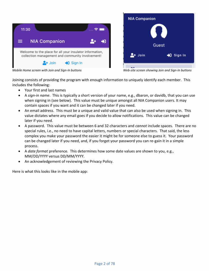
Mobile Home screen with Join and Sign-In buttons Web-site screen showing Join and Sign-In buttons Joining consists of providing the program with enough information to uniquely identify each member. This includes the following:
• Your first and last names
• A sign-in name. This is typically a short version of your name, e.g., dbaron, or davidb, that you can use when signing in (see below). This value must be unique amongst all NIA Companion users. It may contain spaces if you want and it can be changed later if you need.
• An email address. This must be a unique and valid value that can also be used when signing in. This value dictates where any email goes if you decide to allow notifications. This value can be changed later if you need.
• A password. This value must be between 6 and 32 characters and cannot include spaces. There are no special rules, i.e., no need to have capital letters, numbers or special characters. That said, the less complex you make your password the easier it might be for someone else to guess it. Your password can be changed later if you need, and, if you forget your password you can re-gain it in a simple process.
• A date format preference. This determines how some date values are shown to you, e.g., MM/DD/YYYY versus DD/MM/YYYY.
• An acknowledgement of reviewing the Privacy Policy. Here is what this looks like in the mobile app:
Page 3 of 78
Image of partial mobile Join screen showing mandatory fields Note: You must open the Privacy Policy from within the Join screen, scroll thru it, and then acknowledge doing so. Only then will you be able to finish joining. Besides the above few pieces of data which are mandatory, there are numerous other pieces of data that you are encouraged to fill in, but which are considered optional. Those include such things as your address and phone information, your background in the hobby and several other various categories of information including how public or private you wish to be in regards to your profile information. Please see below for more information about the Profile screen. Once you are done filling in as many fields as you wish, you would click the Save button. Assuming there are no conflicts, you will be told that you have successfully joined the program. At that point will have been auto-signed in to the program and will be shown several choices, including the option to set a photo for your profile and/or setting your notification preferences. The latter is very important if you wish to receive emails when other members contribute items to the program.

Page 4 of 78
Successful Join notification plus Options on mobile While everyone is encouraged to join NIA Companion, it is not mandatory to do so to experience certain parts of the program. Guests will be able to do the following:
• View the various forums and posts within the Community area;
• View ads in the Marketplace area;
• View the list of Shows & Events;
• View the list of Members; Guests will not however be able to participate in any of the above areas, or to view member details.
Signing In The Sign In screen is used to let the program know who is using it. It can be opened from either the top-right button in the mobile app (see below) or the top-left are of the navigation bar on the website (see above).
Mobile Home screen with Join and Sign-In (circled) buttons This is what the Sign In screen looks like on the website:

Page 5 of 78
Web-site Sign-In screen You need to provide either your Sign-In Name or your email address, plus your password, in order to sign in. If you need to see your password (instead of dots) you can click the ‘eye’ icon to the right, which toggles the value from dots to letter, or back. Besides your credentials, you have two additional options on this screen. One is to remember your Sign-In Name (or email address). If you turn this on, the program will remember that value and pre-fill it in for you the next time you need to sign in. The other option is to allow the program to also remember your password (in an encrypted manner) such that every time you visit the website or open the mobile app, you will be automatically signed in without having to re-enter any credentials. For many users this will be an acceptable risk, however if you feel that you need or want a bit more security concerning access to the program (and your data), you may decide to opt out of the automatic sign in. In the event that you forget your password, there is a process for re-setting your account. On the Sign-In screen is a button titled “I Forgot My Password”. Clicking that will do two things: First, the program will create a random temporary code that is both stored on the server and included in an email. Secondly a pop-up window will appear within the program that asks you to enter that code along with a new password. Upon entering both and saving, your account will be re-set, the pop-up window will close, and you can use your new password to sign-in to the program.
Signing Out Depending on what platform you use the program on (computer, mobile device), you may or may not need to explicitly sign out of the program. For instance, simply closing the browser window (or tab) on the desktop will effectively sign you out. Likewise, closing the app on the mobile device will do the same. However, if you wish to leave the web page up, or even the app, but do not want others [in your home, office, etc..] to simply start using the program in your absence, you can explicitly sign yourself out. The sign-out function is available either on the Home/Welcome screen on the mobile app or the upper-left area of the navigation bar on the website (see below).

Page 6 of 78
Mobile Home screen with Profile and Sign-Out (circled) buttons Web-site screen with Profile and Sign-Out buttons
When you use the Sign-Out function, the program essentially tells both your web-site/app and the server to “erase” your unique ID for the current session, meaning the program no longer knows who you are. Additionally, if you had previously set the sign-in option for “automatically sign-in”, then the program will prompt you to make sure you really want to “erase” your encrypted password previously stored on your device. In other words, by explicitly signing out, you will not be able to “automatically sign-in” during your next visit. You will instead have to re-enter your password, which on the one hand is more secure, but on the other hand is more inconvenient.
Profile The Profile screen can be accessed from either the top-right corner of the Home screen on mobile devices, or near the top-left of the navigation panel on both platforms (see above). Note that the Profile screen is only available after you have successfully signed-in. The Profile screen is divided into four sections, which you can see and make changes to one-at-a-time:
Top of mobile Profile screen with four panels Note that if you need or want to make changes to two or more of the panels you will need to first save any changes you’ve made on the current panel before changing to the next panel. The program will warn you if you try to do so without first saving.
General The Profile screen is a combination of personal data and preferences. Besides the mandatory identifying information mentioned above in the Joining screen, there are a dozen or so extra pieces of information that you may provide, or not. Things such as your physical address, if shared, allow other members to see where you live on a map (street address is not needed for this). Phone numbers (again, if shared) allow other members to give you a ring. (You do remember when phones actually rang, right?). Other pieces of information simply help other members know more about you. At the bottom of the General panel is an important set of options – Privacy:

Page 7 of 78
Image of partial Profile : General panel showing Privacy Options When you first join NIA Companion, your privacy is set to the maximum, meaning fully private, i.e., nothing is shared. Other members will not know that you are a member – unless you participate in either the Community or Marketplace areas, in which case your name would be attached/visible to anything you post. The second thru fourth options reveals/shares progressively more information about yourself, culminating with the fifth option which allows other users to see the majority of information filled in on the General panel (obviously not things like Sign-In Name or Password).
Password The Password panel is used to change your password. You simply need to provide your current password (just to double-check that it is you who is using the function) and your new password. Note that NIA Companion does not keep track of prior passwords, and so you can always change your current password to something that you used the prior year, or whatever.
Photo The Photo panel is used to set (or clear) a photo of yourself (or image file you may want!). When you first join the NIA Companion, you are assigned a generic male avatar (see below, left):
Male (left) and Female avatars If you would like to not select a photo image, then depending on your gender and your preference, you may select the female avatar (see above, right).

Page 8 of 78
If however you would like to have a photo image attached to your profile, you may select one from either your computer, mobile device, or, if you are using a mobile device, you make take a selfie:
Image of partial web-site Profile : Photo panel Image of partial mobile Profile : Photo panel Once a photo file has been selected, you are given the opportunity manipulate the image a bit before saving it. On the web-site version, this looks like the following:
Image of partial web-site Profile : Photo panel There are buttons and widgets for the following:
• Changing the selected photo to some other photo on your device

Page 9 of 78
• Changing the selected photo to a selfie (only available on mobile devices)
• Clearing the photo altogether, and going back to an avatar image instead
• Rotating the photo (specific buttons differ amongst devices)
• Resizing, or cropping, the photo (specific buttons differ amongst devices) Once you have the photo looking the way you’d like, you may Save the photo to your Profile.
Notifications The Notifications panel is used to tell the program how often, if at all, to notify you of recent additions or changes to information within the Community and Marketplace areas. The initial means of being notified will be email. At some time in the future there may also be SMS (text) messages and/or on-device notifications. Here is what the Notifications panel looks like on the web-site:
Image of partial web-site Profile : Notifications panel There are separate options for Community and Marketplace. For example, some members might want to be notified about Marketplace ads, but not about Community posts. The two tabs above the rest of the options allow you to switch between the two sets of options. The first option is whether or not to receive email notifications at all. If that option is selected (checked) then the second option will be available, i.e., the frequency of the notifications. For that you may choose either one-at-a-time, which means you will be notified as information is added; or a compiled digest which is a complete list of all changes for that day, as of approximately mid-night Pacific time in the USA; or both. Notifications, whether one-at-a-time or digest will include the full text of the item, as well as the first photo (if any) attached to that item. There is a link that will take you directly to that item within either the web-site or the app (assuming you have the app). If the author of a particular item allows their email address to be

Page 10 of 78
shared, then you would also be able to click a link in the notification to create an email message (in your email program) addressed to that member. Note: Notifications are not meant to be ‘replied to’ via your email program. In other words, if you want to reply to either a Marketplace ad, or a Community post, you would not click the ‘Reply’ button in your email program. Instead you would click the ‘View in Web-site/App’ button as described above, and respond from within the program. When new members initially join, their notification preferences are set to ‘none’, i.e., the ‘Receive E-Mail Notifications’ options are un-checked for both Community and Marketplace. Notifications work hand-in-hand with subscriptions. Subscriptions are used to tell the program what you should see in the Community, and what you should get notified about in either the Community or Marketplace. If you have no subscriptions to anything, then there is no point in having notifications turned on. However, if you subscribe to one or more parts of the program you may still choose to not be notified. Subscriptions are explained more in depth in both the Community and Marketplace sections of this document (see below). The “Manage Community Subscriptions” and “Manage Marketplace Subscriptions” buttons (see above) can be used to double-check your current subscriptions, and to make changes, so that you are seeing and receiving all of the information that matters most to you.
Home/Welcome Overview The Home screen is the initial view of the program that users will have when they first visit the site. Besides welcoming remark or two, there are buttons and widgets that allow you to do several things:
• Join the NIA Companion (if you are not yet a member)
• Sign-in to NIA Companion (if you have previously joined)
• View your Profile
• Sign-out of NIA Companion
• View the navigation panel
• View recent activity in the various areas of the program Tip: As a member, there is an option to start-up the program on either specific screen, or the last-used screen.
Navigation Panel The Navigation panel is a combination of several functions, including user management, navigation and more. The panel is always visible (on the left side of the screen) when using the web-site version, and is available as a slide-out panel on the mobile version. To see the navigation panel on the mobile version you will need to tap on the hamburger menu icon on the left edge of most screens:
“Hamburger menu” on mobile

Page 11 of 78
The funny name comes from the icon resembling a “stack” of three “layers”, in some ways similar to the “buns + meat” of a hamburger. Once the Navigation Panel is opened on mobile, it can be hidden by either tapping an item on the panel, or by swiping the panel from right to left, or by tapping the balance of the program screen that can be seen underneath the panel, and greyed out. Here is what the Navigation Panel looks like:
Navigation panel The top section of the panel contains several buttons and widgets that have to do with the current user. Before signing-in, there is a generic avatar of a person within a circle with the word “Guest” below it. After signing-in the avatar will change to the picture the member set in the profile (or an avatar if they wanted), and their name will be displayed underneath. Tip: After signing-in, clicking/tapping the avatar circle will open the Profile screen and take you directly to the “Change Photo” panel. Beneath the avatar/photo circle is a set of two buttons. Before signing-in they are the Join and Sign-In buttons, and after signing-in then are the Profile and Sign-Out buttons. The middle section of the panel contains links to each of the primary screens within the program. The final section of the panel includes several miscellaneous links. The “Site Settings” (“App Settings” on mobile) link opens a screen where you can select the color scheme of the program, as well as the default screen. The

Page 12 of 78
default screen is the screen that will be displayed to the user after opening the site or app. This allows the user to start off exactly where they are most interested, without having to navigate to get there.
Site Settings : Color scheme screen on website Site Settings : Default page screen on website The “Ask for Help” link opens up a screen where you can post a question to the “Website and Mobile App Help” forum in the Community. Once posted either someone from NIA Companion or a helpful member will respond with an answer. The “User Guide” opens this PDF document (which you are now reading). The “Contact Us” link will open your default email program, with a new blank email addressed to NIA Companion.
Community
Overview The Community area is a set of screens and tools that facilitate social networking and information sharing between members. Information is divided up into forums, most of which are established by the program. Within each forum members may create topics, each of which represents an idea, a question or an announcement. Topics are then responded to with posts. Each topic and post may contain one or more photos. Additionally, the posts to a topic can form what is called a thread. What that means is that within a given topic, a series of sub-conversation may take place, with members responding to either the original topic or directly to any response post within that topic. Anyone who has used products such as Facebook or Reddit should feel right at home.
Recent, Active, and All Forums list views

Page 13 of 78
The initial screen for Community is comprised of three different list views, that is, a scrolling list of items. Above the lists is the heading area for the screen, and it includes buttons and tools used for searching, subscriptions, and additional functions.
Community List screen header on mobile Community List screen header on web-site On the mobile version, the hamburger menu is on the far left (used to display the Navigation panel), followed by the “Search” button, the “Manage Subscriptions” tool (please see the section near the end of this document concerning searching), and the additional options button. On the web-site version there is no hamburger menu on the left, since the Navigation panel is always visible.
Searching When searching the Community, as soon as the user types in 3 or more characters in the text field, the program will search the entire Community database for your search term. Please see the detailed description of the “searching for items” tool near the end of this document. The program will scan the following fields for a match:
• Topic subject
• Post text, i.e., the body of the post
• First and Last names of the member who created the topic of post
Subscriptions Community Subscriptions control what you are shown in the Most Recent and Most Active lists of Community, as well as what you are notified about, assuming you have turned on notifications (see Profile : Notifications section). For example, if you are not subscribed to anything, then you would not see anything in the Most Recent and Most Active lists, nor would you be notified of any new items as they occurred (or nightly). You may explicitly subscribe to specific forums (and thus all of the topics that are created within it), or specific topics (without having to be subscribed to that topic’s forum). This is done with the Manage Subscriptions tool and is accessed two ways: The button on the Community home screen:
Community List subscriptions button on mobile Or the ‘Manage Community Subscriptions’ button on the Profile : Notifications screen:

Page 14 of 78
Community manage subscriptions button on mobile Clicking either of these buttons will open up the following screen:

Page 15 of 78
Manage Subscriptions screen on mobile This page includes a list of all forums in the system, including individual members’ shared collections as well as Shows & Events (each gets its own forum). You may toggle each forum individually, or you may use the

Page 16 of 78
buttons near the top of the page to quickly check or un-check all of the options, after which you can still toggle any particular forums you wish. There are also options that control whether or not you will be automatically subscribed to any new forums that come about when either new Shows are created or when members share their collections (which produces a new forum). Tip: The list may be very long due to individual member [shared collection] forums and Show & Event forums. Please remember to scroll down to see/toggle everything you are interested in (or not). Toggling a forum on generally means that you will see and be notified of any topics or posts that are added to, or modified within that forum. That said, even if a forum is ‘on’, you may still un-subscribe to one or more individual topics within that forum (see above Forum Topics view documentation). Toggling a forum off means that you will not see or be notified of any activity within that forum. Again though, you may still explicitly subscribe to individual topics within that forum and thus you will still see or be notified of activity within those topics. When a new member joins NIA Companion they are auto-subscribed to all forums. Likewise, any time a member creates a new Topic or responds to a topic with a new Post, they (but nobody else) are explicitly subscribed to that topic if they already are not already subscribed to that topic’s forum.
Additional items (on far-right menu) When tapped/clicked, the additional items button will display a menu of options:
Community addl. Options menu on web The upper part of the menu allows you to choose the maximum age for the items the program should show you. The older that age, the more items will be in your list, and thus the more scrolling you would have to do to “get to the bottom.” Remember that all of the previous posts are stored in a database, and so if you ever
Page 17 of 78
want to search for something in specific, you can do so without worrying about the age of the item – it will be found and display so that you can view it in its entirety. The bottom item in the menu is used for getting a compiled digest of all Community items (that you are subscribed to) for any given day sent to you via email.
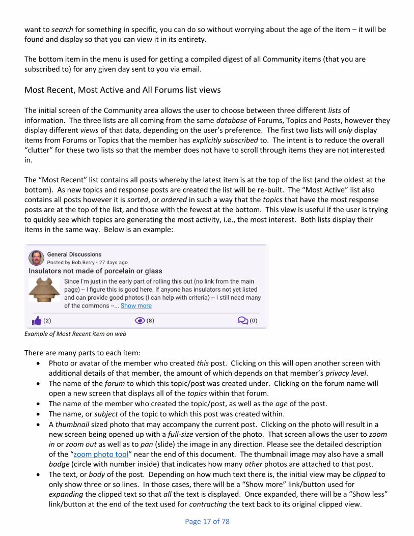
Most Recent, Most Active and All Forums list views The initial screen of the Community area allows the user to choose between three different lists of information. The three lists are all coming from the same database of Forums, Topics and Posts, however they display different views of that data, depending on the user’s preference. The first two lists will only display items from Forums or Topics that the member has explicitly subscribed to. The intent is to reduce the overall “clutter” for these two lists so that the member does not have to scroll through items they are not interested in. The “Most Recent” list contains all posts whereby the latest item is at the top of the list (and the oldest at the bottom). As new topics and response posts are created the list will be re-built. The “Most Active” list also contains all posts however it is sorted, or ordered in such a way that the topics that have the most response posts are at the top of the list, and those with the fewest at the bottom. This view is useful if the user is trying to quickly see which topics are generating the most activity, i.e., the most interest. Both lists display their items in the same way. Below is an example:
Example of Most Recent item on web There are many parts to each item:
• Photo or avatar of the member who created this post. Clicking on this will open another screen with additional details of that member, the amount of which depends on that member’s privacy level.
• The name of the forum to which this topic/post was created under. Clicking on the forum name will open a new screen that displays all of the topics within that forum.
• The name of the member who created the topic/post, as well as the age of the post.
• The name, or subject of the topic to which this post was created within.
• A thumbnail sized photo that may accompany the current post. Clicking on the photo will result in a new screen being opened up with a full-size version of the photo. That screen allows the user to zoom in or zoom out as well as to pan (slide) the image in any direction. Please see the detailed description of the “zoom photo tool” near the end of this document. The thumbnail image may also have a small badge (circle with number inside) that indicates how many other photos are attached to that post.
• The text, or body of the post. Depending on how much text there is, the initial view may be clipped to only show three or so lines. In those cases, there will be a “Show more” link/button used for expanding the clipped text so that all the text is displayed. Once expanded, there will be a “Show less” link/button at the end of the text used for contracting the text back to its original clipped view.

Page 18 of 78
Clicking/tapping directly on the text will open a new screen that displays all of the posts for the current topic.
• The “thumbs up” icon-button, signifies how many people have liked this particular post. The icon may be solid or hollow, indicating whether you have liked the post or not. Clicking the icon will switch between liking and un-liking the post.
• The “eye” icon, signifies how many members have viewed the topic that the current post belongs to.
• The “quote bubbles” icon, signifies how many responses have been posted to the topic that the current post belongs to.
• Unless otherwise noted, clicking or tapping anywhere within the item will open a new screen that displays all of that topic’s posts.
The All Forums list is made up of all the forums in the Community. They are grouped into several sub-lists:
• Discussions, which are standard types of conversations;
• Shared Collections, which are created when a member shares one or more of their Collection pieces;
• Shows & Events, by year, which are created when a show host creates a show or event. The All Forums list allows members to see and explore forums and topics that they may not be subscribed to at that time. Remember – the Most Recent and Most Active lists only display posts from Forums or Topics that the member explicitly subscribed to. Here is an example of what an item from the All Forums list looks like:
Example of All Forums item on web There are several parts to each item:
• The name of the forum, followed by…
• The description of the forum
• The number of topics within the forum, followed by the total number of posts
• The name of the member who last posted to a topic within that forum, as well as the age of that post Clicking anywhere within a forum item will open a new screen that displays all of the topics within that forum (see below for details). Tip: All three lists will remember how far down you scrolled and will automatically re-scroll to the same position the next time the Community screen is accessed. Likewise the age option will also be remembered, and the specific list that was being viewed will be remembered.
Forum Topics view If the user has selected a specific forum from within the All Forums list, or clicked on a forum name within an item in the Most Recent or Most Active lists, then they will be shown a new screen that lists all of the topics within the selected forum. Here is a partial view of what this screen looks like on the website and then the mobile app:

Page 19 of 78
Partial view of All Topics screen on web
Partial view of All Topics screen on mobile At the top of the list is a header, similar to the initial Community screen. The title of the screen differs depending on the device you are using – for web it will include the name of the forum, whereas on mobile the name is shown directly below the header, along with arrow buttons that can be used to switch to different forums. To the right of the screen title is the search tool, again, very similar to that in the Community screen. Likewise, to the right of the search tool is the manage subscriptions button (see above for more on that). To the right of the subscriptions button is the additional options button, similar again to that on the Community screen. Clicking that button will display options for sorting the topics in the list. Finally, on the mobile version, there is an icon button to the left of the forum title – the go back button. Tapping that button will bring the user back to the initial Community screen. For Android users, the device’s hardware and/or software back button will perform the same task. Tip: On mobile devices, the arrow buttons will move “up” and “down” the entire list of forums. When it gets to the very top (first) of the list, clicking “up” again will wrap the list and display the last item in the list. Likewise, if the user was viewing the bottom (last) of the list, clicking “down” again would wrap the list, this time moving to the first item in the list.
Adding a Topic

Page 20 of 78
All forums are made up of one or more topics. A topic is an idea, question or announcement that one member would like to discuss with other members. Creating a new topic is easy and quick. In the bottom right corner of the Community lists page (and the Forum Topics list page) is a large circular button with a plus sign in it:
Add Topic button
Clicking on the “Add Topic” button opens the following screens which differ from each other depending on which platform you are using:
Add Topic screen on website Add Topic screen on mobile
There are three mandatory items needed to create a topic, plus one or more optional items (photos). The first mandatory item is the forum that you would like the new topic created within. Clicking or tapping the “Select a Forum” field (as shown above) will result in a list of all available forums being displayed. The list is long so you may need to scroll a bit before seeing the one you want. Click on the desired forum and its name will be shown on the underlying screen. The second mandatory item is the subject of the topic. Generally, this consists of a few words that sum up the idea, question or announcement. The third mandatory item is the initial message of the topic, also known as the initial post. This is where the user can fully explain their topic. Multiple sentences and paragraphs are allowing in this field – up to 2,500 characters which is well over a solid page of text (in a word processor). Tip: On mobile devices, each word within a topic’s subject will be automatically capitalized, and within the initial message each sentence’s first word will be capitalized. On the website version however, only the first word of both the subject and the initial message will be capitalized. Tip: The initial message can contain hyperlinks to external website. If you are going to include a hyperlink, please make sure to prefix it appropriately, i.e., “https://” or “http://”, depending on the actual address. Each topic can optionally include one or more attached photos. Photos are attached to the topic before the topic is saved, though you can always edit a topic and add or remove photos. To work with attached photos,

Page 21 of 78
click or tap the “Photos” button and a new panel will be displayed. On that panel you can add one or more photos, including captions. For more information on using this feature please view the section titled “Working with attached photos” near the end of this document. Once the mandatory fields are filled in and any photos are attached (or not) the topic can be saved by clicking or tapping the “Save” button. At that point the information will be sent to the server will automatically show up in the list screen, both for the member who created the topic and any other members who subscribe to the topic’s forum.
Topic Posts view Whereas the initial Community lists display a single post from multiple topics, the Topic Posts screen displays all of the posts for a single topic. Selecting an item in the “Most Recent” or “Most Active” lists will result in a new screen being displayed that displays all of the posts within the selected item’s topic. The posts make up what can be called a “threaded conversation” due to the fact that within any single topic there may be several sub-conversations, each of which is known as a thread. Tip: When selecting an item in the initial Community lists, the Topic Posts screen will display that item (post) in the list. Depending on “how far down” in the conversation that post is, the screen may be “auto-scrolled down” to that post, meaning, the user may not initially see the “top” of the conversation. Additionally, on the mobile version, the target post will be temporarily highlighted so as to identify it easily. The Topic Posts screen is organized whereby the initial post is at the “top” and all subsequent response posts are below it. Some of the posts that come after the initial post are indented, which signifies that they are responses not to the initial post itself, but one of the subsequent posts. The following “outline” illustrates an example of a threaded conversation: 1.0 Original Post 1.1. Response to original post 1.1.1 Response to 1.1 1.1.1.1 Response to 1.1.1 1.1.2. Response to 1.1 1.2. Response to original post While the topic’s initial post is always at the “top” of the list, the most recent responses are not always at the “bottom”. Depending on which post a response is meant for, it may be located “at the bottom” of the list, or, it may be somewhere in the “middle”, i.e., “under” the post to which it is in response. Threaded conversations can get very deep as users respond to responses (versus the initial post). As the depth increases, the width of the post, as shown on the screen, gets narrower and narrower. Once it gets too deep, subsequent posts (at even deeper levels) are hidden from the initial view and have to be accessed by drilling down into the deepest item that is shown. When a particular post has hidden responses, there will be an additional button within that post. Clicking the button will result in the existing posts list being hidden, and the “deeper/hidden” responses being displayed. The user can view and respond to those [deeper] responses as well as returning to the previous list of posts. Here is an example topic with several response posts:

Page 22 of 78
Topic Posts screen on website The initial post (used to create the topic) is always at the top/beginning of the list. It stands out from the responses in that it has a special header, which includes the topic’s subject, and a footer, which includes a like button, a views icon and a responses button. Clicking the like button will toggle the current user’s like-value, either no-to-yes, or yes-to-no. The icon will be solid when the current user likes the post, or hollow when they do not. The total number of likes is placed next to the icon. On the website version, clicking on the number of likes will result in a new screen being popped up to display all of the members who liked that post. The “eye” icon denotes how many members have viewed the topic (and any of the posts). The “chat bubbles” icon denotes how many responses have been made to the topic (either to the initial post or any of the subsequent posts). Clicking or tapping on that icon (or the number beside it) will result in a new screen being opened in which the member can respond to the initial post. All posts include an avatar for the member who created the post, their name, and when that post was created (and possibly edited). Clicking or tapping on the avatar will result in a new screen opening that displays the details for that member, dependent on that member’s privacy options.

Page 23 of 78
Below the avatar, poster’s name and date information is the contents of the post itself. At a minimum there will be some amount of text displayed. Depending on how much text was posted, the initial view may be clipped to only show three or so lines. In those cases, there will be a “Show more” link/button used for expanding the clipped text so that all the text is displayed. Once expanded, there will be a “Show less” link/button at the end of the text used for contracting the text back to its original clipped view. On the mobile version tapping the clipped/expanded text will accomplish the same thing as the “Show more/Show less” buttons. If the post has one or more photos attached, then the “show in list” photo will be displayed, as a thumbnail, to the left of the post’s text. Clicking on the photo will result in a new screen being opened up with a full-size version of the photo. That screen allows the user to zoom in or zoom out as well as to pan (slide) the image in any direction. Please see the detailed description of the “zoom photo tool” near the end of this document. The thumbnail image may also have a small badge (circle with number inside) that indicates how many other photos are attached to that post. All response posts also include is a special menu that is available in the upper-right area of their heading area. Depending on who created the post, the items in the menu differ:
Post menu for non-creator on Android/website Post menu for creator on iOS The menu for everyone except the member who created a post only has one item in it – “Report this post”. Clicking/tapping that option results in a new screen being shown that allows a member to select one or more reasons that that the administrators of the program should review the post and possibly contact its author. The menu for the member who created the post has an option for editing the post, or deleting it. Editing the post results in a new screen being shown that allows the post’s text to be altered, as well as any attached photos being added or removed. Posts which have been edited display both their created data and time, as well as their edit date and time. Deleting a post can mean two things, depending on whether other members have responded to that post yet. In cases where nobody has responded to the post, the user is asked if they really want to delete the post, meaning fully erase the post from the database. However, if any members have responded to that post, then the program will not fully delete the post from the database. This is meant to preserve the other members’ responses, some of which may be lengthy and valuable. Instead, the user is told of this condition and asked if they want to “remove” the text of their post. They are also told that this condition can be reversed in the future if they wish.
Responding to a Topic/Post One of the main reasons for creating a topic is to illicit responses from fellow members. Responding to a topic or post is fast and easy. The topic’s original post can be responded to either by clicking/tapping on its conversation bubbles icon, or by clicking/tapping the “Respond to Original Post” button located at the bottom of the Topic Posts screen. Responding to any other response post can be done by clicking/tapping the

Page 24 of 78
“Respond to this post” button which is located in the bottom-right corner of every post. In either case, a new screen will be opened, the appearance of which will depend on the platform:
Add Response screen on website Add Response screen on Android
In either version there is a place to enter the response message, as well as a means of attaching one or more photos to the response. The message is mandatory, i.e., you cannot post a response with no message (even if there is a photo), whereas the photos are optional. The message field will grow as additional text is entered, and each response can be up to 2,500 characters long. Photos are attached to the topic before the response is posted, though responses can always be edited to have additional photos. To work with attached photos, click or tap the “Photos” button and a new panel will be displayed. On that panel you can add one or more photos, including captions. For more information on using this feature please view the section titled “Working with attached photos” near the end of this document. Tip: On the mobile version, the button which indicates how many photos are attached is used to add additional photos, either from the device or via the device’s camera. It is also used to remove the current photo being displayed. Once a post has been saved it will show up within the threaded conversation at the appropriate position. For example, responding to the original post will always result in the new post being placed at the very bottom of the list. However responding to one of the first response posts may result in the new post being placed very near the top of the list, albeit indented by the appropriate amount.
Other actions Above the list of topic posts is the header area. The header area differs per platform. On the website version there is a search field, which is very similar to that of the initial Community lists screen. Typing into the field results in matches being highlighted in yellow. Besides the search field is an actions menu, which contains different options depending on who the current user is. If the current user created the topic, then they are given the option to either edit the topic’s initial post message and/or attach/removed photos, or, delete the topic. Both of these actions are exactly the same as explained about for posts. If the current user did not create the topic then they are given the option to either report the topic, which is exactly the save as explained above for posts, or to toggle their subscription to the topic. If the current user is subscribed to the forum in which the topic is part of, then they are implicitly subscribed to the topic. That said, a member can explicitly un-subscribe from a particular topic even though they remain subscribed to that topic’s forum. Likewise, they can explicitly subscribe to a topic even though they are not subscribed to that topic’s forum.

Page 25 of 78
Note: The creator of a topic is automatically subscribed to their own topic and they cannot un-subscribe themselves from it.
Topic menu for non-authors on website Topic menu for authors on website On the mobile version, the header area is a bit different. Since the initial Community list screen is not visible, there are “up” and “down” arrow buttons that allow the user to move to the previous (up) or next (down) Topic in the initial Community list. Next to arrow buttons is an actions menu, which like above, is different depending on who is using the program. Both conditions include a “Search this topic” button which, when tapped, will result in the header area being changed to allow searching. Besides the “search” button, the other four options are as described above.
Topic menu for non-authors on mobile Topic menu for authors on mobile
Marketplace Overview The Marketplace is an area where members can buy, sell, trade, and even want insulators and related “go-withs”. Every member may create ads in which they describe what they are selling, trading or trying to find. Other members in return can respond to those ads in real-time with confidence that their responses will be shown to the ad creators in the order in which they were received.
List view

Page 26 of 78
The Marketplace is presented to the user as a list of items. Above the list is the heading area for the screen, and it includes buttons and tools used for searching, subscriptions and additional functions.
Marketplace List screen header on mobile Marketplace List screen header on web-site On the mobile version, the hamburger menu is on the far left (used to display the Navigation panel), followed by the “Search” button, the “Manage Subscriptions” tool (please see the section near the end of this document concerning searching), and the additional options button. On the web-site version there is no hamburger menu on the left, since the Navigation panel is always visible.
Searching When searching the Marketplace, as soon as the user types in 3 or more characters in the text field, the program will search the Marketplace, as limited by the existing age option, for your search term. Please see the detailed description of the “searching for items” tool near the end of this document. The program will scan the following fields for a match:
• Ad title
• Ad text, i.e., the body or description of the ad
• First and Last names of the member who created the ad If there are any matches, results will be listed out for you and the search term will be highlighted in yellow. Note: As mentioned above, searching is limited to the age of the Marketplace (an option that the user can change). What this means is that the age limit of the Marketplace is “60 days” then ads created or modified earlier than 60 ago will not be found. If there is a need to search for anything, then the age limit should be set to “no limit” (see below for explanation).
Subscriptions Marketplace Subscriptions control what you are notified about, assuming you have turned on notifications (see Profile : Notifications section). For example, if you are not subscribed to anything, then you would not be notified of any new items added to the Marketplace. You may explicitly subscribe to specific lists by using the Manage Subscriptions tool and is accessed two ways: The button on the Marketplace home screen:
Marketplace List subscriptions button on mobile

Page 27 of 78
Or the ‘Manage Marketplace Subscriptions’ button on the Profile : Notifications screen:
Marketplace manage subscriptions button on mobile
Clicking either of these buttons will open up the following screen:

Page 28 of 78
Manage Subscriptions screen on mobile This page includes all of the lists in the Marketplace. You may toggle each list individually, or you may use the buttons near the top of the page to quickly check or un-check all of the options, after which you can still toggle any particular lists you wish.
Page 29 of 78
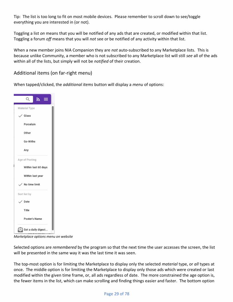
Tip: The list is too long to fit on most mobile devices. Please remember to scroll down to see/toggle everything you are interested in (or not). Toggling a list on means that you will be notified of any ads that are created, or modified within that list. Toggling a forum off means that you will not see or be notified of any activity within that list. When a new member joins NIA Companion they are not auto-subscribed to any Marketplace lists. This is because unlike Community, a member who is not subscribed to any Marketplace list will still see all of the ads within all of the lists, but simply will not be notified of their creation.
Additional items (on far-right menu) When tapped/clicked, the additional items button will display a menu of options:
Marketplace options menu on website Selected options are remembered by the program so that the next time the user accesses the screen, the list will be presented in the same way it was the last time it was seen. The top-most option is for limiting the Marketplace to display only the selected material type, or all types at once. The middle option is for limiting the Marketplace to display only those ads which were created or last modified within the given time frame, or, all ads regardless of date. The more constrained the age option is, the fewer items in the list, which can make scrolling and finding things easier and faster. The bottom option

Page 30 of 78
concerns sorting, which controls the “order” in which items are displayed. The default sort option is “date”, i.e., the date which the ad was created or edited. For dates, the list is initially sorted so that the most recent dates are at the top of the list and the oldest dates are at the bottom. When sorting by the title of the ad or the name of the member who created the ad, i.e., the poster, the list is sorted “alphabetically”, meaning items that begin with “A” are at the top and items that begin with “Z” are at the bottom. Tip: To reverse the current sort option, the user simply needs to re-click/tap that item in the options menu.
Individual Lists The “overall” Marketplace list is divided up into six individual lists, of which one is available at a time:
• Items For Sale
• Items that have Sold
• Items For Trade
• Items that have been Traded
• Items that are Wanted
• Items that were wanted and are now Found By dividing up the overall Marketplace into the above lists, users have quicker and easier means of finding and reviewing the ads they are most interested in. Here is an example of the options menu in the Marketplace: Each item in the Marketplace list contains several pieces of information. Here is an example of a few items:
Marketplace items on website At the far left is a photo of the item. All items must have at least one photo, but can have many more. Next to the photo, on the top, is the title of the ad. The title of the ad will be cut off (in the list screen only) to two lines. Below the title of the ad is the name of the member who posted the ad, as well as the date on which the ad was either created or last edited. If and when an item is either “on sale” (only applies to the For Sale type of items) or “pending”, then that special status will be displayed in-between the poster’s name and the date.
Ad detail view – ‘ad viewer’ When an item in the Marketplace list is clicked/tapped then another screen is displayed where the details of the ad are shown. There are two versions of the ad details screen, one for all users except the member who created the ad, and the other for the member who created the ad. This reflect the two purposes that members have when viewing the screen – the creator of the ad is interested in reviewing any offers on the ad, and assigning a status to it, whereas all other members are interested in viewing the photos, reading the description, and possibly making an offer.

Page 31 of 78
When a member who did not create the ad uses the ad detail screen, they will see the descriptive text in its entirety, as well as a carousel of the photos that are attached to the ad, and which allows the viewer to click or swipe thru them all. Depending on the status of the ad, they may also see either a “Pending” or “On Sale” notation above the title of the ad. The header of the screen will also vary, depending on the list that the ad came from, e.g., “Item for Sale”, “Sold Item”, “Item for Trade”, “Traded Item”, etc.. There is also a “flag” icon button to the right of the title. The button is used to report the ad to the System Administrators for one or more reasons, such as being offensive or inappropriate. Below is an example ad for an item that is for sale:
Marketplace For Sale ad on website In the above example, this ad has been marked as “On Sale” by its lister, and so it displays a special status at the very top. Below that is the title of the ad, followed by the most recent date/time that the ad has been created or updated. The ad lister’s name is also displayed. If the lister’s privacy options allow for their email address to be shared, then the name, as displayed, can be clicked/tapped, which will result in the user’s default email program opening up with a new email ready to be sent to the lister’s email address. If the lister’s privacy options prohibit sharing their email address, then the name display will not be clickable. Below the title, date and lister is what is known as a carousel, meaning, it is a multi-image display tool that the user can use to view all of the attached photos for the current ad. Assuming that the ad does have multiple photos, then on the mobile version the user can swipe sideways to move to the next or previous photo, while on the website version they can click on arrow buttons to do the same. Directly below the carousel is an
Page 32 of 78
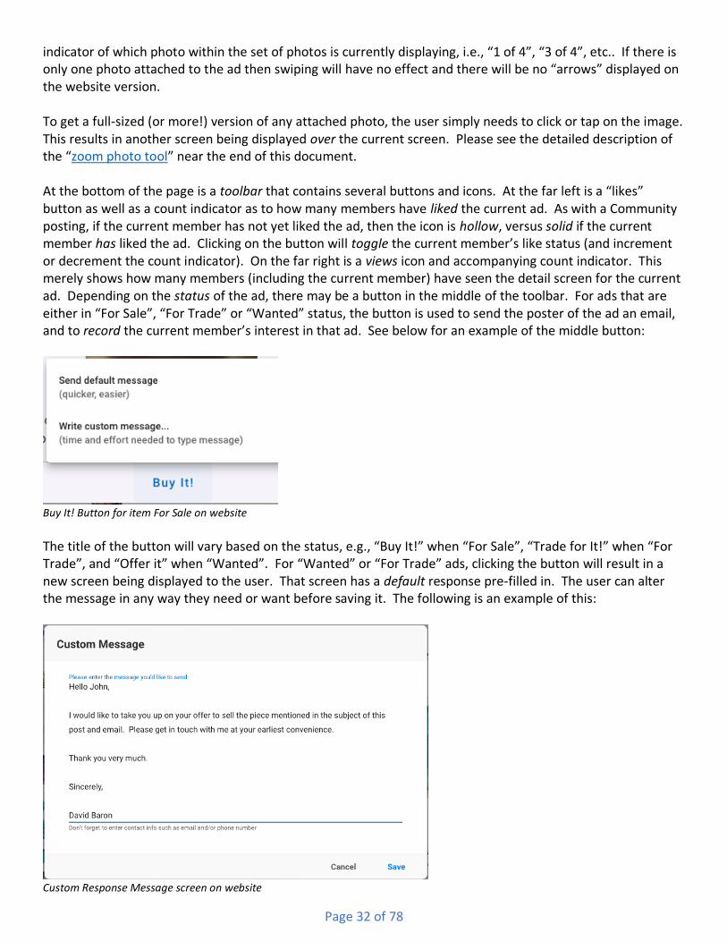
indicator of which photo within the set of photos is currently displaying, i.e., “1 of 4”, “3 of 4”, etc.. If there is only one photo attached to the ad then swiping will have no effect and there will be no “arrows” displayed on the website version. To get a full-sized (or more!) version of any attached photo, the user simply needs to click or tap on the image. This results in another screen being displayed over the current screen. Please see the detailed description of the “zoom photo tool” near the end of this document. At the bottom of the page is a toolbar that contains several buttons and icons. At the far left is a “likes” button as well as a count indicator as to how many members have liked the current ad. As with a Community posting, if the current member has not yet liked the ad, then the icon is hollow, versus solid if the current member has liked the ad. Clicking on the button will toggle the current member’s like status (and increment or decrement the count indicator). On the far right is a views icon and accompanying count indicator. This merely shows how many members (including the current member) have seen the detail screen for the current ad. Depending on the status of the ad, there may be a button in the middle of the toolbar. For ads that are either in “For Sale”, “For Trade” or “Wanted” status, the button is used to send the poster of the ad an email, and to record the current member’s interest in that ad. See below for an example of the middle button:
Buy It! Button for item For Sale on website The title of the button will vary based on the status, e.g., “Buy It!” when “For Sale”, “Trade for It!” when “For Trade”, and “Offer it” when “Wanted”. For “Wanted” or “For Trade” ads, clicking the button will result in a new screen being displayed to the user. That screen has a default response pre-filled in. The user can alter the message in any way they need or want before saving it. The following is an example of this:
Custom Response Message screen on website

Page 33 of 78
For “For Sale” ads, clicking the button displays a small menu with two options (see above). One is the custom message as just discussed, but the other is to immediately send the default message to the ad poster with no modifications (or time delays). As we all know, sometimes it is only a matter of seconds that determines “who answered first” and so this would be the quickest way to do so.
Ad detail view – ‘ad poster’ When an ad in a Marketplace list is clicked/tapped by the creator, or poster, of that ad, and that ad is still “active” (“For Sale”, “For Trade”, “Wanted”), their view of the ad detail screen will differ greatly from everyone else. The poster is not interested in viewing the photos, reading the ad text, or making an offer (on their own item) – they are instead interested in how many other members have viewed/liked the ad, and who has responded with either an offer or request for more information. Below is an example of an item that is for sale:
Poster’s view of For Sale Ad details screen in Marketplace on website The header of the screen will vary, depending on the list that the ad came from, e.g., “Item for Sale”, “Sold Item”, “Item for Trade”, “Traded Item”, etc.. To the far-right of the title is an actions menu icon button. The button reveals a menu with options for editing the ad, or deleting it:

Page 34 of 78
Actions menu for Poster Below the header is a thumbnail image of their item and the title of the ad. Below the thumbnail and title is the text of the ad, and below that is the date and time the ad was first posted, as well as any more recent update date and time. Note: Unlike other areas in the program which display a “medium” sized photo within a carousel that allows viewing all attached photos, there is only a thumbnail sized image of the primary photo. Clicking on the photo will result in a new screen being opened up with a full-size version of the photo. Please see the detailed description of the “zoom photo tool” near the end of this document. Again, this view is mainly for ad posters to view activity on their ad versus reviewing the photos. If the poster wants to change the photos attached to the ad, they would edit the ad (see below). The middle of the screen contains a three-list tabbed view not unlike other tabbed views described in other areas of the program. The three tabs allow switching between a list of member responses, a list of member views, and a list of member likes, each with a count. The list of member responses is ordered so that the first response is at the top of the list and the most recent response at the bottom. This is meant to help ad posters to quickly and easily see exactly who responded first (assuming the responder used NIA Companion to send their response). The bottom of the screen has a set of buttons that the poster can use to change the status of the ad. Items that are “For Sale” or “For Trade” can have one of three statuses, “For Sale/Trade”, “Pending”, and “Sold/Traded”. Items that are “Wanted” can have only two: “Wanted” and “Acquired”. The ad poster can change the status by clicking/tapping on the appropriate button. When an item is set to “Pending”, it will still show up in the “For Sale” or “For Trade” lists, however it will be marked as “Pending”. Ad viewers would still be able to send an offer, just in case the pending transaction fell through. Once an item’s status is changed to “Sold/Traded/Acquired”, then that item would be displayed on the corresponding list, and viewers would not be able to make offers on the item. Ad posters can change the status any time, for any reason.
Creating and Editing an Ad Any member may create an ad at any time. To begin the process the user would click the ‘Add’ circle button in the lower-right corner of the main Marketplace list screen:
Create Ad button

Page 35 of 78
Notes: The button is only available when viewing the “For Sale”, “For Trade” or “Wanted” lists. Additionally, new ads will be created within the list that is currently being viewed, i.e., if the “For Sale” list is being viewed and a new “For Trade” ad is desired, the list would need to be switched to “For Trade” before creating the ad. Clicking on the “Create Ad” button opens the following screens which differ from each other depending on which platform you are using:
Create Ad screen on website Create Ad screen on mobile
There are four mandatory items needed to create an ad, plus one or more optional items. The first mandatory item is the material type. This is a pick list field and is defaulted to the current material type that the member has selected (in the Marketplace list actions menu). To change the material the user would click or tap the existing value which will result in a list of all available types being displayed. Click on the desired type and its name will be shown on the underlying screen. The second mandatory item is the title of the ad. Generally, this consists of a few words that best sum up the item. Many ad posters include the suggested price (for “For Sale” items) in the title, as well as grandiose adjectives and superlatives. The third mandatory item is the body of the ad, also known as the description. This is where the poster can fully describe the item, the color, condition, cost, shipping, payment methods, etc.. Multiple sentences and paragraphs are allowing in this field – up to 2,500 characters which is well over a solid page of text (in a word processor). An additional optional attribute of “For Sale” type ads in the “Show the ‘On Sale’ flag” checkbox. Many ad posters use this option to indicated to viewers that their item has recently been reduced in price. Though this option can be set when creating an ad, the more typical scenario is to leave it off when creating the ad, and then edit the ad at some later time, reducing the price and setting the flag. Tip: On mobile devices, each word within ad ad’s title will be automatically capitalized, and within the body each sentence’s first word will be capitalized. On the website version however, only the first word of both the title and the body will be capitalized. Tip: The body can contain hyperlinks to external website. If you are going to include a hyperlink, please make sure to prefix it appropriately, i.e., “https://” or “http://”, depending on the actual address. Each ad can must include at least one attached photo, and can optionally include numerous others. Photos are attached to the ad before the ad is saved, though ads can always be edited to have additional photos. To

Page 36 of 78
work with attached photos, click or tap the “Photos” button and a new panel will be shown. On that panel one or more photos can be added, including captions. For more information on using this feature please view the section titled “Working with attached photos” near the end of this document. Once the mandatory fields are filled in and any photos are attached (or not) the ad can be saved by clicking or tapping the “Save” button. At that point the information will be sent to the server will automatically show up in the list screen, both for the member who created the ad and any other members who subscribe to the appropriate Marketplace list and for the material designated in the ad. The screen used for adding a new ad is also used for editing an existing ad. There are two ways to begin the editing process. As shown above in the “Poster’s view of ad details” screen-grab, there is both a circular “edit” button in the lower-right corner of the screen, as well as an “Edit Ad” option in the actions menu located in the upper-right corner of the screen. Clicking/tapping either will result in the details screen being shown with the current ad’s values being displayed and ready for editing.
My Collection System
Overview The Collection system is a personal database of each member’s collection. The database is contained within the program’s cloud-based hosting site and so is available at any time, and from any device that can access the internet. There is no need to copy the database from a desktop computer to a mobile device, or to synchronize information from multiple devices. The one-and-only location of the data remains constant and available. Any changes made on your phone are instantly available on your desktop, and vice-a-versa. Plus, collection pieces can be shared, allowing other members to enjoy and learn about each other’s collections. That said, each collection and the pieces within it are uniquely identified as belonging to a single member. After signing in to the program, only those collections and pieces belonging to the current member can be looked at or modified (aside from shared pieces) by that member. Each member has a single master collection which contains all of their pieces. Any piece a member adds to the system is automatically placed within the Master Collection. Members can also create sub-collections in which to organize those pieces. Any single piece can be associated with multiple sub-collections, or none at all. For instance, a collector might have a “North American” sub-collection, as well as an “International” sub-collection. He may also have a “Canadian”, “American” and “Mexican” sub-collection. Pieces that belong to the “Canadian” sub-collection can also belong to the “North American” sub-collection. Likewise, a member may have a “Favorites” sub-collection, to which they associate some number of pieces. Over time, they may remove, or dis-associate one or more of those pieces from their “Favorites”, with those pieces continuing to remain in their Master Collection. The combinations are endless, and, again, sub-collections are merely there to “slice and dice” a master collection into more desirable views at any given time.
List view The Collection system is presented to the user as a list of pieces. The “overall” list is divided up into four views, each representing a different state in which a given piece may exist:
• Owned – these are pieces you have, regardless of how you acquired them, and which you have no current plans on removing from your collection.

Page 37 of 78
• Wanted – these are piece you do not have [yet], but which you would like to have.
• For Sale – these are pieces that you still have, but which you are actively trying to divest yourself of, whether it by sale, trade or even give-away.
• Sold – these are piece you used to have, but which you either sold, traded, or gave away. Below is a screen-grab of the My Collections screen:
My Collection screen on website By dividing up the overall Collection into the above views, users have quicker and easier means of finding and reviewing the pieces they are most interested in. At the top of the screen is the header area, which differs depending on the platform the user is using at the time:

Page 38 of 78
My Collection screen header on mobile My Collection screen header on web-site On the far left of the mobile version is the hamburger menu used for showing the Navigation Panel (see above section of Home screen). The right side of the header contains the searching tool (please see the section near the end of this document concerning searching), the view style button and the additional options button. When searching for pieces, the program will limit the search to both the current collection/sub-collections and the currently viewed state, i.e., “owned”, “wanted”, etc. Please see the detailed description of the “searching for items” tool near the end of this document. The program will scan the following fields for a match regardless of the currently viewed state:
• CD/Part/LR Number • Primary Embossing • All Embossings
• Color • Condition • Condition Notes
• General Notes
When viewing each of the four states, the program will additionally scan the following fields:
Owned Wanted For Sale/Trade Sold/Traded
• Acquisition Price • Expected Cost • Listed Price • Sold Price
• Valuation • Priority • Stock Number • Sold to Name
• Acquired from Name • eBay ID • Sold to Email
• Acquired from Show • Sold to Address
• Acquired from Location
So, for example, if a member is viewing their “owned” list, and they search for “200”, they will find any CD 200s, as well as any piece that they paid, or they value at, $200. Note: Future versions of NIA Companion will allow more complex searching, meaning, a user would be able to search specific fields for specific values, e.g., “find all glass pieces that are purple costing less than $200”. The view style button allows the user to switch between a thinner view of each item, with a smaller picture of the piece, or a tile view of each item, with a larger picture. In general, more thinner items can fit on a screen than tiles, but some people appreciate the larger size of the images with the tile view. Here is an example of the tile view:

Page 39 of 78
Tile view screen on mobile
Tip: On the website version, if the user has a large enough screen, and makes their web browser wide enough, then there will be three tiles displayed across each row, versus two. On the mobile version, simply rotating the device to landscape will result in the same thing. The additional options button is used to display the following menu:
Collections options menu on website Selected options are remembered by the program so that the next time the user accesses the screen, the list will be presented in the same way it was the last time it was seen.

Page 40 of 78
The “Which Collection” options are “toggle” options, meaning each option (“Master” and all sub-collections) can either be checked or unchecked. This means the user can select one or more sub-collections at a time. For instance, the user could select “French” and “Italian” sub-collections to view (assuming they already had those). The list would then display any piece that was in either of those sub-collections. They could then “un-check” the “French” sub-collection so that only pieces associated with the “Italian” sub-collection would display. If all sub-collections are “un-checked” then the “Master” collection is automatically checked and displayed. Likewise, manually selecting the “Master” collection results in all sub-collections being automatically “un-checked” and all pieces being displayed. One set of options concerns sorting, which controls the “order” in which pieces are displayed. The first option, which is also the default sort option is “CD Number”, i.e., the numerical value of the Consolidated Design numbering system that most glass pieces use. This sort option would also apply to the U/M (uni-part, multi-part) Numbers on Porcelain pieces. When sorting by this option, smaller CD numbers will be at the top, and larger ones at the bottom. The second sort option is “Primary Embossing”, which, for pieces having a primary embossing will result in them being sorted “alphabetically”, meaning pieces whose embossings begin with “A” are at the top and embossings that begin with “Z” are at the bottom. If a piece does not have any primary embossing selected (as opposed to having a “No Embossing” value) then it will come before all others. The third and fourth sort options are variable, meaning that they change both their names and meanings depending on which list is being viewed. When viewing the “Owned” list, the third sort option is “Acquisition Date” and the fourth is “Value”. When viewing the “Wanted” list, the third sorting option is “Priority” and the fourth is “Expected Cost”. When viewing the “For Sale” list, the third sorting option is “Listed Date” and the fourth is “List Price”. And when viewing the “Sold” list, the third sorting option is “Sold Date” and the fourth is “Sold Price”. When sorting by “date” type options, the list is initially sorted so that the most recent dates are at the top of the list and the oldest dates are at the bottom. When sorting by “money” type options, the list is initially sorted “ascending”, whereby the lowest numbers are at the top, and the highest at the bottom. When sorting by “want list priority” the pieces with the highest priority will be at the top of the list. Tip: To reverse the current sort option, the user simply needs to re-click/tap that item in the options menu. Each item in the Collection list contains several pieces of information which vary depending on which list if being viewed. Here is an example of a couple of items from the “Owned” list:
Collection pieces in Owned list on website At the far left is a photo of the piece. Most pieces will have at least one photo, but can have many more, or none at all. Next to the photo, on the top, is a combination of the CD (or U/M) number plus the primary embossing of the piece. Below the code and embossing is the color of the piece. The third line is variable depending on the list being viewed:
• When viewing the “Owned” list, the third line consists of both the acquisition date of the piece and the value. If the acquisition date was not specified, then the date that the piece was added to the

Page 41 of 78
collection system would be shown instead. Likewise, if the valuation is not available, then the price paid would be shown instead. If neither are available then a value of zero would be shown.
• When viewing the “Wanted” list, the third line consists of both the priority of obtaining the piece and the expected cost.
• When viewing the “For Sale” list, the third line consists of both the “listed date”, i.e., the date on which the piece was marked as being for sale or for trade, and the sale price of the piece. For pieces listed for trade, then a value of zero would typically be shown.
• When viewing the “Sold” list, the third line consists of both the “sold date”, i.e., the date on which the piece was sold, traded or given away, as well as the sold price. Again, for pieces traded or given away, that value would typically be zero.
Piece detail view When a piece in the Collection list is clicked/tapped then another screen is displayed where the details of the piece are shown. Below is an example of a piece from the “Owned” list:
Owned piece details on website
Page 42 of 78
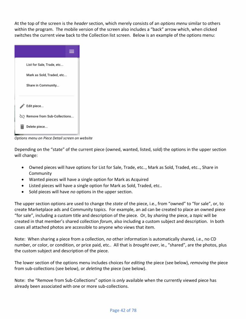
At the top of the screen is the header section, which merely consists of an options menu similar to others within the program. The mobile version of the screen also includes a “back” arrow which, when clicked switches the current view back to the Collection list screen. Below is an example of the options menu:
Options menu on Piece Detail screen on website
Depending on the “state” of the current piece (owned, wanted, listed, sold) the options in the upper section will change:
• Owned pieces will have options for List for Sale, Trade, etc.., Mark as Sold, Traded, etc.., Share in Community
• Wanted pieces will have a single option for Mark as Acquired
• Listed pieces will have a single option for Mark as Sold, Traded, etc..
• Sold pieces will have no options in the upper section. The upper section options are used to change the state of the piece, i.e., from “owned” to “for sale”, or, to create Marketplace ads and Community topics. For example, an ad can be created to place an owned piece “for sale”, including a custom title and description of the piece. Or, by sharing the piece, a topic will be created in that member’s shared collection forum, also including a custom subject and description. In both cases all attached photos are accessible to anyone who views that item. Note: When sharing a piece from a collection, no other information is automatically shared, i.e., no CD number, or color, or condition, or price paid, etc.. All that is brought over, ie., “shared”, are the photos, plus the custom subject and description of the piece. The lower section of the options menu includes choices for editing the piece (see below), removing the piece from sub-collections (see below), or deleting the piece (see below). Note: the “Remove from Sub-Collections” option is only available when the currently viewed piece has already been associated with one or more sub-collections.
Page 43 of 78
Below the header bar is all of the information which has been entered for the piece. There can be several dozen pieces of information displayed, depending on how much information was entered when the piece was added to the collection. The information is divided up into sections:
• A carousel of attached photos. Clicking on a photo will result in a new screen being opened up with a full-size version of that photo. Please see the detailed description of the “zoom photo tool” near the end of this document.
• General Information
• Acquisition Details
• Want List Details
• Listing Details
• Sale/Trade/Give-away Details
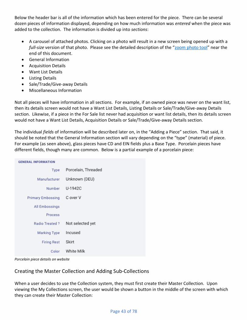
• Miscellaneous Information Not all pieces will have information in all sections. For example, if an owned piece was never on the want list, then its details screen would not have a Want List Details, Listing Details or Sale/Trade/Give-away Details section. Likewise, if a piece in the For Sale list never had acquisition or want list details, then its details screen would not have a Want List Details, Acquisition Details or Sale/Trade/Give-away Details section. The individual fields of information will be described later on, in the “Adding a Piece” section. That said, it should be noted that the General Information section will vary depending on the “type” (material) of piece. For example (as seen above), glass pieces have CD and EIN fields plus a Base Type. Porcelain pieces have different fields, though many are common. Below is a partial example of a porcelain piece:
Porcelain piece details on website
Creating the Master Collection and Adding Sub-Collections When a user decides to use the Collection system, they must first create their Master Collection. Upon viewing the My Collections screen, the user would be shown a button in the middle of the screen with which they can create their Master Collection:

Page 44 of 78
Initial My Collection screen with Add Master Collection button on website After creating the Master Collection, a user can either start to add pieces, or, they may create one or more Sub-Collections. To add a Sub-Collection, the user would click or tap the “Add Sub-Collection” action on the additional actions/options menu via the button at the top-right corner of the list screen. The following screen would then be displayed:
Add Sub-Collection screen on website The only mandatory field for new Sub-Collections is the “Name”, however it may be useful to supply a “Description” of the sub-collection as well. Upon clicking/tapping the “Save” button, the new sub-collection will be created.
Adding a Piece One a Master Collection has been created, the user can start adding pieces. Located in the lower-right corner of the list screen is a circular ‘Add’ button:

Page 45 of 78
Add Piece button Clicking/tapping that button will result in the “Add New Piece” screen being displayed. The appearance differs only slightly between the website version and the mobile. Near the top of both are a pair of buttons for switching between the “Details” of the piece, and the attached “Photos” of the piece. This is very similar to other screens that have been discussed in this document. For more information on the Photos panel, please see the bottom of this document in the section “Working with Attached Photos”. The “details” panel is where most of the information about a piece will be entered or selected. There are several dozen fields, some of which are only visible when the piece is in a certain state, e.g., the “Listing Details” fields are only shown if the piece is going to be listed for sale/trade. Additionally, some fields are only available for certain materials, and are hidden otherwise, e.g., the “EIN” field is only available for glass pieces. Almost all fields are optional with the exception of material and category, which are mandatory. For more information on the types of fields used on this screen (and others throughout the program), please see the bottom of this document in the section “Different Kinds of Fields found in NIA Companion”. Below is an example of the “Add Piece” screen:
Add Piece screen on website The “details” are divided up into sections, some of which are collapsed until needed. They are:
• Collection Inclusions
• General Information

Page 46 of 78
• Want List details
• Acquisition details
• Listing details
• Divestiture details The Collection Inclusions section is where a piece is associated with a sub-collection. As can be seen above, individual toggle buttons are provided for each sub-collection that has been added. There is also a button for the Master collection, however that button is always checked and disabled, meaning that the user cannot disassociate a piece from the Master collection. The other buttons can be toggled, such that when they are checked, the piece will be associated with that sub-collection, and when they are not checked, they are not associated with that sub-collection. Note: A piece can be associated with multiple (or even all) sub-collections, however it does not have to be associated with any sub-collection in order to still show up in the My Collection list screen. The General Information section contains information about the piece regardless of what state that piece is in. The field are variable based on the type of material selected. The following is the list of fields for this section:
• Material – this is a mandatory pick-list field and should be selected before filling in other fields.
• Category – this is a mandatory pick-list field and should be selected before filling in other fields.
• Manufacturer – this is a text field where you can enter whatever value you’d like.
• Country of Origin – this is an optional pick list field. Note that the list will be very long and scrolling may be necessary to find the desired country.
• CD/Part/LR Number – this is a search to select field, available only for glass pieces. If the desired value is found within the list, it can be selected. If not, the value can be added to the list. If that value ever needs to be picked again in the future for some other piece, it will be in the list.
• Primary Embossing – this is a text field that is available for all material types.
• All Embossings – this is a text field that is available for all material types.
• EIN/Index – this is a constrained text field that is available only for glass pieces. For Lightning Rod Insulators, the field will only allow numbers, of any value, while others can have three numbers. If one or two numbers are entered, they will be prefixed with zeros.
• Parts Type – this is a pick list field available only for porcelain pieces.
• ID Number – this is a text field that is available for all material types except glass (which uses CD number).
• Marking Type – this is a pick list field available only for porcelain pieces.
• Firing Rest – this is a pick list field available only for porcelain pieces.
• Process – this is a pick list field available only for porcelain pieces.
• Radio Treated – this is a pick list field available only for porcelain pieces.
• Base Type – this is a pick list field available only for glass pieces.
• Drip Points – this is a text field available only for glass pieces that have appropriate base types.
• Color – this is a search to select field, available for all pieces. If the desired value is found within the list, it can be selected. If not, the value can be added to the list. If that value ever needs to be picked again in the future for some other piece, it will be in the list.
• Condition – this is a pick list field available for all pieces.
• Condition Notes – this is a type-able text field available for all pieces. This field can hold 2,500 characters of text if necessary.
• Height – this is a numerical text field available for all pieces.
• Width – this is a numerical text field available for all pieces.

Page 47 of 78
• Weight – this is a pair (pounds + ounces) of numerical text fields available for all pieces.
• General Notes – this is a type-able text field available for all pieces. This field can hold 2,500 characters of text if necessary. It can be used for holding information when there are no defined fields to do so.
• Current Status – this is a pick list field available for all pieces. This field determines which list on the initial Collections screen the piece will be displayed within. Depending on which list was being displayed with the “Add” button was used, this field will be pre-selected, i.e., if the current list was “Owned” then this field would be pre-selected to “Owned” as well. The user is free to change the value of this field, in which case the piece may not be visible after saving it. In other words, if the user was viewing the “Owned” list, and they add a piece, but change its status to “Wanted”, then the user would have to switch to the “Wanted” list after saving in order to see it.
• Value – this is a constrained text field that is available for all pieces. This field only allows numbers, with no punctuation, i.e., no commas or currency symbols. The value represents U.S. dollars in an effort to simplify currency rates or conversions.
• Valuation Date – this is a date field available for all pieces. The Want List, Acquisition, Listing and Divestiture details sections all initially display a single pick list field that is pre-selected to not displaying the additional fields within that section. The Want List section is used when describing a piece that is not owned yet, but is wanted. It contains the following fields:
• Priority – a pick list field. If “not on list” is selected, the other fields will not be displayed.
• Anticipated Cost – this is a constrained text field that only allows numbers, with no punctuation, i.e., no commas or currency symbols. The value represents U.S. dollars in an effort to simplify currency rates or conversions.
• Include ad in Marketplace – this is a switch button (on or off) that determines if the user would like an ad to be created and displayed in the Marketplace. When this is on the following fields are available:
• Subject of Want Ad – this is a text field which becomes the ad’s title when seen in the Marketplace.
• Body of Want Ad – this is a text field which becomes the ad’s description when seen in the Marketplace.
The Acquisition Details section is used when describing a piece that is owned. It contains the following fields:
• Acquisition Type – a pick list field. If “not acquired” is selected, the other fields will not be displayed.
• Acquisition Date – a date field. If the exact date (day of month, or even month) cannot be remembered, it is best to select the first day of the month, and whichever month comes closest to being remembered.
• Cost – this is a constrained text field that is available only for pieces that have been purchased. This field only allows numbers, with no punctuation, i.e., no commas or currency symbols. The value represents U.S. dollars in an effort to simplify currency rates or conversions.
• From Whom – this is a type-able text field that would hold the full name of the person from whom the piece was acquired. This is not available if the piece was found.
• Which Show – this is a type-able text field that would hold the name of the show at which the piece was acquired. This is not available if the piece was found.
• Location – this is a type-able text field that would hold the “location” from which the piece was acquired. This might hold a value of “eBay”, or “Springfield” or “online auction” or whatever makes most sense.

Page 48 of 78
• Provenance – this is a type-able text field that would hold the ownership history of the piece, to the best that can be provided.
• Share Piece in Community – this is a switch button (on or off) that determines if the user would like a topic to be created and posted to the Community. When this is on, it results in a shared piece that only displays the following two fields plus any attached photos:
• Title of Shared Piece’s Topic – this is a text field which becomes the topic’s title when seen in the Community.
• Description of Shared Piece – this is a text field which becomes the topic’s initial post message, or description, when seen in the Community.
The Listing Details section is used when describing a piece that is being listed for sale or trade. It contains the following fields:
• Listing Type – a pick list field. If “not listed” is selected, the other fields will not be displayed.
• Listing Date – a date field that represents when the piece was (or will be) listed.
• Price – this is a constrained text field that is available only for pieces that have been listed for sale. This field only allows numbers, with no punctuation, i.e., no commas or currency symbols. The value represents U.S. dollars in an effort to simplify currency rates or conversions.
• Stock Number – this is a type-able text field that can be used by members who assign a stock, or inventory, number to each piece they have for sale.
• eBay Item Number – this is a type-able text field that is used to store the eBay “item number” when the piece is being offered on eBay.
• Include listing in Marketplace – this is a switch button (on or off) that determines if the user would like a listing ad to be created and displayed in the Marketplace. When this is on the following fields are available:
• Subject of Marketplace Ad – this is a text field which becomes the ad’s title when seen in the Marketplace.
• Body of Marketplace Ad – this is a text field which becomes the ad’s description when seen in the Marketplace.
The Divestiture Details section is used when describing a piece that used to be owned, but has been parted with. It contains the following fields:
• Divestiture Type – a pick list field. If “not divested” is selected, the other fields will not be displayed.
• Divestiture Date – a date field that represents when the piece was parted with.
• Price – this is a constrained text field that is available only for pieces that have been sold. This field only allows numbers, with no punctuation, i.e., no commas or currency symbols. The value represents U.S. dollars in an effort to simplify currency rates or conversions.
• Sold/Traded/Given to Who – this is a type-able text field that would hold the name of the person to whom the piece was divested. This field is not available for pieces which have been lost.
• Physical Address – this is a type-able text field that is used to store the full address of the person to whom the piece was divested. This field is not available for pieces which have been lost.
• Email Address – this is a type-able text field that is used to store the email address of the person to whom the piece was divested. This field is not available for pieces which have been lost.
• Phone Number – this is a type-able text field that is used to store the phone number of the person to whom the piece was divested. This field is not available for pieces which have been lost.

Page 49 of 78
• Divestiture Status – this is a pick field that is used to store the transaction status of the piece, e.g., “pending payment”, “shipped”, “received”, etc.. This field is not available for pieces which have been lost.
• Satisfaction – this is a pick list field that is used to store the satisfaction level of the person to whom the piece was divested, e.g., “they love it”, “they hate it”.
Once all the desired fields are filled in, and the desired photos are attached, the user would click/tap the “Save” button. If there were any photos attached, they will be uploaded first, followed by the general information. Assuming a successful “save” occurred the current screen would close and the user would be re-shown the Collection list screen.
Editing a Piece The screen used for adding a new piece is also used for editing an existing piece. There are several ways to begin the editing process. As shown above in the “Owned piece details” screen-grab, there is both a circular “edit” button in the lower-right corner of the screen, as well as an “Edit Piece” option in the actions menu located in the upper-right corner of the screen. Clicking/tapping either will result in the details screen being shown with the current ad’s values being displayed and ready for editing. Additionally, on the website version the user can double-click on a piece within the My Collection list screen. Doing so will not only load the selected piece into the “piece details” screen, but will also result in the “Edit Piece” screen being popped-up with the selected piece’s details pre-loaded. Finally, on the mobile version only, the user can swipe to the right on a piece within the My Collection list screen. Doing so reveals an edit icon and once the swipe has covered at least half of the width of the screen, the user can release their finger at which point the “Edit Piece” screen will be displayed:
Swipe right to edit piece on mobile
Deleting and Removing Pieces Occasionally there may times when a piece needs to be deleted from a user’s collection. In NIA Companion there are really two cases concerning deletion. In the first case the user may want to completely erase the existence of a piece from their collection. In this case the piece will be deleted from the master collection, and therefore, from any sub-collections it may have been associated with as well. Once done, there is no way to un-do, re-instate or bring back the piece without re-adding it from scratch. In the second case the user may instead want to remove a piece’s association with one or more (or all) sub-collections, yet still keep the piece in their master collection. In this case the only thing that is erased is the “link” between the piece and its associated sub-collections. The piece still remains in the master collection and may continue to be viewed in the list screen. There are two ways to initiate the delete piece process. As shown above in the “Piece Details” screen, the actions menu in the upper-right corner of the screen contains a “Delete Piece” option. On the mobile version only, the user can swipe to the left on a piece within the My Collection list screen. Doing so reveals a delete

Page 50 of 78
icon and once the swipe has covered at least half of the width of the screen, the user can release their finger at which point the deletion process will begin:
Swipe left to delete/remove piece on mobile The deletion process begins with a warning shown to the user as shown below:
Delete piece warning on mobile If the user selects yes, the program will delete the piece from the collection as well as the My Collection list screen. On the mobile app the “details” screen would be closed (if was open) and the user would be returned to the list screen. There are two ways to remove a piece from one or more sub-collections. The first way is similar to deleting a piece: the “Piece Details” screen’s actions menu in the upper-right corner of the screen contains a “Remove from Sub-Collections” option. When this option is selected the user will be warned as follows:
Remove piece from sub-collections warning on mobile If the user selects yes, the program will remove the piece from all sub-collections it was associated with. If, however, the user wants to retain one or more sub-collection associations, and only remove some associations, then they would instead need to use the “Edit Piece” screen. As shown below, the Edit screen
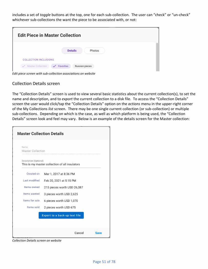
Page 51 of 78
includes a set of toggle buttons at the top, one for each sub-collection. The user can “check” or “un-check” whichever sub-collections the want the piece to be associated with, or not:
Edit piece screen with sub-collection associations on website
Collection Details screen The “Collection Details” screen is used to view several basic statistics about the current collection(s), to set the name and description, and to export the current collection to a disk file. To access the “Collection Details” screen the user would click/tap the “Collection Details” option on the actions menu in the upper-right corner of the My Collections list screen. There may be one single current collection (or sub-collection) or multiple sub-collections. Depending on which is the case, as well as which platform is being used, the “Collection Details” screen look and feel may vary. Below is an example of the details screen for the Master collection:
Collection Details screen on website

Page 52 of 78
At the top of the screen is the name of the collection. If the current collection is the Master Collection, then the name field cannot be changed, i.e., every member’s master collection is named the same thing. If a single sub-collection is being viewed then the field can be typed into and can hold up to 60 characters. If multiple sub-collections are being viewed then their existing names will be displayed but cannot be modified at that time. Below the “name” field is the “Description”. If two or more sub-collections are being viewed then the field cannot be changed. Otherwise the “Description” can be used to properly describe the nature of the collection and can hold 250 characters. In the middle of the screen are several attributes and statistics about the selected collection(s). If a single collection/sub-collection is selected, then that collection’s “created” and “last modified” dates and times are displayed. Below them are counts and totals for the four states of the pieces within the selected collection(s). At the bottom of the screen is a button that is used for exporting all of the pieces in the current collection/sub-collection to a disk file. This is available only on the website version and only when a single collection/sub-collection is selected. The program will prompt the user to provide a name for the text file, as well as a location on their computer’s file system they would like the file placed. Once exported, a program such as Microsoft Excel, Macintosh Numbers, or Google Sheets can open that file in a spreadsheet view.
Group-selection options screen – Website only Most of the time a single piece within the overall collection list is selected and thus displayed on the details screen. However, there are several actions that may be performed on multiple pieces at a time, also known as a group selection. On the website version only, a group selection is created by using the shift and/or ctrl/command () (Windows/Mac) keys and the mouse. Depending on which keys are used, the user might establish a contiguous selection, where all the selected pieces are “touching” each other, or a discontiguous selection, where there are “unselected” pieces in-between the selected pieces. A contiguous selection is typically formed by clicking an initial piece, and then holding down one of the shift keys before clicking on some other piece. At that point the first piece, the last piece and all those in-between would become selected. A discontiguous select is formed by clicking an initial piece and then holding down either the Ctrl key on Window or the Command () on Macintosh before clicking some other piece. At that point the first piece and the last piece would become selected. Holding down the Ctrl/Command key again and clicking would result in that third piece becoming selected. Below is an example of a combination contiguous and discontiguous selection, plus the possible actions that can be taken on them:

Page 53 of 78
Multiple piece group selection on website Once a group of pieces is established, the right side of the screen displays the number of pieces in the selection, as well as the list of actions that can be performed on the selection. They are: Associate Pieces with Sub-Collections – this allows many pieces to be associated to one or more sub-collections in one quick/easy action. This is as opposed to editing each piece, one at a time. For example, if a collector already had their collection pieces added, and then decided to create a new sub-collection, instead of having to go into each piece they wanted to associate with the new sub-collection, they could simply select them all in the list, and then use this tool to perform the association in one step. This action has a single option, that is, the list of sub-collections with which to become associated. Note that if one or more of the pieces were already associated with the checked options, no action would be performed. Additionally, if one or more of the selected pieces had associations to other (non-checked) sub-collections, those associations would remain in place. Here is what this action and its options might look like:

Page 54 of 78
Associate Pieces with Sub-Collection(s) options Change Sub-Collection(s) Associations – this is similar to the above, however this allows the user to disassociate multiple pieces from one (or more) sub-collections and to re-associate them to some other sub-collection(s). This action has two option, that is, a list of sub-collections from which to become disassociated, and a list of sub-collections with which to become associated. Note that if one or more of the pieces were not yet associated with the checked top options, they would still become associated with the checked bottom options. Additionally, if one or more of the selected pieces had associations to other (non-checked) sub-collections, those associations would remain in place. Here is what this action and its options might look like:
Change Sub-Collection(s) Associations options
Share Pieces in Community – this action is used to quickly and easily share multiple pieces from a member’s collection with the Community. If the user has never shared a piece before, a new forum (see above in

Page 55 of 78
Community section for explanation) is created for that user. For each piece being shared, a new topic would be created within the user’s forum. The topic would get a title that is auto-assembled by one or more fields of information about the piece. As shown below, there can be up to five fields of information provided within the title. The user can toggle which fields are to included and can view an example title below the toggle buttons. The description of each shared piece will be the same, as typed in on this panel. While this might be considered inadequate, the alternative would be to somehow allow each piece in the selection (could be hundreds) to have their own unique description. Doing so would forfeit the benefits of this group selection action, and would be akin to manually editing each piece whereby a unique description could be entered and saved, one at a time. Finally, there is an option to handle situations where one or more pieces in the group selection may already be shared, possibly with a more unique title and description. The default is to skip pieces in that situation, but it is ultimately up to the user. Here is what this action and its options looks like:
Share Pieces in Community options
Run Slide Show – this is used to view all of the photos of all of the pieces in the group selection. Each photo would be displayed in a full screen size, i.e., it would be shown in a scale whereby it filled the entire screen (bigger than just the browser). Typically slide-shows run automatically, whereby each photo is displayed for a given amount of time, before the program advances to the next photo. In this case the user can dismiss the slide-show by using the Esc (escape) key on their keyboard. In a manual advancement the user has more control over how long they remain viewing each photo, as well as having zoom-in and zoom-out control for each piece.

Page 56 of 78
Run Slide Show options
Shows & Events
Overview Shows & Events is, as the name implies, an area where users can view past, present and future insulator shows and events. Registered members may also create shows or events if they wish. Along with the details for each show or event, members can also see how many other members plan on attending, as well as indicating to the program that they too are planning on attending.
Multiple Views Shows & Events are presented to the user as either a list, a map or a calendar (website version only). All three views include the same information, albeit in a different visual format. Above the three views is the heading area for the screen, and it includes buttons and tools used for searching, and additional functions.
Shows & Events start screen header on mobile Shows & Events start screen header on web-site On the mobile version, the hamburger menu is on the far left (used to display the Navigation panel), followed by the “Search” button and the additional options button. On the web-site version there is no hamburger menu on the left, since the Navigation panel is always visible.
Searching

Page 57 of 78
When searching Shows & Events, as soon as the user types in 3 or more characters in the text field, the program will search the database, as limited by the existing time-frame option, for your search term. Please see the detailed description of the “searching for items” tool near the end of this document. The program will scan the following fields for a match:
• Name of the show
• Details for the show
• Street Address, City, State, Zip Code and Country of the Show
• Primary Host’s Name and Email Address
• Secondary Host’s Name and Email Address If there are any matches, results will be displayed in all three views. Note: As mentioned above, searching is limited to the currently selected time-frame (an option that the user can change). What this means is that the time-frame is “Upcoming” then any shows which were scheduled to take place in the past will not be found. If there is a need to search for anything, then the time-frame should be set to “All Events” (see below for explanation).
Additional items (on far-right menu) When tapped/clicked, the additional items button will display a menu of options:
Shows & Events addl. Options menu on web

Page 58 of 78
The upper part of the menu allows the user to choose the time-frame for the events the program should show them. Selecting “All events” will result in [many] more items in the list, and thus the more scrolling needed to “get to the bottom.” Remember that all of the previous events are stored in a database, and so if the user ever want to search for something in specific, they can do so without worrying about the age of the item – it will be found and display so that they can view it in its entirety. The bottom section concerns sorting, which controls the “order” in which items are displayed. The default sort option is “Begin date”, i.e., the first date for each show or event. For dates, the list is initially sorted so that the most recent dates are at the top of the list and the oldest dates are at the bottom. When sorting by the name of the event, or the city in which it is being held, the list is sorted “alphabetically”, meaning items that begin with “A” are at the top and items that begin with “Z” are at the bottom. Tip: To reverse the current sort option, the user simply needs to re-click/tap that item in the options menu. The bottom item in the menu is used for creating a new show or event (see below).
List view The list view for Shows & Events is very similar to that of other areas: There are several pieces of information presented in a list which can be sorted in one of several ways. Here is an example of a few items:
Shows & Events list on website At the far left is an icon representing the type of show or event. There are four types: Insulators, Bottles, Insulators + Bottles, and On-line Auction. Next to the icon, on the top, is the name of the event. The name of the event will be cut off (in the list screen only) to two lines. Below the name of the event is the date range of the event, as well as how many days away from today that is. Below the data range is the city and state in which the event is taking place.
Map view

Page 59 of 78
The map view displays all of the shows and events in a graphical manner, by plotting each event as a pin on a map. Each pin on the map is an appropriate icon specifying the type of event. Hovering over a pin (website only) results in the name of the event being displayed. Below is an example of upcoming events:
Shows & Events map on website
Calendar view On the website version, an additional view style is available whereby each show or event is displayed on a calendar.
Show & Event detail view When an item in the Shows & Events list is clicked/tapped then another screen is displayed where the details of the item are shown. In the header bar at the top of the screen will be a “go back” arrow button on the left side (mobile version only) and possibly an actions button on the far-right side, depending on the particular show and the current user. If the show or event has a show report document attached to it, or, if the current user is the member who created the entry, then the icon button will be present. The menu may have options for viewing the show report, and if the user is the creator of the item, then additional options for editing the item, cloning the item, or even deleting the item (see further on for details). The mobile version will also include “up/down” arrow buttons used for viewing the previous or next show or event from the list screen. Below is an example of an upcoming show:

Page 60 of 78
Show or Event detail screen on website Most of the details are obvious however there are a few particulars that need to be explained. A show or event can have either one or two hosts. Each host may have an email address and/or phone number. If they have an email address, their name would be displayed as a clickable/tap-able link, which, if used, would bring up the user’s email program. If they have a phone number, then on mobile devices the phone number would be displayed as a tap-able link, which, if used, would bring up the user’s phone app. Below the hosts may be a show flyer document icon. Clicking/tapping that would result in the show flyer being opened at full size.

Page 61 of 78
There is a R.S.V.P. checkbox or toggle option that allows a member to indicate that they “plan on going” to the show/event. This can be turned on or off as needed. Next to (or under, on mobile) the option button is an indicator as to how many members, possibly including yourself, are planning on going. On the website version the indicator can be clicked on and will result in the display of all of the members who plan on attending. Below the R.S.V.P. section is a map with the show/event indicated by an icon representing the type of show/event (insulators, bottles or both). The map can be zoomed in or out by using the “plus/minus” buttons on the website version, or pinching in or out on the mobile version. Additionally, on the website version, by clicking the show/event icon another browser window will be opened displaying Google Maps, and the “directions to” tool, including the show’s location as the destination. On the mobile version, tapping the show/event icon will result in two additional icons being shown on the screen. See below for example:
Show/Event map with additional tools on mobile The left-hand icon (blue diamond with arrow), when clicked, will open the Google Maps app on the phone, pre-set to the “directions to” tool with the user’s current location as starting point and the show’s location as the destination. The right-hand icon (Google Maps) will also open Google Maps with the show’s location shown with an icon. Below the map section is a button titled “View and Discuss in Community Forum”. All shows/events get a forum within the Community area dedicated to that particular show or event. This is a convenient way for show attendees to discuss the show before, during and after the show or event has taken place. Clicking/tapping the button will take the user to the Community area of the program and will pre-select the appropriate forum. All existing topics will be displayed allowing the current user to either view and respond to them, or to create their own new topic.
Adding a Show or Event Any member may create a show or event. Located in the lower-right corner of the list screen is a circular ‘Add’ button:
Add Show/Event button

Page 62 of 78
Clicking/tapping that results in the “Add New Show or Event” screen being displayed. There are nearly two dozen fields available on this screen, however roughly half of them are mandatory while the rest are optional. For more information on the types of fields used on this screen (and others throughout the program), please see the bottom of this document in the section “Different Kinds of Fields found in NIA Companion”. Below is an example of the “Add New Show or Event” screen, with all of the mandatory fields visible:
Add Show/Event screen on website The list of fields on this screen are as follows:
• Show or Event Type – this is a mandatory pick-list field
• Status – this is a mandatory pick-list field. When a show/event has a status of “draft” it will not be displayed in the list screen to anyone other than the member who created the entry. Members can use this status when they are either not finished with all of the details, or they simply are not ready to publicize the show/event.

Page 63 of 78
• Show or Event Name – this is a mandatory text field that ideally holds the name of the show, without being too long or going into too much detail.
• Country – this is a mandatory pick-list field.
• Address – this is a mandatory text field. There is only a single ‘street address’ field at this time and so this field should only hold actual address information. Other details, such as “Building 3” or “Upstairs”, etc., should be handled in the “details” field (see below).
• City – this is a mandatory text field.
• State – this is a mandatory pick-list field.
• Postal Code – this is a mandatory text field.
• Start Date – this is a mandatory date field. If the exact date (day of month, or even month) is not known then pick any date as a placeholder (and the status should probably be set to draft).
• End Date – this is an optional date field. The only time there should be an end date entered is when it is different than the begin date, meaning, when a show/event take place over two or more days.
• Hours – this is a mandatory text field and is meant to hold a variety of values, though the point of the field is to provide specific time information. Some shows take place over several days, with each day having different opening and closing times. The advice would be for this field to hold the times that would be important for typical attendees. Additional times, such as set-up or take-down/clean-up, should be entered in the “details” field (see below).
• Primary Host Name – this is an optional search to select field. The user can type several characters to search the NIA Companion membership, and can then select the appropriate person. That person can be themselves, or, some other member. If the desired person is not yet a NIA Companion member, the user can continue to type in the rest of the person’s name. The benefits to selecting a NIA Companion member is that the member’s email and phone number will be auto-copied into the following fields when selected (versus manual entry otherwise). Additionally, any NIA Companion members selected as either primary or secondary host are able to edit the show or event if and when necessary.
• Primary Host Email – this is an optional text field.
• Primary Host Phone – this is an optional text field.
• Secondary Host Name – this is an optional search to select field, similar to the “Primary Host Name”. In general there should not be a secondary host unless there is also a primary host.
• Secondary Host Email – this is an optional text field.
• Secondary Host Phone – this is an optional text field.
• Website URL – this is an optional text field. If provided, the appropriate prefix, i.e., either “HTTP://” or “HTTPS://” must be present.
• Description – this is an optional text field. This field can and should hold any information not easily entered in the other fields. This can hold several thousand characters and so should be long enough for all sorts of information, such as breakfast, lunch or dinner details, location specifics or dealer-specific information.
There are also two buttons available only on the website version for attaching both a show flyer and a show report. Both of these files are typically PDFs.
Other actions There are several actions which may be available to the current user (as mentioned above) when viewing the details screen. Using the actions icon button in the upper-right corner of the screen would display the following menu:

Page 64 of 78
Actions menu for Show/Event details on website The “Show Report” icon will only be present if the show/event actually has an attached document. Once clicked/tapped it would download and open the document, typically a PDF file. The next three options are only available to at most, three different members: The member who created the show, the primary host (assuming they were picked from existing NIA Companion members) and the secondary host (also assuming they were picked). Any of these members may edit the existing show/event by selecting the “Edit event” menu option. The same screen used for creating the show/event would be displayed with the details of the current show/event being loaded into the fields. The “Clone event” action allows an existing show/event to be duplicated, i.e., cloned. This is very useful when there is a show or event that occurs annually. To use this feature the member would first select the show/event they wanted to clone. Upon clicking/tapping the “Clone event” action menu, the program will open a new show/event screen and then copy in all of the values from the currently selected show/event The creator of the show would merely need to type in the new date(s), and save, thus saving time and effort. The “Delete event” action allows the appropriate member(s) to fully erase the show/event from the system. The member will be prompted to ensure they really want to erase the show/event. Once this is done there is no way to un-do it or recover the erased information.
Membership Directory
Overview The Members Directory is, as the name implies, an area where users can view all registered members of the NIA Companion program. Note however, that members who have elected to remain fully private will not show up in the directory.
Multiple Views The Members Directory is presented to the user as either a list or a map. Both views include the same information, albeit in a different visual format. Above the two views is the heading area for the screen, and it includes buttons and tools used for searching, and additional functions.

Page 65 of 78
Members Directory start screen header on web-site On the mobile version, the hamburger menu is on the far left (used to display the Navigation panel), followed by the “Search” button and the additional options button. On the web-site version there is no hamburger menu on the left, since the Navigation panel is always visible.
Searching When searching Members, as soon as the user types in 3 or more characters in the text field, the program will search the database, as limited by the existing view options (see below), for your search term. Please see the detailed description of the “searching for items” tool near the end of this document. The program will scan the following fields for a match:
• First and Last Name
• Email Address
• Street Address, City, State, Zip Code and Country
• Cell Phone
• General Notes
• Spouse/Significant Other’s Name If there are any matches, results will be displayed in both views. Once again though, depending on how public a member is, they may show up on the list view, but not the map view. In other words, if a member is restricting the amount of public information for themselves to simply “name”, then they will not show up on the map. Note: As mentioned above, searching is limited to the currently selected view options (both of which the user can change). What this means is that the location option is “Near Me” then any members beyond roughly 100 miles from the current user will not be found. If there is a need to search for anything, then both options should be set to “Any” (see below for explanation).
Additional items (on far-right menu)
When tapped/clicked, the additional items button will display a menu of options:

Page 66 of 78
Shows & Events addl. Options menu on web The upper and middle parts of the menu allows the user to choose the where to look and who to look for options for the members that the program should show them. Both of these options make it convenient to narrow or widen the criteria for who shows up in the list and map screens. That said, there is little down-side to keeping both options set to “Any”. Whichever options are selected are remembered by the program so that the next time the screen is viewed the same options will be in place. The bottom section concerns sorting, which controls the “order” in which items are displayed. The default sort option is “Last name” and the other option is “First name”. The list is sorted “alphabetically”, meaning names that begin with “A” are at the top and items that begin with “Z” are at the bottom. Tip: To reverse the current sort option, the user simply needs to re-click/tap that item in the options menu.
List view The list view for Members Directory is very similar to that of other areas: There are several pieces of information presented in a list which can be sorted in one of several ways. Here is an example of a few items:

Page 67 of 78
Members list on website At the far left is an image with either an actual photography (supplied by the member) or an avatar (either male or female, as selected by the member). Next to the image, on the top, is the name of the member. Below the member’s name is their city and state, providing that they not only provided that information, but that they elected to allow their address to be displayed. As the example above shows, the third member down did not elect to make their address information public.
Map view The map view displays all of the members who have elected to allow their address to be public in a graphical manner, by plotting each member as a pin on a map. Each pin on the map is an appropriate icon specifying the type of event. Hovering over a pin (website only) results in the name of the member being displayed.
Detail view When an item in the Members Directory list is clicked/tapped then another screen is displayed where the details of that member are shown. In the header bar at the top of the screen will be a “go back” arrow button on the left side (mobile version only), followed by the member’s name. On the mobile version the right side of the header will include “up/down” arrow buttons used for viewing the previous or next member from the list screen. Most of the details are obvious however there are a few particulars that need to be explained. First of all, depending on the displayed member’s privacy preferences are, there may be nothing by a “Name” displayed at the top of the screen, plus an avatar. Or, as the example above shows, there may be a lot of information displayed. If the email address is displayed it will be clickable/tab-able, which, if used, would bring up the current user’s email program. Likewise, if a phone number is displayed, then on mobile devices the phone number would be displayed as a tap-able link, which, if used, would bring up the current user’s phone app. Below is an example of an upcoming show:
Page 68 of 78
Show or Event detail screen on website
Appendices
I - Different Kinds of Fields found in NIA Companion A field is typically a rectangular area on the screen where information can be entered. There are four types of fields that users will encounter on the various screens within NIA Companion. They are:
Type-able Text fields These are basic fields that allows the user to type in whatever value they want. Some of these fields are limited to a single line, e.g., member’s Last Name, while others allow multiple lines, e.g., a Marketplace ad’s Description. Most text fields allow any value to be entered, however there are a few that only allow certain
Page 69 of 78
values. For example, the EIN field in the Collection’s Piece Details screen only allows numbers. Most type-able fields also have some sort of length limit however for simplicity’s sake, there are no “counters” displayed anywhere in the program. If a user enters too many characters into a field, they will generally be prompted to correct the value before being able to save.
Pick Lists These are fields that when clicked or tapped, the program displays a list of choices. The user can only select one of the choices they see – they cannot create additional options. Selecting one of the choices copies the name of that choice into the field. Note that the list of choices may be too long to fit on the screen – the user may have to scroll the list up or down to find the value they want.
Search to Select fields These are fields that are a combination of a text field and pick list, plus a bit more. And, each platform works a bit differently in regards to searching for and selecting a value:
• On the website, the user can type a value into the field directly. The program attempts to find matches based on what they type. In general, the more the user types, the closer the matches will get. However, in some cases it only takes a couple of characters for the program to find a match. Any matches are displayed in a list below the text field. If the user sees the item they are looking for, they would either click it, or arrow down to the value and hit the Enter key. Or, if the value is not found, the user can simply type the “Tab” key to add that value to the available options:
Search to Select field with no matches on website
• On mobile devices, when one of these fields are tapped, a new screen is displayed where the user can type in the value they are looking for. As above, the more that is typed, the closer the matches become, and again, matches are displayed beneath the search text field. If the user sees the item they are looking for, they would tap it to return that value to the original screen’s text field. Or, if the value is not found, the user can tap the “Add…” button to add that value to the available options:
Search to Select field with no matches on mobile
Date fields

Page 70 of 78
These are fields where the user is able to either type a valid date into the field, or, they can use a pop-up calendar tool to find and click/tap the necessary date. Once again, each platform works a bit differently in regards to manually typing in a data, or selecting it from a calendar:
• On the website, the user can type in anything they want, however only valid numerical dates will be recognized and accepted. For example: 6/3/05 is valid, but June 3, 2005 is not.
• On the mobile app, the user can only type in allowable values. If they try typing in unacceptable values, such as “letters”, the characters will be skipped.
• On the website, the pop-up calendar looks like the following:
Date field with Calendar pop-up on website
The user can use the arrows at the top to move back or forward one month at a time. They can also click on the Month-Year heading (which is a button) to get another screen for quickly selecting a year and month. Once the date is identified, the user can either double-click on that date, or click the “OK” button, either of which will accept that date and place its value into the text field.
• On iOS, there is a pop-up date picker that appears at the bottom of the screen:
Date picker pop-up on iOS An iOS date picker is comprised of three wheels that the user turns (by flicking their finger on it) until the desired value is in the “middle” (within the highlighted bar). Once the date is identified, the user must tap the “Done” button to copy the date value into the text field.

Page 71 of 78
• On Android, there is a pop-up calendar screen similar to the website version:
Date picker pop-up on iOS The user can either swipe left and right, or, use the arrows at the top-right to move back or forward one month at a time. They can also click on the Month-Year heading pick-list to get another screen for quickly selecting a year and month. Once the date is identified (by tapping on it), the user must tap the “OK” button to copy the date value into the text field.
II - Searching for Items in NIA Companion Both the mobile and the desktop versions of the program allow you to search for information. Depending on the platform being used, the process is a bit different. Here are the two versions of a typical header area:
Header area with search field on website Header area with search button on mobile On the website version, most list screens have a text field in the header area that the user can immediately type into to begin searching. On the mobile version this is begun by tapping the magnifying glass icon. Doing so will result in the heading area changing its appearance a bit, including a text field in which you can enter your search term and a “go back” button that will exit you from the search tool.
Search field plus go-back button on mobile

Page 72 of 78
Regardless of the version, as soon as you type 3 or more characters in the text field, the program will search the current area within the database for your search term. Results will be listed out for you and the search term will be highlighted in yellow. For the initial version of NIA Companion, the “search mechanism” is very simple. It uses whatever you type in to find items which have all of what you type. What that means for example, is that if you enter in “yellow amber”, it will find topics and posts that contain “yellow amber” as you’ve typed it. It will not find items that only have the word “yellow” or items that only have the word “amber”, or even items that do have both works, but not separated by a ‘space’. The “case” of your search term does not matter, i.e., “hemingray” is the same as “Hemingray”. Nor does it matter how complete your term is. For example, if you type in “hemi” it will find “Hemingray”. Likewise, if you type in “gray” it will find Hemingray. Punctuation does matter – “N.E.G.M.” is not the same as “NEGM”, such that if you typed one of those you would not find the other. Depending on the uptake of the program and user input, the search mechanism may be upgraded in the future to be a bit more intelligent. Time will tell. Depending on the area of the program you are in, different fields will be searched. Please see each area above for specifics.
III - Working with Attached Photos
Overview Several areas within NIA Companion allow the member to attach photo files. When a photo is attached it means that a photo file from the member’s device is copied to the NIA Companion web server. The original photo file is left in place and un-touched. When the file is copied to the server three things happen:
1. It gets renamed to an illegible value, which, from a security perspective, makes it hard for bad actors to guess file names in an attempt to copy them outside of the program;
2. It gets converted into a JPEG image format. This provides a bit of compression without losing any quality;
3. It gets duplicated into two additional sizes – a medium sized version used for preview screens and a thumbnail size used in list screens. Creating smaller versions of each file helps with performance (time delay and memory consumption) when doing things such as fetching and displaying a long list it items with photos.
Members may attach multiple photos to an item, however only one of those photos gets displayed in any lists in which the item shows up. Members may denote one photo for each item as “the one to show in a list”. Additionally, each photo can have a caption assigned to it to help provide a small amount of information of that particular photo. Captions are limited to 250 characters. Regardless of which area you are viewing, the Photos screen will look the same, though each platform has a slightly different look-and-feel:

Page 73 of 78
Photos screen on website Photos screen on mobile
Adding Photos Members can attach one or more photos to an item. The process is begun by clicking or tapping on the appropriate “Add” button. On the website version, the button is labeled “Add one or more Photos”. The screen that comes up after clicking it allows the user to select one or more photo files at once by holding down either the Shift key, the Ctrl key (Windows) or Command key (Mac). On mobile devices, there are two “Add” buttons. The “Add Photo from Device” button allows users to select one photo at a time from their device. Multiple photos can be attached however the selection process is one-at-a-time. The “Add Photo using Camera” allows the user to take a real-time photo with their device’s camera. Once the photo file(s) have been selected or taken, the image(s) are displayed on the screen. Only one preview image is shown at a time, and if there are multiple images then the user can switch between them using the on-screen buttons (website version) or by swiping left and right (mobile).
Editing Newly Added Photos When a new photo is attached to an item it can be edited in certain ways, depending on the platform. On the website version a photo can be rotated in 90° increments, either to the left or the right (see the two “Rotate” buttons in the example above). On the mobile version, several editing options are available. Tapping a newly added image will result in a new screen being displayed, the look-and-feel of which is different between iOS and Android.
Photo editing controls on iOS Photo editing controls on Android

Page 74 of 78
In the iOS version there are buttons for rotating the image in 90° increments, either to the left or the right. There is also an aspect ratio button which allows you to set the relative sizes of both the height and width of the image, for example 3:2, 4:3, 16:9 or square. The image can also be cropped at any time by using the crop handles that are overlaid on the image at all times. There is also an undo button that reverses the most recent change. When changes are complete the “Done” button can be used to return the altered image back to the item photos screen, or, use the “Cancel” button to discard any changes. In the Android version there is a crop button that behaves exactly as the aspect ratio button does in the iOS version – it allows the user to apply a pre-set aspect ratio (same as above), or, by using the crop handles, set an arbitrary height and width of the resulting image. There is free-rotate button that allows the user to rotate to any degree they want, or, in explicit 90° increments. There is also an “X” button in the rotate screen that reverts the image back to its original orientation. And there is a scale button that allows the user to scale up or down the image to a precise value. When changes are complete the “check” button can be tapped in the upper-right corner of the device, or, the “X” button can be tapped in the upper-left corner to discard any changes. Note: Only newly attached photos can be edited in any way. Once a photo has been saved, it can only be removed/replaced.
Removing Photos Attached photos can be removed from an item at any time. To remove a photo, make sure that it is the current photo in the preview screen. Then click or tap the “Remove this Photo” button. The photo will be removed from that item, although the “Save” button must be used to keep the change. Additionally, if the photo that is removed was the photo marked as “Show in List”, and there are two or more photos remaining, then the user must make sure to mark the desired photo as “Show in List”. If only one photo remained it would be automatically set a “Show in List”.
Saving Photos After photos are attached to an item, and possibly edited in some way, they are ready to be saved. Photos are saved during the process of saving the item to which they are attached. In most cases, a user will fill out the fields (bits of information) for the item, then they will attach one or more photos, and then they will save the overall item. Since photo files can be very large, and since a user can save many (dozens!) photos with an item, there is a special process for saving photos. When the item is saved, the photos are saved first. The user will see a progress monitor that indicates how many photos have been uploaded to the web server, and how many remain. Each individual photo is saved one-at-a-time. Once all the photos are saved, the overall item is saved.
IV - Using the Zoom Photo tool
Overview Many areas in the NIA Companion display photos that members have attached to various items. In most cases, the photos are much larger, in terms of dimensions, than the small area of the screen in which they are initially displaye. In general, the images will initially be displayed as either a thumbnail or a preview, both

Page 75 of 78
being too small to see any details such as embossing or damage. To help with this there is a zoom screen in which the user can “zoom in” on the photo, which can be displayed in a wide range of scales. This screen is generally accessed by clicking/tapping on either the thumbnail or preview images on the various pages. The look-and-feel of the zoom screen differs depending on the platform being used.
Website version The website version displays the zoom screen as a translucent collection of several items.
• The photo image
• The photo dimensions and any caption
• A toolbar of options
• A horizontal list of thumbnails These four items are overlaid on top of the existing screen, which can be seen underneath them, though with a “greyed out” layer separating the two. The following is an example:
Zoom photo tool on website The image itself will open at a pre-determined scale, generally larger than the underlying thumbnail or preview version. From there the user can use the toolbar or their mouse to “zoom in” or “zoom out”. On the toolbar there is a “plus” button used for zooming in (thus making the image larger) and a “minus” button used for zooming out (thus making the image smaller). If the user’s mouse has a scroll-wheel, the same can be

Page 76 of 78
accomplished by rolling the wheel forward (zoom in) or backwards (zoom out). While zooming in or out, a small percentage label will be displayed over the image, indicating the relative scale of the image to its full size. Directly above the toolbar are the dimensions of the full-size photo, in pixels, width followed by height. If the photo has a caption then that is displayed as a prefix to the dimensions. To the left of the zoom in/out buttons are three navigation buttons that are useful when there are two or more photos in the source item. The left-pointing arrow button will move to the previous photo. If it is on the first photo, then it would go “backwards” to the last photo. The middle-most button (solid arrow pointing right) is the slideshow button and will result in all the photos being shown each at “full-screen” size, with automatic progression every few seconds (until the Esc key is clicked). To the right of the slide-show button is the right-pointing button that will move to the next photo. If it is on the last photo, then it will go “forwards” to the first photo. The two right-most buttons are used for rotating the photo in 90° increments to the left or to the right. Keep in mind that rotating a photo does not result in that photo being permanently rotated. It is merely a temporary visual adjustment. At the bottom of the zoom tool is a list of thumbnail images, one for each photo. This can be used to show a specific photo without having to navigate left or right. When the user is finished with the zoom photo tool they can close it by either typing the ESC key (typically upper-left-hand corner of keyboard) or by clicking the ‘X close button’ located in the upper-right-hand corner of the browser screen.
Mobile version The mobile version displays the zoom screen separately and contains several items.
• The number of images (with current position)
• Buttons for moving to the next or previous image
• The photo image
• The caption, if any. The following is an example:

Page 77 of 78
Zoom photo tool on mobile The “up/down” arrow buttons in the upper-right corner of the screen are used to move to the previous (up) or next (down) image attached to the current item. If the current image is the first image in the list and the “up” button is tapped, then the program will display the last image. Conversely if the current image is the last in the list and the “down” button is tapped, then the program will display the first image. The user can also change position within the list by swiping the current image either up or down. Swiping up result in the next image (the one “below” the current one) being brought “up” into view, and, swiping down results in the previous image (the one “above” the current one) being brought “down”. Unlike the arrow buttons, there is no “wrapping” of the list, meaning, if the current image is the first, and the user swipes down, the program will not “bring down” the last image. Likewise, if the current image is the last and the user swipes up, the program will not “bring up” the first image. The image starts out by being scaled to fully fit on the screen. The user can then zoom in (or out) in two different ways:

Page 78 of 78
• Pinch-to-zoom. This method of manipulating an image was introduced by Apple on their first iPhone and now is available on all mobile devices. In general, by touching (and not releasing) the screen with their thumb and forefinger, the user can zoom in by pinching in, i.e., bringing their two fingers closer to each other. Conversely, by pinching out, i.e., moving their fingers further apart, the user can zoom out. Using this method repeatedly can allow tremendous effects in either direction, which, depending on the resolution of the original image, can result in the most minute of details becoming visible.
• Double-tapping. A quick and easy single-handed method of zooming in (or out) involves simply double-tapping (two taps in-a-row, quickly) on the image. There are two levels of zooming in via double-tap. Once the final zoom level is reached, double-tapping again will result in the image being zoomed out so that it completely fits in the screen (the same view as when the image is first displayed). Double-tapping cannot be used to zoom out (except to return to the initial view). Additionally, if the image had been zoomed out via pinching, i.e., was a smaller size than normal, it can be returned to the initial view size by double-tapping once.
Finally, at the bottom of the screen would be the caption for the current image, if it was available. If the image gets zoomed in so that it completely fills (and over-runs) the screen, the caption will be overlaid on top of the image and so will still be visible. When the user is finished with the zoom photo tool they can close it by tapping the ‘back’ button located in the upper-left-hand corner of the screen.


![4 NORMAS DE AUDITORIA [Modo de compatibilidad]...NIA 560 NIA 570 NIA 580 NIA 600 NIA 610 NIA 620 NIA 700 NIA 705 NIA 706 NIA 710 NIA 720 NIA 800 NIA 805 NIA 810 20/03/2017 7 Implicaciones](https://img.pdfslide.net/doc/110x75/61186efb5a681917227d2458/4-normas-de-auditoria-modo-de-compatibilidad-nia-560-nia-570-nia-580-nia-600.jpg)