Embed Size (px)
Citation preview

1
NIPCC vs. IPCC
Addressing the Disparity between Climate Models and Observations:
Testing the Hypothesis of Anthropogenic Global Warming (AGW)
---------------------------------------------------------------------------------------------------------------------------
S. Fred Singer is Professor Emeritus at the University of Virg inia and chairman of the Science & Environmental
Policy Pro ject (SEPP). His specialty is atmospheric and space physics. An expert in remote sensing and satellites,
he served as the founding director of the US Weather Satellite Serv ice and, more recently, as vice chair of the US
National Advisory Committee on Oceans & Atmosphere. In 2007, he founded the NIPCC (Nongovernmental
International Panel on Climate Change), providing an alternative scientific voice to the UN’s IPCC
(intergovernmental Panel on Climate Change). He edited the first NIPCC report Nature, Not Human Activity, Rules
the Climate (2008) and co-authored the full NIPCC report Climate Change Reconsidered (2009)
----------------------------------------------------------------------------------------------------------------------------
This booklet updates NIPCC report Nature, Not Human Activity, Rules the Climate (2008) and contains new results:
1. It defends NIPCC against false claims that IPCC climate models are "consistent" with observed
temperature trends. The central issue is the cause of global warming: Is it natural or is it manmade?
[This issue is of crucial importance for both climate science and for climate policy.]
2. It demonstrates that because of their chaotic character none of IPCC's climate models can be validated
against observations and used to predict future temperatures.
3. It presents new thinking on Climategate, Hockeystick graph -- and multiple evidence against the claimed
surface warming underlying the IPCC conclusion of AGW. [Is the reported 1979-1997 warming real?]
(1) We give here a description of the controversy about the cause of climate change in the 20th
century. There is
litt le question about the observed increases in greenhouse (GH) gases or about their human cause. But we see no
evidence at all that any of the temperature changes are human-caused (anthropogenic). We certain ly do not see any
effect that can be traced to greenhouse gases, such as CO2.
(2) Climate models are known to be chaotic. None of current models have a sufficient number of runs to overcome
chaotic uncertainty and therefore cannot be validated against observations.
(3) The global surface warming for 1979 – 1997, reported by CRU-Hadley, NCDC-NOAA, and GISS-NASA, and
used by the IPCC to support its claim of a GH-gas cause, is problematic. It is not seen by any other observations;
we cite six independent methods , incl. radiosonde, satellite, and proxy data.
-------------------------------
© SFS (July 2011)

2
1. The Controversy about “Attribution” – Cause of Climate Change.
Without question, the central issue in climate science is to determine whether the human contribution to
the warming of the 20th
century is significant. This is quite a difficult problem. There is no reason to
think that natural forcings have suddenly ceased. But also, anthropogenic global warming (AGW) is
certainly plausible: the level of greenhouse (GH) gases has been increasing steadily as a result of human
activities – mostly the burning of fossil fuels to generate energy. But how to determine the “climate
sensitivity” to GH gases?
The IPCC has wavered on methodology. Their First Assessment Report (FAR--1990) simply pointed out
that both GH gases and temperatures have increased, but paid little attention to the long cooling period
(from 1940 to 1975). Their Second Report (SAR--1996) tried to show that observed patterns of warming
trends (“fingerprints”) agreed with calculated patterns. Their Third Report (TAR--2001) simply claimed
that the 20th
century was the warmest in 1000 years (as if this proves anything!). The fourth report (AR4-
-2007) basically said: We understand all natural forcings – so everything else must be anthropogenic.
NIPCC agrees with IPCC that the fingerprint method can tell if AGW is significant – but we disagree
about the result. IPCC (see Chapter 8 in IPCC-SAR 1996) has been claiming agreement between
modeled and observed trends. NIPCC (2008) asserts that this claim is spurious; there is no agreement.
[For a history, see Singer 2011 http://multi-science.metapress.com/content/kv75274882804k98/fulltext.pdf; he discusses the
text changes made after approval by Chapter-8 authors, but before printing, and the data selection and
changes in crucial graphs -- and how this 1996 IPCC report led to the 1997 Kyoto Protocol (which has
already caused a waste of several hundred billions of dollars)]
While AR4 now asserts to be 90 - 99% sure that the warming of the late 20th
century is anthropogenic,
they have no solid evidence to back this claim. To the contrary, their own data demonstrate the opposite.
All IPCC climate models show an amplification of trends in the tropical zone, with a “hot spot” in the
upper troposphere [Fig. 1] -- while the temperature data from radiosondes (both the Hadley Centre
analysis and the RATPAC analysis by NOAA) do not show this feature. [Fig. 2]
1. Disparity between Modeled and Observed Temperature Trends
• Attribution of observed warming trends to GH-gas increases is based largely on claimed agreement between observed (tropical) tropospheric trends and modeled ones [Santer et al., IJC 2008, Fig 6]. We show that the claimed consistency is spurious.

3
CCSP 1.1 – Chapter 1, Figure 1.3F PCM Simulations of Zonal-Mean Atmospheric Temperature Change
He
igh
t (km
)
Fig. 1: GH-model-predicted temperature trends versus latitude and altitude [this is figure 1.3F from CCSP 2006,
p.25]. Note increasing trends in tropical mid-troposphere, with a maximum around 10 km.
CCSP 1.1 – Chapter 5, Figure 7E
He
igh
t (km
)
Fig. 2: Observed temperature trends versus latitude and altitude [this is figure 5.7E from CCSP 2006, p.116]. Note
the absence of increasing trends (i.e., no “hot spot”) in tropical mid-troposphere. Note also NH and polar warming
relative to SH. (No radiosonde data in white rectangle in SH)

4
This information from IPCC-4 (2007) is also featured in Chapter 5 [B.D. Santer, lead author] of the 2006
report of the US Climate Change Science Program CCSP-SAP-1.1 [2006]. And it is the central feature of
the 2008 NIPCC summary report. Douglass et al (DCPS in IJC 2007) have extended this discussion.
Their analysis (Fig. 3) shows modeled trends increasing with altitude, while observed trends decrease.
The DCPS conclusion has been challenged by Santer and 16 (!) coauthors (in IJC 2008), who claim that
modeled and observed trends are “consistent.” They introduce a new set of temperature data and also
expand the error bars of the modeled trends, thereby suggesting an overlap between models and
observations. [Fig. 4A]. However, Singer (E&E 2011) has shown that Santer’s new set of atmospheric
temperature trends is spurious and does not agree with satellite data [Fig. 5]– contrary to his claims [Fig.
4B]. Singer also showed that the claimed range of uncertainty (grey area) of the model trends is based on
an artifact [Fig. 6]. The distribution of trends from model runs is Gaussian; the yellow area corresponds
to the Standard Deviation while the grey area shows the extremes (“range”) of the distribution. It is
evident that if the number of model runs increases, the yellow area will shrink while the grey area
expands. Clearly then, “range” is not a proper metric for expressing model trend uncertainty.
Therefore, observed and model trends are not consistent, and the conclusion of DCPS [2007] is
reaffirmed: There is a substantial disparity between observed trends and those derived from IPCC’s
greenhouse (GH) models – contrary to Santer et al (2008) -- therefore invalidating the IPCC 2007
conclusion about substantial anthropogenic global warming (AGW).
A more detailed view of the disparity:
Douglass, Christy, Pearson, Singer - 2007
Fig. 3: Temperature trends vs altitude in the tropics [Douglass, Christy, Pearson, Singer. IJC 2007]. Note that DCPS
claims a major disparity between modeled and observed (NOAA-RATPAC and Hadley) radiosonde trends.

5
hPa
Trend (K/dec) (K/dec)
Fig. 4: (This is figure 6 of Santer et al [IJC 2008]). It suggests “consistency” -- with models (grey area) overlapping
with “new” datasets . The new datasets are spurious – even though it is claimed that they are supported by satellite-
MSU data (see Panel B, on right). This claim is shown to be incorrect [Fig. 5]. The model uncertainties (grey area),
based on an elaborate statistical analysis, are likely an artifact [see Fig. 6 and text]. (The narrower yellow area
shows DCPS model uncertainties.)
LT & MT Tropics Temp Trend (degK/dec) (1979 to Yr xxxx)
-0.2
-0.1
0
0.1
0.2
1990 1995 2000 2005
de
gK/d
ec LT
MT
Fig. 5: Tropical Temperature trends from 1979 to Year on abscissa. RATPAC and Hadley datasets are supported by
satellite results (MT minus LT); the other datasets of Fig. 4A are not – contrary to claims of Fig. 4B. Note that both LT
(Lower Troposphere; main contribution from around 700 hPa) and MT (Middle Troposphere; main contribution from
around 400 hPa) trends are close to zero. (Negative trends before 1997 may be a reflection of the effects of volcanic
eruptions El Chichon and Pinatubo. The slightly lower MT trends may reflect the influence of stratospheric cooling.)

6
-0.2 0 0.2 0.4 0.6 1 sims9
2 sims5
3 sims5
4 sims5
5 sims5
6 sims4
7 sims4
8 sims3
9 sims3
10 sims3
11 sims3
12 sims3
13 sims2
14 sims2
15 sims2
16 sims2
17 sims2
18 sims1
19 sims1
20 sims1
21 sims1
22 sims1
Santer trend
Grey left
Grey right
150
200
300
500
850
K/dec
hPa
Fig. 6: Trends vs altitude of the 22 IPCC models (of „20CEN‟). Half of them have only 1 or 2 runs; none have more
than five. Note that the limits of the „grey area‟ of Fig. 4A (marked here with crosses) coincide with single-run models.
(This suggests that the extent of the grey area is the result of chaotic uncertainty. As discussed in the text, the grey
area corresponds to the “range” of trends of the model runs and is not a proper metric.) Hence, If the IPCC
compilation contained only multi-run models, the extent of the grey area would be much reduced.
Summary of Section 1
There is a substantial disparity between observed atmospheric trends and those derived
from IPCC greenhouse (GH) models [NIPCC 2008].
Critiques of NIPCC [e.g., Santer et al IJC 2008] do not stand up to close examination
[Singer Energy&Envir 2011]
Hence, the IPCC [2007] claim of a substantial anthropogenic contribution to climate
change (through GH-gas generation) cannot be maintained.

7
2. Overcoming Chaotic Uncertainty of Climate Models
It is well accepted that climate models, all based on nonlinear partial differential equations, are chaotic –
as also admitted by the IPCC [see BOX p.8]. This means that the trend obtained from a particular model
run depends strongly on the initial conditions. Consequently, most careful modelers will carry out more
than one run, using the identical model – and sometimes up to 5 runs – and then form what is called the
“ensemble-mean.” Fig. 7 shows the results of 5 runs of the Japanese MRI (Meteorological Research
Institute) model. As can be seen, the individual trends differ by almost an order of magnitude. There is
no way to tell which of these 5 trend values, or even their average, the ensemble mean, is “correct,” and
should be compared to the observed trend.
A separate, empirical investigation of this problem shows that 10 or more runs are required to obtain a
stable asymptotic value for the ensemble mean – if the runs have a length of 40 years. With a run length
of 20 years (typical of the IPCC compilation) one needs at least 20 runs [Fig. 8]. Equivalently, with 20 or
more runs, the spread in trend values is reduced to near-zero. We believe the spread in model trends
shown by Santer [Fig. 4A] is due to the fact that of the 22 IPCC models used, ten are only based on 1 or 2
runs and therefore show inherent high chaotic variability. None of the rest use more than 5 runs. (In
addition, of course, each individual model may use slightly different forcings and parameterizations,
leading to structural differences between the models and therefore cause a small additional spread in trend
values).
This result implies that NONE of the 22 IPCC climate models can be validated against observations.
Fig 7: A demonstration of
Chaotic Uncertainty: Five runs
and “ensemble-mean” of the
Japanese MRI climate model,
as shown by Santer et al [IJC
2008]. Note that the individual
temperature trends differ by
nearly an order of magnitude.
Which one should we compare
with the observed trend?

8
The IPCC’s Third Assessment Report (2001) candidly acknowledged that the limited
understanding of climate processes necessarily makes climate modeling an uncertain exercise:
“In sum, a strategy must recognize what is possible. In climate research and modeling, we should
recognize that we are dealing with a coupled nonlinear chaotic system, and therefore that long-
term prediction of future climate states is not possible.” – [TAR 2001, Section 142.2.2, p774]
Fig 8: Cumulative “Ensemble-Mean”
Trends vs Number of Runs: A synthetic
experiment with an unforced 1000-yr
control run shows that at least 10 runs are
necessary to form a stable asymptotic
cumulative ensemble-mean (for a run-
length of 40 years) and at least 20 runs for
a run-length of 20 years. [But there are no
IPCC climate models with more than five
runs.]
Summary of Section 2
Chaotic variability of climate models can be overcome by averaging the
trends of a large number of runs of a particular model—generally 10, 20, or more runs. These results were derived purely empirically.
In practice this means that IPCC climate models (having one, two, and never more than five runs) cannot be validated

9
3. Hockeystick, Climategate, and 20th-Century Climate Changes
The surface thermometer record of the 20th century seems to show two major global warmings: between
1910 and 1940; and between 1979 and 2000. [Fig. 9] (Note that the US record does not show a major
warming between 1979-1997.) We will try to demonstrate here that the earlier warming is genuine but
that the latter warming is not real. (The cooling trend, from about 1940 to 1976, and the sudden
“warming step” around 1977 are not in accord with any GH warming.) We therefore select the interval
1979-1997 for further discussion. (We could also have chosen 1979-2000, but with the 1998 super-El-
Nino removed.)
The 1910 to 1940 warming is seen in the surface thermometer record; there were no balloon or satellite
observations to provide independent confirmation. However, the proxy data of tree rings, ice cores, etc ,
all show this warming; so that we can be fairly sure of its reality. Its cause is generally believed to be due
to natural factors, although Wigley and Santer have claimed it to be anthropogenic (Science, 1998).
On the other hand, the reported 1979 to 1997 surface warming [Fig. 10] is not seen by atmospheric
observations [Fig. 11]. If one takes the near-zero atmospheric trends from radiosondes and (independent)
satellite instruments [Fig. 5] seriously, then – because of “amplification” -- the surface trend should be
smaller – and therefore even closer to zero-- especially in the tropical zone.
[The theory of trend amplification is well accepted and discussed in most meteorology texts (see, e.g.,
Wallace and Hobbs). It is based on the “moist adiabatic adjustment” of the atmospheric lapse rate to
surface warming. The tropical lapse rate is controlled by convective activity that transports latent energy
from the ocean surface into the troposphere – to be released there when WV condenses and cumulus
clouds rain out.]
A variety of independent climate data (see Box) can be used to verify (or not) the observations reported
from surface thermometers on land and ocean for the interval 1979-1997.
Independent Climate Data Used to Verify (or Not) the Land Surface Trend
• Trend is not seen in satellite and (independent) balloon data of 1979-1997
• Atmosphere-Surface “moist adiabatic” amplification is real, but is found only for shorter
intervals, not on decadal scale [Santer et al Science 2005]
• SST warming is questionable; may be an artifact of buoy data. Trend is not seen in OHC (Ocean Heat Content) record
• Absence of temperature rise is in accord with solar data and Sea-Level Rise data
• Proxies do not show post-1979 warming; the absence of a temperature rise is “hidden” by
“Mike’s Nature trick” of cutting off his display of proxy analysis in 1979

10
Fig 9: The temp rise of 1910-1940 is
genuine; however, the 1979-1997 rise
shown is not supported by other,
independent evidence. Note that the
US record does not show a major
warming between 1979-1997 Source:
http://data.giss.nasa.gov/gistemp/graphs
Fig 10: The post-1979
temperature rise shown here is
widely believed. Note that
HadCRU shows a 1998 peak
while the GISS analysis (Fig.9)
does not. (The smoothing
algorithm used here leads to the
illusion of an enhanced trend.)
Source: Duffy, Santer, Wigley in
Physics Today [Jan 2010]

11
Fig 11: Satellite-MSU (global LT) data, independently verified by balloon radiosondes, show no significant 1979-1997
warming (contrary to Fig 10). Note the cooling from volcanic eruptions El Chichon 1982, and Pinatubo 1991. [The
MSU-UAH satellite temperature record of the University of Alabama-Huntsville has survived repeated attacks,
launched because it disagreed so sharply with the surface record (that showed warming). Unlike competing
analyses, MSU-UAH is supported by the independent data from balloon-borne radiosondes.]
Some Outstanding Research Topics
1. Why do Models and Observed Trends disagree on Climate Sensitivity?
Negative Feedback or Saturation?
2. What is Causing Climate Change of 20th Century? Solar Activity changes,
Internal Oscillations – or a Combination (through Stochastic Resonance)?
3. Sea-Level Rise: Understanding its Magnitude. Accelerating – or not?
4. Abrupt Climate Change (D-O events in ice cores and CO2 increases)
5. Possible Climate Effects of Air Traffic

12
Amplification (Scaling Ratio) of Surface Warming Trend
Fig. 3. Atmospheric profiles of temp scaling ratios in models, theory, and radiosonde data.
B D Santer et al. Science 2005;309:1551-1556
Fig 12: Atmospheric profiles of temperature scaling ratios in models, theory, and radiosonde data. (A) RS (z) is the
ratio between the temporal standard deviations of T(z), the temperature at discrete pressure levels, and the surface
temperature TS. (B) Rβ(z) is similarly defined, but for trends over 1979 to 1999. Model results are from 49
realizations of the IPCC historical forcing experiment. Radiosonde scaling ratios were calculated with HadAT2 and
RATPAC T(z) data Theoretically expected values of RS(z) and Rβ(z) are also shown. All standard deviations in
panel (A) were calculated with linearly detrended data. (Rβ(z) results in panel (B) are not plotted for three model
realizations with surface warming close to zero.) All results are for spatial averages over 20°N to 20°S
Note the agreement in (A) between observed amplifications with modeled ones – i.e., for short-term trends.
But note the disagreement in (B) between observed amplifications with modeled ones -- for decadal-term trends.
The authors consider this a “puzzle;‟” it can be readily explained if the surface temperature trend is close to zero.
----------------------------------------------------
Curiously, this theory of trend amplification (shown also in Fig. 1) is verified (but not recognized) by data
collected by Santer and 24 (!) coauthors (Science 2005). They find that the amplification of surface
trends exists in the tropical atmosphere for time intervals on the order of months [Fig. 12A], but not for
decadal time intervals [Fig. 12B]. This lack of amplification they regard as a “puzzle.” But the puzzle is
easily solved if we accept the fact that there is little if any surface warming. (If one amplifies a zero trend
by a factor of 2 or 3, the answer will still be zero.)

13
Land Data Problems : One still has to explain why weather station records seem to show a warming
between 1979 and 2000, while satellites do not. It is well known that the quality of the surface
temperature data is dubious (D’Aleo, Watts). In addition to poor location, an uncertain history of many of
the stations, there is the overall problem of the urban heat island effect [Fig. 13].
The e-mails released in the Climategate scandal suggest also that there has been a selection and correction
process that may have favored the production of a warming trend. (Fig. 14 shows an example of such a
selection in California.) This matter has not been investigated fully, but looms as a possibility, especially
since the number of stations used since 1970 has been cut severely [Fig. 15]. As a result, the sampling
population has changed, with the proportion of low-latitude and low-altitude stations increasing – thus
introducing a warming bias. A further warming bias comes from the selection of stations, with ”best”
stations usually located at airports. While airports may globally be warming, that’s not global warming.
None of the investigations of the Climategate principals has delved into this question. At the present
time, the Berkeley-Earth Project is investigating this difficult but important matter. We should wait to see
what they report.
Solar ―Paradox‖: Meanwhile, we note that the absence of warming between 1979 and 1997 provides a
possible explanation for the paradox raised by Lockwood/Fröhlich against the Svensmark hypothesis of
climate forcing by solar activity [see Box].
Solar ―Paradox‖ of Lockwood-Fröhlich [ProcRoySoc 2007, 2008]
•“There is considerable evidence for solar influence on the Earth's pre-industrial climate and the Sun
may well have been a factor in post-industrial climate change in the first half of the last century. Here we
show that over the past 20 years, all the trends in the Sun that could have had an influence on the Earth's
climate have been in the opposite direction to that required to explain the observed rise in global mean
temperatures.” [emphasis added]
•Comment: The absence of a reported 1979-1997 surface warming may explain this (artificial) paradox
We also note that there is no conflict between the absence of a surface warming trend and the reported
tidal-gauge data on sea-level rise [Fig. 16], which shows no acceleration even during the temperature rise
of 1910-1940.

14
Urban Heat Island Effect
Temperature Trends at 107 Californian Stations 1909 to 1994
Stratified by 1990 population of the county where station is located
(A) Large Counties:
More than 1 million people
Average 29 stations
(B) Midsized Counties:
100,000 to 1 million people
Average 51 stations
(C) Small Counties:
Less than 100,000 people
Average 27 stations
Tem
pe
ratu
re in
de
gF
Fig 13: [From HTCS (Hot Talk Cold Science 1997) Fig. 11] Urban Heat Island (UHI) effect: The observed temperature
trends are shown to depend on the population density. Note that all three [High, Medium and Low population density]
show a temperature rise up to 1940, followed by a cooling.
Fig. 17. Distribution of temperature trends for California weather stations. The arrows indicate the stations selected by GIS S for a global temperature compilation [Christy and Goodridge 1995].
Fig 14: [From HTCS (1997) Fig. 17] Distribution of temperature trends for the California weather stations of Fig 13.
The arrows indicate the stations selected by GISS for a global temperature compilation [Christy and Goodridge 1995].

15
NUMBERS OF WEATHER STATIONS AND GRID BOXES
Fig 15: [Fig. 12 of NIPCC] Number of weather stations declined drastically after 1970, as did the numbe r of grid
boxes covered. The change in the sampling population favored lower-altitude, lower-latitude stations, as well as
airports, likely leading to a warming bias.
Sea-level trends for 84 stations with more than 37 years of data [Trupin and Wahr1990], corrected for post-glacial rebound. Occurrences of major El Niño events are indicated on the time axis; they generally correlate with dips in sea level.
Fig 16: [Fig 21 of Hot Talk Cold Science] Tidal-gauge data [Trupin & Wahr 1990]: Note independence of rate of Sea
Level rise (SLR) on global temperature. There is even a suggestion of a reduced rate of rise during the 1920-40
warming period.

16
Ocean Data: In addition to explaining the absence of warming in the land/surface record, one has to
account also for an absence of GH warming of the ocean, i.e., for a near-zero trend in tropical SST (sea
surface temperature). As a first step, we note that the satellites show a near-zero trend both over land and
ocean; there is no difference [Fig. 17]. But how to account for the rise of the SST reported by the IPCC?
Sea Surface Temperatures are measured with different techniques (buckets, ship inlets or hulls, drifter and
other buoys, satellites) – which leads to problems when data are merged. Surprisingly, though not subject
to land problems (like Urban Heat Islands), SST warming may turn out to be greatly exaggerated.
I have suggested [Singer 2005, 2006] that the reported increase of SST is an artifact, caused by the
increasing proportion of data from drifter buoys in relation to data from ships [see Box]. Buoys, near the
sea surface, record a warmer temperature because of direct solar heating of the ocean [Fig. 18]. The
overall effect then would be to generate a warming trend that is artificial. (The effect should saturate as
the contribution from buoys approaches 100%. Further, day-time values of SST should be greater than
night-time values.)
One still has to explain why the normal greenhouse effect is not observed for SST. Along with increasing
CO2 (and water vapor) there should be an increase in the downwelling infrared radiation to the sea
surface (except for cases of temperature inversions). However, we know from physical optics, that such
IR radiation is absorbed in a “skin” which is only about 10 microns thick. The question then arises how
much of this downwelling energy is shared by the bulk ocean (through rapid mixing) and how much is
immediately re-radiated or spent on additional evaporation from the skin. Opinions on this matter are
divided, but actual data are hard to come by.
Floating Drifter Buoys Introduce an Artificial Trend:
The claimed SST warming may be close to zero and an artifact of the measurements that combine
ship and buoy data. We base this assertion on satellite and independent radiosonde data, as well as on
ocean heat content (OHC) data. Observations of late 20th
century Sea Level Rise (SLR) and of solar
activity changes do not support significant global SST warming -- nor do proxy data (corals).
• Temperature Data from Buoys Rose from Zero (1980) to 90% (2010):
The contribution from drifter buoys rose almost linearly from 0% in 1980 to 72% in 2010.
During the same interval, moored buoys rose from 0% to 18%
• Ref: Composition of ICOADSv2.5.1 Annual number of sea surface temperature observations
per year by platform type, expressed as a fraction of total number of observations. [Figure 2 of
Effects of instrumentation changes on sea surface temperature measured in situ, Elizabeth C.
Kent, et al. online: 17 May 2010. doi: 10.1002/wcc.55. Wiley Interdisciplinary Reviews:
Climate Change Volume 1, Issue 5, pages 718–728, September/October 2010

17
Ocean-minus-Land Temp, Tropics LT
-0.5
-0.4
-0.3
-0.2
-0.1
0
0.1
0.2
0.3
0.4
0.5
1 21 41 61 81 101 121 141 161 181 201 221 241 261 281 301
Tem
pera
ture
Month, 1978 to 2008
Fig 17: Ocean-minus-land temperatures. Little difference is seen between (tropical lower-troposphere) temperatures
over land and oceans (as measured by satellites).
T + dT
SUN
BUOY
IR
Engine Inlet
SHIP
Fig 18: [NIPCC 2008 Fig.20] Cartoon showing absorption of visible and IR radiation and locations of buoys and ship
temperature monitors.
Fortunately, there is independent evidence on SST available from data on ocean heat content
(OHC), the heat stored in the ocean as a result of surface heating. The (rather uncertain) data on OHC
seem to show no significant increase between 1979 and 1997 – although the 1998 El Nino warming does
make an impact [Fig. 19]. Allowing for the poor quality of the data, one may interpret this result as
compatible with little or even no increase in SST. (It also suggests that only a small fraction of
downwelling IR radiation contributes to SST.)

18
Ocean Heat Content
Fig 19: Ocean Heat Content (OHC) shows no perceptible increase between 1979 and 1997, supporting the
hypothesis of no SST warming
Proxy Data: One word about the relationship between Climategate and the ―Hockeystick” temperature graph of Mann, Bradley, and Hughes. When the graph was published [Nature 1998, GRL 1999], public attention immediately focused on the ir claim that the 20
th century was the warmest in the last 1000 years
[Fig. 20]. It was then shown by McIntyre and McKitrick that some of the data had been fudged and that the statistical methodology used was faulty. They also demonstrated that feeding random data into the Michael Mann’s algorithms would invariably yield a hockeystick curve. (Mann [PNAS 2008] has now quietly changed the hockeystick into a graph that shows both the Medieval Warm Period (MWP) and Little Ice Age [Fig. 21].) In any case, we know that the MWP, around 1000 to 1200 AD, was warmer than today, based on many independent investigations [Fig. 22]. But that fact (a warmer MWP) has little relevance to the question of the cause of current warming (if indeed such warming exists). Therefore, when the hockeystick was first published, my attention focused on the fact that Michael Mann’s proxy record seemed to stop in 1979 and that the continuing temperature data came entirely from the Jones analysis of surface thermometers. [I think this is the real explanation of “Mike’s Nature trick,” referred to in the Climategate e-mails that speak of “hiding the decline.”] I immediately sent e-mails to Mann and questioned him about this point, asking him why his proxy temperature record suddenly stopped in 1979. I received back a rather brusque reply that no suitable data were available. But I already knew that such data are indeed available [Figs 23, 24] and therefore surmised that his proxy data did not show the increase in temperature demanded by the surface thermometers. So he simply terminated his analysis in 1979 to hide this fact (his “Nature trick”) – in order to be “politically correct” and support the IPCC story of a temperature increase. The Climategate e-mails make it clear why Mann terminated the Hockeystick in 1979. There is a huge irony here that should be readily apparent. As maintained above, there was in fact no increase in surface temperatures after 1979, and therefore Mann’s (never-published) proxy temperatures are correct. He simply did not have the courage to believe in his own results. To emphasize this point, we show some of the several proxy data in the published literature [Fig. 25].

19
Fig 20: The “Hockeystick” graph [Mann, Bradley, Hughes 1998,1999] has been used to argue that the 20th Century is
unusually warm [IPCC-TAR 2001]. The underlying analysis has now been discredited. Independent lines of
evidence have restored the LIA (Little Ice Age ~1400-1850AD) and shown a MWP (Medieval Warm Period ~900-
1200AD) as being warmer than the present. Note: The “Reconstructed” (proxy-based) Temperatures stop suddenly
in 1979 – and are continued by the “Observed” (weather-station thermometer-based) Temperatures.
Fig 21: Mann et al [PNAS 2008] have now
restored the LIA and MWP. Shown for
comparison are published NH reconstructions,
centered to have the same mean as the
overlapping segment of the CRU instrumental
NH land surface temperature record 1850–2006.
All series have been smoothed with a 40-year
low-pass filter. Confidence intervals have been
reduced to account for smoothing.”

20
500 1000 1500 2000
-0.6
-0.4
-0.2
0.2
0.4
0.6
Tem
pe
ratu
re D
evi
atio
n (
C)
a.
b.
Fig 22: [Fig 3 from NIPCC 2008] (a) SST (mid-Atlantic) from ocean sediment analysis [after Keigwin 1996].
(b) Paleo-temperatures for proxy data (with tree rings eliminated) [Loehle 2007].
Note that the MWP (at ~1000AD) is warmer than the 20th century.
Fig. 16. The climate record as deduced from the width of tree rings. Compared are the ring-width chronology (solid line) and the reconstruction of Arctic annual temperature anomalies (dashed line) [Jacoby et al. 1996, reprinted with permission, (c) American Association for the Advancement of Science]. Note the sharp increase between 1880 and 1940.
Fig 23: [Fig 16 from HTCS (Hot Talk Cold Science 1997)] Tree-ring data of Jacoby et al [Science 1996], showing no
temperature rise after about 1940.

21
Fig 24: Temperature values from the GRIP ice-core borehole in Greenland. Note the pronounced MWP and LIA
[Dahl-Jensen et al Science 1999]. The authors state explicitly: no warming is seen after 1940.
Fig. 25: Recent temperatures from proxy data [courtesy of F C Ljungquist]
[A further example [Kaufman et al, Science 235, 4 Sept 2009] shows NO WARMING of post-1979
proxies; however, the smoothed curve in their figure 2 clearly misrepresents the yearly temp record.]
22
Summary of Section 3
The reported (IPCC) surface temperature trend (1979-1997), largely based on the analysis
of weather-station thermometers by the CRU of EAU (of ―Climategate‖ fame), is
problematic; it is not seen by other observing methods.
Proxy data show no warming after 1979; this is the likely reason Mike Mann stopped his
Hockeystick analysis in 1979 (―Mike’s Nature trick‖) to ―hide the decline‖ -- i.e, to hide the
disparity between proxy temperatures and rapidly rising thermometer temperatures of
CRU. [We have yet to learn how CRU selected and then ―corrected‖ weather station data]
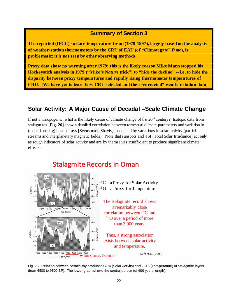
Solar Activity: A Major Cause of Decadal –Scale Climate Change
If not anthropogenic, what is the likely cause of climate change of the 20th
century? Isotopic data from
stalagmites [Fig. 26] show a detailed correlation between terrestrial climate parameters and variation in
(cloud-forming) cosmic rays [Svensmark, Shaviv], produced by variations in solar activity (particle
streams and interplanetary magnetic fields). Note that sunspots and TSI (Total Solar Irradiance) act only
as rough indicators of solar activity and are by themselves insufficient to produce significant climate
effects.
Stalagmite Records in Oman
14C – a Proxy for Solar Activity18O – a Proxy for Temperature
The stalagmite record shows
a remarkably close
correlation between 14C and 18O over a period of more
than 3,000 years.
Thus, a strong association
exists between solar activity
and temperature.
Neff et al. (2001)One Century Duration!
Fig. 26: Relation between cosmic-ray-produced C-14 (Solar Activity) and O-18 (Temperature) of stalagmite layers
(from 6500 to 9500 BP). The lower graph shows the central portion (of 400 years length).

23
A Historical Note
The discrepancy between a reported surface warming (from 1979 onward) and atmospheric trends in the
tropics has been evident for about 20 years. See, for example, Fig. 9 in the 1997 book Hot Talk, Cold
Science [Fig. 27]. Why was there no concerted critique of the surface data – even knowing about the
Urban Heat Island effect? The disparity between surface and atmospheric temperature trends was
investigated by experts in 2000 [see BOX] and in the CCSP-1.1 study (2006). Possible explanations: The
balloon-radiosonde data from the tropics may have been considered too sparse; the satellite-MSU data
were either ignored by IPCC or attacked as incorrect. The proxy data were either ignored or suppressed
by politically correct supporters of AGW. It seems that “Climategate” may have been the “dam-buster”
that finally made it possible to throw doubt on the reported surface warming trends.
Disparity between tropical sfc and atm trends, as already indicated by data in 1997
Fig. 27: [HTCS (1997) Fig. 9] Disparity between tropical surface and atmospheric trends, as already indicated by
data in 1997. Note: NH warming trend argues against any appreciable cooling by sulfate aerosols.
NAS-NRC Report [2000]: “Reconciling Observations of Global Temperature Change”
The NAS-NRC panel (chaired by Prof J M Wallace) failed to “reconcile” the disparity in temperature
trends between surface and troposphere --as measured by balloon-borne radiosondes and also by
independent Satellite Microwave Sounding Units (MSU). The simplest explanation would be to discard
the reported surface trends. Yet the panel preferred the opposite conclusion, disregarding also the “moist
adiabatic” adjustment to the lapse rate.
This panel report was followed six years later by the CCSP report SAP-1.1, which compared (in Chapter
5; BD Santer, lead author) tropical surface and atmospheric temperature trends with climate models (see
Fig.1 and 2) – and noted the obvious disparity. Interestingly, the Executive Summary of the CCSP report
(TMG Wigley, lead author) tried to overcome the results of Chapter 5 by focusing on a global comparison
and by using an inappropriate metric – “range” rather than “Standard Deviation” -- for the comparison.
For details, see Singer [E&E 2011] http://mult i-science.metapress.com/content/kv75274882804k98/fulltext.pdf

24
CONCLUSION• 1. The US-CCSP report shows major differences between
observed temp trends and those from GH models
• These disagreements are confirmed and extended by Douglass et al [in IJC 2007] and by NIPCC 2008
• Claims of “consistency’” between models and obs by Santer et al [in IJC 2008] are shown to be spurious
• 2. IPCC-4 climate models use an insufficient number of runs to overcome “chaotic uncertainty”
• 3. We find no evidence for the surface warming trend
claimed by IPCC-4 in support of AGW
• We conclude that current warming is mostly natural and that the human contribution is minor.
KEY REFERENCES
IPCC [1990; 1996; 2001; 2007] www.ipcc.ch/publications_and_data/publications_and_data_reports.shtml
NIPCC [2008; 2009] http://www.heartland.org/books/NIPCC.html
CCSP-SAP-1.1 [2006] www.climatescience.gov/Library/sap/sap1-1/finalreport/default.htm
Reconciling Observations [NRC-NAS 2000] www.nap.edu/catalog.php?record_id=9755#toc
DCPS: Douglass, Christy, Pearson, Singer [IJC 2007] www.sepp.org/science_papers/DCPS_IJC_final.pdf
Santer and coauthors [IJC 2008] https://www.llnl.gov/news/newsreleases/2008/NR-08-10-05-article.pdf
Singer [E&E 2011] http://multi-science.metapress.com/content/kv75274882804k98/fulltext.pdf
Chaotic models [2011] http://www.sepp.org/science_papers/Chaotic_Behavior_July_2011_Final.doc
HTCS (Hot Talk Cold Science) [Singer 1997] www.independent.org/publications/books/book_summary.asp?bookID=42
The Hockey Stick Illusion [Montford 2010] www.stacey-
international.co.uk/v1/site/product_rpt.asp?Catid=329&catname=Independent+Minds


![Nature, Not Human Activity, Rules the Climate A Report of NIPCC [Non-Governmental International Panel on Climate Change] Prof. S. Fred Singer University](https://img.pdfslide.net/doc/110x75/56649e7d5503460f94b7ff2d/nature-not-human-activity-rules-the-climate-a-report-of-nipcc-non-governmental.jpg)


![NIPCC vs. IPCC - SePP Home Page 2006 report of the US Climate Change Science Program CCSP-SAP-1.1 [2006]. And it is the And it is the central feature of the 2008 NIPCC summary report](https://img.pdfslide.net/doc/110x75/5b4c9e607f8b9afe4d8ba29e/nipcc-vs-ipcc-sepp-home-2006-report-of-the-us-climate-change-science-program.jpg)

![Le NIPCC contre l’IPCC (Le GIEC) - pensee-unique.fr Booklet_2011_FRENCH.pdf · 5 hPa Variations (K/dec ) (K/dec) Fig. 4: (C’est la figure 6 de Santer et al [IJC 2008]). Elle suggère](https://img.pdfslide.net/doc/110x75/5c1bbcb809d3f2870f8b96b0/le-nipcc-contre-lipcc-le-giec-pensee-booklet2011frenchpdf-5-hpa-variations.jpg)