Embed Size (px)
Citation preview
Philosophy of Science, 74 (April 2007) pp. 119–149. 0031-8248/2007/7402-0001$10.00Copyright 2007 by the Philosophy of Science Association. All rights reserved.
119
On the Reality (and Diversity) ofObjective Colors: How Color-QualiaSpace Is a Map of Reflectance-Profile
Space*
Paul Churchland†‡
How, if at all, does the internal structure of human phenomenological color space maponto the internal structure of objective reflectance-profile space, in such a fashion asto provide a useful and accurate representation of that objective feature space? Aprominent argument (due to Hardin, among others) proposes to eliminate colors asreal, objective properties of objects, on grounds that nothing in the external world (andespecially not surface-reflectance-profiles) answers to the well-known and quite deter-minate internal structure of human phenomenological color space. The present paperproposes a novel way to construe the objective space of possible reflectance profilesso that (1) its internal structure becomes evident, and (2) that structure’s homomor-phism with the internal structure of human phenomenological color space becomesobvious. The path is thus reopened to salvage the objective reality of colors, in thesame way that we preserved the objective reality of such features as temperature, pitch,and sourness—by identifying them with some objective feature recognized in modernphysical theory.
1. Introduction to the Problem. At least since Locke (1689, Book 2, Chap-ter viii),1 color scientists and philosophers have been inclined to deny any
*Received November 2004; revised September 2006.
†To contact the author, please write to: Department of Philosophy, University ofCalifornia at San Diego, 9500 Gilman Drive, La Jolla, CA 92093; e-mail:[email protected].
‡The central idea of this paper occurred to me while listening to a provocative talkon color given by Mohan Matthen during the Vancouver Conference on the Philosophyof Color, in October of 2003. My thanks for his inspiration. The paper also reflectswhat I have learned over the years, about color, from Larry Hardin, Kathleen Akins,and Martin Hahn. My thanks to them also.
1. For the analytic and exegetical case that Locke was indeed an eliminativist, ratherthan some sort of reductionist, about objective colors, see the thoughtful essay byRickless (1997). To be sure, Locke’s text admits of other interpretations.
120 PAUL CHURCHLAND
objective reality to the familiar ontology of perceivable colors, on groundsthat physical science has revealed to us that material objects have noqualitative features at their surfaces that genuinely resemble the qualitativefeatures of our subjective color experiences. Objective colors are thereforedismissed as being, at most, “a power in an object to produce in us anexperience with a certain qualitative character.” Accordingly, colorsproper are often demoted from being ‘primary properties’ (i.e., objectiveproperties of external physical objects) to the lesser status of being merely‘secondary properties’ (i.e., properties of our subjective experiences only).
To be sure, we are not logically forced to this eliminative conclusionby the failure of the first-order resemblances cited. A possible alternativeis simply to identify each of the familiar external, commonsense colorswith whatever “power within external objects” it is that tends to producethe relevant internal sensation. More specifically, we might try to identifyeach external color with a specific electromagnetic reflectance profile hadby any object that displays that color. The objective reality of colors wouldthen emerge as no more problematic than is the objective reality of thetemperature of a gas (which is identical to the mean kinetic energy of itsmolecules), or of the pitch of a sound (which is identical to the dominantoscillatory frequency of an atmospheric compression wave), or of thesourness of a spoonful of lemon juice (which is identical with the relativeconcentration of hydrogen ions in that liquid). These parallel propertiesalso fail the ‘first-order resemblance’ test imposed by Locke and otherEarly Modern thinkers. Nonetheless, their successful reduction to objec-tive properties of material objects is an accomplished fact, both of scienceand of settled history. Locke’s criterion for objective reality—a first-orderresemblance to the qualities of our sensations—was simply ill conceived.
On the more modern reductive approach displayed in these examples,color may turn out to be, by the standards of uninformed common sense,a somewhat surprising sort of feature, namely, a profile of reflectanceefficiencies across the visible part of the electromagnetic spectrum. Butthis is no more surprising than any of the other identities just cited. Andno more surprising, perhaps, than the identification of light itself withelectromagnetic waves. Such identities may surprise the scientifically un-informed, but they leave the objective reality of light, temperature, pitch,and sourness entirely intact.
Unfortunately, this happy (reductive) accommodation would seem tobe denied us in the case of colors in particular. For, it is often argued,there is no unique electromagnetic reflectance profile that corresponds to,and might thus be a candidate for identification with, each (or, indeed,any) of the familiar colors. On the contrary, to each of the familiar colorsthere corresponds an apparently unprincipled variety of decidedly differ-ent reflectance profiles. The scattered class of such diverse profiles, for
ON THE REALITY OF OBJECTIVE COLOR 121
each ‘objective’ color, is called the class of metamers for that color, andthey are indeed diverse, as the four profiles in Figure 1 illustrate.
Four distinct material objects, each boasting one of the four reflectanceprofiles here portrayed, will appear identically and indistinguishably yel-low to a normal human observer under normal illumination (e.g., in broaddaylight). And these four profiles are but a small sample of the wide rangeof quite distinct reflectance profiles that all have the same subjective effecton the human visual system. The fact is, our rather crude resources forprocessing chromatic information—namely, the three types of wavelength-sensitive cone cells and the three types of ‘color-opponency’ cells to whichthey ultimately project—are simply inadequate to distinguish betweenthese metamers. Any object boasting any one of them will look to be aqualitatively uniform yellow, at least under normal illumination.
These examples concern the color yellow, but a similar diversity of same-looking metamers attends every other color as well. If one had hopes fora smooth reduction of each of the commonsense colors to a uniquelycorresponding reflectance profile, those hopes are here frustrated: first, bya real diversity of reflectance profiles corresponding to each visually dis-tinguishable color; and second, by our apparent inability to characterizewhat unifies the relevant class of diverse reflectance profiles, appropriateto each visually distinguishable color, independently of appealing to thequalitative character of the visual sensations they happen to produce inthe idiosyncratic visual system of the human brain. If that is the only wayin which we can specify what unites the class of metamers specific to anycolor, then either we must resign ourselves to a deflationary relationalreconstrual (Cohen 2004) of what common sense plainly takes to be mo-nadic properties of material objects, or we must resign ourselves to theelimination of objective colors entirely, as Hardin (1993, 300, n. 2), co-herently enough, recommends.
2. Reformulating the Problem. That the apparently unprincipled diversityof metamers poses a genuine problem for a reductive account of objectivecolors can be seen from a second perspective, one of central importancefor understanding how the brain portrays the external world. A promisinggeneral approach to understanding how the brain—or any of its varioussubsystems—represents the external world posits the brain’s development,through learning, of a variety of (often high-dimensional) maps of theobjective similarity-structure of this, that, or the other objective feature-domain. Through extended experience with the relevant objective feature-domain, the relevant part of the brain can construct an internal map ofthat domain—of the range of possible faces, the range of possible voices,the range of possible reaching motions, the range of possible colors, andso forth. Such internal maps represent the lasting or fixed structure of

122 PAUL CHURCHLAND
Fig
ure
1.
ON THE REALITY OF OBJECTIVE COLOR 123
each external feature-domain, and they constitute the brain’s generalknowledge of the world’s objective structure, that is, of the entire rangeof possible features that the world might display at any given time andplace.
Once these conceptual resources are in place, the ongoing activity ofthe brain’s various sensory systems will produce fleeting activations atspecific locations within those acquired background maps, activations thatcode or index where, in the space of background possibilities compre-hended by the map, the creature’s current objective situation is located.For example, I am now looking at my wife’s face; I am listening to mywife’s voice; she is reaching for a coffee mug; and that coffee mug is white.In sum, I have a background conceptual framework—or, rather, an in-terconnected system of such frameworks—and my sensory systems keepme updated on which of the great many possibilities comprehended bythose frameworks are actualities here and now.
But the informational quality of such sensory indexings is profoundlydependent on the antecedent representational virtues of the backgroundframework in which they fleetingly occur. The basic virtue of such back-ground maps—as with any map—is a structural homomorphism betweenthe map-as-a-whole, on the one hand, and the entire feature-domain thatit attempts to portray, on the other. The family of proximity relationsthat configure the many map elements of the brain’s internal map2 musthave a relevant homomorphism with the family of similarity relations thatconfigure the many landmark features within the domain-to-be-portrayed.Such homomorphisms or second-order resemblances, on this view, are theessence of the brain’s representational achievements. One might call thisaccount “domain-portrayal semantics,” to contrast it with such familiardoctrines as indicator semantics or causal covariation semantics.
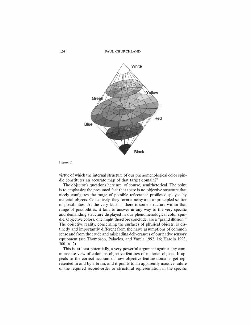
I will not pause, in this essay, to detail the many virtues of this unifiedapproach to how the brain represents the world’s general or backgroundcategorical structure, and how it represents the world’s local configurationhere and now.3 I sketch it here because it provides the background for apowerful contemporary objection to the reality of external colors in par-ticular. “How,” it may be asked, “does the peculiar and well-defined three-dimensional structure of the human phenomenological color space (seethe spindle-shaped solid in Figure 2) map onto the objective space ofpossible electromagnetic reflectance profiles displayed by material objects?What is the internal structure of that objective target feature-domain in
2. Those landmark map elements will be prototypical activation patterns across therelevant neuronal population.
3. Churchland (forthcoming) presents a broad account.
124 PAUL CHURCHLAND
Figure 2.
virtue of which the internal structure of our phenomenological color spin-dle constitutes an accurate map of that target domain?”
The objector’s questions here are, of course, semirhetorical. The pointis to emphasize the presumed fact that there is no objective structure thatnicely configures the range of possible reflectance profiles displayed bymaterial objects. Collectively, they form a noisy and unprincipled scatterof possibilities. At the very least, if there is some structure within thatrange of possibilities, it fails to answer in any way to the very specificand demanding structure displayed in our phenomenological color spin-dle. Objective colors, one might therefore conclude, are a “grand illusion.”The objective reality, concerning the surfaces of physical objects, is dis-tinctly and importantly different from the naıve assumptions of commonsense and from the crude and misleading deliverances of our native sensoryequipment (see Thompson, Palacios, and Varela 1992, 16; Hardin 1993,300, n. 2).
This is, at least potentially, a very powerful argument against any com-monsense view of colors as objective features of material objects. It ap-peals to the correct account of how objective feature-domains get rep-resented in and by a brain, and it points to an apparently massive failureof the required second-order or structural representation in the specific

ON THE REALITY OF OBJECTIVE COLOR 125
case at issue. The unreality of objective colors is the presumptiveconsequence.
Nonetheless, I shall presume to resist this argument, because I think itrests on a false premise. Despite a negative first impression, there is a wayto construe the initially opaque space of possible reflectance profiles sothat its structural homomorphism with human phenomenological spacebecomes immediately apparent. Accordingly, our color space does mapan objective reality after all, I shall argue, and thus the argument againstcolor realism evaporates.
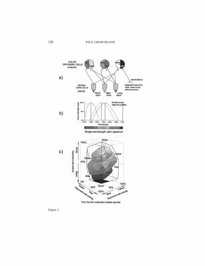
We understand one-half of this ‘mapping conundrum’—namely, ourphenomenological color space—quite well, both empirically and theoret-ically. The now-familiar Hurvich-Jameson opponent-process, neural-network model of human color coding provides a compelling reconstruc-tion of the empirical details of the spindle-shaped color solid of Figure2. Figure 3a portrays the connectivity of that network, and Figure 3bportrays the wavelength sensitivity profiles of the three types of inputcones. If one calculates the full range of possible activation patterns acrossthe three types of second-layer color-coding cells, given the details of thenetwork’s connectivity, that color-coding space turns out to have the shapeportrayed in Figure 3c. Evidently, it has the same dimensionality, shape,and representational organization of the empirical color spindle, whereinlies its claim to explain the organization of our phenomenological colorspace (for the details, see Churchland [2005]). This half of our problem—namely, the nature and ground of our internal map—is stable and moreor less settled. It is the nature of the external reality being mapped thatneeds to be importantly reconceived.
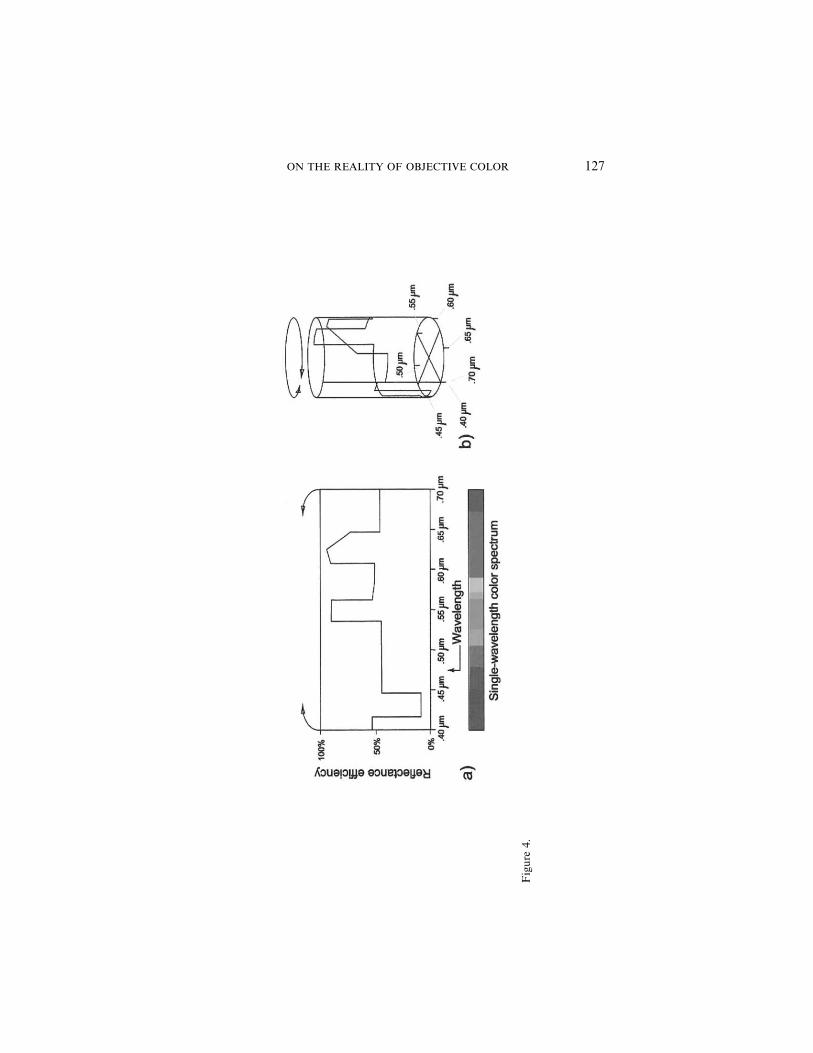
3. Reconfiguring the Space of Possible-Reflectance-Profiles. The conven-tional way of representing any given reflectance profile, located within thenarrow window of the visible spectrum (see Figure 4a), positively hidesan important feature of the range of possibilities therein comprehended.Perhaps the first hint of an alternative mode of representing those pos-sibilities arises from the fact that the phenomenological color that cor-responds to any narrowly monochromatic stimulus varies continuouslyacross the visible spectrum, but it tends toward the same color—as ithappens, a sort of deep purple/magenta—at each of the two oppositeextremes: .40 mm at the extreme left and .70 mm at the extreme right. Itdoesn’t quite get there in either case, for no single wavelength of lightwill produce a sensation in the purple/magenta range. To get that (strictlynonspectral) range of colors, you need simultaneous retinal stimulationsat two places in the visible spectrum, toward its left and right extremes,respectively. But purple/magenta remains the missing color toward whicheach extreme tends. (Everyone since Newton has acquiesced in his con-
126 PAUL CHURCHLAND
Figure 3.
ON THE REALITY OF OBJECTIVE COLOR 127
Fig
ure
4.
128 PAUL CHURCHLAND
structing a continuous ‘color wheel’ in which the nonspectral purples areinterposed to fill in the ‘similarity gap’ left open by the full range of single-wavelength stimuli.4) One’s sense of rightful symmetry might thereforesuggest that—as no more than an idle exercise, perhaps—one should pickup the planar figure in 4a and roll it into a cylinder so that its right-mostvertical edge makes a snug contact with its left-most vertical edge, as inFigure 4b. This converts the original planar space into a space that hasno boundaries in the horizontal direction. It has boundaries only at thetop and bottom of the space.
This trick turns the original reflectance profile itself, whatever its idi-osyncratic ups and downs, into a wraparound configuration that admitsof an optimal approximation by a suitable planar cut through the now-cylindrical space. The locus of any such planar cut through the cylinderwill always be an ellipse of some eccentricity or other (a circle in thelimiting case of a planar cut that is orthogonal to the cylinder), as por-trayed in Figure 5b.
The peculiar ellipse produced by a specific cut will be said to be anoptimal—or, as I shall say henceforth, a canonical—approximation of theoriginal or target reflectance profile when it meets the following two de-fining conditions:
1. The altitude of the ellipse must be such that the total area A abovethe canonical ellipse, but below the several upper reaches of thetarget reflectance profile, is equal to the total area B beneath thecanonical ellipse, but above the several lower reaches of the targetreflectance profile. (This condition guarantees that the total areaunder the target reflectance profile equals the total area under theapproximating ellipse.)
2. The angle by which the ellipse is tilted away from the horizontalplane, and the rotational or compass heading positions of its upperextreme, must be such as to minimize the magnitude of the two areasA and B. (This condition guarantees that the approximating ellipsefollows the gross shape of the target reflectance profile, at least tothe degree possible.)
A suitably situated, tilted, and rotated ellipse that meets these optimizingconditions, for a given reflectance profile, will be said to be the canonicalapproximation of that profile. Note that an indefinite variety of distinctreflectance profiles can share the very same ellipse as their canonical ap-proximation. That clustering population, I shall propose, constitutes the
4. See Hardin (1988, 115, Figure III-1) for a portrayal of exactly where that nonspectralcolor gap lies.

ON THE REALITY OF OBJECTIVE COLOR 129
Fig
ure
5.

130 PAUL CHURCHLAND
class of metamers for whatever ‘seen color’ is produced by an object witha reflectance profile that displays their shared canonical approximation.
Equally important, for each and every individual reflectance profile,however jagged, there is a unique canonical approximation. (This is aconsequence of sheer geometry and of the definition provided above.)Note also that the canonical approximation for a given profile is an ob-jective fact about that profile and about the material object that possessesthat profile. Its specification makes no reference to the human visualsystem nor to the nature of its phenomenological responses to anything.The canonical approximation for the reflectance profile of a given materialthing is an objective, mind-independent feature of that material thing. Wecan safely be realists about whether a given reflectance profile has a spec-ified ellipse as its canonical approximation (for short, its “CA-ellipse”),just as we can safely be realists about the reflectance profile therebyapproximated.
4. How the Human Visual System Tracks CA-Ellipses. Having identifiedsuch an objective, mind-independent feature of material objects, we mightbe tempted, straightaway, to identify any objective color with the canon-ical approximation of the relevant material object’s reflectance profile. Butthis is emphatically not my purpose. As will emerge, my aim is the morenarrowly focused aim of identifying colors proper with the original, fine-grained reflectance profiles themselves, and not with their canonical ap-proximations. But more of that in a moment. For the present, I wish topoint out that the changing activities of the human visual system—asexplored experimentally by generations of psychologists since Munsell,and as portrayed in the familiar Hurvich-Jameson network’s (Hurvich1981) theoretical reconstruction of our phenomenological color space(once again, see Figure 3c)—track the canonical approximations of thesundry reflectance profiles of various material objects very effectively in-deed. Let me illustrate, and let us begin by simply examining the globalstructure of a new space: the entire space of possible CA-ellipses.
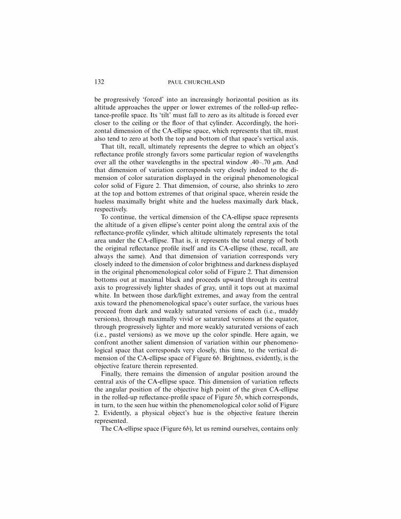
The first thing to appreciate is that the space of possible CA-ellipseshas three dimensions of variation: (1) the vertical position or altitude ofthe given ellipse’s center point within the reflectance-profile cylinder ofFigure 6a; (2) the degree to which that ellipse is tilted away from beingperfectly horizontal; and (3) the rotational position, around the cylinder,of that ellipse’s highest point. This three-space is clearly finite, and itboasts the global shape portrayed in Figure 6b.
Note well its spindle-like or football-like configuration. The horizontaldimension (orthogonal distance away from the vertical central axis)shrinks sharply to zero as the extreme top and bottom of the space areapproached. This reflects the fact that any CA-ellipse in Figure 6a will

ON THE REALITY OF OBJECTIVE COLOR 131
Fig
ure
6.
132 PAUL CHURCHLAND
be progressively ‘forced’ into an increasingly horizontal position as itsaltitude approaches the upper or lower extremes of the rolled-up reflec-tance-profile space. Its ‘tilt’ must fall to zero as its altitude is forced evercloser to the ceiling or the floor of that cylinder. Accordingly, the hori-zontal dimension of the CA-ellipse space, which represents that tilt, mustalso tend to zero at both the top and bottom of that space’s vertical axis.
That tilt, recall, ultimately represents the degree to which an object’sreflectance profile strongly favors some particular region of wavelengthsover all the other wavelengths in the spectral window .40–.70 mm. Andthat dimension of variation corresponds very closely indeed to the di-mension of color saturation displayed in the original phenomenologicalcolor solid of Figure 2. That dimension, of course, also shrinks to zeroat the top and bottom extremes of that original space, wherein reside thehueless maximally bright white and the hueless maximally dark black,respectively.
To continue, the vertical dimension of the CA-ellipse space representsthe altitude of a given ellipse’s center point along the central axis of thereflectance-profile cylinder, which altitude ultimately represents the totalarea under the CA-ellipse. That is, it represents the total energy of boththe original reflectance profile itself and its CA-ellipse (these, recall, arealways the same). And that dimension of variation corresponds veryclosely indeed to the dimension of color brightness and darkness displayedin the original phenomenological color solid of Figure 2. That dimensionbottoms out at maximal black and proceeds upward through its centralaxis to progressively lighter shades of gray, until it tops out at maximalwhite. In between those dark/light extremes, and away from the centralaxis toward the phenomenological space’s outer surface, the various huesproceed from dark and weakly saturated versions of each (i.e., muddyversions), through maximally vivid or saturated versions at the equator,through progressively lighter and more weakly saturated versions of each(i.e., pastel versions) as we move up the color spindle. Here again, weconfront another salient dimension of variation within our phenomeno-logical space that corresponds very closely, this time, to the vertical di-mension of the CA-ellipse space of Figure 6b. Brightness, evidently, is theobjective feature therein represented.
Finally, there remains the dimension of angular position around thecentral axis of the CA-ellipse space. This dimension of variation reflectsthe angular position of the objective high point of the given CA-ellipsein the rolled-up reflectance-profile space of Figure 5b, which corresponds,in turn, to the seen hue within the phenomenological color solid of Figure2. Evidently, a physical object’s hue is the objective feature thereinrepresented.
The CA-ellipse space (Figure 6b), let us remind ourselves, contains only

ON THE REALITY OF OBJECTIVE COLOR 133
points. (It is the rolled-up reflectance-profile space that contains the jaggedprofiles themselves and the wobbling ellipses that variously approximatethem.) But that CA-ellipse space displays, immediately, exactly three di-mensions, each one of which corresponds to a salient dimension of ourantecedently appreciated subjective phenomenological color space, whichalso has three dimensions. Moreover, each of these two spaces displaysthe same global shape: something close to a spindle or a football. Ad-ditionally, both spaces code the brightest objects at the upper tip of theirspindles and the darkest objects at the very bottom. Finally, both spacescode for the very same hues in their corresponding equatorial positions,in the same sequence as we proceed around that equator. Altogether, theinternal structure of our subjective phenomenological color space providesan unexpectedly accurate map of the internal structure of the entirelyobjective CA-ellipse space.
Exactly how accurate is it? Topographically speaking, it is the answerto a color realist’s prayer. It has three dimensions, exactly two of whichpresent themselves in polar coordinates. It has the same global shape.And apparently it has all the same betweenness relations. But how ac-curate is it metrically?
It is very good, but not perfect. First, our phenomenological map ismetrically deformed, somewhat, in the green/yellow/orange/red region,where the human L-cone sensitivity curve and the M-cone sensitivity curvesubstantially overlap each other (see again Figure 3b). This idiosyncraticfeature of the human visual system for detecting color samenesses anddifferences makes us slightly hyperacute in that region. Because of thisoverlap, our color-processing system is here more sensitive to smallchanges in the dominant incident wavelength than it is to wavelengthchanges elsewhere in the optical window: in the short-wavelength or blueregion, for example. The result is that the system counts smallish wave-length changes in the green through red region as equal in magnitude tosomewhat larger increments of wavelength change elsewhere. You can seethis metrical deformation directly by looking at the familiar rainbow-likecolor bars underneath Figures 1a–1d. Those bars mark off equal incre-ments of wavelength, but the ‘seen colors’ that correspond to them changeonly slowly in the blue region to the left, but rather more quickly in thegreen to red region toward the right.
Metrical deformations of some kind are a familiar feature of real-worldmaps. Think of the early-modern maritime maps made of the Americas.These were fairly accurate in the vertical direction, since the map-makingship’s latitude was easily reckoned by the maximum nighttime altitude,above the horizon, of familiar stars. But they were notably inaccurate intheir horizontal dimension, since the earliest expeditions had no accurateclocks, and thus no surefire way of determining their east-west or longitude

134 PAUL CHURCHLAND
position as they made charts of their target coastlines. The western coastof North America, for example, was occasionally misportrayed as tiltingalmost 45� to the left of its actual profile, all the way up to VancouverIsland. Their inaccuracies aside, those maps were still maps. A moreexaggerated example of metrical deformation is that displayed in anyMercator projection of the earth’s surface, such as still grace the walls ofevery grade school classroom in America. As one approaches the northernand southern extremes of such maps, their metrical (mis)representationof east-west distances grows to absurd proportions. These gross metricalfailings notwithstanding, the Mercator projection of the earth’s surfaceremains a paradigm example of a map, and a very useful one at that.Overall, and metrically speaking, our color map is much more accuratethan a Mercator map of the earth.
Second, and as is to be expected, our internal phenomenological mapshows a nontrivial metrical deformation—this time in the vertical orbrightness dimension—in the areas toward the extreme left and the ex-treme right of the optical window portrayed in Figure 1, for this is wherethe absolute sensitivity of our S-cones and our L-cones falls to zero.5 Aswith measuring instruments generally, the accuracy of our color-process-ing system plunges swiftly as one tracks its performance at the extremelimits of its proprietary range of sensitivity. Specifically, reflectance profileswith a substantial but isolated spike hard against either end of the .40–.70 mm window will get (mis)represented as being essentially hueless andas being much darker than they objectively are. In these narrow regionsthe visual system fails to track accurately the objective tilt and altitudeof a profile’s CA-ellipse, at least if the relevant ellipse owes its proprietaryconfiguration to a large reflectance spike confined to that insensitive re-gion. Such residual representational failures are inevitable. They representgenuine, if minor, defects in the human visual system for representingobjective color, but they do not represent any defect in the claim that thehuman visual system does represent objective CA-ellipses. For it remainstrue that, these minor defects aside, the phenomenological space in whichour visual system codes its measurements plainly does constitute a rec-ognizable map of the space of CA-ellipses for objective reflectance profiles.
Moreover, and as if to make amends for its representational failuresat, or very close to, the atypical .40–.70 mm boundary of the rolled-up
5. My thanks to an anonymous referee for forcing my attention toward this particularimperfection in the human visual system’s capacity to track similarities and differencesamong CA-ellipses. Its misrepresentations here are fairly minor and highly localized,however, especially compared to those embodied in a Mercator projection, and theydo nothing to undermine the claim that our phenomenal space is a moderately faithfulmap of CA-ellipse space as a whole.
ON THE REALITY OF OBJECTIVE COLOR 135
reflectance-profile space of Figure 4b, the human visual system does indeedmake effective discriminations of the actual configuration of CA-ellipseswhose high point lies anywhere close to that problematic boundary if,but only if, the reflectance profiles thereby approximated possess the bulkof their energies at two distinct wavelength spikes at some distance oneither side of that discriminational ‘dead point’. In fact, it is preciselysuch two-headed profiles that get coded, by the human visual system, withthe familiar (but appropriately nonspectral) purples!
This idiosyncratic feature of human color coding has been familiar tocolor scientists for many years (see again Hardin 1988, 115, Figure III-1). The CA-ellipse story of what it is that our visual system is coding foraccounts for this wrinkle very nicely. The fact is, it takes a reflectanceprofile containing two substantial energy peaks straddling that .40–.70mm dead point at some distance on either side (and little or no energyelsewhere in the spectral window) to make our visual system respond witha magnitude approaching its responses to CA-ellipses generally. This ex-plains why maximally saturated purples are always so dark, relative tothe saturated versions of all the other colors. A maximally saturated purplerequires a maximally tilted CA-ellipse whose high point is located at thedead point boundary here under discussion. But that high point is doomedto be misrepresented, by the visual system, as being lower than it reallyis, for the more we concentrate the incident reflectance profile’s two energypeaks toward the dead point, the feebler the visual system’s response. Onthe coding story here proposed, therefore, a maximally saturated purpleis thus doomed to seem somewhat darker than any of the other saturatedcolors, at least to humans. And so it is.
All told, the structure of phenomenological space corresponds quitenicely to the structure of an antecedent space of specifiable objectivefeatures after all, namely, the space of possible CA-ellipses. As long aswe portrayed reflectance profiles as so many lines meandering across aflat and everywhere-bounded two-dimensional space, the manner in whichthey cluster into objective similarity classes was almost certain to remainopaque. But once we roll that space into a horizontally unbounded tube,such matters become much easier to see. My central proposal, therefore,is that the objective physical feature that unites all of the reflectance-profile metamers6 for any seen ‘commonsense’ color is the peculiar CA-ellipse that they all share as their best approximation. And our phenom-
6. Well, almost all. Recall once more that the human visual system tracks CA-ellipsesincreasingly poorly for reflectance profiles that display significant amounts of theirenergy in the narrow region of the ‘dead spot’, where .40 mm abuts .70 mm, as notedthree paragraphs ago. This isolated failing can lead to (rare) profile pairs that sharethe same objective CA-ellipse yet look slightly different to us.

136 PAUL CHURCHLAND
enological color space maps the range of possible CA-ellipses veryfaithfully indeed, dimension for dimension, and internal location for in-ternal location.
To see this directly, simply compare the space of possible CA-ellipsesportrayed in Figure 6b with the long-familiar space of possible colorsensations portrayed in Figure 2 (and also with the space of neuronalcoding triplets portrayed in Figure 3c). Evidently, the differences are mi-nor. First, the equator of the CA-ellipse space is not tilted up towardyellow, as is the equator of color-sensation space. This reflects, once again,the fact that the sensitivity curves of our three kinds of cone receptorsare nonuniformly distributed across the human spectral window: theL- and M-cone curves overlap substantially. A saturated-yellow sensation(which requires a near-maximal external stimulation of both L- andM-cones) will therefore seem brighter than any other saturated-color sen-sation. And second, the CA-ellipse space is plainly ‘bulgy’ or more egg-shaped than the phenomenological spindle, as drawn in Figure 2. Figure2 reflects the textbook orthodoxy of representing phenomenological colorspace as a double-coned spindle. But that portrayal is only a graphicalconvenience. Phenomenological color space, too, is more ‘bulgy’ than isconventionally portrayed in Figure 2, as has been known since Munsellfirst sought to portray it over a century ago. A more accurate portrayalwould have it bulging outward somewhat, toward its top and bottom,which would bring its global structure even closer to the space of CA-ellipses portrayed in Figure 5a. Finally, a mathematical reconstruction ofthe shape of the human color solid, based on the Hurvich-Jameson modelnetwork mentioned earlier (see again Figure 3c), also yields a space thatis like the double-coned spindle of Figure 2, but is rather bulgier towardthe top and bottom extremes.7
In all, our internal phenomenological color space is evidently a system-atic homolog of the space of objective CA-ellipses. It is a reliable map ofthe global structure of that external feature space. Moreover, our ephem-eral sensory indexings within that background map (i.e., our fleeting colorsensations themselves) are moderately accurate indications of which CA-ellipse we might be confronting at any given moment. Finally, and mostimportantly, those CA-ellipses evidently constitute the resolution limitwith which the human visual system can access the objective and oftenjagged reflectance profiles of objects. That resolution limit is fairly coarse,to be sure, but there is something objective that is being reliably, if ratherfuzzily, resolved: reflectance profiles across the entire spectral window. Wecall them colors.
7. For the details of its derivation, see Churchland (2005).
ON THE REALITY OF OBJECTIVE COLOR 137
I should mention that the story just outlined is not the first attempt tofind systematic similarities between the structure of our phenomenologicalcolor space and the structure of objective or physical color space. In arecent paper, L. D. Griffin (2001) finds some notable similarities betweenthe several ‘symmetry axes’ of the color spindle of Figure 2 and the‘symmetry axes’ displayed in the less familiar CIE space (CommissionInternationale de l’Eclairage) for objective colors widely used in the light-ing industry. I believe that the parallels he finds are entirely genuine, ifless comprehensive than the systematic structural isomorphism discoveredon the present analysis. My only criticism is that he has chosen, as hisrepresentational target, the wrong space for objective color. The CIE spaceis a space for representing and analyzing illuminants, not reflectance pro-files. It is a space for predicting the seen color that will result from mixinglight at three utterly specific and canonical wavelengths, those corre-sponding to the focal l sensitivities of the human S-, M-, and L-cones.It is a perfectly good and useful space, but it does not address the realityof the objective colors of the vast majority of objects in our terrestrialenvironment, which are almost exclusively reflectance colors, not self-luminous colors. Moreover, it fails to represent the all-important dimen-sion of objective lightness and darkness captured by the space of possibleCA-ellipses, as portrayed in Figure 6b. The CIE space has no room forblack, for example, or for any of the darkish colors in the neighborhoodof black. (The range of colors it comprehends corresponds most closelyto a single horizontal cut through the equator of CA-ellipse space, a planeof constant brightness.) Nonetheless, Griffin’s psychological/physical par-allels are entirely welcome, for the colors of self-luminous bodies are asobjectively real as the more common reflectance colors. (More on self-luminous colors below, in Section 8.)
5. Some Specific Tests. That the space of color sensation tracks (fairlyclosely) the space of CA-ellipses is quite evident. But it is still a hy-pothesis—if a plausible one—that what unites the (uniform-illumination)metamers for any given humanly perceivable color is the CA-ellipse thatthey severally share. (It is initially plausible because the coarse-grainedresources of the human visual system typically cannot tell the differencebetween a given profile and its canonical approximation.) But let usquickly test the hypothesis against two salient examples of real metamericpairs, one drawn from Hardin (1988, 47) and one drawn from Fraser etal. (2003, 30). The first example appears in Figure 7.
These two reflectance profiles are metameric pairs, according to Hardin,despite their evident differences. How do they compare with regard totheir respective CA-ellipses? To answer this question, I traced each ofthese profiles onto a separate transparency and rolled each into a cylinder.

138 PAUL CHURCHLAND
Figure 7.
I then probed each profile (separately) with another rotatable cylinder slidinside it, a cylinder graduated with ellipses of varying tilt angles, until a‘closest match’ was achieved, according to the criteria set out at the endof Section 3. (The relevant areas were measured by integrating over asubstantial number of narrow, vertically oriented rectangles.) This yieldeda unique CA-ellipse for each profile. The CA-ellipse for the double-peakedprofile has a peak at a rotational position mm, a heightR p .52 H p
, and a tilt angle of maximum. The CA-ellipse for the single-14% T p 17%peaked profile has a peak at a rotational angle mm, a heightR p .535
, and a tilt angle of maximum.H p 13% T p 16%The difference between these two CA-ellipses is , ,DR p 5% DH p 1%
and . This difference is marginal, and both CA profiles (withDT p 1%peaks very close to .53 mm) will present as a dull and quite dark green—barely distinguishable, if they are distinguishable at all.
The next pair of metameric profiles also present to us as green, thougha somewhat brighter and more saturated green than in the precedingexample. The taller of these two profiles (Figure 8) was probed in themanner described above and proves to have a CA-ellipse of mm,R p .53
, and of maximum. The second profile has a CA-H p 33% T p 33%ellipse of mm, , and of maximum.R p .53 H p 29% T p 35%
The difference between them is , , and .DR p 0% DH p 4% DT p 2%Once again, the differences are marginal—at or close to the limits ofhuman discrimination.
Given the systematic match already noted between our phenomeno-

ON THE REALITY OF OBJECTIVE COLOR 139
Figure 8.
logical color space (Figure 2) and CA-ellipse space (Figure 6b), thesesingular matches should come as no surprise. But it is salutary to checkout the hypothesis (that the class of same-seeming metamers for humanscorresponds very closely to the class of reflectance profiles that share thesame CA-ellipse) against independent data.
6. An Important Objection. There remains a possible objection to myclaim that our phenomenological color space is a (fairly high-resolution)map of CA-ellipse space and thus is a (rather low-resolution) map of therange of objective reflectance profiles. Hardin complains that our phe-nomenological color space displays an inescapable contrast between ‘un-mixed’ colors (such as red or blue) and ‘mixed’ colors (such as orange orpurple), a contrast that is completely absent in both the CA-ellipse spaceand in the objective space of possible reflectance profiles. How then canwe identify colors with the latter?
Let us agree, at least for the sake of argument, that both parts ofHardin’s claim are correct. This situation does nothing to undermine theclaim that our phenomenological color space accurately maps the spaceof possible CA-ellipses, for the structure of the latter is plainly reflected,

140 PAUL CHURCHLAND
dimension for dimension, in the structure of the former. Hardin’s anti-realist argument here has got the ‘onus of match’ exactly backward. It isnot incumbent on the domain portrayed to have every feature displayedby its portraying map: maps can display all sorts of features that areincidental to their role as effective maps (a common street map crumpleseasily and weighs about an ounce, e.g., in dramatic contrast to the urbandomain that it portrays). The contrast between mixed and unmixed phe-nomenal colors is just such an incidental feature—an artifact, presumably,of the opponent process architecture of our color system.8
What is required is that the relevant structure of the objective reality(namely, the three dimensions of variation for a CA-ellipse, as portrayedin Figure 6b) finds itself reflected in some structural features of the mapthat purports to portray that objective reality (namely, our phenomeno-logical color spindle, as portrayed in Figure 2). In the present case, thatrequirement is plainly met. That the map might have other features thathappen not to correspond to external structures is irrelevant.
My critique of Hardin’s eliminativist position can perhaps be clarifiedwith the following parallel, drawn from another modality. The humannervous system responds to temperature with two anatomically distincttypes of receptor neurons: one for registering temperatures above theskin’s temperature and another for registering temperatures below it. Thefirst system produces a range of increasingly intense sensations all of whichare similar to one another, and so does the second. But the family ofsensations for warmth, on the one hand, and the family for coldness, onthe other, are qualitatively quite distinct from each other. (No surprise,given that they arise from anatomically and physiologically distinctsystems.)
Now, are we going to deny that objective temperature is identical withmean molecular kinetic energy on grounds that the objective scale ofmolecular kinetic energies embodies no such objective qualitative dis-tinction between the regions above and below human skin temperature?Of course not. Nor should we hesitate, for similar (bad) reasons, to identifyobjective colors with reflectance profiles, on grounds that there is nothingin the domain of reflectance profiles that answers to phenomenologicaldistinction between ‘pure’ and ‘mixed’ colors.
7. What, after All, Are Colors? Even so, it remains to discuss exactly howour familiar objective colors should be fit into this emerging framework.Simply identifying the familiar range of colors with the evident range ofCA-ellipses is a very poor option, since only a negligible proportion of
8. See again the Hurvich-Jameson color-processing network of Figure 11.3a in Hurvich(1981).
ON THE REALITY OF OBJECTIVE COLOR 141
material objects have a reflectance profile that is actually identical withthe platonic perfection of a CA-ellipse. Any CA-ellipse, of course, projectsback onto the original reflectance-profile space as a perfectly smooth, one-cycle sine wave of some altitude, amplitude, and left/right location withinthat space (see again Figure 5). But most objects will have a much noisierreflectance profile than a perfect one-cycle sine wave: the meanderingmetamers still dominate the reflectance profiles we actually encounter inthe real world. Accordingly, identifying the various colors with the variousreflectance profiles displayed by perfect CA-ellipses would have the con-sequence that almost nothing in the world is colored.
A much better option is to identify the full range of objective colorswith the full range of objective reflectance profiles—both the relativelyrare perfect CA-ellipses and the multitude of metameric profiles that sev-erally cluster around them—and then acknowledge that we humans areable, with our native visual equipment, to perceive and discriminate thosehighly various reflectance profiles only at a rather low level of resolution.As we noted above, the CA-ellipse constitutes the limit of resolution atwhich humans can discriminate sameness and differences between objec-tive reflectance profiles. In particular, we are typically unable to discrim-inate between any of the many metameric reflectance profiles that sharethe same ellipse as their canonical approximation. These mutually clus-tered metameric profiles will typically present themselves, to the casualhuman eye, as the same color, despite the residual but real differencesbetween them.
This situation, however, is entirely unremarkable. The human auditorysystem, to take a related example, is skilled at recognizing and discrim-inating power-spectrum profiles within the acoustic spectrum. We are goodat recognizing and discriminating the distinct voices of people familiar tous, the distinct voices of the various types of musical instruments, birds,animals, and so forth. No one will deny that distinct types of sounds areidentical with distinct power-spectrum profiles displayed in a propagatingwave train, and no one will deny that our auditory skills reside in thecochlea’s ability to respond to those various profiles in an appropriatelydiscriminatory fashion.
And yet, our cochlea has a resolution limit as well. Clustered aroundthe distinctive power-spectrum profile of a typical oboe’s middle A lies amultitude of possible “acoustic metamers,” all of them different from oneanother in ways that lie beneath the capacity of my cochlea to resolve.Despite their differences, they will all sound the same to me. And so alsofor any other familiar sort of sound. At a certain point, and inevitably,our discriminatory powers simply run out. Such acoustic metamers forfamiliar sounds are as real, and as inevitable, as the electromagnetic meta-mers for familiar colors.
142 PAUL CHURCHLAND
But these undoubted facts about acoustic reality provide no groundsfor irrealism or eliminativism about our commonsense ontology of sounds.Nor do the parallel facts, concerning electromagnetic metamers, providegrounds for irrealism or eliminativism about colors. Indeed, the ontolog-ical advantage, if any, should lie with colors. Sounds are ephemeral: abird, a musical instrument, or an animal emits a sound only occasionally,and the sound fades (as ) to nothing as it promptly flees its point of21/rorigin. By contrast, a material body’s electromagnetic reflectance profileis a quasi-permanent and stable property of that material body. It willchange only if the molecular structure of the body’s surface is modifiedin some way.
The stable solution then, to which we are thus attracted, is that theobjective color of an object is identical with the electromagnetic reflectanceprofile of that object, within the window .40–.70 mm. Our native abilityto recognize and discriminate such profiles is limited to recognizing anddiscriminating the altitude, tilt, and rotation angle of the CA-ellipse thatapproximates any given reflectance profile. But this native ability still givesus a highly reliable grip on an often-telling dimension of objective reality.
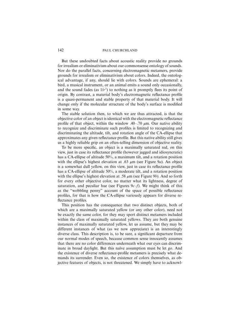
To be more specific, an object is a maximally saturated red, on thisview, just in case its reflectance profile (however jagged and idiosyncratic)has a CA-ellipse of altitude 50%, a maximum tilt, and a rotation positionwith the ellipse’s highest elevation at .63 mm (see Figure 9a). An objectis a somewhat dull yellow, on this view, just in case its reflectance profilehas a CA-ellipse of altitude 50%, a moderate tilt, and a rotation positionwith the ellipse’s highest elevation at .58 mm (see Figure 9b). And so forthfor every other objective color, no matter what its lightness, degree ofsaturation, and peculiar hue (see Figures 9c–f). We might think of thisas the “wobbling penny” account of the space of possible reflectanceprofiles, for that is how the CA-ellipse variously appears for diverse re-flectance profiles.
This position has the consequence that two distinct objects, both ofwhich are a maximally saturated yellow (or any other color), need notbe exactly the same color, for they may sport distinct metamers includedwithin the class of maximally saturated yellows. They are both genuineinstances of maximally saturated yellow, let us assume, but they may bedifferent instances of what (as we now appreciate) is an interestinglydiverse class. This description is, to be sure, a significant departure fromour normal modes of speech, because common sense innocently assumesthat there are no color differences underneath what our eyes can discrim-inate in broad daylight. But this naıve assumption must be let go. Andthe existence of diverse reflectance-profile metamers is precisely what de-mands its surrender. Even so, the existence of colors themselves, as ob-jective features of objects, is not threatened. We simply have to acknowl-
ON THE REALITY OF OBJECTIVE COLOR 143
Fig
ure
9.

144 PAUL CHURCHLAND
edge that there is slightly more to color than “meets the human eye,”even under the optimal conditions of broad daylight.
It is interesting that hidden diversity and sameness of objective colorsare not entirely inaccessible to the human visual system. A simple trickwill make such matters visually available, even to one who is color-blind.Given two shirt buttons, of apparently the same yellow color to normalvision, one can determine whether (1) they are exactly the same color (i.e.,have identical reflectance profiles) or (2) merely have distinct metamericvariants on a general yellow theme. We can do this by running bothbuttons, side by side, through the gauntlet of a rainbow projected on awall. If we project a beam of sunlight through a prism in an otherwisedarkened room, we will produce a fan of distinct monochromatic wave-lengths to serve as diagnostic probes of each button’s reflectance at anygiven wavelength of light. If the two buttons do share identical reflectanceprofiles, then their joint appearance to the human eye will vary, of course,as they are marched through the fan of distinct diagnostic illuminants.But at each position against the fan they will always display the sameappearance as each other. By contrast, if the buttons have distinct meta-meric variants on yellow, then at one or more points in their joint journeyacross the rainbow they will appear different from one another.They must.That they have distinct reflectance profiles entails that they will displaydifferential reflectance behavior at some one or more points within thevisible spectrum. Even a color-blind person will detect such discrepanciesin their objective reflectance behaviors, since they will still present them-selves, to him, as visible differences in apparent grayscale brightness. Inthis way the “hidden” color metamers are made visible, even to peoplewho are color-blind.
Collateral or background information can also be a reliable guide tojudging whether two same-seeming objects really have identical reflectanceprofiles or merely share the same ellipse as their canonical approximation.If one is viewing two visually identical dark-red cherries or two visuallyidentical yellow bananas, for example, one can be confident that the twocherries have genuinely identical reflectance profiles, and so also for thetwo bananas. For one can be independently confident that the two ripecherries have identical molecular constitutions at their surfaces, and soalso for the two ripe bananas. Such identity in molecular constitutionphysically guarantees identity in their reflectance profiles. However, whenbackground information suggests a quite different molecular constitutionfor two same-seeming objects—as with a purple plum and a patch ofpurple paint—the distinct-metamers hypothesis will have a better claimon the situation.
8. The Diversity of Objective Colors. It remains to highlight the contrast
ON THE REALITY OF OBJECTIVE COLOR 145
between the familiar reflectance colors, as characterized in the precedingpages, and the less common emittance or self-luminous colors, as dis-played in a fire, a star, an incandescent bulb, or an LED (light-emittingdiode). The former is a matter of what profile of light an object reflects;the latter is a matter of what profile of light an object emits. Whatevercommon sense might think, these are entirely distinct properties. One andthe same object can simultaneously possess incompatible ‘colors’ of eachkind, as when a stove top heating element veridically presents its familiarreflectance color—a dark charcoal gray—when the kitchen lights are on;but when the lights are switched off and the room is plunged into darkness,the element reveals its self-luminous or emittance color of dull red (therelevant dial on the stove’s control panel was set at “low” all along).Though we could not see its self-luminous color in the first condition—because the intensity of the reflected light swamped the comparativelyfaint emitted light—the darkened condition allows that self-luminouscolor to become visible.
Self-luminous colors were an extremely rare occurrence in the evolu-tionary environment that gave birth to our current color vision. Only thesun, the stars, the occasional firefly, and the occasional forest fire everdisplayed a self-luminous color. Accordingly, and apart from the characterof solar radiation as a background illuminant, the self-luminous colorsmust have played a negligible role in the evolutionary selection of theenabling mechanisms for human color vision. In modern society, of course,the self-luminous colors have become commonplace. And in fact, wheremetamers are concerned, the self-luminous colors are somewhat betterbehaved than the reflective colors. The colors of a thermally incandescentobject almost always present a smoothly varying emittance profile, whosepeak magnitude is tightly tied to the object’s absolute temperature. Andthe self-luminous color of an object engaged in spectral emission (i.e., inphoton emission from electron-shell transitions) is almost always a matterof one or more narrow spikes of monochromatic light (as from an LEDor a sodium street lamp), which color is a reliable guide to the object’speculiar atomic constitution. Metamers are entirely possible here, as else-where, but in fact they are much less common for self-luminous colorsthan for reflectance colors.
The objective space for self-luminous colors (in the window .40–.70 mm)is slightly but importantly different from the objective space for reflectancecolors. In particular, the vertical dimension of the relevant cylinder rep-resents, not reflective efficiency (which tops out at 100%), but emissionintensity, which has no upper limit. Nonetheless, our native representa-tional space (specifically, the color-coding neuronal activation space ofFigure 3c) does its best to represent this relatively new range of possibleemittance profiles, using its existing resources of brightness, saturation,

146 PAUL CHURCHLAND
and hue. But here it encounters an anomalous situation, in that the bright-ness levels of typical self-luminous objects are much too high to be ac-counted for in terms of a 100% reflectance efficiency across the spectrum(i.e., as originating from a maximally reflective white object), and theyoften display a vivid hue (i.e., a nonwhite color) in any case. The humanvisual system responds by coding such anomalous (i.e., self-luminous)inputs at an appropriate place on the ceiling of our opponent-cell acti-vation space, but outside the point-like apex of the spindle-shaped volumethat confines all the representation points for the less dramatic reflectancecolors (see Figure 3c).
These ceiling positions are “impossible” positions, as far as the reflec-tance colors are concerned. (No reflectance color can be as bright as thebrightest possible white and yet be something other than white.) But bythat very fact, those unusual ceiling positions serve as reliable diagnosticpositions, in our preexisting neuronal activation space, to indicate thepresence of a self-luminous object and to indicate its peculiar hue andsaturation. An information-processing system that was shaped by evo-lution to recognize and discriminate one kind of color turns out to beable to recognize and discriminate a second kind of color as well, and todo so in a manner that can sharply distinguish both.
Precisely because they are typically coded, by the visual system, outsidethe normal phenomenological color spindle, the self-luminous colors typ-ically stand out like beacons against the darkness.9 Their typical repre-sentational space is the two-dimensional ceiling of the opponent-cell ac-tivation space. Save for a single point at its center, this space is entirelydistinct from the three-dimensional volume of the familiar spindle-shapedsolid for representing the reflectance colors. But it, too, maps moderatelywell onto the objective range of its proprietary properties, namely, thevarious emittance profiles displayed by self-luminous bodies. (Exactly howthe visual system discriminates between the different brightness levels ofthe self-luminous colors—note that the ceiling of the opponent-cell spacehas only two dimensions—is a matter still unclear on the present account.But I shall leave its pursuit for another occasion.)
I conclude that there are at least two quite distinct kinds of objectivelyreal colors, the reflectance colors and the self-luminous colors. The ob-jective structure of each domain of properties becomes evident if one rollsthe window of the visible spectrum into an abstract cylinder and thenexamines the space of possible planar cuts through that cylinder, as pro-
9. Evidently, there is plenty of room, inside the human activation space for color-coding neurons, for coding vectors that lie outside the confines of the familiar colorspindle (see again Figure 2). These rogue coding vectors—representing “impossible”colors—are explored at length in Churchland (2005).
ON THE REALITY OF OBJECTIVE COLOR 147
viding the best approximation of the fine-grained details of the possiblynoisy power spectrum profile currently portrayed around its surface. Forreflectance colors, the space of possible planar cuts (i.e., the space ofpossible CA-ellipses) is homomorphic with the spindle-shaped solid ofour phenomenological space. And for the more ostentatious self-luminouscolors, the space of their possible hues and saturations is homomorphicwith the space of possible activations within the otherwise unused two-dimensional ceiling of the opponent-cell activation space (see again Figure3c). The colors, of both kinds, are thus entirely real and are as objectiveas you please. We can see them both, for in most cases we can recognizeand discriminate both reflectance profiles and emittance profiles, and dis-criminate the one from the other. The only disappointment here is bothnegligible and inevitable: some of the fine-grained structure of both kindsof profiles lies beneath the resolution of our native visual system. But thisis no argument for irrealism about those profiles (of course), nor is it anargument for irrealism about colors. For that is precisely what the twokinds of colors are: reflectance profiles and emittance profiles, respectively.
9. Comparison with a Related View. The account of objective colors de-fended above shares many of the same motivations and some of thepositive substance of the realist account of colors recently urged by Byrneand Hilbert (2003). But some important differences stand out, and I willclose by bringing several of them to your attention. First, and perhapsleast, those authors propose a new notion of a ‘determinate color’ (e.g.,‘determinate red’) whose extension is exactly the set of metameric reflec-tance profiles between which the human visual system is unable to dis-tinguish. By contrast, I propose to identify distinct colors with distinctreflectance profiles and then embrace the consequence that the humanvisual system cannot distinguish all color differences, since it cannot dis-tinguish all reflectance profile differences. We see color similarities anddifferences only down to the resolution limit defined by the range ofpossible CA-ellipses. There are color similarities and differences beneathwhat we can detect just by looking. Our existing color vocabulary, there-fore, comprehends only a coarse partitioning of the objective reality. Nev-ertheless, that partitioning is still objective in character and is highly usefulas a guide to many of the causal properties of material objects.
Second, and much more important, Byrne and Hilbert acquiesce in thereceived wisdom that the family of metamers for any commonsense colordisplays no unifying intrinsic feature specifiable in purely physical terms.They should not have acquiesced to this claim, because we can indeedspecify, in terms “of interest to a physicist,” the feature that unites thefamily of metamers for a given commonsense color: they all share theidentical reflectance-space ellipse as their canonical approximation. More-
148 PAUL CHURCHLAND
over, this shared objective feature is precisely what gets mapped withinthe human subjective or phenomenological color space. Accordingly, wecan see how the space of human color sensations counts as a structurallyaccurate map of an objective domain of properties, a real achievementby our visual system that remains either denied or unrecognized in theirview.
Finally, Byrne and Hilbert attempt to salvage a unitary conception ofcolor by attempting to knit together the distinct features of reflectance,emittance, and transmittance into a single and deliberately more generalnotion of productance. By contrast, the view of this essay tends in exactlythe opposite direction. I claimed earlier that reflective colors are a familyof properties genuinely distinct from the family of self-luminous colors.And I will say the same for a third family of ‘color’ properties: the variousprofiles of transmittance displayed by transparent and translucent objectssuch as colored glass, colored liquids, and some gemstones. All three typesof color are features to which the human visual system gives us somenontrivial perceptual access, and in each case, that perceptual access in-volves our capacity to distinguish the power-spectrum profiles of the elec-tromagnetic radiation arriving to our eyes. But the three types of objectiveproperties themselves (reflectance, emittance, and transmittance) are rad-ically distinct, from the point of view of informed physics. It would befolly to try to conflate them all into a single notion, especially when wealready enjoy a perceptual system that allows us to spontaneously rec-ognize the distinctions between them on a fairly reliable basis.
To add further force to this argument, the varieties of objective ‘chro-matic phenomena’ do not end with the three types just mentioned. Wemust reckon also with the range of ‘scatterance colors’, as instanced inthe ‘blue’ of the daytime sky. There are also ‘interference colors’, as dis-played, for example, in various thin films such as an oil slick floating onwater. There are also ‘refractance colors’, as get displayed when sunlighthits a prism, a many-faceted gemstone, or a spray of spherical waterdroplets. These three additional kinds of color also involve importantlydifferent intrinsic properties, features, or mechanisms for interacting withlight, each in their own characteristic way.
If we want to respect the impulse toward objectivity implicit in thecommonsense conviction that the colors are real features of the externalworld, we should respect the lessons of modern physics that ‘color prop-erties’ come in a substantial variety of objectively distinct families. Weare merely stuck with a single perceptual modality—a trichromatic visualsystem—with which to ply access to all of them. But that is no groundsfor conflating the distinct types of objective color themselves. They areimportantly different from one another, even in the details of their visualappearance. Withal, and however various, those distinct types of color
ON THE REALITY OF OBJECTIVE COLOR 149
remain as real and as objective as you please, despite what commentatorsfrom Locke to Hardin have too hastily insisted. The colors—all six distinctfamilies—deserve to be welcomed back into the fold of objectively realproperties. We just need to understand them a little differently.
REFERENCES
Byrne, A., and D. R. Hilbert (2003), “Color Realism and Color Science,” Behavioral andBrain Sciences 26: 3–21.
Churchland, Paul M. (2005), “Chimerical Colors: Some Phenomenological Predictions fromCognitive Neuroscience,” Philosophical Psychology 18 (October): 527–560.
——— (forthcoming), Inner Spaces & Outer Spaces: The New Epistemology.Cohen, J. (2004), “Color Properties and Color Ascriptions: A Relationalist Manifesto,”
Philosophical Review 113 (4): 451–506.Fraser, B., et al. (2003), Color Management. Berkeley, CA: Peachpit Press.Griffin, L. D. (2001), “Similarity of Psychological and Physical Color Space Shown by
Symmetry Analysis,” Color: Research and Application 26 (2): 151–157.Hardin, L. (1988), Color for Philosophers: Unweaving the Rainbow. Indianapolis: Hackett.——— (1993), Color for Philosophers: Unweaving the Rainbow. Expanded ed. Indianapolis:
Hackett.Hurvich, L. M. (1981), Color Vision. Sunderland, MA: Sinauer.Locke, John (1689), An Essay Concerning Human Understanding. London: W. Tagg.Rickless, Samuel C. (1997), “Locke on Primary and Secondary Qualities,” Pacific Philo-
sophical Quarterly 78: 297–319.Thompson, E., A. Palacios, and F. Varela (1992), “Ways of Coloring: Comparative Color
Vision as a Case Study for Cognitive Science,” Behavioral and Brain Sciences 15: 16–34.