Embed Size (px)
Citation preview

The Centre for Australian Weather and Climate Research A partnership between CSIRO and the Bureau of Meteorology
On the sensitivity of Australian temperature trends and variability to analysis methods and observation networks CAWCR Technical Report No. 050 R.J.B. Fawcett, B.C. Trewin, K. Braganza, R.J Smalley, B. Jovanovic and D.A. Jones March 2012


On the sensitivity of Australian temperature trends and variability to analysis methods
and observation networks
R.J.B. Fawcett, B.C. Trewin, K. Braganza, R.J. Smalley, B. Jovanovic and D.A. Jones
The Centre for Australian Weather and Climate Research - a partnership between the CSIRO and the Bureau of Meteorology
CAWCR Technical Report No. 050
March 2012
ISSN: 1836-019X
National Library of Australia Cataloguing-in-Publication entry
Authors: R.J.B. Fawcett, B.C. Trewin, K. Braganza, R.J. Smalley, B. Jovanovic and D.A. Jones Title: On the sensitivity of Australian temperature trends and variability to analysis methods
and observation networks. ISBN: 978 0 643 10819 6 Series: CAWCR Technical Report; 050 Other Authors/Contributors: Day, K.A. (Editor) Notes: Includes index and bibliography references

Enquiries should be addressed to: Dr Robert Fawcett Centre for Australian Weather and Climate Research: A partnership between the Bureau of Meteorology and CSIRO GPO Box 1289, Melbourne Victoria 3001, Australia [email protected]
Copyright and Disclaimer
© 2012 CSIRO and the Bureau of Meteorology. To the extent permitted by law, all rights are
reserved and no part of this publication covered by copyright may be reproduced or copied in any
form or by any means except with the written permission of CSIRO and the Bureau of Meteorology.
CSIRO and the Bureau of Meteorology advise that the information contained in this publication
comprises general statements based on scientific research. The reader is advised and needs to be
aware that such information may be incomplete or unable to be used in any specific situation. No
reliance or actions must therefore be made on that information without seeking prior expert
professional, scientific and technical advice. To the extent permitted by law, CSIRO and the Bureau
of Meteorology (including each of its employees and consultants) excludes all liability to any person
for any consequences, including but not limited to all losses, damages, costs, expenses and any other
compensation, arising directly or indirectly from using this publication (in part or in whole) and any
information or material contained in it.

i
Contents
Abstract..........................................................................................................................1
1. Introduction..........................................................................................................2
2. Data .......................................................................................................................4
3. Trends and variability........................................................................................12
4. Comparisons against ACORN ..........................................................................16
5. Trends in the extremes .....................................................................................22
6. Modelling ............................................................................................................27
7. Spatial trends .....................................................................................................35
8. Consistency between ACORN-SAT and other datasets.................................41
9. Concluding remarks ..........................................................................................50
10. Acknowledgments .............................................................................................51
11. References .........................................................................................................51

ii On the sensitivity of Australian temperature trends and variability to analysis methods and observation networks.
List of Figures
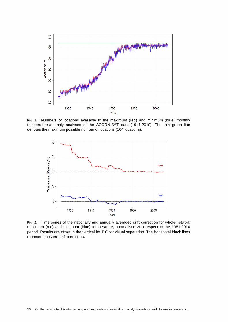
Fig. 1. Numbers of locations available to the maximum (red) and minimum (blue) monthly temperature-anomaly analyses of the ACORN-SAT data (1911-2010). The thin green line denotes the maximum possible number of locations (104 locations)......... 10
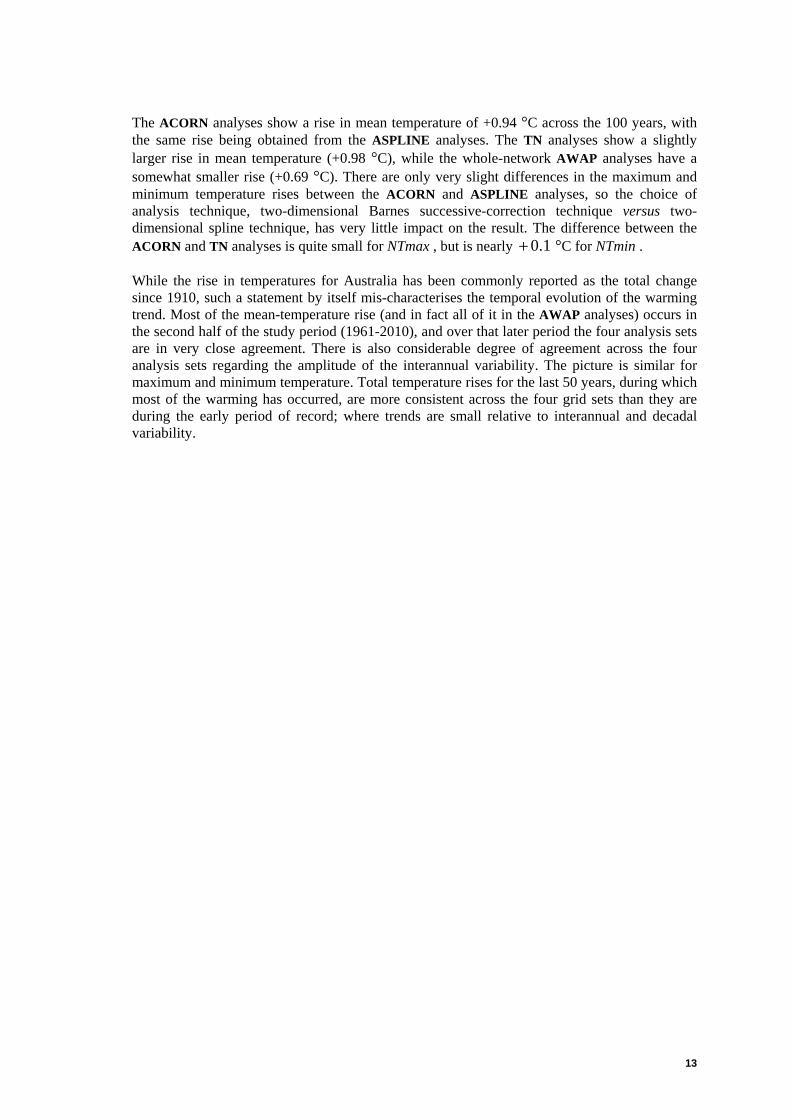
Fig. 2. Time series of the nationally and annually averaged drift correction for whole-network maximum (red) and minimum (blue) temperature, anomalised with respect to the 1981-2010 period. Results are offset in the vertical by 1°C for visual separation. The horizontal black lines represent the zero drift correction. .................. 10
Fig. 3. Numbers of stations available to the drift-corrected whole-network maximum (red) and minimum (blue) monthly temperature analyses (1911-2010)............................... 11
Fig. 4. Time series for NTmax (red), NTmin (blue) and NTmean (green), calculated using the ACORN analyses. The base period is 1981-2010 . The graphs have been progressively offset in the vertical by 2°C for visual separation. Quadratic regression lines are also shown. The horizontal black lines represent the zero anomaly. Total quadratic changes across the 100 years, defined as {last point on the regression line} − {first point on the regression line}, are +0.75°C for NTmax , +1.14°C for NTmin and +0.94°C for NTmean ............................................................. 15
Fig. 5. Standard deviations (in °C) for the quadratic residuals to the NTmax , NTmin and NTmean values for moving 20-year windows, as estimated by the ACORN (red), ASPLINE (orange), TN (green) and AWAP (blue) analyses. The first 20-year window is 1911-1930, while the last is 1991-2010. Results are progressively offset in the vertical by 0.5°C for visual separation, and are plotted against their temporal mid-points. Black lines denote the zero standard deviation. ....................................... 15
Fig. 6 Sensitivity of the computed 100-year-equivalent total linear temperature changes (in °C) to number of years included in the calculation for the ACORN NTmax , NTmin and NTmean time series. Results for maximum temperature are shown in red, minimum temperature in blue, and mean temperature in green. For each temperature variable, the maximum individual value (top line), minimum individual value (bottom line) and mean value (middle line) are shown. Total linear temperature changes for the original 100-year time series are +0.75°C for maximum temperature, +1.14°C for minimum temperature, and +0.94°C for mean temperature.................................................................................................................. 16
Fig. 7. Comparison of the NTmax time series (1911-2010). The differences plotted are ASPLINE − ACORN , TN − ACORN , AWAP − ACORN and WNDC − ACORN (all in °C). All contributing time series are anomalised with respect to the 1981-2010 prior to the calculation of the difference between pairs of time series. Mean absolute differences (in °C) for the first and last 50 years are shown on the right-hand-side of the plot. Time series differences are progressively offset in the vertical by 0.5°C for visual separation. Black lines denote the zero difference. ...................... 19
Fig. 8. As for Fig. 7, but for minimum temperature. ................................................................ 19
Fig. 9. As for Fig. 7, but for mean temperature. ...................................................................... 20
Fig. 10. Comparison of the CTmean time series (1911-2010). The differences plotted are ASPLINE − ACORN , CRUTEM − ACORN , CRUTEMv − ACORN , HadCRU − ACORN , HadCRUv − ACORN , GHCNV3 − ACORN , NCDCV3 − ACORN , NCDCM53 − ACORN , GISS − ACORN , GISSLO − ACORN , GISS3 − ACORN and GISS3LO − ACORN . In addition, the differences RSS − ACORN

iii
and UAH − ACORN are shown for the period 1979-2010. All values in °C. Mean absolute differences for the first and last 50 years are shown on the right hand side of the graph under the graph labels. Time series are progressively offset in the vertical by 0.5°C for visual separation. Black lines denote the zero difference for each comparison. .........................................................................................................20
Fig. 11. Comparison of the CTmean time series (1911-2010) using all the analysis grid sets described in this report. All anomaly values in °C, calculated with respect to 1981-2010. TLT time series are plotted for 1979-2010. ........................................................21
Fig. 12. Percentage areas (of Australia) at or above the 5th (blue shades) and 95th (orange/brown shades) percentiles for annual maximum, minimum and mean-temperature anomalies (ACORN analyses) across the period 1911-2010 .................25
Fig. 13. As for Fig. 12, but for the 1st and 99th percentiles.......................................................25
Fig. 14. Histogram of the temporal locations of highest (red) and lowest (blue) daily maximum temperatures. Each vertical bar indicates the total number of location extremes in that year. Lowest daily maximum temperatures are plotted as a negative histogram for visual separation. See text for full details. ...............................26
Fig. 15. As for Fig. 14, but for minimum temperature. ...............................................................26
Fig. 16. For five Australian Bureau of Meteorology analysis sets, ACORN , ASPLINE , TN , AWAP and WNDC , the multi-dataset mean for NTmax is shown in red (in °C), for NTmin in blue, and for NTmean in green (1911-2010). The corresponding annual ranges are shown in black bars. Results are offset in the vertical by 2°C for visual separation. Black lines denote the zero anomaly. Quadratic models are fitted to each of the five datasets, and the means and ranges shown in grey. The mean quadratic changes are +0.67°C for maximum temperature, +1.06°C for minimum temperature and +0.86°C for mean temperature. ........................................................33
Fig. 17. As for Fig. 16, but for the lowess modelling approach. The NTmax time series are modelled with lowess smoothness parameter 0.74=f , the NTmin time series
with 0.80=f , and the NTmean time series with 0.76=f . The mean changes
are +0.68 °C for NTmax, +1.04 °C for NTmin and +0.87 °C for NTmean . ..................33
Fig. 18 NTmax (red), NTmin (blue) and NTmean (green) time series from the ACORN analyses, together with quadratic trend lines (all in °C). Also shown are the time series with the rainfall impact removed (grey lines; see text for details) together with quadratic trend lines. Graphs are progressively offset in the vertical by 2°C for visual separation. The zero anomaly is shown as a black line. Total quadratic temperature rises are shown (also in °C), with the corresponding rises from the rainfall-adjusted time series in parentheses. ................................................................34
Fig. 19. Linear changes in annual maximum (top), minimum (middle) and mean (bottom) temperature across the period 1911-2010, as calculated from the gridded ACORN analyses. Nationally averaged total linear changes are +0.75°C for maximum temperature, +1.14°C for minimum temperature and +0.94°C for mean temperature...................................................................................................................37
Fig. 20. Linear changes in monthly maximum (top), minimum (middle) and mean (bottom) temperature across the period 1911-2010. Location trends are calculated from the monthly temperature data for those ACORN-SAT locations reporting from 1911 onwards, and subsequently analysed. The analysis first-pass radius is 1200 km.

iv On the sensitivity of Australian temperature trends and variability to analysis methods and observation networks.
National averages of the linear changes are +0.75°C (maximum temperature), +1.05°C (minimum temperature) and +0.90°C (mean temperature). .......................... 38
Fig. 21. Total linear temperature change (in °C) in monthly maximum (top), minimum (middle) and mean (bottom) temperature across 1911-2010 at the ACORN-SAT locations which report from 1911 onwards. Positive temperature changes are plotted in red, negative temperature changes in blue. Circle radii are proportional to the magnitude of the temperature change................................................................... 39
Fig. 22. Total linear temperature change (in °C) in monthly maximum (top), minimum (middle) and mean (bottom) temperature across 1961-2010 at the ACORN-SAT locations which report from 1961 onwards. Positive temperature changes are plotted in red, negative temperature changes in blue. Circle radii are proportional to the magnitude of the temperature change................................................................... 40
Fig. 23. Annualised adjustment time series for maximum (red) and minimum (blue) temperature, obtained by weighting the annualised adjustments at each location by the annualised location impact factors. The adjustment time series are subsequently anomalised with respect to 1981-2010. The grey lines show the difference between analyses of the ACORN unhomogenised and homogenised NTmax and NTmin time series (i.e., {unhomogenised} − {homogenised}), while the thin black lines show the difference between the AWAP and ACORN NTmax and NTmin time series (previously plotted in Figs 7 and 8). Results are offset in the vertical by 1°C for visual separation. The zero difference is also shown in a horizontal thin black line............................................................................................... 47
Fig. 24. Cumulative distribution functions for the acccumulated annualised maximum-temperature homogenisation adjustments, stratified by decade. Adjustments in °C, binned in 0.1 °C increments. Circles denote the median adjustment.......................... 48
Fig. 25. As for Fig 24, but for minimum temperature. ............................................................... 48
Fig. 26. Differences in the ACORN NTmax (red), NTmin (blue) and NTmean (green) time series; {112-location analyses} − {104-location analyses}. Linear trends in these temperature differences are also shown. Difference time series are offset in the vertical by 0.04°C for visual separation. Black lines denote the zero difference. Total temperature impacts, calculated as {last point on the trend line} − {first point on the trend line}, are 0.003− °C for maximum temperature, 0.007+ °C for
minimum temperature, and 0.002+ °C for mean temperature. .................................. 49
Fig. 27. ACORN NTmean annual mean-temperature anomaly time series (red) and Australian-region SST annual mean-temperature anomaly time series (blue), over the period 1911-2010. Both time series anomalised with respect to 1981-2010. Quadratic trend lines are also shown. The total quadratic temperature changes are +0.94°C (SAT) and +0.83°C (SST).............................................................................. 49

v
List of Tables
Table 1 Total quadratic change (in °C) over the period 1911-2010, and standard deviation of the quadratic residuals (in °C) are given for four sets of analyses. Corresponding results are given for two sub-periods (1911-1960 and 1961-2010). The sub-period results are obtained from the regressions computed over the entire period, rather than from regressions computed over the sub-periods. Values are rounded to two decimal places. .............................................................................................................14
Table 2 Hottest and coldest years in the NTmax , NTmin and NTmean time series, as estimated from the various Australian Bureau of Meteorology grid sets over the period 1911-2010. Anomaly values in the time series have been rounded to two decimal places (of °C) prior to the determination of the highest and lowest values in the time series and the years in which they occur........................................................23
Table 3 Cross-validated model errors for the ACORN NTmean time series (1911-2010). Root-mean-square (RMSE) and mean absolute (MAE) errors are given in °C to three decimal places. The quadratic model minimises the cross-validated error amongst the six polynomial models with respect to both metrics. ...............................27
Table 4 Best-fitting polynomial models (i.e., models which minimise the cross-validated RMSE) for various periods. Time series are from the ACORN analyses.....................28
Table 5 Degree of the highest-degree model applied to the ACORN NTmax , NTmin and NTmean time series for which the highest-order term has a statistically significant coefficient, for a range of periods. The threshold for statistical significance is
0.05=p (two-tailed). ‘NA’ denotes the absence of statistically significant highest-
order-term coefficients. .................................................................................................29
Table 6 Results of the cross-validated RMSE approximate minimisation for the ACORN NTmax, NTmin and NTmean time series ( lowess modelling). The second column gives the model smoothness parameter for the approximately best-fitting model of the lowess type. The un-cross-validated RMSE and MAE values for the entire 100-year time series are given in °C ...................................................................................31

vi On the sensitivity of Australian temperature trends and variability to analysis methods and observation networks.

1
ABSTRACT
This report presents an exploration of Australian temperature trends and variability using the new Australian Climate Observations Reference Network (ACORN) Surface Air Temperature (SAT) dataset. We compare changes in nationally and annually averaged daily-maximum, daily-minimum and daily-mean temperature variability to a range of alternative Australian temperature analyses over the last 100 years (1911-2010). For this purpose, we use raw unhomogenised data, as well as a range of high-quality homogenised sub-network and whole-network analysis grids, to explore the sensitivity of the temperature changes over time to the choice of analysis method, selection of sites used in the observational network, and homogenisation techniques. The ACORN-SAT data show little or no change in Australian annual temperatures in the first fifty years (1911-1960) of the study period, followed by a period of rapid warming in the second fifty years (1961-2010). Minimum temperatures show a slightly stronger warming than maximum temperatures, with mean temperatures showing intermediate warming (by construction). Rainfall variability across the last 100 years explains a lot of the difference between the maximum and minimum temperature trends. The new analyses yield estimates for the temperature rise across 1911-2010 of +0.75°C for annual maximum temperature, +1.14°C for annual minimum temperature, and +0.94°C for annual mean temperature. Changes in Australian annual temperatures are poorly characterised by a single linear trend across the entire 100-year period. Using a range of plausible empirical time-series models, we find that the data are better characterised by a quadratic model, comprising a period of relatively static temperatures followed by an accelerating upward trend. Similar results are obtained using the lowess empirical statistical modelling technique. A comparison of the ACORN-SAT analyses with previous temperature analyses generated by the Australian Bureau of Meteorology , and analyses of Australian temperature data performed independently by international agencies, shows very similar estimates of Australian temperature changes over the twentieth century. Temperature changes from 1911 to 1960 show some degree of sensitivity to the choice of network and analysis method, which reflects structural uncertainty due to sparser network coverage during this time. Temperature changes from 1961 to 2010 are much less sensitive to these issues, and the network coverage is fairly stable over this later period. All methods of analyses provide similar warming trends over the last 50 years, including data for which temporal-homogeneity adjustments have not been specifically applied. The warming trend in temperatures over land is consistent with warming in independently measured sea-surface temperatures in the Australian region over the last 100 years.

2 On the sensitivity of Australian temperature trends and variability to analysis methods and observation networks.
1. INTRODUCTION
A new homogenised, daily temperature dataset has been recently developed for Australia (Trewin 2012a , Trewin 2012b). This new dataset is called the Australian Climate Observations Reference Network - Surface Air Temperature (ACORN-SAT) dataset. The ACORN-SAT dataset replaces two operational temperature datasets used by the Australian Bureau of Meteorology ; the shorter (1950-present) daily homogenised temperature record of Trewin(2001) (see also Jones et al. 2004) and the longer (1910-present) annually homogenised temperature record developed by Torok and Nicholls (1996) and subsequently updated by Della-Marta et al. (2004). The ACORN-SAT dataset represents a complete reanalysis of the Australian raw station data that extends the homogenisation of daily temperature data back to 1910. The ACORN-SAT network includes newly digitised historical paper records (Clarkson 2002) that were not available to the previous two analyses. Whereas Torok and Nicholls (1996) applied homogenisation adjustments based on annual data, ACORN-SAT uses a distribution-based approach (quantile matching) to adjust temperatures at the daily timescale. As such, this new homogenisation technique is entirely independent of the Torok and Nicholls approach. The preparation of the ACORN-SAT dataset is described in detail in Trewin (2012a) and Trewin (2012b) . The Australian Bureau of Meteorology produces one other set of operational daily temperature analyses (Jones et al. 2009), constructed as part of the Australian Bureau of Meteorology 's contribution to the Australian Water Availability Project (AWAP) (Raupach et al. 2009). The AWAP analyses are daily (and monthly) gridded temperature analyses for which no specific temporal homogenisations have been applied. Whereas Torok and Nicholls (1996), Trewin (2001) and the new ACORN-SAT dataset use a small subset of the total observing network, the AWAP gridded analyses use (nearly) all available observations at each day (or month) to be analysed, and the analysis technique employed adds two-dimensional analyses of station temperature anomalies to three-dimensional climatological analyses. These climatological analyses have embedded within them climatological temperature-elevation relationships. While the extension of daily records back to 1910 provides new opportunities to analyse changes in monthly, seasonal and daily extreme temperatures, the main focus of this study is the comparison of changes in annual temperatures between existing datasets and the ACORN-SAT dataset. We investigate the sensitivity of temperature trends and variability using a range of whole-network and homogenised sub-network analysis grid sets. These include both local (Australian Bureau of Meteorology) and international gridded analyses of surface air temperature (SAT), supplemented by two satellite-derived analyses of temperature of the lower troposphere (TLT). It is worthwhile to clarify the similarities and differences of temporal changes in temperature to network choices, homogenisation techniques and analysis methods, and to surface versus remotely sensed near-surface differences. As we shall attempt to demonstrate, these comparisons provide some indication of the robustness of the underlying, physical temperature trends and variability. This sensitivity analysis does not explicitly evaluate the need to apply homogeneity adjustments to the ACORN-SAT data. That evaluation is provided by Trewin (2012a) and Trewin (2012b). It is, however, worth pointing out here that one should not expect that the homogenised and

3
unhomogenised records should be consistent in their characterisation of temporal temperature changes. This is particularly true during periods of sparse network coverage. We note here, with reference to commentary on this issue outside of the literature, that there is little a priori justification for the expectation that raw station data should be inherently more accurate in characterising real temporal changes. Further, such an expectation is disabused by the literature, most recently by Menne et al.(2010). Hence, the firmer a posteriori expectation is that the raw data will contain numerous spurious artifacts that are likely to contaminate the characterisation of temporal changes. The datasets used in the study and spatial-averaging techniques are described in Section 2. Section 3 describes the basic trends and variability in the nationally averaged time series. Section 4 compares the new ACORN analyses against other Australian Bureau of Meteorology and international analyses of SAT and TLT. Section 5 looks briefly at trends in the extremes of the analyses. Section 6 looks at statistical modelling of the area-averaged time series. Spatial trends are presented in Section 7, while Section 8 presents a discussion on the consistency between the new ACORN-SAT dataset and other datasets used in this study. Concluding remarks are presented in Section 9. Following Trewin (2012a) and Trewin(2012b), we use “site” to denote a specific observation station, and “location” in the case of the ACORN-SAT and Torok and Nicholls datasets to denote a homogenised composite of one or more sites. Each site has a unique Australian Bureau of Meteorology numerical station identifier (station number). [Some also have World Meteorological Organization numerical station identifiers, and may have their data available internationally under those identifiers.] A listing of the ACORN-SAT locations used in this study can be found on the Australian Bureau of Meteorology 's website at; http://www.bom.gov.au/climate/change/acorn-sat/.
4 On the sensitivity of Australian temperature trends and variability to analysis methods and observation networks.
2. DATA
The gridded data used in this study fall into four groups; (i) homogenised sub-network analyses of maximum, minimum and mean surface air temperature (SAT) prepared by the Australian Bureau of Meteorology , (ii) whole-network and near-whole-network analyses of maximum, minimum and mean SAT prepared by the Australian Bureau of Meteorology, (iii) international mean-temperature analyses of Australian SAT, and (iv) international satellite lower-tropospheric mean-temperature analyses. The analyses, both Australian and international, are all comprised of calendar monthly analyses, except for the Torok and Nicholls (1996) analyses which are annual analyses. For the monthly analyses, annual analyses are prepared by simple (i.e., unweighted) averaging of the twelve monthly analyses. The analysis datasets are complete across the entire study period, with no missing months, except for the TLT data as discussed below. Mean-temperature results for the Australian analyses are obtained as the average of the maximum-temperature and minimum-temperature results, in accordance with standard Australian practice (Trewin 2004). [It is impractical in terms of the Australian data to calculate the mean daily temperature using equally spaced sub-daily data, a technique used in some other parts of the world, because the availability of these data is limited and the standard times of observation vary considerably across the country and throughout the historical record.] For the Australian Bureau of Meteorology monthly analyses, monthly maximum and minimum temperature analyses are prepared from the site/location data, and the results averaged to form the mean-temperature analyses. For the Torok and Nicholls annual analyses and the international SAT analyses, mean temperatures are calculated at the sites/locations and analysed directly. All the Australian Bureau of Meteorology grid sets used in this study have a spatial resolution of 0.25° for latitude and longitude (approximately 25 km), and sites/locations contributing temperature data to the analyses must have two-dimensional station positional metadata (latitude, longitude) to be used in the analyses. The international analyses have varying spatial resolutions, from 1.0° to 5.0°. Some of the Australian Bureau of Meteorology grid sets are available from 1910, while others are available from 1911, and the international SAT analyses extend even further back into the past. For consistency in the reported results, we choose not to use any of the pre-1911 analyses. In any case, there is a great deal of uncertainty surrounding the pre-1910 temperature data for Australia, owing to the use of now-non-standard observation practices (Nicholls et al. 1996b ; Trewin 2012a ; Trewin 2012b). Annual analyses of the satellite TLT data are available for 1979-2010, and have a spatial resolution of 2.5° (approximately 250 km). The TLT analyses are complete for this 32-year period. National averages of the various Australian Bureau of Meteorology gridded analyses are prepared using an area-weighted (cosine of latitude) spatial averaging of the data for continental Australia and the main island of Tasmania. This area-weighting means meridional convergence is taken into account1. Continental averages of the various international grid sets are prepared using spatial averages of 1° resolution grid points for continental Australia only. The coarser resolution and the omission of Tasmania in the preparation of these averages is due to the lower and variable resolution of these analyses. At the coarsest resolutions, grid boxes around the Australian coastline will typically contain substantial areas of ocean, and the case of the blended
1The area average is calculated as [ ] [ ]i
n
iii
n
iwgw 1=1=
/ , where ig is the grid point value at the i th
grid point, and )(cos= ii lw where il is the latitude of the i th grid point.

5
land/ocean analyses will be derived from both SAT and sea-surface temperature (SST) data. To achieve a consistent result, and to limit the influence of SSTs on SATs in the calculation of Australian temperatures, we interpolate these grids at the 1° resolution. The interpolation is performed using bi-cubic polynomial interpolation on a 44× lattice of grid points for the central square in the resulting 33× square region. The technique is a straight-forward bivariate generalisation of the univariate Lagrange four-point interpolation formula given in Abramowitz and Stegun (1965). As has been noted above, some of the analyses in this study are temperature analyses, while others are temperature anomaly2 analyses, and various base periods are employed. Therefore the time series obtained by area averaging are anomalised, or re-anomalised, with respect to the 1981-2010 base period for purposes of consistent comparison. This anomalisation/re-anomalisation process, while obviously having an impact on the means of the time series, does not change the nature of the trends and variability in the annual means. As a notational convenience, particular analysis grid sets discussed in this report will be designated in small bold type (e.g., TN). Homogenised sub-network analyses 1. The Torok and Nicholls (TN) annual temperature-anomaly analyses (Torok and Nicholls 1996 ; Della-Marta et al. 2004) are at the time of writing used in the preparation of the Australian Bureau of Meteorology annual statements (e.g., Australian Bureau of Meteorology 2011). The location anomalies are calculated with respect to the 1961-1990 base period, and are analysed two-dimensionally using the Barnes successive-correction method (see Jones and Weymouth (1997) for a description of how this technique has been used on Australian rainfall and temperature data more generally). Length scales in the Barnes analyses, which determine how detailed the resulting analysis is, are prescribed in advance. The TN data have been homogenised at the annual time scale. 2. The ACORN temperature-anomaly analyses (ACORN) use monthly location temperature-anomaly data derived from the ACORN-SAT project homogenised daily-temperature data (Trewin 2012a ; Trewin 2012b) for 1911-2010. These daily data are homogenised at the daily time scale using methods different from, and independent of, the methods used in generating the TN data. Location anomalies are formed with respect to the 1981-2010 period, and are analysed two-dimensionally using the Barnes successive-correction method (Jones and Weymouth 1997). The period 1981-2010 is chosen because it maximises (at least approximately) the number of locations for which climatological normals can be calculated. Monthly temperature values at locations are calculated from daily temperature data if there are fewer than ten missing daily values in the month. Monthly climatologies, and therefore monthly anomalies, are only calculated if locations have fewer than five missing years in the 1981-2010 period. Out of the 112 locations in the ACORN-SAT network (Trewin 2012a ; Trewin 2012b), we omit from the analyses eight locations classified as urban, either because they are in the centres of major urban areas, or are in more peripheral locations but show evidence of anomalous temperature trends, in comparison to their surrounds. Those omitted stations are; 023090 Adelaide (Kent Town), 032040 Townsville Aero, 039083 Rockhampton Aero, 066062 Sydney (Observatory Hill),
2A temperature anomaly is the departure of a particular temperature value from a long-term (typically 30-year) climatological mean reference value. For example, if a January 2011 monthly temperature is 26°C
and the average January monthly temperature over 1981-2010 is 25°C , then the January 2011 monthly
temperature anomaly is +1°C with respect to the 1981-2010 base period.

6 On the sensitivity of Australian temperature trends and variability to analysis methods and observation networks.
067105 Richmond RAAF, 086071 Melbourne Regional Office, 087031 Laverton RAAF, and 094029 Hobart (Ellerslie Road). The temporal evolution of the analysis network is shown in Fig. 1. Data availability for the monthly temperature-anomaly analyses rises from around 59 locations in the 1910s to around 66 locations in the 1930s, before rapidly rising through the 1950s and 1960s and reaching around 101 locations in the 1970s. 3. The ACORN monthly temperature-anomaly data, as described above, are also analysed using two-dimensional thin-plate smoothing-spline methods (Hutchinson 1995). Length scales in these analyses (ASPLINE) are determined empirically by the analysis procedure, and on some occasions may be extremely smooth. [This is because the thin-plate smoothing spline is attempting to maximise the predictive power of the spline model, which is polynomial in nature, and on some occasions that optimisation may occur with a smooth analysis field.] Such an outcome is not expected to impact significantly on a national spatial average. The base period is likewise 1981-2010. The Australian Bureau of Meteorology also has an official set of monthly SAT anomaly analyses based on a high-quality homogenised sub-network (Trewin 2001 ; Jones et al. 2004), but we have elected not to use them in this study because they are only available from 1950 onwards. They are homogenised at the daily time scale, using methods different from, and independent of, the methods used in homogenising the ACORN-SAT data. Whole-network/near-whole-network analyses 4. Whole-network drift-corrected analyses (WNDC). These analyses start with basic whole-network analyses of maximum and minimum temperature (i.e., they are not anomaly analyses), analysed using the two-dimensional Barnes successive-correction method (Jones and Weymouth 1997). The whole-network analyses use the raw monthly temperatures. These data have been subject to a basic level of quality control for typical known data-quality issues, such as incorrect dating of observations, measurement errors, or significant outliers. However, no explicit homogeneity adjustments have been applied to these data and the degree of quality control applied to the temperature data has varied considerably over time. These analyses are therefore intrinsically inhomogeneous, particularly so for maximum temperature, because of the non-stationary (time-varying) nature of the observing network. In general, the raw data are not ideal for climate variability/climate change analyses due to several sources of spurious changes in the data over time. A significant source of inhomogeneity in spatial averages computed from these analyses arises from spurious changes in the climatology as the mean location of the network changes over time. In Australia, this may occur (for example) during periods where the network has expanded into warmer northern and central locations across the continent. This transient drift in the mean climatology of the network must be estimated and removed from the spatial-average time series in order to perform any meaningful comparison with homogenised datasets. We perform a somewhat simple but objective adjustment for this network non-stationarity in a `drift-corrected' grid set. We first generate a full set of monthly analyses from the raw data for the period 1911-2010, and in the process calculate 1981-2010 monthly climatologies from the raw analysis grids. The second step is to generate a parallel set of monthly analyses for the period 1911-2010, in which the raw data fed into the analysis are replaced by climatological values at each site reporting in the particular month. These climatological values at each site are interpolated from the 1981-2010 monthly climatology grids, using the bi-cubic polynomial interpolation technique mentioned above. If the network were completely static, no changes over time would result in this parallel set of analyses, apart from the normal annual temperature cycle, but the network is obviously not static and so some variation over time results. The drift-corrected analysis is then obtained by subtracting the parallel analysis from the raw analysis. The nationally averaged annual time series of the difference between the drift-corrected analysis

7
and the raw analysis is plotted in Fig. 2, anomalised with respect to the 1981-2010 period. The magnitude of the drift correction is not very large for minimum temperature, but is quite large (nearly 1°C) for maximum temperature in the early years. The drift correction serves to “reduce” the 100-year trend in the raw analyses by a substantial amount. It is important to note here that the warming trend in maximum temperature from the raw analyses is much larger than that in the existing homogenised analyses. The drift correction over the last thirty years is very small, indicating a degree of network stability over that period. Figure 3 shows the numbers of stations used in these whole-network drift-corrected analyses. By the 1920s, around 350 sites are available to the analyses, and this rises through the 1940s and 1950s, but from 1957 to 1964 there is a sudden decline in the number of sites which is equally suddenly reversed. It is believed that the “missing” data for this period are extant but undigitised data, rather than actually unobserved data. This is consistent with experience from digitisation projects (e.g., Clarkson 2002) which have taken place to date. 5. Near-whole-network low-resolution gridded analyses of monthly temperature from the Australian Water Availability Project (AWAP). These analyses employ a hybrid analysis technique (Jones et al. 2009), and are available at two resolutions; low-resolution (0.25°) and high-resolution (0.05°). [National monthly averages formed from the high-resolution analyses are very similar to those obtained from the low-resolution analyses ( AWAP ). In this study we therefore only use the low-resolution analyses.] Station (site) anomalies are calculated and analysed using a two-dimensional Barnes successive-correction approach (Jones and Weymouth 1997). These anomaly analyses are then added to internal climatological grids prepared using the three-dimensional thin-plate smoothing-spline approach (Hutchinson 1995). Three anomalisation epochs are used; 1911-1940, 1941-1970 and 1971-2000. Months within these epochs are anomalised with respect to station normals computed for the specific epoch, and the resulting anomaly grid added to the monthly climatological grid for that epoch. Station normals are calculated from station data, interpolation of the gridded climatologies, or a combination of these, depending on the amount of station data available in the epoch (see Jones et al. (2009) for further details). Months within the 2001-2010 period are currently treated as if they were within the 1971-2000 epoch. These analyses are technically only “near-whole-network”, because they require three-dimensional positional metadata (i.e., latitude, longitude, elevation), but for the purposes of this study, they will be considered to be “whole-network”. [Only a small fraction of the whole network, about 4% of observations in the first 50 years and less than 1% of observations in the second 50 years, is typically excluded through not having a station elevation available.] The use of different epochs for the internal calculation of site anomalies in the AWAP analyses has the benefit of generating anomalies which tend to be distributed around zero, and therefore the zero first-guess field used in the process is in effect an unbiased estimator. However, the network does change quite dramatically through time, as can be seen from the station counts in Fig. 3, and these changes affect the climate normals, and hence the final analysis product. No specific temporal-homogeneity adjustments are applied to the AWAP station data. The AWAP (rainfall and temperature) analyses were developed to provide an improved high-resolution spatial analysis, rather than for the analysis of broad-scale temporal change specifically. Such datasets are typically employed for real-time monitoring; for example for the calculation of the areal extent of extreme phenomena such as drought, floods and heatwaves. While the AWAP data have not been subject to specific temporal-homogeneity adjustments, the process of interpolating a surface using neighbour stations effectively produces a spatial homogenisation at each time interval. It is instructive to compare the ACORN and AWAP results in the manner attempted here. International SAT analyses

8 On the sensitivity of Australian temperature trends and variability to analysis methods and observation networks.
6. University of East Anglia Climatic Research Unit (CRU) CRUTEM version 3 land-only mean-temperature anomaly analyses (CRUTEM). These are obtained from http://www.cru.uea.ac.uk/cru/data/temperature/ (Brohan et al. 2006) and have a resolution of 5.0° and base period 1961-1990. 7. CRUTEM version 3 variance-adjusted land-only mean-temperature anomaly analyses (CRUTEMv). These likewise have a resolution of 5.0° and base period 1961-1990 (Brohan et al. 2006). 8. United Kingdom Meteorological Office Hadley Centre / University of East Anglia Climatic Research Unit HadCRU version 3 blended land/ocean mean-temperature anomaly analyses (HadCRU). These are obtained from http://www.cru.uea.ac.uk/cru/data/temperature/ (Brohan et al. 2006 ; Rayner et al. 2006) and have a resolution of 5.0° . The base period is 1961-1990. 9. HadCRU version 3 variance-adjusted blended land/ocean mean-temperature anomaly analyses (HadCRUv). These likewise have a resolution of 5.0° and base period 1961-1990 (Brohan et al. 2006 ; Rayner et al. 2006). The variance adjustment in this grid set and the CRUTEMv grid set attempts to control for changes over time in the number of available stations in any one region. [Increased numbers of available stations in a particular region, for example an analysis grid cell, can typically be expected to reduce the variance of the analysed values compared to results obtained from having fewer available stations in that region.] All four of these grid sets were obtained from the CRU website in early January 2012, with these data last updated in December 2011. The land-only analyses use only SAT data, and therefore do not necessarily contain meaningful information over the oceans. In contrast, the blended land/ocean analyses make use of SAT data for land areas and sea-surface temperature (SST) data for ocean areas. The problem of the typical coastal land/ocean temperature discontinuity is somewhat circumvented by analysing temperature anomalies instead of temperatures directly. 10. United States (US) National Oceanic and Atmospheric Administration (NOAA) National Climatic Data Center (NCDC) Global Historical Climatology Network (GHCN) version 3 land-only mean-temperature anomaly analyses (GHCNV3). These are obtained from ftp://ftp.ncdc.noaa.gov/pub/data/ghcn/v3/grid/, and have a 5.0° resolution and base period 1961-1990. 11. NCDC version 3b merge 53 blended land/ocean mean-temperature anomaly analyses (NCDCM53). These are obtained from ftp://ftp.ncdc.noaa.gov/pub/data/ghcn/blended/ncdc_blended_merg53v3b.dat and have a 5.0° resolution and base period 1971-2010 (Smith et al. 2008). 12. NCDC version 3 blended land/ocean mean-temperature anomaly analyses (NCDCV3). These are obtained from ftp://ftp.ncdc.noaa.gov/pub/data/ghcn/blended/ncdc-merged-sfc-mntp.dat and have a 5.0° resolution and base period 1971-2010. They are based on the GHCN-Monthly (GHCN-M) v3 and Extended Reconstruction Sea Surface Temperature (ERSST) v3b datasets ( NCDC 2011 ). They supersede the NCDCM53 dataset. The GHCNV3 , NCDCV3 and NCDCM53 grid sets were all obtained from the NCDC website in early January 2012.

9
13. US National Aeronautics and Space Administration (NASA) Goddard Institute for Space Studies (GISS) version 3 blended land/ocean mean-temperature anomaly analyses (GISS). These were obtained from ftp://data.giss.nasa.gov/pub/gistemp/download/ (Hansen et al. 2010) in early January 2012, in the form of observational datasets and analysed locally using the GISS computer programs available at the same location. The resulting analyses have a resolution 1.0° . The base period is 1951-1980. These analyses have a characteristic length scale of 1200 km employed in the algorithm, so the results are typically smoother than those of the Australian Bureau of Meteorology analyses obtained using shorter characteristic length scales. 14. GISS version 3 land-only mean-temperature anomaly analyses (GISSLO). These likewise have a resolution 1.0° and base period 1951-1980, and are obtained in the same manner as the GISS grids. The land temperature dataset contributing to the GISS and GISSLO analyses obtained from the GISS website is derived from the GHCN version 3 dataset, and contains an Australian data inhomogeneity from the mid-1990s to the mid-2000s. The inhomogeneity derived from a change (subsequently reversed) in the method of calculating the mean temperatures reported internationally through CLIMAT messages, which caused an artificial cool bias in Australian mean temperature (Trewin 2004). This change of methodology was from calculating the mean temperature as the average of maximum and minimum temperature to calculating it from synoptic (i.e., hourly or three-hourly) observations, and its consequences are very clearly evident in Fig. 10. A version of the observational dataset which does not contain this inhomogeneity was obtained from GISS in May 2011 and analysed in the same way (those analyses called GISS3 and GISS3LO herein). The versions of the GISS analyses containing the inhomogeneity are included in this study because they were the versions publicly available at the time of writing. International lower-tropospheric temperature analyses 15. Remote Sensing Systems (RSS) version 3.3 mean-temperature analyses (RSS). These are obtained from http://www.remss.com/data/msu/data/netcdf/ and have a resolution of 2.5° . Information about the earlier version 3.2 analyses can be found in Mears and Wentz (2009a) and Mears and Wentz (2009b) . 16. The University of Alabama in Huntsville (UAH) version 5.4 mean-temperature anomaly analyses (UAH). These are obtained from http://vortex.nsstc.uah.edu/public/msu/t2lt/ and have resolution 2.5° and base period 1981-2010. The reader is referred to Christy et al. (2010) and Christy et al. (2011) for more information. Both of these TLT datasets were obtained from the websites mentioned above in early January 2012. It should be noted that the TLT data are not strictly a measure of surface temperature, but rather are derived from the temperature throughout the entire troposphere (and into the lower stratosphere) with largest vertical weighting below a height of 3 kilometres. The TLT data are derived from a series of satellites, and consequently are fully independent of the SAT data. The use of multiple satellite instruments brings its own problems however. There are homogeneity issues in the TLT data, owing to sensor drift, orbital drift and orbital decay (i.e., altitude decline) over time. Careful analysis has been undertaken to correct for these problems, in essence a homogenisation procedure (Mears and Wentz 2009b).
10 On the sensitivity of Australian temperature trends and variability to analysis methods and observation networks.
Fig. 1. Numbers of locations available to the maximum (red) and minimum (blue) monthly temperature-anomaly analyses of the ACORN-SAT data (1911-2010). The thin green line denotes the maximum possible number of locations (104 locations).
Fig. 2. Time series of the nationally and annually averaged drift correction for whole-network maximum (red) and minimum (blue) temperature, anomalised with respect to the 1981-2010 period. Results are offset in the vertical by 1°C for visual separation. The horizontal black lines represent the zero drift correction.

11
Fig. 3. Numbers of stations available to the drift-corrected whole-network maximum (red) and minimum (blue) monthly temperature analyses (1911-2010).

12 On the sensitivity of Australian temperature trends and variability to analysis methods and observation networks.
3. TRENDS AND VARIABILITY
As previously mentioned, the focus of this study is principally to evaluate the large-scale trends and variability in the analyses of the ACORN-SAT location temperature data. A large part of this evaluation therefore involves an investigation into the nationally averaged annual temperature anomaly time series and their temporal characteristics. We explore various analysis issues related to uncertainties in characterising multi-decadal changes in temperature, such as choice of statistical models and end-point sensitivity. However, the manner in which we have defined our metrics of change is somewhat different from the definition of climate change signals, such as those associated with particular climate forcing mechanisms. Such signals have been defined in various ways in the detection and attribution of climate change literature (e.g., Chapter 9 in IPCC 2007). As a notional convenience, we adopt the designations NTmax , NTmin and NTmean for the nationally averaged annual maximum-temperature, minimum-temperature and mean-temperature time series, anomalised with respect to 1981-2010 and CTmean for the corresponding continentally averaged annual mean-temperature time series (likewise anomalised with respect to 1981-2010). The reader is referred to Section 2 for how these time series are computed. We will begin our characterisation of the 100-year temperature changes using quadratic regression models. It should be noted, for the sake of completeness, that our use of total quadratic change is just one method of describing the temperature change over Australia in the last 100 years. Figure 4 shows the NTmax , NTmin and NTmean time series for the period 1911-2010, calculated using the ACORN analyses, together with quadratic regression lines. [All three regressions are statistically significant, with 0.001<p (two-tailed) under the normal null
hypothesis assumptions.] In broad terms, the pattern of temperature change across the 100 years is one of slow (NTmax) to moderate (NTmin) change in the first 50 years, followed by a much more rapid rise in the second 50 years. The total quadratic changes across the 100 years, defined as {last point on the regression line} − {first point on the regression line}, are +0.75 °C for NTmax , +1.14 °C for NTmin and +0.94 °C for NTmean . The justification for the use of quadratic regressions, instead of the more commonly used and rather more easily interpreted linear regressions, will be given in Section 6, but at this point we note that the total quadratic change, when calculated as {last point} − {first point} as is done here, yields the same result as the analogous total linear change, when the ordinates of the regression data (i.e., the years) form an arithmetic progression with no missing values. Hence the total quadratic change is also the total linear change, even though the linear model will subsequently be shown to provide a less-than-adequate description of the data. We now compare the ACORN analyses against some of the other analysis grid sets. Table 1 shows the total quadratic changes across the entire period, with corresponding results for the first and second halves of that period, for the four sets of analyses ACORN , ASPLINE , TN and AWAP, together with the corresponding standard deviations of the quadratic residuals. These allow a characterisation of the interannual variability about the longer-term trend.
13
The ACORN analyses show a rise in mean temperature of +0.94 °C across the 100 years, with the same rise being obtained from the ASPLINE analyses. The TN analyses show a slightly larger rise in mean temperature (+0.98 °C), while the whole-network AWAP analyses have a somewhat smaller rise (+0.69 °C). There are only very slight differences in the maximum and minimum temperature rises between the ACORN and ASPLINE analyses, so the choice of analysis technique, two-dimensional Barnes successive-correction technique versus two-dimensional spline technique, has very little impact on the result. The difference between the ACORN and TN analyses is quite small for NTmax , but is nearly 0.1+ °C for NTmin . While the rise in temperatures for Australia has been commonly reported as the total change since 1910, such a statement by itself mis-characterises the temporal evolution of the warming trend. Most of the mean-temperature rise (and in fact all of it in the AWAP analyses) occurs in the second half of the study period (1961-2010), and over that later period the four analysis sets are in very close agreement. There is also considerable degree of agreement across the four analysis sets regarding the amplitude of the interannual variability. The picture is similar for maximum and minimum temperature. Total temperature rises for the last 50 years, during which most of the warming has occurred, are more consistent across the four grid sets than they are during the early period of record; where trends are small relative to interannual and decadal variability.

14 On the sensitivity of Australian temperature trends and variability to analysis methods and observation networks.
Table 1 Total quadratic change (in °C) over the period 1911-2010, and standard deviation of the quadratic residuals (in °C) are given for four sets of analyses. Corresponding results are given for two sub-periods (1911-1960 and 1961-2010). The sub-period results are obtained from the regressions computed over the entire period, rather than from regressions computed over the sub-periods. Values are rounded to two decimal places.
Statistic Analysis NTmax NTmin NTmean
Total quadratic change (°C)
ACORN ASPLINE
TN AWAP
+ 0.75 + 0.76 + 0.73 + 0.54
+ 1.14 + 1.13 + 1.22 + 0.85
+ 0.94 + 0.94 + 0.98 + 0.69
Standard deviation of quadratic residuals
(°C)
ACORN ASPLINE
TN AWAP
0.41 0.42 0.42 0.43
0.34 0.34 0.35 0.34
0.32 0.32 0.33 0.32
Quadratic change 1911-1960 (°C)
ACORN ASPLINE
TN AWAP
+ 0.02 + 0.04 - 0.06 - 0.17
+ 0.28 + 0.26 + 0.25 + 0.08
+ 0.15 + 0.15 + 0.10 - 0.05
Standard deviation of quadratic residuals
1911-1960 (°C)
ACORN ASPLINE
TN AWAP
0.40 0.41 0.40 0.41
0.34 0.34 0.35 0.33
0.32 0.32 0.32 0.32
Quadratic change 1961-2010 (°C)
ACORN ASPLINE
TN AWAP
+ 0.72 + 0.71 + 0.78 + 0.70
+ 0.84 + 0.85 + 0.96 + 0.76
+ 0.78 + 0.78 + 0.87 + 0.73
Standard deviation of quadratic residuals
1961-2010 (°C)
ACORN ASPLINE
TN AWAP
0.42 0.44 0.43 0.44
0.34 0.35 0.36 0.36
0.32 0.33 0.33 0.33
More comprehensive results for these four grid sets are given in Fig. 5, which shows how the variability in the quadratic residuals in discrete twenty-year samples changes throughout the study period. The three temperature variables show similar interannual variability across the study period, and interannual variability is typically smaller in the first 50 years than in the second 50 years, especially for maximum temperature. The variability is generally consistently represented across the four analysis sets. For a considerable period in the first 50 years, however, the AWAP analyses show reduced interannual variability in NTmin compared to the other three grid sets. We now look at the sensitivity of the computed temperature rises to end-point effects. From the 100-year NTmax time series, we compute total linear temperature changes, defined as before as {last point on the trend line} − {first point on the trend line}, for each of the 11 possible 90-year time series contained within it. Those 90-year total linear temperature changes are then
scaled by to yield 100-year equivalent total linear temperature changes. The maximum, minimum and mean values of the 11 values are computed and graphed. This process
is repeated for the 10 possible 91-year time series (scaling factor ), the 9 possible 92-year
time series (scaling factor ), and so on up to the 2 possible 99-year time series

15
(scaling factor ). The original 100-year results are also included for completeness. Results of this calculation are shown in Fig. 6, along with corresponding results for NTmin and NTmean. Not surprisingly, the range of possible total linear temperature changes widens as fewer years are included in the calculation, but the mean values remain relatively stable, particularly so for the NTmean calculation. In other words, the estimated 100-year total temperature rise is not particularly sensitive to end-point effects. The sensitivity to end points is largest in the maximum temperature time series, as evidenced by the wider spread on the left-hand side of Fig. 6, with mean temperature and minimum temperature showing similar degrees of sensitivity.
Fig. 4. Time series for NTmax (red), NTmin (blue) and NTmean (green), calculated using the ACORN analyses. The base period is 1981-2010 . The graphs have been progressively offset in the vertical by 2°C for visual separation. Quadratic regression lines are also shown. The horizontal black lines represent the zero anomaly. Total quadratic changes across the 100 years, defined as {last point on the regression line} − {first point on the regression line}, are +0.75°C for NTmax , +1.14°C for NTmin and +0.94°C for NTmean .
Fig. 5. Standard deviations (in °C) for the quadratic residuals to the NTmax , NTmin and NTmean values for moving 20-year windows, as estimated by the ACORN (red), ASPLINE (orange), TN (green) and AWAP (blue) analyses. The first 20-year window is 1911-1930, while the last is 1991-2010. Results are progressively offset in the vertical by 0.5°C for visual separation, and are plotted against their temporal mid-points. Black lines denote the zero standard deviation.

16 On the sensitivity of Australian temperature trends and variability to analysis methods and observation networks.
Fig. 6 Sensitivity of the computed 100-year-equivalent total linear temperature changes (in °C) to number of years included in the calculation for the ACORN NTmax , NTmin and NTmean time series. Results for maximum temperature are shown in red, minimum temperature in blue, and mean temperature in green. For each temperature variable, the maximum individual value (top line), minimum individual value (bottom line) and mean value (middle line) are shown. Total linear temperature changes for the original 100-year time series are +0.75°C for maximum temperature, +1.14°C for minimum temperature, and +0.94°C for mean temperature.
4. COMPARISONS AGAINST ACORN
We now present a more detailed comparison of the nationally and continentally averaged annual temperature time series of the various Australian Bureau of Meteorology and international grid sets against the new ACORN grid sets. [The reader is referred to Section 2 for a description of how the NTmax , NTmin , NTmean and CTmean time series are calculated.] This involves computing the differences between the various estimates of the national/continental time series. Mean absolute differences (MADs) for the first and last 50 years are described. Figure 7 shows the comparison for NTmax. There is little difference between the Barnes (ACORN) and spline (ASPLINE) analyses of the same ACORN-SAT data, with MADs of 0.02 °C . The differences between ACORN and TN are slightly larger, with MADs of 0.04°C. There is also reasonable agreement with the two whole-network analyses (AWAP and WNDC) over the last 50 years (MADs of 0.04 to 0.05°C), but the differences are larger over the first 50 years (MADs of 0.11 to 0.12 °C). Overall, the data indicate that the three homogenised analysis sets show a slightly larger magnitude temperature change across the 100 years than the two unhomogenised whole-network analysis sets. Most of the difference arises from the pre-1940 period. Figure 8 shows the corresponding results for the NTmin time series. The ACORN and ASPLINE time series show even closer agreement over the second 50 years for minimum temperature (MADs of 0.01°C) than for maximum temperature, while the differences between ACORN and TN are larger for minimum temperature (MADs of 0.07°C) than for maximum temperature. Again, there is good agreement between ACORN and the two unhomogenised whole-network analyses over the second 50 years (MADs of 0.05°C), but greater differences over the first 50

17
years (MADs of 0.10 to 0.15°C), and again the homogenised analysis sets show a slightly larger magnitude temperature change across the 100 year period than the unhomogenised whole-network analysis sets (AWAP and WNDC). Figure 9 shows the corresponding results for mean temperature. These differences for NTmean are by construction a simple averaging of the differences shown in Figs 7 and 8. Differences between ACORN and TN are fairly consistent across the study period (MADs of 0.05°C), and the differences between ACORN and the two whole-network analyses are consistent with the corresponding results for maximum and minimum temperature (MADs of 0.03 to 0.04°C in the last 50 years and 0.10 to 0.13°C in the first 50 years). The strongest warming of the last 100 years occurs in the last 50 years, with just over 80% of the total quadratic change occurring since 1960 (see Table 1). During this period, the differences between the unhomogenised whole-network analyses and the homogenised sub-network analyses are small. It may be confidently concluded that the basic warming trend is neither an artifact of non-climatic changes in the raw data, nor an artifact of the various homogenisation and analysis methods. Figure 10 shows a comparison of the ACORN CTmean time series against the ASPLINE analyses and the 11 international SAT grid sets over the period 1911-2010. Also shown is a comparison against the two international TLT grid sets over the period 1979-2010. Not surprisingly and consistent with Fig 9, the differences between the ACORN and ASPLINE results are very small. The ACORN analyses are quite consistent with the CRU analyses (CRUTEM and HadCRU, and their variance-adjusted forms CRUTEMv and HadCRUv) in the last 50 years of the study period, with MADs of 0.06 to 0.07°C . MADs in the first 50 years are larger, in the range 0.10 to 0.13°C, with the ACORN analyses showing a slightly stronger warming trend than the CRU analyses. One point to note however is that the CRU analyses depart strongly from the ACORN analyses in the last five years or so of the study period, with that departure being much stronger in the land-only analyses (CRUTEM and CRUTEMv), than in the blended SAT/SST analyses (HadCRU and HadCRUv), indicating that the issue is arising from the SAT data and not from the SST data. This departure does not exist in the two US sets of analyses. The ACORN analyses are also quite consistent with the NCDC analyses over the last 50 years of the study period, with MADs ranging from 0.04 to 0.06°C. MADs for the first 50 years are slightly larger here as well, in the range 0.07 to 0.09°C, and those differences are largely pre-1940. The publicly available versions of the GISS analyses (GISS and GISSLO) clearly show the inhomogeneity mentioned in Section 2, and because that inhomogeneity lies entirely within the anomalisation period (1981-2010), it has a strong effect on the MADs. When that inhomogeneity is removed from the observational data contributing to the analyses (the GISS3 and GISS3LO analyses), the results are much more consistent with the ACORN analyses, and the MADs become more consistent with those obtained from the NCDC analyses. In summary; the different methods of analysing and homogenising the Australian SAT data, employed by four different groups, yield results which at the national/annual level are quite similar. The differences are largely confined to the early part of the record where there are fewer observational data to be used. The ACORN analyses are also reasonably consistent with the two TLT analyses, with MADs of 0.11 to 0.12°C over the common period (1979-2010), but it should be recalled that in making this comparison between the SAT anomalies and the TLT anomalies, a comparison is being

18 On the sensitivity of Australian temperature trends and variability to analysis methods and observation networks.
made between temperatures in different parts of the atmosphere so an exact correspondence is not to be physically expected. We conclude this section by presenting all the various estimates for the CTmean time series in one graph (Fig. 11). As previously noted, the variability amongst the various estimates is generally greater in the early part of the study period, but as the temperature trend is less in those years, it remains very evident that recent decades have been warmer across Australia than the earlier decades.

19
Fig. 7. Comparison of the NTmax time series (1911-2010). The differences plotted are ASPLINE − ACORN , TN − ACORN , AWAP − ACORN and WNDC − ACORN (all in °C). All contributing time series are anomalised with respect to the 1981-2010 prior to the calculation of the difference between pairs of time series. Mean absolute differences (in °C) for the first and last 50 years are shown on the right-hand-side of the plot. Time series differences are progressively offset in the vertical by 0.5°C for visual separation. Black lines denote the zero difference.
Fig. 8. As for Fig. 7, but for minimum temperature.

20 On the sensitivity of Australian temperature trends and variability to analysis methods and observation networks.
Fig. 9. As for Fig. 7, but for mean temperature.
Fig. 10. Comparison of the CTmean time series (1911-2010). The differences plotted are ASPLINE − ACORN , CRUTEM − ACORN , CRUTEMv − ACORN , HadCRU − ACORN , HadCRUv − ACORN , GHCNV3 − ACORN , NCDCV3 − ACORN , NCDCM53 − ACORN , GISS − ACORN , GISSLO − ACORN , GISS3 − ACORN and GISS3LO − ACORN . In addition, the differences RSS − ACORN and UAH − ACORN are shown for the period 1979-2010. All values in °C. Mean absolute differences for the first and last 50 years are shown on the right hand side of the graph under the graph labels. Time series are progressively offset in the vertical by 0.5°C for visual separation. Black lines denote the zero difference for each comparison.

21
Fig. 11. Comparison of the CTmean time series (1911-2010) using all the analysis grid sets described in this report. All anomaly values in °C, calculated with respect to 1981-2010. TLT time series are plotted for 1979-2010.

22 On the sensitivity of Australian temperature trends and variability to analysis methods and observation networks.
5. TRENDS IN THE EXTREMES
In addition to comparing the annual means in the various analyses presented in Section 4, we also compute the national percentage areas of the country for high and low annual maximum, minimum and mean temperature in the ACORN analyses. Here, “low” means being below the 5th percentile of historical values, and “high” means being above the 95th percentile. In this way, the areas below the 5th percentile represent the portion of the country experiencing extreme cool temperatures, while those above the 95th percentile represent the portion of the country experiencing extreme warm temperatures. These percentiles are calculated with respect to the whole 1911-2010 period. The percentage areas are shown in Fig. 12, although to achieve visual separation on the same graph, we plot the percentage areas at or above the 5th and 95th percentiles for each year. Areas at or above the 5th percentile (blue shades) are increasing over time (i.e., areas below the 5th percentile are decreasing over time), with relatively few “cool” spikes in recent years (post-1990). In other words, areas with exceptionally low temperatures are becoming increasingly rare. Areas at or above the 95th percentile, however, are increasing over time, with relatively few “warm” spikes in earlier years (pre-1970) and frequent spikes in subsequent years (post-1970). That increase appears to be accelerating. Similar results are obtained for the annual percentage areas at or above the 1st percentile and at or above the 99th percentile for annual temperature anomalies (Fig. 13). An additional consideration in our assessment of the new ACORN analyses in relation to the previous analyses is the temporal stability of the extremes in the time series. Table 2 shows the years in which the NTmax , NTmin and NTmean time series have their hottest and coldest years, for each of the five Australian Bureau of Meteorology grid sets. Anomaly values have been rounded to two decimal places (of °C) prior to the calculation of the highest and lowest values in the time series and the years in which they occur. All five grid sets agree as to the years of the highest annual minimum temperature, highest annual mean temperature, lowest annual maximum temperature and lowest annual mean temperature. For highest annual maximum temperature, the only disagreement is that the AWAP grids produce a tie for the warmest year. There is more disagreement about the year for the lowest annual minimum temperature, with the two whole-network grid sets being in agreement with each other, but not with the homogenised grid sets which themselves are not in agreement. As with the rest of this study, the first year of the ACORN-SAT dataset (1910) was not included in the calculation of Table 2, but 1910 was neither an especially warm or cold year so its exclusion does not affect the results of the calculation.

23
Table 2 Hottest and coldest years in the NTmax , NTmin and NTmean time series, as estimated from the various Australian Bureau of Meteorology grid sets over the period 1911-2010. Anomaly values in the time series have been rounded to two decimal places (of °C) prior to the determination of the highest and lowest values in the time series and the years in which they occur.
Model Highest Tmax
Highest Tmin
Highest Tmean
Lowest Tmax
Lowest Tmin
Lowest Tmean
ACORN 2002 1998 2005 1917 1917 1917
ASPLINE 2002 1998 2005 1917 1929 1917
TN 2002 1998 2005 1917 1946 1917
AWAP 2005, 2002 1998 2005 1917 1976 1917
WNDC 2002 1998 2005 1917 1976 1917
We now take the opportunity to undertake a calculation in the style of Trewin and Vermont (2010), which looks at the changing nature of highest and lowest daily maximum and minimum temperatures, using the new ACORN-SAT dataset, even though this calculation departs somewhat from our primary focus on annualised data. For each calendar month (i.e., January, February, , December) and each ACORN-SAT location, we compute the highest daily maximum temperature for each year in the study period 1911-2010 , provided (i) there are no more than nine missing days in any given year for that month (this is consistent with the constraint applied to the daily data when preparing the monthly mean datasets for the ACORN gridded analyses), (ii) this results in no more than three missing years out of the 100 for the particular calendar month, and (iii) this results in no more than one missing year out of 10 in any standard decade (1911-1920, 1921-1930, , 2001-2010) for the calendar month. If these data-completeness criteria are not met for a particular location/calendar-month/temperature-variable combination, then that particular subset of the data is completely excluded from further consideration in the calculation. [These criteria follow Trewin and Vermont (2010) to a large extent, but are slightly less restrictive in respect of overall data completeness.] The distribution of the years in which the highest daily maximum temperatures occur are shown in Fig. 14 (red bars), concatenated across all the ACORN-SAT locations (with sufficient data according to the criteria) and across the twelve calendar months. The distribution is graphed in the form of a histogram showing the number of highest daily maximum temperatures for each year. Because the calculation is only looking at the highest daily maximum temperature in a given month, in comparison to its analogues for the same month in other years, if that temperature value occurs more than once in that particular year/month, it still only counts once. If however the overall highest daily maximum temperature across the study period for the calendar month occurs in multiple years, then the contribution to the histogram is apportioned pro-rata across the different years. The entire calculation is then repeated analogously for lowest daily maximum temperature (blue bars in Fig. 14), and for highest and lowest daily minimum temperature (Fig. 15). [We note in passing that, because this is a distributional calculation, the addition of an extra year of data (e.g., 2011) involves the entire recalculation of the results, not just the appending of an extra datum.]
24 On the sensitivity of Australian temperature trends and variability to analysis methods and observation networks.
Because many of the ACORN-SAT locations do not have available data in the first decade, in effect a little less than half of the locations have sufficient data to meet the data-completeness criteria. The average contribution rate is 45 locations (out of 104) for maximum temperature, and 41 for minimum temperature. There is a tendency for lowest daily maximum temperatures to have occurred earlier in the study period (Fig. 14), and a somewhat weaker tendency for highest daily maximum temperatures to have occurred later in the study period. 2009 appears as a definite “spike” in the highest daily maximum-temperature results (Fig. 14); many daily temperature records were broken during the heatwaves of January-February (Australian Bureau of Meteorology 2009a), August (Australian Bureau of Meteorology 2009b) and November (Australian Bureau of Meteorology 2009c) of 2009. [2009 shows as an anomalous, but not record-breaking, year in Figs 12 and 13 for annual maximum temperature; a severe heatwave lasting days or weeks does not necessarily result in an extreme annual temperature anomaly.] There is a stronger tendency for lowest daily minimum temperatures to have occurred earlier in the study period (Fig. 15), and such occurrences are uncommon in the 1980s and 1990s, although slightly more common in the 2000s. Highest daily minimum temperatures are more likely to have occurred in the 1990s and 2000s than in previous decades. These patterns in the distributions of highest and lowest daily maximum and minimum temperatures are consistent with the trends in the annual temperature anomalies (Fig. 4). [Rising temperatures are expected to be associated with increased incidences of record-high daily temperatures and decreased incidences of record-low daily temperatures, in the absence of marked changes in the amplitude of daily temperature variability.]

25
Fig. 12. Percentage areas (of Australia) at or above the 5th (blue shades) and 95th (orange/brown shades) percentiles for annual maximum, minimum and mean-temperature anomalies (ACORN analyses) across the period 1911-2010 .
Fig. 13. As for Fig. 12, but for the 1st and 99th percentiles.

26 On the sensitivity of Australian temperature trends and variability to analysis methods and observation networks.
Fig. 14. Histogram of the temporal locations of highest (red) and lowest (blue) daily maximum temperatures. Each vertical bar indicates the total number of location extremes in that year. Lowest daily maximum temperatures are plotted as a negative histogram for visual separation. See text for full details.
Fig. 15. As for Fig. 14, but for minimum temperature.

27
6. MODELLING
We now fit a range of statistical models to Australian mean temperature to estimate the underlying warming trend in the datasets analysed here. A visual inspection of the NTmean time series (Fig. 4) suggests that the temperature trend across the period 1911-2010 is not best described by a linear model. This initial impression can be confirmed objectively through the calculation of cross-validated model-fitting errors. We compute leave-one-out cross-validated root-mean-square errors (RMSEs) and mean absolute errors (MAEs) for a range of polynomial models, fitted using ordinary least-squares regression methods. The polynomial models will have degree zero up to five. The leave-one-year-out-at-a-time cross-validation is employed to take into account the fact that in its absence higher-order polynomial models usually fit the data better than lower-order polynomial models, and that the better fit arises as a direct consequence of the extra degrees of freedom in the higher-order models rather than as a consequence of the intrinsic characteristics of the data. We may interpret this cross-validation procedure as the search for the model type which maximises the predictive power in respect of missing observations. The results of this empirical polynomial modelling for the ACORN NTmean time series are presented in Table 3. The quadratic model is the best-fitting model with respect to both error metrics for the NTmean time series (RMSE = 0.326°C , MAE = 0.257°C). The constant (no change) model is by some distance the poorest-fitting model of the six candidates (RMSE = 0.434°C , MAE = 0.354°C), clearly indicating that Australian annual mean temperatures over the 1911-2010 period are not consistent with the notion of a stationary climate. The quadratic model is likewise the best-fitting model amongst the six candidates for the NTmax time series (RMSE = 0.421°C , MAE = 0.334°C) and also for the NTmin time series (RMSE = 0.346°C, MAE = 0.271°C). These results provide the motivation for the use of the quadratic trend model in Fig. 4.
Table 3 Cross-validated model errors for the ACORN NTmean time series (1911-2010). Root-mean-square (RMSE) and mean absolute (MAE) errors are given in °C to three decimal places. The quadratic model minimises the cross-validated error amongst the six polynomial models with respect to both metrics.
Model RMSE (°C) MAE (°C)
Constant 0.434 0.354
Linear 0.337 0.260
Quadratic 0.326 0.257
Cubic 0.330 0.259
Quartic 0.333 0.262
Quintic 0.336 0.266
This determination of the best-fitting polynomial model under cross-validation is now repeated for a range of start years, keeping the end year fixed at 2010. For each period, the six polynomial models are fitted and the cross-validated RMSE calculated. The models which minimise the cross-validated RMSE are shown in Table 4 , for the ACORN NTmax , NTmin and NTmean time series. For the longer periods, the quadratic model proves the best fit amongst the six polynomial models. For intermediate periods, the linear model proves the best fit, while for the shortest periods (ten and twenty years), the constant model sometimes proves to be a better-fitting model than the linear model. We interpret this as indicating that for the shortest periods

28 On the sensitivity of Australian temperature trends and variability to analysis methods and observation networks.
the variability associated with the trend is relatively small compared to the interannual variability. [Even at the continental scale, the warming trend is not easily distinguished from the null hypothesis of no trend for periods of a decade or two.] This is evidently not the case for the longer periods.
Table 4 Best-fitting polynomial models (i.e., models which minimise the cross-validated RMSE) for various periods. Time series are from the ACORN analyses.
Period NTmax NTmin NTmean
1911-2010 quadratic quadratic quadratic
1921-2010 quadratic quadratic quadratic
1931-2010 quadratic quadratic quadratic
1941-2010 linear linear linear
1951-2010 linear linear linear
1961-2010 linear linear linear
1971-2010 linear linear linear
1981-2010 linear linear linear
1991-2010 constant constant linear
2001-2010 constant linear constant
An alternative way to approaching the question of fitting polynomial models is to fit the polynomial models (of degrees zero to five in turn) to the time series and look to see if the coefficient of the highest-order term in the regression is statistically significant at the 0.05=p
(5%) level (two-tailed). Statistical significances are computed in the usual way. For the constant model, this represents a test for whether or not the mean of the data is statistically significantly different from zero. Over the full period (1911-2010), the mean will be statistically significantly different from zero if there is a trend present because the data are anomalised with respect to 1981-2010 , rather than with respect to the much longer full period. For the linear model however, this represents a test for whether or not the trend is statistically significant from zero. The rationale for proceeding in this way can be seen from the following illustration. Typically if the data were well-represented by a linear model with non-zero trend, the coefficient of the first-order term in the linear model would be statistically significant, while in the quadratic model for the same data, the coefficient of the first-order term would be statistically significant, but the second-order term's coefficient would not be statistically significant. [The quadratic regression as a whole would be statistically significant, because of the afore-mentioned presence of the linear trend.] Similarly, if the data were well-represented by a quadratic model with non-zero second-order term, the second-order coefficient would be statistically significant in the quadratic regression, but the third-order coefficient in a cubic regression of the same data would not be statistically significant. Table 5 shows, for polynomials models of degree zero to five, the degree of the highest-degree model for which the highest-order term has a statistically significant (and therefore statistically significantly non-zero) coefficient. Results are present for a range of periods for the ACORN NTmax, NTmin and NTmean time series. The standard method of assessing statistical significance is employed in this calculation, which involves the assumption that the residuals to the regressions do not have statistically significant auto-correlation.

29
For the longer periods, this alternative approach generally indicates the quadratic model as the most suitable. This suggests that temperatures are best described as a period of little or no change, followed by a period of monotonic increases. For intermediate periods, the linear model is usually (but not always) indicated. For the shortest periods, no model is indicated. This indicates two things: (i) the mean of the data over these shortest periods is not statistically significantly different from zero (which is not surprising since the data are anomalised with respect to 1981-2010 and therefore have zero mean over that period), and (ii) the linear trend over these shorter periods is not statistically significant (this also is not surprising given the amplitude of the interannual variability present in the data). Indeed, one would not expect to be able to infer meaningful climate trends from just 20 years of data more generally, due to interannual variability. We do not conclude, from the absence of statistically significant trends, that there are no trends over these shortest periods, because we have previously established the existence of statistically significant trends over the longer periods.
Table 5 Degree of the highest-degree model applied to the ACORN NTmax , NTmin and NTmean time series for which the highest-order term has a statistically significant coefficient, for a range of periods. The threshold for statistical significance is 0.05=p (two-tailed). ‘NA’
denotes the absence of statistically significant highest-order-term coefficients.
Period NTmax NTmin NTmean
1911-2010 2 2 2
1921-2010 2 1 2
1931-2010 1 1 1
1941-2010 1 1 1
1951-2010 1 1 1
1961-2010 1 1 1
1971-2010 5 1 1
1981-2010 1 1 1
1991-2010 NA NA NA
2001-2010 NA NA NA
In light of the results of both approaches to resolving the polynomial modelling question, we therefore fit quadratic models to the NTmax, NTmin and NTmean time series using all five Australian Bureau of Meteorology grid sets. The results of the quadratic model-fitting are shown in Fig. 16. Total quadratic temperature changes, averaged across the five datasets and defined as {last point on the regression} − {first point on the regression}, are +0.67 °C for maximum temperature, +1.06 °C for minimum temperature and +0.86 °C for mean temperature. By construction, the results for mean temperature are the average of the results for maximum and minimum temperature, up to rounding and truncation errors. There is very little variation in the fitted models for the last 50 years, which is partly due to the fact that all the contributing time series are anomalised with respect to the same period (1981-2010), meaning no bias-related contributions to the differences in the annual values, but also partly due to the fact that the range bars of the inter-dataset annual-mean values in Fig. 16 are very small, indicating a considerable consistency between datasets of the annual values for the last 50 years. There is greater uncertainty in the annual values for the first 50 years (black bars), which contributes to greater uncertainty in the estimated trend points (grey bars). That uncertainty in the first 50 years is not contributing to uncertainty in the trends over the last 50 years, where warming is most apparent.

30 On the sensitivity of Australian temperature trends and variability to analysis methods and observation networks.
A different modelling approach uses the lowess algorithm (Cleveland 1981). This is an empirical regression-based modelling approach which does not suppose any particular functional form (e.g., a polynomial of specified degree or a Fourier representation) to the model, but rather allows the model to emerge empirically from the data. It takes one parameter f
which is in effect a model smoothness parameter. Allowable values of the parameter f range
from 0 to 1. Larger ( smaller) values of f result in smoother ( more variable) models.
The lowess algorithm, when applied to a time series niii xt 1=)},{( , the it being the years and the
ix being the annual temperature anomalies, yields a set of model estimates niii xt 1=)}ˆ,{( . Here,
100=n . As with the regression modelling previously discussed, the lowess modelling is subjected to a cross-validation procedure to determine the most appropriate value of f . The
cross-validation is performed in the following manner. A value for f is chosen. For each
1,2,3,= −nj , the point ),( jj xt is omitted in turn, and the lowess algorithm applied to the
remaining 1−n points. The model estimate jx̂ for the omitted point ),( jj xt is taken to be the
average of the model estimates for the two adjacent points. In other words, )/2ˆˆ(=ˆ 11 +− + jjj xxx .
[This is done because the implementation of the lowess algorithm used in this study only yields model estimates for the actual temporal points supplied to it. Also, the averaging can obviously only be applied to interior points on the time series. We have elected not to attempt an extrapolation procedure for the two end points.] A simple unweighted average is used here because the temporal points are uniformly spaced; i.e., )/2(= 11 +− + jjj ttt . The result is cross-
validated model estimates for the 98=2−n interior points. RMSEs and MAEs are then computed in the usual way. The cross-validated errors are minimised approximately by searching across a range of values of the parameter f . We have chosen here to minimise the
RMSE. Parametric values ,0.990.01,0.02,= f are used in the search. Once the appropriate
f value has been obtained, the model can then be recomputed in the normal un-cross-validated
fashion. The results of the empirical lowess cross-validation for the three ACORN time series are shown in Table 6. The three time series yield similar levels of optimal smoothing; 0.74=f for
NTmax , 0.80=f for NTmin and 0.76=f for NTmean . The RMSE of 0.317 °C and MAE
of 0.249 °C for the lowess modelling of NTmean (Table 6 ) are lower than the RMSE of 0.326 °C and MAE of 0.257 °C for the quadratic modelling of NTmean (Table 3 ).

31
Table 6 Results of the cross-validated RMSE approximate minimisation for the ACORN NTmax, NTmin and NTmean time series ( lowess modelling). The second column gives the model smoothness parameter for the approximately best-fitting model of the lowess type. The un-cross-validated RMSE and MAE values for the entire 100-year time series are given in °C .
ƒ RMSE MAE
NTmax 0.74 0.408 0.323
NTmin 0.80 0.336 0.264
NTmean 0.76 0.317 0.249
The lowess models are plotted in Fig. 17 for the five Australian Bureau of Meteorology grid sets used in the preparation of Fig. 16. The three sets of time series show a smooth transition between two approximately linear regimes, with weak trends in the early part of the study period, and stronger upward trends in the later part of the study period. Total temperature changes from the average of the five Australian data sets, defined as {last point on the average of the models} − {first point on the average of the models}, are +0.68 °C for NTmax , +1.04 °C for NTmin and +0.87 °C for NTmean . [With different f values resulting for the three time
series, it is not necessarily expected for the total change for NTmean to be exactly the average of the total changes for NTmax and NTmin .] These are very similar to the results obtained from the quadratic modelling (Fig. 16), with greater uncertainty about the model fitting in the earlier part of the period where the trends are weaker and much reduced uncertainty about the model fitting in the later part of the period where the trends are stronger. The total temperature changes from the lowess modelling of the ACORN time series specifically are +0.77 °C for maximum temperature, +1.11 °C for minimum temperature, and +0.94 °C for mean temperature. These values are very close to those obtained from the quadratic modelling of the ACORN time series. The overall conclusion from the polynomial and lowess modelling is one of little or no change in Australian annual temperatures over the first 50 years (1911-1960), followed by a period of rapid warming in the second 50 years (1961-2010). Minimum temperatures show a stronger warming signal than maximum temperatures. Mean temperatures, by construction, show a warming signal intermediate between the two. The linear trend model provides a less-than-adequate description of the NTmax, NTmin and NTmean time series across the full period (1911-2010), and the whole-period linear trend underestimates the rate of recent warming. We note that the preceding analyses, and the principal result that the quadratic and lowess trend models are superior to the linear trend model, pertain to the nationally averaged time series: we have not as part of this study performed an analogous modelling of the various grid point and location annual time series which may individually yield other results.
It is well known that Australian rainfall has an influence on Australian temperatures that is approximately linear (Nicholls et al. 1996a ; Karoly and Braganza 2005). We now do a simple modelling of that impact using Australian-averaged annual rainfall summed from the AWAP low-resolution (0.25°) monthly rainfall analyses (Jones et al. 2009). We take the temperature
time series niii Tt 1=)},{( and rainfall time series n
iii Rt 1=)},{( , and compute the linear regression
ii RaaT 10 ˆˆ=ˆ + in the usual way. Our rainfall-adjusted time series is then TTTT iiiˆˆ=
~ +− ,
where the overbar denotes the 30-year 1981-2010 mean of the relevant time series. [Because our temperature time series are anomalised with respect to 1981-2010 , we wish the rainfall-adjusted temperature time series also to be anomalised with respect to this period.] A quadratic trend

32 On the sensitivity of Australian temperature trends and variability to analysis methods and observation networks.
model is then fitted to the rainfall-adjusted time series for comparison with the quadratic trend model for the original time series. Figure 18 shows the results of this calculation for the three ACORN time series NTmax , NTmin and NTmean . For maximum temperature, the total quadratic temperature rise of +0.75°C increases to +0.96°C once the rainfall impact is removed, while for minimum temperature, the total quadratic temperature rise of +1.14°C decreases to +1.00°C . These two effects are of opposite sign and somewhat similar magnitude, and in consequence there is very little rainfall impact on the mean-temperature time series. [This does however imply a large rainfall impact on diurnal temperature range (not shown). It should also be noted that the fact that nationally and annually averaged rainfall has a weak statistical relationship with nationally and annually averaged mean temperature does not imply that this is also the case at sub-national spatial scales and sub-annual time scales.] It follows that the differences between the NTmax and NTmin total temperature changes are largely removed once the impact of rainfall on temperature is taken into account, a very interesting result.

33
Fig. 16. For five Australian Bureau of Meteorology analysis sets, ACORN , ASPLINE , TN , AWAP and WNDC , the multi-dataset mean for NTmax is shown in red (in °C), for NTmin in blue, and for NTmean in green (1911-2010). The corresponding annual ranges are shown in black bars. Results are offset in the vertical by 2°C for visual separation. Black lines denote the zero anomaly. Quadratic models are fitted to each of the five datasets, and the means and ranges shown in grey. The mean quadratic changes are +0.67°C for maximum temperature, +1.06°C for minimum temperature and +0.86°C for mean temperature.
Fig. 17. As for Fig. 16, but for the lowess modelling approach. The NTmax time series are modelled with lowess smoothness parameter 0.74=f , the NTmin time series with 0.80=f ,
and the NTmean time series with 0.76=f . The mean changes are +0.68 °C for NTmax,
+1.04 °C for NTmin and +0.87 °C for NTmean .

34 On the sensitivity of Australian temperature trends and variability to analysis methods and observation networks.
Fig. 18 NTmax (red), NTmin (blue) and NTmean (green) time series from the ACORN analyses, together with quadratic trend lines (all in °C). Also shown are the time series with the rainfall impact removed (grey lines; see text for details) together with quadratic trend lines. Graphs are progressively offset in the vertical by 2°C for visual separation. The zero anomaly is shown as a black line. Total quadratic temperature rises are shown (also in °C), with the corresponding rises from the rainfall-adjusted time series in parentheses.

35
7. SPATIAL TRENDS
We now present the linear changes across the period 1911-2010 for the ACORN grid set in mapped form (Fig. 19). Annual temperature-anomaly grids are computed from the monthly temperature-anomaly grids by simple averaging, and then linear trends in the annual grid-point values computed. The linear change is calculated as 99 times the linear trend (in °C per year), and as previously noted the total linear change and the total quadratic change are the same for temporally equally spaced data with no gaps. The national averages of these grid-point total changes, calculated in the same manner as described in Section 2, are +0.75°C for maximum temperature, +1.14°C for minimum temperature and +0.94°C for mean temperature. These values are the same (to two decimal places) as the total quadratic changes in the nationally averaged annual temperature anomaly time series (see Section 3). An alternative approach to the mapping of the trends is to calculate the trend in the “opposite” way. In other words, trends and temperature changes are calculated directly from the location data, and then analysed onto grids. We calculate the linear trend directly from the monthly temperature data, without annualising it first, and take the total change to be 99 times the annual trend (in °C per year). For the calculation over 1911-2010 , we only use those locations which report from the first year (1911), which means a substantial fraction of the locations is not included in the calculation (see Fig. 1). Monthly mean temperatures at locations are used in the trend calculation for mean temperature only when both monthly maximum and minimum temperatures are available for the particular location and month. The results are shown in Fig. 20 , with the location temperature-change data contributing to the three analyses in this figure being plotted in Fig. 21 . National averages of the analyses of the location linear changes are +0.75 °C (maximum temperature), +1.05°C (minimum temperature), and +0.90 °C (mean temperature). These nationally averaged changes are the same as those computed from the grids
for maximum temperature, but slightly smaller than those for minimum temperature (+1.14 C) and mean temperature ( +0.94°C ). The analysis first-pass radius (1200 km) is larger than that used in the monthly temperature anomaly analyses contributing to Fig. 19, and in consequence the analyses of Fig. 20 are slightly smoother. Figures 19 to 21 show warming over the 1911-2010 period over the vast majority of the Australian continent for annual maximum, minimum and mean temperature. As a broad generalisation, tropical and subtropical Australia shows slightly stronger warming than more southern regions, especially for minimum temperature, but the differences are slight, with only limited areas showing mean temperature changes over the 1911-2010 period greater than 1.2 °C , or less than 0.4°C . The strongest warming is in central Australia. Parts of New South Wales and southern Queensland show weak (or no) warming, something which in part reflects a number of very warm years in the 1910s in these regions. [Differences between the grid-based analyses in Fig. 19 and the station-based analyses in Figs 20 and 21 are primarily due to changes in station coverage over time; in particular, data from Eucla in Western Australia, which commenced in 1913, are excluded from Figs 20 and 21 but influence the grids analysed in Fig. 19 over most of their history.] Five locations (all in eastern Australia) report negative temperature changes for maximum temperature across the 1911-2010 period, with two locations for minimum temperature and none for mean temperature (Fig. 21). One of these five locations for maximum temperature is Mildura. A possible explanation for the anomalous Mildura trend is rapid land use change associated with the development of widespread irrigated agriculture in the region in the period

36 On the sensitivity of Australian temperature trends and variability to analysis methods and observation networks.
from 1920 to 1945. Trewin (2012a) and Trewin (2012b) found that, over the 1920-1949 period, maximum temperatures at Mildura and at the non-ACORN-SAT location of Griffith (with a similar irrigation history), decreased by 0.3 to 0.4 °C relative to other locations in the region outside irrigation areas. The anomalous trends largely cease after 1950, by which time irrigation in the region had reached approximately its current extent. Corresponding results for the period 1961-2010 are shown in Fig. 22. All locations with data from 1961 onwards are included in the calculation. There is improved spatial coverage (at least 91 sites) and general spatial consistency in the magnitude for positive changes, when linear changes are calculated for the 50-year period. For maximum ( minimum) temperature changes, only five (four) locations report negative changes across 1961-2010, and the changes are generally small,. These locations with negative changes are also nearby to other sites also reporting small-magnitude changes. For the period 1961-2010, there are no locations that report negative changes for both maximum and minimum temperature, and there are no locations which report negative changes for mean temperature.

37
Fig. 19. Linear changes in annual maximum (top), minimum (middle) and mean (bottom) temperature across the period 1911-2010, as calculated from the gridded ACORN analyses. Nationally averaged total linear changes are +0.75°C for maximum temperature, +1.14°C for minimum temperature and +0.94°C for mean temperature.

38 On the sensitivity of Australian temperature trends and variability to analysis methods and observation networks.
Fig. 20. Linear changes in monthly maximum (top), minimum (middle) and mean (bottom) temperature across the period 1911-2010. Location trends are calculated from the monthly temperature data for those ACORN-SAT locations reporting from 1911 onwards, and subsequently analysed. The analysis first-pass radius is 1200 km. National averages of the linear changes are +0.75°C (maximum temperature), +1.05°C (minimum temperature) and +0.90°C (mean temperature).

39
Fig. 21. Total linear temperature change (in °C) in monthly maximum (top), minimum (middle) and mean (bottom) temperature across 1911-2010 at the ACORN-SAT locations which report from 1911 onwards. Positive temperature changes are plotted in red, negative temperature changes in blue. Circle radii are proportional to the magnitude of the temperature change.

40 On the sensitivity of Australian temperature trends and variability to analysis methods and observation networks.
Fig. 22. Total linear temperature change (in °C) in monthly maximum (top), minimum (middle) and mean (bottom) temperature across 1961-2010 at the ACORN-SAT locations which report from 1961 onwards. Positive temperature changes are plotted in red, negative temperature changes in blue. Circle radii are proportional to the magnitude of the temperature change.

41
8. CONSISTENCY BETWEEN ACORN-SAT AND OTHER DATASETS
There is no a priori reason to accept or reject homogeneity adjustments that result in an amplification or diminution of the diagnosed warming. There are, however, very well established reasons to reject the use of raw or unadjusted data to characterise climate variability and change. International studies have shown that the homogenised temperature changes are more likely to reflect real physical changes over time than unadjusted data (e.g., most recently Menne et al. 2010). Unadjusted data are known to, and in the case of Australian data certain to, contain artificial discontinuities and spurious changes due to biases and errors in the raw data. Hence attempts to construct Australian temperature records without the use of any form of homogeneity adjustments are certain to contain non-physical temperature changes. The reader is referred to Trewin (2012a) and Trewin (2012b) in relation to the Australian data. While Fig. 11 shows quite clearly that the warming trends are robust with respect to choices of networks and analysis methods, some differences do exist. The national averages of the homogenised maximum temperature analyses (ACORN , ASPLINE and TN) are, on average, around 0.2 °C lower than the unhomogenised ones (AWAP and WNDC) at the start of the study period (Fig. 7). This difference declines to near zero by around 1960. The pattern for minimum temperature is somewhat similar (Fig. 8), although with more decadal variability and greater amplitude. Comparing the results of Figs 7 and 8 with those of Fig. 2, particularly for maximum temperature, it appears that the generation of stable climatologies implicit in the AWAP and WNDC analyses (even though the way this is done is quite different between the two grid sets) goes part of the way towards removing the temporal inhomogeneities implicit in the raw data without the explicit application of temporal-inhomogeneity adjustments. Hence it is reasonable to describe the AWAP and WNDC analyses as “partially homogenised” rather than unhomogenised. As noted above, the three Australian Bureau of Meteorology homogenised grid sets (ACORN , ASPLINE and TN) show slightly stronger warming trends than the whole-network Australian Bureau of Meteorology grid sets. The differences between these analysis grid sets should predominantly be due to the applied temporal homogenisations. They may appear to be quite large when depicted as Figs 7 and 8 , although when taken in the context of the full interannual variability (e.g., Fig. 4), they are relatively small and do not have a substantial impact on the qualitative interpretation of the results reported here. In addition, the most significant warming period occurs during a period when all datasets broadly agree with each other (Fig. 16). Nevertheless, we wish to characterise, and make some attempt at explaining, those differences. To do this, we must take into account the considerable variation in the network density across the country. We do this accounting in the following manner. For each ACORN-SAT location in each year, we calculate the “impact” of that location on the national annual average, in the form of the change (in °C) in the nationally averaged annual temperature anomaly per °C of change in the annual temperature anomaly at the location. [Because we have around 100 sites in the network, the average impact factor is around 0.01 or 1%.] Since the network is irregularly spaced, the impact factor essentially provides the non-uniform weighting of each location to the interpolated regular-grid-based area average. The annual result is actually obtained by changing the monthly temperature anomaly at each location by 1± °C for each month separately, re-analysing the modified dataset and then re-computing the national average. This calculation is done one location at a time and one year at a time, giving 100 (years) × 104 (locations) numbers. The result is annual impact factors for each location for each year in the study period (1911-2010). Impact factors are typically smaller (larger) in the denser (sparser) parts of the

42 On the sensitivity of Australian temperature trends and variability to analysis methods and observation networks.
network, and typically larger (smaller) in the earlier (later) years. Locations on the coast will also have a smaller impact factor compared with inland locations of the same spatial density. While the ACORN-SAT daily temperature data are homogenised at the daily time scale, the daily adjustments can be aggregated into annual adjustments at each location. Those annual location adjustments are then weighted by the impact factors described in the previous paragraph to form an accumulated adjustment time series. This calculation is done separately for maximum and minimum temperature, with the results shown in Fig. 23. For purposes of comparison with other results, the two adjustment time series are anomalised with respect to the 1981-2010 period. We also form monthly temperature anomalies from the unhomogenised ACORN-SAT daily temperature data (all 104 locations) and analyse those in the same way as the ACORN analyses and compute the NTmax and NTmin time series from those unhomogenised analyses, finally computing the difference between them (in the form {unhomogenised} − {homogenised}). These are also shown in Fig. 23 (grey lines), with the AWAP - ACORN differences (thin black lines) previously plotted in Figs 7 and 8. The differences in Fig. 23 are what we wish to understand. Our hypothesis is that these differences arise from asymmetries in the distributions of positive and negative homogenisation adjustments made at the various ACORN-SAT locations, and that in the early part of the study period, these differences may be strongly influenced by the adjustments made at a relatively small number of locations in the more sparsely populated parts of the network. We also entertain the possibility that causes of the differences for maximum temperature may differ from those for minimum temperature. We will therefore also pay attention to the distribution of the adjustments, as discussed subsequently. The two methods of estimating the nationally and annually averaged magnitude of the homogenisation adjustments (red and blue lines in Fig. 23 for the first method, and grey lines for the second method) give very similar results. Further, the results are consistent with the difference between the AWAP and ACORN analyses (thin black lines in Fig. 23) and the difference between the WNDC and ACORN analyses (not shown). Those results include the previously mentioned fact that the homogenised maximum temperatures are around 0.2 °C lower at the start of the study period. Can these results be explained by the distribution of the adjustments? We now calculate and present those distributions. For our analysis here, we have accumulated those adjustments into annual-adjustment time series for each location. Because the homogenisation at each location is performed relative to the “open on-going” site (the currently reporting station) at each location, these accumulated adjustments tend towards zero at the end of the time series (2010). We stratify those annualised adjustments by decade and compute the cumulative distribution function for them. Figure 24 shows the results for maximum temperature, while Fig. 25 shows the results for minimum temperature. Accumulated annualised adjustments for maximum temperature (Fig. 24) are moderately symmetric around zero, although there is some tendency towards negative adjustments being more common. For minimum temperature, the results are more skewed towards negative adjustments, particularly in the early years. For maximum temperature, the distribution of adjustments during the early period of the record shows a slight bias toward negative adjustments. In other words, this period is apparently “warmer” for non-climatic or artificial reasons. However a close inspection of the data leading to the maximum-temperature result in Fig. 23 indicates that the main reason for the departure is the impact of the adjustments at a small number of locations in data-sparse regions. Six locations explain a substantial fraction of the difference between the homogenised and unhomogenised analyses, because they are present from the start of the study period and are in
43
relatively sparse parts of the network. Those six locations are, in order of importance, 015590 Alice Springs, 002012 Halls Creek, 012038 Kalgoorlie-Boulder, 015135 Tennant Creek, 004106 Marble Bar, and 017031 Marree. For this reason, it is worthwhile performing an additional check on the identification of spurious discontinuities in the maximum-temperature data at these particular locations during the relevant periods. A consistency check can be made using stations that are also used in the Torok and Nicholls (1996) analysis. Additionally, we use the RHtest statistical testing procedure on the monthly data as an independent verification of the discontinuities in the unhomogenised ACORN-SAT data. The RHtest software detects and adjusts discontinuities in time series data. We use version 3 (Wang and Feng 2009 ; Wang et al. 2010 ; see details therein for further information) of the software. In doing this, we have only used it to detect the change points, with the monthly and annual adjustments subsequently calculated separately. [Nearest-neighbour SAT data, and nearby SST data in the case of Darwin, are used as reference series.] The RHtest technique is not a true like-for-like comparison with the daily adjustment technique used by Trewin (2012a), but it does provide a consistency check on the need for, and direction of, adjustments during the relevant periods. Metadata-supported changes in maximum temperature at Alice Springs, Kalgoorlie-Boulder and Tennant Creek were identified using three independent methods. Torok and Nicholls (1996) , Trewin (2012a) and the RHtest method used here have non-cumulative adjustments of 0.6− °C , 0.57− °C and 0.42− °C respectively at Alice Springs in 1932. At Kalgoorlie-Boulder, the three sets of adjustments during a period overlapping 1936-1937 were 0.7− °C, 0.54− °C and
0.87− °C . At both these locations, the adjustments were of the same sign, and generally similar size. At Tennant Creek, metadata-supported adjustments of 0.6+ °C and 0.26− °C were obtained by Trewin (2012a) in 1935 and 1945 respectively. Torok and Nicholls (1996) reported adjustments of 0.8+ °C and 0.4− °C in 1934 and 1944 respectively. [The RHtest method did not detect discontinuities for these years, although it did report a metadata-supported discontinuity in 1963, which was also noted by Trewin (2012a) . No similar adjustment was reported by Torok and Nicholls (1996) .] There was lack of agreement in the methods when identifying discontinuities at Halls Creek; Trewin (2012a) identified five discontinuities, of which only one was supported by metadata, Torok and Nicholls (1996) identified six with none supported by metadata available to the authors, while the RHtest identified three also not supported by metadata. These comparisons provide some support for the need for homogenisation adjustments at these locations in the early part of the study period. It is anticipated that this brief assessment will be revisited in a more detailed subsequent study. Turning now to minimum temperature, the six-location maximum-temperature explanation does not apply. The early-period departure between the homogenised and unhomogenised data in Fig. 23 is not connected with the adjustments at locations which have large impacts on the national average. Rather, the departure is more easily explained by a systematic bias in the distribution of adjustments during this time. The station adjustments of Trewin (2012a) are carried out using a station-by-station approach, essentially in ignorance of the impact of those adjustments on large-scale area averages such as nationally and annually averaged temperatures. Since the ACORN-SAT homogenisation was performed at the daily time scale and not specifically on annual temperature data, the task of deconstructing any systematic factors in the national annually accumulated adjustments is more difficult than would be the case if the homogenisations were performed at the annual time scale.

44 On the sensitivity of Australian temperature trends and variability to analysis methods and observation networks.
However some systematic network-wide sources of inhomogeneity were investigated, such as those potentially associated with the conversion from imperial to metric instrumentation, while others became apparent once the homogenisation process was completed. In terms of the latter, it is particularly notable that the ACORN-SAT daily quantile-matching algorithm has generated accumulated minimum-temperature adjustments over the full 1911-2010 period which are comparable with those generated by the annual breakpoint-based analysis of Torok and Nicholls. Following on from both Trewin (2012a) and Torok and Nicholls (1996) then, the skewness of the distribution of annually accumulated minimum-temperature adjustments in the early decades (Fig. 25) is most likely the result of a systematic change from warmer to cooler locations during that time. However, given the relative sparseness of the early-period record, an accumulation of multiple different (i) systematic and (ii) by-chance non-systematic negative adjustments cannot be ruled out. In exploring this question further, we first consider the “partially homogenised” AWAP analyses in comparison with the homogenised ACORN analyses. The AWAP analyses are generally the warmer of the two in the early years of the record (Figs 8 and 23) thus indicating that the century-scale temperature trend is slightly stronger in the homogenised data. [This is also the case for maximum temperature.] Minimum temperature differences show gradual changes, with the most noticeable shifts being a decrease in the difference between the AWAP and ACORN analyses during the 1940s, and again during the 1990s. These two periods both saw substantial numbers of site moves from town-centre sites to out-of-town sites (mostly airports): indeed about two-thirds of all town-to-rural moves in the ACORN-SAT dataset occurred either between 1939 and 1952, or in the 1990s. As out-of-town sites tend, in the absence of other influences (such as topography or proximity to the coast), to have lower minimum temperatures than in-town sites, a systematic move from in-town to out-of-town locations, as occurred in the 1940s and 1990s, will tend to result in systematic negative discontinuities across these locations. This will be expressed as a transient, artificial cooling of large-scale averages of the unhomogenised minimum temperature data. This tendency is reflected in the adjustments made in the ACORN-SAT dataset; negative adjustments predominated in the ACORN-SAT dataset in both these decades, whereas in other decades adjustments were roughly evenly balanced between positive and negative (Trewin 2012a). This pattern is not particularly evident in Fig. 25, because that figure shows the distributions of the accumulated adjustments (looking backwards from 2010), rather than the distributions of the individual adjustments. Returning now to maximum temperature, the differences between the AWAP and ACORN analyses show a marked drop in the early 1930s, with a sudden decrease of about 0.15 °C . This is most likely attributable to substantial negative adjustments between 1929 and 1932 in the ACORN-SAT dataset, indicating substantial discontinuities (expressed as artificial cooling) at a number of individual locations with a large influence on national analyses, because of the sparsity of data in their regions in that period. These discontinuities are mostly related to site moves that are associated with concatenated records for single locations. These include Alice Springs, Kalgoorlie and Meekatharra. Alice Springs, where the adjustment is associated with a site move in late 1931 or early 1932 from the Telegraph Station to a climatologically cooler site in the town, has a notably large “footprint”; at that time there were only two other locations within 600 kilometres (Tennant Creek and Charlotte Waters) which were observing temperatures, while the nearest neighbours to the west (Marble Bar and Wiluna) were more than 1200 kilometres away. The differences between the ACORN analyses and the “partially homogenised” AWAP and WNDC analyses reinforce the conclusion that a portion of the discontinuities identified by the

45
quantile-matching algorithm of Trewin (2012a) are not related to synoptic-scale changes in climatology (such as through network drift into warmer or more inland locations), but rather due to micro-climatology changes around the vicinity of individual locations (such as through site moves over relatively short distances extending from hundreds of metres to tens of kilometres). This effect would be expected to have a greater impact on discontinuities for night-time minimum temperatures than on daytime maximum temperatures, consistent with results found here. Since the planetary boundary layer is less well mixed at night than during the day, variability in the climatology of minimum temperatures is likely to have shorter spatial scales than for maximum temperatures. This would likely result in localised site moves having, in general, a larger impact on minimum temperatures. It should also be noted at this point of the discussion that the characteristic length scales for temperature trends are larger than those for temperature climatologies, so trend analyses should be more robust in the presence of network non-stationarity than climatological analyses. This brings us to differences between the ACORN and TN homogenised analyses. While Figs 7 and 8 indicate no substantial difference in the century-scale trends of the two datasets, either for maximum or minimum temperatures, there are periods when minimum temperatures in the TN analyses are generally 0.1 °C to 0.2 °C cooler than those in the ACORN analyses, the first covering much of the period from the early 1940s to the late 1960s, the second concentrated in the late 1990s and early 2000s. A major driver of the first period of differences is the difference between the treatment of Alice Springs in the two datasets. [As noted above, Alice Springs has a large “footprint” in the spatial averages - particularly in the TN analyses, which do not include Oodnadatta, Marree or Birdsville, and thus have no South Australian location north of Tarcoola, or Queensland location south-west of Boulia and Charleville.] The Torok and Nicholls (1996) (TN) dataset makes a larger adjustment for the 1974 site move at Alice Springs (1.5 °C compared with 0.8 °C in ACORN-SAT), and does not include the 1955 ( 0.5°C) or 1932 (1.1 °C) adjustments in the ACORN-SAT dataset. The net result of this is that the TN minimum temperatures at Alice Springs are 1.2°C cooler than those in ACORN-SAT from 1944 to 1954, and 0.7°C cooler from 1955 to 1973. Trewin (2012b) found a number of small inhomogeneities at the post-1974 Alice Springs site which were well correlated with multi-year rainfall anomalies and concluded that a likely cause of this behaviour was the influence of short-term vegetation growth on screen-level winds; if correct, this would indicate that part of the shift adjusted for in 1974 in the TN dataset was actually a short-term response to the extremely wet conditions which prevailed in central Australia in the mid-1970s. It is also likely that the reason Torok and Nicholls did not identify the 1932 and 1955 inhomogeneities relates to their being masked by network changes and inhomogeneities at other locations in the region. Further investigation of systematic biases in the early-period concatenated records is difficult to perform. This is because the sparse nature of the network limits the ability to perform comparisons with close neighbouring sites; relative to the rest of the record. Hence the sparseness of the network should be considered a general caveat to temperature changes apparent in the ACORN-SAT dataset during the initial period. The possibility remains that unidentified discontinuities in the early period may exist due to the difficulty in detecting or confirming those not supported by the existing metadata. It is unclear whether such unidentified discontinuities, or non-climate-related changes, would have systematic biases. However if they exist, they are likely small, since they are not easily detected by the various objective methods of identification described in this study and by others (e.g., RHtest). This particular area of uncertainty will be the subject of further study. Importantly, however, these caveats must be

46 On the sensitivity of Australian temperature trends and variability to analysis methods and observation networks.
balanced against the fact that objective methods and metadata show that artificial discontinuities in the temperature data undoubtedly exist (e.g., from site moves), making the use of raw station data entirely inappropriate as a “ground truth” for characterisation of temporal changes. Indeed, the sparser the network, the more likely that careful homogenisation is required to correctly characterise temperature trends and variability. The differences between the TN and ACORN-SAT datasets in the late 1990s and early 2000s appear mostly to relate to network differences, and to the treatment of composite data during the overlap period in cases where sites in town were replaced with sites out of town (e.g., at an airport) with some overlap. As no major new homogenisation has been carried out in the TN dataset since the early 2000s (only the appending of new data), any inhomogeneities in the late 1990s and early 2000s would also have been very close to the end-point of the time series, which limits the confidence with which they can be detected and adjusted for. A particularly striking example of the influence of network differences is 2000, the year with the largest difference between the two datasets. In 2000 minimum temperatures were well below normal across inland parts of the Kimberley but near or above normal on the northern coast. Since the ACORN-SAT dataset has a location (Kalumburu) on the northern Kimberley coast but the TN dataset does not, the TN analysis extends the cool anomalies of the inland Kimberley to the coast, leading to a difference of up to 2°C between the two analyses in that region. The ACORN analyses are closer to the whole-network analyses during this period. Eight urban locations listed in Section 2 that are part of the ACORN-SAT dataset were omitted from the ACORN analyses attempted here. The effect of this omission on the NTmax , NTmin and NTmean time series is very slight. Figure 26 shows the difference between including all 112 locations and using just the 104 non-urban locations. The strongest effect is in minimum temperature, where the inclusion of the eight urban locations increases the nationally averaged total linear minimum-temperature change across the 1911-2010 period by just 0.007+ °C . The inclusion of the eight urban locations on the other hand decreases the nationally averaged total linear maximum-temperature change by a very slight amount. As expected, the effect for mean temperature is the average of the effects for maximum and minimum temperature, resulting in a very slight positive impact. In general, the small impact of urbanisation on the national averages underscores the robustness of the warming trend over the last 50 years that is evident from the similarity between the homogenised and unhomogenised data. This result is consistent with international analyses of the impact of urbanisation on warming trends (Parker 2010). Finally, we compare the new ACORN analyses with a completely independent dataset, the sea-surface temperature (SST) data for the Australian region (defined as 94° E to 174° E and 50° S to the equator) contained within the NOAA Extended Reconstructed Sea Surface Temperature Version 3 (NOAA_ERSST_V3) analyses (Smith and Reynolds 2003 ; Smith and Reynolds 2004 ; Smith et al. 2008). [These data were obtained from the Australian Bureau of Meteorology , and are accessible at http://www.bom.gov.au/cgi-bin/climate/change/timeseries.cgi.] Figure 27 shows a comparison between the ACORN NTmean annual mean-temperature anomaly time series and the Australian region SST annual mean-temperature anomaly time series. Both SAT and SST show a high level of covariability at decadal and, to a lesser extent, interannual timescales. Both show signs of an accelerating temperature rise, but the non-linearity is less pronounced in the SST data than in the SAT data. The more monotonic nature of the SST trends over the last 100 years can be seen by the departure between the two datasets during the early period of the ACORN-SAT record; the period subject to the most uncertainty. Sea-surface temperatures show a steady warming during this period, while the ACORN analyses show little or no change. Total
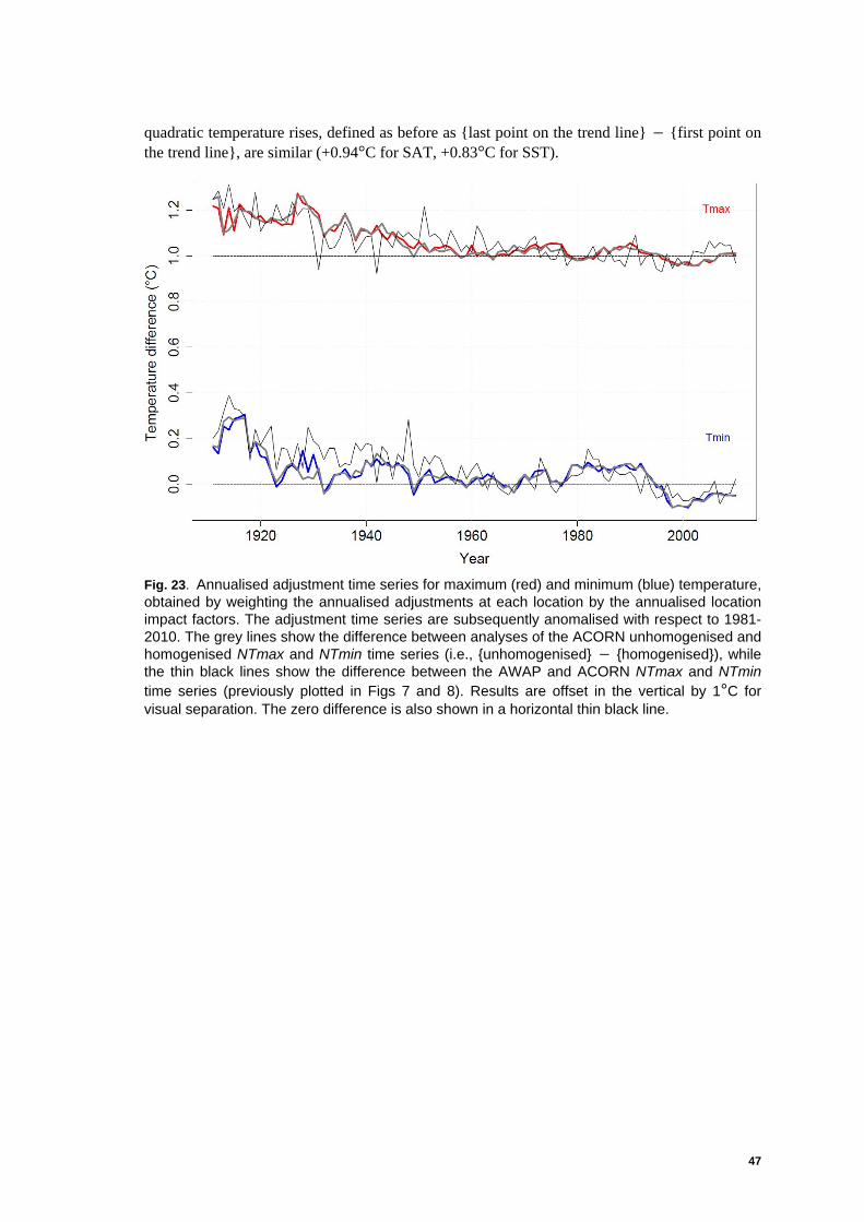
47
quadratic temperature rises, defined as before as {last point on the trend line} − {first point on the trend line}, are similar (+0.94°C for SAT, +0.83°C for SST).
Fig. 23. Annualised adjustment time series for maximum (red) and minimum (blue) temperature, obtained by weighting the annualised adjustments at each location by the annualised location impact factors. The adjustment time series are subsequently anomalised with respect to 1981-2010. The grey lines show the difference between analyses of the ACORN unhomogenised and homogenised NTmax and NTmin time series (i.e., {unhomogenised} − {homogenised}), while the thin black lines show the difference between the AWAP and ACORN NTmax and NTmin time series (previously plotted in Figs 7 and 8). Results are offset in the vertical by 1°C for visual separation. The zero difference is also shown in a horizontal thin black line.

48 On the sensitivity of Australian temperature trends and variability to analysis methods and observation networks.
Fig. 24. Cumulative distribution functions for the acccumulated annualised maximum-temperature homogenisation adjustments, stratified by decade. Adjustments in °C, binned in 0.1 °C increments. Circles denote the median adjustment.
Fig. 25. As for Fig 24, but for minimum temperature.

49
Fig. 26. Differences in the ACORN NTmax (red), NTmin (blue) and NTmean (green) time series; {112-location analyses} − {104-location analyses}. Linear trends in these temperature differences are also shown. Difference time series are offset in the vertical by 0.04°C for visual separation. Black lines denote the zero difference. Total temperature impacts, calculated as {last point on the trend line} − {first point on the trend line}, are 0.003− °C for maximum
temperature, 0.007+ °C for minimum temperature, and 0.002+ °C for mean temperature.
Fig. 27. ACORN NTmean annual mean-temperature anomaly time series (red) and Australian-region SST annual mean-temperature anomaly time series (blue), over the period 1911-2010. Both time series anomalised with respect to 1981-2010. Quadratic trend lines are also shown. The total quadratic temperature changes are +0.94°C (SAT) and +0.83°C (SST).
50 On the sensitivity of Australian temperature trends and variability to analysis methods and observation networks.
9. CONCLUDING REMARKS
This study has concentrated on annual temperatures, and further work will be undertaken to characterise in more detail these changes, particularly at the monthly and seasonal level. The time series of nationally averaged annual temperature anomalies (maximum, minimum, mean) show clear evidence of departures from linearity, which necessarily complicates the reporting of temporal changes in Australian temperature. The picture is one of accelerating warming (the quadratic trend model used in the report has constant acceleration by definition), although when modelled over shorter periods (e.g., the last 30 to 50 years) that non-linearity is harder to detect in the data (Tables 4 and 5). This is consistent with Foster and Rahmstorf (2011), who found that trends in global annual temperature anomalies over recent decades are also basically linear. There is much literature that establishes observed increases in terrestrial and ocean temperatures across the globe (as assessed in IPCC 2007), with recent analyses confirming a continuation of the background warming trend (Foster and Rahmstorf 2011). In this regard, all the datasets analysed here describe warming of Australian temperatures over the last 50 to 100 years. Estimates of the magnitude of temperature change vary slightly, with the largest range in estimates occurring for minimum temperatures (Figs 16 and 17), across homogenised and unhomogenised records. In summary, the analyses undertaken here show that observed warming over Australia is robust to the choice of observing network, homogenisation technique and choice of statistical model used to describe multi-decadal changes in temperature. The warming in the ACORN-SAT data is best described by a quadratic trend model (or the very similar lowess model) and certainly not by a simple linear fit applied over the last 100 years. Australian temperatures showed little or no change during the first three decades of record, followed by accelerated warming over the last 50 years. Just over eighty percent of the total (100-year) change in Australian-averaged temperature occurred in the last five decades. The ACORN-SAT data are similar to all other datasets, including sea-surface temperatures in the Australian region, during the period of most significant warming. This underlines the likely physical reality of the changes diagnosed in Australia's recent climate.

51
10. ACKNOWLEDGMENTS
The work described in this report was undertaken within the National Climate Centre. The authors wish to acknowledge the support of RJBF's supervisor in CAWCR, Dr J.D. Kepert, towards the completion of this report. The statistical software program R (R Development Core Team 2008) was used extensively in the preparation of this report.
11. REFERENCES
Abramowitz, M. and Stegun, I.A. 1965. Handbook of mathematical functions with formulas, graphs and mathematical tables. Dover Publications Inc. New York, USA.
Australian Bureau of Meteorology. 2009a. Special Climate Statement 17: The exceptional January-February 2009 heatwave in south-eastern Australia. URL http://www.bom.gov.au/climate/current/special-statements.shtml (sighted 22 February 2012).
Australian Bureau of Meteorology. 2009b. Special Climate Statement 18: Exceptional winter heat over large parts of Australia. URL http://www.bom.gov.au/climate/current/special-statements.shtml (sighted 5 March 2012).
Australian Bureau of Meteorology. 2009c. Special Climate Statement 19: A prolonged spring heatwave in central and south-eastern Australia. URL http://www.bom.gov.au/climate/current/special-statements.shtml (sighted 5 March 2012).
Australian Bureau of Meteorology. 2011. Annual climate summary 2010. Bureau of Meteorology, Melbourne, Australia. 20pp. URL http://www.bom.gov.au/climate/annual_sum/annsum.shtml (sighted 2 June 2011).
Brohan, P., Kennedy, J.J., Harris, I., Tett, S.F.B. and Jones P.D. 2006. Uncertainty estimates in regional and global observed temperature changes: A new data set from 1850. Journal of Geophysical Research. 111 D12106, doi:10.1029/2005JD006548.
Christy, J.R., Herman, B., Pielke Sr, R., Klotzbach, P., McNider, R., T Hnilo, J.J., Spencer, R.W., Chase, T. and Douglass, D. 2010. What do observational datasets say about modeled tropospheric temperature trends since 1979? International Journal of Remote Sensing. 2. 2148-2169, doi:10.3390/rs2092148.
Christy, J., Spencer, R. and Norris, W. 2011. The role of remote sensing in monitoring global bulk tropospheric temperatures. International Journal of Remote Sensing. 32. 671-685.
Clarkson, N.M. 2002. CLIMARC: a project to extend the Australian computerised CLIMate ARChives. Final report to Land & Water Australia. Queensland Department of Primary Industries, Toowoomba, Australia. 72pp.
Cleveland, W.S 1981. LOWESS: A program for smoothing scatterplots by robust locally weighted regression. The American Statistician. 35 54.

52 On the sensitivity of Australian temperature trends and variability to analysis methods and observation networks.
Della-Marta, P., Collins, D.and Braganza, K. 2004. Updating Australia's high-quality annual temperature dataset. Australian Meteorological Magazine. 53 75-93.
Foster, G.and Rahmstorf, S. 2011. Global temperature evolution 1979-2010. Environmental Research Letters. 6 044022, doi:10.1088/17489326/6/4/044022. Hansen, J., Ruedy, R., Sato, M.and Lo, K. 2010. Global surface temperature change. Reviews of Geophysics. 48 RG4004, doi:10.1029/2010RG000345. Hutchinson, M.F. 1995. Interpolating mean rainfall using thin plate smoothing splines. International Journal of Geographical Information Systems. 9 385-403. IPCC. 2007. Climate Change 2007: The Physical Science Basis. Contribution of Working Group I to the Fourth Assessment Report of the Intergovernmental Panel on Climate Change. S. Solomon, D. Qin, M. Manning, Z. Chen, M. Marquis, K.B. Averyt, M. Tignor, and H.L. Miller, (eds.), Cambridge University Press, Cambridge, United Kingdom and New York, NY, USA. 996 pp. Jones, D.A., Collins, D., Nicholls, N., Phan J.and Della-Marta, P. 2004. A new tool for tracking Australia's climate variability and change. Bulletin of the Australian Meteorological and Oceanographic Society. 17 65-69. Jones, D.A., Wang, W. and Fawcett, R.J.B. 2009. High-quality spatial climate data-sets for Australia. Australian Meteorological and Oceanographic Journal. 58 233-248. Jones, D.A. and Weymouth, G. 1997. An Australian monthly rainfall data set. Technical Report No. 70, Bureau of Meteorology, Melbourne, Australia. 19pp. Karoly, D.J. and Braganza, K. 2005. A new approach to detection and anthropogenic temperature changes in the Australian region. Meteorology and Atmospheric Physics. 89 57-67, doi:10.1007/s00703-005-0121-3. Mears, C.A. and Wentz, F.J. 2009a. Construction of the Remote Sensing Systems V3.2 atmospheric temperature records from the MSU and AMSU microwave sounders. Journal of Atmospheric and Oceanic Technology. 26 1040-1056. Mears, C.A. and Wentz, F.J. 2009b. Construction of the RSS V3.2 lower tropospheric dataset from the MSU and AMSU microwave sounders. Journal of Atmospheric and Oceanic Technology. 26 1493-1509. Menne, M.J., Williams, Jr. C.N. and Palecki, M.A. 2010. On the reliability of the U.S. surface temperature record. Journal of Geophysical Research. 115 D11108, doi:10.1029/2009JD013094.
NCDC. 2011. Summary of Recent Changes in the GHCN-M Temperature Dataset and Merged Land-Ocean Surface Temperature Analyses. National Climatic Data Center, U.S. Department of Commerce, USA. URL ftp://ftp.ncdc.noaa.gov/pub/data/ghcn/blended/ghcnm-v3.pdf (sighted 6 January 2012).

53
Nicholls, N., Lavery, B., Frederiksen, C.and Drosdowsky, W. 1996a. Recent apparent changes in relationships between the El Niño - southern oscillation and Australian rainfall and temperature. Geophysical Research Letters. 23 3357-3360.
Nicholls, N., Tapp, R., Burrows, K. and Richards, D.1996b. Historical thermometer exposures in Australia. International Journal of Climatology. 16 705-710.
Parker, D.E. 2010. Urban heat island effects on estimates of observed climate change. Wiley Interdisciplinary Reviews: Climate Change. 1 123-133, doi:10.1002/wcc.021.
R Development Core Team. 2008. R: A language and environment for statistical computing. R Foundation for Statistical Computing, Vienna, Austria. ISBN 3-900051-07-0, URL http://www.R-project.org/.
Raupach, M.R. ,Briggs, P.R. ,Haverd, V.,King, E.E.,Paget M. and Trudinger, C.M. (2009) Australian Water Availability Project (AWAP): CSIRO Marine and Atmospheric Research Component: Final Report for Phase 3. CAWCR Technical Report No. 013
Rayner, N.A., Brohan, P., Parker, D.E., Folland, C.K., Kennedy, J.J., Vanicek, M., Ansell, T. and Tett, S.F.B. 2006. Improved analyses of changes and uncertainties in marine temperature measured in situ since the mid-nineteenth century: the HadSST2 dataset. Journal of Climate. 19 446-469.
Smith, T.M. and Reynolds, R.W. 2003. Extended Reconstruction of Global Sea Surface Temperatures Based on COADS Data (1854-1997). Journal of Climate. 16 1495-1510.
Smith, T.M. and Reynolds, R.W. 2004. Improved extended reconstruction of SST (1854-1997). Journal of Climate. 17 2466-2477.
Smith, T.M., Reynolds, R.W., Peterson, T.C. and Lawrimore, J.H. 2008. Improvements to NOAA's Historical Merged Land-Ocean Surface Temperature Analysis (1880-2006). Journal of Climate. 21 2283-2293, doi: 10.1175/2007JCLI2100.1.
Torok, S.J. and Nicholls, N. 1996. A historical annual temperature dataset for Australia. Australian Meteorological Magazine. 45 251-260.
Trewin, B.C. 2001. Extreme temperature events in Australia (PhD Thesis). School of Earth Sciences, The University of Melbourne, Melbourne, Australia.
Trewin, B.C. 2004. Effects of changes in algorithms used for the calculation of Australian mean temperature. Australian Meteorological Magazine. 53 1-11.
Trewin, B.C. 2012a. A daily homogenised daily temperature data set for Australia. International Journal of Climatology. (submitted).
Trewin, B.C. 2012b. Techniques involved in developing the Australian Climate Observations Reference Network − Surface Air Temperature (ACORN-SAT) dataset. CAWCR Technical Report (submitted).
Trewin, B.C. and Vermont, H. 2010. Changes in the frequency of record temperatures in Australia, 1957-2009. Australian Meteorological and Oceanographic Journal. 60 113-119.

54 On the sensitivity of Australian temperature trends and variability to analysis methods and observation networks.
X L Wang, H Chen, Y Wu, Y Feng and Q Pu 2010. New techniques for the detection and adjustment of shifts in daily precipitation data series. Journal of Applied Meteorology and Climatology 49 2416-2436, doi: 10.1175/2010JAMC2376.1.
Wang, X.L. and Feng, Y. 2009. RHtestV3 user manual. Environment Canada, Toronto, Canada. 26pp. URL http://cccma.seos.uvic.ca/ETCCDMI/RHtest/RHtestV3_UserManual.doc (sighted 23 February 2012).